BEL Triangle & Flag BreakoutBEL is attempting breakout from Triangle and Bull Flag Pattern on 1D timeframe. Watch for closing at End of the Day. Watch for Earnings because this stock carries earnings risk.
Breakout

Types of Breakout in the Markets ( Monthly Time Frame )In this video I will showcase different type of Breakouts you can see in the markets, mostly Horizontal types and Trendline Types but even inside them which ones are best to follow
I have used charts older than 3 months to showcase this information

NIFTY | 15-Min Chart Update
Nifty is forming a descending triangle on the 15-minute timeframe.
Trendline acting as resistance, limiting upside attempts.
Key support placed near 24,971.
A decisive break below support may trigger further downside, while a breakout above the trendline could signal short-term recovery.
Watch for volume confirmation before taking trades.

Triangle Contraction Symphony: Hidden Supports, Inverted H&SWitness the mesmerizing dance of price action in this chart masterpiece. A pristine triangle contraction pattern emerges, bounded by a supportive yellow trendline below and a red counter-trendline above, perfectly channeling price within tightening bounds.
Layered hidden dotted support/resistance lines add depth, illustrating how price meticulously respects each level—time and again.
Culminating in a textbook inverted head and shoulders formation, this setup showcases contraction elegance at its finest.
Purely educational: Reliving how these levels held in the past. No directional bias here—just the raw beauty of price action precision.
Disclaimer: This post is for educational purposes only, demonstrating historical price action behavior and level interactions. No directional bias or trading recommendations are implied. Past performance is not indicative of future results. Trade at your own risk.

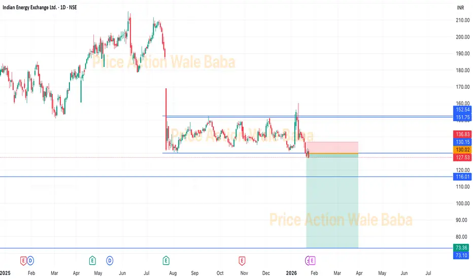
IEX - Box BreakoutIEX was consolidating in the box from the long time and now it's out of the box.
It is good to short IEX and hold for the target of 115-110
Although, you can keep in the hold for the target of 80-75 as we know government policy are comes against IEX's monopoly.
SobhaSobha has box breakout and it's ready to go more down.
Cmp is 1380 which is good to sell, below 1320 we can see 1200 and 1100 as target.
Keep sell on rise will give good return.
SL could be 1480.

Indian Bank - VCP BreakoutAfter 4 months of Ascending Trend we saw two and half months of horizontal consolidation. This consolidation was formed by way of a volatility contraction pattern. What we have witnessed today is a break out from the vcp with volume suggesting it may not be a fakeout.

Reading Price action and Candlesticks like a PROI make educational content videos for Trading
In this video I have used charts older than 3 months to share my experience in the markets by sharing my thinking and chart skills - I hope you will learn something out of it

$SAND MACRO SETUP | 7,800%+ CYCLE EXPANSION IF HTF DEMAND HOLDSCSE:SAND Is Trading At A Major HTF Accumulation Zone After A ~99% Decline From ATH, Forming A Long-Term Base Inside A Multi-Year Descending Channel.
Technical Structure:
• Strong Demand Holding At $0.14 – $0.11
• Price Reacting From HTF Trendline Support
• Structure Remains Valid Above $0.10 (HTF Close)
• Break Above $0.22 – $0.26 Required For Bullish Continuation
Expansion Targets (HTF): $0.65 → $1.50 → $3.50 → $8.48+ (ATH Zone)
This Remains A High R:R Macro Setup If HTF Demand Holds And Price Breaks The Descending Channel.
Invalidation:
HTF Close Below $0.10 Opens Downside Toward $0.05 – $0.035, The Last Major Bullish Order Block.
TA Only. Not Financial Advice. DYOR.

GOLD - Breakout Continues, Bullish Momentum Remains StrongGold prices have attracted fresh buying interest for a second consecutive session, reaching a new all-time high and currently trading around $4,710.
The key driver behind gold’s strength is the ongoing global geopolitical and trade uncertainty. Hawkish statements regarding U.S. tariffs and foreign policy, along with the risk of escalating tensions among major economies, have significantly boosted safe-haven demand. In this environment, gold continues to reaffirm its role as a store of value, drawing strong attention from investors worldwide.
Beyond political factors, investment flows into precious metals are clearly increasing. Global gold ETF holdings have risen steadily over recent weeks, signaling long-term market confidence. Notably, strong buying demand from Asia—especially China—is viewed as a major pillar supporting gold’s sustained upward momentum.
🔎 Key Economic Events to Watch This Week
Wednesday: U.S. President Donald Trump speaks at the WEF; U.S. Pending Home Sale
Thursday: U.S. Q3 GDP (final reading), PCE Price Index, Weekly Jobless Claims
Friday: U.S. S&P Preliminary Manufacturing and Services PMI

Gold Price Action Update-Clean Breakout with Clear Targets AheadGold has finally broken above the falling trendline, confirming a short-term shift in momentum. The breakout is clean, and price is now holding above the breakout area, which keeps the bullish continuation scenario active.
As long as price respects the highlighted support zone, pullbacks can be used for long opportunities toward the marked upside targets. A break below the invalidation level would cancel this setup, so risk management remains key.
This is a structure-based trade, not a chase.
KEY LEVELS
Entry Zone: 4671 – 4668
1st Target: 4678
2nd Target: 4684
Final Target: 4690
Stop Loss: 4660
Disclaimer
This analysis is for educational purposes only and should not be considered financial advice. Trading involves risk. Please do your own research and use proper risk management.

$PUMP PRICE OUTLOOK | 500%–1000% POTENTIAL? #PUMP Is Trading In A Bullish Expansion Zone After Breaking Long-Term Descending Resistance On The Daily Chart.
Price Has Completed A Prolonged Distribution → Correction Phase And Is Now Showing Early Reversal Signals.
Current Technical Structure:
✅ Long-Term Descending Trendline Break Confirmed
✅ Descending Wedge Breakout Structure
✅ Strong HTF Demand Zone Holding (0.0023–0.0021)
✅ Multiple Support Reclaims Indicate Accumulation
✅ Strength Signal: Bullish Above $0.0021
CryptoPatel Targets: $0.00449 / $0.00644 / $0.00872 / $0.015 / $0.026
As Long As PUMP/USDT Holds Above $0.0021, The Bullish Bias Remains Intact.
This Is A High-Risk, High-Reward Accumulation Setup With Asymmetric Upside Potential.
Invalidation: Daily Close Below $0.0021
TA Only. Not Financial Advice. DYOR.

breakout on the way📈 Tata Consumer Products | Breakout Loading? 👀
Tata Consumer Products is pressing against a long-term downward trendline resistance after a strong recovery from the 2024–25 lows.
Price structure shows higher lows, indicating accumulation near resistance.
🔍 Technical View:
• Multiple tests of the same trendline
• Higher lows → buying pressure building
• Momentum positive, but confirmation pending
📊 Key Levels to Watch:
• Breakout confirmation: Daily close above ₹1,210–1,220
• Immediate support: ₹1,150–1,165
📌 Bias: Bullish only on confirmation
⚠️ Disclaimer: Educational purpose only. Not financial advice.
#TataConsumer #BreakoutWatch #AboutToBreak #StockMarketIndia #SwingTrading #TechnicalAnalysis #IndianStocks #PriceAction

UNION BANK OF INDIA | Monthly Chart – Breakout Confirmed UNION BANK OF INDIA | Monthly Chart – Breakout Confirmed 🚀
The Cup & Handle breakout is now clearly visible on the monthly chart, validating the setup discussed earlier.
🔹 Price has closed decisively above the handle resistance (~₹160–162 zone), confirming the breakout.
🔹 Monthly average volume has already been leveled, indicating absorption is complete and the stock is now in an expansion phase.
🔹 Momentum is strong, with price holding above key moving averages — a positive sign for positional and swing traders.
🎯 Upside Levels to Track: - By Next 90 days
Target 1: ₹205
Target 2: ₹250
Positional Target: ₹300–304 (if momentum sustains)
🛑 Risk Management:
Stop-loss: ₹150 on a monthly closing basis
📈 Trading View:
As long as price sustains above the breakout zone, buy-on-dips or hold strategy remains favorable. This is a classic example of structure + volume + time-frame alignment working together.
Trend is now established — manage risk and let the trade play out.
📌 Thanks a ton for checking out my idea! Hope it sparked some value for you.
🙏 Follow for more insights
👍 Boost if you found it helpful
✍️ Drop a comment with your thoughts below!

UNIONBANK: Cup & Handle Sets Stage for UpsideThe chart for Union Bank of India Limited (NSE: UNIONBANK) shows a classic "Cup and Handle" pattern forming over a multi-year period, which is a bullish technical setup supported by steadily increasing volume and positive price action.
• The cup portion covers a deep, rounded bottom with a gradual recovery, fulfilling classic characteristics of the pattern.
• The handle is a minor consolidation after the uptrend, with no deep pullback, which matches a bullish setup.
• Volume increases during the breakout, confirming upward momentum as per technical analysis norms
• The moving averages are trending up, further reinforcing the bullish sentiment.
Entry Target:
The ideal entry is around the breakout level of the handle, which is close to ₹148-150 per the latest monthly close shown on the chart, with a swing target of 160 on immediate basis.
Breakout Level:
The breakout occurs as price closes above the handle’s resistance, which aligns with the ₹160-162zone and provides confirmation. For better risk to reward ratio buyout above 162 levels is suggested.
Investor Targets:
• Target-1: ₹205, which is the first target based on the pattern's height projection.
• Target-2: ₹250, the next logical resistance level using the pattern’s depth and typical bullish extension.
• Price Target: ₹300-304, which is a long-term target if the momentum sustains and the bullish breakout persists.
Stop Loss:
• Place a stop loss below handle support, marked at ₹108 o n a closing basis to manage risk.
📌 Thanks a ton for checking out my idea! Hope it sparked some value for you.
🙏 Follow for more insights
👍 Boost if you found it helpful
✍️ Drop a comment with your thoughts below!

What is the Best Location / Area to Take a trade in the Markets I make educational content videos for trading
In this video I am sharing my experience on which areas are the best to trade with simple Price action using older than 3 months charts

BUY TODAY SELL TOMORROW for 5%DON’T HAVE TIME TO MANAGE YOUR TRADES?
- Take BTST trades at 3:25 pm every day
- Try to exit by taking 4-7% profit of each trade
- SL can also be maintained as closing below the low of the breakout candle
Now, why do I prefer BTST over swing trades? The primary reason is that I have observed that 90% of the stocks give most of the movement in just 1-2 days and the rest of the time they either consolidate or fall
Resistance Breakout in XPROINDIA
BUY TODAY SELL TOMORROW for 5%

BUY TODAY SELL TOMORROW for 5%DON’T HAVE TIME TO MANAGE YOUR TRADES?
- Take BTST trades at 3:25 pm every day
- Try to exit by taking 4-7% profit of each trade
- SL can also be maintained as closing below the low of the breakout candle
Now, why do I prefer BTST over swing trades? The primary reason is that I have observed that 90% of the stocks give most of the movement in just 1-2 days and the rest of the time they either consolidate or fall
Resistance Breakout in MTARTECH
BUY TODAY SELL TOMORROW for 5%

Altseason 2026 Will Be Bigger Than 2017 & 2021 Combined Altseason 2026 Will Be Bigger Than 2017 & 2021 Combined 🚀
OTHERS/BTC (Altcoins Vs Bitcoin) Is Back At The Same Support Level That Triggered Every Major Altcoin Cycle.
2017: +423% Rally
2021: +503% Rally
2026: ~702% Projected Move
Every Cycle This Ratio Bounces, Small Caps Go Parabolic And 10x–100x Opportunities Are Born.
The Only Question That Matters Now:
Are You Early Or Too Late?
NFa & Always DYOR

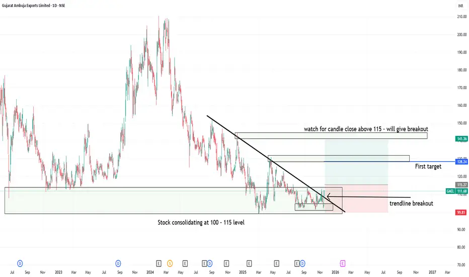
Trendline breakout at support level in GAEL1. Gujrat ambuja export lt- showing consolidation at 100 to 115 levels
2. Candle close above 115 can trigger consolidation breakout at strong support zone
3. Trendline breakout has already happend but above 115 close will be safe and logical
4. Good Risk:Reward one can watch for upside movement with strict sl level
BTCUSD | 4H | Breakout → Retest → Continuation SetupBitcoin has delivered a strong impulsive breakout from a previous consolidation range, indicating bullish strength and fresh demand entering the market.
Price is now retesting a key demand / support zone, which previously acted as resistance. This support-flip-resistance (SBR) structure increases the probability of a trend continuation move to the upside.
Technical Confluence
Higher-timeframe bullish structure intact
Strong impulsive leg → healthy pullback
Retest of prior resistance turned support
Clear risk-to-reward setup
Trade Idea
Bias: Bullish continuation
Entry: After confirmation at demand zone
Stop-loss: Below the demand / structure low
Targets: Next higher resistance / liquidity zone
As long as price holds above the reclaimed support, the bullish scenario remains valid. A clean rejection with strong candles would confirm continuation.
⚠️ This is a technical idea based on price action. Always manage risk.

How to Save yourself from a FAKEOUT - Learn this MethodI made educational content videos for trading
In this video I am telling about how to Identify a fakeout with this simple trick .

BUY TODAY SELL TOMORROW for 5%DON’T HAVE TIME TO MANAGE YOUR TRADES?
- Take BTST trades at 3:25 pm every day
- Try to exit by taking 4-7% profit of each trade
- SL can also be maintained as closing below the low of the breakout candle
Now, why do I prefer BTST over swing trades? The primary reason is that I have observed that 90% of the stocks give most of the movement in just 1-2 days and the rest of the time they either consolidate or fall
Cup & Handle Breakout in DREDGECORP
BUY TODAY SELL TOMORROW for 5%
