UNIONBANK Price Action1. Set up - Breakout
2. Trend - Bullish
3. Strength - strong, as pull back
4. Rounding pattern TP is reached too
Chart Patterns

Bitcoin Is Reacting, Not Breaking, Patience Before the Next MoveWhen I look at this chart, I don’t see panic or trend failure. I see price pulling back into a clearly defined demand area within a rising structure and responding from it. That matters. If sellers were truly in control, price wouldn’t pause here, it would slice through demand without hesitation. Instead, Bitcoin is holding above structure, absorbing selling pressure, and stabilising.
The repeated rejections from the upper supply zone show that resistance exists, but the key point is this: sellers are unable to push price into a breakdown. Momentum has cooled, volatility has compressed, and RSI has reset without price collapsing, all signs of balance, not weakness.
This phase feels slow and uncomfortable, especially for traders who expect constant movement, but historically this is where the market builds the base for its next decision. I’m not interested in chasing price near resistance, and I’m not interested in panic selling into demand. I want to observe how price behaves here, because reactions at structure tell the real story. As long as Bitcoin continues to respect this rising demand and doesn’t accept below it, the broader structure remains intact and upside expansion stays on the table. A clean break below structure would force me to rethink, until then, patience is the position. Sometimes the best trades don’t come from predicting the next candle. They come from waiting while price proves who is actually in control.
Disclaimer: This analysis is for educational purposes only and not financial advice. Always manage risk and trade according to your own plan.

Possibility of some cooldown on GOLD for few months.Possibility of some cooldown on GOLD for few months.
Gold after Rally to ATH of 165000+ looks reached on top end of the Channel ... Possibilities are it can consolidate near 170-175K Level for few weeks before providing new direction to the commodity.
LTP - 164K
Range 150K to 175K.
View - Cautious / Consolidation
Technicals:
Crude is seen moving in upward direction ... Crude / Equities & Gold / Silver are seen moving in opposite directions in past ... With Equities market looking to bottomed out we can see big money moving from Metals to Equity in near months.
Happy Investing.

(FOMC) Bitcoin Bybit chart analysis JENUARY 28Hello
It's a Bitcoin Guide.
If you "follow"
You can receive real-time movement paths and comment notifications on major sections.
If my analysis was helpful,
Please click the booster button at the bottom.
This is a 30-minute Bitcoin chart.
The FOMC will announce interest rates at 4:00 AM tomorrow.
In the lower left corner, with the purple finger,
I've linked my strategy to the long position entry point I entered yesterday, at $82,276.
*Conditional Long Position Strategy based on the Red Finger Movement Path
1. After touching the purple finger's first section at the top (autonomous short)
-> Switch to a long position at $89,300 at the red finger / Stop-loss price if the purple support line is broken
2. First target for a long position at the top section: $91,612.7 -> Target prices in the order of Good and Great
If the price fails to touch the first section at the top and immediately falls,
the second section at the bottom: $88,782.9 is the entry point for a long position
/ Stop-loss price if the purple support line is broken
If the price breaks the purple support line,
the price may fall to up to section 3 from the bottom.
Please use my analysis to this point for reference only.
I hope you operate safely, adhering to principled trading and stop-loss prices.
Thank you.

CANDLE PATTERNS Candlestick patterns are one of the most important tools in technical analysis because they visually represent market psychology: who is in control—the buyers (bulls) or the sellers (bears). Each candlestick captures the battle between demand and supply within a specific timeframe, such as 1 minute, 5 minutes, 30 minutes, daily, or weekly. By studying the shape, size, and position of candles, traders can understand momentum, reversals, trend continuation, and market indecision.
Candlestick charts were first developed by Japanese rice merchants over 300 years ago. Today, they are used by traders across stock markets, index futures, options trading, forex, and crypto. A single candle contains four key pieces of information:
Open
High
Low
Close
A candle is generally green (bullish) if the close is above the open, and red (bearish) if the close is below the open. The body shows the range between open and close, while the wicks (shadows) show the highest and lowest price levels touched.
Patterns form when two or more candles appear together in a particular sequence indicating reversal, continuation, or indecision.

Why Chart Patterns Matter ?Chart patterns reflect real-time battle between buyers and sellers. Every high, low, candle close, and wick communicates intentions of institutions, retail traders, and algos.
For traders, chart patterns help in:
Identifying trend direction
Spotting reversal before confirmation
Planning entries, stop-loss, and take-profit zones
Understanding supply–demand imbalance
Filtering noise in volatile markets
Because patterns repeat across timeframes and markets (stocks, options, forex, crypto), they become reliable tools — especially when aligned with volume spikes and market structure breaks.

BUY TODAY SELL TOMORROW for 5%DON’T HAVE TIME TO MANAGE YOUR TRADES?
- Take BTST trades at 3:25 pm every day
- Try to exit by taking 4-7% profit of each trade
- SL can also be maintained as closing below the low of the breakout candle
Now, why do I prefer BTST over swing trades? The primary reason is that I have observed that 90% of the stocks give most of the movement in just 1-2 days and the rest of the time they either consolidate or fall
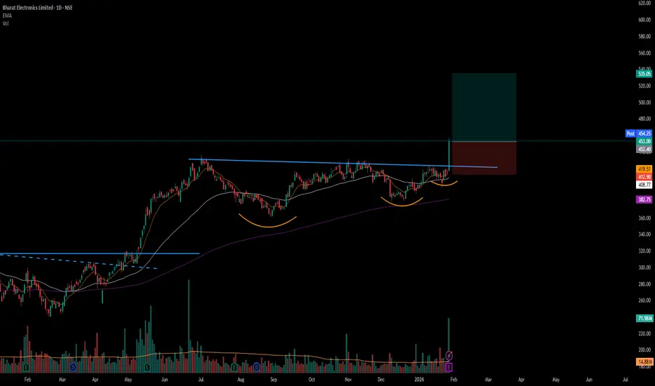
Trendline Breakout in BEL
BUY TODAY SELL TOMORROW for 5%

BUY TODAY SELL TOMORROW for 5%DON’T HAVE TIME TO MANAGE YOUR TRADES?
- Take BTST trades at 3:25 pm every day
- Try to exit by taking 4-7% profit of each trade
- SL can also be maintained as closing below the low of the breakout candle
Now, why do I prefer BTST over swing trades? The primary reason is that I have observed that 90% of the stocks give most of the movement in just 1-2 days and the rest of the time they either consolidate or fall
Resistance Breakout in INDSWFTLAB
BUY TODAY SELL TOMORROW for 5%

Graphite India Ltd | Monthly Timeframe | Structure-Based ViewHi all,
Graphite India is currently trading inside a long-term contracting structure after a multi-year correction. Price has respected both descending resistance and ascending support, indicating compression.
• Strong Base / Demand Zone:
Price has formed a solid base around the ₹430–₹480 zone, which has acted as reliable support multiple times.
• Descending Trendline (Major Supply):
The long-term descending trendline continues to cap price.
Recent candles show price retesting this supply area, but without a confirmed breakout yet.
• Current Phase – Retest, Not Breakout:
The highlighted candle represents a retest of resistance, not confirmation.
➡️ Monthly close is critical to validate strength.
What's next:
✔️ A strong monthly close above the descending trendline
✔️ Acceptance above previous swing highs
✔️ Follow-through volume (optional confirmation)
Until then, this remains a wait-and-watch structure, not a prediction setup.
#GraphiteIndia
#MonthlyChart
#MarketStructure
#PriceAction
#SupportResistance
#TrendlineAnalysis
#IndianStocks
#SwingTrading
#BullManAcademy

TATACONSUMER | Daily TF – RISING WEDGE BreakdownTATACONSUMER is showing short-term weakness after breaking below the rising trendline and failing to hold above 1160.
As long as price stays below this level, the probability increases for a move towards 1120–1100, which aligns with a higher time-frame Bullish Order Block (Demand Zone) and Fibonacci support.
This zone is important because it previously showed strong buying interest.
Plan: No aggressive longs yet.
Wait for price reaction, structure shift, or confirmation inside the demand zone before considering fresh buys.
Market always gives confirmation—patience pays.
Not investment advice.
Regards
Bull Man

XAUUSD Might start profit booking.FOMC Today might move a lot during NY. XAUUSD Might start profit booking.

Bitcoin Bybit chart analysis JENUARY 27Hello
It's a Bitcoin Guide.
If you "follow"
You can receive real-time movement paths and comment notifications on major sections.
If my analysis was helpful,
Please click the booster button at the bottom.
This is a Bitcoin 30-minute chart.
Shortly, there's a Nasdaq indicator release at 12:00 PM.
On the left, with the purple finger,
I've linked the strategy to yesterday's long position entry point, 87.5K.
*Red finger movement path:
One-way long position strategy
1. $87,276 long position entry point / Stop loss if the green support line is broken
2. $88,691.1 long position first target -> Target prices in order from Gap 8 onwards
88.1K in the middle is a useful long position re-entry point.
For those holding long positions yesterday,
I recommend setting a stop loss if the green support line is broken.
Bottom: Light blue support line -> If the first section is broken,
the bottom: $85,238.3 is the final support line.
Up to this point, I ask that you use my analysis for reference only.
I hope you operate safely, with a focus on principled trading and stop-loss orders.
Thank you.

Part 2 Intraday Institutional TradingRisks in Option Trading
1. High Volatility
Premium spikes can trap traders.
2. Time Decay
Especially dangerous for option buyers.
3. Liquidity Issues
Wide spreads can cause losses.
4. Margin Risk for Sellers
Sudden market moves can cause big losses.

is BEL is getting ready for breakout?🔹 Timeframe: Daily
🔹 Trend Bias: Bullish
Price is moving near a key resistance zone on the daily chart
-Clear horizontal resistance tested multiple times
-Higher lows indicating accumulation
-Price holding above short & medium EMAs
🎯 What to Watch:
-Daily close above resistance for breakout confirmation
-Volume expansion on the breakout candle
Possible Targets once resistance break
target1: 440
target2: 450
Educational idea only. Not financial advice. Always manage risk.

#BEL - VCP BreakOut in Daily Time Frame Script: BEL
Key highlights: 💡⚡
📈 VCP BreakOut in Daily Time Frame
📈 Volume spike during Breakout
📈 Base BreakOut
📈 RS Line making 52WH
📈 MACD Crossover
⚠️ Important: Market conditions are BAD, Avoid entering any Trade. Protect Capital Always
⚠️ Important: Always Exit the trade before any Event.
⚠️ Important: Always maintain your Risk:Reward Ratio as 1:2, with this RR, you only need a 33% win rate to Breakeven.
✅ Boost and Follow to never miss a new idea!✅
Disclaimer: I am not SEBI Registered Advisor. My posts are purely for training and educational purposes. Not a BUY or SELL recommendation.
Eat🍜 Sleep😴 TradingView📈 Repeat 🔁
Happy learning with MMT. Cheers!🥂
GARLAND PATTERN : HINDCOPPER ( Multi Year Breakout/Resistence)🌸 HINDCOPPER: The 15-Year "Garland" Pattern Complete
The Technical Setup: Beyond the Cup & Handle
While amateur analysts will call this a "Rounding Bottom" or a "Cup and Handle," true veterans of the Indian market recognize this as a Garland Pattern.
Why? Because a "Garland" (Mala) is what you put on a photo of someone who has passed away. If you bought HINDCOPPER at the peak in 2010 (around ₹600+), your capital has essentially been "dead" for 15 years. This breakout isn't just a price move; it’s a resurrection.
1. The "Cemetery" Zone (2010 - 2024)
The Long Sleep: For over a decade, this stock was a graveyard for retail investors. Every "dip" was a trap, and every "rally" was a ghost.
The Survivors: If you are still holding from 2010, you aren't a trader; you are a legendary "Bagholder Emeritus." This garland is for your patience.
2. The Resurrection (Jan 2026)
The Breakout: We have finally cleared the ₹625 level. In technical terms, the "Ghost of 2010" has been exorcised.
The Volume: The massive green bars at the bottom are the "Electric Shock" that brought this 15-year-old corpse back to life.
3. Fundamental "Dark" Truths
Copper is the New Blood: The world needs copper for EVs and AI, and HINDCOPPER is finally waking up to realize it’s the only primary producer in the country.
Inflation Reality: ₹600 in 2010 is not the same as ₹600 in 2026. While the price has "broken out," the purchasing power of those 2010 buyers is still in the ICU.
Strategy: How to Trade a Ghost?
Entry: Only if you have a pulse. The breakout at ₹625 is the "Entry of the Century."
Support: ₹600 is now the "Floor of the Mausoleum." If we stay above it, the afterlife looks bright.
Target: ₹850. Let's give those 2010 buyers some actual profit before the next decade begins.

BEL: A TEXTBOOK SYMMETRIC TRIANGLE BREAK OUT• BEL is on uptrend and forming higher high pattern in weekly basis.
• It made a strong parallel channel break out on 2024-May to 2024-Jun.
• Stock was consolidating from 2024-Jul.
• It forms a symmetric triangle and consolidated for last 7 month (211 days!)
• Today (28-01-2026) it gives a strong break out.
• Significate volume surge could be observed.
• An entry could be made near 440-450 zone with a SL below the trendline near 419.
• Consolidation range is 436-360=75 points. Hence Target 1 = 450+75=525 and Target 2 =450+75*2=600.
• Watch out psychological resistance at 500!! Trail and enjoy the bull ride.
• Educational purpose only. Happy learning.

PC Jeweller |360° Analysis for Fresh Buyers and Exit holderPC Jeweller Ltd | Educational 360° Technical Review (Weekly Chart)
Higher-Timeframe Structure (Trend Context)
PC Jeweller completed a strong up-cycle and formed a distribution top in the ₹17–19 zone, where multiple higher highs failed to sustain. The sharp rejection and follow-through selling confirm a trend transition from expansion to correction on the higher timeframe.
Current Price Location (Structure + VWAP)
Price is currently trading around ₹10–11, positioned below the weekly VWAP and below the prior value area near ₹12. This places the stock in a weak-to-neutral structure, where price is reacting but has not yet established a confirmed accumulation base.
Volume Profile & Order-Flow Read
VRVP shows the highest historical volume participation near ₹2.5–3.0, marking the strongest long-term demand zone. The ₹9.5–11.5 range shows relatively lighter volume, suggesting this is a reaction zone rather than a high-conviction accumulation area. CVD remains negative, indicating selling pressure is still present.
Relative Strength Analysis (Custom Indicator Insight)
Using the Stock Relative Strength vs NIFTY Sector Index (JANGID) indicator, PC Jeweller shows relative weakness versus the Consumption sector index. The stock is not outperforming its sector, indicating that capital is currently favoring other consumption names and reinforcing the cautious stance for fresh entries.
Best Zones for Fresh Buyers & Existing Holders
From a structure, volume, and relative strength perspective, the higher-probability demand zone lies between ₹7.5–8.5. Fresh participants may prefer waiting for price interaction or confirmation near this zone. For holders from higher levels, averaging near ₹8–9 offers a better risk framework compared to averaging at mid-range prices.
Educational Trade Framework & Risk Levels
• Fresh buying reference: ₹7.5–8.5
• Averaging reference (for higher holders): ₹8–9 after stabilization
• Recovery / supply zones: ₹12–13.5 (≈ +35–55%), extended ₹15–16 (≈ +70–90%)
• Structural invalidation: Weekly close below ₹7
• This analysis is shared strictly for educational discussion, highlighting structure and relative performance, with risk management remaining the responsibility of each participant.

Part 1 Intraday Institutional Trading How Institutions Trade Options
Institutions use:
Delta hedging
Gamma scalping
Volatility Arbitrage
Neutral strategies
They focus more on:
Probability
Volatility cycles
Liquidity zones
Mean reversion
Understanding institutional behavior helps traders make better decisions, especially when reading volume profiles and OI shifts.

Highlight of the day: Silver again up by 6%Silver rose to a new high by 6% heading towards ₹ 4 lac / kg apparently.

Tata Motors PV Ltd | Where Fresh Buyers & Existing Holders StandTata Motors Passenger Vehicles Ltd | Educational 360° Technical Review (Monthly / Weekly Structure)
Higher-Timeframe Structure (What Went Wrong at the Top)
The stock completed a strong uptrend and formed a clear distribution top near ₹700–720, marked by a higher high (HH) followed by sharp downside displacement. The failure to hold above the value area confirms trend exhaustion, and price is now in a corrective / re-accumulation phase, not an active uptrend.
Current Market Context (Where Price Is Now)
Price is trading around the ₹330–350 zone, which is a mid-range area and not a strong demand zone. Volume has contracted significantly compared to the prior rally, indicating lack of aggressive participation and suggesting that the market is still searching for a firm base.
Best Buying Zone for Fresh Entries (Low-Risk Area)
Based on Volume Profile and historical demand, the high-probability buying zone lies between ₹240–280. This zone aligns with prior accumulation, high-volume participation, and structural support. Fresh buyers should avoid chasing at current levels and wait for price acceptance or confirmation in this demand zone.
Strategy for Those Stuck Near the Top (₹650–700 Buyers)
For participants holding from higher levels, averaging at current prices is not optimal. A more logical averaging zone lies near ₹260–280, where risk-to-reward improves meaningfully. If price fails to hold this zone on a closing basis, it would signal deeper weakness and averaging should be avoided.
Recovery & Exit Zones (If Bounce Happens)
Any pullback rally is likely to face supply between ₹420–460, which acts as the first major resistance. A stronger recovery could extend toward ₹520–560, where prior distribution occurred. Long-term holders can use these zones for partial or staggered exits, rather than expecting a straight move back to highs.
Educational Trade Levels & Risk Framework
• Fresh buying zone: ₹240–280
• Averaging zone (for higher holders): ₹260–280 only after confirmation
• Upside reference (recovery): ₹420–460 (≈ +35–45%), extended ₹520–560 (≈ +70–85%)
• Structural stop loss: Monthly close below ₹220
• This remains a corrective-phase stock, not a trending one; patience and risk control are essential, and this analysis is shared strictly for educational discussion, not as investment advice.

Part 5 Advance Option Trading Option Buyers vs. Sellers
Option Buyer
Limited risk (premium paid)
Unlimited profit potential
Theta works against them
Need strong directional move
Option Seller
Unlimited risk but high probability
Earn from premium decay
High margin requirement
Best when market stays in range
Institutions prefer selling due to deep pockets, while retail often leans towards buying due to lower capital requirements.

Part 4 Institutional vs. TechnicalWhy Trade Options?
Retail traders, institutions, and hedgers use options for different reasons:
1. Hedging
Institutions hedge large positions using options to protect risk.
Example:
A mutual fund buys NIFTY PEs to protect its long equity portfolio.
2. Speculation
Small traders use options to generate returns with limited capital.
3. Income Generation
Option sellers earn premium by selling options that they believe will expire worthless.
4. Risk Management
Options allow you to define risk precisely.
