GOLD (XAU/USD) – Bullish Continuation Toward Premium Zone🔍 Technical Analysis Breakdown
Market Structure: Clear bullish structure with higher highs & higher lows intact ✔️
Trendline: Price continues to respect the ascending trendline, confirming strong upside momentum 📈
Breakouts: Multiple confirmed bullish breakouts from consolidation and range zones 🔓
Volume: Strong bullish volume expansion during impulsive moves, validating institutional participation 💥
POI (Point of Interest): Repeated reactions from POI zones, acting as reliable demand areas 🎯
Pivot Point: The green pivot zone is holding as dynamic support after the pullback 🟩
Pullback: Current retracement is corrective and healthy, indicating accumulation before continuation 🔄
🎯 Targets & Trade Projection
Primary Target (TP1): 🟢 4,850 – 4,860
Extended Target (TP2): 🟢 4,890 – 4,920 (premium supply / liquidity zone)
Bullish Continuation Zone: Grey consolidation box → expected higher-low formation then expansion ⬆️
🛑 Invalidation / Risk Level
Bias invalidated below: ❌ 4,740 – 4,720 (High Pivot / trendline break)
✨ Trade Bias: Bullish Continuation
📍 Strategy: Buy pullbacks above pivot | Hold longs while trendline holds
📌 Key Message:
As long as GOLD holds above the pivot point + rising trendline, the path of least resistance remains upward toward the marked targets 🚀💰
Chart Patterns

NIFTY: Textbook Double Top with a Possible Crash of 7000 pt?Technical Analysis
• Previous All-Time High:
Nifty formed its earlier ATH around the 26,300 zone near the end of September 2024.
• Second Phase of Bull Rally:
The next leg of the rally began in early April 2025, with Nifty once again moving up to the 26,300 resistance, but failing to break above it.
• Repeated Rejection at Resistance:
Multiple attempts to decisively cross the 26,300 zone were observed between December 2025 and early January, all of which failed — reinforcing this level as a strong supply zone.
• Distribution Phase:
A textbook distribution pattern appears to be forming, indicating potential exit of smart money.
o FII selling: Approximately ₹80,000 crore sold since December 2025.
Macro Headwinds
• Ongoing geopolitical uncertainty
• Safe-haven rally in Gold & Silver, driven by sustained central bank buying
________________________________________
Trade Setup
Entry Trigger
• Breakdown below the upward trending channel around 24,900
• Daily candle close below this level for confirmation
________________________________________
Trade Structures
• Put Ratio Back Spread
o Limited risk
o Unlimited reward potential
• Long-term Bear Put Spread
o High risk–reward profile
o Target RR of at least 1:10
Risk Factors
• Indian Union Budget on 1st February
→ Avoid aggressive short-term option selling or directional trades around the event
Educational purpose only. Happy chart reading!!!

Part 1 Support and Resistance Introduction to Option Trading
Option trading is a part of the derivatives market where traders buy and sell contracts whose value is derived from an underlying asset like Nifty, BankNifty, stocks, FINNIFTY, SENSEX, commodities, currency, etc.
Unlike equity trading, where you buy shares directly, in options you buy rights (not obligations) to buy or sell the underlying asset at a fixed price.
This fixed price is called the Strike Price.
The unique thing about option trading is that your risk can be limited while your profit potential can be unlimited, especially when buying options.
Options are used by retail traders, big institutions, hedge funds, FIIs, HNIs, and even companies to hedge and speculate.
The attractive part of option trading is the leverage—small premium can control large value of underlying.
But leverage is a double-edged sword; wrong decisions can result in rapid premium decay.
Options can be traded in two ways: buying options or selling/writing options.
Option trading involves understanding price action, sentiment, volatility, open interest, volume, structure, and momentum.
It is one of the most powerful instruments for intraday, swing, positional, and hedged strategies.

KFINTECH 1 Week Tme Frame 📌 Current Price Context
Last close / recent price: ~₹1,018–₹1,019 per share on NSE.
The stock has been weakening over the past week (down ~‑4‑5%).
Price range today: high ~₹1,053 / low ~₹1,016.
📊 Key Pivot & Weekly Levels (1‑Week Focus)
🔹 Pivot (Reference)
Weekly pivot: ~₹1,024 area (central weekly level).
📉 Support Levels (Downside Zones)
Level Price Area What it Means
Near‑term support (S1) ₹1,006 Immediate floor — first downside buffer.
Short support (S2) ₹978–₹980 Next support if selling accelerates.
Deeper support (S3) ₹955–₹960 Stronger lower support on weekly chart.
Below ~₹1,006 weakens short‑term structure and increases bearish risk.
📈 Resistance Levels (Upside Barriers)
Level Price Area What it Means
R1 ₹1,056 Immediate resistance — key 1‑week upside test.
R2 ₹1,079 Secondary barrier — sellers often near here.
R3/Strong resistance ₹1,106–₹1,110 Major breakout zone above recent range.
Above ~₹1,056–₹1,060 would signal less bearish pressure and possibly range recovery.
🔍 Quick Reference Levels (1‑Week)
Support: ~₹1,006 → ₹978 → ₹955
Pivot: ~₹1,024
Resistance: ~₹1,056 → ₹1,079 → ₹1,106+

HINDUNILVR 1 Day Time Frame 📊 Live 1‑Day Price Snapshot (Today’s Trading – India NSE)
🔹 Current Price: ₹2,409.50 INR (latest available intra‑day quote)
🔹 Previous Close: ₹2,390.60 INR
🔹 Day’s Trading Range: ₹2,376.80 – ₹2,434.30 INR
🔹 Volume (Approx): ~1.3 M shares traded
🔹 52‑Week Range: ₹2,136.00 – ₹2,750.00 INR
📈 This is live market data for today’s session (latest trading information available from stock exchange and market feeds).

Structural breakdown after a long uptrendBanknifty makes a Head & Shoulder pattern and confirms a clear breakdown below.
Expecting more selling to follow in coming months.
First target 57700.
Long term target is close to 54150. (Few months)

NIFTY Faces Pressure: Can 24,300 Hold?NIFTY has turned weak after falling around 2.5% on the weekly chart. The index has made a double top near 26,250, which usually means the market is finding it hard to move higher from that area.
On the weekly chart, the candles look bearish. NIFTY is currently holding near an important support around 25,000 (50 EMA). If this level breaks, the market may move lower towards 24,300 and even 23,900.
On the daily chart, NIFTY is trading below all major moving averages (20, 50, 100 & 200 EMA). In the past, whenever NIFTY stayed below these averages, it usually corrected further. Right now, there is no strong support before 24,600.
On the monthly chart, a double top is visible again, showing weakness at higher levels. However, there is decent support near 24,300–24,240, which is also close to the monthly 20 EMA.
Momentum is also weakening. RSI is showing bearish divergence on weekly and monthly charts, which suggests upside strength is fading.
Resistance Levels :- 25,200 – 25,300, 25,500, 26,250
Support Levels :- 24,987, 24,600, 24,300 – 24,240, 23,900
Overall View
As long as NIFTY stays below 25,500, the trend remains weak. Market direction will become clearer near the 24,300 support zone.

MRPL: Bullish Trend Resumption from Structural SupportThe Core Thesis: Strength in Consolidation
MRPL is showing significant technical resilience after a period of deep consolidation. The stock has successfully defended its long-term support levels and is now beginning a fresh upward expansion, characterized by a reclaim of key short-term momentum indicators.
Technical Analysis & Breakout Factors
Moving Average Alignment: The price is trading above all major moving averages on the weekly timeframe. It is currently holding support above the 10, 20, and 50-week EMAs, while the 200-week SMA (orange line) remains trending upward far below current prices, providing a solid long-term floor.
Relative Strength (RS): RS is showing positive divergence. While the broader Nifty has faced volatility, MRPL’s price action remains constructive, indicating that the stock is outperforming the benchmark index.
Volume Confirmation: The recent price bounce is supported by strong volume bars at the bottom of the chart, suggesting institutional accumulation at these demand levels rather than speculative retail interest.
Trade Setup (As per Chart Labels)
Action: BUY (Long Entry)
Entry Trigger: Current market price near ₹155.40, following the successful breakout above the immediate local resistance (dotted red line).
Target 1 (T1): ₹185.00 (Testing the recent swing high resistance).
Target 2 (T2): ₹220.00 (Testing the previous major supply zone/red band).
Stop-Loss (SL): ₹133.00 (A strict close below the Demand Zone and the recent swing low).
Risk/Reward Ratio (R:R): Approx. 1:2.8 (Risking ~₹22 to gain ~₹65).
Disclaimer: This analysis is for educational purposes only and does not constitute financial advice. Conduct your own due diligence before trading.

Nifty 50 1 Month Time Frame 📊 Live Price & Performance (1 Month)
Nifty 50 Index: 25,048.65 (close on 23 Jan 2026)
• Declined ~‑4.3% over the past month.
• 1‑month high ~26,373 / low ~24,919.
📈 Key 1‑Month Technical Levels
🎯 Resistance (Upside)
1. 26,000 – 26,100 — Immediate resistance zone where supply likely increases and prior range top is placed.
2. ~26,300 — 1‑month swing high / recent high area.
Breaking above 26,100–26,300 with momentum would signal a stronger upside breakout.
🛡️ Support (Downside)
1. 25,600 – 25,700 — Key short‑term support cluster (holds medium‑term bullish bias if above this).
2. ~25,000 — Psychological and technical support level (also near recent lows).
3. 24,900 – 24,800 — Lower demand zone from recent 1‑month range.
A breakdown below 25,000 could accelerate downside, while holding above 25,600‑25,700 keeps bulls in control.
📌 What to Watch Next
Bullish breakout trigger: Close above 26,100–26,300.
Bearish catalyst: Sustained move below 25,000.
Neutral/sideways trade: Oscillation between 25,000 and 26,100.

Candlestick Patterns in Trading
Candlestick patterns are one of the most widely used tools in technical analysis for traders across all markets, including stocks, forex, commodities, and cryptocurrencies. They provide visual insights into market psychology by representing price action over a specific period of time. Understanding these patterns allows traders to anticipate potential market reversals, continuations, and indecision.
1. Understanding Candlesticks
A candlestick consists of four key price points:
Open Price – The price at which trading begins for the selected timeframe.
Close Price – The price at which trading ends for that timeframe.
High Price – The highest price achieved during that period.
Low Price – The lowest price achieved during that period.
The body of the candlestick is formed by the open and close prices. If the close price is higher than the open, the candle is bullish (often colored green or white). Conversely, if the close is lower than the open, the candle is bearish (often red or black). The lines above and below the body are called shadows or wicks, representing intraday highs and lows.

Chart Patterns in Trading
Chart patterns are formations created by the price movements of a security on a chart over time. These patterns are a critical component of technical analysis, as they help traders and investors predict potential price movements based on historical behavior. Patterns reflect the psychology of market participants, including fear, greed, optimism, and pessimism, and can indicate trends, reversals, or consolidation phases.
Chart patterns are generally divided into two main categories:
Continuation patterns – These indicate that the current trend (uptrend or downtrend) is likely to continue after the pattern completes.
Reversal patterns – These suggest that the current trend may reverse direction once the pattern is complete.

Union Bank of India near 8 year high
1. Cup with 3 contractions in the handle.
2. Structure good on weekly as well as daily timeframe.
3. Recent Breakout with low volume pullback on Daily TF.
4. Good volume signature.
.
NOTE : Further movement can get choppy or breakout may fail as overall market sentiment not favourable.

XAUUSD – Next Week Could Be Gold’s True Breakout MomentOver the past week, the market has shown something very different:
Gold is no longer behaving like a typical safe-haven asset — it is trading as a fully accepted trend at a new price regime.
🔥 Why next week is critical for Gold
USD continues to weaken, with DXY sliding toward multi-month lows → a strong tailwind for gold.
ATHs are being broken without distribution, signaling institutional acceptance rather than emotional FOMO.
Sell pressure at the highs is limited — buyers step in quickly on even shallow pullbacks.
👉 These are classic signs of a trend expansion phase, not a market top.
🧠 Structure perspective (Weekly → H1)
Higher-timeframe structure remains clearly bullish (Higher Highs – Higher Lows).
Recent pullbacks are rebalancing moves, with no confirmed bearish CHoCH.
Weekly demand and IP zones continue to be defended → active smart-money participation.
In simple terms:
The market is no longer asking “Should we buy gold?”
It is asking “Where is the next safe BUY?”
🎯 Primary bias for next week (MMF View)
Priority: BUY pullbacks — not chasing ATHs
Focus on entries at demand / IP zones.
Avoid emotional buys at extension levels; healthy pullbacks are part of strong trends.
The bigger picture:
👉 $5,000 is no longer just psychological — it is being technically priced in.
⚠️ What to watch
Expect volatility around macro events and Fed expectations.
Short-term noise is normal, but only a structural break changes the trend.
🧩 Final takeaway
Gold is entering a phase where:
ATHs are no longer ceilings,
Pullbacks are opportunities,
Patience outweighs prediction.
In strong trends, traders don’t lose because they’re wrong — they lose because they’re impatient.
Next week, the question isn’t “Will gold rise?”
👉 It’s “Can you follow the flow with discipline?”

Retest of Support BTC1. Rest of the Support(Previous Resistance) Completed
2. Falling wage Wxyz Correction Completed
3. Hourly bulish Divergence is Visible
Next leg 98-99k Probability 60%

Another public sector bank hindsight analysisAll necessary details mentioned on chart itself.
1. Volume patterns
2. Sector tail winds in public sector banks

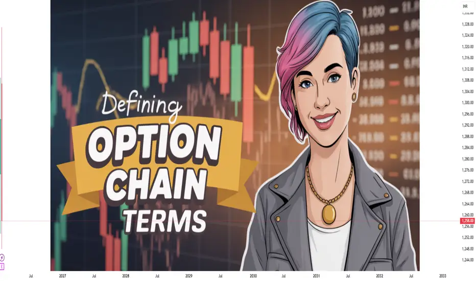
Option Chain Terms – A Comprehensive Explanation1. Underlying Asset
The underlying asset is the security on which the option contract is based. This could be an equity stock (like Reliance or TCS), an index (such as NIFTY or BANKNIFTY), a commodity, or a currency. All option prices in the option chain are derived from the movement of this underlying asset.
2. Expiry Date
The expiry date is the last date on which an option contract remains valid. After this date, the option either expires worthless or is settled (cash or physical settlement, depending on the contract). Option chains usually show multiple expiries—weekly, monthly, and sometimes quarterly—allowing traders to choose contracts based on their time horizon.
3. Strike Price
The strike price is the predetermined price at which the underlying asset can be bought (in the case of a Call option) or sold (in the case of a Put option). Strike prices are arranged vertically in the option chain, with Calls on one side and Puts on the other. The choice of strike price reflects the trader’s market view and risk appetite.
4. Call Option (CE)
A Call option gives the buyer the right, but not the obligation, to buy the underlying asset at the strike price before or on the expiry date. In the option chain, Call options are typically displayed on the left side. Rising Call premiums often indicate bullish sentiment, while heavy Call writing may signal resistance levels.
5. Put Option (PE)
A Put option gives the buyer the right, but not the obligation, to sell the underlying asset at the strike price before or on expiry. Put options are shown on the right side of the option chain. Increasing Put premiums usually reflect bearish sentiment or demand for downside protection.
6. Option Premium (Last Traded Price – LTP)
The option premium is the price paid by the option buyer to the seller (writer). In the option chain, this is shown as the Last Traded Price (LTP). The premium consists of intrinsic value and time value and fluctuates based on factors like underlying price, volatility, time to expiry, and interest rates.
7. Intrinsic Value
Intrinsic value is the real, in-the-money value of an option.
For a Call option: Intrinsic Value = Underlying Price − Strike Price
For a Put option: Intrinsic Value = Strike Price − Underlying Price
If this value is negative, intrinsic value is considered zero.
8. Time Value
Time value is the portion of the option premium beyond intrinsic value. It represents the possibility that the option may gain value before expiry. Time value decreases as expiry approaches, a phenomenon known as time decay or theta decay.
9. Open Interest (OI)
Open Interest refers to the total number of outstanding option contracts that have not been settled or closed. High OI indicates strong participation and liquidity at that strike price. Traders analyze changes in OI to understand whether new positions are being created or old ones are being unwound.
10. Change in Open Interest (ΔOI)
Change in Open Interest shows the increase or decrease in OI compared to the previous trading session.
Rising OI with rising price suggests strong trend continuation.
Rising OI with falling price indicates bearish buildup.
Falling OI suggests position unwinding.
11. Volume
Volume represents the number of option contracts traded during a particular trading session. High volume signals active trading interest and often precedes strong price movements.
12. Implied Volatility (IV)
Implied Volatility reflects the market’s expectation of future price fluctuations in the underlying asset. Higher IV means higher option premiums, while lower IV results in cheaper options. Traders closely track IV to decide whether options are expensive or cheap.
13. Bid Price and Ask Price
Bid Price: The highest price a buyer is willing to pay for an option.
Ask Price: The lowest price a seller is willing to accept.
The difference between them is called the bid-ask spread, which indicates liquidity.
14. At-the-Money (ATM), In-the-Money (ITM), Out-of-the-Money (OTM)
ATM: Strike price closest to the current underlying price.
ITM: Options with intrinsic value.
OTM: Options with no intrinsic value.
These classifications help traders select appropriate strikes.
15. Greeks in Option Chain
Some option chains also display Option Greeks, which measure sensitivity:
Delta: Sensitivity to underlying price changes
Gamma: Rate of change of Delta
Theta: Time decay
Vega: Sensitivity to volatility
Rho: Sensitivity to interest rates
Conclusion
An option chain is far more than a list of prices—it is a powerful analytical tool that reveals market psychology, support and resistance levels, volatility expectations, and trading opportunities. By understanding option chain terms such as strike price, open interest, implied volatility, and option Greeks, traders can make informed decisions, manage risk effectively, and build well-structured option strategies. Mastery of option chain terminology is a foundational step toward successful options trading.
How to Boost Trading Performance1. Build a Strong Trading Foundation
The first step in boosting trading performance is developing a solid understanding of the markets you trade. This includes knowing how different asset classes behave—stocks, indices, commodities, forex, or derivatives—and understanding the factors that influence price movement such as macroeconomic data, earnings, interest rates, liquidity, and market sentiment.
A strong foundation also means clarity about market structure: trends, ranges, volatility cycles, and volume behavior. Traders who lack this foundation often jump from one strategy to another, leading to inconsistent results. Consistency begins with depth of understanding, not breadth of indicators.
2. Define a Clear Trading Plan
A written trading plan is one of the most powerful tools for improving performance. It should clearly define:
Market and instruments traded
Timeframes used
Entry criteria
Exit rules (profit targets and stop-losses)
Position sizing method
Risk per trade
A clear plan removes emotional decision-making during live markets. When rules are predefined, execution becomes mechanical rather than reactive. Traders who follow a plan are far more likely to maintain discipline during volatile or stressful periods.
3. Master Risk Management
Risk management is the backbone of long-term trading success. Even the best strategies fail if risk is not controlled. Boosting performance often has more to do with reducing losses than increasing profits.
Key risk management principles include:
Risking only a small percentage of capital per trade (commonly 0.5%–2%)
Always using stop-loss orders
Avoiding over-leverage
Limiting the number of correlated trades
By protecting capital, traders ensure they remain in the game long enough for skill and probability to work in their favor. Capital preservation leads to confidence, and confidence improves execution.
4. Improve Trade Selection Quality
Not every market move needs to be traded. One of the biggest performance boosters is learning when not to trade. High-quality trades typically align with multiple factors such as trend direction, key support/resistance levels, volume confirmation, and favorable risk–reward ratios.
Professional traders focus on A+ setups—trades that clearly fit their strategy. Reducing overtrading helps conserve mental energy and minimizes transaction costs. Fewer, higher-quality trades often produce better results than frequent low-quality trades.
5. Develop Emotional Control and Discipline
Psychology plays a crucial role in trading performance. Fear, greed, impatience, and overconfidence can sabotage even the most technically sound strategy. Emotional mistakes such as revenge trading, holding losses too long, or exiting winners too early are common performance killers.
To improve emotional control:
Accept losses as part of the business
Focus on process, not short-term results
Maintain realistic expectations
Avoid trading during emotional stress
Traders who master their emotions trade their plan, not their feelings. Over time, emotional discipline becomes a competitive advantage.
6. Maintain a Trading Journal
A detailed trading journal is an essential performance-boosting tool. It should include:
Trade rationale
Entry and exit prices
Stop-loss and target
Risk–reward ratio
Outcome (profit/loss)
Emotional state during the trade
Reviewing this journal regularly helps identify recurring mistakes and strengths. Patterns such as poor entries, late exits, or emotional trades become visible only through data. Continuous self-review turns experience into improvement.
7. Focus on Consistent Execution
Even a profitable strategy will fail if executed inconsistently. Slippage, hesitation, early exits, or missed trades all reduce edge. Boosting performance often means refining execution—entering at planned levels, respecting stop-losses, and letting profits run according to the strategy.
Consistency comes from repetition, confidence in the system, and trust in probabilities. The goal is not perfection but disciplined repetition of correct actions.
8. Adapt to Market Conditions
Markets evolve. A strategy that works well in trending markets may struggle in range-bound or highly volatile environments. Traders who boost performance learn to recognize changing conditions and adjust position sizing, trade frequency, or even stay on the sidelines when conditions are unfavorable.
Flexibility does not mean abandoning your system—it means applying it intelligently within the context of the market environment.
9. Manage Time, Energy, and Lifestyle
Trading performance is closely linked to physical and mental well-being. Fatigue, stress, and lack of focus can impair decision-making. Successful traders treat trading like a profession, not a constant screen-watching activity.
Key habits include:
Trading only during optimal hours
Taking regular breaks
Maintaining physical health
Avoiding information overload
A balanced lifestyle supports sharper focus and better judgment in markets.
10. Commit to Continuous Learning
Markets reward adaptability and punish stagnation. Boosting trading performance requires continuous learning—reviewing past trades, studying market behavior, refining strategies, and learning from mistakes.
However, learning should be structured. Randomly changing strategies after losses is harmful. Instead, traders should test improvements, make incremental changes, and evaluate results objectively.
Conclusion
Boosting trading performance is a gradual, disciplined process rather than a quick fix. It involves building strong market knowledge, following a clear trading plan, managing risk effectively, controlling emotions, and continuously reviewing and improving execution. The most successful traders focus on consistency, patience, and process-driven decision-making. Over time, small improvements across these areas compound into significant performance gains, turning trading from speculation into a structured and sustainable endeavor.

Trading Breakouts and Fakeouts: Capturing Momentum Understanding Breakouts in Trading
A breakout occurs when price moves decisively beyond a well-defined support or resistance level with the potential to start a new trend or accelerate an existing one. These levels usually represent areas where price has previously struggled to move beyond due to a balance between buyers and sellers. When that balance shifts, price breaks out.
Breakouts are powerful because they often reflect a change in market sentiment. For example, when resistance is broken, sellers who were defending that level are overwhelmed, and new buyers enter the market expecting higher prices. At the same time, traders who were short may be forced to cover their positions, adding fuel to the move.
Breakouts commonly occur from chart structures such as consolidation ranges, triangles, flags, head-and-shoulders patterns, and channels. The longer the price consolidates and the more times a level is tested, the more significant the breakout tends to be. Volume often plays a critical role here; a true breakout is usually accompanied by an expansion in volume, signaling strong participation.
Types of Breakouts
Breakouts can be classified in several ways. Range breakouts happen when price moves above resistance or below support after trading sideways for a period. Trendline breakouts occur when price breaks a downward or upward sloping trendline, often indicating a trend reversal or acceleration. Volatility breakouts happen when price exits a low-volatility environment, often after a squeeze, leading to sharp directional moves.
Another important distinction is time-frame based breakouts. Intraday traders focus on breakouts of previous day highs/lows or key intraday levels, while swing and positional traders look for breakouts on daily, weekly, or even monthly charts. Higher time-frame breakouts generally carry more reliability, but they also require wider stop losses and patience.
What Are Fakeouts and Why They Happen
A fakeout, also known as a false breakout, occurs when price briefly moves beyond a key level but fails to sustain the move and quickly reverses back into the prior range. Fakeouts are common because markets are driven by liquidity. Large participants often push price beyond obvious levels to trigger stop losses and breakout orders, then reverse price once sufficient liquidity is collected.
Fakeouts happen for several reasons. One major reason is lack of follow-through buying or selling. Price may break a level, but if volume is weak and broader market sentiment does not support the move, the breakout fails. News-driven volatility can also cause fakeouts, where price reacts sharply to an announcement but then retraces once emotions cool down.
Retail trader behavior plays a role as well. Many traders place stops just beyond obvious support or resistance. When price reaches these areas, stop orders get triggered, causing a brief surge that looks like a breakout. Once those stops are absorbed, price reverses, trapping late breakout traders.
Identifying High-Probability Breakouts
Not all breakouts are equal. High-probability breakouts usually have a few common characteristics. First, the level being broken should be clearly visible and respected in the past. Second, price action before the breakout often shows contraction, such as lower volatility or tighter ranges, indicating pressure buildup. Third, confirmation through volume expansion, strong candle closes, or alignment with the higher-time-frame trend increases reliability.
Context is critical. A breakout in the direction of the broader trend has a much higher success rate than a counter-trend breakout. For example, an upside breakout in a strong bullish market is more likely to succeed than the same breakout during a choppy or bearish environment.
Recognizing and Trading Fakeouts
Fakeouts are frustrating, but experienced traders learn to identify and even trade them. Common signs of a fakeout include weak candle closes beyond the level, long wicks showing rejection, low volume on the breakout attempt, and immediate failure to hold above or below the key level.
One effective approach is the “break and retest” method. Instead of entering immediately on the breakout, traders wait for price to break the level and then retest it from the other side. If the level holds during the retest, the breakout is more likely to be genuine. If price fails quickly and moves back into the range, it signals a potential fakeout.
Some advanced traders deliberately trade fakeouts by entering in the opposite direction once price reclaims the broken level. These trades can be powerful because trapped breakout traders are forced to exit, accelerating the reversal move.
Risk Management in Breakout and Fakeout Trading
Risk management is the backbone of trading breakouts and fakeouts. Breakout trades should have clearly defined stop losses, usually just inside the broken level or below the breakout candle’s low in bullish setups. Because fakeouts are common, position sizing should be conservative, especially in volatile markets.
For fakeout trades, stops are typically placed beyond the extreme of the false breakout. Since reversals can be sharp, reward-to-risk ratios are often favorable, but discipline is essential. Overtrading every breakout or fakeout leads to emotional decisions and inconsistent results.
Psychology and Discipline
The psychology of breakout trading is intense. Fear of missing out (FOMO) often pushes traders to chase breakouts late, increasing the chance of getting trapped in a fakeout. Successful traders stay patient, wait for confirmation, and accept that missing a trade is better than taking a low-quality setup.
Equally important is accepting losses. Even the best breakout traders experience fakeouts regularly. The key is to keep losses small and let successful breakouts run. Over time, consistency and discipline matter more than predicting every move correctly.
Conclusion
Trading breakouts and fakeouts is about understanding market structure, liquidity, and trader behavior. Breakouts offer opportunities to ride strong momentum, while fakeouts remind traders of the market’s deceptive nature. By combining technical analysis with volume, context, and disciplined risk management, traders can improve their ability to capture genuine breakouts and avoid or even profit from fakeouts. Mastery of this approach does not come from avoiding losses entirely, but from managing them wisely while staying aligned with high-probability market conditions.

Bhel - LongThis is a daily chart of BHEL. Earlier, the stock faced strong resistance at the marked level, where price failed to move higher in the past. When the price approached this area again, it broke above the resistance with a sharp upward move, showing strength and strong buying interest. After this breakout, the price is now trading above the resistance zone, which is a positive sign for the overall trend.
The same resistance level has now turned into support. You can see that whenever the price comes down near this support area, buyers step in and the price holds above it. This shows that the breakout level is being respected and sellers are not able to push the stock back below this zone. As long as the price stays above this support, the trend remains bullish.
One important point highlighted on the chart is that volumes are missing. After a strong breakout, ideally volumes should remain high to support further upside. Here, volumes have reduced during consolidation, which means aggressive buying is not visible at the moment. This does not make the structure weak, but it suggests that the next big move may need fresh volume confirmation.
Looking at the MACD indicator, the earlier up move is followed by cooling momentum. The MACD lines are close to each other and trying to stabilize near the zero line. This indicates that selling pressure is reducing and momentum is trying to shift again. If MACD turns up along with an increase in volume, it can support another upward move.
Overall, the chart shows a strong breakout structure with price holding above support, but volumes need to improve for a confident continuation. For learners, this is a good example of how breakout, support, volume behavior, and momentum should be read together before expecting the next move.

Hindustan Zinc - Weekly (Long)On the weekly chart, the recent candles of Hindustan Zinc show strong bullish intent. After a long consolidation phase, price has formed higher lows and now a strong green candle is visible near the resistance zone around 700–705. This kind of candle after a rounded base often signals accumulation and the start of a fresh upward leg. The absence of long upper wicks suggests that sellers are not very active at current levels.
The overall trend is turning positive. For many months the stock moved sideways, but now price is clearly making higher highs and higher lows. The dotted trend line is curving upward, showing that momentum is shifting in favor of buyers. A sustained move above the 705–710 zone can confirm a trend reversal on the higher timeframe and open the door for a medium-term rally.
RSI is around the mid-70s, which shows strong momentum. It has moved from a neutral zone to a bullish zone and is holding above 60. This tells us that buyers are in control. Even though RSI is slightly high, in trending markets RSI can stay elevated for a long time. This supports continuation rather than immediate reversal.
Volume is expanding during the recent rise. Rising price with rising volume is a healthy sign and indicates genuine participation from market players. This confirms that the breakout attempt is backed by demand and not just a short-term spike.
ADX is rising and moving above the lower range, which indicates that a new trend is developing. When ADX starts rising after a long flat phase, it usually marks the beginning of a strong directional move. This aligns well with the price structure and volume behavior.
Best entry can be on a weekly close above 710, or on a small pullback towards 680–690 if price holds above this zone. This allows better risk management. Stop loss can be placed below 640 on a closing basis, which is below the recent swing low and trend support. The first target comes near 820, which is the next major supply area. If momentum continues, a higher target near 1000–1020 is possible over the medium term.
This analysis is for educational purposes only. It is not a buy or sell recommendation. Stock market investments involve risk. Always do your own research and consult a financial advisor before taking any trading or investment decision.

DIXON Monthly chart Suggest 5x ROI Possible in next 7-8 yearsDIXON Monthly chart Suggest 5x ROI Possible in next 7-8 years.
Fundamentals:
Company has delivered good profit growth of 45% CAGR over last 5 years
3 Years ROE 28.1%
Sales growth is 45% of last 10 years.
Technical:
DIXON is following Monthly cycle of 22 months. It may still correct a bit but upside potentials is huge so time to accumulate on all dips.
LTP - 10360
Targets - 52000+
Timeframe - 7-8 Years
Happy Investing.

Chart Nobody Is Watching: BTC.D Could Trigger Biggest AltseasonThe Chart Nobody Is Watching: BTC.D Could Trigger The Biggest Altseason
Bitcoin Dominance (BTC.D) is currently trading at a major HTF distribution zone after printing a cycle high near 66%. Price faced a strong rejection from a Bearish Order Block + Fair Value Gap, confirming supply presence and bearish structural shift.
Technical Structure (HTF):
Cycle high formed at 66% (HTF supply zone)
Clear rejection from Bearish OB + FVG
Support trendline broken
Bearish retest completed near 60%
Structure remains bearish below 60–62%
BTC.D Downside Projection:
50–48% (first expansion zone)
44% (major HTF support)
40% (historical altseason peak zone)
A sustained move toward the 44–40% region has historically aligned with aggressive capital rotation from Bitcoin into altcoins, often marking the beginning of major altcoin expansion phases.
Invalidation: HTF close above 66%
This analysis is based purely on market structure and HTF supply/demand dynamics.
Just my personal view. Not financial or investment advice. Always do your own research.

Antony Waste Handling Cell Ltd – Weekly Chart ViewPrice reacting from deep discount zone with volume support.
🔹 Stock respected 0.786–0.886 Fibonacci retracement zone
🔹 Strong bullish candles emerging from ~428–445 demand area
🔹 Noticeable volume expansion, indicating institutional participation
🔹 Price currently testing the descending trendline resistance
Key Levels to Watch
Immediate Resistance: 570–580
Major Supply / Gap Zone: 733–780
Support Zone: 445–428
Invalidation: Weekly close below 427
Expectation (Not Prediction)
Acceptance above trendline → scope for mean reversion towards gap zone
Rejection from trendline → range continuation with higher lows
📌 No indicators. No noise.
Structure + Levels + Volume = Clarity
Note: Educational view only. Not investment advice.
Regards
Bull Man
#PriceAction
#TechnicalAnalysis
#SwingTrading
#IndianStocks
#WeeklyChart
#SupportAndResistance
#FibonacciRetracement
#VolumeAnalysis
#Trendline
#TradingEducation
