ABLBL | Bullish Divergence Opportunity | Chart Study🔻 Primary Trend
Stock is trading inside a well-defined falling channel (lower highs & lower lows).
Price is currently near the lower channel support, which is a key reaction zone.
🔁 Bullish RSI Divergence
Price: Made a lower low
RSI (14): Formed a higher low
This bullish divergence suggests selling pressure is weakening.
RSI has bounced from oversold zone (~30) and is curling upward.
📉 MACD Observation
MACD remains below zero but:
Histogram selling pressure is reducing
Momentum loss on the downside → early reversal signal (not confirmed yet)
📍 Support Zone
Strong horizontal + channel support around ₹103–105
Multiple reactions from this zone increase its reliability
🎯 Bullish Opportunity Logic (Study only)
Setup favors a technical pullback / relief bounce
Best confirmation would be:
Price holding above support
RSI crossing 40–45
MACD flattening or bullish crossover
📝 Note
This chart is shared purely for educational and technical study purposes.
It is not a recommendation or trading advice. Please do your own analysis.
Divergence


INOXWIND Accumulation Zone – High Probability Upside Reversal INOXWIND is approaching a high-probability bullish reversal zone.
Price is currently sitting at long-term horizontal support while compressing inside a falling triangle pattern. This area has previously acted as a strong demand zone.
Key Bullish Signals:
🔹 1. Price near major support + triangle apex
The price is holding above long-term support and squeezing toward the triangle’s end — a zone where breakouts or sharp reversals often happen.
🔹 2. RSI deeply oversold (near 28–30)
RSI is at levels where previous reversals occurred, showing sellers are exhausted and downside momentum is weakening.
🔹 3. MACD losing bearish strength
The MACD histogram is flattening and the lines are preparing for a potential bullish crossover, indicating the downtrend is weakening.
🔹 4. Tight price compression forming a “price pipe”
Price action is tightening, which often precedes a volatile move — and with indicators oversold, the probability favors an upside bounce.
🎯 Bullish Expectation
If the support holds, INOXWIND may show a sharp relief rally toward:
₹140
₹150 trendline
And possibly higher if volume supports a breakout.
⚠️ Risk Disclaimer
Support breakdown below ₹130 will invalidate the bullish setup.
This is a study of chart behavior and probability only — not a buy/sell recommendation. Always do your own research and manage risk.

NIFTY MIDCAPNIFTY MIDCAP formed with DOUBLE TOP with DIVERGENCE with first target 14,403, and next support at 13,995. If it didn't take supports at 13,995 we can see further downside with FINAL TRAGET 13,900.

Bullish Divergence Spotting a Possible Trend ReversalIn today’s chart study of Crompton Greaves Consumer Electricals, I’ve identified a clear bullish divergence forming between price action and RSI. While the stock continued to make lower lows, the RSI has started making higher lows, signaling that downside momentum is weakening.
This divergence, combined with a flattening MACD histogram and a potential crossover setup forming, suggests the stock may be preparing for a short-term bullish reversal.
The price is also trading near a major support zone around ₹275–₹276, which has been defended multiple times. A sustained move above ₹286 could confirm strength and open up room for a meaningful upside.
This setup offers a high-probability opportunity for early entry before the trend shifts. As always, I’ll be watching volumes and confirmation candles for follow-through.
Note:
This analysis is based purely on technical indicators and chart structure. It is not financial advice. Always conduct your own research and use proper risk management before taking any trade.

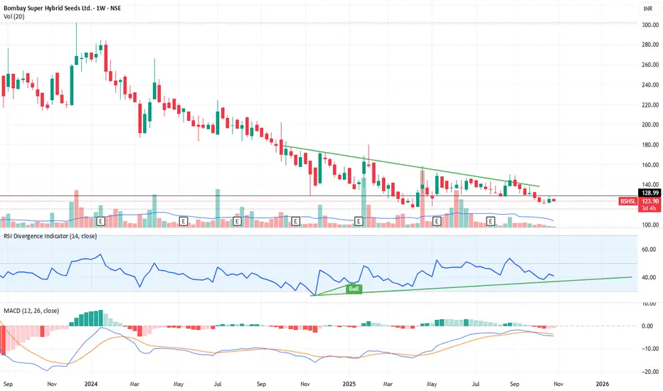
Bullish RSI Divergence & Potential Trend Reversal ( BSHSL )💡 Strategy Description (Study Idea):
This study highlights a bullish reversal setup developing on the weekly timeframe for Bombay Super Hybrid Seeds Ltd (NSE).
The stock has been in a prolonged downtrend, forming lower highs under a descending trendline, but momentum indicators suggest a possible bottoming phase.
Key Observations:
RSI Bullish Divergence:
Price is making lower lows while RSI is forming higher lows — indicating weakening selling pressure.
RSI is currently near the 40 zone, suggesting limited downside risk and potential for an upward move.
MACD Convergence:
The MACD histogram shows fading bearish momentum.
A bullish crossover between the MACD and signal line could confirm a reversal.
Trendline Resistance Zone:
The descending resistance line lies around ₹135–₹140.
A breakout and close above this zone on strong volume may trigger a trend reversal.
Volume Behavior:
Gradual accumulation observed at lower levels.
A volume spike during breakout would strengthen the bullish case.
📝 Notes:
This study is based on technical divergence and trend reversal principles.
Always wait for breakout confirmation with volume before taking directional exposure.
Ideal for positional/swing traders monitoring early trend reversals.
The chart currently indicates a base formation; premature entries below ₹130 could face short-term volatility.
Not financial advice — purely for educational and analytical study purposes.
Divergence Secrets Option Premium Components
The option premium (price) has two parts:
Intrinsic Value: The actual value if exercised now (difference between stock price and strike price).
Time Value: The extra amount traders pay for the potential of future movement before expiry.
As expiry approaches, time value decreases, a phenomenon known as time decay (Theta).

ICICI Bank at a Crucial Support Zone: Can Bulls Take Charge?ICICI Bank (₹1,402) is holding firm above the ₹1,380–1,400 support zone, a level that has sparked rebounds multiple times in the past.
✅ RSI back at 51 → momentum improving
✅ MACD showing bullish divergence → early reversal signal
⚡ Key hurdle: falling trendline resistance at ₹1,416
📈 Bullish setup: Sustaining above ₹1,400 and breaking ₹1,416 could fuel a rally toward ₹1,439–1,452.
Disclaimer: The information provided in this analysis is for educational and informational purposes only and should not be considered as financial or investment advice.

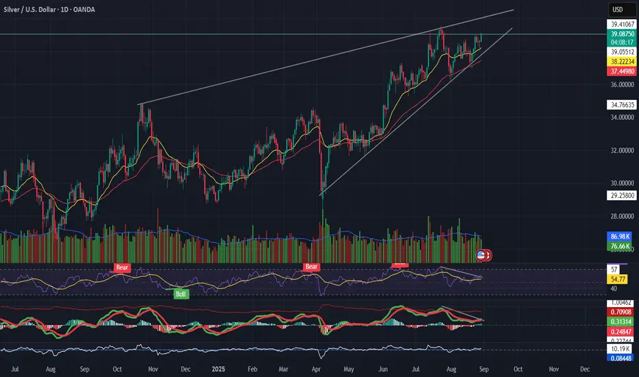
Silver (XAGUSD) Trading in a rising wedge Pattern📌 Silver (XAGUSD)
Trading in a rising wedge, pressing resistance near $39.
RSI divergence → price making higher highs, momentum not following.
MACD rolling over while price climbs = possible bearish divergence.
Support to watch: $37.3 → wedge breakdown if breached.
👉 Bullish only if $39.5 breaks with strong volume; otherwise, risk of pullback.
---
🎯 Takeaway
Silver = extended wedge → caution, momentum weak.
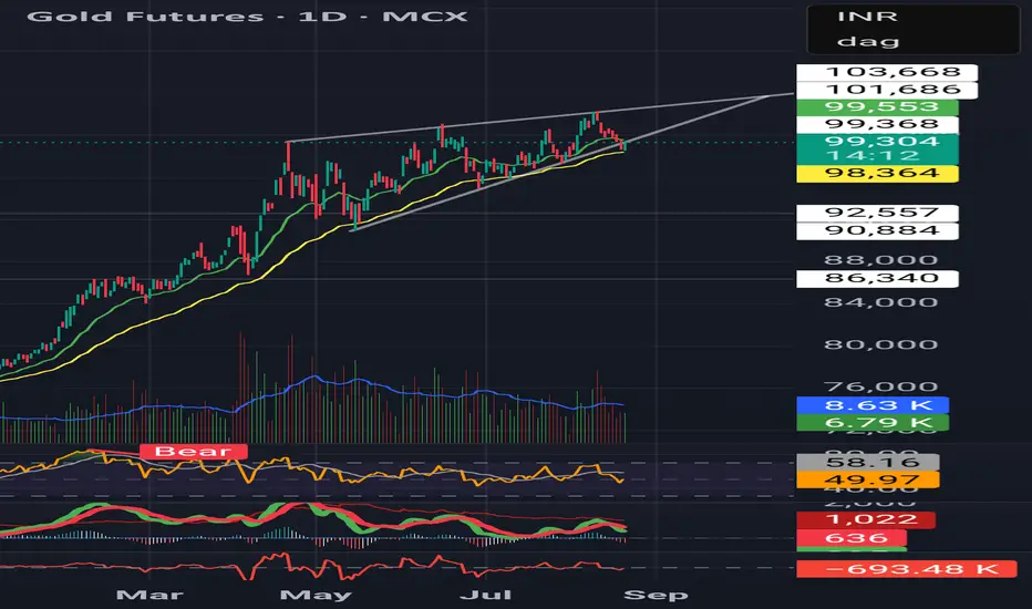
Rising Wedge in Gold
Bearish divergence visible in RSI & MACD
Volumes thinning out on rallies
Suggests safe-haven demand cooling
⚠️ Watch for breakdown below support — could trigger deeper correction.
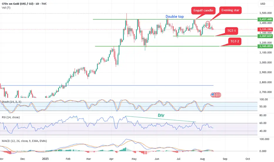
Gold form double top bearish pattern,Bearish Patterns Annotated:
Double Top: A classic bearish reversal pattern resembling an "M" shape. It occurs when price hits resistance twice at similar levels (here, approximately $3,437 and $3,448 in July and August) and fails to break higher. This signals potential exhaustion of buyers and a shift to sellers.
Evening Star: A three-candle bearish reversal pattern marked near the recent high. It typically consists of a large green candle (up day), followed by a small-bodied candle (indecision), and then a large red candle closing below the midpoint of the first candle. This suggests bulls are losing control.
Engulf Candle (Bearish Engulfing): A red candle that completely "engulfs" the body of the prior green candle, indicating strong selling pressure overriding previous buying. It's marked near the top, reinforcing the reversal theme.
Opportunity: - As per chart it can short 3380-3350 with stop loss 3400 above for the targets of double bottom pattern 3260 and 3160.
Crude may bounce up to 5522 level.Crude oil is on bounce, As per chart Crude is showing divergence with morning start. It is at demand zone and add more if come down to 4900 level. It may test minimum 5522 level soon.

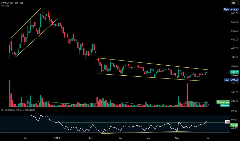
SWIGGY | Positive Divergence |RSI breakout - watchlist ### **Technical Analysis of Swiggy Ltd. (NSE)**
The chart highlights a **descending channel breakout**, indicating a potential trend reversal.
### **Key Observations:**
1. **Descending Channel Formation:**
- Price has oscillated within two downward-sloping trendlines from **January to June 2025**, creating a bearish trend.
- **Breakout above 333.05 INR** suggests buyers may be gaining control.
2. **Volume & Price Action:**
- **Current price:** **333.05 INR**, up **1.28% (+4.20 INR)**.
- **Volume (20-period moving average):** **19.7M vs. 21.35M**—watch for a sustained increase to confirm the breakout.
3. **RSI Divergence:**
- RSI is **55.23**, indicating improving momentum but not yet in overbought territory.
- Divergence suggests weakening bearish pressure, strengthening bullish reversal potential.
- **Support & Resistance:**
- **Support:** **297.00 INR**, the lower boundary of the previous range.
- **Resistance:** **352INR**, the prior high acting as an upside target.
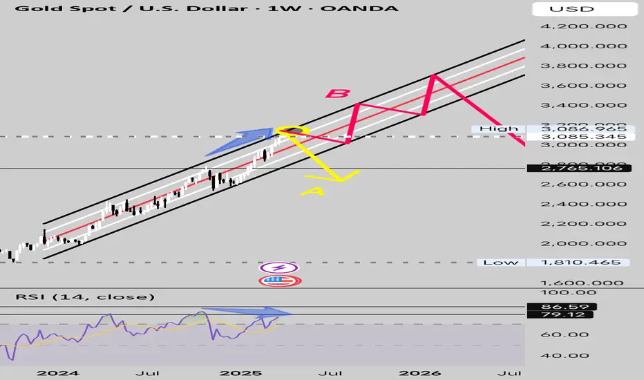
Gold Near The Parallel Channel Resistance. What's Next?Gold has been Trading in the parallel channel ever since the breakout.
Hovering near the Psychological resistance at 3000 with Indicators suggesting Highly Overbought Conditions for Gold.
2 Scenarios are possible.
Scenario A - Gold breaks out of the Parallel Channel and Enters Correction.
Scenario B - Gold Continues its Parallel Channel Uptrend breaking ATH towards 4000.
Technical Analysis suggests that Scenario A is more likely to play out.
Share your Thoughts and Views in the comments section to make this Publication a more Fruitful one.
Bank nifty showing sign of bounce.Bank nifty is showing divergence on chart. Divergence repeats as like 6Aug 2024 to14 Aug 2014 as per chart. MACD also showing cross over. Bank nifty bounce is expected from here.

Journey to become a profitable traderIt starts with an examination that tests trading proficiency and encourages risk management and discipline. Upon completing the examination, the trader will join a prop trading firm, receive a trading account and then grow that account by meeting fixed objectives and withdrawing their profit.
The 1% rule demands that traders never risk more than 1% of their total account value on a single trade. In a $10,000 account, that doesn't mean you can only invest $100. It means you shouldn't lose more than $100 on a single trade.

Advance Divergence trading Seeing divergence increases profitability by alerting a trader to protect profits. Technical traders generally use divergence when the price moves in the opposite direction of a technical indicator.
Strong divergence is the most reliable type of divergence, often signaling a significant reversal. It occurs when the price makes a new high or low, but the indicator fails to do so, indicating weakening momentum.

POWERGRID may fall due to double top formationDOUBLE TOP FORMATION :
powergrid has formed a perfect double top pattern on weekly timeframe and seemed to be positioned for further fall.
Although it had shooted up suddenly 2 weeks back due to the uncertainty which bubbled up surrounding maharashtra election which affected whole stock market. But after the release of the election results it has started going down again
BEARISH DIVERGENCE :
Apartfrom double top it has also formed strong bearish divergence pattern on the chart with 2 divergent peaks having formed on 4th mar & 29th july respectively indicating strong bearish momentum for powergrid
BEARISH MACD :
macd indicator has also become extremely bearish with macd line hovering below signal line by large margin indicating bearish potential
PROFIT TARGET :
The stock will fall till 299 level which is 22 points away from the current level

Divergence Trading Divergence is when the price of an asset is moving in the opposite direction of a technical indicator, such as an oscillator, or is moving contrary to other data. Divergence warns that the current price trend may be weakening, and in some cases may lead to the price changing direction.

Technical Analysis Part - 2The RSI provides immediate signals for buying and selling, helping you understand whether an asset is overbought or oversold. RSI readings below 30 signal buy opportunities, indicating the asset is undervalued. Conversely, RSI readings above 70 signal sell opportunities, suggesting the asset is overvalued.
Volume can confirm divergence signals by indicating the strength and conviction behind price movements. High volume during divergence signals strengthens the reliability of the signal, while low volume may indicate weaker market sentiment.

Technical Analysis Part - 1An RSI divergence occurs when price moves in the opposite direction of the RSI. In other words, a chart might display a change in momentum before a corresponding change in price. A bullish divergence occurs when the RSI displays an oversold reading followed by a higher low that appears with lower lows in the price.
The RSI provides immediate signals for buying and selling, helping you understand whether an asset is overbought or oversold. RSI readings below 30 signal buy opportunities, indicating the asset is undervalued. Conversely, RSI readings above 70 signal sell opportunities, suggesting the asset is overvalued.

Technical Analysis Part - 4The MACD is a momentum indicator that can be used to anticipate changes in market sentiment. However, it is not foolproof: experienced traders look to other metrics, such as trading volume, for a more complete perspective on market sentiment.
Key Takeaways
The moving average convergence divergence (MACD) is a popular momentum indicator that is used in technical analysis.
The MACD is calculated by comparing exponential moving averages in a security's price.
The MACD line is charted alongside a nine-day moving average of the MACD line, called the signal line, and a histogram representing the difference between these two curves.
Traders use the MACD histogram to anticipate changes in market momentum.
MACD analysis can still generate false price predictions. Experienced traders use additional metrics and fundamental analysis to support their forecasts.

Silver DivergenceDivergence and Gold/Silver Ratio
Gold and silver are thought to move together, and often they do. There are periods where the Gold Trust (GLD) and Silver Trust (SLV) move in opposite directions and periods where one metal outperforms the other.
Gold is currently outperforming silver. Such discrepancies occur and are monitored by the gold/silver ratio. The gold/silver ratio shows how many ounces of silver it takes to buy an ounce of gold. Since 1975, the average is near 60; right now it stands near 80 ($1,187 divided by $14.99).
While gold outperformance, or silver's underperformance relative to gold, was very noticeable in early 2016, this has actually been going on for a long time. The outperformance has become even more pronounced since 2016. To start 2016, gold traded at $1,069 and silver at $13.80 -- the gold/silver ratio of 77.5. As of Oct. 2018, it's at 80. Gold prices have risen relative to silver prices quite steadily for years. This is mainly due to silver price weakness since peaking near $50 in 2011 (when silver outperformed gold).
