btcdown trend is at critical stage
if it goes down it will test7000-5000tag
if it goes up it will test 25000tag after that downtrend
Downtrend

brent crude whats next?weak setup on charts ,can see more declines as it is in downtrend
a dual top formation also took place
near term support at 81
trading below key averages

GBPNZD 240GBPNZD is continuing downtrend on the 4 h chart. And create HEAD AND SHOULDER pattern and BEARISH FLAG. IT Broken the structure and so that It pair down trend continue. SL 200 pips, TP 490 pips.

SHIPYARD IS GOING TO ALL TIME HIGH BE READY FOR DOWNTRENDDISCLAIMER THIS ONLY FOR EDUCTION PURPOSE ONLY stock is bullish but is all time high so carefull and downtrend and levels are marks in chart

Script is in downtrentThe price of precious metals and the US dollar tend to move in opposite directions. In finance speak, they are 'inversely co-related'.
This means if the dollar strengthens, silver is unlikely to do well. And that is exactly what has happened in this year.
The dollar is a bit of a juggernaut at the movement. It's trading close to its 20-year high. In fact, so strong is the dollar these days that even the euro, which is usually the stronger currency, has fallen to near parity against the dollar.
The strength of the dollar is due to money flowing in to the US from most other countries due to fears of a global recession.
In a recession, investors tend to park their funds in the perceived safe have of US treasury bonds.
Fears of a recession is rampant in global markets right now. This is keeping the dollar strong.
# High Inflation Leading to Higher Interest Rates
Another reason for the weakness in silver (gold too as gold price is falling), is the sharp rise in interest rates around the world.
The US central bank, the US Federal Reserve, is pursuing an aggressive monetary policy to get inflation under control. The Fed has already raised interest rates and will continue to do so in the weeks and months ahead.
This aggressive rate hike policy is also supporting the dollar and has triggered fears of the US sliding into recession.
Higher interest rates hurt sentiment in precious metals because gold and silver don't earn any interest while investors can earn higher interest on safe government bonds.
Usually, high inflation is positive for gold and silver prices, but this time higher interest rates have spoiled the party.
# Industrial Demand is Under Pressure
In financial markets, silver is treated as a part precious metal and part industrial metal. This is because about 60% of silver demand is from industries.
Silver is considered to be an indispensable industrial metal. It has wide-ranging uses in industries - photography, electronics, IoT, home appliances, textiles, medicine, dentistry, solar photovoltaic cells, LEDs, RFID chips, nuclear reactors, EV batteries, soldering and brazing alloys, water purification, wood preservatives, and more.
During a recession, demand for industrial goods reduces all over the world. Silver is not immune from this slowdown. Whenever the global economic growth seems to be under pressure, silver prices take a hit.
And this is what we are seeing in the market today. Also, the economic slowdown in China, due to harsh lockdowns, has made the situation worse for industrial demand.
Thus, silver prices are likely to be subdued in the short term.
# Outflows from Silver ETFs
In India, silver ETFs are still a relatively new investment vehicle. But in the west, they are very popular.
During covid times, these silver ETFs witnessed record inflows.
However, the weak sentiment in the market has lead to a reversal in 2022. Buyers have turned into sellers and are withdrawing their money.
Of the many market forces driving the price of silver higher, the investments in silver ETFs was a big one. It created a strong bullish sentiment in silver over the last 2 years.
Thus, if sentiment turns more negative than it is now, there could be more downside for silver at least in the short term.
Although, the outlook should improve over time.
Ace trader and long-time silver bull, Vijay Bhambwani, believes the silver bull market is still on. He explained his view in this video - Bull Market in Silver is Still on.
You can also check out Vijay's YouTube playlist on silver.
If you're thinking of taking advantage of falling prices by investing in silver now, we suggest this reading this helpful guide - How to Invest in Silver.
You can track the price of silver here.

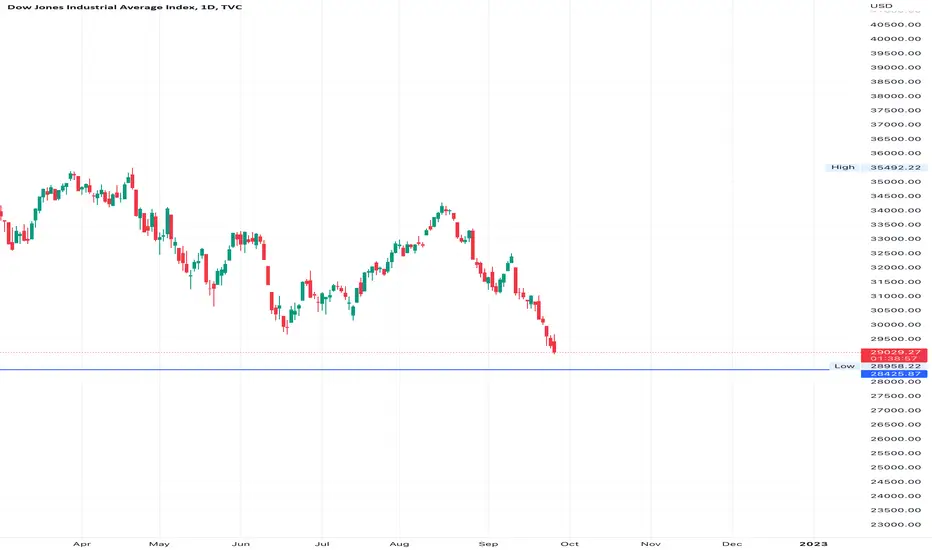
DOW JONES fall prediction with levelsDJ:DJI down fall prediction using supply/demand zonez and support/resistence zones.

NIFTY will touch 17166.. My study has found nifty in negative divergence, swing low 17166 will be unconditionally tested to make further high..

Dow jones made lower low yet again Dow jones has making lower lows with lower highs which is not a good signal in upcoming 6 months for USA and other economies such as Nifty.
To know full analysis kindly click on the
This idea forshort team treader TCS Stock only education preposethe Disclaimer for all of this tcs stock is going to break out on downtrend two to three days

idea for education prepose only Stock Reliance for Shortthe Disclaimer for all is only for Education prepose only stock will show two to three day down trend side but the hit to support so u can cut or book profit on that time only it will return to uptrend is stock in bluechip stock

Nykaa breakout level mark for education only support levels not This is Disclaimer for all is only for E
ducation prepose only breakout going to have in this Stock nykaa

Wipro: Complete Head And Shoulder pattern Wipro: complete Head and Shoulder pattern
Only for aducation parpose

What we see by analyzing the pharma index with 2 theories.Hey.. What do we get if we analyse one chart with two different theories ?
Is it a good idea ?
We use different techniques and methods to analyse a chart.
Some traders use chart patterns, some use moving averages and others use any other technique.
We all did the analysis to determine the trend of that instrument.
What if we use two different theories for the analysis ?
It will give us a more accurate view for that instrument.
Lets check the analysis Nifty Pharma Index Daily Chart by 2 different theories of Chart Patterns and Exponential Moving Averages.
Chart Pattern
A symmetrical triangle pattern appears on the chart.
And today we see the Breakdown of the pattern.
The breakdown of the pattern shows the weakness of the index.
Exponential Moving Averages
For this we use four exponential moving averages of 20, 50, 100 and 200 periods.
We start from the 20th of Jun 2022 when the price is below the all exponential moving averages.
From that day the price started its upward move and it crosses all ema's one by one
and finally it reached at 200ema on 5th of Aug 2022.
During the period of 3 months the all 4 ema's come close to each other.
But the price has failed to cross the 200 ema and it starts its downward move.
From 22nd of Aug 2022 the price tested its 20 ema and 50 ema but has failed to hold them.
Finally on the 16th of Sep 2022 the price closed with a big red candle.
The price traded below to all 4 ema's shows the weakness and start of a downtrend.
Conclusion:
From both theories we see the weakness in the pharma index.
So, the stocks of the sector show the bearish move in the coming days.
This explanation is for educational purposes.
My only intention is to share my style and techniques of analysis.
Thanks

⚠️ Eth Death trapget read for down fall
don't try to catch the running bus just wait lower price range

Buy DJIDow shown reversal in day time frame
use the below trend line for support
every dip is a buy until it breaks

STAR | TREND REVERSAL TRADEPOINTS TO NOTE BEFORE INITIATING LONG:
------------------------------------------------------------------------------
1. Star Pharma has been in a continuous downtrend for more than 6 months forming Lower Highs & lows.
2. A breakout of the downward channel occurred on the 24th of June with record volumes seen of the last 6 months.
3. Now a shift to an upward channel is seen with HH, HL, indicating reversal.
4. Trade is based on a minor Trendline breakout in uptrend.
The trade is as follows:
- Entry above 357.5
- SL 339.45
- Targets of 383, 402

Future Retail heartbreaking chart ***Future Retail at All time low around 3.75 ruppes.
*** It is falling from ATH 575 to 3.75 ( almost 99.5% fall)
*** It seems like an another yes bank
***As per price Action, when the price reach around negligiable , there is no hope for for comeback.
*** There are many investors (mostly retailers) stuck in this script ( some near the ATH, some in mid ).
*** RIP all those investors no....all those retail investor
*** Always set a stop loss for any either long term investment or trading.
*** Stop loss saves you from going to bankrupt (always) so that you can come back .
*** This is from my side , a different post (just for learning)
*** Hope you all will learn a new lesson ie. STOP LOSS
Happy Trading!

Bearish Engulfing in Bank NiftyJust like Nifty, Bank Nifty formed a bearish engulfing near top and chances are high that from here prices may reverse.
Short Sell Bank Nifty
Sell Below 38800
SL Above 39800
Target 1 36000
Target 2 35000

Bearish Engulfing in NiftyNifty has formed bearish engulfing on daily basis and shooting star in a weekly chart.
Dual bearish candle at downtrend line showing weakness in Nifty.
RSI is in overbought zone and now started moving down from above 80 to 70 level.
Short term trend is still bullish but below 17700 or breaking below regression line, trend will reverse.
Nifty Short below 17700
Stop Loss above 18000
Target 1 - 16800
Target 2 - 15200

BHARTI AIRTEL LTD_Down TrendBharti Airtel Ltd down trend moving towards support. It is higher low formation. Still it's Bearish control check with Fibonacci level. Refer next move mentioned in daily chart. Its good for swing traders.

ICICI BANK_NXT MOVE TOWARDS SUPPORT?ICICI BANK is now Downtrend, moving towards support. It is higher low formation. Still it's Bearish control check with Fibonacci level. Refer next move mentioned in daily chart . Its good for swing traders.

BIRLASOFT SHORT POSITIONHello Everyone,
Yesterday, I shared NIFTY IT chart which looked bearish and today, everyone had seen the fall. TCS has new 52 week low.
I am sharing one of the IT Stocks today as well which has bigger chances of falling down in the upcoming days.
"BIRLASOFT"
If you look at the daily timeframe of this stock, clearly you can see CUP&HANDLE Pattern.
Bearish move has already been started.
Next support is at 305.15. If stock breaks this level, then we will see more downfall of BIRLASOFT.
Targets are marked on the charts. Please check and let me know if you have any view on this.
Thanks!

#EUR AUD # SELL PLAN I am looking to sell EUR AUD below 1.48800 and targeting to 1.48000 price broke major structure and continuation of down trend and also liquidated previous high and expecting an drop. we have a nice previous support on below 1.48000 and rest of stoploss must need to be a liquidation.
