Triangle Compression Zone🔎 Overview
The Triangle Compression Zone highlights a phase where price transitions from directional movement into consolidation. After an initial trend, price begins to contract between converging support and resistance lines, signaling reduced volatility and temporary market balance.
------------------------------------------------------------
📘 Concept
A triangle forms when price creates Lower Highs near resistance and Higher Lows from support. This converging structure reflects decreasing momentum and growing indecision, as buyers and sellers reach equilibrium. The pattern represents compression rather than direction, with price awaiting clarity.
------------------------------------------------------------
📊 Chart Explanation
• Market Structure
Price initially forms Higher Highs and Higher Lows, confirming directional strength before entering consolidation.
• Resistance Line
The upper trendline connects multiple rejection points, defining the area where selling pressure limits upside.
• Support Line
The lower trendline links higher low swings, showing consistent buyer defense.
• Triangle Compression
As price oscillates between these boundaries, the range narrows and volatility contracts, creating a balanced market state.
• Key Observation
The contracting structure signals indecision. Directional confirmation only occurs once price accepts beyond the triangle boundaries.
------------------------------------------------------------
📝 Summary
• Triangle represents volatility compression after a trend.
• Support and resistance converge as price range tightens.
• Market remains balanced until a clear resolution occurs.
------------------------------------------------------------
⚠️ Disclaimer
📘 For educational purposes only.
🙅 Not SEBI registered.
❌ Not a buy/sell recommendation.
🧠 Purely a learning resource.
📊 Not Financial Advice.
Marketalgobot

Rising Wedge - Bearish setup🔎 Overview
The Rising Wedge is a price structure that develops during an upward phase where price continues to make higher levels, but the rate of advance gradually slows. The narrowing structure reflects weakening participation as price moves higher, often signaling exhaustion rather than strength.
------------------------------------------------------------
📘 Concept
A Rising Wedge is formed when price creates Higher Highs (HH) and Higher Lows (HL) inside a tightening upward channel.
Although price is still moving upward, each push higher covers less distance, indicating fading momentum and increasing imbalance between effort and result.
------------------------------------------------------------
📊 Chart Explanation
1️⃣ Higher Highs & Higher Lows
Price initially forms HH and HL, confirming an established upward structure and buyer control in the early phase.
2️⃣ Narrowing Upward Channel
The distance between highs and lows contracts as price rises, showing slowing momentum and reduced follow-through at higher levels.
3️⃣ Consolidation Near the Upper Range
Price pauses and compresses near the upper boundary of the wedge, highlighting balance and short-term indecision.
4️⃣ Momentum Weakening
Repeated tests near the upper boundary fail to generate strong expansion, indicating declining buyer participation.
5️⃣ Structural Shift Confirmation
• Weakening buyer strength becomes visible as price struggles to hold higher levels.
• Successive candle closes below the lower wedge trendline confirm a structural shift and validate the bearish reversal.
------------------------------------------------------------
📝 Summary
Rising Wedge reflects slowing upside momentum within an upward structure.
Price compression signals exhaustion rather than continuation.
Consolidation near the top highlights market indecision.
A confirmed close below the lower wedge line marks the directional shift.
------------------------------------------------------------
⚠️ Disclaimer
📘 For educational purposes only.
🙅 Not SEBI registered.
❌ Not a buy/sell recommendation.
🧠 Purely a learning resource.
📊 Not Financial Advice.

Bearish Hammer - Ema and Rsi Confirmation🔎 Overview
The Bearish Hammer with EMA and RSI Confirmation is a structure-based reversal setup that focuses on price rejection at higher levels, supported by EMA positioning and RSI behavior. This setup helps filter weak candles and highlights situations where selling pressure begins to emerge after an upward move.
────────────────────────────
📘 EMA & RSI
EMA (Exponential Moving Average)
• EMA represents short-term price balance and dynamic support/resistance.
• The EMA High–Low Band defines the acceptable price zone for healthy trend structure.
RSI (Relative Strength Index)
• RSI measures momentum strength.
• The RSI MA (signal line) helps confirm whether momentum is sustaining or shifting.
────────────────────────────
🛠 How to Use
Bearish Hammer Formation Rules
• The Bearish Hammer must form at a swing high.
• The candle should show rejection from higher prices with a long upper wick.
• This indicates exhaustion of upward price movement.
────────────────────────────
✅ Validation & Devalidation Rules
Validation (Reversal Confirmation)
• A successive candle close below the low of the Bearish Hammer confirms the setup.
• This shows acceptance below the rejection zone.
Devalidation (Failure Protection)
• A successive candle close above the high of the Bearish Hammer invalidates the setup
────────────────────────────
📌 EMA Band Confirmation
• The Bearish Hammer must form completely above the EMA High–Low Band.
• The EMA High–Low Band should NOT touch the Bearish Hammer candle.
• This confirms that price is stretched away from value and rejection is valid.
────────────────────────────
📉 RSI Confirmation
• RSI should be above its MA line.
• This reflects mature momentum before rejection occurs.
• RSI alignment helps filter low-quality signals.
────────────────────────────
📊 Chart Explanation
• Bearish Hammer forms at a clear swing high.
• EMA High–Low Band remains below the candle, confirming price extension.
• Validation and devalidation lines define the decision zone.
• RSI supports momentum context during the setup.
────────────────────────────
📝 Summary
• Swing-high Bearish Hammer highlights rejection.
• EMA High–Low Band confirms price stretch.
• RSI MA alignment validates momentum context.
• Validation and devalidation levels provide clear structure.
• The setup emphasizes rule-based and disciplined analysis.
────────────────────────────
⚠️ Disclaimer
📘 For educational purposes only.
🙅 Not SEBI registered.
❌ Not a buy/sell recommendation.
🧠 Purely a learning resource.
📊 Not Financial Advice.

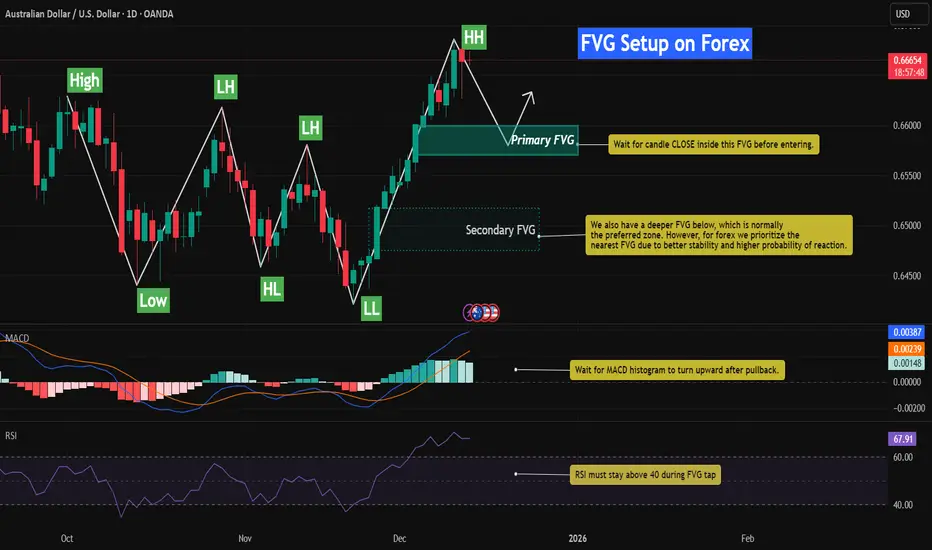
Bullish FVG Retracement With RSI & MACD📈 AUDUSD – Bullish FVG Retracement With RSI & MACD Momentum Confluence
This chart highlights a well-defined bullish structure on AUDUSD, characterized by a sequence of Higher Lows (HL) followed by a clean Higher High (HH). The latest impulsive leg upward created multiple Fair Value Gaps (FVGs), each formed by sharp displacement that left behind inefficiencies in price.
As price extends higher, the nearest unmitigated FVG becomes the primary area of interest. This imbalance represents the most logical level for a corrective retracement before bullish continuation resumes.
While a deeper FVG exists below, the nearest imbalance tends to offer stronger stability and higher probability in forex due to tighter liquidity behavior and more frequent shallow retracements.
In this setup, the combination of FVGs + RSI Behavior + MACD Histogram provides a high-confluence framework for identifying discount retracement zones and timing momentum re-acceleration.
⸻⸻⸻⸻⸻⸻⸻⸻⸻⸻
📊 Key Observations
1️⃣ Recent Bullish FVG Creation
The most recent impulsive leg upward generated a clear bullish FVG.
AUDUSD responded strongly to displacement, confirming active buy-side order flow.
Price has not yet returned to rebalance this inefficiency, making it the most probable retracement magnet.
2️⃣ Primary FVG (High-Probability Zone)
The upper FVG has the strongest confluence:
Formed by strong bullish displacement
Closest imbalance to current price (forex tends to fill nearest inefficiency first)
Aligns with bullish structure (HL → HH progression)
RSI remains elevated, signaling temporary overextension before a healthy pullback
MACD histogram shows slowing momentum, suggesting a cooling phase before continuation
This makes the upper FVG the most structurally significant level for a bullish reaction.
3️⃣ Secondary FVG Below
A deeper FVG also exists, but:
Formed during a smaller displacement
Much lower probability in forex due to shallower retracements
Carries less relevance unless the primary FVG fails
Momentum and structure currently favor reacting to the nearest imbalance
The zone may still attract price in extreme volatility, but it is not the main expectation.
4️⃣ RSI Behavior (Pullback Confirmation)
RSI is currently near the overbought region, indicating:
Market is stretched after a strong rally
A retracement is healthy and expected
During FVG entry, RSI must stay above 40 to maintain bullish structure and prevent a reversal signal
This acts as a structural momentum filter.
5️⃣ MACD Histogram Confirmation
MACD histogram is showing:
Momentum deceleration
A potential shift to light-green bars as price cools
A bullish continuation signal expected once the histogram begins turning upward from the pullback
Together, this confirms the classical model:
impulse → slowdown → retracement → continuation.
6️⃣ Structural Context
AUDUSD maintains a clean bullish sequence:
HL → HH progression
Deep liquidity sweep in the previous leg
Strong displacement aligned with bullish flow
As long as price holds above the FVG and prior HL, pullbacks are more likely to act as rebalancing events, not reversals.
⸻⸻⸻⸻⸻⸻⸻⸻⸻⸻
📊 Chart Explanation
Symbol → OANDA:AUDUSD
Timeframe → 1D
This chart illustrates how Smart Money Concepts blend with momentum indicators:
Clean HL → HH bullish structure
Fresh bullish FVG acting as primary discount zone
Secondary FVG present but lower probability in forex
RSI signaling temporary exhaustion before a pullback
MACD histogram confirming momentum slowdown into the FVG
Expected sequence:
displacement → inefficiency → retracement → mitigation → continuation
Price remains bullish unless structure breaks below the HL and the FVG fails to hold.
⸻⸻⸻⸻⸻⸻⸻⸻⸻⸻
📘How RSI & MACD Strengthen FVG Setups (Bullish & Bearish)
🔹 1. RSI + FVG
Bullish Setup:
RSI holding above 40 during the retracement confirms bullish structure.
Rising RSI from oversold strengthens the likelihood of continuation.
Bearish Setup:
RSI staying below 60 during the pullback confirms bearish structure.
Falling RSI from overbought increases the probability of downside continuation.
RSI shows whether the retracement is a healthy correction or a potential reversal.
🔹 2. MACD Histogram + FVG
Bullish Setup:
Decreasing histogram during the retracement = healthy cooldown.
Histogram turning upward inside or after the FVG = bullish continuation signal.
Bearish Setup:
Increasing histogram during the pullback = losing bearish momentum temporarily.
Histogram turning downward again at the FVG = bearish continuation confirmation.
MACD provides momentum timing for the reaction out of the FVG.
🔹 3. Combined Logic (Works Both Ways)
Displacement creates an FVG
Price retraces into the imbalance
RSI respects structural boundaries (bullish >40, bearish <60)
MACD momentum aligns with the trend direction
Price rejects the FVG and continues the trend
This combined approach filters low-quality FVG zones and identifies the highest-probability continuation setups in both bullish and bearish markets.
⸻⸻⸻⸻⸻⸻⸻⸻⸻⸻
⚠️ Disclaimer
📘 For educational purposes only
🙅 Not SEBI registered
❌ Not financial or investment advice
🧠 Smart-Money-Concepts explanation only
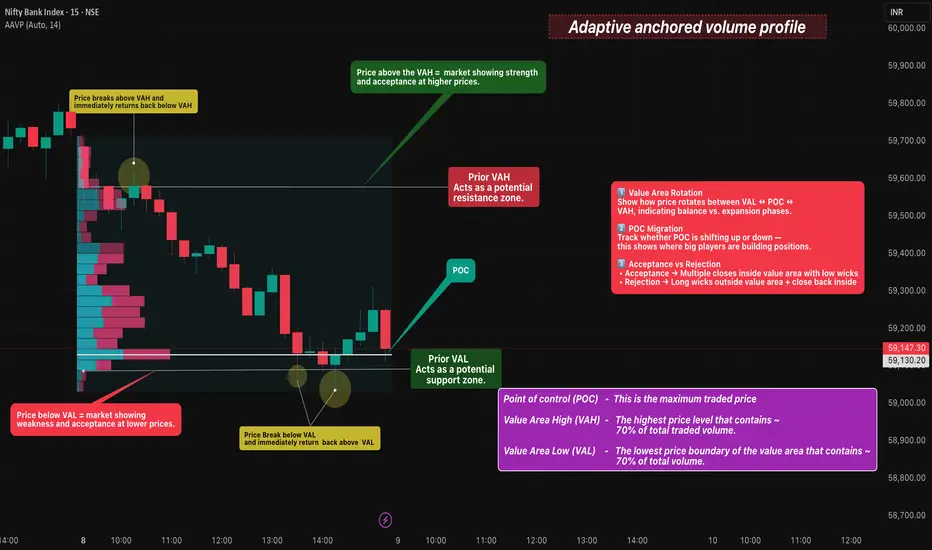
Adaptive anchored volume profile🔎 Overview
AAVP (Adaptive Anchored Volume Profile) is a market-structure visualization tool that highlights where the highest trading activity has occurred over a selected range. It dynamically maps the Value Area, showing where price is being accepted and where rejection is taking place.
This tool helps traders understand:
• Where the market considers “fair value”
• Where price is being accepted
• Where rejection and imbalance begin
------------------------------------------------------------
📊 Key Levels
• POC (Point of Control)
The price level where the maximum volume is traded.
This acts as the market’s fair value zone and a strong magnet for price.
• VAH (Value Area High)
The upper boundary of the high-volume zone.
Above VAH = market showing acceptance at higher prices.
• VAL (Value Area Low)
The lower boundary of the high-volume zone.
Below VAL = market showing acceptance at lower prices.
------------------------------------------------------------
🧭 How to Read Market Behavior Using AAVP
Price above VAH → Strength and higher price acceptance
Price below VAL → Weakness and lower price acceptance
Price between VAH–VAL → Balanced market / equilibrium
Rejection from VAH or VAL → Possible rotation back toward POC
Return inside Value Area after breakout → Failed auction signal
------------------------------------------------------------
📊 Chart Explanation
• The left side histogram represents the Anchored Volume Profile , showing where the highest participation has occurred.
• The thickest horizontal bar marks the POC (Point of Control), where the market found maximum acceptance.
• The upper boundary of the volume cluster is VAH, acting as a potential resistance and strength confirmation zone.
• The lower boundary of the volume cluster is VAL, acting as a potential support and weakness confirmation zone.
• When price trades above VAH, it indicates acceptance at higher prices.
• When price trades below VAL, it indicates acceptance at lower prices.
• When price rotates between VAH and VAL, the market is in balance and consolidation mode.
• Sharp rejection from VAH or VAL often leads to price rotating back toward the POC.
• If price breaks outside VAH/VAL but quickly returns inside the Value Area, it signals a Failed Auction Setup
------------------------------------------------------------
📌 Why AAVP Matters
Reveals real participation zones instead of just price levels
Helps filter fake breakouts using volume acceptance
Improves precision for intraday and swing context
Enhances confidence near support, resistance, and equilibrium
------------------------------------------------------------
📝 Summary
AAVP provides a clear visual map of where the market is trading most efficiently.
POC defines fair value, while VAH and VAL define acceptance boundaries.
Price behavior around these zones reveals whether the market is in balance, expansion, or rejection.
------------------------------------------------------------
⚠️ Disclaimer
📘 For educational purposes only.
🙅 Not SEBI registered.
❌ Not a buy/sell recommendation.
🧠 Purely a learning resource.
📊 Not Financial Advice.
OBV + MACD Confirmed FVG📉 Bitcoin – Bearish FVG Retracement With EMA200, OBV & MACD Momentum Confluence
This chart highlights a clean bearish structure on BTC, defined by a consistent sequence of Lower Highs (LH) and Lower Lows (LL). Throughout this downtrend, multiple Fair Value Gaps (FVGs) have formed — each created by sharp institutional displacement that leaves behind inefficiencies in price.
As price continues trending below the EMA200, bearish order flow remains firmly intact. Each time BTC retraces into an unmitigated FVG, the market efficiently rebalances the imbalance before resuming downward continuation.
In this setup, the integration of FVGs + EMA200 + OBV + MACD Histogram builds a high-probability roadmap for identifying premium retracement zones and anticipating continuation moves.
The major FVG above current price sits directly under the EMA200 and aligns with weakening OBV momentum. This makes it the most structurally significant bearish reaction zone. A secondary FVG exists below it, but carries less importance due to weaker displacement and reduced confluence.
⸻⸻⸻⸻⸻⸻⸻⸻⸻⸻
📊 Key Observations
1️⃣ Prior Bearish FVG Reaction
A previously formed bearish FVG was cleanly mitigated, followed by immediate downside continuation.
This confirms that institutional order flow remains bearish and that FVG zones are functioning as efficient retracement magnets in the current trend.
2️⃣ High-Priority FVG Under EMA200 (Primary Zone)
This upper FVG has the strongest confluence:
Formed by strong bearish displacement
Sits directly below the EMA200, reinforcing trend direction
Aligns with market structure (LH → LL sequence)
OBV shows weakening buying pressure as price approaches the zone
MACD histogram is decreasing into FVG, signaling bearish momentum shift
This makes it the most likely level for a significant rejection if price retraces into it.
3️⃣ Secondary FVG Reaction Zone
A lower FVG also exists, but:
Formed during a smaller displacement
Does not align with EMA200 rejection
Carries weaker structural significance
It may still produce a minor reaction, but is lower probability compared to the primary FVG above.
4️⃣ OBV Momentum Context
OBV declines as price approaches the FVG, which is a critical confirmation.
When OBV decreases during a retracement, it signals absorption of buy-side pressure → strengthening the bearish continuation case.
5️⃣ MACD Histogram Confirmation
MACD histogram is rolling over and turning negative as price pushes toward the FVG.
This confirms bearish momentum returning, increasing the probability of a strong rejection from imbalance.
6️⃣ Structural Context
BTC maintains a clean LH–LL bearish sequence.
As long as price remains under the EMA200 and below the unmitigated FVGs, retracements are more likely to act as rebalancing moves rather than true reversal attempts.
⸻⸻⸻⸻⸻⸻⸻⸻⸻⸻
📊 Chart Explanation
Symbol → BITSTAMP:BTCUSD
Timeframe → 1D
This visualization demonstrates how Smart Money Concepts and momentum indicators align within a trending environment:
Clear LH → LL market structure
Multiple historical FVGs acting as premium retracement zones
A previously mitigated FVG confirming downside continuation
A high-confluence bearish FVG below the EMA200
OBV weakness during retracement phases
MACD histogram declining into FVG retest
Together, these elements create a textbook sequence:
displacement → inefficiency → retracement → mitigation → continuation
Price remains bearish unless BTC can break and close above the upper FVG with strong momentum and volume.
⸻⸻⸻⸻⸻⸻⸻⸻⸻⸻
📘 How EMA200, OBV & MACD Strengthen FVG Setups (Bullish + Bearish)
🔹 1. Trend Filter: EMA200
Below EMA200 → look for bearish FVG rejections
Above EMA200 → look for bullish FVG reactions
EMA200 acts as a dynamic mean-reversion anchor during trending markets.
🔹 2. OBV + FVG
OBV declining on FVG retest → bearish continuation
OBV rising into bullish FVG → bullish continuation
Volume trend strengthens or invalidates FVG reactions.
🔹 3. MACD Histogram + FVG
Falling histogram → bearish FVG confirmation
Rising histogram → bullish FVG confirmation
MACD shows whether momentum aligns with the imbalance.
🔹 Combined Logic (Works Both Ways)
Displacement creates an FVG
Price retraces into the FVG
Trend filter (EMA200) agrees
OBV + MACD confirm volume + momentum direction
Price rejects and continues trend.
⸻⸻⸻⸻⸻⸻⸻⸻⸻⸻
✅ Summary
Market structure remains bearish with LH → LL continuity
A previously filled FVG validated downside continuation
The upper FVG is the highest-probability zone (EMA200 + OBV + MACD alignment)
The secondary imbalance carries lower significance
OBV and MACD both confirm weakening buyer pressure into FVG
As long as BTC stays below EMA200, retracements into FVG are likely continuation setups
⸻⸻⸻⸻⸻⸻⸻⸻⸻⸻
⚠️ Disclaimer
📘 For educational purposes only
🙅 Not SEBI registered
❌ Not financial or investment advice
🧠 Smart-Money-Concepts explanation only

Triple Base Wedge Setup📌 Overview
This idea highlights a contracting price structure forming inside a Falling Wedge while the support base remains protected three separate times. The repeated defense of the same support zone creates a Triple Base, indicating strong demand. As volatility compresses and candles tighten, price approaches a potential expansion point. A strong successive close above the wedge trendline can signal directional continuation driven by the triple-base foundation.
---------------------------------------------------------------------
📊 Chart Explanation
• Falling Wedge Compression
Price is compressing inside a falling wedge, forming lower highs while key lows remain protected — showing reduced volatility and tightening structure.
• Candle Tightening Phase
Candles begin to cluster more closely, indicating a buildup of pressure before the next expansion move.
• Triple Base Support
Price has tapped the same support level three times, demonstrating steady demand and buyers absorbing sell pressure each time.
• Decreasing Seller Strength
As the wedge narrows, each push downward becomes weaker, showing sellers losing momentum while price continues to hold above the same support region.
• Possible Breakout Trigger
A strong successive close above the upper wedge trendline can act as a confirmation signal for upward continuation supported by triple-base strength.
---------------------------------------------------------------------
🟩 Summary
Price is contracting inside a falling wedge structure.
Support has been tested three times, forming a strong Triple Base.
Candles show compression, indicating market indecision before expansion.
A successive close above the wedge trendline may confirm directional continuation.
---------------------------------------------------------------------
⚠️ Disclaimer
📘 For educational purposes only.
🙅 Not SEBI registered.
❌ Not a buy/sell recommendation.
🧠 Purely a learning resource.
📊 Not Financial Advice

Market Cycle Behaviour 🔎 Overview
This chart highlights a clear Market Cycle Behaviour where price transitions through phases of consolidation, controlled pullbacks, and contracting movement. The structure forms a falling wedge pattern, showing reduced volatility and hesitation in price action. As swings tighten and candles compress, the chart reflects a period of market indecision, indicating a slowdown in momentum before the next phase of the cycle develops.
------------------------------------------------------------
📊 Chart Explanation
Price Consolidation
Price moves within a narrow sideways range, showing reduced movement and a temporary pause in direction. This reflects a balance between buying and selling activity.
Falling Wedge Formation
After consolidation, price begins forming a contracting wedge structure, where both highs and lows gradually compress. This signals slowing momentum and a shift toward controlled movements.
Market Indecision
As the wedge tightens, price movement becomes hesitant. The structure reflects uncertainty in near-term direction, with no clear control from either side.
Compression Indicates Indecision
The narrowing of swings highlights strong compression in price behaviour. This phase represents caution in the market as participants wait for clarity.
Market Behaviour
The overall behaviour shows a sequence of consolidation, compression, and wedge formation. This illustrates the natural market cycle where price transitions from expansion into contraction, leading to a state of indecision.
------------------------------------------------------------
Summary
• Price is consolidating and moving inside a contracting structure.
• The falling wedge highlights controlled movement and reduced volatility.
• Current conditions reflect a clear phase of market indecision.
• The setup represents a contraction phase within the broader market cycle.
------------------------------------------------------------
⚠️ Disclaimer
📘 For educational purposes only.
🙅 Not SEBI registered.
❌ Not a buy/sell recommendation.
🧠 Purely a learning resource.
📊 Not Financial Advice

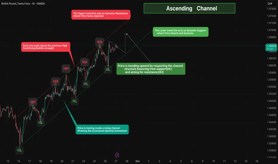
Ascending Channel🔎 Overview
Price is moving inside a well-defined Ascending Channel, showing a strong and structured uptrend.
The market continues to form Higher Highs (HH) and Higher Lows (HL), confirming consistent buying pressure.
The channel provides clear dynamic support and resistance, helping identify potential reversal and continuation zones.
------------------------------------------------------------
📊 Chart Explanation
1️⃣ Higher Highs (HH)
Each new peak rises above the previous one, showing strong bullish momentum.
2️⃣ b]Higher Lows (HL)
Pullbacks consistently find support at higher levels, confirming buyers are stepping in early.
3️⃣ Upper Trendline (Dynamic Resistance)
Price repeatedly reacts from this line and faces rejection — marking short-term overbought areas.
4️⃣ Lower Trendline (Dynamic Support)
Price bounces from this rising support line, validating it as a demand zone where buyers regain control.
5️⃣ Price Movement Inside the Channel
Price is trending upward by respecting the structure — bouncing from HL (support) and aiming for HH (resistance).
6️⃣ Overall Momentum
The series of HH + HL indicates strong, continuous uptrend momentum within the channel.
------------------------------------------------------------
📝 Summary
• A clean Ascending Channel is in place.
• HH and HL sequences confirm bullish structure.
• Buyers defend the lower trendline; sellers react on the upper trendline.
• Until the lower boundary breaks, the market bias remains bullish.
------------------------------------------------------------
⚠️ Disclaimer
📘 For educational purposes only.
🙅 Not SEBI registered.
❌ Not a buy/sell recommendation.
🧠 Purely a learning resource.
📊 Not Financial Advice
FVG Retracement With EMA, RSI & Fib Confluence📈 Bitcoin Chart – FVG Retracement With EMA, RSI & Fib Confluence in a Bearish Market Structure
This chart showcases a sustained bearish sequence on BTC, defined by a clean continuation of Lower Highs (LH) and Lower Lows (LL). Throughout this decline, multiple Fair Value Gaps (FVGs) have formed both locally and at higher levels — each created by strong institutional sell-side displacement.
As price trends downward, these unmitigated FVGs above the market consistently act as magnet zones:price retraces into previous inefficiencies, rebalances them, and resumes the dominant bearish trend.
In the current setup, the integration of FVGs + Fibonacci Retracement(Point A to B) + EMA Levels + RSI Momentum provides a highly structured roadmap for anticipating retracements and continuation points.
The most significant imbalance sits near the major Fib retracement zone and under key EMAs — making it the highest-probability reaction area. Secondary FVGs below it may still induce a bounce, but carry lower structural relevance.
⸻⸻⸻⸻⸻⸻⸻⸻⸻⸻
📊 Key Observations
1️⃣ Prior FVG Mitigation
A previously formed FVG under the EMA was cleanly filled, followed by immediate downside continuation.
This confirms bearish order-flow control and validates the role of FVGs as efficient retracement targets in a downtrend.
2️⃣ High-Priority FVG (Primary Zone)
The upper FVG holds the strongest confluence:
Created by strong displacement
Sits below the EMA50
Aligns with the 38.2%–61.8% Fib retracement zone
This cluster makes it the most likely zone for a meaningful bearish rejection if price retraces into it.
3️⃣ Secondary FVG Reaction Zone
A lower FVG also exists beneath the main zone.
Although it can cause a minor corrective bounce, it formed during a smaller move and does not align with the key trend or Fib levels — giving it lower probability.
4️⃣ RSI Momentum Context
RSI remains below 50, confirming bearish momentum.
When RSI stays under mid-line, bearish FVG reactions tend to be more reliable and continuation setups form cleanly.
5️⃣ Structural Context
The broader structure remains decisively bearish as long as price trades below the EMAs and below the major upper FVG.
Retracements into these zones are more likely to serve as rebalancing moves rather than genuine reversal attempts.
⸻⸻⸻⸻⸻⸻⸻⸻⸻⸻
📊 Chart Explanation
Symbol → BTCUSDT
Timeframe → 1D
This visualization illustrates how Smart Money Concepts apply cleanly during strong trending conditions:
A clear LH–LL downtrend
Several historical FVGs acting as retracement magnets
A previously mitigated FVG confirming bearish control
A high-confluence FVG aligned with EMAs and Fib levels
A secondary imbalance that can still induce short-term reactions
RSI showing momentum remains bearish
Together, these elements outline a textbook sequence:
displacement → inefficiency → retracement → rebalancing → continuation.
Price remains under firm bearish control unless it breaks above the upper FVG with conviction.
⸻⸻⸻⸻⸻⸻⸻⸻⸻⸻
📘 Using Fib Retracement, EMA50, and RSI With FVGs (Bullish + Bearish)
🔹 1. Fibonacci Retracement + FVG
In a downtrend, draw Fib from swing high → low; in an uptrend, draw low → high
The 38.2%–61.8% zone is the prime retracement area in both directions.
If an FVG forms or sits inside this Fib zone, it becomes a high-probability reaction point (bearish rejection in downtrend, bullish bounce in uptrend).
🔹 2. EMA50 + FVG
In a bearish trend, price and FVGs forming below EMA50 act as stronger bearish retracement zones.
In a bullish trend, price and FVGs forming above EMA50 act as stronger bullish retracement zones.
EMA50 acts as a mean reversion point where price often returns to rebalance before continuation.
🔹 3. RSI + FVG
RSI below 50 → bearish momentum → bearish FVG reactions are more reliable.
RSI above 50 → bullish momentum → bullish FVG reactions are more reliable.
If RSI rises from oversold (or falls from overbought), it often signals a retracement phase toward nearby FVGs.
🔹 4. Combined Logic (Works for Bullish and Bearish)
Displacement creates an FVG (inefficiency).
Price retraces into the 38–61% Fib zone.
Retracement taps EMA50 or stays on the correct side of EMA50 (below for bearish, above for bullish).
RSI confirms momentum (below 50 for bearish continuation, above 50 for bullish continuation).
Price rejects from the FVG and continues the trend.
⸻⸻⸻⸻⸻⸻⸻⸻⸻⸻
✅ Summary
Market structure remains bearish with consistent LHs and LLs.
A previously filled FVG under the EMA validated the continuation move.
The upper FVG is the highest-strength level due to EMA + Fib + displacement confluence.
A lower FVG exists but carries reduced importance.
RSI below 50 reinforces bearish momentum and reliability of bearish FVG reactions.
⸻⸻⸻⸻⸻⸻⸻⸻⸻⸻
⚠️ Disclaimer
📘 For educational purposes only.
🙅 Not SEBI registered.
❌ Not investment advice.
🧠 Smart-Money-Concepts explanation only.

Symmetrical Triangle breakdown 🔎 Overview
The Symmetrical Triangle is a contraction pattern formed when the market prints Lower Highs (LH) and Higher Lows (HL) inside two converging trendlines.
After a strong impulsive bullish move (flagpole), price enters consolidation as volatility shrinks — this creates the triangle.
Momentum shifts only when price breaks out of the structure.
A Symmetrical Triangle is a neutral pattern that can break in either direction, allowing momentum to expand upward or downward once price closes beyond the trendline.
In this chart, price breaks the lower trendline and touching the HL-Swing, confirming a bearish continuation.
⸻⸻⸻⸻⸻⸻⸻⸻⸻⸻⸻⸻⸻⸻⸻
📊 Chart Explanation
1️⃣ Strong Uptrend ( Flagpole )
Price starts with a sharp impulsive rally, forming the base structure before the triangle.
2️⃣ Initial Pullback → First LH + HL
After the rally, price begins contracting, creating alternating Lower Highs (LH) and Higher Lows (HL).
3️⃣ Lower High Swings
Multiple LH points show that buyers are losing strength on every upward attempt.
4️⃣ Higher Low Swings
HL points indicate buyers defending the lower boundary, but with weaker force as the structure tightens.
5️⃣ Converging Trendlines (Triangle Structure)
Upper trendline: Drawn by connecting successive LHs.
Lower trendline: Drawn by connecting successive HLs.
Both lines converge toward the apex, indicating decreasing volatility and market indecision.
6️⃣ Price Consolidation Zone
Inside the highlighted box, candles remain tight and range-bound — a classic compression zone before breakout.
7️⃣ Breakout Confirmation Rule
A valid breakout is confirmed only when a full candle closes beyond the upper or lower trendline and interacts with the nearest LH (for bullish break) or HL (for bearish break).
This shows that the breakout is strong enough to violate the previous swing structure, confirming directional momentum.
A full candle close below the lower trendline confirms bearish continuation.
This signals sellers have regained control and trend continuation is likely.
8️⃣ Bias After Breakdown
Since the prior move was strong bullish but the structure broke downwards, the pattern resolves as a bearish reversal of the short-term structure and continuation of immediate downside momentum.
⸻⸻⸻⸻⸻⸻⸻⸻⸻⸻⸻⸻⸻⸻⸻
🟢 Summary
Symmetrical Triangle is confirmed by alternating LH + HL swings.
Trendlines converge → volatility compression.
A confirmed breakdown close below the lower trendline = bearish continuation signal.
Price structure and swings are correctly identified as per textbook pattern rules
⸻⸻⸻⸻⸻⸻⸻⸻⸻⸻⸻⸻⸻⸻⸻
⚠️ Disclaimer
📘 For educational purposes only.
🙅 Not SEBI registered.
❌ Not a buy/sell recommendation.
🧠 Purely a learning resource.
📊 Not Financial Advice.

Inverted Head and Shoulders - Bullish Setup🔎 Overview
The Inverted Head & Shoulders is a bullish reversal pattern that forms after a downtrend.
It signals that selling pressure is weakening and buyers are gradually gaining control.
The structure has three major lows: Left Shoulder, Head (deepest low), and Right Shoulder — followed by a breakout above the Neckline, confirming a trend shift to the upside.
──────────────────────────────────────────
🛠 How the Pattern Forms
1️⃣ Left Shoulder
• Price creates a swing low, then bounces.
• This marks the first buyer reaction in the downtrend.
2️⃣ Head (Deepest Low)
• Price drops below the Left Shoulder to form a deeper low.
• Sellers try to extend the downtrend, but strong buying absorbs the pressure.
• This creates the “Head” — the lowest point in the structure.
3️⃣ Right Shoulder
• Price rises from the Head, pulls back again, but forms a higher low
• This higher low signals seller weakness and early buyer dominance.
4️⃣ Neckline Formation
• Draw a line connecting the highs of the Left Shoulder and Right Shoulder.
• This Neckline acts as the main breakout level confirming the reversal.
──────────────────────────────────────────
🛠 How to Use the Pattern
✔ Validation (Breakout Confirmation)
• The pattern is confirmed only when a Successive candles closes above the Neckline / Validation Line.
• This breakout indicates momentum shift → buyers take control.
• Entries can be taken on breakout or retest.
✔ Devalidation (Failure Protection)
• If price closes below the Devalidation Line , the pattern becomes invalid.
• This protects traders from false breakouts or premature entries.
──────────────────────────────────────────
📊 Chart Explanation
Left Shoulder (0.45101) → First swing low where buyers responded.
Head (0.44742) → Deepest low where strong accumulation occurred.
Right Shoulder (0.44966) → Higher low showing seller exhaustion.
Neckline → Connects highs of both shoulders; main breakout resistance.
Validation Line → Breakout zone; closing above confirms bullish pattern.
Devalidation Line → Close below invalidates the pattern and stops the setup.
──────────────────────────────────────────
🟢 Summary
• Classic bullish reversal structure after a downtrend.
• Head forms the deepest low → buyers accumulate heavily.
• Right Shoulder forms higher low → sellers lose steam.
• Breakout above Neckline confirms shift from sellers → buyers.
• Devalidation line protects against false signals.
──────────────────────────────────────────
⚠️ Disclaimer
📘 For educational purposes only.
🙅 Not SEBI registered.
❌ Not a buy/sell recommendation.
🧠 Purely a learning resource.
📊 Not Financial Advice.

Pivot Points - Traditional🔎 Overview
Traditional Pivot Points are widely used reference levels derived from the previous session’s High, Low, and Close.
They help traders identify equilibrium , short-term trend direction , and key reaction zones where price may bounce or reverse.
The central Pivot Point (P) acts as the day’s balance line, while Resistance (R1–R5) and Support (S1–S5) levels map out potential price behavior for the current session.
---------------------------------------------------------------
📊 What the Levels Represent
🔹 Pivot Point (P)
1. A pre-calculated central level reflecting market equilibrium.
2. Price above P → bullish bias.
3. Price below P → bearish bias.
🔹 Resistance Levels (R1, R2, R3…)
• Highlight potential upside reaction zones.
• Useful for spotting breakout targets, continuation levels, or reversal points.
🔹 Support Levels (S1, S2, S3…)
• Mark potential downside reaction zones.
• Identify areas where buyers may step in or momentum may slow.
---------------------------------------------------------------
🟩 Bullish Bias
1. Price opens above Pivot Point (P) → early buyer control.
2. Long Opportunity (Pullback) : A retest and bounce from the Pivot confirms support.
3. Strong Momentum : A breakout above R1 strengthens the bullish structure.
4. Trend Continuation : Sustained price action above R2 reflects strong upside momentum.
---------------------------------------------------------------
🟥 Bearish Bias
1. Price opens below Pivot Point (P) → early seller control.
2. Short Opportunity (Pullback) : A retest and rejection from the Pivot confirms resistance.
3. Strong Momentum : Breakdown below S1 signals rising bearish pressure.
4. Trend Continuation : Consistent action below S2 suggests a short-term downside trend.
---------------------------------------------------------------
📝 Summary
• Pivot Points offer a structured roadmap for short-term price behaviour.
• P = balance line; R-levels = upside targets; S-levels = downside zones.
• Bias depends on where price opens relative to P.
• Helpful for traders using structure, pullbacks, and breakout confirmation in lower timeframes.
---------------------------------------------------------------
⚠️ Disclaimer
📘 For educational purposes only.
🙅 Not SEBI registered.
❌ Not a buy/sell recommendation.
🧠 Purely a learning resource.
📊 Not Financial Advice.

FVG Retracement in a Downtrend📈 Solana Chart – Fair Value Gap Retracement in a Bearish Market Structure
This chart highlights a clear bearish sequence, defined by a repeated formation of Lower Highs (LH) and Lower Lows (LL) with some Higher Highs (HH) and Higher Lows (HL). Throughout this downtrend, multiple Fair Value Gaps (FVGs) have emerged — each representing price inefficiencies created by strong institutional sell-side displacement.
As price continues to decline, these historical FVGs above the current market reveal a consistent pattern:
price retraces into previous imbalances, rebalances them, and then resumes the downward trajectory.
In the current setup, two active bearish FVGs have formed. The upper zone carries greater priority due to its alignment with a major LH, while the lower FVG — although not high priority — can still generate a corrective pullback.
⸻⸻⸻⸻⸻⸻⸻⸻⸻⸻
📊 Key Observations
1️⃣ Prior FVG Mitigation
A previous FVG was cleanly filled, followed by a sharp rejection — a textbook example of institutional rebalancing.
The reaction confirms the efficiency of using FVGs to anticipate retracement zones in a downtrend.
2️⃣ High-Priority FVG
The upper FVG holds greater importance as it aligns with a major Lower High.
This confluence increases the likelihood of a meaningful rejection should price retrace into this imbalance.
3️⃣ Secondary FVG Reaction Zone
A lower FVG also exists beneath the primary one.
Though not a high-priority inefficiency, it may still trigger a pullback if price interacts with it during corrective movement.
4️⃣ Support Line Liquidity Zone
The descending trendline beneath price may function as a liquidity attractor.
Stops often accumulate below such diagonal structures, making it a potential sweep area before a reaction.
5️⃣ Structural Context
The broader price structure remains decisively bearish.
As long as price trades below the upper FVG, sellers maintain control and retracements serve primarily as rebalancing moves rather than reversal attempts.
⸻⸻⸻⸻⸻⸻⸻⸻⸻⸻
📊 Chart Explanation
Symbol → COINBASE:SOLUSD
Timeframe → 1D
This visualization demonstrates how Fair Value Gaps continue to guide price behavior throughout the downtrend.
Each historical FVG above current price acted as a magnet for retracement, followed by rejection once the inefficiency was filled.
The current structure shows:
A clean downtrend defined by Lower Highs and Lower Lows
A previously filled FVG leading to immediate continuation
A new high-priority FVG near a major LH
A secondary FVG capable of producing a corrective bounce
A descending support line acting as a liquidity pool
Together, these elements showcase classic Smart Money concepts:
inefficiency → retracement → rebalancing → continuation.
Price remains under bearish control unless a decisive break above the primary FVG occurs.
⸻⸻⸻⸻⸻⸻⸻⸻⸻⸻
✅ Summary
Market structure shows a series of LH–LL sequences, confirming a strong downtrend.
Previous FVGs were filled and rejected cleanly, validating order-flow-driven rebalancing.
The upper FVG is the highest-priority reaction zone due to its alignment with a major LH.
A lower FVG may still generate a pullback but carries less structural importance.
The descending support line highlights a potential liquidity sweep before any larger rebound.
⸻⸻⸻⸻⸻⸻⸻⸻⸻⸻
⚠️ Disclaimer
📘 For educational purposes only.
🙅 Not SEBI registered.
❌ Not a buy/sell recommendation.
🧠 Purely a learning resource.
📊 Not Financial Advice.

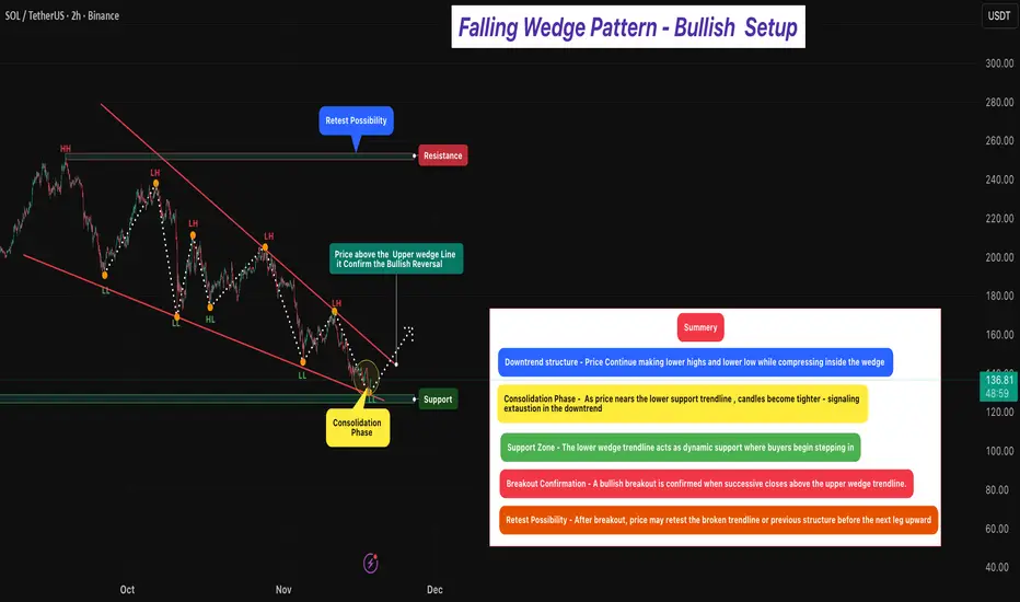
Falling Wedge Pattern - Bullish Setup 🔎 Overview [ /b]
The Falling Wedge Pattern is a bullish reversal setup that forms when price trades inside a narrowing downward channel — creating lower highs and lower lows that converge toward the bottom.
It typically appears after a downtrend, signaling that selling pressure is weakening and buyers may soon regain control.
As price descends within the wedge, the slope begins to reduce and volatility tightens, indicating seller exhaustion and early buyer accumulation near support.
Momentum shifts once price breaks and closes above the upper wedge trendline, confirming a potential bullish reversal.
⸻⸻⸻⸻⸻⸻⸻⸻⸻⸻⸻
📊 Chart Explanation
1️⃣ Downtrend Structure
Price continues forming Lower Highs and Lower Lows within the wedge.
This compression reflects weakening bearish momentum.
2️⃣ Consolidation Phase
As price approaches the wedge’s lower line, candles narrow — indicating reduced volatility, seller fatigue, and early buying activity.
This is often the early reversal zone.
3️⃣ Support Zone
The lower wedge boundary overlaps with a strong structural support area — where buyers repeatedly defend the lows, forming a demand zone.
4️⃣ Breakout Confirmation
A bullish reversal is confirmed when price breaks and closes above the upper wedge line.
This signals a clear momentum shift from sellers → buyers.
5️⃣ Retest Possibility
Post-breakout, price may retest the broken wedge or prior resistance area.
A successful retest adds conviction to the continuation move.
⸻⸻⸻⸻⸻ ⸻⸻⸻⸻⸻⸻
🟩 Summary
• Pattern Type → Falling Wedge (Bullish Reversal)
A narrowing downward structure that signals seller exhaustion and early buyer accumulation.
• Bias → Bullish After Breakout Confirmation
Momentum shifts only when successive candles close firmly above the upper trendline, confirming a true breakout.
• Trend Context → Formed After a Downtrend
Makes the reversal stronger and increases the probability of upside continuation.
• Market Psychology → Sellers Losing Strength
Lower highs are losing momentum, and buyers are defending lows aggressively.
⸻⸻⸻⸻⸻⸻⸻⸻⸻⸻⸻
⚠️ Disclaimer
📘 For educational purposes only.
🙅 Not SEBI registered.
❌ Not a buy/sell recommendation.
🧠 Purely a learning resource.
📊 Not Financial Advice.
ETH/USD - Fair Value Gap Retracement with Historical Reactions📈 ETH/USD – Fair Value Gap Retracement and Support Line Interaction
Ethereum’s daily chart showcases a clear bearish market structure, marked by a consistent series of lower highs and lower lows.
Throughout this decline, multiple Fair Value Gaps (FVGs) have emerged, each reflecting price inefficiencies created by strong institutional sell-side displacement.
These historical FVGs — now visible above the current price — reveal how ETH has repeatedly retraced to fill prior imbalances before resuming its downward trajectory.
The latest setup forms yet another bearish FVG, potentially acting as a retracement zone before continuation.
⸻⸻⸻⸻⸻⸻⸻⸻⸻⸻
📊 Key Observations
1️⃣ Historic FVG Reaction – The previous FVG (around the mid-October region) acted as a powerful supply zone. Price retraced deeply into that imbalance, filled it almost completely, and then reversed sharply — validating the concept of FVG-based rebalancing before continuation.
2️⃣ Current FVG Setup – A new bearish Fair Value Gap has now formed following another strong sell-side impulse. This zone represents a fresh inefficiency that may attract retracement before the next move down.
3️⃣ Optimal Confirmation Depth – The best confirmation typically occurs when price retraces toward the high of the FVG.
Reaching the upper boundary indicates that buy-side liquidity has been tapped and unfilled institutional sell orders have likely been triggered, often preceding a sharp rejection.
4️⃣ Descending Support Line – The trendline below price continues to act as a liquidity attractor. Stops often accumulate beneath it, making it a potential sweep zone before reversal.
5️⃣ Structural Context – The broader structure remains bearish. As long as price trades below the most recent FVG, sellers maintain full control.
⸻⸻⸻⸻⸻⸻⸻⸻⸻⸻
📊 Chart Explanation
Symbol → BINANCE:ETHUSD
Timeframe → 1D
This chart highlights the continuity of Fair Value Gap behavior throughout Ethereum’s bearish cycle.
The earlier FVGs (visible above current price) acted as magnets for retracement and then rejection — clear evidence of institutional rebalancing in action.
Each time ETH filled a previous FVG, the market found equilibrium before continuing downward.
Now, a fresh bearish FVG has formed, marking the next potential reaction area.
If price retraces deeper — ideally up to the high of this new FVG — it would offer the most reliable confirmation of a likely rejection. A shallower retracement, on the other hand, could signal weaker corrective intent.
Below current price, the descending support line identifies a possible liquidity pool. Price may sweep below this line to collect liquidity before any larger reversal attempt.
This confluence of historic and active FVGs, combined with the trendline structure, perfectly captures Smart Money’s rebalancing logic — inefficiency, retracement, rejection, and continuation.
The chart structure clearly displays a sequence of Lower Highs (LH) and Lower Lows (LL), confirming the ongoing bearish trend. This repeating HH–HL–LH–LL rhythm reflects controlled market structure and institutional rebalancing behavior.
⸻⸻⸻⸻⸻⸻⸻⸻⸻⸻
✅ Summary
• Ethereum continues to form lower highs and lower lows, maintaining its bearish structure.
• Historic FVGs show how price repeatedly retraced, filled inefficiencies, and reversed lower.
• A deeper retracement toward the high of the current FVG provides stronger confirmation for a rejection setup.
• The descending support line may act as a liquidity sweep zone before reversal.
• The overall sentiment remains bearish unless price closes above the FVG zone.
⸻⸻⸻⸻⸻⸻⸻⸻⸻⸻
⚠️ Disclaimer
📘 For educational purposes only.
🙅 Not SEBI registered.
❌ Not a buy/sell recommendation.
🧠 Purely a learning resource.
📊 Not Financial Advice.

Fair Value Gap Retracements in a Downtrend📈 BTC/USD – Understanding Fair Value Gap Retracements in a Downtrend
The current market structure on the daily timeframe highlights a clear bearish trend, where price continues to form lower highs and lower lows.
After a strong downward impulse, a Fair Value Gap (FVG) has formed — representing an area of imbalance that price may eventually retrace to before deciding its next move.
This setup reflects a potential rebalancing phase within the ongoing downtrend.
⸻⸻⸻⸻⸻⸻⸻⸻⸻⸻
📊 Key Observations
1️⃣ FVG Formation — A bearish Fair Value Gap has emerged following a strong sell-side move, signaling a region of inefficiency left behind by aggressive sellers.
2️⃣ Retracement Possibility — Price may attempt to retrace into the FVG zone to rebalance this inefficiency before continuing its primary downtrend.
3️⃣ Potential Rejection Zone — If price reacts negatively from the FVG, it could confirm continued bearish sentiment and lead to another lower low.
4️⃣ Trend Context — The overall market remains under a descending structure, with sellers maintaining control as long as price stays below the FVG zone.
⸻⸻⸻⸻⸻⸻⸻⸻⸻⸻
📊 Chart Explanation
Symbol → BINANCE:BTCUSD
Timeframe → 1D
This chart illustrates how a Fair Value Gap (FVG) functions as a key retracement zone within a broader bearish structure. The price action shows a sequence of lower highs and lower lows, confirming a prevailing downtrend.
After a strong downward impulse, price created a bearish FVG — highlighted in red — representing an imbalance area where institutional orders may remain unfilled. Price is now retracing upward, likely to fill this inefficiency.
If the market faces rejection from this FVG zone, it could signal the continuation of the ongoing bearish momentum. However, a clean break and close above it might hint at a short-term structural shift.
Below the current price, a liquidity pool zone is marked — an area where stop-losses likely reside. Price often sweeps such zones to collect liquidity before reversing, aligning with Smart Money behavior.
Overall, this setup showcases how identifying FVGs within market structure helps traders anticipate rebalancing phases, retracements, and potential reaction points in trending markets.
⸻⸻⸻⸻⸻⸻⸻⸻⸻⸻
✅ Summary
• The Fair Value Gap acts as a magnet zone where price may retrace to fill inefficiency.
• A rejection from the FVG could resume bearish continuation.
• A confirmed close above the FVG might hint at short-term strength or structural shift.
• Traders should observe price behavior within this zone for potential rebalancing reactions.
⸻⸻⸻⸻⸻⸻⸻⸻⸻⸻
⚠️ Disclaimer:
📘 For educational purposes only.
🙅 Not SEBI registered.
❌ Not a buy/sell recommendation.
🧠 Purely a learning resource.
📊 Not Financial Advice.

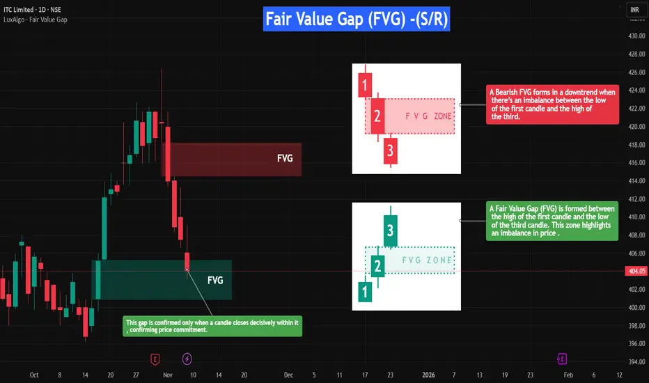
Fair Value Gap (FVG) — Support and Resistance (S/R)🔎 Overview
The Fair Value Gap (FVG) is a unique price imbalance or inefficiency on a price chart where the market rapidly moves, leaving one or more candles without overlapping wicks between highs and lows.
This signifies aggressive buying or selling, resulting in a “gap” of untraded prices.
Once spotted, FVGs often act as magnets, drawing price back to fill the gap — and later serve as dynamic support or resistance zones, depending on the market direction.
⸻⸻⸻⸻⸻⸻⸻⸻⸻⸻
📔 Concept
A Fair Value Gap forms when:
1️⃣ Resistance FVG -- A strong impulsive move causes the low of the first candle and the high of the third candle (in a three-candle sequence) to fail to overlap, leaving a visible gap.
2️⃣ Support FVG -- A strong impulsive move causes the high of the first candle and the low of the third candle (in a three-candle sequence) to fail to overlap, leaving a visible gap.
3️⃣ Imbalance -- This gap highlights an area where orders were skipped, signaling an imbalance between buyers and sellers.
4️⃣ Rebalance -- When revisited, a Bullish FVG often acts as support, while a Bearish FVG acts as resistance, as price reacts to rebalance the inefficiency before the trend continues.
⸻⸻⸻⸻⸻⸻⸻⸻⸻⸻
📌 How to Use
✅ Validation → A valid FVG exists as long as the gap remains unfilled, and traders watch for price to revisit and react to it.
🟩 Bullish FVG → Support: When price retraces into the gap and finds buying interest, the zone holds as support.
🔴 Bearish FVG → Resistance: When price rallies into a bearish gap and faces rejection, the zone holds as resistance.
❌ Devalidation → If price decisively closes inside the FVG, the gap is considered “filled,” and the setup loses significance.
Typically, the lowest unfilled bullish FVG below price in an uptrend (and the highest bearish FVG above in a downtrend) carries more weight and is prioritized for confluence.
⸻⸻⸻⸻⸻⸻⸻⸻⸻⸻
📊 Chart Explanation
Symbol → NSE:ITC
Timeframe → 1D
On the right-hand side, the Fair Value Gaps (FVGs) are illustrated in detail to give a closer look at how they form and function.
These visual examples explain how FVGs represent price inefficiencies — zones that later act as dynamic support or resistance once price revisits them.
On the left-hand side, you can see real-time examples of FVGs forming within live price action.
When a candle closes decisively inside a bullish FVG, it confirms price commitment, allowing the zone to act as support and potentially propel price upward.(These are plotted using open sourced indicator )
This setup beautifully demonstrates how understanding FVG structure helps identify high-probability reaction zones where the market seeks to rebalance itself.
⸻⸻⸻⸻⸻⸻⸻⸻⸻⸻
👀 Observation
Fair Value Gaps work best in volatile markets or during strong impulsive moves.
When price revisits an unfilled gap, the reaction helps define new support or resistance.
Combining FVGs with key structural levels, volume analysis, or momentum indicators (like RSI or Moving Averages) improves reliability.
Always prioritize clean, unfilled gaps aligned with the trend direction for higher conviction.
⸻⸻⸻⸻⸻⸻⸻⸻⸻⸻
💡 Conclusion
The Fair Value Gap not only signals where the market may “rebalance” itself after price inefficiencies but also identifies potential support and resistance zones.
Recognizing how bullish and bearish FVGs interact with price allows traders to anticipate reactions, manage risk, and refine entries and targets with greater accuracy.
⸻⸻⸻⸻⸻⸻⸻⸻⸻⸻
⚠️ Disclaimer
📘 For educational purposes only.
🙅 Not SEBI registered.
❌ Not a buy/sell recommendation.
🧠 Purely a learning resource.
📊 Not Financial Advice.
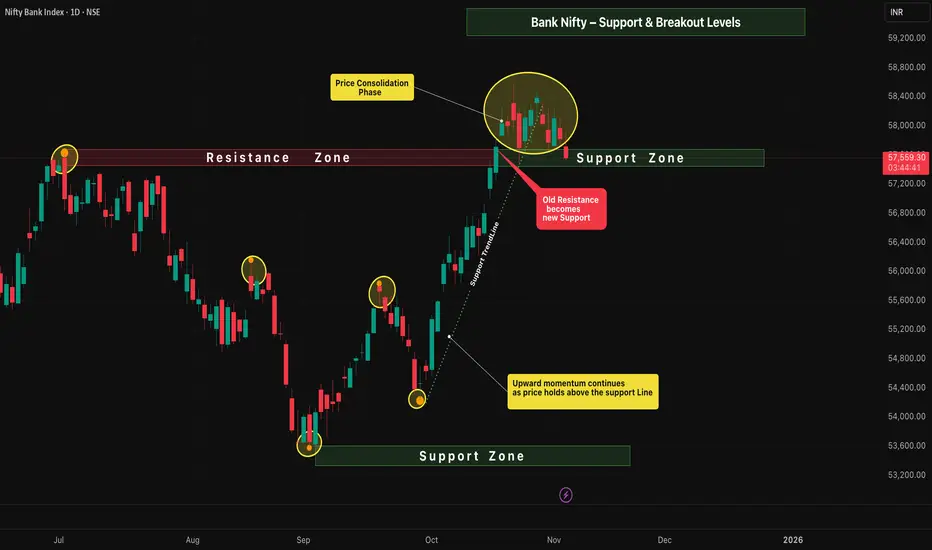
Bank Nifty – Support & Breakout Levels📈 Bank Nifty – Daily Timeframe Analysis
The price structure on the daily chart shows a healthy continuation of the upward momentum , maintaining strength above the key support zone.
Buyers are still in control, but the market has now entered a phase of sideways consolidation — signaling preparation for the next directional move.
⸻⸻⸻⸻⸻⸻⸻⸻⸻⸻
📊 Key Observations
1️⃣ Upward Momentum Continues — Price remains above the support line, showing sustained bullish control and healthy trend structure.
2️⃣ Consolidation Range — Price is currently consolidating between 58577.50 and 57482.05 , reflecting a balance between buyers and sellers.
3️⃣ Old Resistance → New Support — The previous resistance zone is now acting as a strong support base, adding confirmation to the bullish sentiment.
4️⃣ Breakout Scenarios —
A break above the consolidation high at 58,577.50 could ignite the next upward leg and continue the prevailing uptrend.
• A break below the support zone at 57,482.05 may shift momentum to the downside, opening the possibility of a move toward the previous support area.
⸻⸻⸻⸻⸻⸻⸻⸻⸻⸻⸻
✅ Summary
• Trend bias remains bullish as long as price holds above the key support line.
• Consolidation signals short-term indecision before the next major move.
• A confirmed breakout candle above 58,577.50 may open the path for further upside.
• Conversely, a breakdown below 57,482.05may invite short-term selling pressure toward the old support region.
⸻⸻⸻⸻⸻⸻⸻⸻⸻⸻⸻
⚠️ Disclaimer:
📘 For educational purposes only.
🙅 Not SEBI registered.
❌ Not a buy/sell recommendation.
🧠 Purely a learning resource.
📊 Not Financial Advice.
Bullish Fibonacci Retracement Setup📈 Bullish Fibonacci Retracement Setup
Intro
The chart illustrates a classic Bullish Fibonacci Retracement structure — highlighting key swing points, retracement levels, and potential continuation zones.
Price action shows a healthy pullback within a larger uptrend, suggesting accumulation before a possible breakout move.
⸻⸻⸻⸻⸻⸻⸻⸻⸻⸻⸻⸻⸻
🟩 Chart Overview
• Point A → Represents the Swing Low , marking the starting point of the current upward move.
• Point B → Denotes the Swing High , where price faced resistance before retracing.
⸻⸻⸻⸻⸻⸻⸻⸻⸻⸻⸻⸻⸻
📊 Key Fibonacci Levels
1️⃣ Validation Line (78.60%) — Entry is confirmed when any two consecutive candles close above this level, signaling a strong breakout and bullish continuation.
2️⃣ Minimum Retracement (61.80%) — This level has been achieved, and two candles have successfully closed below it, confirming a valid retracement phase within the Fibonacci structure.
3️⃣ Devalidation Line (38.20%) — If any two candles close below this level, the Fibonacci setup becomes invalid.
⸻⸻⸻⸻⸻⸻⸻⸻⸻⸻⸻⸻⸻
🎯 Trail Levels
Trail Levels →
• Stop-loss will trail two levels below the current active level.
• Each target level is confirmed only when two consecutive candles close above it successfully .
⸻⸻⸻⸻⸻⸻⸻⸻⸻⸻⸻⸻⸻
✅ Summary
• Price is retracing within a strong bullish trend.
• A close above the 78.6% Validation Line confirms continuation.
• Structure remains valid as long as price holds above the 38.2% Devalidation Line.
• Trail progressively with momentum as higher targets activate.
⸻⸻⸻⸻⸻⸻⸻⸻⸻⸻⸻⸻⸻
⚠️ Disclaimer:
📘 For educational purposes only.
🙅 Not SEBI registered.
❌ Not a buy/sell recommendation.
🧠 Purely a learning resource.
📊 Not Financial Advice.

Flag Pole and Pennent
🧭 Overview
The chart showcases a strong uptrend followed by a pennant formation, a classic continuation pattern.
After a powerful rally (flagpole), price enters a phase of tight consolidation, forming lower highs and higher lows — a sign that volatility is contracting before the next expansion.
This structure reflects a healthy pause in momentum as the market prepares for a potential upward breakout.
⸻⸻⸻⸻⸻⸻⸻⸻⸻⸻⸻⸻⸻
📊 Chart Observations
1. Higher Highs and Higher Lows formed during the rally confirm a strong bullish bias.
2. After the impulsive move, price starts creating Lower Highs and Higher Lows, shaping a symmetrical pennant.
3. Price Consolidation inside the pennant shows market equilibrium — buyers and sellers are temporarily balanced.
4. The flagpole represents strong prior momentum, and the pennant signals continuation rather than reversal.
5. As the range tightens, probability favors an upward breakout in the direction of the preceding trend.
6. Confirmation: A candle close above the pennant’s upper trendline validates bullish continuation and signals entry.
⸻⸻⸻⸻⸻⸻⸻⸻⸻⸻⸻⸻⸻
🟢 Summary
• Structure: Flagpole + Pennant (Bullish Continuation)
• Market Context: Ongoing uptrend with temporary consolidation
• Trade Bias: Bullish — watch for breakout above upper boundary
⸻⸻⸻⸻⸻⸻⸻⸻⸻⸻⸻⸻⸻
⚠️ Disclaimer
📘 For educational purposes only.
🙅 Not SEBI registered.
❌ Not a buy/sell recommendation.
🧠 Purely a learning resource.
📊 Not Financial Advice.

Flagpole & Breakout – Bullish Continuation Setup🔎 Overview
The Flagpole & Breakout setup is a bullish continuation pattern that forms during strong uptrends.
It represents a temporary pause in momentum where prices consolidate after a sharp upward move (flagpole) — before continuing higher.
This pattern highlights a healthy market structure: strong impulse → controlled pullback → renewed breakout.
____________________________________________________________
📔 Concept
• The pattern starts with a sharp upward surge (Flagpole) driven by strong buying momentum.
• After this, price enters a consolidation phase that resembles a small symmetrical triangle or a downward-sloping flag.
• Buyers and sellers reach temporary equilibrium before the next impulsive leg.
• A breakout above the upper trendline confirms the continuation of the prior uptrend. ____________________________________________________________
📌 How to Use
✅ Validation → When price closes above the upper trendline, confirming bullish continuation.
❌ Devalidation → If price breaks below the lower support line, pattern fails.
____________________________________________________________
📊 Chart Explanation
• Flagpole → Represents the strong initial buying momentum driving prices higher.
• Pennant / Flag → The consolidation phase where the market takes a breather before the next move.
• Upward Move → Indicates powerful buyer strength leading into the pattern.
• Consolidation Zone → A tight price range where buyers and sellers balance before breakout.
• Breakout → A bullish signal confirming the continuation of the prior trend.
• Key Insight → The stronger the flagpole and the tighter the consolidation, the higher the breakout reliability.
____________________________________________________________
👀 Observation
The flag pattern reflects market psychology — after a surge, traders take profits, causing short-term consolidation.
Once sellers are absorbed, a breakout occurs, attracting new momentum buyers and triggering trend continuation.
High volume during the breakout adds confirmation and strength to the setup.
____________________________________________________________
💡 Conclusion
Flag and Pennant formations are among the most reliable continuation patterns in technical analysis.
Recognizing them early allows traders to join the trend with defined risk and reward setups .
____________________________________________________________
⚠️ Disclaimer
📘 For educational purposes only.
🙅 Not SEBI registered.
❌ Not a buy/sell recommendation.
🧠 Purely a learning resource.
📊 Not Financial Advice.

EMA Ribbon - Trend Strength & Reversal insight🧭 1. Overview
The EMA Ribbon is a set of multiple Exponential Moving Averages (EMAs) layered together to visualize the trend strength, direction, and possible reversals.
It helps traders identify when the market is trending strongly or losing momentum.
In this chart,
• Yellow lines = Short-term EMAs (react quickly to price)
• White lines = Long-term EMAs (show overall market direction)
When used together, they form a ribbon-like structure that acts as both dynamic support and resistance.
⸻⸻⸻⸻⸻⸻⸻⸻⸻⸻⸻⸻
📊 2. EMA Ribbon on Chart
• When the ribbon expands, it shows trend strength increasing — momentum is strong.
• When the ribbon contracts (becomes narrow), momentum is cooling, often leading to consolidation or reversal.
• The slope and crossover behavior of short and long EMAs reveal bullish or bearish momentum.
⸻⸻⸻⸻⸻⸻⸻⸻⸻⸻⸻⸻
🟢 3. Bullish Momentum
When short-term EMAs (yellow) stay above the long-term EMAs (white):
• EMA ribbon slopes upward → confirms an ongoing uptrend.
• Ribbon acts as a dynamic support zone — price often bounces from it.
• Indicates strong buying pressure and trend continuation.
• The wider the ribbon, the stronger the bullish momentum.
⸻⸻⸻⸻⸻⸻⸻⸻⸻⸻⸻⸻
🔴 4. Bearish Momentum
When short-term EMAs (yellow) fall below long-term EMAs (white):
• EMA ribbon slopes downward → confirms a downtrend.
• Ribbon acts as a dynamic resistance zone — price struggles to break above it.
• Indicates strong selling pressure and bearish control.
• Ribbon expansion during a downtrend suggests momentum strength from sellers
⸻⸻⸻⸻⸻⸻⸻⸻⸻⸻⸻⸻
📘 5. Summary
✅ Bullish Phase: Short EMAs above long EMAs → strong uptrend & support zone.
❌ Bearish Phase: Short EMAs below long EMAs → strong downtrend & resistance zone.
⚙️ Neutral / Reversal Phase: EMAs narrow together → momentum cooling, await breakout.
The EMA Ribbon is not just a visual trend indicator — it’s a dynamic momentum tool that adapts with price, helping traders identify both trend continuation and early reversal signs.
____________________________________________________________
⚠️ Disclaimer
📘 For educational purposes only.
🙅 Not SEBI registered.
❌ Not a buy/sell recommendation.
🧠 Purely a learning resource.
📊 Not Financial Advice.
