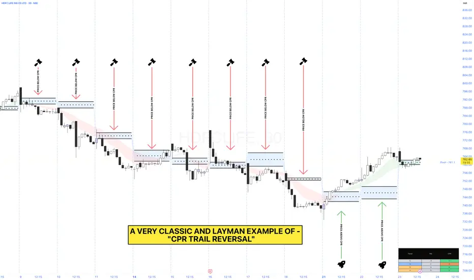
HDFCLIFE ( CPR REVERSAL )HEY PIVSTER'S
Here, we can see a chart analysis of NSE:HDFCLIFE where we spot a live example to demonstrate how an actual CPR Reversal pattern actually looks like and more to it we have added "CPR TRAILS" which now makes the whole pattern look much more informative...🙂
So, here is an example of "CPR TRAIL REVERSAL" which depicts how a particular trend changes alongside it's CPR 📝
SOME OBSERVATION TO BE NOTED:
Here, in the sample size taken for example shows one very interesting price movement alongside it's CPR formation and that is basically-
"If we observe closely then alongside a descending CPR Trail formation the Price alongside the same is not closing above the CPR" 👀
And even if price is able to open above the CPR's we can see that Price is not able to cross the opening high of the first 30min candle until 21st July, 2025 where the price changed track and closed above CPR on the same day 📊
Pema
NIFTY50: (THE BROADER PICTURE) HEY FAM,
- As you see in the pictorial representation of NSE:NIFTY , the index took an upsurge at around 13th June, 2023 with a gap-up opening which happens to the level of previous month high (PMH).
- Moving on we also see a PEMA crossover with an initial retest of price at Monthly H3 (MH3) level which shows that monthly responsive players are in action now when the price takes the first support from marked zone that is -> (PMH - MH3)
- Now in the same week we form a Weekly high (PWH) at around 19th June, 2023 which you can see comes in a beautiful confluence with the level of Monthly H4 (MH4) thus making it a hot level on the upper side which is why the line is marked as 'orange'.
- Fast forward to this current week, we have a reference that the index has a responsive range of around 210 points which is clearly marked on the chart too.
- This week beautifully shows the fight between the weekly and monthly responsive players trying to break through from the responsive range and thus open gates for their respective initiative players to race towards their range targets.
NOTE:
I hope you understand the broader picture now and can also testify how simple things can be if you just connect the respective dots from multiple pivot timeframe.
So, I think that this information through a brief pictorial representation helps you in further projects and the same time shows you one of the way you can use PIVOT STUDY WITHOUT EVEN APPLYING ANY INDICATOR!!
Let me know your thoughts upon this publish in the comment section.
THANK YOU
