GOLD / SILVER SPREADSHello & welcome to this analysis
GOLD/SILVER (COMEX) ratio charts has done 1.62 Fibonacci of its Inverse Head & Shoulder breakout.
It has immediate parallel channel resistance near 109, if it breaks above it then next resistance is at 118 where it has a Bearish Harmonic Bat.
Current support is at 102, below that it could test the breakout level at 92
Search in ideas for "RATIO CHART"

XAGUSD all set to Outperform US30, Short Term Buy Signal!#XAGUSD #US30
Attached: Daily Ratio Chart as of 31st Jan 2025
BULLISH SETUP
- Breakout from Triangle to start an Impulse Rally for the Ratio meaning Money to shift from US Markets to Precious Metals
- This is Positive for the Price of XAGUSD and Negative for the Price of Dow Jones (or US30)

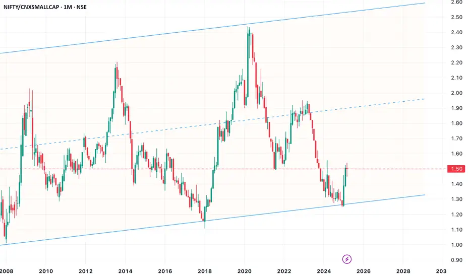
Nifty50 Vs Nifty SmallCap 100This ratio chart between LargeCaps and SmallCaps has been a good retail sentiment indicator. At the extremes, it has been a good contrarian indicator
When large-cap underperformance reaches an extreme low and starts to reverse, like in 2024 Sep, one of the 3 scenarios unfolds and seems to last 18 to 24 months
1. Both LargeCaps and SmallCaps correct, but SmallCaps correct even more
2. LargeCaps are relatively stable but SmallCaps are correcting
3. LargeCaps are rallying and SmallCaps are yet to catch up
Let's see if Scenario 1 >>> Scenario 2
Ps: This is NOT an investment advice
A strong rally use it to exitCNX Realty VS Nifty & CNX Realty CMP 816
Elliott- The first ABC correction is a zig zag. The wave B is an expanded flat corrective pattern which is clearer on the ratio chart. It is again very clear from this chart that a corrective pattern has emerged post the completion of zig zag. This is an expanded flat corrective pattern which should go minimum to the 970 zone. This is a good 18% from the current levels. Which means some of the stocks can move 30 to 40%.
Conclusion- Do not take this rally seriously. Book ur profits and exit as another set of ABC correction will begin post its completion. So yet another Index showing a strong rally. Make money and exit.

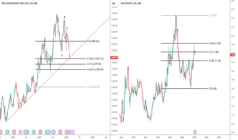
Correction not over in ITTCS CMP -3784
I had stated before that IT and Pharma is also weak and they will also correct. They have started late and will correct further.
Elliott- the iiird wave of C of the zig zag corrective pattern is underway. Below 3760 we will see 3680 and 3590.
Nifty IT vs Nifty 50 - on the right is the ratio chart. See how the IT performed better than Nifty during the sharp sell off. Now its time for Nifty 50 to do better. Which also means the correction in IT is still not done.
SILVER all set to MASSIVELY OUTPERFORM Banking Stocks!Attached: Silver Spot vs. IndusInd Bank Monthly Chart as of 22nd January 2025
I have taken Indusind Bank as a proxy for Indian Banking Stocks as it is a Major Large Cap Private Bank that is not only part of Bank Nifty but also part of Nifty 50 and once used to be part of Top 20 Nifty stocks but because it crashed 40% in 2024 it lost that spot
The Monthly Ratio Chart has the following Observations that support a Bullish Investment Case for Owning Silver vs. Indian Banking Stocks, they are as follows:
1) 20/ 50 Monthly EMA Bullish Crossover for the first time since 2009
2) Ratio closing above 100 Month EMA and consolidating for the Next Leg Up
3) Ichimoku Cloud Resistance that held for more than a Decade also getting cleared
And the Upside as shown on the Ratio Chart is crazy which if you translate to a Price Chart, means Silver over the years can see Triple Digit Returns, Doubling to Quadrupling!

RITCO#RITCO
The stock is trading above strong resistance.
We can see a breakout as volume is rising in the stock,
support of 50MA in daily chart.
The ratio chart is also on breakout.
Entry:- 400
Target:-440/480/570
SL:-360

EMUDHRA LTD#EMUDHRA
Ascending Triangle pattern is formed & the stock is
trading at strong resistance. We can see a breakout
as volume is rising in the stock, support of 50MA in daily chart.
The ratio chart is also on breakout.

PATANJALI#PATANJALI
The stock took support at multiyear strong resistance.
We can see stock making new highs as volume is rising in
the stock, support of 50MA in weekly chart.
The ratio chart is also on breakout.

UPDATER SERVICES LTD#UDS
Flag & Pole pattern Breakout & the stock is trading at ATH.
We can see stock making new highs as volume is rising in the stock,
golden crossover done in daily chart.
The ratio chart is also on breakout.

RAINBOW CHILDRENS MED#RAINBOW
The stock is trading above strong resistance.
We can see a breakout as volume is rising in the stock, support of 50MA in daily chart.
The ratio chart is also on breakout.

DYNAMIC INDUSTRIES LTD#DYNAMIND
The stock is trading at multiyear strong resistance.
We can see a breakout as volume is rising in the stock,
golden crossover done in daily & weekly chart.
The ratio chart is also on breakout.
Entry:-100
Target:-110/120/140
SL:-90

INDO AMINE Ratio Chart.IN DO AMINE compared to benchmark index Nifty 50. The price gave a falling trendline breakout and is currently on retest of the same.

Rounding Bottom patternRounding Bottom pattern is formed & the stock is trading at strong resistance.
We can see a breakout as volume is rising in the stock &
golden crossover is done in daily chart.
The ratio chart is also on breakout.
Entry :- 650
Target :- 710/800/910
SL :- 590
What's your view?
DAY=259/366 (15/9/2024)365 DAYSHARDCHALLENGE

co -relation of bank nifty and In 10y bond yieldthere is inverse corelation in nifty bank ratio chart and india 10y bond yield v important thing to note that in 10y bond yield has fallen but bank nifty in ratio chart is at support big movement can come in nifty bank.

AU bankAU banks shows continuous impulse on upside and as it take up it previous high it may confirm the wave 3 in progress as per the EW analysis. Bank nifty : Nifty ratio chart shows bank nifty may outperform nifty for the coming weeks and this has good possibility as per the wave counts

It’s Time For Media Sector To Start A Rally ✅Media sector is silent from last 5-6 months and one is talking about this but as per my analysis big players are making position and CNX Media will outperform Nifty50 for next several months.
✅Big players and fund managers are always monitoring these ratios. They use this data to make informed decisions about their investments. Also they only need to outperform Nifty50 so these ratio charts help a lot.
✅No one in the market will explain this to you like this ,consider reallocating some funds to CNX Media stocks also.

CAMPUS Long Idea CAMPUS/CNX500 Ratio chart shows stock is showing strength.
It broke Trendline and making Inverted Head & Shoulder. Need to break resistance to outperform cnx500 stocks.
When market is down, I think campus is going to be strong stock or if market is good, campus might outperform.
Lets plan accordingly

SILVER/GOLD Ratio ChartSIlver might outperform Gold from the chart analysis.
Need to see monthly close above Trendline for confirmation.
Then we can plan more concentration in silver than gold in case of any equity market downside.

Pepe Coin: The New Meme Coin Sensation of 2024Pepe coin, a meme coin that’s quickly becoming a legend in its own right, has astonishingly reached the 3B market cap mark, positioning itself as the 3rd meme coin ever to achieve such a feat. This remarkable achievement comes after a staggering 400% gain in just the last week. 🔥
Currently, it stands proudly at the 40th rank by market cap and an impressive 9th rank by volume in the last 24 hours . Let’s take a closer look at Pepe coin and see why everyone’s talking about it. 👇
✅ Pepe’s Market Performance: A Quick Overview
The buzz around Pepe coin is palpable, and it’s already being hailed as one of the top meme coins of this cycle. And guess what? The real euphoria hasn’t even kicked in yet. 🔥
Pepe is coming out of the long-term accumulation range, and with the crypto market starting a new bull cycle, the momentum is going to accelerate soon. The current candles’ range and the volumes are a testament to the underlying strength.
✅ Comparative Analysis: Pepe vs. Doge
⚡️ Structural Similarities between PEPE and DOGE
If we place Pepe and Doge alongside, it’s like looking at two sides of the same coin . The market structures and fractals of Doge from 2020 to 2021 bear a striking resemblance to Pepe’s current trajectory. And what do the market gods say about history? It is often similar and repeats itself! 👀
At the moment, it looks like Pepe is right at the same stage as Doge was in 2021 , when it started it’s monster rally. The momentum building up around Pepe suggests we’re just at the beginning of what could be an exhilarating euphoric phase.
⚡️ Relative Performance of PEPE and DOGE
Since there’s no symbol for PEPEDOGE, we can make a ratio chart by dividing PEPE by DOGE to make a custom symbol. Looking at the chart, Pepe has significantly outperformed Doge by over 300%. I’ve used the latest swing as a reference because it’s the most relevant point in the current scenario, as meme coins have been rallying from that point onwards.
✅ Broader Market Context
⚡️ Relative Performance of DOGE and BITCOIN
We’re examining this chart to grasp how the market context is evolving. Doge has consistently been lagging behind BTC for a couple of years . Both its price and momentum are at historic lows.
However, there are early indicators suggesting a reversal and a change in trend. This implies that once the alt season kicks in, Doge will gain momentum and surpass Bitcoin. This context is crucial because it sets the stage for Pepe’s performance, suggesting that its lead over Doge could extend throughout this market cycle.
⚡️ Relative Performance of PEPE and BITCOIN
Despite Bitcoin’s dominance, Pepe has been making waves, outperforming the crypto giant and hinting at the immense potential it holds for the upcoming alt season. This strengthens the fact that once the market-wide alt rally begins, Pepe can outperform others by a huge margin.
Conclusion
Pepe coin’s journey is a fascinating tale of unexpected triumphs and the unpredictable nature of meme coins. Its rapid ascent to a SEED_TVCODER77_ETHBTCDATA:3B market cap and its standout performance in the market are clear indicators of its potential to climb even higher, possibly reaching the $50B mark or beyond.
While the crypto market is known for its volatility and surprises, Pepe coin’s current trajectory suggests that it’s on its way to becoming one of the top 10 coins in this cycle. The excitement around Pepe is undeniable, and for those of us watching, participating, or just cheering from the sidelines, it’s a reminder of the thrilling unpredictability that draws us to cryptocurrencies.
Thanks for reading. Hope you found it useful.
Let me know your thoughts in the comments. Cheers!
Disclaimer: This post should NOT be construed as investment advice and is meant for learning purposes only. Please consult your financial advisor before making any investments.

AWHCL: Box BreakoutAWHCL Looks Good on Weekly Timeframe.
It is a Type of Box Breakout, and patterns like this are very high rewarding.
This is a Ratio Chart of AWHCL and NIFTY 500
You can see from this ratio chart that AWHCL is a good value stock, and can now outperform Nifty 500.

Market Watch: Assessing the Possibility of an Impending CrashThe financial sector has been experiencing a persistent underperformance, notably reflected in the contrasting trends of Banknifty and Nifty. While Nifty has been consistently marking higher highs, indicating positive momentum, Banknifty/Nifty Ratio Chart, on the other hand, is showing a pattern of forming lower highs. This ongoing divergence between the two indices raises a red flag, signalling potential concerns for market participants. Such a disparity in performance suggests a lack of uniformity in the financial landscape, prompting investors to closely monitor and assess the underlying factors contributing to this divergence. Understanding these trends becomes crucial for making informed decisions in the face of the evolving market dynamics.
Investors should closely monitor Nifty for potential immediate tops, especially examining bearish momentum divergence for confirmation. This analysis is crucial for gaining insights into evolving market sentiment and making informed decisions amid potential risks.

CNX IT is expected to Outperform NiftyThe ratio chart of CNXIT TO NIFTY signals CNXIT is gearing up for ouperformance to Nifty in coming months..Time to ACCumulate CNXIT BEES
