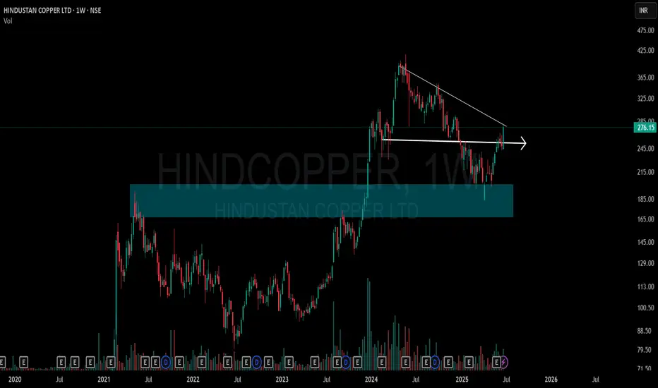
HINDCOPPER | Supply-Demand Flip & Structure This chart shows a clean structural shift on the weekly timeframe for Hindustan Copper Ltd (NSE: HINDCOPPER):
🔷 Blue Zone: A key Supply-to-Demand Flip area. Price reacted strongly from this zone after multiple touches, showing its relevance.
📉 CT Line (Compression Trendline): Price was getting compressed under this trendline. It's now visibly breached.
➡️ Arrow Zone: Highlights a smaller supply-demand zone, formed after consolidation and breakout. Marked for structural clarity.
Volume also shows higher activity during this move, indicating strength behind the recent price action.
Supply_and_demand
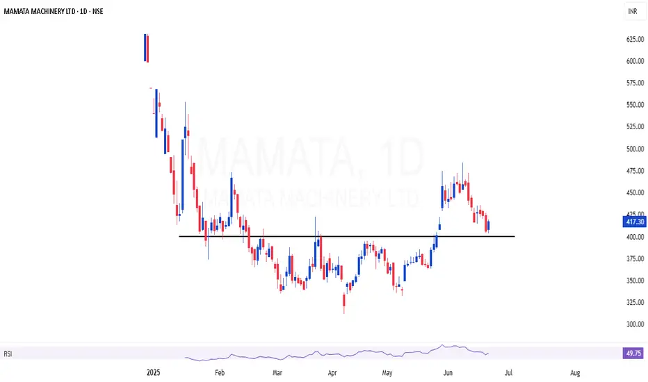
MAMATA | Breakout and retesting the area of valueMAMATA | Breakout and retesting the area of value
Valuation also looking good
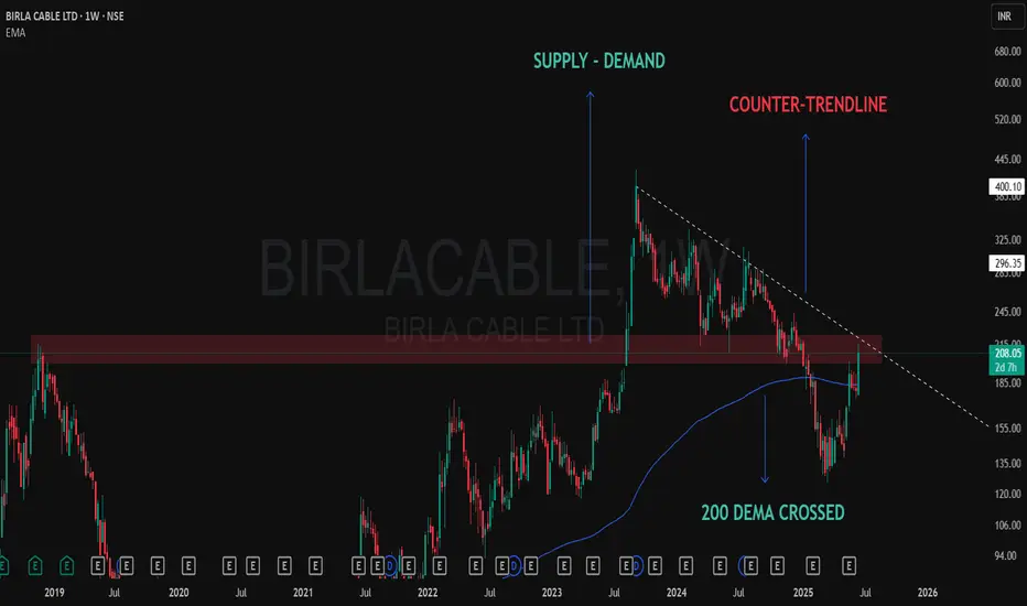
Technical Development on Weekly Chart – Birla Cable📈 BIRLA CABLE – Chart Talking Loud Now!
✅ 200 DEMA crossed
200 Dema was providing solid resistance and now taken out marked with blue line.
❌ At Counter-Trendline
Solid CT thrown from the top of the pattern, dotted white line shows that.
✅ Demand Zone Holding Strong
Clearly shown a solid supply zone which got converted into a Demand only after the Breakout some months back.
After months of consolidation and rejection from the same supply zone… price is now attacking with volume 🔥
🧠 “When structure aligns with emotionless patience, conviction follows.”
BPCL | Ferocious Flag - Looks good for 30%BPCL | Ferocious Flag 🏁
Looks good for 30% based on the flag setup
Keep SL below 300 for short term trading position
CMP : 334

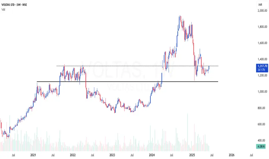
VOLTAS | Excellent area of value in weekly time frameVOLTAS | Excellent area of value in weekly time frame
Weekly 200 EMA support
RSI bullish divergence
Good risk reward
Quality stock at decent correction , looking good for reversal from here
BEPL | Yet another good monthly candle at excellent areaBEPL | Yet another good monthly candle
Excellent area of value at this location
Breakout after 7 years consolidation and retesting
High probable setup for doubling
CMP : 119

SOBHA | Breakout after consolidation + 200 EMA supportSOBHA | Breakout after consolidation + 200 EMA support
CMP : 1433 (Dip : 1300)
SL : 1200
Target : 2000

Nifty Update: Key Supply Zone Test Ahead – Time to Book Partial On 27th February, I shared a detailed analysis explaining why Nifty was likely to take support from the Monthly Demand Zone .
At that time, the entire market was extremely bearish. FIIs were selling heavily, and most people believed that catching the bottom was impossible. But as demand and supply zone traders , we trusted the footprints of smart money—and as expected, Nifty took support exactly at that zone and reversed.
Today, Nifty is trading just below 5% of its all-time high . This shows the power of demand zones, which are not just random boxes but clear evidence of institutional activity.
Now, let's focus on the current market development .
📈 Nifty Nearing a Critical Supply Zone 📉
If you look at the chart, you'll see that Nifty is now approaching a Daily Supply Zone (Drop-Base-Drop) Which have strong follow-through, making this a strong resistance area .
In addition, I’ve marked a Weekly Supply Zone (Drop-Base-Rally) on the chart. Interestingly, the daily supply zone lies inside this weekly supply zone , creating a powerful confluence of resistance. This stacking of zones increases the probability of price facing rejection in this area.
📊 What Should Traders Do?
If you are holding profitable positions in stocks, this could be a good time to book partial profits .
Be prepared for a possible price rejection from the daily and weekly supply zone .
However, it’s not guaranteed that Nifty will fall from here. Price can also break through the zone, but as traders, capital protection comes first .
The most likely scenario is a small pullback , not a major fall. After the pullback, Nifty may resume its upward move.
Always focus on high-probability setups and manage your risk smartly.
📢 Conclusion:
Nifty is at a crucial supply zone cluster. A pullback is likely, so this could be a smart time to lock in some gains. Watch price action closely and adjust your strategy accordingly.
Lastly, Thank you for your support. Feel free to ask if you have questions.
“Trade what you see, not what you hear. The chart always whispers before the news screams.” 📊🔥
This analysis is purely for educational purposes and is not intended as a trading or investment recommendation. I am not a SEBI registered analyst.

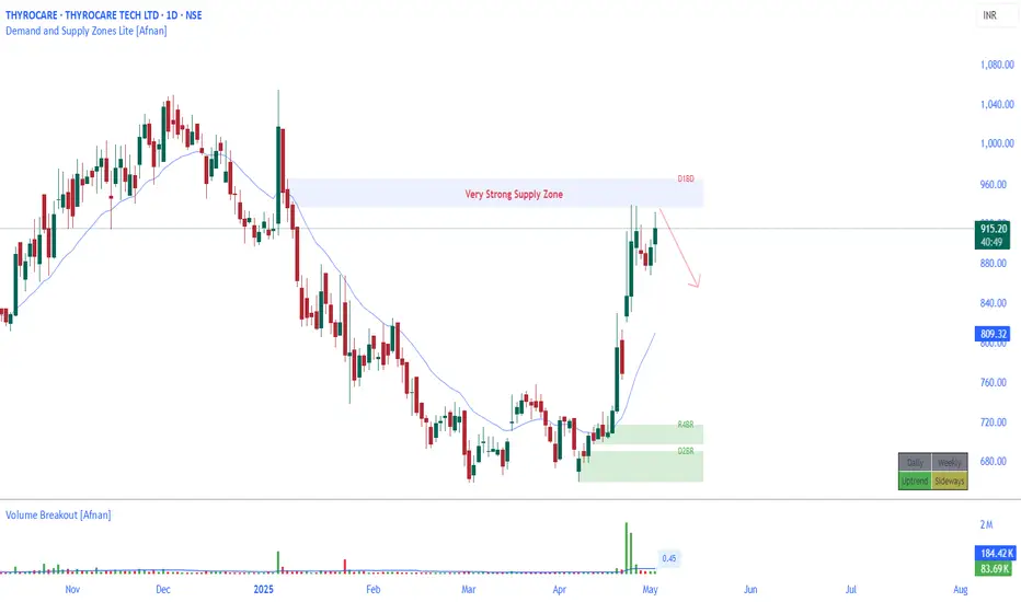
THYROCARE at a Make-or-Break Level: Strong Rejection Expected?🧠 Technical Overview
THYROCARE has recently approached a strong supply zone , which is formed by a classic Drop-Base-Drop structure — footprints of institutional players.
When price enters such zones, it often encounters heavy selling pressure due to pending sell orders placed by big players (smart money). This creates an ideal condition for a potential reversal or correction.
At the current level, there's a clear indication that the stock might face resistance. If you're trader and already holding THYROCARE in your portfolio, this could be a wise area to consider partial or full profit booking .
📊 Key Observations
Strong Supply Zone: Price has entered a well-defined Drop-Base-Drop zone.
Risk Management Tip: Booking profits here can protect gains if the expected rejection plays out.
Short-Term Outlook: A pullback or downward move is likely if supply pressure dominates.
📌 Important Note for Investors
If you're a long-term investor, use this opportunity to assess your risk-reward ratio. This zone could lead to a temporary dip, but keeping an eye on fundamentals alongside technicals will help with bigger decisions.
🔥 Motivational Nugget
"Every great trader was once a beginner who dared to learn, analyze, and act with courage." 🚀💼📉
Lastly, Thank you for your support, your likes & comments. Feel free to ask if you have questions.
This analysis is purely for educational purposes and is not a trading or investment recommendation . I am not a SEBI registered analyst.
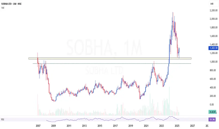
SOBHA | Excellent area of value - Looks strong buySOBHA | Excellent area of value in monthly time frame - Looks strong buy
Showing strong reversal candles at support
CMP : 1322 (Dip : 1000)
Clean Breakouts Don’t Lie — TFCILTDSupport Trendline holding beautifully from mid-2021.
CT (Counter Trendline) broken decisively this month with strong volume ✅.
Supply-Demand Zone (marked in green) retested and held.
Hidden Line (dotted pink) showing internal resistance structure — now taken out 🔥.
Current Structure:
A classic breakout with multiple confirmations — trend support, supply zone defense, CT break, hidden resistance breach — aligning well together.
🚀 As always, follow strict risk management. No trade is sure-shot — but structures like these offer probability edges.

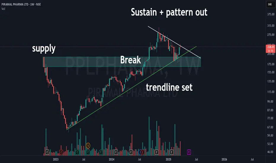
Piramal Pharma Yet to Breakout? | MotherBar + CT + Supply DemandPiramal Pharma Ltd is at a critical juncture! 🚀 The stock is consolidating within a counter trendline (CTL) while respecting the rising trendline support.
Key highlights:
✅ Mother Candle Formation - A large weekly candle acting as a range.
✅ Counter Trendline Breakout Watch - Price is still testing resistance, a breakout could trigger momentum.
✅ Demand Zone Support - The highlighted zone could act as a buying area.
✅ Volume Analysis - Increasing volumes hint at potential accumulation.
Will this breakout or get rejected? Let’s watch price action carefully! 📊🔥
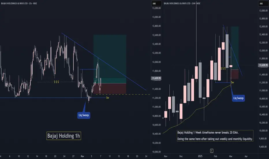
Bajaj Holding Short Term Swing TradeBajaj holding has grabbed monthly and weekly liquidity while maintaining is uptrend.
If Nifty holds current levels ie. above 22400 then Bajaj Holding has high chances to move up and continue its trend.
Do like or follow for more Trading ideas like these. You can comment your views on this analysis.
L&T Finance Weekly Breakout Setup 🔹 Green Line – The weekly support held strong, giving a perfect WTF (Where's The Floor) bounce.
🔹 Supply Zone (Blue Box) – This crucial resistance has now been broken out convincingly.
🔹 Red Line – A CT (Counter-Trendline) breakout with solid volume confirmation.
🔹 Bright Blue Line (MTF Resistance @ 185.82) – The toughest resistance, but it's far from the breakout zone, making this a high-RR trade idea.
🔥 Unique setup with multiple confluences! Volume spike adds conviction. Can bulls sustain the momentum? 🤔
📈 What’s your take on this breakout? Comment below! 👇

Pcbl Chemical – Supply Turned Demand, Higher Lows & Breakout Set📊 Stock: PCBL CHEMICAL LTD (NSE) – 1W Chart
📈 Bullish Structure Developing!
Supply turned into demand! Initially, the stock faced a strong supply zone, leading to a correction and consolidation.
Breakout & Sustained Move – After breaking out, the stock sustained above the breakout level for a long period, confirming demand at this zone.
Higher Lows Formation – A classic bullish structure is developing, indicating accumulation.
CT Base Breakout Approaching – The stock is breaking out of a contraction phase, which could lead to further upside.
Volume is a concern, but price action remains strong. A volume pickup could fuel a stronger move! 🚀
💬 What’s your take on this setup? Are you tracking PCBL? Drop your thoughts below! ⬇️

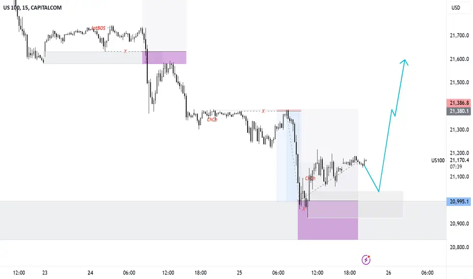
US100 View for feb last weekUS100 is reversing from the demand zone and waiting for the confirmation to enter buy side.
Here is the view for educational purposes
Buy zone is marked between 20926.5 - 21040.8. It will be the high probability area. So, wait for the confirmation before entry.
Trade with 1:3 RR and it might touch all time high again. Trade accordingly.
It might be weak below the marked zone.
Trade after the confirmation.
Key Levels: Nifty at a Crucial Turning Point! What's Next? Nifty's price structure is showing a clear pattern of lower highs and lower lows, indicating a prevailing downtrend. However, the market is now at an interesting Demand Zone that could determine its next big move.
📊 Key Observations
On January 27, Nifty took support from an old demand zone, and formed new lower high.
This minor reversal also led to the creation of a new demand zone.
Currently, Nifty is approaching this fresh Demand zone & old Demand Zone, making it a highly significant area to watch.
🔍 Possible Scenarios Ahead
Reversal from the Demand Zone : If Nifty respects this demand zones and reverses, we may see a potential bottom forming.
Sideways Consolidation : Nifty may move sideways, indicating indecision before a breakout.
Breakdown Below Demand Zone : If the demand zone is breached, Nifty could make a new lower low, continuing its downward trend.
🔄 What’s Next?
The next few sessions will be crucial in determining whether Nifty finds strength or continues its downward trajectory. Traders should closely monitor price action and key levels to gauge market sentiment.
Lastly, thank you for your support, your likes & comments. Feel free to ask if you have questions.
🌟 “Patience and discipline separate the successful trader from the rest.”
This analysis is for educational purposes only and is not a trading or investment recommendation. I am not a SEBI-registered analyst.

SIYSIL: A Strong Demand Zone Setup with High Reward Potential!When it comes to technical analysis, understanding demand zones can give traders an edge in identifying potential reversal points. Demand zones represent the footprints of institutional players who significantly influence the market. These zones indicate unfilled buy orders, and when the price revisits these areas, institutions tend to buy again, leading to a reversal.
Let's dive into SIYSIL's price action and explore its technical structure!
🌟 Weekly Chart Analysis
SIYSIL is currently displaying a highly structured setup. If we analyze the weekly chart , we can clearly see a well-defined Rally-Base-Rally (RBR) Demand Zone . The strength of this demand zone is reinforced by the fact that it broke a previous significant resistance level and formed an all-time high .
📊 Daily Chart Confirmation
Upon shifting to the daily chart , the same demand zone is clearly visible. A strong follow-through from this zone has resulted in a powerful imbalance, further validating the structure.
Moreover, there are currently no nearby supply zones that could act as resistance, making this demand zone even more significant.
💡 Observations
Act of Polarity: The concept of polarity further strengthens this structure— the previous resistance level has now turned into support , aligning perfectly with the demand zone.
Market Conditions: While this setup appears strong, it's essential to consider the current weakness in the overall market . Even well-defined structures can face challenges in uncertain conditions, so risk management is crucial.
📈 Final Thoughts
SIYSIL presents a structured demand zone setup with multiple confirmations on both the weekly and daily charts. The alignment of the demand zone with previous resistance-turned-support adds a strong layer of confluence.
Lastly, thank you for your support. Feel free to ask if you have questions.
🚀 "A successful trader is not the one who never loses but the one who learns to manage losses."
Disclaimer: This analysis is purely for educational purposes and is not intended as a trading or investment recommendation. I am not a SEBI-registered analyst.

CREDITACC long Idea...CREDITACC chart looks good for uptrend. Good Volumes have seen in Daily chart. It is yet to confirm uptrend by breaking trendline resistance.
Pro's: Liquidity pump in system by RBI which is good news for Finance Sector. Waiting for Interest rates to reduce in coming months.
Con's: Q3FY25 PAT is down and sales growth is down. Buisness is dull due to Micro-Finance Lending NPA's, Provisions. Growth will come with Interest rate cycle. So good time is Ahead.
NOTE: Risk Management is Very Important to save capital.

LICHSG Long-Short OpportunityLICHSG has created a fresh supply on the price chart. If price retraces to the SZ we may expect to see a move down on the stock. If the price continues to move down towards the area of weekly demand we may expect to see a strong bounce out of the weekly Demand Zone

Balrampurchini LONG Balrampurchini is approaching a strong weekly demand zone. There is a daily DZ nested within the weekly level. The confluence is adding an odd enhancer as we are expecting the price to bounce out of the Demand Zone

AMD Effect on the BankniftyThe chart clearly reflects how the big players have done stop loss hunting where most retail traders and investors have their stop losses below a consolidation. It is clearly seen that the big players induced false buying and dragged the prices all the way down first triggering all stop losses and now gearing up the market to take it up in the intended direction.

Phases of the market - The "AMD" Effect In trading, the terms accumulation, manipulation, and distribution represent distinct phases of market behavior, driven by the strategies of large institutional players such as banks, hedge funds, or market makers. These phases reflect how these entities operate to achieve their objectives while influencing market psychology and price movements.
At the core of these phases lies the concept of supply and demand. However, recognizing where these phases occur within the market is crucial for traders. Let’s break them down for better understanding:
Let us breakdown these terms to understand them in a better way :
1. Accumulation Phase : This is when big players, like banks or hedge funds, start buying a lot of shares of a stock or asset without causing the price to rise too much. They do it quietly so that others don’t notice what they’re up to.
The price tends to remain flat and trades within a narrow range since fewer trades are happening. A lot of traders tend to loose the plot here since they are unable to understand if this accumulation is occurring in the wholesale area or the retail area and this is the KEY!!!
If prices are accumulating in the wholesale area it is more likely the prices are going to push to the upside than downside. This phase is generally ignored by most retail traders and investors as they consider this as a dull market environment. This is highlighted in a yellow rectangle on the chart.
2. Manipulation Phase : This is a phase where big players intentionally create sharp price swings to confuse or scare smaller traders (retail traders). The goal is to trick people into making the wrong moves, like selling too early or buying at the wrong time. Usually the big players create sudden spikes to the upside or downside. These spikes in general trend to hit majority of the stop losses of the retail traders causing them to loose money more frequently. Many smaller traders lose money here because they react emotionally or fall for fake signals, not realizing they’re being played by smarter, bigger players. This is highlighted in a blue rectangle on the chart
3. Distribution Phase: This is the stage where the big players move the market significantly to the upside or to the downside depending upon the prices being in the wholesale or the retail section. This phase generally tends to have higher volumes. Majority of the retail traders tend to enter at the very end of this phase and get trapped in the market. This is highlighted in an orange rectangle on the chart
This cycle often repeats itself forming the basis of the Wyckoff Market Cycle. Since price is fractal in nature these phases occur on all time frames. For illustration purposes we have taken an example of a Nifty chart. I have manually plotted the phases of the market and illustrated how these phases play out however these phases can be coded using pine script as well. I have divided the swing high and the swing low in two parts.
The lower section signifies" wholesale area" where the big players would be buyers and the upper section signifies retail prices where the big players would be sellers. Now if you watch the wholesale area carefully all the manipulations are taking place in the downward direction(highlighted in blue rectangle) which is signifying that prices are moving down first before moving up. The retail trader is getting trapped in the false breakout to the upside and the moment that happens he wants to "Buy" and keeps a stop loss below the consolidation only for the stop loss to get triggered first and then price moving in the intended direction.
Similarly, in the "retail area", manipulations often occur in the upward direction (highlighted in the blue rectangle). This means prices initially move higher before reversing downward. Retail traders frequently fall into the trap of reacting to a **false breakdown**. When prices appear to break down, these traders rush to "sell" and place their stop-loss orders above the consolidation. Unfortunately, their stop-losses are often triggered first, only for the price to then move in the intended direction afterward.
This pattern is a common occurrence in the market, happening almost daily. It underscores the importance of understanding these manipulative moves to strategically place stop-loss orders in safer locations.
Relying solely on market phases to make trading decisions is not enough to ensure consistent success. Instead, combining this knowledge with an understanding of the **bigger picture**—the overall price structure and market context—is essential. Once this framework is established, traders can confidently apply any price action strategy for entry and exit points.
With practice, identifying these phases on your charts becomes much easier. I hope you find this information valuable, and with some effort, you’ll be able to spot these patterns regularly. Good luck, and happy trading!
