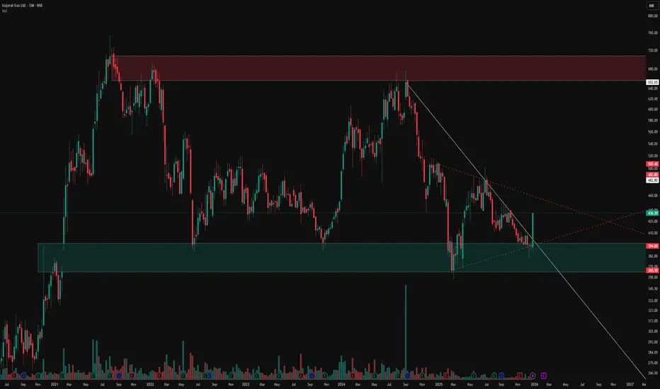
Unveiling Hidden Symmetrical Triangle and Saving from FakeoutsThis weekly chart post highlights key price action elements in a sideways pattern, focusing on zones, trendlines, and a subtle symmetrical triangle for educational observation. Green demand zones and red supply zones frame the overall range, while the white counter trend line traces internal fluctuations. The dotted red line uncovers a hidden symmetrical triangle, where converging lines often lead to breakout rejections observed as fakeouts
Key Chart Features
-Demand & Supply Zones: Green areas mark demand support, red zones indicate supply resistance, revealing price reactions within the sideways structure.
-Counter Trend Line: White line connects minor highs and lows, illustrating counter-trend swings that define the internal rhythm amid broader consolidation.
-Hidden Symmetrical Triangle: Dotted red outline exposes the converging pattern, a consolidation coil with balanced higher lows and lower highs, frequently trapping breakout attempts.
Disclaimer: Not a SEBI-registered advisor. This is purely educational on price dynamics, supply-demand, trendlines, and hidden patterns—no investment advice or forecasts. Past patterns do not guarantee future results; conduct your own analysis.
Supplydemandtrading
CERA – Demand Zone Confluence Supporting Bullish OutlookCERA has exhibited a notable price reaction from its Quarterly Demand Zone 📊, where price absorbed existing buy orders and initiated an upward movement 🚀. This reaction area coincides with the Yearly Demand Zone 🧭, thereby forming a strong confluence zone 🔗 that reinforces its structural significance.
On the Monthly timeframe 📅 , the active Demand Zone overlaps both the Monthly and Yearly Demand Zones . Such multi‑timeframe alignment ⚙️ typically represents a high‑probability support region 💪. Following the initial reaction from this area, price demonstrated a sustained upward move 📈 and established a new, untested Monthly Demand Zone 🟩.
Currently, the price is retracing toward this newly‑formed Monthly Demand Zone 🔄. The retracement is particularly significant because it occurs without any observable reaction from a higher‑timeframe supply zone 🚫🏗️. This suggests that the zone’s underlying demand remains intact 💼, and that the market is approaching an area of potential accumulation 🏦.
Additionally, the Weekly chart 📅 reveals that the current zone coincides with a Monthly Demand Zone 🧱, providing further confirmation of institutional-level support 🏛️. Overall, the technical setup indicates a favorable environment for a potential bullish reversal or continuation from this demand area 🔥📈.
📌 Conclusion
CERA is currently positioned within a multi‑layered structural support zone 🧱 that reflects strong institutional interest and demand alignment across timeframes. The fresh Monthly Demand Zone, combined with Yearly and Quarterly confluence, strengthens the bullish bias.
Unless price invalidates the zone through a sharp breakdown with high volume, the technical structure remains biased to the upside 🚀, favoring long accumulation setups and positioning this level as a potential launchpad for the next impulsive move 💫

Supply to Demand Flip Explained! | Spot High-Probability Zones Ever wondered how smart traders catch the perfect entries? 🤔
In this video, I break down the Supply-Demand Conversion Zones—where Supply turns into Demand and vice versa. With real chart examples .

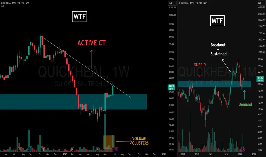
Supply Flips, Trendline Squeezes & Volume Talks – Clean MTFA📌 Charting Breakdown
This post dives into a clean Multi-Timeframe Analysis (MTFA) for QUICKHEAL using structural logic — with Weekly Time Frame (WTF) on the left and Monthly Time Frame (MTF) on the right.
🔍 Left Side – Weekly Time Frame (WTF)
-The Active CT (Counter-Trend) is marked via the dominant trendline resistance, which price is actively engaging.
-We observe a strong Volume Cluster forming near the base of the reclaimed demand zone — often a sign of accumulation or significant interest.
🧠 Right Side – Monthly Time Frame (MTF)
-Here, a textbook Supply & Demand Conversion is visualized.
-Initially, price reacted to a clear Supply Zone, creating the resistance base.
-Once that zone was broken with strength and sustained above it, the previous supply area transformed into Demand, validating the impulse move.
-Price then returned to test this now-converted zone — an SR flip seen through the lens of supply-demand logic, not just support/resistance lines.
🧾 Disclaimer:
This post is not a forecast, tip, or financial advice. It is purely an educational breakdown of price structure and market behavior based on my personal charting style. Feel free to ask your doubts or thoughts in the comments — let’s build clarity, not predictions.
Miss This Retest and You’ll Miss the Rally – CUPID Setup Explain🔴 A – Supply-Demand Conversion Zone
This is the heart of the setup. When price trades below this zone, we stay cautious or short on weak structures. But if it sustains above this, it becomes the launchpad for longs—provided all system conditions align
🟠 B – Ideal Retest Zone
We anticipate a retracement here. A healthy correction towards A zone to tap into fresh demand. This retest is essential to build a valid higher low before breaking out.
🟣 C – All-Time High (ATH) Supply Zone
The ultimate target and strong resistance zone. If our breakout from E happens cleanly, this becomes the next significant level to watch—potential partial booking zone.
🟡 D – Hidden Resistance (WTF)
Subtle yet powerful. This line isn’t obvious to many but holds weight in our top-down analysis. If price cleanly breaks this, it adds conviction to the momentum.
⚪ E – Weekly CT Line
The main trigger. We want price to pull back (B), form a strong base (A), and then break E with a power candle, backed by strong volume
📊 Current Status:
✅ Price above A (bullish tilt activated)
❌ No proper retest at B yet
🔜 Awaiting clean breakout of E post-retest
📌 Hidden resistance D and supply C remain above as Resistances / Hurdles after our Breakout

ALEMBICLTD - WEEKLY CHART WITH CUP AND HANDLE BREAKOUTHi All,
This idea is about Alembic Ltd
Alembic Limited is engaged in the businesses of Pharmaceuticals, Real Estate, and Power Assets.
Fundamentals:
Market Cap ₹ 3,087 Cr.
Current Price ₹ 120
High / Low ₹ 122 / 72.2
Stock P/E 11.5
Book Value ₹ 85.1
ROCE 4.86 %
ROE 12.6 %
Equity capital ₹ 51.4 Cr.
EPS ₹ 10.5
Promoter holding 70.9 %
Market Cap to Sales 19.6
Sales growth 23.8 %
Technicals
As can be seen in the weekly chart of Alembic Ltd, if the price crosses 123 resistance it has an upside of 13% before meeting TOP RESISTANCE. Beyond that the stock will venture into uncharted territory of making ATH
Trade should not be taken before the price close above MAJOR RESISTANCE
Cup and handle formation with trend line resistance
Happy Trading,
Thanks,
Stock-n-Shine

RKFORGE - CLEAN BREAKOUT WITH VERY CLOSE 50/200 SMAA very positive breakout where all the moving averages converge & then expand.
1 Yr Breakout with strong sectoral tailwinds as all forging stocks doing well
Strong upsurge in Volume indicates sustained price action upside from the present levels
Supply and demand zones clearly marked in the chart with no extra indicators to cause any confusion.

AISL - SME STOCK LONG BREAKOUT (SALES > MKTCAP) Hi All,
This idea is about ANI Integrated Services Ltd
Fundamentals
Mkt Cap - 134 Cr
Sales - 188 Cr
Mkt Cap /Sales - 0.72
EPS - 5.84
ROE - 11.4%
ROCE - 13.7%
D/E - 0.46
Sales has exceeded Mkt Cap which could mean Stock Price can rise exponentially
Technicals
Price has broken a long resistance of 75-80 levels and then broken next resistance zone as well. It has diverged a lot from Moving Averages so recommend buy at pull back
There has been a consistent uptrend in Sales which is a very positive sign
Happy Trading,
Thanks,
Stock-n-Shine

GICRE - UPSIDE POTENTIAL OF 40%Hi All,
General Insurance Corporation of India - CMP (406)
Market Cap - 71309 Cr
Stock PE - 10.7
Book Value - 315
Promoter Holding - 85%
EPS - 38
As per the technical pattern on weekly timeframe, price action has formed Bullish Continuation Pattern and is currently trading at lower channel of the trend formation.
An upside of 40% is clearly visible over coming months which is the upper channel of the bullish pattern.
In the current week, price action has broken the horizontal resistance as well confirming the upside in near future.
Relative Strength has also turned positive on all major time frames.
As per fundamentals,
Stocks is still undervalued at PE of just 10.7 with sector PE of 17.
Healthy Dividend of 20.4%
CAGR growth of 24.1% over last 5 years
Hope everyone enjoys this trade!
Happy Trading,
Thanks,
Stock-n-Shine

Swing Trade opportunity in CAMSSwing Trade opportunity in CAMS
Entry - 2061
Target - 2235
DISCLAIMER: I am not SEBI registered and the ideas posted are only for educational purpose. Always trade with proper STOPLOSS.

Swing trade opportunity in SCISwing trade opportunity in SCI
Entry - 122.8
Target - 147
DISCLAIMER: I am not SEBI registered and the ideas posted are only for educational purpose. Always trade with proper STOPLOSS.

Rally Base Drop – Supply ZoneUnlike conventional Price Action Analysis, which relies on countless chart patterns, Supply Demand Strategy focuses only on four high-probability price formations. Rally Base Drop (RBD) is one of the four price formations which lay the foundation of the Supply Demand Trading Strategy.
Rally Base Drop Pattern
RBD is a reversal price pattern, which one can generally locate at market turning points. At areas where uptrends get exhausted and begin a new downward move.
RBD occurs when prices have been rising, and peaking, followed by a sharp drop. This indicates that the sellers are now more aggressive and have overwhelmed the buyers to form a Supply Zone.
Components of a Rally Base Drop Pattern
This formation comprises three parts:
1. Leg-In Candle - Bullish Candle to the left-hand side of the base structure. It need not be an explosive candle.
2. Base Candles - Narrow range small-bodied candles which indicate that orders are potentially being accumulated by the institutions.
3. Leg-Out Candle – Huge Explosive Red candle with a sharp drop in price, which indicates the footprint of Institutional Selling activity.
Steps to Identify a Rally Base Drop Pattern
1. Start with the Current Price on the Chart and go from Right to left
2. Look up and left until you find a strong Drop in the Price
3. Identify whether the formation is an RBD
4. Mark the Zone
When marking the Zone, we need to watch for freshness and the strength of the Leg-Out Candle.
Fresh Supply Zones are those where the price has never retraced after formation, they have the highest probability of having unfilled sell orders.
Strong Explosive Red Leg-Out Candle indicates that supply and demand are totally out of balance and institutions have been aggressive sellers at that price zone.
Trade Action at a Rally Base Drop Supply Zone
RBD pattern is the footprint of Institutional selling activity, formed due to the sheer size of their sell orders. This implies that, when prices retrace back to the area, there is a strong likelihood that there will be a large number of pending sell orders.
After identifying the supply zone, we as retail traders must wait for the price to retrace to the zone. The first retracement to the RBD supply zone is a high-probability sell opportunity. We can initiate a short trade on the pullback to the zone and in doing so participate along with the Institutions to the short side.
Some past examples:
Although RBD is a very powerful supply zone formation, it is highly recommended that one mustn’t trade it in isolation. Combining it with factors like a trend, trend exhaustion and location will improve the odds of the zones working in our favour.

ALKYLAMINE | Falling wedge breakout - Potential for 30%ALKYLAMINE | Falling wedge breakout - Potential for 30%
CMP : 2864
SL : 2680
Target : 3700
1:4 risk reward setup

All you need to know about Caplin Point | Technical, FinancialI daily make educational content videos on financial markets

Marico Daily - Parallel ChannelThe chart says it all!
Trade small since the market is still extremely volatile!
Happy Trading!

KRISHANA phoschem Limited Life time High - Good to go longKRISHANA phoschem Limited Life time High - Good to go Long

Possible 8% in ROSSARI LNA stands for Late night analysis
Follow me on trading view: in.tradingview.com
We discuss potential stocks provided by you guys only in my DMs and comment sections so give your stocks in comments and DM me for tomorrows video :)
👑 Terms used if you don't know :
✣ Contraction pattern: A pattern starting with a broadening high candlestick and low candlestick and converging to a fixed point, these highs and lows created in between them are bulls vs bears fight going on inside the pattern and if it comes to the lower part of it, surely bulls will take it to the topmost point and vice-versa until one of them wins
✣ Structure and trend: Two types of trends that exist in the market today are uptrends and downtrends. Each type of trend tells a different story and has its own impact on a trader's success in the market. While uptrends show a series of higher highs and higher lows, downtrends show lower highs and lower lows
✣Breakout: Breakouts are commonly associated with ranges or other chart patterns, including triangles( HERE WE WILL SEE THIS ONE ), flags, wedges, and head-and-shoulders. These patterns are formed when the price moves in a specific way which results in well-defined support and/or resistance levels. Traders then watch these levels for breakouts
✣ RSI DIVERGENCE: A bullish divergence occurs when the RSI creates an oversold reading followed by a higher low that matches correspondingly lower lows in the price. This indicates rising bullish momentum, and a break above oversold territory could be used to trigger a new long position.
✣ Supply/ Demand: In the supply zone , the prices are higher than the bid price, and in the demand zone , they are lower. The bid price is what a trader is willing to pay for a stock
👑 Important levels - explained well
👑 Comment your thoughts and queries regarding anything on this analysis of mine, feel free buddy :)
⌛ Motivational and psychological area ⌛
✣Trade only if you are in the right mindset, if you have been emotionally weak for some time, take your time and don't trade, trade with a happy and + mindset only.
✣If you want to make money, firstly be prepared to lose it, only that much which you can afford and that much by which you can make a mistake again, learn from them and grow
✣Don't lose hope and keep grinding
✣I have seen my friends on youtube streaming games with watching 10, constantly they streamed for a year or two and now they are buzzing with 1k to 2k watching daily.
✣Focus on the process, you are here to make money not stupid decisions and lose it all
✣No one will help you climb the mountain, few will tell the path, so follow good people, make good mentors and make good decisions and choices in the stock market.
✣Believe in yourself :)
🎓🎓 Some info about me :)
➼My name is Apoorv and I am a 2nd year Engineering student, I want to pursue trading as my career, and thus whatsoever setups or trades I potentially see on my charting platform, I post it here and share them with you all.
➼I hope you will love my simple analysis style.
➼Feel free to suggest your view on this as learning is earning here :)
➼I take my trades on my Zerodha account :)
➼I don't take all the trades I post
➼These charts are my and only my work, my thought process, just from an educational point of view and no calls

Grab 10% by super simple and effective analysis - MCDOWELL_N 👑 Terms used if you don't know :
✣ Contraction pattern: A pattern starting with a broadening high candlestick and low candlestick and converging to a fixed point, these highs and lows created in between them are bulls vs bears fight going on inside the pattern and if it comes to the lower part of it, surely bulls will take it to the topmost point and vice-versa until one of them wins
✣ Structure and trend: Two types of trends that exist in the market today are uptrends and downtrends. Each type of trend tells a different story and has its own impact on a trader's success in the market. While uptrends show a series of higher highs and higher lows, downtrends show lower highs and lower lows
✣Breakout: Breakouts are commonly associated with ranges or other chart patterns, including triangles( HERE WE WILL SEE THIS ONE ), flags, wedges , and head-and-shoulders. These patterns are formed when the price moves in a specific way which results in well-defined support and/or resistance levels. Traders then watch these levels for breakouts
✣ RSI DIVERGENCE: A bullish divergence occurs when the RSI creates an oversold reading followed by a higher low that matches correspondingly lower lows in the price. This indicates rising bullish momentum, and a break above oversold territory could be used to trigger a new long position.
✣ Supply/ Demand: In the supply zone, the prices are higher than the bid price, and in the demand zone, they are lower. The bid price is what a trader is willing to pay for a stock
👑 Important levels - explained well
👑 Comment your thoughts and queries regarding anything on this analysis of mine, feel free buddy :)
⌛ Motivational and psychological area ⌛
✣Trade only if you are in the right mindset, if you have been emotionally weak for some time, take your time and don't trade, trade with a happy and + mindset only.
✣If you want to make money, firstly be prepared to lose it, only that much which you can afford and that much by which you can make a mistake again, learn from them and grow
✣Don't lose hope and keep grinding
✣I have seen my friends on youtube streaming games with watching 10, constantly they streamed for a year or two and now they are buzzing with 1k to 2k watching daily.
✣Focus on the process, you are here to make money not stupid decisions and lose it all
✣No one will help you climb the mountain, few will tell the path, so follow good people, make good mentors and make good decisions and choices in the stock market.
✣Believe in yourself :)
🎓🎓 Some info about me :)
➼My name is Apoorv and I am a 2nd year Engineering student, I want to pursue trading as my career, and thus whatsoever setups or trades I potentially see on my charting platform, I post it here and share them with you all.
➼I hope you will love my simple analysis style.
➼Feel free to suggest your view on this as learning is earning here :)
➼I take my trades on my Zerodha account :)
➼I don't take all the trades I post
➼These charts are my and only my work, my thought process, just from an educational point of view and no calls.

Trading concept- Absorption of Supply Myth: If the price approaches a level repeatedly, and gets rejected from it, this means that the level is very strong.
Reality: After each touch, the level becomes weaker and weaker due to the absorption of the residual orders.
Underlying concept:
1. Whenever the price keeps approaching a certain level, there are pending sell orders that are waiting to be filled.
2. Every time the price comes back to this level, a certain amount of orders gets filled. This is called absorption.
3. The more the price approaches that level, the lesser the unfilled order remains.
4. Ultimately all the orders get absorbed and we see a breakout from that level.
Example:
Disclaimer: This is NOT investment advice. This post is meant for learning purposes only. Invest your capital at your own risk.
Happy learning. Cheers!
@johntradingwick

PNB longIn this analysis , PNB analysis been done based upon pure Triangle Chart Pattern , 2 month and 6 month target been given , 2 month target is based upon 1 day time frame whereas 6 month is based upon weekly time frame ,
In my opinion PNB is not fundamentally strong enough hence you should do your own research before betting . BAd news can impact stock performance as seen previously , so dont bet heavy , use side money if possible otherwise ignore , focus on other good stocks
opinion my own
Thank you

MINDACORP | Small flag and Trendline breakout - 55%MINDACORP | Small flag and Trendline breakout and now retesting the breakout zone - Looks good for 55%
CMP : 97 (Dip till 92)
SL : 84
Target : 150
1:7+ risk reward setup (from dip)

JKTYRE | Swing opportunity in this channel for 16%JKTYRE | Swing opportunity in this channel for 16% while enroute to 185.
CMP : 123
SL : 118
Target : 143
1:4 risk reward setup

