BRITANNIA INDUSTRIES LTD. – INTRADAY ZONE ANALYSIS📈 BRITANNIA INDUSTRIES LTD. – INTRADAY ZONE ANALYSIS
📆 Date: July 1, 2025 | ⏱ Timeframe: 15-Minute Chart
🔍 Educational Breakdown – For Learning & Study Use Only
________________________________________
🔹 Price Action Zones
🔴 Top Range (Resistance): ₹5869.50
🟢 Bottom Range (Support): ₹5721
⚪ Neutral Zone: Between ₹5732 – ₹5804 (No clear directional bias until breakout from either zone)
________________________________________
🧩 Chart Pattern: No
There’s no prominent chart pattern (e.g., flag, wedge, triangle) seen in the current snapshot. This is primarily a demand-supply structure with price action analysis.
________________________________________
🔁 Reversal Candlestick Patterns:
🔴 Top Range: No textbook reversal candle observed yet. However, the previous rejection from ₹5822–₹5804 still makes this zone valid for bearish observation.
🟢 Bottom Range: ✅ Morning Star pattern identified near ₹5721.
This is a strong bullish reversal pattern indicating potential buyer strength emerging from the demand zone.
________________________________________
🧠 1. Trade Plan (Based on Reason and Logic)
🔼 Bullish Trade:
Idea: Go long if price retests ₹5732–₹5721 and holds with bullish confirmation (preferably another higher low or volume spike).
Stop Loss: Below ₹5715
Risk-Reward: 1:1 | 1:2+
Logic: Presence of a valid Morning Star reversal at demand zone suggests buyer strength and potential upside toward ₹5800+.
________________________________________
🔽 Bearish Trade:
Idea: Short if price rallies to ₹5822–₹5804 and shows rejection (bearish wick, reversal candle, volume drop).
Stop Loss: ₹5827.25
Risk-Reward: 1:1 | 1:2+
Logic: Previously reacted supply zone with strong rejection. If tested again without volume confirmation, short setup is valid.
________________________________________
📦 2. Trade Plan Based on Demand/Supply Zones
🟥 Supply Zone: ₹5822 – ₹5804
SL: ₹5827.25
Plan: Enter short only if price rejects the zone again with bearish confirmation.
Risk-Reward: 1:1 | 1:2+
🟩 Demand Zone: ₹5732 – ₹5721
SL: ₹5715.60
Plan: Enter long if the zone holds, ideally using the Morning Star as confirmation.
Risk-Reward: 1:1 | 1:2+
________________________________________
📌 Disclaimer
This analysis is shared for educational and study purposes only. It does not constitute investment advice. The author is not SEBI-registered. Please consult a SEBI-registered advisor before making trading decisions. Always use proper risk management and trade only with confirmation.
________________________________________
💬 Comments
What’s your view on Britannia?
Will the Morning Star at the demand zone lead to a reversal, or will supply pressure dominate again?
Drop your thoughts and chart setups below 👇
________________________________________
Technical Analysis

BTCUSD Short Opportunity – Bearish Channel Resistance TestPair: BTCUSD
Timeframe: 4H
I’m planning a short position on Bitcoin based on this well-defined descending channel structure.
🔹 Setup Explanation:
Price has been respecting a downward-sloping channel, with multiple touches at both the upper and lower bounds.
Currently, BTC is testing the upper trendline resistance of this channel near the $108,000–$109,000 area.
This area also aligns with prior supply zones where strong selling pressure emerged.
The recent impulsive move up appears overextended, increasing the likelihood of a technical pullback.
🔹 Potential Reversal Area:
Upper channel boundary: ~108,500–109,000 USD
Confluence with previous horizontal resistance
Weak momentum candles forming near this resistance
🔹 Trade Plan:
Entry Zone: Between 108,000–109,000 (as price consolidates near the channel top)
Stop-Loss: Above 110,000 to protect against breakout and invalidation of the pattern
Target Zone:
First Target (TP1): 104,500 (gray support zone mid-channel)
Second Target (TP2): 97,000 (lower channel boundary)
🎯 Risk-to-Reward:
Targeting a 1:2 to 1:3 R:R, depending on execution
This means risking ~1,500–2,000 points for a potential reward of 4,000–10,000 points
🛡️ Important Notes:
Watch for strong bullish momentum or a clean breakout above 110,000—this invalidates the setup.
Confirm rejection with lower timeframe bearish signals (e.g., bearish engulfing or supply zone rejection).
Be prepared to trail stop after TP1 is hit to secure profits.
✅ Summary:
This setup aims to capitalize on the potential rejection from the upper boundary of a long-standing descending channel, expecting BTCUSD to retest the mid and lower range support zones.

BHARAT FORGE LTD. – INTRADAY ZONE ANALYSIS________________________________________________________________________________
📈 BHARAT FORGE LTD. – INTRADAY ZONE ANALYSIS
📆 Date: July 1, 2025 | ⏱ Timeframe: 15-Minute Chart
🔍 Educational Breakdown – For Learning & Study Use Only
________________________________________________________________________________
🔹 Price Action Zones
🔴 Top Range(Resistance): 1324.50
🟢 Bottom Range(Support): ₹1270
⚪ No Trade Zone: Mid-range, no clear directional bias
________________________________________________________________________________
🧩 Chart Pattern: No
There is no visible or marked chart pattern (e.g., flag, triangle, head and shoulders) on the chart.
________________________________________________________________________________
🔁 Reversal Candlestick Patterns:
🔴 Top Range: No visible reversal candle pattern at the supply zone on this chart snapshot, but the area has been marked for potential rejection.
🟢 Bottom Range: No textbook reversal candlestick (like pin bar, hammer, or engulfing) is clearly visible at ₹1270. However, the price bounced strongly from this level, indicating possible short-term support or buyer interest.
________________________________________________________________________________
🧠 1. Trade Plan (Based on Reason and Logic)
🔼 Bullish Trade:
Idea: If price retests ₹1270 and forms a bullish structure (strong bullish candle, reversal candles, volume support, long wick)
Stop Loss: Below ₹1269
Risk-Reward: 1:1 | 1:2+
Logic: you need to give an actual logic to this
________________________________________________________________________________
🔽 Bearish Trade:
Idea: If price rejects 1324.50 and forms a bearish structure (strong bearish candle, reversal candles, volume support, long wick)
Stop Loss: ₹1325
Risk-Reward: 1:1 | 1:2+
Logic: Historically rejected area as marked on chart.
________________________________________________________________________________
📦 2. Trade Plan Based on Demand/Supply Zones
🟥 Supply Zone Trade:
Zone: ₹1293.30 – ₹1299.90
SL: ₹1301.45
Plan: Trade the Supply Zone (only on rejection confirmation)
Risk-Reward: 1:1 | 1:2+
🟩 Demand Zone: No defined demand zone.
________________________________________________________________________________
📌 Disclaimer
This analysis is shared for educational and study purposes only. It does not constitute investment advice. The author is not SEBI-registered. Please consult a SEBI-registered advisor before making trading decisions. Always use proper risk management and trade only with confirmation.
________________________________________________________________________________
💬 Comments
What’s your view on Bharat Forge?
Will it reject from the supply zone or hold the bottom range?
Share your charts or thoughts below 👇
________________________________________________________________________________

APOLLO HOSPITALS (NSE: APOLLOHOSP)View: Strongly Bullish.
Bias: High momentum uptrend.
Strategy:
BUY: Initiate at current levels (around ₹7500) or on dips towards ₹7250-₹7300, or on a confirmed daily close above ₹7600.
Targets (T):
T1: ₹7800-₹8000
T2: ₹8250-₹8500
Stop-Loss (SL): ₹7150 (on daily closing basis).
Reasoning:
Confirmed breakout from a significant Rectangle/W-pattern consolidation.
Exceptional volume accompanying the breakout.
Strong bullish momentum indicated by RSI.
Potential for a new leg of the uptrend after clearing ₹7600.
Note: This is an educational analysis and not financial advice. Do your own due diligence before investing.

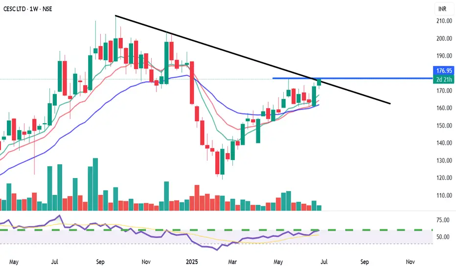
CESC Ltd. (NSE: CESC) - Weekly Chart AnalysisView: Bullish on confirmed breakout.
Bias: Positive momentum.
Strategy:
BUY: Above ₹178-180 (on weekly closing basis, confirming trendline and resistance breakout).
Targets (T):
T1: ₹195-200
T2: ₹210-220+
Stop-Loss (SL): ₹168 (on weekly closing basis).
Reasoning:
Attempting a breakout from a significant descending trendline.
Cleared horizontal resistance at ₹175.
Bullish crossover in moving averages with price above all MAs.
Strong RSI and supportive volume.
Potential for a major trend reversal.
Note: This is an educational analysis and not financial advice. Do your own due diligence before investing.
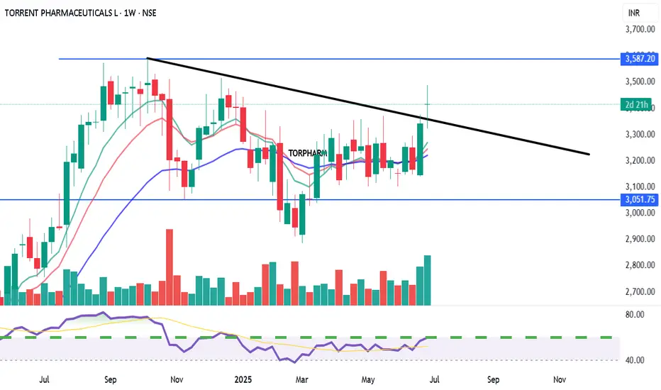
TORRENT PHARMACEUTICALS LTD. (TORPHARM) View: Bullish on confirmed breakout.
Bias: Positive momentum building.
Strategy:
BUY: Above ₹3600 (on weekly closing basis with strong volume confirmation).
Targets (T):
T1: ₹3750
T2: ₹3950+
Stop-Loss (SL): ₹3400 (on weekly closing basis).
Reasoning:
Strong support at ₹3000-₹3050.
Challenging multi-month descending trendline resistance.
Positive RSI divergence and increasing volume.
Potential for a significant trend reversal if breakout is confirmed.
XAUUSD 01/07: GOLD'S RELIEF RALLY FROM A MONTHLY LOWXAUUSD 01/07: GOLD'S RELIEF RALLY FROM A MONTHLY LOW – USD WEAKENS, BUT CLEAR MOMENTUM IS STILL MISSING
🌍 Market Overview – USD Weakness & Gold's Rebound Potential
After a significant drop to a one-month low, Gold is beginning to recover slightly, partly due to a weaker USD, improving market sentiment. However, the rally remains cautious and still lacks a strong momentum to push gold decisively higher.
💵 USD Weakness: Can Gold Continue to Rebound?
Recent US economic data has shown a slight decline in consumer spending, which has led to speculations that the Federal Reserve may take a more dovish stance on interest rates in the near future. This has weakened the USD, providing room for Gold to rebound slightly.
That said, there hasn't been a significant catalyst to push Gold into a strong breakout yet.
📉 The Fed is Still the Key Player
The market is closely watching the Fed's next moves. However, there’s a divide on whether interest rates will be cut or maintained. The recent US data isn’t weak enough to warrant a policy change from the Fed, but it’s also not strong enough for the Fed to keep its hawkish stance intact.
This leaves Gold in a limbo, with no clear direction in the near term. Gold is caught between weak expectations of further rate cuts and the ongoing strength of the USD.
🧠 Analysis for Traders:
Gold is responding lightly to macroeconomic factors but hasn’t established a strong trend. This is a period prone to market noise—Gold may jump up and down on news, but the momentum required to establish a consistent trend is lacking.
Traders should monitor USD movements and US labor data closely this week, especially the NFP report, as this could provide more clarity for Gold’s future direction.
✍️ Conclusion:
Gold is recovering from its lows, but it remains uncertain.
The Buy side hopes for rate cuts by the Fed.
The Sell side is betting on USD strength.
As for us traders, let’s stay patient, observe closely, and be ready for the next move. The big wave may still be coming, but smaller price actions right now could give us clues for the upcoming trend.
🔶 Key Levels & Strategy:
Current Support Zone: Gold is holding above the critical psychological support levels of 3300-3304. If the upward momentum continues, a move towards 335x-337x is highly possible in the near term.
Liquidity Gap: Currently, there’s a liquidity gap at the higher levels. The goal is for Gold to rise further to fill this gap before any deeper retracement occurs.
📈 Trading Plan:
BUY ZONE: 3303 – 3301
‼️ SL: 3297
✔️ TP: 3306 → 3310 → 3315 → 3320 → 3325 → 3330 → ???
SELL ZONE: 3358 – 3360
‼️ SL: 3364
✔️ TP: 3354 → 3350 → 3345 → 3340 → 3320
⚡ Final Thoughts:
As the market awaits further data, keep an eye on these key support and resistance levels for your trading setups.
The overall trend is still upward, but short-term volatility is expected. Make sure to follow your risk management strategies.

VOLTAMPVOLTAMP may give a good upside move if it gives breakout.
It's been making HH-HL formation, broke resistance and re-tested it, now seems ready.
Keep following it.
✅ If you like my analysis, please follow me as a token of appreciation :)
in.tradingview.com/u/SatpalS/
📌 For learning and educational purposes only, not a recommendation. Please consult your financial advisor before investing.

Powerful Monthly Channel | Clean Price Structure Across📉 Description:
-This is a classic example of a broadening falling channel on the Monthly Time Frame (MTF), where the counter-trendline (CT) has just been taken out by a strong bullish candle. Volume confirms the strength
📌What makes this setup particularly interesting:
-MTF structure: Despite a series of lower lows on the monthly, it has respected the broad structure of the falling channel throughout.
-WTF/DTF structure: Weekly and Daily timeframes are making higher lows (HLs),
-Price behavior: Clean reaction to the trendline and no choppiness around breakout — this reflects a well-absorbed selling zone
⚠️ This is not a forecast, not a call or tip — just me charting what I see. Drop any doubts in the comments.
BTCUSDT – Targeting 125,000 if Resistance BreaksBTCUSDT is holding a strong uptrend, with price respecting the ascending trendline and consistently filling fair value gaps. The pair is approaching key resistance around 110,000 and may form a breakout–retest pattern, potentially unlocking a move toward 125,000.
On the news front, institutional inflows are returning, spot ETFs continue to attract capital, and the Fed is keeping rates steady — all supporting bullish momentum. As long as price holds above 101,200, the upside scenario remains in play.

SIEMENS LTD. – INTRADAY ZONE ANALYSIS________________________________________
📈 SIEMENS LTD. – INTRADAY ZONE ANALYSIS
📆 Date: July 1, 2025 | ⏱ Timeframe: 15-Minute Chart
🔍 Educational Analysis for Learning Purposes Only
________________________________________
📊 Zone Breakdown:
• 🔴 Top Range Resistance – 3,271.90
Marked in Red: This is a clearly defined supply zone where the price faced sharp rejection after testing highs. Bearish opportunity zone if a reversal pattern appears — watch for signs like bearish engulfing, double top, or rising volume + long upper wicks.
• 🟠 No Trade Zone – Around 3,225–3,260
Marked in Orange: This range has seen volatile, choppy action without clear bias. Traders may avoid fresh positions here unless directional strength emerges with volume confirmation.
• 🟢 Demand Zone – 3,182.60 to 3,165 | SL: 3,160.35
Marked in Green: Price reversed sharply from this area in the past with strong bullish candles. Acts as a low-risk buying area on retest with bullish confirmation. Risk-managed entries possible here.
• 🟩 Bottom Support – 3,101.10
Marked in Dark Green: Crucial structural support zone. Breakdown below this level could change the short-term trend to bearish. Currently a “last line of defense” for bulls.
________________________________________
🔍 Candlestick & Chart Pattern Observation:
✅ Bearish Rejection Near Top Zone:
A strong upper rejection candle (long wick) appeared right at the top resistance (3,271.90), followed by consistent lower highs and lower closes. This confirms seller presence. No double top yet, but early signs of a potential short-term top formation are visible.
✅ Bullish Reversal from Demand Zone:
The candle near 3,170 zone shows a sharp bullish engulfing move on higher volume — signaling potential institutional interest. This zone has repeatedly offered bounce opportunities.
📉 Volume Clue:
Volume expanded during the bounce from demand zone and tapered near resistance — confirming participation during dips and caution near highs.
________________________________________
⚙️ Educational Trade Ideas (Study Purpose Only)
▶️ Reversal Setup – Bearish Bias
• Entry: Below 3,245 on bearish continuation candle
• Stop Loss: Above 3,272 (Top Range)
• Risk-Reward: 1:1 | 1:2+
________________________________________
🧠 Ideal for studying exhaustion after a resistance test and confirmation through lower highs.
▶️ Pullback Setup – Bullish Bias
• Entry: Between 3,170–3,182 (Demand Zone)
• Stop Loss: 3,160.35
• Risk-Reward: 1:1 | 1:2+
🧠 Classic demand zone bounce setup. Strong volume + engulfing candle supports bullish case.
________________________________________
⚠️ Disclaimer (SEBI-Compliant):
This content is strictly for educational and informational purposes. It is not investment advice or a recommendation to buy/sell any securities. Always consult a SEBI-registered financial advisor before making any financial decisions.
STWP | Learn. Trade. Grow.
________________________________________
💬 Do you think the top is strong enough for a short? Or will bulls take control at demand again?
Drop your thoughts and analysis below ⬇️
________________________________________

Shorting BTCUSD After Trendline Failure & Bearish RetestPlanning to short BTCUSD as price has rejected from the descending trendline resistance after breaking the minor ascending trendline support. The confluence of trendline rejection and bearish retest suggests potential downside continuation.
Entry Zone: ~107,300–107,350
Stop-Loss: Above 107,550 (recent high)
Target: 106,550 support area
Risk-to-Reward Ratio: ~1:2 (Min) 1:4 (Final Target)
Quote:
"Trendline confluence and failed bullish continuation often lead to deeper pullbacks."
📊 Summary of the Idea
✅Reason for Entry: Multiple rejections at trendline + structure breakdown.
✅Confirmation: Retest rejection candle.
✅Invalidation: A clean breakout and hold above the descending trendline.

30/06: WILL WE SEE A RECOVERY ON THE LAST DAY OF THE MONTH? GOLD PLAN – 30/06: WILL WE SEE A RECOVERY ON THE LAST DAY OF THE MONTH? ☄️
✅ Macro Context – Focus on USD Debt and Political Pressure
As June comes to a close, the US faces a major $6 trillion debt maturity from COVID-era borrowings, creating potential stress on USD liquidity and overall market sentiment.
Gold saw a sharp dip to the 32xx range during the Asian session but has bounced back and is currently hovering near last week's closing levels.
While the medium-term outlook remains bearish, short-term signals are showing signs of a potential recovery.
✅ Political Catalyst:
Trump’s Pressure on Fed: Trump is pushing the Federal Reserve to cut interest rates to 1%-2%, saying he won’t appoint anyone unwilling to ease monetary policy.
This has sparked expectations for potential rate cuts, which could provide support for gold prices in the near term.
✅ Technical Outlook – Multi-timeframe Structure
Gold continues its downward correction on higher timeframes. However, short-term candles are indicating recovery momentum, with buying activity near the 327x zone.
Today's Strategy: Focus on short-term BUY setups that align with the recovery wave.
✔️ Key Resistance & Support Levels
🔺 Resistance: 3283 – 3291 – 3301 – 3322
🔻 Support: 3277 – 3271 – 3259 – 3247
🔖 Trade Scenarios
✅ Buy Scalping
🔺 Entry: 3272 – 3274
🔹 SL: 3268
✔️ TP: 3282 → 3288 → 3298
✅ Buy Zone
🔺 Entry: 3249 – 3251
🔹 SL: 3244
✔️ TP: 3265 → 3282 → 3295 → 3310
💠 Sell Scalping
🔺 Entry: 3298 – 3300
🔹 SL: 3304
✔️ TP: 3292 → 3282 → 3270
💠 Sell Zone
🔺 Entry: 3327 – 3329
🔹 SL: 3333
✔️ TP: 3322 → 3310 → 3298 → 3282
⚡️ Final Note
As we near the end of the month, expect possible volatility due to USD flows and institutional rebalancing, which could create further opportunities in the gold market.

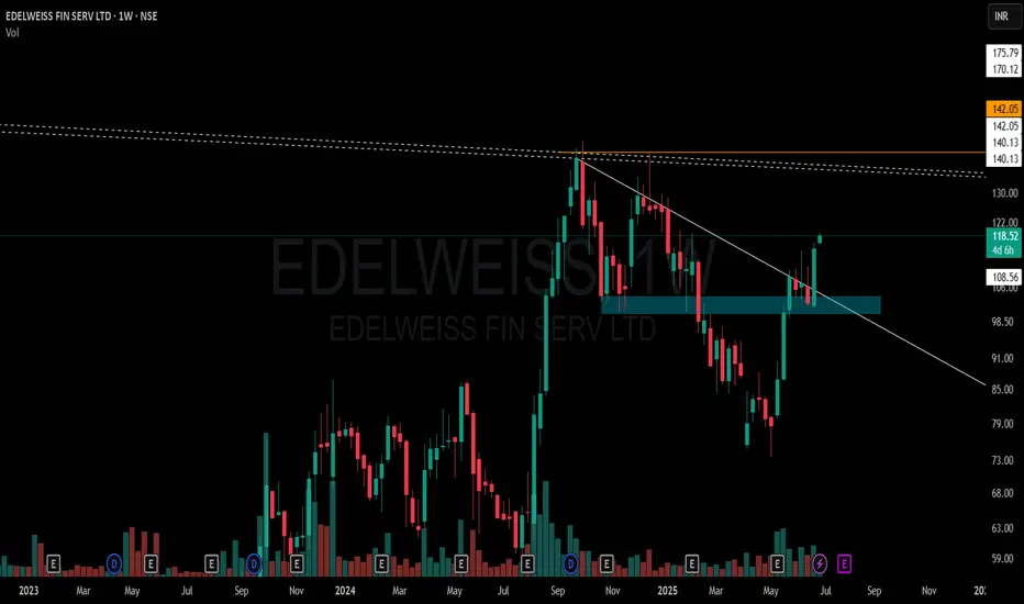
EDELWEISS FIN SERV LTD – Weekly Structure A few key observations on this weekly chart without any forecast bias:
🔹 White Solid Trendline – Marks the active CT (counter-trend) level which has now been decisively taken out.
🔹 Blue Zone – A previously tested supply and demand area has been regained and price is now sustaining above it.
🔹 White Dotted Lines – Multiple short-term weekly hindrances lie just above, acting as micro-resistances.
🔹 Orange Line – Reflects multi-timeframe level confluence and a known volume cluster region to watch ahead.
🔹 Volume has seen a healthy pickup during this breakout, suggesting participation.
📌 Not a recommendation. Just sharing chart structure and price behavior.
XAUUSD – Bearish Momentum Builds Amid Risk-On MoodGold continues to trade within a clearly defined descending channel, forming lower highs and leaving several Fair Value Gaps unfilled. After rebounding from the 3,238 USD support, price is now approaching key resistance near 3,297 USD — aligning with the main descending trendline.
If price fails to break above this resistance, a drop back toward the 3,238 USD support is likely, with a deeper target around 3,200 USD at the lower boundary of the channel.
Fundamentals currently support the bearish bias: improving US–China trade relations and rare earth agreements have triggered “risk-on” sentiment, pulling capital away from gold. Meanwhile, strong USD momentum is driven by robust Core PCE data and the Fed’s hawkish stance, showing no rush to cut rates.
Strategy outlook: Watch for price reaction at 3,297 USD. If bearish rejection occurs, short setups toward 3,238 USD and below could be considered.

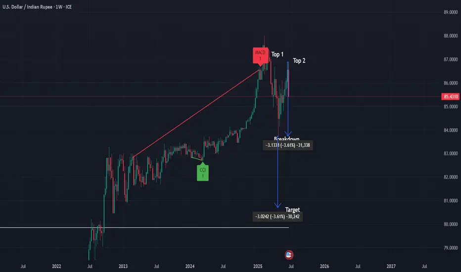
USD/INR Weekly Chart Analysis 📌 USD/INR Weekly Chart – Double Top Analysis
After a sustained uptrend, USD/INR is showing potential signs of a reversal with a well-defined Double Top pattern on the weekly timeframe.
✅ Pattern: Double Top (Weekly)
✅ Key Resistance: ~87.00 (tops)
✅ Breakdown Level: 83.76 (watch for confirmed weekly close below)
✅ Target Projection: ~80.76 (based on measured move)
✅ Stop-loss: ~84.70 (ATR-based level)
📉 Bias: Bearish on confirmed weekly close below 83.76 with increased selling volume.
🔎 Volume Note: Look for higher volume on breakdown to confirm selling pressure and pattern validity.
✅ Commentary:
This classic double top setup suggests potential trend exhaustion after an extended move up. A weekly close below the 83.76 neckline with strong volume would strengthen the bearish signal, targeting ~80.76 in the medium term. ATR-based stop-loss placement provides tactical risk management above recent support
ASIAN PAINTS LTD. – INTRADAY ZONE ANALYSIS________________________________________________________________________________
📈 ASIAN PAINTS LTD. – INTRADAY ZONE ANALYSIS
📆 Date: June 29, 2025 | ⏱ Timeframe: 15-Minute Chart
🔍 Educational Analysis for Learning Purposes Only
________________________________________________________________________________
📊 Zone Breakdown:
• 🔴 Top Range Resistance – 2,364.50
Marked in Red: This is a potential supply zone, where price may face resistance after a strong move up. Ideal for observing bearish reversal patterns like a shooting star, bearish engulfing, or a doji — especially if volume drops or candles show exhaustion.
• 🟠 Neutral Zone – Avoid Trade Area (2,320–2,340)
Marked in Orange: Historically indecisive. Avoid trades here as price often moves sideways or with false breakouts.
• 🟢 Demand Zone – 2,302.90 to 2,293.70 | SL: 2,292
Marked in Green: Price broke out with strong volume from this area. A retest may offer bullish pullback opportunities with proper confirmation candles.
• 🟩 Bottom Support – 2,275.40
Important base level. Breakdown below this zone may change overall short-term bias.
________________________________________________________________________________
🔍 Candlestick Observation:
At the resistance zone, the last candle shows slight upper rejection and reduced body size.
🧠 Interpretation: A possible early signal of exhaustion. Traders can watch for confirmation via volume drop or follow-up bearish candle for a short bias — or wait for breakout strength for long continuation.
________________________________________________________________________________
⚙️ Educational Trade Ideas (Study Purpose Only)
▶️ Reversal Setup – Bearish Bias
• Entry: Below ₹2,358 on bearish candle confirmation
• Stop Loss: Above ₹2,365
• Risk-Reward: 1:1 | 1:2+
• 🧠 Ideal for studying price rejection after a rally into resistance
________________________________________________________________________________
▶️ Pullback Setup – Bullish Bias
• Entry: Near ₹2,300 with bullish confirmation at demand zone
• Stop Loss: ₹2,292
• Risk-Reward: 1:1 | 1:2+
• 🧠 Useful example of “breakout → retest → continuation” pattern
________________________________________________________________________________⚠️ Disclaimer (SEBI-Compliant):
This content is shared strictly for educational and informational purposes. It is not investment advice or a trading recommendation. Please consult a SEBI-registered financial advisor before taking any investment decisions.
STWP | Learn. Trade. Grow.
________________________________________________________________________________
💬 What do you think about this setup?
Did you observe any other key patterns or zones?
👇 Drop your thoughts in the comments — let’s grow together!
________________________________________________________________________________

MARUTI SUZUKI INDIA LTD. – INTRADAY ZONE ANALYSIS________________________________________________________________________________📈 MARUTI SUZUKI INDIA LTD. – INTRADAY ZONE ANALYSIS
📆 Date: June 29, 2025 | ⏱ Timeframe: 15-Minute Chart
🔍 Educational Analysis for Learning Purposes Only
________________________________________________________________________________
📊 Zone Breakdown:
• 🔴 Top Range Resistance – 12,848
Marked in Red: This area has previously acted as a supply zone, where prices were rejected sharply. It is a potential region to watch for bearish reversal patterns, especially if price rises into this zone on weak volume or shows rejection candles like shooting star or bearish engulfing.
• 🟠 Neutral Zone (No Trade Zone) – Between ~12,720 to ~12,680
Marked in Orange: This is an indecision zone, where price has shown choppiness in the past. It is advisable to stay cautious and avoid trades here, as clear momentum is often missing in this range.
• 🟢 Support Zone – 12,617
Marked in Green: This is the demand zone, where price previously reversed on higher volume. It is a good region to observe for bullish candlestick confirmation patterns (e.g., hammer, bullish engulfing, morning star) on intraday timeframes.
________________________________________________________________________________
🔍 Candlestick Pattern Observation:
At the support zone (12,617), the most recent candle (the last one) shows a long lower wick with a bullish body, forming a bullish hammer-like structure.
• 🧠 Interpretation: This suggests possible buying interest at lower levels, especially since it coincides with volume spike, indicating potential reversal.
• 📌 However, confirmation from the next candle (closing above 12,670 with decent volume) would be required before validating it as a bullish reversal.
________________________________________________________________________________
⚙️ Educational Trade Idea (For Study Purpose Only):
▶️ Potential Long Trade Setup (Bullish Bias)
• Entry (Low-Risk Learner Zone): Around 12,670–12,675, only if next candle shows bullish strength
• Stop Loss: Below 12,617 (zone low) → e.g., 12,600
🧠 Reasoning:
• Price is reacting from a well-identified demand zone
• Volume spike confirms possible accumulation
• Candle with rejection wick hints at reversal interest
• Risk-reward approx. 1:2 or better depending on exit point
________________________________________________________________________________
⚠️ Disclaimer (SEBI-Compliant):
This analysis is shared strictly for educational and informational purposes. It does not constitute investment advice or a recommendation to trade. Viewers are encouraged to use this for learning technical chart reading and should consult a registered advisor before making any financial decisions.
STWP | Learn. Trade. Grow.
________________________________________________________________________________
What do you think about this setup?
Did you spot any other patterns or zones?
👇 Drop your comments below — let’s grow together!
________________________________________________________________________________

How I Read Price Action Like a Pro (Most Miss This Step)The REAL Way to Read Price Action — No Indicators, Just Logic
I make educational content videos for swing trading .

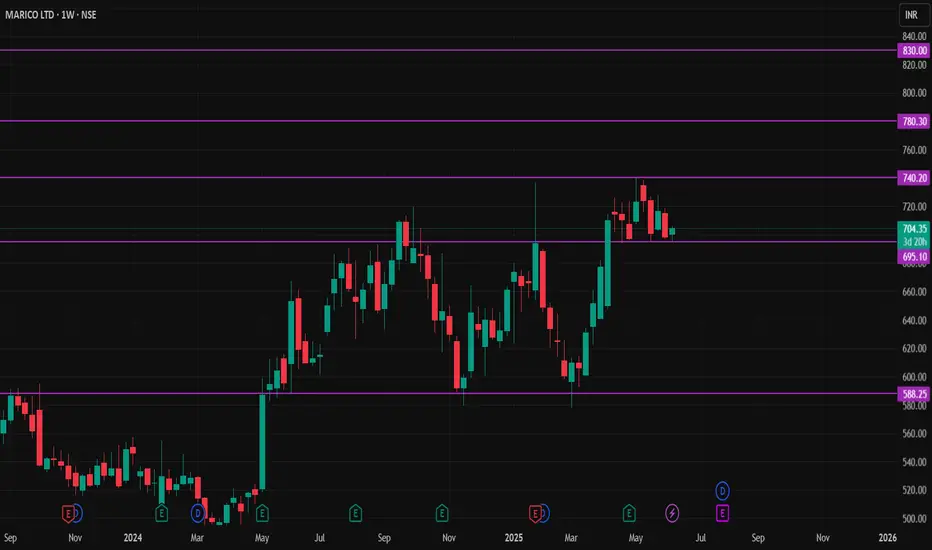
MARICO STOCKNSE:MARICO Stock has formed W shape pattern. Now it's take a best support level of 690 Rupees,
Buy sustain above 710 Rupees,
First Target 730 to 740 Rupees,
Second Target 760 to 780 Rupees,
Third Target 800 to 830 Rupees,
Stoploss below 690 Rupees (Weekly Candle Closed)
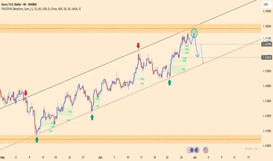
EURUSD – Bearish Pressure Resumes After Rejection at 1.17500EURUSD has rejected the 1.17500 resistance zone and is now forming lower highs on the H4 chart, signaling weakening bullish momentum within the ascending channel.
Stronger-than-expected Core PCE data from the US reinforces the Fed’s cautious stance, keeping the USD strong. Meanwhile, political rumors about Trump potentially replacing Powell have triggered market volatility but still support the dollar in the short term.
As long as price fails to break above 1.17500, EURUSD is likely to decline toward the 1.15900 zone. A bullish scenario would only be validated if price closes above 1.1760.
XAUUSD – Bearish Pressure Intensifies, New Lows in SightGold remains firmly within a well-defined descending channel, consistently forming lower highs and lower lows. After a breakout of the minor channel, price appears to be pulling back toward the 3,300 zone before potentially resuming its downtrend.
The temporary ceasefire between Iran and Israel and the US–China rare earth trade deal have dampened safe-haven demand, with capital rotating back into equities. At the same time, stable core PCE data supports the USD, adding further pressure on gold.
If price fails to hold above the 3,260 area, the next target lies near 3,218.

XAUUSD Bullish Reversal from Channel Support | Gold Buy SetupAnalysis Overview:
Gold has been trading inside a clearly defined descending channel (marked by the orange trendlines). After a strong bearish move, price has reached the lower boundary of this channel, which is acting as dynamic support.
Key Technical Details:
Descending Channel Support: XAUUSD has tested the lower trendline multiple times and is currently showing rejection wicks, suggesting potential exhaustion of selling pressure.
Demand Zone: The shaded horizontal area represents a prior consolidation and minor support level that aligns with the channel bottom, adding strong confluence.
Entry: Planned buy entry at the current level near channel support, anticipating a bounce.
Stop Loss: Placed below the recent swing low and outside the channel, to allow room for volatility while protecting against continuation of the downtrend.
Target: The mid-to-upper boundary of the descending channel, aiming for a favorable risk-reward ratio.
Market Context: The higher timeframe trend remains bearish overall, so this is a short-term reversal (counter-trend) setup within the channel structure.
Trade Plan Rationale:
Expecting a corrective move upward within the descending channel as price retests previous supply zones and dynamic resistance. This setup is based on:
Confluence of channel support and demand zone
Multiple rejection wicks showing buyers stepping in
Potential mean reversion towards the channel midpoint
Disclaimer:
This is my personal analysis on XAUUSD and not financial advice. Always do your own research and manage risk carefully.
