Gold Hits Resistance Inside Rising Channel | Short-Term PullbackHello Everyone, i hope u all will be doing good in your life and your trading as well, let;s analyise Gold as it is trading inside a rising channel, but price is currently facing strong resistance near the channel top. The recent move shows signs of rejection, which opens the door for a short-term pullback, not a trend reversal.
This is a counter-trend short focused only on a corrective move. As long as price stays below the marked resistance zone, selling pressure can continue toward lower channel support. Buyers are still in control on higher timeframes, so shorts should remain quick and disciplined.
Key Levels
Short Zone: Near channel resistance
Pullback Targets: 4625 → 4610 → 4597
Invalidation: Above 4660
Disclaimer This analysis is for educational purposes only and should not be considered as financial advice. Trading involves risk. Please do your own research and use proper risk management before taking any trade.
Analysis By @TraderRahulPal | More analysis & educational content on my profile.
If this update helped, like and follow for regular updates.
Traderrahulpal

Gold Structure Update – Bulls Still in Control next 4518++Hello everyone, gold is trading inside a clear rising channel, and the structure remains bullish with higher lows intact. After the recent upside move, price has pulled back toward the lower side of the channel, which is a normal and healthy move in a strong trend.
This pullback is happening exactly where buyers are expected to step in. As long as price holds above the marked support zone, the probability still favors upside continuation, not breakdown. Strong trends usually pause, shake out weak hands, and then continue.
For now, there is no sign of trend failure. Only a clean break and acceptance below support would change the view. Until then, this remains a buy-on-pullback market, not a place to panic or chase.
Key Levels to Watch
Buy Zone: 4466–4463
Stop Loss: Below 4445
1st Target: 4480
2nd Target: 4500
3rd Target: 4518
Bias: Bullish above support
Disclaimer: This analysis is for educational purposes only and should not be taken as financial advice. Please do your own research or consult your financial advisor before investing.
Analysis By @TraderRahulPal | More analysis & educational content on my profile.
If this update helped, like and follow for regular updates.

Gold Update: Watching Channel Support for ContinuationGuys last trade of the year haha, let's see if we got something in this trade. Gold is trading inside a rising channel, and the overall structure remains positive. After the recent move up, price has pulled back toward the lower side of the channel, which is a normal and healthy behavior in an uptrend.
This pullback is bringing price closer to a key support area, where buyers have previously stepped in. As long as price holds above this support, the probability favors upside continuation rather than a breakdown.
This is not a breakout trade. It is a buy-on-pullback setup, where patience matters more than speed. A clear hold near support is what keeps this setup valid.
Disclaimer: This analysis is for educational purposes only and should not be taken as financial advice. Please do your own research or consult your financial advisor before investing.
Analysis By @TraderRahulPal | More analysis & educational content on my profile.
If this update helped, like and follow for regular updates.

This Year Didn’t Make Me Rich–It Made Me Better, & Consistent :)Hello Traders!
As 2025 comes to an end, I want to share something real. Not a highlight reel. Not a perfect equity curve. Just an honest story from the start of this year to where I stand today.
The beginning of 2025 was not good for me as a trader.
The ending feels very different.
And that difference is not because of a new strategy.
It is because of a new mindset.
How 2025 Actually Started for Me
The year began with confusion.
I was trading regularly, posting analysis, reading charts correctly, but results were inconsistent.
Many trades looked perfect on the chart.
Structure was clean.
Direction was right.
Still, something was missing.
Some days I booked profits too early.
Some days I held losses longer than planned.
Sometimes I entered again just to recover a previous trade.
At that time, I thought the problem was execution speed or market conditions.
Later, I understood the problem was deeper.
Right Analysis Was Never the Problem
One thing became very clear as months passed.
My analysis was rarely wrong.
Gold respected levels.
Market structure behaved as expected.
Liquidity did what liquidity always does.
But my reactions were not stable.
A small pullback felt like danger.
A quick profit felt like relief.
A losing trade felt personal.
That is when I realised something important.
Execution Is Emotional, Not Technical
Execution does not fail because charts change.
Execution fails because emotions take control.
Fear made me exit good trades early.
Ego made me hold bad trades longer.
Overconfidence made me increase size when I should not have.
And hesitation made me miss the best entries.
The market was doing its job.
I was not doing mine properly.
The Turning Point of 2025
Mid-year, I stopped trying to trade more.
I started trying to understand myself more.
I reduced position size.
I focused on calm execution, not fast execution.
I accepted that missing a trade is better than forcing one.
I stopped trying to prove I was right and started trying to trade well.
Slowly, results changed.
Not suddenly.
Not magically.
But steadily.
What Improved in the Second Half of the Year
• My trades became fewer but cleaner.
• My drawdowns became smaller.
• My exits became calmer.
• My mindset became more patient.
• My confidence became quiet, not loud.
I was no longer chasing the market.
I was waiting for it.
The Biggest Lesson of 2025
Psychology is more important than setup.
Anyone can learn a strategy.
Anyone can mark support and resistance.
But staying calm when price goes against you.
Following rules after two losses.
Keeping size under control when confidence is high.
That is the real edge.
Self-Awareness Is the Real Profit
This year taught me when I become impulsive.
It taught me when fear controls my decisions.
It taught me when ego tries to interfere.
And once you see these patterns in yourself,
you stop fighting the market and start managing yourself.
That is when consistency begins.
Why I Am Ending 2025 Confident
Not because I won every trade.
Not because every month was green.
But because I understand myself better as a trader.
I trust my process more.
I respect risk more.
I react less and think more.
That is real growth.
As we step into a new year, I wish you clarity in your decisions, discipline in your execution, and patience in your journey.
Happy New Year to everyone who chose growth over shortcuts and learning over ego.
Conclusion from overall this
If your 2025 was difficult, it was not wasted.
If you learned about yourself, you moved forward.
I am entering the next year calmer, clearer, and more consistent.
And if this journey feels similar to yours, feel free to connect, comment, or share your experience.

Gold (XAUUSD) – 4H Chart Update | Breakout → Pullback Phase!Hello Everyone,, i hope you all will be doing good, let's check the updates of Gold as it has already done the hard part, the breakout above the previous resistance is in place. After the breakout, price pushed higher and is now doing what strong markets usually do: a pullback.
This pullback is not a sign of weakness yet. In fact, it is a healthy reaction, where the market is testing whether the old resistance can act as new support. This phase decides continuation or failure.
As long as Gold holds above the marked support zone, the structure remains positive, and continuation toward higher levels stays open. What we want to see here is price stabilizing, not panic selling.
If support fails and price starts accepting below it, then the breakout thesis weakens. Until that happens, this move should be treated as a normal post-breakout retest.
Key Levels to Watch
Breakout Level / New Support: Around 4330–4340
Immediate Support Zone: Pullback base area
Upside Continuation: Possible if support holds
Bias: Neutral-to-Bullish above support
Well Guys Most traders get confused during pullbacks. Strong moves rarely go straight up, continuation usually comes after patience, not after chasing candles.
Disclaimer: This analysis is for educational purposes only and should not be taken as financial advice. Please do your own research or consult your financial advisor before investing.
Give likes and comment your thought on my analysis, thankyou everyone!

Gold Holds Rising Channel – Upside Targets Still OpenGold is trading inside a clean rising channel, forming clear higher highs and higher lows, which confirms that the overall trend remains bullish. Instead of chasing breakouts, price is now doing what strong trends usually do, pause and consolidate before the next move.
The marked buying zone sits perfectly inside the rising channel and has already acted as a strong demand area. As long as Gold holds above this zone, buyers remain in control and upside continuation remains the higher probability scenario.
Upside targets are aligned with the channel resistance, which adds further confidence to this setup. These types of structures often reward traders who wait for pullbacks rather than reacting emotionally to fast candles.
A breakdown below the marked invalidation level would weaken this bullish view, but until then, the structure favors patience and trend-following.
Key Levels to Watch
Best Buying Range: 4519–4515
1st Target: 4535
2nd Target: 4553
Final Target: 4570
Structure Invalidation: Below 4497
Trend Bias: Bullish above support
Disclaimer: This analysis is for educational purposes only and should not be taken as financial advice. Please do your own research or consult your financial advisor before investing.

Gold 15-Min Chart: Previous Support should act as Resistance nowHello everyone, Guy's Gold has made a sharp recovery after the recent drop, but i am expecting gold should take resistance in this area. This level has already shown rejection in the past, making it a critical decision area for the market.
The rejection near this zone suggests that sellers are still active. If Gold fails to sustain above this resistance, a pullback toward the lower support areas is likely. Such pullbacks are normal after strong impulsive moves and often provide better clarity for the next direction.
As long as price stays below this resistance, upside looks limited in the short term. A clean breakout and hold above this level is required to shift the bias back to bullish.
Disclaimer: This analysis is for educational purposes only and should not be taken as financial advice. Please do your own research or consult your financial advisor before investing.

Gold After Liquidity Grab: Short side intraday move, R you readyHello Everyone, let's analyse Gold as this once again tested a major resistance zone, but instead of giving a clean breakout, price briefly moved above the level and then quickly reversed. This move was not strength, it was a liquidity grab.
In simple words, smart money pushed price above resistance to trap breakout buyers, collect their stop-loss liquidity, and then bring price back into the range. This is why price failed to hold above the highs and started showing weakness soon after.
Right now, Gold is trading back below resistance, which keeps the short term bias cautious to bearish. If selling pressure continues, price may slowly rotate toward the lower support / demand zone, where buyers could appear again.
This chart is a good reminder that not every breakout is real. Waiting for confirmation always matters more than speed.
Disclaimer: This analysis is for educational purposes only and should not be taken as financial advice. Please do your own research or consult your financial advisor before investing.
Analysis By @TraderRahulPal | More analysis & educational content on my profile.
If this helped you understand price behavior better, like, follow, and share your view in comments.

Gold Bulls Eye Major Resistance – Can They Break Through?Gold continues to trade in an upward trend, recovering strongly from recent lows. On the 4-hour chart, price is moving closer to a falling resistance trendline, which has acted as a major barrier in the past. This makes the upcoming resistance zone very important for short-term traders.
The next key resistance lies between $4250–$4265, where profit booking can be expected. This area has multiple technical confluences, and traders should monitor how price reacts here. A successful breakout and close above this zone could lead to an extended rally toward $4320–$4350.
However, if price faces rejection from this trendline, a short-term pullback toward the $4120–$4080 support zone would be normal and healthy for the trend. Despite the short-term caution, the overall market structure for Gold remains bullish as long as the price stays above support.
Disclaimer: This analysis is for educational purposes only and should not be taken as financial advice. Please do your own research or consult your financial advisor before investing.
Analysis By @TraderRahulPal | More analysis & educational content on my profile.
If you found this helpful, don’t forget to like and follow for regular updates.

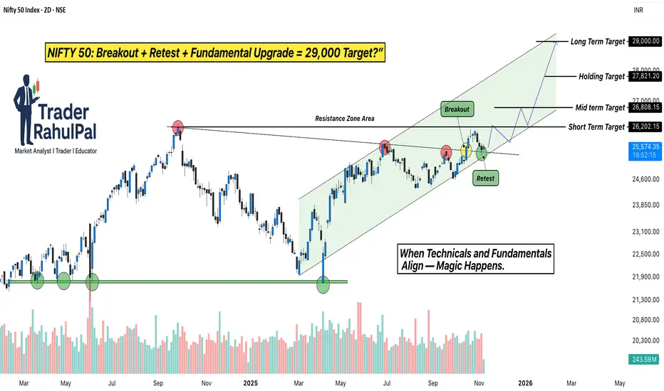
NIFTY Breakout + Goldman Sachs Upgrade = 29,000 Target?Hello Traders!
Today’s analysis is on NIFTY 50 Index, which has recently given a strong Breakout and Retest setup after months of consolidation. The index broke out from its Resistance Zone , retested the breakout area perfectly, and is now holding firmly inside a rising Trend Channel .
This move is not just technical, it’s being backed by major institutional optimism. According to a recent Goldman Sachs report , India’s stock market has been upgraded to “Overweight”, with NIFTY 50 projected to reach 29,000 by 2026 .
Why this setup is special?
Perfect breakout and retest structure with strong volume confirmation.
Channel trend remains intact, showing controlled accumulation at higher levels.
Institutional support from Goldman Sachs aligns with the technical breakout, adding conviction to the rally.
Levels to Track:
NIFTY is holding above the breakout zone near 25,000 , with immediate support seen at 24,600 . As long as the index sustains above this level, the short-term upside remains open toward 26,800 , followed by the next leg around 29,000 , matching Goldman Sachs’ longterm projection.
Rahul’s Tip:
When technicals and fundamentals align, the results are often explosive. A clean retest like this, supported by global institutional confidence, can lead to a powerful trend extension. Traders who position early usually ride the strongest part of the move.
(Analysis By @TraderRahulPal | More analysis & educational content on my profile. If this helped you, don’t forget to like and follow for regular updates.)
Disclaimer:
This analysis is for educational purposes only and should not be taken as financial advice. Please do your own research or consult your financial advisor before investing.
Smart Money Accumulating BDL — Are You Watching This Setup?Hello Traders!
Today’s analysis is on Bharat Dynamics Ltd. (BDL) where a clear Reversal from Bottom Setup is developing. After weeks of sideways consolidation, the stock has formed a clean Rectangle Accumulation Pattern right above a strong demand zone. The latest Hammer candle appearing inside this zone adds strong confirmation that buyers are stepping in again.
Why this setup is special?
Multiple rejections from supply and repeated buying from demand create a classic accumulation range.
The recent hammer candle shows rejection of lower prices and signals potential reversal strength.
Sideways accumulation after a downtrend often leads to strong breakout rallies when demand overpowers supply.
Levels to Track:
The best entry zone lies between 1425–1410, aligning perfectly with demand. As long as price stays above 1360, the structure remains intact. On the upside, the first target sits near 1492, followed by 1560, and finally a breakout extension target around 1635, where previous supply reacts strongly.
Rahul’s Tip:
Every strong rally begins with silent accumulation. Patterns like this look slow at first, but once the breakout hits, momentum often surprises traders who were waiting too long.
(Analysis By @TraderRahulPal | More analysis & educational content on my profile. If this helped you, don’t forget to like and follow for regular updates.)
Disclaimer:
This analysis is for educational purposes only and should not be taken as financial advice. Please do your own research or consult your financial advisor before investing.
The Calm Stocks Swing Strategy - Big Moves Start in Silence!Hello Traders!
Most people believe swing trades work only when stocks are moving fast.
Strong candles, news headlines, social media hype and suddenly everyone feels confident.
But after spending years studying stock charts, I have learned something very different.
The best swing trades in stocks usually begin when nothing looks exciting.
When a stock becomes quiet, volume dries up and nobody is talking about it
that is often when serious preparation starts.
Retail bolega “ye stock toh bilkul boring hai” and moves on 😄
What a Calm Stock Phase Really Means
A calm phase appears when a stock starts moving in a tight range with smaller candles and limited volatility.
Price keeps respecting the same support and resistance levels again and again.
Volume slowly reduces but price structure remains stable which shows balance not weakness
For swing traders, this boredom is not a problem. It is actually a signal to start paying attention.
Why Smart Money Loves Silence
Big players cannot build positions when price is moving fast because it attracts attention.
They prefer calm stocks where accumulation can happen slowly without pushing price.
Low volatility allows them to prepare before the real move begins.
Silence does not mean nothing is happening. It often means something is being built quietly.
Why Retail Traders Miss These Moves
Most retail traders want action and fast movement.
Calm stocks feel uninteresting so they get ignored.
When the breakout finally happens, retail notices it late and enters emotionally.
Retail chases movement. Swing traders prepare before movement.
How I Personally Trade Calm Stock Swing Setups
I scan daily and weekly charts to find stocks moving in tight consolidation ranges.
I check whether price is repeatedly reacting from the same support and resistance zones.
I focus on stocks where volume is reducing but structure is still clean.
Instead of chasing breakouts, I plan entries near the range with limited risk.
This keeps my mind calm and decisions logical. No pressure and no hurry.
Real Chart Example: Hero MotoCorp
To make this concept practical, I have explained it using the Hero MotoCorp daily chart above.
If you look closely, the stock spent a long time moving inside a tight consolidation zone.
Price reacted multiple times near resistance and support while volume kept reducing.
During this phase, many traders ignored the stock because it looked slow and boring.
But this calm structure was actually preparation.
Once the stock finally broke out, it delivered a clean swing move with strong follow through and very limited pullbacks.
This is exactly how calm stocks reward patience.
Main yahi karta hoon, I study the silence first and let the move come to me.
The Breakout Is the Result Not the Start
Most traders believe the breakout candle is the opportunity.
In reality, the real edge comes from preparation during consolidation.
When volatility expands, the swing trader is already positioned.
Jab sab excited😄hote hain tab smart planning already ho chuki hoti hai.
Rahul’s Tip
If a stock feels too quiet, too slow or too boring, do not ignore it immediately.
Sometimes silence is the market’s way of preparing something big.
Patience during calm phases has helped me far more than chasing excitement.
Conclusion
The Calm Stocks Swing Strategy teaches you to think opposite to the crowd.
Instead of chasing noise, you learn to prepare during silence.
In stocks, the loudest moves often begin when nobody is paying attention.
If this post helped you see calm stocks differently,
like it, share your view in the comments and follow for more practical swing trading insights.

The Most Important Bitcoin Level of This Cycle — Don’t Miss It.Bitcoin is once again testing its multi-year rising support trendline, the same zone that has triggered every major rally since 2020. Price has repeatedly formed higher lows, showing that long-term buyers are still defending this structure.
What makes this zone special is the confluence:
A macro rising support trendline that has held for nearly 4 years.
A fresh institutional demand zone between 88k–92k.
Volume spike indicating renewed accumulation.
Rejection from macro rising resistance , resetting liquidity below.
This type of setup usually appears before expansion moves. As long as BTC holds above this macro support, the market continues to favor upside targets:
1st Target: 106,770 (conservative)
2nd Target: 124,250 (mid-term)
3rd Target: 135,800+ (macro breakout zone)
But here’s the key point:
A clean breakdown below the structure would delay the bullish cycle, until then, dips into the demand zone remain high-probability accumulation opportunities for long-term traders.
History rarely repeats perfectly…
but it often rhymes, and BTC is back at the same place where big moves begin.
Analysis By @TraderRahulPal | More analysis & educational content on my profile.
Disclaimer:
This analysis is for educational purposes only and is not financial advice. Markets can change quickly always manage risk, do your own research, and trade according to your plan.

Emotions vs Logic – Behavioral Finance Explained Simply!Hello Traders!
Every chart you see, every candle formation, and every market move is ultimately a reflection of human behavior.
Markets rise when emotions rise… and they fall when emotions collapse.
Understanding the battle between emotion and logic is one of the most important skills a trader can learn, because this battle is happening inside your mind every single day.
1. What Is Behavioral Finance?
Behavioral finance studies how human emotions influence financial decisions.
It explains why people buy high, sell low, panic too early, and hold losses for too long.
It also explains why logic disappears the moment money is involved.
In simple words:
Behavioral finance tells you why traders do what they shouldn’t do.
2. Emotions That Impact Your Trades
Fear: Makes you exit early or avoid good trades.
Greed: Makes you overtrade and increase position sizes.
Hope: Makes you hold losing trades longer than you should.
Regret: Makes you chase missed entries and force bad setups.
These emotions don’t just influence decisions, they completely override logic when not controlled.
3. Why Logic Fails in Real Time Trading
You may know the strategy, but your instinct takes over the moment money is at risk.
Your brain reacts to losses the same way it reacts to physical pain.
Overconfidence after wins leads to careless decisions.
Fear after losses leads to hesitation and self-doubt.
The market is logical.
Your mind is not, unless trained.
4. How Logic Actually Helps You Trade Better
Logic keeps your risk fixed and predictable.
Logic follows a plan even when emotions are screaming the opposite.
Logic doesn’t chase candles or revenge-trade.
Logic helps you treat trading as a process, not a lottery.
Logic doesn’t eliminate emotions, it protects you from acting on them.
5. Simple Ways to Shift From Emotional to Logical Trading
Use a predefined plan for entries, exits, and stop losses.
Risk a fixed percentage every trade to avoid panic.
Take fewer, high-quality trades instead of reacting to every move.
Keep a journal to track emotional decisions and patterns.
Consistency grows when emotional impulse decreases.
Rahul’s Tip:
You don’t need to remove emotions, you just need to stop letting them press the buttons.
Once you learn to pause, breathe, and follow your plan, logic automatically becomes stronger than impulse.
Conclusion:
The market doesn’t reward intelligence, it rewards emotional control.
Every trader knows what they should do, but only disciplined traders actually do it.
Master your emotions first, and the charts will start making sense like never before.
If this post helped you understand the emotional side of trading, like it, share your thoughts, and follow for more deep psychology insights!

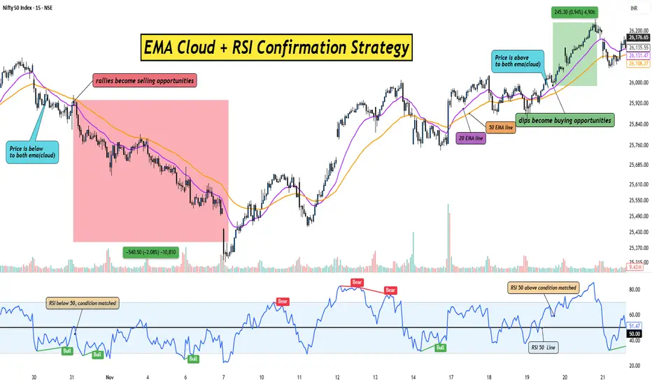
The EMA Cloud+RSI Combo That Traders Are Using to Catch Big MoveHello Traders!
If you struggle with false breakouts and early entries, this simple combination of the EMA Cloud and RSI Confirmation can help you filter noise and catch cleaner trend moves.
This setup works for Stocks, crypto, indices, forex, any market where trends matter.
Let’s break it down in the simplest way possible.
1. What Is the EMA Cloud?
The EMA Cloud is a zone created using two EMAs, commonly the 20 EMA and 50 EMA.
When price stays above the cloud, the trend is bullish and dips become buying opportunities.
When price stays below the cloud, the trend is bearish and rallies become selling opportunities.
The cloud visually shows where momentum is strong versus where price is losing strength.
2. Why Add RSI Confirmation?
RSI helps you avoid chasing overextended moves.
You only take a trade when RSI aligns with the cloud direction, giving you confirmation.
This reduces false entries and improves accuracy.
EMA Cloud gives the trend.
RSI gives the green signal to enter.
3. Entry Rules:– Simple and Clear
For Longs:
Price must stay above the EMA Cloud.
RSI should be above 50 to confirm bullish momentum.
Enter on a small pullback into the cloud or after a breakout candle closes above it.
For Shorts:
Price must stay below the EMA Cloud.
RSI should be below 50 for bearish confirmation.
Enter on a pullback toward the cloud or a breakdown candle.
This combination prevents you from buying too early or selling too late.
4. Exit Strategy:– Keep It Clean
Exit when price closes inside the EMA Cloud against your direction.
Aggressive traders can exit when RSI crosses back below 50 (for longs) or above 50 (for shorts).
Always trail your stop loss below the cloud to lock in gains.
The cloud helps you ride the trend longer with less stress.
5. Why This Strategy Works So Well
EMA Cloud filters the market trend.
RSI filters the momentum.
Together, they eliminate 70% of noise and give you only the smoothest trend trades.
It’s simple, visual, and beginner-friendly, yet powerful enough for advanced traders.
Rahul’s Tip:
Don’t rush entries just because the market is moving fast.
Wait for cloud direction + RSI confirmation, this patience alone can double your accuracy.
Conclusion:
The EMA Cloud + RSI Confirmation Strategy is a clean, reliable way to follow trends without second-guessing.
It removes emotional entries, filters noise, and gives you structured trade opportunities.
Use it consistently, and you’ll notice how much clearer your charts feel, and how much calmer your decision-making becomes.
If this post helped you understand a simple yet effective trend strategy, like it, comment your thoughts, and follow for more practical trading setups!
Gold Breaks Trendline – Bulls Back in Control!Hello Everyone let's analyse Gold as it has broken above its falling trendline resistance, signaling a possible shift from short-term weakness to bullish momentum. After several attempts, the price finally managed to close above the trendline with increasing volume, showing that buyers are stepping in again.
Currently, Gold is retesting the previous resistance turned support zone around $4200–$4205. As long as price holds above this level, the structure remains positive, and the next upside targets could be seen toward $4260–$4270.
Short-term traders can look for confirmation candles near support before entering. A clean retest followed by bullish continuation can offer a good risk–reward setup. On the other hand, if the price breaks back below $4190, momentum could slow down again.
Disclaimer: This analysis is for educational purposes only and should not be taken as financial advice. Please do your own research or consult your financial advisor before investing.
Analysis By @TraderRahulPal | More analysis & educational content on my profile.
If you found this helpful, don’t forget to like and follow for regular updates.
How to Identify Multibagger Stocks Using Fundamentals?Hello Traders!
Many people look for multibagger stocks, but only a few understand how to find them. A real multibagger comes from a strong business, not luck. Here are simple fundamentals that help you identify a stock with long-term growth potential.
1. Look for Steady Revenue Growth
A multibagger company grows its sales every year.
Check at least 5 years of consistent growth.
If sales keep increasing, the business is moving in the right direction.
2. Look for Rising Profits and Better Margins
Profit should grow faster than sales.
Higher margins show the company is becoming stronger.
A profitable company can grow without stress.
3. Choose Low-Debt Companies
High debt is a danger sign.
A company with low or zero debt is more stable.
Low debt means less risk during tough times.
4. Check If the Company Has a Strong Advantage
A multibagger usually has something special compared to others.
This can be brand power, technology, low cost, or unique products.
A strong advantage helps the company stay ahead.
5. Study the Management
Good leaders build strong companies.
Look at their track record and decisions.
Honest and stable management is a positive sign.
6. Make Sure the Industry Has Growth
Even a good company cannot grow in a dead industry.
Choose businesses in fast-growing sectors.
Industry growth supports stock growth.
7. Enter at a Fair Price
Even the best company is risky if bought too high.
Compare the valuation with industry averages.
A good business at a fair price becomes a powerful long-term winner.
8. Check Promoter Holding
High promoter holding shows confidence.
Avoid companies where promoters have pledged shares.
When promoters believe in the company, it’s a strong signal.
9. Watch Return Ratios (ROE, ROCE)
A good multibagger maintains ROE and ROCE above 15 percent.
High return ratios mean the company uses money wisely.
These ratios should be steady or rising.
10. Think Long Term
Multibaggers take time to grow.
Focus on the business, not daily price moves.
Long-term thinking builds real wealth.
Rahul’s Tip:
Multibaggers are found through simple research, not hype. Look for strong fundamentals, good management, and fair value. Then hold with patience.
Conclusion:
Finding a multibagger is all about understanding the business. Choose companies that grow steadily, stay financially strong, and have a clear future. With patience and discipline, wealth will follow.
Gold (XAUUSD)15-Min Chart Update | Support Zone Holding StronglyHello guys, Gold continues to respect its rising channel structure, moving between the rising support and resistance trendlines. After a minor correction, the price has once again bounced from the rising support trendline, showing strong buying interest near the lower boundary of the channel.
This area around $4145–$4150 is acting as a short-term support zone, and as long as price stays above it, the bias remains bullish. A continuation of this move could push Gold higher toward the upper channel resistance near $4180–$4185.
On the other hand, a clear breakdown below this support zone may trigger a quick pullback toward $4130–$4120, where fresh buying could appear again. Overall, the structure remains positive, and buyers are defending the support well.
Disclaimer: This analysis is for educational purposes only and should not be taken as financial advice. Please do your own research or consult your financial advisor before investing.
Analysis By @TraderRahulPal | More analysis & educational content on my profile.
If you found this helpful, don’t forget to like and follow for regular updates.

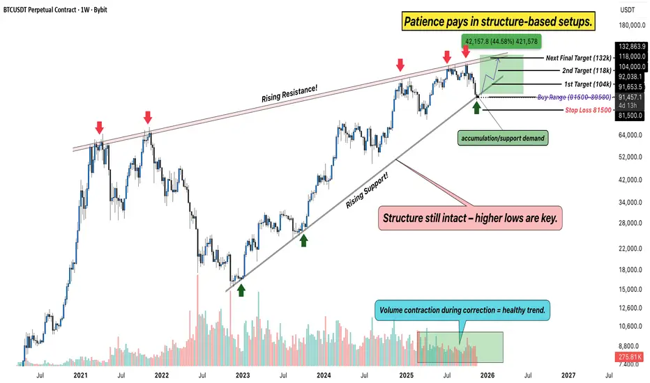
Bitcoin Weekly Chart – Structure Still Intact, Patience is PowerHello Everyone, i hope you all doing good, Lets discuss about bitcoin. After weeks of consolidation and volatility, Bitcoin is back at its rising support zone, where strong hands usually step in. The structure on the weekly chart continues to hold higher lows, a clear sign that the broader trend remains bullish despite short-term pullbacks.
Technical View
Rising Channel: BTC continues to move within a rising channel, with clear reactions from both support and resistance levels. The current price is testing the buy range between 81,600–89,500, an area that has historically acted as a high-probability reversal zone.
Resistance Levels: Key upside levels to watch are 104K, 118K, and the final target zone near 132K, the same rising resistance that rejected price multiple times in past cycles.
Support: As long as BTC stays above 81,500, the structure remains valid. A weekly close below this zone would invalidate the bullish bias.
Volume Behavior: Notice how each correction comes with lower volume, a healthy sign of accumulation, not distribution.
Big Picture
This phase often shakes out emotional traders while rewarding the ones who trust structure and time. If Bitcoin holds this zone and begins to bounce, it could mark the start of the next major wave, potentially aiming for a new cycle high in the coming months.
Rahul’s Insight: Big moves don’t start with hype, they start with quiet structure and strong conviction. The crowd reacts; the disciplined trader prepares.
Analysis By @TraderRahulPal | More analysis & educational content on my profile.
Gold 30-Min Chart: Sellers Active Near Resistance!Gold is once again testing its falling resistance trendline, which has already rejected the price several times in recent sessions. Each time the price touches this trendline, selling pressure increases, showing how strong this resistance zone is.
Currently, the price is near $4070–$4080, where short-term traders should stay alert. If the price fails to break above this resistance, a pullback toward the $4000–$3980 support zone looks likely. This area has previously acted as a strong demand zone, where buyers may re-enter.
However, if Gold breaks and sustains above this trendline resistance, we could see a fresh upside momentum building up toward $4115–$4135 levels. For now, the structure looks weak near resistance, and traders should wait for a clear breakout or rejection confirmation before taking any position.
Disclaimer: This analysis is for educational purposes only and should not be taken as financial advice. Please do your own research or consult your financial advisor before investing.
Analysis By @TraderRahulPal | More analysis & educational content on my profile.
If you found this helpful, don’t forget to like and follow for regular updates.

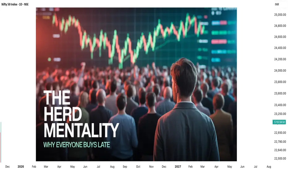
The Herd Mentality – Why Everyone Buys When It’s Too Late?Hello Traders!
You’ve seen it a hundred times, the market rallies, social media explodes, and suddenly everyone starts buying.
Then, just when retail traders feel “safe” entering, the price crashes.
It’s not bad luck, it’s herd mentality .
And unless you understand how it works, you’ll keep following the crowd straight into losses.
1. What is Herd Mentality in Trading?
Herd mentality is the instinct to do what everyone else is doing, buying when others buy, selling when others sell.
It’s rooted in human psychology, our brains feel safer when we’re part of a group.
In trading, this instinct is deadly because the crowd always reacts late.
When you feel comfortable entering a trade, it’s usually because the market has already moved.
2. The Cycle of Fear and Greed
Every bull run begins with a few smart traders who buy quietly when no one’s interested.
As prices rise, social media hype builds, the crowd starts joining in.
Then, when “everyone” is talking about the coin, smart money exits, leaving the herd trapped at the top.
The same happens in bear markets, panic selling at bottoms while professionals buy patiently.
It’s not about intelligence, it’s about emotion.
3. How the Market Exploits the Crowd
Institutions and big traders understand herd behavior better than anyone.
They create liquidity by pushing prices to levels where retail traders feel emotionally forced to act.
The market uses human nature, fear and greed, as its fuel.
The crowd provides the liquidity, and professionals use that liquidity to enter or exit quietly.
4. How to Avoid Becoming Part of the Herd
Develop your own plan, if your entry depends on others’ excitement, it’s not your setup.
Buy when the market feels uncomfortable; sell when everyone feels confident.
Learn to think independently. The best trades usually feel the hardest to take.
Patience and conviction are your weapons against the herd.
5. The Truth Most Traders Don’t Want to Hear
If you wait for social proof to feel confident, you’ll always be late.
By the time the crowd “believes,” the move is already priced in.
You don’t get rich by following others, you get rich by understanding why others behave the way they do.
Rahul’s Tip:
The market doesn’t punish retail traders because they lack knowledge, it punishes them because they act emotionally together.
Train your mind to do what’s uncomfortable, not what’s popular. That’s where the profit hides.
Conclusion:
The herd mentality is the silent killer of most portfolios.
The more people talk about an asset, the less opportunity it holds.
Smart traders buy silence and sell noise.
Once you learn to think independently, you’ll stop being the liquidity, and start trading like the ones who create it.
If this post opened your eyes to herd psychology, like it, share your view in comments, and follow for more deep market insights!
Bitcoin – Buying the Trendline, Not the HypeBitcoin (BTCUSD) continues to respect its rising trendline structure , showing consistent demand on every retest. This type of price action often reveals where smart money is quietly adding positions, not chasing, but accumulating near support.
Each of the highlighted points shows how price has respected this trendline multiple times, forming a clean series of higher lows. As long as this level holds, the broader direction remains bullish.
Currently, BTC is testing this key support once again. I’m positioning near the trendline because the risk is clearly defined , and the potential reward toward 111K+ remains wide open.
Short-term volatility can still appear, but structure beats emotions . As long as buyers defend this zone, we may see another impulsive leg forming soon.
Disclaimer: This analysis is for educational purposes only. It’s not investment advice. Always do your own research before trading.

Don’t Miss This Rare MCX Setup Breakout + Retest= Big Move AheadHello Traders!
Today’s analysis is on MCX Ltd., where we just spotted a powerful Descending Triangle Breakout . After weeks of consolidation, the price has finally broken the falling resistance and even retested the breakout zone. This setup often leads to a strong trending move.
Why this setup is special?
Price respected support multiple times, showing heavy demand from lower levels.
Breakout + Retest makes it one of the most reliable continuation patterns.
Risk–Reward is highly favorable for both short-term and positional traders.
Levels to Track:
Currently, the best accumulation zone lies between 8000–8155 , which gives a low-risk entry point. On the upside, the immediate short-term target is around 8446 , while the medium-term level aligns with the previous ATH near 9115 . If momentum sustains, the stock even has potential to reach the positional target of 9774 . For risk management, traders can keep a short to medium-term stop loss at 7788 , while positional traders may consider a wider SL at 7522 .
Rahul’s Tip:
Such breakouts don’t come often. Once the retest is done, the real rally usually begins. Traders who wait too long often end up chasing the move at much higher prices.
If you want to catch these setups before they take off, make sure you follow closely — (Analysis By @TraderRahulPal, TradingView Moderator). More analysis & educational content is shared regularly on my profile. Sometimes one breakout can change your trading month completely. If this helped you, don’t forget to like and follow for regular updates.
Disclaimer:
This analysis is for educational purposes only and should not be taken as financial advice. Please do your own research or consult your financial advisor before investing.
