PROTECTED SOURCE SCRIPT
Hikaru's FV Comparison
Hikaru's FV Comparison allows you to compare any two assets using Hikaru Bands. This indicator shows where your comparison asset sits within its own bands while you're viewing another chart. Perfect for spotting divergences between correlated markets - see if SPX is overbought while BTC isn't, or check if ETH and SOL are aligned in their band positions.
The orange line (customizable color) represents the comparison asset's relative position mapped to your current chart's Hikaru Bands. When the comparison asset touches its lower extreme band, the line appears at your chart's lower extreme. When it's overbought, the line moves to the corresponding overbought zone on your chart.
█ FEATURES
Comparison Symbol Selection
• Choose any symbol to compare against your current chart (default: CRYPTO:ETHUSD)
• Works with stocks, crypto, forex, indices, or any TradingView symbol
• Confirmation dialog on first load to select your comparison asset
Visual Clarity
• Customizable comparison line color (default: orange) for easy visibility
• Grey line indicates periods with no data available for the comparison symbol
• Single clean line overlay - no clutter, just the essential information
Full Hikaru Bands Customization
All original Hikaru Bands features are included:
• 10 component indicators: EMA Spread, CCI, BB%, Crosby Ratio, Sharpe Ratio, ROC, Z-Score, PGO, RSI, and Omega Ratio
• Multiple color schemes: Extremes, VAMS Style, Copper, Ocean, Washed Out, Neon, Warm, Cool
• Adjustable normalization lookback, basis length, band multiplier, and smoothing
█ HOW TO USE
Setting Up
1 — Add the indicator to your chart. A dialog will prompt you to select a comparison symbol.
2 — Choose the asset you want to compare (e.g., TVC:SPX to compare with the S&P 500).
3 — Adjust the comparison line color in the Style settings if needed (it's at the top for easy access).
Interpreting the Comparison Line
• When the line is near your chart's upper bands: The comparison asset is in its overbought zone
• When the line is near your chart's lower bands: The comparison asset is in its oversold zone
• When the line is near the middle basis: The comparison asset is trading near its equilibrium
• Grey line: No historical data available for the comparison asset during that period
Trading Applications
• Divergence Detection: Spot when correlated assets are moving in opposite band directions
• Correlation Confirmation: Verify that related markets are showing similar strength or weakness
• Leading Indicators: Watch for one asset reaching extremes before the other follows
• Risk Assessment: Check if macro indices like SPX are overbought when considering crypto longs
█ EXAMPLES
ETH vs SOL
Compare Ethereum against Solana to see if they're aligned. If ETH is at its lower bands but SOL shows (via the comparison line) at its upper bands, this divergence might indicate a rotation between the two assets.
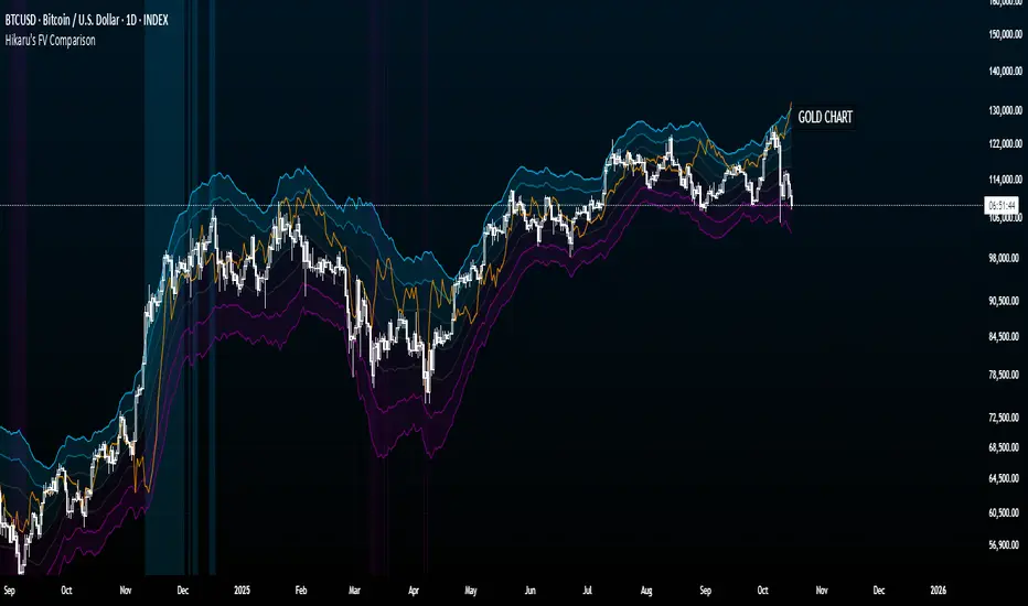
Crypto vs GOLD
Compare your crypto chart against TVC:GOLD (GOLD Index) to see money flow correlations.
█ DISCLAIMER
This tool is designed for technical analysis and should not be used as a standalone signal for trading.
Protected script
This script is published as closed-source. However, you can use it freely and without any limitations – learn more here.
Disclaimer
The information and publications are not meant to be, and do not constitute, financial, investment, trading, or other types of advice or recommendations supplied or endorsed by TradingView. Read more in the Terms of Use.