XAMD - cycles shows a table of active amd phases saves the trouble of having to look through htfs and you just see a table of them allPine Script® indicatorby xxcizzUpdated 20
cd_bias_profile_Cxcd_bias_profile Cx Overview: cd_bias_profile_Cx is an all-in-one professional analysis terminal designed to determine market direction (Bias) based on institutional trading strategies (SMC & ICT). This tool integrates multi-timeframe (MTF) data, institutional liquidity sweeps, SMT divergences, and candle closure confirmations into a single cohesive structure, providing traders with a comprehensive map of institutional Order Flow. 🚀 Advanced Hierarchical Profile Architecture The indicator visualizes the market through a three-layered hierarchy (Major, Middle, Plot), allowing you to see exactly which higher-tier structure the current price action is serving. • Smart Timeframe (Auto-TF) Logic: In "Auto" mode, the system automatically selects the most logical hierarchy based on your chart interval using the following sequence: . o Example Scenario: If your chart is set to 5-Minute (5m): Major (Macro Structure): H4 (The outermost container candle) Middle (Intermediate Structure): H1 (Mid-scale candle) Plot (Local Structure): 15m (The smallest nested high-timeframe candle) • Nested Candle Design: Each high-timeframe candle is rendered as transparent boxes with specific body colors, encapsulating the lower-tier price action (OHLC) within it. • Cyclical Refresh: Profile drawings reset automatically at the opening of every new Major timeframe candle. This ensures the analysis remains focused on the freshest institutional cycle. 🧠 Bias Algorithm & Decision Mechanism To eliminate subjective interpretation, the algorithm operates on a purely mathematical logic based solely on Candle Closures (Close). It generates three distinct outcomes: 1. Reversal: o Condition 1: A liquidity Sweep must occur at the HTF level. o Condition 2 (SMT Confirmation): If no sweep is detected on the primary pair, the algorithm automatically scans correlated assets (e.g., checking GBPUSD or DXY for an EURUSD trade). An SMT Divergence in a correlated asset is accepted as institutional manipulation confirmation. o Final Trigger: Once a CISD (Change in State of Delivery) occurs on the Lower Timeframe (LTF), the "Reversal" bias is confirmed. 2. Continuation: When a high-timeframe candle closes convincingly above/below the previous candle's High or Low, the algorithm reports that the current trend maintains its strength. 3. Indeterminate: In "non-delivery" zones where the market neither sweeps liquidity nor creates a structural break, the algorithm remains neutral to prevent overtrading. 🚨 Alert Center The alert system is designed for high-confluence setups, ensuring you never miss a structural shift: • Flexible TF Selection: You can manually toggle which of the 5 tracked timeframes (1M, 1W, 1D, etc.) should trigger notifications based on your strategy. • "Any of Them" Function: When enabled, an instant notification is sent the moment a "Reversal" or "Continuation" signal forms on any of your selected timeframes. • Directional Filtering: You can filter alerts to receive only "Bullish" or only "Bearish" setups, allowing you to align with your primary macro bias. ⚙️ Pro Tips for Usage • Invalidation Lines: The dashed lines on the chart indicate the exact price level where the institutional bias is "invalidated." These serve as professional-grade stop-loss levels. • B-ADJ Support: For Futures traders, back-adjustment settings are optimized within the code for seamless data transition. • Manual Mode: If you wish to use custom timeframes not found in the standard sequence (e.g., 2-hour or 3-day charts), you can define them via the "Manuel" settings toggle. • High-probability trade setups can be expected when there is multi-timeframe alignment in the same direction. • Strategic Use Cases: The indicator is optimized for trading Distribution Phases within advanced frameworks. Whether you are looking for the C3 candle in the Universal Model or the Distribution (D) phase in an AMD (Power of 3) setup, this tool provides the necessary structural confirmation. • User Discretion: Please note that this is a directional bias tool. While it identifies which direction is supported by multi-timeframe alignment, the final execution and entry management on lower timeframes are the user's responsibility. • Always remember to seek additional confluence before executing a trade. Chart Visual Profile Visual Example (SMT Usage) : On the chart, while the 10:00 H1 candle on GBPUSD sweeps its previous candle's liquidity, its correlated pair EURUSD does not show a sweep. If the "Use SMT for Bias" option is enabled, this SMT divergence with the correlated pair is accepted as a valid HTF Sweep. Upon the new candle open, once a 5m CISD confirmation occurs on EURUSD, the Bias Table will display "Bearish" for the H1/5m row. Entry examples: Please feel free to share your feedback and suggestions in the comments below. Happy trading! Pine Script® indicatorby cdikici71Updated 5252 2 K
cd_Quarterly_cycles_SSMT_TPD_CxGeneral This indicator is designed in line with the Quarterly Theory to display each cycle on the chart, either boxed and/or in candlestick form. Additionally, it performs inter-cycle divergence analysis ( SSMT ) with the correlated symbol, Terminus Price Divergence ( TPD ), Precision Swing Point ( PSP ) analysis, and potential Power of Three ( PO3 ) analysis. Special thanks to @HandlesHandled for his great indicator, which I used while preparing the cycles content. Details & Usage: Optional cycles available: Weekly, Daily, 90m, and Micro cycles. Displaying/removing cycles can be controlled from the menu (cycles / candles / labels). All selected cycles can be shown, or you can limit the number of displayed cycles (min: 2, max: 4). The summary table can be toggled on/off and repositioned. What’s in the summary table? • Below the header, the correlated symbol used in the analysis is displayed (e.g., SSMT → US500). • If available, live and previous bar results of the SSMT analysis are shown. • Under the PSP & TPD section, results are displayed when conditions are met. • Under Alerts, the real-time status of conditions defined in the menu is shown. • Under Potential AMD, possible PO3 analysis results are displayed. Analysis & Symbol Selection: To run analyses, a correlated symbol must first be defined with the main symbol. Default pairs are preloaded (see below), but users should adjust them according to their exchange and instruments. If no correlated pair is defined, cycles are displayed only as boxes/candles. Once defined pairs are opened on the chart, analyses load automatically. Pairs listed on the same row in the menu are automatically linked, so no need to re-enter them across rows. SSMT Analysis: Based on the chart’s timeframe, divergences are searched across Weekly, Daily, 90m, and Micro cycles. The code will not produce results for smaller cycles than the current timeframe. (Example: On H1, Micro cycles will not be displayed.) Results are obtained by comparing the highs and lows of consecutive cycles in the same period. If one pair makes a new high/low while the other does not, this divergence is added to SSMT results. The difference from classic SMT is that cycles are used instead of bars. PSP & TPD Analysis: A correlated symbol must be defined. For PSP, timeframe options are added to the menu. Users toggle timeframes on/off by checking/unchecking boxes. In selected timeframes, PSP & TPD analysis is performed. • PSP: If candlesticks differ in color (bullish/bearish) between symbols and the bar is at a high/low of the timeframe (and higher/lower than the bars before/after it), it is identified as a PSP. Divergences between pairs are interpreted as potential reversal signals. • TPD: Once a PSP occurs, the closing price of the previous bar and the opening price of the next bar are compared. If one symbol shows continuation while the other does not, it is marked as a divergence. Example: Let’s assume Pair 1 and Pair 2 are selected in the menu with the H4 timeframe, and our cycle is Weekly (Box). For Pair 1, the H4 candle at the Weekly high level: • Is positioned at the Weekly high, • Its high is above both the previous and the next candle, • It closed bearish (open > close). For Pair 2, the same H4 candle closed bullish (close > open). → PSP conditions are met. For TPD, we now check the candles before and after this PSP (H4) candle on both pairs. Comparing the previous candle’s close with the next candle’s open, we see that: • In Pair 1, the next open is lower than the previous close, • In Pair 2, the next open is higher than the previous close. Pair 1 → close > open Pair 2 → close < open Since they are not aligned in the same direction, this is interpreted as a divergence — a potential reversal signal. While TPD results are displayed in the summary table, whenever the conditions are met in the selected timeframes, the signals are also plotted directly on the chart. (🚦, X) • Higher timeframe TPD example: • Current timeframe TPD example: Alerts: The indicator can be conditioned based on aligned timeframes defined within the concept. Example (assuming random active rows in the screenshot): • Weekly Bullish SSMT → Tf2 (menu-selected) Bullish TPD → Daily Bullish SSMT. Selecting “none” in the menu means that condition is not required. When an alert is triggered, it will be displayed in the corresponding row of the table. • Example with only condition 3 enabled: Potential PO3 Analysis: According to Quarterly Theory, price moves in cycles, and the same structures are assumed to continue in smaller timeframes. From classical PO3 knowledge: before the main move, price first manipulates in the opposite direction to trap buyers/sellers, then makes its true move. The cyclical sequence is: (A)ccumulation → (M)anipulation → (D)istribution → (R)eversal / Continuation. Within cycle candles, the first letter of each phase is displayed. So how does the analysis work? If the active cycle is in (M)anipulation or (D)istribution phase, and it sweeps the previous cycle’s high or low but then pulls back inside, this is flagged in the summary table as a possible PO3 signal. In other words, it reflects the alignment of theoretical sequence with real-time price action. Confluence with SSMT and TPD conditions further strengthens the expectation. Final Note: No single marking or alert carries meaning on its own — it must always be evaluated in the context of your concept knowledge. Instead of trading purely on expectations, align bias + trend + entry confirmations to improve your success rate. Feedback and suggestions are welcome. Happy trading! Pine Script® indicatorby cdikici71Updated 7777 1.8 K
B A N K $ - HTF Candle Boxes (Power of 3)This indicator allows you to visualise the HTF candles on the LTF's, this is useful for using the Power of 3 / Accumulation, Manipulation & Distribution concepts. By default, the HTF interval is set to 1h, this means that an outline will be created around the LTF candles that are within that 1h window. (i.e from 13:00-14:00 etc). Features HTF Interval Selector - this allows the user to customise which HTF interval to use Candle Boxes - this outlines the full outer perimeter of the relevant candles Include Body - this highlights the distance between the candle Open & Close Show MidLine Additional Settings Hide Side Lines - this will only draw the Top & Bottom lines Extend Lines to Current Candle - most recent Top & Bottom lines will extend to current price Draw Lines from Exact Candle - this makes the most recent candle lines cleaner I personally use this indicator to outline the most recent 3 1h candles to make it easier to identify sweeps & reversals however there is additional functionality to allow the user to customise the indicator to their preference.Pine Script® indicatorby wintonbanks188
Candle Range Trading (CRT) with Alerts 📌 Description: The Candle Range Trading (CRT) indicator identifies potential reversal or continuation setups based on specific two-candle price action patterns. It analyzes pairs of candles to detect Bullish or Bearish CRT patterns and provides visual signals (triangles) and alert notifications to support scalp or swing trading strategies. 🔍 How It Works: 🔻 Bearish CRT Pattern: Candle 1 is bullish Candle 2 is bearish Candle 2's high > Candle 1's high Candle 2 closes within Candle 1’s range 🔺 Red triangle above candle 🔺 Bullish CRT Pattern: Candle 1 is bearish Candle 2 is bullish Candle 2's low < Candle 1's low Candle 2 closes within Candle 1’s range 🔻 Green triangle below candle 📈 Visual Features: 🔺 Red triangle = Bearish CRT 🔻 Green triangle = Bullish CRT 📏 Optional box showing CRT High and CRT Low 🔔 Built-in Alerts: Bullish CRT Alert: "Bullish CRT Pattern Detected" Bearish CRT Alert: "Bearish CRT Pattern Detected" Set alerts to get notified instantly when a pattern is detected. ⚠️ Note: Use in conjunction with trend filters, support/resistance, or volume for best results. Ideal for scalping or short-term trades. Avoid trading in choppy or low-volume markets. ⚠️ Disclaimer: This script was generated with the assistance of ChatGPT by OpenAI and is intended for educational and informational purposes only. All strategies, alerts, and signals derived from this indicator should be thoroughly backtested and validated before using in live trading. Trading involves substantial risk, and past performance is not indicative of future results. The author and ChatGPT bear no responsibility for any trading losses or financial decisions made using this script. Users are solely responsible for the risks associated with their trading actions. Always apply proper risk management and perform your own due diligence before making any financial decisions. Pine Script® indicatorby marcostan9333 1.7 K
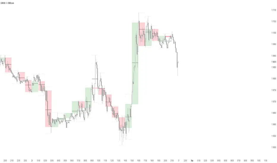
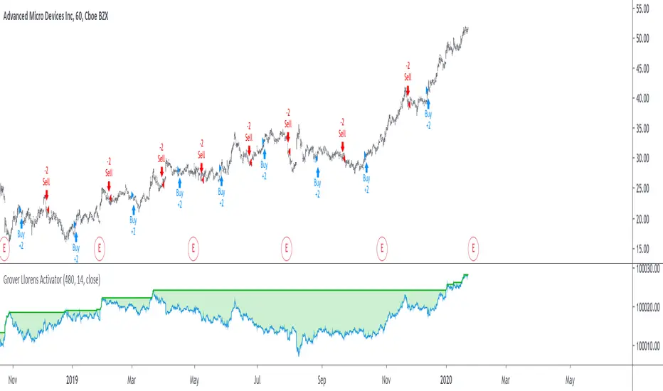
Grover Llorens Activator Strategy AnalysisThe Grover Llorens Activator is a trailing stop indicator deeply inspired by the parabolic SAR indicator, and aim to provide early exit points and reversal detection. The indicator was posted not so long ago, you can find it here : Today a strategy using the indicator is proposed, and its profitability is analyzed on 3 different markets with the main time frame being 1 hour, remember that lower time frames involve lower absolute price changes, therefore we are way more affected by the spread, and we can require a larger position sizing depending on our investment target, trading higher time-frames is always a good practice and this is why 1 hour is selected. Based on the result we might make various conclusions regarding the indicator accuracy and might have ideas on future improvements of the indicator. I'am not great when it comes to strategy design, i still hope to share correct and useful information in this post, let me know your thoughts on the post format and if i should make more of these. Setup And Rules The analysis is solely based on the indicator signals, money management isn't taken into account, this allow us to have an idea on the indicator robustness and resilience, particularly on extremely volatile markets and ones exhibiting a chaotic structure, altho it is normally good practice to close any position before a market closure in order to avoid any potential major gaps. The settings used are 480 for length and 14 for mult, this create relatively mid term signals that are suited for a trend indicator such as the Grover Llorens Activator, unfortunately we can't infer the indicator optimal settings, thats how it is with any technical indicator anyway. Here are the rules of our strategy : long : closing price cross over the indicator short : closing price cross under the indicator We use constant position sizing, once a signal is triggered all the previous positions are closed. Description Of The Statistics Used Various statistics are presented in this post, here is a brief description of the main ones : Percent Profitability (higher = better): Percentage of winning trades, that is : winning trades/total number of trades × 100 Maximum Drawdown (lower = better) : The highest difference between a peak and a valley in the balance, that is : peak - valley , in percentage : (peak - valley)/peak × 100 Profit Factor (higher = better) : Gross profit divided by gross loss, values under 1 represent gross losses superior to the gross profits Remember that more volatility = more risk, since higher absolute price changes can logically cause larger losses. EURUSD The first market analyzed is the Forex market with the EURUSD major pair with a position sizing of 1000 units (1 micro lot). Since October EURUSD is not showing any particular strong trend but posses a discrete rising motion, fortunately cycles can be observed. The equity was rising until two trades appeared causing a decline in the equity. Before October a bearish market could be observed. We can see that the equity is rising, the trend still posses various retracements that affect our indicator, however we can see that the indicator totally nail the end of the trend, thats the power of converging toward the price. In short : $ 86.63 net profit 340 closed trades 37.65 % profitable (thats a lot of loosing trades) 1.19 profit factor $ 76.67 max drawdown Applying a spread would create negative results (in general the average spread is used), not a great start... BTCUSD The cryptocurrency market is relatively more volatile than others, which also mean potentially higher returns, we test the indicator using certainly the most traded cryptocurrency, BTCUSD. We will use a position sizing of 1 unit. In the case of BTCUSD the strategy balance is relatively stationary around the initial capital, with of course high dispersion. from september to december the market is bearish with various ranging periods, no apparent cycles can be observed, except maybe in the ranging period of october, this ranging period is followed by a non linear trend (relatively parabolic) that the indicator failed to capture in its integrity (this is a recurrent problem and it is starting to piss me off xD). In short : $ 2010.64 net profit (aka how i bet the crypto market) 395 closed trades 38.23 % profitable 1.036 profit factor $ 5738.01 max drawdown (aka how i lost to the crypto market) AMD AMD stand for Advanced Micro Devices and is a company focused on the development of computer technology, i love the microprocessor market and i really like AMD who start this year in a pretty great way with a net bullish trend. The performance of the indicator on AMD is decent (at last !) with the equity producing many new higher highs. The indicator performance still drop in the middle end of 2019 with a large equity drawdown of 17$ caused by the gap of august 8. Unfortunately AMD, like lot of well behaving stocks can only tells us that the indicator has good performances on heavily trending markets with no excess of noise or chaotic structures. In short : $ 17.86 net profit (Enough for a consistent lunch) 295 closed trades 36.27 % profitable 1.414 profit factor $ 10.37 max drawdown. Conclusion A strategy using the recently proposed Grover Llorens activator has been presented. We can easily conclude that the indicator can't possibly generate long term returns under chaotic and volatile markets, and could even produce unnecessary trades in trending markets without much parasitic fluctuations such as noise and retracements (think about a simple linear trend) since the indicator converge toward the price and would therefore automatically cross over/under the trend, thus guaranteeing a false signal. However we have seen its ability to provide accurate early reversal detection shine from time to time, thus over performing lagging indicators in this aspect, however the duration of price fluctuations isn't fixed at a certain period, the rate of convergence should be way faster during volatile fluctuations, of moderate speed during more cyclic fluctuations, and really slow with apparent long term trends, this could be achieved by making the indicator adaptive, but it won't really make it necessarily perform better. That said i still believe that converging trend indicators are really interesting and aim to capture the non lasting behavior of price fluctuations, they shouldn't receive so much hate (think about the poor p-sar). Thanks for reading ! Pine Script® strategyby alexgrover2020 1 K