Multi-Sigma Bands [fmb]Multi-Sigma Bands plots standard deviation (sigma) bands around a selectable basis (SMA, EMA, RMA, or Linear Regression). It’s designed to help you spot when price is behaving “normally” versus when it’s stretching into statistically extended territory.
What it shows
- Basis: the central reference line (your chosen basis type)
- ±1σ zone: the common range where price spends much of its time
- ±2σ zone: extended range where moves often become more emotional or trend-driven
- ±3σ zone: extreme range where price is statistically stretched (risk increases)
How to read it
- Inside ±1σ
- Often normal behaviour and mean-reverting price action around the basis.
- Between ±1σ and ±2σ
- A meaningful extension. In trends, price can “walk” these areas for longer than expected.
- Between ±2σ and ±3σ
- Rare extension. Can signal exhaustion, blow-off behaviour, or capitulation depending on direction and context.
How traders typically use it
- Trend context
- In strong uptrends, price may ride the upper bands (+1σ to +2σ) repeatedly.
- In strong downtrends, the lower bands (-1σ to -2σ) can act the same way.
- Bands show statistical stretch, not automatic reversal signals.
- Extension and risk framing
- The farther price is from the basis, the more “stretched” it is.
- That usually means chasing becomes riskier and entries require tighter confirmation.
- Range behaviour
- Ranges often oscillate around the basis, with frequent returns toward the middle zone.
Settings
- Source: what price series to use (Close by default)
- Length: lookback used for both basis and standard deviation
- Basis: SMA, EMA, RMA, or LinReg
- Stdev smoothing: optional smoothing on standard deviation for cleaner bands
- σ multipliers: customise σ1, σ2, σ3 (defaults: 1, 2, 3)
- Force Monthly Data (optional): calculate bands using a higher-timeframe source to reduce noise and focus on macro structure
Disclaimer
This indicator is for informational and educational purposes only and is not financial advice. Always use risk management and confirm with market structure and trend context.
Bands

VWAP Tension Bands + Osc Sigma Gap [MAXmks]Hello Traders,
This indicator started as an accident. I was building a different tool — a multi-metric dashboard — and added VWAP deviation as one of the components. I expected it to help catch falling knives. It didn't.
But I noticed something else. During cooling-off periods — when volatility fades and price just sits there, not really going anywhere — VWAP deviation on lower timeframes would start climbing quietly. And more often than not, a pullback followed. Sometimes a liquidity sweep first, then a pullback. I watched this pattern for months before deciding to build a dedicated tool around it, adding oscillator confirmation to filter the noise.
This is that tool.
The core idea
Markets act like a rubber band around VWAP — the further price stretches, the higher the tension. But raw deviation isn't enough. The real question: is momentum confirming the stretch, or lagging behind?
The σ-Gap captures when these two disagree — price pushed hard, but internals haven't caught up. That's where mean-reversion setups tend to appear.
The indicator tracks VWAP deviation across 2m / 5m / 15m simultaneously and compares it against a composite of momentum oscillators (Williams %R, CVD-based metrics). Signals require multi-timeframe consensus — no single timeframe can trigger alone.
Adaptive thresholds
What counts as "extreme" isn't fixed. Distance is measured in standard deviations (σ) , not pips or percentages — so the indicator adapts to volatility automatically. Thresholds scale with regime and historical distribution, adjusting to current market conditions in real time.
Two modes
Standard — adaptive thresholds, more signals. Good for active sessions and exploration.
High Precision — adds divergence confirmation from multiple oscillators (MFI, Delta RSI, CVD Z-Score). Fewer signals, higher selectivity.
Extreme Tension
When σ-Gap exceeds 1.6× the threshold, the indicator can fire without full confirmation. Rare, but these are the "overstretched" moments worth watching.
Filters (so you don't trade ghosts)
RVOL filter blocks signals during low activity. Session close filter avoids entries near VWAP reset. 24h volume filter skips illiquid instruments. Cooldown prevents signal clustering in the same direction.
Best use case
Built for short-term mean-reversion — quick snapback plays on 5m–15m charts where price overextends and reverts within a few candles. The engine is optimized for this rhythm, not for trend-following or swings.
On-chart
Tension Bands show dynamic threshold zones around VWAP. Signals are non-repainting and confirmed on bar close. Compact HUD displays all metrics, filter states, and signal status in real time.
Alerts
Pre-signal alerts when conditions start forming. Confirmed signal alerts with full breakdown: VWAP deviation values, σ-Gap readings, divergences detected, current mode.
Volume matters
This is a VWAP-based indicator. No volume data = no signal. If your instrument shows "No Volume" in the dashboard, switch to a data feed that provides it (crypto spot, futures, stocks with real volume).
A note on expectations
I use this logic in my own research and it has shown useful results for me in my backtesting scenarios. But this is an indicator for analysis , not a magic button. Your execution, fees, slippage, and market regime all matter. Treat signals as context, not commands. DYOR.
Feedback welcome.
For educational and analysis purposes only. Not financial advice.

Universal Adaptive Tracking🙏🏻 Behold, this is UAT (Universal Adaptive Tracker) , with less words imma proceed how it compares with alternatives:
^^ comparison with non-adaptive quadratic regression (purple line), that has higher overshoots, less precision
^^ comparison with JMA and its adaptive gain. JMA’s gain is heavily limited, while UAT’s negative and positive gains are soft-saturated with p-order Möbius transform
This drop is inspired by, dedicated to, and made will all love towards Jurik Research , who retired in October 2k21. When some1 steps out, some1 has to step in, and that time it’s me (again xd). But there’s some history u gotta know:
Some history u gotta know:
In ~2008 dudes from forexfactory reverse engineered Jurik Moving Average
In late 1990s dudes from Jurik Research approximated the best possible adaptive tracking filter for evolution of prices via engineering miracles
Today in 2k26, me I'm gonna present to you the real mathematical objects/entities behind JMA top-edge engineered approximates. You will prolly be even more happy now then all the dem together back then.
Why all this?
When we talk about object tracking stuff, e.g. air defense, drones, missiles, projectiles, prices, etc, it all comes down to adaptive control and (Position & Velocity & Acceleration) aka PVA state space models (the real stuff many of you count as DSP ).
Why? Cuz while position (P) : (mean), or position & velocity (PV) : (linear regression) are stable enough in dem own ways, Position & Velocity & Acceleration (PVA) : (quadratic regression+) require adaptivity do be stable. And real world stuff needs PVA, due to non-linearity for starters.
So that’s why. If your goal is Really smoothing and no lag, u gotta go there. I see a lot of folks are crazy with it and want it, so here is it, for y’all. And good news, this is perfect for your favorite Moving Windows.
How to use it
The upper study:
The final filter (main state): just as you use other fast smoothers, MAs, etc, you know better than me here
You can also turn in volatility bands in script’s style settings, these do not require any adjustments
Finally, you can turn on, in the same place, separate trackers each based on negative and positive volatility exclusively. When both are almost equal, that indicates stability & persistence in markets. May sound like it’s nothing important, but I've never seen anything like it before. Also, if you'd allow your our inner mental gym hero gloriously arise, you can argue that these 2 separate trackers represent 2 fair prices (one for sellers, one for buyers). All better then 1 imaginary fair price for both (forget about it)
The lower study:
The lower study: you can analyze streams of upward of downward volatilities separately. This is incredibly powerful
You can also turn these off and turn on neg & pos intensities, and use them as trend detector, when each or both cross 1.5 (naturally neutral) threshold.
^^ Upper study with expected typical and maximum volatility bands turned On
...
The method explained
What you got in the end is non-linear, adaptive, lighting fast when needed and slow when required price tracking. All built upon real math entities/objects, not a brilliantly engineered approximation of them. No parameters to optimize, data tells it all.
... It all starts from a process model, in our cause this is...
MFPM (Mechanical Feedback Price Model)
Doesn’t make gaussian assumptions like most quant mainstream tech, accepts that innovations are Laplace “at best”, relies in L inf and L0 spaces.
I created this model neither trynna fit non-fitting ARMA / variants, nor trynna be silly assuming that price state evolution and markets are random.
Theory behind it: if no new volume comes, then price evolution would be simply guided by the feedback based on previous trading activity, pushing prices towards the midrange between 2 latest datapoints, being the main force behind so called “pullbacks” and reason why most pullbacks end just a bit past 50% of a move.
This is the Real mechanical feedback based mean reversion, that is always there in the markets no matter what, think of it as a background process that is always there, and fresh new volume deviates prices away from it. Btw, this can also be expressed as AR2 with both phis = 0.5 .
Then I separate positive and negative innovations from this model and process them separately, reflecting the asymmetry between buy and sell forces, smth that most forget. Both of these follow exponential distribution . Each stream has its own memory so here we use recursive operators . We track maximum innovations (differences between real and expected datapoints) with exponentially decaying damping factor, and keep tracking typical innovation, with the same factor.
Then we calculate what’s called in lovely audio engineering as “ crest factor ”, the difference is we don’t do RMS and stuff. But hey again we work with laplace innovations, so we keep things in L0 and L inf spirit. Then we go a couple of steps further, making this crest factor truly relative (resolution agnostic), and then, most importantly, we apply a natural saturation on it based on p-order Möbius transform, but not with arbitrary p and L, but guided by informational limits of the data. These final "intensity" parameters are what we need next to make our object tracking adaptive.
Extended Beta(2, 2) Window
This is imo the main part of this. Looking at tapering windows in DSP and how wavelets are made from derivatives of PDF functions of probability distributions, I figured that why use just one derivative? That made me come up with Universal Moving Average , that combines PDF and CDF of Beta(2, 2) distribution . And that is fine for P (position) tracking model.
Here we need PVA (position & velocity & acceleration). We can realize that everything starts from PDF, and by adding derivatives and anti-derivatives of it as factors of final window weights, we can create smth truly unique, a weightset that is non-arbitrary and naturally provides response alike quadratic regression does, But, naturally smoothed.
Why do I consider this a discovery, a primordial math object? Because x^2 itself and Beta(2, 2) based on it are the only primitives, esp out of all these dozens of DSP tapering windows, that provide you a finite amount of derivatives. You can keep differentiating Hann window until the kingdom f come, while Welch window aka Beta(2, 2) has a natural stopping point, because the 3rd derivative is 0, so we can’t use it. Symmetrically, we do 2 steps up from PDF, getting 1st and second anti-derivatives. What’s lovely, symmetrically, 3rd antiderivative even tho exist, it stops making any sense. 2nd one still makes sense, it’s smth like “potential” of probability distribution, not really discussed in mainstream open access sources.
Finally, the last part is to introduce adaptivity using these intensity exponents we’ve calculated with MFPM. We do 2 separate trackers, one using the negative intensity exponent, another one uses positive intensity exponent.
And at the end, even tho using both together is cool, the final state estimate is calculated simply as the state which intensity has higher.
^^ impulse response of our final kernel with fixed (non adaptive) intensity exponents: 1 (blue) and 2 (red). You see it's all about phase
…
And that’s all folks.
…
Actually no …
Last, not least, is the ability to add additional innovation weight to the kernel:
^^ Weighting by innovations “On”. Provides incredible tracking precision, paid with smoothness. I think this screenshot, showing what happened after the gap, and how the tracker managed to react, explains it all.
...
Live Long and Prosper, all good TradingView
∞

MAD Supertrend [Alpha Extract]A sophisticated SuperTrend implementation that replaces traditional ATR calculations with Mean Absolute Deviation methodology for adaptive volatility measurement and band construction. Utilizing SMA baseline with MAD-based deviation bands and optional adaptive factor adjustments, this indicator delivers institutional-grade trend detection with strength-based filtering and dynamic visual feedback. The system's MAD approach provides superior noise reduction compared to ATR while maintaining responsiveness to genuine volatility changes, combined with momentum-based strength calculations for high-conviction signal generation.
🔶 Advanced MAD-Based Band Construction
Implements Mean Absolute Deviation calculation as volatility proxy, measuring absolute price deviations from mean and smoothing for stable band generation without ATR dependency. The system calculates SMA baseline, computes MAD from configurable lookback period, applies factor multipliers to create upper and lower bands, then implements classic SuperTrend ratcheting logic where bands only adjust when price violates previous levels or calculations warrant updates.
// Core MAD SuperTrend Framework
SMA_Value = ta.sma(src, SMA_Length)
Mean = ta.sma(src, MAD_Length)
Abs_Deviation = abs(src - Mean)
MAD_Value = ta.sma(Abs_Deviation, MAD_Length)
// Band Construction with Ratcheting
Upper_Band = SMA_Value + MAD_Factor * MAD_Value
Lower_Band = SMA_Value - MAD_Factor * MAD_Value
// Ratcheting logic prevents premature band adjustments
🔶 Adaptive Factor Adjustment Engine
Features optional adaptive multiplier system that modulates MAD factor based on normalized MAD magnitude relative to recent extremes, creating bands that automatically expand during high-volatility regimes and contract during consolidation. The system applies min-max normalization to MAD values over configurable lookback, multiplies by adaptation parameter, and adds to base factor for dynamic volatility sensitivity without manual recalibration.
🔶 Momentum-Based Strength Filter
Implements sophisticated strength calculation measuring price momentum relative to baseline divided by volatility-adjusted MAD bands, producing normalized 0-1 strength scores with exponential smoothing. The system calculates distance from SMA baseline, normalizes by MAD-derived band width, and applies configurable minimum threshold requiring sufficient momentum before trend signals activate, filtering weak or choppy market conditions.
🔶 SuperTrend Direction Logic
Utilizes classic SuperTrend methodology adapted for MAD bands where trend direction flips on opposite band violations with state persistence until confirmation. The system tracks whether price closes above upper band (bearish flip to bullish) or below lower band (bullish flip to bearish), maintains directional state until opposing violation occurs, and generates binary +1/-1 trend signals suitable for systematic position management.
🔶 Intelligent Candle Sticking System
Provides advanced line positioning option that anchors SuperTrend line to candle wicks or bodies rather than pure calculation values for enhanced visual clarity. The system supports two modes: Wick (positions at high/low extremes based on trend direction) and Body (constrains line between calculation and candle extremes), creating cleaner chart presentation while maintaining mathematical integrity of underlying signals.
🔶 Dynamic Gradient Visualization Framework
Implements color intensity modulation based on smoothed strength calculations, transitioning from muted to vivid hues as momentum conviction increases. The system applies gradient interpolation using strength ratio, creating visual feedback where strong trending moves display intense colors while weak or consolidating conditions show faded tones across trend line, channel bands, and candle coloring for immediate regime assessment.
🔶 MAD Channel Architecture
Features volatility-adjusted channel bands centered on baseline or candle-stuck line with configurable multiplier for support/resistance visualization. The system calculates upper and lower bounds using MAD values scaled by adaptive factors and channel multipliers, applies dynamic transparency based on trend strength, and creates filled regions that intensify during strong trends and fade during weak conditions.
🔶 Multi-Layer Glow Effect System
Provides sophisticated line rendering with triple-layer plot system creating glow effect through progressively wider and more transparent outer layers. The system plots core trend line at specified width with full color intensity, adds inner glow layer at +2 width with moderate transparency, and outer glow at +4 width with higher transparency, creating visual depth and emphasis without cluttering chart space.
🔶 Strength-Based State Management
Implements intelligent trend state logic requiring both directional signal and minimum strength threshold breach before confirming trend transitions. The system calculates raw SuperTrend direction, evaluates smoothed strength against configurable minimum, generates filtered trend state that can be bullish (+1), bearish (-1), or neutral (0), and maintains state persistence using hold logic that prevents oscillation during ambiguous conditions.
🔶 Comprehensive Alert Integration
Generates trend flip alerts when filtered state transitions from bearish to bullish or bullish to bearish with full confirmation requirements satisfied. The system detects state changes through comparison with previous bar, triggers single alert per transition rather than continuous notifications, and provides customizable message templates for automated trading system integration or manual notification preferences.
🔶 Performance Optimization Architecture
Utilizes efficient calculation methods with null value handling, nz() functions preventing errors during initialization bars, and optimized gradient calculations. The system includes intelligent state persistence minimizing recalculation overhead, streamlined MAD computation avoiding redundant mean calculations, and smooth visual updates maintaining consistent performance across extended historical periods.
This indicator delivers sophisticated SuperTrend analysis through Mean Absolute Deviation methodology providing superior statistical properties compared to traditional ATR-based approaches. MAD calculations offer more robust volatility measurement resistant to extreme outliers while maintaining sensitivity to genuine market regime changes. The system's adaptive factor adjustment, momentum-based strength filtering, and dynamic visual feedback make it essential for traders seeking reliable trend-following signals with reduced false breakouts during choppy conditions. The combination of MAD bands, candle-sticking options, gradient strength visualization, and comprehensive filtering creates institutional-grade trend detection suitable for systematic approaches across cryptocurrency, forex, and equity markets with clear entry/exit signals and comprehensive alert capabilities.

Kinetic Flow [PyraTime]📊 INDICATOR OVERVIEW
Kinetic Flow is a professional-grade momentum and trend-detection engine designed for traders who prioritize precision and clarity. By synthesizing Kinetic Flow Analysis with Fractal Efficiency Filtering, the V8 Flow edition provides a sophisticated, data-driven visualization of market regimes while systematically neutralizing noise through its proprietary "Chop Shield."
🎯 CORE TECHNOLOGIES
🔹 Kinetic Flow Engine
Adaptive Equilibrium: A state-managed basis line that calculates the path of least resistance.
Volatility-Scaled Ribbons: ATR-dynamic channels that expand and contract based on market energy.
Iron-Clad Stability: Logic-locked to closed-bar calculations to eliminate intrabar flickering and "ghost" signals.
🔹 Chop Shield (Fractal Efficiency)
Market Fragmentation Detection: Mathematically identifies when price action lacks directional efficiency.
Regime Filtering: Automatically shifts the indicator into a "Neutral" state during low-efficiency phases to prevent whipsaws.
Fibonacci Thresholding: Defaulted to 61.8% for optimal balance between speed and reliability.
🔹 Professional Signal System
Transition Labels: High-contrast BUY and SELL markers at momentum pivot points.
Overextension Logic: Strategic TP (Take-Profit) markers appear when the "Strain" on the kinetic ribbon reaches exhaustion levels.
Visual Regime Mapping: Adaptive candle coloring provides an immediate heat-map of current market conditions (Bullish, Bearish, or Filtered).
🔹 PyraTime Dashboard (V8 HUD Standard) A specialized, monospace HUD positioned at the Bottom-Right for non-intrusive data monitoring:
CONTEXT: Real-time regime status (BULLISH | BEARISH | FILTERED).
EFFICIENCY: A percentage-based score of directional trend strength.
VOL RATIO: Real-time volatility tracking via precision ATR.
STATUS: Instant operational feedback (ACTIVE | FILTERED).

Point of Control [BigBeluga]🔵 OVERVIEW
Point of Control identifies the exact price level with the highest traded volume over a selected lookback period.
This level—called the Point of Control (PoC) —marks where the greatest market participation occurred, representing a zone of highest volume.
The indicator helps traders visualize dominant volume concentrations, fair-value levels, and structural balance within recent price action.
🔵 CONCEPTS
Point of Control (PoC) — The single price level within the defined lookback range that has accumulated the most traded volume.
Volume Distribution Bins — The price range is divided into 25 equal bins, and volume is aggregated per bin to locate the maximum concentration.
Range Boundaries — The highest and lowest price within the lookback window are used to form the upper and lower reference limits.
PoC Channel — Optional upper and lower bands plotted around the main PoC to visualize a fair-value corridor.
Volume Intensity Mapping — Candle color dynamically shifts based on the candle’s position relative to the PoC channel, showing whether price is balanced or trending away from high-volume levels.
🔵 FEATURES
Configurable Lookback Range — Adjust how many bars (10–400) are used for calculating the PoC.
Precise PoC Calculation — Volume aggregation across 25 bins to identify the exact volume peak.
Dynamic Channel Visualization — PoC bands above and below the central level to indicate equilibrium tolerance.
Adaptive Candle Coloring —
- Neutral → price inside PoC channel. Gray
- Bullish → price above PoC channel. Blue 🔵
- Bearish → price below PoC channel. Orange 🟠
Automatic Volume Labeling — Displays total volume at the active PoC level for quick reference.
Directional Indicators — 🔵 or 🟠 markers appear when price shifts above or below the PoC channel.
Range Visualization — Plots the highest and lowest points of the active lookback window for contextual awareness.
Live Updating Logic — PoC recalculates automatically every 15 bars for efficient chart performance and accuracy.
🔵 HOW TO USE
Volume Anchoring — Use PoC as a reference for where the majority of volume occurred; price often reacts to or consolidates around this level.
Trend Confirmation — Sustained price movement away from PoC channel may signal developing directional imbalance.
Value Tracking — Watch the shifting of PoC across time to identify where fair value migrates during market evolution.
Equilibrium Mapping — When price hovers around PoC, the market is balanced; when it departs, a new value zone may form.
Combine With Volume Profiles — Use alongside profile tools for higher-resolution analysis of institutional activity.
🔵 CONCLUSION
Point of Control provides a pure, volume-centric view of market balance by pinpointing where most transactions occurred within any chosen range.
It delivers a clean and efficient visualization of fair value zones—helping traders track the heartbeat of market participation, recognize dominant liquidity areas, and stay aligned with where true market interest resides.

Adaptive Strength Overlay (MTF) [BackQuant]Adaptive Strength Overlay (MTF)
A multi-timeframe RSI strength visualizer that projects oscillator “pressure” directly onto price using adaptive gradient fills between percent bands. Built to make strength, exhaustion, and regime context readable at a glance, without needing to stare at a separate oscillator panel.
Mean-Reversion mode example
What this indicator does
This indicator converts RSI strength into a chart overlay that reacts to momentum and extremes, then visualizes it as colored “pressure zones” around price.
Instead of plotting RSI in a sub-window, it:
Builds 1 to 3 symmetric percent bands above and below price.
Computes RSI strength on up to 3 different timeframes (MTF).
Smooths RSI with your selected moving average type.
Maps RSI values into discrete transparency “buckets”.
Fills between the bands with a gradient whose opacity reflects strength or exhaustion.
Displays a compact RSI table for all enabled timeframes.
Provides alert conditions for extremes and midline shifts on each timeframe.
The result is an overlay that looks like a dynamic envelope. When strength rises, the envelope “lights up” in the direction of the move. When strength becomes stretched, the outer zones become visually prominent.
Core idea: “Strength as an overlay”
RSI is normally interpreted in a separate oscillator panel. That makes context-switching slow:
You check price action.
You look down at RSI.
You mentally translate RSI into risk or trend bias.
This script removes that translation step by projecting strength directly onto the price area, using band fills as a visual language:
More visible fill = stronger strength or more extreme condition (depending on mode).
Less visible fill = weak strength or neutral state.
Two operating modes
1) Trend mode
Trend mode emphasizes strength aligned with direction:
When RSI is strong on the upside, upper bands become more visible.
When RSI is strong on the downside, lower bands become more visible.
Neutral RSI fades, so the chart de-clutters during chop.
Use Trend mode when:
You want a clean trend-following overlay.
You want to quickly see which timeframe(s) are powering the move.
You want to filter entries to moments when strength confirms direction.
2) Mean-Reversion mode
Mean-Reversion mode flips the emphasis to highlight exhaustion against the move :
Upper extremes become a “potential exhaustion” cue.
Lower extremes become a “potential exhaustion” cue.
The overlay is tuned to make stretched conditions obvious.
This is not an automatic “short overbought / long oversold” system. It is a visualization mode that makes “extended” conditions stand out faster, especially when multiple timeframes align.
How the bands work (Percent Bands)
The indicator constructs up to three symmetric envelopes around price:
Band 1: percent1 scaled by scale
Band 2: percent2 scaled by scale (optional)
Band 3: percent3 scaled by scale (optional)
The percent bands are simple deviations from the selected price source:
Upper = price * (1 + (percent * scaling)/100)
Lower = price * (1 - (percent * scaling)/100)
Why this matters:
It anchors “strength visualization” to meaningful price distance.
It makes the overlay comparable across assets because it’s percent-based.
It gives you a consistent spatial frame for reading momentum versus extension.
Multi-timeframe engine (MTF)
The script runs the same strength calculation on up to three timeframes:
Timeframe 1 uses the chart timeframe by default (empty string input).
Timeframe 2 is optional and defaults to Daily.
Timeframe 3 is optional and defaults to Weekly.
Each timeframe has:
Its own RSI period (len, len2, len3).
Its own smoothing length (slen, slen2, slen3).
The same smoothing type selection (EMA, HMA, etc).
This creates a layered view:
TF1 often reflects tactical pressure (entries/exits).
TF2 reflects structural pressure (swing context).
TF3 reflects macro bias (regime context).
When multiple timeframes agree, the fills stack and the overlay becomes visually louder. When they disagree, the overlay looks mixed or muted, which is exactly the point.
Smoothing options (why so many)
Raw RSI can be noisy. This script lets you smooth RSI with multiple MA types, which changes how “responsive” the overlay feels:
EMA/RMA smooth without lagging as hard as SMA.
HMA responds faster but can be twitchy.
LINREG can feel more “structural”.
ALMA and T3/TEMA provide heavier smoothing profiles with different lag characteristics.
This isn’t cosmetic. Your smoothing choice affects:
How early the overlay “lights up” in Trend mode.
How long extremes remain highlighted in Mean-Reversion mode.
How often fills flicker in chop.
Strength mapping (the transparency buckets)
Instead of mapping RSI to a continuous color scale, the script uses a discrete transparency ladder. That creates a clean, readable visual that avoids constant flickering.
The logic assigns two transparency values per timeframe:
Upper-side transparency responds to lower RSI zones (weak upside strength).
Lower-side transparency responds to higher RSI zones (strong upside strength).
Then the script uses those transparencies differently depending on mode:
Trend mode shows “strength aligned with direction”.
Mean-Reversion mode swaps the emphasis so “extremes” stand out as potential stretch.
You can think of it as:
Trend mode highlights continuation strength.
Mean-Reversion mode highlights potential exhaustion.
Fill stacking (how the overlay is built)
The overlay uses layered fills:
Fill from price to Band 1
Fill from Band 1 to Band 2 (if enabled)
Fill from Band 2 to Band 3 (if enabled)
Upper side uses the negative color (typically red) and lower side uses the positive color (typically green), because upper bands represent “above price” space and lower bands represent “below price” space. The intensity is controlled by the computed transparency per timeframe and selected mode.
Important behavior:
Disabling Band 2 or Band 3 can change how the stacked fills look, because you are removing fill segments.
If you want a clean look, run only Band 1.
If you want a “regime heat” look, run Bands 1–3 with higher scaling.
Table (MTF RSI dashboard)
A compact table prints RSI values for each configured timeframe:
Row labels show TF.
Values show the smoothed RSI output that drives the overlay.
Use it for quick confirmation:
If overlay looks strong but table RSI is neutral, your band settings might be too tight.
If TF3 RSI is extreme while TF1 is neutral, you are likely in a macro stretched regime with local consolidation.
Alerts (built-in)
Alerts are provided for each timeframe separately, covering:
Entering upper extreme (cross above 70)
Exiting upper extreme (cross below 70)
Entering lower extreme (cross below 30)
Exiting lower extreme (cross above 30)
Bullish midline cross (cross above 50)
Bearish midline cross (cross below 50)
This enables workflows like:
Notify when TF2 enters extreme, then wait for TF1 mean-reversion confirmation.
Notify when TF3 crosses midline, then only take TF1 trend setups in that direction.
How to use it (practical reads)
Trend mode reads
Strong continuation: TF1 and TF2 fills become clearly visible on the same side.
Healthy pullback: TF1 fades but TF2 stays visible, suggesting underlying structure remains strong.
Chop warning: fills alternate or remain mostly invisible, indicating neutral strength.
Mean-Reversion mode reads
Exhaustion zones: outer fills become prominent near the extremes, signaling stretched conditions.
Compression after extreme: fill fades while price stabilizes, suggesting “cooling off” rather than immediate reversal.
Multi-TF stretch: TF2 and TF3 extremes together often mark higher significance zones.
Recommended setup presets
Preset A: Clean trend overlay
Mode: Trend
Bands: only Band 1
Scale: 1–2
Smoothing: EMA, moderate slen (6–10)
TF2: Daily on intraday charts
Preset B: Regime and exhaustion mapper
Mode: Mean-Reversion
Bands: Bands 1–3
Scale: 2–4
Smoothing: T3 or RMA, slightly higher slen
TF2: Daily, TF3: Weekly
Limitations
This is a strength visualization tool, not a full entry/exit system.
Percent bands are not volatility-adjusted, they are distance frames. In very high vol conditions, you may need higher band percentages or higher scaling.
MTF values update on their own timeframe closes, so higher timeframes will step rather than update every bar.

ATR Bands (MA Distance)ATR Bands (MA Distance) plots volatility-based bands at a multiple of ATR away from a selected moving average.
Unlike percentage envelopes or standard deviation bands, this indicator measures distance from the moving average using ATR, representing the market’s normal “breathing range” rather than statistical probability.
Key Features
The center line is a selectable moving average (EMA, SMA, RMA/Wilder, or WMA).
Upper and lower bands are calculated as:
Moving Average ± ATR × Multiplier
Band width automatically adapts to changing market volatility.
Designed for consistent use across different markets and timeframes without parameter re-optimization.
Non-repainting: all values are calculated only from confirmed historical bars.
Intended Use
ATR Bands (MA Distance) is best used as a context and preparation tool , not as a direct entry or exit signal.
Typical use cases include:
Identifying areas where price is extended relative to its recent volatility.
Visualizing normal vs. stretched price distance from the moving average.
Supporting range-based analysis or trade preparation when combined with other indicators (e.g., oscillators).
Important Notes / How NOT to Use
This indicator does NOT generate buy or sell signals by itself .
Touching or crossing a band does not imply an automatic reversal.
In strong trending markets, price may stay outside the bands for extended periods.
ATR Bands should not be interpreted as overbought/oversold levels on their own.
This indicator does NOT repaint. Once a bar is closed, its values will not change.
For best results:
Use ATR Bands as a preparation zone, then wait for confirmation from your own entry logic.
Disable or ignore band-based mean-reversion ideas during strong trend conditions.
Concept Summary (Short)
ATR Bands (MA Distance) visualize how far price has moved from its moving average in terms of volatility, without repainting and without relying on percentage deviation or statistical assumptions.
Optional Short Description (Preview)
Volatility-based, non-repainting ATR bands plotted at a distance from a moving average.
Designed for market context and trade preparation — not standalone signals.

CUSUM Volatility BreakoutCUSUM Volatility Breakout A statistical trend-detection and volatility-breakout indicator that identifies subtle momentum shifts earlier than traditional tools.
OVERVIEW
The CUSUM control chart is a statistical tool designed to detect small, gradual shifts from a target value. In trading, it helps identify the early stages of a trend, giving traders a heads-up before momentum becomes obvious on standard price charts. By spotting these subtle movements, the CUSUM Volatility Breakout indicator (CUSUM VB) can highlight potential breakout opportunities earlier than traditional indicators. In other words, a statistical trend detection & breakout indicator.
Copyright © 2025 CoinOperator
HOW IT WORKS
CUSUM VB uses a combination of differenced price series, volume normalization, and dynamic control limits:
CUSUM Principle: Tracks cumulative deviations of price from a zero reference. Signals occur when cumulative deviations exceed a control limit shown on the chart and clears any enabled filters.
Adaptive Volatility: H adjusts automatically based on short- vs long-term ATR ratios, allowing faster detection during volatile periods and reduced false signals in calm markets.
Volume Weighting (optional): Amplifies price CUSUM values during high-volume bars to prioritize market participation strength.
ATR Confirmation (optional): Ensures breakouts are accompanied by expanded volatility.
Bollinger Band Squeeze Integration (optional): Confirms trend breakouts by detecting volatility contraction and release shown on the chart as triangles.
Signals:
Arrows on the price chart mark the bars where trades are actually filled, based on conditions detected on the prior signal bar.
Long Entry: Confirmed positive CUSUM breach (price & volume) with BB breakout (signal bar).
Short Entry: Confirmed negative CUSUM breach (price & volume) with BB breakout (signal bar).
Exit Signals: Triggered automatically by opposite-side signals.
Alerts, when created, fire on the bars where fills occur.
CHART COMPONENTS
CUSUM Upper Price (CU Price) and CUSUM Lower Price (CL Price) are green/red circles for confirmed signals.
● Rapid upward accumulation of CU Price indicates a developing bullish trend.
● Rapid downward accumulation of CL Price indicates a developing bearish trend.
Decision/Control limits (UCL/LCL, red)
Zero line (reference for the differenced price series baseline)
Optional BB triangles and volume CUSUM
SETUP AND CONFIGURATION
Differenced Price Series
Differenced Price Length and Lag
Increase differencing lag or window length → Increases variance of residuals → Wider control limits (UCL/LCL) → Slower to trigger.
Decrease lag or window → Tighter limits, more responsive to short-term regime shifts.
CUSUM Parameters
Volume-Weighted CUSUM
NOTE : Uses price length if 'Confirm Price with Volume' is disabled, otherwise will use volume length.
Amplifies CUSUM price responses during high-volume bars and reduces them during low-volume bars. This links trend detection to market participation strength.
Volume-Weighted CUSUM doesn’t replace price confirmation with volume; it modulates it by volume intensity, amplifying price signals when participation is strong and suppressing them when weak.
Recommended when analyzing assets with consistent volume patterns (e.g., stocks, major futures).
Disable for low-liquidity or irregular-volume instruments (e.g., crypto pairs, small-cap stocks).
ATR Confirmation
Enable this feature to confirm CUSUM signals only when price deviations are accompanied by higher-than-normal volatility. The indicator compares current ATR to a smoothed ATR to detect volatility expansion. This helps distinguish true breakouts from low-volatility noise and reduces false signals during quiet periods.
Adjust the ATR lookback length, smoothing length, and expansion factor to control sensitivity. Rule of thumb:
ATR Length ≈ 0.5 × differenced price length to 1.5 × differenced price length gives balanced sensitivity.
ATR Smoothing 5–10 bars.
ATR Expansion 5% to 50%.
CUSUM Input Mode
Select how CUSUM processes differenced price and log-normalized volume — either directly (Txfrm Data) or as deviations from a short-term EMA baseline (Residuals):
Txfrm Data = transformed input: differenced price & log-normalized volume as input for CUSUM (larger swings, more frequent control limit breaches)
Residuals = deviation from short-term EMA baseline (smaller swings, fewer control limit breaches, but higher signal quality).
Residual EMA Length: Defines how quickly the residual baseline adapts to recent differenced price moves. Shorter = more reactive; longer = smoother baseline. Keep EMA length moderate; over-smoothing can distort timing.
Control Sensitivity (K)
Increase K → Less sensitive → CUSUM accumulates slower → Fewer signals, captures only major trends.
Decrease K → More sensitive → CUSUM accumulates faster → More signals, captures minor swings too.
Reset Mode : Method of resetting CUSUM values.
Immediate Reset: Reset both immediately after any signal breach. Traditional SPC.
Opposite-Side Reset: Reset only the opposite side when a valid signal fires. Best for ongoing trend tracking.
Decay Reset: Gradually reduce CUSUM values toward zero with a decay factor each bar. Maintains trend memory but allows slow “forgetting.”
Threshold Reset: Reset only if CUSUM returns below a small threshold (10 % of H). Filters noise without full wipe.
No Reset / Continuous: Never reset; instead track running totals. Long-term cumulative bias measurement.
Conflict Handling : Method of handling conflicting signals.
Ignore Both: Discards both when overlap occurs.
Prioritize Latest: Chooses the direction implied by the most recent close.
Prioritize Stronger: Compares absolute magnitudes of CU Price vs CL Price.
Average Resolve: Looks at the difference; small overlap → ignore, otherwise pick direction by sign.
Sequential Confirm: Requires N consecutive same-direction signals before confirmation.
Volume Parameters (Optional)
Amplification Factor
Adjusts volume sensitivity and effectively rescales the log series of volume to a comparable magnitude with price changes.
Since price and volume are normalized in a compatible way, the amplification factor is used instead of independent K and H values for volume.
Bollinger Bands (Optional)
Lookback Synchronization
BB Lookback (for CUSUM): Number of bars that define a window for the BB signal to look back for the CUSUM signal.
CUSUM Lookback (for BB): Number of bars that define a window for the CUSUM signal to look back for the BB signal.
Both can be enabled for stricter alignment.
Relationship Between K, H, ARL₀ and ARL₁
H (max) is usually the only H you need to adjust. With everything else being constant, increasing either K or H (max) generally increases both ARL₀ and ARL₁ : higher thresholds reduce false alarms but slow detection, and lower thresholds do the opposite.
Increase Min Target ARL ratio →
ARL₀ increases (safer, fewer false alarms)
ARL₁ decreases or stays small (faster detection)
Control limits slightly expand to achieve separation
Strategy becomes more selective and stable
Decrease Min Target ARL ratio →
ARL₀ decreases (more false alarms tolerated)
ARL₁ increases (slower detection tolerated)
Control limits tighten
Strategy becomes more sensitive but lower quality
The ARL Ratio of ARL₀ / ARL₁ is typically between 3 and 8. This implies you want your ARL₀ (false-alarm interval) ≈ 'Min Target ARL ratio' × differenced price length window.
Example:
"Min Target ARL ratio = 4.0"
⇒ implies you want your ARL₀ (false-alarm interval) ≈ 4 × differenced price length.
Assume price length = 50 (typical differencing window).
ARL ratio = 4.0 → target ARL = 4 × 50 = 200 bars.
● On a 6-hour chart (≈4 bars/day) → ~50 days between expected false alarms (on average).
● On a daily chart → ~200 trading days between false alarms (very conservative).
ARL ratio = 8.0 → target ARL = 400 bars → twice as infrequent signals vs ratio=4.
ARL ratio = 2.0 → target ARL = 100 bars → about half the inter-signal interval.
Another way to think about it: probability of a false alarm on any bar ≈ 1 / target ARL. If you want ~1% of bars producing alarms, target ARL ≈ 100.
QUICK START
Start with the defaults.
Set price series → length/order/lag
Configure CUSUM thresholds → K, H min/max
1. Adjust the price differencing lag/window.
2. Verify that it captures real price inflection points without overreacting to bar noise.
Enable optional filters → Volume, ATR, BB
The optional Bollinger Bands squeeze usually works best if used with CUSUM Input Mode = Txfrm Data.
Monitor CUSUM chart → CU Price, CL Price, thresholds, zero line
Act on signals → data window / chart triangles
Adjust sensitivity → H (max), K, lengths
Monitor ARL ratio and CUSUM behavior for fine-tuning
Note : When you’ve finalized the length, lag, and order of the Price Difference, as well as the Ln(Vol) Series of “Confirm Price with Volume” if enabled, then pass both through the Augmented Dickey–Fuller (ADF) mean reversion test to ensure they are stationary, i.e., mean reverting. You can find a ready-made indicator for such use at . Many thanks to tbtkg for this indicator.
SUMMARY
CUSUM VB combines CUSUM statistical control, volatility-adaptive thresholds, volume weighting, and optional BB breakout confirmation to provide robust, actionable signals across a wide variety of trading instruments.
Why traders use it : Fast detection of shifts, reduced false alarms, versatile across markets.
Ideal for : Futures (continuous contracts), forex, crypto, stocks, ETFs, and commodity/index CFDs, especially where:
● Price and volume data exist
● Breakouts and volatility shifts are tradable
● There’s enough liquidity for meaningful signals
Visualization : Upper/lower CUSUM circles, UCL/LCL thresholds, optional highlight traded background, optional volume and BB overlays on the chart, optional entry/exit labels on the price chart, as well as entry/exit signals in the data window.
Alerts : For entry/exit labels when trades are actually filled.
CUSUM VB is designed for traders who want statistically grounded trend detection with configurable sensitivity, visual clarity, and multi-market versatility.
DISCLAIMER
This software and documentation are provided “as is” without any warranties of any kind, express or implied. CoinOperator assumes no responsibility or liability for any errors, omissions, or losses arising from the use or interpretation of this software or its outputs. Trading and investing carry inherent risks, and users are solely responsible for their own decisions and results.

BBands + Overbought/Oversold MarkersAdvanced Bollinger Bands indicator with overbought/oversold signals, automatic squeeze detection, and multi-timeframe (MTF) capabilities.
Retains all functions of the original Bollinger Bands indicator from TradingView with a few added features:
Overbought/Oversold Markers: Visual signals when price opens and closes outside the bands
🔴 Red Highlight & Arrow → Price opens & closes above the upper BB (potential overbought/excess momentum).
🟢 Green Highlight & Arrow → Price opens & closes below the lower BB (potential oversold/reversal).
Squeeze Detection: Automatically highlights when bandwidth reaches its lowest point (narrowest BB width) in the lookback period, signalling potential breakout zones
Multi-Timeframe Bands: Display Bollinger Bands from any timeframe on your current chart (e.g., weekly bands on a daily chart), including markers and squeeze zones
Dual Rendering MTF Modes: Choose between traditional plots (unlimited history) or smooth line drawing (~125-165 MTF bars of history)
Built-in Alerts: Set alerts for overbought conditions, oversold conditions, squeeze detection, or any combination
Fully Customizable: Adjust MA type (SMA/EMA/RMA/WMA/VWMA), standard deviation multiplier, colors, and marker styles
Perfect for: Swing traders, MTF analysis, volatility-based entries, and identifying consolidation/expansion cycles.

BB Squeeze - HighQToolsBBW Squeeze — HighQTools
As always, if anyone has any tips or additional features they'd like to see, feel free to reach out!
Overview
The BBW Percentile Squeeze highlights periods of exceptionally compressed volatility by measuring Bollinger Band Width (BBW) and ranking it within a rolling historical percentile. When BBW falls into the lowest portion of its own distribution, price is statistically “tight” relative to recent history—a condition that often precedes volatility expansion.
Instead of plotting an oscillator in a separate pane, this tool expresses information directly on the price chart by changing bar colors during squeeze conditions, keeping charts clean and execution-focused.
How It Works
Standard Bollinger Bands are calculated using a configurable length and standard deviation.
Band width is normalized and evaluated against a rolling lookback window.
The current width is converted into a percentile rank (0–100):
Lower percentile = tighter volatility
Higher percentile = expanded volatility
When the percentile drops below the user-defined threshold, the market is considered to be in a squeeze.
An optional RTH-only mode allows the percentile calculation to consider Regular Trading Hours bars only, which is especially useful for futures traders who want to ignore overnight volatility distortions.
Visual Signals
Squeeze Bars
Bars are recolored when BBW percentile falls below the selected threshold, indicating extreme compression.
Release Bar (optional)
The first bar exiting the squeeze can be highlighted separately, marking the resolution of compression.
No oscillator, no bands, no shapes—only context applied directly to price.
How to Use It
The squeeze itself is not a trade signal.
Squeeze conditions indicate stored energy—expect range expansion, not direction.
Focus on:
Market structure
Higher-timeframe context
Volume, delta, or acceptance/rejection
The release from squeeze often provides the best opportunity, especially when aligned with directional bias or structural breaks.
For best results, use this tool as a context filter alongside execution setups rather than as a standalone entry signal.
Recommended Settings
BB Length: 10
Std Dev: 2.0
Percentile Lookback: 200–300 bars
Squeeze Threshold: 5-10 percentile
RTH-only: Enabled for index futures
Disclaimer
This indicator is designed to provide context, not predictions. Always combine volatility information with sound risk management and a complete trading plan.

Market Acceptance Envelope [Interakktive]The Market Acceptance Envelope (MAE) is a diagnostic tool that shows where price statistically belongs — not where it might go. Unlike traditional bands that expand with volatility, MAE expands with acceptance: regions where price rotates comfortably, efficiency drops, and the market agrees on fair value.
This is the anti-Bollinger thesis: bands should represent where price IS accepted, not where it MIGHT reach based on standard deviation.
█ USAGE
The filled corridor represents the current acceptance zone — where price has demonstrated rotational behavior with low directional efficiency. When price is inside the corridor, it's "home." When outside, it's exploring territory the market hasn't yet accepted.
For discretionary traders, MAE provides instant context: "Is price where it belongs, or is it extended?"
For systematic traders, the exported values (confidence, asymmetry, position) can inform position sizing and filter logic.
█ ACCEPTANCE CENTROID
Unlike traditional bands centered on a moving average, MAE uses an Acceptance Centroid — a time-weighted price level where acceptance behavior concentrates. The centroid is calculated by weighting price by:
• Inverse efficiency (low efficiency = high acceptance)
• Volatility stability (stable vol = higher weight)
• Dwell factor (time spent near level)
This means the centroid drifts toward where price actually rotates, not simply where it averages.
█ ASYMMETRIC BOUNDARIES
MAE calculates upper and lower boundaries independently. Markets rarely treat up and down equally — during uptrends, the upper boundary may be wider (more accepted upside exploration), while the lower boundary stays tight (quick rejection of dips).
This asymmetry is visible on the chart and exported as a metric (-1 to +1).
█ CONFIDENCE-BASED VISIBILITY
The corridor's opacity reflects acceptance confidence:
• High confidence → clearly visible corridor (price is in accepted rotation)
• Low confidence → faded corridor (trending/directional market, acceptance not established)
When the corridor fades, it's telling you: "Acceptance hasn't been earned here yet."
█ WHAT THIS INDICATOR IS
• A diagnostic acceptance envelope showing where price statistically belongs
• Asymmetric by design — upper and lower calculated independently
• Confidence-weighted visibility — fades when acceptance is not earned
• Non-repainting — uses closed-bar data only
█ WHAT THIS INDICATOR IS NOT
• NOT Bollinger Bands (no standard deviation around a mean)
• NOT Keltner Channels (no ATR-scaled envelope)
• NOT a signal generator — no touches = signals philosophy
• NO arrows, NO entries/exits, NO buy/sell recommendations
█ HOW IT WORKS
MAE uses an acceptance-weighted calculation approach:
1. ACCEPTANCE WEIGHT
Each bar receives a weight based on:
• Efficiency: (1 - efficiency) — low efficiency = rotational = high acceptance
• Volatility Stability: stable vol environment = higher weight
• Dwell Factor: price staying near central tendency = higher weight
2. ACCEPTANCE CENTROID
Weighted average of price using acceptance weights:
centroid = Σ(price × weight) / Σ(weight)
Smoothed adaptively — faster during drift, slower when stable.
3. ASYMMETRIC BOUNDARIES
Upper and lower distances calculated separately:
• rngUp = acceptance-weighted average of (price - centroid) when price > centroid
• rngDn = acceptance-weighted average of (centroid - price) when price < centroid
4. CONFIDENCE SCORE
Composite of average acceptance weight, volatility stability, and centroid stability.
Maps to corridor opacity: high confidence = visible, low confidence = faded.
█ SETTINGS
Market Acceptance Envelope — Core
• Acceptance Lookback (20): Bars to evaluate for acceptance conditions. Higher = smoother, slower response.
• Preset (Swing): Scalper = tight/fast, Swing = balanced, Position = wide/stable.
• Envelope Sensitivity (1.0): Width multiplier. Higher = wider corridor.
Market Acceptance Envelope — Visuals
• Show Corridor (true): Display the acceptance corridor.
• Show Centroid (false): Display the acceptance centroid line.
Market Acceptance Envelope — Data Window
• Show Data Window Values (false): Export MAE metrics for external use.
█ EXPORTED VALUES
When Data Window is enabled:
• mae_upper: Upper boundary value
• mae_lower: Lower boundary value
• mae_centroid: Acceptance centroid value
• mae_width: Corridor width (upper - lower)
• mae_asymmetry: Asymmetry ratio (-1 to +1, negative = lower wider)
• mae_confidence: Acceptance confidence (0-100)
• mae_position: Price position (-1 = below, 0 = inside, +1 = above)
█ SUITABLE MARKETS
Works on all markets: Stocks, Futures, Forex, Crypto, Indices.
Works on all timeframes. Higher timeframes show more stable acceptance zones.
█ DISCLAIMER
This indicator is for educational and informational purposes only. It does not constitute financial advice. Past performance does not guarantee future results. Always conduct your own analysis and use proper risk management. This is a diagnostic tool — it provides context, not signals.

Hurst-Optimized Adaptive Channel [Kodexius]Hurst-Optimized Adaptive Channel (HOAC) is a regime-aware channel indicator that continuously adapts its centerline and volatility bands based on the market’s current behavior. Instead of using a single fixed channel model, HOAC evaluates whether price action is behaving more like a trend-following environment or a mean-reverting environment, then automatically selects the most suitable channel structure.
At the core of the engine is a robust Hurst Exponent estimation using R/S (Rescaled Range) analysis. The Hurst value is smoothed and compared against user-defined thresholds to classify the market regime. In trending regimes, the script emphasizes stability by favoring a slower, smoother channel when it proves more accurate over time. In mean-reversion regimes, it deliberately prioritizes a faster model to react sooner to reversion opportunities, similar in spirit to how traders use Bollinger-style behavior.
The result is a clean, professional adaptive channel with inner and outer bands, dynamic gradient fills, and an optional mean-reversion signal layer. A minimalist dashboard summarizes the detected regime, the current Hurst reading, and which internal model is currently preferred.
🔹 Features
🔸 Robust Regime Detection via Hurst Exponent (R/S Analysis)
HOAC uses a robust Hurst Exponent estimate derived from log returns and Rescaled Range analysis. The Hurst value acts as a behavioral filter:
- H > Trend Start threshold suggests trend persistence and directional continuation.
- H < Mean Reversion threshold suggests anti-persistence and a higher likelihood of reverting toward a central value.
Values between thresholds are treated as Neutral, allowing the channel to remain adaptive without forcing a hard bias.
This regime framework is designed to make the channel selection context-aware rather than purely reactive to recent volatility.
🔸 Dual Channel Engine (Fast vs Slow Models)
Instead of relying on one fixed channel, HOAC computes two independent channel candidates:
Fast model: shorter WMA basis and standard deviation window, intended to respond quickly and fit more reactive environments.
Slow model: longer WMA basis and standard deviation window, intended to reduce noise and better represent sustained directional flow.
Each model produces:
- A midline (basis)
- Outer bands (wider deviation)
- Inner bands (tighter deviation)
This structure gives you a clear core zone and an outer envelope that better represents volatility expansion.
🔸 Rolling Optimization Memory (Model Selection by Error)
HOAC includes an internal optimization layer that continuously measures how well each model fits current price action. On every bar, each model’s absolute deviation from the basis is recorded into a rolling memory window. The script then compares total accumulated error between fast and slow models and prefers the one with lower recent error.
This approach does not attempt curve fitting on multiple parameters. It focuses on a simple, interpretable metric: “Which model has tracked price more accurately over the last X bars?”
Additionally:
If the regime is Mean Reversion, the script explicitly prioritizes the fast model, ensuring responsiveness when reversals matter most.
🔸 Optional Output Smoothing (User-Selectable)
The final selected channel can be smoothed using your choice of:
- SMA
- EMA
- HMA
- RMA
This affects the plotted midline and all band outputs, allowing you to tune visual stability and responsiveness without changing the underlying decision engine.
🔸 Premium Visualization Layer (Inner Core + Outer Fade)
HOAC uses a layered band design:
- Inner bands define the core equilibrium zone around the midline.
- Outer bands define an extended volatility envelope for extremes.
Gradient fills and line styling help separate the core from the extremes while staying visually clean. The midline includes a subtle glow effect for clarity.
🔸 Adaptive Bar Tinting Strength (Regime Intensity)
Bar coloring dynamically adjusts transparency based on how far the Hurst value is from 0.5. When market behavior is more decisively trending or mean-reverting, the tint becomes more pronounced. When behavior is closer to random, the tint becomes more subtle.
🔸 Mean-Reversion Signal Layer
Mean-reversion signals are enabled when the environment is not classified as Trending:
- Buy when price crosses back above the lower outer band
- Sell when price crosses back below the upper outer band
This is intentionally a “return to channel” logic rather than a breakout logic, aligning signals with mean-reversion behavior and avoiding signals in strongly trending regimes by default.
🔸 Minimalist Dashboard (HUD)
A compact table displays:
- Current regime classification
- Smoothed Hurst value
- Which model is currently preferred (Fast or Slow)
- Trend flow direction (based on midline slope)
🔹 Calculations
1) Robust Hurst Exponent (R/S Analysis)
The script estimates Hurst using a Rescaled Range approach on log returns. It builds a returns array, computes mean, cumulative deviation range (R), standard deviation (S), then converts RS into a Hurst exponent.
calc_robust_hurst(int length) =>
float r = math.log(close / close )
float returns = array.new_float(length)
for i = 0 to length - 1
array.set(returns, i, r )
float mean = array.avg(returns)
float cumDev = 0.0
float maxCD = -1.0e10
float minCD = 1.0e10
float sumSqDiff = 0.0
for i = 0 to length - 1
float val = array.get(returns, i)
sumSqDiff += math.pow(val - mean, 2)
cumDev += (val - mean)
if cumDev > maxCD
maxCD := cumDev
if cumDev < minCD
minCD := cumDev
float R = maxCD - minCD
float S = math.sqrt(sumSqDiff / length)
float RS = (S == 0) ? 0.0 : (R / S)
float hurst = (RS > 0) ? (math.log10(RS) / math.log10(length)) : 0.5
hurst
This design avoids simplistic proxies and attempts to reflect persistence (trend tendency) vs anti-persistence (mean reversion tendency) from the underlying return structure.
2) Hurst Smoothing
Raw Hurst values can be noisy, so the script applies EMA smoothing before regime decisions.
float rawHurst = calc_robust_hurst(i_hurstLen)
float hVal = ta.ema(rawHurst, i_smoothHurst)
This stabilized hVal is the value used across regime classification, dynamic visuals, and the HUD display.
3) Regime Classification
The smoothed Hurst reading is compared to user thresholds to label the environment.
string regime = "NEUTRAL"
if hVal > i_trendZone
regime := "TRENDING"
else if hVal < i_chopZone
regime := "MEAN REV"
Higher Hurst implies more persistence, so the indicator treats it as a trend environment.
Lower Hurst implies more mean-reverting behavior, so the indicator enables MR logic and emphasizes faster adaptation.
4) Dual Channel Models (Fast and Slow)
HOAC computes two candidate channel structures in parallel. Each model is a WMA basis with volatility envelopes derived from standard deviation. Inner and outer bands are created using different multipliers.
Fast model (more reactive):
float fastBasis = ta.wma(close, 20)
float fastDev = ta.stdev(close, 20)
ChannelObj fastM = ChannelObj.new(fastBasis, fastBasis + fastDev * 2.0, fastBasis - fastDev * 2.0, fastBasis + fastDev * 1.0, fastBasis - fastDev * 1.0, math.abs(close - fastBasis))
Slow model (more stable):
float slowBasis = ta.wma(close, 50)
float slowDev = ta.stdev(close, 50)
ChannelObj slowM = ChannelObj.new(slowBasis, slowBasis + slowDev * 2.5, slowBasis - slowDev * 2.5, slowBasis + slowDev * 1.25, slowBasis - slowDev * 1.25, math.abs(close - slowBasis))
Both models store their structure in a ChannelObj type, including the instantaneous tracking error (abs(close - basis)).
5) Rolling Error Memory and Model Preference
To decide which model fits current conditions better, the script stores recent errors into rolling arrays and compares cumulative error totals.
var float errFast = array.new_float()
var float errSlow = array.new_float()
update_error(float errArr, float error, int maxLen) =>
errArr.unshift(error)
if errArr.size() > maxLen
errArr.pop()
Each bar updates both error histories and computes which model has lower recent accumulated error.
update_error(errFast, fastM.error, i_optLookback)
update_error(errSlow, slowM.error, i_optLookback)
bool preferFast = errFast.sum() < errSlow.sum()
This is an interpretable optimization approach: it does not attempt to brute-force parameters, it simply prefers the model that has tracked price more closely over the last i_optLookback bars.
6) Winner Selection Logic (Regime-Aware Hybrid)
The final model selection uses both regime and rolling error performance.
ChannelObj winner = regime == "MEAN REV" ? fastM : (preferFast ? fastM : slowM)
rawMid := winner.mid
rawUp := winner.upper
rawDn := winner.lower
rawUpInner := winner.upper_inner
rawDnInner := winner.lower_inner
In Mean Reversion, the script forces the fast model to ensure responsiveness.
Otherwise, it selects the lowest-error model between fast and slow.
7) Optional Output Smoothing
After the winner is selected, the script optionally smooths the final channel outputs using the chosen moving average type.
smooth(float src, string type, int len) =>
switch type
"SMA" => ta.sma(src, len)
"EMA" => ta.ema(src, len)
"HMA" => ta.hma(src, len)
"RMA" => ta.rma(src, len)
=> src
float finalMid = i_enableSmooth ? smooth(rawMid, i_smoothType, i_smoothLen) : rawMid
float finalUp = i_enableSmooth ? smooth(rawUp, i_smoothType, i_smoothLen) : rawUp
float finalDn = i_enableSmooth ? smooth(rawDn, i_smoothType, i_smoothLen) : rawDn
float finalUpInner = i_enableSmooth ? smooth(rawUpInner, i_smoothType, i_smoothLen) : rawUpInner
float finalDnInner = i_enableSmooth ? smooth(rawDnInner, i_smoothType, i_smoothLen) : rawDnInner
This preserves decision integrity since smoothing happens after model selection, not before.
8) Dynamic Visual Intensity From Hurst
Transparency is derived from the distance of hVal to 0.5, so stronger behavioral regimes appear with clearer tints.
int dynTrans = int(math.max(20, math.min(80, 100 - (math.abs(hVal - 0.5) * 200))))

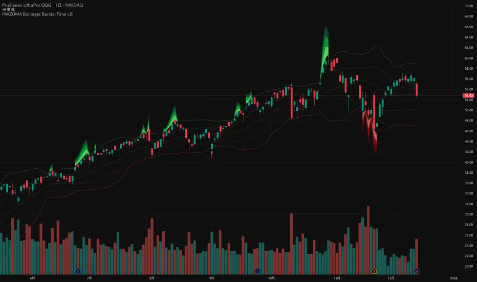
INAZUMA Bollinger BandsThis is an indicator based on the widely used Bollinger Bands, enhanced with a unique feature that visually emphasizes the "strength of the breakout" when the price penetrates the bands.
Main Features and Characteristics
1. Standard Bollinger Bands Display
Center Line (Basis): Simple Moving Average (\text{SMA(20)}).
1 sigma Lines: Light green (+) and red (-) lines for reference.
2 sigma Lines (Upper/Lower Band): The main dark green (+) and red (-) bands.
2. Emphasized Breakout Zones: "INAZUMA / Flare" and "MAGMA"
The key feature is the activation of colored, expanding areas when the candlestick's High or Low breaks significantly outside the \pm 2\sigma bands.
Upper Side (Green Base / Flare):
When the High exceeds the +2\sigma line, a green gradient area expands upwards.
Indication: This visually suggests strong buying pressure or overbought conditions. The color deepens as the price moves further away, indicating higher momentum.
Lower Side (Red Base / Magma):
When the Low falls below the -2 sigma line, a red gradient area expands downwards.
Indication: This visually suggests strong selling pressure or oversold conditions. The color deepens as the price moves further away, indicating higher momentum.
Key Insight: This visual aid helps traders quickly assess the momentum and market excitement when the price moves outside the standard Bollinger Bands range. Use it as a reference for judging trend strength and potential entry/exit points.
Customizable Settings
You can adjust the following parameters in the indicator settings:
Length: The period used for calculating the Moving Average and Standard Deviation. (Default: 20)
StdDev (Standard Deviation): The multiplier for the band width (e.g., 2.0 for -2 sigma). (Default: 2.0)
Source: The price data used for calculation (Default: close).
RSI Multi Levels kiawosch [TradingFinder] 7-14-42 Consolidation🔵 Introduction
The Relative Strength Index or RSI is a tool used to measure the speed and intensity of price movement, oscillating between zero and one hundred. It is commonly applied to identify strength or weakness in market momentum across different time intervals. Despite its simple formula and wide usage, the behavior of RSI within specific ranges often provides more precise information than traditional overbought and oversold levels.
The Multi RSI layout displays three RSI values with periods 7, 14 and 42. The seven period RSI plays the primary role in short term analysis. When this value enters predefined ranges, it shows highly consistent and interpretable behavior that can signal trend continuation, corrections or the start of a range structure. The other two values, RSI 14 and RSI 42, help reveal higher timeframe momentum and provide context for the depth and quality of price movement.
Three potential zones are defined, each representing a behavioral range. The position zones forms the basis for signal interpretation :
High Potential : 78 to 85 & 22 to 15
Mid Potential : 70 to 78 & 30 to 22
Low Potential : 58 to 62 & 42 to 38
These zones highlight areas where RSI reacts in specific ways to price movement. Entering the High Potential range usually aligns with new highs or lows in price and often precedes continuation after a correction. In contrast, reactions inside the Mid Potential range frequently appear during clean ranges or channel structures. This approach focuses on momentum quality and structural behavior rather than classic overbought and oversold thresholds.
In summary, the logic behind the signals follows three principles :
Trend continuation, When RSI 7 enters the High Potential zone and price prints a new high or low, continuation after a correction becomes the most likely outcome.
Reversal or slowdown, When RSI exits the High Potential zone while price is reaching a previous high or low, the probability of a short term reversal increases.
Range behavior, In clean ranges or channel structures, RSI 7 typically reacts inside the Mid Potential zone and produces consistent swing responses.
🔵 How to Use
This method is based on observing the repeating behavior of RSI within momentum zones and identifying moments when price continues after a shallow correction or, conversely, when signs of slowing and reversal appear. RSI 7 plays the main role since it gives the most sensitive response to short term price changes. Its entry into or exit from a potential zone, combined with the position of price relative to recent highs and lows, forms the core of the signal logic. RSI 14 and RSI 42 provide higher timeframe confirmation and help evaluate the broader strength or weakness behind each movement.
🟣 Trend continuation after entering the High Potential zone
When RSI 7 reaches the High Potential zone while price forms a new high or low, the probability of continuation becomes very high. The typical sequence includes a short correction in price and a retreat of RSI toward the Mid Potential zone. As long as price structure remains intact and RSI turns upward again, continuation becomes the most likely scenario. As shown in the charts, price often expands strongly after this type of correction and breaks the previous high.
🟣 Reversal or slowdown after exiting the High Potential zone
If RSI 7 enters the High Potential zone but then exits while price is interacting with a previous high or low, conditions for a short term reversal appear. This behavior is clear in the charts, where price hits a supply or demand area and RSI can no longer return to the upper zone. The drop in RSI reflects weakening momentum and, when accompanied by a confirming candle, increases the chance of a reversal or at least a temporary pause.
🟣 Strong reversal after hitting the Mid Potential zone during deeper corrections
Sometimes price enters a deeper corrective phase and RSI 7 moves into or through the Mid Potential zone. When this occurs near a previous low, it can mark the start of a significant reversal. The charts show this pattern clearly, where RSI turns upward while price reacts to support. If the other RSI values show relative alignment, the probability of a strong rebound increases. This signal is often seen after fast declines and can mark the beginning of a recovery wave.
🟣 Range structure and repetitive reactions inside the Mid Potential zone
When price enters a clean range or channel, the behavior of RSI 7 changes completely. In such conditions, RSI repeatedly reacts inside the Mid Potential zone. Each time price touches the upper or lower boundary of the range, RSI approaches the upper or lower part of this zone as well. The result is a sequence of predictable swing reactions, perfectly suitable for mean reversion strategies. Breakouts in these environments also tend to show higher failure rates.
🟣 Sharp reactions and fast reversals at extreme levels (RSI near 90 or below 10)
Although this approach is not based on classic overbought and oversold logic, extremely high or low RSI readings such as ninety often produce strong immediate reactions in price. These conditions usually occur after sudden spikes or emotional breakouts. As visible in the charts, RSI collapses quickly after reaching such extremes and price often reverses sharply. While not a core signal, these moments add meaningful context to momentum interpretation.
🔵 Settings
RSI Setting : This section allows enabling or disabling the three RSI values, adjusting their calculation length and customizing their colors. It is designed to help separate short, medium and longer term momentum visually on the chart.
Zones Setting : This section controls the display of momentum zones and the color applied to each area. Adjusting these colors or toggling them on and off helps the trader visually track the intensity and structure of momentum.
Levels Setting : This section allows editing the numeric boundaries of the levels or showing and hiding each one individually. These levels form the visual framework for interpreting RSI behavior within the defined momentum zones.
🔵 Conclusion
Examining RSI behavior across different momentum zones shows that entering these ranges creates relatively consistent patterns in price movement. Reaching the High Potential zone often corresponds to later stages of a trend, where price has the strength to continue after a brief correction and structure remains intact. In contrast, reactions within the Mid Potential zone occur more frequently when the market transitions into a range or a limited movement phase, where repetitive oscillations dominate.
Overall, observing RSI inside these zones helps distinguish between trending movement, corrective phases and range conditions with greater clarity. Entry or exit from each zone provides insight into the underlying strength or weakness of momentum and reveals where the market is positioned within its movement cycle. This perspective, based on momentum regions rather than traditional values alone, offers a more refined understanding of price behavior and highlights the likely direction of the next move.

IDLP - Intraday Daily Levels Pro [FXSMARTLAB]🔥 IDLP – Intraday Daily Levels Pro
IDLP – Intraday Daily Levels Pro is a precision toolkit for intraday traders who rely on objective daily structure instead of repainting indicators and noisy signals.
Every level plotted by IDLP is derived from one simple rule:
Today’s trading decisions must be based on completed market data only.
That means:
✅ No use of the current day’s unfinished data for levels
✅ No lookahead
✅ No hidden repaint behavior
IDLP reconstructs the previous trading day from the intraday chart and then projects that structure forward onto the current session, giving you a stable, institutional-style intraday map.
🧱 1. Previous Daily Levels (Core Structure)
IDLP extracts and displays the full previous daily structure, which you can toggle on/off individually via the inputs:
Previous Daily High (PDH)
Previous Daily Low (PDL)
Previous Daily Open
Previous Daily Close,
Previous Daily Mid (50% of the range)
Previous Daily Q1 (25% of the range)
Previous Daily Q3 (75% of the range)
All of these come from the day that just closed and are then locked for the entire current session.
What these levels tell you:
PDH / PDL – true extremes of yesterday’s price action (liquidity zones, breakout/reversal points).
Previous Daily Open / Close – how the market positioned itself between session start and end
Mid (50%) – equilibrium level of the previous day’s auction.
Q1 / Q3 (25% / 75%) internal structure of the previous day’s range, dividing it into four equal zones and helping you see if price is trading in the lower, middle, or upper quarter of yesterday’s range.
All these levels are non-repaint: once the day is completed, they are fixed and never change when you scroll, replay, or backtest.
🎯 2. Previous Day Pivot System (P, S1, S2, R1, R2)
IDLP includes a classic floor-trader pivot grid, but critically:
It is calculated only from the previous day’s high, low, and close.
So for the current session, the following are fixed:
Pivot P – central reference level of the previous day.
Support 1 (S1) and Support 2 (S2)
Resistance 1 (R1) and Resistance 2 (R2)
These levels are widely used by institutional desks and algos to structure:
mean-reversion plays, breakout zones, intraday targets, and risk placement.
Everything in this section is non-repaint because it only uses the previous day’s fully closed OHLC.
📏 3. 1-Day ADR Bands Around Previous Daily Open
Instead of a multi-day ADR, IDLP uses a pure 1-Day ADR logic:
ADR = Range of the previous day
ADR = PDH − PDL
From that, IDLP builds two clean bands centered around the previous daily Open:
ADR Upper Band = Previous Day Open + (ADR × Multiplier)
ADR Lower Band = Previous Day Open − (ADR × Multiplier)
The multiplier is user-controlled in the inputs:
ADR Multiplier (default: 0.8)
This lets you choose how “tight” or “wide” you want the ADR envelope to be around the previous day’s open.
Typical use cases:
Identify realistic intraday extension targets, Spot exhaustion moves beyond ADR bands, Frame reversals after reaching volatility extremes, Align trades with or against volatility expansion
Again, since ADR is calculated only from the completed previous day, these bands are totally non-repaint during the current session.
🔒 4. True Non-Repaint Architecture
The internal logic of IDLP is built to guarantee non-repaint behavior:
It reconstructs each day using time("D") and tracks:
dayOpen, dayHigh, dayLow, dayClose for the current day
prevDayOpen, prevDayHigh, prevDayLow, prevDayClose for the previous day
At the moment a new day starts:
The “current day” gets “frozen” into prevDay*
These prevDay* values then drive: Previous Daily Levels, Pivots, ADR.
During the current day:
All these “previous day” values stay fixed, no matter what happens.
They do not move in real time, they do not shift in replay.
This means:
What you see in the past is exactly what you would have seen live.
No fake backtests.
No illusion of perfection from repainting behavior.
🎯 5. Designed For Intraday Traders
IDLP – Intraday Daily Levels Pro is made for:
- Day traders and scalpers
- Index and FX traders
- Prop firm challenge trading
- Traders using ICT/SMC-style levels, liquidity, and range logic
- Anyone who wants a clean, institutional-style daily framework without noise
You get:
Previous Day OHLC
Mid / Q1 / Q3 of the previous range
Previous-Day Pivots (P, S1, S2, R1, R2)
1-Day ADR Bands around Previous Day Open
All calculated only from closed data, updated once per day, and then locked.

Hyper Squeeze Sniper (Dual Side: Long + Short)Hyper Squeeze Sniper (Dual Side Strategy)
This script is a comprehensive Volatility Breakout System designed to identify and trade explosive price moves following periods of consolidation. It combines the classical "Squeeze" theory with Linear Regression Momentum, Volume Analysis, and an ATR-based Trailing Stop to filter false signals and manage risk effectively.
The script operates on a logic of "Compression -> Explosion -> Trend Following" suitable for both Long and Short positions.
🛠 Detailed Methodology (How it works)
1. The Squeeze Detection (Consolidation) The core concept relies on the relationship between Bollinger Bands (BB) and Keltner Channels (KC).
Condition: When the Bollinger Bands (Standard Deviation) contract and fall inside the Keltner Channels (ATR based), it indicates a period of extremely low volatility (The Squeeze).
Visual: The background turns Gray to indicate "Do Not Trade / Wait Mode".
2. Momentum Confirmation (Linear Regression) Instead of using standard lagging indicators, this script utilizes Linear Regression of the price deviation to determine the direction of the breakout.
If the Linear Regression Slope > 0, the bias is Bullish.
If the Linear Regression Slope < 0, the bias is Bearish.
3. Volume Validation To avoid fake breakouts, a Volume Spike filter is applied. A signal is only valid if the current volume exceeds its moving average by a defined multiplier (Default x1.2).
4. Risk Management: ATR Trailing Stop Once a trade is entered, the script calculates a dynamic Trailing Stop based on the Average True Range (ATR).
- Long: The stop line trails below the price and never moves down.
- Short: The stop line trails above the price and never moves up.
- Exit: The position is closed immediately when the price breaches this volatility-based safety line.
How to Use
1. Wait: Look for the Gray Background. This is the accumulation phase.
2. Entry:
LONG: Wait for a Green Triangle ▲ (Price breaks Upper BB + Vol Spike + Bullish Momentum).
SHORT: Wait for a Red Triangle ▼ (Price breaks Lower BB + Vol Spike + Bearish Momentum).
3. Exit: Close the position when the "X" mark appears or when candles cross the trailing safety line.
Settings
- BB Length/Mult: Adjust the sensitivity of the squeeze detection.
- Vol Spike Factor: Increase this to filter out low-volume breakouts.
- ATR Period/Mult: Adjust the trailing stop distance (Higher = Wider stop for swing trading).

Kernel Channel [BackQuant]Kernel Channel
A non-parametric, kernel-weighted trend channel that adapts to local structure, smooths noise without lagging like moving averages, and highlights volatility compressions, expansions, and directional bias through a flexible choice of kernels, band types, and squeeze logic.
What this is
This indicator builds a full trend channel using kernel regression rather than classical averaging. Instead of a simple moving average or exponential weighting, the midline is computed as a kernel-weighted expectation of past values. This allows it to adapt to local shape, give more weight to nearby bars, and reduce distortion from outliers.
You can think of it as a sliding local smoother where you define both the “window” of influence (Window Length) and the “locality strength” (Bandwidth). The result is a flexible midline with optional upper and lower bands derived from kernel-weighted ATR or kernel-weighted standard deviation, letting you visualize volatility in a structurally consistent way.
Three plotting modes help demonstrate this difference:
When the midline is shown alone, you get a smooth, adaptive baseline that behaves almost like a regression moving average, as shown in this view:
When full channels are enabled, you see how standard deviation reacts to local structure with dynamically widening and tightening bands, a mode illustrated here:
When ATR mode is chosen instead of StdDev, band width reflects breadth of movement rather than variance, creating a volatility-aware envelope like the example here:
Why kernels
Classical moving averages allocate fixed weights. Kernels let the user define weighting shape:
Epanechnikov — emphasizes bars near the current bar, fades fast, stable and smooth.
Triangular — linear decay, simple and responsive.
Laplacian — exponential decay from the current point, sharper reactivity.
Cosine — gentle periodic decay, balanced smoothness for trend filters.
Using these in combination with a bandwidth parameter gives fine control over smoothness vs responsiveness. Smaller bandwidths give sharper local sensitivity, larger bandwidths give smoother curvature.
How it works (core logic)
The indicator computes three building blocks:
1) Kernel-weighted midline
For every bar, a sliding window looks back Window Length bars. Each bar in this window receives a kernel weight depending on:
its index distance from the present
the chosen kernel shape
the bandwidth parameter (locality)
Weights form the denominator, weighted values form the numerator, and the resulting ratio is the kernel regression mean. This midline is the central trend.
2) Kernel-based width
You choose one of two band types:
Kernel ATR — ATR values are kernel-averaged, producing a smooth, volatility-based width that is not dependent on variance. Ideal for directional trend channels and regime separation.
Kernel StdDev — local variance around the midline is computed through kernel weighting. This produces a true statistical envelope that narrows in quiet periods and widens in noisy areas.
Width is scaled using Band Multiplier , controlling how far the envelope extends.
3) Upper and lower channels
Provided midline and width exist, the channel edges are:
Upper = midline + bandMult × width
Lower = midline − bandMult × width
These create smooth structures around price that adapt continuously.
Plotting modes
The indicator supports multiple visual styles depending on what you want to emphasize.
When only the midline is displayed, you get a pure kernel trend: a smooth regression-like curve that reacts to local structure while filtering noise, demonstrated here: This provides a clean read on direction and slope.
With full channels enabled, the behavior of the bands becomes visible. Standard deviation mode creates elastic boundaries that tighten during compressions and widen during turbulence, which you can see in the band-focused demonstration: This helps identify expansion events, volatility clusters, and breakouts.
ATR mode shifts interpretation from statistical variance to raw movement amplitude. This makes channels less sensitive to outliers and more consistent across trend phases, as shown in this ATR variation example: This mode is particularly useful for breakout systems and bar-range regimes.
Regime detection and bar coloring
The slope of the midline defines directional bias:
Up-slope → green
Down-slope → red
Flat → gray
A secondary regime filter compares close to the channel:
Trend Up Strong — close above upper band and midline rising.
Trend Down Strong — close below lower band and midline falling.
Trend Up Weak — close between midline and upper band with rising slope.
Trend Down Weak — close between lower band and midline with falling slope.
Compression mode — squeeze conditions.
Bar coloring is optional and can be toggled for cleaner charts.
Squeeze logic
The indicator includes non-standard squeeze detection based on relative width , defined as:
width / |midline|
This gives a dimensionless measure of how “tight” or “loose” the channel is, normalized for trend level.
A rolling window evaluates the percentile rank of current width relative to past behavior. If the width is in the lowest X% of its last N observations, the script flags a squeeze environment. This highlights compression regions that may precede breakouts or regime shifts.
Deviation highlighting
When using Kernel StdDev mode, you may enable deviation flags that highlight bars where price moves outside the channel:
Above upper band → bullish momentum overextension
Below lower band → bearish momentum overextension
This is turned off in ATR mode because ATR widths do not represent distributional variance.
Alerts included
Kernel Channel Long — midline turns up.
Kernel Channel Short — midline turns down.
Price Crossed Midline — crossover or crossunder of the midline.
Price Above Upper — early momentum expansion.
Price Below Lower — downward volatility expansion.
These help automate regime changes and breakout detection.
How to use it
Trend identification
The midline acts as a bias filter. Rising midline means trend strength upward, falling midline means downward behavior. The channel width contextualizes confidence.
Breakout anticipation
Kernel StdDev compressions highlight areas where price is coiling. Breakouts often follow narrow relative width. ATR mode provides structural expansion cues that are smooth and robust.
Mean reversion
StdDev mode is suitable for fade setups. Moves to outer bands during low volatility often revert to the midline.
Continuation logic
If price breaks above the upper band while midline is rising, the indicator flags strong directional expansion. Same logic for breakdowns on the lower band.
Volatility characterization
Kernel ATR maps raw bar movements and is excellent for identifying regime shifts in markets where variance is unstable.
Tuning guidance
For smoother long-term trend tracking
Larger window (150–300).
Moderate bandwidth (1.0–2.0).
Epanechnikov or Cosine kernel.
ATR mode for stable envelopes.
For swing trading / short-term structure
Window length around 50–100.
Bandwidth 0.6–1.2.
Triangular for speed, Laplacian for sharper reactions.
StdDev bands for precise volatility compression.
For breakout systems
Smaller bandwidth for sharp local detection.
ATR mode for stable envelopes.
Enable squeeze highlighting for identifying setups early.
For mean-reversion systems
Use StdDev bands.
Moderate window length.
Highlight deviations to locate overextended bars.
Settings overview
Kernel Settings
Source
Window Length
Bandwidth
Kernel Type (Epanechnikov, Triangular, Laplacian, Cosine)
Channel Width
Band Type (Kernel ATR or Kernel StdDev)
Band Multiplier
Visuals
Show Bands
Color Bars By Regime
Highlight Squeeze Periods
Highlight Deviation
Lookback and Percentile settings
Colors for uptrend, downtrend, squeeze, flat
Trading applications
Trend filtering — trade only in direction of the midline slope.
Breakout confirmation — expansion outside the bands while slope agrees.
Squeeze timing — compression periods often precede the next directional leg.
Volatility-aware stops — ATR mode makes channel edges suitable for adaptive stop placement.
Structural swing mapping — StdDev bands help locate midline pullbacks vs distributional extremes.
Bias rotation — bar coloring highlights when regime shifts occur.
Notes
The Kernel Channel is not a signal generator by itself, but a structural map. It helps classify trend direction, volatility environment, distribution shape, and compression cycles. Combine it with your entry and exit framework, risk parameters, and higher-timeframe confirmation.
It is designed to behave consistently across markets, to avoid the bluntness of classical averages, and to reveal subtle curvature in price that traditional channels miss. Adjust kernel type, bandwidth, and band source to match the noise profile of your instrument, then use squeeze logic and deviation highlighting to guide timing.
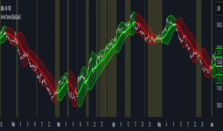
McMillan Volatility Bands (MVB) – with Entry Logic// McMillan Volatility Bands (MVB) with signal + entry logic
// Author: ChatGPT for OneRyanAlexander
// Notes:
// - Bands are computed using percentage volatility (log returns), per the Black‑Scholes framing.
// - Inner band (default 3σ) and outer band (default 4σ) are configurable.
// - A setup occurs when price closes outside the outer band, then closes back within the inner band.
// The bar that re‑enters is the "signal bar." We then require price to trade beyond the signal bar's
// extreme by a user‑defined cushion (default 0.34 * signal bar range) to confirm entry.
// - Includes alertconditions for both setups and confirmed entries.

Dynamic Fractal Flow [Alpha Extract]An advanced momentum oscillator that combines fractal market structure analysis with adaptive volatility weighting and multi-derivative calculus to identify high-probability trend reversals and continuation patterns. Utilizing sophisticated noise filtering through choppiness indexing and efficiency ratio analysis, this indicator delivers entries that adapt to changing market regimes while reducing false signals during consolidation via multi-layer confirmation centered on acceleration analysis, statistical band context, and dynamic omega weighting—without any divergence detection.
🔶 Fractal-Based Market Structure Detection
Employs Williams Fractal methodology to identify pivotal market highs and lows, calculating normalized price position within the established fractal range to generate oscillator signals based on structural positioning. The system tracks fractal points dynamically and computes relative positioning with ATR fallback protection, ensuring continuous signal generation even during extended trending periods without fractal formation.
🔶 Dynamic Omega Weighting System
Implements an adaptive weighting algorithm that adjusts signal emphasis based on real-time volatility conditions and volume strength, calculating dynamic omega coefficients ranging from 0.3 to 0.9. The system applies heavier weighting to recent price action during high-conviction moves while reducing sensitivity during low-volume environments, mitigating lag inherent in fixed-period calculations through volatility normalization and volume-strength integration.
🔶 Cascading Robustness Filtering
Features up to five stages of progressive EMA smoothing with user-adjustable robustness steps, each layer systematically filtering microstructure noise while preserving essential trend information. Smoothing periods scale with the chosen fractal length and robustness steps using a fixed smoothing multiplier for consistent, predictable behavior.
🔶 Adaptive Noise Suppression Engine
Integrates dual-component noise filtering combining Choppiness Index calculation with Kaufman’s Efficiency Ratio to detect ranging versus trending market conditions. The system applies dynamic damping that maintains full signal strength during trending environments while suppressing signals during choppy consolidation, aligning output with the prevailing regime.
🔶 Acceleration and Jerk Analysis Framework
Calculates second-derivative acceleration and third-derivative jerk to identify explosive momentum shifts before they fully materialize on traditional indicators. Detects bullish acceleration when both acceleration and jerk turn positive in negative oscillator territory, and bearish acceleration when both turn negative in positive territory, providing early entry signals for high-velocity trend initiation phases.
🔶 Multi-Layer Signal Generation Architecture
Combines three primary signal types with hierarchical validation: acceleration signals, band crossover entries, and threshold momentum signals. Each signal category includes momentum confirmation, trend-state validation, and statistical band context; signals are further conditioned by band squeeze detection to avoid low-probability entries during compression phases. Divergence is intentionally excluded for a purely structure- and momentum-driven approach.
🔶 Dynamic Statistical Band System
Utilizes Bollinger-style standard deviation bands with configurable multiplier and length to create adaptive threshold zones that expand during volatile periods and contract during consolidation. Includes band squeeze detection to identify compression phases that typically precede expansion, with signal suppression during squeezes to prevent premature entries.
🔶 Gradient Color Visualization System
Features color gradient mapping that dynamically adjusts line intensity based on signal strength, transitioning from neutral gray to progressively intense bullish or bearish colors as conviction increases. Includes gradient fills between the signal line and zero with transparency scaling based on oscillator intensity for immediate visual confirmation of trend strength and directional bias.
All analysis provided by Alpha Extract is for educational and informational purposes only. The information and publications are not meant to be, and do not constitute, financial, investment, trading, or other types of advice or recommendations.

Market Pressure Differential (MPD) [SharpStrat]Market Pressure Differential (MPD)
Concept & Purpose
The Market Pressure Differential (MPD) is a proprietary indicator designed to measure the internal balance of buying and selling pressure directly on the price chart.
Unlike standard momentum or trend indicators, MPD analyzes the structural behavior of each candle—its body, wicks, and overall range—to determine whether the market is dominated by expansion (buying aggression) or contraction (selling absorption).
This indicator provides a visual overlay of market pressure that adapts dynamically to volatility, helping traders see real-time shifts in participation intensity without using oscillators.
In simple terms:
When MPD expands upward → buyer pressure dominates.
When MPD contracts downward → seller pressure dominates.
Calculation Overview
MPD uses a structural candle formula to compute directional pressure:
Body Ratio = (Close − Open) / (High − Low)
Wick Differential = (Lower Wick − Upper Wick) / (High − Low)
Raw Pressure = (Body Ratio × Body Weight) + (Wick Differential × Wick Weight)
Then it applies:
EMA smoothing (to stabilize short-term noise)
Standard deviation normalization (to maintain consistent scaling)
ATR projection (to adapt the signal visually to volatility)
This produces the MPD projection line and the pressure ribbon, drawn directly on the main chart.
Customizable Inputs
Users can adjust color schemes, EMA smoothing length, ATR parameters, normalization length, and body/wick weighting to adapt the indicator’s sensitivity and aesthetic to different markets or chart themes.
How to Use
The Market Pressure Differential (MPD) visualizes the real-time balance between buying and selling pressure. It should be used as a contextual bias tool, not a standalone signal generator.
The white line represents the MPD projection, showing how market pressure evolves in real time based on candle structure and volatility.
The red line represents the ATR envelope, which defines the market’s expected volatility range.
MPD reacts quickly to candle structure, so trend bias is based on how its projection behaves relative to the ATR envelope:
Above the ATR band → positive pressure and bullish bias.
Below the ATR band → negative pressure and bearish bias.
Hovering near the ATR band → neutral or indecisive conditions.
The MPD percentage in the label represents the normalized strength of pressure relative to recent volatility.
Positive % = buying dominance.
Negative % = selling dominance.
Higher absolute values = stronger momentum compared to volatility.
To trade with MPD:
Watch candle colors and the projection line — green or positive % shows buyer control, red or negative % shows seller control.
Note transitions above or below the ATR level for early signs of momentum shifts.
Combine MPD signals with price structure, key levels, or volume for confirmation.
This helps reveal which side controls the market and whether that pressure is strong enough to overcome typical volatility.
Disclaimer
It introduces a novel structural–pressure approach to visualizing market dynamics.
For educational and analytical purposes only; this does not constitute financial advice.
Aggregated Scores Oscillator [Alpha Extract]A sophisticated risk-adjusted performance measurement system that combines Omega Ratio and Sortino Ratio methodologies to create a comprehensive market assessment oscillator. Utilizing advanced statistical band calculations with expanding and rolling window analysis, this indicator delivers institutional-grade overbought/oversold detection based on risk-adjusted returns rather than traditional price movements. The system's dual-ratio aggregation approach provides superior signal accuracy by incorporating both upside potential and downside risk metrics with dynamic threshold adaptation for varying market conditions.
🔶 Advanced Statistical Framework
Implements dual statistical methodologies using expanding and rolling window calculations to create adaptive threshold bands that evolve with market conditions. The system calculates cumulative statistics alongside rolling averages to provide both historical context and current market regime sensitivity with configurable window parameters for optimal performance across timeframes.
🔶 Dual Ratio Integration System
Combines Omega Ratio analysis measuring excess returns versus deficit returns with Sortino Ratio calculations focusing on downside deviation for comprehensive risk-adjusted performance assessment. The system applies configurable smoothing to both ratios before aggregation, ensuring stable signal generation while maintaining sensitivity to regime changes.
// Omega Ratio Calculation
Excess_Return = sum((Daily_Return > Target_Return ? Daily_Return - Target_Return : 0), Period)
Deficit_Return = sum((Daily_Return < Target_Return ? Target_Return - Daily_Return : 0), Period)
Omega_Ratio = Deficit_Return ≠ 0 ? (Excess_Return / Deficit_Return) : na
// Sortino Ratio Framework
Downside_Deviation = sqrt(sum((Daily_Return < Target_Return ? (Daily_Return - Target_Return)² : 0), Period) / Period)
Sortino_Ratio = (Mean_Return / Downside_Deviation) * sqrt(Annualization_Factor)
// Aggregated Score
Aggregated_Score = SMA(Omega_Ratio, Omega_SMA) + SMA(Sortino_Ratio, Sortino_SMA)
🔶 Dynamic Band Calculation Engine
Features sophisticated threshold determination using both expanding historical statistics and rolling window analysis to create adaptive overbought/oversold levels. The system incorporates configurable multipliers and sensitivity adjustments to optimize signal timing across varying market volatility conditions with automatic band convergence logic.
🔶 Signal Generation Framework
Generates overbought conditions when aggregated score exceeds adjusted upper threshold and oversold conditions below lower threshold, with neutral zone identification for range-bound markets. The system provides clear binary signal states with background zone highlighting and dynamic oscillator coloring for intuitive market condition assessment.
🔶 Enhanced Visual Architecture
Provides modern dark theme visualization with neon color scheme, dynamic oscillator line coloring based on signal states, and gradient band fills for comprehensive market condition visualization. The system includes zero-line reference, statistical band plots, and background zone highlighting with configurable transparency levels.
snapshot
🔶 Risk-Adjusted Performance Analysis
Utilizes target return parameters for customizable risk assessment baselines, enabling traders to evaluate performance relative to specific return objectives. The system's focus on downside deviation through Sortino analysis provides superior risk-adjusted signals compared to traditional volatility-based oscillators that treat upside and downside movements equally.
🔶 Multi-Timeframe Adaptability
Features configurable calculation periods and rolling windows to optimize performance across various timeframes from intraday to long-term analysis. The system's statistical foundation ensures consistent signal quality regardless of timeframe selection while maintaining sensitivity to market regime changes through adaptive band calculations.
🔶 Performance Optimization Framework
Implements efficient statistical calculations with optimized variable management and configurable smoothing parameters to balance responsiveness with signal stability. The system includes automatic band adjustment mechanisms and rolling window management for consistent performance across extended analysis periods.
This indicator delivers sophisticated risk-adjusted market analysis by combining proven statistical ratios in a unified oscillator framework. Unlike traditional overbought/oversold indicators that rely solely on price movements, the ASO incorporates risk-adjusted performance metrics to identify genuine market extremes based on return quality rather than price volatility alone. The system's adaptive statistical bands and dual-ratio methodology provide institutional-grade signal accuracy suitable for systematic trading approaches across cryptocurrency, forex, and equity markets with comprehensive visual feedback and configurable risk parameters for optimal strategy integration.

John Bollinger's Bollinger BandsJapanese below / 日本語説明は下記
This indicator replicates how John Bollinger, the inventor of Bollinger Bands, uses Bollinger Bands, displaying Bollinger Bands, %B and Bandwidth in one indicator with alerts and signals.
Bollinger Bands is created by John Bollinger in 1980s who is an American financial trader and analyst. He introduced %B and Bandwidth 30 years later.
🟦 What's different from other Bollinger Bands indicator?
Unlike the default Bollinger Bands or other custom Bollinger Bands indicators on TradingView, this indicator enables to display three Bollinger Bands tools into a single indicator with signals and alerts capability.
You can plot the classic Bollinger Bands together with either %B or Bandwidth or three tools altogether which requires the specific setting(see below settings).
This makes it easy to quantitatively monitor volatility changes and price position in relation to Bollinger Bands in one place.
🟦 Features:
Plots Bollinger Bands (Upper, Basis, Lower) with fill between bands.
Option to display %B or Bandwidth with Bollinger Bands.
Plots highest and lowest Bandwidth levels over a customizable lookback period.
Adds visual markers when Bandwidth reaches its highest (Bulge) or lowest (Squeeze) value.
Includes ready-to-use alert conditions for Bulge and Squeeze events.
📈Chart
Green triangles and red triangles in the bottom chart mark Bulges and Squeezes respectively.
🟦 Settings:
Length: Number of bars used for Bollinger Band middleline calculation.
Basis MA Type: Choose SMA, EMA, SMMA (RMA), WMA, or VWMA for the midline.
StdDev: Standard deviation multiplier (default = 2.0).
Option: Select "Bandwidth" or "%B" (add the indicator twice if you want to display both).
Period for Squeeze and Bulge: Lookback period for detecting the highest and lowest Bandwidth levels.(default = 125 as specified by John Bollinger )
Style Settings: Colors, line thickness, and transparency can be customized.
📈Chart
The chart below shows an example of three Bollinger Bands tools: Bollinger Band, %B and Bandwidth are in display.
To do this, you need to add this indicator TWICE where you select %B from Option in the first addition of this indicator and Bandwidth from Option in the second addition.
🟦 Usage:
🟠Monitor Volatility:
Watch Bandwidth values to spot volatility contractions (Squeeze) and expansions (Bulge) that often precede strong price moves.
John Bollinger defines Squeeze and Bulge as follows;
Squeeze:
The lowest bandwidth in the past 125 period, where trend is born.
Bulge:
The highest bandwidth in the past 125 period where trend is going to die.
According to John Bollinger, this 125 period can be used in any timeframe.
📈Chart1
Example of Squeeze
You can see uptrends start after squeeze(red triangles)
📈Chart2
Example of Bulge
You can see the trend reversal from downtrend to uptrends at the bulge(green triangles)
📈Chart3
Bulge DOES NOT NECESSARILY mean the beginning of a trend in opposite direction.
For example, you can see a bulge happening in the right side of the chart where green triangles are marked. Nevertheless, uptrend still continues after the bulge.
In this case, the bulge marks the beginning of a consolidation which lead to the continuation of the trend. It means that a phase of the trend highlighted in the light blue box came to an end.
Note: light blue box is not drawn by the indicator.
Like other technical analysis methods or tools, these setups do not guarantee birth of new trends and trend reversals. Traders should be carefully observing these setups along with other factors for making decisions.
🟠Track Price Position:
Use %B to see where price is located in relation to the Bollinger Bands.
If %B is close to 1, the price is near upper band while %B is close to 0, the price is near lower band.
🟠Set Alerts:
Receive alerts when Bandwidth hits highest and lowest values of bandwidth, helping you prepare for potential breakout, ending of trends and trend reversal opportunities.
🟠Combine with Other Tools:
This indicator would work best when combined with price action, trend analysis, or
market environmental analysis.
—————————————————————————————
このインジケーターはボリンジャーバンドの考案者であるジョン・ボリンジャー氏が提唱するボリンジャーバンドの使い方を再現するために、ボリンジャーバンド、%B、バンドウィズ(Bandwidth) の3つを1つのインジケーターで表示可能にしたものです。シグナルやアラートにも対応しています。
ボリンジャーバンドは1980年代にアメリカ人トレーダー兼アナリストのジョン・ボリンジャー氏によって開発されました。彼はその30年後に%Bとバンドウィズを導入しました。
🟦 他のボリンジャーバンドとの違い
TradingView標準のボリンジャーバンドや他のボリンジャーバンドとは異なり、このインジケーターでは3つのボリンジャーバンドツールを1つのインジケーターで表示し、シグナルやアラート機能も利用できるようになっています。
一般的に知られている通常のボリンジャーバンドに加え、%Bやバンドウィズを組み合わせて表示でき、設定次第では3つすべてを同時にモニターすることも可能です。これにより、価格とボリンジャーバンドの位置関係とボラティリティ変化をひと目で、かつ定量的に把握することができます。
🟦 機能:
ボリンジャーバンド(アッパーバンド・基準線・ロワーバンド)を描画し、バンド間を塗りつぶし表示。
オプションで%Bまたはバンドウィズを追加表示可能。
バンドウィズの最高値・最安値を、任意の期間で検出して表示。
バンドウィズが指定期間の最高値(バルジ※)または最安値(スクイーズ)に達した際にシグナルを表示。
※バルジは一般的にボリンジャーバンドで用いられるエクスパンションとほぼ同じ意味ですが、定義が異なります。(下記参照)
バルジおよびスクイーズ発生時のアラート設定が可能。
📈 チャート例
下記チャートの緑の三角と赤の三角は、それぞれバルジとスクイーズを示しています。
🟦 設定:
Length: ボリンジャーバンドの基準線計算に使う期間。
Basis MA Type: SMA, EMA, SMMA (RMA), WMA, VWMAから選択可能。
StdDev: 標準偏差の乗数(デフォルト2.0)。
Option: 「Bandwidth」または「%B」を選択(両方表示するにはこのインジケーターを2回追加)。
Period for Squeeze and Bulge: Bandwidthの最高値・最安値を検出する期間(デフォルトはジョン・ボリンジャー氏が推奨する125)。
Style Settings: 色、線の太さ、透明度などをカスタマイズ可能。
📈 チャート例
下のチャートは「ボリンジャーバンド」「%B」「バンドウィズ」の3つを同時に表示した例です。
この場合、インジケーターを2回追加し、最初に追加した方ではOptionを「%B」に、次に追加した方では「Bandwidth」を選択します。
🟦 使い方:
🟠 ボラティリティを監視する:
バンドウィズの値を見ることで、価格変動の収縮(スクイーズ)や拡大(バルジ)を確認できます。
これらはしばしば強い値動きの前兆となります。
ジョン・ボリンジャー氏はスクイーズとバルジを次のように定義しています:
スクイーズ: 過去125期間の中で最も低いバンドウィズ→ 新しいトレンドが生まれる場所。
バルジ: 過去125期間の中で最も高いバンドウィズ → トレンドが終わりを迎える場所。
この「125期間」はどのタイムフレームでも利用可能とされています。
📈 チャート1
スクイーズの例
赤い三角のスクイーズの後に上昇トレンドが始まっているのが確認できます。
📈 チャート2
バルジの例
緑の三角のバルジの箇所で下降トレンドから上昇トレンドへの反転が見られます。
📈 チャート3
バルジが必ずしも反転を意味しない例
下記のチャート右側の緑の三角で示されたバルジの後も、上昇トレンドが継続しています。
この場合、バルジは反転ではなく「トレンド一時的な調整(レンジ入り)」を示しており、結果的に上昇トレンドが継続しています。
この場合、バルジは水色のボックスで示されたトレンドのフェーズの終わりを示しています。
※水色のボックスはインジケーターが描画したものではありません。
また、他のテクニカル分析と同様に、これらのセットアップは必ず新しいトレンドの発生やトレンド転換を保証するものではありません。トレーダーは他の要素も考慮し、慎重に意思決定する必要があります。
🟠 価格とボリンジャーバンドの位置関係を確認する:
%Bを利用すれば、価格がバンドのどこに位置しているかを簡単に把握できます。
%Bが1に近ければ価格はアッパーバンド付近、0に近ければロワーバンド付近にあります。
🟠 アラートを設定する:
バンドウィズが一定期間の最高値または最安値に到達した際にアラートを設定することで、ブレイクアウトやトレンド終了、反転の可能性に備えることができます。
🟠 他のツールと組み合わせる:
このインジケーターは、プライスアクション、トレンド分析、環境認識などと組み合わせて活用すると最も効果的です。
