Bands and Channels


Multi-Timeframe Trend MA&BB Suite: 6x Moving Averages by Jenn.ioMulti-Timeframe Trend MA & BB Suite: 6x Moving Averages + 5x MTF View by Jenn.io
Indicator Overview
This indicator is a comprehensive, all-in-one trend and volatility tool designed for traders who rely on Moving Averages (MAs) and Bollinger Bands (BBs). It stands out by allowing users to plot up to six fully customized MAs on the current chart, while simultaneously projecting the values of those same MAs from up to five higher timeframes (MTF).
It's the essential tool for top-down analysis and identifying high-probability confluence zones.
Key Features and Customization
1. The Core: 6x MAs and Bollinger Bands: six Independent MAs: Plot up to six separate Moving Averages on your current chart. Each MA is fully customizable in terms of:
Type: Choose from SMA, EMA, SMMA (RMA), WMA, or VWMA.
Source and Length: Set the calculation source (Close, Open, etc.) and the lookback period.
Style: Customize color, thickness, and line style (Solid, Dashed, Dotted).
Integrated Bollinger Bands (BB): Includes standard Bollinger Bands with customization for length, standard deviation, MA type, and the option to enable or disable the band fill color.
2. Advanced: Multi-Timeframe (MTF) Projection
a. 5x MTF Timeframes: The user can enable and fully customize up to five distinct higher timeframes (e.g., Daily, Weekly, Monthly, 4H, 15m).
b. Dynamic MTF Visualization: The indicator fetches the value of the 6 MAs from these higher timeframes and displays them on the current chart using one of three customizable modes:
Extended Mode: Projects the MTF MA value as a continuous line extending to the right, simulating where the MA is moving on the higher chart.
Floating Segment: Draws a short, visible line segment near the current price action, showing the MA value without cluttering the whole chart.
Floating Label: Displays the MA value as a text label anchored to the right of the current bar, providing clean, non-obtrusive data.
Recommended Usage
1. MTF Confluence: Look for instances where the MTF MA lines align closely with the MAs or BBs of your current timeframe. These areas represent strong support/resistance zones.
2. Trend Filter: Use the Extended Mode MTF lines to quickly determine the higher-timeframe trend without changing your chart. For example, if the Daily 200 EMA is above the current price, the bias is bearish.
3. Precision Entries: Use the Floating Label Mode to see the precise MA value from a higher timeframe. This is useful for placing limit orders near key structural levels.

ID Candle Body % Star Rating + SMC ToolkitThis tool combines strong-body candle detection, trend analysis, SMC-based setups, session levels, VWAP, Donchian Channels and live alerts. It’s built to help you read momentum, structure and volatility on any intraday chart.
1. Strong Body Candle Detection
The script highlights candles with exceptional bodies using three conditions:
• Body is larger than the previous five candles
• Body makes up more than 85% of the entire candle
• Both conditions happening at the same time
These signals help you spot strength or exhaustion in real time.
2. EMA Trend Layer
Three EMAs (50/100/200 by default) plot the overall trend.
When enabled, the area between the fast and slow EMAs fills with a soft color to show bullish or bearish bias at a glance.
3. Bullish and Bearish Setup (ICT-style patterns)
The indicator marks classic two-candle continuation setups:
• Bullish setup with a break above the previous high and an FVG
• Bearish setup with a break below the previous low and an FVG
You can also enable “low break” and “high break” variations to track liquidity sweeps.
Each setup has its own alert option.
4. Four Key Market Sessions
The script plots Asia Open, Midnight Open, London Open and New York Open.
Each session shows:
• A real-time box
• High, low and midpoint
• Optional extended lines projecting forward
These levels often act as reaction zones on lower timeframes.
5. VWAP With Optional Bands
You can anchor VWAP to the session, week, month, quarter or year.
Bands can be calculated using standard deviation or a percentage.
There’s also an option to hide VWAP on higher timeframes.
6. Donchian Channel
A classic 20-period DC is included to provide an additional structure reference for breakouts and trend ranges.
7. Real-Time Alerts
Alerts trigger only once per bar and cover:
• Bullish setup
• Bearish setup
• Liquidity sweep variations
• VWAP star-rating (if enabled in the code block)
Great for traders who monitor multiple pairs.

Nifty SMC S&R MA and All Indicator[SumitQuants]🇮🇳🔥 **Nifty SMC S&R + MA + VWAP + Order Flow Suite
**
Built for Indian Markets • Tuned for NIFTY, BANKNIFTY & NSE Stocks
A complete institutional-grade trading system crafted for Indian traders who want a serious edge using Smart Money Concepts, Market Structure, Support–Resistance Strength, VWAP, Breakout Logic & Trend Tools — all combined into ONE ultra-optimized indicator.
🧠 Why This Indicator Stands Out
Most indicators only show price.
This one shows intent — clear, confident, and easy to read.
It reveals:
➡ where institutions are active
➡ where liquidity is sitting
➡ where real strength is building
➡ and who is actually in control — buyers or sellers
This is how professional desks read the markets — and now you can too.
🔥 What’s Inside (Complete Feature Stack)
🟧 1. Support–Resistance Strength Engine (Buyer/Seller Strength %)
Your built-in market power meter:
🟦 Auto S/R zones
🟩 Buyer vs Seller Strength %
🟨 Strength boxes with clean visuals
🔁 Live reactions when price taps strong or weak zones
Perfect for timing entries, reversals, retests and trap-detections in NIFTY & BANKNIFTY.
🟩 2. Smart Money Concepts (Full SMC Suite)
A complete institutional SMC system:
✔ BOS / CHoCH (Internal + Swing)
✔ Market Structure in real time
✔ Internal & Swing Order Blocks
✔ Strong / Weak Highs & Lows
✔ Equal High / Equal Low (EQH/EQL)
✔ Fair Value Gaps (FVG)
✔ Trend Bias Coloring
✔ Premium / Discount Zones
Every element is built for clarity — high-quality visuals without chart clutter.
📈 3. Moving Average Suite (5 Fully Custom MAs)
Elegant MA system for trend confirmation:
✨ EMA
✨ SMA
✨ SMMA
✨ WMA
✨ VWMA
Beautiful colors, clean visibility, and completely optional — enable only what you need.
⚡ 4. Enhanced Supertrend System
A modern Supertrend built for actual usability:
🎨 3 display styles (Line / Histogram / Ghost Mode)
🔄 Clear trend-change signals
🌗 Background trend zones
⚡ No repaint
⏰ Alerts for every reversal
Ideal for intraday momentum and bias confirmation.
📉 5. Breakouts with Volume Confirmation
Stops you from getting trapped in fakeouts:
🔥 Support Break
🔥 Resistance Break
🟦 Bullish Rejection
🟥 Bearish Rejection
📈 Volume-validated breakouts
📊 Smooth visual labels for clean execution
Ultra useful for NIFTY/BANKNIFTY’s typical stophunt → reversal patterns.
🎯 6. VWAP System with Multi-Band Zones
Professional VWAP for Indian markets:
✔ Session VWAP
✔ Weekly VWAP
✔ Monthly VWAP
✔ Premium–Discount Zones
✔ Expansion vs Mean-Reversion levels
✔ Clean visual bands
Perfect for intraday scalping & morning session planning.
🔔 7. Full Alerts Framework Included
Get notified for all key institutional events:
🚨 BOS / CHoCH
🚨 Order Block Breakouts
🚨 Equal High/Low
🚨 Fair Value Gaps
🚨 Trend Changes
🚨 Breakouts
🚨 Swing / Internal Structure Events
Never miss a major shift again — even when away from charts.
🧽 8. Clean UI + Auto Watermark
🖤 Dark/Light mode optimized
🧊 Smooth spacing
✨ Minimalistic visuals
🔍 Zero chart clutter
⚡ High-performance
A premium interface built for Indian index trading.
🧪 Who Is This Built For?
✔ Intraday F&O Traders
✔ NIFTY & BANKNIFTY Scalpers
✔ Swing Traders
✔ Price Action + SMC Traders
✔ VWAP-Based Scalpers
✔ Anyone wanting a complete premium system in a single indicator
⚡ Why Indian Traders Love It
⚡ Captures Nifty morning trap zones
⚡ Predicts London session expansions
⚡ Warns about NY reversal pressure
⚡ Identifies true institutional footprints
⚡ Shows real strength behind S/R zones
⚡ Eliminates false breakouts
⚡ Gives bias, structure & context instantly
This is not just an indicator —
It’s a full institutional trading framework.
🛒 Get Full Access
This indicator is available exclusively inside the Courses section on the official website.
👉 Purchase & Access:
www.ironmindtrader.com
Inside the course:
🔧 Installation Steps
⚙️ Recommended Settings
📘 Trading Logic
🔄 Lifetime Updates Included

Smart Trend Signal with Bands [wjdtks255]Indicator Description for TradingView
Title: Adaptive Trend Kernel
Description:
The "Adaptive Trend Kernel " is a versatile trend-following and volatility indicator designed to help traders identify dynamic market trends, potential reversals, and price extremes within a channel. Built upon a customized linear regression model, this indicator provides clear visual cues to enhance your trading decisions.
Key Features:
Regression Line: A central dynamic line representing the core trend direction, calculated based on a user-defined "Regression Length."
Regression Bands: Standard deviation-based bands plotted around the Regression Line, which act like a dynamic channel. These bands expand and contract with market volatility, indicating potential overbought/oversold conditions relative to the trend.
Trend Reversal Signals: Distinct "Up" (green triangle up) and "Down" (red triangle down) signals are generated when the price (close) crosses over or under the Regression Line. These signals suggest potential shifts in the short-term trend direction.
Visual Customization: Highly flexible input options for adjusting line colors, band colors, line width, and panel opacity. Users can toggle the visibility of bands and trend labels to suit their chart preferences.
Panel Label: A subtle "Regression" label is dynamically positioned, offering clear context without cluttering the main chart.
How it Works: The indicator calculates a linear regression line as the adaptive center of the price movement. Standard deviation is then used to create upper and lower bands, encapsulating typical price fluctuations. Signals are fired when price breaks out of the regression line, suggesting a momentum shift in line with the established trend or a potential reversal.
Trading Methods & Strategies
Here are some trading strategies you can apply using the "Adaptive Trend Kernel " indicator:
Trend-Following with Confirmation:
Long Entry: Look for an "Up" signal (green triangle up) when the price is above the Regression Line, especially after a brief retracement towards the line. This confirms that the uptrend is likely resuming.
Short Entry: Look for a "Down" signal (red triangle down) when the price is below the Regression Line, especially after a brief rally towards the line. This confirms that the downtrend is likely resuming.
Exit Strategy: Consider exiting if an opposite signal appears, or if the price closes outside the opposite band, indicating potential overextension or reversal.
Reversal / Counter-Trend Play:
Long Entry (Aggressive): When the price approaches or briefly dips below the Lower Regression Band and then generates an "Up" signal (green triangle up). This could indicate a potential bounce from an oversold condition relative to the trend.
Short Entry (Aggressive): When the price approaches or briefly moves above the Upper Regression Band and then generates a "Down" signal (red triangle down). This could indicate a potential pullback from an overbought condition relative to the trend.
Confirmation: This strategy works best when combined with other reversal confirmation patterns (e.g., bullish/bearish engulfing candlesticks) or divergences in other momentum indicators (like RSI).
Volatility Breakout:
Entry (Long): After a period of low volatility where the Regression Bands are narrow, observe if the price decisively breaks above the Upper Regression Band and an "Up" signal appears. This suggests a strong bullish momentum breakout.
Entry (Short): After a period of low volatility where the Regression Bands are narrow, observe if the price decisively breaks below the Lower Regression Band and a "Down" signal appears. This suggests a strong bearish momentum breakdown.
Management: Volatility breakouts can be swift; use appropriate risk management and profit-taking strategies.
Important Considerations:
Risk Management: Always apply proper stop-loss and take-profit levels. No indicator is infallible.
Timeframe Sensitivity: Adjust the "Regression Length" and "Band Multiplier" according to the asset and timeframe you are trading. Shorter lengths might suit scalping, while longer lengths are better for swing trading.
Confirmation with Other Tools: For higher conviction trades, use this indicator in conjunction with other technical analysis tools such like volume, MACD, or RSI on an oscillator pane.
Backtesting: Always backtest any strategy on historical data to understand its performance characteristics before live trading.

VisionAlgoPurpose: A multi-functional trading indicator that combines trend analysis, market structure, support/resistance zones, supply/demand levels, signal generation, risk management (TP/SL), and a visual dashboard for informed trading decisions.
1. Signal Generation
VisionAlgo provides buy and sell signals based on several technical filters:
SuperTrend Signals:
Calculated using a customizable ATR-based supertrend formula.
Generates bullish signals when price crosses above the supertrend and bearish signals when price crosses below.
Signals can be filtered into Normal and Strong signals depending on trend alignment with EMA/SMA filters.
Moving Average Filter:
Users can apply a moving average filter (SMA, EMA, WMA, VWMA, HMA) to validate signals.
Ensures trades align with the broader trend.
Signal Sensitivity & Mode:
Adjustable sensitivity (1–15) to control frequency of signals.
Signal Mode options: All, Normal, or Strong.
Candle Coloring:
Bars can be automatically colored bullish or bearish based on active signals for quick visual reference.
2. Trend and Market Structure Indicators
EMA Trend Confirmation:
200-period EMA serves as a long-term trend filter.
Signals above EMA reinforce bullish bias, signals below reinforce bearish bias.
Linear Regression & Trend Slopes:
Calculates slope, intercept, and deviations of price to detect potential reversal zones and trend direction.
Power MA / Trend Ribbon / Cirrus Cloud:
Optional advanced trend indicators that provide layered confirmation of market direction.
Auto Trend Lines:
Draws trend lines automatically based on swing highs/lows for visual trend guidance.
3. Support/Resistance & Supply-Demand Zones
EzAlgo SR Levels:
Dynamically detects support/resistance levels using pivot highs/lows.
Zones can be extended and colored differently based on bullish/bearish conditions.
Supply/Demand Zones (POI):
Tracks high/low swings to mark supply and demand areas.
Uses ATR-based buffers for box sizing.
Prevents overlapping zones and highlights breakout-of-structure (BOS) events.
Reversal Bands / Retest Zones:
Multi-layered bands around price to detect potential reversal and retest zones using ATR or True Range multipliers.
4. Risk Management – TP / SL System
Entry, Stop Loss, and Take Profit Levels:
Automatically calculates and plots TP1, TP2, TP3 based on ATR multiples.
Stop Loss dynamically adjusts depending on trade direction and risk multiplier.
TP/SL Breakout Labels:
Labels appear on the chart when price hits a TP or SL level for instant trade feedback.
Customizable Colors for Visualization:
Different colors for entry, SL, TP levels for clarity.
5. Dashboard Functionality
Multi-Timeframe Trend Overview:
Displays trend direction across multiple timeframes (1h, 2h, 4h, 8h, Daily).
Uses EMA to define bullish/bearish trend for each timeframe.
Current Position and Trend Summary:
Shows active position (Buy/Sell) and current trend in a compact table on the chart.
Background color dynamically changes to green/red based on bullish/bearish bias.
6. Advanced Features
Trailing Stop Loss (Optional):
Can enable dynamic trailing stops to lock profits.
Reversals & Reversal Bands:
Highlight potential market turning points using multi-period ATR bands.
Trend Line Customization:
Line color, width, style, and extendable endpoints for visual trend analysis.
Volume / Range Filters:
Incorporates filters based on price consolidation and breakout strength.
7. Code Structure Highlights
Input Section:
All major user inputs are grouped logically (Buy/Sell, Indicators, TP/SL, Dashboard, Trend Lines, etc.).
Signal Logic:
Computes bullish and bearish signals based on supertrend and moving averages.
Differentiates normal and strong signals for precision.
Position Tracking:
Keeps track of long/short positions and whether TP levels have been hit.
TP/SL Logic:
Uses ATR-based multipliers for dynamic risk management.
Plots horizontal lines and labels for each TP and SL.
Support & Resistance Logic:
Detects pivot highs/lows for SR levels.
Uses arrays to manage dynamic lines and zone fills.
Supply/Demand Zone Logic:
Avoids overlapping zones with ATR buffer.
Marks breakout-of-structure (BOS) zones when price breaks key levels.
Dashboard Logic:
Creates a visual table with current position, trend, and timeframe analysis.

Supply & Demand ZonesThis indicator detects high-probability supply and demand zones using a multi-step smart money concept approach:
Liquidity Sweep Detection: Identifies when price sweeps above a pivot high (supply setup) or below a pivot low (demand setup), capturing liquidity grabs by institutional traders.
Displacement Confirmation: Requires a strong displacement candle (measured by ATR and body percentage) or fair value gap (FVG/imbalance) in the opposite direction after the sweep.
Volume Confirmation: Optional filter ensures zones form only when volume exceeds the user-defined threshold, indicating institutional participation.
Smart Filtering: Built-in logic prevents overlapping zones, enforces minimum spacing between signals, and requires confirmation bars to eliminate false signals.
Zone Lifecycle Management: Zones are automatically removed when price closes through them with momentum. Breached zones can optionally "flip" to the opposite type when re-tested with strong displacement.
✨ Key Features
Clean Visual Display: Small "D" (Demand) and "S" (Supply) labels with shaded zone boxes
Non-Repainting: All signals use confirmed historical data—no lookahead or repainting
Volume Filter: Optional confirmation using volume spike detection
Zone Flip Logic: Breached demand zones can become supply (and vice versa) when violated
Overlap Prevention: Smart algorithm prevents clustered or duplicate zones
Confirmation Delay: Configurable wait period after sweep to confirm genuine setups
Customizable Inputs: Adjust pivot sensitivity, displacement thresholds, volume filters, and more
Alert Ready: Built-in alert conditions for new supply and demand zone formations
🎯 How to Add to Your Chart
Favorite the Indicator: Click the star icon to add this script to your favorites
Open Your Chart: Navigate to the asset and timeframe you want to trade (works best on 5m-1H intraday charts)
Add Indicator: Click "Indicators" at the top, search for "Supply & Demand Zones (Smart Filtered)", and add to chart
Customize Settings: Click the gear icon ⚙️ to adjust inputs based on your trading style and instrument volatility
Set Alerts: Right-click the indicator name → "Add alert" → Select "Supply Zone" or "Demand Zone" conditions
📖 How to Use
Demand Zones (Green "D" Labels):
Price swept below a swing low (liquidity grab)
Strong bullish displacement or imbalance followed
Trading Action: Look for LONG entries when price returns to the zone or on immediate continuation
Stop Loss: Place just below the zone or sweep low
Target: Next resistance level, supply zone, or risk-reward ratio target
Supply Zones (Red "S" Labels):
Price swept above a swing high (liquidity grab)
Strong bearish displacement or imbalance followed
Trading Action: Look for SHORT entries when price returns to the zone or on immediate continuation
Stop Loss: Place just above the zone or sweep high
Target: Next support level, demand zone, or risk-reward ratio target
Flipped Zones (Orange Labels):
Previous demand/supply zone was broken with strong momentum
Zone has flipped polarity and may now act as the opposite type
Trading Action: Exercise caution—wait for additional confirmation before trading flipped zones
🔍 What to Look For
High-Quality Setups:
Zone forms with above-average volume (check volume filter is enabled)
Clear liquidity sweep visible on the chart
Strong displacement candle with large body percentage
Zone aligns with overall market trend or key structure levels
Multiple timeframe confirmation (check higher timeframe for context)
Avoid These Setups:
Zones forming in choppy, low-volume conditions
Multiple overlapping zones in the same area (indicator filters these automatically)
Zones that appear immediately after news events (set confirmation bars higher)
Counter-trend zones without additional confluence
⚙️ Recommended Settings by Timeframe
5-Minute Charts (Scalping):
Pivot Lookback: 3/3
Min Displacement ATR: 0.9
Confirmation Bars: 1
Min Zone Spacing: 3-5 bars
Volume Threshold: 1.2x
15-Minute Charts (Intraday):
Pivot Lookback: 4/4 (default)
Min Displacement ATR: 1.0 (default)
Confirmation Bars: 2 (default)
Min Zone Spacing: 5-8 bars
Volume Threshold: 1.2x
1-Hour Charts (Swing Trading):
Pivot Lookback: 5/5
Min Displacement ATR: 1.2-1.5
Confirmation Bars: 3
Min Zone Spacing: 8-12 bars
Volume Threshold: 1.3x
💡 Trading Tips & Best Practices
Combine with Price Action: Use this indicator alongside candlestick patterns, support/resistance, and trendlines for confirmation
Multiple Timeframe Analysis: Check higher timeframes for overall bias and major zones
Volume is Key: Enable volume filter to focus on institutional-backed moves
Risk Management: Always use stop losses and proper position sizing
Backtesting: Test settings on your preferred instruments and timeframes before live trading
Context Matters: Consider market conditions, news events, and session times
Wait for Confirmation: Don't rush entries—wait for price reaction at the zone
⚠️ Important Disclaimers
Educational Purpose Only: This indicator is provided for educational and informational purposes. It does not constitute financial advice, investment recommendations, or trading signals.
No Guarantees: Past performance and backtested results do not guarantee future results. Trading involves substantial risk of loss.

Previous Session Lines — High, Low, and 50% LevelsThis indicator automatically marks the previous completed session’s price range on your chart. You select a daily session window (for example: 09:30–16:00) and the script calculates:
* Previous Session High
* Previous Session Low
* Previous Session 50% (Midpoint)
When a session closes, the indicator draws all three levels on the chart and extends them forward for 24 hours, giving you clean, stable reference levels for the current trading day. Only the most recent session is shown; older sessions are automatically removed.
These levels are commonly used by day traders and swing traders to identify:
* Key support and resistance zones
* Breakout or rejection levels
* Market bias for the new session
* Areas where liquidity tends to accumulate
* Price reaction levels during overnight or intraday trading
Because the lines do not update in real time during the session, the levels remain static, accurate, and truly represent the completed session.
Settings users can adjust:
Session Settings:
* Start and end time of the session (repeats daily)
* Custom session name, which appears on the line labels
Line Appearance:
* Color
* Line thickness
* Line style (solid, dashed, dotted)
Label Appearance:
* Text size (tiny to huge)
* Text color automatically adjusts to contrast with the selected line color
Why this indicator is useful:
* Makes prior session structure immediately visible
* Helps identify high-probability reaction areas
* Shows only one session to reduce clutter
* Lines stay stable regardless of chart zoom or scaling
* Labels stay aligned at the right side of the chart
* Works on all timeframes, including extended hours and crypto charts
This tool is ideal for traders who rely on structured session analysis, including day traders, futures traders, forex traders, crypto traders, and anyone using session highs and lows to guide trading decisions.
This was developed to create an auto-mapping tool to comply with MrZinc's "London 50" strategy. You can learn more about that on his YouTube channel www.youtube.com
You can follow my YouTube trading channel here
www.youtube.com

H7This indicator quantifies real buying and selling pressure by tracking capital flow in and out of the market in real time. It converts every candle into an objective measure of money dominance rather than price noise.
It isolates aggressive buyers versus aggressive sellers, detects liquidity absorption, highlights shifts in control, and maps where capital is accumulating or exiting.
The tool is built for traders who want clarity on which side is actually financing the move.
It can be used on any timeframe and is optimized for trend confirmation, reversal detection, and high conviction entries.

SOZAY Advanced Trend Lines v6“SOZAY Advanced Trend Lines v6”
It automatically draws on the chart:
Downtrends (pivot high → lower new high)
Uptrends (pivot low → higher new low)
It can place H (High) and L (Low) labels on pivot points.
The most recent trend line is solid, and older ones can be shown as dashed if you want.
To avoid too many lines, it only keeps the last X trends (you set this value).
What do the settings mean?
Left Bars / Right Bars
Defines how many bars to the left and right must be lower/higher for a bar to be considered a pivot.
Higher values = fewer but “bigger” trends.
Lower values = more frequent, shorter-term trends.
Maximum number of trends to draw
The maximum number of trend lines that will be kept on the chart (e.g. 50).
Show Pivot H / L labels
Turns the H and L labels on or off.
Draw downtrends (High)
Enables or disables downtrend lines that start from pivot highs.
Draw uptrends (Low)
Enables or disables uptrend lines that start from pivot lows.
Uptrend / Downtrend color
The colors of the lines (typically green for up, red for down).
Show old lines as dashed
The newest trend line is solid; the previous line(s) of the same type are shown as dashed.
In summary:
This script automatically draws all possible uptrends and downtrends using pivot logic so you don’t have to draw trend lines manually. You just use the settings to decide how selective it should be.

J&C Indicator 20/40 MA4H SMA Signal Map (20/40) Strategy
Timeframe: 4-Hour
Overview:
This is a momentum-based trend confirmation system using dual moving averages. The strategy identifies potential entry points when price action aligns with moving average positioning.
LONG Signal:
Triggers when the market demonstrates bullish momentum with price confirming an upside breakout while both moving averages are in a favorable uptrend alignment.
SHORT Signal:
Triggers when the market demonstrates bearish momentum with price confirming a downside breakdown while both moving averages are in a favorable downtrend alignment.
Key Features:
Uses a 20-period and 40-period simple moving average on the 4-hour timeframe
Filters out false signals by requiring multi-factor confirmation
Generates clear visual alerts with background highlighting
Real-time dashboard showing current MA values and trend direction
Sound/notification alerts for immediate signal awareness
Best Used For:
Swing trading on higher timeframes with proper risk management and support from additional confluence factors on your trading setup.

TMAX Divergence by ericfreemanTMAX Divergence 是一套由 EricFreeman 開發的 RSI 背離偵測指標,用於捕捉市場反轉的關鍵位置。
此指標透過:
RSI(14) 高檔/低檔(預設 70 / 30)
價格與 RSI 的高低點不一致(背離)
Pivot 高低點辨識 + 等待最多 X 根 K
ATR x 倍數的 TP / SL 視覺化顯示
協助交易者明確判斷市場是否出現「動能減弱 → 可能反轉」的訊號。
特點:
自動標註看漲 / 看跌背離
可調參數:Pivot、等待 K 棒、ATR 倍數、RSI 區間
不下單、不回測,純視覺輔助
TP / SL 以菱形標示,方便手動交易判斷
適用於:加密貨幣、外匯、指數、股票
此指標屬於 TMAX 系列的一部分,未來將推出更多趨勢與反轉工具。
TMAX Divergence is an RSI-based divergence detection indicator developed by EricFreeman, designed to identify early reversal signals in the market.
This tool analyzes:
RSI(14) overbought & oversold zones (default 70/30)
Bullish & bearish divergences between price and RSI
Pivot-based swing high/low detection
Optional waiting period (X candles) after divergence
ATR-based TP/SL visualization
to help traders spot potential momentum loss and trend reversals.
Features:
Auto-detection of bullish & bearish divergences
Fully adjustable settings: Pivot size, wait bars, ATR multipliers, RSI levels
Pure indicator (no orders, no backtesting)
TP/SL displayed with diamonds for manual trading reference
Works on crypto, forex, stocks, and indices
Part of the growing TMAX indicator series designed for trend and reversal analysis.


sydrox indicator secret stratgy based on sydrox concepts hidden gem free money hehehe muhhh ye secret gatekeep ahhh

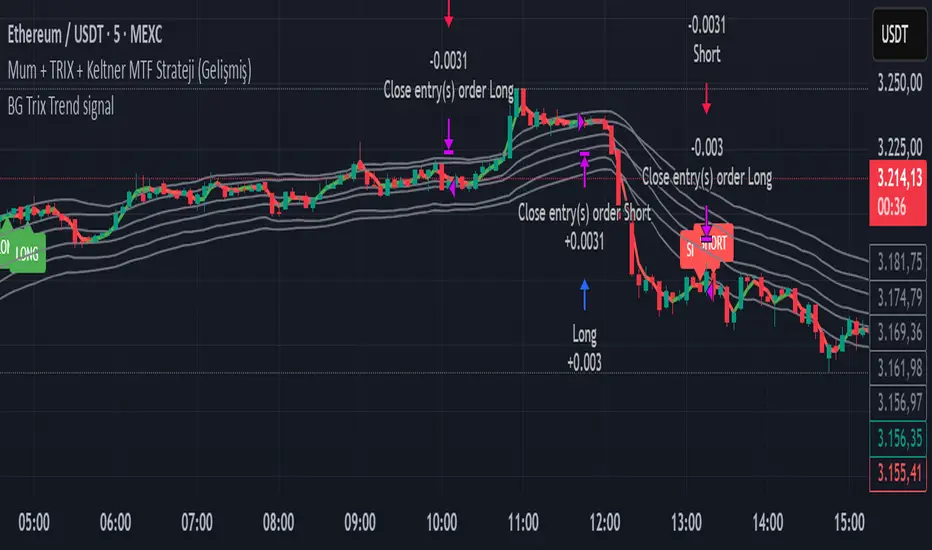
BG Trix Trend signalovides dynamic long and short signals based on a multi-timeframe candle averaging method. It calculates a four-step average of recent candles to determine the trend and changes candle color accordingly (green for upward, red for downward).
Features:
Multi-Timeframe Candle Analysis: Combines current and previous candle data to smooth price action.
Optional TRIX Filter: Adds a TRIX-based trend filter from a separate timeframe. Only triggers signals when TRIX confirms the trend.
Optional Keltner Channel Filter: Prevents signals when the price is inside the Keltner channel. Long signals only trigger above the upper band; short signals only trigger below the lower band. Separate MTF and MA type can be selected for the channel.
Visual Signals: Long and short signals are displayed as arrows on the chart. Candle color reflects trend direction.
Fully Customizable: Users can enable/disable TRIX and Keltner filters and select MA types and timeframes independently.
This indicator is ideal for traders who want clear trend signals while filtering out trades inside key price channels. No exit management is included—signals are purely for entry visualization.
Polynomial BandsPolynomial Bands apply a second-degree least-squares regression model to estimate the underlying non-linear trend of the price series. Over the selected lookback window, the indicator computes the quadratic polynomial
y(x) = A + Bx + Cx^2
and evaluates this function at the most recent bar. This value serves as the Base Line. It represents the fitted trend at the current location within the window.
After fitting the polynomial, the indicator calculates residuals by measuring the difference between observed prices and the regression curve. The sample variance of these residuals provides an estimate of dispersion around the fitted polynomial. The square root of this variance is used as the volatility measure for generating symmetric envelopes around the Base Line at multiples of the standard deviation.
The resulting bands represent regions of statistically expected deviation from the underlying quadratic trend. Narrow bands correspond to stable adherence to the modeled curve, while wide bands reflect increased irregularity or volatility.

XAUUSD Recovery for FamilyXAUUSD Recovery for Family is a trend-tracking tool based on a stepped 109-period EMA.
It highlights market direction using automatic color changes and background shading.
How It Works
A modified 109-period EMA is used to detect trend bias
The line only updates in steps after a fixed number of bars (MA Step = 33)
Background color changes when trend direction shifts
Alerts notify the trader when price crosses above or below the trend line
What It Shows
🟢 Green chart background = bullish bias
🔴 Red chart background = bearish bias
📢 Alert signals are generated when the price crosses the stepped EMA
What It Does NOT Do
❌ It does not execute trades automatically
❌ It does not guarantee profit or accuracy
❌ It does not repaint signals
Important Notes
This is a trend visualization tool only
Always combine with proper risk management and confirmation tools
Past performance is not a guarantee of future results
This script is for educational and research purposes

Bollinger Bands Regression Forecast [BigBeluga]🔵 OVERVIEW
The Bollinger Bands Regression Forecast combines volatility envelopes from Bollinger Bands with a linear regression-based projection model .
It visualizes both current and future price zones by extrapolating the Bollinger channel forward in time, giving traders a statistical forecast of probable support and resistance behavior.
🔵 CONCEPTS
Classic Bollinger Bands use a moving average (basis) and standard deviation (deviation) to form dynamic envelopes around price.
This indicator enhances them with linear regression slope detection , allowing it to forecast how the band may expand or contract in the future.
Regression is applied to both the band’s basis and deviation components to predict their trajectory for a user-defined number of Forecast Bars .
The resulting forecast creates a smoothed, funnel-shaped projection that dynamically adapts to volatility.
▲ and ▼ markers highlight potential mean reversion points when price crosses the outer bounds of the bands.
🔵 FEATURES
Forecast Engine : Uses linear regression to project Bollinger Band movement into the future.
Dynamic Channel Width : Adapts standard deviation and slope for realistic volatility modeling.
Auto-Labeled Levels : Displays live upper and lower forecast values for quick reference.
Cross Signals : Marks potential overbought and oversold zones with ▲/▼ signals when price exits the band.
Trend-Adaptive Basis Color : Basis line automatically switches color to represent short-term trend direction.
Customizable Colors and Widths for complete visual control.
🔵 HOW TO USE
Apply the indicator to visualize both current Bollinger structure and its forward projection.
Use ▲/▼ breakout markers to identify short-term reversals or volatility shifts.
When price consistently rides the upper band forecast, the trend is strong and likely continuing.
When regression shows narrowing bands ahead, expect a volatility contraction or consolidation period.
For range traders, outer projected bands can be used as potential mean reversion entry points .
Combine with volume or momentum filters to confirm whether breakouts are genuine or fading.
🔵 CONCLUSION
Bollinger Bands Regression Forecast transforms classic Bollinger analysis into a predictive forecasting model .
By merging volatility dynamics with regression-based extrapolation, it provides traders with a forward-looking visualization of likely price boundaries — revealing not only where volatility is but also where it’s heading next.

Fibonacci Bands 33 — Pro (auto+fix EMA/ATR + HTF panel)Fibonacci Bands 33 — Pro (auto+fix EMA/ATR + HTF panel)

Jace's Raff ChannelJust a basic, no-frills, Raff Regression channel. You can adjust the regression length and provide a starting point offset.

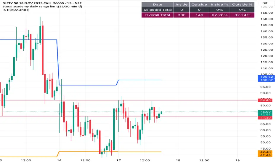
INTRADALIMIT
IDEAL TIME FRAME-15 min
This indicator automatically plots critical daily price levels using Fibonacci extensions.
Instead of manually drawing Fibonacci levels every single morning, this script does the work for you, projecting a potential "map" for the day's price action.
2-Stage Dashboard (SQZPRO Wide + EMA)Dashboard for Darvas Box EMA momentum traders, located in the bottom right, mostly for quickly screening if a setup is viable.
- EMAs are 9 & 21
- SQZPRO set to wide squeezes
Long setup:
- Green SQZPRO row
- Green EMA row
Short setup:
- Green SQZPRO row
- Red EMA row
