Auto Squeeze Breakout BarsThe Auto Squeeze Breakout Bars find bars that are breaking out of a low volatility environment into a high volatility environment.
The Squeeze shading is signaled when the volatility of the asset is very low. Then the Squeeze Breakout Bars are signaled when the asset is breaking out of this low volatility structure.
Warning bars will be signaled when it is approaching a breakout, but the conditions are not fully met at that very time.
The Auto Squeeze Breakout Bar indicator also has a built in stop loss mechanic that can be set to your preferred limit.
Stop losses are highly recommended when using the breakout bars because of possible head fakes. They are rare, but can occur depending on the asset you are trading.
For Access or Questions: Private message us. Thank you.
Bitcoin (Cryptocurrency)

CS Trading Bot Study - Crypto EditionWhat is this Study about?
The CS Trading Bot Study is for getting Open Long (Buy) and Close Long signals (Sell) that you can use to get alerts in various ways (Webhooks, Emails, etc).
The Study is very profitable for a vast amount of Crypto assets and the algorithm behind is not overfitted.
How to use it?
Make sure to start your research and find your favorite Crypto assets using the corresponding strategy:
The research process is very important as you can see beforehand how well the alerts for this Study would perform.
Make sure to read the Strategy's description, as well!
After you found your Crypto assets of interest using the corresponding Strategy...
Open a new chart for each asset and add the Study from your favorite indicators.
Click on the alert symbol on your chart and from "Condition" choose the "CS Bot" Strategy.
Then below choose "CS Bot Buy Alert" and "CS Bot Sell Alert" (each separate alerts).
Under "options" check "Once per bar" (very important) .
Pick your desired way of getting the alerts (app, popup, email, webhook).
The webhooks for setting alerts are very interesting as you can forward your signals to your own trading bot or simply wait until my trading bot is available (currently in development)
Since I develop myself, rest assured it will be available soon. Look out for comments below as soon as it is available!
How to access?
If you are interested to get access to the complete package, please don't hesitate to send me a private message for a quote.
The amount of concurrent users using the package (=licenses) is limited to max. 500 a month (more we cannot manually handle has Tradingview has no automation for this yet).
Access to the bot package is based on a monthly basis. If you get access, you will asked in person at the end of the month if you want to continue or not.
The monthly fee depends on the demand, but for as long as you continue using the package your initial price stays the same!

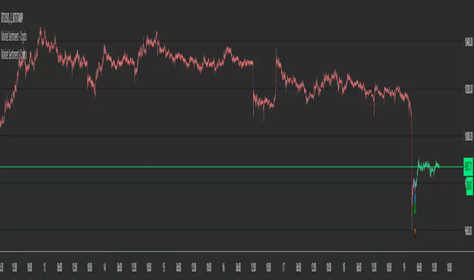
Market Sentiment - CryptoMarket Sentiment - Crypto
This is a market sentiment indicator.
When there is greed - it is good to go Short , when there is fear - go Long .
- The indicator can be used as a trend detection tool, greatly increasing the chance of being on the right side of the market.
- It directly shows the change in trend with Buy and Sell marks on the chart.
- Using it as a standalone is possible, but don't forget about Risk Management .
- Alerts are available.
- It works for Crypto only, showing the change in market sentiment for Bitcoin and Ethereum.
The same results are shown on all timeframes.
Higher timeframes may miss some small changes in trend because they may happen intra-bar. Lower timeframes are good for higher precision.
The indicator can be used on any chart, but it will show data relevant only to Crypto (Bitcoin and Ethereum).
Phantom Trader -- BTC -- OnlyPhantom Trader is a "counter-trend" strategy built to take advantage of non-linear trading ranges and heavy chop zones.
Phantom Script is forward-thinking, and will project the next possible reversal zone (PRZ) well head of the move.
This script can be utilized for :
Hedging
Swing trading
Scalping
---------------------------------------------------------------------------------
Most reliable time frames are the 60-30-and 15
Green line indicates hidden support levels
Purple line Hidden resistance levels.
When price comes in contact with our PRZ "Potential Reversal Zone"
It is wise to take up a hedge position.
BITMEX:XBTUSD"
BITMEX:XBT
BITSTAMP:BTCUSD
BITSTAMP:BTCEUR
COINBASE:BTCUSD
COINBASE:BTCUSDC
COINBASE:BTCEUR
COINBASE:BTCGB
BITFINEX:BTCUSD
BITFINEX:BTCEUR
BITFINEX:BTCGBP
BINANCE:BTCUSD
BINANCE:BTCUSDC
BINANCE:BTCUSDT
BINANCE:BTCUSDC
BYBIT:BTCUSD
GEMINI:BTCUSD
KRKN:XBTUSD
----------------Impulse Rejection----------------------
Bullish Impulse
WEAK SELL SIGNAL: If Price is closing above Purple Phantom PRZ during bullish impulse, then likely a bullish impulse continuation is to take place.
STRONG SELL SIGNAL: If Price is failing to close above Purple Phantom PRZ Line after a bullish impulse, then look to hedge the short, or to take up a short position.
Bearish Impulse:
WEAK BUY SIGNAL: If Price is closing below Green Phantom PRZ line, after a bearish impulse, then maintain short position.
STRONG BUY SIGNAL: Once Price starts closing above Green Phantom PRZ line, look to hedge a long against a short, take profit the short, or net long the asset.
-------------------------------------------------------------------
Signal Invalidation
Close and continuation above Purple PRZ would invalidate short signal
Close and continuation below Green PRZ would invalidate the long signal
If the same above PRZ is rung once again, then that was likely a stop hunt.
Another close above, and signal should be retaken.
-----------------------------------------------------------------------
Midline Signals
Rejection at Midlines, during a bullish impulse, is bearish:
-Entering a short position or profit-taking current long is advised.
-A net-long trader not wanting to profit take their long can hedge an equal-sized short there.
Rejection at Midlines, during a bearish impulse, could signal trend change:
-A net-short trader should hedge a long position against their short.
-A net-long trader can add to their long on the second or third bounce
Continued rejection at midline, one should take up a net position in the direction of which the chart is rejecting.
-----------------------------------------------------------------------
For Test Access Please use the following GOOGLE form:
forms.gle
For monthly licensing:
https://coin-observatory.chargifypay.com...
$75/month licensing fee
To obtain a lifetime license
And
For SCRIPT SUPPORT please join our discord:
discord.gg
For ALL ASSET Classes

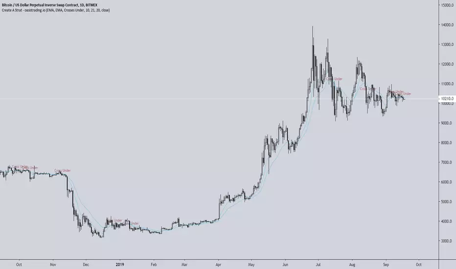
Create A StratThis indicator is free to all Oasis Trading Group members.
Create A Strat is an indicator that allows you to do just that - create your own strategy.
You can select from an EMA, Bollinger Band, VWAP and candle as each source.
You can program it to alert you when the desired condition occurs.
Some possible examples include:
Candle closes above Bollinger band
EMA crosses VWAP
Two EMAs cross
EMA crosses any part of the Bollinger Band (upper/mid/lower - all user selectable)
Visual alerts are given as well as actual alerts you may set.
In addition, Create A Strat is useful because Tradingview's strategy tester is known to repaint and give misinformation when it comes to your strategy. Using Create A Strat will allow you to backtest your chosen strategy without issue.
For Access or Questions: Private message us. Thank you.
DRAGO v1Welcome to the DRAGO v1.
This indicator is best used on heikin ashi candles on higher timeframes such as 4hr, 1 day.
You can set alerts on this indicator for Buys and Sells.
This indicator does NOT repaint.
No back tester is currently provided with the Express.
DM for access!
[Maco] PUELL MULTIPLEReverse formulated what the closed source version is and releasing open source publicly to give back to the community.
If you have any questions feel free to join our Discord!

Improved CCI with Momentum OscillatorThis indicator is free to all Oasis Trading Group members.
The Improved CCI is a basic CCI with a momentum gauge applied to the zero line. This indicator is used to find breakouts/breakdowns and when they have lost momentum.
A bullish entry would be found when the CCI has broken the 100 line when the Momentum gauge is above zero or when the CCI has crossed above the -100 line when the Momentum gauge is above zero.
A bearish entry would be found when the CCI has broken the -100 line when the Momentum gauge is below zero or when the CCI has crossed below the 100 line when the Momentum gauge is below zero.
For Access or Questions: Private message us. Thank you.
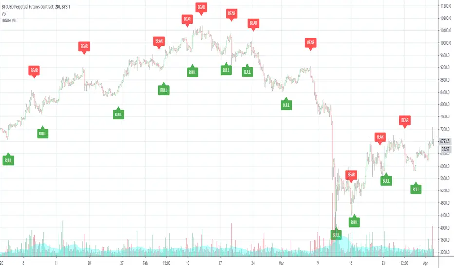
Express XYZExpress XYZ allows you to set the parameters that best fit your needs.
You can select the range of candles you want the indicator to lock in on.
You can select if you want more or less signals to appear on the indicator to fit your trading style.
You can set alerts for buy/sell which is labeled as BULL (buy) and BEAR (sell).
Enjoy the experience to customize the Express XYZ to fit your needs!

Crypto Multi Exchange Volume (CMEV)Crypto Multi Exchange Volume (CMEV) aggregates and plots trading volumes for supported cryptoasset pairs over multiple different cryptoasset exchanges. For developers looking for more information and for those who want to compile their own version of CMEV, please check out my GitHub (jakobpredin/crypto-multi-exchange-volume).
Configuration
CMEV comes with two configurable settings - whether base volume or quote volume is plotted and the length of the volume's EMA. By default, the base volume is used for plotting and the length of the EMA is set to 12 periods.
Use cases
The indicator was primarily developed in order to be able to chart using the trading pair with the longest available trading history. Due to the fast-changing preferences of where cryptoassets are traded, volumes tend to be very inconsistent and can give a distorted picture of a pairs history. For illustration, check out the SC-BTC pair from Poloniex using their native volume and compare it to the CMEV volume.
The other use case is to be able to spot divergences in volume. A great example here is bitcoin's 2019 rally where volumes from derivatives exchanges are at all time highs but volumes from retail/spot exchanges are not.
Supported exchanges
CMEV currently supports asset pairs from the following exchanges:
Binance
Bitfinex
Bitstamp
Bittrex
Coinbase
Gemini
Kraken
Poloniex
Limitations
Because of the fact that CMEV is pulling data from from multiple different exchanges and is computationally intensive it can take a couple of seconds to load while charting certain cryptoasset pairs.
Additionally, due to Tradingview's various limitations only a certain number of pairs can be supported at a time. By default, only pairs with a BTC or USD quote are supported and many non-unique pairs with consistently low trading volumes have been removed. For a full explanation, please refer to the docs in my GitHub (jakobpredin/crypto-multi-exchange-volume).
Future of the project
I plan on supporting pairs from more exchanges in the future as I see fit and as they become available for charting on Tradingview. Further, I may develop a strategy script using CMEV as its core indicator.
I welcome everybody from the community to help me extend the functionality of CMEV in order to make investing in cryptoassets more transparent for everybody.

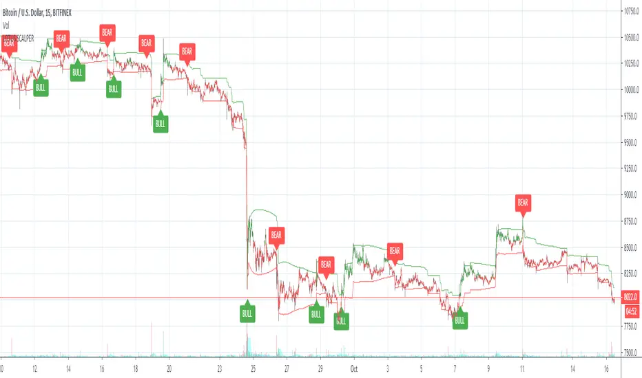
Lotus scalperWelcome to the Lotus scalper. This indicator is designed for scalping the 15m and 30m timeframes.
BULL = Buy
BEAR = Sell
Enjoy and let me know if you have questions!
You can also set alerts with this indicator!
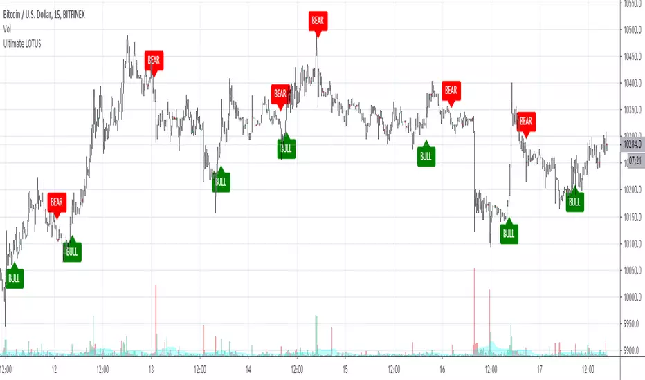
Ultimate LOTUSWelcome to the Ultimate LOTUS.
You may have used my original Lotus indicator from last year. This is the new and improved version of the Lotus.
This indicator does NOT repaint!
How to use: Wait for the candle to close before taking a signal. You can also set alerts with this indicator!
BULL = Buy alert
BEAR = Sell alert
DM if you have any questions!
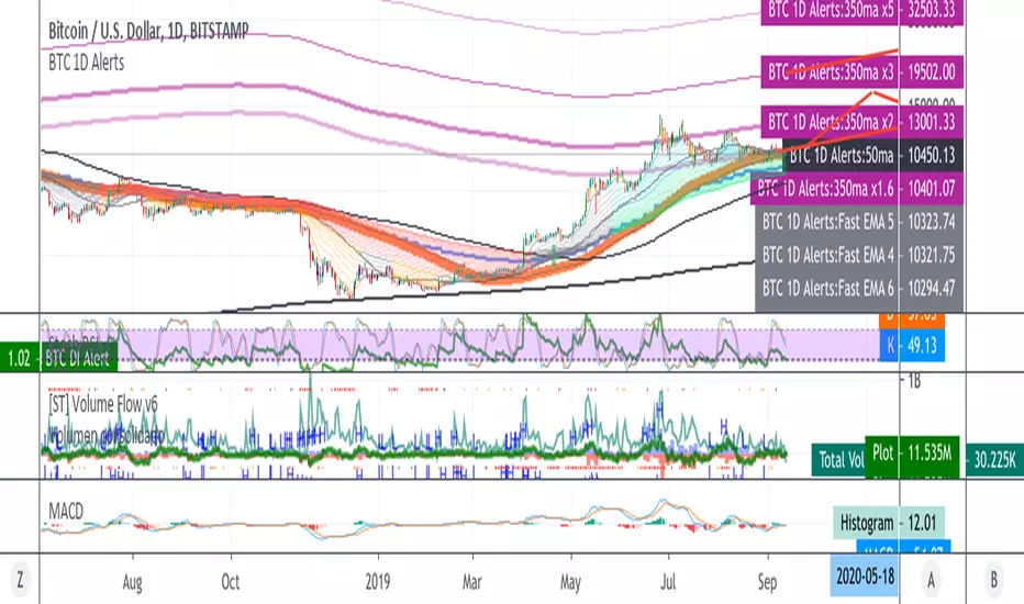
A Simple Bitcoin Stock to Flow ModelThis is just a bit of fun. Stock to flow is a hot topic so I thought I'd mess around. Here is a model that is very closely based on the one available here: digitalik.net . I take no credit for the actual model.
It can be tuned with parameters a and b, but this is the best fit imo.
The model is a bit pointless as Tradingview doesn't let us run scripts on future candles, so no predictions.
The blue line is the actual model and the pink line is a 200 MA.
Run this script on the DAILY chart please ;)
Here's a close up of current action. Interesting maybe ;)

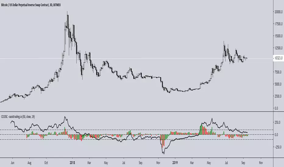
BTC 1D Alerts V1This script contains a variety of key indicator for bitcoin all-in-one and they can be activated individually in the menu. These are meant to be used on the 1D chart for Bitcoin.
1457 Day Moving Average: the bottom of the bitcoin price and arguably the rock bottom price target.
Ichimoku Cloud: a common useful indicator for bitcoin support and resistance.
350ma fibs (21 8 5 3 2 and 1.6) : Signify the tops of each logarthmic rise in bitcoin price. They are generally curving higher over the long term. For halvening #3, the predicted market crash would be after hitting the 350ma x3 fib. Also the 350 ma / 111 ma cross signifies bull market top within about 3 days as well. Using the combination of the 350ma fibs and the 350/111 crosses, reasonably identify when market top is about to occur.
50,120,200 ma: Common moving averages that bitcoin retests during bull market runs. Also, the 50/200 golden and death crosses.
1D EMA Superguppy Ribbons: green = bull market, gray is indeterminate, red = bear market. Very high specificity indicator of bull runs, especially for bitcoin. You can change to 3D candle for even more specificity for a bull market start. Use the 1W for even more specificity. 1D Superguppy is recommended for decisionmaking.
1W EMA21: a very good moving average programmed to be shown on both the daily and weekly candle time. Bitcoin commonly corrects to this repeatedly during past bull runs. Acts as support during bull run and resistance during a bear market.
Steps to identifying a bull market:
1. 50/200 golden cross
2. 1D EMA superguppy green
3. 3D EMA superguppy green (if you prefer more certainty than step 2).
4. Hitting the 1W EMA21 and bouncing off during the bull run signifies corrections.
Once a bull market is identified,
Additional recommended buying and selling techniques:
Indicators:
- Fiblines - to determine retracements from peaks (such as all time high or recent highs)
- Stochastic RSI - 1d, 3d, and 1W SRSI are great time to buy, especially the 1W SRSI which comes much less frequently.
- volumen consolidado - for multi exchange volumes compiled into a single line. I prefer buying on the lowest volume days which generally coincide with dips.
- MACD - somewhat dubious utility but many algorithms are programmed to buy or sell based on this.
Check out the Alerts for golden crosses and 350ma Fib crosses which are invaluable for long term buying planning.
I left this open source so that all the formulas can be understood and verified. Much of it hacked together from other sources but all indicators that are fundamental to bitcoin. I apologize in advance for not attributing all the articles and references... but then again I am making no money off of this anyway.

[astropark] Long-Short Strategy V2 [alarms]This indicator is not an holy grail, but it is an amazing trend finder and works nicely between 30m and 4h timeframes :)))
This is a modified version of the following strategy:
After the great success of V2, as a lot of people around asked me about, I decided to publish a new version which will let you set alarms on Buy and Sell , so each time a signal is triggered you will be notified accordingly and FAST!
HOW TO USE THIS INDICATOR
Buy/Long at next candle's open price when you see a green "B" label on the chart , trying to buy as low as possible near or below the green cloud, considering it as moving support for more buys/longs. The bigger the cloud, the stronger the bull-trend and so the stronger the support.
Sell/Short at next candle's open price when you see a red "S" label on the screen , trying to sell as high as possible near or over the red cloud, considering it as moving resistance for more sells/shorts. The bigger the cloud, the stronger the bear-trend and so the stronger the resistance.
Keep in mind that the lower the timeframe you work on, the easier is the trend to change rapidly, so always set a -2% / -5% stop-loss on trades and follow the trend with a good trailing stop strategy . If you need help, just send me a direct message.
This is not a free indicator, so send me a private message in order to get access to this script .
Do you like my scripts? Offer me a coffee, a beer, a pizza or whatever :)
BTC jar: 1K5kuYQPEqoNo6GRmJbHWMPmqwKM5S3oRR
ETH jar: 0x091b541a6dd6fe08c4e7bd909baafb2fce9b975e
LTC jar: LSVoAChsZrVsvbNyUfdpxtFpDAUSaUTUig
XRP jar: (XRP deposit tag) 103997763 (XRP deposit address) rEb8TK3gBgk5auZkwc6sHnwrGVJH8DuaLh
PS: Do you need a customization or do you need a dev who implements your strategy? send me a private message ;-)

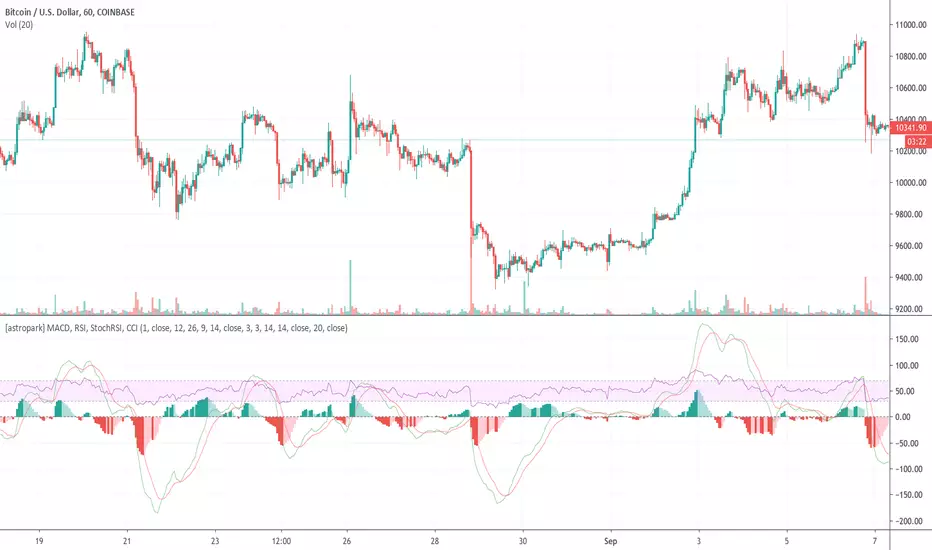
[astropark] MACD, RSI, StochRSI, CCIHi Followers,
here it is a new script, which unifies many very useful oscillator just in one: RSI + MACD + Stochastic RSI + CCI
This is not a public indicator, so send me a private message in order to get access to this script.
Do you like my scripts? Offer me a coffee , a beer, a pizza or whatever :)
BTC jar: 1K5kuYQPEqoNo6GRmJbHWMPmqwKM5S3oRR
ETH jar: 0x091b541a6dd6fe08c4e7bd909baafb2fce9b975e
LTC jar: LSVoAChsZrVsvbNyUfdpxtFpDAUSaUTUig
XRP jar: (XRP deposit tag) 103997763 (XRP deposit address) rEb8TK3gBgk5auZkwc6sHnwrGVJH8DuaLh
PS: Do you need a customization or do you need a dev who implements your strategy? send me a private message ;-)
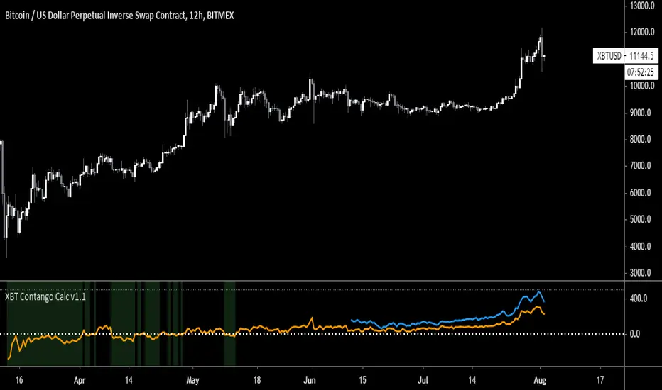
XBT Contango Calculator v1.1
This indicator measures value of basis (or spread) of current Futures contracts compared to spot. The default settings are specifically for Bitmex XBTU19 and XBTZ19 futures contracts. These will need to be updated after expiration. Also, it seems that Tradingview does not keep charts of expired contracts. If anyone knows how to import data from previous expired contracts, please let me know. This historical data could be valuable for evaluating previous XBT futures curves.
Also, VERY important to understand is this indicator only works with Spot Bitcoin charts (XBTUSD, BTCUSD, etc). If you add this to any other asset chart, it would not be useful (unless you changed settings to evaluate a different Futures product).
Contango and Backwardation are important fundamental indicators to keep track of while trading Futures markets. For a better explanation, Ugly Old Goat had done several medium articles on this. Please check out link below for his latest article on the subject...
uglyoldgoat.com
Notes on chart above should explain most of what you need to know on to use this indicator. The zero line is the spot price on the chart, so a positive value means Futures are trading at a premium (or in Contango). You can set a value of extreme Contango which will give an alert as red background (default setting is +$500). Green background will appear when Futures are trading at a discount to spot (Backwardation).
Hope some people get some use out of this. This is my first attempt at coding anything, so any feedback would be greatly appreciated!
BTC Donations: 3CypEdvBcvVHbqzHUt1FDiUG53U7pYWviV
Magick CloudA leading indicator that predicts future price action and shows support and resistance.
Magick Cloud projects 21 bars into the future and uses Fibonacci to predict the targets.
A refreshed version of sKrypt Cloud made by @writner.
Created after testing ~8693 script versions in total and a month of hard work.
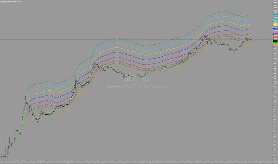
The Golden Ratio MultiplierBy Philip Swift
As Bitcoin continues to progress on its adoption journey, we learn more about its growth trajectory.
Rather than Bitcoin price action behaving like a traditional stock market share price, we see it act more like a technology being adopted at an exponential rate.
This is because Bitcoin is a network being adopted by society, and because it is decentralised money with limited supply, its price is a direct representation of that adoption process.
There are a number of regression analysis tools and stock to flow ratio studies that are helping us to understand the direction of Bitcoin’s adoption curve.
The new tool outlined in this paper brings an alternative degree of precision to understanding Bitcoin’s price action over time. It will demonstrate that Bitcoin’s adoption is not only following a broad growth curve but appears to be following established mathematical structures.
In doing so, it also:
Accurately and consistently highlights intracycle highs and lows for Bitcoin’s price.
Picks out every market cycle top in Bitcoin’s history.
Forecasts when Bitcoin will top out in the coming market cycle.
To begin, we will use the 350 day moving average of Bitcoin’s price. It has historically been an important moving average because once price moves above it, a new bull run begins.
more ...
medium.com
All rights reserved to Philip Swift (@PositiveCrypto)

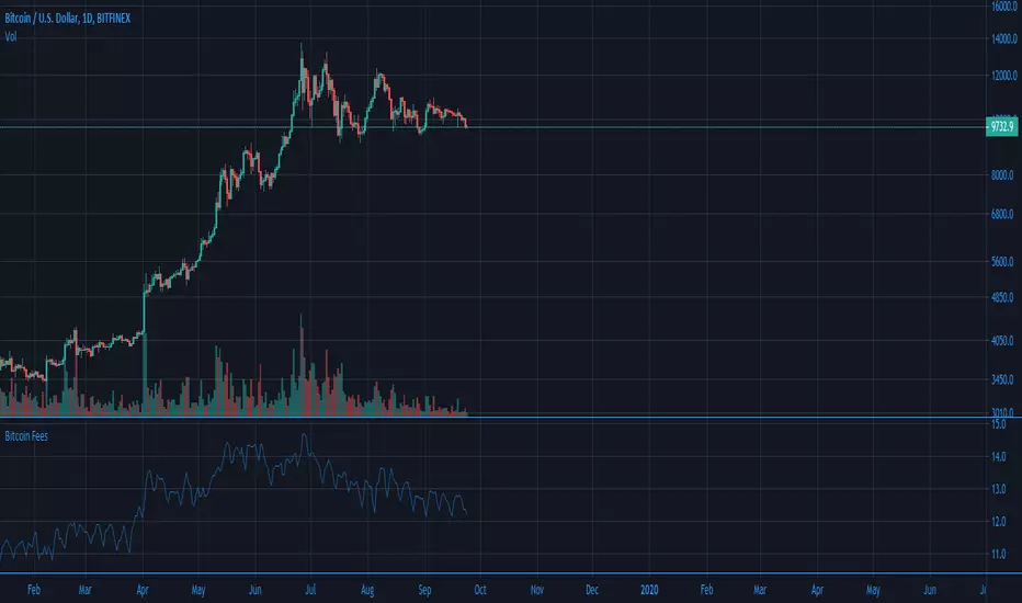
Ori Bitcoin Transaction FeesThis indicator shows natural logarithm of Bitcoin fees with Ori Trend. There is also a toggle for line view.