buy and sell v1.2
**Buy & Sell v1.2**
مؤشّر يعطي إشارات شراء وبيع مباشرة على الشارت اعتمادًا على هيكل الحركة والشموع، مع ظهور العلامات على الرسم وتنبيهات جاهزة—بدون تعقيد أو إعدادات كثيرة. *(هذا ليس نصيحة استثمارية)*
**Buy & Sell v1.2**
Simple indicator that prints clear Buy/Sell signals on the chart using market structure and candle behavior, with on-chart markers and ready-to-use alerts—no extra complexity. *(Not financial advice)*
Breadth Indicators

Multi-Exchange VWAP Aggregator (Crypto)Description:
This advanced VWAP indicator aggregates volume data from up to 9 cryptocurrency exchanges simultaneously, providing a more accurate volume-weighted average price than single-exchange VWAP calculations.
Key Features:
Multi-Exchange Aggregation - Combines volume from Binance, Coinbase, Bybit, Bitfinex, Bitstamp, Deribit, OKEx, Phemex, and FTX
Flexible Currency Pairs - Supports both spot (USD, USDT, EUR, USDC, BUSD, DAI) and perpetual futures contracts
Standard Deviation Bands - Includes customizable 1σ, 2σ, and 3σ bands for identifying overbought/oversold levels
Multiple Reset Periods - Daily, Weekly, Monthly, or Session-based VWAP calculations
Volume Calculation Options - Choose between SUM, AVG, MEDIAN, or VARIANCE for volume aggregation
Why Use This?
Traditional VWAP indicators only use volume from a single exchange, which can be misleading in fragmented crypto markets. This indicator provides a comprehensive market-wide VWAP by aggregating volume across major exchanges, giving you a more reliable benchmark for entries, exits, and institutional price levels.
Perfect for traders who want to see where the real volume-weighted price sits across the entire crypto market, not just one exchange.

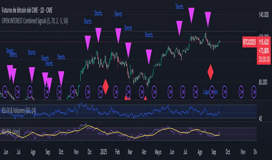
Liquidation Detector, Short and Long with Open InterestThe script analyzes three main pieces of data from each candle (or time bar): price, Open Interest (OI), and volume. It then uses that data to look for two distinct types of patterns and marks them on the chart for easy viewing.
CAN ONLY BE USED WITH STICKER BTC1! CME
Liquidation Detection:
What are you looking for? A sharp drop in Open Interest accompanied by a spike in volume.
What does it mean? This pattern indicates that a large number of positions (usually long) are being closed quickly, which can cause a sharp price drop. It's a signal of market capitulation that many traders use as a potential entry point.
Shorts Entry Detection:
What are you looking for? A price drop accompanied by an increase in Open Interest and a spike in volume.
What does it mean? This pattern shows that "new money" is entering the market to open short positions. It confirms a downtrend and suggests that the price drop has real strength behind it.
Marker: A purple triangle labeled "Shorts."
KA IntradiaKA Intradia plots the current session’s Daily Open and symmetric micro-percent bands above and below it. It shows price only (no percent labels) and anchors values on the left price scale for a clean, unobtrusive read. Levels refresh automatically at the first bar of each new day and work on any symbol or timeframe. Use them to gauge intraday bias, likely reaction zones, and momentum stretches at a glance. Optional alerts fire when price crosses any active band.

KA_anualKA_anual — Annual Open % Levels
KA_anual plots the current year’s opening price and fixed percentage bands every 10% up to ±130%. The levels update automatically at the first bar of each new year. Lines are tied to the price scale and shown only for the current year, so they move with your chart without cluttering past history. Use them to gauge momentum, potential support/resistance, and stretch zones at a glance. Works on any symbol and timeframe; no inputs required.

KA Pivot Estricto (5L/5R)Indicator Name: KA Pivot Estricto (5L/5R)
Description:
This indicator identifies strict pivot highs and pivot lows on any timeframe. A pivot high is plotted when the current candle is strictly higher than the previous N candles on the left and the next N candles on the right. A pivot low is plotted when the current candle is strictly lower than the previous N candles on the left and the next N candles on the right.
The script draws a red triangle above bars for pivot highs and a green triangle below bars for pivot lows. Both markers stay attached to the price candles (they move with the chart).
Features:
Customizable lookback period (left and right bars).
Option to require strict pivots (no equal highs/lows allowed).
Clean visual markers (triangles only, no text).
Works across all timeframes.
Use case:
This tool is useful for traders who want to spot swing highs and lows, confirm potential reversal points, or build strategies that depend on confirmed pivot structures.

XAUUSD Combined Levels / The_lurkerXAUUSD Combined Levels to trade as support. XAUUSD Combined Levels to trade as support

inside forex vip📌 SuperTrend
Based on:
ATR Period (default 10).
Multiplier ATR (default 3).
Calculates the trend direction (upward/downward).
Generates buy/sell signals:
Buy: Positive crossover with EMA color matching (bullish).
Sell: Negative crossover with EMA color matching (bearish).
Phoenix Pattern Scanner v1.3.2 - Multi-Pattern, Score & PresetsAdvanced multi-pattern scanner with intelligent presets and heuristic scoring system.
🎯 KEY FEATURES
- 5 Trading Style Presets: Conservative, Balanced, Aggressive, Swing, Scalp
- 4 Core Patterns: RVOL (unusual volume), Momentum breakout, RSI bounce, Gap & Go
- Heuristic Score (0-100): Visual ranking system for signal quality
- Per-Pattern Anti-Noise: Prevents signal spam with configurable minimum distance
- Relative Strength %: Compare performance vs benchmark (default SPY)
- Squeeze Detection: Identifies low volatility compression (BB inside Keltner)
📊 SMART FILTERS
- Minimum price and average dollar volume gates
- Weekly trend confirmation (optional)
- Separate lookback periods for each pattern
- Configurable RSI length and Gap parameters
⚙️ CUSTOMIZATION
- All parameters adjustable via settings
- Toggle individual components on/off
- Clean info panel with real-time metrics
- Color-coded score visualization
📍 BEST USED ON
- Daily timeframe (primary design)
- Liquid stocks above $5
- As a screening tool alongside your analysis
⚠️ IMPORTANT NOTES
- Educational/informational tool only
- NOT financial advice or trade signals
- Heuristic score is diagnostic, not predictive
- Past pattern behavior ≠ future results
💡 QUICK START
1. Select a preset matching your style
2. Adjust filters for your market
3. Set alerts for patterns you want to track
4. Use score as relative ranking, not absolute signal
Version 1.3.2 - Stable release
Open source - Free to use and modify
Feedback and improvements welcome

Ravi AlgoBot📌 Indicator Description (Publish Notes)
Indicator Name:
EoR / EoS Entry & SL/Target Manager (Put=Red, Call=Green)
Purpose:
यह indicator उन traders के लिए बनाया गया है जो अपनी manual levels (EoR, EoR+1 for Put, और EoS, EoS-1 for Call) को chart पर plot करना चाहते हैं और उनके आधार पर Entry, Stop Loss और Target manage करना चाहते हैं।
How it works:
आप manual prices (EoR, EoR+1, EoS, EoS-1) input fields में डालेंगे।
Put levels (EoR, EoR+1) लाल रंग में दिखेंगे।
Call levels (EoS, EoS-1) हरे रंग में दिखेंगे।
हर price पर chart पर horizontal line + label बनेगा।
आप अपने Stop Loss और Target prices भी manual डाल सकते हैं (Call और Put दोनों के लिए अलग-अलग)।
जब भी price किसी entry/SL/Target level को touch करेगा:
Chart पर signal shape बनेगा (triangle)
एक alertcondition trigger होगा।
आप TradingView में Alerts create करके इन alerts को webhook URL से connect कर सकते हैं।
Example: जब EoR Put level touch हो → webhook के ज़रिए broker/bot में auto order लग जाएगा।
SL और Target levels भी इसी तरह alerts से manage होंगे।
Use Case:
Manual level-based intraday या positional trading
Automated trading setup (via TradingView alerts → Webhook → Broker API)
Put/Call entry, target, SL को clearly visualize और monitor करना
Disclaimer:
यह indicator trading automation tool नहीं है। Actual buy/sell orders Pine Script से नहीं लग सकते। Order execution केवल TradingView Alerts और external webhook के integration से ही possible है। कृपया पहले paper-trade और test करें।

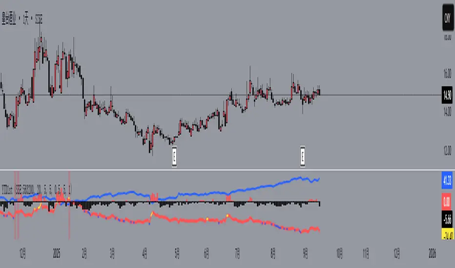
YTD1st个股年初至今的涨幅对比中证2000(可修改)
Comparison of individual stock year-to-date gains against the CSI 2000 (editable)
Profit booking Indicatorbasic indicator to check swing highs and lows. it uses macd cross over along with moving average of 20 and 50. when candle crosses 50ema it will give buy signal and when crosses below 20ema it gives sell signal.

BossBAWANG · Main Chart v0.1 is a trend-following multi-factor indicator that combines price deviation from a midline, ATR channels, and bull-bear lines to define market bias.
On the main chart, it plots the midline, ATR trend channels, Bollinger Bands, and bull-bear lines. Candles are dynamically colored, and when multiple conditions align, the script highlights Strong Long or Strong Short confluence signals. Built-in alerts allow users to receive notifications instantly.
Features
• Trend midline (EMA60) and ATR channels for short-term support/resistance
• Bull-bear lines (EMA200 ± ATR) to capture long-term bias
• Candle coloring with confluence detection (Strong Long / Strong Short)
• Data Window outputs: midline, trend lines, bull-bear lines, filters, and strength score
• Built-in alert conditions for trading signals
Recommended Timeframes: 4H / 1D (works on others as well)
Markets: Crypto, FX, commodities, indices
⚠️ Disclaimer: This indicator is for educational and technical analysis purposes only. It does not constitute financial advice. Past performance does not guarantee future results.
[DEM] On Balance Volume On Balance Volume is an enhanced version of the classic OBV indicator that transforms volume-price momentum into a histogram format with dynamic color coding to visualize trend strength and direction changes. The indicator calculates traditional On Balance Volume by accumulating volume based on price direction, then applies user-selectable smoothing (SMA, EMA, RMA, WMA, or VWMA) followed by dual RMA filtering with fast (14-period) and slow (80-period) parameters to create a momentum oscillator. The final output displays the difference between fast and slow lines as colored columns, where lime indicates strengthening upward momentum, red shows intensifying downward momentum, fuchsia represents weakening upward momentum, and green signals weakening downward momentum. This approach provides traders with a clear visual representation of volume-based momentum shifts while filtering out noise through multiple layers of smoothing, making it easier to identify significant changes in buying and selling pressure compared to traditional OBV displays.

Ravi Raj rending Intraday BotTrend Reversal Catching
🔹 Features:
✅ Buy & Sell signals with proper confirmation
✅ Dynamic support & resistance levels
✅ Trend direction + reversal detection
✅ Risk management (Stop Loss & Target levels)
✅ Works on Nifty, BankNifty, Stocks & Options
🔹 Best Timeframe:
5 Min, 15 Min (Intraday Trading)
Works on both Index & Equity
🔹 Trading Style:
Scalping
Momentum Trading
Ravi Raj rending Intraday Bot
8102106608 udhwa
