XAUMO ECON DS OSCXAUMO — ECON DS OSC (XAUUSD)
DeltaProxy • Sweep/Reclaim • Sessions • MTF BlendNet • Dynamic Colors • BG Regimes • Alerts
Execution TF: 15m | Bias TF: 1H | Script Session TZ: Europe/London
EDUCATIONAL ONLY — Not financial advice — Not trade signals.
───────────────────────────────────────────
OVERVIEW
───────────────────────────────────────────
XAUMO — ECON DS OSC is a Demand/Supply pressure oscillator built for intraday
execution on gold. It converts candle structure + relative volume behavior into
three actionable lines (Demand, Supply, and a blended decision net), then adds
“proof layers” (session normalization, sweep/reclaim validation, imbalance
dominance filters, and MTF confluence) so you can separate real pressure from
noise.
This is NOT a “buy/sell arrow” script. It is a decision framework:
PRESSURE → PROOF → TRIGGER → ENTRY → RISK (SL1/SL2) → TARGETS (TP1/TP2)
───────────────────────────────────────────
WHAT YOU SEE ON THE CHART (3 LINES)
───────────────────────────────────────────
1) Demand (LTF) = buying pressure estimate
2) Supply (LTF) = selling pressure estimate
3) Net Blend (LTF+HTF) = decision line (institutional filter)
Definitions:
- LTF Net = Demand - Supply
- HTF Net = (HTF Demand - HTF Supply) on your chosen bias timeframe
- BlendNet = (1 - weight)*LTF Net + weight*HTF Net
Trader meaning:
- Demand above Supply = bullish pressure
- Supply above Demand = bearish pressure
- BlendNet = execution is 15m, bias is 1H (filter + confluence)
───────────────────────────────────────────
SCREENSHOT WALKTHROUGH (THE PROVIDED 15m/1H CHART)
───────────────────────────────────────────
On the attached chart:
- HTF Demand is above HTF Supply → the 1H bias is bullish
- LTF Demand stays above LTF Supply → local pressure supports the bias
- Net Blend stays positive → LTF pressure is aligned with HTF context
- “SW” markers show Sweep/Reclaim events → liquidity taken then reclaimed
- Background regimes highlight cross / net shift / sweep / dominance states
Use this to avoid one common mistake:
Do not chase tops. Wait for proof (SW/IMB) and enter on structure, not emotion.
───────────────────────────────────────────
PROOF LAYERS (WHY THIS IS NOT “JUST AN OSCILLATOR”)
───────────────────────────────────────────
1) Session Normalization (Europe/London)
Raw volume differs by session (Asia vs London vs NY). When enabled, the script
normalizes volume by session baselines so “high volume” means “high relative to
this session,” not an absolute number.
2) DeltaProxy Pressure Model (wick-aware)
For XAUUSD, wicks matter (stop-runs, liquidity grabs). DeltaProxy infers intent
from body direction + wick bias, then adjusts by ATR/spread (clamped) to avoid
fake extremes. Output is bounded for stability.
3) Sweep → Reclaim Validation (liquidity proof)
A sweep is only meaningful if price reclaims (closes back inside). You can use:
- Swing sweeps (structure)
- VWAP/VA sweeps (mean/value behavior)
- Gate sweeps (manual XAUMO levels)
- Any (broad coverage)
4) Imbalance Dominance Filter (validated triggers)
Imbalance logic confirms DOMINANCE using thresholds such as:
- ratio (Demand/Supply)
- dominance share
- z-score of net pressure vs baseline
Optional: require a sweep/reclaim proof before validating imbalance.
5) MTF BlendNet Confluence (15m execution filtered by 1H context)
The HTF net is blended into the LTF net via a weight:
Higher weight = safer/slower entries
Lower weight = faster/more aggressive entries
───────────────────────────────────────────
BACKGROUND REGIMES + MARKERS (FAST VISUAL READ)
───────────────────────────────────────────
Each background layer can be toggled ON/OFF:
BG #1 Cross (Demand/Supply) = early flips (fast, can whipsaw in chop)
BG #2 Net Cross (BlendNet) = stronger shift with HTF influence
BG #3 Sweep/Reclaim = liquidity-proof timing layer
BG #4 Imbalance Regime = dominance regime (avoid fading while active)
Markers:
- SW = sweep/reclaim event (proof)
- IMB D = bullish validated imbalance (dominance trigger)
- IMB S = bearish validated imbalance (dominance trigger)
───────────────────────────────────────────
ALERTS (SCANNING + EXECUTION)
───────────────────────────────────────────
A) Individual alerts (alertcondition)
Typical conditions:
- Bull/Bear Demand–Supply cross
- Bull/Bear Net Blend cross
- Bull/Bear Sweep/Reclaim
- Bull/Bear Validated Imbalance
B) Master alert() (dynamic message, recommended)
If you use dynamic values in the message, create alert using:
Create Alert → Condition → “Any alert() function call”
This is best for webhooks and execution bots.
───────────────────────────────────────────
PRACTICAL PLAYBOOK (HOW TRADERS USE IT)
───────────────────────────────────────────
Setup A — Continuation (intraday bread-and-butter)
1) 1H Bias clear:
Bull: HTF Demand > HTF Supply
Bear: HTF Supply > HTF Demand
2) BlendNet aligned and sloping (not flat)
3) Trigger:
Best: IMB validated in bias direction
Next: Net Cross in bias direction
4) Entry:
Trigger candle close OR first pullback after trigger (preferred)
5) Risk:
SL1 (mitigated) = beyond last 15m micro swing / reclaim reference
SL2 (tailgate) = beyond deeper structure OR ~1.2–1.5 ATR(15m)
6) Targets:
TP1 = first friction/reaction
TP2 = only while BlendNet remains aligned (no fading/flattening)
Setup B — Sweep → Reclaim Reversal (sniper)
1) SW prints (bull or bear)
2) Confirmation within 1–3 candles:
Best: IMB validated in sweep direction
OK: Cross after SW
3) Entry:
Reclaim close OR clean retest of reclaim reference
4) Risk:
SL1 = beyond swept level (reclaim ref)
SL2 = beyond next major structure swing
5) Targets:
TP1 = mean return / first friction
TP2 = only if BlendNet flips and holds
───────────────────────────────────────────
RISK MODEL (SL1 + SL2)
───────────────────────────────────────────
SL1 (mitigated) = “trade idea is wrong quickly” (tight structural stop)
SL2 (tailgate) = “survive spikes” (deeper structure / ATR emergency stop)
TP1 = reduce risk and pay yourself
TP2 = only if BlendNet stays aligned and not fading
If you did not define SL1 and SL2 before entry, do not enter.
───────────────────────────────────────────
NOTES / LIMITATIONS
───────────────────────────────────────────
- This is an indicator, not a guarantee of performance.
- Volume/wick inference depends on feed quality.
- Session normalization may require tuning per broker/feed.
- Close-confirmed logic reduces false triggers, but chop can still whipsaw.
───────────────────────────────────────────
DISCLAIMER
───────────────────────────────────────────
EDUCATIONAL ONLY — Not financial advice — Not trade signals.
Trading involves substantial risk, including the risk of loss.
You are responsible for your own decisions, risk management, and execution.
───────────────────────────────────
───────────────────────────────────
───────────────────────────────────
XAUMO — ECON DS OSC (XAUUSD)
DeltaProxy • Sweep/Reclaim • Sessions • MTF BlendNet • Dynamic Colors • BG Regimes • Alerts
إطار التنفيذ: 15 دقيقة | إطار الانحياز: 1 ساعة | توقيت الجلسات داخل السكربت: Europe/London
للتعليم فقط — ليس نصيحة مالية — ليس إشارات تداول.
───────────────────────────────────────────
نظرة عامة
───────────────────────────────────────────
XAUMO — ECON DS OSC هو أوسيليتور ضغط طلب/عرض مصمم لتنفيذ تداولات الذهب داخل
اليوم. يقوم بتحويل بنية الشمعة + سلوك الحجم النسبي إلى 3 خطوط عملية (الطلب،
العرض، وصافي قرار ممزوج)، ثم يضيف “طبقات إثبات” (تطبيع الجلسات، تحقق
Sweep/Reclaim، فلاتر سيادة عدم التوازن، وتوافق متعدد الأطر) حتى تميّز الضغط
الحقيقي من الضوضاء.
هذا ليس سكربت “أسهم شراء/بيع”. هذا إطار قرار واضح:
ضغط → إثبات → زناد → دخول → مخاطرة (SL1/SL2) → أهداف (TP1/TP2)
───────────────────────────────────────────
ماذا ترى على الشارت (3 خطوط)
───────────────────────────────────────────
1) الطلب (LTF) = تقدير ضغط الشراء
2) العرض (LTF) = تقدير ضغط البيع
3) صافي Blend (LTF+HTF) = خط القرار (فلتر “مؤسسي”)
التعريفات:
- صافي LTF = الطلب - العرض
- صافي HTF = (طلب HTF - عرض HTF) على إطار الانحياز المختار
- BlendNet = (1 - الوزن)*صافي LTF + الوزن*صافي HTF
المعنى للمتداول:
- الطلب فوق العرض = ضغط صاعد
- العرض فوق الطلب = ضغط هابط
- BlendNet = التنفيذ 15د، والانحياز 1س (فلتر + توافق)
───────────────────────────────────────────
شرح اللقطة (الشارت المرفق 15م/1س)
───────────────────────────────────────────
على الشارت المرفق:
- طلب HTF أعلى من عرض HTF → الانحياز على 1س صاعد
- طلب LTF يظل أعلى من عرض LTF → الضغط المحلي يدعم الانحياز
- صافي Blend يظل موجب → ضغط 15د متوافق مع سياق 1س
- علامات “SW” تُظهر أحداث Sweep/Reclaim → سيولة تُسحب ثم تُستعاد بالإغلاق
- أنظمة الخلفية تُبرز حالات: تقاطع / تحوّل صافي / سويب / سيادة
قاعدة عملية لتجنب خطأ شائع:
لا تطارد القمم. استنَ الإثبات (SW/IMB) وادخل على بنية مؤكدة، لا على انفعال.
───────────────────────────────────────────
طبقات الإثبات (لماذا هذا ليس “أوسيليتور عادي”)
───────────────────────────────────────────
1) تطبيع الجلسات (Europe/London)
الحجم الخام يختلف بين الجلسات (آسيا/لندن/نيويورك). عند تفعيل التطبيع يقوم
السكربت بتطبيع الحجم بخطوط أساس لكل جلسة، فيصبح “حجم مرتفع” = مرتفع مقارنة
بهذه الجلسة، وليس رقمًا مطلقًا.
2) نموذج الضغط DeltaProxy (ذكي مع الذيول)
في الذهب، الذيول مهمة (Stop-runs وسحب سيولة). DeltaProxy يستنتج النية من
اتجاه الجسم + انحياز الذيول، ثم يضبط بعامل ATR/Spread (ضمن حدود) لتجنب
التطرفات الوهمية. الناتج محدود لاستقرار أفضل.
3) تحقق Sweep → Reclaim (إثبات السيولة)
السويب لا يهم إلا إذا حدث Reclaim (إغلاق داخل النطاق مرة أخرى). يمكنك اختيار:
- Swing sweeps (بنية/سوينجات)
- VWAP/VA sweeps (قيمة/متوسط)
- Gate sweeps (مستويات XAUMO اليدوية)
- Any (تغطية واسعة)
4) فلتر سيادة عدم التوازن (Triggers مُتحققة)
منطق عدم التوازن يؤكد “السيادة” باستخدام عتبات مثل:
- Ratio (الطلب/العرض)
- Dominance Share (حصة السيطرة)
- Z-Score لصافي الضغط مقابل خط الأساس
اختياري: اشتراط وجود Sweep/Reclaim قبل اعتماد عدم التوازن.
5) توافق متعدد الأطر عبر BlendNet (تنفيذ 15د مفلتر بسياق 1س)
يتم مزج صافي HTF داخل صافي LTF عبر وزن:
وزن أعلى = دخول أأمن/أبطأ
وزن أقل = دخول أسرع/أكثر عدوانية
───────────────────────────────────────────
أنظمة الخلفية + العلامات (قراءة بصرية سريعة)
───────────────────────────────────────────
يمكن تفعيل/تعطيل كل طبقة خلفية:
BG #1 تقاطع الطلب/العرض = قلب مبكر (سريع وقد يضرب في التذبذب)
BG #2 تقاطع الصافي BlendNet = تحوّل أقوى بتأثير HTF
BG #3 Sweep/Reclaim = طبقة توقيت بإثبات سيولة
BG #4 نظام عدم التوازن = سيادة (تجنب معاكسة الطرف المسيطر)
العلامات:
- SW = حدث Sweep/Reclaim (إثبات)
- IMB D = عدم توازن صاعد مُتحقق (زناد سيادة)
- IMB S = عدم توازن هابط مُتحقق (زناد سيادة)
───────────────────────────────────────────
التنبيهات (Scanning + Execution)
───────────────────────────────────────────
A) تنبيهات فردية (alertcondition)
أمثلة شائعة:
- تقاطع صاعد/هابط بين الطلب والعرض
- تقاطع صاعد/هابط لصافي BlendNet
- Sweep/Reclaim صاعد/هابط
- عدم توازن مُتحقق صاعد/هابط
B) تنبيه رئيسي عبر alert() (رسالة ديناميكية — مُفضل)
إذا كانت رسالتك تحتوي قيَم ديناميكية، أنشئ التنبيه باستخدام:
Create Alert → Condition → “Any alert() function call”
وهذا أفضل للـwebhooks وبوتات التنفيذ.
───────────────────────────────────────────
دليل عملي (كيف يستخدمه المتداولون)
───────────────────────────────────────────
Setup A — استمرار مع الانحياز (شغل اليوم)
1) انحياز 1س واضح:
صاعد: طلب HTF > عرض HTF
هابط: عرض HTF > طلب HTF
2) BlendNet متوافق ومائل (غير مسطح)
3) الزناد:
الأفضل: IMB مُتحقق في اتجاه الانحياز
التالي: تقاطع صافي في اتجاه الانحياز
4) الدخول:
إغلاق شمعة الزناد أو أول Pullback بعدها (مُفضل)
5) المخاطرة:
SL1 (مخفف) = وراء آخر Micro Swing على 15د / مرجع الـReclaim
SL2 (Tailgate) = وراء بنية أعمق أو ~1.2–1.5 ATR(15m)
6) الأهداف:
TP1 = أول احتكاك/رد فعل
TP2 = فقط طالما BlendNet متوافق (لا بهتان/لا تسطح)
Setup B — سويب ثم استرجاع (قنّاص انعكاس)
1) ظهور SW (صاعد أو هابط)
2) تأكيد خلال 1–3 شمعات:
الأفضل: IMB مُتحقق في اتجاه السويب
مقبول: تقاطع بعد SW
3) الدخول:
إغلاق الـReclaim أو إعادة اختبار نظيفة لمرجع الـReclaim
4) المخاطرة:
SL1 = وراء المستوى المسحوب (مرجع الـReclaim)
SL2 = وراء سوينج بنيوي أكبر
5) الأهداف:
TP1 = رجوع للمتوسط / أول احتكاك
TP2 = فقط إذا BlendNet انقلب وثبت
───────────────────────────────────────────
نموذج المخاطرة (SL1 + SL2)
───────────────────────────────────────────
SL1 (مخفف) = “فكرة الصفقة غلط بسرعة” (ستوب بنيوي قريب)
SL2 (Tailgate) = “تحمّل السبايكس” (بنية أعمق / ستوب طوارئ ATR)
TP1 = خفف المخاطرة وادفع نفسك
TP2 = فقط إذا BlendNet يظل متوافقًا ولا يبهت
لو لم تحدد SL1 وSL2 قبل الدخول، لا تدخل.
───────────────────────────────────────────
ملاحظات / حدود الاستخدام
───────────────────────────────────────────
- هذا مؤشر، وليس ضمانًا لأي نتائج.
- استنتاج الحجم/الذيول يعتمد على جودة الـFeed.
- تطبيع الجلسات قد يحتاج ضبط حسب الوسيط/البيانات.
- منطق الإغلاق المؤكد يقلل الإشارات الكاذبة، لكن التذبذب قد يسبب Whipsaws.
───────────────────────────────────────────
إخلاء مسؤولية
───────────────────────────────────────────
للتعليم فقط — ليس نصيحة مالية — ليس إشارات تداول.
التداول ينطوي على مخاطر كبيرة بما فيها خسارة رأس المال.
أنت مسؤول عن قراراتك وإدارة المخاطر والتنفيذ.
BTC-D

Wall Street Disruptor 3.0Why choose our indicators?
√ Data verification: Based on 1-year historical data backtesting and 1-year real trading verification, the winning rate is as high as 90% (non simulated, with real trading records attached)
√ Multi scenario adaptation: Accurately identify bull/bear/volatile market trends, supporting mainstream currencies such as BTC and ETH
√ Minimalist operation: The chart directly displays the "long short arrow" and "stop loss take profit level", which beginners can learn in 3 minutes
Target audience
▷ Contract players who frequently open orders in the short term but have an unbalanced profit and loss balance
Office workers who lack time to monitor the market and hope to use indicators to assist decision-making
Experienced traders with existing trading systems who require additional factor validation strategies
▷ Rational investors who want to reduce emotional trading and pursue stable returns
The buying and selling signal strategy of "Sweeping Wall Street" and the top and bottom signal strategy of "Fund Monitoring" both have no delay and no
The characteristics of redrawing and no future function provide reliable references for trading. However, it needs to be recognized that there is no such thing as
An absolutely accurate strategy, the rebound and breakthrough of support and resistance levels follow the principle of probability, which means that we
Trading means standing on the side with a higher winning rate. Combining these two signal systems can increase the success rate of trading
rise
Up to 80% -95%.
Trading indicators are essentially auxiliary tools that transform complex market data into intuitive and understandable forms
The ultimate success or failure of the transaction depends on the user. Successful transactions require the rational use of this data, combined with
The human trading system focuses on familiar market environments and market types.
Risk control is the cornerstone of successful trading. Effectively controlling losses can surpass 80% of traders. Remember,
Funds are the most valuable resource in trading, and judgments can be inaccurate, but trading should not be viewed as gambling. Transaction process
Not only is it the application of technology, but it is also a psychological exercise. Cultivating a stable mentality and emotional control ability is a long-term benefit
The key to profit. Continuous learning, summarizing experience, and maintaining discipline are necessary to stand firm in the rapidly changing market
The place of defeat
为什么选择我们的指标?
√ 数据验证:基于1年历史数据回测与一年实盘验证,胜率高达90%(非模拟,附真实交易记录)
√ 多场景适配:精准识别牛市/熊市/震荡行情,支持BTC、ETH等主流币种
√ 极简操作:图表直接显示「多空箭头」「止损止盈位」,新手3分钟上手
适合人群
▷ 短线频繁开单却盈亏不平衡的合约玩家
▷ 缺乏时间盯盘,希望用指标辅助决策的上班族
▷ 已有交易系统,需额外因子验证策略的老手
▷ 想降低情绪化交易,追求稳定收益的理性投资者
《横扫华尔街》买卖信号策略与《资金监控》顶底信号策略均具备无延迟、无
重绘和无未来函数的特点,为交易提供可靠参考。然而,需要认识到市场中没有
绝对准确的策略,支撑与阻力位的反弹与突破均遵循概率原理,也就是说,我们
做交易就是站在胜率较高的一方。将这两个信号系统结合应用,可使交易胜率提
升
至80%-95%。
交易指标本质上是辅助工具,它们将复杂的市场数据转化为直观可理解的形
式,但最终交易成败取决于使用者。成功的交易需要合理运用这些数据,结合个
人交易系统,专注于自己熟悉的市场环境和行情类型。
风险控制是交易成功的基石。有效控制亏损就能超越 80%的交易者。记住,
资金是交易中最宝贵的资源,判断可以有误,但不能将交易视为赌博。交易过程
不仅是技术的运用,更是心理的锻炼,培养稳健的心态和情绪控制能力是长期盈
利的关键。持续学习、总结经验并保持纪律性,才能在瞬息万变的市场中立于不
败之地
11分钟前
版本注释
Why choose our indicators?
√ Data verification: Based on 1-year historical data backtesting and 1-year real trading verification, the winning rate is as high as 90% (non simulated, with real trading records attached)
√ Multi scenario adaptation: Accurately identify bull/bear/volatile market trends, supporting mainstream currencies such as BTC and ETH
√ Minimalist operation: The chart directly displays the "long short arrow" and "stop loss take profit level", which beginners can learn in 3 minutes
Target audience
▷ Contract players who frequently open orders in the short term but have an unbalanced profit and loss balance
Office workers who lack time to monitor the market and hope to use indicators to assist decision-making
Experienced traders with existing trading systems who require additional factor validation strategies
▷ Rational investors who want to reduce emotional trading and pursue stable returns
The buying and selling signal strategy of "Sweeping Wall Street" and the top and bottom signal strategy of "Fund Monitoring" both have no delay and no
The characteristics of redrawing and no future function provide reliable references for trading. However, it needs to be recognized that there is no such thing as
An absolutely accurate strategy, the rebound and breakthrough of support and resistance levels follow the principle of probability, which means that we
Trading means standing on the side with a higher winning rate. Combining these two signal systems can increase the success rate of trading
rise
Up to 80% -95%.
Trading indicators are essentially auxiliary tools that transform complex market data into intuitive and understandable forms
The ultimate success or failure of the transaction depends on the user. Successful transactions require the rational use of this data, combined with
The human trading system focuses on familiar market environments and market types.
Risk control is the cornerstone of successful trading. Effectively controlling losses can surpass 80% of traders. Remember,
Funds are the most valuable resource in trading, and judgments can be inaccurate, but trading should not be viewed as gambling. Transaction process
Not only is it the application of technology, but it is also a psychological exercise. Cultivating a stable mentality and emotional control ability is a long-term benefit
The key to profit. Continuous learning, summarizing experience, and maintaining discipline are necessary to stand firm in the rapidly changing market
The place of defeat
为什么选择我们的指标?
√ 数据验证:基于1年历史数据回测与一年实盘验证,胜率高达90%(非模拟,附真实交易记录)
√ 多场景适配:精准识别牛市/熊市/震荡行情,支持BTC、ETH等主流币种
√ 极简操作:图表直接显示「多空箭头」「止损止盈位」,新手3分钟上手
适合人群
▷ 短线频繁开单却盈亏不平衡的合约玩家
▷ 缺乏时间盯盘,希望用指标辅助决策的上班族
▷ 已有交易系统,需额外因子验证策略的老手
▷ 想降低情绪化交易,追求稳定收益的理性投资者
《横扫华尔街》买卖信号策略与《资金监控》顶底信号策略均具备无延迟、无
重绘和无未来函数的特点,为交易提供可靠参考。然而,需要认识到市场中没有
绝对准确的策略,支撑与阻力位的反弹与突破均遵循概率原理,也就是说,我们
做交易就是站在胜率较高的一方。将这两个信号系统结合应用,可使交易胜率提
升
至80%-95%。
交易指标本质上是辅助工具,它们将复杂的市场数据转化为直观可理解的形
式,但最终交易成败取决于使用者。成功的交易需要合理运用这些数据,结合个
人交易系统,专注于自己熟悉的市场环境和行情类型。
风险控制是交易成功的基石。有效控制亏损就能超越 80%的交易者。记住,
资金是交易中最宝贵的资源,判断可以有误,但不能将交易视为赌博。交易过程
不仅是技术的运用,更是心理的锻炼,培养稳健的心态和情绪控制能力是长期盈
利的关键。持续学习、总结经验并保持纪律性,才能在瞬息万变的市场中立于不
败之地

BTC - Satoshis Altcoin Graveyard OVERVIEW
The Satoshi's Altcoin Graveyard (SAG) is a macro-statistical engine designed to solve the problem of Survivorship Bias . It is a well-known phenomenon in the crypto markets that the "Top 10" list is in a constant state of flux. If you look at historical data from CoinMarketCap (CMC) year by year, you will see a revolving door of projects that once seemed "too big to fail" disappearing into obscurity. Meanwhile, Bitcoin has remained the undisputed #1 since inception.
While most traders have a "gut feeling" that Altcoins eventually depreciate against Bitcoin, I believe in measuring it and drawing it on a chart for better visibility. By locking in specific "Cohorts" of market leaders from the past, we can track their inevitable decay through the Satoshi Sieve .
THE 13-COIN STATISTICAL BUCKET
To ensure an objective, non-biased audit, each cohort (we look at 2018, 2020 and 2022) is constructed using a fixed market-cap methodology from the snapshot date (excluding stablecoins):
• The Core: The Top 10 non-stablecoin assets at that time by Marketcap.
• The Risk Alpha: Representative samples from the Top #25, #50, and #100 ranks. (By including lower-ranked "riskier" alts, we capture the full statistical decay of the market, not just the "Blue Chips.")
TECHNICAL ARCHITECTURE
This script is engineered to push the boundaries of the Pine Script engine. TradingView enforces a hard limit of 40 unique data requests . By tracking 3 cohorts of 13 assets plus the Bitcoin base, this indicator utilizes exactly 40/40 requests , providing the maximum possible data density in a single chart window.
THE SPS CONCEPT (Survival Probability Score)
The SPS measures the Breadth of Survival . It answers: "How many coins from this year (the year of the snapshot) are actually outperforming BTC?"
We use a binary logic system to determine if a coin is "Winning" or "Losing" against the only benchmark that matters: Bitcoin.
• The Status Formula: Status = Current_Alt_BTC_Ratio >= Entry_Alt_BTC_Ratio ? 1 : 0 . This means: Every single day, at the Daily Close , the script compares the current Alt/BTC ratio to the fixed ratio from the snapshot date. If the coin is worth more in Bitcoin today than it was back then, it is assigned a "1" (a Win). If it has lost value against Bitcoin, it gets a "0" (a Loss).
• The SPS Line: SPS Line = (Sum of 'Wins' / 13) * 100 This means: We add up all the "Winners" for that specific day and turn it into a percentage. For example, if the Aqua line is at 7.69% on your chart, it confirms that on that day , exactly 1 out of the 13 coins was successfully beating Bitcoin, while the other 12 were underperforming.
THE PERFORMANCE MATRIX
In the top-right corner, we provide a Weighted Portfolio Simulation . This answers the financial question: "If I swapped 1 BTC into an equal-weight basket of these 13 coins on the snapshot day, what is my BTC value today?".
• Value < 1.0 BTC: You lost purchasing power compared to holding Bitcoin.
• Value > 1.0 BTC: You successfully achieved "Alpha" over the benchmark.
HOW TO READ THE CHART
• The Waterfall: Lines generally trend downward as the "Satoshi Sieve" filters out assets that cannot maintain their BTC-relative value.
• Dynamic Winners: We dynamically print the names of the current survivors at the tip of each line. If a cohort shows "None," the graveyard is full.
HOW TO READ THE MATRIX
• The BTC Target: Any portfolio value in the matrix below 1.0 BTC represents a failed altcoin rotation.
• Class of 2018: A portfolio value near 0.15 BTC at the current date, means a 85% loss rate.
• Class of 2020: A portfolio value near 0.77 BTC at the current date, means an approx 20 % loss rate.
• Class of 2022: A portfolio value near 0.31 BTC at the current date, means an approx 70% loss rate.
DIFFERENCE FROM AN ALTCOIN INDEX
Standard Altcoin Indexes (like my ALSI Index ) "rebalance" by removing losers and adding new winners. This is deceptive. The Altcoin Graveyard never rebalances . It forces you to watch the "losers" decay, providing a realistic look at the long-term opportunity cost of "Buy and Hold" for anything other than Bitcoin.
CONCLUSION
The data revealed by the Satoshi Sieve leads to a singular, sobering "Lesson Learned": Picking the right coin to outperform Bitcoin is not just difficult—it is statistically improbable over a long-term horizon.
While the "Risk-Reward" of altcoins is often marketed as having higher upside, the Altcoin Graveyard proves that for the vast majority of assets, the reward does not justify the risk of total portfolio erosion in BTC terms.
• The Mathematical Odds: If you picked a Top 10 coin in 2018, your chance of outperforming BTC today is effectively 0%.
• The Rotation Trap: Most investors "HODL" these assets into the graveyard, hoping for a return to previous ATHs that never comes because the liquidity has already moved on to the next "Class" of winners.
The final conclusion is clear: Diversification into altcoins is often just a slow-motion transfer of wealth back to Bitcoin. If you cannot identify the 1-out-of-13 that survives the Sieve, your best risk-adjusted move has historically been to simply hold the benchmark.
DISCLAIMER
This script is for educational purposes only. It does not constitute financial advice. It is a mathematical study of historical opportunity cost and survivorship bias.
Tags
bitcoin, btc, satoshis graveyard, altseason, dominance, total3, rotation, cycle, index, alsi, Rob Maths, robmaths

IcebergCryptoX - Week Data Gap📊 BTC WEEKEND DATA COLLECTION
This indicator analyzes Bitcoin movements during weekends when traditional US markets are closed.
🎯 DATA COLLECTED:
- Gap from Friday close → Monday open (%)
- Maximum upward/downward movements during the weekend
- Total weekend range
- Mean reversion rate (return to Friday closing price)
- Movement direction (positive/negative/neutral)
- Historical records (biggest gaps and ranges)
📈 FEATURES:
✓ Colored zones to visually identify weekends
✓ Detailed labels on each weekend with key metrics
✓ Real-time statistics table
✓ Tracking of extremes and averages
✓ 100% data collection (no trading signals)
⚙️ PARAMETERS:
- Display weekend zones (on/off)
- Display labels (on/off)
- Statistics table (on/off)
- Significant movement threshold (customizable)
📉 USAGE:
Ideal for analyzing BTC volatility patterns outside US trading hours and identifying recurring opportunities.
Recommended timeframe: 15min to 1H

Blockcircle AMS V3 - Altcoin Market ScorecardThe Blockcircle Altcoin Market Scorecard is a proprietary multi-timeframe analysis system developed by Blockcircle since 2017, designed to aggregate 11 distinct inter-market relationships into a single, actionable sentiment score (0-100). This indicator represents years of research into altcoin market dynamics and cross-asset correlations, providing traders with a systematic framework for bias determination rather than discretionary guesswork.
WHAT PROBLEM THIS SOLVES
Altcoin traders face a fundamental challenge: determining whether current market conditions favor altcoin exposure. This typically requires monitoring dozens of charts, manually tracking BTC dominance, stablecoin flows, relative strength against equities, and sector rotation patterns. Most traders either skip this analysis entirely or do it inconsistently. The AMS consolidates this multi-dimensional analysis into a single dashboard that updates in real-time across multiple timeframes simultaneously.
WHAT MAKES THIS ORIGINAL AND WORTH USING
The value proposition is not any single component, but rather the complete analytical system working together:
Proprietary Metric Selection - The specific combination of 11 inter-market relationships was developed through years of observing what actually correlates with altcoin performance. This is not a random collection of indicators - each metric was selected because it provides non-redundant information about altcoin market conditions.
Empirically-Derived Weighting - Not all metrics are weighted equally. BTC Dominance weakness, Stablecoin Dominance weakness, and Crypto vs Russell 2000 strength carry higher weights (20 points each) because they historically correlate more strongly with altcoin performance. Metrics like DXY and Stablecoin inflows carry lower weights (2.5 points). This weighting reflects observed significance, not arbitrary assignment.
Multi-Timeframe Synthesis - Viewing the same 11 metrics across three timeframes simultaneously, with automatic timeframe stepping, allows confirmation of short-term setups against higher timeframe trends. This would require maintaining 33+ separate chart windows manually.
Statistical Context Layer - Raw scores without context have limited utility. The statistical analysis (Z-Score, historical probabilities, volatility measurements) answers the question: "Is this score reading unusual relative to recent history?" A score of 75 means something different when the 200-bar average is 50 vs 70.
Pattern Detection Engine - The configurable pattern system identifies accumulation and distribution zones systematically, removing the subjectivity of manual pattern recognition.
THE 11 METRICS ANALYZED
Each metric is evaluated using Heikin Ashi candle analysis to determine bullish, bearish, or mixed status:
BTC Dominance behavior (inverted - weakness is bullish for alts)
Sector Beacon performance (configurable, default ETH/BTC)
BTC/USD price action
Altcoins vs BTC relative strength (TOTAL3-USDT/BTC)
Small-cap altcoins vs BTC relative strength (OTHERS.BTC)
Stablecoin dominance (inverted - USDT.D + USDC.D + DAI.D)
Stablecoin market cap inflows (USDT + USDC + DAI)
DXY/Fiat currency weakness (inverted)
Crypto vs Russell 2000 relative strength (TOTAL/RTY)
Crypto vs S&P 500 relative strength (TOTAL/SPX)
Crypto vs Nasdaq relative strength (TOTAL/NDX)
HOW THE SCORING SYSTEM WORKS
For each metric across your selected timeframes, the system evaluates:
Candle direction (bullish vs bearish close on Heikin Ashi)
Higher-high/higher-low patterns vs lower-high/lower-low patterns compared to prior bar
Mixed pattern detection (when both bullish and bearish characteristics present simultaneously)
Metrics are assigned traffic-light status: Green (bullish, full weight), Orange (mixed/neutral, half weight), or Red (bearish, zero weight). The weighted scoring algorithm sums the contributions to produce the composite AMS score (0-100).
Score interpretation:
80-100: Very Bullish conditions for altcoins
60-79: Bullish conditions
40-59: Neutral/mixed conditions
30-39: Bearish conditions
0-29: Very Bearish conditions
MULTI-TIMEFRAME ANALYSIS
Three configurable timeframes with auto-calculation available. When Auto-Set Higher Timeframes is enabled, the indicator automatically steps up the hierarchy (e.g., 15m chart → TF1=15m, TF2=30m, TF3=1H). This confirms whether shorter-term setups align with higher timeframe trends.
Each timeframe supports a Candle Offset feature for referencing prior candles instead of the current bar, useful for observing score evolution and momentum direction.
Statistical Analysis Framework
Calculated over your configurable lookback period:
Min/Max/Average scores - baseline context
Median values - central tendency less affected by outliers
Standard Deviation - score volatility measurement
Volatility % (coefficient of variation) - normalized variability
Z-Score - how many standard deviations current score is from mean
Score RSI (14-period) - momentum of the score itself
Rate of Change % (5-bar) - velocity of score movement
Acceleration - second derivative, detecting momentum shifts early
Historical probability distributions (P>60, P>70, P>80, P>90)
Pattern Detection System
Five fully configurable pattern trackers detect accumulation zones (multiple occurrences below a threshold) or distribution zones (multiple occurrences above a threshold):
Timeframe selection (TF1, TF2, or TF3)
Direction (Above for potential tops, Below for potential bottoms)
Score threshold
Minimum occurrences required
Lookback period in candles
Custom marker colors
Visual markers appear on chart when criteria are met. This systematizes what would otherwise be subjective pattern recognition.
Momentum Shift Detection
Tracks when score momentum crosses from negative to positive (bullish shift) or positive to negative (bearish shift). Configurable threshold filters noise. Identifies inflection points in market sentiment before the score itself crosses key levels.
Moving Averages of Score
Five configurable MAs (SMA, EMA, WMA, VWMA, HMA) applicable to any timeframe's score or average score. MA crossovers generate visual markers. Smooths score data and provides trend context.
Consecutive Bars Analysis
Tracks how many consecutive bars the score has remained above or below key thresholds. Default table displays consecutive bars ]60, ]80, [40, and [20 for each timeframe. Extended periods above 80 may indicate overheated conditions; extended periods below 20 may indicate capitulation zones.
PRACTICAL APPLICATIONS
The AMS provides objective data to answer: "Should I have an altcoin bullish bias or bearish bias right now?"
Use cases:
Confirming scalp or swing trade setups align with broader market conditions
Identifying when to deploy or withdraw capital from altcoin positions
Detecting early shifts in market regime before price action confirms
Providing objective data to counter emotional decision-making
Establishing position sizing based on conviction level (score alignment across timeframes)
When the AMS closes the 1-week or 2-week timeframe bullish (]60), historical data suggests this has often preceded periods of altcoin strength. However, past performance does not guarantee future results, and the indicator should be one input in your decision-making process, not a standalone signal generator.
IMPORTANT LIMITATIONS
This indicator uses request.security() calls to fetch data from multiple symbols. It does not use lookahead and does not access future data.
Heikin Ashi analysis means signals are smoothed and may lag pure price action.
The score reflects current conditions, not predictions. Market conditions can change rapidly.
A high score does not guarantee altcoin prices will rise. Always use proper risk management.
The indicator tells you market conditions - it does not tell you which altcoins to buy or exact entry timing.
ALERT INTEGRATION
Comprehensive alert conditions available:
=60, ]=80, Pattern detections (all 5 pattern trackers)
Momentum shifts (bullish/bearish)
MA crossovers
Custom alert profiles with multi-timeframe AND/OR logic
Rising momentum combined with high scores
Discord webhook formatting (JSON) or standard text
TABLE DISPLAY OPTIONS
Fully customizable scorecard with section visibility toggles:
Custom Metrics Section (11 individual metric statuses)
Altcoin Scores Section (composite scores and bias)
Momentum Section (momentum, consecutive bars, Z-Score, RSI, ROC, Acceleration)
Statistical Section (min/max/avg, median, std dev, volatility, probabilities)
Signal Counts Section (green/orange/red metric counts)
Summary Section (market view summary)
Position (corners) and text size adjustable. Disable sections for cleaner views.
WHY THIS INDICATOR REQUIRES PROTECTION
The source is protected because the specific combination of metrics, the empirically-derived weighting system, and the multi-layered analysis framework represent proprietary research developed over years of active trading and market observation. This is not a wrapper around publicly available indicators or a simple mashup - the value is in the systematic methodology for synthesizing cross-market data into actionable bias determination. The research investment required to identify which metrics matter, how much weight each should carry, and how to combine them meaningfully is what justifies both the protection and the access model.

Volume-Edge Trend [wjdtks255]🚀 Volume-Edge Trend
1. Overview This indicator is designed to capture high-probability trend reversals by combining Market Structure Breakouts with Volume Confirmation. Instead of chasing every price movement, it analyzes the highest highs and lowest lows over a set period to identify true structural shifts. By filtering these moves with a 20-period volume average, it effectively eliminates weak "fakeouts" and focuses on high-conviction momentum.
2. How to Trade
📈 LONG Entry: * Enter when a green BUY label appears below the candle.
This signal confirms that price has broken above the previous structural high with significant buying volume.
💀 SHORT Entry: * Enter when a red SELL label appears above the candle.
This signal confirms that price has breached the previous structural low, backed by strong selling pressure.
🎯 Exit (TP/SL):
Use the thick, dynamic Trend Line as your trailing stop-loss.
For Longs, exit if the price closes below the green support line.
For Shorts, exit if the price breaks above the red resistance line.
3. Key Features
Structural Breakout Engine: Tracks price action across a customizable "Length" to detect when a market moves out of a consolidation zone.
Volume Surge Filter: Includes a built-in toggle to ensure signals only fire when trading volume exceeds its 20-period average, confirming institutional participation.
Real-time Trend Navigation: Features a dynamic background fill and a reinforced trend line that provides instant visual feedback on the current market bias.
4. Recommended Settings
Length (Analysis Period): 14 (Optimized for standard trend following).
Volume Filter: Keep "On" to maximize signal accuracy.
Timeframe: Highly effective on 15m, 1H, and 4H charts for volatile assets like BTC, ETH, and NASDAQ.

1H EMA window multiple cyclesThis is a display method with nested EMAs across multiple timeframes. Within the one-hour window, you can see whether there are key moving averages providing resistance above or below the current candlestick, allowing for effective judgment and eliminating the need to repeatedly switch between different timeframes and multiple alerts.
这是一个多时间级别EMA嵌套的显示方式。在一小时窗口下,可以看到当下K线的上下是否有关键均线的阻力,以便做出有效判断,免去了切换不同时间窗口和多重报警的反复切换。

The Physics Engine [@Ash_TheTrader]Here is the updated, ultra-detailed TradingView description. I have expanded the strategy
⚛️ Kinematic Impulse Engine: Measuring the G-Force of Price
By @Ash_TheTrader
Traditional technical analysis often relies on "lagging" indicators. Tools like the RSI or moving averages tell you where price has been . While useful, they are like driving a car looking only in the rearview mirror.
The Kinematic Impulse Engine (KIE) is a next-generation momentum tool.
It treats price action like a physical object moving through space to measure its Velocity (Speed) , Acceleration (G-Force) , and Mass (Volume) . By understanding the physics behind a move, we can determine if a trend is a powerful impulse or an exhausted drift waiting to reverse.
---
⚛️ The Core Concept: Trading with G-Force
If you step on the gas pedal in a car, you feel pushed back into your seat. That is acceleration (positive G-Force). When you slam on the brakes, you are thrown forward. That is deceleration (negative G-Force).
The market works the same way.
Standard momentum indicators only measure speed. The KIE measures how fast that speed is changing .
The Problem: Price can be moving higher (high speed), but the rate at which it is moving higher is slowing down. Standard indicators look bullish right up until the crash.
The Solution: The KIE detects that deceleration instantly, warning you that the "G-Force" pushing the price up has vanished, often before the price peaks.
---
🎨 Visual Decoder: Reading the Heatmap
We have eliminated the need to stare at complex oscillator lines. The KIE paints the candles directly based on their "Kinetic Energy."
1. Neon Cyan: The Impulse (High G-Force) 🚀
Physics State: High Velocity + Positive Acceleration.
The market has "pedal to the metal." Buyers are aggressive, and the move is speeding up.
Meaning: DO NOT SHORT. Look for entries or hold positions.
2. Deep Purple: Exhaustion (Braking) 🛑
Physics State: High Velocity + Negative Acceleration (Deceleration).
The car is still moving forward, but the driver has taken their foot off the gas.
Meaning: Take profits, tighten stops, or prepare for a reversal.
3. Dark Gray: Equilibrium (Chop) 💤
Physics State: Low Velocity.
No significant energy. The market is waiting for news or liquidity.
Meaning: Stay out. Save your fees.
---
🛡️ STRATEGY GUIDE: How to Leverage This Indicator
Here is the step-by-Step guide to using the Physics Engine for two distinct playstyles:
Strategy A: The "Rocket" Breakout (Trend Following)
Best for catching the meat of the move.
Step 1 (The Setup): Wait for price to be in a Gray (Chop) zone. This indicates potential energy is building up.
Step 2 (The Ignition): Wait for the first Neon Cyan candle to close outside of the range.
Step 3 (Validation): Look for the small Triangle Icon (Impulse Start). This confirms that G-Force has kicked in.
Step 4 (The Exit): Hold the trade as long as candles remain Cyan. The moment a candle turns Purple , the acceleration is gone. Exit or trail your stop loss tight.
Strategy B: The "Gravity" Reversal (Sniper Entry)
Best for catching tops and bottoms.
Step 1 (The Setup): Identify an extended trend where candles have been Cyan for a long time.
Step 2 (The Warning): Wait for candles to shift from Cyan to Deep Purple . This means the buyers are exhausted.
Step 3 (The Trigger): Look for the "GRAVITY" label. This is the strongest signal in the script. It means Price is making a New High, but G-Force is crashing.
Step 4 (Execution): Enter the reversal trade. Place your stop loss just above the high of the Gravity candle.
---
🧠 The Engine Room (Technical Details)
For the quants and data nerds, here is how @Ash_TheTrader designed the math:
1. Relative Velocity: Price changes are normalized against ATR (Average True Range). A $10 move in Bitcoin is not the same as a $10 move in Forex; the KIE adjusts automatically.
2. Mass Integration: Force = Mass x Acceleration. The script uses relative Volume as "Mass." A move on low volume will show weaker colors than a move on high volume.
3. The HUD: The dashboard gives you raw numbers. If G-Force is positive (Green), the trend is safe. If G-Force is negative (Red), the trend is in danger.
Trade smart. Trade with physics.
Developed by @Ash_TheTrader .

COT Noncommercial Long/Short % (Indices + FX + BTC) -invincible3COT Noncommercial Long/Short % — (Indices+ FX+BTC) by invincible3
📊 Description
The COT Noncommercial Long/Short % — Indices, FX & BTC indicator visualizes weekly speculative positioning from the CFTC Commitment of Traders (COT) Legacy reports, covering global equity indices, major currencies, and Bitcoin futures in a single unified dashboard.
It shows how noncommercial traders (large speculators such as hedge funds and institutions) are positioned on the long vs short side, expressed as a percentage of total speculative positions.
The result is a clean, comparative view of risk appetite, directional bias, and crowding across major global markets.
This indicator is designed for macro traders, swing traders, and investors who want to understand where smart money is positioned, not for intraday scalping.
🧮 Positioning Calculation
For each market:
Long % = Noncommercial Long Positions/(Noncommercial Long + Short)x100
Short % = 100 - Long %
Only Noncommercial positions are used — these participants typically drive trend continuation, macro shifts, and reversals.
📦 Included Markets
📈 Equity Indices
S&P 500
Dow Jones
Nasdaq
Nikkei 225
₿ Crypto
Bitcoin Futures (CME)
💱 Major Currencies
USD
EUR
JPY
CHF
CAD
GBP
AUD
NZD
All markets use official CFTC Legacy contract codes and are retrieved via TradingView’s LibraryCOT.
🟩🟥 Visual Layout
Each market is displayed as a stacked vertical column representing total speculative positioning:
Bright Green (Bottom) → Noncommercial Long %
Dark Green (Top) → Noncommercial Short %
Total height = 100%
Above each column:
L xx% → Long percentage (green)
S xx% → Short percentage (dark)
Below each column:
Market label
Markets are automatically sorted (ascending) by Long %, making it easy to identify:
Heavily short / bearish markets (left)
Heavily long / bullish markets (right)
⚙️ SETTINGS
Data Source
Futures Only
Futures & Options
Choose whether options positions are included in COT calculations.
Display
Bar Height (Cells)
Controls vertical resolution of the stacked bars.
Table Location
Top-Right, Top-Left, Bottom-Right, Bottom-Left.
Show L / S % Text
Toggle long/short percentage labels.
Colors
Long % Color (Bullish)
Short % Color (Bearish)
🔍 HOW TO USE
This indicator provides macro-level context and should be combined with price action, fundamentals, and risk management.
Common use cases:
Risk-on / Risk-off analysis
Compare indices, FX, and BTC positioning in one view.
Trend confirmation
Strong trends often align with dominant speculative bias.
Crowding detection
Extremely high Long % or Short % may signal crowded trades.
Cross-market comparison
Spot divergences between equities, currencies, and crypto.
Reversal context
Watch for price reversals when positioning becomes extreme.
🧠 Notes
COT data updates weekly (not real-time)
📌 Summary
The COT Noncommercial Long/Short % — Indices, FX & BTC indicator delivers a clear, visual snapshot of institutional sentiment across global risk assets.
By showing where large speculators are positioned, it helps traders understand market bias, identify crowded trades, and place price action into a broader macro context.

Market Divergence Index (MDI)MDI - Specialized indicator for BTC, ETH and dominance analysis.
⚠️ FREE BETA - Временный открытый доступ для тестирования
Recommended pairs:
• BTC/USDT or ETH/USDT → Benchmark: USDT.D
• USDT.D → Benchmark: BTC
Adjust Quality Threshold (1-10) for signal filtering.
📱 Telegram: @belfort94

Liquidity X-Ray: Whale Traps [@Ash_TheTrader]👁️ Liquidity X-Ray: The Institutional Edge
Stop Trading Blind. See Inside the Candle.
Ninety percent of retail traders only see the outer shell of a candlestick—the Open, High, Low, and Close. They are trading blind to the actual battle that took place during that candle's formation.
Institutions, however, use expensive Order Flow software to see where aggressive buying or selling is happening in real-time.
The Liquidity X-Ray Strategy , developed by @Ash_TheTrader , levels the playing field. It uses advanced Intrabar Analysis to simulate institutional order flow footprints directly on your chart, automating powerful reversal signals based on "Absorption."
---
🧠 The Concept: Intrabar Analysis & Delta
How does it work?
Imagine a single 1-Hour candle . Inside that candle, there are sixty 1-Minute candles hidden from view.
This strategy performs an "X-Ray" scan. It tunnels into the lower timeframes (e.g., 5-minute data inside a 1-hour bar) to calculate the Net Delta —the difference between aggressive buying volume and aggressive selling volume.
Cyan Candles: Indicate that aggressive buyers (hitting the Ask) won the internal battle.
Magenta Candles: Indicate that aggressive sellers (hitting the Bid) won the internal battle.
But knowing who won isn't enough. The real edge comes from identifying Absorption .
---
🎯 The Signals: Detecting Traps & Shields
The core philosophy of this strategy by @Ash_TheTrader is simple: Identify where high effort yields low results.
When massive volume comes in, but price refuses to move, it means one side is being "absorbed" by a larger player. This is often the precursor to a violent reversal.
1. The Bear Trap (🪤)
What you see: A candle with massive volume and aggressive internal buying (positive Delta), yet the candle body remains small and fails to push price significantly higher.
The Psychology: Retail traders are FOMO-buying aggressively at a high. Institutional "Whales" are sitting on the other side, passively selling into this demand, absorbing all the buy orders.
The Result: Once the buyers are exhausted, the trap snaps shut, and price reverses downward.
Strategy Action: Enters a SHORT position.
2. The Bull Shield (🛡️)
What you see: A candle with massive volume and aggressive internal selling (negative Delta), yet the candle body remains small and fails to push price lower.
The Psychology: A "Stop Run" is occurring. Retail traders are panic-selling. Smart money is stepping in like a shield, absorbing all the sell pressure at a fixed level.
The Result: Once the sellers are exhausted, there is no one left to sell, and price rallies upward.
Strategy Action: Enters a LONG position.
---
⚡ Strategy Features & The Viral Dashboard
This isn't just an indicator; it's a complete, automated trading system.
Automated Execution: The script takes the trades for you when a Shield or Trap is confirmed upon candle close.
Smart Risk Management: It automatically places Stop Losses beyond the wick of the signal candle and targets a default 2:1 Risk/Reward ratio .
The Live Performance Panel:
Look at the top right of your chart. The strategy features a built-in, professional-grade dashboard that displays real-time statistics. You can instantly see the strategy's Win Rate and Net Profit over the current historical data.
"Numbers don't lie. Don't just guess if a setup works; watch the win rate adjust in real-time." — @Ash_TheTrader
---
🛠️ How to Use This Strategy
For the best results, follow these institutional guidelines:
1. Timeframe: This strategy is most effective on Higher Timeframes where institutional volume is dominant. We recommend the 1-Hour (1H) or 4-Hour (4H) charts.
2. Intrabar Resolution (Settings): In the strategy settings, ensure the "Intrabar Resolution" is set lower than your chart timeframe. The default is 5 minutes , which is ideal for scanning inside 1H or 4H candles.
3. Confluence: While the strategy can be traded standalone, the best signals often occur near major support/resistance zones or key Fibonacci levels.
---
⚠️ Disclaimer
This strategy uses request.security_lower_tf to perform its calculations. While highly accurate, past performance on the dashboard does not guarantee future results. Always manage your risk responsibly.
Trade smart. See the liquidity.
~ @Ash_TheTrader

KINETIC GOLD NQ Velocity Breakout [Ash_TheTrader]🚀 Stop Guessing. Start Scalping with Physics.
Introducing the KINETIC GOLD NQ ⚡ VELOCITY BREAKOUT System
Author: Ash_TheTrader
Assets: Gold (XAUUSD), Nasdaq (US100), Bitcoin (BTC)
Style: High-Frequency Scalping (M1/M5)
---
🛑 The Problem: Why Most Indicators Fail
You’ve been there. The RSI says "Oversold," so you buy. But price keeps crashing. The Moving Average crosses over, so you enter. But the trend is already over.
Why? Because those indicators are lagging . They tell you what happened 10 candles ago.
⚡ The Solution: The "Physics" of Price
Markets move like objects in the real world. They have Velocity (Speed) and Momentum (Mass).
The Kinetic Velocity Breakout (KMB) system doesn't look at "Overbought" or "Oversold." It looks for FORCE .
It answers one simple question: Is the market moving fast enough to pay me?
---
🧠 The 4 "Smart Logic" Features
1. The Velocity Speedometer 🏎️
Most candles are "noise." This system ignores them. It uses a Normalized Volatility Engine to detect when price hits "WARP SPEED".
• Blue: Slow (Cruising). Don't touch.
• Yellow: Accelerating. Get ready.
• Red: WARP SPEED. Institutional money is entering.
2. The 1.5x Impulse Rule 💥
The algorithm strictly enforces the "1.5x Law." A signal ONLY fires if the breakout candle is 1.5 times larger than the average of the last 3 candles.
• Result? No more fakeouts. We only trade real expansions.
3. "Smart Mode" AI Dashboard 🖥️
A heads-up display (HUD) lives on your chart, auto-detecting your trading environment:
• Auto-Session: Tells you if you are in London, New York, or Asia.
• Risk Mode: Shows if you are using "Aggressive" or "Normal" logic.
• Status: Gives you a text readout like "READY ⚡" or "WAIT..."
4. Auto-Pilot Risk Management 🛡️
Scalping is fast. You don't have time to calculate Pips.
• The script draws the lines for you.
• As soon as a "ROCKET" signal appears, a Green TP Line (2x Reward) and Red SL Line appear instantly.
---
🎮 How to Trade: The 3-Step "Kinetic" Strategy
This strategy is designed for Gold (XAUUSD) and Nasdaq (US100) on the 5-Minute Timeframe .
Step 1: The "Yellow" Warning ⚠️
Watch the Smart Structure Lines (Dashed Lines).
• If the candles turn Yellow or the Dashboard says "FAST" , wake up.
• This means pressure is building against a key level.
Step 2: The "Warp" Trigger 🚀
Wait for a Confirmed Breakout . You are looking for:
1. A candle closes OUTSIDE the dashed structure line.
2. The candle color is NEON CYAN (Bullish) or NEON MAGENTA (Bearish).
3. The Signal Label appears: "ROCKET" (Buy) or "DROP" (Sell).
👉 Rule: No Label? No Trade. The 1.5x Logic saves you from bad trades.
Step 3: The Execution 💰
1. Enter at the close of the signal candle.
2. Stop Loss: Place it exactly on the Red Line provided by the indicator.
3. Take Profit: Place it on the Green Line .
4. Walk away. Let the physics work.
---
⚙️ Customizing Your Style
The script comes with two built-in "Personalities":
🛡️ Normal Scalper (Default)
• Best for: New traders, Funded Accounts.
• Logic: Waits for strong confirmation. High Win Rate.
• Risk: 1:2 Risk/Reward.
⚠️ QuickScalper (Aggressive)
• Best for: Gold M1, Volatility Hunters.
• Logic: Enters earlier on 1.2x Impulse. More signals, faster exits.
• Risk: 1:1.5 Risk/Reward (Grab the cash and go).
---
👇 Get the Code
Search for: KINETIC ⚡ in the TradingView library.
"Markets are physics. Trade the Velocity, not the noise." — Ash_TheTrader

Ghost Scalp Protocol By [@Ash_TheTrader]👻 GHOST SCALP PROTOCOL
💀 Stop Getting Trapped. Start Tracking the Banks.
Most retail traders lose because they enter exactly where institutions are exiting. They get caught in "Stop Hunts" and "Fake-Outs."
The Ghost Scalp Protocol is not just an indicator; it is a complete institutional trading system designed for M1 & M5 Scalpers . It combines Smart Money Concepts (SMC) with a Physics-Based Momentum Engine (p=mv) to detect high-probability reversals.
⚛️ THE LOGIC: 3-STAGE CONFIRMATION
This algorithm does not rely on lagging indicators. It uses a 3-step "Protocol" to validate every trade:
1. THE GHOST TRAP (Liquidity Sweeps)
The script automatically draws "Ghost Lines" at key Swing Highs/Lows where retail Stop Losses are hiding. It waits for price to sweep these levels.
The Signal: A Neon Skull (☠️) appears only if price aggressively rejects the level with high volume. This is the "Turtle Soup" pattern.
2. THE PHYSICS ENGINE (p = mv)
Momentum is not just price speed; it is Mass (Volume) x Velocity (Range) . The dashboard calculates the "Force" of every candle.
The Signal: An Arrow (⬆/⬇) appears when momentum surges 5x above the average. This confirms the banks are pushing the move.
3. BANK BIAS (Elasticity Filter)
Markets move like a rubber band. The script calculates a hidden "Fair Value" baseline to create a trading Bias. It only looks for Shorts in PREMIUM (Shorting) zones and Longs in DISCOUNT (Accumulating) zones.
📊 THE SMART DASHBOARD (HUD)
A futuristic, non-intrusive Heads-Up Display keeps you focused on the data that matters:
• 🏦 BANK BIAS: Tells you if Institutions are likely Accumulating or Shorting .
• 📈 HTF TREND: Automatically checks the 1-Hour Trend . Don't fight the tide.
• 🚀 MOMENTUM: Real-time Physics calculation. Green Text = Acceleration, Red Text = Deceleration.
• 🌍 SESSION: Shows active Bank Sessions (Tokyo, London, NY). It flashes ⚠️ OVERLAP ALERT (Gold) when London & New York are open simultaneously.
🔥 STRATEGY: HOW TO TRADE
Use this checklist to execute high-probability scalps:
📉 SHORT SETUP (SELL)
1. Liquidity: Wait for price to break above a Red Ghost Line (Sweep Highs).
2. Signal: Wait for the Pink Skull ☠️ (Trap Detected).
3. Confluence: Dashboard Bias says "SHORTING" and HTF Trend is "BEARISH."
4. Entry: On the Close of the Skull candle.
5. Stop Loss: Just above the wick swing high.
📈 LONG SETUP (BUY)
1. Liquidity: Wait for price to break below a Blue Ghost Line (Sweep Lows).
2. Signal: Wait for the Blue Skull ☠️ (Trap Detected).
3. Confluence: Dashboard Bias says "ACCUMULATING" and HTF Trend is "BULLISH."
4. Entry: On the Close of the Skull candle.
5. Stop Loss: Just below the wick swing low.
🏆 RECOMMENDED PAIRS & TIMEFRAMES
• ⚡ Best Timeframes: M1 (Sniper) and M5 (Standard Scalping).
• 💎 Best Assets: Gold (XAUUSD), Nasdaq (US100), Bitcoin (BTCUSD), and Volatile Forex Pairs (GBPUSD).
🛠️ SETTINGS & CUSTOMIZATION
• Surge Factor: Default is 5.0x for high-conviction signals. Lower to 3.0 for more frequency.
• Smart Sessions: Automatically converts to New York Time (EST) regardless of your location.
• Visuals: Designed with "Ghost Glow" technology—97% transparent backgrounds that look classy and don't clutter your chart.
"The Ghost Algo sees what you can't."
~ Ash_TheTrader

Ash_TheTrader: Institutional Truth / Volume ProfileSTOP GUESSING. See the Institutional Truth. (No Repaint)
Most retail traders are trading blind. You are looking at lagging moving averages and "magic" lines that disappear when the price moves against them.
The institutions? They are trading Liquidity.
For months, I have been developing a proprietary engine that strips away the noise and reveals the Statistical Truth of the market. This is not just another "buy/sell" indicator. This is an Institutional Liquidity Engine designed to show you exactly where the money is hiding.
Introducing: Ash_TheTrader: Institutional Truth
👁️ What is "The Truth"?
This script utilizes an Auto-Anchored Liquidity Engine that automatically detects the start of true market cycles. It builds a real-time profile of volume, delta, and imbalance to answer one simple question: Who is actually in control?
It features a "Black Box" Signal Engine that refuses to repaint. If it says BIAS ↑ , the institutional flow is bullish. Period.
🚀 Key Features
• 🚫 NO REPAINT Bias: Signals are mathematically locked. They never disappear. • 🏦 Institutional Logic: It filters out "Retail Traps." If price hasn't reclaimed the Value Level (POC), it won't signal a trade—saving you from buying the top. • ⚡ Dual-Core Engine: Switch between Swing Mode (Macro Trends) and Scalp Mode (M1/M5 Aggressive Algorithms). • 🧱 Liquidity Walls: Bright Neon blocks appear where 75%+ of volume is one-sided. This is where you place your limit orders.
📚 Step-by-Step: How to Trade "The Truth"
1. Choose Your Engine Go to Settings > Algorithm Mode. • Select "Normal (Swing)" for H1/H4 trend trading (Higher Winrate). • Select "Scalp (Aggressive)" for M1/M5/M15 (Faster Signals).
2. The "Green Light" Setup (Long) • Wait for the Dashboard: Look for the signal ✅ SWING BIAS ↑ or ⚡ SCALP BIAS ↑ . • Check the Trap: Ensure the text does NOT say "⚠️ TRAP." • Entry: Enter on the close of the candle. • Stop Loss: Place below the Yellow "Truth" Level (Point of Control) or the recent Swing Low.
3. The "Brick Wall" Scalp • If you see a bright NEON RED block appear on the profile, that is a Bearish Wall . • Price will often bounce off this level aggressively. • Strategy: Place a Sell Limit order at the Neon Red block for a quick reaction trade.
4. The Divergence Warning • Keep an eye on the bottom banner of the dashboard. • If you are Long, but you see a big RED "BEARISH DIV" warning, take profit immediately. The institutions are leaving the trade.
⚠️ A Warning This tool is powerful, but it reveals the reality of the market. Sometimes the Dashboard will say "⚠️ ACCUMULATING" or "⚠️ NEUTRAL." Do not force a trade. The secret to a high winrate is knowing when not to trade. Let the engine do the work.
Add it to your chart now. Stop guessing.
Cheers, @Ash_TheTrader

Ash_TheTrader Algo : Smart Structure & Liquidity🚀 The "Code" to Market Structure: How to Find the Real Trend with "Ash_TheTrader Algo"
Why do 90% of traders fail? Because they try to catch falling knives instead of riding the wave.
They buy support in a downtrend. They sell resistance in an uptrend. They get crushed by the "Trend."
But seeing the real Market Structure in real-time is hard... until now.
I have engineered the Ash_TheTrader Algo to solve the biggest problem in trading: Directional Bias. It automates Institutional Market Structure (SMC) so you never trade against the flow of money again.
Here is how to use the "Structure & Zones" engine to trade like a pro.
---
🧠 THE ENGINE: How "Ash_TheTrader " Maps the Market
Retail traders look at price. Institutions look at Structure . This Algo visualizes the institutional roadmap:
1. The Roadmap (Smart Structure): It automatically detects BOS (Break of Structure) for trend continuation and CHoCH (Change of Character) for trend reversals. No more guessing if the trend has changed.
2. The Fortress (Smart Zones): It draws High-Timeframe (HTF) Supply & Demand zones. Crucially, these are Auto-Flipping —if a Supply Zone is broken, it turns into Demand instantly.
3. The Verification (Dashboard): It doesn't just show one timeframe. It checks if the LTF (Lower Timeframe) and HTF (Higher Timeframe) structures align.
---
📉 THE STRATEGY: The "Zone & Structure" Play
Stop taking random trades. Use this "Structure-First" checklist.
🟢 SETUP 1: The "Trend Continuation" Buy
Step 1: Check the Bias.
Look at the Dashboard. Is the HTF Trend 🟢 ? If yes, we are only looking for Buys. Do not fight the big money.
Step 2: The Pullback to the Wall.
Wait for price to drop into a Blue Zone (HTF Demand) or a Flipped Support Zone .
Patience is key. Let the price come to your fortress.
Step 3: The Structure Shift (The Trigger).
Once inside the zone, we need proof that buyers are stepping in.
▪️ Look for a Bullish CHoCH or BOS label to print.
▪️ Watch the Dashboard Pace turn Green (▲▲) .
👉 ENTRY: On the close of the candle that creates the BOS/CHoCH.
🛑 STOP LOSS: Below the recent Structural Low or the Blue Zone.
🎯 TAKE PROFIT: The next unmitigated Red Zone (Supply) or the Weak High.
---
🔴 SETUP 2: The "Structural Reversal" Sell
Step 1: Identify the Exhaustion.
Price rallies into a major Orange Zone (HTF Supply) . The Dashboard shows Pace is slowing down or hitting extreme exhaustion.
Step 2: The Break of the Floor.
Do not sell just because it touched the line. Wait for the algo to print a Bearish CHoCH .
This confirms that the uptrend structure has been broken and bears are in control.
Step 3: Dashboard Confirmation.
Check the Dashboard:
▪️ Is the LTF Trend flipping to Red? 🔴
▪️ Is the Volume validating the move?
👉 ENTRY: On the retest of the broken structure or immediately after the CHoCH.
🛑 STOP LOSS: Above the Structural High or the Orange Zone.
🎯 TAKE PROFIT: The next Blue Zone (Demand) or Weak Low.
---
⚡ PRO TIPS: MASTERING THE ZONES
▪️ The "Zone Flip" is Powerful: If price smashes through an Orange Supply Zone with a strong BOS , that zone will turn Blue . This "Flip" is often the highest probability entry for a retest trade.
▪️ Full Alignment = Full Risk: When the Dashboard shows HTF 🟢 AND LTF 🟢 , you have "Full Alignment." These are your A+ setups. Increase confidence here.
▪️ Don't ignore the Sweeps: Even when trading structure, keep an eye on the Sweep 🧹 labels. A Sweep of a low followed by a CHoCH is the strongest reversal signal in existence.
---
📥 HOW TO START
Market Structure is the language of the banks. This tool translates it for you.
1. Add "Ash_TheTrader Algo : Smart Structure & Liquidity" to your chart.
2. Go to Settings -> Visuals. Ensure "Show BOS / CHoCH" and "Show HTF Zones" are ON.
3. Study the Flow: Look at how price respects the Blue/Orange zones. Notice how the Trend colors on the Dashboard predict the next leg.
Stop guessing the direction. Let the Structure guide you.
Trade Smart, Stay Disciplined.
~ @Ash_TheTrader

BTC Valuation ZonesBTC Valuation – Distance From 200 MA
This indicator provides a simple but powerful Bitcoin valuation framework based on how far price is from the 200-period Moving Average, a level that has historically acted as Bitcoin’s long-term equilibrium.
Instead of predicting tops or bottoms, this tool focuses on mean-reversion behavior:
When price deviates too far above the 200 MA → risk increases
When price deviates deeply below the 200 MA → long-term opportunity increases

BTC ETF Average Inflow Cost BasisConcept
Since the historic launch of Bitcoin Spot ETFs on January 11, 2024, institutional flows have become a major driver of price action. This indicator aims to visualize the aggregate Cost Basis (average entry price) of the major Bitcoin ETFs relative to the underlying asset.
It serves as an on-chain proxy for institutional positioning, helping traders identify critical support levels where ETF inflows have historically concentrated.
How it Works
The script aggregates daily volume data from the top Bitcoin ETFs (IBIT, FBTC, ARKB, GBTC, BITB) and compares it against the Bitcoin price (BTCUSDT).
ETF Cost Basis (Pink Line):
This is calculated as a Cumulative Volume-Weighted Average Price (VWAP), anchored specifically to the ETF launch date (Jan 11, 2024).
Formula: It accumulates (BTC Price * Total ETF Volume) and divides it by the Cumulative Total ETF Volume.
This creates a dynamic level representing the "breakeven" price for the aggregate volume traded through these funds.
True Market Mean (Gray Line):
This represents the simple cumulative average of the Bitcoin price since the ETF launch date. It acts as a neutral baseline for the post-ETF market era.
How to Use
Institutional Support: The Cost Basis line often acts as a strong dynamic support level during corrections. When price revisits this level, it suggests the market is returning to the average institutional entry price.
Trend Filter:
Price > Cost Basis: The market is in a net profit state relative to ETF flows (Bullish/Trend continuation).
Price < Cost Basis: The market is in a net loss state (Bearish/Capitulation risk).
Confluence: The intersection of the Cost Basis and the True Market Mean can signal pivotal moments of trend reset.
Features
Data Aggregation: Pulls data from 5 major ETFs via request.security without repainting (using closed bars).
Dashboard: Includes a table in the top-right corner displaying real-time values for Price, Cost Basis, and Market Mean.
Customization: You can toggle individual ETF Moving Averages in the settings (disabled by default due to price scale differences between BTC and ETF shares).
Disclaimer
This tool is for educational purposes only and attempts to estimate institutional cost basis using volume proxies. It does not represent financial advice.

Vega Convexity Engine [PRO]ENGINEERED ASYMMETRY.
This is the flagship Stage 2 Specialist Model of the Vega Crypto Strategies ecosystem.
While the free "Regime Filter" tells you when to trade (filtering out chop), the Convexity Engine tells you how to trade. It activates only when the Regime Filter confirms an Impulse, classifying the specific vector of the market move to maximize risk-adjusted returns.
PRO FEATURES
This script visualizes the output of our Hierarchical Machine Learning Engine:
🚀 Directional Classification:
It does not just say "Buy." It classifies volatility into 4 distinct probability classes:
- EXPLOSION: High-confidence, high-velocity upside (Fat-Tail).
- RALLY: Standard trend continuation.
- PULLBACK: Short-term correction opportunity.
- CRASH: High-confidence downside (Long Squeeze Detection).
🛡️ Dynamic Risk Engine (Intraday Stops):
The "+" markers on your chart represent the Vega Institutional Stop Loss . These levels dynamically adjust based on Average True Range (ATR) and Volatility Z-Scores.
Strategy: If price breaches the "+" marker, the hypothesis is invalidated. Exit immediately.
📊 Institutional HUD:
A professional heads-up display showing the current Regime, Vector, and Risk Deployment status in real-time.
THE PHILOSOPHY
"Convexity" means limited downside with unlimited upside. By combining the Regime Filter (sitting in cash during noise) with Dynamic Stops (cutting losers fast), this engine is designed to capture the "fat tails" of the crypto market distribution.
🔒 HOW TO GET ACCESS
This is an Invite-Only script. It is strictly for members of Vega Crypto Strategies .
To unlock access, please visit the link in the Author Profile below or check our signature. Once subscribed via Whop, your TradingView username will be automatically authorized instantly.
Disclaimer: This tool is for educational purposes only. Past performance is not indicative of future results. Trading cryptocurrencies involves significant risk.

INSTITUTIONAL MOMENTUM [@Ash_TheTrader]⚡ The Impulse Engine: Institutional Velocity & Smart Structure System
Subtitle/Short Description: Stop looking at just Open and Close. Visualize the speed of price action, detect institutional footprints, and trade off dynamic "living" market structure that flips and burns automatically. Developed by @Ash_TheTrader.
The Hidden Dimension of Price Action
Most traders look at a standard candlestick and see four data points: Open, High, Low, and Close.
But this hides the most critical information: The struggle.
Did the buyers step in aggressively in the first 5 minutes, pushing price to highs instantly? (Institutional buying)
Or did it take 59 minutes of slow, grinding effort to reach that high? (Retail exhaustion/Trap)
Standard candles look identical in both scenarios. The Impulse Engine, developed by @Ash_TheTrader, solves this by visualizing the "Speed of Price" (Velocity) directly onto your chart, combined with a state-of-the-art, dynamic market structure system.
It’s not just an indicator; it’s a complete market X-ray.
1. The Velocity Painter: See the Speed ⚡
The core of this system is the Velocity Engine. It looks "inside" your current timeframe bar (using lower timeframe data) to calculate how fast price traveled to its extremes.
It paints the bars based on institutional urgency, allowing you to ignore the noise and focus on the momentum.
The Visual Code:
⚡ NEON CYAN (Bullish Impulse) : Aggressive buying. Price ripped from the open to the high very quickly. This is where the smart money is stepping on the gas.
⚡ NEON MAGENTA (Bearish Impulse): Aggressive selling. Price crashed from the open to the low immediately.
💤 FADED GREY (Exhaustion/Trap): The "grind." Price took a long time to reach its extremes. These are often low-momentum environments or potential traps waiting to reverse.
STANDARD GREEN/RED: Normal market flow with no significant velocity extremes.
"Trade the Neon, Ignore the Grey." — @Ash_TheTrader
2. Smart Structure: "Living" Levels 🏗️
Old-school pivot indicators clutter your chart with endless historical lines that are no longer relevant. The Impulse Engine uses a "Living Structure" algorithm that manages the lifecycle of every support and resistance level.
It only shows you the two most relevant Resistance levels (R1, R2) above price, and the two most relevant Support levels (S1, S2) below price.
Risk-Based Classification:
You choose the structure based on your trading style in the settings:
Scalp Mode: Detects short-term, 5-bar swings. (Thin dotted lines).
Trend Mode: Detects standard trend swings (21-bar). (Dashed lines).
Major Swing: Detects deep, major structural points (60-bar). (Thick solid lines).
The "Flip & Burn" Mechanic (Viral Feature) 🔥
This is where the system gets smart. It understands market mechanics:
The Flip (Role Reversal): If a Resistance level is broken by a candle close, it automatically turns Gold and becomes Support (Flip). The same applies to Support turning into Resistance. You no longer need to guess if an old level will hold from the other side.
The Burn (Auto-Cleaning): If a "Flipped" level is broken again, the system recognizes it has lost its structural integrity. The line is instantly "burned" (removed from the chart).
This ensures your chart only ever shows levels that are active and respected.
3. Whale Signs: The Footprint of Big Money 🐋
Sometimes, velocity isn't enough. You need to see raw power.
The Whale Sign feature detects massive expansions in volatility. It flags any candle whose range is significantly larger (default 2x) than the average of the previous two candles.
💚 Green Triangle + $ (Below Bar): A massive bullish expansion candle. A "Wake Up" call for longs.
❤️ Red Triangle + $ (Above Bar): A massive bearish expansion candle. A warning sign for shorts.
These often precede sustained velocity moves.
4. The Pro HUD (Heads-Up Display) 💻
In the bottom right corner, the dynamic HUD gives you a real-time health check of the current candle.
Status Header: Instantly tells you if the current candle is IMPULSE, EXHAUSTION, or NORMAL.
Live Velocity %: The exact speed score. The text color changes to Neon during impulses and fades to grey during exhaustion.
Mode Info: Reminds you which risk setting you are currently using (e.g., Mode: ).
Signature: The official @Ash_TheTrader stamp of quality.
How to Trade With The Impulse Engine
This system is designed for confluence. Never trade a signal in isolation.
📈 Strategy 1 : The "Velocity Bounce" (Trend Continuation)
Ensure the market is trending (e.g., making higher highs).
Wait for price to pull back to a Smart Support level (Cyan dashed line or Gold "Flip" line).
Trigger: Look for a Neon Cyan Impulse Candle to form right off that support level. This confirms institutions are defending the structure with speed.
📉 Strategy 2: The "Whale Breakout"
Identify a consolidation zone below a Smart Resistance level.
Trigger: A Whale Sign ($) appears on a candle that successfully closes above the Resistance level.
Confirmation: The very next candle should ideally be a Neon Impulse candle continuing the move.
Conclusion
The markets are moved by aggression and speed. By obscuring this data, standard charts put you at a disadvantage.
The Impulse Engine brings this hidden data to the forefront, combining institutional velocity detection with smart, automated market structure that reacts to price just like a professional trader would.
Trade faster, trade smarter.
Developed by @Ash_TheTrader.
(Disclaimer: This tool is for informational purposes only and does not constitute financial advice. Always manage your risk.)

CloudScore by ExitAnt [Upgrade]📘 CloudScore PRO by ExitAnt (v13)
CloudScore PRO는 일목균형표(REAL Ichimoku Cloud)의 ‘진짜 상방 돌파’만을 감지하고,
여기에 총 10가지 추세·모멘텀·패턴·거래량 요소를 점수화하여 (0~9점)
현재 추세 전환의 강도를 직관적으로 알려주는 고급 추세 분석 지표입니다.
일목 구름은 본래 강력한 추세 전환 신호를 제공하지만
“위→안→위” 또는 “부분 돌파” 같은 왜곡 신호가 매우 많습니다.
v13은 이를 완전히 제거하고,
오직 아래→안→위 또는 아래→위(직통) 형태의 ‘진짜 돌파’에서만 점수를 계산합니다.
🎯 지표 목적
* 진짜 일목구름 돌파만 필터링하여 신뢰도 상승
* 10개 기술 요소의 점수화(0~9점)로 한눈에 추세 강도 판단
* 거짓 진입 신호(위→안→위) 완전 제거
* 점수 0일 때도 ‘🔴’로 명확하게 무효 신호 표시
* 초보자부터 숙련자까지 모두 활용 가능한 추세 진입 필터링 지표
🧠 점수 계산 방식 (가중치 기반)
구름 돌파가 유효하게 발생하면,
아래 10가지 조건을 체크하여 각 항목별 가중치 점수가 합산됩니다.
▶ 기존 +1 점 항목 (5개)
1. 골든 크로스 발생
Fast MA가 Slow MA를 최근 N봉 내 상향 돌파
2. RSI 과매도 구간
RSI < 설정값 → 반등 가능성 증가
3. MACD 강세 전환
MACD < 0 & 시그널 상향 돌파
4. RSI 상승 다이버전스
가격 하락, RSI 상승 → 바닥 가능성
5. 종가 > MA200
장기 추세와 일치하는 경우만 점수 강화
▶ 신규 +1 점 항목 (추가 5개)
6. ADX > 20 (추세 강도)
추세가 실제로 형성되고 있을 때
7. 거래량 스파이크 발생
거래량이 평균 대비 일정 배수 이상 증가 → 큰 매수 유입
8. Stochastic Oversold Cross
%K < 30에서 골든크로스 → 저점 반등 신호
9. Bollinger Band Rebound
이전 봉이 하단 밴드를 이탈하고, 현재 봉이 중심선을 회복한 경우
10. 강세 캔들 패턴 (Bullish Engulfing / Hammer 등)
강한 반전 패턴 발생 시
> 점수는 단순 +1 합산이 아니라
> 각 요소의 중요도에 따른 가중치 합산 방식으로 계산됩니다.
📊 점수별 이모지 (8단계)
| 점수 구간 | 이모지 | 의미 |
| -------- | ------ | -------------- |
| ≤ 0 | 🔴 | 무효 신호 |
| 0 ~ 1 | ⚪ | 매우 약함 |
| 1 ~ 2 | 🟡 | 약함 |
| 2 ~ 3 | 🟢 | 관찰 필요 |
| 3 ~ 4 | 🔵 | 양호 |
| 4 ~ 5 | 📈 | 추세 형성 |
| 5 ~ 6.5 | 🚀 | 매우 강함 |
| **6.5+** | **👑** | **최상급 고신뢰 구간** |
> 👑 이모지는 6.5점 초과에서만 표시되며,
> 여러 핵심 조건이 동시에 충족된 극소수 구간에서만 나타납니다.
🖥 차트 표시 요소
* REAL Ichimoku Cloud(미래 이동 없는 실제 구름)을 기반으로 계산
* TRUE breakout(아래 → 위 돌파) 시 캔들 위에 점수 이모지 표시
* 최근 N개의 캔들만 표시 가능
* 우측 상단에 현재 점수 요소 설명 패널 표시
* 점수 0점일 때도 🔴 표시하여 신호의 부재를 명확히 표현
* 위→안→위처럼 잘못된 돌파는 완전히 제외됨
🔧 사용자 설정
* Tenkan / Kijun / SenkouB 기간 설정
* 점수 요소 개별 활성화/비활성화
* 이모지 커스터마이즈
* 최근 몇 개의 캔들까지 표시할지 설정
* MA, RSI, MACD, ADX, Bollinger 등 점수 요소 사용자 정의 가능
⚠️ 유의사항
이 지표는 일목구름 돌파 기반의 확률적 보조 도구이며,
단독으로 매수·매도 결정을 내리는 용도로 사용해서는 안 됩니다.
* 시장 변동성
* 시간 프레임
* 거래량 환경
에 따라 신호 강도는 달라질 수 있습니다.
실제 매매 적용 전 반드시 백테스트 및 시뮬레이션을 권장합니다.
오케이. 그럼 **지금 네 코드(v13, 가중치 + 8단계 이모지 기준)** 와
**완전히 1:1로 맞는 영어 설명 최종본**을 줄게.
(퍼블릭 배포용으로 그대로 써도 되는 수준)
# 📘 **CloudScore PRO by ExitAnt (v13)**
CloudScore PRO is an advanced **Ichimoku-based trend scoring indicator**
that detects only **true, valid Ichimoku Cloud breakouts** and evaluates the
strength of the trend using a **weighted score system built from 10 technical components**.
Unlike standard Ichimoku signals — which often generate distorted breakouts such as
**“above → inside → above”** —
CloudScore PRO v13 **filters these out completely** and only accepts the following structures as valid breakouts:
* **below → inside → above**
* **below → above (direct breakout)**
This ensures that scoring is applied **only when a genuine trend transition occurs**.
## 🎯 Purpose of the Indicator
* Filter out false Ichimoku Cloud breakouts
* Evaluate trend strength using **10 weighted confirmation signals**
* Visualize trend quality instantly using **8-stage emoji scoring**
* Clearly mark invalid signals (score ≤ 0)
* Serve as a robust **entry filter** for both beginners and advanced traders
## 🧠 Scoring Logic (Weighted System)
When a valid cloud breakout occurs, CloudScore PRO evaluates the following
10 components and **adds weighted scores based on their importance**.
### ▶ Core Trend & Momentum Components (5)
1. **Golden Cross**
* Fast MA crosses above Slow MA within the defined lookback period
2. **RSI Oversold Condition**
* RSI below threshold, indicating potential reversal
3. **MACD Bullish Shift**
* MACD below zero with bullish signal-line crossover
4. **RSI Bullish Divergence**
* Price makes a lower low while RSI makes a higher low
5. **Close Above MA200**
* Price aligned with the long-term trend direction
### ▶ Additional Confirmation Components (5)
6. **ADX Trend Strength**
* Confirms that a real trend is forming
7. **Volume Spike**
* Significant increase in trading volume vs average
8. **Stochastic Oversold Cross**
* %K crosses upward below the 30 level
9. **Bollinger Band Rebound**
* Price recovers after breaking below the lower band
10. **Bullish Candlestick Pattern**
* Engulfing, Hammer, or similar reversal patterns
> Scores are **not simple +1 increments**.
> Each component contributes a **weighted value**, reflecting its real-world importance.
## 📊 Emoji Score System (8 Levels)
| Score Range | Emoji | Meaning |
| ----------- | ------ | ---------------------------------- |
| ≤ 0 | 🔴 | Invalid / no signal |
| 0 ~ 1 | ⚪ | Very weak |
| 1 ~ 2 | 🟡 | Weak |
| 2 ~ 3 | 🟢 | Moderate |
| 3 ~ 4 | 🔵 | Decent |
| 4 ~ 5 | 📈 | Trend forming |
| 5 ~ 6.5 | 🚀 | Very strong |
| **6.5+** | **👑** | **Premium, high-confidence setup** |
👑 **The crown emoji appears only when the total weighted score exceeds 6.5**,
meaning multiple high-importance conditions are aligned simultaneously.
This prevents “emoji inflation” and ensures that premium signals remain rare and meaningful.
## 🖥 Chart Features
* Uses **REAL Ichimoku Cloud** (no future displacement)
* Displays score emojis directly on breakout candles
* Supports LONG / SHORT / BOTH modes
* Optional display limited to the most recent N bars
* Top-right panel explains scoring structure and logic
* Completely ignores false breakouts (above → inside → above)
## 🔧 User Options
* Adjust Ichimoku, MA, RSI, MACD, ADX parameters
* Enable or disable individual scoring components
* Fully customize emoji symbols
* **Display only signals above a chosen minimum score**
* e.g. show only 👑 setups by setting minimum score to 6.5
## ⚠️ Disclaimer
CloudScore PRO is a **probability-based trend evaluation tool**,
not a standalone buy or sell signal.
Signal strength may vary depending on:
* Market volatility
* Timeframe
* Volume environment
Always perform proper backtesting and apply sound risk management
before using this indicator in live trading.
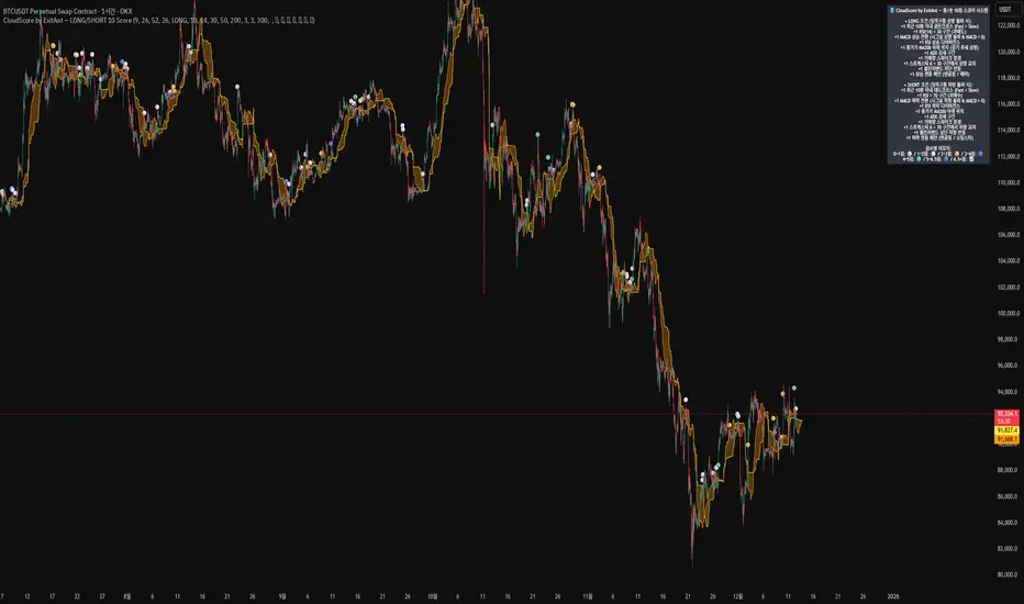
CloudScore by ExitAnt📘 CloudScore by ExitAnt
CloudScore by ExitAnt 는 일목균형표(Ichimoku Cloud)의 구름대 돌파 신호를 기반으로,
다양한 추세 보조지표를 결합하여 매수 추세 강도를 점수화(0~5점) 해주는 트렌드 분석 지표입니다.
기존 일목구름 단독 신호는 변동성이 크거나 신뢰도가 낮을 수 있기 때문에,
이 지표는 여러 기술적 요소를 종합적으로 평가하여
“지금이 얼마나 강력한 추세 전환 구간인가?” 를 직관적으로 보여줍니다.
🎯 지표 목적
일목균형표 구름 돌파의 신뢰도 강화
보조지표 신호를 자동으로 점수화하여 한눈에 판단 가능
캔들 위에 이모지를 배치해 시각적으로 즉시 해석 가능
초보자부터 숙련자까지 모두 활용 가능한 추세 진입 필터링 도구
🧠 점수 계산 방식 (0~5점)
구름 상향 돌파가 발생하면 아래 조건들을 체크하여 점수를 부여합니다.
▶ +1점 조건 항목
1. 골든 크로스 발생
* 최근 설정한 n봉 이내에서 Fast MA가 Slow MA를 상향 돌파한 경우
2. RSI 과매도 구간
* RSI가 설정 값 이하일 때 추세 전환 가능성이 증가
3. MACD 강세 전환
* MACD가 0 아래에 있으면서 시그널선 상향 돌파 발생
4. RSI 상승 다이버전스
* 가격은 낮아지지만 RSI는 상승 → 바닥 신호
5. 200MA 위에 위치
* 장기 추세와 일치하는 시점만 점수 강화
▶ 점수별 이모지
1점 🟡 : 약한 진입 신호
2점 🟢 : 관찰이 필요한 강화 신호
3점 📈 : 추세 전환 가능성 증가
4점 🚀 : 강한 추세 신호
5점 👑 : 매우 강력한 진입 시그널
🖥 차트 표시 요소
구름대(Span A / Span B)만 표시하여 더 깔끔한 시각화
이모지는 캔들 위에 자동 배치
필요 시 최근 n개의 캔들만 표시하도록 설정 가능
오른쪽 상단에 조건 요약 안내창 표시
🔧 사용자 설정
Tenkan / Kijun / SenkouB 기간 조정
MA, RSI, MACD, 다이버전스 사용 여부 선택
최근 몇 개의 캔들까지 점수를 표시할지 설정 가능
이모지는 사용자 취향에 따라 변경 가능
⚠️ 유의사항
본 지표는 **가격 움직임의 확률적 해석을 돕는 보조지표**이며, 단독으로 매수·매도 결정을 내려서는 안 됩니다.
시장 상황(변동성, 거래량, 프레임)에 따라 신호의 신뢰도는 달라질 수 있습니다.
실제 매매 전략에 적용하기 전 반드시 백테스트와 검증이 필요합니다.
# **📘 CloudScore by ExitAnt — English Description**
📘 CloudScore by ExitAnt
CloudScore by ExitAnt is a trend analysis indicator that evaluates bullish trend strength by scoring (0–5 points) signals based on Ichimoku Cloud breakouts combined with multiple momentum and trend indicators.
Since the default Ichimoku Cloud breakout alone can be unreliable or highly volatile, this indicator integrates several technical conditions to visually and intuitively show
“How strong is the current trend reversal opportunity?”
🎯 Purpose of the Indicator
Enhance the reliability of Ichimoku Cloud breakout signals
Automatically score multiple signals for quick visual judgment
Place emojis directly above candles for instant interpretation
Works for both beginners and experienced traders as a trend-entry filtering tool
🧠 Scoring Logic (0–5 points)
When a bullish breakout above the cloud occurs, the indicator checks the following conditions and assigns points.
▶ +1 Point Conditions
1. Golden Cross
* Fast MA crosses above Slow MA within the user-defined lookback window
2. RSI Oversold
* RSI below threshold increases the probability of trend reversal
3. MACD Bullish Shift
* MACD is below zero while crossing above the signal line
4. RSI Bullish Divergence
* Price makes a lower low while RSI makes a higher low → potential bottom signal
5. Above the 200MA
* Only scores when price aligns with long-term trend direction
▶ Emoji by Score
1 Point 🟡 : Weak early signal
2 Points 🟢 : Improved setup; watch closely
3 Points 📈 : Decent trend reversal possibility
4 Points 🚀 : Strong trend entry signal
5 Points 👑 : Very strong bullish signal
🖥 Chart Elements
Displays only Span A / Span B to keep the cloud visually clean
Emojis automatically appear above candles
Optionally limit the number of candles displaying signals
Summary box appears in the upper-right corner
🔧 User Settings
Adjustable Tenkan / Kijun / Senkou B periods
Enable/disable MA, RSI, MACD, divergence filters
Set how many recent candles should show the score
Emojis can be customized by the user
⚠️ Disclaimer
This is a technical assistant tool that helps interpret price movement probabilities; it should not be used as a standalone buy/sell signal.
Signal reliability may vary depending on volatility, volume, and timeframe.
Always conduct backtesting and validation before using it in real trading strategies.

Best Metal to Sell → More BTCWhichever precious metal has outperformed Bitcoin the most over the last 21 days (by >4%) is showing short-term strength → sell a small slice of that metal and rotate into BTC.
Orange = trim some gold → buy BTC
Grey = trim some silver → buy BTC
Black = no clear edge → hold
This is a gradual, disciplined rebalancing tool for anyone holding physical gold & silver who wants to slowly increase their BTC exposure on relative strength spikes — without ever going “all-in”.
You decide the pace: 1% per signal, pause anytime, or stop when you’ve reached your personal comfort level of BTC allocation.
2020–2025 backtest (weekly 1% rotations):
$200k metals → 18.4 BTC + $0 metals left = $1.68 million
HODL metals only = $320k
HODL BTC from day one = ~$1.4 million
It’s not about beating BTC every cycle — it’s about turning stagnant metals into more sats, at your own pace.

RSI os/ob overlay on candle - RichFintech.comRSI os/ob overlay on candle - RichFintech.com reduce the time your eyes must to look two pane, easier to analysis and tired eyes
