Ticker Change AlertScript can be used to create an alert when the specified change percentage occurs for a given period, on a given exchange/pair.
Originally intended to be used to spot 4% change in BTC
Change

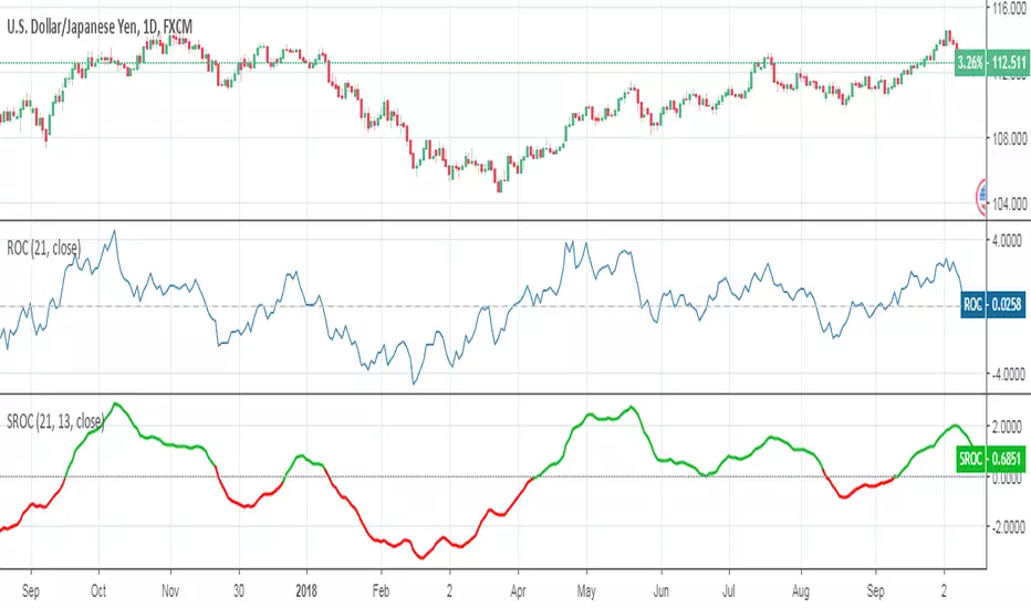
Smoothed Rate of ChangeSmoothed Rate of Change indicator script.
This indicator was originally developed by Fred G. Schutzman.
Percentage Change FunctionThis is little code snippet can be copied and pasted into your own strategies and indicators to easily calculate some interesting percentage change levels within a given lookback period.
The function will return:
The price change from the start to the end of the period
The price change from the start of the period to the highest point within the period
The price change from the start of the period to the lowest point within the period
It was originally intended to be used in conjunction with other scripts to assist with decision making. However, it doesn't look too bad as an indicator and so plots have been added.
For more information regarding the code, some commentary and free tutorials, you can visit the Bactest-Rookies (.com) website.
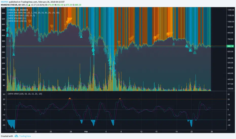
CMYK VRMI◊ Introduction
This script indicates the relative movement of price x volume.
◊ Origin
Based on 'The Relative Momentum Index' by Roger Altman : February, 1993 issue of Technical Analysis of Stocks & Commodities magazine.
While RSI counts up and down days from close to close, the Relative Momentum Index counts up and down days from the close relative to a close x number of days ago.
This results in an RSI that is smoother. The input has been changed to the change of a smoothed close multiplied by a smoothed volume.
The polarity of VRMI indicates bearish/bullish movement.
◊ Adjustments
CMYK color theme applied.
◊ Usage
VRMI indicates the force the market moves with.
◊ Future Prospects
-
◊ ◊ ◊ ◊ ◊ ◊ ◊ ◊ ◊ ◊ ◊ ◊ ◊ ◊ ◊ ◊ ◊ ◊ ◊ ◊ ◊ ◊ ◊ ◊ ◊ ◊ ◊ ◊ ◊ ◊ ◊ ◊ ◊ ◊ ◊ ◊ ◊ ◊ ◊ ◊ ◊ ◊ ◊ ◊ ◊ ◊ ◊ ◊ ◊ ◊ ◊ ◊ ◊ ◊ ◊ ◊ ◊ ◊ ◊ ◊ ◊ ◊ ◊ ◊ ◊ ◊ ◊ ◊ ◊ ◊ ◊ ◊ ◊ ◊ ◊ ◊ ◊ ◊ ◊ ◊ ◊ ◊ ◊ ◊ ◊ ◊ ◊ ◊ ◊ ◊ ◊ ◊ ◊ ◊ ◊ ◊ ◊ ◊ ◊ ◊ ◊ ◊ ◊ ◊ ◊ ◊
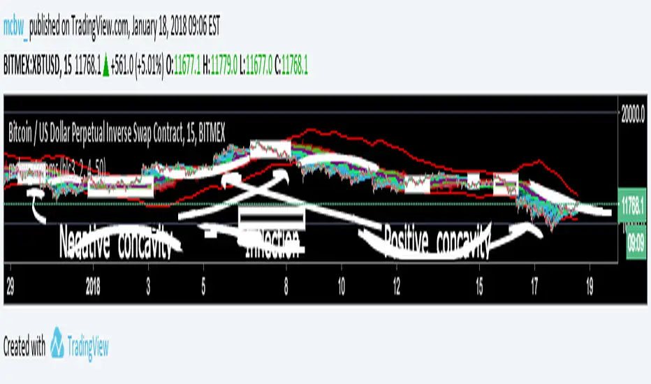
Stream Influxes and ReversalsI have a really interesting script for you guys today. While walking home I had an interesting idea that I wanted to visualize, but had no clue how it would turn out. This script is the result and it seems to provide some larger information.
For anyone who doesn't know the definition of concavity here is a super quick calculus lesson: Concavity is a fancy word for the sign of the second derivative of something. This is the SLOPE OF A SLOPE; how fast is the rate of change changing? An example is position, if you are in a place and want to go to another place the first derivative how you move there is the velocity, if you are measuring the derivative of velocity that is called acceleration. If you are speeding up then you have positive concavity. If you are slowing down you have negative concavity. On a graph positive concavity looks like a cup, negative concavity looks like an upside down bowl. Infection is just a fancy word for when it is zero, which means - to + or + to - So...
If we look at the concavity of the edges it seems to provide us clues about how the price is moving and where it wants to reverse. I made boxes around points of inflection (pos --> neg or neg --> pos concavity)
The purple lines are just moving averages of the green dots. The green dots are where the edges are at each time step, just the average of all of them at once. If price is wiggling a lot then it creates lots of edges, the green dots get plotted close to the price line, which moves up the purple lines.
The red line is a highlight of the last line, helps guide the eye.
The other smooth red lines are a shout out to bollinger bands, set the band width smaller to find break outs or squeezes.
There really isn't a defined strategy for how to use this, but with all the messages I am getting about these scripts everyone is always surprising me with what they see. So I hope some of you can make some good calls with this!
Theres lots of calculations here and it takes a long time to load, if it won't load, just toggle something back and forth till it does.
Happy trading everyone! I hope these scripts give some of you financial freedom. If you're making really good profits then share some of it with those who are less fortunate. Cheers
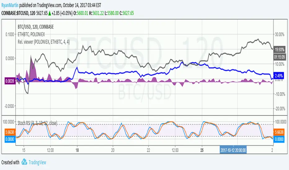
Price relation viewer - add percent change of two symbols (BETA)This script is very much beta!
This is a simple script to visualize how two symbols move in relation to each other. For example if the underlying symbol is a 2x Gold ETF (meaning the ticker moves at 2x the spot price of gold---if gold goes up 3% this ticker should go up 6%) and the comparison symbol is an 2x inverse gold ETF (at gold up 3% this should move down 6%). If these ETFs were 100% accurate at tracking the price of gold then this tool would report a value of zero at all times.
Day 1
Ticker - $10
Comparison - $10
Day 2
Ticker - $12
Comp - $11
This tool value - |20%| + -|10%| = 10%
It uses a short simple moving average to smooth things out a bit (see inputs). It is important to keep your axis scale in mind when using this! Two symbols that are always near zero mean they are offsetting each other very well but the value displayed might range from 0 to 0.005, but the graphed area can make it look extreme if autoscaled.
This is a tool with very specific uses : comparing how one digital currency moves in relation to bitcoin's price, comparing how gold moves in relation to silver, etc.
Percent Change per CandleThis indicator allows you to quickly view the true % change per candlestick (prev close > current close), but it also has 3 other customizable values for you to set your own % change conditions (such as open > high). Feel free to edit the script to suit your own needs as well.


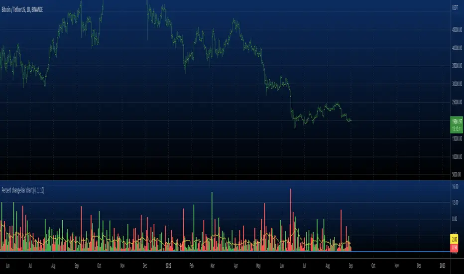
Percent change bar chart v 3.0 This histogram displays price or % change from previous bar.
Can be applied to any time frame.
06/01/2017
Added look back bars.

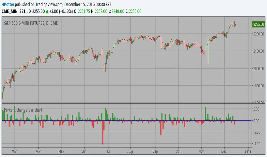
Percent change bar chart v 2.0 This histogram displays price or % change from previous bar.
Can be applied to any time frame.
15/12/2016 Update:
Number of digits after the floating point for study values on the axis now two.
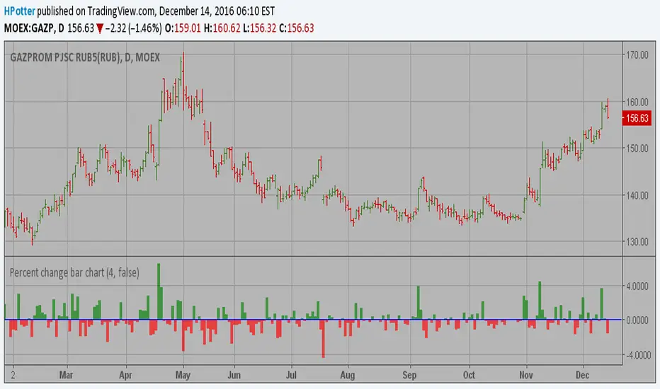
Percent change bar chart This histogram displays price or % change from previous bar.
Can be applied to any time frame.

Rate Of Change - Absolute ValueMeasures the period's change in terms of the instrument's value (e.g. pip, dollar, etc) instead of as a percentage. I generally use it on a daily time frame with a period=1 to see how the current day's move compares with prior days' moves in order to gain a perspective into how this move ranks historically.
[RS]Timed Percentual Change V0EXPERIMENTAL: time based percentual change.
note: each series uses it self as base reference so there's a bit a divergence.
