TZ - India VIX Volatility ZonesTZ – India VIX Volatility Zones is a long-term volatility analysis indicator designed to visually map important India VIX regimes using clearly defined horizontal zones and labels.
The indicator highlights how market volatility cycles between complacency, normal conditions, elevated risk, and panic phases. These zones are based on historical behavior of India VIX and help traders understand when risk is underpriced or overstretched.
This tool is especially useful for:
Index traders
Options sellers and buyers
Risk management and regime filtering
Long-term volatility study
How It Works
The script plots static, historically significant volatility zones on the India VIX chart and visually separates them using shaded bands and labels.
Volatility Zones Explained
1.Extreme Low Volatility (VIX 8–10)
Indicates market complacency and underpriced risk. Often precedes volatility expansion.
2.Low Volatility (VIX 10–13)
Stable market conditions with controlled movement.
3.Normal Volatility (VIX 13–18)
Healthy market behavior and balanced risk.
4.High Volatility (VIX 18–25)
Rising uncertainty and increased intraday swings.
5.Panic Zone (VIX 25–35+)
High fear environment, usually during major events or crises.
How Traders Can Use This Indicator
Identify volatility regimes before choosing option strategies
Avoid aggressive short-volatility trades during extreme zones
Prepare for volatility expansion during low-VIX phases
Use as a market risk context tool alongside price action
This indicator does not provide buy/sell signals. It is designed for contextual analysis and decision support.
Best Usage
Apply on India VIX (NSE:INDIAVIX)
Works best on Weekly and Monthly timeframes
Can be combined with index charts for volatility-based risk assessment
Disclaimer
This indicator is for educational and analytical purposes only.
It does not constitute financial advice or trade recommendations.
Users should apply proper risk management and confirm signals using additional analysis.
Cycles

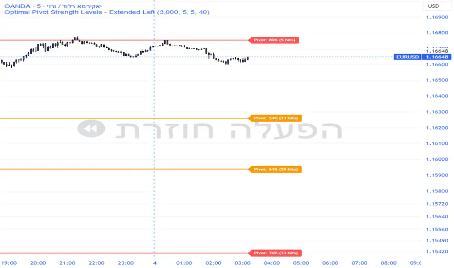
Pivot Edge ProOverview
Smart Pivot Analytics is a highly accurate technical analysis tool designed to identify and validate significant price levels. Unlike standard pivot indicators that only mark recent highs, this tool backtests each identified pivot against thousands of historical candlesticks to calculate its real-world “success rate.”
Key Features
Historical Backtesting: The indicator scans up to 4,900 historical columns to find every instance where price interacted with a specific pivot level.
Strength Score (%): Each level is assigned a percentage score based on its reversal rate. It calculates how many times the price has successfully reached and rejected the level, providing a statistical “hit rate.”
Dynamic Hit Counter: Displays the exact number of times a level has been tested (hit), helping traders distinguish between new levels and established “old” levels.
Smart Filtering: To keep the chart clean, the indicator automatically filters out weak levels and prevents “clutter” by merging levels that are too close together.
Infinite Left Projection: Lines extend left to infinity, allowing traders to see the historical significance of a level across the entire price history at a glance.
How to Trade with It
Red Levels (High Power > 75%): These are “Top Reaction Zones”. Expect a strong price rejection or significant breakout when these levels are tested.
Orange Levels (Medium Power): Suitable for profit targets or as secondary confirmation for entering a trade.
Encounter: Use these levels in conjunction with your existing strategy. When a high power pivot aligns with your entry signal, the probability of a successful trade increases significantly.
Technical Parameters
Lookback Period: Defines how far back in history the script calculates power.
Touch Radius: The "sensitivity" of the level (how close the price has to get to be considered a "hit").
Minimum Strength: A filter to show only the most reliable levels.
TCI Time Oracle - Intraday
🟢 Green Zone — Opening & Closing Liquidity Window
Time:
Opening Green: ~9:15 – 9:30 AM
Closing Green: ~3:15 – 3:30 PM
Market Character:
Highest liquidity of the day
Overnight positions unwind / fresh positions initiate
Strong directional intent often revealed
Smart money sets the day’s bias
Trading Insight:
Best zone for trend bias identification
Option premiums react fastest here
Not ideal for late entries, but excellent for confirmation
🔵 Blue Zone — Midday Compression / Algo Control
Time: ~11:15 AM – 12:00 PM
Market Character:
Volatility contraction
Algo-driven price control
Time decay dominates options
Fake breakouts and mean reversion
Trading Insight
Worst zone for aggressive option buying
Best for range scalping or staying flat
Institutions wait, retailers get chopped
🔴 Red Zone — Institutional Expansion / Trap Zone
Time: ~1:15 PM – 2:00 PM
Market Character:
Sudden volatility expansion
Institutional orders hit the market
Trend acceleration or sharp reversal
Options see rapid delta & gamma shift
Trading Insight:
High probability trend continuation or trap creation
Strong zone for directional option trades
Requires strict risk management
Big Picture Takeaway
Green sets the intent
Blue compresses and traps
Red expands and delivers the real move
This time-zone behavior is exactly why one strategy cannot work all day. Edge comes from trading the right setup in the right time window.

Sector Rotation ULTIMATE: 7 Narrativas IndependientesSector Rotation ULTIMATE: Crypto Narrative Rotation (7 Independent Sectors)
Advanced indicator displaying the relative strength of major crypto sectors through 7 independently normalized lines (0-100):
• Layer1 (ETH, SOL, BNB, TON, etc.) - Pink
• Enterprise (XRP, HBAR, XLM, QNT, VET) - Yellow
• DeFi (UNI, AAVE, MKR, LDO, CRV, etc.) - Cyan
• Memecoins (SHIB, DOGE, PEPE, WIF, FLOKI, BONK) - Green
• AI (TAO, FET, ICP, GRT, etc.) - Orange
• L2 / Scalability (ARB, OP, MATIC, STRK) - Purple
• RWA + Infra (ONDO, LINK) - Brown
Each sector sums the dominance of its top coins (40 total) and is normalized independently so the lines cross constantly, revealing real capital rotations.
- Colored fills to visually highlight the leading sector
- Works perfectly on any timeframe (clean daily data, no intraday noise)
- Ideal for spotting altseason, sector rotations, and entry timing
Use on CRYPTOCAP:TOTAL. The definitive narrative oscillator for 2026!
#Crypto #Altcoins #SectorRotation #DeFi #Memecoins #AI #RWA

4MA / 4MA[1] Forward Projection with 4 SD Forecast Bands4MA / 4MA Projection + 4 SD Bands + Cross Table is a forward-projection tool built around a simple moving average pair: the 4-period SMA (MA4) and its 1-bar lagged value (MA4 ). It takes a prior MA behavior pattern, projects that structure forward, and wraps the projected mean path with four Standard Deviation (SD) bands to visualize probable future price ranges.
This indicator is designed to help you anticipate:
Where the MA structure is likely to travel next
How wide the “expected” future price corridor may be
Where a future MA4 vs MA4 crossover is most likely to occur
When the real (live) crossover actually prints on the chart
What you see on the chart
1) Live moving averages (current market)
MA4 tracks the short-term mean of price.
MA4 is simply the previous bar’s MA4 value (a 1-bar lag).
Their relationship (MA4 above/below MA4 ) gives a clean, minimal read on trend alignment and directional bias.
2) Projected MA path (forward curve)
A forward “ghost” of the MA structure is drawn ahead of price. This projected curve represents the indicator’s best estimate of how the moving average structure may evolve if the market continues to rhyme with the selected historical behavior window.
3) 4 Standard Deviation bands (predictive future price ranges)
Surrounding the projected mean path are four SD envelopes. Think of these as forecast corridors:
Inner bands = tighter “expected” range
Outer bands = wider “stress / extreme” range
These bands are not a guarantee—rather, they’re a structured way to visualize “how far price can reasonably swing” around the projected mean based on observed volatility.
4) Vertical projection lines (most probable cross zone)
Within the projected region you’ll see vertical lines running through the bands. These lines mark the most probable zone where MA4 and MA4 are expected to cross in the projection.
In plain terms:
The projected MAs are two curves.
When those curves are forecasted to intersect, the script marks the intersection region with a vertical line.
This gives you a forward “timing window” for a potential MA shift.
5) Cross Table (top-right)
The table is your confirmation layer. It reports:
Current MA4 value
Current MA4 value
Whether MA4 is above or below MA4
The most recent BUY / SELL cross event
When a real, live crossover happens on the actual chart:
It registers as BUY (MA4 crosses above MA4 )
Or SELL (MA4 crosses below MA4 )
…and the table updates immediately so you can confirm the event without guessing.
How to use it
Practical workflow
Use the projected SD bands as future range context
If price is projected to sit comfortably inside inner bands, the market is behaving “normally.”
If price reaches outer bands, you’re in a higher-volatility / stretched scenario.
Use vertical lines as a “watch zone”
Vertical lines do not force a trade.
They act like a forward “heads-up”: this is the most likely window for an MA crossover to occur if the projection holds.
Use the table for confirmation
When the crossover happens for real, the table is your confirmation signal.
Combine it with structure (support/resistance, trendlines, market context) rather than trading it in isolation.
Notes and best practices
This is a projection tool: it helps visualize a structured forward hypothesis, not a certainty.
SD bands are best used as forecast corridors (risk framing, range planning, and expectation management).
The table is the execution/confirmation layer: it tells you what the MAs are doing now.

Price Range CHoCH Alert🎯 Smart Money Concept (SMC) indicator that monitors a specific price level and alerts only when price touches that level AND
subsequently creates a Change of Character (CHoCH).
Key Features:
• Set a custom price level to monitor
• Detects CHoCH/BOS based on pivot highs/lows
• Alerts ONLY when: Price touches level → CHoCH occurs
• Visual confirmation with level line and status table
• Configurable tolerance for precise level targeting
• Works for both bullish and bearish scenarios
Perfect for:
✓ Institutional level trading
✓ Key support/resistance breakouts
✓ Liquidity grab confirmations
✓ Structure break validation
Simply set your target price level and let the indicator watch for the perfect SMC setup!

LJ Parsons Adjustable expanding MRT Fib Version 2Based on premium/discount/fair-value levels the indicator will expand with the market by settable dates.
The levels are not fib based as such but are resonant levels within an multiplicative /12 log scale using the LJ Parsons Market resonance hypothesis.

Turtle MTF Donchian plus ATR What you’re looking at
This indicator is a Turtle-style breakout system:
Donchian Channels = breakout levels (entry signals)
ATR = how far to place your Stop Loss and Take Profit (or Donchian exit if you turn that on)
And it can do it on a different timeframe than your chart (MTF).
Step-by-step: how it works
1) You choose your “Signal Timeframe”
In settings:
Signal Timeframe = 1 → signals are based on 1 minute
5 → based on 5 minute
60 → 1 hour
D → daily
✅ You can be on a 1m chart but set signals to D if you want only swing signals.
2) It builds the Donchian breakout levels
It calculates:
Donchian High = the highest high of the last entryLen candles (default 20), excluding the current candle
Donchian Low = the lowest low of the last entryLen candles, excluding current candle
Those two lines are your breakout “walls”.
3) It waits for a REAL breakout (fresh cross)
A long setup triggers only when:
price crosses ABOVE the Donchian High (not just stays above)
A short setup triggers only when:
price crosses BELOW the Donchian Low
✅ This reduces spam signals.
4) It calculates ATR on the same signal timeframe
ATR is volatility. Bigger ATR = bigger stop/target.
Defaults:
ATR length = 20
5) It creates your Entry / SL / TP levels automatically
When a LONG triggers:
Entry = Donchian High
Stop Loss = Entry − (SL mult × ATR)
(default SL mult is 2 → so 2×ATR stop)
Take Profit (if you’re using TP mode) = Entry + (TP mult × ATR)
When a SHORT triggers:
Entry = Donchian Low
Stop Loss = Entry + (SL mult × ATR)
Take Profit = Entry − (TP mult × ATR)
6) It prints it on the chart (easy mode)
When a signal happens it will:
Drop a label that says LONG or SHORT
Show the numbers:
Entry
SL
TP (or Donchian exit level)
Draw horizontal lines for Entry / SL / TP (latest signal only)
7) It can use “true Turtle exit” if you want
If you turn ON:
Use Turtle Exit Rule
Then it does NOT use a fixed TP.
Instead it says:
Long: exit when price breaks below the Donchian exit low (default exitLen = 10)
Short: exit when price breaks above the Donchian exit high
That’s the classic “let winners run” vibe.
8) Alerts (Option A)
You can set alerts for:
Turtle Long
Turtle Short
Those alerts are simple and reliable (no dynamic text).
How YOU would use it (quick examples)
If you trade 1m intraday
Chart: 1m
Signal Timeframe: 1
Try entryLen: 40–60 (less choppy than 20)
ATR: 14–20
SL: 2×ATR
If you want daily swings too
Chart: 1m (for execution)
Signal Timeframe: D (for direction/entries)
That gives you swing breakouts while you watch intraday.


PivotStrike Pro 1M + Time-Anchored Pivots
# PivotStrike Pro 1M — Supertrend Style + Time-Anchored Pivots
**PivotStrike Pro 1M (PSP1M-ST)** blends a fast Supertrend-style trend engine with **time-anchored major S/R pivots** that stay locked to the candles as you scroll and zoom. It’s designed for **clear, one-shot Buy/Sell flips** on the 1-minute chart while keeping your chart readable and decisive during strong moves.
## What it does
* **Supertrend Rails (non-repainting on close)**
Green rail sits **below** price in uptrends; red rail sits **above** price in downtrends. When the regime flips, you get a **single Buy or Sell flag**—no re-printing on the same bar.
* **Time-Anchored S/R Pivots**
Confirms **major swing highs/lows** using left/right pivot windows and anchors each level to the bar’s timestamp. Lines extend to the right and **remain aligned with price** when you zoom.
* **Simple, production-ready alerts**
Built-in alerts for Buy/Sell flips so you can route to notifications or bots.
## Why it’s different
* **One-shot signals** you can trust at regime change (no clusters of duplicate arrows).
* **Locked pivots** using `xloc=bar_time`, so support/resistance doesn’t drift when you change the view.
* **HTF option** for the Supertrend engine if you want to smooth 1-minute noise.
## Inputs (quick guide)
* **Indicator Timeframe**: leave blank for chart timeframe (1M), or choose a higher TF to smooth (e.g., 3M/5M).
* **ATR Period / ATR Multiplier**: default **10 / 3.0** (same feel as classic Supertrend).
* **Source**: HL2 (default).
* **Change ATR Method**: RMA(TR) on; toggle off to use `ta.atr`.
* **Show Buy/Sell Signals / Highlighter**: visual preferences.
* **Major S/R (Pivots)**: enable, choose left/right bars (defaults 8/8), line count, style, and transparency.
## Recommended 1M presets
* **ATR Period 10**, **Multiplier 3.0**, **Source HL2**, **Highlighter ON**, **Signals ON**.
* If the rail feels too tight/loose: nudge Multiplier **2.5–3.5**.
* Live scalping? Keep timeframe on **Chart**. Want fewer flips? Try **3M/5M** engine via *Indicator Timeframe*.
## How to read it
* **Trend**: Follow the rail—green below = uptrend bias; red above = downtrend bias.
* **Buy/Sell**: Acts at the **confirmed regime flip**. Use pivots to assess nearby S/R for entries, partials, or stop placement.
* **Pivots**: Recent highs (red lines) and lows (green lines). Breaks/holds around these areas often mark continuation vs. fade zones.
## Alerts
* **PSP1M-ST: BUY / SELL** — triggers on confirmed flips.
Tip: Pair with a simple “rail touch/close beyond” rule in your strategy if you want automation.
## Repainting & HTF notes
* The rail and flags **do not repaint after bar close** on the chart timeframe.
* If you pick a **higher Indicator Timeframe**, the engine only finalizes when that **HTF bar closes** (normal behavior). For pure 1M confirmation, leave the timeframe blank.
## Best practices
* Use pivots to avoid chasing into resistance/support.
* Combine with volume or session filters (e.g., avoid lunch chop).
* Scale risk by distance to the rail; trail behind the rail for simple exits.
> **Disclaimer**: This script is for educational use only. Markets carry risk. Always test and manage risk before trading.

Strategy Scanner (H4 Trend + Clouds)Here is a trend-following strategy I coded for the H4: it first filters the overall direction via the EMA 200, waits for a precise price correction in the recharge zone (between EMA 13 and 32), and only validates the entry if the Stoch RSI confirms an extreme extension (< 10 or > 90) to maximize the chances of a rebound. With a comprehensive tool designed for Trend Following and Pullback traders. It combines Short-Term Momentum, Long-Term Structure, and Multi-Timeframe (MTF) analysis into a single, clean indicator.
aza
@aza 92i

NQ Geometric Trading System NQ Geometric Trading System
Advanced confluence indicator for NQ futures implementing Michael S. Jenkins' geometric methodology.
Core Features:
Automatic spike detection (9:30-9:35) captures institutional footprint
Geometric levels from opening range using Jenkins ratios (R_50, R_25, R_67, extensions)
Rising zero angles provide dynamic time+price support/resistance
Fibonacci time windows highlight natural reversal periods
Weighted confluence algorithm (spike levels = 2x, others = 1x)
Real-time dashboard displays score 0-10 and signal strength
Customizable alerts for high-probability setups
How It Works:
System automatically detects opening spike extremes, calculates geometric ratios from 9:30-10:00 range, projects zero angles rising at 0.75 points/minute, and highlights Fibonacci time windows. When multiple factors align, dashboard shows confluence score with color-coded signals (Strong 5+, Trade 4, Watch 3).
Optimized For:
NQ/MNQ scalping and day trading on 1-5 minute timeframes. Works best during regular trading hours with timezone set to Exchange.
Customizable:
15+ parameters including angle rate, confluence threshold, price tolerance, time windows, and visual settings. Default optimized for NQ but adaptable.
Requirements:
Chart timezone must be "Exchange" or "America/New_York" for proper spike/range detection.
Perfect for traders seeking mechanical, objective signals based on proven geometric principles.

50SMA bounceScans stocks that closed above Weekly 10SMA and previous week closing below the weekly 10SMA

Global Sessions Pro NY/London/Tokyo - O/C/H/LGLOBAL SESSIONS PRO — NY / LONDON / TOKYO
Session Opens, Highs, Lows, Midpoints, Closes, Ranges & Killzones
OVERVIEW
Global Sessions Pro is a comprehensive session-mapping indicator designed for traders who rely on market structure, session context, and time-based behavior.
The indicator automatically plots New York, London, and Tokyo sessions, including:
• Session Open, High, Low, Midpoint, and Close
• Prior session levels projected forward
• Session range boxes
• Right-side labeled price levels (clearly identified)
• Stacked session summary labels (no overlap)
• Optional killzones and overlap windows
• Breakout alerts (prior or current session levels)
The script is fully timezone-aware, DST-safe, and works on any chart timeframe.
KEY FEATURES
SESSION MAPPING
For each session (NY / London / Tokyo), the indicator can display:
• Open
• High
• Low
• Midpoint (High + Low) / 2
• Close
Each level is drawn with its own horizontal line and optional right-side label, so there is never confusion about which line represents which level.
SESSION RANGE BOXES
Optional shaded boxes highlight the true session range as it develops in real time.
These are useful for visualizing:
• Compression vs expansion
• Relative session volatility
• Strength or weakness between sessions
Opacity and visibility are fully configurable.
RIGHT-SIDE LEVEL LABELS
Each session level can be labeled on the right edge of the chart, showing:
• Session name (NY / Lon / Tok)
• Level type (O / H / L / M / C)
• Optional price value
Examples:
NY H: 18234.25
Lon L: 18098.50
Tok M: 18142.75
This eliminates ambiguity when multiple session levels overlap or share similar colors.
SESSION SUMMARY LABELS (AUTO-STACKED)
At the top of each session range, an optional summary label displays:
• Session name
• Open / High / Low / Close
• Total range (points)
• Range in ticks
• ATR multiple
Summary labels are automatically stacked vertically using ATR-based or tick-based spacing, preventing overlap even when multiple sessions occur close together.
PRIOR SESSION LEVELS
The indicator can project prior session levels into the next session, including:
• Prior High and Low
• Optional prior Open, Close, and Midpoint
These levels are commonly used for:
• Support and resistance
• Liquidity sweeps
• Mean reversion
• Failed breakouts
Projection length is configurable and safely capped to comply with TradingView drawing limits.
KILLZONES AND SESSION OVERLAPS
Optional background shading highlights key institutional windows:
• London Open
• New York Open
• London / New York overlap
These zones help identify high-probability volatility windows and time-based trade filters.
All killzones respect the selected session timezone basis.
ALERTS
Built-in alerts are available for:
• Break of prior session high
• Break of prior session low
• Break of current session high
• Break of current session low
Alerts can be configured to trigger on wick or close.
Alert logic is written using precomputed crossover detection to ensure historical consistency and avoid missed or false alerts.
TIMEZONE AND SESSION HANDLING (IMPORTANT)
SESSION TIME BASIS OPTIONS
The indicator supports three session-time modes:
Market Local (DST-aware) – Recommended
• New York uses America/New_York
• London uses Europe/London
• Tokyo uses Asia/Tokyo
• Automatically adjusts for daylight saving time
UTC (Fixed)
• Sessions are interpreted strictly in UTC
• Best for crypto or non-DST workflows
• Requires manual adjustment during DST changes
Custom Timezone
• Define a single custom timezone for all sessions
This ensures sessions display correctly regardless of the chart’s timezone.
DEFAULT SESSION TIMES
(Default values assume Market Local (DST-aware) mode)
Tokyo: 09:00 – 15:00
London: 08:00 – 16:30
New York: 09:30 – 16:00
These defaults are optimized for cash and index trading.
FX traders may adjust session windows as needed.
BEST USE CASES
This indicator is particularly effective for:
• Index futures (ES, NQ, RTY, DAX, FTSE)
• Forex session-based strategies
• Time-based breakout systems
• Liquidity sweep and mean-reversion models
• London Open and New York Open trading
• Multi-session market context analysis
PERFORMANCE AND SAFETY NOTES
• All future-drawn objects are capped to comply with TradingView limits
• Crossover logic is evaluated every bar to prevent calculation drift
• Old session drawings are automatically culled to reduce chart clutter
• Works on all intraday and higher timeframes
RECOMMENDED SETTINGS
For most traders:
• Session Time Basis: Market Local (DST-aware)
• Show Open / High / Low / Midpoint: ON
• Prior Session Levels: ON
• Summary Labels: ON
• Killzones: ON
• Alerts: ON (Close-based)
FINAL NOTES
This indicator is designed to provide objective session structure without opinionated trade signals. It works best as a context layer combined with your own execution rules, confirmations, and risk management.
If you trade time, structure, and liquidity, this script provides the framework.

SMC Confluence Suite [Pure Score Alerts]🚀 The Missing Link in SMC Trading: Timing & Confluence
Knowing "Where" to trade (Order Blocks/FVG) is only half the battle. Knowing "When" to pull the trigger is what separates amateurs from professionals.
The SMC Confluence Suite is a sophisticated Market Scoring Engine designed to validate your trade setups. It acts as a "Market Weather Station," analyzing Structure, Momentum, Extension, and Volatility in real-time to generate a single Confidence Score (0-100).
🧠 How It Works (The Logic)
This indicator processes 5 key dimensions to calculate a Long and Short Score:
Structure: Is the trend Bullish, Bearish, or in a Pullback?
Momentum: Analyzes RSI and divergence (Bull/Bear Div).
Extension (The Dux Logic): Detects if price is "Parabolic" (Overheated) or at a "Discount". It prevents FOMO buying at the top.
Rotation: Analyzes Volume Churn. Is the volume supporting the move, or is it stalling (distribution)?
Mood: A synthesis of market sentiment (Greed vs. Fear).
📊 The Dashboard
Long/Short Score:
> 80 (Aggressive 🚀): Market is priming for a strong move (Setup B / Unicorn).
60 - 80 (Standard ✅): Healthy trend, safe for Pullbacks (Setup C / Golden Swing).
< 40 (No Entry ⛔): Weak market or dangerous conditions.
Warning Flags:
PARABOLIC 🔥: Price moved too fast. Score resets to 0 to prevent chasing.
HIGH CHURN 🌪️: High volume but no price movement. Potential reversal.
✨ Key Features in V8.1
Score Trace (History): See historical scores printed directly on the chart (above/below candles). This allows you to backtest: "Did my winning trade have a high score?"
Asset Modes: optimized settings for Crypto, Stocks, and Metals (Gold/Silver).
Pure Alerts: Simplified alert system. Get notified only when Score > 80 (The "Sniper" moment).
💡 How to Trade (The Strategy)
Use this script alongside an SMC Structure indicator (like the SMC Strategy Companion).
Setup B (Breakout): Requires Score > 80 + High Volatility.
Setup C (Pullback): Requires Score > 60 + No "Parabolic" warning.
Kill Switch: If the Dashboard shows "PARABOLIC" or "CHURN", cancel all entries immediately.

VN Stock Risk + RS CombinedDescription
This script is a cycle-based risk and relative strength indicator designed for the Vietnam stock market.
It combines:
Market Risk (long-term cycle & trend extension)
Relative Strength (RS) versus VN-Index
The goal is to identify stocks that are not overheated and are outperforming the broader market.
How it works
The indicator calculates:
Risk score (0–1) using:
Deviation from long-term cycle SMA
Price distance from 40-week MA
Medium-term flow (20W / 40W MA)
Relative Strength (RS):
Stock price divided by VN-Index price
Compared to RS 40-week MA
How to use
Timeframe: Weekly only
Green zone: Low risk + RS above MA → accumulate / hold
Yellow zone: Mixed signals → wait
Red zone: High risk or weak RS → avoid / reduce exposure
Rule of thumb:
Buy stocks with lower risk than VN-Index and RS above its 40-week MA.
Intended use
Mid-to-long-term investing
Portfolio allocation
Avoiding market tops
❌ Not for day trading or scalping

Altcoin Risk + RS vs BTC1. What is this indicator?
The Altcoin Risk + RS vs BTC indicator is a cycle-based investment tool, designed to answer one key question:
“Is this altcoin both relatively strong and not overheated?”
It combines two essential dimensions of decision-making:
Risk (cycle & valuation) – Is the price too extended?
Relative Strength (RS) – Is capital flowing into this altcoin instead of Bitcoin?
This indicator is not for short-term trading.
It is optimized for mid-to-long-term positioning, portfolio allocation, and avoiding cycle tops.
2. Core concepts
2.1 Risk Component – “Is the altcoin overheated?”
The Risk score (0 → 1) measures how far the altcoin has moved relative to its own historical growth path.
It combines three elements:
Deviation from long-term cycle SMA (2–3 years)
→ Measures long-term valuation vs cycle trend
Log distance from 20-week moving average
→ Identifies bull vs bear regime
Trend momentum (50-day / 50-week MA)
→ Captures acceleration or exhaustion
Interpretation:
Risk Level Meaning
Low (≤ 0.3) Undervalued / accumulation
Medium (0.3–0.6) Healthy trend
High (≥ 0.8) Overheated / distribution
2.2 Relative Strength (RS) vs Bitcoin – “Is it beating BTC?”
Relative Strength is calculated as:
RS = Altcoin Price / Bitcoin Price
Then compared to its 40-week moving average.
Interpretation:
RS Condition Meaning
RS > MA40 Altcoin outperforming BTC
RS < MA40 BTC stronger (alt underperforming)
This ensures you only buy altcoins that are actually attracting capital, not just rising because BTC is rising.
3. Combined logic (the key idea)
An altcoin is attractive only when BOTH conditions are true:
✅ Condition 1 – Risk filter
Altcoin Risk < Bitcoin Risk
→ The altcoin is not more overheated than BTC
✅ Condition 2 – Relative Strength filter
RS > RS 40W MA
→ The altcoin is outperforming BTC
4. Indicator signals (visual meaning)
Background Color Meaning Action
🟢 Green Low risk + strong RS Accumulate / DCA
🟡 Yellow Mixed conditions Wait / monitor
🔴 Red High risk or weak RS Avoid / reduce
5. How to use it correctly (step-by-step)
Step 1 – Timeframe
Weekly chart only
Daily or lower timeframes will generate noise
Step 2 – Asset selection
Best suited for:
ETH
SOL
BNB
KAS
AVAX
❌ Not recommended for meme coins or illiquid assets
Step 3 – Capital allocation
Focus only on green-zone altcoins
Ignore “interesting narratives” if the indicator is red
Step 4 – Portfolio discipline
Increase exposure when green appears after a long red/yellow period
Reduce exposure when risk turns red, even if price is still rising
6. What this indicator is NOT
❌ Not a scalping tool
❌ Not a top/bottom picker
❌ Not predictive of short-term price movements
It is a risk management and capital allocation framework.
7. Typical mistakes to avoid
Using it on daily charts
Buying altcoins with high RS but very high risk
Ignoring Bitcoin risk context
Applying it to hype-driven meme coins

Strategy Scanner (H4 Trend)
Here is a trend-following strategy I coded for the H4: it first filters the overall direction via the EMA 200, waits for a precise price correction in the recharge zone (between EMA 13 and 32), and only validates the entry if the Stoch RSI confirms an extreme extension (< 10 or > 90) to maximize the chances of a rebound.
aza
@aza 92i

Equinox & Pluto & Mercury Signals 2010-2035 (Final Verified)An auxiliary indicator that displays Pluto direct/retrograde, vernal equinox/autumnal equinox, and Mercury retrograde on a daily chart.

InCrypto WatermarkInCrypto Watermark
A customizable overlay indicator that displays essential trading information directly on your TradingView charts. This tool helps traders quickly access key market data without cluttering the chart interface.
KEY FEATURES:
• Symbol Information: Displays current trading pair and active timeframe
• Price Display: Optional current price with smart precision formatting
• Price Change: Optional price change percentage over 24 bars with color-coded indicators
• Date & Time: Multiple format options for date (DD/MM/YYYY, MM/DD/YYYY, YYYY-MM-DD, DD.MM.YYYY) and time (HH:MM, HH:MM:SS)
• Custom Text: Customizable title and subtitle text
• Full Customization: Adjustable positioning, colors, sizes, alignment, and opacity for all elements
• Visibility Controls: Show/hide individual elements independently
• Background Options: Customizable background color, opacity, and optional borders
SETTINGS:
The indicator is organized into logical groups:
- Text Content: Title and subtitle customization
- Visibility: Individual show/hide controls for each element
- Watermark Position: Flexible placement options
- Symbol Info Position: Separate positioning controls
- Cell Size: Width and height adjustments
- Title/Subtitle/Symbol Info Settings: Color, size, alignment, and opacity controls
- Background Settings: Background color, opacity, and border options
USE CASES:
• Chart branding for trading groups or channels
• Quick reference for essential trading information
• Professional-looking charts for screenshots
• Multi-timeframe analysis assistance
TECHNICAL DETAILS:
• Pine Script v6
• Overlay indicator
• Works on all TradingView-supported markets and timeframes
• Real-time updates
HOW TO USE:
1. Add the indicator to your chart
2. Customize title and subtitle in Text Content settings
3. Adjust positioning for watermark and symbol info sections
4. Enable/disable individual information elements as needed
5. Fine-tune colors, sizes, and opacity to match your chart style
The indicator automatically adjusts price precision based on the asset's price level. Price change is calculated over 24 bars of the current timeframe (not 24 hours).
DISCLAIMER:
This indicator is for informational purposes only. It does not constitute investment advice, financial advice, trading advice, or any other type of advice. Past performance does not guarantee future results. Always conduct your own research and risk management before making trading decisions. Trading involves substantial risk of loss and is not suitable for every investor.

MACDTraditional MACD
Used in Kinetic Momentum Theory
The histogram is 2 times higher than the Tradingview default MACD

phoenix liquidity candle Ema V.1.1This indicator is designed to identify session-based range boxes across different trading sessions, helping traders clearly visualize market structure and consolidation zones during active market hours.
The script automatically detects price ranges within each session, allowing traders to understand where liquidity is building and where potential breakouts or rejections may occur.
Additionally, the indicator includes EMA 9 and EMA 11, providing short-term trend guidance and momentum confirmation when price interacts with session ranges.
Key Features:
• Automatic Session Range Box detection
• Clear visualization of session highs and lows
• Integrated EMA 9 & EMA 11
• Useful for scalping, intraday, and session-based strategies
• Designed for clean charts and decision support (not signal-based)
This tool is intended to assist traders in understanding market behavior during sessions, not to provide buy or sell signals.

Clock&Flow: Elements of Cycle Analysis 2nd partClock&Flow – Elements of Cycle Analysis (ECA) | Complete Suite
Elements of Cycle Analysis (ECA) is an advanced cyclic analysis suite designed to interpret the market through time, structure, strength, and energy, combining cycles, volatility, and participation into a single operational framework.
The suite consists of two complementary modules:
🔹ECA 1 – Cycles, Structure, and Volatility (Overlay: True)
ECA 1 is dedicated to the structural and temporal analysis of the market.
Cyclic SMAs (Cyclic Ratio) Moving averages are calibrated according to nominal cycles and timeframes to monitor multiple cycles simultaneously (from the lower cycle to the upper cycles). Crossovers between fast and slow SMAs certify the closing or transition of the cycle related to the faster SMA. The specific cycle is identified in the Info Table at the bottom right (for 15m - 1h - 2h - 1D timeframes). You can select the number of cycles to observe and the asset type to apply them to:
Index: Standard quotes (e.g., Cash sessions).
Future: Extended quotes (24h).
50-200: Classic institutional references for the medium-long term.
ATR-based Dynamic Cyclic Channels The channels represent a lower cycle and its upper counterpart; their width is determined by the observed timeframe and calculated based on average volatility (ATR). Volatility is not treated as noise but as a structural component of the cycle, essential for contextualizing excesses, compressions, and expansions.
Info Table and Quick Guide Dynamic tables automatically link SMAs, timeframes, and time cycles, providing an immediate reading of the current cyclic context.
Time Bands (Weekly / Daily) Temporal visualization helps identify cyclic pivots and rhythm transitions.
🔹 ECA 2 – Market Excesses, Strength, and Energy
ECA 2 analyzes how the market moves within the cyclic structure.
Excesses and Divergences (Cyclic Stochastic) An oscillator calibrated on the same cyclic ratio as the suite. Crossovers between the lower cycle (blue) and upper cycle (red) signal potential phase changes. In areas of excess, divergences often confirm the closing and restart of a cycle.
Directional Movement System (DMS) The ADX measures the strength of the movement, while +DI and -DI indicate direction. A simultaneous crossover of ADX, +DI, and -DI signals imminent acceleration, even before the strength is fully expressed.
Market Pulse – Real Market Energy The Market Pulse measures the amount of real energy moving through the market by relating three factors:
Price Velocity
Normalized Volume
Volatility (ATR relative to price)
These three factors are combined multiplicatively: if one is missing, the impulse weakens. The zero line represents a state of energy equilibrium; values above or below indicate a real imbalance (bullish or bearish). Note: Market Pulse is not a classic oscillator and should not be interpreted as overbought or oversold; it is used to evaluate the energetic quality of a movement.
Operational Convergence
The maximum operational effectiveness of the ECA suite is achieved when all modules converge on the same market phase.
When cyclic timing, volatility, price structure, trend strength, and movement energy align, the context signals a high-probability operational phase. The system is applicable to any timeframe or asset because it is not bound by dogmatic or subjective interpretations of technical or fundamental analysis; instead, it leverages what is actually happening in the market. Major chart patterns and Volume Profile (technically not includable in this specific suite) provide further confirmation.
Under these conditions, the signal does not originate from a single indicator but from the consistency of the entire system: time, volatility, and energy moving in the same direction.
Entries should always be accompanied by proper risk management.
––––––––––––––––––––––––––––––––––––––––––––––––––––––––––––––––––––––––
Clock&Flow – Elements of Cycle Analysis (ECA) | Suite Completa
Elements of Cycle Analysis (ECA) è una suite avanzata di analisi ciclica progettata per leggere il mercato attraverso tempo, struttura, forza ed energia, combinando cicli, volatilità e partecipazione in un unico framework operativo.
La suite è composta da due moduli complementari:
🔹 ECA 1 – Cicli, Struttura e Volatilità (overlay true)
ECA 1 è dedicato all’analisi strutturale e temporale del mercato.
SMA cicliche (ratio ciclica)
Le medie mobili sono calibrate in funzione dei cicli nominali e del timeframe per monitorare più cicli simultaneamente (dal ciclo inferiore fino ai cicli superiori).
Gli incroci tra SMA veloci e lente certificano la chiusura o transizione del ciclo correlato alla SMA più veloce. Il ciclo in questione è segnalato nella info table in basso a destra (per i time frame 15’ - 1h - 2h - 1D) Puoi selezionare il numero dei cicli da osservare e su quali asset applicarle (Index = quotazioni standard / Future = quotazioni estese / 50-200 i classici riferimenti istituzionali per il medio-lungo periodo
Canali ciclici dinamici basati su ATR
I canali rappresentano un ciclo inferiore e il suo superiore, l’ampiezza è data dal time frame osservato e calcolata sulla volatilità media (ATR).
La volatilità non è trattata come rumore, ma come componente strutturale del ciclo, utile per contestualizzare eccessi, compressioni ed espansioni.
Info Table e Quick Guide
Tabelle dinamiche collegano automaticamente SMA, timeframe e cicli temporali, fornendo una lettura immediata del contesto ciclico in corso.
Time Bands (Weekly / Daily)
La visualizzazione temporale aiuta a individuare pivot ciclici e transizioni di ritmo.
––––––––––––––––––––––––––––––––––––––––––––––––––––––––––––––––––––––
🔹 ECA 2 – Eccessi, Forza ed Energia del Mercato
ECA 2 analizza come il mercato si muove all’interno della struttura ciclica.
Eccessi e divergenze (Stochastic ciclico)
Oscillatore calibrato sulla stessa ratio ciclica della suite.
Gli incroci tra ciclo inferiore (blu) e superiore (rosso) segnalano potenziali cambi di fase; in area di eccesso, le divergenze certificano spesso la chiusura e ripartenza del ciclo.
Directional Movement System (DMS)
L’ADX misura la forza del movimento, mentre +DI e –DI ne indicano la direzione.
L’incrocio simultaneo di ADX, +DI e –DI segnala un’accelerazione imminente, anche in assenza di forza già espressa.
Market Pulse – Energia reale del mercato
Il Market Pulse misura quanta energia reale sta attraversando il mercato mettendo in relazione:
velocità del prezzo
volume normalizzato
volatilità (ATR rapportato al prezzo)
I tre fattori sono combinati in modo moltiplicativo: se uno manca, l’impulso si indebolisce.
La linea dello zero rappresenta una condizione di equilibrio energetico; valori sopra o sotto indicano uno sbilanciamento reale, rialzista o ribassista.
Il Market Pulse non è un oscillatore classico e non va interpretato in termini di ipercomprato o ipervenduto: serve a valutare la qualità energetica del movimento.
La massima efficacia operativa della suite ECA si ottiene quando tutti i moduli convergono sulla stessa fase di mercato.
Quando tempi ciclici, volatilità, struttura del prezzo, forza del trend ed energia del movimento risultano allineati, il contesto segnala una fase ad alta probabilità operativa.
È applicabile su qualunque time frame o asset perché non è vincolato a dogmatiche e soggettive interpretazioni di analisi tecnica - fondamentale ma sfrutta ciò che realmente sta accadendo sul mercato.
I principali pattern grafici e il Volume Profile (in questa suite tecnicamente non inseribili) forniscono ulteriori conferme e/o indicazioni.
In queste condizioni il segnale non nasce da un singolo indicatore, ma dalla coerenza dell’intero sistema: tempo, volatilità ed energia si muovono nella stessa direzione.
Gli ingressi vanno sempre accompagnati da una corretta gestione del rischio.
