Market Internals SPY[TP]# Market Internals SPY Dashboard - TradingView Publication
## 📊 Overview
**Market Internals SPY ** is a comprehensive multi-factor market sentiment dashboard designed specifically for SPY (S&P 500 ETF) traders. This indicator combines four powerful market breadth signals into one easy-to-read interface, helping traders identify high-probability setups and avoid false breakouts.
---
## 🎯 What Makes This Indicator Unique?
Unlike single-indicator tools, this dashboard synthesizes **multiple market internals** to provide confluence-based trading signals:
- **CPR (Central Pivot Range)** - Institutional pivot levels
- **VIX (Volatility Index)** - Fear gauge
- **Put/Call Ratio** - Options sentiment with dynamic crossover alerts
- ** USI:ADD (Advance/Decline Line)** - Market breadth strength
All presented in a clean, real-time dashboard with visual alerts directly on your chart.
---
## 📈 Key Features
### 1. **Static Daily CPR Levels**
- Automatically plots Top CPR, Pivot, and Bottom CPR
- Levels remain fixed throughout the trading day (no repainting)
- **Trend Bias Indicator**: Green = Current Pivot > Previous Pivot (Bullish structure)
### 2. **Put/Call Ratio Crossover System**
- 10-period SMA smoothing for cleaner signals
- **Bullish Signal** (Green background): Put/Call crosses below SMA
- Indicates decreasing hedging activity (bullish)
- **Bearish Signal** (Red background): Put/Call crosses above SMA
- Indicates increasing hedging activity (bearish)
### 3. **Price/Breadth Divergence Detection**
- **Yellow Candles**: Highlight when price and USI:ADD diverge
- Price rising but USI:ADD falling = Potential reversal
- Price falling but USI:ADD rising = Possible bottom
### 4. **Comprehensive Real-Time Dashboard**
A top-right table displaying:
- **CPR Trend Bias**: Bullish/Bearish structure
- **VIX Level**: Current value + directional bias
- **Put/Call Ratio**: Live value + trend arrows
- **AD Line**: Breadth strength with directional indicators
### 5. **Intelligent Bar Coloring**
- **Green bars**: USI:ADD rising (breadth improving)
- **Red bars**: USI:ADD falling (breadth deteriorating)
- **Yellow bars**: Divergence warning (potential reversal)
---
## 🔧 How to Use
### Setup Instructions
1. **Add to Chart**: Apply to SPY on your preferred intraday timeframe (5m, 15m, 30m, 1H)
2. **Configure Symbols** (if needed):
- Default settings work for most platforms
- If "PCC" doesn't load, try: `PCCR`, `INDEX:PCC`, `USI:PCC`, or `CBOE:PCC`
- Ensure you have market internals data access ( USI:ADD , VIX)
### Trading Signals
#### 🟢 **Bullish Confluence** (High-Probability Long Setup)
- CPR Trend = BULLISH
- VIX falling or low (<20)
- Put/Call below SMA (or green background crossover)
- USI:ADD rising (green bars)
- **Entry**: Look for bullish price action at support levels
#### 🔴 **Bearish Confluence** (High-Probability Short Setup)
- CPR Trend = BEARISH
- VIX rising or elevated (>25)
- Put/Call above SMA (or red background crossover)
- USI:ADD falling (red bars)
- **Entry**: Look for bearish rejection at resistance
#### ⚠️ **Divergence Warning**
- Yellow candles indicate mismatch between price and breadth
- Consider profit-taking or reversals when divergence appears at extremes
### Best Practices
- **Multi-Timeframe Confirmation**: Check higher timeframes (4H, Daily) for trend alignment
- **Volume Confirmation**: Combine with volume analysis for stronger signals
- **Risk Management**: Always use stop losses; no indicator is 100% accurate
- **News Awareness**: Be cautious around major economic releases
---
## 📚 Understanding the Components
### CPR (Central Pivot Range)
Traditional floor trader pivot levels calculated from previous day's High, Low, Close:
- **Pivot (PP)** = (High + Low + Close) / 3
- **Top CPR (TC)** = (PP - BC) + PP
- **Bottom CPR (BC)** = (High + Low) / 2
### VIX (Volatility Index)
- **< 15**: Complacency, potential for sudden moves
- **15-20**: Normal conditions
- **20-30**: Elevated uncertainty
- **> 30**: High fear, potential bottoming process
### Put/Call Ratio
- **< 0.7**: Excessive optimism (contrarian bearish)
- **0.7-1.0**: Balanced sentiment
- **> 1.0**: Defensive positioning (contrarian bullish potential)
### USI:ADD (NYSE Advance/Decline)
- **> 0**: More stocks advancing than declining (bullish breadth)
- **< 0**: More stocks declining than advancing (bearish breadth)
- **Extreme readings** (±2000+): Potential exhaustion
---
## ⚙️ Customization Options
### Input Parameters
- **AD Line Symbol**: Default "ADD" (try "ADVN" or "NYSE:ADD" if needed)
- **VIX Symbol**: Default "VIX" (try "CBOE:VIX" if needed)
- **Put/Call Symbol**: Default "PCC" (alternatives listed above)
### Color Scheme
- Blue: CPR levels
- Purple: Pivot point
- Green: Bullish signals/backgrounds
- Red: Bearish signals/backgrounds
- Yellow: Divergence warnings
---
## 💡 Pro Tips
1. **Wait for Confluence**: Don't trade on a single indicator - wait for 3+ signals to align
2. **Use CPR as Dynamic S/R**: Price tends to react at TC and BC levels
3. **Watch the Crossovers**: Put/Call crossovers often precede significant moves
4. **Monitor Divergences**: Yellow candles at key levels are high-value signals
5. **Combine with Price Action**: This tool confirms direction - you still need entry triggers
---
## ⚠️ Limitations & Disclaimers
- Requires **premium data** for USI:ADD and VIX on most platforms
- Best suited for **intraday SPY trading** (may adapt to other indices)
- **Not a standalone system** - use with proper risk management
- Past performance does not guarantee future results
- Always backtest before live trading
---
## 🎓 Example Scenario
**Bullish Setup**:
- 9:45 AM EST: Price pulls back to Bottom CPR
- Dashboard shows: ✅ Bullish CPR Bias, ✅ VIX 16.5 (falling), ✅ Put/Call 0.68 ⬇️ Bull, ✅ USI:ADD +850 ⬆️
- Green background flashes (Put/Call crossunder)
- **Action**: Enter long at BC with stop below TC of previous day
---
## 📊 Ideal Timeframes
- **Primary**: 5-minute, 15-minute (day trading)
- **Secondary**: 30-minute, 1-hour (swing entries)
- **Confirmation**: Daily chart for trend context
---
## 🔄 Updates & Support
This indicator is actively maintained. If you encounter symbol loading issues:
1. Check your data provider includes market internals
2. Try alternative symbols in inputs
3. Ensure you're using a premium TradingView plan (if required)
---
## 📝 Version Information
- **Version**: 5 (Pine Script v5)
- **Type**: Overlay Indicator
- **Author**: tapaspattanaik
- **Category**: Market Internals / Breadth Analysis
---
## 🏆 Final Thoughts
This indicator is designed for **serious traders** who understand that edge comes from confluence, not single signals. By combining institutional pivot levels with real-time market internals, you gain a significant advantage in reading market sentiment and timing entries with precision.
**Remember**: The best trades happen when multiple independent factors align. Use this dashboard to find those moments.
---
## 📌 How to Add This Indicator
1. Open TradingView and navigate to Pine Editor
2. Copy the complete script code
3. Click "Add to Chart"
4. Configure symbols if needed (see Setup Instructions above)
5. Adjust position/colors to your preference
---
**Happy Trading! 📈**
*This indicator is for educational purposes. Always manage risk appropriately and never risk more than you can afford to lose.*
---
### Tags
`#SPY` `#MarketInternals` `#CPR` `#VIX` `#PutCallRatio` `#BreadthAnalysis` `#DayTrading` `#SwingTrading` `#TechnicalAnalysis` `#PivotPoints`
Marketinternals

Weighted NIFTY 5D Directional BreadthOverview
This indicator measures market participation quality within the NIFTY index by tracking how many heavily-weighted stocks are contributing to index direction over a rolling 5-day period.
Instead of counting simple up/down closes, it evaluates directional momentum × index weight, making it far more reliable for identifying narrow leadership, distribution, and late-stage rallies.
Why this indicator matters
Indexes can continue making higher highs even when only a few large stocks are doing the lifting.
This tool reveals what price alone hides:
Whether participation is broad or narrowing
When index highs are being driven by fewer contributors
Early warnings of fragility before corrections
How it works
Each selected NIFTY stock is assigned a weight approximating index influence
The indicator checks whether each stock is up or down versus its 5-day close
Directional signals are weighted and aggregated
The result is a single breadth line reflecting true contribution strength
Positive values → weighted participation is supportive
Negative values → weighted drag beneath the index
How to interpret
Index Higher High + Indicator Lower High
→ Narrow leadership, distribution risk
Indicator turns down before price
→ Early loss of momentum
Sustained positive readings
→ Healthy, broad participation
Sustained negative readings
→ Market weakness beneath the surface
This is not a buy/sell signal, but a context and risk-assessment tool.
Best use cases
Identifying late-stage rallies
Confirming or rejecting breakouts
Risk management for index trades
Combining with price structure or momentum indicators
Notes
Designed for Daily and higher timeframes
Uses non-repainting logic
Best used alongside price action and structure
Disclaimer
This indicator is intended for educational and analytical purposes only.
It does not provide financial advice or trade recommendations.

Yelober - Market Internal direction+ Key levelsYelober – Market Internals + Key Levels is a focused intraday trading tool that helps you spot high-probability price direction by anchoring decisions to structure that matters: yesterday’s RTH High/Low, today’s pre-market High/Low, and a fast Value Area/POC from the prior session. Paired with a compact market internals dashboard (NYSE/NASDAQ UVOL vs. DVOL ratios, VOLD slopes, TICK/TICKQ momentum, and optional VIX trend), it gives you a real-time read on breadth so you can choose which direction to trade, when to enter (breaks, retests, or fades at PMH/PML/VAH/VAL/POC), and how to plan exits as internals confirm or deteriorate. On top of these intraday decision benefits, it also allows traders—in a very subtle but powerful way—to keep an eye on the VIX and immediately recognize significant spikes or sharp decreases that should be factored in before entering a trade, or used as a quick signal to modify an existing position. In short: clear levels for the chart, live internals for the context, and a smarter, rules-based path to execution.
# Yelober – Market Internals + Key Levels
*A TradingView indicator for session key levels + real‑time market internals (NYSE/NASDAQ TICK, UVOL/DVOL/VOLD, and VIX).*
**Script name in Pine:** `Yelober - Market Internal direction+ Key levels` (Pine v6)
---
## 1) What this indicator does
**Purpose:** Help intraday traders quickly find high‑probability reaction zones and read market internals momentum without switching charts. It overlays yesterday/today’s **automatic price levels** on your active chart and shows a **market breadth table** that summarizes NYSE/NASDAQ buying pressure and TICK direction, with an optional VIX trend read.
### Key features at a glance
* **Automatic Price Levels (overlay on chart)**
* Yesterday’s High/Low of Day (**yHoD**, **yLoD**)
* Extended Hours High/Low (**yEHH**, **yEHL**) across yesterday AH + today pre‑market
* Today’s Pre‑Market High/Low (**PMH**, **PML**)
* Yesterday’s **Value Area High/Low** (**VAH/VAL**) and **Point of Control (POC)** computed from a volume profile of yesterday’s **regular session**
* Smart de‑duplication:
* Shows **only the higher** of (yEHH vs PMH) and **only the lower** of (yEHL vs PML) to avoid redundant bands
* **Market Breadth Table (on‑chart table)**
* **NYSE ratio** = UVOL/DVOL (signed) with **VOLD slope** from session open
* **NASDAQ ratio** = UVOLQ/DVOLQ (signed) with **VOLDQ slope** from session open
* **TICK** and **TICKQ**: live cumulative ratio and short‑term slope
* **VIX** (optional): current value + slope over a configurable lookback/timeframe
* Color‑coded trends with sensible thresholds and optional normalization
---
## 2) How to use it (trader workflow)
1. **Mark your reaction zones**
* Watch **yHoD/yLoD**, **PMH/PML**, and **VAH/VAL/POC** for first touches, break/retest, and failure tests.
* Expect increased responsiveness when multiple levels cluster (e.g., PMH ≈ VAH ≈ daily pivot).
2. **Read the breadth panel for context**
* **NYSE/NASDAQ ratio** (>1 = more up‑volume than down‑volume; <−1 = down‑dominant). Strong green across both favors long setups; red favors short setups.
* **VOLD slopes** (NYSE & NASDAQ): positive and accelerating → broadening participation; negative → persistent pressure.
* **TICK/TICKQ**: cumulative ratio and **slope arrows** (↗ / ↘ / →). Use the slope to gauge **near‑term thrust or fade**.
* **VIX slope**: rising VIX (red) often coincides with risk‑off; falling VIX (green) with risk‑on.
3. **Confluence = higher confidence**
* Example: Price reclaims **PMH** while **NYSE/NASDAQ ratios** print green and **TICK slopes** point ↗ — consider break‑and‑go; if VIX slope is ↘, that adds risk‑on confidence.
* Example: Price rejects **VAH** while **VOLD slopes** roll negative and VIX ↗ — consider fade/reversal.
4. **Risk management**
* Place stops just beyond key levels tested; if breadth flips, tighten or exit.
> **Timeframes:** Works best on 1–15m charts for intraday. Value Area is computed from **yesterday’s RTH**; choose a smaller calculation timeframe (e.g., 5–15m) for stable profiles.
---
## 3) Inputs & settings (what each option controls)
### Global Style
* **Enable all automatic price levels**: master toggle for yHoD/yLoD, yEHH/yEHL, PMH/PML, VAH/VAL/POC.
* **Line style/width**: applies to all drawn levels.
* **Label size/style** and **label color linking**: use the same color as the line or override with a global label color.
* **Maximum bars lookback**: how far the script scans to build yesterday metrics (performance‑sensitive).
### Value Area / Volume Profile
* **Enable Value Area calculations** *(on by default)*: computes yesterday’s **POC**, **VAH**, **VAL** from a simplified intraday volume profile built from yesterday’s **regular session bars**.
* **Max Volume Profile Points** *(default 50)*: lower values = faster; higher = more precise.
* **Value Area Calculation Timeframe** *(default 15)*: the security timeframe used when collecting yesterday’s highs/lows/volumes.
### Individual Level Toggles & Colors
* **yHoD / yLoD** (yesterday high/low)
* **yEHH / yEHL** (yesterday AH + today pre‑market extremes)
* **PMH / PML** (today pre‑market extremes)
* **VAH / VAL / POC** (yesterday RTH value area + point of control)
### Market Breadth Panel
* **Show NYSE / NASDAQ / VIX**: choose which series to display in the table.
* **Table Position / Size / Background Color**: UI placement and legibility.
* **Slope Averaging Periods** *(default 5)*: number of recent TICK/TICKQ ratio points used in slope calculation.
* **Candles for Rate** *(default 10)* & **Normalize Rate**: VIX slope calculation as % change between `now` and `n` candles ago; normalize divides by `n`.
* **VIX Timeframe**: optionally compute VIX on a higher TF (e.g., 15, 30, 60) for a smoother regime read.
* **Volume Normalization** (NYSE & NASDAQ): display VOLD slopes scaled to `tens/thousands/millions/10th millions` for readable magnitudes; color thresholds adapt to your choice.
---
## 4) Data sources & definitions
* **UVOL/VOLD (NYSE)** and **UVOLQ/DVOLQ/VOLDQ (NASDAQ)** via `request.security()`
* **Ratio** = `UVOL/DVOL` (signed; negative when down‑volume dominates)
* **VOLD slope** ≈ `(VOLD_now − VOLD_open) / bars_since_open`, then normalized per your setting
* **TICK/TICKQ**: cumulative sum of prints this session with **positives vs negatives ratio**, plus a simple linear regression **slope** of the last `N` ratio values
* **VIX**: value and slope across a user‑selected timeframe and lookback
* **Sessions (EST/EDT)**
* **Regular:** 09:30–16:00
* **Pre‑Market:** 04:00–09:30
* **After Hours:** 16:00–20:00
* **Extended‑hours extremes** combine **yesterday AH** + **today PM**
> **Note:** All session checks are done with TradingView’s `time(…,"America/New_York")` context. If your broker’s RTH differs (e.g., futures), adjust expectations accordingly.
---
## 5) How the algorithms work (plain English)
### A) Key Levels
* **Yesterday’s RTH High/Low**: scans yesterday’s bars within 09:30–16:00 and records the extremes + bar indices.
* **Extended Hours**: scans yesterday AH and today PM to get **yEHH/yEHL**. Script shows **either yEHH or PMH** (whichever is **higher**) and **either yEHL or PML** (whichever is **lower**) to avoid duplicate bands stacked together.
* **Value Area & POC (RTH only)**
* Build a coarse volume profile with `Max Volume Profile Points` buckets across the price range formed by yesterday’s RTH bars.
* Distribute each bar’s volume uniformly across the buckets it spans (fast approximation to keep Pine within execution limits).
* **POC** = bucket with max volume. **VA** expands from POC outward until **70%** of cumulative volume is enclosed → yields **VAH/VAL**.
### B) Market Breadth Table
* **NYSE/NASDAQ Ratio**: signed UVOL/DVOL with basic coloring.
* **VOLD Slopes**: from session open to current, normalized to human‑readable units; colors flip green/red based on thresholds that map to your normalization setting (e.g., ±2M for NYSE, ±3.5×10M for NASDAQ).
* **TICK/TICKQ Slope**: linear regression over the last `N` ratio points → **↗ / → / ↘** with the rounded slope value.
* **VIX Slope**: % change between now and `n` candles ago (optionally divided by `n`). Red when rising beyond threshold; green when falling.
---
## 6) Recommended presets
* **Stocks (liquid, intraday)**
* Value Area **ON**, `Max Volume Points` = **40–60**, **Timeframe** = **5–15**
* Breadth: show **NYSE & NASDAQ & VIX**, `Slope periods` = **5–8**, `Candles for rate` = **10–20**, **Normalize VIX** = **ON**
* **Index futures / very high‑volume symbols**
* If you see Pine timeouts, set `Max Volume Points` = **20–40** or temporarily **disable Value Area**.
* Keep breadth panel **ON** (it’s light). Consider **VIX timeframe = 15/30** for regime clarity.
---
## 7) Tips, edge cases & performance
* **Performance:** The volume profile is capped (`maxBarsToProcess ≤ 500` and bucketed) to keep it responsive. If you experience slowdowns, reduce `Max Volume Points`, `Maximum bars lookback`, or disable Value Area.
* **Redundant lines:** The script **intentionally suppresses** PMH/PML when yEHH/yEHL are more extreme, and vice‑versa.
* **Label visibility:** Use `Label style = none` if you only want clean lines and read values from the right‑end labels.
* **Futures/RTH differences:** Value Area is from **yesterday’s RTH** only; for 24h instruments the RTH period may not reflect overnight structure.
* **Session transitions:** PMH/PML tracking stops as soon as RTH starts; values persist as static levels for the session.
---
## 8) Known limitations
* Uses public TradingView symbols: `UVOL`, `VOLD`, `UVOLQ`, `DVOLQ`, `VOLDQ`, `TICK`, `TICKQ`, `VIX`. If your data plan or region limits any symbol, the corresponding table rows may show `na`.
* The VA/POC approximation assumes uniform distribution of each bar’s volume across its high–low. That’s fast but not a tick‑level profile.
* Works best on US equities with standard NY session; alternative sessions may need code changes.
---
## 9) Troubleshooting
* **“Script is too slow / timed out”** → Lower `Max Volume Points`, lower `Maximum bars lookback`, or toggle **OFF** `Enable Value Area calculations` for that instrument.
* **Missing breadth values** → Ensure the symbols above load on your account; try reloading chart or switching timeframes once.
* **Overlapping labels** → Set `Label style = none` or reduce label size.
---
## 10) Version / license / contribution
* **Version:** Initial public release (Pine v6).
* **Author:** © yelober
* **License:** Free for community use and enhancement. Please keep author credit.
* **Contributing:** Open PRs/ideas: presets, alert conditions, multi‑day VA composites, optional mid‑value (`(VAH+VAL)/2`), session filter for futures, and alertable state machine for breadth regime transitions.
---
## 11) Quick start (TL;DR)
1. Add the indicator and **keep default settings**.
2. Trade **reactions** at yHoD/yLoD/PMH/PML/VAH/VAL/POC.
3. Use the **breadth table**: look for **green ratios + ↗ slopes** (risk‑on) or **red ratios + ↘ slopes** (risk‑off). Check **VIX** slope for confirmation.
4. Manage risk around levels; when breadth flips against you, tighten or exit.
---
### Changelog (public)
* **v1.0:** First community release with automatic RTH levels, VA/POC approximation, breadth dashboard (NYSE/NASDAQ/TICK/TICKQ/VIX) with normalization and adaptive color thresholds.

VIX Filter/RSI/EMA Bias/Cum-TICK w/ Exhaustion Zone DashboardThis all-in-one dashboard gives intraday traders a real-time visual read of market conditions, combining volatility regime, trend bias, momentum exhaustion, and internal strength — all in a fully customizable overlay that won’t clutter your chart.
📉 VIX Market Regime Detector
Identifies "Weak", "Normal", "Volatile", or "Danger" market states based on customizable VIX ranges and symbol (e.g., VXN or VIX).
📊 RSI Momentum Readout
Displays real-time RSI from any selected timeframe or symbol, with adjustable length, OB/OS thresholds, and color-coded exhaustion alerts.
📈 EMA Trend Bias Scanner
Compares fast and slow EMAs to define bullish or bearish bias, using your preferred timeframe, symbol, and EMA lengths — ideal for multi-timeframe setups.
🧠 Cumulative TICK Pressure & Exhaustion Engine
Analyzes internal market strength using cumulative TICK data to classify conditions as:
-Strong / Mild Bullish or Bearish Pressure
-Choppy / No Edge
-⚠️ Exhaustion Zones — when raw TICK values hit extreme highs/lows, a separate highlight box appears in the dashboard, warning of potential turning points
All logic is customizable, including TICK symbol, timeframes, thresholds, and lookback periods.
Scalpers and day traders who want fast, visual insight into market internals, exhaustion, and trend bias.

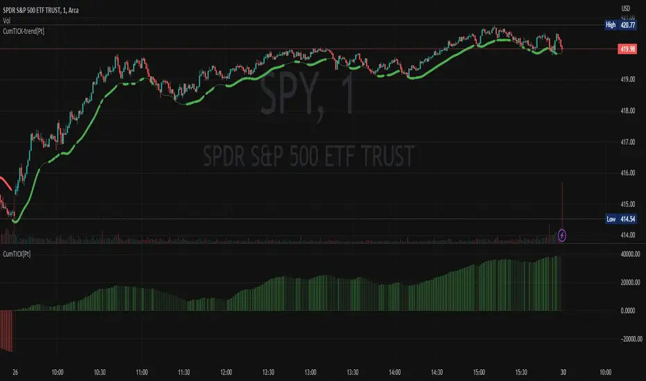
Cumulative TICK [Pt]Cumulative TICK Indicator, shown as the bottom indicator, is a robust tool designed to provide traders with insights into market trends using TICK data. This indicator visualizes the cumulative TICK trend in the form of colored columns on a separate chart below the main price chart.
Here's an overview of the key features of the Cumulative TICK Indicator:
1. Selectable TICK Source 🔄: The indicator allows users to choose from four different TICK data sources, namely USI:TICK , USI:TICKQ , USI:TICKI , and $USI:TICKA.
2. TICK Data Type Selection 🎚️: Users can select the type of TICK data to be used. The options include: Close, Open, hl2, ohlc4, hlc3.
3. Optional Simple Moving Average (SMA) 📊: The indicator offers an option to apply an SMA to the Cumulative TICK values, with a customizable length.
4. After-hour Background Color 🌙: The background color changes during after-hours to provide a clear distinction between regular and after-hour trading sessions.
🛠️ How it Works:
The Cumulative TICK Indicator uses TICK data accumulated during the regular market hours (9:30-16:00) as per the New York time zone. At the start of a new session or at the end of the regular session, this cumulative TICK value is reset.
The calculated Cumulative TICK is plotted in a column-style graph. If the SMA is applied, the SMA values are used for the column plots instead. The columns are colored green when the Cumulative TICK is positive and red when it is negative. The shades of green and red vary based on whether the Cumulative TICK is increasing or decreasing compared to the previous value.
This is a simple yet powerful tool to track market sentiment throughout the day using TICK data. Please note that this indicator is intended to be used as part of a comprehensive trading strategy. Always ensure you are managing risk appropriately and consulting various data sources to make informed trading decisions.
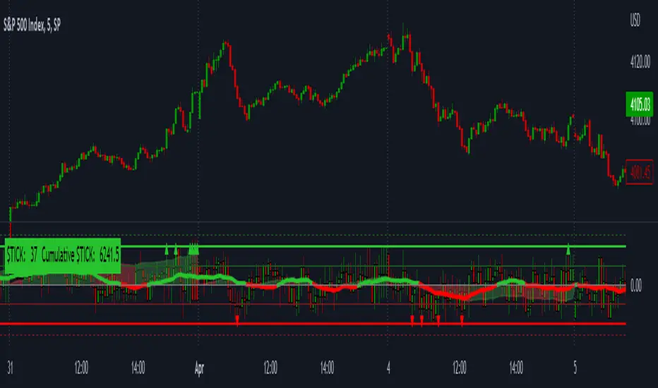
LNL Smart TICKLNL Smart TICK
This study is mostly beneficial for intraday traders. It is basically a user-friendly "colorful" representation of the $TICK chart with highlighted $TICK extremes. This indicator also includes: a simple trend gauge that can visualize the bias for the day, cumulative tick cloud which is showing the cumulative strength of either longs & shorts on the day.
$TICK Trend Gauge
Although it is just a exponential moving average. This average (default set on 20) works quite well as an overall gauge for the day. Whenever the gauge is green (above zero), any negative $TICK values below -500 can offer great pullback opportunities. Same applies for the red gauge. 20 EMA is below zero ? Great time to fade any +500 or +1000 tick readings. Obviously the gauge can be ajdusted to any number based on personal style.
$TICK Extremes (little triangles)
These little triangles are triggered anytime $TICK jumps above or below the pre-set values of +1000 or -1000. By just simply observing the $TICK triangles during the day can tell you how much volaility or pressure there is. Sometimes there will be 20 green triangles and only 2 red ones. That obviously mean there is a strong bearish pressure. But there will be days when you are not going to see any triangles at all which can mean there is either a low volatility or the price is stuck in the indecisive market.
Cumulative $TICK Cloud
Cumulative $TICK by itself is a great study for day traders. It is basically running "counting" $TICK that is adding the previous $TICK values from previous bars. Cumulative $TICK can create a direct picture of the current market sentiment. It is not just a simple green / red line but a cloud that can really show you the depth on the $TICK. Some days, the cloud will be quite wide which is a good sign for the strength to one side, but sometimes the cloud will be so narrow it will practically disappear. This would be telling you the exact opposite - not much conviction to any side. Of course the depth as well as the color of the cloud can change during the day.
$TICK & Cumulative $TICK Tables
By just looking at these tables. You can immidiately tell the state of the current $TICK. They both can be red or green. It all depends whether the values are positive or negative. The tables are just a little visual addition to the whole $TICK study.
Hope it helps.
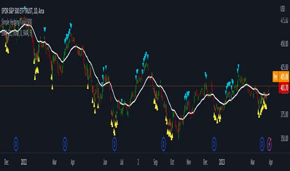
LNL Simple Hedging ToolLNL Simple Hedging Tool
Simple Hedging Tool was created specifically for swing traders who struggle with hedging. This tool helps to spot the ideal moments to put the hedges on (protection of the portfolio during "high risk" times). Simple Hedging Tool will not help you when day trading. It was designed for the daily charts. It is called simple because it is pretty much self-explanatory indicator. The candles are either blue or yellow. Meaning of the colors depend on the version you are using. This tool consist of two versions:
SPX Version:
This version was designed for indexes & overall market benchmarks. In contrast with the VIX version, the SPX version is little more sophisticated since it is based on key market internals. Blue arrows above the candles? More often than not this is signalizing that the key market internals are now approaching bearish signals which means it is the best time to hedge any bullish positions. On the contrary, the yellow arrows are the good reason to lighten up of the shorts & ease off the gas pedal on any bearish outlooks.
VIX Version:
Apart from the black swan events (big market crashes) Vix usually oscillates between the daily extremes. The VIX version is based on a simple bollinger band technique which is visualized with blue & yellow arrows. Whenever the yellow arrows & candles appear, it is good time to put the hedges on & perhaps lighten up on longs.
IMPORTANT DISCLAIMER:
The signals from this tool WILL NOT TELL YOU where to buy or sell! But rather when is a good time TO NOT buy or TO NOT sell. Once the signals appear it does not necessarily mean that the move is over & reversion willl happen immidiately. These signals can be flashing for days even weeks. They are not flashing for you to change the bias but rather tighten up your exposure in case your portfolio is mostly one sided.
Hope it helps.
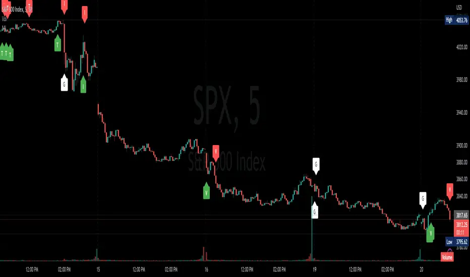
Market InternalsMarket internals can be a powerful tool for determining future moves, overall trend health and provide a means of directional confidence.
This indicator watches a handful of SPX and US stocks based internals to determine key areas of sentiment changes, the internals monitored are:
US Stocks Ticks
Call and Put SPX Volume
SPX Gamma Dispersion
US Stocks Ask and Big Volume
US Stocks Advancing and Declining Issues
Each time there's a bullish or bearish sentiment change it will be market with green/red flag and a single letter that identifies what market internal has changed.
SPX gamma dispersion events aren't to be considered directional from historical observations made but can be a sign of liquidity adjustments and when paired with any of the other aforementioned internals sentiment changes can be used as a powerful signal.
If it's observed that market internals are changing erratically then it's a clear indication of market chop and best to wait for cleaner trends.
Future updates may include non-SPX based internals analysis, change in display, alerts/alertconditions and more. Feel free to comment with any desired changes and we can discuss!
4C NYSE Market Breadth RatioThe NYSE Market Breadth Ratio is considered by some to be the “king” of market internals. It lets you know instantly how strong current buying or selling pressure is in the broad market, to eliminate guessing or opinion.
This indicator plots the Market Breadth Ratio values for the NYSE and the NASD exchanges in real time.
It also plots the NYSE Market Breadth Ratio in a histogram plot for visual reference.
The indicator dynamically changes colors between green and red depending on whether breadth is currently positive or negative.
This indicator divides the 'Up-Volume' ("UVOL") by 'Down-Volume' ("DVOL"), for each exchange.
It can be added to any chart, but is incredibly useful when added to other sources of market internals like the NYSE Advancers/Decliners Difference (ticker ADD) or with the NYSE UVOL / DVOL Difference (ticker VOLD ).
Credit goes to author=@auron9000 as the bulk of this code was from their Breadth Ratio Bubbles indicator.
---> The changes made to their indicator include: bug fixes where the values werent properly updating; fixed indicator to be a separate plot (not chart overlay), and added the histogram plot.

Market Internals [Makit0] MARKET INTERNALS INDICATOR v0.5beta
Market Internals are suitable for day trade equity indices, named SPY or /ES, please do your own research about what they are and how to use them
This scripts plots the NYSE market internals charts as an indicator for an easy and full visualization of market internal structure all in one chart, useful for SPY and /ES trading
Description of the Market Internals
- TICK: NYSE stocks ticking up vs stocks ticking down, extreme values may point to trend continuation on trending days or reversal in non trending days, example of extreme values can be 800 and 1000
- ADD: NYSE stocks going up vs stocks going down, if price auctions around the zero line may be a non trend day, otherwise may be a trend day
- VOLD: NYSE volume of stocks up vs volume of stocks going down, identify clearly where the volume is going, as example if volume is flowing down may be a good idea no to place longs
- TRIN: NYSE up stocks vs down stocks ratio divided by up volume vs down volume ratio. A value of 1 indicates parity, below that the strength is on the long side, above the strength is in the short side.
A basic use of market internals may be looking for divergences, for example:
- /ES is trading in a range but ADD and VOLD are trending up nonstop, may /ES will break the range to the upside
- /ES is trading in a range and ADD and VOLD are trading around the zero line but got an extreme reading on TICK, may be a non trending day and the TICK extreme reading is at one of the extremes of the /ES range, may be a good probability trade to fade that move
- /ES is trading in a trend to the downside, ADD and VOLD too, you catch a good portion of the move but are fearful to flat and miss more gains, you see in the TICK a lot of extreme values below -800 so your're confident in the continuation of the downtrend, until the TICK goes beyond -1000 and you use that signal to go flat
Market internals give you context and confirmation, price in /ES may be trending but if market internals do not confirm the move may a reversal is on its way
Price is an advertise, you can see the real move in the structure below, in the behavior of the individual components of the market, those are the real questions:
- How many stocks are going up/down (ADD)
- How many volume is flowing up/down (VOLD)
- How many stocks are ticking up/down (TICK)
- What is the overall volume breath of the market (TRIN)
FEATURES:
- Plot one of the four basic market internal indices: TICK, ADD, VOLD and TRIN
- Show labels with values beyond an user defined threshold
- Show ZERO line
- Show user defined Dotted and Dashed lines
- Show user defined moving average
SETTINGS:
- Market internal: ticker to plot in the indicator, four options to choose from (TICK, ADD, VOLD and TRIN)
- Labels threshold: all values beyond this will be ploted as labels
- Dot lines at: two dotted lines will be plotted at this value above and below the zero line
- Dash lines at: two dashed lines will be plotted at this value above and below the zero line
- MA type: two options avaiable SMA (Simple Moving Average) or EMA (Exponential Moving Average)
- MA length: number of bars to calculate the moving average
- Show zero line: show or hide zero line
- Show dot line: show or hide dotted lines
- Show dash line: show or hide dashed lines
- Show labels: show or hide labels
GOOD LUCK AND HAPPY TRADING
