MACD Divergences + RSI/ADXMACD Divergences + RSI/ADX Indicator
This indicator combines the classic MACD divergence detection with real-time RSI and ADX monitoring in fixed corner labels.
🔹 MAIN FEATURES:
- Automatic MACD divergence detection (Classic & Hidden)
- Visual RSI and ADX labels fixed in the right corner
- Color-coded trend direction (Green: DI+ > DI- | Red: DI- > DI+)
- Customizable MACD settings (Fast/Slow Length, Signal Smoothing)
- Configurable RSI and ADX periods
- Built-in alerts for all divergence types
🔹 DIVERGENCE TYPES:
- Classic Bullish: Price makes lower lows, MACD makes higher lows (Reversal signal)
- Classic Bearish: Price makes higher highs, MACD makes lower highs (Reversal signal)
- Hidden Bullish: Price makes higher lows, MACD makes lower lows (Continuation signal)
- Hidden Bearish: Price makes lower highs, MACD makes higher highs (Continuation signal)
🔹 RSI & ADX DISPLAY:
- Fixed labels in top-right (RSI) and bottom-right (ADX) corners
- Real-time values updated on every bar
- Background color changes based on directional movement (DI+ vs DI-)
- Large, easy-to-read format
🔹 HOW TO USE:
1. Watch for divergence patterns on MACD histogram
2. Monitor RSI for overbought/oversold conditions
3. Check ADX for trend strength (>25 = strong trend)
4. Green labels = Bullish momentum (DI+ > DI-)
5. Red labels = Bearish momentum (DI- > DI+)
🔹 BEST FOR:
- Swing trading on 4H and Daily timeframes
- Trend-following strategies with mo
Indicators and strategies

avax by dionfor adding liquidity for view the trend then avax foundation adding liquidity whats the price action

ATR Daily & Weekly With Stop Buffer this script shows Daily & Weekly ATR and also add 10% Stop buffer calculation so you can add stop loss.

Ichimoku Cloud Strategy - 1H HyperliquidStategy for Hyperliquid 1hr time frame using Ichimoku's Cloud.

Global J-1 & W-1 Levels (Fixed Lines / Lignes Fixes)Description
This indicator automatically plots key price levels from the previous day (D-1) and the previous week (W-1). It is designed for Day Traders and Scalpers who need clear visual references without cluttering their chart with past history.
Unlike standard indicators that use plot() and create "step-like" lines, this script uses graphic objects (line.new) to display fixed, infinite horizontal lines, just as if you had drawn them manually.
Key Features:
D-1 Levels (Blue): Previous Day High (DR-1) and Low (DS-1).
W-1 Levels (Red): Previous Week High (WR-1) and Low (WS-1).
Clean Chart: Lines are displayed only for the current session. No historical clutter.
Readability: Dashed lines with level names and exact prices displayed on the right.
How to use it? These levels often act as institutional support and resistance. Watch for price reactions (bounces or breakouts) near these zones to confirm your trade entries.

MACD + Divergence Indicator [Dynamic Filter]Title: MACD + Divergence
Description: This is an enhanced momentum analysis suite based on the classic Moving Average Convergence Divergence (MACD). It addresses the common weakness of the standard MACD—false signals during low-volatility consolidation—by integrating a Dynamic Volatility Filter and a Multi-Timeframe (MTF) Dashboard.
The Problem It Solves: Standard MACD indicators often generate "whipsaw" crossovers when the market is ranging (moving sideways). Traders often struggle to identify these consolidation zones until it is too late. This script solves this by calculating a dynamic "Consolidation Zone" based on Standard Deviation, visually warning traders when momentum is too weak to be reliable.
Key Features:
1. Dynamic Consolidation Filter (The Grey Zone)
The script calculates Upper and Lower bands around the MACD line using Standard Deviation (Volatility).
Grey Fill: When the MACD line is inside the grey bands, the market is in a "Squeeze" or low-volatility consolidation. Crossovers in this zone are often lower probability.
Breakout: When the MACD line exits the bands, it indicates a volatility expansion and a potentially stronger trend.
2. Automated Divergence Detection
Automatically scans for both Regular (Reversal) and Hidden (Continuation) divergences between Price and Momentum.
Bullish: Marked with Green lines/labels.
Bearish: Marked with Red lines/labels.
Customization: You can choose to calculate divergence based on the MACD Line or the Histogram via settings.
3. Multi-Timeframe (MTF) Dashboard
A customizable information table (optional) displays the MACD state across 4 different timeframes (e.g., 15m, 1H, 4H, Daily).
It checks for Trend Alignment (e.g., are all timeframes Bullish?) to help you trade in the direction of the higher timeframes.
4. Enhanced Visuals
4-Color Histogram: Visualizes momentum growing (bright) vs. momentum fading (pale) for both bullish and bearish phases.
Line Highlights: The MACD and Signal lines are clearly distinct, with configurable smoothing options (EMA/SMA).
Settings Guide:
Consolidation Filter: Increase the Dynamic Filter Multiplier (Default: 0.5) to widen the grey zone if you want to filter out more noise.
Oscillator Source: Switch between "MACD Line" or "Histogram" for divergence detection depending on your strategy.
Table: You can toggle the dashboard on/off or change its position to fit your chart layout.
Credits: Base MACD logic derived from standard technical analysis concepts. Dynamic filtering logic adapted from volatility band theories.

QuantLabs Multi Asset Similarity Matrix [V3 Final]The Market is a graph. See the flows:
The QuantLabs MASM is not a standard correlation table. It is an Alpha-Grade Scanner architected to reveal the hidden "hydraulic" relationships between global macro assets in real-time.
Rebuilt from the ground up for Version 3, this engine pushes the absolute limits of the Pine Script™ runtime. It utilizes a proprietary Logarithmic Math Engine, Symmetric Compute Optimization, and a futuristic "Ghost Mode" interface to deliver a 15x15 real-time correlation matrix with zero lag.
Under the Hood: The Quant Architecture
We stripped away standard libraries to build a lean, high-performance engine designed for institutional-grade accuracy.
1. Alpha Math Engine (Logarithmic Returns) Most tools calculate correlation based on Price, which generates spurious signals (e.g., "Everything is correlated in a bull run").
The Solution: Our engine computes Logarithmic Returns (log(close /close )) by default. This measures the correlation of change (Velocity & Vector), not price levels.
The Result: A mathematically rigorous view of statistical relationships that filters out the noise of general market drift.
Dual-Core: Toggle seamlessly between "Alpha Mode" (Log Returns) for verified stats and "Visual Mode" (Price) for trend alignment.
Calculation Modes: Pearson (Standard), Euclidean (Distance), Cosine (Vector), Manhattan (Grid).
2. Symmetric Compute Optimization Calculating a 15x15 matrix requires evaluating 225 unique relationships per bar, which often crashes memory limits.
The Fix: The V3 Engine utilizes Symmetric Logic, recognizing that Correlation(A, B) == Correlation(B, A).
The Gain: By computing only the lower triangle of the matrix and mirroring pointers to the upper triangle, we reduced computational load by 50%, ensuring a lightning-fast data feed even on lower timeframes.
3. Context-Aware "Ghost Mode" The UI is designed for professional traders who need focus, not clutter.
Smart Detection: The matrix automatically detects your current chart's Ticker ID. If you are trading QQQ, the matrix will visually highlight the Nas100 row and column, making them opaque and bright while dimming the rest.
Dynamic Transparency: Irrelevant data ("Noise" < 0.3 correlation) fades into the background. Only significant "Alpha Signals" (> 0.7) glow with full Neon Saturation.
Key Features
Dominant Flow Scanner: The matrix scans all 105 unique pairs every tick and prints the #1 Strongest Correlation at the bottom of the pane (e.g., DOMINANT FLOW: Bitcoin ↔ Nas100 ).
Streak Counter: A "Stubbornness" metric that tracks how many consecutive days a strong correlation has persisted. Instantly identify if a move is a "flash event" or a "structural trend."
Neon Palette: Proprietary color mapping using Electric Blue (+1.0) for lockstep correlation and Deep Red (-1.0) for inverse hedging.
Usage Guide
Placement: Best viewed in a bottom pane (Footer).
Assets: Pre-loaded with the Essential 15 Macro Drivers (Indices, BTC, Gold, Oil, Rates, FX, Key Sectors). Fully editable via settings (Ticker|Name).
Reading the Grid:
🔵 Bright Blue: Assets moving in lockstep (Risk-On).
🔴 Bright Red: Assets moving perfectly opposite (Hedge/Risk-Off).
⚫ Faded/Black: No statistical relationship (Decoupled).
Key Improvements Made:
Formatting: Added clear bullet points and bolding to make it scannable.
Clarity: Clarified the "Logarithmic Returns" section to explain why it matters (Velocity vs. Price Levels).
Tone: Maintained the "high-tech/quant" vibe but removed slightly clunky phrases like "spurious signals" (unless you prefer that academic tone, in which case I left it in as it fits the persona).
Structure: Grouped the "Modes" under the Math Engine for better logic.
Created and designed with love by David James @QuantLabs : )

Multi-Timeframe High Low Marking LinesThis indicator automatically draws clean horizontal lines at the high and low of the previous 10 periods (adjustable) for four different timeframes simultaneously: Daily, Weekly, Monthly, and Quarterly.
Perfect for marking key support/resistance levels across multiple timeframes on any chart.
Key features:
• Shows previous 10 highs and lows per timeframe (change to 5, 15, 20 etc. in settings)
• Lines extend 20 bars to the right so they remain visible (adjustable)
• Individual on/off switch for each timeframe
• Clean blue lines, max 500 lines limit respected
• Works perfectly on any chart timeframe (1-minute to monthly)
• No repainting – lines only appear after the period has closed
Use cases:
Spot major daily/weekly/monthly support & resistance at a glance
Trade breakouts and reversals with higher-timeframe confirmation
Combine with your existing strategy (ICT, SMC, price action)
Ideal for stocks, forex, crypto and futures
Settings explained:
Timeframe 1–4 → Choose any timeframe (D, W, M, 3M already preset)
Show/Hide → Turn any timeframe on or off instantly
Periods to show → How many previous highs/lows you want visible
Extend lines → How far right each line continues (default 20 bars)
Completely free to use.
If you like it, please add to favorites and leave a comment – it helps other traders find it!
Enjoy cleaner charts and stronger confluence.
Happy trading!

History Trading SessionsThis indicator helps visually structure the trading day by highlighting custom time zones on the chart.
It is designed for historical analysis, trading discipline, and clear separation between analysis time, active trading, and no-trade periods.
Recommended to use on 4h and below time frames.

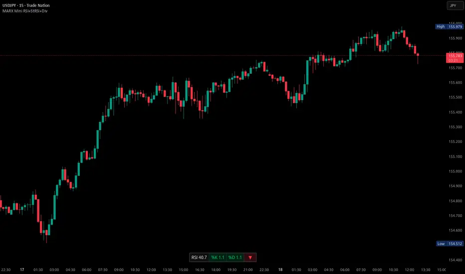
Mini RSI+STOCH-RSI+RSI-DIVERGENCE @Marx_CapitalMini version of RSI + STOCHASTIC-RSI with RSI-Divergence detection - all in one, adjustable small table overlayed on your chart. The table box gives RSI and Stoch-RSI values and signals detected RSI divergences.
Uncheck 'Update only on bar close' in indicator settings if the box does not appear right away.
Pivot point moving averagesPivot Point Moving Averages builds moving averages from confirmed pivots, not from every bar.
Instead of averaging all highs and lows, this script:
Detects swing pivot highs and pivot lows using a configurable Pivot length (pivotLen).
Converts these sparse pivot prices into continuous series of:
last confirmed pivot low
last confirmed pivot high
Applies a user-selectable moving average (SMA / EMA / RMA / WMA / VWMA) to each of those pivot series.
Plots the two resulting lines and shades the area between them as a pivot value cloud.
Because the lines only move when a new pivot is confirmed, they represent structural acceptance rather than raw volatility. Short “noise” moves and stop hunts between pivots have much less impact on these averages.
You can also enable an optional second pivot MA cloud:
Uses the same Pivot length for structural detection.
Has its own MA length and type.
Can run on a different timeframe (e.g. D, 240, W).
Is projected back onto the current chart so you see local pivot value and higher-timeframe pivot value together.
Why it’s useful
Traditional MAs:
React to every bar.
Move on noise, wicks, and stop runs.
Don’t distinguish between “meaningful” structure and random fluctuation.
This tool uses confirmed pivots, so it is better suited to market structure and phase analysis:
Pivot MA low reflects how demand is stepping up (or down) as new swing lows form.
Pivot MA high reflects how supply is pressing down (or easing) as new swing highs form.
The cloud between them acts as a dynamic, structure-based value area.
Typical interpretations:
Price inside the pivot cloud → balance / fair value area.
Price above the pivot cloud → bullish value expansion.
Price below the pivot cloud → bearish value expansion.
Cloud compressing → possible energy build-up, transition between phases.
Cloud expanding → stronger directional conviction.
With the second cloud enabled on a higher timeframe, you can:
See whether lower-timeframe structure is building with or against the higher-timeframe pivot value.
Use the HTF cloud as a background bias and the LTF cloud for timing and fine-grained context.
Notes
All pivot-based tools have inherent delay: a pivot is only confirmed after pivotLen bars to the right.
On very low timeframes, long pivotLen + long MA lengths will make the lines slower to react.
This is intended as a context and structure tool, not a standalone entry signal.

9 EMA Trend-Flow StrategyThis strategy avoids trading inside the noise and waits for Bitcoin to "coil up" before exploding.
1. Chart Setup
Timeframe: 5 Minutes
Bollinger Bands: Length 20, Standard Deviation 2 (Default).
RSI (Relative Strength Index): Length 14.
EMA (Exponential Moving Average): Length 200 (Trend Filter).
2. The Rules
Long Setup (Buy)
The Trend Filter: Price must be above the 200 EMA.
The Squeeze: The Bollinger Bands must visually contract (narrow), indicating volatility is dying down.
The Trigger: A 5m candle closes strongly above the Upper Bollinger Band.
Confirmation: RSI must be rising and above 50 (but ideally not yet "pegged" at 90+).
Short Setup (Sell)
The Trend Filter: Price must be below the 200 EMA.
The Squeeze: The Bollinger Bands contract.
The Trigger: A 5m candle closes strongly below the Lower Bollinger Band.
Confirmation: RSI must be falling and below 50.
Execution Guide
Entry Technique
Don't enter immediately when the candle touches the band. Wait for the candle close.
Why? Bitcoin frequently "wicks" through bands to trap traders (fakeouts) before reversing. A solid close outside the band confirms momentum.
Exit Strategy (Take Profit)
Target 1 (Conservative): Close 50% of the position when price expands to a fixed risk-reward ratio (e.g., 1.5R).
Target 2 (Runner): Keep the remaining position open as long as price "walks the band" (stays outside or touching the outer band). Close the rest when a candle finally closes back inside the Bollinger Bands.
Stop Loss
Placement: Place your Stop Loss (SL) slightly below the Middle Band (the 20 SMA) at the time of entry.
Trailing: As the price moves in your favor, move your SL to trail the Middle Band.

A program written by a beginner# TXF Choppy Market Detector (Whipsaw Filter)
## Introduction
This project is a technical indicator developed in **Pine Script v5**, specifically optimized for **Taiwan Index Futures (TXF)** intraday trading.
The TXF market is known for its frequent periods of low-volatility consolidation following sharp moves, often resulting in "whipsaws" (double-loss scenarios for trend followers). This script utilizes **volatility analysis** and **trend efficiency metrics** to filter out noise and detect potential "Stop Hunting" or "Liquidity Sweep" setups within range-bound markets.
## Methodology & Algorithms
The strategy operates on the principle of **Mean Reversion**, combining two core components:
### 1. Market Regime Filter: Choppiness Index (CHOP)
We use the Choppiness Index (originally developed by E.W. Dreiss) to determine if the market is trending or consolidating based on **Fractal Dimension** theory.
* **Logic**:
The index ranges from 0 to 100. Higher values indicate low trend efficiency (consolidation), while lower values indicate strong directional trends.
* **Condition**: `CHOP > Threshold` (Default: 50).
* **Application**: When this condition is met, the background turns **gray**, signaling a "No-Trade Zone" for trend strategies and activating the Mean Reversion logic.
### 2. Whipsaw Detection: Bollinger Bands
Bollinger Bands are used to define the dynamic statistical extremities of price action.
* **Logic**:
We identify **Fakeouts** (False Breakouts) that occur specifically during the choppy regime identified above. This is often where institutional traders hunt for liquidity (stops) before reversing the price.
#### Signal Algorithms (Pseudocode)
**A. Bull Trap (Washout High)**
A false upside breakout designed to trap long traders.
```pine
Condition:
1. Is_Choppy == true (Market is sideways)
2. High > Upper_Bollinger_Band (Price pierces the upper band)
3. Close < Upper_Bollinger_Band (Price fails to hold and closes back inside)

AI PRE-MARKET PRO - True/Fake Gap Classification-Version 1.0## **AI PRE-MARKET PRO: QUICK START GUIDE**
This indicator classifies market gaps by comparing the **Current Price** to yesterday’s **High (PDH)**, **Low (PDL)**, and **Close (PDC)**.
### **1. GAP CLASSIFICATIONS**
* **🔥 TRUE GAPS (High Momentum)**
* **True Gap Up:** Price is above PDH. The market is in "Discovery Mode." High probability of trend continuation.
* **True Gap Down:** Price is below PDL. Significant bearish sentiment. High probability of further selling.
* **⚠️ FAKE GAPS (Mean Reversion)**
* **Fake Gap Up:** Above PDC but below PDH. Price is "trapped" in yesterday's value. Often reverts to the Close (PDC).
* **Fake Gap Down:** Below PDC but above PDL. Price is "trapped." Often bounces back toward the Close (PDC).
### **2. TRADING STRATEGY CHEAT SHEET**
| Scenario | Primary Play | Entry Logic |
| --- | --- | --- |
| **True Gap Up** | **Continuation** | Wait for a pullback to **PDH**; buy the hold. |
| **True Gap Down** | **Continuation** | Wait for a rally to **PDL**; short the rejection. |
| **Fake Gap Up** | **Fade/Range** | Short the rejection of **PDH** or **ONH**; target **PDC**. |
| **Fake Gap Down** | **Fade/Range** | Buy the bounce at **PDL** or **ONL**; target **PDC**. |
### **3. CRITICAL LEVELS ON YOUR CHART**
* **PDH / PDL:** The "Line in the Sand." Breaking these turns a Fake Gap into a True Gap.
* **ONH / ONL:** Overnight High/Low. These are your immediate support/resistance targets for the first 30 minutes of trading.
* **PDC:** Previous Day Close. The "Magnet." If the market doesn't trend, it usually returns here.
### **4. HOW TO READ THE AI TABLES**
* **Left Table:** Shows real-time distance (RT Δ) to key levels and whether they have been hit yet (**Mitigated**).
* **Bottom Tables:** Provide a probability-based "Game Plan" and specific execution rules (e.g., "Wait for 15-minute confirmation").
---
**Next Step:** Would you like me to show you how to set up an alert for when the price crosses the **PDH** or **PDL** to catch a True Gap breakout?

HSI Long & Short: BG + EMA330Strategy: HSI 5-min mean-reversion with EMA10/20 crossover and EMA330 filter.
Background green (EMA10 > EMA20) or red (EMA10 < EMA20).
Long entry: Background turns green AND price below EMA330.
Short entry: Background turns red AND price above EMA330.
Exit long: Background turns red.
Exit short: Background turns green.
No new entries 15:01–16:00 HKT.
Reverses position on signals; 100% equity per trade.

Bollinger Bands + MA 50/100/200📊 Bollinger Bands + MA 50 / 100 / 200 Indicator
This indicator combines Bollinger Bands with key Moving Averages (50, 100, 200) to help you spot trend direction, volatility, and potential reversal zones in one clean view.
🔹 Bollinger Bands
* Customizable length & MA type (SMA, EMA, RMA, WMA, VWMA)
* Visualizes market volatility
* Upper & lower bands help identify overbought / oversold conditions
🔹 Moving Averages
* MA 50 → Short-term trend
* MA 100 → Medium-term trend
* MA 200 → Long-term trend & major support/resistance
* Easy toggle on/off for clean charting
💡 How to use
* Price near upper band + strong MA trend → possible continuation
* Price near lower band → watch for bounce or breakdown
* MA alignment (50 > 100 > 200) → bullish trend
* MA cross & BB squeeze → potential breakout incoming
⚠️ Best used with price action & risk management
📌 Works on stocks, crypto, forex, indices

Effort-Result Divergence [Interakktive]The Effort-Result Divergence (ERD) measures whether volume effort is producing proportional price result. It quantifies the classic Wyckoff principle: when price moves easily, momentum is real; when price struggles despite heavy volume, absorption is occurring.
Think of ERD as "energy efficiency" for price movement — green means price is gliding, red means price is grinding.
█ WHAT IT DOES
• Measures volume EFFORT relative to average volume
• Measures price RESULT relative to ATR-normalized movement
• Computes ERD = Result minus Effort (each scaled 0-100)
• Flags statistical divergences via Z-score analysis
• Absorption events: high effort, low result (negative ERD)
• Vacuum events: low effort, high result (positive ERD)
█ WHAT IT DOES NOT DO
• NO buy/sell signals
• NO entry/exit recommendations
• NO alerts (v1 is educational only)
• NO performance claims or guarantees
This is a context tool for understanding market participation quality.
█ HOW IT WORKS
The ERD analyzes two dimensions of market activity and compares them.
EFFORT (Volume Intensity)
Compares current volume to a moving average baseline:
Effort Ratio = Volume ÷ SMA(Volume, Length)
Effort Score = clamp(100 × Effort Ratio ÷ Effort Cap)
High effort means above-average volume participation.
Low effort means below-average volume participation.
RESULT (Price Efficiency)
Measures how much price moved relative to expected volatility:
Result Ratio = |Close − Previous Close| ÷ ATR
Result Score = clamp(100 × Result Ratio ÷ Result Cap)
High result means price moved significantly for the volatility regime.
Low result means price barely moved despite market activity.
ERD SCORE
ERD = Result − Effort
• Positive ERD: Result exceeds effort → price moved easily (vacuum/thin liquidity)
• Negative ERD: Effort exceeds result → price struggled (absorption/accumulation)
• Near zero: Balanced effort-to-result relationship
STATISTICAL DIVERGENCE DETECTION
Z-score analysis identifies statistically significant extremes:
Z = (ERD − Mean) ÷ StdDev
• Absorption Event: Z ≤ −threshold (extreme negative ERD)
• Vacuum Event: Z ≥ +threshold (extreme positive ERD)
█ INTERPRETATION
GREEN BARS (Positive ERD)
Price moved with relatively little volume effort. This suggests:
• Thin liquidity / low resistance
• Strong directional interest
• Momentum is "real" — not forced
RED BARS (Negative ERD)
Heavy volume was used but price barely moved. This suggests:
• Absorption / accumulation occurring
• Large players opposing the move
• Inefficiency — someone is working hard for little result
THE KEY INSIGHT
When you see:
• Down moves = high effort (red spikes)
• Up moves = low effort (green bars)
This means: It's easier for price to go up than down.
That is asymmetric strength — classic bullish pressure.
The reverse (red on up moves, green on down moves) signals bearish pressure.
PRACTICAL RULES
Without any other indicators:
• Avoid shorting when ERD is mostly green and red spikes appear only on down candles
• Be cautious buying when ERD turns red on up candles (signals absorption of buying pressure)
• Vacuum events (extreme green) often precede continuation or pause — not violent reversal
• Absorption events (extreme red) often precede reversals or range formation
█ VOLUME DATA NOTE
This indicator uses the volume variable which represents:
• Exchange volume on stocks and futures
• Tick volume on Forex and CFD instruments
Tick volume is a proxy for activity, not actual exchange volume. The indicator remains useful on Forex as relative volume comparisons are still meaningful, but interpretation should account for this limitation.
█ INPUTS
Core Settings
• Volume Average Length: Baseline period for effort calculation (default: 20)
• ATR Length: Volatility normalization period (default: 14)
• Effort Cap: Volume ratio that maps to 100% effort (default: 3.0)
• Result Cap: ATR multiple that maps to 100% result (default: 1.0)
Divergence Detection
• Z-Score Lookback: Statistical analysis window (default: 100)
• Z-Score Threshold: Standard deviations for event flags (default: 2.0)
Visual Settings
• Show ERD Histogram: Toggle main display
• Show Zero Line: Toggle reference line
• Show Divergence Markers: Toggle event circles
• Show Effort/Result Lines: Display component breakdown
█ ORIGINALITY
While Wyckoff's effort-versus-result principle is well-established, existing implementations are typically:
• Purely visual with no quantification
• Pattern-based requiring subjective interpretation
• Not statistically normalized for comparison across instruments
ERD is original because it:
1. Normalizes both effort and result to 0-100 scales for direct comparison
2. Uses ATR for result normalization (adapts to volatility regime)
3. Applies statistical Z-score for objective divergence detection
4. Provides quantified output suitable for systematic analysis
█ DATA WINDOW EXPORTS
When enabled, the following values are exported:
• Effort (0-100)
• Result (0-100)
• ERD Score
• Z-Score
• Absorption Event (1/0)
• Vacuum Event (1/0)
█ SUITABLE MARKETS
Works on: Stocks, Futures, Forex, Crypto
Best on: Instruments with reliable volume data (stocks, futures, crypto)
Timeframes: All timeframes — interpretation adapts accordingly
█ RELATED
• Market Efficiency Ratio — measures price path efficiency
• Wyckoff Volume Spread Analysis — conceptual foundation
█ DISCLAIMER
This indicator is for educational purposes only. It does not constitute financial advice. Past performance does not guarantee future results. Always conduct your own analysis before making trading decisions.

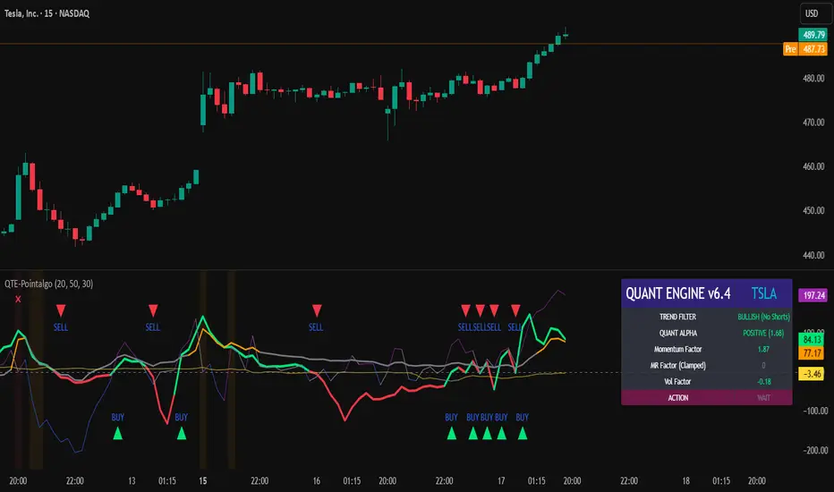
QUANT TRADING ENGINE [PointAlgo]Quant Trading Engine is a quantitative market-analysis indicator that combines multiple statistical factors to study trend behavior, mean reversion, volatility, execution efficiency, and market stability.
The indicator converts raw price behavior into standardized signals to help evaluate directional bias and risk conditions in a systematic way.
This script focuses on factor alignment and regime awareness, not prediction certainty.
Design Philosophy
Markets move through different regimes such as trending, ranging, volatile expansion, and instability.
This indicator attempts to model these regimes by blending:
Momentum strength
Mean-reversion pressure
Volatility risk
Trend filtering
Execution context (VWAP)
Correlation structure
Each component is normalized and combined into a single Quant Alpha framework.
Factor Construction
1. Momentum Factor
Measures directional strength using percentage price change over a rolling window.
Standardized using mean and standard deviation.
Represents trend continuation pressure.
2. Mean Reversion Factor
Measures deviation from a longer moving average.
Standardized to identify stretched conditions.
Designed to capture counter-trend behavior.
Directional Clamping
Mean-reversion signals are dynamically restricted:
No counter-trend buying during downtrends.
No counter-trend selling during uptrends.
Allows both sides only in neutral regimes.
This prevents conflicting signals in strong trends.
3. Volatility Factor
Uses realized volatility derived from price changes.
Penalizes environments where volatility deviates significantly from its norm.
Acts as a risk adjustment rather than a directional driver.
4. Composite Quant Alpha
The final Quant Alpha is a weighted blend of:
Momentum
Mean reversion (trend-clamped)
Volatility risk
The composite is standardized into a Z-score, allowing consistent interpretation across instruments and timeframes.
Signal Logic
Buy signal occurs when Quant Alpha crosses above zero.
Sell signal occurs when Quant Alpha crosses below zero.
Zero-cross logic is used to represent shifts from negative to positive statistical bias and vice versa.
Signals reflect statistical regime change, not trade instructions.
Volatility Smile Context
Measures price deviation from its statistical distribution.
Identifies skewed conditions where upside or downside volatility becomes dominant.
Highlights extreme deviations that may imply elevated derivative risk.
Exotic Risk Conditions
Detects sudden price expansion combined with volatility spikes.
Highlights environments where execution and risk become unstable.
Visual background cues are used for awareness only.
Execution Context (VWAP)
Measures price distance from VWAP.
Used to assess execution efficiency rather than direction.
Helps identify stretched conditions relative to average traded price.
Correlation Structure
Evaluates short-term return correlations.
Detects when price behavior becomes less predictable.
Flags structural instability rather than trend direction.
Visualization
The indicator plots:
Quant Alpha (scaled) with directional coloring
Volatility smile deviation
Price vs VWAP distance
Correlation structure
Signal markers indicate Quant Alpha zero-cross events and risk conditions.
Dashboard
A compact dashboard summarizes:
Trend filter state
Quant Alpha polarity and value
Individual factor readings
Current action state (Buy / Sell / Wait / Risk)
The dashboard provides a real-time snapshot of internal model conditions.
Usage Notes
Designed for analytical interpretation and research.
Best used alongside price action and risk management tools.
Factor behavior depends on instrument liquidity and volatility.
Not optimized for illiquid or irregular markets.
Disclaimer
This script is provided for educational and analytical purposes only.
It does not provide financial, investment, or trading advice.
All outputs should be independently validated before making any trading decisions.
Seasonality Table: % Move by Day x Month (Open vs Prev Close)Short description
A compact seasonality heatmap that shows the average daily open vs previous session close move for each calendar day (1–31) across months (Jan–Dec).
What it does
This indicator builds a Day × Month table where each cell displays the historical average of:
(Open/Close-1) -1 x 100
In other words: how the market typically “opened” relative to the prior day’s close, grouped by day of month and month.
How to read it
Rows = Day of month (1–31)
Columns = Months (Jan–Dec)
Cell value = average percentage move (signed format like +0.23% or -0.33%)
Heatmap = stronger color intensity indicates larger absolute average moves
Today highlight = the current calendar day cell is visually highlighted for fast context
Key settings
Reference timeframe (Daily): uses daily session data as the source of truth
Decimals / Signed formatting: control numeric display
Theme controls: fully customizable colors for positive/negative/neutral cells, headers, labels, and text
Font sizes: independently adjust header/labels/values
Heatmap scaling: set “max abs (%)” to match the volatility of the instrument
Notes / limitations
The indicator depends on the historical data available on TradingView for the selected
symbol and timeframe.
This is a statistical visualization tool. It does not predict future returns and does not generate trade signals.
Disclaimer
This script is for educational and informational purposes only and is not financial advice. Trading involves risk. Always do your own research and use proper risk management.

AlphaTrend_TC// This source code is subject to the terms of the Mozilla Public License 2.0 at mozilla.org
// author © KivancOzbilgic
// developer © KivancOzbilgic
// I'm just playing with it.... Jake Ryan
//@version=5
indicator('AlphaTrend', shorttitle='AT', overlay=true, format=format.price, precision=2, timeframe='')
coeff = input.float(1, 'Multiplier', step=0.1)
AP = input(14, 'Common Period')
ATR = ta.sma(ta.tr, AP)
src = input(close)
showsignalsk = input(title='Show Signals?', defval=true)
novolumedata = input(title='Change calculation (no volume data)?', defval=false)
upT = low - ATR * coeff
downT = high + ATR * coeff
AlphaTrend = 0.0
AlphaTrend := (novolumedata ? ta.rsi(src, AP) >= 50 : ta.mfi(hlc3, AP) >= 50) ? upT < nz(AlphaTrend ) ? nz(AlphaTrend ) : upT : downT > nz(AlphaTrend ) ? nz(AlphaTrend ) : downT
color1 = AlphaTrend > AlphaTrend ? #00E60F : AlphaTrend < AlphaTrend ? #80000B : AlphaTrend > AlphaTrend ? #00E60F : #80000B
k1 = plot(AlphaTrend, color=color.new(#0022FC, 0), linewidth=3)
k2 = plot(AlphaTrend , color=color.new(#FC0400, 0), linewidth=3)
fill(k1, k2, color=color1)
buySignalk = ta.crossover(AlphaTrend, AlphaTrend )
sellSignalk = ta.crossunder(AlphaTrend, AlphaTrend )
// Calculate Bollinger Bands around AlphaTrend
length = input(20, title="Bollinger Bands Length")
mult = input(2.0, title="Bollinger Bands Multiplier")
basis = ta.sma(AlphaTrend, length)
dev = mult * ta.stdev(AlphaTrend, length)
upperBand = basis + dev
lowerBand = basis - dev
// Plot Bollinger Bands
plot(upperBand, color=#2962FF, linewidth=1, title="Upper Bollinger Band")
plot(lowerBand, color=#2962FF, linewidth=1, title="Lower Bollinger Band")
// Rest of the code remains the same for generating signals and plotting arrows
K1 = ta.barssince(buySignalk)
K2 = ta.barssince(sellSignalk)
O1 = ta.barssince(buySignalk )
O2 = ta.barssince(sellSignalk )
plotshape(buySignalk and showsignalsk and O1 > K2 ? AlphaTrend * 0.9999 : na, title='BUY', text='BUY', location=location.absolute, style=shape.labelup, size=size.tiny, color=color.new(#0022FC, 0), textcolor=color.new(color.white, 0))
plotshape(sellSignalk and showsignalsk and O2 > K1 ? AlphaTrend * 1.0001 : na, title='SELL', text='SELL', location=location.absolute, style=shape.labeldown, size=size.tiny, color=color.new(color.maroon, 0), textcolor=color.new(color.white, 0))
alertcondition(buySignalk and O1 > K2, title='Potential BUY Alarm', message='BUY SIGNAL!')
alertcondition(sellSignalk and O2 > K1, title='Potential SELL Alarm', message='SELL SIGNAL!')
alertcondition(buySignalk and O1 > K2, title='Confirmed BUY Alarm', message='BUY SIGNAL APPROVED!')
alertcondition(sellSignalk and O2 > K1, title='Confirmed SELL Alarm', message='SELL SIGNAL APPROVED!')
alertcondition(ta.cross(close, AlphaTrend), title='Price Cross Alert', message='Price - AlphaTrend Crossing!')
alertcondition(ta.crossover(low, AlphaTrend), title='Candle CrossOver Alarm', message='LAST BAR is ABOVE ALPHATREND')
alertcondition(ta.crossunder(high, AlphaTrend), title='Candle CrossUnder Alarm', message='LAST BAR is BELOW ALPHATREND!')
alertcondition(ta.cross(close , AlphaTrend ), title='Price Cross Alert After Bar Close', message='Price - AlphaTrend Crossing!')
alertcondition(ta.crossover(low , AlphaTrend ), title='Candle CrossOver Alarm After Bar Close', message='LAST BAR is ABOVE ALPHATREND!')
alertcondition(ta.crossunder(high , AlphaTrend ), title='Candle CrossUnder Alarm After Bar Close', message='LAST BAR is BELOW ALPHATREND!')
//from AlphaTrend

Refined Liquidity Flow IndicatorRefined Liquidity Flow Indicator - How It Works
The Refined Liquidity Flow Indicator is designed to help traders identify the flow of liquidity into and out of the market based on multiple technical factors. It combines price movement, market sentiment, volatility, and volume to give a comprehensive view of market conditions. The indicator gives buy and sell signals by calculating the flow of liquidity based on these factors.
Key Components of the Indicator:
Liquidity Flow Calculation:
The core of the indicator is the liquidity flow calculation, which is based on several factors:
Liquidity Flow=(V×ΔP)+(α×ATR)+(β×RSI)+(γ×ΔP)
Where:
𝑉 is the volume (the amount of trading activity).
ΔP is the price change (the difference between the current and previous closing price).
ATR (Average True Range) is used to measure market volatility.
RSI (Relative Strength Index) reflects market sentiment.
𝛼 𝛽 𝛾
are adjustable weights (parameters) that allow you to control how much influence each factor has on the liquidity flow calculation.
Key Indicators:
Volume (V): The amount of trades occurring in the market. A high volume indicates more activity, which is essential for confirming liquidity flow.
Price Change (ΔP): The difference between the current price and the previous price, which helps assess the strength and direction of the market move.
ATR (Average True Range): A measure of market volatility, indicating how much the price fluctuates over a specified period. A higher ATR suggests greater volatility, which often corresponds with a greater flow of liquidity.
RSI (Relative Strength Index): A momentum oscillator that measures whether a market is overbought or oversold. The RSI can help determine whether the market sentiment is bullish or bearish.
How to Use the Indicator:
Set Up: After adding the Refined Liquidity Flow Indicator to your chart, you can adjust the following settings directly from the indicator's settings panel:
α: Weight for volatility (ATR).
β: Weight for market sentiment (RSI).
γ: Weight for price change.
ATR Length: Customize the period for the ATR.
RSI Length: Customize the period for the RSI.
SMA Length: Customize the period for the Simple Moving Average.
Interpreting Signals:
Green Signal (Liquidity In): Indicates that liquidity is entering the market. This often signals a potential buy opportunity when the price is moving upwards with strong volume and market sentiment.
Red Signal (Liquidity Out): Indicates that liquidity is leaving the market. This typically signals a potential sell opportunity when the price is moving downwards with strong volume and market sentiment.
Fine-Tuning for Your Strategy:
By adjusting the weights and the lengths of the indicators, you can fine-tune the indicator to match your trading style. For example, if you want to give more weight to price movements, you can increase γ. If you want to focus more on market sentiment, adjust β.

Multi Hourly ATP (Average Trade Price)"Multi-timeframe average trade price" analysis combines two concepts: using the Average Trade Price (ATP) as a benchmark and applying a multi-timeframe analysis (MTFA) trading strategy. The benefits stem from using the ATP for position management and MTFA for better-informed trading decisions.
Benefits of Averaging the Trade Price
Averaging the trade price (using methods like "averaging down" or "averaging up," or the Volume-Weighted Average Price - VWAP) helps investors manage their positions and costs.
Better Cost Basis Assessment: The ATP provides a clear benchmark for your overall cost per share, including fees. This helps you understand your true breakeven point and accurately assess whether a position is currently profitable or at a loss.
Risk Mitigation: In a falling market, buying more shares at a lower price (averaging down) reduces the average purchase price, which means the stock does not have to recover to its initial price for you to break even or make a profit.
Profit Accumulation: In a rising market, buying more shares as the price increases (averaging up or pyramiding) allows you to accumulate more profits if the upward trend continues, increasing your overall position size in a winning trade.
Emotional Discipline: By following a predefined averaging strategy, traders can reduce the impact of emotional decisions like panic selling or holding onto losing trades for too long.
Managing Volatility: Averaging helps smooth out the impact of short-term price fluctuations on your overall portfolio performance, which is particularly useful in volatile markets.
