Volume Share - Bitcoin Retail % [cryptorae]I've been keeping my eyes on retail BTC trading volume as a % of total BTC trading volume (charted).
It's the single best chart showing the death of sentiment in this bear market. Retail fell to as low as 5.6% on 6/8. The good news is that the % has stabilized at these levels.
I think retail interest will need to trend higher in tandem with higher price moves for us to break through key resistance levels.
To know why, let's look closer at the anatomy of the recent bull and bear market.
In the 2017 bull market:
- Retail interest trended higher or sideways with each drive up
- Average retail volume share was ~46%
In other words, price movements were dominated by infusions of new money.
In the 2018 bear market:
- Retail interest trended LOWER with each recovery in price
- Average retail volume share was ~15%
In other words, price movements were dominated by money exchanging through the hands of traders.
Open thoughts:
- If the bear market persists and prices reach critical levels, I think that retail % would spike as some finally rush for the exit and new investors happily jump in
- If prices recover w/o a sustained increase in retail %, I'd not be so quick to call a bull market
Things I classify as "retail":
- Bitflyer
- Bithumb
- Coinbase
- Bistamp
- Kraken
Things classified as "non-retail"
- Bitmex
- Bitfinex
The formula is retail / (retail + non-retail)
The script is open for you to modify if you disagree. Let me know your thoughts/tweaks.
Search in scripts for "BTC"
Crypto Market Change in BTC [Fingers]Crypto Market Change provides an indication of whether the value of a basket of 19 coins traded in BTC on Binance (as of July 12, 2018) are headed up or down. A simple moving average of the percentage change in BTC price for each coin is calculated. The moving averages are then summed and displayed. A measure of price volatility is indicated by standard deviation bands. Period, moving average length, and number of standard deviations are adjustable.

Crypto Market Change in BTC [Fingers]Crypto Market Change provides an indication of whether the value of a basket of 19 coins traded in BTC on Binance (as of July 12, 2018) are headed up or down. A simple moving average of the percentage change in BTC price for each coin is calculated. The moving averages are then summed and displayed. A measure of price volatility of indicated by standard deviation bands. Period, moving average length, and number of standard deviations are adjustable.

40 DOMINANT ALTCOINS BINANCEThis indicator is a combination of 40 different altcoins which are found on Binance exchange.
I have listed all Binance altcoins in the order of the oldest listed and the newest.
Due to limitations on TV for calling only 40 securities at the same time, I have limited myself with adding only the oldest ones (9+ months) and some 8+ to make up at least 40 for more data.
I have excluded BTC, BCC, ETH, USDT, BNB from list as these are the trading pairs.
I have some updates in mind and will try to add more options in coming months
Regularly updating 40 altcoins list by sorting them by market cap and available historical data from Binance
Adding Bitfinex, Bittrex and other exchanges separetly, as there is only 40 security call limit
Adding ETH; USDT pairs for all above exchanges.
You can add any indicator to this indicator - such as MACD, RSI, EMA and so on to help you analyse it more deeper
When you load this indicator, it takes about 1 min wait as it takes and calculates a lot of data. After it is loaded, it works perfectly.
Currently there is only 40 oldest altcoins to gather enough data, but as time passes, I will change some of them to create better picture of alt coins.
Please report any problems and give feedback.
Any idea of improvement is welcome and I will try my best.
Please support me an consider to give a small tip to addresses bellow. It would greatly help me to free more time for improvements as I am working to support family and my time is limited for markets.
ETH: 0xac290B4A721f5ef75b0971F1102e01E1942A4578
BTC: 39p3rKuJYKGqph1Qs35yEfNWoPvpUJBBcy
This will greatly help me to keep update this indicator and give me more time to analyse and sort out all altcoins my their market cap, volume and influence.

All of BTC (Average BTC price)A script to give average price across multiple exchanges(for now only USD) v1(Bitstamp,Bitfinex,Coinbase) and plot as candles that can be adjusted to current currency (via exchange rate)
please comment if you want your exchange added and what foreign exchanges should be averaged first(japan?,china??,korea??!!,mexico???!!)
Whats in future versions?
Add Look at volume to give weight to average function
auto exchange rates?
strategy!!??
pretty colors?
please drop any suggestions below
//insert donation info//
if i helped you in anyway feel free to donate to=
BTC: 37e8WqB9hmDwZN9jJDp2yj5B32CqrEzvjw
ETH: 0x45c5e69028924772bf15092236f33c1e07cee97c
LTC: MJVNYkW4NGubZACaX3wNJcVJjJS7Yr6Hok
As im in the amazing contry know as mexico and use the very valuable MXN it takes very little to help alot
//end shameless donation info//
and for those of you wondering yes i have inverted the colors of the candles intentionally... you can edit them from the script settings

Mayer Multiple v2.0 - Klahr ThresholdThis is a simple update to the Mayer Multiple script by Unbound , which charts an indicator created by Trace Mayer and popularized by Preston Pysh.
The original post identified any price below 2.4x the 100-day MA as the BTC buy threshold. While the logic there is historically sound, it does not account for the fact that the BTC trend is parabolic in nature. With that in mind, I've attempted to update the 2.4x multiple to react based on the moving average of the Mayer Multiple itself. To do so, I simply found the number that, when added to the MM moving average, historically hit the 2.4x multiple during periods of low volatility. This turns out to be 1.17.
The green line represents the Klahr Threshold (is it obnoxious if I call it that? I've always wanted an indicator named after me). As you can see from the above chart, it hovers around 2.4x in late 2012 to early 2013, rises above it until mid 2014, and then stays below until 2016. It then stays almost exactly at 2.4x until April 2017, when it rises significantly above it for the first time since July 2014. The convergence in late 2012 and 2016-2017 is what leads me to believe that this should be the basis for the updated threshold.
It's entirely possible that there's a more robust method of calculating a reactive threshold (or a different number that should be added to the multiple's MA), but I think this is a good first step in refining the multiple to withstand the test of time.

Dumb Money Flow - Retail Panic & FOMO# Dumb Money Flow (DMF) - Retail Panic & FOMO
## 🌊 Overview
**Dumb Money Flow (DMF)** is a powerful **contrarian indicator** designed to track the emotional state of the retail "herd." It identifies moments of extreme **Panic** (irrational selling) and **FOMO** (irrational buying) by analyzing on-chain data, volume anomalies, and price velocity.
In crypto markets, retail traders often buy the top (FOMO) and sell the bottom (Panic). This indicator helps you do the opposite: **Buy when the herd is fearful, and Sell when the herd is greedy.**
---
## 🧠 How It Works
The indicator combines multiple data points into a single **Sentiment Index** (0-100), normalized over a 90-day period to ensure it always uses the full range of the chart.
### 1. Panic Index (Bearish Sentiment)
Tracks signs of capitulation and fear. High values contribute to the **Panic Zone**.
* **Exchange Inflows:** Spikes in funds moving to exchanges (preparing to sell).
* **Volume Spikes:** High volume during price drops (panic selling).
* **Price Crash (ROC):** Rapid, emotional price drops over 3 days.
* **Volatility (ATR):** High market nervousness and instability.
### 2. FOMO Index (Bullish Sentiment)
Tracks signs of euphoria and greed. High values contribute to the **FOMO Zone**.
* **Exchange Outflows:** Funds moving to cold storage (HODLing/Greed).
* **Profitable Addresses:** When >90% of holders are in profit, tops often form.
* **Parabolic Rise:** Rapid, unsustainable price increases.
---
## 🎨 Visual Guide
The indicator uses a distinct color scheme to highlight extremes:
* **🟢 Dark Green Zone (> 80): Extreme FOMO**
* **Meaning:** The crowd is euphoric. Risk of a correction is high.
* **Action:** Consider taking profits or looking for short entries.
* **🔴 Dark Burgundy Zone (< 20): Extreme Panic**
* **Meaning:** The crowd is capitulating. Prices may be oversold.
* **Action:** Look for buying opportunities (catching the knife with confirmation).
* **🔵 Light Blue Line:**
* The smoothed moving average of the sentiment, helpful for seeing the trend direction.
---
## 🛠️ How to Use (Trading Strategies)
### 1. Contrarian Reversals (The Primary Strategy)
* **Buy Signal:** Wait for the line to drop deep into the **Burgundy Panic Zone (< 20)** and then start curling up. This indicates that the worst of the selling pressure is over.
* **Sell Signal:** Wait for the line to spike into the **Green FOMO Zone (> 80)** and then start curling down. This suggests buying exhaustion.
### 2. Divergences
* **Bullish Divergence:** Price makes a **Lower Low**, but the DMF Indicator makes a **Higher Low** (less panic on the second drop). This is a strong reversal signal.
* **Bearish Divergence:** Price makes a **Higher High**, but the DMF Indicator makes a **Lower High** (less FOMO/buying power on the second peak).
### 3. Trend Confirmation (Midline Cross)
* **Crossing 50 Up:** Sentiment is shifting from Fear to Greed (Bullish).
* **Crossing 50 Down:** Sentiment is shifting from Greed to Fear (Bearish).
---
## ⚙️ Settings
* **Data Source:** Defaults to `INTOTHEBLOCK` for on-chain data.
* **Crypto Asset:** Auto-detects BTC/ETH, but can be forced.
* **Normalization Period:** Default 90 days. Determines the "window" for defining what is considered "Extreme" relative to recent history.
* **Weights:** You can customize how much each factor (Volume, Inflows, Price) contributes to the index.
---
**Disclaimer:** This indicator is for educational purposes only. "Dumb Money" analysis is a probability tool, not a crystal ball. Always manage your risk.
**Indicator by:** @iCD_creator
**Version:** 1.0
**Pine Script™ Version:** 6
---
## Updates & Support
For questions, suggestions, or bug reports, please comment below or message the author.
**Like this indicator? Leave a 👍 and share your feedback!**

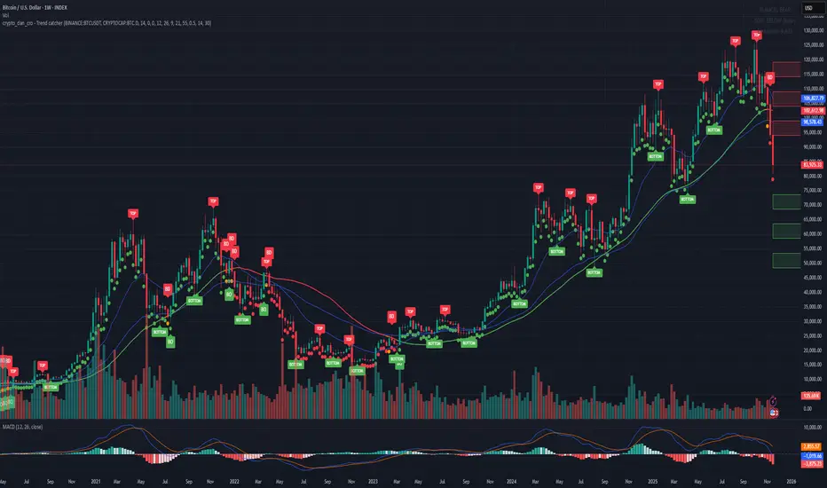
Crypto_dan_cro - Trend catcher - BTC OnlyCrypto_dan_cro - Trend catcher indicator
This indicator will show you the Macro trend BTC ONLY.
DOTS
Red dots - mean we are in Bearish part of the cycle where prices are expected to drop further
Yellow dots - mean we are in the area where either breakout or breakdown are possible
Green dots - mean we are in a Bullish part of the cycle, where prices are expected to raise
SMA LINE
Crossing below line, will make line red - bearmarket
Crossing above line, will make line green - bullmarket
Trading on the line, will make line yellow - direction still not decided
TOP & BOTTOM
Top - showing you tops
Bottom - showing you bottoms
BREAKOUTS & BREAKDOWNS
BO - BreakOut - showing you change in trend, and prices are expected to raise
BD - BreakDown - showing you change in trend, and prices are expected to drop.
SUPPORT & RESISTANCE
Red squares on the last candle - showing you 3 closest resistances (on every timeframe)
Green squares on the last candle - showing you 3 closest supports (on every timeframe)
Crypto markets are volatile, if you choose to use this indicator in trading, you are doing it on your own. Crypto_dan_cro is not responsible for any profits or losses created by using this Indicator.
Good luck ;)
If you want to get this indicator for free, follow me on
X handle: @crypto_dan_cro
Turn notifications on and engage with my posts

BK10 BTC Regime v10.3BK10 BTC Regime v10.3 – Cycle, Risk, and Euphoria Map
BK10 v10.3 is a regime map designed to show at a glance where the market is: from CRASH/STRESS to EUPHORIA. It combines trend (50/200 EMA), momentum (RSI), and optionally, macro context (SPX + VIX) to classify each candlestick into 6 states:
CRASH · RISK-OFF · NEUTRAL · ACCUMULATION · RISK-ON · EUPHORIA
The indicator colors the background according to the regime.

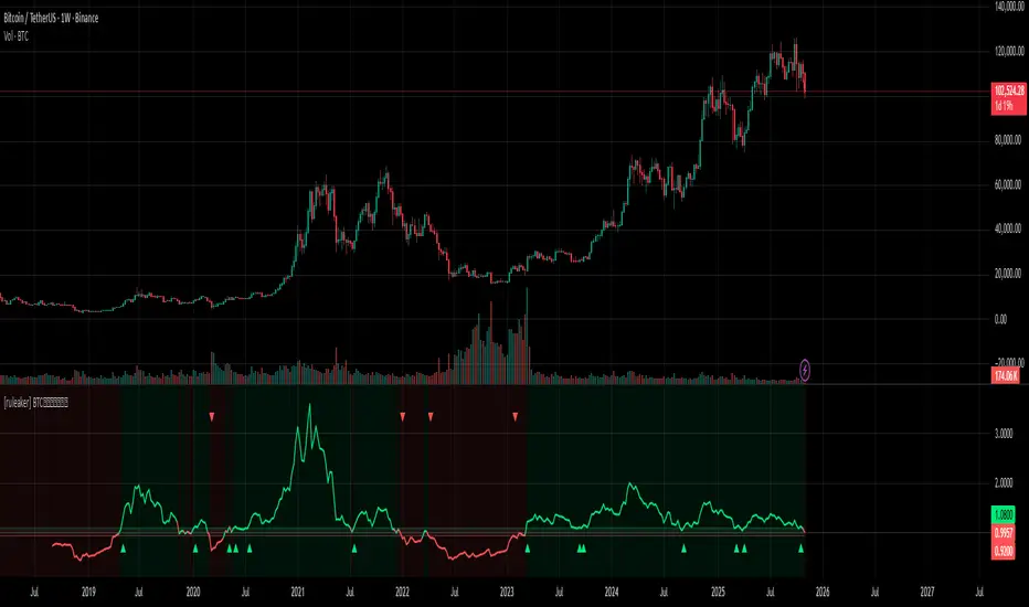
[ruleaker] BTC捕捉牛熊转换点 BTC Cycle Reversal Detector
Designed for trend trading and major market cycle transitions.
Enter precisely at the turning points between bull and bear markets,
short at local peaks within bear cycles,
and go long at local bottoms within bull cycles.
Stablecoin to BTC Market Cap RatioThis indicator calculates the ratio of the combined market capitalization of USDT and USDC stablecoins to the market capitalization of BTC. Data is updated daily from TradingView's CRYPTOCAP sources. It is displayed as a line in a separate panel, allowing analysis of stablecoin liquidity dynamics relative to BTC.
How to Use
Add the indicator to any asset chart in TradingView. It is useful for assessing the potential buying power of stablecoins in the cryptocurrency market. High ratio values may signal accumulation of liquidity in stablecoins, often preceding growth in BTC or altcoins (bullish signal). Low values indicate a decrease in the role of stablecoins, which may be bearish. It is recommended to combine with other indicators, such as RSI or volumes, to confirm trends.

Power Law BTC IndicatorPOWER LAW BTC indicator:
A long-term price model that suggests Bitcoin's price follows a power law function over time. Unlike traditional stock market models that assume linear or exponential growth, the power law model suggests that Bitcoin's price scales in a predictable, non-random way over the long run

Ant_JJun 5-Minute Day-Trading IndicatorThis invite-only indicator is designed for short-term BTC and crypto trading, focusing on precision during volatile data-driven markets and capital protection during sideways conditions.
It integrates Ichimoku-based structure mapping with volume asymmetry analysis and proprietary rule-based filters.
Unlike a traditional mashup, this system does not simply overlay multiple indicators.
It uses Ichimoku’s leading spans to classify structural bias (trend vs. neutral), then evaluates directional confirmation through candle displacement and volume pressure imbalance.
Only when both structure and momentum align is a directional label printed.
If the system detects indecision (flat or overlapping clouds with contracting volume), it enters a neutral state to avoid unnecessary exposure.
Key concept:
— Preventing bleed during non-trending phases
— Adaptive response around macro/volatility events (e.g., CPI, PMI)
— Rule-based execution to remove emotional decision-making
Usage notes:
— Intended for 5-minute intraday use
— Long/Short labels appear only on rule-confirmed entries
— No repainting / no backfill logic
— Analytical use only — not investment advice

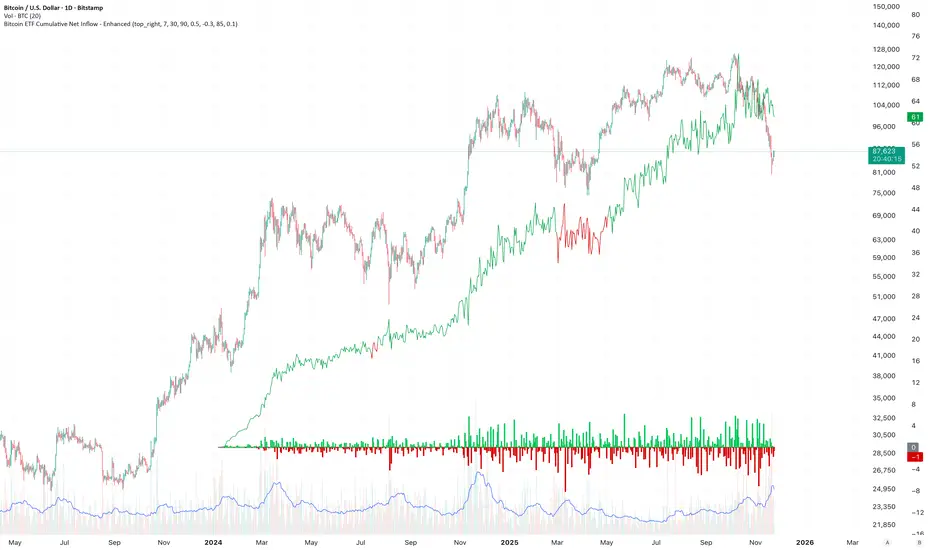
Bitcoin ETF Cumulative Net InflowIndicator Description:
This indicator calculates and plots the cumulative net inflow (in billions of USD) for selected Bitcoin ETFs on the main price chart. It uses AUM data from TradingView to estimate daily net flows, adjusted for BTC price changes, and accumulates them over time. The line is overlaid on the price chart (e.g., BTCUSD) with a right scale for better visibility, helping to identify correlations between ETF inflows and Bitcoin price movements.
Key Features:
Supports selection of 10 major Bitcoin ETFs (IBIT, FBTC, ARKB, etc.) via inputs.
Cumulative inflow line (purple, linewidth=2) for trend analysis.
Data sourced from request.financial("AUM", "D") for accuracy.
Quant BTC ETH Oversold Indicator $$$ V0001A very powerful indicator for determining high probability of oversold location for btc and eth.
sHip Crypto Buy/Sell Pro BTC 15minThis is a 15min BTC buy sell indicator that is made by Ai. Have not tested yet but you can give it a go if you want.

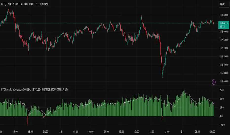
Multi CEX BTC Spot vs Perpetual PremiumThis Indicator shows the BTC Spot vs Perpetual premium across different CEX.
HIFI BTC Daily Hashrate Momentum OscillatorThe "HIFI BTC Daily Hashrate Momentum Oscillator" indicator is an oscillator that analyzes the "health" and confidence of miners in the Bitcoin network. It measures the momentum of hashrate changes using its deviation from the 30-day and 60-day moving averages. A rising hashrate is often a leading or confirming bullish trend indicator for the price of BTC.
Main Idea
Hashrate is the total computing power involved in mining. Its growth indicates increased investment in network security and miners' confidence in future profitability.
Blue Oscillator (fast): Shows the short-term dynamics of hashrate growth.
Green Oscillator (slow): Indicates the long-term trend of hash rate changes.
Chart background: The green background signals the acceleration of the hash rate growth (short-term momentum is higher than long-term), which is a positive sign.
How to Read Signals
A Buy signal appears when two fundamental conditions coincide:
Growth acceleration: The short-term hashrate momentum becomes stronger than the long-term one (the blue line crosses the green one from bottom to top). This indicates that miners are actively building capacity.
Exit from stagnation: This acceleration occurs after a period of weak hashrate growth or decline (the green line is below the red dashed line).
This combination indicates the potential start of a new cycle of growth and confidence in the network, which historically has often preceded the rise in the price of Bitcoin itself.
Disclamer: This indicator is an analysis tool and should not be considered as a direct financial recommendation. Always do your own analysis before making trades.

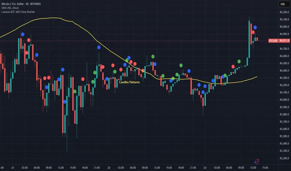
Lukiano BTC 369 Close MarkerThis indicator highlights candles where the closing price reduces to 3, 6, or 9 based on digital root calculation (sum of digits).
🔵 Blue dot = 3
🟢 Green dot = 6
🔴 Red dot = 9
Inspired by Tesla’s 369 theory and adapted for BTC traders who want to explore alternative energy-based signals.
Created by @Lukiano
CycleWave BTC/USD H1# CycleWave BITSTAMP:BTCUSD H1 Time Reversal Prediction
## Technical Description
This indicator displays pre-calculated cycle data for Bitcoin on the H1 timeframe. Unlike traditional indicators that calculate cycles in real-time, this one uses carefully pre-analyzed cycle data that I manually input after conducting detailed spectral analysis offline. The indicator itself serves as a visualization tool that presents these pre-calculated cycles and provides statistical information about their performance.
## Core Features
* Displays a color-coded line representing manually identified market cycles
* Shows forward projection up to 32 hours ahead (dotted section)
* Uses color to indicate predicted trend direction (green = up, red = down)
* Includes an information panel with statistical data and timing estimates
* Pre-calculated specifically for BTC/USD on the H1 timeframe
## Data Source Methodology
The cycle data displayed by this indicator comes from:
1. Offline spectral analysis using specialized software
2. Manual identification of dominant market cycles
3. Careful filtering to select the most significant 4-6 cycles
4. Expert combination and weighting of cycles based on historical performance
5. Regular updates when market conditions change or cycles need recalibration
The indicator itself doesn't perform these calculations - it simply visualizes the pre-analyzed data and provides performance statistics.
## How To Use
1. The main colored line shows the projected cycle movement:
- Green sections indicate expected upward movement
- Red sections indicate expected downward movement
2. The dotted continuation shows the future projection
3. The information panel provides:
- Current trend direction
- Cycle completion percentage
- Hours until expected trend change
- Expected trend change timestamp
- Correlation quality (statistical measure of past accuracy)
## Practical Application
This indicator is particularly useful for:
* Timing entries and exits around predicted turning points
* Planning ahead for potential reversals
* Confirming signals from other technical indicators
* Understanding the current position within the cycle
## Customization Options
* Time Shift: Fine-tune the cycle alignment (+/- 24 hours)
* Invert Cycle: Reverse the cycle direction when needed
* Visualization settings: Adjust line width, dots width, and colors
* Information display: Toggle the statistical information panel
## Limitations
* Shows potential reversal TIMES, not exact price levels
* Periodically requires updates as market cycles evolve
* Performance may vary during highly volatile periods
* Past correlation does not guarantee future accuracy
The data behind this indicator is manually updated based on ongoing cycle analysis to maintain accuracy with changing market conditions.

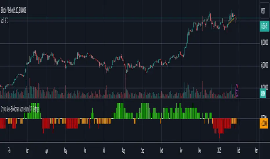
Crypto Neo - Blockchain Momentum (BTC Settings)The Crypto Neo - Blockchain Momentum indicator analyzes Bitcoin’s on-chain activity to gauge bullish or bearish trends. It combines multiple on-chain metrics and applies different moving average strategies to assess Bitcoin’s momentum.
This indicator is designed to track key blockchain data sources, such as:
Hash Rate
Active Addresses
Transactions per Second
New Addresses
Trader Behavior
Long-Term Holders (Cruisers)
Money Flow In/Out
Large Transactions Count
It processes these inputs using various Moving Average (MA) types, including SMA, EMA, DMA, to generate a Bullish Momentum Score, which is visually displayed on the chart.
How to Use:
Select MA Type – Choose between SMA, EMA, MIXMA, or DMA to determine how moving averages are applied.
Set MA Lengths – Adjust MA1 Length and MA2 Length to define short-term vs. long-term trend comparison.
Customize Data Sources – Select different on-chain metrics for the indicator to analyze.
Interpret the Bullish Momentum Score:
🟢 Green (Strong Bullish Momentum) – Bullish on-chain signals dominate.
🟡 Yellow (Moderate Bullish Momentum) – Weak bullish trend forming.
⚪ White (Neutral) – No clear trend.
🟠 Orange (Moderate Bearish Momentum) – Weak bearish signals emerging.
🔴 Red (Strong Bearish Momentum) – Bearish on-chain signals dominate.
Important Notes
This indicator does not generate trading signals but helps interpret blockchain trends for informed decision-making.
Since it relies on daily on-chain data, it is best used on the 1D timeframe for accurate readings.
Real-time calculations may vary slightly due to different bar update behaviors.
This indicator is very useful to confirm market turns early. Here are a few an example setups:
1. Back in 2019 on chain metrics started trending up after the market had dumped signaling a very good opportunity to buy.
2. During the 2021 bull market. When the market was forming a top, the on chain metrics started trending down indicating a risk to the downside.