[AMBAGES] X ProtocolTitle: X Protocol
Description: The X Protocol is an institutional-grade framework designed for traders utilizing Smart Money Concepts (SMC) and ICT methodologies. Rather than providing static overlays, this script functions as a logic engine that filters market noise by requiring confluence between time, price, and cross-asset correlation.
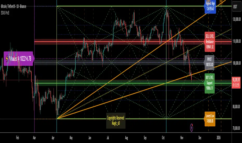
The Purpose of this Integration (The Mashup) Traders often struggle with "chart paralysis" when monitoring multiple timeframes. The X Protocol solves this by integrating disparate elements—MTF Fair Value Gaps, Time Cycles, and SMT Divergences—into a single Confluence Score. The script does not simply plot these indicators; it evaluates their relationship. For example, an Entry Model (like a CISD) is only highlighted if it occurs within a specific HTF POI during a designated Macro time window.
Key Methodology & Features
1. The Confluence Dashboard The heart of the system is a dynamic calculation engine that assigns a real-time score (0–10) based on:
Bias Detector: Evaluates market structure by comparing the current swing points against Higher Timeframe (HTF) PD Arrays.
POI Analysis: Tracks price interaction with Monthly, Weekly, and Daily High/Low levels.
Macro Alignment: Validates setups based on time-of-day algorithmic windows (e.g., London Open, AM/PM Silver Bullet windows).
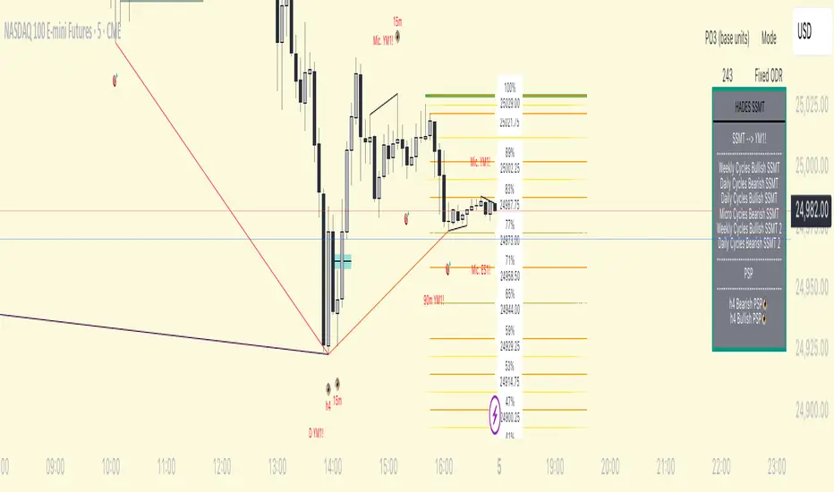
2. Smart Money Technique (SMT) Scanner The script utilizes a multi-symbol comparison (default: ES, NQ, YM) to detect "cracking" correlations.
Logic: It calculates the divergence between the current ticker and two external tickers. A signal is only plotted when a "Swing High/Low" failure occurs at a key liquidity level, preventing the common issue of constant, irrelevant SMT signals.
3. Algorithmic Time Cycles & DWM
DWM Levels: Plots Previous Daily, Weekly, and Monthly levels using precise pivot-time logic rather than standard daily closes.
Time Cycles: Visualizes 90-minute and 270-minute accumulation/distribution cycles to help traders anticipate volatility shifts.
4. Advanced Entry Models The script visualizes two specific institutional models:
CISD (Change in State of Delivery): Defined here as a specific volume-weighted shift following a liquidity sweep.
IFVG (Inverse Fair Value Gap): Identifies gaps that have been reclaimed and "flipped," acting as a support/resistance anchor.
How to Use
Check Bias: Ensure the Dashboard indicates a Bullish or Bearish lean based on HTF structure.
Wait for POI: Monitor for price to reach a DWM level or HTF FVG.
Monitor SMT: Look for the SMT Divergence indicator to confirm institutional accumulation/distribution.
Execution: Look for a CISD or IFVG print when the Confluence Score is 6 or higher.
Credits & Attribution This script utilizes concepts popularized by Inner Circle Trader (ICT). All logic and calculations for the dashboard, confluence scoring, and SMT scanning were custom-coded by .
Disclaimer: This tool is for analytical purposes only. Trading involves significant risk. Past performance does not guarantee future results.
Pine Script® indicator