Astrology Weekly Time Calendar [yigdeli]Overview
Thanks to @twingall for their support and feedback.
Astrology Weekly Time Calendar is a time-based visualization indicator designed for users who already work with astrology-based market timing methods.
Instead of analyzing price or generating signals, the indicator focuses exclusively on structuring and projecting user-defined time expectations onto the chart.
It displays predefined future time windows in a session-style format, allowing users to visually reference their own outlook within upcoming periods.
📌 This tool does not attempt to predict price behavior. It provides a structured visual context for time-based expectations defined by the user.
📸
Clean chart showing multiple vertical time boxes across a full week.
Caption:
Example of user-defined weekly time windows visualized in a session-style format.
Core Concept
This indicator does not calculate, interpret, or validate astrological data.
All astrology-related expectations:
Are determined externally by the user
Are based on the user’s own research, methodology, or experience
Are manually entered into the script via input sessions
The indicator acts purely as a visual organization layer, aligning these predefined time windows with the chart’s timeframe and timezone.
How It Works
The user performs their own astrology-based time analysis externally
Based on this analysis, the user defines specific time windows (e.g. active, neutral, or mixed periods)
These time windows are manually entered into the indicator inputs
The script projects these ranges forward on the chart as vertical time zones, similar to a session-based tool
The indicator does not evaluate the validity or effectiveness of any external methodology.
All interpretation remains entirely the responsibility of the user.
📸
Zoomed-in chart showing a single day with multiple colored time boxes.
Caption:
Close-up view of intraday time windows with customizable colors and labels.
Visual Structure
Each time window is displayed as a vertical box on the chart
Colors are fully customizable and represent user-defined classifications
Optional labels may display:
Day
Date
Time
The vertical height of boxes is purely cosmetic and does not represent price levels, targets, outcomes, or performance
The indicator is designed to remain visually clean while supporting complex weekly structures.
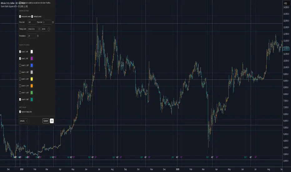
⚠️ Note on Colors and Example Charts
The colors used in the example charts are default visual settings and are shown for illustration purposes only.
They do not represent factual market outcomes, validated results, or verified historical behavior.
All displayed time windows are purely visual references based on user-defined inputs and should not be interpreted as reflections of actual market performance.
Manual Input – How to Define Time Windows
All time windows displayed by the indicator are manually defined by the user.
Users first determine their own time expectations externally, then enter the corresponding date and time ranges into the script inputs (similar to defining sessions).
The indicator does not generate, modify, or validate these values. It only visualizes the user-defined time windows on the chart.
This approach ensures full flexibility while keeping all interpretation under the user’s control.
How to Fill the Inputs (Example Workflow)
Time windows are defined sequentially, similar to session-based configurations.
Each new time range always starts where the previous one ends.
This ensures a continuous and organized structure throughout the day.
Example (Monday):
First time window: 00:00 → 03:55
Second time window: 03:55 → 07:30
Third time window: 07:30 → 10:00
Fourth time window: 10:00 → 15:00
…and so on
The end time of one window becomes the start time of the next window.
Users are free to define as many time ranges as needed for each day.
Notes Field (Optional)
Each time window includes an optional notes field, which is empty by default.
Users may use this field to record:
Lunar phases
Cycles
Important astrological references
Personal observations
The indicator does not interpret or process these notes.
They are displayed purely for user reference.
Time Zone & Display Options
Time ranges can be defined according to the user’s local time zone using the time zone selector
Users may optionally enable or disable:
Day name
Date
Time
labels directly on the chart
These display settings allow users to customize how much contextual information is shown, without affecting the underlying time windows.
📸
Settings panel showing session/time inputs, color selections, and note fields.
Caption:
Example of manually entered time ranges and optional notes used to define weekly time expectations.
📸
Full settings panel overview with multiple days and sessions configured.
Caption:
Overview of input settings used to organize and customize weekly time windows.
Intended Users
This indicator is intended for:
Users familiar with astrology-based market timing
Traders who already define their own time expectations externally
Advanced or niche users seeking a structured way to visualize time-based outlooks
It is not designed as a general-purpose trading indicator.
What This Script Does NOT Do
❌ Does not generate buy or sell signals
❌ Does not predict price direction
❌ Does not calculate astrological data
❌ Does not provide financial or trading advice
The script is strictly a time-window visualization tool.
Disclaimer
This indicator is provided for visual and analytical purposes only.
It does not constitute financial advice.
Users should apply their own judgment, confirmation methods, and risk management when using this tool.
Past or future visualizations shown in examples do not imply any form of performance expectation.
Pine Script® indicator