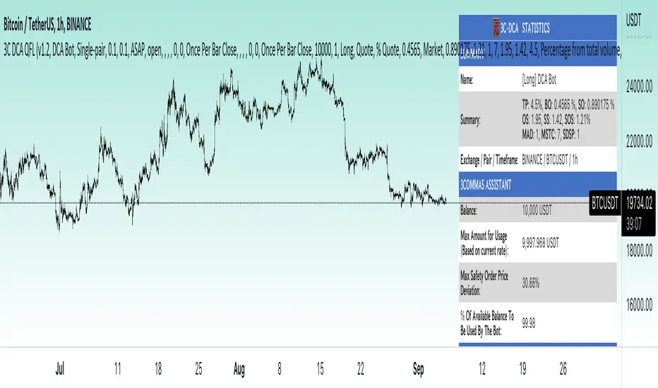
3Commas dollar cost averaging (DCA) QFL IndicatorAs investors, we often face the dilemma of willing high stock prices when we sell, but not when we buy. There are times when this dilemma causes investors to wait for a dip in prices, thereby potentially missing out on a continual rise. This is how investors get lured away from the markets and become tangled in the slippery slope of market timing, which is not advisable to a long-term investment strategy.
Skyrex developed a complex indicator based on dollar-cost averaging in Quick Fingers Luc's interpretation. It is a combinations of strategies which allows to systematically accumulate assets by investing scaled amounts of money at defined market cycle global support levels. Dollar-cost averaging can reduce the overall impact of price volatility and lower the average cost per asset thus even during market slumps only a small bounce is required to reach take profit.
The indicator script monitors a chart price action and identifies bases as they form. When bases are reached the script provides entry alerts. During price action development an asset value can go lower and in this way the script will perform safety entries alerts at each subsequent accumulation levels. When weighted average entry price reaches target profit the script will perform a take profit action alert.
Bases are identified as pivot lows in a fractal pattern and validated by an adjustable decrease/rise percentage to ensure significancy of identified bases. To qualify a pivot low, the indicator will perform the following validation:
Validate the price rate of change on drops and bounces is above a given threshold amount.
Validate the volume at the low pivot point is above the volume moving average (using a given length).
Validate the volume amount is a given factor of magnitude above is above the volume moving average.
Validate the potential new base is not too close to the previous range by using a given price percent difference threshold amount.
A fractal pattern is a recurring pattern on a price chart that can predict reversals among larger, more chaotic price movements. These basic fractals are composed of five or more bars. The rules for identifying fractals are as follows:
A bearish turning point occurs when there is a pattern with the highest high in the middle and two lower highs on each side.
A bullish turning point occurs when there is a pattern with the lowest low in the middle and two higher lows on each side.
Basic dollar-cost averaging approach is enhances by implementation of adjustable accumulation levels in order to provide opportunity of setting them at defined global support levels and Martingale volume coefficient to increase averaging effect. According to Quick Fingers Luc's principles trading principles we added volume validation of a base because it allows to confirm that the market is resistant to further price decrease.
The indicator supports traditional and cryptocurrency spot, futures , options and marginal trading exchanges. It works accurately with BTC , USD, USDT, ETH and BNB quote currencies. Best to use with 1H timeframe charts and limit orders. The indicator can be and should be configured for each particular asset according to its global support and resistance levels and price action cycles. You can modify levels and risk management settings to receive better performance
The difference between core script and this interpretation is that this strategy is specially designed for 3Commas bots
How to use?
1. Apply indicator to a trading pair your are interested in using 1H timeframe chart
2. Configure the indicator: change layer values, order size multiple and take profit/stop loss values according to current market cycle stage
3. Set up a TradingView custom alert using the indicator settings to trigger on a condition you are interested in
4. The indicator will send alerts when to enter and when to exit positions which can be applied to your portfolio using external trading platforms
5. Update settings once market conditions are changed using backtests on a monthly period
Search in scripts for "Fractal"
Dollar cost averaging (DCA) QFL IndicatorAs investors, we often face the dilemma of willing high stock prices when we sell, but not when we buy. There are times when this dilemma causes investors to wait for a dip in prices, thereby potentially missing out on a continual rise. This is how investors get lured away from the markets and become tangled in the slippery slope of market timing, which is not advisable to a long-term investment strategy.
Skyrex developed a complex indicator based on dollar-cost averaging in Quick Fingers Luc's interpretation. It is a combinations of strategies which allows to systematically accumulate assets by investing scaled amounts of money at defined market cycle global support levels. Dollar-cost averaging can reduce the overall impact of price volatility and lower the average cost per asset thus even during market slumps only a small bounce is required to reach take profit.
The indicator script monitors a chart price action and identifies bases as they form. When bases are reached the script provides entry alerts. During price action development an asset value can go lower and in this way the script will perform safety entries alerts at each subsequent accumulation levels. When weighted average entry price reaches target profit the script will perform a take profit action alert.
Bases are identified as pivot lows in a fractal pattern and validated by an adjustable decrease/rise percentage to ensure significancy of identified bases. To qualify a pivot low, the indicator will perform the following validation:
Validate the price rate of change on drops and bounces is above a given threshold amount.
Validate the volume at the low pivot point is above the volume moving average (using a given length).
Validate the volume amount is a given factor of magnitude above is above the volume moving average.
Validate the potential new base is not too close to the previous range by using a given price percent difference threshold amount.
A fractal pattern is a recurring pattern on a price chart that can predict reversals among larger, more chaotic price movements. These basic fractals are composed of five or more bars. The rules for identifying fractals are as follows:
A bearish turning point occurs when there is a pattern with the highest high in the middle and two lower highs on each side.
A bullish turning point occurs when there is a pattern with the lowest low in the middle and two higher lows on each side.
Basic dollar-cost averaging approach is enhances by implementation of adjustable accumulation levels in order to provide opportunity of setting them at defined global support levels and Martingale volume coefficient to increase averaging effect. According to Quick Fingers Luc's principles trading principles we added volume validation of a base because it allows to confirm that the market is resistant to further price decrease.
The indicator supports traditional and cryptocurrency spot, futures, options and marginal trading exchanges. It works accurately with BTC, USD, USDT, ETH and BNB quote currencies. Best to use with 1H timeframe charts and limit orders. The indicator can be and should be configured for each particular asset according to its global support and resistance levels and price action cycles. You can modify levels and risk management settings to receive better performance
Advantages of this indicator:
The indicator has custom alert settings for each strategy action
The indicator can be used with 3Commas, Cryptohopper, Alertatron or Zignaly bots
The indicator is sustainable to market slumps and can be used for long-term trading
The indicator provides a large number of entries which is good for diversification
Can be applied to any market and quote currency
Easy to configure user interface settings
How to use?
1. Apply indicator to a trading pair your are interested in using 1H timeframe chart
2. Configure the indicator: change layer values, order size multiple and take profit/stop loss values according to current market cycle stage
3. Set up a TradingView custom alert using the indicator settings to trigger on a condition you are interested in
4. The indicator will send alerts when to enter and when to exit positions which can be applied to your portfolio using external trading platforms
5. Update settings once market conditions are changed using backtests on a monthly period

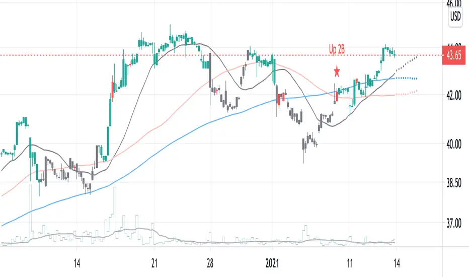
2B detector betaIdentifying a trend reversal is practically tricky, given that price movement is somewhat unpredictable and mostly obeys a power law. In which the price difference is primarily out of normal distribution. According to Benoit Mandelbrot, the price distribution follows an alpha-stable distribution with α equal to 1.7.
Real data observation suggests that stock prices do not follow the Random Walk Hypothesis or Brownian motion. Instead, they follow a fractal pattern. Fractals exhibit similar patterns at different scales called self-similarity. Using this character, one can develop fractal patterns to identify local highs and local lows.
This indicator identifies the reversal signal so-called 2B base on the following logic:
1. Identify local highs and local lows with fractals
2. Define relative positions of those local highs and lows (ABC and 2B)
3. Define the local range of ABC and B
Disclaimer: This indicator is only for research purposes. Please do not take it as investing or trading advice.
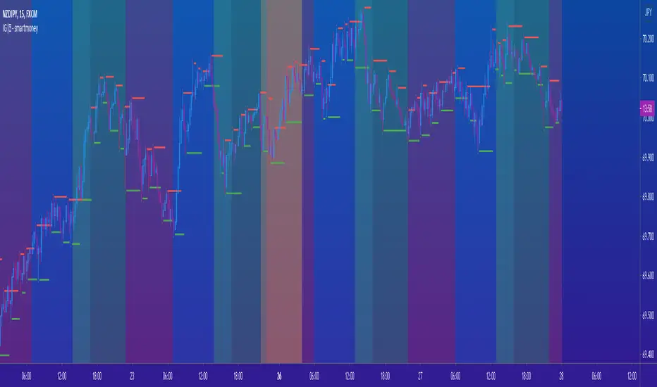
IG|ꝏ - smartmoneyIndicator composed of a combination of the following indicators:
Weekends Background (off by default)
Forex Sessions (Asian, Europe, America) (off by default)
Fractals (default) (on by default)
Fractal SR (Support and Resistance) (off by default)
*There is a on and off setting to every indicator seperately
This is indicator was created to help forex students on back testing session movements and counter movements easier in order to perfect their strategies and identify session end and begginng.
The Fractal SR is nothing more than an extension line of the High and Low price of the candle highligthed by fractals with and arrow above or bellow representing easier Support and Resistance Lines to follow.
Scalping Swing Trading Tool R1-4 by JustUncleLDescription:
This study project is a "Scalping Swing trading Tool" and is an alternative to the "Scalping Pullback Tool R1". It is designed for a two pane TradingView chart layout :
the first pane set to 15min Time Frame;
the second pane set to 1min Time Frame(TF).
The tools incorporates the majority of the indicators needed to analyse and scalp Trends for Swings, PullBacks and reversals on 15min charts and 1min charts.
Incorporated within this tool are the following indicators:
1. The following EMAs are drawn automatically:
Green = EMA89 (15min TF) = EMA75 (1min TF)
Blue = EMA200 (15min TF) = EMA180 (1min TF)
Black = EMA633 (15min TF) = EMA540 (1min TF)
2. The 10EMA (default) High/Low+Close Price Action Channel (PAC), the PAC channel
display is disabled by default.
3. Optionally display Fractals and optional Fractal levels
4. Optional HH, LH, LL, HL finder.
5. Coloured coded Bar high lighting based on the PAC:
blue = bar closed above PAC
red = bar closed below PAC
gray = bar closed inside PAC
lime Line = EMA10 of bar close
6. Pivot points (disables Fractals automatically when selected) with optional labels.
7. EMA5-12 Channel is displayed by default.
8. EMA12-36 Ribbon is displayed by default
9. Optionally display EMA36 and PAC instead of EMA12-36 Ribbon.
Set up and hints:
I am unable to provide a full description here, as Pullback Trading incorporates a full trading Methodology, there are a number of articles and books written on the subject.
Set to two pane TradingView chart, set first pane to 15Min and second to 1min.
Set the chart to Heikin Ashi Candles (optional).
I also add a "Sweetspot Gold2" indicator to the chart as well to help with support and resistance finding and shows where the important "00" lines are.
Use the EMA200 on the 15min pane as the anchor. So when prices above EMA200 we only trade long (buy) and when prices below the EMA200 we only trade short (sell).
On the 15min chart draw any obvious Vertical Trend Lines (VTL), use Pivots point as a guide.
On the 15min chart what we’re looking for price to Pullback into the EMA5-12 Channel or EMA12-36 ribbon, we draw Trendlines uitilising the Pivot points or Fractals to guide your TL drawing.
On the 15min chart look for the trend to resume and break through the drawn TL. The bar color needs to change back to the trend direction colour to confirm as a break.
Now this break can be traded as a 15min trade or now look to the 1min chart.
On the 1min chart draw any Pullback into any of the EMAs.
On the 1min chart look for the trend to resume and break through the drawn TL. The bar color needs to change back to the trend direction colour to confirm as a break.
Now this break can be traded as a 1min trade.
There is also an option to select Pristine (ie Ideal) filtered Fractals, which look like tents or V shape 5-candle patterns. These are actually used to calculate the Pivot points as well.
Other than the "SweetSpot Gold2" indicator, you should not need any other indicator to successfully trade trends for Pullbacks and reversals. If you really want another indicator use the AO (Awesome Oscillator) as it is momentum based.

MACD Box V6.3 (Right Labels)Using the dual MACD indicator, identify the range formed by high-volume MACD candlesticks. Then, use fractals formed by three or five candlesticks to identify trends formed by two consecutive fractals.

Momentum Market Structure ProThis first indicator in the Beyond Market Structure Suite gives you clear market structure at a glance, with adaptive support & resistance zones. It's the only SMC-style indicator built from momentum highs & lows, as far as I know. It creates dynamic support & resistance zones that change strength and resize intelligently, and gives you timely alerts when price bounces from support/rejects from resistance.
You’re free to use the provided entry and exit signals as a ready-to-use, self-contained strategy, or plug its structure into your existing system to sharpen your edge :
• Market structure bias may help improve a compatible system's win rate by taking longs only in bullish bias and shorts in bearish structure.
• Support/resistance can help trend traders identify inflection points, and help range traders define ranges.
🟩 HIGHLIGHTS
⭐ Unique market structure with different characteristics than purely price-based models.
⭐ Support and resistance created from only the extreme levels.
⭐ Support & resistance zones adapt to remain relevant. Zones are deactivated when they become too weak.
⭐ Long and short signals for a bounce from support/rejection from resistance.
🟩 WHY "MARKET STRUCTURE FIRST, ALWAYS"?
"There is only one side to the stock market; and it is not the bull side or the bear side, but the right side." — Jesse Livermore, Reminiscences of a Stock Operator (1923)
If the market is structurally against your trade, you're gonna have a bad time. So you must know what the market structure is before you plan your trade. The more precise and relevant your definition of market structure, the better.
🟩 HOW TO TRADE USING THIS INDICATOR (SIMPLE)
• Directional filter : The prevailing bias background can be used for any kind of trades you want to take. For example, you can long a bounce from support in a bullish market structure bias, or short a rejection from resistance in bearish bias.
• Entries : For more conservative entries, you could wait for a Candle Trend flip after a reaction from your chosen zone (see below for more about Candle Trend).
• Stops : The included running stop-loss level based on Average True Range (ATR) can be used for a stop-loss — set the desired multiplier, and use the level from the bar where you enter your trade.
• Take-profit : Similarly, you can set a Risk:Return-based take-profit target. Support and resistance zones can also be used as full or partial take-profit targets.
See the Advanced section below for more ideas.
🟩 SIGNALS
⭐ ENTRIES
You can enable signals and alerts for bounces from support and rejections from resistance (you'll get more signals using Adaptive mode). You can filter these by requiring corresponding market structure bias (it uses the bias you've already set for the background), and by requiring that Candle Trend confirm the move.
I've slipped in my all-time favourite creation to this indicator: Candle Trend. When price makes a Simple Low pivot, the trend flips bullish. When price then makes a Simple High pivot, the trend flips bearish (see my Market Structure library for a full explanation). This tool is so simple, yet I haven't noticed it anywhere else. It shows short-term trends beautifully. I use it mainly as confirmation of a move. You can use it to confirm ANY kind of move, but here we use it for bounces from support/rejections from resistance.
Note that the pivots and Zigzags are structure, not signals.
⭐ STOPS
You can use the supplied running ATR-based stop level to find a stop-loss level that suits your trading style. Set the desired multiplier, and use the level from the bar where you enter your trade.
⭐ TAKE-PROFIT
Similarly, you can set a take-profit target based on Risk:Return (R:R). If this setting is enabled, the indicator calculates the distance between the closing price and your configured stop, then multiplies that by the configured R:R factor to calculate an appropriate take-profit level. Note that while the stop line is reasonably smooth, the take-profit line varies much more, reflecting the fact that if price has moved away from your stop, the trade requires a greater move in order to hit a given R:R ratio.
Since the indicator doesn't know where you were actually able to enter a position, add a ray using the drawing tool and set an alert if you want to be notified when price reaches your stop or target.
🟩 WHAT'S UNIQUE ABOUT THIS INDICATOR
⭐ MOMENTUM PIVOTS
Almost all market structure indicators use simple Williams fractals. A very small number incorporate momentum, either as a filter or to actually derive the highs and lows. However, of those that derive pivots from momentum, I'm not aware of any that then create full market structure from it.
⭐ SUPPORT & RESISTANCE
Some other indicators also adjust S/R zones after creation, some use volume in zone creation, some increase strength for overlap, a few merge zones together, and many use price interactions to classify zones. But my implementation differs from others, as far as I can tell after looking at many many indicators, in seven specific ways:
+ Zones are *created* from purely high-momentum pivots, not derived or filtered from simple Williams pivots (e.g. `ta.pivothigh()`).
+ Zones are *weakened* dynamically as well as strengthened. Many people know that S/R gets stronger if price rejects from it, but this is only half the story. Different price patterns strengthen *or weaken* zones.
+ We use *conviction-weighted candle patterns* to adjust strength. Not simply +1 for price touching the zone, but a set of single-bar and multi-bar patterns which all have different effects.
+ The rolling strength adjustments are all *moderated by volume*. The *relative volume* forms a part of each adjustment pattern. Some of our patterns reward strong volume, some punish it.
+ We do our own candle modelling, and the adjustment patterns take this into account.
+ We *resize* zones as a result of certain candle patterns ("indecision erodes, conviction defends").
+ We shrink overlapping zones to their sum *and* add their strengths.
🟩 HOW TO TRADE USING THIS INDICATOR (ADVANCED)
In addition to the ideas in the How to Trade Using This indicator (Simple) section above, here are some more ideas.
You can use the market structure:
• As a bias for entries given by more reactive momentum resets, or indeed other indicators and systems.
• You could use a change in market structure to close a long-running trend-following position.
You can use the distance from a potential entry to the CHoCH line as a filter to choose higher-potential trades in ranging assets.
Confluence between market structure and your favourite trend indicator can be powerful.
Multi timeframe analysis
This is a bit of a rabbit hole, but you could use a split screen with this indicator on a higher timeframe (HTF) view of the same asset:
• If the 1D structure turns bullish, the next time that the 1H structure also flips bullish might be a good entry.
• Rejection from a HTF zone, confirmed by lower timeframe (LTF) structure, could be a good entry.
None of this is advice. You need to master your own system, and especially know your own strengths and weaknesses, in order to be a successful trader. An indicator, no matter how cool, is not going to one-shot that process for you.
In Adaptive mode, a skillful trader will be able to spot more opportunities to classify and use support and resistance than any algorithm, including mine, now that they've been automatically drawn for you.
If you are doing historical analysis, note that the "Calculated bars" setting is set to a reasonably small number by default, which helps performance. Either increase this number (setting to zero means "use all the bars"), or use Bar Replay to examine further back in the chart's history. If you encounter errors or slow loading, reduce this number.
🟩 SUPPORT & RESISTANCE
A support zone is an area where price is more likely to bounce, and a resistance zone is an area where price is more likely to reject. Marking these zones up on the chart is extremely helpful, but time-consuming. We create them automatically from only high-momentum areas, to cut noise and highlight the zones we consider most important.
In Simple mode, we simply mark S/R zones from momentum and Implied pivots. We don't update them, just deactivate them if price closes beyond them. Use this mode if you're interested in only recent levels.
In Adaptive mode, zones persist after they're traversed. Once the zones are created, we adjust them based on how price and volume interact with them. We display stronger zones with more opaque fills, and weaker zones with more transparent fills. To calculate strength, we first preprocess candles to take into account gaps between candles, because price movement after market is just as important in its own way. The preprocessing also redefines what constitutes upper and lower wicks, so as to better account for order flow and commitment. We use these modelled candle values, as well as their relative amplitude historically, rather than the raw OHLC for all calculations for interactions of price and zones. It's important to understand, when trying to figure out why the indicator strengthened or weakened a zone, that it sees fundamental price action in a different way to what is shown on standard chart candles (and in a way that can't easily be represented accurately on chart candles).
Then, we strengthen or weaken , and resize support and resistance zones dynamically using different formulas for different events, based on principles including these:
• The close is the market's "vote", the momentum shift anchor.
• Defended penetrations reveal validated liquidity clusters.
• Markets contract to defended levels.
• "The wick is the fakeout, but the close tells you if institutions held the level." — ICT (Inner Circle Trader)
Adaptive mode is more powerful, but you might need to tweak some of the Advanced Support & Resistance settings to get a comfortable number of zones on the chart.
🟩 MOMENTUM PIVOTS
The building blocks of market structure are Highs and Lows — places where price hits a temporary extreme and reverses. All the indicators I could find that create full market structure do so from basic price pivots — Williams fractals, being the highest/lowest candle wick for N candles backwards and forwards (there are some notable first attempts on TradingView to use momentum to define pivots, but no full structure). "Highest/lowest out of N bars" is the almost universal method, but it also picks up somewhat arbitrary price movements. Recognising this, programmers and traders often use longer lookbacks to focus on the more significant Highs and Lows. This removes some noise, but can also remove detail.
My indicator uses a completely different way of thinking about High and Low pivots. A High is where *momentum* peaks and falls back, and a low is where it dips and then recovers. While this is happening, we record the extremes in price, and use those prices as the High or Low pivot zones.
This deliberately picks out different, more meaningful pivots than any purely price-based approach, helping you focus on the swings that matter. By design, it also ignores some stray wicks and other price action that doesn't reflect significant momentum. Price action "purists" might not like this at first, but remember, ultimately we want to trade this. Check and see which levels the market later respects. It's very often not simply the numerically higher/lower local maxima and minima, but the levels that held meaning, interpreted here through momentum.
The first-release version uses the humble Stochastic as the structural momentum metric. Yes, I know — it's overlooked by most people, but that's because they're using it wrong. Stochastic is a full-range oscillator with medium excursions, unlike RSI, say, which is a creeping oscillator with reluctant resets. This makes Stoch (at the default period of 14) not quite reactive enough for on-the-ball momentum reset entry signals, but close to perfect (no metric is 100%) for structural pivots.
Stochastic is also a solid choice for structure because divergences are rare and not usually very far away in terms of price. More reactive momentum metrics such as Stochastic RSI produce very noisy structure that would take a whole extra layer of interpreting (see Further Research, below).
For these reasons, I may or may not add other options for momentum. In the initial release, I've added smoothed RSI as an alternative just to show it's possible, which takes even longer than Stochastic to migrate from one extreme to another, creating an interesting, longer-term structure.
🟩 IMPLIED PIVOTS
We want pivots to mark important price levels so that we can compute market direction and support & resistance zones from them.
In this context, we see that some momentum metrics, and Stochastic in particular, tend to give multiple consecutive resets in the same direction. In other words, we get High followed by High, or Low followed by Low, which does not give us the chance to create properly detailed structure. To remedy this, we simply take the most extreme price action between two same-direction pivots, and create an Implied pivot out of it, after the second same-direction pivot is created.
Obviously these pivots are created very late. Recalling why we wanted them, we realise that this is fine. By definition , price has not exceeded the Implied Pivot level when they're created. So they show us an interesting level that is yet untested.
Implied Pivots are thus created indirectly by momentum but defined directly by price. They are for structure only. We choose not to give them a Dow type (HH, HL, LH, LL) and not to include them in the Main Zigzag to emphasise their secondary nature. However, Implied Pivots are not "internal" or "minor" pivots. There is no such concept in the current Momentum Market Structure model.
If you want less responsive, more long-term structure, you can turn Implied Pivots off.
🟩 DOW STRUCTURE
Dow structure is the simplest form of market structure — Higher Highs (HHs) and Higher Lows (HLs) is an uptrend (showing buyer dominance), and vice-versa for a downtrend.
We label all Momentum (not Implied) Pivots with their Dow qualifier. You can also choose to display the background bias according to the Dow trend.
There is an input option to enable a "Ranging" Dow state, which happens when you get Lower Highs in an uptrend or Higher Lows in a downtrend.
🟩 SMC-STYLE STRUCTURE (BOS, CHOCH)
The ideas of trend continuation after taking out prior highs/lows and looking for early signs of possible reversal go back to Dow and Wyckoff, but have been popularised by SMC as Break Of Structure (BOS) and Change of Character (CHoCH).
BOS can be used as a trigger: for example:
• Wait for a bullish break of structure
• Then attempt to buy the pullback
• Cancel if structure breaks bearish (meaning, we get a bearish CHoCH break)
How to buy the pullback? This is the trillion-dollar question. First, you need solid structure. Without structure, you got nothin'. Then, you want some identified levels where price might bounce from.
If only we incorporated intelligent support and resistance into this very indicator 😍
Creating and maintaining correct BOS and CHoCH continuously , without resetting arbitrarily when conditions get difficult, is technically challenging. I believe I've created an implementation of this structure that is at least as solid as any other available.
In general, BOS is fully momentum‑pivot‑driven; CHoCH is anchored to momentum pivots but maintained mainly by raw price extremes relative to those anchors (breaks are obviously pure price). This means that the exact levels will sometimes differ from your previous favourite market structure indicator.
We have made some assumptions here which may or may not match any one person's understanding of the "correct" way to do things, including: BOS is not reset on wicks because, for us, if price cannot close beyond the BOS there is no BOS break, therefore the previous wick level is still important. The candidate for CHoCH on opposing CHoCH break *is* reset on a wick, because we want to be sure to overcome the leftover liquidity at that new extreme before calling a Change of Character. The CHoCH is moved on a BOS break. For a bullish BOS break, the new CHoCH is the lowest price *since the last momentum pivot was confirmed, creating the BOS that just broke*, and vice-versa for bearish. If there's a stray wick before that, which doesn't shift momentum, we don't care about it.
🟩 ZIGZAG
The Major Swing Zigzag dynamically connects momentum highs and lows (e.g., from a Higher Low to the latest Higher High), adjusting as new extremes form to reveal the overall trend leg.
The Implied Structure Zigzag joins momentum pivots and Implied pivots, if enabled.
🟩 REPAINTING
It's really important to understand two things before asking "Does it repaint?":
1. ALL structure indicators repaint, in the sense of drawing things into the past or notifying you of things that happened in past bars, because by definition, structure needs some kind of confirmation, which takes at least one bar, usually several. This is normal.
2. Almost all indicators of ANY kind repaint in that they display unconfirmed values until the current bar closes. This is also normal.
Most features of this indicator repaint in the ordinary, intended ways described above: the pivots (Implied doubly so), BOS and CHoCH lines, and formation of S/R zones.
The Zigzags, by design, adjust themselves to new pivots. The active lines often change and attach themselves to new anchors. This is a form of repainting. It's important to note that the Zigzags are not signals. They're there to help visualise market structure, and structure does change. Therefore, I prioritised clearly explaining what price did rather than preserving its history.
One of the "bad" kinds of repainting is if a signal is printed when the bar closes, but then on a later bar that "confirmed" signal changes. This is a fundamental issue with some high timeframe implementations. It's bad because you might already have entered a trade and now the indicator is pretending that it never signalled it for you. My indicators do not do this (in fact I wrote an entire library to help other authors avoid this).
If you are ever in any doubt, play with an indicator in Bar Replay mode to see exactly what it does.
To understand repainting, see the official docs: www.tradingview.com
🟩 FURTHER RESEARCH
I've attempted to answer two of the tricky problems in technical analysis in Pine: how to do robust and responsive market structure, and how to maintain support and resistance zones once created. However, this just opens up more possibilities. Which momentum metrics are suitable for structure? Can more reactive metrics be used, and how do we account for divergences in a structural model based on key horizontal levels? Which sets of rules give the best results for maintaining support and resistance? Does the market have a long or a short memory? Is bar decay a natural law or a coping mechanism?
🟩 CREDITS
❤️ I'd like to thank my humble trading mentor, whose brilliant ideas inspire me to garble out code. Thanks are also due to @Timeframe_Titans for guidance on the finer points of market structure (all mistakes and distortions are my own), and to @NJPorthos for feedback and encouragement during the months in the wilderness.
Paid script

Zen ProThe Trading Theory of Entanglement (缠论), developed by a Chinese trading Master in 2006, is the single most complete and comprehensive trading theory known today. Although the theory remains ‘mysterious’ among traders outside China, millions and millions of Chinese traders study this theory everyday, and the theory has been proven to provide the closest description of market behaviors for all types of market including forex, stocks, derivatives, commodity, and cryptocurrency etc., and for all time frames no matter monthly, daily, 30m, 1m or even in seconds. The theory’s philosophy is based on human greed, hatred, delusion, arrogance and doubt, which reveal the most fundamental aspects of any market. For this reason, other trading theories or techniques such as the Dow theory, the Elliott Wave theory, and the Gann theory etc. can all find their explanations as well as their limitations from the Theory of Entanglement.
Fractals, strokes, line segments and pivots are basic elements in the Theory of Entanglement, and only by accurately drawing them on a chart can one find the most accurate buying and selling points. However, manually drawing these elements on an ever-changing chart is both challenging and time consuming, and may lead to incorrect interpretation of the market trend. Our Zen Pro indicator aims to provide the most accurate drawings of strokes, line segments, and pivots, as well as to automate the drawing process for three consecutive levels such as 1m, 5m, and 30m (similar to time frames but not necessarily the same). Buying and selling points are also labeled on the chart to provide users with appropriate trading guidance.
Note that different from the ZigZag indicator or its related ones which mainly connect high and low points on a chart, our developed Zen Pro is a highly structured and well organized technical indicator, and the elements defined in the theory are constructed step by step in the following manner: a pair of top and bottom fractals form a stroke, a minimum of three consecutive strokes form a line segment, and the overlapping area of three consecutive line segments defines a pivot (indicated by the rectangular area). The pivot is the key component to help identify trend continuation or reversal, based on the so-called trend divergence. More importantly, distinguished from other similar indicators implementing the Theory of Entanglement, our Zen Pro perfectly realizes recursions of multiple levels (time frames). For example, a stroke at a higher timeframe of 30m coincides with a line segment in a lower timeframe of 5m, and also coincides with a ‘trend type’ (see below definition) at an even lower timeframe of 1m. This feature is essential for multi-timeframe trading and provides confluence of buying and selling signals at multiple timeframes.
It is important to emphasize that users are strongly recommended to apply the Theory of Entanglement to analyze the current trend (whether it will continue or reverse) based on the drawings provided by the indicator, rather than blindly follow the labels of buying and selling points as signals. For acquiring more information on our Zen Pro, getting tips on how to use it more effectively in trading, as well as learning the Theory of Entanglement from basic concepts, interested users are encouraged to contact the author directly.
Zen Pro缠论指标应用了一套严格的数学递归运算逻辑,能够自动处理k线包含关系,识别顶、底分型,实现自动画笔、笔中枢、线段、线段中枢、走势类型等完美缠论走势图中的基础组成元素。
本指标的强大之处在于其可以做到走势结构的选择性递归生长,做到完美的区间套定位,高级别笔与低级别线段、走势类型的表里关系对应,以及接近做到高级别的任意标准笔、任意标准线段在低级别均具有内部结构和有理由地成立!
本指标用强大的数学递归运算逻辑,解决了千人千缠的难点,对走势进行清晰地逻辑划分,并可自动识别本级别与次级别背驰和盘整背驰,从而准确地标注本级别1、2、3类买卖点,为使用缠论交易的用户在交易上提供了最有效的帮助,让缠论不再高不可攀!
注:自前期的Zen指标发布一年多以来,我们收到了很多用户的良好反馈,但同时也深知其所存在的不足,因此我们听取了用户的宝贵意见,经过上万次的编译、调试与修改,现已在新发布的Zen Pro指标中解决了Zen指标的所有问题,例如需要手动设置单笔成线段的比例,以及手动设置成笔条件等等。Zen Pro无需用户自行设置,实现了根据当前条件完全自动划分走势。其对于走势的分析更加精确,展现出更加清晰的走势结构,从而使用户可以更有效和准确地判断当前走势的延续与转折。目前Zen Pro已达到我们对缠论指标用于准确描述市场行为的所有预期。
另:当前市场上有很多缠论指标供用户选择,而判断一个指标是否有效的标准不仅仅是该指标能否在大周期(≥ 4小时)或某个时间阶段对走势划分准确,而更是其能否清晰展现小周期(< 30分)的走势结构,以及更加重要的一点,是否能够实现多级别联立(即递归)。目前几乎所有其他的指标均未能实现对于走势结构的递归,从而仅适合于单一周期的操作。
而我们开发的Zen Pro以实现级别递归为基础,但又不仅仅局限于严格递归(若严格递归则可达到 > 99%),而是为更好地适应走势,依据走势的多义性对线段及走势类型进行调整,从而使生成的走势图更加利于分析,大大增加了用户对未来走势判断的准确程度,也同时极大程度上增强了用户的交易信心。
Relations between fractal, stroke, line segment, pivot, and some important definitions:
• Stroke: Connecting two adjacent top and bottom fractals with at least one candlestick in between.
• Line segment: Consists of an odd number of strokes, at least three strokes are required, and the first three strokes must have overlapping portions.
• Level: Levels generally correspond to time frames of the chart, such as 1w, 1d, 4h, 30m, 5m, 1m etc. Sub-level: The above levels are respectively the sub-levels of the previous level.
• Pivot: The part of a trend type at a certain level that is overlapped by at least three consecutive sub-level trend types.
• Trend type: There are two trend types: trend and range. In trend, there are also two types: rising trend and falling trend.
• Range: At any level, a completed trend type contains only one pivot.
• Trend: At any level, a completed trend type contains at least two pivots in the same direction in sequence, which is called a trend at this level.
List of drawings on the chart (for default color settings):
1. Thick blue lines: Strokes at the current level.
2. Thick orange lines: Strokes at a higher level, also line segments at the current level.
3. White dotted lines: Line segments at a higher level, also strokes at two levels higher from the current one.
4. Blue shaded rectangles: Pivots at the sub-level in a trend or a range.
5. Green shaded rectangles: Pivots at the current level in a rising trend or a range.
6. Orange shaded rectangles: Pivots at the current level in a falling trend or a range.
List of labels on the chart (above the candle: sell signal, below the candle: buy signal)
1. Small "1" label below the candle: The lower-level 1st buying point due to the bottom trend divergence or range divergence calculated from MACD: Buy signal
2. Small "1" label above the candle: The lower-level 1st selling point due to the top trend divergence or range divergence calculated from MACD: Sell signal
3. Large "1", "2", "3" labels below the candle: The current-level 1st, 2nd, and 3rd buying points due to the bottom trend divergence or range divergence calculated from MACD: Buy signal
4. Large "1", "2", "3" labels above the candle: The current-level 1st, 2nd, and 3rd selling points due to the top trend divergence or range divergence calculated from MACD: Sell signal
Trading ChannelTrading Channel aims to be a canvas on which to develop any strategy that the user feels comfortable with.
The greatest utility of the script lies in the fact that it plots a channel over the price action, as a support and resistance pivot, within which the price action develops.
It is a script of maximum simplicity in concept and development, but at the same time presents robust support to the price action and a quick visual aid complementary to any indicators that the user works with, feels comfortable with, and uses as a basis for their strategies.
The script includes the following features (most of them disabled by default, available for potential use without the need to add additional indicators):
Fast SMA
Medium SMA
Slow SMA (disabled)
Fast EMA (disabled)
Medium EMA (disabled)
Slow EMA (disabled)
Pivot
Pivot SMA
P Multiplier
Set of resistance and support pivots according to the studies of John L. Person (R3, R2, R1, S1, S2, S3 and midpoints) (disabled by default)
Channel for the current time period in use
Channels for extended time periods (disabled by default)
Various trend, momentum, and overbought/oversold indicating labels (note that the calculations for their representation are based on SMA's even though EMA's are visualized).
SMA's/EMA's
Both are available as both are used as basic indicators for different types of strategies. The default selection of SMA's in this case is based on the fact that the script development is largely based on the studies shared by John L. Person in the area of pivots and by Bill Williams in the area of fractals. Note also that for that same reason the various trend, momentum, and overbought/oversold indicating labels are calculated based on them.
Set of resistance and support pivots
They are included as a consultation tool especially for the higher time periods. They can be used to mark the most interesting supports/resistances and not lose sight of them while operating in lower time periods. Marking monthly, weekly, and daily pivots can be very useful. Additionally, marking S1 and R2 for bullish trends, S1 and R1 for ranges, and S2 and R1 for bearish trends can provide an even more precise framework to work on.
P Multiplier
It is set by default at 4, and is the basis for being able to consider during the use of a specific time frame, the price action with respect to higher time frames. It is the multiplier used for the generation of channels for extended time periods.
Channel for the current time period in use
It is a channel formed by the maximum and minimum closing of the last 21 periods. This value is modifiable and its adjustment depends on the asset under study. 24/7 markets show good results with this adjustment (in the case of BTC really good).
This channel represents a pivot in the form of a yellow middle line, with its support and resistance extremes on the upper green and lower red lines. The same green and red lines, referenced this time to the maximum, are added and serve as possible stop-loss marks.
Channels for extended time periods
Enabling the maximum and minimum channels for extended periods can provide a better idea of the price situation (it is recommended to disable the channel in use and enable the upper one for consultation, it provides a better vision).
Identifying labels:
Following a summary explanation for possible long entries, the same but opposite should be considered for possible short entries:
Small green arrow under candle: indicates possible upward trend (pivot above pivot SMA)
Large green arrow under candle: indicates upward trend (pivot above pivot SMA and above fast SMA)
Green triangle over candle: indicates channel breakout, possible upward momentum (represented as a fractal as its concept is the same)
Green/red arrows at the bottom of the chart: intended to confirm the validity of a signal (should doubt green indications with red lower arrow and vice versa)
Green/red dots at the bottom of the chart: red represents areas of strong resistance and green signals of strong support (with red dots, proceed with caution despite green signals, and vice versa)
Comments
It is emphasized that the basic and most useful functionality of this script is to provide a reliable base on which to develop any strategy, as a framework for working.
If the identifying labels are used, it should be taken into account that the earliest will always be the most reliable and valuable, but their confirmation will always depend on the user's strategy.
Its use in conjunction with the "Pivot Position for Trading Channel" indicator can serve as a base for the development of different strategies, by providing indication of the relative position of the price within the channel.
This script is just a consultation tool with didactic goals, it should not be used as an investment recommendation and the information provided should not be relied upon as such.
------------------------
Trading Channel pretende ser un lienzo sobre el que desarrollar cualquiera que sea la estrategia con la que el usuario se sienta más cómodo.
La mayor utilidad del script radica en que se traza sobre la acción del precio un canal, a modo de pivotes de soporte y resistencia, dentro del cual se desarrolla la acción del precio.
Se trata de un script de máxima sencillez en concepto y desarrollo, pero que a la vez presenta un soporte robusto a la acción del precio y una ayuda rápida visual complementaria a cualquieras que sean los indicadores con los que el usuario trabaje, se sienta más cómodo y utilice como base de sus estrategias.
El script incluye las siguientes funcionalidades (la mayoría desactivadas por defecto, disponibles para su potencial uso sin necesidad de añadir indicadores adicionales):
- SMA rápida
- SMA media
- SMA lenta (desactivada)
- EMA rápida (desactivada)
- EMA media (desactivada)
- EMA lenta (desactivada)
- Pivote
- SMA de pivote
- Multiplicador de P
- Conjunto de pivotes resistencia y soporte de acuerdo a los estudios de John L. Person (R3, R2, R1, S1, S2, S3 y puntos medios) (desactivados por defecto)
- Canal para el periodo temporal en uso
- Canales para periodos temporales extendidos (desactivados por defecto)
- Diversas etiquetas indicativas de cambios de tendencia, de impulso y de sobrecompra y sobreventa (nótese que los cálculos para su representación están basados en SMA's aunque se visualicen EMA's).
SMA's/EMA's
Ambas disponibles pues tanto unas como otras son utilizadas como indicadores básicos para diferentes tipos de estrategias. La selección de SMA's por defecto en este caso se basa en que las bases para desarrollo del script son en gran medida los estudios compartidos por John L. Person en el área de pivotes y de Bill Williams en el área de los fractales. Nótese también que por esa misma razón las diversas etiquetas indicativas de cambios de tendencia, impulso y sobrecompra/sobreventa se calculan en base a ellas.
Conjunto de pivotes resistencia y soporte
Se incluyen como herramienta de consulta sobre todo para los periodos temporales más altos. Pueden utilizarse para marcar los soportes/resistencias de más interés y no perderlos de vista mientras se opera en periodos de tiempo más bajos. De acuerdo a los estudios de John L. Person, marcarse los pivotes mensuales, semanales y diarios puede resultar de mucha utilidad. Adicionalmente, marcar S1 y R2 para tendencias alcistas, S1 y R1 para rangos, y S2 y R1 para tendencias bajistas puede proporcionar un marco aún más preciso sobre el que trabajar.
Multiplicador de p
Está fijado por defecto en 4, y es la base para poder considerar durante el uso de una franja temporal concreta, la acción del precio respecto a franjas temporales superiores. Es el multiplicador utilizado para la generación de los canales para periodos temporales extendidos.
Canal para el periodo temporal en uso
Se trata de un canal conformado por los cierres máximos y mínimos de los últimos 21 periodos. Este valor es modificable y su ajuste depende del activo en estudio. Mercados 24/7 muestran buenos resultados con este ajuste (en el caso de BTC realmente buenos).
Este canal representa en cierta manera un pivote en forma de línea intermedia amarilla, con sus extremos de soporte y resistencia en las líneas verdes superior y roja inferior. Se añaden las mismas líneas verdes y rojas, referenciadas esta vez a los máximos, que sirven como posibles marcas de stop-loss.
Canales para periodos temporales extendidos
Habilitar los máximos y mínimos de canales de periodos extendidos puede proporcionar una mejor idea de la situación del precio (se recomienda deshabilitar el canal en uso y habilitar el superior para consulta, proporciona una mejor visión).
Etiquetas identificativas:
A continuación explicación resumida para posibles entradas en largo, lo mismo pero de modo opuesto debería considerarse para posibles entradas en corto:
Flecha verde pequeña bajo vela: indica inicio de tendencia en alza (pivote por encima de SMA de pivote y ambos por encima de SMA rápida)
Flecha verde grande bajo vela: indica tendencia en alza (pivote por encima de SMA de pivote y ambos por encima de SMA rápida y media)
Triángulo verde sobre vela: indica rotura de canal, posible impulso al alza (representado a modo de fractal pues su concepto es el mismo)
Flechas verdes/rojas a pie de gráfico: pretenden confirmar la validez de una señal (debería dudarse de las indicaciones verdes con flecha inferior roja y viceversa)
Puntos verdes/rojos a pie de gráfico: los rojos representan áreas de fuerte resistencia y los verdes de fuerte soporte (con puntos rojos, proceder con cautela pese a señales verdes, y viceversa)
Comentarios
Se insiste en que la funcionalidad básica y de mayor utilidad de este script es proporcionar una base confiable sobre la que desarrollar cualquier estrategia, a modo de marco de trabajo.
Si se hace uso de las etiquetas identificativas, debe tenerse en cuenta que las más prematuras siempre serán las más confiables y valiosas, pero que su confirmación siempre dependerá de la estrategia por parte del usuario.
Su uso en conjunción al indicador "Pivot Position for Trading Channel" puede servir de base para el desarrollo de diferentes estrategias, al proporcionar indicación de la posición relativa del precio dentro del canal.
Este script es solo una herramienta de consulta con objetivos didácticos, no debe ser utilizado como recomendación de inversión y no se debe confiar en ella como tal.
Reversal Levelv1.0
In the search for one indicator that accurately finds the top and bottoms of the market, I have come across various indicators that use fractals and or zig-zag (still a form of fractals) to find the peak of each move.
Fractal is a fantastic indicator, but the very glaring downside is that fractals are inherently late.
This indicator is calculated with a combination of RSI and Stochastic in an attempt to reduce the lag.
Spiral Guide Algorithm [V2]Spiral Guide Algorithm (SGA)
At its core, the Spiral Guide Algorithm is a low noise, un-bounded, oscillating cycle indicator designed to capture state change within a non-Gaussian distribution.
The idea, design, and application of the Spiral Guide Algorithm is rooted in first principles from four core areas of study, and in application proves to be an excellent trend following tool.
The Spiral Guide Algorithm produces and visualizes three principal components. Below we will cover each of those areas, as well as, how to apply this algorithm in trade analysis.
Principal Components
1. SGA Signal = waveform fundamental signal line
2. SGA Filtered Signal = finite impulse response filter of the SGA signal
3. SGA Histogram = delta between SGA signal and SGA filtered signal
Theory of Operation
1. Digital Signal Processing (DSP)
a. The SGA applies a DSP technique used in wireless transmission that decomposes a waveform into discrete components and then quantifies the interaction between each of those components.
2. Complex Systems Theory
a. In complex systems the tail often wags the dog and so SGA focuses not on the average of the distribution, but on the edges.
3. Game Theory
a. Positive feedback drives large changes from historical extremes, so targeting points of extreme oscillation offers the best chance of capturing large changes in the distribution.
4. Auction Theory
a. We know the auction process cycles between two phases:
i. At value
ii. Discovering value
b. SGA is designed to capture much of the “value discovery” phase between two “at value” areas.
Derivatives
1. When the SGA signal line is above 0 the time frame is up-trending
2. When the SGA signal line is below 0 the time frame is down-trending
3. A fundamental time frame shift is occurring when SGA signal line crosses 0
4. The ratio of SGA signal line time above 0 vs time below 0 will expose the current time frame bias (long, short, flat)
Application
1. Trades are signaled when the SGA signal line crosses the SGA filtered signal, and the trade is confirmed when the SGA filtered signal changes state.
2. Trades can be entered when the SGA signal line crosses 0.
3. SGA should align with the following before entering a trade: Structure, Cycles, Fractals.
4. The histogram is used for detecting divergence.
When and Where
1. Due to the large number of sample sets needed to calculate the SGA signal line, the SGA is designed for intraday charting.
2. Monitor multiple time frames around entry and exit time frame to satisfy the fractal requirements. As a rule, a 3-5x fractal above and below the entry and exit time frame is needed to align cycles.
3. For example:
a. Tick data or 1 second
b. 1 min
c. 5 min (entry/exit)
d. 15 min
4. This algorithm sees success in markets that are not mean reversion biased.
a. Trending markets with high volatility provide the best results.
Comprehensive Market AnalyzerVERSION 2.0:
Notice to users: To better reflect its extensive features, this indicator has been renamed from "Tsūrubokkusu (Toolbox) 🧰" to "Comprehensive Market Analyzer". Thank you for your understanding and adaptation to this change.
Purpose and Usage:
The Comprehensive Market Analyzer is designed to provide traders with a holistic view of market conditions by integrating various technical indicators into a single,
cohesive tool. Each indicator has been carefully selected and improved to work together, offering enhanced customization and advanced market insights.
This combination allows for more comprehensive market analysis, improved decision-making, and efficient trading strategies.
📘 Machine Learning Integration
Purpose : Utilizes machine learning algorithms to analyze past market data and provides predictive insights based on historical data.
Usage : Activate machine learning features, set lookback windows, influence weighting, and start bar for improved trend predictions.
Activate Machine Learning :
Description : Enables advanced machine learning features that analyze past market data.
Details : This feature allows the algorithm to use historical data to forecast market movements, providing traders with enhanced predictive insights on historical data.
Kernel Lookback Window :
Description : Sets the number of previous bars that the algorithm will analyze.
Details : A higher number provides a broader view of market trends, while a lower number makes the model more sensitive to recent changes.
Kernel Influence Weighting :
Description : Adjusts the emphasis on recent versus older data.
Details : Increasing this value gives more importance to recent data, potentially making predictions more responsive to new trends.
Kernel Calculation Start Bar :
Description : Specifies the bar number from which to start the machine learning calculations.
Details : Avoids early data which may contain excessive noise and less reliable market signals.
Kernel Functions :
Gaussian Kernel :
Description : Uses a Gaussian distribution to weight historical data, focusing on more recent data points for trend analysis.
Details : Calculates weights based on the Gaussian distribution, emphasizing data points closer to the present.
Laplacian Kernel :
Description : Applies Laplacian distribution, emphasizing data points closer to the current time more heavily.
Details : Uses the Laplacian function to provide a different perspective on data weighting.
RBF Kernel :
Description : Utilizes a Radial Basis Function for smoothing and analyzing data, providing a different approach to trend prediction.
Details : Applies the RBF function to smooth data and enhance the accuracy of trend predictions.
Wavelet Kernel :
Description : Applies wavelet transform for analyzing frequency components, helping to detect patterns in the price movements.
Details : Uses wavelet-based calculations to focus on specific frequency components within the data, aiding in pattern recognition.
📘 Enhanced Ichimoku Kinkō Hyō Integration
Purpose : Provides a comprehensive overview of market trends and momentum using the Ichimoku Kinkō Hyō indicator.
Usage : Display various components of the Ichimoku Kinkō Hyō, customize their appearance, provides additional calculations for trend analysis.
Display Ichimoku Kinkō Hyō :
Description : Toggle to show or hide the Ichimoku Kinkō hyō indicator.
Details : This indicator helps traders see support and resistance levels, trend direction, and potential future movements.
Activate Heikin-Ashi Source :
Description : Switches between regular price data and Heikin-Ashi candles for analysis.
Details : Heikin-Ashi candles smooth price data, making trends easier to spot.
Display Tenkan-Sen Line :
Description : Shows the Tenkan-Sen line, a key short-term trend indicator.
Color Customization : Set the color of the Tenkan-Sen line for better visibility.
Minimum Length : Determine the shortest period for calculating the Tenkan-Sen line.
Maximum Length : Determine the longest period for calculating the Tenkan-Sen line.
Dynamic Length Adjustment : Automatically adjusts the length of the Tenkan-Sen based on market conditions.
Display Kijun-Sen Line :
Description : Shows the Kijun-Sen line, a key medium-term trend indicator.
Color Customization : Set the color of the Kijun-Sen line for better visibility.
Minimum Length : Determine the shortest period for calculating the Kijun-Sen line.
Maximum Length : Determine the longest period for calculating the Kijun-Sen line.
Dynamic Length Adjustment : Automatically adjusts the length of the Kijun-Sen based on market conditions.
Kijun-Sen Divider Tool : Adjust the sensitivity of the Kijun-Sen calculation.
Display Chikou Span :
Description : Shows the Chikou Span, which lags behind the current price to help confirm trends.
Bear Phase Color : Set the color for bearish periods.
Bull Phase Color : Set the color for bullish periods.
Consolidation Color : Set the color for consolidation periods.
Minimum Length : Determine the shortest lag period for the Chikou Span.
Maximum Length : Determine the longest lag period for the Chikou Span.
Dynamic Length Adjustment : Automatically adjusts the length of the Chikou Span based on market conditions.
Display Senkou Span A and B :
Description : Shows the Senkou Span A and B, which form the Ichimoku Cloud indicating future support and resistance levels.
Bear Color : Set the color for bearish clouds.
Bull Color : Set the color for bullish clouds.
Neutral Color : Set the color for neutral periods.
Minimum Length : Determine the shortest period for calculating the Senkou Span.
Maximum Length : Determine the longest period for calculating the Senkou Span.
Dynamic Length Adjustment : Automatically adjusts the length of the Senkou Span based on market conditions.
Projection Offset : Set how far ahead the Senkou Span is projected.
Kumo Cloud Settings :
Enable Kumo Cloud Fill : Toggle to fill the space between Senkou Span A and B with color.
Cloud Fill Transparency : Adjust the transparency of the cloud fill.
Apply WMA Smoothing :
Description : Smooths the indicator lines using a Weighted Moving Average to clarify trends.
Bar Coloring Based on Ichimoku Signals :
Description : Colors the bars based on Ichimoku signals to provide a quick visual indication of market sentiment.
Bearish Signal Bar Color : Set the color for bars during bearish signals.
Bullish Signal Bar Color : Set the color for bars during bullish signals.
Consolidation Signal Bar Color : Set the color for bars during consolidation periods.
Neutral Bar Color : Set the color for bars during neutral conditions.
Enhanced Calculations :
Heikin Ashi Values : Smooths price movements to make trends more visible.
Alternative Source Calculation : Uses a different method for calculating the indicator based on user settings.
Volume Calculations : Enhanced functions for calculating volume based on different candlestick patterns.
Dynamic Length Adjustment : Automatically adjusts the length of Ichimoku components based on market volatility.
Gaussian Kernel Calculations : Uses advanced calculations for smoother and more accurate trend analysis.
Chikou Span Adaptation : Improved calculation for the Chikou Span using dynamic lengths and advanced methods.
Visual Enhancements : Adds color gradients to the Senkou Span and dynamic coloring for the Chikou Span to improve trend visibility.
Plotting Ichimoku Components :
Tenkan-Sen : Plots the Tenkan-Sen line with dynamic adjustments.
Kijun-Sen : Plots the Kijun-Sen line with dynamic adjustments.
Senkou Span A and B : Plots these lines with dynamic projections and advanced smoothing.
Chikou Span : Plots the Chikou Span with dynamic offsets and coloring.
📘 Enhanced Candlestick Patterns Integration
Purpose : Identifies and displays various candlestick patterns to help traders spot key market movements and potential reversals.
Usage : Toggle the display of patterns, select specific pattern types, and customize pattern labels for improved visual analysis.
Display Patterns :
Description : Toggle to enable or disable the display of all candlestick patterns.
Details : When enabled, all selected candlestick patterns will be displayed on the chart, aiding traders in identifying key market movements and potential reversals.
Select Pattern Type :
Description : Select the type of candlestick patterns to detect.
Details : Options include Bullish (indicating potential upward trends), Bearish (indicating potential downward trends), or Both.
Trend Filter Method :
Description : Select the method to filter trends.
Details : Options include True Range (based on price range), Fractals, Volume, Combined, or None (no filtering).
Pattern Label Colors :
Bullish Pattern Color : Choose the color for labeling Bullish patterns, indicating potential upward trends.
Bearish Pattern Color : Choose the color for labeling Bearish patterns, indicating potential downward trends.
Indecision Pattern Color : Choose the color for labeling Indecision patterns, indicating no clear trend direction.
Base Line and Patterns Display Options :
Show Base Line in Place of Labels : Toggle to display a base line instead of labels for detected patterns. This helps visualize the general trend.
Show Counterattack Lines : Toggle to display Counterattack Lines patterns, indicating potential reversal points.
Show Dark Cloud Cover : Toggle to display Dark Cloud Cover patterns, a bearish pattern suggesting a potential reversal from an uptrend to a downtrend.
Show Engulfing Patterns : Toggle to display Engulfing patterns. Bullish Engulfing patterns suggest a potential upward reversal, while Bearish Engulfing patterns suggest a potential downward reversal.
Show Hammer Patterns : Toggle to display Hammer patterns, a bullish pattern indicating a potential reversal from a downtrend to an uptrend.
Show Hanging Man Patterns : Toggle to display Hanging Man patterns, a bearish pattern indicating a potential reversal from an uptrend to a downtrend.
Show Harami Patterns : Toggle to display Harami patterns. Bullish Harami patterns suggest a potential upward reversal, while Bearish Harami patterns suggest a potential downward reversal.
Show In-Neck Patterns : Toggle to display In-Neck patterns, indicating a potential continuation of the current trend.
Show On-Neck Patterns : Toggle to display On-Neck patterns, indicating a potential continuation of the current trend.
Show Piercing Patterns : Toggle to display Piercing patterns, a bullish pattern suggesting a potential reversal from a downtrend to an uptrend.
Show Three Black Crows : Toggle to display Three Black Crows patterns, a bearish pattern suggesting a potential reversal from an uptrend to a downtrend.
Show Thrusting Patterns : Toggle to display Thrusting patterns, a bearish pattern suggesting a potential continuation of the downtrend.
Show Upside Gap Two Crows : Toggle to display Upside Gap Two Crows patterns, a bearish pattern suggesting a potential downward reversal after an upward gap.
Show Evening Star : Toggle to display Evening Star patterns, a bearish pattern suggesting a potential reversal from an uptrend to a downtrend.
Show Inverted Hammer : Toggle to display Inverted Hammer patterns, a bullish pattern suggesting a potential reversal from a downtrend to an uptrend.
Show Morning Star : Toggle to display Morning Star patterns, a bullish pattern suggesting a potential reversal from a downtrend to an uptrend.
Show Shooting Star : Toggle to display Shooting Star patterns, a bearish pattern suggesting a potential reversal from an uptrend to a downtrend.
Show Doji Patterns : Toggle to display Doji patterns, indicating market indecision and potential reversals.
Show Dragonfly Doji : Toggle to display Dragonfly Doji patterns, a bullish pattern suggesting a potential reversal from a downtrend to an uptrend.
Show Evening Doji Star : Toggle to display Evening Doji Star patterns, a bearish pattern suggesting a potential reversal from an uptrend to a downtrend.
Show Gravestone Doji : Toggle to display Gravestone Doji patterns, a bearish pattern suggesting a potential reversal from an uptrend to a downtrend.
Show Long-Legged Doji : Toggle to display Long-Legged Doji patterns, indicating high market indecision and potential reversals.
Show Morning Doji Star : Toggle to display Morning Doji Star patterns, a bullish pattern suggesting a potential reversal from a downtrend to an uptrend.
Show Rising Three Methods : Toggle to display Rising Three Methods patterns, a bullish pattern suggesting a continuation of the uptrend.
Show Falling Three Methods : Toggle to display Falling Three Methods patterns, a bearish pattern suggesting a continuation of the downtrend.
Show Tasuki Patterns : Toggle to display Tasuki patterns, indicating potential trend continuation after a gap.
Show Marubozo : Toggle to display Marubozo patterns, indicating strong trend continuation, either bullish or bearish.
Show Long Lower Shadow : Toggle to display Long Lower Shadow patterns, indicating strong buying pressure and potential upward movement.
Show Long Upper Shadow : Toggle to display Long Upper Shadow patterns, indicating strong selling pressure and potential downward movement.
Show Three Inside Up/Down : Toggle to display Three Inside Up/Down patterns, indicating potential bullish or bearish reversals.
Show Kicker Pattern : Toggle to display Kicker patterns, indicating significant potential reversals.
Show Tweezer Tops/Bottoms : Toggle to display Tweezer Tops/Bottoms patterns, indicating potential reversals at the tops or bottoms.
Show Mat Hold Pattern : Toggle to display Mat Hold patterns, a bullish pattern suggesting a continuation of the uptrend.
Candle Body/Shadow Comparison Options :
Candle Body/Shadow Comparison : Choose the criteria to compare candle sizes: Shadows (larger shadows), Body (larger body), Both (larger shadows and body), Either (larger shadows or body), or None (no comparison).
Look-back Period for Candle Comparison : Specify the number of periods to look back when comparing the current candle size to determine if it is significant.
Period for Body Length Average : Specify the period for calculating the average body length of candles to help identify significant patterns.
Period for Candle Length Average : Specify the period for calculating the average length of candles to help identify significant patterns.
Specific Pattern Thresholds :
Doji Body Percentage Threshold : Set the percentage threshold for identifying Doji patterns based on the candle body size compared to its range.
Upper Shadow Percentage Limit : Set the maximum allowed upper shadow percentage of the candle’s range for identifying specific Doji patterns.
Lower Shadow Percentage Limit : Set the maximum allowed lower shadow percentage of the candle’s range for identifying specific Doji patterns.
Price Deviation Tolerance : Specify the price deviation tolerance for pattern recognition, which helps in identifying patterns within a certain price range.
Thrusting Neck Percentage : Set the percentage threshold for identifying Thrusting Neck patterns, indicating a potential continuation of the current trend.
Base Line Settings :
Base Line EMA Length : Specify the length of the EMA for the Base Line, helping to visualize the general trend.
Enhanced Calculations :
Wavelet Transform : If machine learning is enabled, calculates the wavelet transform for smoother and more accurate pattern detection.
Candle Body and Shadows Calculation : Detailed calculations for candle body and shadow lengths to improve pattern detection.
Average Calculations : Calculate averages for body and candle sizes to help identify significant patterns.
Fractals Calculation : Identify fractal highs and lows to aid in trend detection.
Trend Filters : Apply user-selected trend filters based on True Range, Fractals, Volume, or a combination.
Pattern Detection and Labeling : Detects and labels various candlestick patterns, including Doji, Engulfing, Hammer, and more, with options for displaying labels or base lines.
Alerts and Notifications : Set alerts for detected patterns and base line colors to notify traders of significant market events.
Plotting Candlestick Patterns :
Pattern Detection : Automatically detects and labels various candlestick patterns based on user settings.
Label Customization : Customize the labels for different patterns, including color and text.
Base Line Plotting : Option to plot a base line instead of labels for detected patterns, enhancing trend visualization.
Alerts for Patterns : Set alerts for detected patterns to keep traders informed of significant market changes.
📘 Enhanced Fibonacci Retracement Integration
Purpose : Provides a tool for identifying potential support and resistance levels using Fibonacci retracement.
Usage : Toggle the display of Fibonacci levels, adjust the lookback period, and customize the appearance of Fibonacci levels for better market analysis.
Auto Mode :
Description : Toggle to enable or disable automatic detection of price points.
Details : When enabled, the highest and lowest price points within a specified period will be automatically detected to set Fibonacci levels. Disable to manually set the top and bottom prices.
Period :
Description : Set the lookback period for detecting price points.
Details : Defines the number of bars to look back when detecting the highest and lowest prices in Auto Mode, used for calculating Fibonacci levels.
Manual Top :
Description : Manually set the top price level.
Details : Adjust this setting to reflect the peak price of interest when Auto Mode is disabled.
Manual Bottom :
Description : Manually set the bottom price level.
Details : Adjust this setting to reflect the low price of interest when Auto Mode is disabled.
Display Fibonacci :
Description : Toggle to show or hide Fibonacci retracement levels.
Details : When enabled, the calculated Fibonacci levels will be displayed on the chart, overlaying the price data.
Baseline Levels :
Description : Select Fibonacci levels to highlight as baselines.
Details : Choose specific levels to be visually distinct, emphasizing their significance in the analysis.
Fibonacci Levels Colors :
Upper Levels Color : Set the color for Fibonacci levels above the baseline, indicating potential resistance levels.
Lower Levels Color : Set the color for Fibonacci levels below the baseline, indicating potential support levels.
Baseline Levels Color : Set the color for highlighted baseline Fibonacci levels, making them stand out from other levels.
Display Individual Fibonacci Levels :
Show Level : Toggle to enable or disable the display of specific Fibonacci levels.
Level Value : Set the multiplier used to calculate each specific Fibonacci level relative to the price range.
Reverse Levels :
Description : Toggle to switch the calculation direction of Fibonacci levels.
Details : When enabled, levels are calculated in reverse, useful for analyzing downtrends.
Line Extension :
Description : Choose how Fibonacci level lines are extended on the chart.
Details : Options include extending lines to the left, right, or both, affecting their visual presentation.
Text Size :
Description : Adjust the font size of the labels for Fibonacci levels.
Details : Options range from large to tiny, allowing for readability adjustments according to user preference.
Line Style :
Description : Select the line style for Fibonacci levels.
Details : Options include solid, dotted, and dashed, providing visual distinction.
Line Width :
Description : Set the thickness of the Fibonacci level lines.
Details : A higher value makes the lines more prominent on the chart.
Baseline Line Style :
Description : Choose the line style specifically for the baseline levels.
Details : This can differ from other Fibonacci levels to emphasize their importance.
Baseline Line Width :
Description : Adjust the thickness of the baseline level lines.
Details : Can be set differently from other levels for visual emphasis.
Enhanced Calculations :
Automatic and Manual Top/Bottom Setup : Detect or manually set the highest and lowest price points.
Price Range Calculation : Determine the range between the highest and lowest prices.
Fibonacci Level Values : Calculate the values for each Fibonacci level.
Visual and Label Configuration : Configure visual aspects and labels for each level.
Plotting and Labeling :
Level Plotting :
Description : Plot each Fibonacci level on the chart.
Details : Draw lines representing each calculated level.
Label Customization :
Description : Customize the labels for Fibonacci levels.
Details : Include text, colors, and positioning for clarity.
📘 Supports and Resistances Integration
Purpose : Identifies key support and resistance levels to aid in market analysis.
Usage : Toggle the display of support and resistance lines, customize their appearance, and use Bollinger Bands for additional insights.
Display Supports and Resistances :
Description : Toggle to enable or disable the display of support and resistance lines.
Details : When enabled, support and resistance lines will be shown on the chart, providing key levels for market analysis.
Swing Period :
Description : Set the retrospective period for identifying swing points.
Details : A longer period captures more significant trends but may reduce sensitivity. The default value is 10.
Support Line Color :
Description : Set the color for support lines.
Details : Choose a color that enhances chart readability. Default is green.
Resistance Line Color :
Description : Set the color for resistance lines.
Details : Choose a color that makes resistance lines easily distinguishable. Default is red.
Trend-Based Line Color :
Description : Toggle to enable dynamic coloring based on trend direction.
Details : When enabled, the color of the lines will change according to the trend, aiding visual analysis.
Line Thickness :
Description : Adjust the thickness of the support and resistance lines.
Details : Choose a thickness value between 1 and 5 for better visibility.
Line Style :
Description : Select the style of the lines.
Details : Options include Solid, Dotted, or Dashed lines for visual distinction.
Number of Lines to Display :
Description : Set the maximum number of support/resistance lines to display.
Details : Adjust the number of lines to avoid clutter or to show more levels.
Display Bollinger Bands :
Description : Toggle to show or hide Bollinger Bands on the chart.
Details : Bollinger Bands provide a visual representation of volatility and potential price ranges.
Bollinger Bands Integration :
Description : Enable the integration of Bollinger Bands for S/R calculation.
Details : This feature adjusts the placement of S/R lines based on the market volatility captured by the Bollinger Bands.
Bollinger Bands Color Settings :
Description : Set colors for different Bollinger Band conditions.
Details :
Green: Prices above the median but below the upper band (potential overbought area).
Dark green: Prices above the upper band (strong upward momentum).
Light red: Prices below the median but above the lower band (potential oversold area).
Dark red: Prices below the lower band (strong downward momentum).
Fill Opacity Adjustment :
Description : Adjust the fill opacity between Bollinger Bands.
Details : Set the opacity level to balance visibility with other chart elements.
BB Sensitivity Level :
Description : Adjust the sensitivity for determining S/R levels near Bollinger Bands.
Details : A higher value increases the consideration of levels near the bands.
Band Width Multiplier :
Description : Control the width of the Bollinger Bands.
Details : Adjust the multiplier to expand or contract the bands based on market volatility.
Uniform BB Coloring :
Description : Apply a consistent color to Bollinger Bands.
Details : Simplify visual interpretation with a uniform color.
Plotting and Alerts :
Plotting Bollinger Bands :
Description : Plot the Bollinger Bands on the chart.
Details : The bands are colored based on the conditions set for market volatility and price ranges.
Alerts and Notifications :
Description : Set alerts for support/resistance breaks and Bollinger Band breakouts.
Details : Notify traders of significant market events related to these levels.
📘 Enhanced Trend Lines Integration
Purpose : Identifies and plots trend lines based on market structure to help traders understand market direction and potential buy/sell points.
Usage : Toggle the display of trend lines, customize their appearance, and use enhanced calculations for trend analysis.
Display Trend Lines :
Description : Enable or disable the display of trend lines on the chart.
Details : These trend lines are calculated based on market structure, specifically through the detection of Breaks of Structure (BOS). If enabled, the trend lines will help in identifying the market overall trend and potential buy and sell points.
Trend Line Colors :
Upper Line Color : Set the color for the upper trend lines to enhance visual distinction.
Lower Line Color : Set the color for the lower trend lines, aiding in easy identification of support levels.
Pivot Labels :
Show Pivots Labels : Control the display of pivot labels on the chart.
Pivot Label Size : Select the size of the pivot labels displayed on the chart. Options include Tiny, Small, Normal, Large, and Huge.
Trend Line Calculations :
Pivot Depth : Adjust the depth for pivot calculation based on the selected timeframe to capture significant price movements.
Pivot Deviation : Set the deviation for pivot calculation to identify key turning points.
Pivot Backstep : Define the backstep for pivot calculation to ensure accurate detection of pivot points.
Enhanced Calculations :
Market Structure Detection : Utilize advanced algorithms to identify key market structures, improving trend line accuracy.
Adaptive Parameters : Automatically adjust pivot depth, deviation, and backstep based on the selected timeframe for better relevance.
Zigzag Calculation : Implement zigzag patterns to dynamically adjust trend lines, ensuring they reflect current market conditions.
Slope and Intercept Calculation : Compute the slope and intercept for trend lines to enhance precision in trend detection.
Dynamic Updates : Continuously update trend lines as new data becomes available, ensuring real-time accuracy.
Alerts and Notifications : Set alerts for new high and low pivots, as well as for when the price crosses upper or lower trend lines, keeping traders informed of significant market changes.
Plotting Trend Lines :
Trend Line Plotting : Automatically draw trend lines based on detected BOS, helping traders visualize the market trend.
Diagonal Support/Resistance Lines : Plot diagonal lines to indicate support and resistance levels, enhancing the understanding of market dynamics.
Pivot Label Customization : Customize pivot labels for clear identification of high and low points in the trend.
Alerts for Trend Lines : Set alerts for when price crosses trend lines, ensuring timely notifications of potential trading opportunities.
📘 Enhanced Linear Regression Integration
Purpose : Uses linear regression to analyze price movements and identify trends.
Usage : Display the linear regression projection line, customize its appearance, and use enhanced calculations for better trend analysis.
Display Projection Line :
Description : Toggle to display or hide the linear regression projection line on the chart.
Details : This line represents the best fit line that predicts future prices based on historical data.
Data Source :
Description : Select the data source for the linear regression projection.
Details : This is typically the closing price but can be any price point such as open, high, or low. The selected source will be used to calculate the linear regression projection line.
Trend-Based Line Color :
Enable Trend-Based Line Color : Toggle to automatically color the projection line based on the trend direction. When enabled, the line will be red for a downward trend and green for an upward trend, providing a visual indication of market direction.
Uptrend Line Color : Select the color for the projection line when the trend is upward. This color will be used when "Enable Trend-Based Line Color" is active.
Downtrend Line Color : Select the color for the projection line when the trend is downward. This color will be used when "Enable Trend-Based Line Color" is active.
Enhanced Calculations :
Standard Deviation Calculation : Calculate the standard deviation for a given length to understand the volatility around the linear regression line.
Pearson's Correlation Calculation : Compute Pearson's R to measure the strength of the linear relationship between the price points and the linear regression line.
Slope and Intercept Calculation : Calculate the slope and intercept for the regression line, providing the basis for the projection.
Kernel Application : Optionally apply the RBF Kernel to the selected source data for smoothing and enhancing the regression calculations.
Dynamic Length Selection : Automatically select the optimal regression period based on the highest Pearson's R value, ensuring the most accurate trend representation.
Real-Time Updates : Continuously update the regression line and related calculations as new data becomes available, maintaining accuracy in real-time.
Alerts and Notifications : Set alerts for when the price crosses the linear regression projection line, notifying traders of significant market events.
Plotting Linear Regression Components :
Projection Line Plotting : Automatically draw the linear regression projection line based on historical data and the selected data source.
Label Customization : Customize the label for the projection line, including color and text, for clear identification on the chart.
Alerts for Projection Line : Set alerts for when the price crosses the projection line, ensuring timely notifications of potential trading opportunities.
📘 POC Analysis Integration
Purpose : Identifies the Point of Control (POC) to highlight price levels with the highest trading volume.
Usage : Toggle the display of the POC, customize its appearance, and use enhanced calculations for better market analysis.
Display POC :
Description : Toggle to display or hide the Point of Control (POC) on the chart.
Details : The POC is the price level at which the highest volume of trading occurred, indicating a focal point of market activity.
Data Source :
Description : Select the price source for POC analysis.
Details : This is typically the closing price but can be any price point such as open, high, or low. The selected source will be used to calculate the POC.
POC Line Colors :
Color Above POC : Set the line color when the closing price is above the POC.
Color Below POC : Set the line color when the closing price is below the POC.
Width Multiplier :
Description : Adjust the width around the price for POC analysis.
Details : A higher value broadens the calculation range.
POC Calculation and Visualization :
Price Level Initialization : Calculate the initial spacing between price levels based on the first candlestick and user settings.
Volume Data Accumulation : Accumulate volume data at specified price levels for each candlestick to determine the POC.
Dynamic Array Expansion : Expand price levels array to accommodate new price data outside the current range.
POC Determination : Determine and visualize the POC at the last candlestick if enabled by the user.
Alerts and Notifications : Set alerts for when the price crosses the POC, notifying traders of significant market events.
Plotting POC Components :
POC Line Plotting : Automatically draw the POC line based on historical data and the selected data source.
Label Customization : Customize the label for the POC line, including color and text, for clear identification on the chart.
Alerts for POC : Set alerts for when the price crosses the POC, ensuring timely notifications of potential trading opportunities.
📘 Enhanced Divergences Integration
Purpose : Detects and displays divergences between price movements and indicators to identify potential reversal points.
Usage : Toggle the display of divergences, select data sources, customize divergence colors, and use enhanced calculations for better trend analysis.
Display Divergences :
Description : Toggle to display or hide the detected divergences on the chart.
Details : Divergences occur when the price movement of an asset and a related indicator (e.g., volume or momentum) move in opposite directions. They are used to identify potential reversal points in the market. Regular divergences signal possible reversals, while hidden divergences can indicate continuation.
Data Source :
Description : Defines the timeframe from which to fetch data for analysis.
Details : Typically lower than the chart current timeframe for multi-timeframe analysis.
Divergence Colors :
Bearish Divergence Color : Sets the color for bearish divergence lines. Bearish divergences typically suggest potential downward price movement.
Bullish Divergence Color : Sets the color for bullish divergence lines. Bullish divergences typically indicate potential upward price movement.
Pivot Bars :
Left Bars : Number of bars to the left of the pivot point to consider. Helps in identifying the pivot high or low by looking back these many bars.
Right Bars : Number of bars to the right of the pivot point to consider. Assists in confirming a pivot point by ensuring no higher high or lower low is present within this range.
Display Hidden Divergences :
Description : When enabled, this setting reveals hidden divergences on the chart.
Details : Hidden divergences are a subtler form of divergence that often signal continuation rather than reversal. A hidden bullish divergence occurs when price makes a higher low while the indicator makes a lower low, suggesting the continuation of an uptrend. Conversely, a hidden bearish divergence occurs when price makes a lower high while the indicator makes a higher high, indicating the continuation of a downtrend. These divergences are particularly useful for identifying the strength of the current trend.
Dynamic Line Width Based on Divergence Count :
Description : When enabled, adjusts the width of the divergence line dynamically based on the count of divergences detected.
Details : This provides visual emphasis on stronger signals.
Enhanced Calculations :
Standard Deviation Calculation : Calculate the standard deviation for a given length to understand the volatility around the linear regression line.
Pearson's Correlation Calculation : Compute Pearson's R to measure the strength of the linear relationship between the price points and the linear regression line.
Slope and Intercept Calculation : Calculate the slope and intercept for the regression line, providing the basis for the projection.
Kernel Application : Optionally apply the RBF Kernel to the selected source data for smoothing and enhancing the regression calculations.
Dynamic Length Selection : Automatically select the optimal regression period based on the highest Pearson's R value, ensuring the most accurate trend representation.
Real-Time Updates : Continuously update the regression line and related calculations as new data becomes available, maintaining accuracy in real-time.
Alerts and Notifications : Set alerts for when the price crosses the linear regression projection line, notifying traders of significant market events.
Plotting Divergence Components :
Divergence Line Plotting : Automatically draw divergence lines based on historical data and the selected data source.
Label Customization : Customize the label for the divergence lines, including color and text, for clear identification on the chart.
Alerts for Divergences : Set alerts for when a divergence is detected, ensuring timely notifications of potential trading opportunities.
📘 Enhanced Average True Range Integration
Purpose : Measures market volatility using the Average True Range (ATR) to assist in identifying potential buy and sell points.
Usage : Set the ATR period, minimum tick filter, upper and lower coefficients, and customize ATR colors for better market analysis.
Show Labels :
Description : Enable or disable the display of labels for the Average True Range (ATR) indicator.
Details : This option controls whether the ATR signals (buy and sell) are shown on the chart with respective labels.
ATR Period :
Description : Sets the period for calculating the Average True Range (ATR).
Details : The ATR measures market volatility by calculating the average range of price movement over a specified period. A shorter period makes the ATR more sensitive to recent price movements, while a longer period smooths out short-term volatility.
Minimum Tick Filter :
Description : Sets the minimum tick filter for buy and sell signals.
Details : This filter ensures that the price movement is significant enough to be considered a valid signal. For example, a value of 20 means that the price must move at least 20 ticks from the open to the close to generate a signal.
Upper Coefficient :
Description : Sets the upper coefficient for band calculation.
Details : This value adjusts the sensitivity of the upper band used to detect high points. A higher coefficient makes the band wider, capturing more significant price movements, while a lower coefficient makes the band narrower, making it more sensitive to smaller price changes.
Lower Coefficient :
Description : Sets the lower coefficient for band calculation.
Details : This value adjusts the sensitivity of the lower band used to detect low points. A higher coefficient makes the band wider, capturing more significant price movements, while a lower coefficient makes the band narrower, making it more sensitive to smaller price changes.
ATR Colors :
Bullish Color : Sets the color for the bullish signal, helping to visually distinguish bullish trends.
Bearish Color : Sets the color for the bearish signal, helping to visually distinguish bearish trends.
Enhanced Calculations :
Dynamic Coefficient Calculation : Calculates dynamic coefficients based on market volatility, adjusting the sensitivity of ATR bands accordingly.
Band Calculation : Computes high and low bands using dynamic coefficients to detect significant price movements.
High/Low Point Detection : Identifies potential high and low points based on ATR band calculations and price thresholds.
Real-Time Updates : Continuously updates ATR calculations and signals as new data becomes available, ensuring accuracy in real-time.
Plotting ATR Components :
Signal Plotting : Plots bullish and bearish ATR signals on the chart based on calculated conditions.
Label Customization : Customize the labels for ATR signals, including color and text, for clear identification on the chart.
Alerts for Signals : Set alerts for detected bullish and bearish signals, ensuring timely notifications of potential trading opportunities.
📘 Enhanced ATR Visualization Parameters
Purpose : Provides a visual representation of market volatility using the ATR Strength Meter.
Usage : Toggle the display of the ATR Strength Meter, set thresholds, and customize its appearance for better market analysis.
Display ATR Strength Meter :
Description : Toggle to display or hide the ATR Strength Meter, a visual representation of market volatility.
Details : The meter is based on the Average True Range (ATR) and helps identify volatility trends.
High ATR Threshold :
Description : Set the threshold for high volatility.
Details : ATR values above this threshold indicate increased market volatility.
Low ATR Threshold :
Description : Set the threshold for low volatility.
Details : ATR values below this threshold indicate decreased market volatility.
Progression Bar Position :
Description : Select the position of the ATR Strength Meter on the chart.
Details : Options are "Top" or "Bottom", affecting where the volatility meter is displayed relative to price action.
Progress Bar Length :
Description : Set the horizontal length of the ATR Strength progression bar.
Details : Adjust to increase or decrease the bar's width, accommodating different chart sizes and user preferences.
Enhanced Calculations :
ATR Strength Calculation : Calculate the ATR strength to measure market volatility.
Dynamic Coefficients : Use dynamic coefficients based on volatility for more accurate calculations.
Progress Bar Calculation : Determine the position and color of the progression bar based on ATR strength.
Label Positioning : Dynamically position labels for minimum and maximum values to avoid overlap.
Plotting ATR Strength Meter :
Progression Bar Plotting : Plot the progression bar to represent the ATR strength.
Label Customization : Customize labels for the ATR strength, minimum, and maximum values.
📘 Enhanced Relative Strength Index Integration
(A special thanks to RumpyPumpyDumpy for allowing the private reuse of his script.)
Purpose : Measures market momentum using the Relative Strength Index (RSI) and Stochastic RSI to assist in identifying potential buy and sell points.
Usage : Set the RSI and StochRSI parameters, toggle the display of the RSI Meter, and customize its appearance for better market analysis.
RSI Calculation Parameters :
RSI Length : Defines the length of the RSI calculation.
Details : A longer period captures more data points but may reduce sensitivity.
RSI Overbought Level : Sets the overbought level for RSI.
Details : Values above this level indicate overbought conditions.
RSI Oversold Level : Sets the oversold level for RSI.
Details : Values below this level indicate oversold conditions.
StochRSI Length : Defines the length of the StochRSI calculation.
Details : A longer period captures more data points but may reduce sensitivity.
StochRSI %K Length : Defines the length of the %K line of the StochRSI.
StochRSI %D Length : Defines the length of the %D line (SMA of %K) of the StochRSI.
RSI Visualization Parameters :
Display RSI Meter : Toggle the display of the RSI Meter on the chart.
RSI Meter Size : Adjust the size of the RSI Meter displayed on the chart.
Details : Measured as the diameter of the meter. Increase the value for larger display size, enhancing visibility and making it easier to read the RSI trend at a glance.
Horizontal Offset : Move the RSI Meter horizontally across the chart.
Details : Positive values shift the meter to the left, allowing for placement adjustments relative to the chart's current view or specific visual preferences.
RSI Meter Components :
Sectors and Ticks : Draw sector arcs and tick marks around the RSI Meter to represent different RSI levels and thresholds.
Needle : Draw the needle on the RSI Meter to indicate the current RSI value.
Sector Labels : Label each sector of the RSI Meter to indicate market conditions like "Strong Buy," "Buy," "Neutral," "Sell," and "Strong Sell."
Title Label : Draw the title label for the RSI Meter displaying the RSI value and its period.
Enhanced Calculations :
RSI Calculation : Calculate the RSI using the built-in function with the specified length and source.
StochRSI Calculation : Calculate StochRSI values using the specified lengths for RSI, %K, and %D.
Dynamic Line Management : Efficiently manage and update dynamically created line objects to prevent potential memory leaks.
Optimized Sector and Needle Drawing : Enhanced the drawing functions for sectors, needles, and ticks to improve visual clarity and performance.
Plotting RSI Meter :
Sector Plotting : Draw the sectors on the RSI Meter using specified colors and widths to represent different RSI levels and thresholds.
Needle Plotting : Plot the needle on the RSI Meter based on the calculated RSI value to visually indicate the current RSI level.
Tick Plotting : Plot tick marks around the RSI Meter to denote key RSI levels and thresholds for better readability.
Label Plotting : Draw sector labels and a title label on the RSI Meter to provide context and information about the RSI levels and their corresponding market conditions.
📘 Market Sentiment Integration
Purpose : Analyzes market sentiment using various indicators to provide an overall sentiment score.
Usage : Enable or disable individual sentiment indicators, set account type, and customize sentiment calculations for better market analysis.
Volatility Index (IV) :
Description : Enable or disable the use of the Volatility Index in sentiment calculation.
Details : When enabled, the Volatility Index (IV) provides insight into market sentiment by measuring market volatility. The selected Volatility Index varies based on your TradingView account type.
Account Type :
Description : Select your TradingView account type.
Details : Free accounts use SPX, while Premium accounts use VIX.
Put/Call Ratio (PCR) :
Description : Enable or disable the use of the Put/Call ratio in sentiment calculation.
Details : The Put/Call ratio is a sentiment indicator that measures the volume of put options traded relative to call options, indicating market sentiment towards bearish or bullish expectations.
Fear and Greed Index :
Description : Enable or disable the use of the Fear and Greed Index in sentiment calculation.
Details : The Fear and Greed Index gauges the prevailing emotions in the market, indicating whether investors are inclined towards fear (bearish sentiment) or greed (bullish sentiment).
Momentum Indicators :
Description : Enable or disable the use of momentum indicators like MACD and RoC in sentiment calculation.
Details : Momentum indicators help identify the strength and direction of price movements, assisting in sentiment analysis.
Adaptive Periods for Shorter Timeframes :
Description : Toggle this option to use shorter periods for sentiment indicators when analyzing lower timeframes.
Details : Enabling this option allows for more responsive and sensitive analysis when working with shorter timeframes.
Calculation Details :
Normalization Function : Normalize the values of the indicators over a 252-period range.
Set Periods Function : Set periods based on user preference for faster or slower periods, adjusting the analysis sensitivity.
IV Calculation : Calculate the IV value based on the selected Volatility Index (SPX for Free accounts, VIX for Premium accounts).
Put/Call Ratio Calculation : Calculate the Put/Call ratio using volume data, where put volume is proportional to the trading range, and call volume is proportional to the price change.
RoC Calculation : Calculate the Rate of Change (RoC) as a momentum indicator, measuring the percentage change in closing prices over a specified period.
Dynamic Thresholds : Define dynamic thresholds based on historical data, calculating mean and standard deviation to determine upper and lower thresholds for IV, PCR, and RoC.
📘 Enhanced Market Trend Dashboard Integration
Purpose : Provides a summary of key market indicators and signals in a single dashboard for quick and easy reference.
Usage : Customize the dashboard settings to display relevant market information, including Ichimoku components, Linear Regression, Support/Resistance levels, MACD, RSI, and Market Sentiment.
Market Trend Dashboard Parameters :
Display Market Trend Dashboard : Toggle to show or hide the market trend dashboard, providing a summary of key indicators and signals.
Panel Position : Select the position of the dashboard on the chart for optimal viewing.
Panel Text Size : Choose the text size for the information displayed in the dashboard, ensuring readability.
Panel Background Color : Set the background color of the market trend dashboard, enhancing contrast with the chart.
Ichimoku Dashboard Parameters :
Display Ichimoku Dashboard : Toggle to show or hide the Ichimoku section in the dashboard.
Display Tenkan-Sen Price Cross : Indicate when the price crosses the Tenkan-Sen line, signaling potential trade opportunities.
Display Kijun-Sen Price Cross : Indicate when the price crosses the Kijun-Sen line, often considered a stronger signal than Tenkan-Sen crosses.
Display Chikou Span Price Cross : Indicate Chikou Span price crosses, providing insight into potential trend reversals.
Display Kumo Breakout : Indicate Kumo (cloud) breakouts, which can signify major trend shifts.
Display Kumo Twist : Indicate Kumo twists, suggesting changing market dynamics and potential reversals.
Linear Regression Projection Dashboard Parameters :
Display LR Projection Dashboard : Toggle to show or hide the Linear Regression Projection section in the dashboard.
Display Linear Regression Period : Indicate the period used for Linear Regression Projection analysis.
Display Pearson R Details : Show the Pearson R value in the dashboard, indicating the strength and direction of the correlation in the Linear Regression Projection.
Supports and Resistances Dashboard Parameters :
Display S/R Dashboard : Toggle to show or hide the Support and Resistance section in the dashboard.
Display S/R Break Prices : Show the latest break prices of support and resistance levels in the dashboard.
MACD Dashboard Parameters :
Display MACD Dashboard : Toggle to show or hide the MACD section in the dashboard.
RSI Dashboard Parameters :
Display RSI Dashboard : Toggle to show or hide the Relative Strength Index section in the dashboard.
Display RSI Details : Show the RSI value and status in the dashboard.
Display StochRSI Details : Show the StochRSI %K, %D values and status in the dashboard.
Market Sentiment Dashboard Parameters :
Display Market Sentiment Dashboard : Enable or disable the display of the Market Sentiment Dashboard, which summarizes key market sentiment indicators like Implied Volatility, Put/Call Ratio, and Fear and Greed Index.
Display Implied Volatility Details : Show or hide the Implied Volatility details in the Market Sentiment Dashboard.
Display Put/Call Ratio Details : Show or hide the Put/Call Ratio details in the Market Sentiment Dashboard.
Display Fear and Greed Index Details : Show or hide the Fear and Greed Index details in the Market Sentiment Dashboard.
Enhanced Calculations :
Ichimoku Cloud Trend Calculation : Calculates trend based on the relationship between Ichimoku Cloud components, identifying bullish or bearish trends.
Support and Resistance Break Detection : Detects breaks in support and resistance levels and updates the dashboard accordingly.
Linear Regression Projection Calculation : Calculates Linear Regression Projection and Pearson R value for trend analysis.
MACD Signal Calculation : Determines MACD status based on histogram values.
RSI and StochRSI Calculation : Calculates RSI and StochRSI values and updates their statuses in the dashboard.
Market Sentiment Score Calculation : Calculates overall market sentiment score based on individual sentiment indicators.
Dynamic Alert Management : Manages alerts for various dashboard signals to prevent repeated alerts.
Real-Time Data Integration : Continuously updates the dashboard with real-time data for accurate and current trend analysis.
Plotting Market Trend Dashboard Components :
Ichimoku Components Plotting : Plots Tenkan-Sen, Kijun-Sen, Chikou Span, and Kumo cloud with dynamic adjustments.
Support and Resistance Levels Plotting : Plots support and resistance levels and updates them dynamically based on market data.
Linear Regression Projection Plotting : Plots the Linear Regression Projection line and labels with trend-based colors.
MACD and RSI Plotting : Plots MACD and RSI signals on the dashboard, including status updates.
Market Sentiment Indicators Plotting : Plots Market Sentiment indicators like IV, PCR, and Fear and Greed Index with dynamic updates.
Alert Notifications Plotting : Plots alert notifications for significant market changes based on dashboard signals.
Summary
This comprehensive market analyzer integrates multiple technical indicators, including machine learning, Ichimoku Kinkō Hyō, candlestick patterns, Fibonacci retracement, support and resistance levels, trend lines, linear regression, POC analysis, divergences, ATR, RSI, and market sentiment. Each section includes detailed descriptions and usage instructions to help traders understand how to effectively utilize the indicator in their trading strategies.
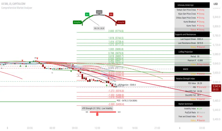
Nubia - Auto Midas Anchored VWAP [xdecow]This indicator looks for the highs and lows using the highest / lowest of 4 different periods. The default values are 17, 72, 305 and 1292 inspired by BO Williams phicube fractals.
The indicator will show anchored vwaps from those 8 dynamic points (4 tops and 4 bottoms).
A true trend is defined when 4 fractals line up without much opposite resistance (only the two smallest opposing vwaps).
When the price is between several vwaps it is a sign of consolidation or pullback. You can use larger timeframes to check for possible targets in large consolidations and pullbacks.

PhiCube MIMATENThis PhiCube indicator shows trends of the individual PhiCube fractals. At least 3 fractals are aligned numerically for this line to appear. If the user combines MIMATEN (MIMA in trend) with MIMACON (MIMA in consolidation), the result is the MIMASAR (MIMA Support and Resistence) indicator.
Este indicador PhiCube mostra tendências dos fractais PhiCube individuais. É preciso ter 3 fractais alinhados numericamente para aparecer. Se o usuário combinar MIMATEN (MIMA na tendência) com MIMACON (MIMA na consolidação), o resultado é o MIMASAR (MIMA Suporte e Resistência).

PhiCube DUPLAMIMATENThis PhiCube indicator shows trends of the individual PhiCube fractals. When present on the chart, each line's PhiCube fractal is stronger than indicated by just the MIMA alone. It is often combined with MIMATEN or MIMASAR to give the visual interpretation of more force.
Este indicador, quando present no gráfico, significa que cada fractal PhiCube está em uma tendência mais forte do que mostrado somente pelas MIMAs. Normalmente é combinado com MIMATEN ou MIMASAR para dar uma sensação visual de mais força.

PhiCube Santo BandaThis PhiCube indicator is designed to show the first signs of reversal, direction, and strength of trend. SM represents the fractal size desired. The band, which is formed by the lines BANDA1 and BANDA2, represents behavior of the larger fractal. When SM is green (PV present) and above the band, with the band getting wider, an uptrend is suggested. When SM is inside the band, there is very weak direction and/or force. When the SM line is red (PC) and below the band, with the band expanding, a downtrend is suggested. Buy signals are generated when SM above the band turns from black to green. A sell signal is suggested when SM below the band turns from black to red.
Este indicador PhiCube foi desenvolvido para mostrar os primeiros sinais de reversão, direção e força da tendência. SM representa o fractal do tamanho desejado. A banda, formada pelas linhas BANDA1 e BANDA2, representa o comportamento do fractal maior. Quando SM virar para a cor verde (PV presente) e acima da banda com a banda expandindo, uma tendência de alta é sugerida. SM dentro da banda representa falta de força ou direção. Quando SM virar para a cor vermelha (PV presente), com a banda cruzada para baixo e expandindo, uma tendência de baixa é sugerida. Sinais de compra são gerados quando SM acima da banda virar da cor preta para a cor verde. Sinais de venda são gerados quando SM abaixo da banda virar da cor preta para a cor vermelha.

Pullback Trading Tool R5-65 by JustUncleLBy request this is an updated version of the "PullBack Trading Tool": removes experimental "OCC" channel, added option to display ribbons or just single moving average lines, added alert arrows for "PB" exits, added alertcondition for TV alarm subsystem, added some extract options for Pivot points and general cleanup of code.
Description:
This project incorporates the majority of the indicators needed to analyse and trade Trends for Pullbacks, swings and reversals.
Incorporated within this tool are the following indicators:
1. Major industry (Banks) recognised important EMAs in an EMA Ribbon:
Lime = EMA5 (Optional Display)
DodgerBlue = EMA12 (Optional Display)
Red = EMA36 (Optional display)
Green = EMA89
Blue = EMA200
Black = EMA633
2. The 5 EMA (default) High/Low/Close Price Action Channel (PAC), the PAC channel display is disabled by default.
3. Optionally display Fractals and optional Fractal levels
4. Optional HH, LH, LL, HL finder.
5. Optional Buy/Sell "PB" exit Alerts with Optional 200EMA filter.
6. Coloured coded Bar high lighting based on the PAC:
blue = bar closed above PAC
red = bar closed below PAC
gray = bar closed inside PAC
7. Alert condition sent to TradingView's Alarm subsystem for PB exits.
8. Pivot points with optional labels.
9. EMA5-12 Ribbon is displayed by default.
10.EMA12-36 Ribbon is displayed by default
Set up and hints:
I am unable to provide a full description here, as Pullback Trading incorporates a full trading Methodology, there are a number of articles and books written on the subject.
Set the chart to Heikin Ashi Candles (optional).
I also add a "Sweetspot Gold R3" indicator to the chart as well to help with support and resistance finding and shows where the important "00" lines are.
First on a weekly basis say Sunday night or Monday morning, analyse the Daily and Weekly charts to establish overall trends, and support/resistant levels. Draw significant mini trend lines (2/3 TL), vertical trend lines (VTL) and S/R levels. Can use the Pivots points to guide VTL drawing and Fractals to help guide 2/3 TL drawing.
Once the trend direction and any potential major reversals highlighted, drop down to lower timeframe chart and draw appropriate mini Trend line (2/3 TL) matching the established momentum direction. Take note of potential pull backs from and of the EMAs, in particular the EMA5-12 ribbon, EMA12-36 Ribbon and the 200EMA. Can use the Pivots and/or Fractals points to guide your 2/3 TL drawing.
Set a TradingView alarm on the "PBTOOL alert", with the default settings this normally occurs before or during the Break of the manually drawn TL lines.
Once alerted check to see if the TL is broken and is returning to trend away from the EMA lines, this is indicated by bar colour change to trend directional colour.
You can trade that alert or drop down to even lower time frames and perform the same TL analysis there to find trades at the lower TF. Trading at lower TF you will allow tighter Stop loss settings.
Other than the "SweetSpot Gold R3" indicator, you should not need any other indicator to successfully trade trends for Pullbacks and reversals. If you really want another indicator I suggest a momentum one for example: AO ( Awesome Oscillator ), MACD or Squeeze Momentum.

Echo Chamber [theUltimator5]The Echo Chamber - When history repeats, maybe you should listen.
Ever had that eerie feeling you've seen this exact price action before? The Echo Chamber doesn't just give you déjà vu—it mathematically proves it, scales it, and projects what happened next.
📖 WHAT IT DOES
The Echo Chamber is an advanced pattern recognition tool that scans your chart's history to find segments that closely match your current price action. But here's where it gets interesting: it doesn't just find similar patterns - It expands and contracts the time window to create a uniquely scaled fractal. Patterns don't always follow the same timeframe, but they do follow similar patterns.
Using a custom correlation analysis algorithm combined with flexible time-scaling, this indicator:
Finds historical price segments that mirror your current market structure
Scales and overlays them perfectly onto your current chart
Projects forward what happened AFTER that historical match
Gives you a visual "echo" from the past with a glimpse into potential futures
══════════════════════════════
HOW TO USE IT
This indicator starts off in manual mode, which means that YOU, the user, can select the point in time that you want to project from. Simply click on a point in time to set the starting value.
Once you select your point in time, the indicator will automatically plot the chosen historical chart pattern and correlation over the current chart and project the price forwards based on how the chart looked in the past. If you want to change the point in time, you can update it from the settings, or drag the point on the chart over to a new position.
You can manually select any point in time, and the chart will quickly update with the new pattern. A correlation will be shown in a table alongside the date/timestamp of the selected point in time.
You can switch to auto mode, which will automatically search out the best-fit pattern over a defined lookback range and plot the past/future projection for you without having to manually select a point in time at all. It simply finds the best fit for you.
You can change the scale factor by adjusting multiplication and division variables to find time-scaled fractal patterns.
══════════════════════════════
🎯 KEY FEATURES
Two Operating Modes:
🔧 MANUAL MODE - Select any historical point and see how it correlates with current price action in real-time. Perfect for:
• Analyzing specific past events (crashes, rallies, consolidations)
• Testing historical patterns against current conditions
• Educational analysis of market structure repetition
🤖 AUTO MODE - It automatically scans through your lookback period to find the single best-correlated historical match. Ideal for:
• Quick pattern discovery
• Systematic trading approach
• Unbiased pattern recognition
Time Warp Technology:
The time warp feature expands and compresses the correlation window to provide a custom fractal so you can analyze windows of time that don't necessarily match the current chart.
💡 *Example: Multiplier=3, Divisor=2 gives you a 1.5x time stretch—perfect for finding patterns that played out 50% slower than current price action.*
Drawing Modes:
Scale Only : Pure vertical scaling—matches price range while maintaining temporal alignment at bar 0
Rotate & Scale : Advanced geometric transformation that anchors both the start AND end points, creating a rotated fit that matches your current segment's slope and range
Visual Components:
🟠 Orange Overlay : The historical match, perfectly scaled to your current price action
🟣 Purple Projection : What happened NEXT after that historical pattern (dotted line into the future)
📦 Highlight Boxes : Shows you exactly where in history these patterns came from
📊 Live Correlation Table : Real-time correlation coefficient with color-coded strength indicator
══════════════════════════════
⚙️ PARAMETERS EXPLAINED
Correlation Window Length (20) : How many bars to match. Smaller = more precise matches but noisier. Larger = broader patterns but fewer matches.
Note: if this value is too high in auto mode, the script may time out from computational overload.
Multiplication Factor : Historical time multiplier. 2 = sample every 2nd bar from history. Higher values find slower historical patterns.
Division Factor : Historical time divisor applied after multiplication. Final sample rate = (Length × Factor) ÷ Divisor, rounded down.
Lookback Range : How far back to search for patterns. More history = better chance of finding matches but slower performance.
Note: if this value is too high in auto mode, the script may time out from computational overload.
Future Projection Length : How many bars forward to project from the historical match. Your crystal ball's focal length.
══════════════════════════════
💼 TRADING APPLICATIONS
Trend Continuation/Reversal :
If the purple projection continues the current trend, that's your historical confirmation. If it reverses, you've found a potential turning point that's happened before under similar conditions.
Support/Resistance Validation :
Does the projection respect your S/R levels? History suggests those levels matter. Does it break through? You've found historical precedent for a breakout.
Time-Based Exits :
The projection shows not just WHERE price might go, but WHEN. Use it to anticipate timing of moves.
Multi-Timeframe Analysis :
Use time compression to overlay higher timeframe patterns onto lower timeframes. See daily patterns on hourly charts, weekly on daily, etc.
Pattern Education :
In Manual Mode, study how specific historical events correlate with current conditions. Build your pattern recognition library.
══════════════════════════════
📊 CORRELATION TABLE
The table shows your correlation coefficient as a percentage:
80-100%: Extremely strong correlation—history is practically repeating
60-80%: Strong correlation—significant similarity
40-60%: Moderate correlation—some structural similarity
20-40%: Weak correlation—limited similarity
0-20%: Very weak correlation—essentially random match
-20-40%: Weak inverse correlation
-40-60%: Moderate inverse correlation
-60-80%: Strong inverse correlation
-80-100%: Extremely strong inverse correlation—history is practically inverting
**Important**: The correlation measures SHAPE similarity, not price level. An 85% correlation means the price movements follow a very similar pattern, regardless of whether prices are higher or lower.
══════════════════════════════
⚠️ IMPORTANT DISCLAIMERS
- Past performance does NOT guarantee future results (but it sure is interesting to study)
- High correlation doesn't mean causation—markets are complex adaptive systems
- Use this as ONE tool in your analytical toolkit, not a standalone trading system
- The projection is what HAPPENED after a similar pattern in the past, not a prediction
- Always use proper risk management regardless of what the Echo Chamber suggests
══════════════════════════════
🎓 PRO TIPS
1. Start with Auto Mode to find high-correlation matches, then switch to Manual Mode to study why that period was similar
2. Experiment with time warping on different timeframes—a 2x factor on a daily chart lets you see weekly patterns
3. Watch for correlation decay —if correlation drops sharply after the match, current conditions are diverging from history
4. Combine with volume —check if volume patterns also match
5. Use "Rotate & Scale" mode when the current trend angle differs from the historical match
6. Increase lookback range to 500-1000+ on daily/weekly charts for finding rare historical parallels
══════════════════════════════
🔧 TECHNICAL NOTES
- Uses Pearson correlation coefficient for pattern matching
- Implements range-based scaling to normalize different price levels
- Rotation mode uses linear interpolation for geometric transformation
- All calculations are performed on close prices
- Boxes highlight actual historical bar ranges (high/low)
- Maximum of 500 lines and 500 boxes for performance optimization

Karapuz Daily Context EngineKarapuz Daily Context Engine is designed for traders who want to understand the day’s context in advance and see how the market shapes its structure even before European liquidity hits the chart. It blends Asian session analysis with fractal structure, helping you quickly grasp the market’s intraday dynamics and potential directional bias.
The indicator automatically highlights the Asian session, reads its range, and compares it to the previous one. Based on this comparison, it generates a color-coded state — a daily sentiment marker that instantly shows whether buyers or sellers are taking the initiative.
The Asia box fills with color one hour before the Frankfurt open, giving you early access to the emerging context and making this tool perfect for your morning preparation.
Fractals act as clean structural cues, helping you identify key local highs and lows without cluttering the chart.
Key Features:
Intelligent detection and analysis of the Asian session.
Color-based daily context generated by comparing the current and previous Asian ranges.
True daily context that refreshes every new trading day.
Early visualization — session shading appears 1 hour before Frankfurt opens.
Adjustable fractals (3/5 bars) for clean structural insights.
Minimalistic, sharp visual design optimized for fast chart reading.
For contact or questions, you can reach me on Telegram: @KarapuzGG

HTF Power of Three+ Limitless by Supreme
HTF Power of Three+ Limitless by Supreme
This indicator provides a high fidelity lens into the market's fundamental fractal rhythm.
For the professional trader who understands every candle is a story of accumulation manipulation and distribution this tool transcends the limitations of linear time analysis.
It offers an institutional grade panoramic dashboard of the Power of Three archetype operating seamlessly across any timeframe without constraint.
The core limitation of standard chart analysis is the boundary between timeframes.
This tool dissolves these walls presenting a fluid four dimensional view of market dynamics directly on your chart.
It transforms your perception by offering a continuous unbroken context of the higher timeframe narrative that governs all lower timeframe price action.
This is not merely another visualization tool.
It is a complete solution to the problem of temporal dissonance that plagues most traders.
The standard chart presents a flat fragmented reality.
You are forced to switch between timeframes losing your place and breaking your cognitive flow.
This constant friction degrades the quality of analysis and leads to missed opportunities or flawed execution.
The market is a fractal an infinitely repeating pattern across all scales of time.
Lower timeframe price movements are not random events.
They are the direct consequence of the objectives being pursued on higher timeframes.
To trade without this higher timeframe context is to navigate a storm without a compass guided only by the immediate chaotic waves.
This indicator provides that compass.
The Power of Three is the narrative structure embedded within every candle.
This concept posits that smart money engineers price through a deliberate three phase process.
First is the accumulation phase.
This is a period of relative equilibrium typically around the opening price where large institutions quietly build their positions.
It is the balance before the imbalance the coiling of a spring.
Second is the manipulation phase.
This is the critical judas swing or stop hunt designed to engineer liquidity.
Price is intentionally driven against the true intended direction to trip stop loss orders from breakout traders and induce uninformed participants to take the wrong side of the market.
Their selling becomes the liquidity for institutions to buy at better prices and vice versa.
Third is the distribution phase.
This is the true expansion move where price travels rapidly in the direction of institutional intent.
This is the clean efficient price leg that most trend following systems attempt to capture often after the most advantageous entry point has passed.
Understanding this three part structure is the key to aligning your trades with smart money flow.
This tool makes that entire process visible.
The current live higher timeframe candle is projected onto your chart as it forms.
This is not a static snapshot but a living representation of the ongoing campaign.
Every tick on your lower timeframe chart now has context.
You can see precisely if price is in the initial accumulation phase giving you time to prepare.
You can identify the manipulation phase as it happens allowing you to avoid being trapped or to position yourself for the reversal.
You can confirm the beginning of the distribution phase providing the confidence to engage with the true market move.
The indicator also displays the three previously completed higher timeframe candles.
This is not just historical data.
It is the immediate narrative context.
These three candles reveal the established order flow and the key price levels that matter.
The highs and lows of these candles are not arbitrary points.
They are institutional reference points magnets for liquidity and critical levels for targeting or invalidation.
A manipulation move will often seek the high or low of the previous candle before reversing.
The expansion move will often target the liquidity resting beyond a high or low from two candles prior.
This four candle panoramic view allows for sophisticated narrative construction.
You can build a high probability thesis for the trading session based on the interrelationship of these candles.
For example after a series of strong bullish higher timeframe closes a brief manipulative dip below the prior candle's open becomes a very high probability long entry.
Conversely a failure to expand above the previous candle's high after a strong run may signal exhaustion and an impending reversal.
The tool's architecture is built on a state of the art non redrawing framework.
All visual elements are created once and only their parameters are updated.
This eliminates redraw lag entirely ensuring a fluid instantaneous and seamless experience.
Your analytical environment will remain sharp responsive and completely unburdened even during extreme market volatility.
The engine is unbound by time.
Its logic is perfectly fractal.
A scalper on a one minute chart using a fifteen minute context gains the same clarity and follows the same principles as a swing trader on a daily chart using a weekly context.
The pattern is universal.
This tool makes its application universally accessible.
This is for the trader who is no longer satisfied with looking at the market through a keyhole.
It is for the analyst who demands a complete limitless and flawlessly performing view of the price delivery process.
-
By installing this indicator you move from a fragmented view of price to a holistic four dimensional understanding of the market.
You achieve temporal coherence seeing the cause on the higher timeframe and the effect on the lower timeframe as a single unified process.
You begin to operate without the constraints of conventional charting.

CandelaCharts - Unicorn Model📝 Overview
The Unicorn Model is an advanced indicator that pinpoints high-probability reversal setups based on the ICT Unicorn formation. It uses a zigzag-based structure to detect engineered liquidity grabs followed by sharp displacements in the opposite direction—ideal for fade entries or the start of new trends.
The indicator is enhanced with macro time filters, allowing it to align model detections with key trading sessions and institutional flow windows.
The ICT Unicorn Model is a precision-driven intraday strategy rooted in smart money concepts. It combines time-of-day sensitivity, engineered liquidity runs, and institutional order flow to uncover high-quality trading opportunities.
📦 Features
Liquidity Levels: Projects forward-looking liquidity zones after a Unicorn model is confirmed, highlighting potential price targets. These zones act as magnet areas where price is likely to be drawn, helping traders manage exits, partials, and re-entries with greater precision.
Unicorn: The Unicorn formation utilizes a smart money framework and a dynamic zigzag detection method to identify engineered liquidity grabs—sharp sweeps of previous highs or lows—followed by impulsive reversals.
Macros: These time-based intervals represent key moments when institutional algorithms are most active, seeking liquidity, rebalancing, or delivering price to key levels like fair value gaps and liquidity pools.
Custom TF Pairing: Choose your preferred combination of entry timeframe and context timeframe. For example, trade 5m setups within a 1h HTF bias, allowing precise alignment of microstructure with broader directional intent.
HTF & LTF PD Arrays: Displays high- and low-timeframe PD Arrays (e.g., Fair Value Gaps, Inversion Fair Value Gaps) that act as zones of interest or rejection, enhancing confluence and risk control.
History: Backtest previous Unicorn setups directly on the chart. Toggle historical models to analyze past behavior, improve your confidence, and fine-tune your trade execution across varying market regimes.
Killzone Filter: Restrict signal generation to specific trading sessions or killzones (e.g., London Open, New York AM). This minimizes false positives in low-volume or overlapping ranges.
Standard Deviation: Dynamically calculates and plots four deviation bands from the model confirmation point. These levels offer insight into stretch targets, volatility bands, and potential mean-reversion zones.
Dashboard: A real-time control panel showing the active model, HTF candle timer, current directional bias, asset name, and session date—offering clarity and fast decision-making at a glance.
⚙️ Settings
Core
Status: Filter models based on status
Bias: Controls what model type will be displayed, bullish or bearish
Fractal: Controls the timeframe pairing that will be used
Length: Sets the maximum number of candles allowed for a model to develop
Labels: Display the model label (e.g., C1, C2, Cn)
Unicorn
Zigzag: Adjusts the length of the Zigzag formation
Breaker: Defines the style of Breaker Blocks
Sweeps
Sweep: Shows the sweep that forms a model
I-sweep: Controls the visibility of invalidated sweeps
D-purge: Plots the double purge sweeps
S-area: Highlights the sweep area
Liquidity
Liquidity: Displays the liquidity levels that belong to the model
History
History: Controls the number of past models displayed on the chart
Filters
Asia: Filter models based on Asia Killzone hours
London: Filter models based on London Killzone hours
NY AM: Filter models based on NY AM Killzone hours
NY Launch: Filter models based on NY Launch Killzone hours
NY PM: Filter models based on NY PM Killzone hours
Custom: Filter models based on user Custom hours
HTF
Candles: Controls the number of HTF candles that will be visible on the chart
NY Open: Display True Day Open line
Offset: Controls the distance of HTF from the current chart
Space: Controls the space between HTF candles
Size: Controls the size of HTF candles
PD Array: Displays ICT PD Arrays
CE Line: Style the equilibrium line of PD Array
Border: Style the border of the PD Array
LTF
H/L Line: Displays on the LTF chart the High and Low of each HTF candle
O/C Line: Displays on the LTF chart the Open and Close of each HTF candle
PD Array: Displays ICT PD Arrays
CE Line: Style the equilibrium line of PD Array
Border: Style the border of the PD Array
Standard Deviation
StDev: Controls standard deviation of available levels
Labels: Controls the size of standard deviation levels
Anchor: Controls the anchor point of standard deviation levels (wick, body)
Lines: Controls the line widths and color of standard deviation levels
Dashboard
Panel: Display information about the current model
💡 Framework
The Unicorn Model analyzes price action by combining key elements to identify high-probability trade setups. It detects liquidity sweeps and uses a zigzag method to spot Breaker Blocks. The model maps PD Arrays like Fair Value Gaps and Inversion FVGs for precision zones, integrates macro time filters for context, and projects forward price targets based on liquidity clusters. Together, these components provide a clear framework to anticipate market trends and optimize entries and exits.
The model incorporates the following timeframe pairing:
15s - 5m
1m - 15m
1m - 30m
2m - 20m
3m - 30m
3m - 60m
5m - 1H
15m - 4H
15m - 8H
30m - 9H
30m - 12H
1H - 1D
2H - 2D
3H - 3D
4H - 1W
8H - 2W
12H - 3W
1D - 1M
2D - 2M
1W - 3M
2W - 6M
3W - 9M
1M - 12M
Below are the key components that make up the model:
Sweep
D-purge
Zigzag (Breaker)
PD Arrays (FVG, IFVG)
Macros
Standard Deviation
Liquidity
The Unicorn Model operates through a defined lifecycle that tracks its current stage, helping to assess the validity of potential trade opportunities.
The model's lifecycle includes the following statuses:
Formation (grey)
Invalidation (red)
Success (green)
Through the phases of Formation, Invalidation, and Success, traders can effectively manage positions, minimize risk, and capitalize on the high-probability setups presented by the Unicorn Model.
⚡️ Showcase
The Unicorn Model is an advanced trading framework designed to elevate your market analysis and increase your trading edge. By leveraging smart money concepts and sophisticated pattern detection, it helps you spot key liquidity sweeps, reversal zones, and high-probability setups, enabling more precise entries, exits, and risk management tailored to market structure.
LTF PD Array
LTF PD Arrays are crucial to the Unicorn Model and must align with the Zigzag Breaker for the setup to be considered valid.
HTF PD Array
Higher-Timeframe PD Arrays deliver essential macro context, serving to validate both the direction and momentum of potential reversals.
Timeframe Alignment
Timeframe alignment is a fundamental element of the Unicorn trading model. By integrating multi-timeframe context, the model effectively identifies high-probability models.
Killzone Filters
Filter Unicorn Models according to key market sessions—Asia, London, New York AM, New York Launch, and New York PM—to target periods of high liquidity. This approach improves the accuracy and timing of trade setups by capturing moments when smart money is most active.
Macros
The Unicorn Model uses ICT Macro Times to identify key trading periods when institutional activity is most intense. By syncing setups with these critical windows, the model improves accuracy and provides better context for entries, risk management, and potential reversals.
Gain a trading advantage with the Unicorn Model — your essential tool for clearer insights, smarter decision-making, and more confident trade execution.
🚨 Alerts
This script provides alert options for all model types, which must be configured within TradingView.
Bearish Model
A bearish model alert is triggered when a model forms, signaling a 4 Zigzag points formation and a bearish Breaker.
Bullish Model
A bullish model alert is triggered when a model forms, signaling a 4 Zigzag points formation and a bullish Breaker.
⚠️ Disclaimer
These tools are exclusively available on the TradingView platform.
Our charting tools are intended solely for informational and educational purposes and should not be regarded as financial, investment, or trading advice. They are not designed to predict market movements or offer specific recommendations. Users should be aware that past performance is not indicative of future results and should not rely on these tools for financial decisions. By using these charting tools, the purchaser agrees that the seller and creator hold no responsibility for any decisions made based on information provided by the tools. The purchaser assumes full responsibility and liability for any actions taken and their consequences, including potential financial losses or investment outcomes that may result from the use of these products.
By purchasing, the customer acknowledges and accepts that neither the seller nor the creator is liable for any undesired outcomes stemming from the development, sale, or use of these products. Additionally, the purchaser agrees to indemnify the seller from any liability. If invited through the Friends and Family Program, the purchaser understands that any provided discount code applies only to the initial purchase of Candela's subscription. The purchaser is responsible for canceling or requesting cancellation of their subscription if they choose not to continue at the full retail price. In the event the purchaser no longer wishes to use the products, they must unsubscribe from the membership service, if applicable.
We do not offer reimbursements, refunds, or chargebacks. Once these Terms are accepted at the time of purchase, no reimbursements, refunds, or chargebacks will be issued under any circumstances.
By continuing to use these charting tools, the user confirms their understanding and acceptance of these Terms as outlined in this disclaimer.

CandelaCharts - Turtle Soup Model📝 Overview
The ICT Turtle Soup Model indicator is a precision-engineered tool designed to identify high-probability reversal setups based on ICT’s renowned Turtle Soup strategy.
The Turtle Soup Model is a classic reversal setup that exploits false breakouts beyond previous swing highs or lows. It targets areas where retail traders are trapped into breakout trades, only for the price to reverse sharply in the opposite direction.
Price briefly breaks a previous high (for short setups) or low (for long setups), triggering stop orders and pulling in breakout traders. Once that liquidity is taken, smart money reverses price back inside the range, creating a high-probability fade setup.
📦 Features
Liquidity Levels: Projects forward-looking liquidity levels after a Turtle Soup model is formed, highlighting potential price targets. These projected zones act as magnet levels—areas where price is likely to reach based on the liquidity draw narrative. This allows traders to manage exits and partials with more precision.
Market Structure Shift (MSS): Confirms reversal strength by detecting a bullish or bearish MSS after a sweep. Acts as a secondary confirmation to filter out weak setups.
Custom TF Pairing: Choose your own combination of entry timeframe and context timeframe. For example, trade 5m setups inside a 1h HTF bias — perfect for aligning microstructure with macro intent.
HTF & LTF PD Arrays: Displays HTF PD Arrays (e.g., Fair Value Gaps, Inversion Fair Value Gaps) to serve as confluence zones.
History: Review and backtest past Turtle Soup setups directly on the chart. Toggle historical models on/off to study model behavior across different market conditions.
Killzone Filter: Limit signals to specific trading sessions or time blocks (e.g., New York AM, London, Asia, etc). Avoid signals in low-liquidity or choppy environments.
Standard Deviation: Calculates and projects four levels of standard deviation from the point of model confirmation. These zones help identify overextended moves, mean-reversion opportunities, and confluence with liquidity or PD arrays.
Dashboard: The dashboard displays the active model type, remaining time of the HTF candle, current bias, asset name, and date—providing real-time context and signal clarity at a glance.
⚙️ Settings
Core
Status: Filter models based on status
Bias: Controls what model type will be displayed, bullish or bearish
Fractal: Controls the timeframe pairing that will be used
High Probability Models: Detects and plots only the high-probability models
Sweeps
Sweep: Shows the sweep that forms a model
I-sweep: Controls the visibility of invalidated sweeps
D-purge: Plots the double purge sweeps
S-area: Highlights the sweep area
Liquidity
Liquidity: Displays the liquidity levels that belong to the model
MSS
MSS: Displays the Market Structure Shift for a model
History
History: Controls the number of past models displayed on the chart
Filters
Asia: Filter models based on Asia Killzone hours
London: Filter models based on London Killzone hours
NY AM: Filter models based on NY AM Killzone hours
NY Launch: Filter models based on NY Launch Killzone hours
NY PM: Filter models based on NY PM Killzone hours
Custom: Filter models based on user Custom hours
HTF
Candles: Controls the number of HTF candles that will be visible on the chart
Candles T: Displays the model’s third timeframe candle, which serves as a confirmation of directional bias
NY Open: Display True Day Open line
Offset: Controls the distance of HTF from the current chart
Space: Controls the space between HTF candles
Size: Controls the size of HTF candles
PD Array: Displays ICT PD Arrays
CE Line: Style the equilibrium line of PD Array
Border: Style the border of the PD Array
LTF
H/L Line: Displays on the LTF chart the High and Low of each HTF candle
O/C Line: Displays on the LTF chart the Open and Close of each HTF candle
PD Array: Displays ICT PD Arrays
CE Line: Style the equilibrium line of PD Array
Border: Style the border of the PD Array
Standard Deviation
StDev: Controls standard deviation of available levels
Labels: Controls the size of standard deviation levels
Lines: Controls the line widths and color of standard deviation levels
Dashboard
Panel: Display information about the current model
💡 Framework
The Turtle Soup Model is designed to detect and interpret false breakout patterns by analyzing key price action components, each playing a vital role in identifying liquidity traps and generating actionable reversal signals.
The model incorporates the following timeframe pairing:
15s - 5m - 15m
1m - 5m - 1H
2m - 15m - 2H
3m - 30m - 3H
5m - 60m - 4H
15m - 1H - 8H
30m - 3H - 12H
1H - 4H - 1D
4H - 1D - 1W
1D - 1W - 1M
1W - 1M - 6M
1M - 6M - 12M
Below are the key components that make up the model:
Sweep
D-purge
MSS
Liquidity
Standard Deviation
HTF & LTF PD Arrays
The Turtle Soup Model operates through a defined lifecycle that identifies its current state and determines the validity of a trade opportunity.
The model's lifecycle includes the following statuses:
Formation (grey)
Invalidation (red)
Pre-Invalidation (purple)
Success (green)
By incorporating the phases of Formation, Invalidation, and Success, traders can effectively manage risk, optimize position handling, and capitalize on the high-probability opportunities presented by the Turtle Soup Model.
⚡️ Showcase
Introducing the Turtle Soup Model — a powerful trading tool engineered to detect high-probability false breakout reversals. This indicator helps you pinpoint liquidity sweeps, confirm market structure shifts, and identify precise entry and exit points, enabling more confident, informed, and timely trading decisions.
LTF PD Array
LTF PD Arrays are essential for model formation—a valid Turtle Soup setup will only trigger if a qualifying LTF PD Array is present near the sweep zone.
HTF PD Array
HTF PD Arrays provide macro-level context and are used to validate the direction and strength of the potential reversal.
Timeframe Alignment
In the Turtle Soup trading model, timeframe alignment is an essential structural component. The model relies on multi-timeframe context to identify high-probability reversal setups based on failed breakouts.
High-Probability Model
A high-probability setup forms when key elements align: a Sweep, Market Structure Shift (MSS), LTF and HTF PD Arrays.
Killzone Filters
Filter Turtle Soup Models based on key market sessions: Asia, London, New York AM, New York Launch, and New York PM . This allows you to focus on high-liquidity periods where smart money activity is most likely to occur, improving both the quality and timing of your trade setups.
Unlock your trading edge with the Turtle Soup Model — your go-to tool for sharper insights, smarter decisions, and more confident execution in the markets.
🚨 Alerts
This script offers alert options for all model types. The alerts need to be set up manually from TradingView.
Bearish Model
A bearish model alert is triggered when a model forms, signaling a high sweep, MS,S and LTF PD Array.
Bullish Model
A bullish model alert is triggered when a model forms, signaling a low sweep, MSS and LTF PD Array.
⚠️ Disclaimer
These tools are exclusively available on the TradingView platform.
Our charting tools are intended solely for informational and educational purposes and should not be regarded as financial, investment, or trading advice. They are not designed to predict market movements or offer specific recommendations. Users should be aware that past performance is not indicative of future results and should not rely on these tools for financial decisions. By using these charting tools, the purchaser agrees that the seller and creator hold no responsibility for any decisions made based on information provided by the tools. The purchaser assumes full responsibility and liability for any actions taken and their consequences, including potential financial losses or investment outcomes that may result from the use of these products.
By purchasing, the customer acknowledges and accepts that neither the seller nor the creator is liable for any undesired outcomes stemming from the development, sale, or use of these products. Additionally, the purchaser agrees to indemnify the seller from any liability. If invited through the Friends and Family Program, the purchaser understands that any provided discount code applies only to the initial purchase of Candela's subscription. The purchaser is responsible for canceling or requesting cancellation of their subscription if they choose not to continue at the full retail price. In the event the purchaser no longer wishes to use the products, they must unsubscribe from the membership service, if applicable.
We do not offer reimbursements, refunds, or chargebacks. Once these Terms are accepted at the time of purchase, no reimbursements, refunds, or chargebacks will be issued under any circumstances.
By continuing to use these charting tools, the user confirms their understanding and acceptance of these Terms as outlined in this disclaimer.

Pivot Candle PatternsPivot Candle Patterns Indicator
Overview
The PivotCandlePatterns indicator is a sophisticated trading tool that identifies high-probability candlestick patterns at market pivot points. By combining Williams fractals pivot detection with advanced candlestick pattern recognition, this indicator targets the specific patterns that statistically show the highest likelihood of signaling reversals at market tops and bottoms.
Scientific Foundation
The indicator is built on extensive statistical analysis of historical price data using a 42-period Williams fractal lookback period. Our research analyzed which candlestick patterns most frequently appear at genuine market reversal points, quantifying their occurrence rates and subsequent success in predicting reversals.
Key Research Findings:
At Market Tops (Pivot Highs):
- Three White Soldiers: 28.3% occurrence rate
- Spinning Tops: 13.9% occurrence rate
- Inverted Hammers: 11.7% occurrence rate
At Market Bottoms (Pivot Lows):
- Three Black Crows: 28.4% occurrence rate
- Hammers: 13.3% occurrence rate
- Spinning Tops: 13.1% occurrence rate
How It Works
1. Pivot Point Detection
The indicator uses a non-repainting implementation of Williams fractals to identify potential market turning points:
- A pivot high is confirmed when the middle candle's high is higher than surrounding candles within the lookback period
- A pivot low is confirmed when the middle candle's low is lower than surrounding candles within the lookback period
- The default lookback period is 2 candles (user adjustable from 1-10)
2. Candlestick Pattern Recognition
At identified pivot points, the indicator analyzes candle properties using these parameters:
- Body percentage threshold for Spinning Tops: 40% (adjustable from 10-60%)
- Shadow percentage threshold for Hammer patterns: 60% (adjustable from 40-80%)
- Maximum upper shadow for Hammer: 10% (adjustable from 5-20%)
- Maximum lower shadow for Inverted Hammer: 10% (adjustable from 5-20%)
3. Pattern Definitions
The indicator recognizes these specific patterns:
Single-Candle Patterns:
- Spinning Top : Small body (< 40% of total range) with significant upper and lower shadows (> 25% each)
- Hammer : Small body (< 40%), very long lower shadow (> 60%), minimal upper shadow (< 10%), closing price above opening price
- Inverted Hammer : Small body (< 40%), very long upper shadow (> 60%), minimal lower shadow (< 10%)
Multi-Candle Patterns:
- Three White Soldiers : Three consecutive bullish candles, each closing higher than the previous, with each open within the previous candle's body
- Three Black Crows : Three consecutive bearish candles, each closing lower than the previous, with each open within the previous candle's body
4. Visual Representation
The indicator provides multiple visualization options:
- Highlighted candle backgrounds for pattern identification
- Text or dot labels showing pattern names and success rates
- Customizable colors for different pattern types
- Real-time alert functionality on pattern detection
- Information dashboard displaying pattern statistics
Why It Works
1. Statistical Edge
Unlike traditional candlestick pattern indicators that simply identify patterns regardless of context, PivotCandlePatterns focuses exclusively on patterns occurring at statistical pivot points, dramatically increasing signal quality.
2. Non-Repainting Design
The pivot detection algorithm only uses confirmed data, ensuring the indicator doesn't repaint or provide false signals that disappear on subsequent candles.
3. Complementary Pattern Selection
The selected patterns have both:
- Statistical significance (high frequency at pivots)
- Logical market psychology (reflecting institutional supply/demand changes)
For example, Three White Soldiers at a pivot high suggests excessive bullish sentiment reaching exhaustion, while Hammers at pivot lows indicate rejection of lower prices and potential buying pressure.
Practical Applications
1. Reversal Trading
The primary use is identifying potential market reversals with statistical probability metrics. Higher percentage patterns (like Three White Soldiers at 28.3%) warrant more attention than lower probability patterns.
2. Confirmation Tool
The indicator works well when combined with other technical analysis methods:
- Support/resistance levels
- Trend line breaks
- Divergences on oscillators
- Volume analysis
3. Risk Management
The built-in success rate metrics help traders properly size positions based on historical pattern reliability. The displayed percentages reflect the probability of the pattern successfully predicting a reversal.
Optimized Settings
Based on extensive testing, the default parameters (Body: 40%, Shadow: 60%, Shadow Maximums: 10%, Lookback: 2) provide the optimal balance between:
- Signal frequency
- False positive reduction
- Early entry opportunities
- Pattern clarity
Users can adjust these parameters based on their timeframe and trading style, but the defaults represent the statistically optimal configuration.
Complementary Research: Reclaim Analysis
Additional research on "reclaim" scenarios (where price briefly breaks a level before returning) showed:
- Fast reclaims (1-2 candles) have 70-90% success rates
- Reclaims with increasing volume have 53.1% success rate vs. decreasing volume at 22.6%
This complementary research reinforces the importance of candle patterns and timing at critical market levels.
