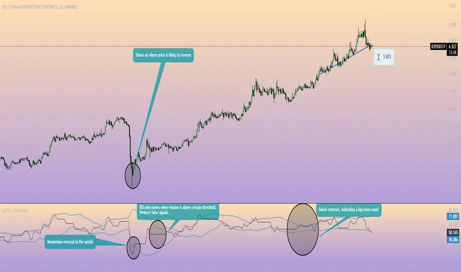
Directional Volume IndexDirectional Volume Index (DVI) (buying/selling pressure)
This index is adapted from the Directional Movement Index (DMI), but based on volume instead of price movements. The idea is to detect building directional volume indicating a growing amount of orders that will eventually cause the price to follow. (DVI is not displayed by default)
The rough algorithm for the Positive Directional Volume Index (green bar):
calculate the delta to the previous green bar's volume
if the delta is positive (growing buying pressure) add it to an SMA, else add 0 (also for red bars)
divide these average deltas by the average volume
the result is the Positive Directional Volume Index (DVI+) (vice versa for DVI-)
Differential Directional Volume Index (DDVI) (relative pressure)
Creating the difference of both Directional Volume Indexes (DVI+ - DVI-) creates the Differential Directional Volume Index (DDVI) with rising values indicating a growing buying pressure, falling values a growing selling pressure. (DDVI is displayed by default, smoothed by a custom moving average)
Average Directional Volume Index (ADVX) (pressure strength)
Putting the relative pressure (DDVI) in relation to the total pressure (DVI+ + DVI-) we can determine the strength and duration of the currently building volume change / trend. For the DMI/ADX usually 20 is an indicator for a strong trend, values above 50 suggesting exhaustion and approaching reversals. (ADVX is not displayed by default, smoothed by a custom moving average)
Divergences of the Differential Directional Volume Index (DDVI) (imbalances)
By detecting divergences we can detect situations where e.g. bullish volume starts to build while price is in a downtrend, suggesting that there is growing buying pressure indicating an imminent bullish pullback/order block or reversal. (strong and hidden divergences are displayed by default)
Divergences Overview:
strong bull: higher lows on volume, lower lows on price
medium bull: higher lows on volume, equal lows on price
weak bull: equal lows on volume, lower lows on price
hidden bull: lower lows on volume, higher lows on price
strong bear: lower highs on volume, higher highs on price
medium bear: lower highs on volume, equal highs on price
weak bear: equal highs on volume, higher highs on price
hidden bear: higher highs on volume, lower highs on price
DDVI Bands (dynamic overbought/oversold levels)
Using Bollinger Bands with DDVI as source we receive an averaged relative pressure with stdev band offsets. This can be used as dynamic overbought/oversold levels indicating reversals on sharp crossovers.
Alerts
As of now there are no alerts built in, but all internal data is exposed via plot and plotshape functions, so it can be used for custom crossover conditions in the alert dialog. This is still a personal research project, so if you find good setups, please let me know.
Search in scripts for "bands"
FIR Low Pass Filter Suite (FIR)The FIR Low Pass Filter Suite is an advanced signal processing indicator that applies finite impulse response (FIR) filtering techniques to price data. At its core, the indicator uses windowed-sinc filtering, which provides optimal frequency response characteristics for separating trend from noise in financial data.
The indicator offers multiple window functions including Kaiser, Kaiser-Bessel Derived (KBD), Hann, Hamming, Blackman, Triangular, and Lanczos. Each window type provides different trade-offs between main-lobe width and side-lobe attenuation, allowing users to fine-tune the frequency response characteristics of the filter. The Kaiser and KBD windows provide additional control through an alpha parameter that adjusts the shape of the window function.
A key feature is the ability to operate in either linear or logarithmic space. Logarithmic filtering can be particularly appropriate for financial data due to the multiplicative nature of price movements. The indicator includes an envelope system that can adaptively calculate bands around the filtered price using either arithmetic or geometric deviation, with separate controls for upper and lower bands to account for the asymmetric nature of market movements.
The implementation handles edge effects through proper initialization and offers both centered and forward-only filtering modes. Centered mode provides zero phase distortion but introduces lag, while forward-only mode operates causally with no lag but introduces some phase distortion. All calculations are performed using vectorized operations for efficiency, with carefully designed state management to handle the filter's warm-up period.
Visual feedback is provided through customizable color gradients that can reflect the current trend direction, with optional glow effects and background fills to enhance visibility. The indicator maintains high numerical precision throughout its calculations while providing smooth, artifact-free output suitable for both analysis and visualization.
Adaptive Linear Regression ChannelOverview
The Adaptive Linear Regression Channel Script is an advanced, multi-functional trading tool crafted to help traders pinpoint market trends, identify potential reversals, assess volatility, and establish dynamic levels for profit-taking and position exits. By incorporating key concepts such as linear regression , standard deviation , and other volatility measures like the ATR , the script offers a comprehensive view of market behavior beyond traditional deviation metrics.
This dynamic model continuously adapts to changing market conditions, adjusting in real-time to provide clear visualizations of trends, channels, and volatility levels. This adaptability makes the script invaluable for both trend-following and counter-trend strategies, giving traders the flexibility to respond effectively to different market environments.
Background
What is Linear Regression?
Definition : Linear regression is a statistical technique used to model the relationship between a dependent variable (target) and one or more independent variables (predictors).
In its simplest form (simple linear regression), the relationship between two variables is represented by a straight line (the regression line).
y = mx + b
where :
- y is the target variable (price)
- m is the slope
- x is the independent variable (time)
- b is the intercept
Slope of the Regression Line
Definition: The slope (m) measures the rate at which the dependent variable (y) changes as the independent variable (x) changes.
Interpretation:
- A positive slope indicates an uptrend.
- A negative slope indicates a downtrend.
Uses in Trading:
- Identifying the strength and direction of market trends.
- Assessing the momentum of price movements.
R-squared (Coefficient of Determination)
Definition: A measure of how well the regression line fits the data, ranging from 0 to 1.
Calculation :
R2 = 1− (SS tot/SS res)
where:
- SSres is the sum of squared residuals.
- SStot is the total sum of squares.
Interpretation:
- Higher R2 indicates a better fit, meaning the model explains a larger proportion of the variance in the data.
Uses in Trading:
- Higher R-squared values give traders confidence in trend-based signals.
- Low R-squared values may suggest that the market is more random or volatile.
Standard Deviation
Definition: Standard Deviation quantifies the dispersion of data points in a dataset relative to the mean. A low standard deviation indicates that data points tend to be close to the mean, while a high standard deviation indicates that the data points are spread out over a larger range of values.
Calculation
σ=√∑(xi−μ)2/N
Where
- σ is the standard deviation.
- ∑ is the summation symbol, indicating that the expression that follows should be summed over all data points.
- xi, this represents the i-th data point in the dataset.
- μ\mu, this represents the mean(average) of all the data points in the dataset.
- (xi−μ)2, this is the squared difference between each data point and the mean.
- N is the total number of data points in the dataset.
- **Interpretation**
- A higher standard deviation indicates greater volatility.
- Useful for identifying overbought/oversold conditions in markets.
Key Features
Dynamic Linear Regression Channels:
The script automatically generates adaptive regression channels that expand or contract based on the current market volatility. This real-time adjustment ensures that traders are always working with the most relevant data, making it easier to spot key support and resistance levels.
The channel width itself serves as an indicator of market volatility, expanding during periods of heightened uncertainty and contracting during more stable phases. Additionally, the channel width is trained on previous channel widths , allowing the script to adapt and provide a more accurate view of volatility trends of the asset. Traders can also customize the script to train on less historical data , enabling a more recent view of volatility , which is particularly useful in fast-moving or changing markets.
Dynamic Profits and Stops:
What is it?
Dynamic profit levels allow traders to adjust take-profit targets based on real-time market conditions. Unlike static levels, which remain fixed regardless of market changes, these adaptive levels leverage past volatility data to create more flexible profit-taking strategies.
How does it work?
The script determines these levels using previously stored deviation values. These deviations are categorized into quantiles (like Q1, Q2, Q3, etc.) to classify current market conditions. As new deviation data is recorded, the profit levels are adjusted dynamically to reflect changes in market volatility. This approach helps to refine profit targets, especially when using regression channels with standard deviation rather than traditional ATR bands.
Why is it valuable?
By utilizing adaptive profit levels, traders can optimize their exits based on the current volatility landscape. For instance, when volatility increases, the dynamic levels expand, allowing trades to capture larger price movements. Conversely, during low volatility, profit targets tighten to lock in gains sooner, reducing exposure to market reversals. This flexibility is especially beneficial when combined with adaptive regression channels that respond to changes in standard deviation.
Slope-Based Trend Analysis:
One of the core elements of this script is the slope of the regression line , which helps define the direction and strength of the trend. Positive slopes indicate bullish momentum, while negative slopes suggest bearish conditions. The slope's steepness gives traders insight into the market's momentum, allowing them to adjust their strategies based on the strength of the trend.
Additionally, the script uses the slope to create a color gradient , which visually represents the intensity of the market's momentum. The gradient peaks at one color to show the maximum bullish momentum experienced in the past, while another color represents the maximum bearish momentum experienced in the past. This color-coded visualization makes it easier for traders to quickly assess the market's strength and direction at a glance.
Volatility Heatmap:
The integrated heatmap provides an intuitive, color-coded visualization of market volatility. The heatmap highlights areas where price action is expanding or contracting, giving traders a clear view of where volatility is rising or falling. By mapping out deviations from the regression line, the heatmap makes it easier to spot periods of high volatility that could lead to major market moves or potential reversals.
Deviation Concepts:
The script tracks price deviations from the regression line when a new range is formed, providing valuable insights when the price significantly deviates from the expected trend. These deviations are key in identifying potential breakout points or trend shifts .
This helps traders understand when the market is overextended or when a pullback may be imminent, allowing them to make more informed trading decisions.
Adaptive Model Properties:
Unlike static indicators, this script adapts over time . As the market changes, it stores historical data related to channel widths , slope dynamics , and volatility levels , adjusting its analysis accordingly to stay relevant to current market conditions.
Traders have the ability to train the model on all available data or specify a set number of bars to focus on more recent market activity. This flexibility allows for more tailored analysis , ensuring that traders can work with data that best fits their trading style and time horizon.
This continuous learning approach ensures that traders always have the most up-to-date insight into the market's structure.
Table
The table displays key metrics in real time to provide deeper insights into market behavior:
1. Deviation & Slope : Shows the current deviation if set to standard deviation or atr if set to atr(values used to calculated the channel widths) and the trend slope, helping to gauge market volatility and trend direction.
2. Rate of Change : For both deviation/atr and slope, the table also calculates the rate of change of their rates—essentially capturing the acceleration or deceleration of trends and volatility. This helps identify shifts in market momentum early.
3. R-squared : Indicates the strength and reliability of the trend fit. A higher value means the regression line better explains the price movements.
4. Quantiles : Uses historical deviation data to categorize current market conditions into quartiles (e.g., Q1, Q2, Q3). This helps classify the market's current volatility level, allowing traders to adjust strategies dynamically.
By combining these metrics, the table offers a comprehensive, real-time snapshot of market conditions, enabling more informed and adaptive trading decisions.
Settings
Here’s a breakdown of the script's settings for easy reference:
Linear Regression Settings
Show Dynamic Levels :Toggle to display dynamic profit levels on the chart.
Deviation Type :Select the method for calculating deviation—options include ATR (Average True Range) or Standard Deviation.
Timeframe :Sets the specific timeframe for the regression analysis (default is the chart’s timeframe).
Period :Defines the number of bars used for calculating the regression line (e.g., 50 bars).
Deviation Multiplier :Multiplier used to adjust the width of the deviation channel around the regression line.
Rate of Change :Sets the period for calculating the rate of change of the slope (used for momentum analysis).
Max Bars Back :Limits the number of historical bars to analyze (0 means all available data).
Slope Lookback :Number of bars used to calculate the slope gradient for trend detection.
Slope Gradient Display :Toggle to enable gradient coloring based on slope direction.
Slope Gradient Colors :Set colors for positive and negative slopes, respectively.
Slope Fill :Adjusts the transparency of the slope gradient fill.
Volatility Gradient Display :Toggle to enable gradient coloring based on volatility levels.
Volatility Gradient Colors :Set colors for low and high volatility, respectively.
Volatility Fill :Adjusts the transparency of the volatility gradient fill.
Table Settings
Show Table :Toggle to display the metrics table on the chart.
Table Position :Choose where to position the table (e.g., top-right, middle-center, etc.).
Font Size :Set the size of the text in the table. Options include Tiny, Small, Normal, Large, and Huge.
Torus Visualization-Secret Geometry-AYNETExplanation:
Outer and Inner Circles:
The script draws two main circles: the outer boundary and the inner boundary of the Torus.
Bands Between Circles:
Additional concentric circles are drawn to create the illusion of a Torus structure.
Customizable Inputs:
You can control the outer radius, inner radius, number of segments for smoother circles, and the number of bands to improve visualization.
Parameters:
center_x and center_y define the center of the Torus on the chart.
outer_radius and inner_radius control the size of the Torus.
segments define the resolution of the circles (more segments = smoother appearance).
Visualization:
The Torus appears as a series of concentric circles, giving a 2D approximation of the 3D structure.
This script can be visualized on any chart, and the Torus will adjust its position based on the specified center and radius values.
Original Keltner with Support And ResistanceThis indicator is based on the original Keltner Channels using typical price and calculating the 10 period average of high - low
Typical price = (high + low + close)/3
In this case, I've taken Typical price as (open + high + low + close)/4 on the advice of John Bollinger from his book Bollinger on Bollinger Bands.
Buy Line = 10 Period Typical Price Average + 10 Period Average of (High - Low)
Sell Line = 10 Period Typical Price Average - 10 Period Average of (High - Low)
This is the basis for the indicator. I've added the highest of the Buy Line and lowest of the Sell Line for the same period which acts as Support and Resistance.
If price is trending below the Lowest of Sell Line, take only sell trades and the Lowest Line acts as resistance.
If price is trending above the Highest of Buy Line, take only buy trades and the Highest Line acts as support.
VWAP2 --ClaireIndicator Release Notes
I am excited to introduce a powerful multi-timeframe Volume Weighted Average Price (VWAP) indicator. This tool helps traders analyze market trends and identify key support and resistance levels across various timeframes. Below are the main features and usage guidelines for this indicator:
Key Features
Open Price for Each Timeframe
The "Open" option represents the opening price for each specific timeframe, such as daily, weekly, monthly, etc.
Previous vs. Current Levels
Levels prefixed with 'P' (e.g., pwval) are calculated for the previous period, while those without 'P' (e.g., wval) represent the current period. For instance, pwval is the VWAP-calculated Value Area Low (VAL) for the previous week, whereas wval applies to the current week.
VWAP Calculation Standards
VWAP can be calculated using a standard deviation (S) or a percentage (P). The "Multiplier" indicates how many standard deviations are applied, with a default setting of S (standard deviation) and a multiplier of 1.
Data Source Default
The default data source for calculations is hlc3, which is the average of high, low, and close prices. This can be adjusted if needed.
Merge Function
The Merge option visually groups data that is closely aligned within a specified range, allowing for a clearer representation of critical price levels.
Viewing Recommendations
When analyzing higher dimensions, it is recommended to enable Quarter (Q) and Year (Y) settings to identify important price levels near the current price. For detailed attention, you can disable levels that are significantly distant from the current price.
Data Limitations
Free TradingView accounts can pull data from up to 20,000 candles. This means the indicator is most accurate and comprehensive on 1-hour and 4-hour timeframes, given these data constraints.
Usage Guidelines
Trend Analysis: Utilize VWAP and bands across different timeframes to identify market trend continuations or reversals.
Support and Resistance Identification: Use the calculated upper and lower bands as potential support or resistance levels to optimize entry and exit points in your trading.
Combined Application: It is recommended to use this indicator alongside other technical analysis tools to improve the accuracy of your analysis and the reliability of your trading decisions.
I believe this versatile and highly customizable VWAP indicator will become an essential part of your trading toolkit, helping you to better understand market dynamics and make more precise trading decisions.
Fibonacci BandsDescription
This indicator dynamically calculates Fibonacci retracement levels based on the highest high and lowest low over a specified lookback period. The key Fibonacci levels (0.236, 0.382, 0.5, 0.618, and 0.786) are plotted on the chart, with shaded areas between these levels for visual guidance.
How it works
The script computes the highest high (hh) and the lowest low (ll) over the defined length.
It calculates the price range (delta) as the difference between the highest high and the lowest low.
Fibonacci levels are then determined using the formula: ℎℎ − (delta × Fibonacci ratio)
Each Fibonacci level is then plotted as a line with a specific color.
Key Features
Customizable Length: Users can adjust the lookback period to suit their trading strategy.
Multiple Fibonacci Levels: Includes common Fibonacci retracement levels, providing traders with a comprehensive view of potential support and resistance areas.
Visual Fillings: The script includes customizable shading between levels, which helps traders quickly identify key zones (like the "Golden Zone" between 0.5 and 0.618).
Unique Points
Fibonacci Focus: This script is specifically designed around Fibonacci retracement levels, which are popular among technical traders for identifying potential reversal points.
Dynamic Range Calculation: The use of the highest high and lowest low within a user-defined period offers a dynamic approach to adapting to changing market conditions.
How to use it
Adjust the length parameter (default is 60) to determine how many bars back the indicator will calculate the highest high and lowest low. A longer length may provide a broader perspective of price action, while a shorter length may react more quickly to recent price changes.
Observe the plotted Fibonacci levels: 0.236, 0.382, 0.5, 0.618, and 0.786. These levels often act as potential support and resistance points. Pay attention to how price interacts with these levels.
When the price approaches a Fibonacci level, consider it a potential reversal point. The filled areas between the Fibonacci levels indicate zones where price might consolidate or reverse. The "Golden Zone" (between 0.5 and 0.618) is particularly significant; many traders watch this area closely for potential entry points in an uptrend or exit points in a downtrend.
Bitcoin Logarithmic Growth Curve 2024The Bitcoin logarithmic growth curve is a concept used to analyze Bitcoin's price movements over time. The idea is based on the observation that Bitcoin's price tends to grow exponentially, particularly during bull markets. It attempts to give a long-term perspective on the Bitcoin price movements.
The curve includes an upper and lower band. These bands often represent zones where Bitcoin's price is overextended (upper band) or undervalued (lower band) relative to its historical growth trajectory. When the price touches or exceeds the upper band, it may indicate a speculative bubble, while prices near the lower band may suggest a buying opportunity.
Unlike most Bitcoin growth curve indicators, this one includes a logarithmic growth curve optimized using the latest 2024 price data, making it, in our view, superior to previous models. Additionally, it features statistical confidence intervals derived from linear regression, compatible across all timeframes, and extrapolates the data far into the future. Finally, this model allows users the flexibility to manually adjust the function parameters to suit their preferences.
The Bitcoin logarithmic growth curve has the following function:
y = 10^(a * log10(x) - b)
In the context of this formula, the y value represents the Bitcoin price, while the x value corresponds to the time, specifically indicated by the weekly bar number on the chart.
How is it made (You can skip this section if you’re not a fan of math):
To optimize the fit of this function and determine the optimal values of a and b, the previous weekly cycle peak values were analyzed. The corresponding x and y values were recorded as follows:
113, 18.55
240, 1004.42
451, 19128.27
655, 65502.47
The same process was applied to the bear market low values:
103, 2.48
267, 211.03
471, 3192.87
676, 16255.15
Next, these values were converted to their linear form by applying the base-10 logarithm. This transformation allows the function to be expressed in a linear state: y = a * x − b. This step is essential for enabling linear regression on these values.
For the cycle peak (x,y) values:
2.053, 1.268
2.380, 3.002
2.654, 4.282
2.816, 4.816
And for the bear market low (x,y) values:
2.013, 0.394
2.427, 2.324
2.673, 3.504
2.830, 4.211
Next, linear regression was performed on both these datasets. (Numerous tools are available online for linear regression calculations, making manual computations unnecessary).
Linear regression is a method used to find a straight line that best represents the relationship between two variables. It looks at how changes in one variable affect another and tries to predict values based on that relationship.
The goal is to minimize the differences between the actual data points and the points predicted by the line. Essentially, it aims to optimize for the highest R-Square value.
Below are the results:
It is important to note that both the slope (a-value) and the y-intercept (b-value) have associated standard errors. These standard errors can be used to calculate confidence intervals by multiplying them by the t-values (two degrees of freedom) from the linear regression.
These t-values can be found in a t-distribution table. For the top cycle confidence intervals, we used t10% (0.133), t25% (0.323), and t33% (0.414). For the bottom cycle confidence intervals, the t-values used were t10% (0.133), t25% (0.323), t33% (0.414), t50% (0.765), and t67% (1.063).
The final bull cycle function is:
y = 10^(4.058 ± 0.133 * log10(x) – 6.44 ± 0.324)
The final bear cycle function is:
y = 10^(4.684 ± 0.025 * log10(x) – -9.034 ± 0.063)
The main Criticisms of growth curve models:
The Bitcoin logarithmic growth curve model faces several general criticisms that we’d like to highlight briefly. The most significant, in our view, is its heavy reliance on past price data, which may not accurately forecast future trends. For instance, previous growth curve models from 2020 on TradingView were overly optimistic in predicting the last cycle’s peak.
This is why we aimed to present our process for deriving the final functions in a transparent, step-by-step scientific manner, including statistical confidence intervals. It's important to note that the bull cycle function is less reliable than the bear cycle function, as the top band is significantly wider than the bottom band.
Even so, we still believe that the Bitcoin logarithmic growth curve presented in this script is overly optimistic since it goes parly against the concept of diminishing returns which we discussed in this post:
This is why we also propose alternative parameter settings that align more closely with the theory of diminishing returns.
Our recommendations:
Drawing on the concept of diminishing returns, we propose alternative settings for this model that we believe provide a more realistic forecast aligned with this theory. The adjusted parameters apply only to the top band: a-value: 3.637 ± 0.2343 and b-parameter: -5.369 ± 0.6264. However, please note that these values are highly subjective, and you should be aware of the model's limitations.
Conservative bull cycle model:
y = 10^(3.637 ± 0.2343 * log10(x) - 5.369 ± 0.6264)
Hullinger Percentile Oscillator [AlgoAlpha]🚀 Introducing the Hullinger Percentile Oscillator by AlgoAlpha! 🚀
This versatile Pine Script™ indicator is designed to help you identify swing trends and potential reversals with precision. Whether you're looking to catch market swings or spot divergences, the Hullinger Percentile Oscillator offers a comprehensive suite of features to enhance your trading strategy.
Key Features
🎯 Customizable Hullinger Settings: Adjust the main length, source, and standard deviation multipliers to fine-tune the indicator to your preferred trading style.
🔄 Dynamic Oscillator Modes: Switch between "Swing" mode for trend identification and "Contrarian" mode for reversal spotting, adapting the indicator to your market view.
📉 Divergence Detection: The indicator includes parameters to control the sensitivity and confirmation of divergence signals, helping to filter out noise and highlight significant market moves.
🌈 Color-Coded Visuals: Easily distinguish between bullish and bearish signals with customizable color settings for a clear visual representation on your chart.
🔔 Alert Integration: Stay ahead of the market with built-in alerts for key conditions, including strong and weak reversals, as well as bullish and bearish swings.
Quick Guide to Using the Hullinger Percentile Oscillator
Maximize your trading edge with the Hullinger Percentile Oscillator by following these steps! 📈✨
🛠 Add the Indicator: Add the indicator to favorites by pressing the star icon ⭐. Customize settings like Main Length, Oscillator Mode, and Appearance to fit your trading needs.
📊 Market Analysis: Use "Swing" mode to track trends and "Contrarian" mode to spot reversals. Watch for divergence signals to catch potential trend changes.
🔔 Alerts: Set up alerts to be notified of significant market movements without constantly monitoring your chart.
How It Works
The Hullinger Percentile Oscillator calculates its signals by applying a modified standard deviation approach to the Hull Moving Average (HMA) of a selected price source. It creates both inner and outer bands based on different multipliers. The oscillator then measures the position of the price relative to these bands, smoothing the result for swing trend detection. Depending on the chosen mode, the oscillator either highlights swing trends or potential reversals. Divergences are detected by comparing recent pivot highs and lows in both price and the oscillator, allowing you to spot bullish or bearish divergence setups. Alerts are triggered based on key crossovers or when specific conditions are met, ensuring that you are always informed of crucial market developments.
Candle Strength Oscillator by SyntaxGeekThis candle strength oscillator displays a smoothed rolling difference between the body range (close and open) and total candle range (high and low).
When candles have small bodies, such as a doji, it can indicate weakness, when candles have essentially little to no wicks it can indicate strength.
There are two modes of display for the strength trend to show potential exhaustion on either side, bollinger bands and donchian channels. Each has their own pros and cons but as most are familiar with bollinger bands this is the default.
Another feature is the ATR measurement, which can assist in displaying an overall reduction in range volatility when comparing historical price movements to current oscillations.
The zero line can show some importance with regards to the peaks and valleys of the main measurement, when everything is trending and there's a reversal, if the zero line isn't broken it could be considered a trend continuation pullback vs a complete reversal.
Trend arrows and bar coloring are available but should not be considered trade signals for entry and exit, merely just another way of viewing the lower study information.
As the raw data of each candle measurement is quite noisy, the entire dataset is passed through an HMA smoothing process, if more options are requested I'll consider adding them.
Thanks for view my script and happy trading!
MTF Bollinger BandWidth [CryptoSea]The MTF Bollinger BandWidth Indicator is an advanced analytical tool crafted for traders who need to gauge market volatility and trend strength across multiple timeframes. This powerful indicator leverages the Bollinger BandWidth concept to provide a comprehensive view of price movements and volatility changes, making it ideal for those looking to enhance their trading strategies with multi-timeframe analysis.
Key Features
Multi-Timeframe Analysis: Allows users to monitor Bollinger BandWidth across various timeframes, providing a macro and micro perspective on market volatility.
Pivot Point Detection: Identifies crucial high and low pivot points, offering insights into potential support and resistance levels. Pivot points are dynamic and adjust based on the timeframe viewed, reflecting short-term fluctuations or longer-term trends.
Customizable Parameters: Includes options to adjust the length of the moving average, the standard deviation multiplier, and more, enabling traders to tailor the tool to their specific needs.
Dynamic Color Coding: Utilizes color changes to indicate different market conditions, aiding in quick visual assessments.
In the example below, notice how changes in BBW across different timeframes provide early signals for potential volatility increases or decreases.
How it Works
Calculation of BandWidth: Measures the percentage difference between the upper and lower Bollinger Bands, which expands or contracts based on market volatility.
High and Low Pivot Tracking: Automatically calculates and tracks the pivots in BBW values, which are critical for identifying turning points in market behavior. High and low levels will change depending on the timeframe, capturing distinct market behaviors from granular movements to broad trends.
Visual Alerts and Table Display: Highlights significant changes in BBW with visual alerts and provides a detailed table view for comparison across timeframes.
In the example below, BBW identifies a significant contraction followed by an expansion, suggesting a potential breakout.
Application
Strategic Market Entry and Exit: Assists traders in making well-informed decisions about when to enter and exit trades based on volatility cues.
Trend Strength Assessment: Helps in determining the strength of the prevailing market trend through detailed analysis of expansion and contraction periods.
Adaptable to Various Trading Styles: Suitable for day traders, swing traders, and long-term investors due to its customization capabilities and effectiveness across different timeframes.
The MTF Bollinger BandWidth Indicator is a must-have in the arsenal of traders who demand depth, accuracy, and responsiveness in their market analysis tools. Enhance your trading decisions by integrating this sophisticated indicator into your strategy to navigate the complexities of various market conditions effectively.
Bullish Candlestick Patterns With Filters [TradeDots]The "Bullish Candlestick Patterns With Filters" is a trading indicator that identifies 6 core bullish candlestick patterns. This is further enhanced by applying channel indicator as filters, designed to further increase the accuracy of the recognized patterns.
6 CANDLESTICK PATTERNS
Hammer
Inverted Hammer
Bullish Engulfing
The Piercing Line
The Morning Star
The 3 White Soldiers
SIGNAL FILTERING
The indicator incorporates with 2 primary methodologies aimed at filtering out lower accuracy signals.
Firstly, it comes with a "Lowest period" parameter that examines whether the trough of the bullish candlestick configuration signifies the lowest point within a specified retrospective bar length. The longer the period, the higher the probability that the price will rebound.
Secondly, the channel indicators, the Keltner Channels or Bollinger Bands. This indicator examines whether the lowest point of the bullish candlestick pattern breaches the lower band, indicating an oversold signal. Users have the flexibility to modify the length and band multiplier, enabling them to custom-tune signal sensitivity.
Without Filtering:
With Filtering
RISK DISCLAIMER
Trading entails substantial risk, and most day traders incur losses. All content, tools, scripts, articles, and education provided by TradeDots serve purely informational and educational purposes. Past performances are not definitive predictors of future results.
Mean and Standard Deviation Lines Description:
Calculates the mean and standard deviation of close-to-close price differences over a specified period, providing insights into price volatility and potential breakouts.
Manually calculates mean and standard deviation for a deeper understanding of statistical concepts.
Plots the mean line, upper bound (mean + standard deviation), and lower bound (mean - standard deviation) to visualize price behavior relative to these levels.
Highlights bars that cross the upper or lower bounds with green (above) or red (below) triangles for easy identification of potential breakouts or breakdowns.
Customizable period input allows for analysis of short-term or long-term volatility patterns.
Probability Interpretations based on Standard Deviation:
50% probability: mean or expected value
68% probability: Values within 1 standard deviation of the mean (mean ± stdev) represent roughly 68% of the data in a normal distribution. This implies that around 68% of closing prices in the past period fell within this range.
95% probability: Expanding to 2 standard deviations (mean ± 2*stdev) captures approximately 95% of the data. So, in theory, there's a 95% chance that future closing prices will fall within this wider range.
99.7% probability: Going further to 3 standard deviations (mean ± 3*stdev) encompasses nearly 99.7% of the data. However, these extreme values become less likely as you move further away from the mean.
Key Features:
Uses manual calculations for mean and standard deviation, providing a hands-on approach.
Excludes the current bar's close price from calculations for more accurate analysis of past data.
Ensures valid index usage for robust calculation logic.
Employs unbiased standard deviation calculation for better statistical validity.
Offers clear visual representation of mean and volatility bands.
Considerations:
Manual calculations might have a slight performance impact compared to built-in functions.
Not a perfect normal distribution: Financial markets often deviate from a perfect normal distribution. This means probability interpretations based on standard deviation shouldn't be taken as absolute truths.
Non-stationarity: Market conditions and price behavior can change over time, impacting the validity of past data as a future predictor.
Other factors: Many other factors influence price movements beyond just the mean and standard deviation.
Always consider other technical and fundamental factors when making trading decisions.
Potential Use Cases:
Identifying periods of high or low volatility.
Discovering potential breakout or breakdown opportunities.
Comparing volatility across different timeframes.
Complementing other technical indicators for confirmation.
Understanding statistical concepts for financial analysis.
Squeeze Momentum TD - A Revisited Version of the TTM SqueezeDescription:
The "Squeeze Momentum TD" is our unique take on the highly acclaimed TTM Squeeze indicator, renowned in the trading community for its efficiency in pinpointing market momentum. This script is a tribute and an extension to the foundational work laid by several pivotal figures in the trading industry:
• John Carter, for his creation of the TTM Squeeze and TTM Squeeze Pro, which revolutionized the way traders interpret volatility and momentum.
• Lazybear, whose original interpretation of the TTM Squeeze, known as the "Squeeze Momentum Indicator", provided an invaluable foundation for further development.
• Makit0, who evolved Lazybear's script to incorporate enhancements from the TTM Squeeze Pro, resulting in the "Squeeze PRO Arrows".
Our script, "Squeeze Momentum TD", represents a custom version developed after reviewing all variations of the TTM Squeeze indicator. This iteration focuses on a distinct visualization approach, featuring an overlay band on the chart for an user-friendly experience. We've distilled the essence of the TTM Squeeze and its advanced version, the TTM Squeeze Pro, into a form that emphasizes intuitive usability while retaining comprehensive analytical depth.
Features:
-Customizable Bollinger Bands and Keltner Channels: These core components of the TTM Squeeze.
-Dynamic Squeeze Conditions: Ranging from No Squeeze to High Compression.
-Momentum Oscillator: A linear regression-based momentum calculation, offering clear insights into market trends.
-User-Defined Color Schemes: Personalize your experience with adjustable colors for bands and plot shapes.
-Advanced Alert System: Alerts for key market shifts like Bull Watch Out, Bear Watch Out, and Momentum shifts.
-Adaptive Band Widths: Modify the band widths to suit your preference.
How to use it?
• Transition from Light Green to Dark Green: Indicates a potential end to the bullish momentum. This 'Bull Watch Out' signal suggests that traders should be cautious about continuing bullish trends.
• Transition from Light Red to Dark Red: Signals that the bearish momentum might be fading, triggering a 'Bear Watch Out' alert. It's a hint for traders to be wary of ongoing bearish trends.
• Shift from Dark Green to Light Green: This change suggests an increase in bullish momentum. It's an indicator for traders to consider bullish positions.
• Change from Dark Red to Light Red: Implies that bearish momentum is picking up. Traders might want to explore bearish strategies under this condition.
• Rapid Change from Light Red to Light Green: This swift shift indicates a quick transition from bearish to bullish sentiment. It's a strong signal for traders to consider switching to bullish positions.
• Quick Shift from Light Green to Light Red: Demonstrates a speedy change from bullish to bearish momentum. It suggests that traders might want to adjust their strategies to align with the emerging bearish trend.
Acknowledgements:
Special thanks to Beardy_Fred for the significant contributions to the development of this script. This work stands as a testament to the collaborative spirit of the trading community, continuously evolving to meet the demands of diverse trading strategies.
Disclaimer:
This script is provided for educational and informational purposes only. Users should conduct their own due diligence before making any trading decisions.
Stochastic Levels on Chart [MisterMoTA]The values of the Stochastic Levels on Chart indicator are calculated using Reverse Engineering calculations starting from default Stochastic formula : 100 * (close - lowest(low, length)) / (highest(high, length) - lowest(low, length)).
I added options for users to define the Extreme Overbought and Oversold values, also simple Oversold and Overbought values of the stochastic, default Extreme Overbought at 100, Extreme Oversold at 0, the 20 for Oversold and 80 as Overbought, plus the middle stochastic level = 50.
The script has included a color coded 20 SMA that will turn red when the 20 SMA is falling and green when it is rising, also there are bollinger bands using 2 standard deviation plus an extra top and bottom bollinger bands with a 2.5 standard deviation.
The users can use Stochastic Levels on Chart along with a simple Stochastic or a Stochastic Rsi indicator, when the price on chart touching extreme levels and Stochastic or Stochastic Rsi K line crossing above or bellow D line users can see on chart the levels where price need to close for getting stochastic overbought or oversold.
In the demo chart we can see at daily stochastic crossed down and the price crossed down all the levels displayed on chart, and same before stochastic was crossing up from oversold and price crossed up the stochastic levels displayed on chart.
In strong bullish moves the Extreme level 100 of the stochastic will be pushed higher, same in a strong bearish move the Extreme Oversold 0 level will be pushed lower, so users need to wait for confirmation of a crossover between K and D lines of stochastic that will signalize a pullback or a reverse of the trend.
For better results you will need to add a dmi or an adx or other indicator that will show you trend strength.
If you have any questions or suggestions to improve the script please send me a PM.
CCI based support and resistance strategy
WARNING:
Commissions and slippage has not been considered! Don’t take it easy adding commissions and slippage could turns a fake-profitable strategy to a real disaster.
We consider account size as 10k and we enter 1000 for each trade.
Less than 100 trades is too small sample community and it’s not reliable, Also the performance of the past do not guarantee future performance. This result was handpicked by author and will differ by other timeframes, instruments and settings.
*PLEASE SHARE YOUR SETTINGS THAT WORK WITH THE COMMUNITY.
Introduction:
The CCI-based dynamic support and resistance is a "Bands and Channels" kind of indicator consisting an upper and lower band. This is a strategy which uses CCI-based (Made by me) indicator to execute trades.
SL and TP are calculated based on max ATR during last selected time period. You can edit strategy settings using "Ksl", "Ktp" and the other button for time period. “KSL” and “KTP” are 2.5 and 5 by default.
Bands are calculated regarding CCI previous high and low pivot. CCI length, right pivot length and left pivot length are 50.
A dynamic support and resistance has been calculated using last upper-cci minus a buffer and last lower-cci plus the buffer. The buffer is 10.
If "Trend matter?" button is on you can detect trend by color of the upper and lower line. Green is bullish and red is bearish! "Trend matter?" is on.
The "show mid?" button makes mid line visible, which is average of upper and lower lines, visible. The button is not active by default.
Reaction to the support could be a buy signal while a reaction to the resistance could interpreted as a sell signal.
How this strategy work?
Donald Lambert, a technical analyst, created the CCI, or Commodity Channel Index, which he first published in 1980. CCI is calculated regarding CCI can be used both as trend-detector or an oscillator. As an oscillator most traders believe in static predefined levels. Overbought and oversold candles which are clear in the chart could be used as sell and buy signals.
During my trading career I’ve noticed that there might be some reversal points for the CCI. I believe CCI could have to potential to reverse more from lately reversal point. Of course, just like other trading strategies we are talking about probabilities. We do not expect a win trade each time.
On price chart
Now this the question! What price should the instrument reach that CCI turns to be equal to our reversing aim for CCI? Imagine we have found last important bearish reversal of CCI in 200. Now, if we need the CCI to be 200 what price should we wait for?
How to calculate?
This is the CCI formula:
CCI = (Typical Price - SMA of TP) / (0.015 x Mean Deviation)
Where, Typical Price (TP) = (High + Low + Close)/3
For probable reversing points, high and low pivots of 50 bars have been used.
So we do have an Upper CCI and a Lower CCI. They are valid until the next pivot is available.
By relocating factors in CCI formula you can reach the “Typical Price”.
“
Typical Price = CCI (0.015 * Mean Deviation) + SMA of TP
So we could have a Support or Resistance by replacing CCI with Upper and Lower CCI.
A buy signal is valid if the trend is bullish (or “trend matter” is off) and lowest low of last 2 candles is lower than support and close is greater than both support and open.
A Sell signal is produced in opposite situation.
There are 2+1 options for trend!
Trend matter box is on by default, which means we’ll just open trades in direction of the trend. It’s available to turn it off.
Other 2 options are cross and slope. Cross calculated by comparing fast SMA and slow SMA. The slope one differentiate slow SMA to last “n” one.
Considering last day and today highest ATR as the ATR to calculating SL and TP is our unique technique.
[KVA]Keltner Channel PercentageThe " Keltner Channel Percentage " (KC%) indicator, designed for TradingView's version 5 language, offers a unique perspective on market volatility and trend analysis, similar yet distinct from the well-known Bollinger Bands Percentage (BB%).
Audience and Applications:
This indicator is suited for traders who prefer a volatility-based approach but seek a smoother, trend-focused alternative to BB%.
It is especially valuable in markets where volatility is not just a byproduct but a central aspect of price dynamics.
In essence, the " Keltner Channel Percentage " stands as a complementary tool to Bollinger Bands Percentage. It offers a different lens through which to view market volatility and trends, providing traders with additional insights and strategies for navigating the financial markets. Its unique combination of simplicity and depth makes it a valuable addition to the technical analyst's toolkit, suitable for a variety of trading scenarios and market conditions.
RSI Bands + Levels (Miu)This indicator was designed to plot lines from prices of overbought (OB) and oversold (OS) RSI levels in chart. It will also create a visible band between these levels.
It's main utility is to show in chart current and past prices for OB/OS RSI levels. Traditionally the RSI is considered overbought when above 70 and oversold when below 30 but you can customize these values in settings. The RSI oscillates between zero and 100.
Users can easily identify overbought and oversold prices using this indicator and then it is expected to help users to make better strategic decisions with their trades.
There are some extra options available in settings:
- Customizable RSI levels
- Customizable RSI length
- RSI Levels: if activated, it will draw lines above OB line and below OS line according to the multiplier, so it will plot sequential lines that goes in different RSI levels (e.g: RSI 72, 74, 76, 78 and 80).
- Backgroud only: it will remove these lines and keep only a backgroung color instead
- RSI 50: it will draw a line as RSI 50
- Customizable multiplier
Enjoy!
Worm *Public*This Pine Script code is designed to create a custom technical indicator called "Worm" that helps identify trends in the market based on momentum. Let's break down the code and its settings:
Indicator Title and Overlay:
The indicator is named "Worm (Clean)" and is set to be overlaid on the price chart.
Input Settings:
The code defines various input settings, which can be customized by the user. These settings include:
Indicator Settings (e.g., Alpha, Gap)
Backtest Settings (e.g., HighlightCrossovers, ApplyNorm)
Color Settings (e.g., Buy Color, Sell Color, Wait Color)
Location Settings for displaying the indicator above, below, or at the price.
Toggleable Inputs:
These settings allow you to choose whether the momentum indicator should be displayed above, below, or at the price chart. You can also specify the colors for buy, sell, and wait signals.
Indicator Calculations:
The code calculates momentum using various formulas involving the source price data (e.g., open, high, low, close). Momentum values are stored in variables L0, L1, L2, L3, and lrsi.
It also calculates the Color values for the indicator based on certain conditions and user-defined settings.
Bcolor and Scolor are used to determine the color of the plotted indicator based on buy and sell conditions.
Bollinger Bands (BB) and Keltner Channels (KC) Calculation:
The code calculates Bollinger Bands (UpperBB and LowerBB) and Keltner Channels (UpperKC and LowerKC) using the source price data.
It also determines whether the market is in a squeeze (SqzOn) or not (NoSqz) based on the relationship between BB and KC.
Signal Generation:
Buy and sell signals are generated based on various conditions, including momentum values and the squeeze state.
The color of the indicator line is determined based on the buy and sell signals.
LagF Calculation:
The LagF variable is calculated based on certain formulas involving the L0Line, L1Line, L2Line, and L3Line values.
Control Color:
The Color variable is used to control the color of the LagF indicator line based on certain conditions.
Plotting:
The momentum indicator (Val) is plotted on the chart with the specified colors and style.
The LagF indicator (Worm) is also plotted with a dynamic color based on market conditions.
Alerts are triggered when buy or sell signals are generated.
Experimental Section:
This section appears to be left for experimentation and may contain additional code or features.
Overall, this Pine Script code calculates and displays a custom momentum-based indicator called "Worm" on a price chart. It generates buy and sell signals based on momentum and squeeze conditions and allows users to customize various settings, including indicator location and colors. The code is designed for technical analysis and trend identification in financial markets.
Z-Score Based Momentum Zones with Advanced Volatility ChannelsThe indicator "Z-Score Based Momentum Zones with Advanced Volatility Channels" combines various technical analysis components, including volatility, price changes, and volume correction, to calculate Z-Scores and determine momentum zones and provide a visual representation of price movements and volatility based on multi timeframe highest high and lowest low values.
Note: THIS IS A IMPROVEMNT OF "Multi Time Frame Composite Bands" INDICATOR OF MINE WITH MORE EMPHASIS ON MOMENTUM ZONES CALULATED BASED ON Z-SCORES
Input Options
look_back_length: This input specifies the look-back period for calculating intraday volatility. correction It is set to a default value of 5.
lookback_period: This input sets the look-back period for calculating relative price change. The default value is 5.
zscore_period: This input determines the look-back period for calculating the Z-Score. The default value is 500.
avgZscore_length: This input defines the length of the momentum block used in calculations, with a default value of 14.
include_vc: This is a boolean input that, if set to true, enables volume correction in the calculations. By default, it is set to false.
1. Volatility Bands (Composite High and Low):
Composite High and Low: These are calculated by combining different moving averages of the high prices (high) and low prices (low). Specifically:
a_high and a_low are calculated as the average of the highest (ta.highest) and lowest (ta.lowest) high and low prices over various look-back periods (5, 8, 13, 21, 34) to capture short and long-term trends.
b_high and b_low are calculated as the simple moving average (SMA) of the high and low prices over different look-back periods (5, 8, 13) to smooth out the trends.
high_c and low_c are obtained by averaging a_high with b_high and a_low with b_low respectively.
IDV Correction Calulation : In this script the Intraday Volatility (IDV) is calculated as the simple moving average (SMA) of the daily high-low price range divided by the closing price. This measures how much the price fluctuates in a given period.
Composite High and Low with Volatility: The final c_high and c_low values are obtained by adjusting high_c and low_c with the calculated intraday volatility (IDV). These values are used to create the "Composite High" and "Composite Low" plots.
Composite High and Low with Volatility Correction: The final c_high and c_low values are obtained by adjusting high_c and low_c with the calculated intraday volatility (IDV). These values are used to create the "Composite High" and "Composite Low" plots.
2. Momentum Blocks Based on Z-Score:
Relative Price Change (RPC):
The Relative Price Change (rpdev) is calculated as the difference between the current high-low-close average (hlc3) and the previous simple moving average (psma_hlc3) of the same quantity. This measures the change in price over time.
Additionally, std_hlc3 is calculated as the standard deviation of the hlc3 values over a specified look-back period. The standard deviation quantifies the dispersion or volatility in the price data.
The rpdev is then divided by the std_hlc3 to normalize the price change by the volatility. This normalization ensures that the price change is expressed in terms of standard deviations, which is a common practice in quantitative analysis.
Essentially, the rpdev represents how many standard deviations the current price is away from the previous moving average.
Volume Correction (VC): If the include_vc input is set to true, volume correction is applied by dividing the trading volume by the previous simple moving average of the volume (psma_volume). This accounts for changes in trading activity.
Volume Corrected Relative Price Change (VCRPD): The vcrpd is calculated by multiplying the rpdev by the volume correction factor (vc). This incorporates both price changes and volume data.
Z-Scores: The Z-scores are calculated by taking the difference between the vcrpd and the mean (mean_vcrpd) and then dividing it by the standard deviation (stddev_vcrpd). Z-scores measure how many standard deviations a value is away from the mean. They help identify whether a value is unusually high or low compared to its historical distribution.
Momentum Blocks: The "Momentum Blocks" are essentially derived from the Z-scores (avgZScore). The script assigns different colors to the "Fill Area" based on predefined Z-score ranges. These colored areas represent different momentum zones:
Positive Z-scores indicate bullish momentum, and different shades of green are used to fill the area.
Negative Z-scores indicate bearish momentum, and different shades of red are used.
Z-scores near zero (between -0.25 and 0.25) suggest neutrality, and a yellow color is used.
Bitcoin to GOLD [presentTrading]**Introduction and How it is Different**
Unlike traditional indicators, the BTGR offers a unique perspective on market sentiment and asset valuation by juxtaposing two seemingly disparate assets: Bitcoin, the digital gold, and Gold, the traditional store of value. This article introduces an advanced version of this ratio, complete with upper and lower bands calculated using standard deviations. These bands add an extra layer of analytical depth, allowing for more nuanced trading strategies.
BTCUSD 12h bigger picture
**Economic Principles**
The BTGR is rooted in the economic principles of asset valuation and market sentiment. Gold has long been considered a safe haven asset, a place where investors park their money during times of economic uncertainty. Bitcoin, on the other hand, is often viewed as a high-risk, high-reward investment. By comparing the two, the BTGR provides insights into the broader market sentiment.
- Risk Appetite: A high BTGR indicates a bullish sentiment towards riskier assets like Bitcoin.
- Market Uncertainty: A low BTGR suggests a bearish sentiment and a flight to the safety of Gold.
- Asset Diversification: The BTGR can be used as a tool for portfolio diversification, helping investors balance risk and reward.
**How to Use It**
Setting Up the Indicator
- Platform: The indicator is designed for use on TradingView.
- Time Frame: A 480-minute time frame is recommended for more accurate signals.
- Parameters: The moving average is set at 200 periods, and the standard deviation is calculated over the same period.
**Trading Signal**
Long Entry: Consider going long when the BTGR crosses above the upper band.
Short Entry: Consider going short when the BTGR crosses below the lower band.
Note: Due to the issue that the number of trading is less than about 100 times, the corresponding strategy is not allowed to publish.
Bitcoin Market Cap wave model weeklyThis Bitcoin Market Cap wave model indicator is rooted in the foundation of my previously developed tool, the : Bitcoin wave model
To derive the Total Market Cap from the Bitcoin wave price model, I employed a straightforward estimation for the Total Market Supply (TMS). This estimation relies on the formula:
TMS <= (1 - 2^(-h)) for any h.This equation holds true for any value of h, which will be elaborated upon shortly. It is important to note that this inequality becomes the equality at the dates of halvings, diverging only slightly during other periods.
Bitcoin wave model is based on the logarithmic regression model and the sinusoidal waves, induced by the halving events.
This chart presents the outcome of an in-depth analysis of the complete set of Bitcoin price data available from October 2009 to August 2023.
The central concept is that the logarithm of the Bitcoin price closely adheres to the logarithmic regression model. If we plot the logarithm of the price against the logarithm of time, it forms a nearly straight line.
The parameters of this model are provided in the script as follows: log(BTCUSD) = 1.48 + 5.44log(h).
The secondary concept involves employing the inherent time unit of Bitcoin instead of days:
'h' denotes a slightly adjusted time measurement intrinsic to the Bitcoin blockchain. It can be approximated as (days since the genesis block) * 0.0007. Precisely, 'h' is defined as follows: h = 0 at the genesis block, h = 1 at the first halving block, and so forth. In general, h = block height / 210,000.
Adjustments are made to account for variations in block creation time.
The third concept revolves around investigating halving waves triggered by supply shock events resulting from the halvings. These halvings occur at regular intervals in Bitcoin's native time 'h'. All halvings transpire when 'h' is an integer. These events induce waves with intervals denoted as h = 1.
Consequently, we can model these waves using a sin(2pih - a) function. The parameter determining the time shift is assessed as 'a = 0.4', aligning with earlier expectations for halving events and their subsequent outcomes.
The fourth concept introduces the notion that the waves gradually diminish in amplitude over the progression of "time h," diminishing at a rate of 0.7^h.
Lastly, we can create bands around the modeled sinusoidal waves. The upper band is derived by multiplying the sine wave by a factor of 3.1*(1-0.16)^h, while the lower band is obtained by dividing the sine wave by the same factor, 3.1*(1-0.16)^h.
The current bandwidth is 2.5x. That means that the upper band is 2.5 times the lower band. These bands are forming an exceptionally narrow predictive channel for Bitcoin. Consequently, a highly accurate estimation of the peak of the next cycle can be derived.
The prediction indicates that the zenith past the fourth halving, expected around the summer of 2025, could result in Total Bitcoin Market Cap ranging between 4B and 5B USD.
The projections to the future works well only for weekly timeframe.
Enjoy the mathematical insights!
Volatility Price RangeThe Volatility Price Range is an overlay which estimates a price range for the next seven days and next day, based on historical volatility (already available in TradingView). The upper and lower bands are calculated as follows:
The Volatility for one week is calculated using the formula: WV = HV * √t where:
WV: one-week volatility
HV: annual volatility
√: square root
t: the time factor expressed in years
From this formula we can deduce the weekly volatility WV = HV * √(1 / 52) = HV / 7.2 where 52: weeks in a year.
The daily volatility DV = HV * √(1 / 365) = HV / 19.1 where 365: days in a year.
To calculate the lower and upper value of the bands, the weekly/daily volatility value obtained will be subtracted/added from/to the current price.