TRIZONACCI_Mean reversal_signalsMarket State Engine
Deterministic Confidence-Scoring System for TradingView
A professional-grade PineScript v5 indicator that scores market conditions from 0-100, helping traders identify high-quality trading opportunities through systematic structure analysis, VWAP positioning, order flow dynamics, and time-based context.
🎯 Overview
The Market State Engine is not a trading bot—it's a noise-reduction and opportunity-ranking system designed to filter market conditions and surface only the highest-quality setups.
Instead of blindly taking every signal, this indicator:
✅ Scores market conditions objectively (0-100 scale)
✅ Filters out low-probability setups automatically
✅ Classifies opportunities into A, A+, and A++ grades
✅ Alerts only on confirmed structure shifts with supporting context
✅ Keeps the human in control - provides intelligence, not automation
Philosophy: Reduce Noise. Enforce Discipline. Surface Quality.
🚀 Key Features
Deterministic Scoring - No black boxes, fully explainable logic
Multi-Factor Analysis - Combines 4 independent market state components
Structure-First Approach - Only alerts on confirmed pivot breaks
VWAP Mean Reversion Logic - Directional filtering based on VWAP zones
Order Flow Proxy - CVD divergence and confirmation detection
Session-Aware Scoring - Prioritizes high-volume New York sessions
Alert De-Duplication - One alert per unique structure shift
Zero Repainting - Uses confirmed pivots only (left=2, right=2)
Fully Configurable - All parameters exposed as inputs
Visual Feedback - VWAP bands, setup labels, and real-time score panel
📊 Scoring System (0-100)
The Market State Engine evaluates four independent components, each contributing up to 25 points for a maximum total score of 100.
🎯 Component Breakdown
Component Max Points Description
VWAP Context 25 Measures price deviation from session VWAP
Structure Shift 25 Confirms pivot breakout (HARD GATE)
CVD Alignment 25 Detects order flow divergence/confirmation
Time-of-Day 25 Identifies high-probability trading sessions
1️⃣ VWAP Context (Max 25 Points)
Purpose: Identifies extreme price deviations from fair value for mean-reversion opportunities.
VWAP (Volume-Weighted Average Price) is calculated session-anchored to New York market time, with standard deviation bands creating zones of opportunity.
Band Structure:
1st Band: ±1σ from VWAP (fair value zone)
2nd Band: ±2σ from VWAP (moderate deviation)
3rd Band: ±3σ from VWAP (extreme deviation)
Scoring Logic (Exclusive):
Price in 3rd VWAP Band (>2σ and ≤3σ) → +25 points
Price in 2nd VWAP Band (>1σ and ≤2σ) → +15 points
Otherwise (inside 1σ or beyond 3σ) → 0 points
Key Insight: The further price stretches from VWAP, the higher the probability of mean reversion.
2️⃣ Structure Shift (Max 25 Points) — HARD GATE
Purpose: Confirms momentum shift through confirmed pivot breakouts.
⚠️ CRITICAL: Structure shift is mandatory. If no valid structure shift occurs, the total score becomes 0 regardless of other factors.
Detection Method:
Uses TradingView's ta.pivothigh() and ta.pivotlow() functions with locked parameters:
Left bars: 2
Right bars: 2
Source: Configurable (Wick or Body)
Break confirmation: Candle close only
Bullish Structure Shift:
✅ Prior swing high exists (confirmed pivot)
✅ Current candle closes above swing high + tick buffer
✅ Must occur in VWAP 2nd or 3rd band
✅ VWAP Filter: Price must be at or below VWAP (lower bands)
Bearish Structure Shift:
✅ Prior swing low exists (confirmed pivot)
✅ Current candle closes below swing low - tick buffer
✅ Must occur in VWAP 2nd or 3rd band
✅ VWAP Filter: Price must be at or above VWAP (upper bands)
Scoring:
Valid structure shift → +25 points
No structure shift → Total score = 0
Tick Buffer: Default 5 ticks (configurable) - prevents false breaks from minor price noise.
3️⃣ CVD Alignment (Max 25 Points)
Purpose: Detects institutional order flow through volume delta analysis.
CVD (Cumulative Volume Delta) is a proxy for order flow:
Close > Open → +Volume (buying pressure)
Close < Open → -Volume (selling pressure)
Scoring Logic:
Condition Points Description
Divergence +25 Price makes higher high + CVD makes lower high (bearish)
Price makes lower low + CVD makes higher low (bullish)
Confirmation +20 Price and CVD both make higher highs or lower lows
Neutral 0 No clear divergence or confirmation
Lookback Window: Last 20 bars (configurable) - prevents stale divergences.
Key Insight: Divergences suggest weakening momentum, while confirmations validate the trend.
4️⃣ Time-of-Day Context (Max 25 Points)
Purpose: Prioritizes high-volume, high-volatility New York sessions.
Scored Sessions (America/New_York timezone):
Session Time Range (NY) Points Description
Pre-Market 03:00 - 04:00 +25 Early liquidity injection
Market Open 09:30 - 11:30 +25 Highest volume period
Off-Hours All other times 0 Lower probability setups
Key Insight: Structure shifts during active sessions have higher follow-through probability.
🏆 Setup Classification
Setups are graded based on total score thresholds (configurable):
Grade Score Range Typical Components Quality Level
A++ Setup ≥90 All 4 factors aligned
(VWAP 3rd band + Structure + CVD + Session) Premium - Rare
A+ Setup ≥75 Structure + VWAP + CVD or Session
(3 of 4 factors) High - Select
A Setup ≥60 Structure + VWAP + Session
(Minimum viable setup) Good - Regular
No Grade <60 Insufficient confluence Filtered out
Default Thresholds:
A Setup: 60 points
A+ Setup: 75 points
A++ Setup: 90 points
📥 Installation
Step 1: Download the Indicator
Download the market_state_engine.pine file from this repository.
Step 2: Add to TradingView
Open TradingView
Open the Pine Editor (bottom panel)
Click "New" → "Blank indicator"
Delete all default code
Paste the contents of market_state_engine.pine
Click "Add to Chart"
Step 3: Configure for Your Symbol
Click the gear icon next to the indicator name
Adjust Tick Size for your instrument:
ES futures: 0.25
NQ futures: 0.25
Stocks: 0.01
Save settings
⚙️ Configuration
Symbol Settings
Parameter Default Description
Tick Size 0.25 Minimum price movement for your symbol
Tick Buffer Count 5 Ticks beyond swing for valid break
VWAP Settings
Parameter Default Description
VWAP Band 1 (σ) 1.0 1st standard deviation multiplier
VWAP Band 2 (σ) 2.0 2nd standard deviation multiplier
VWAP Band 3 (σ) 3.0 3rd standard deviation multiplier
Session Settings
Parameter Default Description
Session 1 0300-0400 Pre-market window (NY time)
Session 2 0930-1130 Market open window (NY time)
Score Thresholds
Parameter Default Description
A Setup Threshold 60 Minimum score for A grade
A+ Setup Threshold 75 Minimum score for A+ grade
A++ Setup Threshold 90 Minimum score for A++ grade
CVD Settings
Parameter Default Description
CVD Divergence Lookback 20 Maximum bars for divergence detection
Swing Settings
Parameter Default Options Description
Swing Detection Method Wick Wick / Body Use high/low or open/close for pivots
Visual Settings
Parameter Default Description
Show VWAP Bands ✅ Display VWAP and standard deviation bands
Show Setup Labels ✅ Display setup markers on chart
Show Score Panel ✅ Display real-time score breakdown
📖 How to Use
Step 1: Apply to 1-Minute Chart
⚠️ The indicator is locked to 1-minute timeframe - do not use on other timeframes.
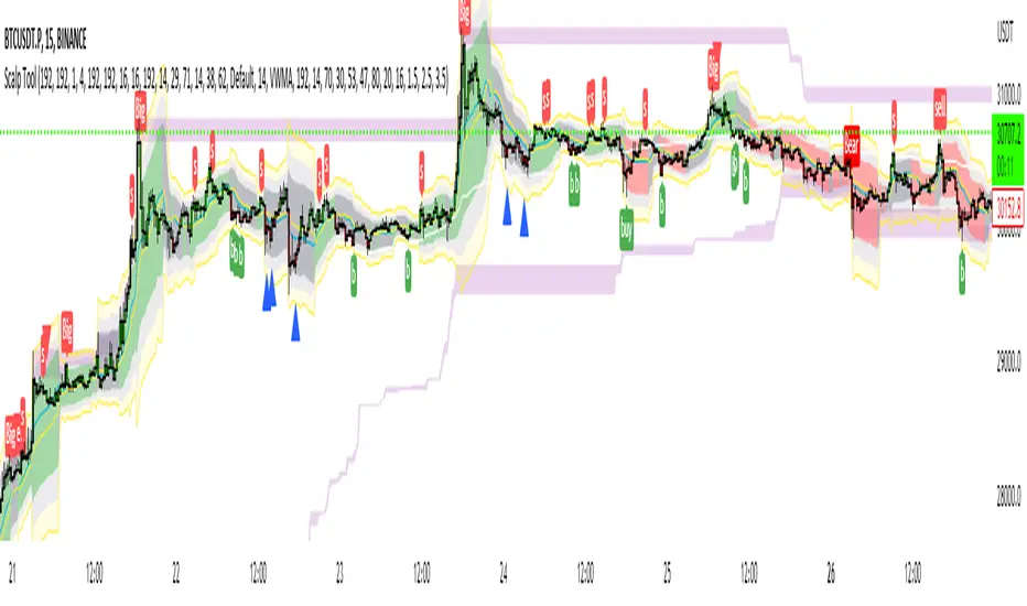
Step 2: Understand the Visual Signals
Setup Labels
Green Triangle (▲) - Bullish (Long) setup detected
Red Triangle (▼) - Bearish (Short) setup detected
Label shows Grade (A/A+/A++) and Total Score
VWAP Bands
Yellow Line - Session VWAP (fair value)
Blue Bands - ±1σ (fair value zone)
Purple Bands - ±2σ (moderate deviation)
Red Bands - ±3σ (extreme deviation)
Score Panel (Top Right)
Real-time breakdown of all four components:
Component Score
VWAP Zone 15/25
Structure 25/25
CVD 20/25
Session 25/25
TOTAL 85/100 (A+)
Step 3: Interpret Signals
Valid Long Setup:
✅ Green triangle below candle
✅ Price in lower VWAP bands (below VWAP)
✅ Structure shift breaks swing high
✅ Score ≥60
Valid Short Setup:
✅ Red triangle above candle
✅ Price in upper VWAP bands (above VWAP)
✅ Structure shift breaks swing low
✅ Score ≥60
Step 4: Set Up Alerts (See Alert Conditions section)
🚦 Signal Filters (VWAP Zone Logic)
The indicator uses directional VWAP filtering to prevent counter-trend signals:
Long Signals (Green)
Only allowed when price is AT or BELOW VWAP
✅ Lower 2nd band (-2σ to -1σ)
✅ Lower 3rd band (-3σ to -2σ)
✅ At VWAP exactly
❌ BLOCKED in upper bands (above VWAP)
Logic: Longs when price is stretched below fair value (mean reversion)
Short Signals (Red)
Only allowed when price is AT or ABOVE VWAP
✅ Upper 2nd band (+1σ to +2σ)
✅ Upper 3rd band (+2σ to +3σ)
✅ At VWAP exactly
❌ BLOCKED in lower bands (below VWAP)
Logic: Shorts when price is stretched above fair value (mean reversion)
🎨 Visual Elements
Chart Overlays
Element Color Description
VWAP Line Yellow Session-anchored fair value
±1σ Bands Blue Fair value zone (no score)
±2σ Bands Purple Moderate deviation (15 pts)
±3σ Bands Red Extreme deviation (25 pts)
Swing Highs Red ▼ Confirmed pivot highs
Swing Lows Green ▲ Confirmed pivot lows
Session Background Light Green Active high-value session
Setup Labels
Bullish Setup:
A+
▲ 75
Green label below candle, shows grade and score
Bearish Setup:
A++
▼ 90
Red label above candle, shows grade and score
Score Panel
Real-time table in top-right corner:
Individual component scores (0-25 each)
Total score (0-100)
Current setup grade (A/A+/A++)
Updates in real-time as market conditions change
🔔 Alert Conditions
Setting Up Alerts
Method 1: Built-in Alert Conditions
Click "Create Alert" in TradingView
Select Market State Engine as condition
Choose alert type:
Bullish Setup - Long signals only
Bearish Setup - Short signals only
Any Setup - All signals
Set to "Once Per Bar Close"
Configure notification method (app, email, webhook)
Method 2: Custom Alert Message
Alert messages include full breakdown:
A+ Setup Detected (Score: 85)
Components: VWAP(25) + Structure(25) + CVD(20) + Time(15)
CVD State: Confirmation
Direction: Long
Timeframe: 1m
Alert Behavior
✅ One alert per unique pivot break - no spam
✅ Fires on candle close only - no repainting
✅ Minimum score filter - only A grade or higher (≥60)
✅ Direction-specific - separate bullish/bearish conditions
⚠️ No cooldown between different pivots - multiple alerts per session allowed if different swing levels break
🔧 Technical Details
Timeframe Lock
Required: 1-minute chart only
Reason: Scoring model calibrated for 1m micro-structure
Future: Multi-timeframe support planned for v2
Timezone Configuration
Hard-coded: America/New_York
Session Detection: Uses TradingView's native session functions
Consistency: All time-based logic uses NY timezone
Swing Detection Parameters
Locked to specification:
ta.pivothigh(source, left=2, right=2)
ta.pivotlow(source, left=2, right=2)
Implications:
Pivots confirmed 2 bars after formation
No repainting - historical pivots don't move
4-bar minimum swing structure (2 left + pivot + 2 right)
VWAP Calculation
Type: Session-anchored (resets daily)
Source: Typical price (high + low + close) / 3
Weighting: Volume-weighted
Standard Deviation: True population standard deviation
CVD Proxy Formula
barDelta = close > open ? volume : close < open ? -volume : 0
CVD = cumulative sum of barDelta (session-reset)
Performance Limits
Max Labels: 500 (TradingView limit)
Max Bars Back: 500
Memory: Lightweight - uses only essential variables
💡 Best Practices
1. Use as a Filter, Not a Strategy
❌ Don't: Blindly take every signal
✅ Do: Use score as confluence for your existing analysis
2. Higher Grades = Better Probability
A Setups (60-74): Regular opportunities, still require discretion
A+ Setups (75-89): High-quality, multiple factors aligned
A++ Setups (90-100): Rare premium opportunities, strongest edge
3. Respect the VWAP Zone Filter
The indicator automatically blocks:
Longs in upper VWAP bands (counter-trend)
Shorts in lower VWAP bands (counter-trend)
Trust this logic - it enforces mean reversion discipline.
4. Monitor the Score Panel
Watch which components are scoring to understand why a setup formed:
Missing CVD score? → No order flow confirmation
Missing Time score? → Outside high-volume sessions
Low VWAP score? → Weak deviation from fair value
5. Combine with Risk Management
The indicator provides opportunity scoring, not position sizing:
Use stop losses based on swing structure
Scale position size with setup grade (larger on A++, smaller on A)
Set profit targets at VWAP or opposing band
6. Session Awareness
Prioritize signals during active sessions:
03:00-04:00 NY: Pre-market momentum
09:30-11:30 NY: Highest volume, tightest spreads
Off-hours signals (0 time score) are lower probability but still valid if other factors strong.
7. Understand the Hard Gate
If no structure shift occurs:
Total score = 0
No alerts fire
Other components irrelevant
Why? Structure shift confirms momentum change - without it, there's no tradable opportunity.
8. Avoid Over-Optimization
Default settings are well-calibrated:
Don't chase "perfect" parameters
Test changes on historical data before live use
Document any modifications
9. Leverage Alert De-Duplication
The indicator prevents spam automatically:
One alert per unique swing break
New swing levels = new alerts
No need to manually filter notifications
10. Supplement with Price Action
Use the indicator alongside:
Support/resistance levels
Order flow footprint charts
Volume profile
Market internals (breadth, TICK, etc.)
📚 Example Scenarios
Example 1: A++ Premium Setup (Score: 95)
Price: In lower 3rd VWAP band (-2.8σ) → VWAP: 25 pts
Structure: Close breaks swing high → Structure: 25 pts
CVD: Price LL + CVD HL (bullish div) → CVD: 25 pts
Time: 10:15 AM NY (market open) → Time: 25 pts
Direction: LONG (price below VWAP) → Valid
Grade: A++ (95/100)
Interpretation: All factors aligned - premium mean-reversion long opportunity.
Example 2: A+ Strong Setup (Score: 80)
Price: In upper 2nd VWAP band (+1.5σ) → VWAP: 15 pts
Structure: Close breaks swing low → Structure: 25 pts
CVD: Price HH + CVD LH (bearish div) → CVD: 25 pts
Time: 2:00 PM NY (off-hours) → Time: 0 pts
Direction: SHORT (price above VWAP) → Valid
Grade: A+ (65/100)
Interpretation: Strong setup despite off-hours, bearish divergence adds confidence.
Example 3: Filtered Setup (Score: 0)
Price: In upper 3rd VWAP band (+2.5σ) → VWAP: 25 pts (if allowed)
Structure: Close breaks swing high → Structure: BLOCKED
CVD: Price HH + CVD HH (confirmation) → CVD: 20 pts (if allowed)
Time: 10:00 AM NY → Time: 25 pts (if allowed)
Direction: LONG (price ABOVE VWAP) → ❌ INVALID ZONE
Grade: None (0/100) - NO ALERT
Interpretation: VWAP filter blocked long signal in upper band - prevents counter-trend trade.
🛠️ Troubleshooting
No Signals Appearing
✅ Verify you're on 1-minute chart
✅ Check Tick Size matches your symbol
✅ Ensure VWAP Bands are visible
✅ Wait for confirmed pivots (requires at least 5 bars of history)
Alerts Not Firing
✅ Confirm alert is set to "Once Per Bar Close"
✅ Check score threshold (must be ≥60 by default)
✅ Verify VWAP zone filter isn't blocking signals
✅ Check that structure shift is actually occurring
Score Always Zero
✅ No structure shift detected (hard gate active)
✅ Price may not be in valid VWAP zone (2nd or 3rd band)
✅ Insufficient swing history (wait for pivots to form)
Too Many/Too Few Signals
Too many signals:
Increase A Setup Threshold (e.g., 70 instead of 60)
Increase Tick Buffer Count (reduces false breaks)
Too few signals:
Decrease A Setup Threshold (e.g., 50 instead of 60)
Decrease Tick Buffer Count (more sensitive to breaks)
📜 License
This indicator is provided under the Mozilla Public License 2.0.
🤝 Credits
Developed as a professional trading tool for systematic opportunity identification.
Philosophy: Reduce noise. Enforce discipline. Keep the human in control.
📞 Support
For questions, issues, or feature requests, please consult:
This README documentation
The specification document (pinescript_market_state_engine_spec.docx)
Inline code comments in market_state_engine.pine
🔄 Version History
v1.0 (Current)
Initial release
4-component scoring model (VWAP + Structure + CVD + Time)
VWAP zone directional filtering
Alert de-duplication
Configurable inputs
Real-time score panel
Session-aware logic
🎓 Understanding the Numbers
Quick Reference Card
Score Range Grade Quality Typical Use
90-100 A++ Premium Highest conviction trades
75-89 A+ High Strong probability setups
60-74 A Good Acceptable with discretion
0-59 None Filtered Skip or wait for confluence
Component Contribution Examples
Minimum A Setup (60 points):
Structure (25) + VWAP 3rd band (25) + Time (25) = 75 ✅
Typical A+ Setup (75 points):
Structure (25) + VWAP 2nd band (15) + CVD confirm (20) + Time (25) = 85 ✅
Maximum A++ Setup (100 points):
Structure (25) + VWAP 3rd band (25) + CVD divergence (25) + Time (25) = 100 ✅
🎯 Final Reminder
This is NOT a trading bot.
This is NOT financial advice.
This is a decision-support tool.
Always:
✅ Use proper risk management
✅ Understand the logic before trading
✅ Backtest on your symbols
✅ Keep the human in control
Happy Trading! 📈
Pine Script® indicator