Nimu Market on DemandNimu Market On Demand is an innovative tool designed to provide a visual representation of market demand levels on a scale of 1 to 100. This scale is displayed at specific intervals , making it easy for users to understand market demand fluctuations in real time.
To enhance analysis, Nimu Market On Demand also incorporates the Relative Strength Index (RSI) with key thresholds at . RSI is a widely-used technical indicator that measures market strength and momentum, offering insights into overbought (excessive buying) or oversold (excessive selling) conditions.
The combination of the Demand graph and RSI enables users to:
Identify the right time to buy when the RSI falls below 30, signaling an oversold condition.
Determine the optimal time to sell when the RSI rises above 70, indicating an overbought condition.
With an integrated visualization, users can effortlessly observe demand patterns and combine them with RSI signals to make smarter and more strategic trading decisions. This tool is designed to help traders and investors maximize opportunities in a dynamic market environment.
Search in scripts for "demand"

EMA with Supply and Demand Zones
The EMA with Supply and Demand Strategy is a trend-following trading approach that integrates Exponential Moving Averages (EMA) with supply and demand zones to identify potential entry and exit points. Below is a detailed description of its components and logic:
Key Components of the Strategy
1. EMA (Exponential Moving Average)
The EMA is used as a trend filter:
Bullish Trend: Price is above the EMA.
Bearish Trend: Price is below the EMA.
The EMA ensures that trades align with the overall market trend, reducing counter-trend risks.
2. Supply and Demand Zones
Demand Zone:
Represents areas where the price historically found support (buyers dominated).
Calculated using the lowest low over a specified lookback period.
Used for identifying potential long entry points.
Supply Zone:
Represents areas where the price historically faced resistance (sellers dominated).
Calculated using the highest high over a specified lookback period.
Used for identifying potential short entry points.
3. Trade Conditions
Long Trade:
Triggered when:
The price is above the EMA (bullish trend).
The low of the current candle touches or penetrates the most recent demand zone.
Short Trade:
Triggered when:
The price is below the EMA (bearish trend).
The high of the current candle touches or penetrates the most recent supply zone.
4. Exit Conditions
Long Exit:
Exit the trade when the price closes below the EMA, indicating a potential trend reversal.
Short Exit:
Exit the trade when the price closes above the EMA, signaling a potential upward reversal.
Visual Representation
EMA: A blue line plotted on the chart to show the trend.
Supply Zones: Red horizontal lines representing potential resistance levels.
Demand Zones: Green horizontal lines representing potential support levels.
These zones dynamically adjust to reflect the most recent 3 levels.
How the Strategy Works
Trend Identification:
The EMA determines the direction of the trade:
Look for long trades only in a bullish trend (price above EMA).
Look for short trades only in a bearish trend (price below EMA).
Entry Points:
Wait for price interaction with a supply or demand zone:
If the price touches a demand zone during a bullish trend, initiate a long trade.
If the price touches a supply zone during a bearish trend, initiate a short trade.
Risk Management:
The strategy exits trades if the price moves against the trend (crosses the EMA).
This ensures minimal exposure during adverse market movements.
Benefits of the Strategy
Trend Alignment:
Reduces counter-trend trades, improving the win rate.
Clear Entry and Exit Rules:
Combines price action (zones) with a reliable trend filter (EMA).
Dynamic Levels:
The supply and demand zones adapt to changing market conditions.
Customization Options
EMA Length:
Adjust to suit different timeframes or market conditions (e.g., 20 for faster trends, 50 for slower trends).
Lookback Period:
Fine-tune to capture broader or narrower supply and demand zones.
Risk/Reward Preferences:
Pair the strategy with stop-loss and take-profit levels for enhanced control.
This strategy is ideal for traders looking for a structured approach to identify high-probability trades while aligning with the prevailing trend. Backtest and optimize parameters based on your trading style and the specific asset you're tradin

Multi Timeframe Supply & Demand ZonesIntroduction
Hello fellow traders and coders, I’d like to introduce the multi time-frame supply and demand indicator that you’ve been looking for, its a dynamic script encompassing a lot of features however it is merely a tool to be used in conjunction with your own market analysis.
Features
A maximum of 2 time-frames that can be customized independently.
The ability to change individual swing lengths that create the supply and demand boxes, all time-frames will come set at 7, you can however set this to whatever you are comfortable with.
Supply and demand functionality for both time-frames.
The ability to either use (highs and lows) or closes for mitigation of supply and demand zones, meaning that if set to close the zones will be mitigated if a close is above the top for supply and bottom from demand, the same will apply when the high and low flag is used.
The ability to customize box colors, border type, border width and text size.
The ability to prevent lower time frame structure from showing on higher time frames which I don’t advice as it will provide you with an inaccurate perception of the lower time frame structure hence I’ve made the feature available but set it to false.
The script also has a section called general settings that will allow you to hide all the supply and demand zones on the chart.
The ability to choose the number of supply or demand zones to display per time-frame.
General Settings Functionality.
Input 1 allows you to hide all the demand zones on the chart.
Input 2 allows you to hide all the supply zones on the chart.
Input 3 if false will show lower time frame structure on a higher time frame. Default is true to prevent inaccurate results on higher time-frames.

Supply Demand Profiles [LuxAlgo]The Supply Demand Profiles is a charting tool that measures the traded volume at all price levels on the market over a specified time period and highlights the relationship between the price of a given asset and the willingness of traders to either buy or sell it, in other words, highlights key concepts as significant supply & demand zones, the distribution of the traded volume, and market sentiment at specific price levels within a specified time period, allowing traders to reveal dominant and/or significant price levels and to analyze the trading activity of a particular user-selected range.
In other words, this tool highlights key concepts as significant supply & demand zones, the distribution of the traded volume, and market sentiment at specific price levels within a specified time period, allowing traders to reveal dominant and/or significant price levels and to analyze the trading activity of a particular user-selected range.
Besides having the tool as a combo tool, the uniqueness of this version of the tool compared to its early versions is its ability to benefit from different volume data sources and its ability to use a variety of different polarity methods, where polarity is a measure used to divide the total volume into either up volume (trades that moved the price up) or down volume (trades that moved the price down).
🔶 USAGE
Supply & demand zones are presented as horizontal zones across the selected range, hence adding the ability to visualize the price interaction with them
By default, the right side of the profile is the volume profile which highlights the distribution of the traded activity at different price levels, emphasizing the value area, the range of price levels in which the specified percentage of all volume was traded during the time period, and levels of significance, such as developing point of control line, value area high/low lines, and profile high/low labels
The left side of the profile is the sentiment profile which highlights the market sentiment at specific price levels
🔶 DETAILS
🔹 Volume data sources
The users have the option to select volume data sources as either 'volume' (regular volume) or 'volume delta', where volume represents all the recorded trades that occur at a given bar and volume delta is the difference between the buying and the selling volume, that is, the net demand at a given bar
🔹 Polarity methods
The users are able to choose the methods of how the tool to take into consideration the polarity of the bar (the direction of a bar, green (bullish) or red (bearish) bar) among a variety of different options, such as 'bar polarity', 'bar buying/selling pressure', 'intrabar (chart bars at a lower timeframe than the chart's) polarity', 'intrabar buying/selling pressure', and 'heikin ashi bar polarity'.
Finally, the interactive mode of the tool is activated, as such users can easily modify the intervals of their interest just by selecting the indicator and moving the points on the chart
🔶 SETTINGS
The script takes into account user-defined parameters and plots the profiles and zones
🔹 Calculation Settings
Volume Data Source and Polarity: This option is to set the desired volume data source and polarity method
Lower Timeframe Precision: This option is applicable in case any of the 'Intrabar (LTF)' options are selected, please check the tooltip for further details
Value Area Volume %: Specifies the percentage for the value area calculation
🔹 Presentation Settings
Supply & Demand Zones: Toggles the visibility of the supply & demand zones
Volume Profile: Toggles the visibility of the volume profile
Sentiment Profile: Toggles the visibility of the sentiment profile
🔹 Presentation, Others
Value Area High (VAH): Toggles the visibility of the VAH line and color customization option
Point of Control (POC): Toggles the visibility of the developing POC line and color customization option
Value Area Low (VAL): Toggles the visibility of the VAL line and color customization option
🔹 Supply & Demand, Others
Supply & Demand Threshold %: This option is used to set the threshold value to determine supply & demand zones
Supply/Demand Zones: Color customization option
🔹 Volume Profile, Others
Profile, Up/Down Volume: Color customization option
Value Area, Up/Down Volume: Color customization option
🔹 Sentiment Profile, Others
Sentiment, Bullish/Bearish: Color customization option
Value Area, Bullish/Bearish: Color customization option
🔹 Others
Number of Rows: Specify how many rows the profile will have
Placment: Specify where to display the profile
Profile Width %: Alters the width of the rows in the profile, relative to the profile range
Profile Price Levels: Toggles the visibility of the profile price levels
Profile Background, Color: Fills the background of the profile range
Value Area Background, Color: Fills the background of the value area range
Start Calculation/End Calculation: The tool is interactive, where the user may modify the range by selecting the indicator and moving the points on the chart or can set the start/end time using these options
🔶 RELATED SCRIPTS
Volume-Profile
Volume-Profile-Maps
Volume-Delta

VWAP Supply and Demand ZonesThis is my 1st indicator enjoy.
Description of the VWAP Supply and Demand Zones indicator:
This indicator uses the Volume Weighted Average Price (VWAP) to identify potential supply and demand zones in the market. The VWAP is a popular indicator that shows the average price of a security weighted by volume over a specified period of time. It can be used as a benchmark to measure the efficiency of trading and to identify trends and price levels.
The indicator plots the VWAP as a blue line on the chart, and also plots two other lines above and below it, which represent the upper and lower bounds of the supply and demand zones. The width of these zones can be adjusted by changing the “Zone Width” input parameter.
The indicator also plots shapes on the chart to mark when a supply or demand zone is formed. A supply zone is formed when the price crosses above the VWAP and then falls back below it, indicating that there is more selling pressure than buying pressure at that level. A red triangle is plotted above the bar where this happens, and a red zone is drawn between the previous close and previous VWAP values.
A demand zone is formed when the price crosses below the VWAP and then rises back above it, indicating that there is more buying pressure than selling pressure at that level. A green triangle is plotted below the bar where this happens, and a green zone is drawn between the previous close and previous VWAP values.
The supply and demand zones can be used as potential areas of support and resistance, where traders can look for reversal or continuation signals. For example, if the price enters a supply zone from below, it may indicate that sellers are willing to sell at higher prices, which could lead to a bearish reversal. Conversely, if the price enters a demand zone from above, it may indicate that buyers are willing to buy at lower prices, which could lead to a bullish reversal.
The indicator can be applied to any timeframe or market, but it may work better on higher timeframes where volume data is more reliable. It can also be combined with other indicators or tools to confirm or filter signals.

Supply & Demand (10-MTF) | StableThe Supply & Demand (10-MTF) indicator is a sophisticated technical analysis tool designed to identify high-probability institutional "buy" and "sell" zones across ten different timeframes simultaneously.
Core Functionality
The indicator works by scanning for displacement—sharp, aggressive price movements that leave behind "unfilled orders."
Zone Identification: It identifies a "Base" (the candle before the move) and a "Leg-out" (the momentum candles). If the leg-out meets your momentum strength requirements, a zone is drawn.
Multi-Timeframe Aggregation: Instead of switching between charts, a trader can see 1H Supply, 4H Demand, and Daily Supply zones all layered on a 5-minute chart.
Real-Time Invalidation: The indicator tracks whether price has "mitigated" (broken) a zone. Once a zone is breached by a wick or a close (depending on your settings), it can be hidden or marked as historic.
Why It’s Useful for Traders
1. Confluence Mapping (The "Nest" Strategy)
The most powerful use of this tool is finding Nested Zones. When a 15-minute Demand zone resides inside a 4-hour Demand zone, the probability of a reversal is significantly higher. This indicator makes these high-confluence areas visually obvious.
2. Institutional Footprint Tracking
Institutions do not buy or sell everything at once; they leave footprints in the form of supply and demand imbalances. This tool helps retail traders avoid "buying the top" or "selling the bottom" by showing where the big money actually entered the market.
3. Dynamic Stop Loss & Take Profit
Stop Loss: Traders can place stops just outside the structural boundary of a zone.
Take Profit: Traders can use the opposing HTF (Higher Timeframe) supply zone as a natural target for a long trade.
4. Time Efficiency
Managing 10 timeframes manually is mentally exhausting. This indicator automates the "top-down analysis" process, allowing you to focus on execution rather than chart flipping.

Wyckoff Map (TR + S/D + Springs/Upthrusts)Wyckoff Map is a context-aware market structure overlay that visualizes key Wyckoff concepts directly on the price chart — without repainting and without relying on black-box signals.
Instead of generating isolated buy/sell alerts, this tool maps the environment in which price is operating, helping traders understand where supply and demand are interacting, where liquidity is being swept, and which phase the market is likely in.
What the script shows
Trading Range (TR)
Automatically detects a recent trading range
Displays the range as a shaded box for immediate context
Supply & Demand Zones
Demand zone near the range low (buyers’ area)
Supply zone near the range high (sellers’ area)
Zones adapt dynamically as the range evolves
Wyckoff Events
Spring: downside liquidity sweep followed by a reclaim (potential accumulation behavior)
Upthrust: upside liquidity sweep followed by failure (potential distribution behavior)
Events are filtered by range context and optional volume confirmation
Market Phase (Heuristic)
Labels the current environment as:
Accumulation
Distribution
Neutral Trading Range
Markup / Markdown
Phase is inferred from price position within the range and moving-average slope
Legend & Visual Guidance
A floating legend explains all zones and events
Designed to remain readable during replay and live trading
How to use
This script is not a standalone trading strategy.
It is best used to:
Avoid chasing breakouts into supply
Identify failed breakdowns near demand
Recognize accumulation vs distribution behavior
Add context to lower-timeframe entries
Combine with your own execution model (structure, risk, or order flow)
Higher-timeframe context is strongly recommended.
⚙️ Customization
You can adjust:
Trading range length
Zone thickness (ATR-based)
Pivot sensitivity
Volume confirmation
Event confirmation strictness
Visibility of zones, events, phase labels, and legend
Disclaimer
Wyckoff analysis is contextual and probabilistic, not deterministic.
This tool visualizes structural behavior — it does not predict future price.
Use proper risk management.
TL;DR (Short Description)
A non-repainting Wyckoff market structure overlay that maps trading ranges, supply/demand zones, Springs, Upthrusts, and accumulation/distribution phases directly on the chart.

Supply & Demand Zones (Volume-Based)📌 Supply & Demand Zones (Volume-Based) — Indicator Description
Overview
This indicator visually highlights potential supply and demand price zones using historical candle structure combined with relative volume behavior.The zones are intended to help users observe areas of increased market activity where price has previously reacted. This tool is designed for visual analysis only.
How the Zones Are Identified
Demand zones are highlighted when price shows a strong bullish reaction following a bearish candle.Supply zones are highlighted when price shows a strong bearish reaction following a bullish candle.Relative volume is used as context, not as a predictive input, to classify zones into higher or lower activity levels.Zones automatically invalidate when price structurally breaks them.
About the Percentage Display
The percentage shown on a zone represents normalized relative volume strength at the time the zone was formed.This value is not a probability, not a success rate, and not a performance metric.It should not be interpreted as a prediction or trading signal.Percentages are displayed only for active zones and are removed once a zone is invalidated.
How This Indicator Is Intended to Be Used
As a visual reference tool for identifying historical supply and demand areas.As a contextual overlay alongside other forms of technical analysis.To observe how price behaves when revisiting previously active zones.This indicator does not suggest trade direction, entry timing, or exit levels.
Important Notes & Limitations
All zones are derived from historical price and volume data.Market conditions change, and historical zones may lose relevance over time.No trading decisions should be made based solely on this indicator.Users are encouraged to apply their own analysis and risk management.
Disclaimer
This indicator is provided for educational and informational purposes only.It does not constitute trading, investment, or financial advice.The author assumes no responsibility for decisions made using this tool.

Supply-Demand Dominance & Energy RibbonOverview:
This indicator is specifically fine-tuned for the Nasdaq (NAS100) market. It combines volume-based Delta analysis (Supply-Demand) with price kinetic energy (Slope) to identify high-probability reversal points and trend strength.
Key Features & Usage:
Supply-Demand Dominance (Top-Right Label):
Analyzes volume spikes over a 50-period lookback to determine market control.
Displays "매수 우위" (Bullish Dominance) or "매도 우위" (Bearish Dominance) in real-time.
Energy Ribbon (Bottom Visualization):
Calculates the slope of the TCI oscillator to visualize momentum intensity.
Solid Green/Red: Strong momentum.
Faded Green/Red: Weakening momentum or minor trend.
Momentum Combo Signals (Circle Shapes):
Triggered when WaveTrend and TCI oscillators cross in extreme zones (Overbought 70 / Oversold 30).
Smart Filter: Signals are only shown when they align with the current Supply-Demand dominance, reducing "market noise."
Volume Spikes (Arrow Symbols):
Indicates abnormal volume activity (1.5x average delta). These arrows (↑/↓) help identify potential breakout points or the climax of a move even when a full combo signal isn't present.

4H Supply & Demand – 50% Mitigation (MTF clean)4H Supply & Demand – 50% Mitigation (MTF clean)
This indicator shows strictly 4h supply & demand zones
automatically deletes any zone that got filled by 51%

Supply & demand with qualifieres [By:CienF-OTC]🚀 Supply & Demand (S/D) Zones Indicator - Precision Pattern 🚀
This Advanced Supply and Demand (S/D) Zones Indicator is engineered to identify high-probability zones: Indecisive Base (Consolidation) followed by an Explosive Exit (Expansion), coupled with a strict momentum validation process.
🎯 Key Features and High-Precision Logic 🎯
The indicator filters potential zones through three critical movement stages:
1. Strict Indecisive Base Detection:
Rule: A candle is defined as an Indecisive Base if its body is less than or equal to 50% of its total range (High - Low). This accurately captures Dojis, Spinning Tops, and true equilibrium candles.
Zone Drawing: The zone covers the price range (High/Low) of one or more consecutive base candles.
2. Validation of the Explosive Exit:
The candle immediately following the base must be an Explosive/Decisive Candle, exceeding a minimum body threshold (default 50.0% in the current version) to confirm significant capital entry.
3. Strict Momentum and Freshness Filters
The core of the indicator's precision lies in these filters, which you can activate in the settings:
🚫 Anti-Stall Filter (Strict Follow-up): The candle that follows the explosion CANNOT be Indecisive (i.e., its body cannot be $\leq 50\%$ of its range). If the follow-up candle is weak, the zone is rejected for lack of true commitment. (Note: This filter is set to OFF by default in v6.0 for flexibility but highly recommended for high-probability setups).
Freshness (Mitigation): Zones that have been previously tested/touched by the price (mitigated) are deactivated and colored gray (optional) or automatically deleted, keeping your chart clean and showing only active, fresh zones.

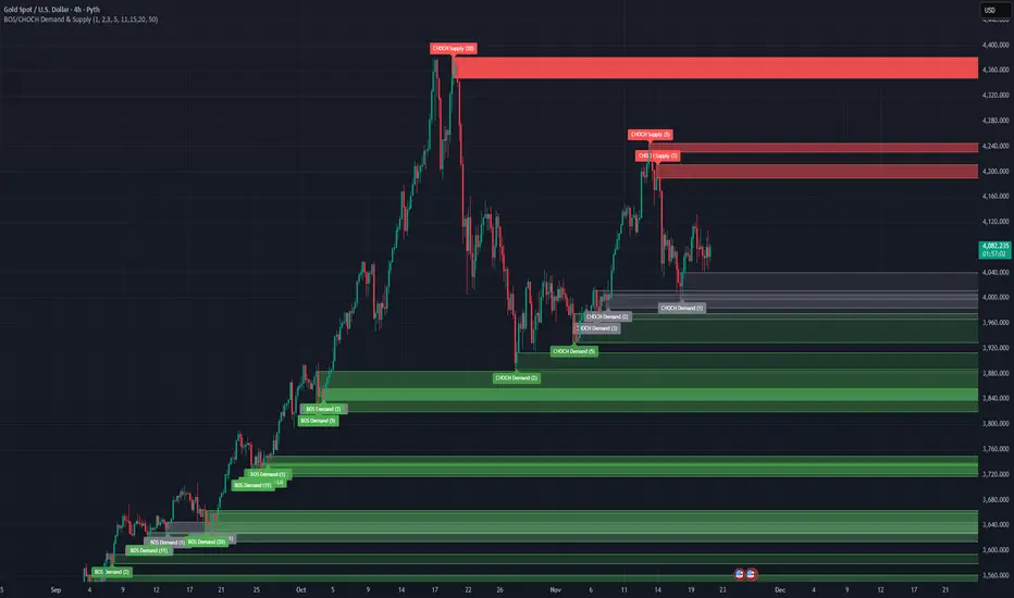
BOS/CHOCH Demand & SupplyThis indicator automatically identifies and plots Supply and Demand zones based on Smart Money Concepts (SMC) methodology. It detects structural breaks in price action and marks the origin zones that initiated these moves.
How It Works (Technical Methodology)
1. Swing Point Detection
The indicator uses Pine Script's ta.pivothigh() and ta.pivotlow() functions to identify swing highs and lows. Users can input multiple lookback periods (e.g., 1, 2, 3, 5, 11, 15, 20) to detect structure across different timeframe perspectives simultaneously.
2. Break of Structure (BOS) Detection
A Bullish BOS is confirmed when:
Current candle closes above the last swing high
Previous candle's high was still below that swing high
The current swing high is higher than the previous swing high (trend continuation)
A Bearish BOS is confirmed when:
Current candle closes below the last swing low
Previous candle's low was still above that swing low
The current swing low is lower than the previous swing low (trend continuation)
3. Change of Character (CHOCH) Detection
A Bullish CHOCH is confirmed when:
Price breaks above the last swing high
But that swing high was lower than the previous swing high (potential reversal signal)
A Bearish CHOCH is confirmed when:
Price breaks below the last swing low
But that swing low was higher than the previous swing low (potential reversal signal)
4. Inducement / Liquidity Grab Filter (Optional)
When enabled, zones are only drawn if the swing point that created them first grabbed liquidity from the previous swing:
For Demand zones: The swing low must have traded below the previous swing low before the bullish break
For Supply zones: The swing high must have traded above the previous swing high before the bearish break
This filter helps identify higher-probability zones where stop-losses were likely triggered before the move.
5. Zone Construction
Demand Zone (Bullish):
Top boundary: max(open, close) of the swing low candle
Bottom boundary: low of the swing low candle
Supply Zone (Bearish):
Top boundary: high of the swing high candle
Bottom boundary: min(open, close) of the swing high candle
This captures the candle body-to-wick range where institutional orders likely reside.
6. Zone Lifecycle Management
Active Zone: Displayed in green (demand) or red (supply)
Mitigated Zone: When price touches the zone but doesn't break it, the zone turns gray (indicating partial fill)
Broken Zone: When price fully breaks through the zone, it is automatically deleted from the chart
How to Use
Demand Zones (Green): Look for long entries when price returns to these zones. The zone represents where buying pressure previously overcame selling.
Supply Zones (Red): Look for short entries when price returns to these zones. The zone represents where selling pressure previously overcame buying.
BOS Zones: Indicate trend continuation - trade in the direction of the break.
CHOCH Zones: Indicate potential reversal - these are early warning signals of trend change.
Enable "Require Inducement" for higher-quality setups where liquidity was grabbed before the structural break.
Multi-Lookback Periods: Using multiple values helps identify zones across different structural levels. Smaller values catch minor structure; larger values catch major structure.
Disclaimer
This indicator is a technical analysis tool and should be used in conjunction with other forms of analysis. Past performance does not guarantee future results. Always use proper risk management.
MFT Supply/Demand — Top2 (Opacity by Strength, Minimal Labels)Script Overview — “MFT Supply/Demand — Top 2 (Opacity by Strength, Minimal Labels)”
This multi–timeframe (MTF) Pine Script indicator automatically detects and displays the strongest supply and demand zones across selected higher (HTF), mid (MTF), and lower (LTF) timeframes.
It dynamically identifies large-body, high-volume candles (and optional order-block breakouts) that signal institutional activity, then plots only the two strongest supply zones above the current price and two strongest demand zones below the current price — keeping the chart clean and focused.

Machine Learning-Inspired Supply & Demand Zones [AlgoPoint]This indicator is a Smart Supply & Demand Zone tool, developed with principles inspired by Machine Learning (ML). It intelligently filters out market noise, allowing you to focus only on the most significant zones where institutional order flow is likely present.
💡 How It Works: Why Is This Indicator "Smart"?
Unlike traditional indicators that only measure simple price movements, this script uses an algorithm that asks the same critical questions an experienced market analyst would to qualify a zone:
- 1. Price Imbalance: How fast and aggressively did the price leave the zone? Our algorithm measures the body size of the "departure candle" relative to the current market volatility (ATR). A zone is only considered if it was formed by an explosive move that is statistically significant, indicating a major imbalance between buyers and sellers.
- 2. Volume Confirmation: Did the "smart money" participate in this move? The script checks if the volume on the departure candle was significantly higher than the recent average volume. A spike in volume confirms that the move was backed by institutional interest, adding strength and validity to the zone.
- 3. Valid Pivot Structure: Did the zone originate from a meaningful swing high or low? The algorithm first identifies a valid pivot structure, ensuring that zones are not drawn from insignificant or random price fluctuations.
Only when a potential zone passes these three critical tests—our "quality filter"—is it drawn on your chart.
🚀 Features & How to Use
Using the indicator is straightforward. You will see two primary types of boxes on your chart:
* 🟥 Red Box (Supply Zone): An area of potential resistance where selling pressure is likely to be strong. Look for potential shorting opportunities as the price approaches this zone.
* 🟩 Green Box (Demand Zone): An area of potential support where buying pressure is likely to be strong. Look for potential long opportunities as the price pulls back into this zone.
Dynamic Zone Management
This indicator is not static; it lives and breathes with the market:
- Fresh Zone: A newly formed zone appears in its full, vibrant color. These are the highest-probability zones as they have not yet been re-tested.
- Broken / Flipped Zone: You have full control over what happens when a zone is broken! In the settings, you can choose:
- Delete Zone: The zone will be removed completely when the price closes through it.
- Show as Broken (Flip): When broken, the zone will turn gray, stop extending, and remain on your chart. This is extremely useful for identifying Support/Resistance Flips, where a broken demand zone becomes new resistance, or a broken supply zone becomes new support.
⚙️ Settings & Customization
Fine-tune the indicator to match your personal trading style via the settings menu:
- Breakout Behavior: The most powerful feature. Choose between Delete Zone and Show as Broken (Flip) to customize your chart.
- Zone Finding Logic: Control the indicator's sensitivity.
- Selective: Requires both strong imbalance and high volume. Finds fewer, but higher-quality, zones.
- Moderate: Requires either strong imbalance or high volume. Finds more potential zones.
- Sensitivity Settings: Adjust the ATR Multiplier and Volume Multiplier to make the criteria for a "strong" zone stricter or looser.
Follow-up Buy / Sell Volume Pressure at Supply / Demand Zones█ Overview:
BE-Volume Footprint & Pressure Candles, is an indicator which is preliminarily designed to analyze the supply and demand patterns based on Rally Base Rally (RBR), Drop Base Drop (DBD), Drop Base Rally (DBR) & Rally Base Drop (RBD) concepts in conjunction to volume pressure. Understanding these concepts are crucial. Let's break down why the "Base" is you Best friend in this context.
Commonness in RBR, DBD, DBR, RBD patterns ?
There is an impulse price movement at first, be it rally (price moving up) or the Drop (price moving down), followed by a period of consolidation which is referred as "BASE" and later with another impulse move of price (Rally or Drop).
Why is the Base Important
1. Market Balance: Base represents a balance between buyers and sellers. This is where decisions are made.
2. Confirmation: It confirms the strength of previous impulse move which has happened.
Base & the Liquidity Play:
Supply & Demand Zone predict the presence of all large orders within the limits of the Base Zone. Price is expected to return to the zone to fill the unfilled orders placed by large players.
For the price to move in the intended direction Liquidity plays the major role. hence indicator aims to help traders in identifying those zones where liquidity exists and the volume pressure helps in confirming that liquidity is making its play.
Bottom pane in the below snapshots is a visual representation of Buyers volume pressure (Green Line & the Green filled area) making the price move upwards vs Sellers volume pressure (Red Line & the Red filled area) making the price move downwards.
Top pane in the below snapshots is a visual representation on the pattern identification (Blue marked zone & the Blue line referred as Liquidity level)
Bullish Pressure On Buy Liquidity:
Bearish Pressure On Sell Liquidity:
█ How It Works:
1. Indicator computes technical & mathematical operations such as ATR, delta of Highs & Lows of the candle and Candle ranges to identify the patterns and marks the liquidity lines accordingly.
2. Indicator then waits for price to return to the liquidity levels and checks if Directional volume pressure to flow-in while the prices hover near the Liquidity zones.
3. Once the Volume pressure is evident, loop in to the ride.
█ When It wont Work:
When there no sufficient Liquidity or sustained Opposite volume pressure, trades are expected to fail.
█ Limitations:
Works only on the scripts which has volume info. Relays on LTF candles to determine intra-bar volumes. Hence, Use on TF greater than 1 min and lesser than 15 min.
█ Indicator Features:
1. StrictEntries: employs' tighter rules (rather most significant setups) on the directional volume pressure applied for the price to move. If unchecked, liberal rules applied on the directional volume pressure leading to more setups being identified.
2. Setup Confirmation period: Indicates Waiting period to analyze the directional volume pressure. Early (lesser wait period) is Risky and Late (longer wait period) is too late for the
ride. Find the quant based on the accuracy of the setup provided in the bottom right table.
3. Algo Enabled with Place Holders:
Indicator is equipped with algo alerts, supported with necessary placeholders to trade any instrument like stock, options etc.
Accepted PlaceHolders (Case Sensitive!!)
1. {{ticker}}-->InstrumentName
2. {{datetime}}-->Date & Time Of Order Placement
3. {{close}}-->LTP Price of Script
4. {{TD}}-->Current Level:
Note: Negative Numbers for Short Setup
5. {{EN}} {{SL}} {{TGT}} {{T1}} {{T2}} --> Trade Levels
6. {{Qty}} {{Qty*x}} --> Qty -> Trade Qty mapped in Settings. Replace x with actual number of your choice for the multiplier
7. {{BS}}-->Based on the Direction of Trade Output shall be with B or S (B == Long Trade & S == Short Trade)
8. {{BUYSELL}}-->Based on the Direction of Trade Output shall be with BUY or SELL (BUY == Long Trade & SELL == Short Trade)
9. {{IBUYSELL}}-->Based on the Direction of Trade Output shall be with BUY or SELL (BUY == SHORT Trade & SELL == LONG Trade)
Dynamic Alerts:
10. { {100R0} }-->Dynamic Place Holder 100 Refers to Strike Difference and Zero refers to ATM
11. { {100R-1} }-->Dynamic Place Holder 100 Refers to Strike Difference and -1 refers to
ATM - 100 strike
12. { {50R2} }-->Dynamic Place Holder 50 Refers to Strike Difference and 2 refers to
ATM + (2 * 50 = 100) strike
13. { {"ddMMyy", 0} }-->Dynamically Picks today date in the specified format.
14. { {"ddMMyy", n} }-->replace n with actual number of your choice to Pick date post today date in the specified format.
15. { {"ddMMyy", "MON"} }-->dynamically pick Monday date (coming Monday, if today is not Monday)
Note. for the 2nd Param-->you can choose to specify either Number OR any letter from =>
16. {{CEPE}} {{ICEPE}} {{CP}} {{ICP}} -> Dynamic Option Side CE or C refers to Calls and PE or P refers to Puts. If "I" is used in PlaceHolder text, On long entries PUTs shall be used
Indicator is equipped with customizable Trade & Risk management settings like multiple Take profit levels, Trailing SL.

Impulse Alert - Demand (Buy) [Fixed]🔵 Impulse Alert – Demand (Buy)
This indicator is designed to detect high-probability Demand Zones based on impulsive bullish price action, helping traders get alerted only when it matters most.
🧠 Core Logic:
Scans the chart for 2 consecutive bullish impulsive candles with significant range (body size)
Also captures single large bullish impulse candles that often mark institutional buying
Marks the origin of the move as a potential Demand Zone
Sends alerts when such bullish setups form, allowing you to monitor charts passively
⚙️ Features:
✅ Alerts on impulsive move formations
✅ Detects both 2-candle and single-candle impulses
✅ Custom zone detection logic based on pip size and momentum
✅ Cleaner & smarter: removes distractions and avoids false signals
📌 Best Used For:
Smart Money / Supply & Demand traders
Identifying potential institutional buy zones
Executing trades with HTF confluence
Traders who want to get alerted without screen-watching
🔁 Suggested Strategy:
Set HTF directional bias (H1, H4, D1)
Use this indicator on LTF (1M–15M) for impulsive bullish entries
Wait for price to return to the marked zone for low-risk entries
💡 Pro Tip: Combine with your Supply Zone (Sell) indicator to track both sides of market structure and increase R:R
👤 Created by: Rohit Jadhav | YT/Insta/X - @GrowthByTrading
📬 Want updates, enhancements, or personal versions? Leave feedback or reach out through profile!
Supply/Demand Zones - Fixed v3 (Cross YES Only)This Pine Script indicator creates Supply/Demand Zones with specific filtering criteria for TradingView. Here's a comprehensive description:
Supply/Demand Zones -(Cross YES Only)
Core Functionality
Session-Based Analysis: Identifies and visualizes price ranges during user-defined time sessions
Cross Validation Filter: Only displays zones when the "Cross" condition is met (Open and Close prices cross the mid-range level)
Real-Time Monitoring: Tracks price action during active sessions and creates zones after session completion
Key Features
Time Range Configuration
Customizable session hours (start/end time with minute precision)
Timezone support (default: Europe/Bucharest)
Flexible scheduling for different trading sessions
Visual Elements
Range Border: Dotted outline showing the full session range (High to Low)
Key Levels: Horizontal lines for High, Low, and Mid-range levels
Sub-Range Zones: Shaded areas showing Open and Close price zones
Percentage Labels: Display the percentage of range occupied by Open/Close zones
Active Session Background: Blue background highlighting during active sessions
Smart Filtering System
Cross Condition: Only creates zones when:
Open < Mid AND Close > Mid (bullish cross), OR
Open > Mid AND Close < Mid (bearish cross)
This filter ensures only significant price movements that cross the session's midpoint are highlighted
Customization Options
Display Controls: Toggle visibility for borders, lines, zones, and labels
Color Schemes: Full color customization for all elements
Transparency Settings: Adjustable transparency for zone fills
Text Styling: Configurable label colors and information display
Technical Specifications
Maximum capacity: 500 boxes, 500 lines, 200 labels
Overlay indicator (draws directly on price chart)
Bar-time based positioning for accurate historical placement
Use Cases
Supply/Demand Trading: Identify key price levels where institutions may have interest
Session Analysis: Understand price behavior during specific trading hours
Breakout Detection: Focus on sessions where price crosses significant levels
Support/Resistance: Use range levels for future trade planning
What Makes It Unique
The "Cross YES Only" filter ensures that only meaningful price sessions are highlighted - those where the market shows directional bias by crossing from one side of the range to the other, indicating potential institutional interest or significant market sentiment shifts.

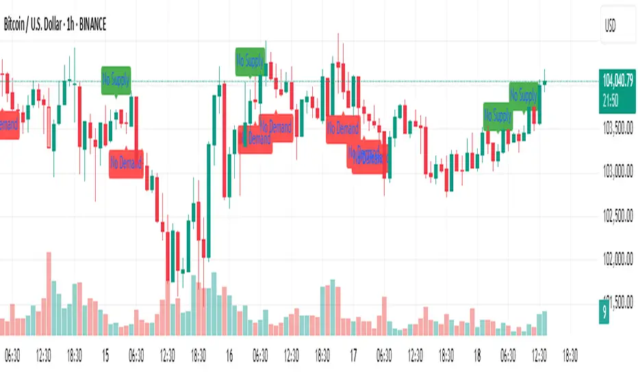
No Supply No Demand (NSND) – Volume Spread Analysis ToolThis indicator is designed for traders utilizing Volume Spread Analysis (VSA) techniques. It automatically detects potential No Demand (ND) and No Supply (NS) candles based on volume and price behavior, and confirms them using future price action within a user-defined number of lookahead bars.
Confirmed No Demand (ND): Detected when a bullish candle has volume lower than the previous two bars and is followed by weakness (next highs swept, close below).
Confirmed No Supply (NS): Detected when a bearish candle has volume lower than the previous two bars and is followed by strength (next lows swept, close above).
Adjustable lookahead bars parameter to control the confirmation window.
This tool helps identify potential distribution (ND) and accumulation (NS) areas, providing early signs of market turning points based on professional volume logic. The dot appears next to ND or NS.

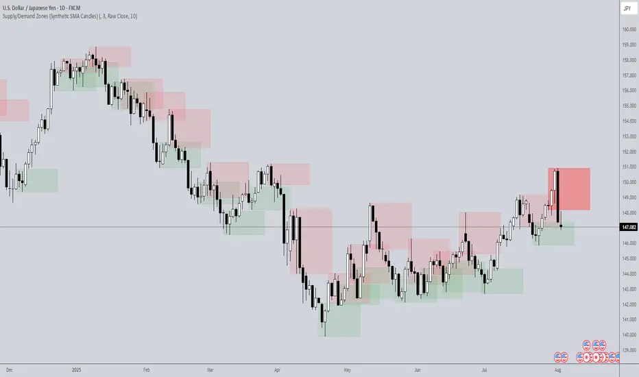
Supply/Demand Zones (Synthetic SMA Candles)Supply/Demand Zones (Synthetic SMA Candles)
Created by The_Forex_Steward
This indicator highlights institutional-style supply and demand zones using synthetic SMA-based candles rather than raw price data. It provides a smoother, more refined view of price action to help identify key imbalance areas where price is likely to react.
Features:
- Uses SMA-smoothed synthetic candles to detect bullish and bearish engulfing structures
- Draws demand zones after bullish breakouts and supply zones after bearish breakouts
- Zones are persistent for a customizable number of bars
- Mitigated zones can optionally be removed from the chart
- Includes alerts for breakout and mitigation events
- Optional plotting of synthetic candles over price for visual clarity
How It Works:
When a synthetic candle closes above the high of a previous bearish candle, a bullish engulfing is detected, and a demand zone is created from that bearish candle’s high and low. Conversely, when price closes below the low of a previous bullish candle, a supply zone is formed. These zones stay on the chart for the user-defined duration or until they are mitigated by price, at which point they can be removed automatically.
How to Use:
- Adjust the SMA Length to control how smooth the synthetic candles appear
- Enable or disable Show Supply Zones and Show Demand Zones as needed
- Set the Zone Duration to control how long each zone persists
- Use Delete Mitigated Zones to automatically remove zones when price returns to them
- Optionally enable Show Synthetic SMA Candles to see the candle logic used in detection
- Use the built-in alerts to stay notified of new zone creation or mitigation
Note: This tool is most effective when combined with structure or trend-based strategies for confirmation.
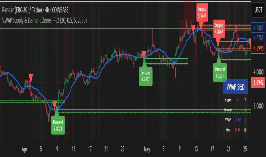
VWAP Supply & Demand Zones PRO**Overview:**
This script represents a major evolution of the original "VWAP Supply and Demand Zones" indicator. Initially created to explore price interaction with VWAP, it has now matured into a robust and feature-rich tool for identifying high-probability zones of institutional buying and selling pressure. The update introduces volume and momentum validation, dynamic zone management, alert logic, and a visual dashboard (HUD) — all designed for improved precision and clarity. The structural improvements, anti-repainting logic, and significant added utility warranted releasing this as a new script rather than a minor update.
---
### What It Does:
This indicator dynamically detects **supply and demand zones** using VWAP-based logic combined with **volume** and **momentum confirmation**. When price crosses VWAP with strength, it identifies the potential zone of excess demand (below VWAP) or supply (above VWAP), marking it visually with colored regions on the chart.
Each zone is extended for a user-defined duration, monitored for touch interactions (tests), and tracked for possible breaks. The script helps traders interpret price behavior around these institutional zones as either **reversal** opportunities or **continuation** confirmation depending on context and strategy preference.
---
### How It Works:
* **VWAP Basis**: Zones are anchored at VWAP at the time of a significant cross.
* **Volume & Momentum Filters**: Crosses are only considered valid if backed by above-average volume and notable price momentum.
* **Zone Drawing**: Validated supply and demand zones are drawn as boxes on the chart. Each is extended forward for a customizable number of bars.
* **Touch Counting**: Zones track the number of price touches. Alerts are issued after a user-defined number of tests.
* **Break Detection**: If price closes significantly beyond a zone boundary, the zone is marked as broken and visually dimmed.
* **Visual Dashboard (HUD)**: A compact real-time HUD displays VWAP value, active zone counts, and current market bias.
---
### How to Use It:
**Reversal Trading:**
* Look for price **rejecting** a zone after touching it.
* Use rejection candles or secondary indicators (e.g., RSI divergence) to confirm.
* These setups may offer low-risk entries when price respects the zone.
**Continuation Trading:**
* A **break of a zone** suggests strong directional bias.
* Use confirmed zone breaks to enter in the direction of momentum.
* Ideal in trending environments, especially with high volume and ATR movement.
---
### Key Inputs:
* **VWAP Length**: Moving VWAP period (default: 20)
* **Zone Width %**: Percentage size of zone buffer (default: 0.5%)
* **Min Touches**: How many times price must test a zone before alerts trigger
* **Zone Extension**: How far into the future zones are projected
* **Volume & ATR Filters**: Ensure only strong, valid crossovers create zones
---
### Alerts:
You can enable alerts for:
* **New zone creation**
* **Zone tests (after minimum touch count)**
* **Zone breaks**
* **VWAP crosses**
* **Active presence inside a zone (entry conditions)**
These alerts help automate market monitoring, making it suitable for discretionary or systematic workflows.
---
### Why It's a New Script:
This is not a cosmetic update. The internal logic, signal generation, filtering methodology, visual engine, and UX framework have been entirely rebuilt from the ground up. The result is a highly adaptive, precision-oriented tool — appropriate for intraday scalpers and swing traders alike. It goes far beyond the original in terms of functionality and reliability, justifying a fresh release.
---
### Suitable Markets and Timeframes:
* Works across all liquid markets (crypto, equities, futures, forex)
* Best used on timeframes where volume data is stable (5m and above recommended)
* Recalibrate inputs for optimal detection across instruments
Supply and Demand Zones🔍 Supply and Demand Zones
by The_Forex_Steward
This indicator automatically identifies Supply and Demand Zones based on aggregated synthetic candles, helping traders pinpoint potential reversal or breakout levels with clarity and precision.
🧠 How It Works:
This tool aggregates price data over a set number of candles (defined by the Aggregation Factor ) to create "synthetic candles" that smooth out noise and highlight significant institutional price activity. These candles are then analyzed to detect bullish or bearish order blocks , which are visualized as zones:
-Demand Zones (Green) : Formed when price breaks above the high of a previous bearish synthetic candle.
-Supply Zones (Red) : Formed when price breaks below the low of a previous bullish synthetic candle.
These areas often represent key institutional interest where price is likely to react.
⚙️ Key Features:
-Aggregation Factor : Groups candles to form larger, synthetic ones. Higher values smooth price and reduce noise.
-Custom Zone Length : Define how far zones extend forward (up to 500 bars).
-Mitigation Logic : Choose whether to auto-delete zones once price breaks through them.
-Visual Customization : Customize zone colors and borders to suit your charting style.
-Alerts : Get notified when new Supply or Demand zones are formed.
📈 How to Use It:
1. Trend Trading : Use zones as dynamic support/resistance to enter with trend pullbacks.
2. Reversals : Look for price reactions at untested zones for potential counter-trend setups.
3. Breakouts : Monitor for zone breaks that signal strong momentum or shifts in market structure.
4. Confluence : Combine with other indicators (like RSI or volume) for more robust trade setups.
🔔 Alerts:
Receive alerts when new demand or supply zones are formed so you can take action in real time.
✅ Recommended Settings:
For intraday trading : Use lower aggregation values (e.g., 3–5).
For swing/position trading : Higher values (e.g., 6–10) may give better structure.

CANX Supply and Demand - Order Block - Candle Identification© CanxStixTrader
CANX Supply and Demand - Order Block - Candle Identification
Description
Designed as a visual aid, to highlight the last up or down candle before a fractal break. We can assume these candles where the point of origin that generated enough strength to break recent structure. By using them as reference points, traders are expected to follow their own set of rules and mark higher probability supply and demand zones in the area.
How to use:
Expect price to retest in these areas, and if they fail, a potential retest in the opposite direction . The greater the number of times a zone is tested, the more likely it is to break. A fresh zone that has not yet been tested will have a higher probability of a bounce.
Fractal period and candle break type can be customized in the settings. This works on all time frames.
**The indicator is set to my optimal settings for the 5 minute or 15 minute time frame** Please mess around to find your comfort zone and back test the results.
The lower the period number the more noise this creates on the market. The higher the number the less noise and more potential for a stronger zone.
Keep it simple
No Supply / No Demand Candle AlertsNo Supply Candle: A No Supply candle generally has a large body (close near high) with low volume. So, you would likely want the body percentage to be high, meaning the price action is concentrated near the high of the candle.
No Demand Candle: A No Demand candle generally has a large body (close near low) with low volume. You would want a high body percentage but with the close near low.