Multi VWAP from Gaps [MW]Multi VWAP from Gaps
Introduction
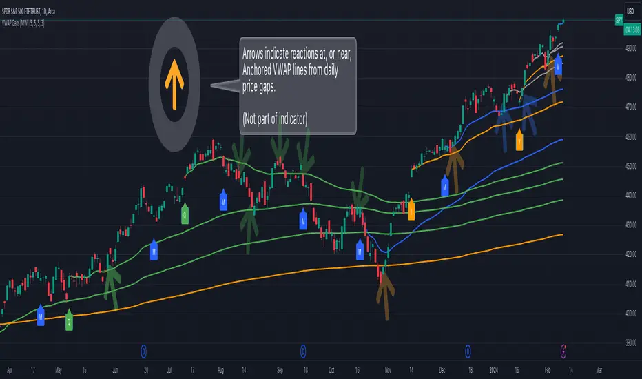
The Multi VWAP from Gaps tool extends the concept of using the Anchored Volume Weighted Average Price, popularized by its founder, Brian Shannon, founder of AlphaTrends. It creates automatic AVWAPS for anchor points originating at the biggest gaps of the week, month, quarter and year. Currently, most standard VWAP tools allow users to place custom anchored VWAPs, but the routine of doing this for every equity being watched can become cumbersome. This tool makes that process multi-times easier. Considering that large gaps can represent a shift in market structure, this tool provides unique and immediate insight into how past daily price gaps can and have affected price action.
Settings
LABEL SETTINGS
Show Biggest Gap of Week | Month | Quarter : Toggle labels that identify the location of the biggest gaps for the selected time period.
Show Big Labels : Toggle labels from showing the date and gap size to just showing a single letter (W/M/Q/Y) designating the time period that the gap is from.
Hide All Labels : Turn labels off and on.
MAX VWAP LINES
Max Weekly | Monthly | Quarterly | Yearly Lines : How many VWAP lines, starting from today, should be shown for the specified time period. Max: 5
SHOW VWAP LINES
Show Weekly | Monthly | Quarterly | Yearly Lines : This feature allows you to remove lines for the specified time period.
Calculations
This indicator does not provide buy or sell signals. It is simply the VWAP calculated starting from an “anchor point”, or start time. It is calculated by the summation of Price x Volume / Volume for the period starting at the anchor point.
How to Interpret
According to Brian Shannon, VWAP is an objective measure of what the average trader has paid for a particular equity over a given period, and is the value that large institutional investors frequently use as a trade signal. Therefore, by definition, when the price is above an AVWAP, buyers are in control for that period of time. Likewise, if the price is below the AVWAP, sellers are in control for that period of time.
VWAPs that coincide with important events, such as FOMC meetings, CPI reports, earnings reports, have added significance. In many cases, these events can cause gaps to happen in day-to-day price movement, and can affect market structure going forward.
Practically speaking, price action can tend to change direction when a significant VWAP is hit, voiding buy and sell signals. Like moving averages, this indicator can show, in real-time, how a buy or sell signal should be interpreted. A significant AVWAP line is a point of interest, and can serve as strong support or resistance, because large institutions may be using those values for entries or exits. For a great analysis of how to use AVWAP, visit the AlphaTrends channel on Youtube here or you can buy Brian Shannon’s “Anchored VWAP” book on Amazon.
Other Usage Notes and Limitations
It's important for traders to be aware of the limitations of any indicator and to use them as part of a broader, well-rounded trading strategy that includes risk management, fundamental analysis, and other tools that can help with reducing false signals, determining trend direction, and providing additional confirmation for a trade decision. Diversifying strategies and not relying solely on one type of indicator or analysis can help mitigate some of these risks.
Additionally, in order to build the VWAP calculations, past data is needed that may not be available on shorter timeframes. The workaround is that for some longer-term VWAP lines on shorter timeframes, you may see less than the total of lines that you selected in settings. This is particularly the case with quarterly VWAP lines on the 5 minute timeframe for some equities.
Acknowledgements
This script uses the MarketHolidays library by @Protervus. Also, for debugging, the JavaScript-style Debug Console by @algotraderdev was invaluable. Special thanks to @antsmuzic for helping review and debug the script. And, of course, without Brian Shannon's books, videos, and interviews, this indicator would would not have happened.
Search in scripts for "etf涨跌幅限制"
Gap Removal IndicatorThis gap indicator shows the price of your chosen instrument as if no gaps had occurred overnight. It can be especially useful on highly-volatile exchange-listed instruments that track other 24/7 assets, because the normal candlestick chart of these instruments will create a large amount of noise that may decrease the accuracy of your indicators or make the trend harder to see.
Gaps are determined with the following code:
daychange = ta.change(dayofmonth)
gapup = daychange and open > math.max(open,close)
gapdown = daychange and open < math.min(open,close)
Whereas the gap value is determined by taking the overnight difference in prices:
downgap_change = math.min(open,close) - open
upgap_change = open - math.max(open,close)
The gap changes are cumulatively added and subtracted from the initial closing price to create the gap-adjusted price. The price will depend on how many bars your subscription allows, so pay more attention to the relative differences and/or trend than the cumulative gap-adjusted price itself.
The gap indicator comes pre-built with normal candlestick and Heikin-Ashi candle types, and four indicators (two EMAs, Bollinger bands, and a supertrend). All elements are configurable.

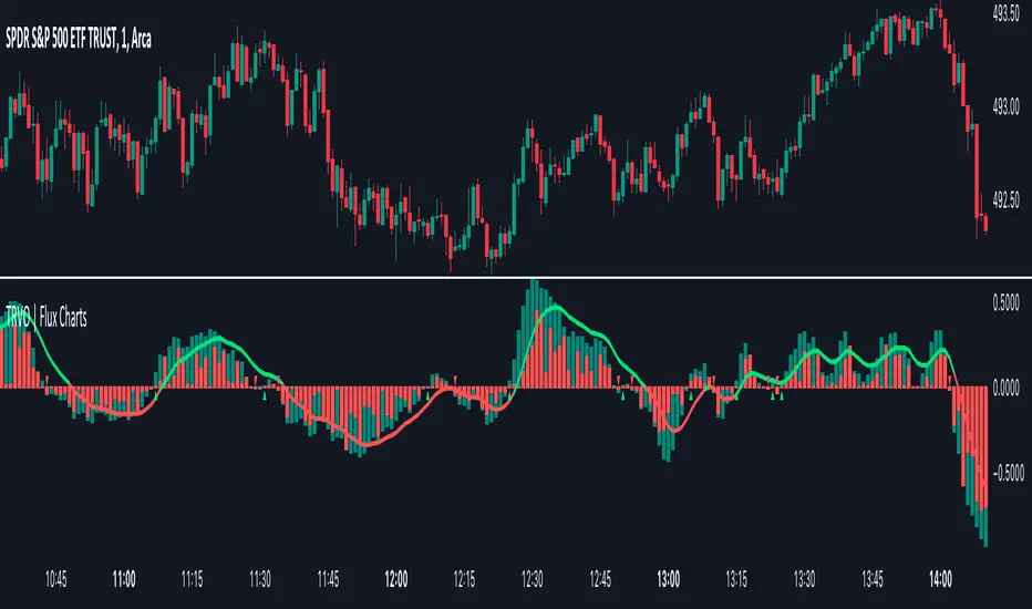
Time Relative Volume Oscillator | Flux Charts💎 GENERAL OVERVIEW
The relative volume indicator aims to improve upon the default existing relative volume indicator by comparing volumes between previous trading sessions rather than previous candles. As such, it works best on lower time frames as there is more data to compare with. The purpose of the indicator is to show how the current bar’s volume compares to the volume at the same time on previous trading days.
There exists a couple different modes and combinations that each provide a different perspective on the trading volume.
Oscillator mode
Oscillator mode starts with the same relative volume calculation, but adds two EMAs of different lengths that diverge and converge. Like the MACD, it plots the difference as a histogram. This functions as an easy way to view when relative volume is increasing or decreasing.
How to use:
The oscillator oscillates between -1 and 1. It moves along with volume direction, so this mode can be used to view the current volume direction in a lagging fashion. In oscillating markets, this indicator can give an idea of how buy/sell volume is moving and where it currently stands. Small arrows mark where reversals are predicted, when the histogram crosses over 0. The biggest pitfall of this mode is that, in a straight trending market, the two EMAs converge and it gives a false reversal signal.
Delta mode
Delta volume mode is a step up from the buy/sell volume mode. It separates both sides into the top and bottom, while also displaying the actual volume behind it in a semi transparent overlay. The best feature, however, is the delta oscillator. This oscillator fluctuates depending on how buy/sell volume is changing and plots bullish/bearish labels when the dominant side (bullish/bearish) changes. The signals, while a bit common, can sometimes dictate large direction changes, started by a dominant volume switch.
On top of different display modes, there is also one more volume mode: buy/sell volume. Instead of only showing the total volume and relative volume, it calculates and separates buying and selling volume.
This volume mode displays differently in all three viewing modes, but the basic principle is the same. It adds a vital piece of information to the chart without adding clutter. The calculation for buy/sell volume uses the candle wicks and body to compare bullish and bearish movement.
Classic mode
Classic mode takes the default volume indicator and improves upon it by also displaying the relative volume on top of the actual volume. Relative volume is calculated similarly between the three display modes: simply by comparing the current bar’s volume to the volume at the same time during previous trading days. Classic mode displays this “relative volume” as well as a simple EMA over top of the actual trading volume.
Originality
The script improves upon the existing relative volume indicator by using previous trading days rather than previous candles to generate the relative volume. On top of that, the calculation methods are unique, using different formulas like variations of the sigmoid function to smooth noise. The main issue this script aims to fix is that towards the start or end of the day relative volume indicators all see spikes as volume grows into close. The new relative volume calculations fix this problem and show what the “true” relative volume is because they compare the current bar to the “same” bar on previous trading sessions.
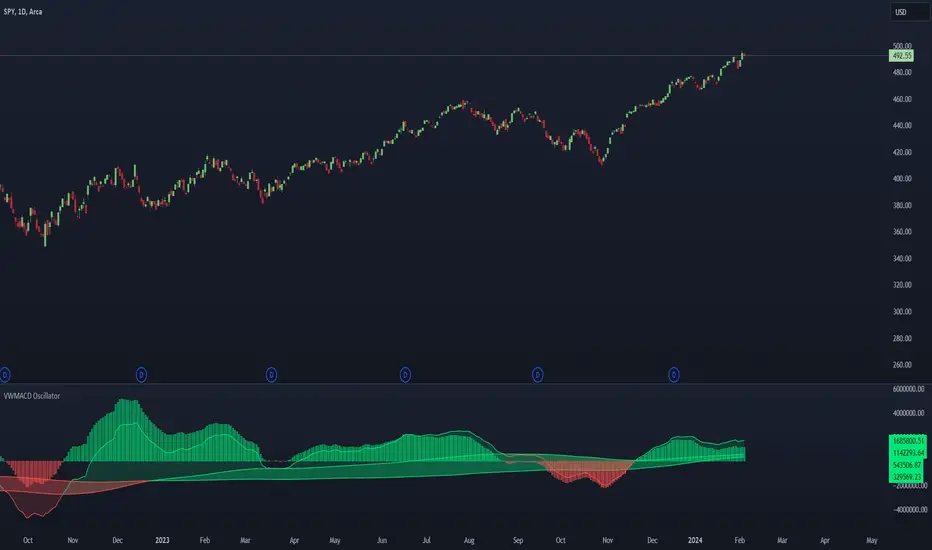
VWMACD Oscillator @shrilssThe VWMACD Oscillator is a unique and innovative trading indicator designed to provide insights into market momentum using the Volume Weighted Moving Average Convergence Divergence (VWMACD) concept. This script amalgamates various elements to offer a comprehensive view of market trends and potential reversal points.
Key Features:
- Fast Period: Adjust the fast moving average period to fine-tune the sensitivity of the indicator to short-term price movements.
- Slow Period: Set the slow moving average period to control the responsiveness of the indicator to longer-term trends.
- Signal Period: Determine the signal line period to smooth out fluctuations and identify potential trade signals.
- Longer Period: Define the longer period to capture extended trends and market cycles.
How it Works:
The VWMACD Oscillator is derived from the convergence and divergence of two volume-weighted moving averages. It combines the volume factor with the source input to create a robust momentum oscillator. The fast and slow moving averages are calculated by weighting the source with the corresponding volume, providing a unique perspective on market strength.
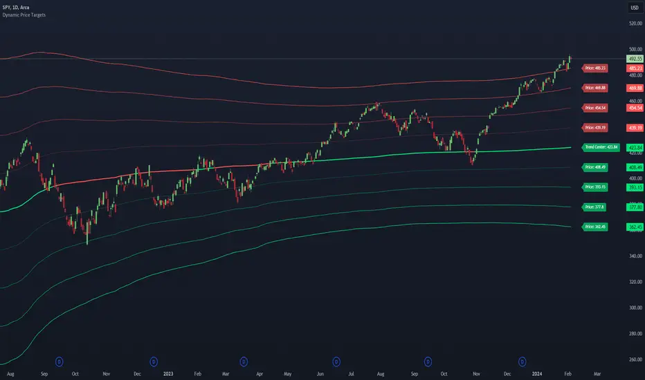
Dynamic Price Targets @shrilssDynamic Price Targets is a designed to provide traders with a comprehensive view of dynamic price levels based on Volume Weighted Moving Average (VWMA) and standard deviation. This script allows users to identify potential support and resistance zones, aiding in strategic decision-making during market analysis.
The script calculates the VWMA of a chosen price source over a specified length, establishing a dynamic baseline for market trends. The standard deviation is then used to derive multiple upper and lower targets, each representing a certain deviation from the VWMA. These levels are color-coded for clarity, with upper targets displayed in shades of red and lower targets in shades of green.
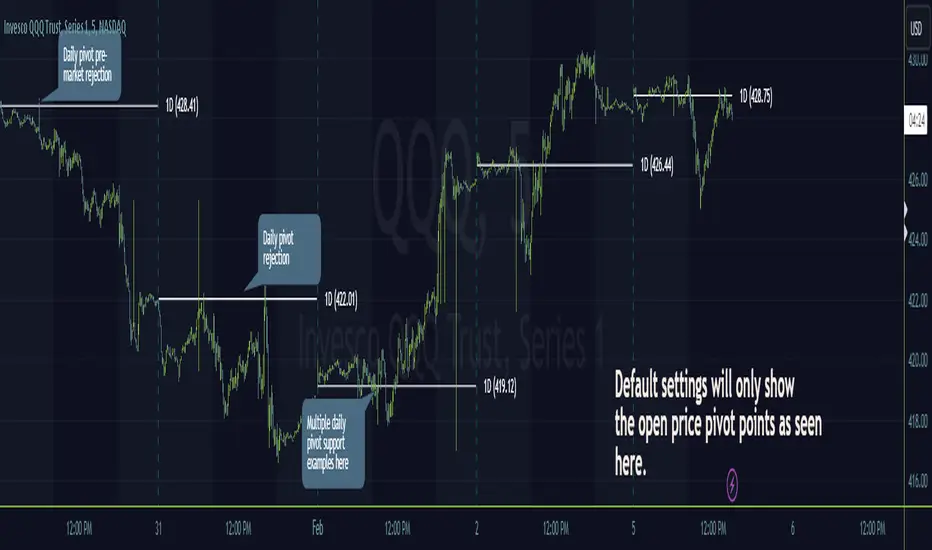
Timeframe PivotsUse this tool to plot open prices from any timeframe as a pivot level with the option to go advanced and turn on extensions (instructions below), which review the relationship between previous and current open prices to build range extensions up to six levels wide.
Please be aware extensions, nor vwap are not enabled by default! It is up to the user to determine how they wish to setup this indicator. Please read the full description for utilizing this indicator so that it's well known the complete feature set and understanding of how to enable additional plots, complete instruction is provided for all users below.
Default configuration example:
To enable extensions the user must open the indicator configuration by clicking the gear icon for "Timeframe Pivots", depending on screen resolution scrolling with mouse may need to occur in order to find the section labeled "Extensions", use the mouse or equivalent human interface device to check the checkbox to the right of the color plots and line type drop down.
Extensions enabled example:
Timeframe Selection
Timeframes available to the indicator are any timeframe the platform makes available to the user by default, or also if the TradingView user has higher tier plan to create custom timeframes - those should be available as well. To adjust timeframe the user must open the indicator configuration by clicking the gear icon for "Timeframe Pivots", depending on screen resolution scrolling with mouse may need to occur in order to find the input labeled "Timeframe", use the mouse or equivalent human interface device select the drop down and select timeframe suitable to users application.
How the extension width and extensions are calculated:
The exact process takes the new timeframe change open price calculates the difference between prior open, once that has been completed then it's divided in half to build extensions.
Code example:
Extension Width = (Open - Open ) / 2
How the extensions are calculated:
// +1 for positive extension, -1 for negative extension
(Extension Width * (Configured Multiplier * 1)) + Pivot Open Price
+1 Extension:
$5 * (1.0 * 1) + $400 = $405
-1 Extension:
$5 * (1.0 * -1) + $400 = $395
So it should be established how each projected extension, either positive or negative, is created.
Range bound market detection and notes:
One note regarding the ranges, sometimes the open prices of each period can be close in proximity to their predecessor, there's not enough range to build meaningful projections. In these situations this means the market is most likely range bound and prior range data is utilized to continue providing guidance. This addresses an issue with other pivot indicators that will instead blindly follow price and present useless pivot ranges.
It does this through detection of average half range widths, the last 14 ranges to be exact, if the current, (open - open / 2), half range width is smaller than the average, prior half range width will be used.
Code example:
// assume past half range widths are 10, 8, 9, 5, 14, 7, 7, 9, 10, 10, 4, 7, 7, 8
float v_halfRangeWidthToUseForExtensions = na
v_priorHalfRangeWidth = 10
v_avgHalfRangeWidth = 8.2 // past range widths sum = 115 / 14
v_newHalfRangeWidthToUseForExtensions = 2 // new open - open is tiny compared to avg
if v_newHalfRangeWidthToUseForExtensions < v_avgHalfRangeWidth
// replace new half range width with previous one
v_newHalfRangeWidthToUseForExtensions := v_priorHalfRangeWidth
In the code example above if the new half range width was above or equal to the rolling average, no adjustment would be made by the indicator.
VWAP
Additional feature of showing vwap, anchored to the same timeframe as the pivot, provides a trend and volume analysis within the confines of the pivots range.
The user must open the indicator configuration by clicking the gear icon for "Timeframe Pivots", scroll using mouse to the "VWAP" section and click the checkbox next to the "Source" field, past the color plots. They are not enabled by default!
The user can also add the bands for VWAP by clicking the checkbox next to the "Bands" field, past the color plots. They are not enabled by default!
VWAP calculations begin from open price of new timeframe change, then afterwards the "Source" set is utilized, the default is HLC3 which is standard for VWAP indicators.
Multiple Timeframe Analysis (MTFA)
It's simple to create a unique combination of favored timeframes for multiple timeframe analysis, consider daily, weekly and monthly combined analysis for powerful indications of market sentiment and directional bias.
Example MTFA demonstration:
Why was this created?
I created this while investigating the efficacy of open price ranges, it became apparent that these pivot ranges are some of the more price respecting pivots I've ever observed. I also grew tired of lack of price adherence to other pivot indicators widely available.
There exists a relationship between each timeframes open price in comparison to prior open price, if the market is willing to navigate to a prior lower open price from higher open price, it could be perceived as bearish and the extensions (if enabled as instructed above), could be suitable range based projections for future price movements.
Example comparison:
As can be seen, and there are many examples, where Timeframe Pivots provides more discreet levels and potential explanations for price movements.
Supertrend with Target Price & ATREE [SS]Hey everyone,
Releasing this supertrend mashup indicator.
This is your basic supertrend, but with two additions:
1. The integration of the ATREE technical probability modeller; and
2. The use of ATR price targets for crossovers
ATREE
ATREE stands for Advanced Technical Range Expectancy Estimator. It has its very own indicator available here . If you are not that familiar with it, I would suggest heading over to that page and reading about it, because it gives you the in-depth details.
But for a recap, ATREE uses technical indicators such as RSI, Stochastics or Z-Score to predict the likely sentiment, whether it be bullish or bearish. The indicator allows you to select the ATREE model type and supports 3 separate probability models based on either:
1. RSI
2. Stochastics; or
3. Z-Score
If you want to know which model is most effective for the ticker and timeframe you are using, you can launch up the native ATREE indicator and review the backtesting results to ascertain which model performs optimally for that particular ticker on that particular timeframe.
When ATREE assesses the sentiment as bearish, you will get a red fill. When it assesses the sentiment as bullish, you will get a green fill. This will help you adjust your bias to focus on either dip buying or rip shorting.
The ATREE timeframe is also customizable, so you can pull data from higher timeframes than you are on.
ATR Price Targets
As with my EMA 9/21 crossover with the target price, this is essentially the same concept. When the trend shifts to bullish or bearish, bull and bear targets will be printed so you know where to look for potential reversal and you can also set realistic target prices if you are scalping or day trading.
Supertrend
The last and base feature is the supertrend. The supertrend settings are customizeable.
It will provide a green line for uptrend and a redline for downtrend, the basic supertrend functionality.
And that's the indicator!
Let me know what you think and hope you enjoy!
Safe trades as always!

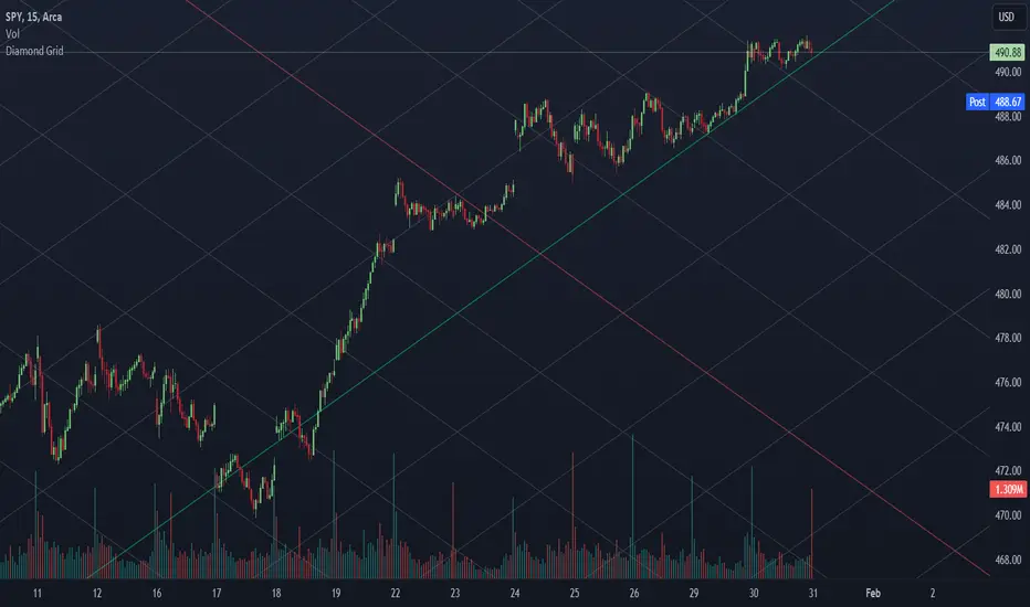
Diamond Grids @shrilssUncover hidden patterns and potential reversal zones with the Diamond Grids Indicator. This script introduces a unique approach to visualizing price extremes within a specified range, aiding traders in identifying critical support and resistance levels. The indicator dynamically calculates and displays diamond-shaped grids based on user-defined short and long lengths and ATR. Utilize this powerful tool to enhance your technical analysis and gain insights into potential trend reversals.
Key Features:
- Dynamic Grid Calculation: The indicator dynamically calculates and plots diamond-shaped grids based on specified short and long lengths. These grids represent key price extremes within the defined range.
- Multi-Level Support and Resistance: Each diamond grid consists of multiple support and resistance lines, providing a comprehensive view of potential reversal zones. Traders can use these levels to make informed decisions.
- Customizable Parameters: Tailor the indicator to your trading style with customizable parameters such as short length, long length, and a multiplier. Adjust these settings to align the indicator with your unique preferences.
- Real-Time Updates: The indicator updates in real-time, ensuring that traders have the latest information on potential reversal zones. Stay ahead of market movements and make timely decisions.
- Toggle Trend Visualization: Diamond-shaped grids are color-coded for easy interpretation. Positive and negative grid lines are distinctly marked, offering a clear visual representation of the overall trend.
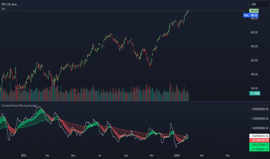
Clustered Asset Moving Average @shrilssThe Clustered Asset Moving Average script is designed to provide traders with a unique perspective on a cluster of multiple assets. By combining the closing prices and volumes of 12 specified assets, this indicator calculates a Clustered Moving Average to reveal potential trends and market sentiment within this asset cluster.
Key Features:
- Asset Cluster Analysis:
The script considers 12 assets, including well-known names such as Google (GOOG), Microsoft (MSFT), Apple (AAPL), Tesla (TSLA), and others.
It calculates the price and volume of each asset to form a comprehensive view of the asset cluster.
- Clustered Moving Average Calculation:
The Asset Price and Volume are combined to calculate the Clustered Moving Average
This moving average reflects the relationship between the aggregated price and volume of the specified assets.
- Multiple Exponential Moving Averages (EMA):
The script includes three EMAs (10, 25, and 100) applied to the Clustered Moving Average, providing different time perspectives.
Users can customize the visibility of each EMA based on their trading preferences.
- Visual Representation:
The indicator offers a visual representation of the Clustered Moving Average, allowing traders to quickly identify trends and potential reversal points.
Different EMAs are color-coded, enhancing visual clarity.
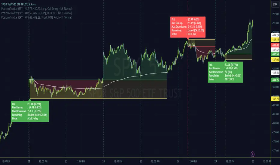
Position TrackerUse this tool to plot a trading position on the chart, using the guided confirmation prompts after adding to the chart.
To use this tool, after adding to the chart it will prompt for entry and exit time and entry price selection which will require using a mouse or touch screen to complete the action; the prompts appear at the bottom of the chart and are a blue bubble/box looking object :)
It will provide a readout of the live profit and loss, run-up and drawdown of a trade as well as present notes if added.
Visuals provide an easy look at periods of drawdown, and a anchored vwap is included as a simple guide for trade management.
Setting the symbol will allow many instances of the tool on the same layout and each instance will hide it's display while not on the matching symbol chart.
Once the end time for the trade is met, the label with trade breakdown thoughtfully moves away from active price and can be seen by scrolling to trade entry area.
If there's enough interest I will add some additional features but wanted to start simple. Or feel free to copy and make it your own!
Thanks and happy trading.
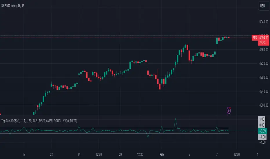
Top Cap ADD%This is a very basic oscillator that plots the average % change of the top 5 highest market cap stocks in the S&P500. It can be easily modified to suit your needs on which stocks you'd like to track, and or filter out the threshold you're looking for.
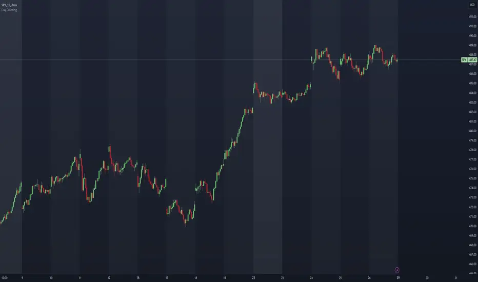
Day Coloring @shrilssDay Coloring Indicator, A tool designed to bring visual clarity to your charts by dynamically coloring the background based on the day of the week. This script adds a layer of organization to your charts, making it easier for traders to track and analyze market movements on different weekdays.
Key Features:
- Customizable Timezone:
Choose from a range of timezones, including popular ones like New York, Los Angeles, Chicago, Phoenix, Vancouver, Santiago, and Mexico City.
- Intuitive Background Coloring:
Each weekday is assigned a distinctive background color, allowing for quick identification and differentiation between different trading days.
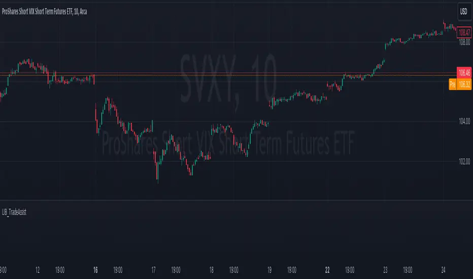
LIB_TradeAssistLibrary "LIB_TradeAssist"
This library is a collection of assistence tools saving me the need to copy same code again and again in my various indicators and strategies.
Slop_Magnitude(val_now, val_older, mult_factor)
Calculate the slop magnetude betwen current price and an older price. Since the change is usually minimal, we multiply it by def value of 3000 to make it usable.You can optionally pass other multiply factor
Parameters:
val_now (float)
val_older (float)
mult_factor (float)
Returns: : Slop angle magnetude
Multi VWAP [MW]Introduction
The Multi VWAP tool extends the concept of using the Anchored Volume Weighted Average Price, popularized by its founder, Brian Shannon, founder of AlphaTrends, and creates automatic AVWAPS for multiple anchor points, such as for 2-day, 3-day, 4-day, 5-day, and custom date anchors as well as automagically creating month-to-date and year-to-date anchors. Currently, most standard VWAP tools allow users to place custom anchored VWAPs, but the routine of doing this for every equity being watched can become cumbersome. This tool makes that process multi-times easier. Brian Shannon is also the author of “Maximum Trading Gains With Anchored VWAP: The Perfect Combination of Price, Time, and Volume”. Available at Amazon.
Settings
Daily VWAP : A continuous line of the the daily Volume Weighted Average Price (VWAP)
Weekly VWAP : A continuous line of the weekly VWAP
2-Day AVWAP : The anchored VWAP from 2 trading days ago (holidays and weekends are excluded in this calculation)
3-Day AVWAP : The anchored VWAP from 3 trading days ago
4-Day AVWAP : The anchored VWAP from 4 trading days ago
5-Day AVWAP : The anchored VWAP from 5 trading days ago. The slope of this line and the position of the price relative to this line can be used to determine trend direction.
10-Day AVWAP : The anchored VWAP from 10 trading days ago
Month-to-Date AVWAP : The anchored VWAP from the beginning of the current month
Year-to-Date AVWAP : The anchored VWAP from the beginning of the current year
Custom Date AVWAP : Sets a date to begin an anchored VWAP starting from any time.
Use only the most recent VWAP for Week, Month, and Year: Toggles on and off the continuous weekly, monthly, and yearly VWAPs
Calculations
This indicator does not provide buy or sell signals. It is simply the VWAP calculated starting from an “anchor point”, or start time. It is the calculated by the summation of Price x Volume / Volume for the period starting at the anchor point.
How to Interpret
According to Brian Shannon, VWAP is an objective measure of what the average trader has paid for a particular equity over a given period, and is the value that large institutional investors frequently use as a trade signal. Therefore, by definition, when the price is above an AVWAP, buyers are in control for that period of time. Likewise, if the price is below the AVWAP, sellers are in control for that period of time.
Shannon also distinguishes the importance of an increasing or decreasing 5 day VWAP, which reflects the price sentiment, objectively, for roughly the last trading week, or 5 trading days. Pricing below a decreasing 5-day VWAP is considered very bearish, while pricing above an increasing 5-day VWAP is considered bullish and is recommended before considering long positions.
Additionally, a custom VWAP can be generated to coincide with important events, such as FOMC meetings, CPI reports, earnings reports, etc.
Practically speaking, price action can tend to change direction when a significant VWAP is hit, voiding buy and sell signals. Like moving averages, this indicator can show, in real-time, how a buy or sell signal should be interpreted. A significant AVWAP line is a point of interest, and can serve as strong support or resistance, because large institutions may be using those values for entries or exits. For a great analysis of how to use AVWAP, visit the AlphaTrends channel on Youtube here or you can buy Brian Shannon’s “Anchored VWAP” book on Amazon.
Other Usage Notes and Limitations
It's important for traders to be aware of the limitations of any indicator and to use them as part of a broader, well-rounded trading strategy that includes risk management, fundamental analysis, and other tools that can help with reducing false signals, determining trend direction, and providing additional confirmation for a trade decision. Diversifying strategies and not relying solely on one type of indicator or analysis can help mitigate some of these risks.
Additionally, the indicator may take a little longer to load than usual. On the rare occasion where it fails to load, you may need to remove the indicator and add it back to your chart. Also, if you do encounter this problem, avoid redrawing your chart while the indicator is being added to the screen.
Acknowledgements
This script uses the MarketHolidays library by @Protervus. Also, for debugging, the JavaScript-style Debug Console by @algotraderdev and the TimeFormattingLibrary by @twingall were invaluable. And, of course, without Brian Shannon's books, videos, and interviews, this indicator would would not be possible.

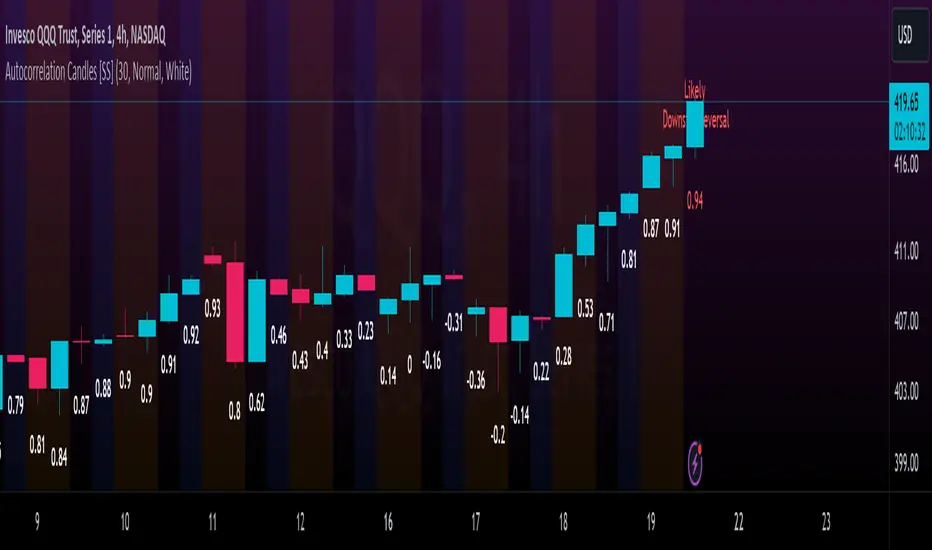
Autocorrelation Candles [SS]Hey everyone, this is the Autocorrelation Candles indicator!
I have formulated it in a way that is similar to the TD 9 candle counting indicators, only instead of TD, its using a lagged autocorrelation of previous candle over a 14 period look back.
It operates similar to trend correlations (for example, my Trend Correlation Oscillator Indicator), however instead of correlating to time, it correlates to itself (autoregression). The theory being, as the autoregression correlation increases and the market becomes too "trendy", we are due for a reversal.
The indicator will display the current lagged correlation of each candle below it. When we approach a period of previous reversal, it will change the colour to orange. When we reach a very high autocorrelation (0.94 or greater), it will turn red and signal a potential reversal to the upside or downside:
Uses:
I will reference this on the larger timeframes (Daily, weekly and 4 hour) about a couple times a week or after a major trend day to see where we are.
You can use this on the smaller timeframes as well, it will work just fine.
Customizations:
I have been listening and learning my lesson, I have made the ability to customize the base text colour to black or white depending on your theme use! SO if you have white theme, you can change to black and vice versa.
As well, if you don't want labels on every candle, in the settings menu there is an option to limit the labels to a desired amount. You select the max amount and it will adjust.
You can also adjust the size of the labels between tiny, medium, and large.
Conclusion
And that's the indicator! Despite being fairly simple in concept, I have been working away on it for a bit with some logistic issues that I finally got sorted.
Hopefully, you enjoy,
Leave your questions below!
Safe trades everyone!
Volatility Spectrum - Whvntr"Volatility Spectrum" is a useful technical indicator crafted for traders who prioritize precision in volatility analysis. This tool revolutionizes the traditional Average True Range (ATR) concept by offering a nuanced, multi-faceted view of market volatility.
Key Features:
Enhanced Volatility Insights: Seamlessly integrates standard ATR with an average ATR for a more detailed volatility analysis.
Customizable Parameters: Users can tailor the ATR and average ATR lengths to align with various trading styles and timeframes.
Multiple Smoothing Techniques: Options like RMA, SMA, EMA, or WMA are available to customize the ATR's responsiveness.
Dynamic Color Indicators: Unique color gradients visually represent different levels of volatility, aiding in quick and effective analysis.
Configurable Volatility Alerts: Set up alerts for specific high or low volatility conditions to assist in making informed decisions.
Intuitive Backgrounds: The background color shifts in response to volatility levels, offering an instant read on market dynamics .
Personalized Color Settings: Customize the color scheme for high and low volatility indicators to fit personal preferences and trading dashboards.
When and Where to Use:
Diverse Market Application: Suitable for various markets, including stocks, forex, and commodities.
Strategy Enhancement: Integrates with trading strategies for improved risk management and optimized entry/exit points.
Adaptable for All Trading Styles: Effective for both short-term day trading and long-term investment approaches.
Informed Trading Decisions: Best used in conjunction with other indicators for a well-rounded approach to volatility-based trading.
"Volatility Spectrum" is an essential tool for traders looking to enrich their understanding of market volatility. Its adaptability and depth make it a valuable component in any trader's toolkit, suitable for a range of markets and trading strategies.
"While 'Volatility Spectrum' provides valuable insights into market volatility, its indications should not be interpreted as definitive predictions or guarantees of future market behavior."
