Perfect Hammer Pattern Indicators and Alerts# Perfect Hammer Pattern Indicators and Alerts
This indicator identifies a specific and precise hammer candlestick pattern formation that can signal potential trend reversals or continuation setups. Unlike traditional hammer pattern indicators, this script focuses on exact wick measurements to identify high-probability trade setups.
## Pattern Specifications
### Bullish Setup Requirements
- Two consecutive green (bullish) candles
- Both candles must have NO lower wick (perfect bottom)
- Both candles must have an upper wick (showing buying pressure)
- Previous candle must be red (bearish) for context
- Marked with a green 'H' below the pattern
### Bearish Setup Requirements
- Two consecutive red (bearish) candles
- Both candles must have NO upper wick (perfect top)
- Both candles must have a lower wick (showing selling pressure)
- Previous candle must be green (bullish) for context
- Marked with a red 'H' above the pattern
## Trading Logic
This pattern is particularly effective because it shows clear control by either buyers (bullish pattern) or sellers (bearish pattern):
- In the bullish pattern, the absence of lower wicks indicates strong buying pressure preventing prices from falling below the open, while the upper wicks show profit-taking at highs
- In the bearish pattern, the absence of upper wicks shows strong selling pressure capping any upward movement, while the lower wicks indicate some buying support below
## Alerts
The indicator includes two alert conditions:
1. Bullish Pattern Alert: Triggers when two perfect bullish hammers appear after a bearish candle
2. Bearish Pattern Alert: Triggers when two perfect bearish hammers appear after a bullish candle
## Usage Tips
- Best used on timeframes 15 minutes and above
- Consider using in conjunction with key support/resistance levels
- Volume confirmation can increase pattern reliability
- The pattern may signal either trend continuation or reversal - always consider the larger market context
## Notes
- This indicator focuses on precise hammer formations rather than approximate patterns
- The requirement for consecutive perfect hammers makes this a relatively rare but high-probability setup
- Visual markers ('H') provide easy pattern identification on charts
Search in scripts for "indicators"

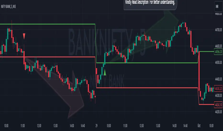
Breakout/Breakdown Indicator (30 Min Range) by InvestYourAsset👉The indicator provided here is a technical analysis indicator for TradingView users that identifies potential breakout and breakdown opportunities on the initial 30-minute range in every trading session.
👉The indicator high and low of the initial 30-minute period and plotting them as horizontal lines on the chart. The high is marked in green line and the low is marked in red line.
📈The indicator then generates buy and sell signals based on whether the current close price crosses above or below the previous 30-minute high and low, respectively.
📢The indicator also has two inputs:
👉 sessionStartHour : The hour at which the trading session begins. The default value is 9, However users can change the time according to their own trading style.
👉 sessionStartMinute : The minute at which the trading session begins. The default value is 0.
These inputs can be used to adjust the indicator to the specific trading session that you are interested in.
✅How to use the Indicator:
👉To use the 30 Minute Breakout/Breakdown Indicator, simply add it to your chart and configure the inputs to your liking. Once the indicator is added to the chart, it will plot the 30-minute high and low as horizontal lines, as well as generate buy and sell signals based on the current close price.
✅Here is a step-by-step guide:
📈Open TradingView and select the chart that you want to add the indicator to.
📈Click on the "Indicators" tab and search for "30 Minute Breakout/Breakdown Indicator by InvestYourAsset".
📈Click on the indicator to add it to your chart.
📈Configure the inputs to your liking. The default values are typically fine, but you can experiment with different values to see what works best for you.
📈Once you are satisfied with the settings, click on the "Apply" button.
📈The indicator will now be displayed on your chart. You will see two horizontal lines representing the previous 30-minute high and low, as well as triangles representing buy and sell signals.
✅How to interpret the signals:
📈Buy signal : A buy signal is generated when the current close price crosses above the previous 30-minute high. This suggests that the price is likely to continue moving higher in the short term.
📈Sell signal : A sell signal is generated when the current close price crosses below the previous 30-minute low. This suggests that the price is likely to continue moving lower in the short term.
👉Traders should remember that the present indicator is just one tool that can be used to identify potential trading opportunities. It is important to use other technical analysis tools and risk management techniques to confirm your trading signals before entering any trades.
✅Things to consider while using the indicator:
📈Look for buy signals in an uptrend and sell signals in a downtrend. This will increase the likelihood of your trades being successful.
📈Place your stop losses below the previous 30-minute low for buy signals and above the previous 30-minute high for sell signals. This will help to limit your losses if the trade goes against you.
📈Consider taking profits at key resistance and support levels. This will help you to lock in your profits and avoid giving them back to the market.
Follow us for timely updates regarding indicators that we may publish in future and give it a like if you appreciate the indicator.
Auto Trailing stoploss By InvestYourAsset💥The Auto Trailing Stop-Loss indicator is a technical indicator that uses the ATR (Average True Range) to calculate a trailing stop-loss for both long and short positions.
💥The signals according to the indicator allows traders to exit from the position before its too late! The indicator can be used to determine when to enter and exit trades.
💥To use the indicator, you simply need to set the input parameters to suit your trading style and risk tolerance. The default values for the parameters are:
p: The ATR period (14)
q: The stop period (20)
x: The multiplier used to calculate the initial high and initial low (1.5)
Calculations:
📈Calculates the ATR using the specified period you can modify ATR period according to your trading style.
📈Calculates the initial high and low stop levels based on the highest high and lowest low over the user defined ATR period.
📈Calculates short and long stoploss levels using the initial high and low stops.
💥Once you have set the input parameters according to your trading style whether you are a day trader or a swing trader, the indicator will plot the short stoploss, long stoploss, and stoploss hit signals on your chart.
💥You can use the indicator to enter and exit trades in a various ways.
For example,
🚀 you could enter a long trade when the price crosses above both red and green lines plotted on the chart. (or when price crosses over both short stoploss and long stoploss.) You could also use the indicator to secure your profits by moving your stop-loss up as the price moves in your favor.
Here is an example of how you could use the indicator to enter and exit trades:
🚀Enter a long trade when the price crosses above the red line or short stoploss.
✅keep Moving your stop-loss upward with the long stoploss or green line.
✅Exit the trade when the price crosses below the long stoploss or green line.
💥You can also use the indicator to protect your existing trades. For example, if you are already in a long trade, you could move your stop-loss up to the short stop when the price moves up 10%. This will help you to protect your profits in case the price starts to move against you.
💥💥some additional tips for using the Auto Trailing Stop-Loss indicator:
✅Use the indicator in conjunction with other technical indicators or your own trading strategy to generate entry and exit signals.
✅Backtest your trading strategy before using it live to make sure that it is profitable.
✅Use the indicator to protect your profits by moving your stop-loss up as the price moves in your favor.
✅ Always follow risk management rules and manage your position sizing according to your risk appetite.
✅ Be aware of the overall trend direction. If the trend is up, you should be looking for bullish reversals or continuations. If the trend is down, you should be looking for bearish reversals or continuations.
This script essentially provides a visual representation of a trading strategy that automatically adjusts stop-loss levels based on market volatility (ATR). It also includes signals for entering long or short positions and visually highlights these signals on the chart.
📣📣Follow us for timely updates regarding future indicators and give it a like if you appreciate the work.📣📣

McClellan Indicators (Oscillator, Summation Index w/ RSI & MACD)Four indicators in one based on the McClellan Oscillator for both the NYSE and Nasdaq exchanges. Designed to be used in conjunction with each other- plot the Oscillator (Osc), Summation Index (MSI), and RSI/MACD of the MSI on both your SPX and Nasdaq chart. Select the exchange and indicator within the settings. These tools are secondary- but when the signals are combined with the action of the index and stocks can be helpful in identifying market turns and trend strength.
McClellan Oscillator--
The Osc is a market breadth tool that uses a fast and slow EMA based on the difference between advancing and declining stocks on the exchange. Used primarily to identify breadth thrusts, divergences, and extremes (oversold/overbought). Plot horizontal levels to see when the market internals are extremely overbought or oversold, and take note of when the Osc is declining while the market is advancing or vice versa.
McClellan Summation Index--
For intermediate trends the MSI is a running total of the Osc which can be used to confirm the strength of a trend, and spot potential reversals. A 10 period ema is included on this indicator, where crossovers can aid in spotting the change in trend of market internals, and divergences can identify when market internals are not in line with the trend. Shading is applied for when the internals are in a bullish or bearish trend.
Two additional indicators are the RSI and MACD of the Summation Index. An overbought or oversold MSI RSI generally indicates a strong trend in the market internals, however you may want to take note when the RSI stalls and begins to "hook" in the opposite direction. This indicator has signals to show when the market internals may be turning and to be on lookout for trend change.
Similarly- the MACD of the MSI identifies the strength of the trend, and crossovers can be used to help spot reversals. Shading is included in this indicator to spot the bullish/bearish trend of internals.

3 indicators in another time frame "3 indicators in another time frame"
1- In the indicator settings section, you can save and change another time period
2-For time frame changes, it should be calculated in minutes
3-Includes three performance indicators ( ichimoku , bollinger bans, pivot ) that are set to a 15-minute timeframe by default.

CM_SlingShotSystem+_CassicEMA+Willams21EMA13 htc1977 editionThis strategy is a combination of 2 indicators based on EMA(actually x3 EMAs and Williams ind.
We usin this to see where EMA fast is above EMA slow(for long), entry position when price hit fast EMA and exit if trend changes or price overbought, or by stoploss 1%.
The opposite for a short position.
For better result You can change every EMA's, stoploss, Willam's ind and other visualisation in settings.
If You find good combination - please, let me know(if You want).
I will check it with ML, and attach it here.
Original indicators will write in comments

Fisherized CCIIntroduction
This here is a non-repainting indicator where I use inverse Fisher transformation and smoothing on the well-known CCI (Commdity Channel Index) momentum indicator.
"The Inverse Fisher Transform" describes the calculation and use of the inverse Fisher transform by Dr . Ehlers in 2004. The transform is applied to any indicator with a known probability distribution function. It enables to transform an indicator signal into the range between +1 and -1. This can help to eliminate the noise of an indicator.
The CCI is an momentum indicator which describes the distance of the price to the average price.
For smoothing I used the Hann Window and NET (Noise Elimination Technique) methods.
Additional Features
Divergence Analysis
Trend-adaptive Histogram
Timeframe selection
Usage
It is usually used to spot potential trend reverals or mean-reversion (against the trend) trades on lower timeframes. IMO it can be even used to spot trend-following trades. It always depends on which settings you have, which timeframe do you use and which indicators you combine with it.
The suggested timeframe for this indicator is 15 min (with the length setting on 50).
The histogram with adaptive mode enabled could be used as filter applied on the buy and sell signals.
The divergence analysis can help to spot additional entries/exits or confirm the buy and sell signals.
Always try to find the best settings! This indicators has a lot of customization options you should take advantage of.
Signals
The indicator uses the following logic to generate the buy and sell signals:
Normal
Buy -> When CCI and MA go above the top band (usually +100) and cross
Sell -> When CCI and MA go below the the bottom band (usually -100) and cross
Fisherized
Buy -> When CCI and MA go above the the zero line and cross
Sell -> When CCI and MA go below the the zero line and cross
Have fun with the indicator! I am open for feedback and questions. :)

MultiMA-v5 - Multiple Moving Average indicatorsMultiple Moving Average indicators (MultiMA)
This script is drawing several Moving Average (MA) indicators for different lengths and timeframes in the main chart pane.
MultiMA can be controlled as a single entity, which makes it very comfortable and space saving tool.
Each particular MA graph can be enabled or disabled and also marked with the corresponding text label.
MultiMA includes EMA (Exponential Moving Average) and SMA (Simple Moving Average).
The list of the lengths/timeframes are:
1) both EMA and SMA:
for 1 hour, 4 hours, 1 day, 1 week timeframes and
for 20, 50, 100 and 200 lengths.
(excluding EMA/SMA 200 1 hour as they overlap with EMA/SMA 50 4 hours)
2) EMA only:
1 minute 33, 84, 163 lengths,
5 minutes 50, 84, 115, 144, 163 lengths,
30 minutes 84, 163 lengths.

(MACD-Price) Displaying MACD Indicators on Price Chartshello?
Although it is a simple indicator, I decided to disclose it because I thought it was a pretty useful (?) indicator.
** Others may have previously published indicators similar to this indicator.
** Please understand this.
** All charts or indicators disclosed are not guaranteed to result in profit or loss.
** Therefore, please use it as a reference for your own trading strategy.
(design purpose)
The MACD indicator is a secondary indicator and is located below the price chart.
Accordingly, it is not easy to check along with the price flow.
Therefore, the index has been reorganized to display important factors in interpreting the MACD index according to the price change.
(Metric Description)
- The center line of the EMA line corresponding to the MACD value and the signal value displayed in the MACD indicator is designed to receive the Close value or Open value among prices according to changes in the rise and fall.
- The color of the line displayed in the manner described above is designed to change color when the Histogram passes the zero point, so that you can check whether the current state is in an uptrend or a downtrend.
Uptrend: green
Downtrend: blue
(How to Interpret and Apply)
- Buy when the 'Buy / Sell line' of the MACD-P indicator is level and the color is green, and when it crosses the 'Buy / Sell line' upwards.
- Sell when the 'Buy / Sell line' of the MACD-P indicator is level and the color is blue, and when it crosses below the 'Buy / Sell line'.
Volume Indicators PackageCONTAINS 3 OF MY BEST VOLUME INDICATORS ALL FOR THE PRICE OF ONE!
CONTAINS:
Average Dollar Volume in RED
Up/Down Volume Ratio in Green
Volume Buzz/Volume Run Rate in BLUE
If you would like to get these individually, I also have scripts for that too.
Below is information about all three of these indicators, what they do, and why they are important.
---------------------------------------------------------------------------------------------AVERAGE DOLLAR VOLUME----------------------------------------------------------------------------------------
Dollar volume is simply the volume traded multiplied times the cost of the stock.
Dollar volume is an extremely important metric for finding stocks with enough liquidity for market makers to position themselves in. Market Liquidity is defined as market's feature whereby an individual or firm can quickly purchase or sell an asset without causing a drastic change in the asset's price. The key concept you want to understand is that these big instructions with billions of dollars need liquidity in a stock in order to even think about buying it, and therefore these institutions will demand a large dollar volume . A good dollar volume amount, that represents a pretty liquid name, is typically above 100 million $ average. Why are institutions important? Simple because they are the ones who make stocks move, and I mean really move. If you want to see large growth from a stock in a short amount of time, you need institutions wielding billions of dollars to be fighting one another to buy more shares. Institutions are the ones who make or break a stock, this is why we call them market makers.
My script calculates average dollar volume using four averages: the 50, the 30, the 20, and the 10 period. I use multiple averages in order to provide the accurate and up to date information to you. It then selects the minimum of these averages and divides this value by 1 million and displays this number to you.
TL;DR? If you want monster moves from your stocks, you need to pick names with average high liquidity(dollar volume >= $100 million). The number presented to you is in millions of whatever currency the name is traded in.
---------------------------------------------------------------------------------------------UP/DOWN VOLUME RATIO-----------------------------------------------------------------------------------------
Up/Down Volume Ratio is calculated by summing volume on days when it closes up and divide that total by the volume on days when the stock closed down.
High volume up days are typically a sign of accumulation(buying) by big players, while down days are signs of distribution(selling) by big market players. The Up Down volume ratio takes this assumption and turns it into a tangible number that's easier for the trader to understand. My formula is calculated using the past 50 periods, be warned it will not display a value for stocks with under 50 periods of trading history. This indicator is great for identify accumulation of growth stocks early on in their moves, most of the time you would like a growth stocks U/D value to be above 2, showing institutional sponsorship of a stock.
Up/Down Volume value interpretation:
U/D < 1 -> Bearish outlook, as sellers are in control
U/D = 1 -> Sellers and Buyers are equal
U/D > 1 -> Bullish outlook, as buyers are in control
U/D > 2 -> Bullish outlook, significant accumulation underway by market makers
U/D >= 3 -> MONSTER STOCK ALERT, market makers can not get enough of this stock and are ravenous to buy more
U/D values greater than 2 are rare and typically do not last very long, and U/D >= 3 are extremely rare one example I kind find of a stock's U/D peaking above 3 was Google back in 2005.
-----------------------------------------------------------------------------------------------------VOLUME BUZZ-----------------------------------------------------------------------------------------------
Volume Buzz/ Volume Run Rate as seen on TC2000 and MarketSmith respectively.
Basically, the volume buzz tells you what percentage over average(100 time period moving average) the volume traded was. You can use this indicator to more readily identify above-average trading volume and accumulation days on charts. The percentage will show up in the top left corner, make sure to click the settings button and uncheck the second box(left of plot) in order to get rid of the chart line.

Ichimoku Cloud LONG and SHORT indicatorsThis simple script uses 4 rules from Ichimoku Cloud indicator to marks position entry points.
The idea is that by entering a long position just when these 4 criteria are met, you can capture a 2-3% plus move within the next few days:
1. The conversion line is above the base line
2. The price is above the clouds
3. The lagging span is above the clouds
4. The rightmost cloud is green
The same 4 criteria but inverted will indicate a short entry.
In order to avoid 'stale' entries which can lead to chasing, we want the price and conversion line crossovers to be recent, within the past few days. Ideally we want to enter before close on the day the entry signal is given so that we can capture any potential gap up (or down if short). Often the price will make a nice move the next day or day after. If any of the criteria become invalidated, or if after 4-5 days there hasn't been significant movement, then it was a false alarm.
This script will show the basic Ichimoku Cloud indicators, plus labels for bearish and bullish price and conversion line crossovers as well as LONG and SHOT indicators to show when the entry criteria have been met.
Stoch X, an Indicator of Indicators by DGTStochastic refers to a randomly determined process and financial markets use stochastic models to represent the seemingly random behaviour of assets and then used by quantitative analysts to value options on asset prices
The stochastic oscillator, developed by George Lane, presents the location of the closing price of a stock in relation to the high and low range of the price of a stock over a period of time. Lane has said that the stochastic oscillator does not follow price or volume or anything similar. He indicates that the oscillator follows the speed or momentum of price.
Traditionally, readings over 80 are considered in the overbought range, and readings under 20 are considered oversold. Please note that, very strong trends can maintain overbought or oversold conditions for an extended period and traders should look to changes in the stochastic oscillator for clues about future trend shifts. It is advised to check the higher timeframe of your trading timeframe and see where you are in the “big picture”
Signal crosses , intersection of stochastic and its signal line is considered to be a signal that a reversal may be in the works
Divergence between the stochastic oscillator and trending price action is also seen as an important reversal signal
Lane also reveals in interviews that, as a rule, the momentum or speed of the price of a stock changes before the price changes itself . In this way, the stochastic oscillator can be used to foreshadow reversals when the indicator reveals bullish or bearish divergences. This signal is the first, and arguably the most important, trading signal Lane identified.
What is Stochastic X ?
Stochastic X , is essentially an indicator of an indicator, providing stochastic calculation to some of well known indicators, such as RSI, MFI, OBV, etc. This means that it is a measure of selected specific indicator relative to its own high/low range over a user defined period of time.
Features of Stoch X
1- Displays Stoch of and indicator plus a companion indicator (companion display can be disabled from user dialog box)
Available options
Stoch Source plus PM A, where Source is close price and PMA refers to Price Distance to its Moving Average (for further details you may check my study of Price Distance to its MA by DGT, and different application of distance concept available with “MACD-X, More Than MACD" And “P-MACD”)
Stoch RSI plus RSI , Stoch RSI, developed by Tushar Chande and Stanley Kroll, is a build-in indicator available on Trading View, where Stoch X adds RSI as a companion indicator to Stoch RSI
Stoch MFI and MFI , where MFI is Money Flow Index, measures buying and selling pressure through analyzing both price and volume
Stoch OBV + VO , Where OBV is On Balance Volume, is a momentum indicator that measures positive and negative volume flow. VO stands for Volume Oscillator which aims to confirm a market turnaround or trend reversal
Stoch EWO + EWO , EWO stands for Elliott Wave Oscillator
By default the threshold levels are indicated and are displayed differently for the regular Stoch or Stoch RSI. Overbought band (70-80), oversold band (20-30) and middle line (0) are emphasized
Warning : Centered Oscillators base line is moved from 0 to 50 to better suit with Stoch X, which is applied to PMA, VO and EWO
2- Can be plotted along with Stoch in the same window using the same scaling
To avoid misinterpreting the area between Stoch X and its Signal Line is highlighted automatically in case Stoch is selected to be plotted
3- Squeeze Indicator added as Add-on in the bottom of the Stoch X
During volatile market conditions the stochastic oscillator has been known to produce false signals. One way to help with this is to take the price trend as a filter, or basic chart pattern analysis can help to identify major, underlying trends and increase the Stoch X's accuracy.
This study implements Squeeze Indicator to help and add additional insight for filtering false signals. Blue diamond shapes indicates the squeeze release, that is volatility increased and according to momentum direction the buy/sell possibility can be considered. Orange ones displays consolidation periods, that is low volatility and the market is assumed to be in squeeze and no trade is recommended. in this phase.
Disclaimer: Trading success is all about following your trading strategy and the indicators should fit within your trading strategy, and not to be traded upon solely
The script is for informational and educational purposes only. Use of the script does not constitutes professional and/or financial advice. You alone the sole responsibility of evaluating the script output and risks associated with the use of the script. In exchange for using the script, you agree not to hold dgtrd TradingView user liable for any possible claim for damages arising from any decision you make based on use of the script

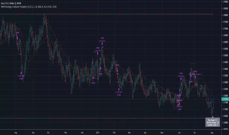
No Nonsense NNFX VP Strategy for Back Testing 3 x Indicators| jhAfter testing your individual indicators, it's time to build up your algo with additional indicators and further backtest the strategy.
Using SSL twice here, faster SSL for 1st confirmation, slower SSL for 2nd confirmation and TDFI for volume validation.
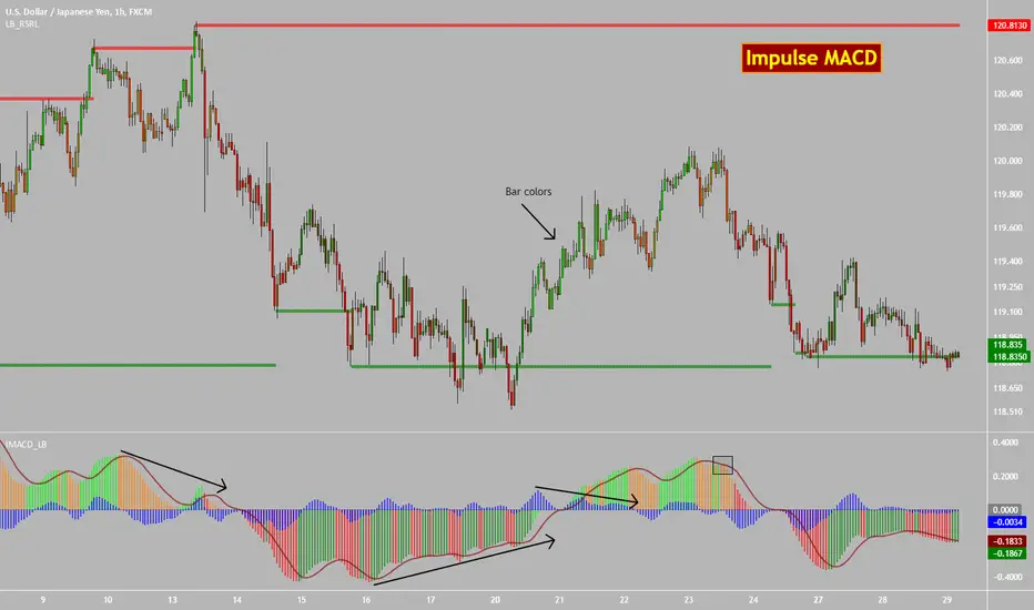
Impulse MACD [LazyBear]Impulse MACD is a modified MACD, formed by filtering out the values in a MA range (region between MAs of high and low), thereby reducing whipsaw typical in a sideways market. This is usually plotted as histogram. This also plots the traditional histogram (MACD - Signal), to help in finding entries/exits.
Use this like a traditional MACD (Zero line crossing or Signal crossing).
Colors legend:
Impulse MACD: Possible colors => Lime / Green / Orange / Red, based on the ImpulseMACD position with respect to MidLine and Signal.
Impulse MACD Signal: Maroon line.
Blue histogram: (ImpulseMACD - Signal).
List of my public indicators : bit.ly
List of my app-store indicators : blog.tradingview.com
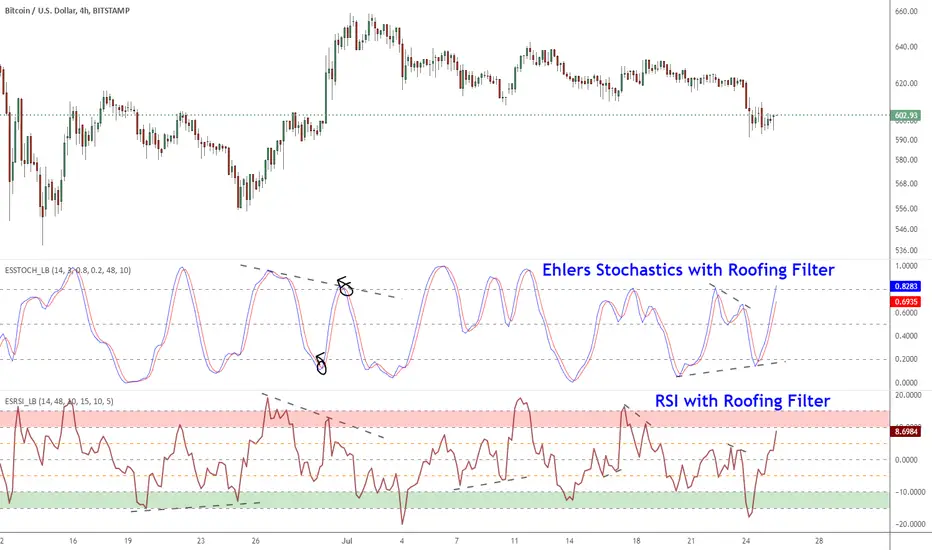
Ehlers Smoothed Stochastic & RSI with Roofing FiltersRoofing filters, first discussed by Mr.John Ehlers, act as a passband, filtering out unwanted noise from market data and accentuating turning points.
I have included 2 indicators with filters enabled. Both support double smoothing via options page. All the parameters are configurable.
Info on Roofing Filter and Ehlers Super Smoother:
----------------------------------------------------
The Ehlers' Roofing Filter is an expansion on Ehlers Super Smoother Filter, both being smoothing techniques based on analog filters. This filter aims at reducing noise in price data.
In Super Smoother Filter, regardless of the time frame used, all waves having cycles of less than 10 bars are considered noise (customizable via options page). The Roofing Filter uses this principle, however, it also creates a so-called "roof" by eliminating wave components having cycles greater than 48 bars which are perceived as "spectral dilation". Thus, the filter only passes those spectral components whose periods are between 10 and 48 bars. This technique noticeably reduces indicator lag and also helps assess turning points more accurately.
More info:
- Spectral dilation paper: www.mesasoftware.com
- John Ehlers presentation: www.youtube.com
------------------------------------------------------
If you want to use RSI %B and Bandwidth, follow this guide to "Make mine" this chart and get access to the source:
drive.google.com
For the complete list of my indicators, check this post:
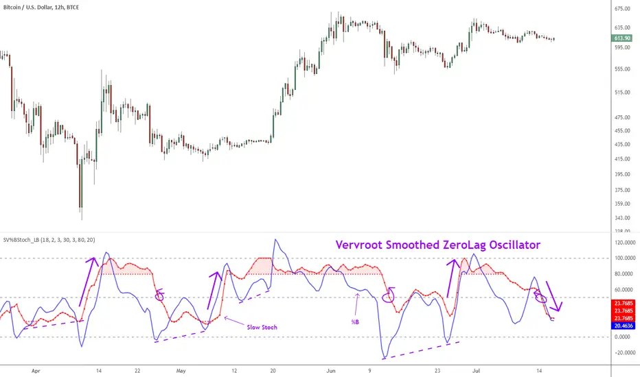
Indicator: Vervoort Smoothed Oscillator [LazyBear]This is Mr. Sylvian Vervoort's take on improving some well-known indicators (%B and Stoch) using smoothing techniques. A combination of TEMA and WMA does a nice job smoothing out %B, derived from zero-lag “Rainbow” data series. The same Rainbow series, averaged with the typical price, smooth the Stochastic K oscillator to produce slowStoch.
Vervroot's strategy for this oscillator (detailed explanation in the reference material below):
- It must be bullish for a buy signal and bearish for a sell signal. This means that both the oscillators must be moving up or down.
- Use the oscillators for detecting divergences. Divergence even in one is still valid.
- Stoch crossing 50 is a good confirmation signal. Momentum usually is an excellent leading indicator, so keep an eye on Stoch.
More info:
www.traders.com
www.scribd.com
Complete list of my indicators (Check the comments, I keep the list updated there):
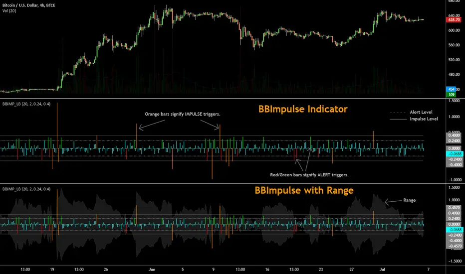
BBImpulse IndicatorBBImpulse is part of the latest indicators package offered by John Bollinger. Excerpt from their market blurb (www.bbforex.com):
"BBImpulse is derived from %b. Its value is the periodic change of %b, so if %b was 0.45 this period and 0.20 last period the present value of BBImpulse is 0.25. We present two reference levels on the chart, an alert level and an impulse level."
"Generally the market moves in the direction of the latest alerts and/or impulses except towards the end of a move where one can take advantage of exhaustion/reversal signals from this indicator."
"Ian Woodward employs BBImpulse for his Kahuna signals using key levels of 0.24 and 0.40."
I added support for the following:
- Highlighting alert/impulse trigger bars
- Rendering the range (check options page).
I noticed that the range, by itself, highlights lot of info:
- Tapering in (narrowing) of range may signify topping or falling prices.
- Tapering out (expanding) may signify nearing a bottom or rising prices.
- Range getting "ranged" between alert or impulse levels signify a major move in the direction of the last impulse trigger. I think for this, alert level ranging intensity is greater than impulse level ranging intensity.
Someone more familiar with BB will have more observations, I am sure. Please do share here so we BB noobs can learn :)
For more indicators, check out my complete list here:
Indicator: Elder Impulse SystemAccording to Elder, "The Impulse System encourages you to enter a trade cautiously but exit fast, by identifying inflection points where a trend speeds up or slows down. This is the professional approach to trading, the total opposite of the amateur's style. Beginners jump into trades without thinking too much and take forever to get out, hoping and waiting for the market to turn their way."
The Impulse System is based on two indicators, a 13-day exponential moving average and the MACD-Histogram. The moving average identifies the trend, while the MACD-Histogram measures momentum. As a result, the Impulse System combines trend following and momentum to identify impulses that can be traded.
By default it uses your chart's time frame, but you can set it to any custom time frame via options page. Optionally, price bars can be color coded too.
More info:
stockcharts.com
Steps to import / use custom indicators from this chart:
PDF: drive.google.com

Supertrend Nova Cloud [Pineify]Supertrend Nova Cloud
Overview
The Supertrend Nova Cloud is a sophisticated trend-following system designed to filter market noise and provide clear, actionable insights into market direction and volatility. By combining two distinct Supertrend calculations—the fast-acting "Nova" and the slower, more robust "Nebula"—this indicator creates a dynamic "Cloud" that visualizes the strength and stability of the current trend. It is engineered to help traders identify strong trending periods, potential pullbacks, and major reversals with greater confidence than a single Supertrend indicator.
Key Features
Dual-Trend Architecture: Utilizes a two-layer approach with a Fast (Nova) and Slow (Nebula) Supertrend to define market structure.
Dynamic Nova Cloud: A visual gradient fill between the two trendlines that adjusts its intensity ("Glow") based on the spread between the trends, representing market volatility.
Smart Candle Coloring: Candles are colored based on the consensus between the two trends, clearly distinguishing between strong trends, pullbacks, and recovery phases.
High-Quality Signals: Buy and Sell signals are filtered and only generated when the major (Slow) trend reverses, reducing false signals during chop.
Real-time Dashboard: An on-chart dashboard displays the current state of both the Nova and Nebula trends for instant analysis.
How It Works
The Supertrend Nova Cloud operates on the principles of Average True Range (ATR) volatility to determine trend direction.
Nova (Fast Trend): Calculated using a shorter ATR length (default 10) and a lower multiplier (default 2.0). This line reacts quickly to price changes, serving as an early warning system or trailing stop for aggressive entries.
Nebula (Slow Trend): Calculated using a longer ATR length (default 20) and a higher multiplier (default 4.0). This line defines the overall market bias and acts as significant support/resistance.
Cloud Gradient Logic: The script calculates the absolute difference (delta) between the Nova and Nebula lines. It compares this delta to its recent historical maximum to determine the opacity of the fill color. A wider spread (higher volatility) results in a brighter, more opaque cloud, while a narrow spread (consolidation) results in a more transparent cloud.
How multiple indicators work together
In trading, a single trend indicator often faces a dilemma: if it's too fast, it gives false signals; if it's too slow, it lags significantly. The Supertrend Nova Cloud solves this by combining both:
The Fast Supertrend captures immediate momentum and provides potential re-entry points during strong trends.
The Slow Supertrend acts as a filter. The script logic enforces that major reversal signals ("NOVA BUY/SELL") are only triggered when this slower, dominant trend changes direction.
By requiring the Slow trend to confirm the reversal, the indicator filters out the "noise" that would typically whip-saw a standard Supertrend.
Trading Ideas and Insights
Trend Riding: When the Cloud is fully Green (Strong Bull) or Red (Strong Bear), and the candles match this color, the trend is established. These are ideal conditions for holding positions.
Pullback Opportunities: If the candles turn a lighter shade (e.g., light red during an uptrend), it indicates the price has broken the Fast trend but holds above the Slow trend. This "Mixed" state often represents a buying opportunity in an uptrend (or selling in a downtrend).
Volatility Expansion: A widening cloud (brighter glow) indicates expanding volatility and often accompanies a strong breakout or trend acceleration.
Unique Aspects
Visual Volatility Feedback: Unlike standard fills, the "Nova Cloud" uses a custom algorithm to adjust transparency based on the relative distance between the two trendlines. This gives traders an intuitive sense of market expansion and contraction.
Nuanced State Detection: The script doesn't just show Up or Down. It identifies four states: Strong Bull, Strong Bear, Fast Bull/Slow Bear (Recovery), and Fast Bear/Slow Bull (Pullback), coding the candles accordingly.
How to Use
Entry: Look for "NOVA BUY" or "NOVA SELL" labels. These appear when the major trend (Nebula) flips, confirming a significant shift in market structure.
Stop Loss: The Nebula (thick) line serves as a robust trailing stop loss. As long as price holds beyond this line, the macro trend remains intact.
Re-Entry/Pyramiding: During a strong trend, if price dips into the cloud (changing candle color to mixed/neutral) and then resumes the trend color, it can be a valid re-entry signal.
Customization
Users can fully customize the indicator via the settings menu:
Nova & Nebula Settings: Adjust the ATR Length and Factor for both the Fast and Slow trends to tune sensitivity for different timeframes or assets.
Visuals: Toggle the Dashboard, Candle Coloring, and customize the colors for Bullish, Bearish, and Neutral states.
Conclusion
The Supertrend Nova Cloud offers a comprehensive visual interface for trend traders. By harmonizing two time horizons of volatility analysis into a single, cohesive display, it simplifies decision-making and helps traders stay on the right side of the major trend while identifying granular opportunities within it.

Volatility Squeeze Pro [JOAT]
Volatility Squeeze Pro — Advanced Volatility Compression Analysis System
This indicator addresses a specific analytical challenge in volatility analysis: how to identify periods when different volatility measurements show compression relationships that may indicate potential energy buildup in the market. It combines two distinct volatility calculation methods—standard deviation-based bands and ATR-based channels—with a momentum oscillator to provide comprehensive volatility state analysis.
Why This Combination Provides Unique Analytical Value
Traditional volatility indicators typically focus on single measurements, but markets exhibit different types of volatility that require different analytical approaches:
1. **Closing Price Volatility** (Standard Deviation): Measures how much closing prices deviate from their average
2. **Trading Range Volatility** (ATR): Measures the actual high-to-low trading ranges
3. **Directional Momentum**: Measures where price sits within its recent range
The problem with using these individually:
- Standard deviation alone doesn't account for intraday volatility
- ATR alone doesn't consider closing price clustering
- Momentum alone doesn't provide volatility context
- No single measurement captures the complete volatility picture
This indicator's originality lies in creating a comprehensive volatility analysis system that:
**Identifies Volatility Compression**: When closing price volatility contracts inside trading range volatility, it suggests potential energy buildup
**Provides Momentum Context**: Shows directional bias during compression periods
**Offers Multi-Dimensional Analysis**: Combines three different analytical approaches into one coherent system
**Delivers Real-Time Assessment**: Continuously monitors the relationship between different volatility types
Technical Innovation and Originality
While individual components (Bollinger Bands, Keltner Channels, Linear Regression) are standard, the innovation lies in:
1. **Volatility Relationship Detection**: The mathematical comparison between standard deviation bands and ATR channels creates a unique compression identification system
2. **Integrated Momentum Analysis**: Linear regression-based momentum calculation provides directional context specifically during volatility compression periods
3. **Multi-State Visualization**: The indicator provides clear visual encoding of different volatility states (compressed vs. normal) with momentum direction
4. **Adaptive Threshold System**: The squeeze detection automatically adapts to different instruments and timeframes without manual calibration
How the Components Work Together Analytically
The three components create a comprehensive volatility analysis framework:
**Standard Deviation Component**: Measures closing price dispersion around the mean
float bbBasis = ta.sma(close, bbLength)
float bbDev = bbMult * ta.stdev(close, bbLength)
float bbUpper = bbBasis + bbDev
float bbLower = bbBasis - bbDev
**ATR Channel Component**: Measures actual trading range volatility
float kcBasis = ta.ema(close, kcLength)
float kcRange = ta.atr(atrLength)
float kcUpper = kcBasis + kcRange * kcMult
float kcLower = kcBasis - kcRange * kcMult
**Squeeze Detection Logic**: Identifies when closing price volatility compresses within trading range volatility
bool squeezeOn = bbLower > kcLower and bbUpper < kcUpper
// This condition indicates closing prices are clustering more tightly
// than the typical trading range would suggest
**Momentum Context Component**: Provides directional bias during compression
float highestHigh = ta.highest(high, momLength)
float lowestLow = ta.lowest(low, momLength)
float momentum = ta.linreg(close - math.avg(highestHigh, lowestLow), momLength, 0)
float momSmooth = ta.sma(momentum, smoothLength)
The analytical relationship creates a system where:
- Squeeze detection identifies WHEN volatility compression occurs
- Momentum analysis shows WHERE price is positioned during compression
- Combined analysis provides both timing and directional context
How the Volatility Comparison Works
The indicator compares two volatility measurements:
Standard Deviation Bands
These measure how much closing prices deviate from their average. When prices cluster tightly around the average, the bands contract.
// Standard deviation bands calculation
float bbBasis = ta.sma(close, bbLength)
float bbDev = bbMult * ta.stdev(close, bbLength)
float bbUpper = bbBasis + bbDev
float bbLower = bbBasis - bbDev
ATR-Based Channels
These measure volatility using Average True Range—the typical distance between high and low prices. They respond to the actual trading range rather than closing price dispersion.
// ATR-based channels calculation
float kcBasis = ta.ema(close, kcLength)
float kcRange = ta.atr(atrLength)
float kcUpper = kcBasis + kcRange * kcMult
float kcLower = kcBasis - kcRange * kcMult
The Squeeze Condition
A "squeeze" is detected when the standard deviation bands are completely contained within the ATR channels:
// Squeeze detection
bool squeezeOn = bbLower > kcLower and bbUpper < kcUpper
This condition indicates that closing price volatility has compressed relative to the overall trading range.
The Momentum Component
The momentum oscillator measures where price sits relative to its recent high-low range, using linear regression for smoothing:
// Momentum calculation
float highestHigh = ta.highest(high, momLength)
float lowestLow = ta.lowest(low, momLength)
float momentum = ta.linreg(close - math.avg(highestHigh, lowestLow), momLength, 0)
float momSmooth = ta.sma(momentum, smoothLength)
Positive values indicate price is above the midpoint of its recent range; negative values indicate below.
Why Display Both Together
The squeeze detection shows WHEN volatility is compressed. The momentum reading shows the current directional bias of price within that compression. Together, they provide two pieces of information:
1. Is volatility currently compressed? (squeeze status)
2. Where is price leaning within the current range? (momentum)
These are observations about current conditions, not predictions about future movement.
Visual Elements
Momentum Histogram — Bars showing momentum value
- Green shades: Positive momentum (price above range midpoint)
- Red shades: Negative momentum (price below range midpoint)
- Brighter colors: Momentum increasing
- Faded colors: Momentum decreasing
Squeeze Dots — Circles on the zero line
- Red: Squeeze condition active
- Green: No squeeze condition
Release Markers — Triangle markers when squeeze condition ends
Dashboard — Current readings and status
Color Scheme
Squeeze Active — #FF5252 (red)
No Squeeze — #4CAF50 (green)
Momentum Positive — #00E676 / #81C784 (green shades)
Momentum Negative — #FF5252 / #E57373 (red shades)
Inputs
Standard Deviation Bands:
Length (default: 20)
Multiplier (default: 2.0)
ATR Channels:
Length (default: 20)
Multiplier (default: 1.5)
ATR Period (default: 10)
Momentum:
Length (default: 12)
Smoothing (default: 3)
How to Read the Display
Red dots indicate the squeeze condition is present
Green dots indicate normal volatility relationship
Histogram direction shows current momentum bias
Histogram color brightness shows whether momentum is increasing or decreasing
Alerts
Squeeze condition started
Squeeze condition ended
Squeeze ended with positive momentum
Squeeze ended with negative momentum
Extended squeeze (8+ bars)
Important Limitations and Realistic Expectations
Volatility compression detection is a mathematical relationship between calculations—it does not predict future price movements
Many compression periods do not result in significant price expansion or directional moves
Momentum direction during compression does not reliably indicate future breakout direction
This indicator analyzes current and historical volatility conditions only—it cannot predict future volatility
False signals are common—not every squeeze leads to tradeable price movement
Different parameter settings will produce different compression detection sensitivity
Market conditions, news events, and fundamental factors often override technical volatility patterns
No volatility indicator can predict the timing, direction, or magnitude of future price movements
This tool should be used as one component of comprehensive market analysis
Appropriate Use Cases
This indicator is designed for:
- Volatility state analysis and monitoring
- Educational study of volatility relationships
- Multi-dimensional volatility assessment
- Supplementary analysis alongside other technical tools
- Understanding market compression/expansion cycles
This indicator is NOT designed for:
- Standalone trading signal generation
- Guaranteed breakout prediction
- Automated trading system triggers
- Market timing precision
- Replacement of fundamental analysis
Understanding Volatility Analysis Limitations
Volatility analysis, while useful for understanding market conditions, has inherent limitations:
- Past volatility patterns do not guarantee future patterns
- Compression periods can extend much longer than expected
- Expansion periods may be brief and insufficient for trading
- External factors (news, fundamentals) often override technical patterns
- Different markets and timeframes exhibit different volatility characteristics
— Made with passion by officialjackofalltrades

VWAP Flow ParmezanThe "Official Bank Flow VWAP" is a comprehensive trading suite designed for institutional Forex traders.
This indicator solves the problem of chart clutter by combining two critical components of liquidity: Price (Value) and Time (Sessions). It is specifically optimized for EUR/USD and GBP/USD on intraday timeframes (M5, M15), helping you identify high-probability setups where "Fair Value" meets "Volatility."
Key Features
1. Multi-Timeframe VWAP Hierarchy Unlike standard indicators, this tool visualizes the interaction between three distinct timeframes:
Daily VWAP (Dynamic Color): Your primary trend filter. Green when Bullish (Price > VWAP), Red when Bearish (Price < VWAP).
Weekly VWAP (Orange Dots): Represents the medium-term balance. Acts as a magnet for mean reversion mid-week.
Monthly VWAP (Purple Line): The institutional "line in the sand." Major support/resistance level.
2. Standard Deviation Bands (Market Balance) The indicator plots SD1 and SD2 bands around the Daily VWAP:
Inner Zone (SD1): Represents the "Fair Value" area.
Outer Bands (SD2): Represents overbought/oversold conditions. Useful for identifying mean reversion plays back to the center.
3. Official Exchange Sessions (Time) Forget confusing "killzones." This tool highlights the Official Open times for major exchanges, adjusted for Daylight Savings via New York time:
London Open (08:00 LDN): The start of European volume.
New York Open (08:00 NY): The injection of US liquidity.
London Close/Fix: The daily overlap close, often marking trend reversals.
Note: Sessions are visualized with non-intrusive black "shadow" backgrounds to keep your chart clean.
4. "Ghost" Levels (Previous VWAP) A unique feature that plots the closing VWAP level of the previous day. Institutional algorithms often target these "untested" levels as Take Profit targets or liquidity pools.
How to Use
Trend Following: If Price is above the Daily VWAP (Green) during the London Open, look for Long entries targeting the SD1/SD2 upper bands.
Mean Reversion: If Price hits the SD2 Band while far away from the Weekly VWAP, look for a reversal back to the mean.
Confluence: The strongest signals occur when price touches a key VWAP level (e.g., Weekly VWAP) specifically during the highlighted Session Start times.
Settings
Timezone: Defaults to America/New_York to automatically handle DST shifts for London/NY opens.
Visuals: Fully customizable colors and transparency. Default is set to a "Dark Mode" friendly professional palette.

MorphWave Bands [JOAT]MorphWave Bands - Adaptive Volatility Envelope System
MorphWave Bands create a dynamic price envelope that automatically adjusts its width based on current market conditions. Unlike static Bollinger Bands, this indicator blends ATR and standard deviation with an efficiency ratio to expand during trending conditions and contract during consolidation.
What This Indicator Does
Plots adaptive upper and lower bands around a customizable moving average basis
Automatically adjusts band width using a blend of ATR and standard deviation
Detects volatility squeezes when bands contract to historical lows
Highlights breakouts when price moves beyond the bands
Provides squeeze alerts for anticipating volatility expansion
Adaptive Mechanism
The bands adapt through a multi-step process:
// Blend ATR and Standard Deviation
blendedVol = useAtrBlend ? (atrVal * 0.6 + stdVal * 0.4) : stdVal
// Normalize volatility to its historical range
volNorm = (blendedVol - volLow) / (volHigh - volLow)
// Create adaptive multiplier
adaptMult = baseMult * (0.5 + volNorm * adaptSens)
This creates bands that respond to market regime changes while maintaining stability.
Squeeze Detection
A squeeze is identified when band width drops below a specified percentile of its historical range:
Background highlighting indicates active squeeze conditions
Low percentile readings suggest compressed volatility
Squeeze exits often precede directional moves
Inputs Overview
Band Length — Period for basis calculation (default: 20)
Base Multiplier — Starting band width multiplier (default: 2.0)
MA Type — Choose from SMA, EMA, WMA, VWMA, or HMA
Adaptation Lookback — Historical period for normalization (default: 50)
Adaptation Sensitivity — How much bands respond to volatility changes
Squeeze Threshold — Percentile below which squeeze is detected
Dashboard Information
Current trend direction relative to basis and bands
Band width percentage
Squeeze status (Active or None)
Efficiency ratio
Current adaptive multiplier value
How to Use It
Look for squeeze conditions as potential precursors to breakouts
Use band touches as dynamic support/resistance references
Monitor breakout signals when price closes beyond bands
Combine with momentum indicators for directional confirmation
Alerts
Upper/Lower Breakout — Price exceeds band boundaries
Squeeze Entry/Exit — Volatility compression begins or ends
Basis Crosses — Price crosses the center line
This indicator is provided for educational purposes. It does not constitute financial advice.
— Made with passion by officialjackofalltrades

Pivot Boss IndicatorsPivot boss indicators shows central pivot range and pivot levels for support and resistance.
