Korea M2 Liquidity Index💡 Korea M2 Liquidity Index
- This indicator visualizes Korea's M2 liquidity trends, designed to help both domestic and global investors easily understand the overall money supply situation in the Korean economy.
- In particular, by comparing it with the KOSPI index, investors can assess the equity market level relative to liquidity, allowing for a more precise valuation analysis to determine whether the Korean stock market is overvalued or undervalued.
✅ What is M2?
- M2 is a broad measure of money supply, which includes cash, demand deposits, savings deposits, and certain financial products.
- It serves as a crucial macroeconomic indicator that reflects the overall liquidity and capital supply in the Korean economy.
💰 KRW and USD display options
- KRW basis: Displays the total M2 amount in Korean won (in trillion units).
- USD basis: Converts the total M2 amount into US dollars using the KRW/USD exchange rate(KRW/USD) making it useful for global investors or those analyzing in USD terms.
📊 Display style and interpretation
- Users can freely choose to display Korea’s M2 and liquidity index and turn them on or off as needed.
- The index is simplified and displayed in trillion won units, allowing for an intuitive view of long-term trends and structural changes.
- The Offset (days) feature enables temporal adjustments, making it easier to compare this indicator with other economic or financial data series.
🌏 Example use cases
- Domestic policy analysis: Analyze the correlation between Bank of Korea's monetary policy changes (base rates, liquidity injections, etc.) and M2 growth.
- FX and global capital flow analysis: Understand the relationship between KRW/USD exchange rate fluctuations and changes in domestic liquidity.
- Leading indicator for asset markets: Use it as a forward-looking signal for stock, real estate, and bond markets.
- Comparison with KOSPI index: Identify gaps between liquidity and market levels to support strategic investment decisions and evaluate market capitalization levels more precisely.
copyright @invest_hedgeway
============================================================
💡 Korea M2 Liquidity Index
- 이 지표는 대한민국의 M2 유동성 흐름을 시각화하여, 국내 및 글로벌 투자자들이 한국 경제의 자금 공급 상태를 한눈에 파악할 수 있도록 설계되었습니다.
- 특히 코스피 지수와 비교 분석함으로써 유동성 대비 주가지수 수준을 평가하고, 한국 증시의 상대적 고평가·저평가 여부를 판단해 보다 정교한 밸류에이션 분석에 활용할 수 있습니다.
✅ M2란?
- M2는 광의통화 지표로, 현금 + 요구불 예금 + 저축성 예금 + 금융상품(일부) 등을 포함하는 총 유동성을 의미합니다. 이는 한국 경제의 자금 공급 상태를 나타내는 중요한 거시경제 지표로 활용됩니다.
💰 KRW 및 USD 표시 선택
- KRW(원화) 기준: 한국 원화 기준으로 M2 총액(조 단위)을 나타냅니다.
- USD 기준: M2 총액을 환율(KRW/USD) 기준으로 달러화 환산 후 표시하여, 글로벌 투자자나 달러화 기준 평가 시 활용 가능합니다.
📊 표시 방식과 해석
- 사용자는 한국의 M2와 유동성지수를 자유롭게 선택해 원하는 방식으로 켜거나 끌 수 있습니다.
- 지표는 조원(Trillion won) 단위로 단순화해 표시되며, 장기 흐름과 추세 변화를 시각적으로 확인할 수 있습니다.
- Offset (days) 기능을 통해 시리즈를 시차 조정할 수 있어, 다른 경제 지표와의 비교 분석에 유용합니다.
🌏 활용 예시
- 국내 정책 분석: 한국은행의 통화정책 변화(기준금리, 유동성 공급 등)와 M2 증가율 간 상관성 분석.
- 환율 및 글로벌 자금 흐름 분석: 원/달러 환율 변동과 유동성 간 상관관계 파악.
- 주식, 부동산, 채권 등 자산시장 선행 지표로서 활용.
- 코스피 지수와의 비교 분석: 시장 유동성과 지수의 괴리를 파악하여 전략적 투자 판단과 시가총액 수준에 대한 평가에 활용.
copyright @invest_hedgeway
Search in scripts for "liquidity"

Liquidity Rush:VSMarkettrend Liquidity Rush (LR) Indicator – Market Move Detector
🔍 What is Liquidity Rush?
The Liquidity Rush (LR) indicator detects the flow of big money (institutional or high-volume traders) into a stock over a selected time frame. It visually represents the net liquidity inflow/outflow and compares it with the stock's total market capitalization (MC) to give you a contextual view of its significance.
📊 Indicator Output:
You’ll see a label like:
250.07 Cr / 0.23%MC
250.07 Cr → Liquidity change (buy/sell impact) in the selected timeframe.
0.23%MC → This liquidity is 0.23% of the stock’s market cap.
This helps you judge:
Whether the move is impactful or just noise.
If smart money is likely entering or exiting.
⚠️ Why % of Market Cap?
Volume or liquidity alone doesn't tell the full story. 100 Cr inflow in a 5,000 Cr company is significant (2%), but the same in a 50,000 Cr company is not impactful (0.2%). That’s why this indicator shows LR as a % of MC — to give you contextual importance.
🟢 When is it Powerful?
If LR % > 2% of market cap consistently → Strong entry signals likely from big players.
If LR jumps suddenly after a dull phase → Watch for breakout or reversal.
🎨 Color Coding (Based on Liquidity Amount):
<10 Cr → Low (likely retail-driven)
>10–20 Cr → Moderate (watchful)
>20–100 Cr → Heating up
>100 Cr → High liquidity activity (possible institutional move)
📅 Best Timeframes:
Use it on Daily, Weekly for quick flow detection.
Combine with price action or volume for confirmation.
Use Cases:
Identify breakouts with backing.
Filter fake moves with weak liquidity.
Spot smart money entry before price jumps.
Note : It does not means that stock with low LR are bad and not move, many stock move with low LR also, This indicator need not to be used in isolation.

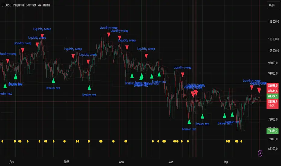
Liquidity Zones Alerts"Liquidity Zones Alerts" is a powerful smart-money-based indicator designed to detect key liquidity grabs and provide high-probability reversal signals using a combination of market structure, volume, volatility, and candlestick confirmation.
🧠 How It Works
The core logic of this indicator is built around the Smart Money Concepts:
🔺 Liquidity Sweeps: Detects when price takes out previous daily or weekly highs/lows, suggesting stop hunts or engineered liquidity moves by institutional players.
📈 Volume Filter: Ensures signals only appear during above-average volume, filtering out noise and low-interest moves.
⚡ Volatility Filter: Flags high-range candles relative to the average, catching flash crashes/spikes that often precede strong reversals.
🔄 Engulfing Candle Confirmation: Confirms entry with a bullish or bearish engulfing pattern after liquidity is taken — increasing signal reliability.
🧭 Premium/Discount Zone Logic: Trades are filtered to ensure longs are only taken in discount zones, and shorts in premium zones, using a 20-period market range for context.
📌 Features
✅ Daily & Weekly liquidity zones toggle
✅ Visual signals with clean 🔻(short) & 🔺(long) arrows
✅ Auto-detection of flash crashes
✅ Alerts on both long and short setups
✅ Optional previous high/low level plotting for context
✅ Background highlighting of valid signal candles
✅ Multi-timeframe friendly and compatible with any asset
🛠️ Use Case
Whether you're a scalper or a swing trader, this tool helps you spot institutional entry zones before the move happens. It works especially well when combined with your existing bias or supply/demand zones.
💬 “Price doesn't move randomly — it hunts liquidity. This indicator shows you where and when it happens.”
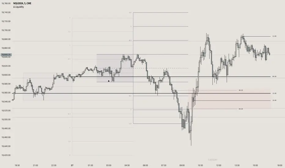
itradesize /\ Previous Liquidity x ICTI’d like to introduce a clean and simple RTH gap and liquidity levels indicator with additional Asian and London ranges, along with standard deviation levels and many customizable options.
Previous D/W/M highs and lows are areas where liquidity tends to accumulate. This is because many traders place stop-loss orders around these levels, creating a concentration of buy stops above the previous day's high and sell stops below the previous day's low. High-frequency trading algorithms and institutional traders often target these areas to capture liquidity.
What the indicator could show in summary?
- Regular trading hours gap with deviations
- Asia with deviations (lines or boxes)
- London with deviations (lines or boxes)
- Weekdays on chart
- 3 AM candle marker
- Previous D/W/M levels
- Important opening times (08:00, 09:30, 10:00, 14:00, 00:00, 18:00)
- Daily separators
By marking out the previous day's highs and lows, traders can create a framework for their trading day. This helps in identifying potential setups and understanding where significant price action might occur. It also aids in filtering out noise and focusing on the most relevant price levels.
These levels can also act as potential reversal points. When the market reaches a previous high or low, it might reverse direction, especially if it has raided the liquidity resting there. This concept is part of a strategy where traders look for the market to raid these levels and then reverse, providing trading opportunities
The indicator shows previous liquidity levels on a daily, weekly, and monthly basis. It also displays opening times at 8:30, 9:30-10:00, 14:00-00:00, and 18:00. Opening times are crucial in trading because they help define specific periods when market activity is expected to be higher, which can lead to better trading opportunities. The script has been made mostly for indices.
You can create various entry and exit strategies based on the indicator. Please remember, that adequate knowledge of ICT is necessary for this to be beneficial.
You might wonder why only these times are shown. This is because these are the times when the futures market is active or should be active. It's important to note that opening times can vary between different asset classes.
18:00 A new daily candle open
00:00 Midnight open
02:00 New 4-hour candle open
08:30 High-impact news
09:30 NY Equities open
10:00 New 4-hour candle open
The concept of "Asian Killzone Standard Deviations" involves using the Asian trading session's price range to project potential price movements during subsequent trading sessions, such as the London or New York sessions. This is done by calculating standard deviations from the Asian range, which can help traders identify potential support and resistance levels.
You can create a complete model by exclusively focusing on the Asian time zone. Deviations within this zone may have varying impacts on future price movements, and the Interbank Price Delivery Agreement (IPDA) often reflects Asia's high, close, and low prices.
A similar approach can be taken with the London time zone. The standard deviation levels within each zone could potentially serve as support or indicate reversals, including liquidity hunts. It's important to backtest these ideas to gain reliable insights into when and where to apply them.
* Asian Range: This is the price range established during the Asian trading session. It serves as a reference point for calculating standard deviations.
* London Range: The same applies to the London range as well. Combine standard deviation projections with other technical analysis tools, such as order blocks or fair value gaps, to enhance accuracy.
* Standard Deviations: These are statistical measures that indicate the amount of variation or dispersion from the average. In trading, they are used to project potential price levels beyond the current range.
You can also use regular trading hours gap as a standalone model. The 4 STDV and 2.5 STDV levels are important for determining the high or low of the current price action.
The RTH gap is created when there is a difference between the closing price of a market at the end of one trading day and the opening price at the start of the next trading day. This gap can be upward (gap higher), downward (gap lower), or unchanged. It is significant because it often indicates market sentiment and can create inefficiencies that traders look to exploit.
Alternatively, you can combine these elements to create a complete strategy for different scenarios.
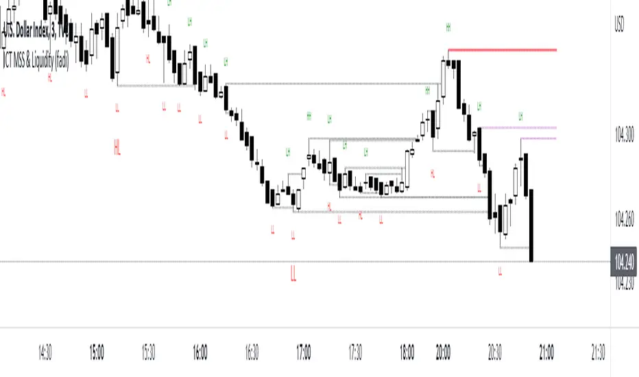
ICT MSS & Liquidity (fadi)ICT MSS & Liquidity indicator calculates two pivot points and the most likely location of the liquidity. The two pivot points are called Major and Internal. Both can be configured and adjusted separately to suit the instrument being traded and how the trader prefers to trade.
Major Trend
Major Trend is usually a better indicator of the trend direction. This is because it encapsulates longer period and allows for price fluctuation reducing the number of false Market Structure Shifts (MSS).
There is no set numeric value for the Pivot Length (number of bars used to calculate the high and low points). The pivot length is a judgement call by the trader and can be adjusted to what the trader feels comfortable with.
In the image above, a trader can see that the Major trend is making lower low move where it has swept liquidity (dotted line) and has the potential to reverse direction, if higher timeframe provides supporting evidence.
Internal Trend
Internal Trend is usually used to identify an internal shift in market structure that may, but not guaranteed, indicates that the Major Trend's current leg movement is about to reverse direction. It is not an indicator in itself that the overall Major trend is about to make major change in direction.
For example, if the Major trend is showing Lower Lows and Lower Highs, a higher high on the Internal Trend could simply mean that the Major Trend is done with a Lower Low move and about to make a lower high move and not sweep the liquidity above the previous lower high. If, however, the larger picture indicates that the Major Trend has reached a potential reversal point, the Internal Trend could be used to corroborate that thesis by forming the higher high.
In the image above, the internal trend provides an indication that a market structure shift is probably under way and, if proper analysis performed, a position can be entered.
Liquidity
Liquidity rests above highs and lows on both Major and Internal trends. The indicator will draw both open and claimed liquidity lines. Price tends to move towards liquidity and, if enabled, the indicator provides an easy way to identify potential targets. Liquidity could be drawn on both Major and Internal Trends.
[WRx450] FED net liquidityThis indicator show the net liquidity of the FED.
Net liquidity = Fed balance sheet (total asset) - Treasury General Account - Reverse Repo
All sources can be select otherwise in parameter.
It is possible to show only the weekly changes in Net liquidity.
Net liquidity and Net liquidity changes are shown only on wednesday because Total asset and TGA reports are updated only on Wednesday. (updating the Net liquidity on a daily basis would be inacurate)
Aurora Reversal Suite: Liquidity & Inversion ModelConcept & Methodology The Aurora Reversal Suite is not a general-purpose indicator; it is a hard-coded algorithmic implementation of a specific institutional reversal model often referred to as the "2022 Mentorship Model" or "Sweep-to-Inversion" setup.
While many scripts display Liquidity Sweeps or Fair Value Gaps individually, this script solves the problem of "confluence fatigue" by algorithmically enforcing a strict order of operations. It does not alert on every sweep; it alerts only when a specific sequence of price action events occurs in a verified order.
The Algorithmic Logic (How it Works) The core value of this script lies in its conditional filtering logic, which automates the following manual verification process:
Event A: Liquidity Sweep
The script first monitors key institutional levels: Previous Day High/Low, Session High/Low (Asia/London/NY), and dynamic Swing Points.
It detects a "Sweep" event when price breaches a level but fails to close beyond it (or closes back inside within a defined lookback period).
Event B: Displacement & Inversion
Unlike standard FVG indicators, this script searches specifically for Inversion FVGs (iFVG) that form immediately following the sweep event.
The script logic requires that the iFVG be created by the displacement leg that reverses the sweep. This binds the "Entry Signal" directly to the "Liquidity Event."
Event C: Algorithmic Filtering (The "Strict" Mode)
To filter out false positives common in choppy markets, the script applies a multi-layer filter before printing a signal:
Volume Qualification: The signal bar's volume must exceed a user-defined multiple of the N-period average volume (default 1.5x) to confirm institutional participation.
SMT Divergence Filter: The script cross-references a correlated asset (e.g., NQ vs. ES or EU vs. DXY). If enabled, a signal is only valid if the correlated asset failed to make a matching high/low at the moment of the sweep (SMT Divergence).
Bias Alignment: The script calculates directional bias using a waterfall logic (Daily > 4H > 1H). Signals counter to this calculated bias are suppressed in "Strict" mode.
Included Features & Components
Automated Market Structure: Real-time labeling of BOS (Break of Structure) and MSS (Market Structure Shift) based on swing point logic.
Session Killzones: Visual boxes for Asia, London, and NY sessions with auto-extending high/low lines to track session liquidity.
Multi-Timeframe Dashboard: A calculated table displaying the trend state of the Daily, 4H, and 1H timeframes to assist with top-down analysis.
Power of 3 (PO3) Overlay: Visualization of higher-timeframe candle geometry on lower-timeframe charts to identify accumulation/distribution phases.
Why This Mashup is Necessary Attempting to trade this specific reversal model using separate indicators results in chart clutter and conflicting signals. By combining the Sweep detection, iFVG creation, and SMT filtering into a single codebase, we can programmatically eliminate "naked" sweeps that have no displacement, providing a cleaner and more objective view of the market structure.
Settings & Customization
Signal Mode: Choose between "Simple" (Price Action only) or "Strict" (Trend + Volume filtered).
SMT Input: Manually define the correlated asset ticker for divergence checks.
Visuals: Fully customizable colors for Bullish/Bearish scenarios to fit light or dark themes.
Disclaimer This script is a tool for market analysis and does not guarantee future results. It is intended to assist traders in identifying high-probability setups based on historical price action concepts.

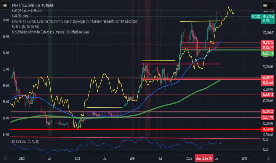
M2 Global Liquidity Index [Extended + Empirical BTC Offset]M2 Global Liquidity Index
This script visualizes global M2 liquidity based on major economic zones (USA, China, Eurozone, Japan, UK), with the option to include extended countries such as Switzerland, Canada, India, Russia, Brazil, South Korea, Mexico, and South Africa.
The indicator includes an empirically derived offset to reflect how Bitcoin historically reacts with a time lag—typically around 12 weeks—after shifts in global liquidity.
Features:
Predefined empirical offset options ranging from 12 to 120 days
Automatic offset adjustment when applied to the weekly chart
Optional inclusion of extended global M2 sources
Important:
This indicator is intended only for use on the weekly chart. It provides meaningful and accurate results exclusively in this time frame, due to the nature of the offset-based correlation logic.
Use cases:
Macro-level analysis of Bitcoin’s price movements
Identifying early signs of potential market tops or bottoms in relation to liquidity flows
Liquidity Zone IndicatorLiquidity Zone Indicator
This PineScript indicator for TradingView identifies liquidity zones in the market where significant trading activity occurs, based on volume spikes and price levels. It highlights areas where large orders may be filled, useful for day traders and scalpers.
Features:
Detects bullish and bearish liquidity zones using a lookback period (default: 50 bars) and volume threshold (default: 1.5x average volume).
Displays zones as shaded boxes or diamond markers above/below bars, customizable by color.
Option to extend zones until price breaks through, with dynamic transparency for better visualization.
Includes an alert for when a liquidity zone is hit.
Settings:
Liquidity Lookback: Number of bars to analyze for high/low price levels.
Volume Threshold: Multiplier for detecting volume spikes.
Display as Zone: Toggle between zone boxes or markers.
Extend Zone: Keep zones active until price crosses them.
Zone Color: Customize the color of zones or markers.
Ideal for traders looking to spot potential reversal or breakout areas driven by liquidity.

ICT IPDA Liquidity Matrix By AlgoCadosThe ICT IPDA Liquidity Matrix by AlgoCados is a sophisticated trading tool that integrates the principles of the Interbank Price Delivery Algorithm (IPDA), as taught by The Inner Circle Trader (ICT). This indicator is meticulously designed to support traders in identifying key institutional levels and liquidity zones, enhancing their trading strategies with data-driven insights. Suitable for both day traders and swing traders, the tool is optimized for high-frequency and positional trading, providing a robust framework for analyzing market dynamics across multiple time horizons.
# Key Features
Multi-Time Frame Analysis
High Time Frame (HTF) Levels : The indicator tracks critical trading levels over multiple days, specifically at 20, 40, and 60-day intervals. This functionality is essential for identifying long-term trends and significant support and resistance levels that aid in strategic decision-making for swing traders and positional traders.
Low Time Frame (LTF) Levels : It monitors price movements within 20, 40, and 60-hour intervals on lower time frames. This granularity provides a detailed view of intraday price actions, which is crucial for scalping and short-term trading strategies favored by day traders.
Daily Open Integration : The indicator includes the daily opening price, providing a crucial reference point that reflects the market's initial sentiment. This feature helps traders assess the market's direction and volatility, enabling them to make informed decisions based on the day's early movements, which is particularly useful for day trading strategies.
IPDA Reference Points : By leveraging IPDA's 20, 40, and 60-period lookbacks, the tool identifies Key Highs and Lows, which are used by IPDA as Draw On Liquidity. IPDA is an electronic and algorithmic system engineered for achieving price delivery efficiency, as taught by ICT. These reference points serve as benchmarks for understanding institutional trading behavior, allowing traders to align their strategies with the dominant market forces and recognize institutional key levels.
Dynamic Updates and Overlap Management : The indicator is updated daily at the beginning of a new daily candle with the latest market data, ensuring that traders operate with the most current information. It also features intelligent overlap management that prioritizes the most relevant levels based on the timeframe hierarchy, reducing visual clutter and enhancing chart readability.
Comprehensive Customization Options : Traders can tailor the indicator to their specific needs through an extensive input menu. This includes toggles for visibility, line styles, color selections, and label display preferences. These customization options ensure that the tool can adapt to various trading styles and preferences, enhancing user experience and analytical capabilities.
User-Friendly Interface : The tool is designed with a user-friendly interface that includes clear, concise labels for all significant levels. It supports various font families and sizes, making it easier to interpret and act upon the displayed data, ensuring that traders can focus on making informed trading decisions without being overwhelmed by unnecessary information.
# Usage Note
The indicator is segmented into two key functionalities:
LTF Displays : The Low Time Frame (LTF) settings are exclusive to timeframes up to 1 hour, providing detailed analysis for intraday traders. This is crucial for traders who need precise and timely data to make quick decisions within the trading day.
HTF Displays : The High Time Frame (HTF) settings apply to the daily timeframe and any shorter intervals, allowing for comprehensive analysis over extended periods. This is beneficial for swing traders looking to identify broader trends and market directions.
# Inputs and Configurations
BINANCE:BTCUSDT
Offset: Adjustable setting to shift displayed data horizontally for better visibility, allowing traders to view past levels and make informed decisions based on historical data.
Label Styles: Choose between compact or verbose label formats for different levels, offering flexibility in how much detail is displayed on the chart.
Daily Open Line: Customizable line style and color for the daily opening price, providing a clear visual reference for the start of the trading day.
HTF Levels: Configurable high and low lines for HTF with options for style and color customization, allowing traders to highlight significant levels in a way that suits their trading style.
LTF Levels: Similar customization options for LTF levels, ensuring flexibility in how data is presented, making it easier for traders to focus on the most relevant intraday levels.
Text Utils: Settings for font family, size, and text color, allowing for personalized display preferences and ensuring that the chart is both informative and aesthetically pleasing.
# Advanced Features
Overlap Management : The script intelligently handles overlapping levels, particularly where multiple timeframes intersect, by prioritizing the more significant levels and removing redundant ones. This ensures that the charts remain clear and focused on the most critical data points, allowing traders to concentrate on the most relevant market information.
Real-Time Updates : The indicator updates its calculations at the start of each new daily bar, incorporating the latest market data to provide timely and accurate trading signals. This real-time updating is crucial for traders who rely on up-to-date information to execute their strategies effectively and make informed trading decisions.
# Example Use Cases
Scalpers/Day traders: Can utilize the LTF features to make rapid decisions based on hourly market movements, identifying short-term trading opportunities with precision.
Swing Traders: Will benefit from the HTF analysis to identify broader trends and key levels that influence longer-term market movements, enabling them to capture significant market swings.
By providing a clear, detailed view of key market dynamics, the ICT IPDA Liquidity Matrix by AlgoCados empowers traders to make more informed and effective trading decisions, aligning with institutional trading methodologies and enhancing their market understanding.
# Usage Disclaimer
This tool is designed to assist in trading decisions, but it should be used in conjunction with other analysis methods and risk management strategies. Trading involves significant risk, and it is essential to understand the market conditions thoroughly before making trading decisions.

FED net liquidity [Orderflow]This indicator show the net liquidity of the FED.
Net Liquidity = FED balance sheet (total asset) - Treasury General Account - Reverse Repo
Net liquidity and Net liquidity changes are shown on wednesday. Total asset and TGA report are on weekly basis, thus a daily basis would be inacurate.
it is possible to add this indicator twice and move one of them in another graphic below and show the change. It gives a clear view of the liquidity.
[WRx450] FED net liquidityThis indicator show the net liquidity of the FED.
Net Liquidity = FED balance sheet (total asset) - Treasury General Account - Reverse Repo
Net liquidity and Net liquidity changes are shown on wednesday. Total asset and TGA report are on weekly basis, thus a daily basis would be inacurate.
it is possible to add this indicator twice and move one of them in another graphic below and show the change. It gives a clear view of the liquidity.

Daily and Weekly Sweep - LiquidityDaily and Weekly Sweep – Liquidity
Description:
The script is designed to illustrate the sweeps of the high and low of the previous day and week. The larger the ratio of shares traded to the percentage price change, the more deep and liquid the market is presumed to be, therefore the market maker always seeks liquidity. Liquidity rests above previous highs and below previous lows as many traders see these as obvious points to place their stops. These are areas on the chart where many orders are placed together and serve as tipping points for market makers. The script focuses on the previous day and week. We can assume these are potential areas for mitigation.
How to use:
The indicator plots the highs and lows of the previous day and week. On default, it also shows the high and low price for the first 8 hours of the opening day of the week. Users can customise this in settings. The weekly open is also plotted. The background changes colour once a daily/weekly high or low has been breached and stops at the extreme point of price. These areas may provide points of interest in the future.
A good understanding of supply and demand, order blocks, market structure, and how to identify fresh levels is expected to utilise it's full potential.
Alert function added for:
- Daily Sweep
- Weekly Sweep
Indicator in use:

Hui-Heubel Liquidity RatioThe Hui-Heubel Liquidity Ratio (lhh) is a measurement of market resiliency and liquidity. Higher values indicate a more liquid and resilient market, lower values indicate a more fragile market susceptible to volatile moves. It does not work on all tickers (for example, if something does not report volume).
Generally, you will see lhh rise when stocks sell off and fall when they are bought. Occasionally you will see scenarios where price will go up while lhh does as well, often this is a symptom of short covering.
Includes two configurable SMAs and a configurable lookback window.

Liquidity Entry Triggers (4-Model System) | WarRoomXYZLiquidity Entry Triggers is an open-source, price-action-based analytical framework designed to highlight recurring institutional liquidity behaviors that appear across all liquid markets.
The script focuses on how and where liquidity is taken, rather than attempting to predict direction using oscillators or lagging indicators.
It is optimized for XAUUSD, FX pairs, indices, and crypto , particularly on 1m–15m timeframes where session behavior and liquidity reactions are most visible.
This tool is not a buy/sell signal generator .
It provides contextual entry zones based on structural liquidity logic, allowing traders to apply their own execution rules.
Core Philosophy
Markets move because of:
•Trapped traders
•Forced liquidations
•Session-based liquidity cycles
•Reactions at prior institutional participation zones
This script visualizes four repeatable entry triggers that emerge from those mechanisms.
🔹 1. Failed Breakout / Trapped Trader Model
When price breaks a clearly defined range high or low, breakout traders often enter expecting continuation.
If price fails to hold outside the range and closes back inside, those traders become trapped.
The script detects:
•Breaks beyond recent highs/lows
•Immediate rejection back into the range
•Structural failure of momentum
These conditions frequently lead to mean reversion or reversal moves as trapped traders exit and fuel movement in the opposite direction.
Markers are plotted at the point of failure to highlight potential trap zones.
🔹 2. Liquidation Flush Detection
Sharp impulsive candles with abnormally large wicks often represent liquidation cascades rather than healthy trend continuation.
The script identifies liquidation behavior by measuring:
•Wick-to-body imbalance
•Sudden expansion followed by rejection
•Temporary price inefficiencies
These flushes commonly occur near:
•Session highs/lows
•Range extremes
•Trend exhaustion points
Such events often lead to rebalance moves , where price partially or fully fills the wick.
🔹 3. Orderblock Reaction Zones
Orderblocks represent areas where heavy participation occurred before a strong displacement move.
The script highlights:
•Clean bullish and bearish orderblock structures
•Zones formed during consolidation prior to expansion
•Areas likely to be defended when revisited
Orderblocks with minimal noise and clean departure are prioritized, as they often reflect institutional positioning rather than retail activity.
These zones are intended as reaction areas , not automatic entry signals.
🔹 4. London Session Liquidity Sweep Model
The London session frequently establishes the initial daily high or low.
Later in the session or during New York, price often:
•Sweeps internal liquidity around that level
•Rejects after the sweep
•Continues with the higher-timeframe bias
The script monitors London session behavior and marks:
•Liquidity runs above/below London highs and lows
•Rejections back inside the prior structure
This model is especially effective when combined with broader daily context.
🔹4. How the Components Work Together
The framework is designed as a context stack , not a checklist of signals:
Liquidity Event → Location → Timing → Trader Execution
Each model reinforces the others:
•Failed breakouts often occur after liquidity sweeps
•Liquidation wicks frequently form near orderblocks
•London sweeps often trigger failed momentum moves
•Confluence increases probability, not certainty
🔹 Practical Usage Guide
✔ Identify context
Determine whether price is approaching a range extreme, session level, or prior participation zone.
✔ Wait for a liquidity event
Look for a sweep, failed breakout, or liquidation wick.
✔ Observe reaction
Rejection, displacement, or reclaim behavior provides confirmation.
✔ Execute manually
Stops are commonly placed beyond the liquidity extreme.
Targets are typically internal liquidity, prior highs/lows, or imbalance zones.
The indicator does not manage trades or enforce rules.
Execution and risk management remain the trader’s responsibility.
🔹 5. Originality & Design Notes
This script does not replicate or bundle existing indicators.
It introduces:
•A multi-model liquidity entry framework
•Structural failed breakout detection
•Wick-based liquidation imbalance logic
•Session-aware liquidity sweep visualization
•A unified, minimal, non-lagging design
All concepts are based on observable market behavior and integrated into a single analytical tool.
🔹 6. Suitable Markets & Timeframes
Works best on:
•XAUUSD
•Major FX pairs
•Indices
•Liquid crypto markets
Recommended timeframes:
•1m
•5m
•15m
•30m
🔹7. Limitations & Notes
•This is an analytical framework , not a trading system
•All markings are confirmed at candle close (non-repainting)
•No open interest or order flow data is used
•Results depend on user interpretation and execution
•Best used alongside session bias and higher-timeframe structure
Disclaimer
This script is provided for educational and informational purposes only.
It does not constitute financial advice, investment advice, or a recommendation to buy or sell any instrument.
Trading involves risk, and losses can exceed initial deposits.
The author assumes no responsibility for trading decisions made using this tool.
Users are strongly encouraged to test this script in demo or simulation environments and to apply proper risk management, position sizing, and personal discretion at all times.
By using this script, you acknowledge and accept all associated risks.

NHEST Liquidity Ultra Minimal (Short Labels)
NHEST Liquidity Ultra Minimal is a clean, lightweight, and distraction-free liquidity mapping tool designed for traders who want institutional-grade clarity without chart noise.
It highlights only the most important liquidity zones — nothing extra, nothing cluttered — giving you a pure view of where price is most likely to react, reverse, or sweep.
✔ Ultra-Minimal Design
This indicator removes all unnecessary visuals and focuses solely on key liquidity levels derived from price structure. No boxes, no labels, no shading overload — just the critical price zones that matter.
✔ Smart Liquidity Levels
NHEST Liquidity Ultra Minimal automatically detects major liquidity pools such as:
• Buy-side liquidity (BSL) above price
• Sell-side liquidity (SSL) below price
• Primary and secondary liquidity shelves
These levels help traders anticipate where smart money may target next.
✔ Higher-Timeframe Stability
Built to work cleanly across all timeframes, from scalping to swing trading. Liquidity zones update smoothly and remain stable even during high-volatility conditions.
✔ Perfect for Smart Money Concepts (SMC)
This indicator is ideal for traders who follow:
• ICT concepts
• Liquidity hunts
• Market structure
• Breakers & mitigation blocks
• Sweep-into-imbalance setups
✔ No Lag — No Repaints
All levels are calculated in real-time using non-repainting logic.
✔ Clean Visuals for Any Style
Whether you’re using a dark chart or a white chart, NHEST Liquidity Ultra Minimal keeps your workspace clean, organized, and easy to read — perfect for professional analysis, live streaming, and trading education content.
⸻
How to Use
1. Identify zones above price (BSL) as potential liquidity targets for bullish expansions.
2. Identify zones below price (SSL) as downside liquidity targets for bearish expansions.
3. Expect price to gravitate toward the nearest liquidity pool during consolidation.
4. Use the levels to anticipate sweeps, reversals, or continuation moves.
⸻
Best For
• Smart money traders
• Gold (XAUUSD) traders
• Crypto, Forex, Indices
• Scalpers & intraday traders
• Price-action purists
• Traders who want a clean chart
⸻
Disclaimer
This script is for educational purposes only and is not financial advice.
Always use proper risk management.
By NHEST TRADING LLC

Volume Bubbles & Liquidity Heatmap [LuxAlgo]The Volume Bubbles & Liquidity Heatmap indicator highlights volume and liquidity clearly and precisely with its volume bubbles and liquidity heat map, allowing to identify key price areas.
Customize the bubbles with different time frames and different display modes: total volume, buy and sell volume, or delta volume.
🔶 USAGE
The primary objective of this tool is to offer traders a straightforward method for analyzing volume on any selected timeframe.
By default, the tool displays buy and sell volume bubbles for the daily timeframe over the last 2,000 bars. Traders should be aware of the difference between the timeframe of the chart and that of the bubbles.
The tool also displays a liquidity heat map to help traders identify price areas where liquidity accumulates or is lacking.
🔹 Volume Bubbles
The bubbles have three possible display modes:
Total Volume: Displays the total volume of trades per bubble.
Buy & Sell Volume: Each bubble is divided into buy and sell volume.
Delta Volume: Displays the difference between buy and sell volume.
Each bubble represents the trading volume for a given period. By default, the timeframe for each bubble is set to daily, meaning each bubble represents the trading volume for each day.
The size of each bubble is proportional to the volume traded; a larger bubble indicates greater volume, while a smaller bubble indicates lower volume.
The color of each bubble indicates the dominant volume: green for buy volume and red for sell volume.
One of the tool's main goals is to facilitate simple, clear, multi-timeframe volume analysis.
The previous chart shows Delta Volume bubbles with various chart and bubble timeframe configurations.
To correctly visualize the bubbles, traders must ensure there is a sufficient number of bars per bubble. This is achieved by using a lower chart timeframe and a higher bubble timeframe.
As can be seen in the image above, the greater the difference between the chart and bubble timeframes, the better the visualization.
🔹 Liquidity Heatmap
The other main element of the tool is the liquidity heatmap. By default, it divides the chart into 25 different price areas and displays the accumulated trading volume on each.
The image above shows a 4-hour BTC chart displaying only the liquidity heatmap. Traders should be aware of these key price areas and observe how the price behaves in them, looking for possible opportunities to engage with the market.
The main parameters for controlling the heatmap on the settings panel are Rows and Cell Minimum Size. Rows modifies the number of horizontal price areas displayed, while Cell Minimum Size modifies the minimum size of each liquidity cell in each row.
As can be seen in the above BTC hourly chart, the cell size is 24 at the top and 168 at the bottom. The cells are smaller on top and bigger on the bottom.
The color of each cell reflects the liquidity size with a gradient; this reflects the total volume traded within each cell. The default colors are:
Red: larger liquidity
Yellow: medium liquidity
Blue: lower liquidity
🔹 Using Both Tools Together
This indicator provides the means to identify directional bias and market timing.
The main idea is that if buyers are strong, prices are likely to increase, and if sellers are strong, prices are likely to decrease. This gives us a directional bias for opening long or short positions. Then, we combine our directional bias with price rejection or acceptance of key liquidity levels to determine the timing of opening or closing our positions.
Now, let's review some charts.
This first chart is BTC 1H with Delta Weekly Bubbles. Delta Bubbles measure the difference between buy and sell volume, so we can easily see which group is dominant (buyers or sellers) and how strong they are in any given week. This, along with the key price areas displayed by the Liquidity Heatmap, can help us navigate the markets.
We divided market behavior into seven groups, and each group has several bubbles, numbered from 1 to 17.
Bubbles 1, 2, and 3: After strong buyers market consolidates with positive delta, prices move up next week.
Bubbles 3, 4, and 5: Strength changes from buyers to sellers. Next week, prices go down.
Bubbles 6 and 7: The market trades at higher prices, but with negative delta. Next week, prices go down.
Bubbles 7, 8, and 9: Strength changes from sellers to buyers. Next weeks (9 and 10), prices go up.
Bubbles 10, 11, and 12: After strong buyers prices trade higher with a negative delta. Next weeks (12 and 13) prices go down.
Bubbles 12, 14, and 15: Strength changes from sellers to buyers; next week, prices increase.
Bubbles 15 and 16: The market trades higher with a very small positive delta; next week, prices go down.
Current bubble/week 17 is not yet finished. Right now, it is trading lower, but with a smaller negative delta than last week. This may signal that sellers are losing strength and that a potential reversal will follow, with prices trading higher.
This is the same BTC 1H chart, but with price rejections from key liquidity areas acting as strong price barriers.
When prices reach a key area with strong liquidity and are rejected, it signals a good time to take action.
By observing price behavior at certain key price levels, we can improve our timing for entering or exiting the markets.
🔶 DETAILS
🔹 Bubbles Display
From the settings panel, traders can configure the bubbles with four main parameters: Mode, Timeframe, Size%, and Shape.
The image above shows five-minute BTC charts with execution over the last 3,500 bars, different display modes, a daily timeframe, 100% size, and shape one.
The Size % parameter controls the overall size of the bubbles, while the Shape parameter controls their vertical growth.
Since the chart has two scales, one for time and one for price, traders can use the Shape parameter to make the bubbles round.
The chart above shows the same bubbles with different size and shape parameters.
You can also customize data labels and timeframe separators from the settings panel.
🔶 SETTINGS
Execute on last X bars: Number of bars for indicator execution
🔹 Bubbles
Display Bubbles: Enable/Disable volume bubbles.
Bubble Mode: Select from the following options: total volume, buy and sell volume, or the delta between buy and sell volume.
Bubble Timeframe: Select the timeframe for which the bubbles will be displayed.
Bubble Size %: Select the size of the bubbles as a percentage.
Bubble Shape: Select the shape of the bubbles. The larger the number, the more vertical the bubbles will be stretched.
🔹 Labels
Display Labels: Enable/Disable data labels, select size and location.
🔹 Separators
Display Separators: Enable/Disable timeframe separators and select color.
🔹 Liquidity Heatmap
Display Heatmap: Enable/Disable liquidity heatmap.
Heatmap Rows: select number of rows to be displayed.
Cell Minimum Size: Select the minimum size for each cell in each row.
Colors.
🔹 Style
Buy & Sell Volume Colors.

Apex Edge – Liquidity RaiderApex Edge – Liquidity Raider
The Predator That Hunts Where Retail Never Looks
The Liquidity Raider is not your average liquidity line plotter.
This is an institutional-grade hunting system that tracks the pools of liquidity Smart Money algos stalk — and tells you exactly when price is circling in for the strike.
Where most retail tools simply mark lines, this one acts like a predator:
Scans the chart dynamically to detect clustered highs & lows (pivot-based liquidity zones).
Filters noise with sensitivity & price rounding so you only get real liquidity levels — not every random swing.
Plots live BSL (Buy-Side Liquidity) & SSL (Sell-Side Liquidity) lines in clean dotted format.
Auto-deletes levels when swept, so your chart stays clean and focused.
Triggers directional arrows when price comes within your specified % distance to the target liquidity pool — before the market moves.
EMA confluence layer lets you align with institutional flow (customizable Fast & Slow EMAs).
Core Power
Cluster Logic – Finds high-probability liquidity zones using repeated pivot levels.
Sweep Awareness – Lines vanish the moment liquidity is taken, keeping focus on the next pool.
Proximity Strike Detection – Arrow signals only when price is within striking range.
Directional Clarity – Red arrows = targeting BSL, Green arrows = targeting SSL.
Scalable Across Timeframes – Adapts to your chart’s timeframe with dynamic lookback scaling.
Institutional Flow Filter – Optional EMA confirmation keeps you aligned with the real trend.
How to Use
Identify liquidity pools – Dotted green = buy-side, dotted red = sell-side.
Watch proximity arrows – These mean price is in range and hunting that pool.
Align with EMA bias – Enter only in the direction of institutional momentum.
Target the sweep – Your take profit is where the liquidity is resting.
Why Liquidity Raider Wins
This is not a lagging signal system.
It’s a real-time, clean, predictive tool designed to mimic the targeting logic of high-frequency algos.
By removing swept levels and focusing only on the next available pools, Liquidity Raider keeps you one step ahead of the crowd — and perfectly positioned for the kill shot.
MTF External Range Liquidity - SMC IndicatorsThe Multi-Timeframe External Range Liquidity highlights possible “Key Liquidity Zones” above and below Short-Term highs and lows. Allowing for the filtering out of shorter-term swings and easily identifying levels for possible “liquidity runs” or “stop runs”.
Purged Liquidity
This shows areas where the price has already reached above previous key highs or below previous key lows. Recognizing “Purged Liquidity” areas is useful for historical analysis and understanding prior liquidity-driven movements.
Open Liquidity
These mark possible or potential Open Liquidity Zones where the price might reach above or below short-term key highs and lows.
Multi-Timeframe Analysis
The Multi Timeframe Feature allows traders to have all “key Liquidity Levels” from higher and lower timeframes relative to the current timeframe. (Weekly and down to the 1-Minute Chart) while trading in real-time allowing the trader to keep the higher time frame “levels” in mind when trading on lower time frames.
1W BSL & 1W SSL indicate levels of transposed from the Weekly timeframe to the Daily timeframe or lower.
1D BSL & 1D SSL indicate levels of transposed from the Daily timeframe to the 4H timeframe or lower.
4H BSL & 4H SSL indicate levels of transposed from the 4H timeframe to the 1H timeframe or lower.
1H BSL & 1H SSL indicate levels of transposed from the 1H timeframe to the 15M timeframe or lower.
15M BSL & 15M SSL indicate levels of transposed from the 15M timeframe to the 5M timeframe or lower.
5M BSL & 5M SSL indicate levels of transposed from the 5M timeframe to the timeframes lower than 5M.
How This Can Help with Analysis
Timing Entries
This tool can be used to look for possible entry levels by looking at where the last run on liquidity (Purged Liquidity) above a previous key high or low was. The trader would use this indicator by waiting until the liquidity is purged before looking for a possible trade setup.
This helps in waiting for entries and may avoid or reduce the number of entries where the trade would get stopped due to an early entry.
Setting Possible Targets
This indicator can be used to look for higher time frame “Open Liquidity” key levels above short-term highs or below short-term lows as potential targets.
Other Key Features
Alerts on selected time frame “key levels”
Choose to show and hide levels on any timeframe.
Choose the number of the Purged and Open Liquidity desired to show on the chart.
Highlights the Daily, Weekly, and Monthly Highs and Lows.
Liquidity Hunter [VectorYield]Liquidity Hunter is a technical analysis tool designed to visualize market structure by identifying key liquidity pools—areas where stop-loss and pending orders are typically clustered. This indicator highlights these levels to help traders analyze potential price reaction zones.
What is Liquidity?
In technical analysis, liquidity refers to price levels where significant trading activity has historically occurred or is expected to occur, such as:
Above old Swing Highs (Buy-side liquidity)
Below old Swing Lows (Sell-side liquidity)
Core Features
1. Multi-Type Liquidity Detection
Plots various categories of market structure:
Structural : Swing Highs/Lows (S-H, S-L) and Equal Highs/Lows (EQH, EQL).
Time-Based : Previous Day, Week, and Month Highs/Lows.
Session-Based : High/Low of Asia, London, and New York sessions.
2. Volume-Based Strength
The indicator analyses volume at the pivot point of a swing. Levels marked as High-Strength (⭐) indicate that the pivot was formed with above-average volume relative to the lookback period.
3. Sweep vs. Break Classification
Distinguishes between price interaction types:
Liquidity Sweep (💰): Price wicks through a level but closes within the range.
Structural Break (▶): Price closes firmly beyond the level.
4. Session & Killzone Visuals
Optionally overlays the Asian, London, and New York trading sessions and specific "Killzone" time windows on the chart.
5. Dashboard
An on-screen dashboard displays the nearest bullish and bearish targets, their distance from current price, and their calculated strength status.
Settings & Customization
Pivot Lookback : Adjust the sensitivity of swing detection.
Session Times : Configure custom start/end times and timezones for session overlays.
Visuals : All colors, line styles, and symbols can be toggled or customized in the settings menu.

Market Structure HighLow + Liquidity [MaB]📊 Market Structure HighLow + Liquidity A comprehensive indicator combining precision market structure analysis with real-time liquidity zone detection, built on a custom finite-state machine architecture.
━━━━━━━━━━━━━━━━━━━━━━━━━━━━━━━━━━━━━━━━
🎯 KEY FEATURES
• Automatic Swing Detection Identifies structural High/Low points using a dual-confirmation system (minimum candles + pullback percentage)
• Smart Trend Tracking Automatically switches between Uptrend (Higher Highs & Higher Lows) and Downtrend (Lower Highs & Lower Lows)
• Breakout Alerts Visual markers for confirmed breakouts (Br↑ / Br↓) with configurable threshold
• Sequential Labeling Clear numbered labels (L1, H2, L3, H4...) showing the exact market structure progression
• Color-Coded Structure Lines
• Green: Uptrend continuation legs
• Red: Downtrend continuation legs
• Gray: Trend inversion points
• Imbalance Zones (FVG) Automatically detects Fair Value Gaps that form during impulsive moves between validated swing points
• Inducement Zones Identifies potential liquidity traps - FVGs that form before breakout confirmation, often used as stop-hunt areas
• Dynamic Zone Management Zones automatically close when price touches them, with configurable retracement sensitivity
━━━━━━━━━━━━━━━━━━━━━━━━━━━━━━━━━━━━━━━━
🔬 TECHNICAL ARCHITECTURE
This indicator does NOT rely on TradingView's built-in ta.pivothigh() / ta.pivotlow() functions.
Instead, it implements a custom finite-state machine (FSM) that manages multiple monitoring states, alternating dynamically between Uptrend and Downtrend modes based on confirmed breakouts.
Core Components:
• State Machine Engine Multiple internal states handle candidate detection, validation, and confirmation phases. The system transitions between states based on price action triggers and confirmation criteria.
• Dual-Confirmation System Each swing point must satisfy two independent filters before validation:
o Time-based filter (minimum candles)
o Price-based filter (minimum retracement %)
• Directional Breakout Logic Separate breakout detection routines for uptrend continuation, downtrend continuation, and trend inversion scenarios. Each triggers specific state transitions.
• FVG Classification Engine Automatically distinguishes between Imbalance zones (post-confirmation FVGs) and Inducement zones (pre-confirmation FVGs) based on breakout timing context.
• Dynamic Zone Lifecycle Zones are created, monitored, and closed through a managed lifecycle with configurable touch sensitivity.
━━━━━━━━━━━━━━━━━━━━━━━━━━━━━━━━━━━━━━━━
⚙️ CONFIGURABLE PARAMETERS
Market Structure
• Analysis Start Date: Define when to begin structure analysis
• Min Confirmation Candles: Required candles for validation (default: 3)
• Pullback Percentage: Minimum retracement for confirmation (default: 10%)
• Breakout Threshold: Percentage beyond structure for breakout (default: 1%)
Liquidity
• Show Zones: Toggle visibility of imbalance and inducement zones
• Zone Colors: Customize colors for Supply/Demand imbalances and inducements
• Zone Retracement %: How deep price must enter zone to consider it touched (0-100%)
• Inactive Zones Transparency: Visual distinction for closed zones
Display
• Show Market Structure Table: Toggle info panel
• Replay Mode: Optimize for TradingView Replay feature
━━━━━━━━━━━━━━━━━━━━━━━━━━━━━━━━━━━━━━━━
🎨 ZONE COLOR CODING
• 🔴 Imbalance Supply (Red): Bearish FVG - potential resistance/short entry
• 🟢 Imbalance Demand (Green): Bullish FVG - potential support/long entry
• 🟠 Inducement Supply (Orange): Pre-breakout bearish FVG - possible stop-hunt zone
• 🔵 Inducement Demand (Blue): Pre-breakout bullish FVG - possible stop-hunt zone
━━━━━━━━━━━━━━━━━━━━━━━━━━━━━━━━━━━━━━━━
💡 HOW IT WORKS
1. Initializes state machine in UPTREND mode, searching for first swing Low
2. Tracks price movement and triggers candidate states upon potential reversals
3. Validates candidates through dual-confirmation (time + price filters)
4. Upon confirmation, scans price range for FVG patterns (3-candle gaps)
5. Classifies detected FVGs based on breakout timing (Inducement vs Imbalance)
6. Monitors breakout levels - triggers state transitions on confirmed breaks
7. Alternates between Uptrend/Downtrend modes based on breakout direction
8. Manages zone lifecycle - closes zones when price retraces into them
━━━━━━━━━━━━━━━━━━━━━━━━━━━━━━━━━━━━━━━━
🔧 BEST USED FOR
• Identifying key support/resistance levels with liquidity context
• Spotting potential reversal zones (imbalances)
• Avoiding stop-hunt traps (inducement awareness)
• Trend direction confirmation
• Breakout trading setups with confluence
• Multi-timeframe structure and liquidity analysis
• Understanding where institutional orders may be resting
━━━━━━━━━━━━━━━━━━━━━━━━━━━━━━━━━━━━━━━━
⚠️ NOTES
• Works best on higher timeframes (1H+) for cleaner structure
• Inducement zones often convert to Imbalance zones after breakout confirmation
• Zone Retracement % allows fine-tuning: 0% = first touch, 25% = quarter penetration, 100% = full traversal
• Inactive zones remain visible (faded) to show historical liquidity levels
• Use Replay Mode when backtesting to prevent buffer overflow errors

Time Liquidity a Zulu Kilo indicatorTime Liquidity (Daily/Weekly/Monthly/Quarterly/Yearly) — New York Time (ET)
Time Liquidity is a calendar-based “liquidity map” that tracks highs and lows for the current Day / Week / Month / Quarter / Year (using America/New_York time). When each period completes, its high/low becomes a persistent liquidity level that extends forward until price takes it—helping you quickly see where prior time-based liquidity is still “untouched.”
This is not a trading strategy and does not place trades. It is a context + levels tool designed to help you plan, frame targets, and monitor which higher-timeframe highs/lows remain in play.
What it plots:
1) Current period range boxes (optional)
-A live “bounding box” for the active D / W / M / Q / Y period, updating as new highs/lows form. This gives you better perspective
-Per-timeframe visibility controls and opacity controls.
2) Historical liquidity lines (optional)
-When a period rolls over, the completed period’s High (▲) and Low (▼) are projected forward as liquidity lines.
-Each line remains active until price breaches it (high taken when price trades above; low taken when price trades below).
-Tags identify the source timeframe (D/W/M/Q/Y) and side (high/low).
3) NeoHUD (optional)
-A compact panel showing the nearest next “untaken” liquidity above and below current price for each timeframe.
-Useful for quickly answering: “What’s the closest higher-timeframe high above me?” and “What’s the closest low below me?”
Time / session logic (important)
-All calendar boundaries are computed in New York time (America/New_York).
-Week start is Monday 00:00 ET.
-Sunday handling: you can choose whether Sunday merges into Monday (default behavior - This mostly for futures/FX markets) or is treated as a separate day (useful for Bitcoin, etc..).
(Note: This tool is calendar-based, not exchange-session-based. If your market has non-standard sessions/settlement conventions, interpret levels accordingly.)
How to use it (practical workflow)
-Turn on the timeframes you care about (D/W/M/Q/Y).
-Use current boxes to see the active period’s developing range.
-Use historical lines as a “to-do list” of still-untouched highs/lows.
-Watch the NeoHUD to stay oriented on the closest remaining liquidity above/below price (per timeframe).
For a cleaner chart or faster performance, reduce:
-Max Historical Liquidity Lines Kept / TF
-The number of enabled timeframes
-Glow/frame effects and/or boxes
Limitations / transparency
This indicator does not predict direction or guarantee outcomes; it only visualizes time-based highs/lows and whether they have been taken.
On very low timeframes or long histories, TradingView object limits may apply; use the settings above to manage chart load.
No alerts are included in this script (levels are intended for visual decision support).
Risk notice
Trading involves risk. This tool is provided for educational and informational purposes only and should not be used as the sole basis for trading decisions.

ZynIQ Liquidity Master Pro v2 - (Pro Pack)Overview
ZynIQ Liquidity Master v2 (Pro) identifies key liquidity pools and sweep zones using automated swing logic, equal-high/low detection and multi-level liquidity mapping. It provides a clear view of where liquidity may be resting above or below price, helping traders understand potential sweep or mitigation behaviour.
Key Features
• Automatic detection of EQH/EQL (equal highs/lows)
• Mapping of major swing liquidity zones
• Optional PDH/PDL (previous day high/low) and weekly levels
• Detection of potential liquidity sweep areas
• Clean labels for swing points and liquidity clusters
• Configurable sensitivity for different markets or timeframes
• Lightweight visuals with minimal clutter
Use Cases
• Identifying major liquidity pools above or below price
• Spotting potential sweep conditions before reversals
• Anchoring market structure or FVG tools with liquidity context
• Understanding where price may target during expansion moves
Notes
This tool identifies areas of resting liquidity based on swing and equal-high/low logic. It is not a standalone trading system. Use with your preferred confirmation and risk management.
