EMA+ATR Band MTF Trend EntryThis is a Multi-Timeframe Trend Trading indicator strategy adapted from Sahil Rohmehtra’s Mentorship programme. The trading decision is made by first accessing the trend in higher timeframe (say Monthly) by using TWO EMAs. If the faster EMA (say 20 period) is above Slower EMA (say 50 period) and the price is above slower EMA then the trend is suitable for buyers. Similarly if faster EMA is below slow EMA and the price is below that then trend is suitable for sellers.
Once we access the trend in the higher timeframe we move to the lower timeframe (say Weekly) and access the 5-period RSI value. If RSI is below 30 then we can prepare for possible buy entry in lower (Daily) timeframe if entry conditions are met in daily timeframe. Similarly sell bias can be initiated when the higher timeframe EMA trend is down, daily RSI is above 70 and sell entry condition is met in daily timeframe. The RSI thresholds can be changed by the user.
Once we identified the RSI bias then wait for the confirmation candle in the lower timeframe (say 1 hour). In the entry timeframe we plot a band of 20 EMA of LOWs ± 1 ATR lines. Here,we wait for a candle to close above the 20 EMA of LOWs + 1 ATR for a buy signal with an increase in On Balance Volume (OBV) value. Similarly for sell signal we should get a candle close below the 20 EMA of LOWs - 1 ATR with corresponding change in OBV. This candle is the signal candle.
Once we get a Buy or Sell signal the corresponding stop loss is the nearest LOW - 1 ATR or HIGH + 1 ATR. The ATR scaling may be changed by the user. Now if another candle closes above the high of the buy signal candle then enter on buy. If the low of the buy signal candle is broken then it is a potential short-term sell entry. Similarly if another candle closes below the sell signal candle then enter short and if there is a close above high of the signal candle then it is a potential buy entry.
Search in scripts for "pullback"

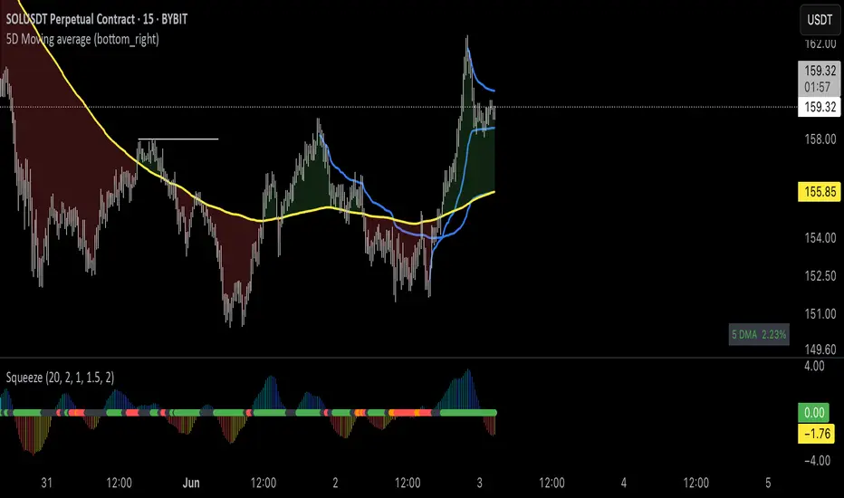
Brian Shannon 5-Day MA BackgroundBrian Shannon 5-Day Moving Average with Dynamic Background Fill
OVERVIEW
This indicator implements Brian Shannon's renowned 5-Day Moving Average methodology from his acclaimed work "Technical Analysis Using Multiple Timeframes." The indicator provides instant visual clarity on short-term trend direction and momentum, making it an essential tool for swing traders and active investors.
KEY FEATURES
• True 5-Day Moving Average: Dynamically calculates the correct period across all timeframes (1min, 5min, 15min, 1H, etc.)
• Visual Price-to-MA Relationship: Color-coded fill between price and the moving average
- Green Fill: Price is above the 5-day MA (bullish short-term momentum)
- Red Fill: Price is below the 5-day MA (bearish short-term momentum)
• Multi-Timeframe Compatible: Works seamlessly on any chart timeframe while maintaining the true 5-day calculation
BRIAN SHANNON'S STRATEGIC APPLICATION
Primary Uses:
1. Trend Identification: Quickly identify short-term momentum shifts
2. Dynamic Support/Resistance: The 5-day MA acts as a moving support level in uptrends and resistance in downtrends
3. Entry Signal Confirmation: Look for pullbacks to the 5-day MA as potential entry points in trending stocks
4. Multi-Timeframe Analysis: Essential component of Shannon's multiple timeframe approach
Perfect Combination with:
• AVWAP (Anchored Volume Weighted Average Price): Use together to identify high-probability setups where price is above both the 5-day MA and AVWAP
• Longer-term Moving Averages: Combine with 20-day and 50-day MAs for complete trend analysis
• Volume Analysis: Confirm 5-day MA signals with volume patterns
TRADING APPLICATIONS
For Swing Traders:
• Bullish Setup: Price above 5-day MA + above AVWAP + above longer-term MAs = Strong uptrend
• Bearish Setup: Price below 5-day MA + below AVWAP + below longer-term MAs = Strong downtrend
• Entry Timing: Use pullbacks to the 5-day MA as entry opportunities in the direction of the primary trend
For Day Traders:
• Quick visual confirmation of intraday momentum
• Dynamic support/resistance levels for scalping opportunities
• Clear trend bias for directional trades
WHY THIS INDICATOR WORKS
Brian Shannon's approach emphasizes that the 5-day moving average represents the short-term sentiment of market participants. When price is consistently above this level, it indicates buyers are in control of short-term price action. Conversely, when price falls below, it suggests selling pressure is dominating.
The visual fill makes it immediately obvious:
• How far price is from the 5-day MA
• The strength of the current short-term trend
• Potential areas where price might find support or resistance
BEST PRACTICES
1. Never use in isolation - Always combine with longer timeframe analysis
2. Volume confirmation - Look for volume expansion on moves away from the 5-day MA
3. Multiple timeframe approach - Check higher timeframes for overall trend direction
4. Combine with AVWAP - Most powerful when both indicators align
INSTALLATION NOTES
This indicator automatically adjusts for any timeframe, ensuring you always get a true 5-trading-day moving average regardless of whether you're viewing 1-minute or hourly charts.
Based on the technical analysis methodology of Brian Shannon, author of "Technical Analysis Using Multiple Timeframes"
Overnight Bias: Net Long/Short with PercentOvernight bias can assist with NY session gap fades or gap and go trading once the NY session is open.
Some general gap rules are:
1. Gap Direction Aligned with Overnight Bias
Rule: If the NY session gaps up and the overnight bias is Net Long (e.g., >60% of bars above the overnight open), favor longs.
Confirmation: Look for price to hold above overnight open or VWAP.
Invalidation: If price re-enters the overnight range, reassess.
2. Gap Opposing Overnight Bias (Contrarian Setup)
Rule: If the NY opens opposite the overnight bias, expect potential gap fill or reversal.
Trade Bias: Look for retracement back toward the overnight open or VWAP.
Example: Overnight was Net Long, but NY gaps down → wait for reclaim of VWAP to go long, else fade strength.
3. Gap Into Prior Day Value Area (VAH to VAL)
Rule: If the NY session gaps into the prior day value area:
It implies mean reversion behavior.
Expect price to rotate toward the POC (point of control).
Trade Bias: Fade toward POC if overnight bias is balanced or opposite the gap direction.
4. Gap Outside Prior Day Value Area
Rule: A gap above VAH or below VAL suggests potential breakout or new trend day.
Trade Bias: If overnight bias aligns (e.g., gap above VAH + Net Long overnight), consider trend continuation.
Invalidation: If price breaks back inside the prior day value area, watch for failed breakout → fade trade possible.
5. Gap Above Prior Day High / Below Prior Day Low
Rule: This is a true breakout gap.
Above Prior High + Net Long Bias: Look for continuation.
Below Prior Low + Net Short Bias: Look for sell pressure continuation.
Trade Bias: Use pullbacks to the prior high/low or overnight open for continuation setups.
6. Gap Within Prior Day Range
Rule: If the NY open is within the prior day’s high and low, expect chop or balanced conditions.
Trade Bias: Use overnight VWAP and prior POC as decision zones. Be cautious unless a breakout occurs.
7. Failed Gap and Re-entry into Prior Day Range
Rule: If price gaps above prior high but re-enters the prior range, it's a failed breakout.
Trade Bias: Look for a fade back to VAH or POC.
Confirmation: Watch for breakdown below overnight VWAP or failure to hold overnight open.
8. Gap + Overnight VWAP Divergence
Rule: If price gaps opposite the direction of VWAP (e.g., VWAP rising, gap down), wait for confirmation.
Trade Bias: Be cautious with early trades. Bias may flip if VWAP is reclaimed.
9. Gap + Overnight Open Test
Rule: If price opens with a gap and then retests the overnight open, that level becomes a decision zone.
Trade Bias:
Hold above = trend continuation.
Rejection = gap fill or reversal.
10. Unfilled Gap = Trend Bias
Rule: If the gap remains unfilled for the first 30–60 minutes, it increases the odds of a trend day.
Trade Bias: Trade pullbacks in the direction of the gap and overnight bias.
Should anyone have suggestion to add please do so.

Deviation ChannelsIndicator Name: Deviation Channels (Dev Chan)
Why Use This Indicator?
Visualize Volatility Ranges:
The indicator plots Keltner Channels at four levels above and below an average line, letting you easily see how far price has deviated from a typical range. Each “dev” line highlights potential support or resistance during pullbacks or surges.
Color-Coded Clarity:
Each band shifts color intensity depending on whether the current price is trading above or below it, letting you spot breakouts and rejections at a glance. Meanwhile, the Fast SMA (default 10) also changes color – green if price is above, red if below – adding a quick momentum read.
Adjustable Source & Length:
Choose your input source (open, close, ohlc4, or hlc3) and set your Keltner length to suit different asset classes or timeframes. Whether you want a tighter, more reactive channel or a smoother, longer-term reading, the script adapts with minimal effort.
A Simple Trading Approach
Identify Trend with Fast SMA:
If the Fast SMA (default length 10) is green (price above it), treat that as a bullish environment. If it’s red (price below), favor bearish or neutral stances.
Wait for Price to Reach Lower/Upper Deviations:
In a bullish setup (Fast SMA green), watch for price to dip into one of the lower channels (e.g., -1 Dev or -2 Dev). Such pullbacks can become potential “buy the dip” zones if price stabilizes and resumes upward momentum.
Conversely, if the Fast SMA is red, watch for price to test the upper channels (1 Dev or 2 Dev). That might be a short opportunity or a place to close out any remaining longs before a deeper correction.
Manage Risk with Channel Levels:
Place stop-losses just beyond the next “dev” band to protect against volatility. For example, if you enter on a bounce at -1 Dev, consider placing a stop near -2 Dev or -3 Dev, depending on your risk tolerance.
Take Profits Gradually:
In an uptrend, you might scale out of positions as price moves toward higher lines (e.g., 1 Dev or 2 Dev). Conversely, if price fails to hold above the Fast SMA or repeatedly closes below a key band, it might be time to exit.
Disclaimer: No single indicator is foolproof. Always combine with sound risk management, observe multiple timeframes, and consider fundamental factors before making trading decisions. Experiment with the Keltner length and Fast SMA fastLength to find the sweet spot for your market and time horizon.
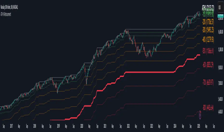
Percentage Retracement from ATH█ OVERVIEW
The Percentage Retracement from ATH indicator is a dynamic trading utility designed to help traders gauge market pullbacks from the peak price. By calculating key retracement levels based on the All-Time High (ATH) and user‑defined percentage inputs, it offers clear visual cues to assist in identifying potential support and resistance zones.
█ KEY FEATURES
Custom Date — Use a custom start date so the indicator only considers specified price action.
Retracement Calculation — Determines ATH and calculates levels based on user‑defined percentages (0% to –100%).
Visual Customisation — Plots configurable horizontal lines and labels showing retracement percentages and prices.
Time Filtering — Uses time filtering to base levels on the desired data period.
█ PURPOSE
Assist traders in visualising the depth of price retracements from recent or historical peaks.
Identify critical zones where the market may find support or resistance after reaching an ATH.
Facilitate more informed entry and exit decisions by clearly demarcating retracement levels on the chart.
█ IDEAL USERS
Swing Traders — Looking to exploit pullbacks following strong upward moves.
Technical Analysts — Interested in pinpointing key retracement levels as potential reversal or continuation points.
Price Action Traders — Focused on the nuances of market peaks and subsequent corrections.
Strategy Developers — Keen to backtest and refine approaches centred on retracement dynamics.
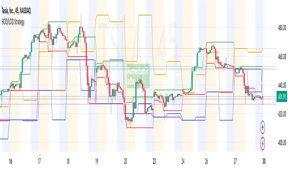
HOD/LOD/PMH/PML/PDH/PDL Strategy by @tradingbauhaus This script is a trading strategy @tradingbauhaus designed to trade based on key price levels, such as the High of Day (HOD), Low of Day (LOD), Premarket High (PMH), Premarket Low (PML), Previous Day High (PDH), and Previous Day Low (PDL). Below, I’ll explain in detail what the script does:
Core Functionality of the Script:
Calculates Key Price Levels:
HOD (High of Day): The highest price of the current day.
LOD (Low of Day): The lowest price of the current day.
PMH (Premarket High): The highest price during the premarket session (before the market opens).
PML (Premarket Low): The lowest price during the premarket session.
PDH (Previous Day High): The highest price of the previous day.
PDL (Previous Day Low): The lowest price of the previous day.
Draws Horizontal Lines on the Chart:
Plots horizontal lines on the chart for each key level (HOD, LOD, PMH, PML, PDH, PDL) with specific colors for easy visual identification.
Defines Entry and Exit Rules:
Long Entry (Buy): If the price crosses above the PMH (Premarket High) or the PDH (Previous Day High).
Short Entry (Sell): If the price crosses below the PML (Premarket Low) or the PDL (Previous Day Low).
Long Exit: If the price reaches the HOD (High of Day) during a long position.
Short Exit: If the price reaches the LOD (Low of Day) during a short position.
How the Script Works Step by Step:
Calculates Key Levels:
Uses the request.security function to fetch the HOD and LOD of the current day, as well as the highs and lows of the previous day (PDH and PDL).
Calculates the PMH and PML during the premarket session (before 9:30 AM).
Plots Levels on the Chart:
Uses the plot function to draw horizontal lines on the chart representing the key levels (HOD, LOD, PMH, PML, PDH, PDL).
Each level has a specific color for easy identification:
HOD: White.
LOD: Purple.
PDH: Orange.
PDL: Blue.
PMH: Green.
PML: Red.
Defines Trading Rules:
Uses conditions with ta.crossover and ta.crossunder to detect when the price crosses key levels.
Long Entry: If the price crosses above the PMH or PDH, a long position (buy) is opened.
Short Entry: If the price crosses below the PML or PDL, a short position (sell) is opened.
Long Exit: If the price reaches the HOD during a long position, the position is closed.
Short Exit: If the price reaches the LOD during a short position, the position is closed.
Executes Orders Automatically:
Uses the strategy.entry and strategy.close functions to open and close positions automatically based on the defined rules.
Advantages of This Strategy:
Based on Key Levels: Uses important price levels that often act as support and resistance.
Easy to Visualize: Horizontal lines on the chart make it easy to identify levels.
Automated: Entries and exits are executed automatically based on the defined rules.
Limitations of This Strategy:
Dependent on Volatility: Works best in markets with significant price movements.
False Crosses: There may be false crosses that generate incorrect signals.
No Advanced Risk Management: Does not include dynamic stop-loss or take-profit mechanisms.
How to Improve the Strategy:
Add Stop-Loss and Take-Profit: To limit losses and lock in profits.
Filter Signals with Indicators: Use RSI, MACD, or other indicators to confirm signals.
Optimize Levels: Adjust key levels based on the asset’s behavior.
In summary, this script is a trading strategy that operates based on key price levels, such as HOD, LOD, PMH, PML, PDH, and PDL. It is useful for traders who want to trade based on significant support and resistance levels.
TearRepresentative's Rule-Based Dip Buying Strategy Rule-Based Dip Buying Strategy Indicator
This TradingView indicator, inspired by TearRepresentative [ , is a refined tool designed to assist traders in implementing a rule-based dip buying strategy. The indicator automates the identification of optimal buy and sell points, helping traders stay disciplined and minimize emotional biases. It is tailored to index trading, specifically leveraged ETFs like SPXL, to capture opportunities in market pullbacks and recoveries.
Key Features
Dynamic Buy Levels:
Tracks the local high over a customizable lookback period and calculates three buy levels based on percentage drops from the high:
Buy Level 1: First entry point (e.g., 15% drop).
Buy Level 2: Second entry point (e.g., additional 10% drop).
Buy Level 3: Third entry point (e.g., additional 7% drop).
Average Price Tracking:
Dynamically calculates the average price for entered positions when multiple buy levels are triggered.
Sell Level:
Computes a take-profit level (e.g., 20% above the average price) to automate profit-taking when the market rebounds.
Signal Visualization:
Buy Signals: Displayed as green triangles at each buy level.
Sell Signals: Displayed as red triangles at the sell level.
Alerts:
Configurable alerts notify traders when buy or sell signals are triggered, ensuring no opportunity is missed.
Visual Aids:
Semi-transparent and dynamic lines represent buy and sell levels for clear visualization.
Labels provide additional clarity for active levels, helping traders quickly identify actionable signals.
How It Works
The indicator analyzes market movements to identify dips based on predefined thresholds.
Buy signals are triggered when the market price reaches specified levels below the local high.
Once a position is taken, the indicator dynamically adjusts the average entry price and calculates the corresponding sell level.
A sell signal is generated when the market price rises above the calculated take-profit level.
Why Use This Indicator?
Discipline: Automates decision-making, removing emotional factors from trading.
Clarity: Provides clear entry and exit points to simplify complex market dynamics.
Versatility: Suitable for all market conditions, especially during pullbacks and rebounds.
Customization: Allows traders to tailor parameters to their preferred trading style and risk tolerance.
Acknowledgment
This indicator is based on the strategy and insights provided by TearRepresentative, whose expertise in rule-based trading has inspired countless traders. TearRepresentative's approach emphasizes simplicity, reliability, and consistency, offering a robust framework for long-term success.

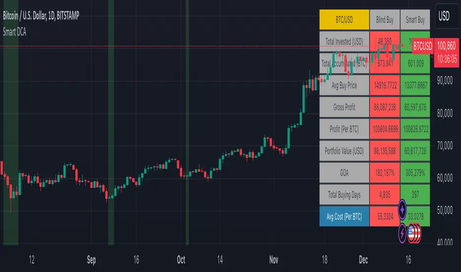
Smart DCA Strategy (Public)INSPIRATION
While Dollar Cost Averaging (DCA) is a popular and stress-free investment approach, I noticed an opportunity for enhancement. Standard DCA involves buying consistently, regardless of market conditions, which can sometimes mean missing out on optimal investment opportunities. This led me to develop the Smart DCA Strategy – a 'set and forget' method like traditional DCA, but with an intelligent twist to boost its effectiveness.
The goal was to build something more profitable than a standard DCA strategy so it was equally important that this indicator could backtest its own results in an A/B test manner against the regular DCA strategy.
WHY IS IT SMART?
The key to this strategy is its dynamic approach: buying aggressively when the market shows signs of being oversold, and sitting on the sidelines when it's not. This approach aims to optimize entry points, enhancing the potential for better returns while maintaining the simplicity and low stress of DCA.
WHAT THIS STRATEGY IS, AND IS NOT
This is an investment style strategy. It is designed to improve upon the common standard DCA investment strategy. It is therefore NOT a day trading strategy. Feel free to experiment with various timeframes, but it was designed to be used on a daily timeframe and that's how I recommend it to be used.
You may also go months without any buy signals during bull markets, but remember that is exactly the point of the strategy - to keep your buying power on the sidelines until the markets have significantly pulled back. You need to be patient and trust in the historical backtesting you have performed.
HOW IT WORKS
The Smart DCA Strategy leverages a creative approach to using Moving Averages to identify the most opportune moments to buy. A trigger occurs when a daily candle, in its entirety including the high wick, closes below the threshold line or box plotted on the chart. The indicator is designed to facilitate both backtesting and live trading.
HOW TO USE
Settings:
The input parameters for tuning have been intentionally simplified in an effort to prevent users falling into the overfitting trap.
The main control is the Buying strictness scale setting. Setting this to a lower value will provide more buying days (less strict) while higher values mean less buying days (more strict). In my testing I've found level 9 to provide good all round results.
Validation days is a setting to prevent triggering entries until the asset has spent a given number of days (candles) in the overbought state. Increasing this makes entries stricter. I've found 0 to give the best results across most assets.
In the backtest settings you can also configure how much to buy for each day an entry triggers. Blind buy size is the amount you would buy every day in a standard DCA strategy. Smart buy size is the amount you would buy each day a Smart DCA entry is triggered.
You can also experiment with backtesting your strategy over different historical datasets by using the Start date and End date settings. The results table will not calculate for any trades outside what you've set in the date range settings.
Backtesting:
When backtesting you should use the results table on the top right to tune and optimise the results of your strategy. As with all backtests, be careful to avoid overfitting the parameters. It's better to have a setup which works well across many currencies and historical periods than a setup which is excellent on one dataset but bad on most others. This gives a much higher probability that it will be effective when you move to live trading.
The results table provides a clear visual representation as to which strategy, standard or smart, is more profitable for the given dataset. You will notice the columns are dynamically coloured red and green. Their colour changes based on which strategy is more profitable in the A/B style backtest - green wins, red loses. The key metrics to focus on are GOA (Gain on Account) and Avg Cost.
Live Trading:
After you've finished backtesting you can proceed with configuring your alerts for live trading.
But first, you need to estimate the amount you should buy on each Smart DCA entry. We can use the Total invested row in the results table to calculate this. Assuming we're looking to trade on
BTCUSD
Decide how much USD you would spend each day to buy BTC if you were using a standard DCA strategy. Lets say that is $5 per day
Enter that USD amount in the Blind buy size settings box
Check the Blind Buy column in the results table. If we set the backtest date range to the last 10 years, we would expect the amount spent on blind buys over 10 years to be $18,250 given $5 each day
Next we need to tweak the value of the Smart buy size parameter in setting to get it as close as we can to the Total Invested amount for Blind Buy
By following this approach it means we will invest roughly the same amount into our Smart DCA strategy as we would have into a standard DCA strategy over any given time period.
After you have calculated the Smart buy size, you can go ahead and set up alerts on Smart DCA buy triggers.
BOT AUTOMATION
In an effort to maintain the 'set and forget' stress-free benefits of a standard DCA strategy, I have set my personal Smart DCA Strategy up to be automated. The bot runs on AWS and I have a fully functional project for the bot on my GitHub account. Just reach out if you would like me to point you towards it. You can also hook this into any other 3rd party trade automation system of your choice using the pre-configured alerts within the indicator.
PLANNED FUTURE DEVELOPMENTS
Currently this is purely an accumulation strategy. It does not have any sell signals right now but I have ideas on how I will build upon it to incorporate an algorithm for selling. The strategy should gradually offload profits in bull markets which generates more USD which gives more buying power to rinse and repeat the same process in the next cycle only with a bigger starting capital. Watch this space!
MARKETS
Crypto:
This strategy has been specifically built to work on the crypto markets. It has been developed, backtested and tuned against crypto markets and I personally only run it on crypto markets to accumulate more of the coins I believe in for the long term. In the section below I will provide some backtest results from some of the top crypto assets.
Stocks:
I've found it is generally more profitable than a standard DCA strategy on the majority of stocks, however the results proved to be a lot more impressive on crypto. This is mainly due to the volatility and cycles found in crypto markets. The strategy makes its profits from capitalising on pullbacks in price. Good stocks on the other hand tend to move up and to the right with less significant pullbacks, therefore giving this strategy less opportunity to flourish.
Forex:
As this is an accumulation style investment strategy, I do not recommend that you use it to trade Forex.
For more info about this strategy including backtest results, please see the full description on the invite only version of this strategy named "Smart DCA Strategy"
Adjustable Correction from ATH SignalA "Correction Signal from All-Time High" is an indicator used to identify potential reversals or pullbacks in an asset's price after it has reached its highest historical level, known as an all-time high (ATH). This signal typically occurs when the price begins to decline after hitting the ATH, suggesting a correction phase where the asset retraces part of its upward movement.
Key elements of this signal include:
Overbought Conditions: The asset may have experienced a strong rally leading to an overbought condition, where the price could be considered too high relative to recent trends.
Reversal Patterns: The correction signal is often accompanied by technical patterns or indicators that suggest a reversal, such as bearish candlestick formations, negative divergence in momentum indicators, or moving average crossovers.
Percentage Decline: A correction is generally defined as a price drop of at least 10% from the ATH, although smaller pullbacks may also signal potential market shifts.
Volume Analysis: Increased selling volume after the ATH can validate the correction signal, indicating that more market participants are taking profits or exiting positions.
This signal helps traders and investors anticipate periods of market consolidation or potential downturns after significant price advances, allowing for better risk management or entry points for new positions.
Pivot Points + Day First Candle Breakout + VWAP + Supertrend This indicator amalgamates several key indicators to provide a comprehensive analysis for trading decisions, including SuperTrend, Pivot Points, VWAP, along with the Day First Candle Breakout strategy.
Key Features:
Day First Candle Breakout: Identifies potential breakout opportunities based on the first candle of the trading day. It utilizes the high and low of the initial trading range to determine entry points.
Timeframe Selection: Allows users to select the timeframe for analyzing the first candle (e.g., 5, 15, or 60 minutes).
Previous Day and Week High/Low: Displays the high and low of the previous day and week to provide additional context for trading decisions and assess the strength of the trend.
Trend Strength Analysis: Indicates whether the current price is above or below the previous day's high or low, signaling a stronger bullish or bearish trend respectively.
SuperTrend Indicator: Visualizes the trend direction and potential reversal points based on the SuperTrend indicator. It helps traders to stay aligned with the prevailing trend and avoid premature exits.
Pivot Points: Presents key support and resistance levels derived from Pivot Points, assisting traders in identifying potential reversal or breakout zones.
VWAP (Volume Weighted Average Price): Plots VWAP to provide insight into the average price traded over a given period, aiding in determining the fair value of the asset and potential buying/selling zones.
Trading Signals:
Buy Signal: Triggered when the price exceeds the high of the initial trading range after an upward price gap.
Sell Signal: Generated when the price falls below the low of the initial trading range after a downward price gap.
Caveats for Effective Trading:
Extended Trading Ranges: Adjusts support and resistance levels if the initial trading range extends beyond the defined timeframe.
Morning Noise Consideration: Exercises caution during volatile morning sessions to avoid false breakouts and whipsaws.
Pullbacks and Narrow Range Bars: Looks for opportunities during pullbacks or when the price forms narrow range bars to enter trades, reducing the risk of sudden reversals.
Day First Candle BreakoutR-DFCB V1.5: Day First Candle Breakout
This indicator identifies potential breakout opportunities based on the first candle of the trading day. It considers the high and low of the initial trading range to determine possible entry points, along with the previous day's high and low to gauge the strength of the trend.
Key Features:
Day First Candle Breakout: Analyzes the first candle of the trading day to identify potential breakout scenarios.
Timeframe Selection: Allows users to select the timeframe for analyzing the first candle (e.g., 5, 15, or 60 minutes).
Previous Day and Week High/Low: Displays the high and low of the previous day and week to provide additional context for trading decisions.
Previous Day Trend Strength: Indicates whether the current price is above or below the previous day's high or low, signaling a stronger bullish or bearish trend respectively.
Trading Signals:
Buy Signal: Triggered when the price exceeds the high of the initial trading range after an upward price gap.
Sell Signal: Generated when the price falls below the low of the initial trading range after a downward price gap.
Trend Strength Analysis:
Strong Bullish Trend: If the current price is above the previous day's high, it indicates a stronger bullish trend.
Strong Bearish Trend: If the current price is below the previous day's low, it suggests a stronger bearish trend.
Caveats for Effective Trading:
Extended Trading Ranges: Adjusts support and resistance levels if the initial trading range extends beyond the defined timeframe.
Morning Noise Consideration: Exercises caution during volatile morning sessions to avoid false breakouts and whipsaws.
Pullbacks and Narrow Range Bars: Looks for opportunities during pullbacks or when the price forms narrow range bars to enter trades, reducing the risk of sudden reversals.
Dynamic Momentum Oscillator (DMO) [Angel Algo]Dynamic Momentum Oscillator (DMO)
OVERVIEW: The Dynamic Momentum Oscillator (DMO) is a technical indicator designed to measure the momentum of price movements in financial markets. It combines momentum calculation with dynamic range assessment to provide insights into potential trend reversals and overbought/oversold conditions.
DMO is different from classic momentum oscillators like the RSI or Stochastic Oscillator because it looks at the momentum in relation to how much the price is moving. This helps it give signals that better match what's happening in the market, especially when the market's volatility is changing.
HOW TO USE:
Interpretation:
Thresholds: Horizontal lines mark user-defined threshold levels for overbought (OB) and oversold (OS) conditions, aiding in identifying potential trend pullbacks and reversals.
DMO Line: The primary line on the indicator plot. It reflects momentum in relation to the dynamic price range. Positive values indicate bullish momentum, while negative values indicate bearish momentum.
Filled Area: The area between the DMO line and the zero line is filled with color to enhance visualization of momentum shifts.
Trading Signals:
Thresholds: Monitor for potential trend reversals when the DMO crosses above the overbought threshold or below the oversold threshold.
Crossovers: Look for buy signals when the DMO line crosses above the zero and sell signals when it crosses below.
Filled Area: The green color indicates bullish momentum, red indicates bearish momentum and gray color indicates neutral conditions.
Signals: Circles appear on the chart when the DMO crosses the overbought or oversold thresholds, indicating conditions for potential trend pullbacks or reversals.
SETTINGS:
Length: Adjust the length parameter to vary the number of periods considered in the momentum calculation.
Smoothing: Enable or disable smoothing of the DMO line using the provided option.
Thresholds: Customize the overbought and oversold threshold levels to suit specific market conditions and trading preferences.
Disclaimer: The DMO indicator serves as part of a comprehensive trading strategy and should not be solely relied upon for trading decisions. Past performance is not indicative of future results, and trading involves inherent risks.

Money Flow Trend Strength [CraftyChaos]I devised this indicator because I wanted to find a way to track the Money Flow Trend to exhaustion for both directions.
Overview:
I use two MFI series and an EMA of the faster MFI series to derive when the Money Flow is trending in one direction or another.
What does this indicator not do:
This indicator does not give buy and sell signals.
What does this indicator do:
This indicator offers confluence with your other indicators to determine when a reversal is approaching after a sustained trend of money flowing in or out of an asset.
This indicator can help time your trades near reversal points, so you are not entering trades in the middle of some trending move.
How to Tune
I would not recommend changing the settings. I have exposed them for people that want to experiment. The short lengths are key to reducing lag
How to read the indicator:
When a red cross appears at the top, this indicates money flow into the asset is strong. Do not short an asset while there are red crosses. You will get REKT
When a green cross appears at the bottom, this indicates money flow exiting the asset is strong. DO NOT buy an asset while there are green crosses. You will get REKT.
When the white step line enters the top, but no crosses appear, this indicates money is flowing into the asset, but is weak. The trend will either gain strength soon or will collapse.
When the white step line enters the bottom, but no crosses appear, this indicates money is flowing out of the asset, but is weak. The trend will either gain strength soon or will collapse.
The green line is the slower MFI. I would not use any crosses with the white step line and the green line. These two lines can cross frequently and show divergences with price. very frequent crossing may indicate sideways movement with no real price movement.
I often see the white step line enter the bottom and top zones under two primary conditions:
Secondary tests of support and resistance zone which fail
Failed breakouts/pullbacks after a pump or dump
Additionally, I use my indicator with the following indicators. You may find them useful:
Jurik Filtered, Composite Fractal Behavior (CFB) Channels (on current timeframe). Note: I often find strong trends trace the upper/lower bands, and end when the upper or lower band flattens
Jurik Filtered, Composite Fractal Behavior (CFB) Channels (on smaller timeframe, i.e., 2hr on a 4h or 15m on the 1hr). Note: I often find weak trend pullbacks/breakouts touch the channel bands
Session Volume Profile. Note: find trend completion corresponds to price above/below VAL areas
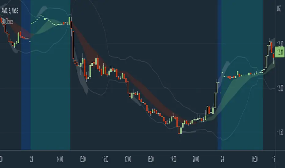
Bollinger Band Clouds [vnhilton]I recommend to turn off 'Labels on price scale' & 'Values in status line' as this indicator's intended use is for visualizing volatility in the form of overextensions & pullbacks only.
Default settings for intraday use - however you can change various settings for your personal use.
Bollinger bands is a volatility indicator which plots X standard deviation bands away from the base moving average. When price isn't volatile, bands are compressed (closer to base moving average), & expand when volatility starts to increase - this makes Bollinger bands a great visual indicator for displaying volatility cycles. Although prices aren't normally distributed (i.e. 2 standard deviation bands won't mean 95% of price will lie within the bands), Bollinger bands can be useful to show strong abnormal trends when price is outside the bands, which can be seen as overextensions & will have to retrace sooner or later, towards the moving averages. Price trends within bands are seen as healthy trends (price grinds fit this description).
This indicator creates clouds (fill) between 2 different moving average standard deviation bands. The idea is to better visualize strong trends/overextensions as the shorter period standard deviation bands will be outside the longer period bands. This indicator also provides bar color changes for when the bar close is outside the longer period standard deviation bands to help illustrate the strong trends/overextensions. The chart snapshot image shows standard deviation clouds for a 10-20 period SMA. This indicator also allows for better visualization on pullbacks to the mean, by giving a MA cloud between the 2 short & long period MAs.
FTL - Range Filter X2 + EMA + UOThjs script combines two range filters, an EMA and the Ultimate oscillator.
This is an indicator type of script with alerts that is ideal for one minute scalping and was developed initially for NAS100 but has been used successfully with other symbols.
The two range filters are used to detect when the short and mid term trends are in the same direction.
The EMA indicates the longer term trend and the UO is used to determine if an asset is overbought or oversold.
This indicator pairs well with divergence indicators to add confluence to a change in direction.
Additional features of this indicator:
- Configure whether to show buy and sell labels only when asset is not overbought or oversold
- Select whether to show buys only when price is above the EMA , or sells only below the EMA
- Indicate a bar where a trend crosses the EMA and select if the crossover or cross under should be shown only in a counter trend.
- Pullbacks within a trend can be identified. This may indicate trend continuation.
- Alerts can be created for pullbacks, EMA crossing and for buy or sell signals

Close to SupertrendMany a times, we have seen that the price closing in towards supertrend reverses.
This indicator gives signal that identifies high / low of any candle if near the down / up supertrend line by a defined margin using arrow signals.
I've simply re-used readily available supertrend indicator source code and just modified it to these signals. So, almost all of the source code is not mine.
Enter the short / long position when arrow signal appears.
SL / trend reversal will be mandatorily at close of a candle above or below the supertrend line, and the supertrend changes direction.
Hope this indicator comes handy for you.

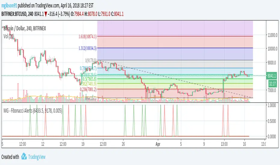
MG - Fibonacci Alerts - 1.0This script allows a user to get alerts when the price goes within a certain percentage threshold of a Fibonacci level.
If connected with AutoView, it could allow an easy way to do automated range trading between Fibonacci levels. Although I plan to do this myself, I haven't used it for this purpose yet so please be cautious and verify with live results beforehand before using it for any automation.
NOTE: The image shown of the indicator is not fully correct as the close price is used. In many cases in the example image, the candle close price DID come within the alert threshold but closed outside the threshold
Usage:
1. User performs a Fibonacci retracement / extension analysis to identify a sensible high and low point. (Currently, this script is geared towards dip pullbacks during a bull market with the ability to toggle rise pullbacks in a bear market in the pipeline)
2. User enters the high and low points into this indicator
3. User can then set alerts on the buy and sell signals which should provide alerts at excellent entry / exit points.
a. Alerts must be created on the buy and sell signal bars. E.g. Buy signal => Alert when 'Buy Signal' crosses up '0.9'
4. Set the alerts to once per bar (not per close). In this indicator, we want to catch things as soon as they happen.
NOTE: Should use in conjunction with another indicator for maximize results.
I personally use this indicator ()
TODO
- Add negative alert levels
- Allow user to specify direction of Fib retracement as the levels are different in bull and bear markets
All feedback is welcome
2 hours ago
MG - Fibonacci Level AlertsThis script allows a user to get alerts when the price goes within a certain percentage threshold of a Fibonacci level.
If connected with AutoView, it could allow an easy way to do automated range trading between Fibonacci levels. Although I plan to do this myself, I haven't used it for this purpose yet so please be cautious and verify with live results beforehand before using it for any automation.
NOTE: The image shown of the indicator is not fully correct as the close price is used. In many cases in the example image, the candle close price DID come within the alert threshold but closed outside the threshold
Usage:
1. User performs a Fibonacci retracement / extension analysis to identify a sensible high and low point. (Currently, this script is geared towards dip pullbacks during a bull market with the ability to toggle rise pullbacks in a bear market in the pipeline)
2. User enters the high and low points into this indicator
3. User can then set alerts on the buy and sell signals which should provide alerts at excellent entry / exit points.
4. Set the alerts to once per bar (not per close). In this indicator, we want to catch things as soon as they happen.
NOTE: Should use in conjunction with another indicator for maximum results.
I personally use this indicator ()
TODO
- Add negative alert levels
- Allow user to specify direction of Fib retracement as the levels are different in bull and bear markets
All feedback is welcome

5m Exit AlertsThese can help a lot with Daytrading if you don't have a price target in mind when there's no clear resistance / support nearby, and you don't trust the market enough to hold it as a swing trade.
Keep in mind that its main purpose is to give you a "warning" that it might be good to look at your screen, instead of guaranteeing you "now is the best time to exit". You won't reach high winning stats by blindly following this alert.
"A Exit LONG":
(I'm using letters instead of numbers for all Exit alerts to make sure I don't accidentally confuse Enter and Exit alerts).
There are 4 conditions that might trigger it. The reasons show up in the exit alert message (unfortunately only as a number, since alert messages can't have "dynamic text" in TradingView), and can also be displayed as symbols in the chart (see image above - make sure to enable "Show Signals" in the indicator settings first though).
Here are the conditions sorted from best to worst:
Technical reversal: Bearish Hammer candle with Volume > 2 * avg volume (of last 30 candles), when 5m candle closed. Reversal very likely. This is usually the best time to take your gains for the rest of the day.
EMA 3/8 cross: standard 5m EMA 3/8 cross, indicating a trend reversal, or at least a pullback. Can also be helpful to detect double tops / double bottoms.
Trailing Stop Loss: Crossed below 30m EMA 8, 5m candle closed. This is a "fallback" alert in case EMA 3 was already below EMA 8 before you set up the alert. It's not unlikely that the stock might go further down to VWAP, so depending on the chart and market this might be a good opportunity to save the gains you have left.
"Final" Stop Loss: Crossed below VWAP. Usually not a good sign. If you entered around VWAP your losses shouldn't be big yet, but if you plan on holding the stock the Daily chart and market outlook should better be quite convincing, and you wouldn't have needed to use this alert in the first place.
Keep in mind these work of course best if you picked a "good" stock: clear movement, tidy price action, high volume. Otherwise alerts are more likely to be triggered redundantly.
Always consider how the market and stock looks like, then decide whether to exit or not! Usually it makes sense to wait a bit to see f. e. whether the stock bounces off the 30m EMA 8, and it's just a pullback.
"B Enter SHORT":
Similar, but for shorts...
"C 1m Scalp LONG" + "D 1m Scalp SHORT":
Simple Scalping alert for EMA 3/8 cross on a 1m chart - but without needing to use a 1m chart to set it up!
Unfortunately it's not as accurate as manually setting this alert up on a 1m chart. It might be an advantage though that it sometimes is triggered 1-2 min later, since this means there are less redundant triggerings.
It can be useful esp. on high momentum trades, but I honestly haven't used it in a looong while.
"X Candle Close":
same as in 5m Entry indicator: triggered when 5m candle is confirmed
"Z Trend Change: UP" + "Z Trend Change: DOWN":
This one is meant to be used only on SPY: It alerts you when SPY is changing its trending direction, which might mean entering or closing existing trades.
I have therefore set it up to never end (by setting it to "Once Per Bar Close" in the alert settings).
It's based on DMI positive or negative being > 25. I had it based on VWAP at the beginning, but there were days where it was triggered every 5 minutes...
More infos: www.reddit.com

Stochastic Momentum Channel with Volume Filter [IkkeOmar]A stochastic version of my momentum channel volume filter
The "Stochastic Momentum" indicator combines the concepts of Stochastic and Bollinger Bands to provide insights into price momentum and potential trend reversals. It can be used to identify overbought and oversold conditions, as well as potential bullish and bearish signals.
The indicator calculates a Stochastic RSI using the RSI (Relative Strength Index) of a given price source. It applies smoothing to the Stochastic RSI values using moving averages to generate two lines: the %K line and the %D line. The %K line represents the current momentum, while the %D line represents a filtered version of the momentum.
Additionally, the indicator plots Bollinger Bands around the moving average of the Stochastic RSI. The upper and lower bands represent levels where the price is considered relatively high or low compared to its recent volatility. The distance between the bands reflects the current market volatility.
Here's how the indicator can be interpreted:
Stochastic Momentum (%K and %D lines):
When the %K line crosses above the %D line, it suggests a potential upward move or bullish momentum.
When the %K line crosses below the %D line, it indicates a potential downward move or bearish momentum.
The color of the plot changes based on the relationship between the %K and %D lines. Green indicates %K > %D, while red indicates %K < %D.
Bollinger Bands (Upper and Lower Bands):
When the price crosses above the upper band, it suggests an overbought condition, indicating a potential reversal or pullback.
When the price crosses below the lower band, it suggests an oversold condition, indicating a potential reversal or bounce.
To identify potential upward moves, consider the following conditions:
If the price is not in a contraction phase (the bands are not narrowing), and the price crosses above the lower band, it may signal a potential upward move or bounce.
If the %K line crosses above the %D line while the %K line is below the upper band, it may indicate a potential upward move.
To identify potential downward moves, consider the following conditions:
If the price is not in a contraction phase (the bands are not narrowing), and the price crosses below the upper band, it may signal a potential downward move or pullback.
If the %K line crosses below the %D line while the %K line is above the lower band, it may indicate a potential downward move.
Code explanation
Input Variables:
The input function is used to create customizable input variables that can be adjusted by the user.
smoothK and smoothD are inputs for the smoothing periods of the %K and %D lines, respectively.
lengthRSI represents the length of the RSI calculation.
lengthStoch is the length parameter for the stochastic calculation.
volumeFilterLength determines the length of the volume filter used to filter the RSI.
Source Definition:
The src variable is an input that defines the price source used for the calculations.
By default, the close price is used, but the user can choose a different price source.
RSI Calculation:
The rsi1 variable calculates the RSI using the ta.rsi function.
The RSI is a popular oscillator that measures the strength and speed of price movements.
It is calculated based on the average gain and average loss over a specified period.
In this case, the RSI is calculated using the src price source and the lengthRSI parameter.
Volume Filter:
The code calculates a volume filter to filter the RSI values based on the average volume.
The volumeAvg variable calculates the simple moving average of the volume over a specified period (volumeFilterLength).
The filteredRsi variable stores the RSI values that meet the condition of having a volume greater than or equal to the average volume (volume >= volumeAvg).
Stochastic Calculation:
The k variable calculates the %K line of the Stochastic RSI using the ta.stoch function.
The ta.stoch function takes the filtered RSI values (filteredRsi) as inputs and calculates the %K line based on the length parameter (lengthStoch).
The smoothK parameter is used to smooth the %K line by applying a moving average.
The d variable represents the %D line, which is a smoothed version of the %K line obtained by applying another moving average with a period defined by smoothD.
Momentum Calculation:
The kd variable calculates the average of the %K and %D lines, representing the momentum of the Stochastic RSI.
Bollinger Bands Calculation:
The ma variable calculates the moving average of the momentum values (kd) using the ta.sma function with a period defined by bandLength.
The offs variable calculates the offset by multiplying the standard deviation of the momentum values with a factor of 1.6185.
The up and dn variables represent the upper and lower bands, respectively, by adding and subtracting the offset from the moving average.
The Bollinger Bands provide a measure of volatility and can indicate potential overbought and oversold conditions.
Color Assignments:
The colors for the plot and Bollinger Bands are assigned based on certain conditions.
If the %K line is greater than the %D line, the plotCol variable is set to green. Otherwise, it is set to red.
The upCol and dnCol variables are set to different colors based on whether the fast moving average (fastMA) is above or below the upper and lower bands, respectively.
Plotting:
The Stochastic Momentum (%K) is plotted using the plot function with the assigned color (plotCol).
The upper and lower Bollinger Bands are plotted using the plot function with the respective colors (upCol and dnCol).
The fast moving average (fastMA) is plotted in black color to distinguish it from the bands.
The hline function is used to plot horizontal lines representing the upper and lower bands of the Stochastic Momentum.
The code combines the Stochastic RSI, Bollinger Bands, and color logic to provide visual representations of momentum and potential trend reversals. It allows traders to observe the interaction between the Stochastic Momentum lines, the Bollinger Bands, and price movements, enabling them to make informed trading decisions.

CVD Complete Volume Analysis ProCVD Complete Volume Analysis Pro | Order Flow & Absorption
Introduction:
In the world of modern trading, Price is the advertisement, but Volume is the fuel. However, standard volume indicators on TradingView are often insufficient. They tell you how much was traded, but they don’t tell you how it was traded.
Was that large volume spike aggressive buying driving the trend? or was it a "buying frenzy" hitting a wall of passive limit orders (absorption)?
The CVD Complete Volume Analysis Pro (v5) is an advanced institutional-grade Order Flow engine. By utilizing 1-second intrabar data, this indicator reconstructs the "Tick Rule" to separate Aggressive (Market) orders from Passive (Limit) orders. It calculates Cumulative Volume Delta (CVD), detects Absorption/Distribution anomalies, and utilizes an embedded Logistic Regression model to predict daily directional bias.
This is not just an indicator; it is a complete Order Flow Dashboard designed to aid and support complex footprint charts for the everyday trader.
🏗️ How It Works: The "Micro-Structure" Engine
Most volume indicators on TradingView look at the close of a 1-minute or 5-minute bar to guess the volume direction. This script goes deeper.
1. The 1-Second Granularity
Using TradingView's request.security_lower_tf capability, this script pulls 1-second resolution data regardless of the chart timeframe you are on.
It analyzes the price movement every second.
It applies the "Tick Rule": If price moves up, volume is classified as Buy. If price moves down, volume is classified as Sell.
This allows for a highly accurate reconstruction of Buying vs. Selling pressure that standard indicators miss.
2. The "Cluster" Concept
The script aggregates these 1-second data points into Clusters.
Default: 60 seconds (1 minute) per cluster.
This creates a normalized "Heartbeat" of the market, allowing us to compare the efficiency of volume over fixed time windows, removing the noise of time-based chart distortions.
3. The "Passive" Detection Logic (The Core Feature)
This is the most powerful aspect of the tool. It calculates the relationship between Effort (CVD) and Result (Price Move).
The Baseline: The script calculates a rolling statistical baseline (Standard Deviation) of how much price should move for a given amount of Delta.
Absorption (Hidden Buying): If we see massive Aggressive Selling (Negative CVD) but price refuses to drop (or drops significantly less than the statistical model predicts), the script identifies this as Passive Buying.
Distribution (Hidden Selling): If we see massive Aggressive Buying (Positive CVD) but price refuses to rise, the script identifies this as Passive Selling.
📊 The Dashboard Breakdown
The on-screen dashboard is your command center. It updates in real-time to provide a snapshot of the market's internal mechanics.
Section 1: Flow Analysis
This section analyzes the current session's behavior.
Flow Type: Categorizes the market state using algorithmic logic.
Aggressive Buying/Selling: The market is trending, and aggressive participants are winning.
Strong Accumulation/Distribution: A reversal signal. Aggressive participants are trapped, and passive whales are absorbing order flow.
Flow vs. Price: Detects divergences instantly.
Bullish Divergence: Net Flow is Positive, but Price is down (indicates manipulation or temporary suppression).
Bearish Divergence: Net Flow is Negative, but Price is up (indicates a "trap" move).
Section 2: Volume Breakdown
A detailed ledger of the day's activity.
Aggressive Buy/Sell: Market orders executing at the ask/bid. This represents "Impatience."
Passive Buy/Sell: The estimated volume of Limit Orders absorbing the aggressive flow. This represents "Intent."
Net Flow: The mathematical sum of all buy pressure minus sell pressure.
Section 3: Net Positioning (Multi-Day)
Markets don't happen in a vacuum. This section looks back (default 5 days) to see the accumulated inventory.
Bias: Are we in a multi-day accumulation or distribution phase?
Activity Type:
High Hidden Activity: Indicates a fighting market with heavy limit orders (choppy/reversal prone).
Mostly Aggressive: Indicates a trending market with low resistance.
Section 4: Predictive Model (Machine Learning)
The script features an embedded Logistic Regression Model.
It trains on the last N days of Flow Data (CVD, Net Aggressive, Net Passive, Passive Ratios).
It outputs a Probability Score (0% to 100%) regarding the likelihood of an UP close for the current session.
Note: This is a probability model based on order flow history, not a guarantee. Use it as a bias confirmation tool.
🧠 Educational: How to Trade With This
Strategy 1: The "Absorption" Reversal
Context: Price hits a major resistance level.
Look at the Dashboard: You want to see "Flow Type" switch to "Strong Distribution".
The Logic: Price is rising, and aggressive buyers are hitting the ask. However, the script detects that for every buy order, a passive seller is absorbing it. Price stops moving up despite high volume.
The Trigger: When Price creates a lower low on the chart while the dashboard shows Distribution, this is a high-probability short entry.
Strategy 2: The Flow Divergence
Context: Price is trending down.
Look at the Dashboard: Price is making new lows, but the "Net Flow" is turning Green (Positive), or the "Cum CVD" is sloping upwards.
The Logic: This is "Effort vs. Result." Sellers are exhausted. They are pushing price down, but the net flow is shifting to buyers.
The Trigger: Enter Long on the first structure break.
Strategy 3: Trend Continuation
Context: Market is opening or breaking a range.
Look at the Dashboard: You want "Full Alignment."
Signals: "Flow Type" says Aggressive Buying, Net Flow is Positive, and the Predictive Model shows >60% Bullish Probability.
The Logic: There is no passive resistance. Aggressive buyers are pushing price up freely.
The Trigger: Buy pullbacks.
⚙️ Settings & Configuration
Cluster Size: The number of 1-second bars to group together.
Use 60 (1 min) for Scalping.
Use 300 (5 min) for Day Trading.
Average Length: The baseline for statistical calculations. Higher numbers = smoother baselines but slower adaptation.
Detection Settings:
Passive Multiplier: Adjusts the sensitivity of the absorption estimation. 1.0 is standard. Increase to 1.5 if you only want to see extreme anomalies.
Daily Tracking:
History Days: How many days of data to display in the table. Note: Due to TradingView data limits, keeping this between 3-5 days ensures the most stability.
⚠️ Important Technical Limitations
Please read this section carefully to understand the constraints of the Pine Script environment:
Data Depth (The 100k Limit): TradingView limits request.security_lower_tf to approximately 100,000 intrabars.
This means the script can typically only "see" the last 3 to 5 days of true 1-second data.
If you set History Days or Training Days too high (e.g., 20 days), the script may return 0 values for older dates because the high-resolution data simply doesn't exist on the server.
Approximation of Ticks: While 1-second data is extremely precise, it is still an aggregation. In extremely high-volatility events (like CPI releases), multiple ticks happen inside one second. The script attributes the volume of that second based on the close relative to the open/prev close. It is the best approximation possible on TradingView, but not a replacement for Level 3 Tick Data feeds.
Calculation Time: This is a heavy script. On lower-end devices or when loading on many charts simultaneously, you may experience a "Calculation took too long" warning. If this happens, reduce the History Days to 3.
🛡️ Disclaimer
No Repainting: This indicator uses strict historical referencing and does not repaint closed clusters.
Not Financial Advice: This tool provides data visualization. Order flow is a subjective art. Always manage your risk.
Author's Note:
I built this tool because I wanted the power of Order Flow footprint charts without the visual clutter. By using statistical baselines to detect passive liquidity, we can finally see the "invisible hand" of the market directly on our TradingView charts. I hope this adds value to your trading.
👍 If you find this script useful, please leave a Boost and a Comment below!

Dow Theory Cockpit [Analytics Pro]1. Overview and Key Features
The core philosophy of this tool is to "Eliminate market noise and pinpoint high-probability trade setups.
🤖 Triple-Logic Engine: Automatically detects three distinct strategies: Trend Following
(Breakout), Retracement (Dip), and Reversal (Sniper).
🛡️ Ironclad Protection: Features an ATR-based dynamic Stop Loss (SL). It automatically
positions your SL at levels resistant to "stop hunting" or market noise.
💰 Automatic Risk Management: The tool calculates and displays the optimal lot size based
on your SL distance, ensuring your risk amount remains constant regardless of market
volatility.
📊 Performance Visualization: Real-time Win Rate panel displaying data for "Today," "This
Month," "This Year," and "All Time.
🌍 Global Market Insights: Monitor not just your active chart, but also Gold, JPY, BTC, and
critical US/JP economic indicators (Interest Rates, Inflation, etc.) simultaneously.
2. Three Entry Signals
The tool automatically toggles between three optimized logics depending on market conditions
Signal Type Target & Strategy 🎯
SNIPER Reversal Captures "Tops and Bottoms." Detects RSI exhaustion + Bollinger
Band mean reversion to catch the start of a reversal.
DIP Trend Following Captures "Pullbacks." Picks up entries when price touches MAs or
retraces during a strong uptrend.
BREAK Trend Following Captures "Breakouts." Rides the momentum the moment price
breaks recent Highs or Lows.
💡 Pro Tip: When multiple conditions align, signals merge (e.g., "SNIPER & DIP") to keep
your chart clean and highlight high-conviction setups.
3. Dashboard Guide
The dual-panel interface is fully customizable in terms of visibility and placement.
① Main Analysis Panel (Default: Top Right)
In-depth analysis of the current currency pair.
・MAIN: Displays the pair and volatility status (HIGH VOL / NORMAL).
・Target RR: Your target Risk:Reward ratio (e.g., 1:1.5).
・🌊 Trend Monitor: Instantly check trend directions across 15M, 1H, 4H, and Daily timeframes.
・Strategic Note: When all timeframes align (Full Alignment), the signal is considered a "high-
probability" setup.
・📊 Win Rate: Tracks success rates and trade counts across four periods (Day, Mo, Yr, All).
・Risk: Shows current risk settings, spread, and account type.
② Market Scanner Panel (Default: Bottom Right)
Multi-market and fundamental surveillance.
・SCANNER: Constant monitoring of Gold, USDJPY, and Bitcoin. It alerts you immediately when
a trend or signal forms on these major assets.
・US/JP ECONOMY: Side-by-side comparison of essential fundamental data:
・Rate: Policy Interest Rates
・Inf%: Inflation (CPI)
・GDP: Economic Growth Rate
・Job: Unemployment / Payrolls
4. Trading Workflow
Follow these steps for the highest success rate:
1.STEP 1: Wait for SignalWait for the audio alert or the "BUY/SELL" label to appear.
Important: Never entry while the candle is still moving.
2.STEP 2: Filter ConfirmationJust before the candle closes, verify:
・MTF Panel: Are the 1H and 4H colors aligned with the signal? (Green for Buy, Red for Sell)
・MA Ribbon: Is the ribbon showing a clean, healthy spread?
3.STEP 3: Execution (At Candle Close)If the signal remains after the candle closes, enter at
the open of the next candle. Use the "Lot: X.XX" value shown on the blue label—this is your
safety-calculated lot size.
4.STEP 4: Exit Strategy (TP/SL)Immediately set your orders based on the lines on the chart:
・🟥 Red Line (SL): Positioned at 3x ATR to withstand noise.
・🟩 Green Line (TP): Optimized for consistent win rates.
5. Customization
・ : Set your Risk(%) per trade (Recommended: 1.0–2.0%). Adjust the SL Buffer (Default 3.0) to balance win rate versus lot size.
・ : Adjust font size (Tiny/Small/Normal) and panel width to fit your screen resolution.
・ : Customize colors and thickness to match your visual preference.

Williams Volatility Channel (Full Range Breakout)Overview
This indicator implements a volatility breakout system inspired by legendary trader Larry Williams. It plots daily breakout levels calculated as the previous day’s close ± the full previous day’s range (high – low). These levels act as extreme volatility expansion thresholds:
- Upper Level: Previous close + previous day’s range
- Lower Level: Previous close – previous day’s range
A price move beyond these levels signals a strong directional breakout driven by expanded volatility — a classic Larry Williams concept for identifying potential trend continuation or acceleration days.
This version uses the full prior range (multiplier = 1.0), making it more aggressive than Williams’ original examples (which often used smaller fractions like 0.25–0.5 × range). It is particularly useful on instruments with clear daily sessions and visible overnight gaps or volatility spikes.
Key Features
Daily breakout levels plotted as horizontal lines that update at the start of each new trading day.
Optional semi-transparent fill between upper and lower levels for better visual channel perception.
Subtle background shading on the first bar of each new day and new week for easier time orientation.
Configurable colors and visibility toggles.
Generic session duration input (informational only) to help estimate candles per day on non-standard markets (e.g., European indices ≈ 8.5h, US stocks ≈ 6.5h, crypto ≈ 24h).
How to Use the Indicator
Breakout Signals
Bullish Breakout: Price closes or sustains above the Upper Level → potential strong upward momentum. Consider long entries or adding to existing longs.
Bearish Breakout: Price closes or sustains below the Lower Level → potential strong downward momentum. Consider short entries or adding to existing shorts.
These breakouts often occur on news events, earnings, or when the market “wakes up” after low-volatility periods.
Trend Confirmation
Use the direction of the breakout to confirm the prevailing trend: In an uptrend, focus primarily on upside breakouts.
In a downtrend, focus primarily on downside breakouts.
Breakouts against the trend can signal potential reversals (use with caution and additional confirmation).
Support & Resistance
Once price has broken a level, that level often flips role: A broken Upper Level can act as support on pullbacks.
A broken Lower Level can act as resistance on bounces.
Risk Management
Place stops beyond the opposite level or use ATR-based stops.
Consider partial profit-taking at 1× or 2× the prior day’s range from entry.
Best Markets & Timeframes
Works well on: Stock indices (DAX, FTSE MIB, CAC, S&P 500 futures, etc.)
Individual stocks
Commodities and futures with defined daily sessions
Cryptocurrencies (adjust session hours to 24 for continuous markets)
Recommended intraday timeframes: 5–60 minutes. On higher timeframes (4H, daily), the levels still appear but are less frequently tested intraday.
Important Notes
This is a trend-following / momentum tool, not a mean-reversion or gap-fading strategy (unlike Larry Williams’ famous “OOPS” pattern).
False breakouts can occur in low-volatility or ranging markets — always use additional confluence (volume, trend filters, higher-timeframe context).
The session duration input is informational and allows definition of how many candles per day should be used in the calculation.
This indicator provides a clean, visually intuitive way to spot high-volatility breakout opportunities based on one of Larry Williams’ timeless volatility concepts. Add it to your charts and combine it with your existing trading system for enhanced entry timing on strong momentum days.
