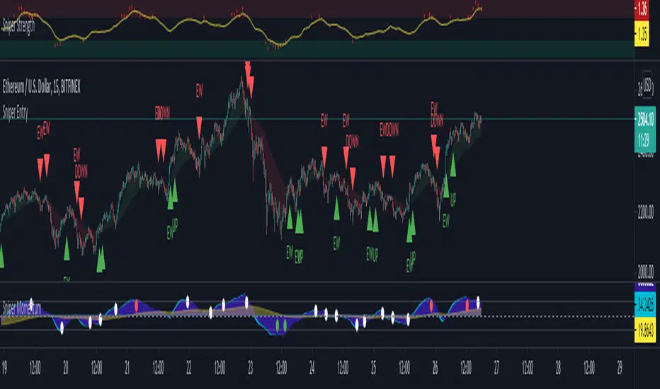
Crypto Smart ScalperCrypto Smart Scalper V 1.0
Indicator designed to assist in trend identification utilising Open/Close Price for up and down moves.
This is NOT a trading system and should be used with supporting information and data. It is not identifying or is meant to represent a standalone trading system.
Open/Closed Price identified for potential trend direction once swings are complete.
If you would like to enquire about access to this invite only script please send me a private message on trading view and I will be happy to assist. Thank you.
Search in scripts for "smart"
[LunaOwl] 智慧型RSI (Smart RSI - a handy tool with less noise)Relative Strength Index is a common technical analysis tool, it is classified as a momentum oscillator, measuring the velocity and magnitude of directional price movements. it is most typically used on a 14-period timeframe, measured on a scale from 0 to 100, with high and low levels marked at 70 and 30.
相對強弱指標是常見的技術分析工具,它被歸類為動量振盪器,用於測量定向價格運動的速度和幅度,通常會使用14期數,擺盪範圍在0到100間,超買超賣分別標記成70、30。
after simple improvement and addition of logical judgment, it becomes a passive judge from subjective judgments, avoid the shortcomings of peoples in watching passivation, and the trade can be more consistent.
經過簡單的改良與添加邏輯判斷,能夠使RSI指標的使用,從主觀的判斷成為被動的確認指標,有效避免人們判斷指標鈍化的主觀缺失,並能夠使得交易更加一致。
--------------------------*
1) parameter
RSI period 1 - default is 14, same as general RSI.
RSI period 2 - default is 5, due to its own formula, the amplitude of the oscillator will become larger and more agile or fast. When the parameter is small.
exponential moving avg of RSI - using the result of RSI period 1 as the source of Ema's formula, the default length is 14, which can filter the excessive agility of RSI period 2 to reduce noise, and compared to using the baseline as the criterion for long and short judgments, The characteristics of exponential moving avg are more suitable to become flexible filtering standards.
Overbought - default is 70, you can set your overbought level.
Oversold - same as above, the default is 30.
2) Options
Open Candle color(開啟蠟燭線趨勢) - choose whether to start the color of the candle.
Open background color(開啟指標背景色) - the default is false, you can turn on.
--------------------------*
1. 設置參數
RSI期數1:預設值是14,是普通的RSI指標。
RSI期數2:預設值是5,由於RSI公式的算法,造成參數愈小擺盪幅度就會變大,反應比較快。
指數平均化的RSI期數1:將RSI期數1的結果帶入指數移動平均公式,預設值14,它能過濾RSI期數2過度敏捷的缺點,減少雜訊,相較於單純使用基準線作為多空判斷標準,用EMA的判斷標準更加因時制宜。
超買線:預設值是70,可以隨意調。
超賣線:預設值是30,一樣的。
2. 設定選項
開啟蠟燭線趨勢:顧名思義。已經幫您開好了。
開啟指標背景色:顏色太淺的話可以調深一點。
--------------------------*
ver.2- adjust new style design and create two options.
修改2: 調整新的樣式設計與建立兩個選項。
--------------------------*
ver.3- Create alert condition. maybe I should refer to the Alert Creation Framework,
there is also room for improvement.
修改3: 建立快訊選項。我應該參考警報創建框架,還有進步空間。
--------------------------*
Indicator Style - 指標樣式
The design uses casual light color style, light gray between overbought and oversold.
--------------------------*
Market Example - 市場範例
1. Bitcoin/Tether, Binance, 1 day
2. Bitcoin/USD, Coinbase, 4 hour
3. EUR/USD, Forex Market, 4 hour
4. GBP/USD, Forex Market, 30 min
5. TAIEX, Taiwan SE Weighted Index, 1 week
--------------------------*
postscript - 後記感想
The purpose of publishing Chinese Scripts is to make Pine close to more Chinese user.
I hope English skills enhancement...staggered writing makes me feel hard.
發布中文腳本的目的,是希望可以讓 Pine 親近更多中文圈的使用者。希望我的英語進步,中英文交錯撰寫有一些困難。
--------------------------*
If you find my works useful, you can give me encouragement. I can buy more books to sophisticated themselves.
如果您發現我的作品有用,可以給我鼓勵。讓我可以買更多書籍來精進自己。

Long Term Smart Money ExpertLong Term Smart Money Expert is quick guide indicator for long term trade or swing trade
It has used 35 moving average, 90 moving average and 200 moving average
Plotted lines are average value of 35 MA and 90 MA and 35 MA and 200 MA
Buy Signal generates on 35 MA crossover
Sell Signal Generates on 35 MA crossunder
This indicator needs Trend Lines +++ for better performance
Intraday Smart Money ExpertIntraday Masters Analogy is the tool where Buy and sell signals generates automatically according to the candles behavior.
It uses WD Gann Levels to calculate entry point with the help of VWAP .
Pivot points determines the recent support and resistance levels.
Trading rule for this indicator
This indicator is designed for Indian equity stocks
Best performance is expected on 5 minutes chart or 15 minutes chart
Order thumb rule
1. avoid any trade signal before 9:35 AM Indian time
2. signal and and related stop loss candle must be formed in the same day
3. if order placed in 5 minutes chart then don't go for a target of 15 minutes chart
4. if order placed in 15 minutes time frame and target is too far then check the target in 5 minutes time frame
5. if signal candle touches the target then avoid the signal.
6. Money management is most important for this indicator.
7. Take trade only if it satisfy risk reward ratio.
8. It has long target but need patience.
Signal
using vwap calculates gann square of 9 levels and if any smart money activity on that level then checks the confirmation of the trend by higherhigh or lowerlow formation
Buy Entry : entry price should be on the high of the candle before signal for buy and sl on bottom of flagged candle just before signal
SellEntry : entry price should be on the low of the candle before signal for sell and sl on top of flagged candle just before signal
Warning : Don't place any order without stop loss

Trader Set - Volume MetricThe last tool in my methodology set, another one of those tools that has unique unpublished formulas, this one purely for following volume and reading smart money's hand, YES it's possible. This indicator has few Alerts built in that you can use, will update the rest of the scripts for additional alerts. You can easily set the alert to play a sound that is not disturbing in long run and check mark open ending and have easy time being alerted when some crossings are happening.
Please, don't ask for access, only my students from my classes will have access to this indicator. The English version of the website and learning material is under development and the moment they get ready I will announce it under each related script.
Khaos-Smart-FractalsKhaos-Smart-Fractals
This indicator draws fractals as well as drawing fractal breaks. A fractal break is when a bar closes beyond the last painted fractal at the time.
There are two types of fractal breaks.
1) First Fractal Breaks (FFB) which is the first break of a fractal in a new trend direction. Thereby signifying a new trend direction.
2) Continuation Fractal Breaks (cFB) which are fractal breaks that occur after a FFB, in the FFB trend direction, thereby signify a continuing of the trend direction.
The indicator paints an Triangle Up for Bullish Fractals, and a Triangle Down for Bearish Fractals.
The indicator will paint First Fractal Breaks with a Flag Icon and a label “FFB”.
The indicator will paint Continuation Fractal Breaks with a sequencing letters, where A is the first Continuation Fractal Break, “B” is the second, and “C” is the third and so on…
There are two dash levels to the right of the current price bar, these are at levels of the highest high of the last two bullish fractals, and the lowest low of the last 2 bear fractals. This can be used for trailing stops.
First Fractal Break Alerts are fully supported, via email, sms, and desktop notification, via TradingView
LEGAL STUFF:
Risk Disclosure
Futures , forex, stock, crypto and derivative trading contains substantial risk and is not for every investor. An investor could potentially lose all or more than the initial investment. Risk capital is money that can be lost without jeopardizing ones’ financial security or life style. Only risk capital should be used for trading and only those with sufficient risk capital should consider trading. Past performance is not necessarily indicative of future results
Hypothetical Performance Disclosure
Hypothetical performance results have many inherent limitations, some of which are described below. no representation is being made that any account will or is likely to achieve profits or losses similar to those shown; in fact, there are frequently sharp differences between hypothetical performance results and the actual results subsequently achieved by any particular trading program. One of the limitations of hypothetical performance results is that they are generally prepared with the benefit of hindsight. In addition, hypothetical trading does not involve financial risk, and no hypothetical trading record can completely account for the impact of financial risk of actual trading. for example, the ability to withstand losses or to adhere to a particular trading program in spite of trading losses are material points which can also adversely affect actual trading results. There are numerous other factors related to the markets in general or to the implementation of any specific trading program which cannot be fully accounted for in the preparation of hypothetical performance results and all which can adversely affect trading results

MSTY-WNTR Rebalancing SignalMSTY-WNTR Rebalancing Signal
## Overview
The **MSTY-WNTR Rebalancing Signal** is a custom TradingView indicator designed to help investors dynamically allocate between two YieldMax ETFs: **MSTY** (YieldMax MSTR Option Income Strategy ETF) and **WNTR** (YieldMax Short MSTR Option Income Strategy ETF). These ETFs are tied to MicroStrategy (MSTR) stock, which is heavily influenced by Bitcoin's price due to MSTR's significant Bitcoin holdings.
MSTY benefits from upward movements in MSTR (and thus Bitcoin) through a covered call strategy that generates income but caps upside potential. WNTR, on the other hand, provides inverse exposure, profiting from MSTR declines but losing in rallies. This indicator uses Bitcoin's momentum and MSTR's relative strength to signal when to hold MSTY (bullish phases), WNTR (bearish phases), or stay neutral, aiming to optimize returns by switching allocations at key turning points.
Inspired by strategies discussed in crypto communities (e.g., X posts analyzing MSTR-linked ETFs), this indicator promotes an active rebalancing approach over a "set and forget" buy-and-hold strategy. In simulated backtests over the past 12 months (as of August 4, 2025), the optimized version has shown potential to outperform holding 100% MSTY or 100% WNTR alone, with an illustrative APY of ~125% vs. ~6% for MSTY and ~-15% for WNTR in one scenario.
**Important Disclaimer**: This is not financial advice. Past performance does not guarantee future results. Always consult a financial advisor. Trading involves risk, and you could lose money. The indicator is for educational and informational purposes only.
## Key Features
- **Momentum-Based Signals**: Uses a Simple Moving Average (SMA) on Bitcoin's price to detect bullish (price > SMA) or bearish (price < SMA) trends.
- **RSI Confirmation**: Incorporates MSTR's Relative Strength Index (RSI) to filter signals, avoiding overbought conditions for MSTY and oversold for WNTR.
- **Visual Cues**:
- Green upward triangle for "Hold MSTY".
- Red downward triangle for "Hold WNTR".
- Yellow cross for "Switch" signals.
- Background color: Green for MSTY, red for WNTR.
- **Information Panel**: A table in the top-right corner displays real-time data: BTC Price, SMA value, MSTR RSI, and current Allocation (MSTY, WNTR, or Neutral).
- **Alerts**: Configurable alerts for holding MSTY, holding WNTR, or switching.
- **Optimized Parameters**: Defaults are tuned (SMA: 10 days, RSI: 15 periods, Overbought: 80, Oversold: 20) based on simulations to reduce whipsaws and capture trends effectively.
## How It Works
The indicator's logic is straightforward yet effective for volatile assets like Bitcoin and MSTR:
1. **Primary Trigger (Bitcoin Momentum)**:
- Calculate the SMA of Bitcoin's closing price (default: 10-day).
- Bullish: Current BTC price > SMA → Potential MSTY hold.
- Bearish: Current BTC price < SMA → Potential WNTR hold.
2. **Secondary Filter (MSTR RSI Confirmation)**:
- Compute RSI on MSTR stock (default: 15-period).
- For bullish signals: If RSI > Overbought (80), signal Neutral (avoid overextended rallies).
- For bearish signals: If RSI < Oversold (20), signal Neutral (avoid capitulation bottoms).
3. **Allocation Rules**:
- Hold 100% MSTY if bullish and not overbought.
- Hold 100% WNTR if bearish and not oversold.
- Neutral otherwise (e.g., during choppy or extreme markets) – consider holding cash or avoiding trades.
4. **Rebalancing**:
- Switch signals trigger when the hold changes (e.g., from MSTY to WNTR).
- Recommended frequency: Weekly reviews or on 5% BTC moves to minimize trading costs (aim for 4-6 trades/year).
This approach leverages Bitcoin's influence on MSTR while mitigating the risks of MSTY's covered call drag during downtrends and WNTR's losses in uptrends.
## Setup and Usage
1. **Chart Requirements**:
- Apply this indicator to a Bitcoin chart (e.g., BTCUSD on Binance or Coinbase, daily timeframe recommended).
- Ensure MSTR stock data is accessible (TradingView supports it natively).
2. **Adding to TradingView**:
- Open the Pine Editor.
- Paste the script code.
- Save and add to your chart.
- Customize inputs if needed (e.g., adjust SMA/RSI lengths for different timeframes).
3. **Interpretation**:
- **Green Background/Triangle**: Allocate 100% to MSTY – Bitcoin is in an uptrend, MSTR not overbought.
- **Red Background/Triangle**: Allocate 100% to WNTR – Bitcoin in downtrend, MSTR not oversold.
- **Yellow Switch Cross**: Rebalance your portfolio immediately.
- **Neutral (No Signal)**: Panel shows "Neutral" – Hold cash or previous position; reassess weekly.
- Monitor the panel for key metrics to validate signals manually.
4. **Backtesting and Strategy Integration**:
- Convert to a strategy script by changing `indicator()` to `strategy()` and adding entry/exit logic for automated testing.
- In simulations (e.g., using Python or TradingView's backtester), it has outperformed buy-and-hold in volatile markets by ~100-200% relative APY, but results vary.
- Factor in fees: ETF expense ratios (~0.99%), trading commissions (~$0.40/trade), and slippage.
5. **Risk Management**:
- Use with a diversified portfolio; never allocate more than you can afford to lose.
- Add stop-losses (e.g., 10% trailing) to protect against extreme moves.
- Rebalance sparingly to avoid over-trading in sideways markets.
- Dividends: Reinvest MSTY/WNTR payouts into the current hold for compounding.
## Performance Insights (Simulated as of August 4, 2025)
Based on synthetic backtests modeling the last 12 months:
- **Optimized Strategy APY**: ~125% (by timing switches effectively).
- **Hold 100% MSTY APY**: ~6% (gains from BTC rallies offset by downtrends).
- **Hold 100% WNTR APY**: ~-15% (losses in bull phases outweigh bear gains).
In one scenario with stronger volatility, the strategy achieved ~4533% APY vs. 10% for MSTY and -34% for WNTR, highlighting its potential in dynamic markets. However, these are illustrative; real results depend on actual BTC/MSTR movements. Test thoroughly on historical data.
## Limitations and Considerations
- **Data Dependency**: Relies on accurate BTC and MSTR data; delays or gaps can affect signals.
- **Market Risks**: Bitcoin's volatility can lead to false signals (whipsaws); the RSI filter helps but isn't perfect.
- **No Guarantees**: This indicator doesn't predict the future. MSTR's correlation to BTC may change (e.g., due to regulatory events).
- **Not for All Users**: Best for intermediate/advanced traders familiar with ETFs and crypto. Beginners should paper trade first.
- **Updates**: As of August 4, 2025, this is version 1.0. Future updates may include volume filters or EMA options.
If you find this indicator useful, consider leaving a like or comment on TradingView. Feedback welcome for improvements!

SmartMind2The MACD (Moving Average Convergence Divergence) is a popular technical indicator in trading, primarily used to detect trends and possible reversal points.
How is the MACD structured?
The MACD indicator consists of three components:
MACD Line:
Calculated as the difference between two exponential moving averages (EMAs), commonly 12 and 26 periods.
Formula:
MACD Line
=
𝐸
𝑀
𝐴
12
(
Price
)
−
𝐸
𝑀
𝐴
26
(
Price
)
MACD Line=EMA
12
(Price)−EMA
26
(Price)
Signal Line:
An exponential moving average (usually 9 periods) of the MACD line.
Formula:
Signal Line
=
𝐸
𝑀
𝐴
9
(
MACD Line
)
Signal Line=EMA
9
(MACD Line)
Histogram:
Graphically represents the difference between the MACD line and the Signal line.
Formula:
Histogram
=
MACD Line
−
Signal Line
Histogram=MACD Line−Signal Line
Interpretation of MACD:
Buy Signal: Occurs when the MACD line crosses above the signal line (bullish signal).
Sell Signal: Occurs when the MACD line crosses below the signal line (bearish signal).
Trend Reversal: A divergence between price movements and the MACD indicates a potential reversal (e.g., rising prices with a falling MACD).
SmartMind1Stochastic is a momentum indicator in trading, used to determine whether a price is overbought or oversold. It comes in two main variants:
1. Fast Stochastic
It consists of two lines:
%K line: Shows where the closing price is relative to the trading range of the recent periods.
%D line: A moving average of the %K line (typically 3 periods).
Characteristics:
Very responsive to price changes.
Generates numerous trading signals, but also more false signals.
2. Slow Stochastic
Also consists of two lines:
Slow %K line: Corresponds to the %D line of the Fast Stochastic.
Slow %D line: A moving average of the slow %K line (usually 3 periods).
Characteristics:
Produces fewer signals, but more precise and reliable.
Reduces false signals, making it preferable for identifying overbought or oversold conditions.
Practical Usage:
Values above 80 indicate overbought conditions (prices may soon fall).
Values below 20 indicate oversold conditions (prices may soon rise).
Traders generally prefer the Slow Stochastic for its greater reliability.

Financial Conditions Composite Z-Score1. Inputs and Data Sources
The script pulls data for the following financial metrics using TradingView's request.security function:
CBOE:VIX (Volatility Index): A measure of market volatility.
MOVE Index: A measure of bond market volatility (or Treasury volatility).
BAMLH0A0HYM2 (High-Yield Spread): The spread between high-yield corporate bonds and Treasury yields.
BAMLC0A0CM (Credit Spread): The spread for investment-grade corporate bonds.
Each of these metrics represents a key aspect of financial conditions:
VIX: Equity market risk.
MOVE: Bond market risk.
High-Yield Spread and Credit Spread: Perception of risk in corporate debt.
2. Z-Score Calculation
A z-score standardizes each metric to show how far it deviates from its average over a specified period (lookback = 160, or 160 days):
Positive z-scores indicate the metric is higher than average.
Negative z-scores indicate the metric is lower than average.
The formula for the z-score:
Z-Score = Metric − Mean
Standard Deviation Z-Score = Standard Deviation Metric−Mean
3. Combined Z-Score
The script combines the four individual z-scores into a single Composite Z-Score, equally weighted across the metrics:
Combined Z-Score = (Z VIX + Z MOVE + Z High-Yield Spread + Z Credit Spread) / 4
This Combined Z-Score provides an overall measure of financial conditions:
Positive combined z-scores indicate tighter or riskier financial conditions.
Negative combined z-scores indicate looser or less risky financial conditions.
4. Visual Elements on the Chart
A. Colorful Lines: Individual Z-Scores
Each of the four metrics is plotted as a separate line:
Red: Z-score of the VIX.
Green: Z-score of the MOVE index.
Orange: Z-score of the high-yield spread.
Purple: Z-score of the credit spread.
These lines show how each metric contributes to the overall financial conditions. For example:
A rising red line means increasing equity market volatility (risk).
A rising green line means increasing bond market volatility (risk).
B. Blue Line: Combined Z-Score
The blue line represents the Combined Z-Score. It aggregates the individual z-scores into a single measure:
A rising blue line suggests financial conditions are tightening (greater risk across markets).
A falling blue line suggests financial conditions are loosening (lower risk across markets).
C. Red and Green Background: Z-Score Regions
Red Background: When the Combined Z-Score is positive (>0), it indicates riskier or tighter financial conditions.
Green Background: When the Combined Z-Score is negative (<0), it indicates less risky or looser financial conditions.
This background coloring helps visually distinguish periods of riskier financial conditions from less risky ones.
5. Purpose of the Visualization
This indicator provides a comprehensive view of financial conditions across multiple asset classes:
Traders can use it to gauge the level of systemic market stress.
Investors can use it to assess when risk is elevated (positive z-scores) or subdued (negative z-scores).
It helps in decision-making for strategies that depend on market volatility or risk appetite.
Summary of What You See:
Colorful Lines (Red, Green, Orange, Purple): Individual z-scores for each metric (VIX, MOVE, high-yield spread, credit spread).
Blue Line: The aggregated Combined Z-Score that summarizes financial conditions.
Red and Green Background:
Red: Tight or risky financial conditions (Combined Z-Score > 0).
Green: Loose or low-risk financial conditions (Combined Z-Score < 0).
This visualization provides a multi-dimensional view of financial conditions at a glance, helping to identify periods of high or low risk in the markets.

SMTV IndicatorThis indicator uses the ATR set to 2 to indicate Dynamic Support and Resistance levels. It also uses VWAP set to Weekly and a 50 Moving Average to indicate additional trend and support and resistance levels.
ATR x 2
View the Indicator on the 1H to Identify the Daily Support and Resistance levels.
This will be the Green and Red channel lines.
Red Line will indicate the daily Resistance Level.
Green Line will indicate the daily Support Level.
This is where prices are most likely to go to and either reverse or breakthrough, if it breaks either the Support or Resistance level then the next Support and Resistance Level will be marked out.
VWAP
The indicator is set to weekly, and it will indicate a Key Support or Resistance Level.
If price is above the VWAP it will indicate a Bullish Bias.
If price is below VWAP it will indicate a Bearish Bias.
You will often see bounces from this level, depending on if the Market is Bullish or Bearish.
If the VWAP is broken through and a bounce takes places then you can often see Trend reversal
Break of Structure
The indicator will also indicate when a Bullish or Bearish break off structure has occurred, which generally will indicate a trend change.
Green meaning Bullish.
Red meaning Bearish.
There is also an option to check the Buy and Sell signals box in the input, these signals will occur when a Break of Structure has taken place and the next candle after the BOS closes in the same direction as the BOS signal.
You can use this indicator on anytime frame, however you will get more false signals on lower time frames, if you wish in these times, you can set the ATR to 3 or 4 to get less false signals. It is important to view the Daily Support and Resistance levels and the VWAP and 50MA these will be the main levels with highest Risk to Reward entries. You can then use lower time frames like the 5 or 1min to find break of structure indication to indicate the direction around the daily support and resistance, VWAP and 50MA.

SLO Pro-J-Algo # Smart Liquidity & OTE Analysis Tool
## OVERVIEW
This indicator is designed for traders who utilize institutional trading concepts, specifically liquidity sweeps and optimal trade entry (OTE) zones, combined with session-based market structure analysis. It identifies potential market manipulation points where stop losses are likely clustered, and highlights high-probability entry zones based on Fibonacci retracements.
The tool combines four main analytical components that work synergistically to identify trading opportunities aligned with smart money behavior.
---
## CORE CONCEPTS & METHODOLOGY
### 1. TRADING SESSIONS ANALYSIS
**What it does:**
The indicator tracks three major forex trading sessions with customizable time zones:
- **Asian Session** (Default: 01:00-13:00 UTC+4) - Typically characterized by range-bound price action
- **London Session** (Default: 11:00-20:00 UTC+4) - High volatility period with increased institutional activity
- **New York Session** (Default: 17:00-00:00 UTC+4) - Overlaps with London creating peak liquidity
**How it works:**
- Automatically highlights active sessions with colored background boxes
- Draws session high/low lines which often act as intraday support/resistance
- Identifies session overlaps (e.g., London-NY overlap) where volatility and liquidity are highest
- Color-codes the price bars during overlaps to alert traders to increased opportunity periods
- Displays real-time session status (🟢 Open / 🔴 Closed) for quick reference
**Trading Application:**
Session highs and lows frequently become liquidity targets. The indicator helps traders anticipate when price might sweep these levels before continuing in the original direction. Session overlaps are prime times for major moves as multiple institutional players are active simultaneously.
---
### 2. EXTERNAL LIQUIDITY SWEEPS
**What it does:**
Identifies when price "sweeps" or breaks beyond significant swing highs and lows where stop losses are typically clustered. These sweeps often precede reversals or continuations after liquidity is collected.
**How it works:**
- Scans the previous 20 bars (configurable) to identify swing high and low points
- Marks these levels as "buyside liquidity" (above highs) or "sellside liquidity" (below lows)
- Monitors price action using three detection methods:
* **Wick Break:** Any candle wick extending beyond the liquidity level
* **Close Break:** Candle body closing beyond the level (stronger confirmation)
* **Full Retrace:** Price breaks the level then closes back inside the range (classic liquidity grab)
- Uses an ATR-based buffer to avoid false signals from minor price spikes
- Confirms sweeps only after a configurable number of confirmation bars to reduce repainting
**The Logic Behind It:**
Institutional traders need liquidity to fill large orders. Stop losses clustered above swing highs and below swing lows provide this liquidity. When these levels are swept, it often indicates smart money is entering positions in the opposite direction, causing reversals.
**Visual Representation:**
- Blue horizontal lines mark buyside liquidity zones (above price)
- Gray horizontal lines mark sellside liquidity zones (below price)
- Labels indicate when liquidity has been swept (✓) or remains active
- Historical zones are maintained for context (configurable display limit)
---
### 3. INTERNAL LIQUIDITY DETECTION
**What it does:**
Identifies equal highs (EQH) and equal lows (EQL) within recent price action - levels that have been tested multiple times without breaking. These represent internal liquidity pools that price often revisits before making larger moves.
**How it works:**
- Examines the most recent 8 bars (configurable) for price levels that occur multiple times
- Uses an ATR-based threshold (default 0.1% of ATR) to determine if highs or lows are "equal"
- Requires minimum 3 occurrences (configurable) of the same level to qualify as internal liquidity
- Tracks both the creation and sweeping of these internal levels
- Differentiates between wick breaks and close breaks for sweep confirmation
**The Concept:**
Unlike external liquidity at swing points, internal liquidity represents recent stop clusters and pending orders within the current price structure. Identifying these levels helps traders anticipate short-term price targets and potential reversal points before larger directional moves.
**Why This Matters:**
Price often needs to clear internal liquidity before making sustained moves to external liquidity levels. This creates a "roadmap" of where price is likely to go in sequence, improving trade timing.
**Visual Representation:**
- Cyan lines mark internal buyside liquidity (equal highs)
- Orange lines mark internal sellside liquidity (equal lows)
- Dashed or solid lines based on user preference
- Labels show when internal levels are swept
---
### 4. OPTIMAL TRADE ENTRY (OTE) ZONES
**What it does:**
Calculates and displays Fibonacci retracement zones (0.618-0.786) from recent swing points, representing "discount" or "premium" areas where institutional traders often enter positions after a liquidity sweep or structure break.
**How it works:**
- Identifies swing highs and lows using a 10-bar lookback period (configurable)
- Calculates three key Fibonacci levels:
* **0.618** - The "golden ratio" retracement (most significant)
* **0.705** - Mid-point between 0.618 and 0.786
* **0.786** - Deep retracement level (square root of 0.618)
- Optionally requires a structure break before displaying OTE zones
- Dynamically extends zones as new price action develops
- Tracks whether price has entered the zone (✅) or exited without filling (❌)
- Displays up to 2 most recent zones (configurable) to avoid chart clutter
**The Methodology:**
OTE zones represent areas where price is at a "discount" (for longs) or "premium" (for shorts) relative to the recent swing. After a liquidity sweep or structure break, institutional traders often wait for retracements into these zones before entering, as it offers better risk-to-reward ratios.
**Combining with Liquidity:**
The most powerful setups occur when:
1. External liquidity is swept
2. Price retraces into an OTE zone
3. Internal liquidity is present as a target
This confluence suggests smart money activity and high-probability trade opportunities.
**Visual Representation:**
- Shaded blue zone between 0.618 and 0.786 levels
- Three horizontal lines showing key Fibonacci levels with different colors/styles
- Labels (🎯) indicate bullish or bearish OTE zones
- Entry (✅) and exit (❌) status for each zone
---
## WHY THESE FEATURES WORK TOGETHER
This indicator combines these four components because they represent different stages of institutional trading behavior:
1. **Session Timing** - Identifies WHEN institutional activity is highest
2. **Liquidity Sweeps** - Shows WHERE smart money is collecting liquidity
3. **OTE Zones** - Highlights WHERE institutional entries likely occur after sweeps
4. **Internal Liquidity** - Provides SHORT-TERM targets for profit-taking or add-ons
Rather than using each concept in isolation, this integration creates a complete market structure framework. For example:
- A buyside liquidity sweep during London open →
- Followed by a retrace into a bullish OTE zone →
- With internal sellside liquidity as the initial target
This sequence represents a complete high-probability trade setup aligned with smart money principles.
---
## ANTI-REPAINTING FEATURES
**The Repainting Problem:**
Many indicators that identify patterns on historical data repaint their signals when live trading, showing signals that weren't actually there in real-time. This creates a false sense of accuracy.
**Our Solution:**
- **Confirmation Bars Setting:** Signals only appear after X bars have confirmed the pattern (default: 2 bars)
- **Marked Confirmation:** Labels show "C" when using confirmed signals
- **Trade-off:** More confirmation = less repainting but slightly delayed signals
- **User Control:** Traders can toggle between real-time signals (faster but may repaint) and confirmed signals (delayed but reliable)
---
## KEY CUSTOMIZATION OPTIONS
### Master Controls
- Toggle each major feature on/off independently
- Combine only the features relevant to your trading style
### Display Settings
- Adjust lookback periods for each component
- Control number of historical zones displayed
- Customize colors, line styles, and transparency
- Show/hide labels and session names
- Configure text sizes for different screen setups
### Detection Sensitivity
- **Sweep Detection:** Choose between wick breaks, close breaks, or full retraces
- **ATR Buffer:** Add distance requirements to confirm sweeps (reduces false signals)
- **Equal Level Threshold:** Adjust how close levels must be to qualify as "equal"
- **Confirmation Bars:** Balance between signal speed and reliability
### Alert System
- Session open/close notifications
- Liquidity sweep alerts
- OTE zone entry alerts
- Configurable alert frequency and types
---
## HOW TO USE THIS INDICATOR
### Basic Setup
1. Add the indicator to your chart (works on all timeframes, though 5M-1H recommended for intraday)
2. Enable the features you want to use via Master Controls
3. Adjust colors and transparency to match your chart preferences
4. Configure alert preferences if using notifications
### Trading Workflow
**Step 1: Identify the Session**
- Determine which trading session is active or approaching
- Note session highs/lows as potential liquidity targets
- Be especially alert during session overlaps
**Step 2: Watch for Liquidity Sweeps**
- Monitor external liquidity lines (swing highs/lows)
- When price sweeps liquidity, anticipate a potential reversal
- Stronger sweeps (close breaks + full retraces) are more significant
**Step 3: Wait for OTE Retracement**
- After a sweep, wait for price to retrace into the OTE zone (0.618-0.786)
- Bullish OTE after sellside sweep = potential long
- Bearish OTE after buyside sweep = potential short
**Step 4: Use Internal Liquidity as Targets**
- Look for internal liquidity in the direction of your trade
- These serve as initial profit targets
- External liquidity serves as extended targets
**Step 5: Manage Confirmation Settings**
- For live trading, use confirmed signals (2+ confirmation bars)
- For backtesting or analysis, you may use real-time signals
- Note that confirmed signals appear with "C" marking
### Example Trade Scenarios
**Bullish Setup:**
1. London session opens (increased volume)
2. Price sweeps sellside liquidity below Asian low
3. Price retraces into bullish OTE zone (0.618-0.786 of the sweep move)
4. Target internal buyside liquidity, then external buyside liquidity
**Bearish Setup:**
1. NY session overlap with London (peak liquidity)
2. Price sweeps buyside liquidity above recent high
3. Price retraces into bearish OTE zone
4. Target internal sellside liquidity, then session lows
---
## BEST PRACTICES
### What This Indicator Does Well
✓ Identifies high-probability institutional trading zones
✓ Provides clear visual roadmap of likely price targets
✓ Reduces chart clutter with configurable history limits
✓ Works across multiple timeframes and instruments
✓ Minimizes repainting with confirmation settings
### What This Indicator Doesn't Do
✗ Does not provide entry/exit arrows (intentional - requires trader discretion)
✗ Does not guarantee winning trades (no indicator does)
✗ Does not work in isolation (combine with price action/market context)
✗ Does not replace risk management (always use stop losses)
### Recommended Complementary Analysis
- Price action patterns (engulfing candles, pinbars at OTE zones)
- Volume profile or footprint charts for order flow confirmation
- Higher timeframe trend context (don't fade strong trends)
- Economic calendar awareness (avoid major news events)
---
## TECHNICAL NOTES
### Performance Optimization
- Uses max_bars_back limitation to reduce memory usage
- Automatic cleanup of old zones to prevent slowdown
- Efficient array management with configurable display limits
- Suitable for both intraday and swing trading timeframes
### Timeframe Recommendations
- **1-5 Minute:** Scalping with tight internal liquidity targets
- **15-30 Minute:** Intraday trading with session-based setups
- **1-4 Hour:** Swing trading with multi-session analysis
- **Daily:** Position trading using weekly liquidity levels
### Instrument Compatibility
Works on all liquid instruments:
- Forex pairs (optimal due to clear sessions)
- Stock index futures (ES, NQ, etc.)
- Cryptocurrency (24/7 markets - use custom session times)
- Individual stocks (less pronounced session effects)
---
## EDUCATIONAL RESOURCES
To better understand the concepts used in this indicator:
**Liquidity Concepts:**
- Study institutional order flow and stop loss hunting
- Learn about market microstructure and liquidity provision
- Understand the difference between retail and institutional trading
**Fibonacci/OTE:**
- Research Fibonacci retracements in trending markets
- Study the mathematical significance of the golden ratio (0.618)
- Practice identifying retracement entries on historical charts
**Session Trading:**
- Analyze volume profiles during different forex sessions
- Study typical price behavior during session overlaps
- Understand timezone conversions for your local trading hours
---
## VERSION HISTORY & UPDATES
This script represents a complete integration of multiple smart money concepts into a single, cohesive tool. Future updates will be published using the Update feature rather than creating separate scripts for minor variations.
---
## DISCLAIMER
This indicator is for educational and informational purposes only. It does not constitute financial advice or trading recommendations. All trading involves risk, and past performance does not guarantee future results. Always practice proper risk management and never risk more than you can afford to lose.
The concepts presented here (liquidity sweeps, OTE zones, session analysis) are widely discussed trading theories. This indicator is an interpretation and visualization of these concepts, not a guarantee of their effectiveness.
---
## SETTINGS SUMMARY
**Master Controls:** Enable/disable each major feature independently
**Repainting Controls:** Adjust confirmation requirements for signals
**Trading Sessions:** Customize session times, colors, and display options
**External Liquidity:** Configure detection sensitivity and visual styling
**Internal Liquidity:** Adjust lookback periods and threshold sensitivity
**OTE Zones:** Select which Fibonacci levels to display and entry requirements
**Alerts:** Configure notifications for sessions, sweeps, and entries
---
## SUPPORT & FEEDBACK
If you find this indicator helpful, please leave a like and comment with your feedback. For questions about specific settings or concepts, refer to the tooltips in the indicator settings panel - each parameter includes a detailed explanation.
Remember: The best indicator is the one you understand and can apply consistently within your trading plan. Take time to practice with this tool on demo accounts before risking real capital.

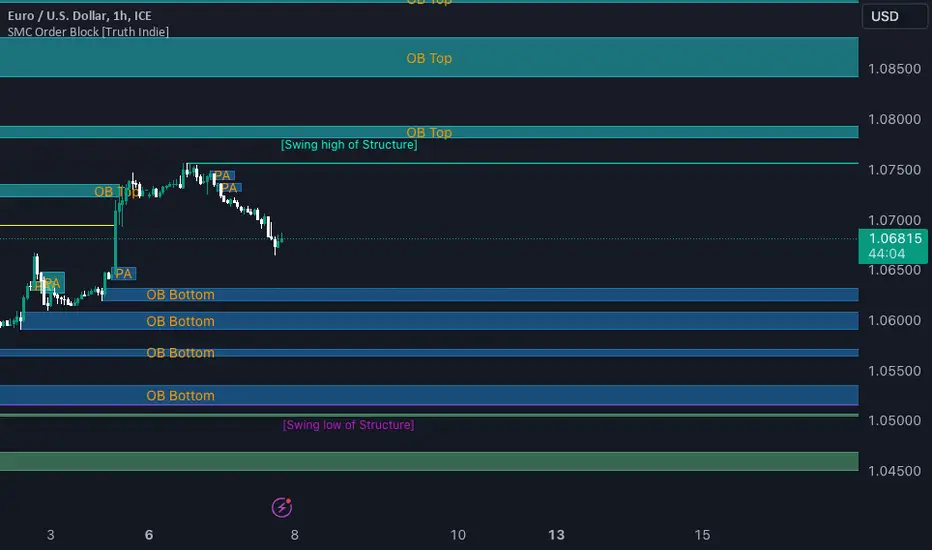
SMC Order Block [Truth Indie]Smart Money Concept (SMC)
For me, SMC is a trading philosophy that stems from those with knowledge and understanding of the structure of the Smart Money group's trading system. It is developed through the observation of price behavior.
SMC is related to the Smart Money group or those entities that can influence the market, such as financial institutions, banks, or funds. Market movements are often driven by market fundamentals or economics. The Smart Money group possesses extensive research data for analyzing the market's fundamentals and has the ability to steer the market in various directions based on market and economic fundamentals at a given time.
The SMC concept is adapted from the ICT concept, and it was developed and shared by The Inner Circle Trader.
I have been studying and trying to understand SMC for some time, and I have many questions I would like to explore. The challenge lies in the fact that different sources of knowledge on this topic often have varying teachings, and my proficiency in the English language is limited. As a result, I haven't had the opportunity to study from the primary source, The Inner Circle Trader.
This indicator was created for the purpose of researching Market Structure and Order Blocks, which are integral parts of the SMC Concept.
The fundamental principle for identifying Order Blocks is as follows:
1.Locate swings that create candlestick imbalances.
2.An imbalance refers to a candlestick that is larger than the preceding one and contains a Fair Value Gap (FVG).
This indicator categorizes Order Blocks into four types, and you are encouraged to customize them to suit your preferences.
OB Type1
1.The closing price of candle has an opposite direction to the candle .
2.Candle has a wick longer than its body, by at least 1 times or more (adjustable).
3.Candle has a wick longer than candle , by at least 2 times or more (adjustable).
4.There is a Fair Value Gap (FVG) between the wicks of candle and .
OB Type1_HTF
-This condition is the same as OB Type1, but it involves analyzing 6 candles instead. This means looking at a larger time frame, twice as big as the original one.
OB Type2
1.The closing price of candle has the opposite direction to candle .
2.Candle has a body larger than its wick by at least 1 times or more (adjustable).
3.Candle has a body larger than candle by at least 2 times or more (adjustable).
4.There is a Fair Value Gap (FVG) between the wicks of candle and .
OB Type2_HTF means observing a larger time frame, specifically twice as big as the previous one.
OB Type3
1.The closing price of candle has the same direction as candle .
2.Candle has a wick longer than its body, by at least 1 times or more (adjustable).
3.Candle has a wick longer than candle , by at least 2 times or more (adjustable).
4.There is a Fair Value Gap (FVG) between the wicks of candle and .
OB Type3_HTF means observing a larger time frame, specifically twice as big as the previous one.
OB Type4
1.The closing price of candle has the same direction as candle .
2.Candle has a body larger than its wick by at least 1 times or more (adjustable).
3.Candle has a body larger than candle by at least 2 times or more (adjustable).
4.There is a Fair Value Gap (FVG) between the wicks of candle and .
OB Type4_HTF is an indicator that involves looking at a larger time frame, specifically twice as big as the original one.
Order Block Setting
1.Click to activate the OB search in different Types.
2.Adjust the body of the candle .
3.Adjust the strength of the candle or the Imbalance candle.
4.You can change the name of OB.
5.Adjust the font size and color.
6.Adjust the color of the OB BOX and History BOX.
7.Adjust the font of OB HTF.
1.It refers to the value of W for a specific candle.
2.It refers to the value of Im for a specific candle.
3.It refers to the values of W and Im in the HTF.
4.For OB Type1 and Type3, a higher W value will search for candles with a larger wick and a smaller body. When the W value is lower, it will search for candles with a smaller wick and a larger body, moving from low to high.
5.For OB Type2 and Type4, a lower W value will search for candles with a smaller wick and a larger body. When the W value is higher, it will search for candles with a larger wick and a smaller body, moving from high to low.
Market Structure
Comprising the process of breaking the price structure, resulting in BOS (Breakout of Structure) or CHoCH (Change of Character High), and creating new High or Low based on the price structure.
1.When the market forms a price structure with High and Low, when the price moves to disrupt the structure in either direction, it will lead to BOS or CHoCH, resulting in a new High or Low. You can adjust the method of breaking the structure using the close, high, or low.
2.When you break the price structure, a High or Low will be formed on one side, and it will lead to an Inducement Swing. When the price moves and collides, it will create a price range of High and Low. You can adjust the method of breaking the structure using the close, high, or low.
3.There is an option for testing Fibonacci (Fibo). Its function is similar to the Inducement Swing. You can adjust the Fibonacci settings.
Premium & Discount Zone
1.The Premium & Discount Zone will appear based on the current price structure. It helps you see the price zones you are interested in.
2.You can adjust the %Premium & Discount as needed.
3.The OB (Order Block) will be displayed when a price structure of High and Low forms within the Premium & Discount Zone. The OB in this indicator is not a recommendation to buy or sell. You need to research and test various conditions before making trading decisions.
Everyone's trading strategies are different, and it comes down to backtesting and selecting the strategy that suits your individual needs. Hopefully, this indicator will assist the TradingView community of traders in their trading endeavors.
AKILLI ANALIZ TERMINALI (V20-REVIZE)SMART ANALYSIS TERMINAL (V20-ULTIMATE)
This indicator is a professional-grade analysis terminal designed for both strategic daily analysis (Swing Trade) and real-time intraday trading (Scalp/Day Trade). It allows you to perform a complete technical X-ray of the market on a single dashboard.
CORE FEATURES:
- Dual-Mode Hybrid Engine: Choose between "NIGHT (ANALYSIS)" or "IN-DAY (AGGRESSIVE)" modes in settings. Mathematical periods and target levels update automatically.
- Smart Scoring System: Blends RSI, MACD, EMA, ADX, and Volume data to produce 5 distinct signals from "VERY POSITIVE" to "VERY NEGATIVE."
- Symmetrical Visual Panel: Left panel displays Live Signal, Pivot Balance, Money Flow, and Target/Support; right panel focuses on RSI, Trend, Momentum, and Volume confirmation.
- Money Flow Algorithm: Detects institutional accumulation (Entry) or distribution (Exit) by analyzing price-volume correlation.
USER GUIDE:
1. NIGHT MODE: Use for evening analysis to plan for the next day. Based on EMA 20/50 and standard MACD values.
2. IN-DAY MODE: Use during live sessions on 5m and 15m charts. Catch instant momentum shifts with EMA 9/21 and aggressive settings.

SFP + TP/SL + WT JSON BOT (Touch/Return)Smart Reversal Engine with Automated TP/SL & WunderTrading Integration
This invite-only indicator is designed for traders seeking highly responsive reversal detection and fully automated execution.
It combines multiple market conditions into a single confirmation system that identifies high-probability turning points with minimal delay.
The tool provides:
🔷 Key Features
✔ Real-time reversal detection
Signals are generated the moment specific market conditions align—no need to wait for candle closures.
This allows extremely early entries with minimal lag.
✔ Auto-calculated TP/SL levels
Profit-taking and protection levels are dynamically generated based on market structure.
Visual TP/SL lines appear directly on the chart for clarity.
✔ Backtesting suite
Last N trades statistics
Monthly performance summary (last 4 months)
Estimated PnL based on user-defined capital & leverage
On-chart TP/SL markers
Everything updates automatically as new signals appear.
✔ Fully automated execution through WunderTrading
When enabled, the indicator automatically sends structured JSON alerts compatible with WT bots:
Enter Long
Enter Short
Exit All
Including:
Market orders
Position size based on your capital settings
Exchange-level TP/SL placement
This allows the chart signals to translate directly into live trading actions.
🔷 Customization
Users can freely adjust:
Entry behavior mode
TP/SL model
Capital allocation
Leverage settings
Backtest window
Without exposing or modifying the underlying logic.
🔷 Notes
This script does not repaint after confirmation.
Real-time signals may update during candle formation (normal for intrabar processing).
Strategy logic is proprietary and not disclosed.
Access is invite-only.
If you would like access, contact me directly through TradingView messages.
Setup guide and WT integration instructions are provided for all subscribers.
智能反转引擎(Smart Reversal Engine)+ 自动 TP/SL + WunderTrading 全自动交易接口
这是一个 邀请制(Invite-Only) 指标,专为追求高响应性反转信号、自动化交易执行的用户打造。
它将多重市场条件整合成统一的判定系统,在极短延迟下识别潜在的高概率转折点。
不会披露策略逻辑、指标原理或内部结构。
🔷 主要功能
✔ 实时反转信号(无需等待收线)
当关键市场条件同时满足时,系统会即时给出提醒。
适用于希望提前布局、减少延迟的交易者。
✔ 自动计算 TP / SL
止盈/止损根据市场位置自动生成,图表上清晰显示,仅需跟随即可。
无需手动测量价格距离。
✔ 完整回测统计系统
最近 N 笔交易统计
最近 4 个月月度表现
根据本金与杠杆估算的 PnL
每一笔 TP / SL 自动打标
所有统计数据均实时更新。
✔ 完整支持 WunderTrading 全自动下单
启用后可自动发送结构化 JSON 信号,包括:
开多
开空
全部平仓
并自动附带:
市价单
依照用户设置的手数 / 杠杆
交易所级别 TP / SL 挂单
实现从图表信号 → 自动交易执行的全流程自动化。
🔷 自定义设置
你可以自由调整:
入场模式
TP/SL 比例
本金
杠杆
回测窗口长度
无需触碰或理解核心逻辑。
🔷 注意事项
指标在信号确认后不会重绘
实时信号在未收线时可能动态变化(属正常现象)
核心算法为私有内容,不会公开
采用 Invite-Only 授权方式

Correlation Pro
Smart Correlation Pro is an indicator for assessing the correlation between two assets in the market. It analyzes correlation over a selected period and provides traders with flexible tools for making informed decisions.
Key Features:
1. Correlation coefficient (-1 to 1):
• 1: Perfect positive correlation (movement in the same direction).
• 0: No correlation (assets are independent).
• -1: Perfect negative correlation (movement in opposite directions).
2. Dynamic analysis:
• Changes the color of the line depending on the strength of the correlation:
• Green — high positive correlation.
• Red — high negative correlation.
• Gray — weak or no correlation.
3. Trading signals:
• Automatic alerts when important correlation levels are reached (> 0.8 or < -0.8).
• Visual cues for identifying potential entry points or risk diversification.
4. Customizable settings:
• Compare any two assets (e.g., BTC and ETH).
• Ability to choose the correlation calculation period.
Who it’s for:
• Traders analyzing coin movements in the cryptocurrency market.
• Investors looking for the strongest or weakest assets for their portfolio.
• Those working with hedging or diversification strategies.
How to Use:
1. Set the second asset in the indicator settings.
2. Analyze the correlation change on the chart:
• High positive correlation → similar price movement, opportunity for hedging.
• High negative correlation → opposite movement, suitable for diversification.
• Low correlation → independence of assets, opportunity to choose the stronger asset.
Benefits:
• Easy to use.
• Instant analysis of asset correlations.
• Increases decision-making accuracy in the market.
(Опис:
Smart Correlation Pro — це індикатор для оцінки взаємозв’язку між двома активами на ринку. Він аналізує кореляцію за обраним періодом та надає трейдерам гнучкі інструменти для ухвалення обґрунтованих рішень.
Основні можливості:
1. Коефіцієнт кореляції (-1 до 1):
• 1: Ідеальна позитивна кореляція (рух в одному напрямку).
• 0: Відсутність кореляції (активи незалежні).
• -1: Ідеальна негативна кореляція (рух у протилежних напрямках).
2. Динамічний аналіз:
• Змінює колір лінії залежно від сили кореляції:
• Зелений — висока позитивна кореляція.
• Червоний — висока негативна кореляція.
• Сірий — слабка або відсутня кореляція.
3. Сигнали для трейдингу:
• Автоматичні оповіщення при досягненні важливих рівнів кореляції (> 0.8 або < -0.8).
• Візуальні підказки для визначення можливих точок входу або диверсифікації ризиків.
4. Гнучкість налаштувань:
• Порівнюйте будь-які два активи (наприклад, BTC та ETH).
• Можливість обирати період розрахунку кореляції.
Кому підходить:
• Трейдерам, які аналізують рух монет на криптовалютному ринку.
• Інвесторам, що шукають найсильніші або найслабші активи для портфеля.
• Тих, хто працює з хеджуванням або диверсифікацією.
Як використовувати:
1. Встановіть другий актив у параметрах індикатора.
2. Аналізуйте зміну кореляції на графіку:
• Висока позитивна кореляція → схожий рух цін, можливість хеджування.
• Висока негативна кореляція → протилежний рух, підходить для диверсифікації.
• Низька кореляція → незалежність активів, можливість вибору сильнішого активу.
Переваги:
• Простота у використанні.
• Миттєвий аналіз взаємозв’язків між активами.
• Підвищує точність рішень на ринку.)

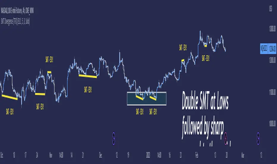
SMT Divergence [TFO]Smart Money Technique ( SMT ) Divergence is meant to annotate divergences between closely correlated assets. This indicator works by finding local lows and highs for both the current chart symbol and the symbol defined in the settings. It compares both symbols' pivots and evaluates whether they indicate a valid divergence (based on where they're located, whether they make opposing highs/lows, whether a clean connection can be made, etc.).
Take $ES_F and $NQ_F for example ( S&P 500 and Nasdaq 100 U.S. index futures ). These two names normally track each other very closely (and in the same direction, versus something like $DXY ), but if $ES_F is steadily rising towards a large institutional level and making higher highs, while $NQ_F is approaching a similarly important level and making lower highs on that same timeframe, this would indicate a divergence between the two assets that could foreshadow a “Smart Money Reversal.”
We can look at diverging highs at resistance as potential reason to look for low timeframe reversal structure to get short, and likewise look at diverging lows near support as potential reason to look for reversal structure to get long. As with most trading concepts, the higher timeframes here are key in this analysis. Divergence on a 4h chart can be much more telling than divergence on a 1m chart; but assuming a higher timeframe bias is already formulated, then SMT could simply act as an additional confluence tool to enter a trade.
Smart Trend IndicatorThis indicator is a decisive tool for identifying the trend of the script.
This trend identifies any change in trend as early as possible.
The indicator works ideally if a pivot or a prior pivot is broken, taking in consideration the EMA 21 and EMA 50 as fast and slow indicators respectively.
The indicator also uses a candle stick holding method to disregard and up and down moves created by volatility which would be a false indication on the chart.
A Combination of indicators such as ichimokou, Ema cross over, holding method and pivot methods make this indicator work as perfectly as possible.

Advance SMC (Milad Tayefi)Smart money indicator which recognizes market structure and produces buy/sell signals.

Smart Chart Patterns: Breakout Boxes## Abstract
This script is an algorithmic pattern recognition tool designed to identify, validate, and trade classical reversal structures (Double/Triple Tops and Bottoms). Unlike subjective drawing tools, this indicator employs a quantitative approach to geometry. It utilizes Volatility Normalization to ensure that angle detection works consistently across all asset classes—from high-priced assets like Bitcoin to low-volatility Forex pairs—without requiring manual recalibration.
## Methodology & Features
1. Pivot Chaining & Integrity Checks The algorithm identifies Swing Highs and Swing Lows (Pivots). It then "chains" them together to form resistance or support barriers.
Integrity Check: The script strictly enforces that price action between pivots must not violate the connecting line. If price cuts through the line, the pattern is invalidated immediately.
2. Angled vs. Horizontal Structures
Angled Mode: Allows for "channel-like" tops and bottoms (e.g., Rising Wedges or Descending Channels) up to a user-defined volatility-adjusted angle.
Horizontal Mode: If angled lines are disabled, the script applies a strict 1-degree tolerance filter, identifying only classical "Flat" Double/Triple patterns.
3. Trend Filtering To reduce false positives in ranging markets, the script includes a directional filter:
Double Tops are only validated if preceded by a quantitative Uptrend.
Double Bottoms are only validated if preceded by a quantitative Downtrend.
Trend Strength is measured by the net price displacement relative to ATR over a lookback period.
4. Automated Risk Management Upon pattern confirmation (breakout), the script automatically projects:
Target (Green): Projected based on the vertical height of the pattern (Pivot to Neckline).
Stop Loss (Red): Calculated dynamically using the Neckline ± (1.5 * ATR), adapting to current market volatility.
## Settings Guide
Min Touches: Set to 2 for Double patterns, 3 for Triple patterns.
Trend Filter: Enable to ensure the pattern is reversing an existing trend.
Angle Control: Adjusts the maximum allowed slope. Because this is normalized, 15.0 is a robust default for almost all assets.
Targets & Stops: Toggles the automated SL/TP lines and adjusts their multipliers.

Smart High low Pivot Points
## Description
The **Pivot High Low Indicator** is a powerful technical analysis tool designed to automatically identify and highlight significant pivot points in price action. This indicator marks crucial reversal zones where price has formed local peaks (pivot highs) and troughs (pivot lows), helping traders spot potential support/resistance levels and trend reversal points.
The indicator features intelligent price formatting that adapts to any market - from crypto tokens to large-cap stocks - displaying values in readable formats (M/B/T notation for large numbers, precise decimals for small values).
---
## Key Features
### 🎯 **Dual Pivot Detection System**
- **Pivot Highs**: Automatically identifies local price peaks where price is higher than surrounding bars
- **Pivot Lows**: Detects local price bottoms where price is lower than surrounding bars
- Independent left/right length settings for each pivot type
### 🎨 **Fully Customizable Appearance**
- Separate color controls for pivot high and low labels
- Custom text colors for optimal visibility
- Distinct label background colors (default: green for highs, red for lows)
- Clean, non-intrusive chart overlay
### ⚙️ **Flexible Configuration**
- Adjustable left/right bar lengths for sensitivity control
- Independent settings for highs and lows
- Real-time adaptation to market conditions
---
## Benefits
✅ **Identify Key Support & Resistance Levels** - Pivot points often act as important price levels where reversals occur
✅ **Spot Trend Reversals Early** - Recognize when momentum shifts from bullish to bearish or vice versa
✅ **Enhanced Market Structure Analysis** - Understand swing highs and lows for better trade timing
✅ **Works Across All Markets** - Optimized for stocks, forex, crypto, commodities, and indices
✅ **Clean Visual Presentation** - Labeled price points directly on chart without clutter
✅ **Universal Price Display** - Automatically formats prices for readability regardless of asset value
## Settings Available
### **LENGTH LEFT / RIGHT**
| Setting | Default | Min | Description |
|---------|---------|-----|-------------|
| **Pivot High - Left** | 15 | 1 | Number of bars to the left that must be lower than the pivot high |
| **Pivot High - Right** | 15 | 1 | Number of bars to the right that must be lower than the pivot high |
| **Pivot Low - Left** | 7 | 1 | Number of bars to the left that must be higher than the pivot low |
| **Pivot Low - Right** | 7 | 1 | Number of bars to the right that must be higher than the pivot low |
**💡 Tip**: Higher values = fewer, more significant pivots. Lower values = more frequent, minor pivots.
### **TEXT COLOR / LABEL COLOR**
| Setting | Default | Description |
|---------|---------|-------------|
| **Pivot High - Text Color** | White | Color of the price text on pivot high labels |
| **Pivot High - Label Color** | Green (#005703) | Background color of pivot high labels |
| **Pivot Low - Text Color** | White | Color of the price text on pivot low labels |
| **Pivot Low - Label Color** | Red (#7b0000) | Background color of pivot low labels |
## Use Cases
- 📈 **Swing Trading**: Identify swing high/low entry and exit points
- 🎯 **Support/Resistance**: Mark key levels for limit orders
- 📊 **Market Structure**: Analyze higher highs/higher lows or lower highs/lower lows
- ⚡ **Breakout Trading**: Spot when price breaks above pivot highs or below pivot lows
- 🔄 **Reversal Trading**: Enter trades at confirmed pivot points

Smart DCA 1.0This indicator shows you when BTC is falling from its local highs and gives you an optimal entry price.

Smart Scalper V7 [Churn Filter]Indicator uses relative volume by time as well as ADX to highlight if volume is high to prevent trading in chop or being faked out.
Dec 1
Release Notes
How to Read the "Traffic Light" 🚦
You asked: "How do I work out if volume is higher or lower?" Look at the White Horizontal Line running across the indicator.
Height (Quantity):
Above the Line: Volume is High (The crowd is here).
Below the Line: Volume is Low (Everyone is at lunch).
Color (Quality):
🟢 Green: High Volume + Strong Trend. (Best for Entries).
🟡 Yellow: High Volume but NO Trend. This is usually a Reversal or a Trap. (Big fight, no winner yet).
🟠 Orange: Trending, but on Low Volume. The price is drifting. Don't trust it—it can snap back easily.
🔴 Red: Low Volume, No Trend. The "Kill Zone." Do not trade.
