Multi-Timeframe Simple TrendSimple Trend State Indicator inspired by @TaPlot's Price Time Frame Continuity indicator. Indicator works well on any Chart Timeframe although some aliasing of the State Response should be expected when comparing a State Response calculated on one Chart Timeframe to a Higher Chart Timeframe ie. comparing the State Result for 30 min from both a 1D Chart and 130 min Chart.
Current Trend State is calculated based on the Current Angle of the SMA Length "L". A Simple moving average is used as an Array Function has to be used to calculate the current MA Value for Time Frames < Chart.
Current Trend State Control is as follows:
Long Trend State = Current Angle > Min Long Angle
Bullish Trend State = Current Angle < Min Long Angle and Current Angle > Max Reversal Angle
Neutral Trend State = Current Angle < Max Reversal Angle and Current Angle > Min Reversal Angle
Bearish Trend State = Current Angle < Min Reversal Angle and Current Angle > Max Short Angle
Short Trend State = Current Angle < Max Short Angle
I use Gann Angle based State Angle definitions in my charts.
Visualization of the Trend State is controlled via the colors selected in the GUI.
Indicator output creates 6 Panels organized linearly at the Location defined via the GUI. Each panel identifies the Timeframe and Timeframe State for the Timeframes selected in the GUI.
IMPORTANT - Timeframes 4-6 MUST be < Current Chart. Timeframes 1-3 should be >= Current Chart
What does the Tool give you? It enables you to see, based on a standardized measure, the relative behavior of the underlying trends on the selected Timeframe ie . the current Asset Trend Support Structure.
So for Simple Trend Following: an identified Bullish Pulse could be Identified, and then followed to the highest Timeframe that is able to maintain that Bullish State. This is your Pivotal Timeframe. If a Bearish Pulse is identified then ride it until it grows strong enough to change the Trend State of the panel below your Pivotal Timeframe.
Search in scripts for "trend"

Trend Analysis Index [CC]The Trend Analysis Index was created by Adam White and not to be confused with the Trend Analysis Indicator that I also published. This indicator operates under the same idea but using a completely different calculation to achieve similar results. The idea behind this indicator is for a combination of volatility and trend confirmation. If the indicator is above it's signal line then the stock is very volatile and vice versa. If the stock is currently trending as in above a chosen moving average for example and the indicator falls below the signal line then there is a pretty good chance in a trend reversal. The recommended buy and sell system to use is to pair this indicator with a moving average crossover system which I have included in the script. Buy when the indicator is above it's signal and the shorter moving average crosses above the longer moving average. For selling you would do the same and sell when the indicator is above it's signal and the shorter moving average crosses below the longer moving average. I have included strong buy and sell signals in addition to the normal ones so stronger signals are darker in color and normal signals are lighter in color.
Let me know what other indicators or scripts you would like to see me publish!

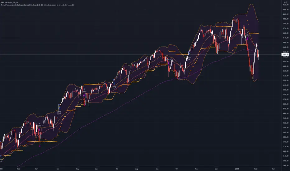
Trend Following with Bollinger BandsThis is a trend following system which uses the Bollinger Bands instead of the Donchian Channels.
Long position:
* Price closes above the middle line.
* The fast EMA (in this case the 40) crosses over or is above the slow one (in this case the 120)
Short position:
* Price closes below the middle line.
* The fast EMA crosses under or is below the slow one.
Stoploss:
* 4 ATRs away from the price.
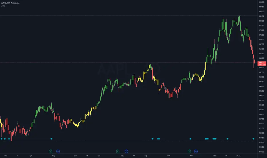
10X Bars - Directional TrendsMy interpretation of John Carter's popular Simpler Trading 10X Bars indicator.
Momentum is displayed to quickly see the quality and strength of a trend based on a calculation of the Directional Movement Index (DMI). The DMI is an indicator developed by J. Welles Wilder in 1978 that identifies in which direction the price of an asset is moving. The DMI is calculated by comparing prior highs and lows and produces 2 measurements illustrating the strength of the current trend:
-> a positive directional movement line (+DI); and
-> a negative directional movement line (-DI).
The average directional index (ADX) measures the strength of the current trend, either +DI or +DI; a reading above 20 typically indicates a strong trend.
-> Green bars indicate an uptrend i.e. when +DI is above -DI and ADX is greater than 20 - there is more upward pressure than downward pressure in the price;
-> Red bars indicate a downtrend i.e. when -DI is above +DI and ADX is greater than 20 - there is more downward pressure on the price; and
-> Yellow bars indicate no strong directional trend and potential for a reversal.
Volume spikes 50% above average volume are then flagged as dots at the bottom of the chart (although you can change this location), confirming the momentum further.
This indicator should compliment other popular indicators, as confirmation whether to stay in a position or not.
Three EMAs Trend-following Strategy (by Coinrule)Trend-following strategies are great because they give you the peace of mind that you're trading in line with the market.
However, by definition, you're always following . That means you're always a bit later than your want to be. The main challenges such strategies face are:
Confirming that there is a trend
Following the trend, hopefully, early enough to catch the majority of the move
Hopping off the trade when it seems to have run its course
This EMA Trend-following strategy attempts to address such challenges while allowing for a dynamic stop loss.
ENTRY
The trading system requires three crossovers on the same candle to confirm that a new trend is beginning:
Price crossing over EMA 7
Price crossing over EMA 14
Price crossing over EMA 21
The first benefit of using all three crossovers is to reduce false signals. The second benefit is that you know that a strong trend is likely to develop relatively soon, with the help of the fast setup of the three EMAs.
EXIT
The strategy comes with a fixed take profit and a volatility stop, which acts as a trailing stop to adapt to the trend's strength. That helps you get out of the way as soon as market conditions change. Depending on your long term confidence in the asset, you can edit the fixed take profit to be more conservative or aggressive.
The position is closed when:
The price increases by 4%
The price crosses below the volatility stop.
The best time frame for this strategy based on our backtest is the 4-hr. Shorter timeframes can also work well, although they exhibit larger volatility in their returns. In general, this approach suits medium timeframes. A trading fee of 0.1% is taken into account. The fee is aligned to the base fee applied on Binance, which is the largest cryptocurrency exchange.
You can execute this strategy on your favourite exchange at coinrule.com

[blackcat] L3 M.H. Pee Trend Continuation FactorLevel: 3
Background
Developed by M. H. Pee, the Trend Continuation Factor aims to help traders identify whether the market is trending, and, in case it is, in what direction it is headed. It can be used in any time frame, with every currency pair and is suitable for beginner traders.
Function
The indicator is comprised of two lines, namely the PlusTCF and MinusTCF, which separately correspond to bullish and bearish momentum, respectively. If the PlusTCF line is positive, then the prevailing trend is bullish, while a positive MinusTCF line signifies a bearish trend. Logically, both lines cannot be positive at the same time because the market cannot be in a bullish and a bearish trend simultaneously. However, they both can be negative at a current moment, implying that the market has consolidated in a trading range.
As for trading this indicator, it is generally interpreted and acted upon in a similar way as trading the Average Directional Movement Index. The most basic trading strategy involving the TCF is to enter long positions when the PlusTCF line is positive and to enter short positions when the MinusTCF is positive.
Traders also tend to regard the crossovers of the PlusTCF and MinusTCF lines as entry signals in the direction of the advancing line. Thus, if the PlusTCF crosses the MinusTCF and becomes positive, you should initiate a long entry, and vice versa.
Key Signal
PlusTCF Line --> bullish momentum line in yellow;
MinusTCF Line --> bearish momentum line in fuchsia.
Alerts are available.
Remarks
This is a Level 3 free and open source indicator.
Feedbacks are appreciated.

Trend ExplorerAre we in a bull or a bear market?
From the technical analysis point of view, the answer is "It depends". It depends from the parameters of your indicator, the timeframe of the pair you are looking and the volatility of that specific market you are looking to.
After I experimented with various trending indicators I decided to develop a framework that potentially could "embed" already existing logic from well known indicators (e.g. Supertrend OTT etc.).
The most important part is that I managed to abstract that logic away and experiment even further to produce some more robust, market and timeframe resolution agnostic results. While at the same time I was able to switch between market and timeframe resolution specific configuration to take some decision.
Finally, I decided to share this code with you folks! Developed this indicator "Trend Explorer" in an effort to make the aforementioned abstraction of all those trending indicators.
The goal is to enable the user to explore and combine different approaches in order to create a more robust and market general/specific, timeframe resolution invariant/fluctuating and volatility auto/manual adjusted indicator according to his needs.
The logic behind the abstraction is fairly simple. The trending indicator consists of two boundary lines the "bull trend low boundary" (green) and the "bear trend high boundary" (red). The indicator also has a control line (orange). Every time the control line crosses a boundary there is a trend reversal! The boundary lines are defined by the thresholds. To be more precise, boundaries are pulled upwards by thresholds (blue) during a bull market and downwards during a bear market. I challenge the user to experiment with the different ways of calculating the thresholds and the control. I am open to suggestions that might improve and extend the possibilities of this indicator. Any feedback, comments, general thoughts or bug reports are welcome.
Why did I chose those defaults?
For threshold calculation I chose MINMAX which calculates the local minimum and maximum using a sliding window. As far as I know it is not used in any existing trending indicator, but it seems reasonable for a trader to search for local min and max to make a decision. The width of the sliding window a.k.a the "period to remember" the local min and max is 30 days by default, just because I believe that for regular people it is a reasonable period of time to forget too.
Also, compared to the SUBADD method MINMAX does not seem to lag behind, especially when using averages in the SUBADD mode. Moreover, I consider MINMAX to be more general than the margins used by the SUBADD since margins should be configured based on the underlying market volatility.
For a source of min and max I chose the low and high values just because they are timeframe resolution invariant, meaning that they have the same (not exactly due to number precision and rounding, but very close) results for a single pair whether you use "4 hour" or "1 day" time interval! Another popular choice might be (close, close) since many traders wait for the daily candle to close in order to discard outliers. However, this approach is not resolution invariant and it depends from the time interval the user has selected.
Do you have any interesting trending indicator you would like to see how it performs in this framework logic? Let me know!
Do you have in mind any variation of Control or Thresholds calculation you would like to test? Please describe it in the comments below so I can add it in my implementation for you!
Did you find any other bug or you experienced any strange behavior? PM me with a description of the bug, the trading pair the timeframe resolution the exact time (candle) and all the necessary configurations for this indicator so I can reproduce it on my machine!
Please enjoy with caution,
Jason

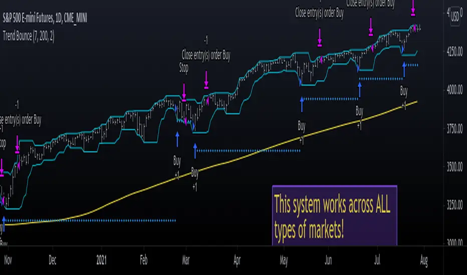
Trend Bounce [racer8]I discovered this mechanical trading system titled "This Algo Strategy Has Only 3 rules and 62% Win Rate".
I coded the trading system on Tradingview...and now I am introducing it to you guys.
I modified the system so that it has both buy & sell signals.
I've tested it repeatedly in different markets on TV including stocks, currency pairs, bitcoin, and commodities...and it works!
A buy signal is generated whenever the current close is below the previous 7-day low and the current close is above the 200 period moving average.
A sell signal is generated whenever the current close is above the previous 7-day high and the current close is below the 200 period moving average.
The system also has a 2-ATR stop loss which I coded.
This system is unique in that it has both trend-following and reversal elements in it.
The system trades short-term reversals while obeying the long-term trend.
Essentially, you are buying the dips of bullish trends! & selling at the peaks of bearish trends!
Enjoy ♡
Easy TrendThis signal is completely based on analysis and transformation of a single simple moving average. As with all signals and indicators, it should be combined with others.
This is how the signal is built:
1. First it takes the SMA of the closing price.
2. It then takes the ROC of that SMA using a length of 1.
3. It takes an 8-period SMA and also a 64-period SMA of that ROC.
4. These are plotted as follows:
- the ROC is plotted in green when above 0 (trending up) and red when below 0 (trending down).
- the 8-period SMA is plotted as a thin white line within the ROC signal
- the 64-period SMA is plotted as a thick white line within the ROC signal
When the trendline is green, this is a bullish zone. When the trendline is red, this is a bearish zone.
Moving averages (all types of moving averages) are inherently lagging signals. To compensate for that, I am offsetting each SMA series by half of its period. This may be confusing to some, but the end result is a mathematically accurate SMA signal, centered on the signal that it is providing the moving average of. It doesn't stop the lag, but it directly and obviously shows how lagged each signal is, which I personally find better to trade against.
Symbols on the top and bottom of indicator:
Yellow triangle at bottom of indicator shows where a downward trend is starting to bottom out and a buy/long opening may be available soon.
Green triangle at bottom of indicator shows that a downward trend has switched to an upward trend. This indicates a good time to buy.
Yellow triangle at top of indicator shows where an upward trend is starting to plateau and a sell/short opening may be available soon.
Red triangle at top of indicator shows that an upward trend has switched to a downward trend. This indicates a good time to sell.
Note: You may see multiple yellow triangles before seeing a green or red triangle. This can happen when multiple trend accelerations or decelerations occur within an overall green or red zone.
In addition there is a dotted line connecting the end of the 64-period SMA to the end of the 8-period SMA. This indicates the direction the trend is moving towards. When the dotted line crosses the zero line, this portrays a rough estimate of where the trend may switch from a downtrend to an uptrend or vice versa. This is the "best" time to buy or sell, depending on your strategy.
I recommend placing a SMA on your candles set to the same window size as this indicator, and also to offset that SMA to the left by half its window size. For example, a 90-period SMA should be offset by -45 periods. That will cause it to be correctly aligned with this trend signal.

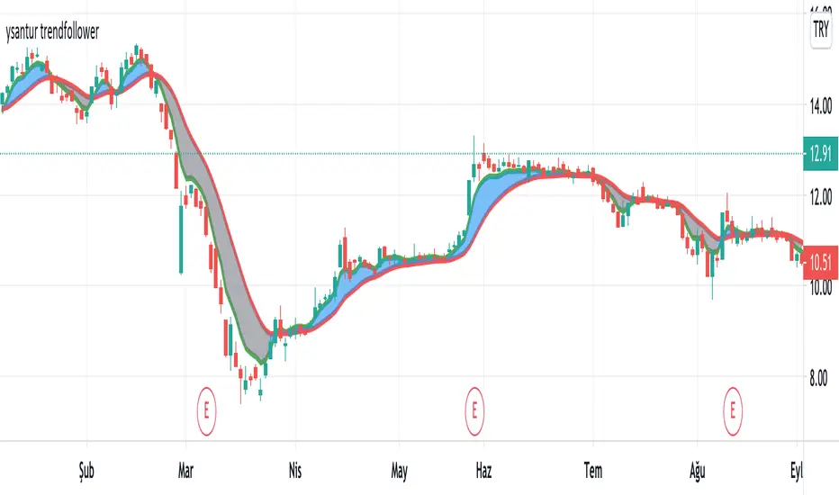
ysantur trendfollowerIt is an indicator that aims to stay in the trend by generating a buy or sell signal according to the intersection of two moving averages. The first trend line is a moving average whose weights are calculated based on fibonacci numbers or golden ratio. The second trend line is achieved by smoothing the first. Thus, two trend lines, one faster and one slower, are obtained.
How does it work
- When the fast line cross over the slow line, it generates a buy signal. On the contrary, a sell signal occurs when the fast trend line cross under the slower trend
- The area between the two trend lines is colored for easier understanding. Blue cloud shows "Bullish", gray cloud shows "Bearish"
- If prices are above the blue cloud, it indicates a strong Bullish trend.
- When prices go under the gray cloud, a strong bearish trend is observed.
- Prices being in the cloud should be treated as a "Hold" signal. In this case, the fast trend will act as resistance and slow trend act as a support. Position should be changed according to the situation.
- While there is a blue cloud, that is, in the bull trend, the two trend lines moving too far from each other may indicate a possible correction / reversal.
- While there is a gray cloud, that is, in the bear trend, the divergence of two trend lines from each other may indicate a possible correction / reversal.
- While in the bearish trend, prices move far from the cloud and re-enter into the cloud in near time. When these levels are monitored carefully, a return from a possible bear trend can be caught early.
As with every indicator, it can produce false signals in the horizontal market, so it should not be used alone. I continue to improve on it to put it in less positions due to commission and slip, not to generate false signals in the horizontal market. Now I can say that it produces good results in daily periods, not bad in hourly and 4 hours periods. Backtest is required for shorter periods. Please feel free to comment and write for my improvement.
Trend SniperThis is a leading indicator showing wave reversal points.
By drawing trendlines on this indicator you can quickly see a break of the trendline before the break on a price chart trendline.
Manually draw trendlines on the indicator to form an uptrend or downtrend.
A break down of the upward trendline gives a sell signal.
A break up of the downward trendline gives a buy signal.
Also included an extra timeframe (Blue Line) to give a bigger perspective from different timeframes. You can choose your own different timeframe that can be lower or higher than your current price chart timeframe.
For example: Place your chart on 1H and draw your trendlines on the indicator. Set the extra timeframe to 4H of 1D to see the overall trend and motion.
By using this indicator the way we suggest, you will be able to get good trend continuation signals

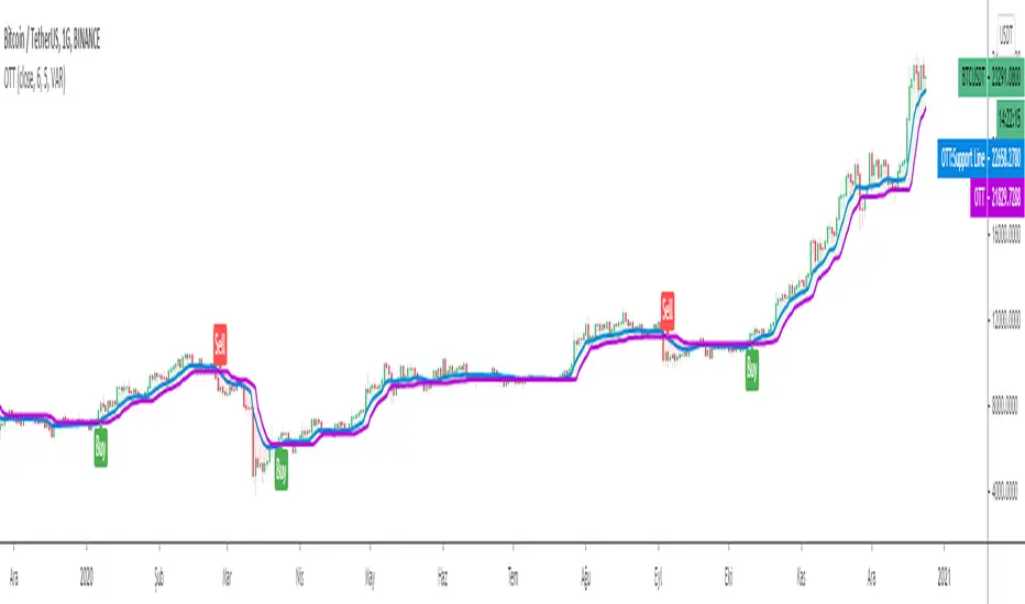
Optimized Trend TrackerA brand new indicator from the developer of MOST (Moving Stop Loss) indicator Anıl Özekşi.
Optimized Trend Tracker OTT is an indicator that provides traders to find an existing trend or in another words to ser which side of the current trend we are on.
We are under the effect of the uptrend in cases where the prices are above OTT ,
under the influence of a downward trend, when prices are below OTT
it is possible to say that we are.
The first parameter in the OTT indicator set by the two parameters is the period/length.
OTT will be much sensitive to trend movements if it is smaller. And vice versa, will be less sensitive when it is longer.
As the period increases it will become less sensitive to little trends and price actions.
In this way, your choice of period, will be closely related to which of the sort of trends you are interested in.
The OTT percent parameter in OTT is an optimization coefficient. Just like in the period
small values are better at capturing short term fluctuations, while large values
will be more suitable for long-term trends.
In addition, when OTT is used with the support line in it, buy and sell signals
it will become a producing indicator.
You can use OTT default alarms and Buy Sell signals like:
1-
BUY when Prices are above OTT
SELL when Prices are below OTT
2-
BUY when OTT support Line crosses over OTT line.
SELL when OTT support Line crosses under OTT line.
3-
BUY when OTT line is Green and makes higher highs.
SELL when OTT line is Red and makes lower lows.
Note: A small coverage with English subtitles will be available on my Youtube Channel soon.
EMA Slope Cross Trend Follower StrategyThis strategy uses the cross of the slopes of two EMAs having different lengths to generate trend follower signals. By default, I use 130 and 400, which behave very well.
The conditions which make the strat enter the market are:
- Fast Slope > Slow Slope and price > EMA 200 : go Long
- Fast Slope < Slow Slope and price < EMA200 : go Short
The simple slopes cross in the opposite direction, closes the position.
The strategy performs best on Bitcoin and the most liquid and capitalized Altcoins, but works greatly on volatile assets as well, in particular if they often go trending.
Works best on 4h time frame.
There's also an optional Volatility filter, which opens the position only if the difference between the two slopes is more than a specific value, which can be set in the strategy inputs. The purpose is not opening positions if price is going sideways and the noise is way > than the signal.
Enjoy it!

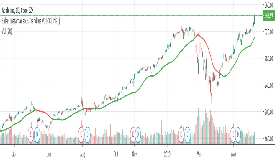
Ehlers Instantaneous Trendline V1 [CC]The Instantaneous Trendline was created by John Ehlers (Rocket Science For Traders pgs 109-110) and this indicator is perfect for determining the medium to long term trend. Buy when the indicator line is green and sell when it is red. I will be introducing a different version of this indicator which is perfect for short term trends so these will pair great together.
Let me know if there are other scripts you would like to see me publish or if you want something custom done!
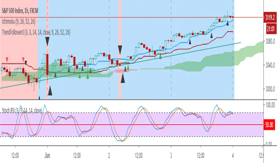
Trend Follow with kijun-sen/tenkan sen for 1 Hour SPX
This script determines, plots and alerts on probable trend initiation and continuation points, using tenkan-sen(conversion line of ichimoku), kijun-sen(baseline of ichimoku) and stochastic RSI, for 1 H SPX.
New long/short trend initiates when prices cross above/below kijun sen. The trend continues when prices cross above/below tenkan-sen or stochastic RSI crosses up/down its signal line, while prices are above/below kijun-sen.
It is good to take partial profit between 10-15 points gain and trail the left with stops below kijun-sen line.
While placing the order, using 2-3 points buffer above/below of signal bars is recommended. Additionally, please be careful about clouds and do not place long/short orders below/above clouds.
Trend Trade ( in W, D, H, 15M )Condition:
Uptrend, EMA5 > EMA8 > EMA13
Downtrend, EMA5 < EMA8 < EMA13
EMA# input can be changed by user.
Trading Plan:
1. Long in Uptrend when Price croseover EMA5;
Buy EMA5 + 0.03 (Do not wait for close), initial stop EMA13-0.03
If it is a big Gap up, do not chase. Let it go;
2. Short in Downtrend when Price croseunder EMA5;
Short EMA5 - 0.03 (Do not wait for close), initial stop EMA13+0.03
If it is a big Gap Down, do not chase. Let it go;
3. No target strategy in this study;
Back test Weekly, daily, hourly, 15M chart for ES1!, CL1!, GC1!, SPY, QQQ, TLT, IWM, XLF, XLK, XOP, GS, IBM, APPL, AMD, MMM, WBA
When side way move, Entry could be stopped quickly with small loss;
When entry in trending move, the position could be hold for a good range, and keep adding to winner.
Using this study, Futures and ETFs are better than single stock. Big Gap can break the trend, and trigger big stop loss;
This study is designed to join an existing trend. Try not use this in the time frame below 15 min.
To catch the turning point of a swing, Price action (Demand/Supply Confirmation) and trendlineBreak could be more accurate than EMA/SMA lines.

Automatic TrendlinesIntroduction
For a full free tutorial explaining this code in more detail, visit the backtest-rookies (.com) website.
This indicator will plot two trend lines at any given time. A resistance trend line and a support trend line. The resistance trend is shown with red circles and is created by joining swing highs together. The second is a support trend which is created by joining swing lows.
Since we need swings to make the trend, the trend line code contains code for the swing detection. You can play around with the swing detection to alter how frequently new trend lines are detected. Relying on swings also means that there will be some delay in trend detection depending on how you configure the swing detection. The higher you set rightbars, the more lag you will have before a trend is detected. However, at the same time the quality of the pivots found will increase. So it is a trade-off you need to come to terms with and decide what the best settings are for you.
Lines
A single trend line is made up of several components.
Pivot Points: Marked as blue or orange circles. There will be two pivots per trend.
Orange/Purple Lines: Connecting all pivot points. You will see these lines change direction slightly each time a new pivot is detected (new circles appear).
Green/Red Circle lines: Showing the trend line from the earliest moment a new trend is detected.
Blue Dashed lines: Joining the purple and green/red circle lines so the full trend line can be seen.
Note: The blue dashed lines use pine-scripts drawing functions. As such, there is a limit to how many of these can be placed on a chart. When the limit is reached, the oldest line will be removed so the newest can be drawn. This means that if you detect enough trends and scroll back in time, the blue dashed lines will disappear at some point!

Trendless MACD Strategy (Trendless Strategy Series -1 )I Try to eliminate the trend of the stock to see a clear version of the indicators. If you have any idea about that topic, you can send a message to me and we can improve this idea together.

HMA-Kahlman Trend & TrendlinesThis script utilizes two modules, Trendlines module (by Joris Duyck) and HMA-Kahlman Trend module. Trendlines module produces crossovers predictive of the next local trend.

Trend Channel [Gu5]SMA 200 determines the trend
Bullish trend, green candles. Down trend, red candles.
If the market value is narrow to the SMA200 channel, yellow candles.
Setting recommended for SMA Range
BTCUSD = 100
EURUSD = 1000
SPX = 100
ETHUSD = 10
Smart Pivot Trend█ OVERVIEW
Smart Pivot Trend is a market structure–based trend indicator that combines swing pivots, volatility adaptation (ATR), and dynamic range levels to determine which side of the market is in control — buyers or sellers. Instead of moving averages, trend direction is defined through structural breaks inside pivot ranges.
The indicator visualizes the active trend, evolving market structure, and historical support/resistance levels created at moments of control shifts. It helps identify trend transitions, structure breaks, and areas where price has an increased probability of reaction.
█ CONCEPT
Built around adaptive swing structure. The core idea is that trend emerges from market structure, not from price relative to an average.
- Swing highs and swing lows form the current structural range.
- Two internal percentage-based levels inside this range act as decision zones.
- Break above the upper level → bullish control.
- Break below the lower level → bearish control.
To prevent structure from becoming outdated during strong moves, pivots are dynamically adjusted when price deviates beyond ATR × multiplier. This mechanism makes the structure volatility-aware rather than static.
As a result, the indicator combines:
- a dynamic, living market structure (active pivot trend)
- static “market memory” levels marking previous control shifts
█ FEATURES
Calculations
- Swing pivots as the foundation of market structure
- Internal range levels as structural decision zones
- ATR-based adaptive pivot correction (volatility-aware structure)
- Smooth Factor — controls the degree of structural correction relative to price; defines how fast pivots adapt during strong moves
- Trend change detection through structural range breaks
Visualization
- Active trend line based on current structure
- Historical support/resistance levels plotted at trend flips
- Triangles marking breaks of those levels
- Gradient fill between price and the active trend line
- Trend-based coloring (green = bullish, red = bearish)
- Optional candle coloring based on current structural trend (bullish / bearish control)
Signals
- BUY / SELL — on structural trend changes
- Bullish Break / Bearish Break — when historical levels are broken
- Impulse breaks (when candles break levels with strong momentum)
Alerts
- Trend change to bullish
- Trend change to bearish
- Resistance break
- Support break
█ HOW TO USE
Main settings:
- Swing Length — sensitivity of swing detection
- Lower / Upper Level — internal structural decision levels
- ATR Length / Multiplier — influence of volatility on pivot adaptation
- Smooth Factor — speed of structural adjustment to price
- Visual options — colors, hiding lines, deleting broken levels, color candles by trend
Trend logic:
- Price above active pivot low → bullish structure
- Price below active pivot high → bearish structure
█ APPLICATION
Trend-following
- The indicator can act as a directional filter for signals from other tools.
- Entries are taken only when signals from external indicators (e.g., RSI, MACD, momentum tools, price action setups, breakout systems) align with the current Smart Pivot Trend direction.
- Highest probability occurs when entries happen during pullbacks to the active trend line in the direction of the prevailing structure.
Market structure shifts
- A trend flip represents a transfer of control between buyers and sellers.
- These moments often precede larger moves because the swing structure changes.
Breakout trading
- Historical levels mark areas where control previously changed.
- Their break often leads to volatility expansion and impulsive movement.
Pullback trading
- The active trend line acts as dynamic support/resistance.
- Pullbacks to this line in strong trends often provide favorable risk-to-reward setups.
█ ADAPTATION TO TRADING STYLE
The Swing Length and Smooth Factor parameters allow the indicator to be tailored to different trading styles:
Shorter Swing Length + higher Smooth Factor
- structure reacts faster
- more frequent trend shifts
- suitable for scalping and intraday trading
Longer Swing Length + lower Smooth Factor
- slower structural changes
- filters minor fluctuations
- better suited for swing trading and longer-term positions
This allows the indicator to function both as a fast micro-structure engine and as a stable higher-level trend filter.
█ NOTES
- This is a structural analysis tool, not a standalone trading system
- Best results come when combined with key S/R levels, higher timeframe context, and price action
- In ranging markets, trend flips may occur more frequently — a natural behavior of structure-based systems

Trend Line & Delta Montosca [English v33.7]This indicator, Trend Line & Delta Montosca , is a high-precision tool designed to identify institutional entry points by combining price action structure with real-time volume sentiment (Order Flow).
Here is a breakdown of its core logic and operational flow:
1. Market Structure & Trendline Analysis
The indicator starts by identifying "Pivot Highs" and "Pivot Lows" based on the Sensitivity settings you chose.
Pivot Connect Method: It draws trendlines connecting these key structural points. A "Long" bias is established when a trendline is broken to the upside, and a "Short" bias when broken to the downside.
BOS (Break of Structure): It monitors when the price closes above the previous high or below the previous low to confirm the current market phase (Bullish or Bearish).
2. Intermarket Synchronization (ES + NQ)
This is a unique "Institutional" filter. The script checks a secondary symbol (e.g., NQ if you are trading ES) to ensure the move is happening across the entire market.
If both instruments hit a pivot at the same time, the trendline is drawn thicker, indicating higher institutional conviction.
3. Order Flow Validation (Delta)
Breaking a trendline is not enough; it must be backed by "Smart Money" volume. The indicator uses Lower Timeframe (LTF) Intrabar Data to calculate the Delta:
Strength Filter: It checks if the buying/selling volume in a single candle exceeds a specific percentage (set to 75% by default).
Efficiency Filter: It identifies "Absorption" where the price moves aggressively with lower volume, suggesting a lack of resistance.
4. Inverted FVG (Fair Value Gap) Reaction
The final "trigger" is often the reaction to a Fair Value Gap.
The script tracks bearish and bullish FVGs.
The Inversion Logic: A "Long" signal is only validated if the price "inverts" a bearish FVG (closes above it), treating the old resistance as new institutional support.
5. Blue Sky Filter (ATH)
When the price is at an All-Time High (ATH), traditional FVG reactions might not exist. The script includes an optional "Blue Sky" logic that allows for trend-following entries even if there is no previous FVG to invert, as long as the structural breakout and Delta are present.
Visualization Summary
Labels: Clearly mark "LONG" or "SHORT" at the exact candle of entry.
Snapshots: To help you review your trades, the script leaves a "visual footprint" (the trendline and the FVG box) that caused the signal, so you can see the exact institutional context after the trade has moved.

FxShare - Trend MomentumThis one is just a clean background script. You can use it as an addition to your other indicators or if you just want:
a clean Trend Channel
a calm background
Momentum Strength meter panel.
It is based on our favorite accurate combo ATR, MACD and RSI mix . It has only one outside parameter for channel smoothing - 0-50 range. Use it, break it, improve it..
