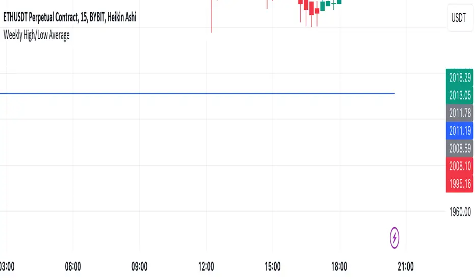
Mtl Weekly This Pine Script indicator for TradingView calculates and plots a line on the weekly chart, representing the average of the weekly high and low prices. The script uses conditional statements to determine and update the weekly high and low values. The calculated average is then plotted as a line on the chart in blue color. This indicator helps visualize the central point between weekly highs and lows, providing insights into potential trend directions.
Search in scripts for "weekly"
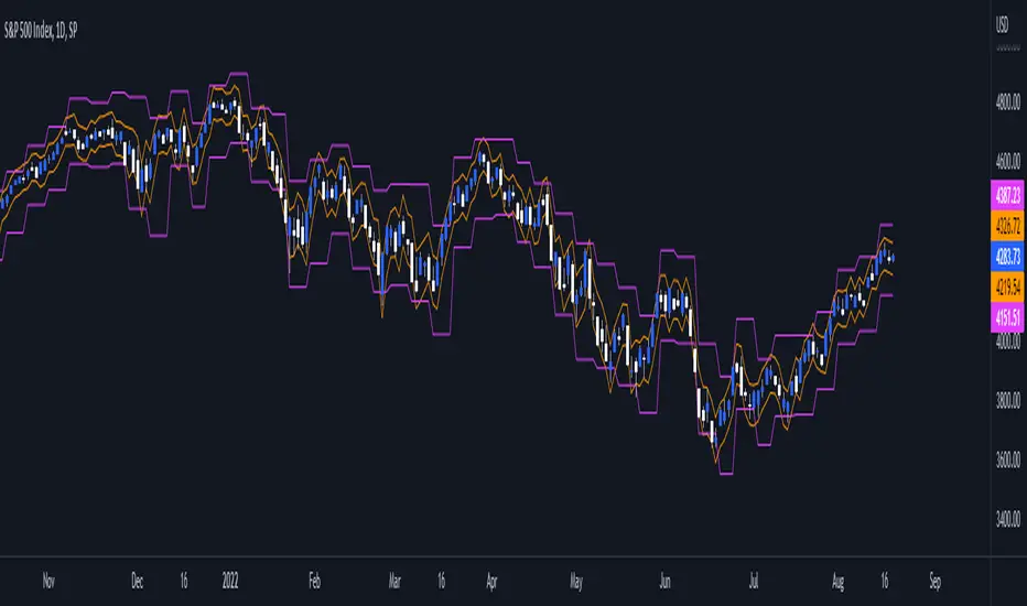
VWAP Balance ZonesVWAP Balance Zones (VBZ) Is based on 3 concepts.
Many Traders use VWAP to help determine Price Trends.
Trends are typically identified by new Highs or new Lows.
Balanced is found when Supply and Demand are mostly Equal.
VBZ tracks the daily, weekly, and monthly highs and lows; Then plots the average (50%) between the VWAP and the respective extremes.
50% VWAP Zones can be considered significant since they attempt to identify the equilibrium between market participants within the current trend, serving as key reference points to consider for decision making. >While in an uptrend, Buyers may see price falling to the Hi 50% as an attractive value entry for the continuation upwards.
>While ALSO in an uptrend, Sellers may see price falling to the Hi 50% as a change in sentiment with more downwards movement on the way.
Because of these conflicting mindsets, these zones are thought to display areas of balance between buyers and sellers, which can serve as potential decision points throughout the day.
VBZ Draws Zones from the Daily (High/Low/Close) VWAPs and the Day's (High/Low/Close) extremes as seen below.
Technically speaking, an average between vwap and extreme is a single point, to make these into zones I am using multiple sources for vwap and tracking different points of the bar throughout the day (ex. Close VWAP & Daily Highest Close)
Weekly and Monthly are only displaying the Average Price between the VWAP and the (Weekly or Monthly) High/Low.
These hold up as important levels for speculation; however, since most action will be discovered at the daily zones, I am not displaying the zones for the Weekly and Monthly to keep noise to a minimum.
Unique Behaviors:
- Weekly values are hidden on the first day of the week since they are similar to the daily values on the first day of the week.
- Monthly values are hidden in the first week of the month for the same reason.

TASC 2023.09 The Weekly Factor█ OVERVIEW
TASC's September 2023 edition of Traders' Tips features an article written by Andrea Unger titled “The Weekly Factor", discussing the application of price patterns as filters for trade entries. This script implements a sample trading strategy presented in the article for demonstration purposes only. It explores how the strategy's equity curve might benefit from filtering trade entries using a specific price pattern.
█ CONCEPTS
Pattern filters represent valuable tools that assess current market conditions based on price movements and determine when those conditions become more favorable for trade entries.
The filter used and tested in this article is a metric called the "weekly factor", which measures the price range over the last five trading days and compares it to the open of the session five days ago and the close of the session one day ago (i.e., the "body" of the five-day period). When the five-day body is small compared to the five-day range, this could indicate "indecision" or "compression", potentially followed by a price expansion. Thus, the weekly factor metric can help identify areas in the market where a period of compression might signal a potential breakout.
This script demonstrates the use of the weekly factor for a sample intraday trading strategy (intended for educational and exploratory purposes only). In this strategy, the entry signal is triggered when a 15-minute bar breaks out of the previous day's high-low range, and the position is closed at the end of the day.
█ CALCULATIONS
The script uses two timeframes:
• The strategy entries are processed on the 15-minute timeframe.
• The weekly factor is obtained from the daily timeframe using the request.security function and the following formula:
math.abs(open - close ) < RangeFilter * (ta.highest(5) - ta.lowest(5) )
Here, RangeFilter is an input that can be optimized to find the favorable ratio between the five-day body and the five-day range. Smaller RangeFilter values will lead to fewer trade entries. A RangeFilter value of 1 is equivalent to turning off the filtering altogether.

CPR Weekly Variable Weekday SellerGood afternoon traders,
This is a script I built for option selling, in attempt to have a high success rate. This is pretty much the same as my other one titled "CPR Option Selling Strategy." The difference is this one is strictly for Weeklies, with a variable weekday to expiry. I've had many requests to have a weekly that would end on Thursday, so here it is. Just select the date for expiry of the option, then it will calculate a "weekly" option set, using the the same set up as the traditional M-F weekly CPR information, except for offset for the weekday in question.
So for expiry dates for options on Thursday, you would choose "Thursday" in the parameters and it will calculate using Fri through Thu data for the pivot timeframes.
The rest is like this...
The gist of how it works:
It uses the opening or close of the current chart's timeframe opening bar when referenced against a "weekly" timeframe determined by the week ending weekday chosen for the central pivot range ( CPR ).
Using that comparison, this script calculates an option to sell: put, call, or iron condor. It will calculate a call value using an average of the CPR central pivot and the max value of the prior higher timeframe's high or R1 (whichever is higher.)
It does the same for the put side, but uses the higher timeframe's low or S1 (whichever is lower.)
It will use the option on the other side of the source (open or close) of the CPR as the "option in play."
Settings:
There are many settings, most are simply "viewable" settings, and probably self explanatory, others, not so much:
"Source for Trigger" - this is the value used on the "opening bar," such as the close. This value is the one compared to the Central Pivot Range in determining whether to sell a call (if the source is lower,) sell a put (if the source is higher,) or an iron condor if it's in the CPR .
"Show Historical Win/Loss Percentages" - this shows a table in the bottom right of the W/L percentages for the current ticker and settings. Used for a quick glance at historical success rates.
Example use (OLD EXAMPLE):
An example use (which I completed last week) on the chart referenced in this share: I sold a put-spread for $0.90, selling a 590 and buying a 570 strike in the middle of the week. I was looking at an hourly timeframe chart with a weekly pivot timeframe for the strategy.
Obviously, making only $0.90 on a $20 spread, there is a lot more to lose than to make, but I did some other analysis to go with it, so I felt safe, and I had a stop set for $1.50. So it worked, along with 3 other plays I did, very similar, and if that "Historical Win/Loss Percentage" is accurate, which I am fairly certain it is, I felt good about it.
The key all comes down to what you sell it for, right? That piece only you can determine. :)
Happy trading and enjoy,
Deuce

Daily/Weekly ExtremesBACKGROUND
This indicator calculates the daily and weekly +-1 standard deviation of the S&P 500 based on 2 methodologies:
1. VIX - Using the market's expectation of forward volatility, one can calculate the daily expectation by dividing the VIX by the square root of 252 (the number of trading days in a year) - also know as the "rule of 16." Similarly, dividing by the square root of 50 will give you the weekly expected range based on the VIX.
2. ATR - We also provide expected weekly and daily ranges based on 5 day/week ATR.
HOW TO USE
- This indicator only has 1 option in the settings: choosing the ATR (default) or the VIX to plot the +-1 standard deviation range.
- This indicator WILL ONLY display these ranges if you are looking at the SPX or ES futures. The ranges will not be displayed if you are looking at any other symbols
- The boundaries displayed on the chart should not be used on their own as bounce/reject levels. They are simply to provide a frame of reference as to where price is trading with respect to the market's implied expectations. It can be used as an indicator to look for signs of reversals on the tape.
- Daily and Weekly extremes are plotted on all time frames (even on lower time frames).
The Flip Backgrounds - Weekly & HourlyDescription
This indicator creates vertical background bands of larger timeframes when viewing lower timeframes so the trader can keep track of the larger timeframes when they are zoomed in on lower timeframes. This script displays hourly and weekly backgrounds. When the timeframe is thirty minutes or lower, hourly backgrounds are displayed. When the timeframe is greater or equal to an hour, then weekly backgrounds are displayed. The weekly backgrounds are great for spotting price movement over a weeks span. Many times price will go up the first part of the week and then come right back down in the second half (or vice versa). The weekly background makes these trends easy to spot.
The Flip
When a new candle forms, on any timeframe, this is referred to as "the flip". The most prominent flip is the hourly timeframe because intraday price action can be clearly seen with the hour timeframe. This is where this script gets its name. Also, since the stock market opens on the bottom of the hour, the hourly background start on the bottom of the hour as well.
Style
The hourly and weekly backgrounds can be independently toggled on and off for ease of use. The hourly and weekly vertical backgrounds are split into alternating colors. Each of these colors can be individually chosen (along with transparency) to match the trader chart colors.
Note: the weekly backgrounds logic in this script keeps track of the weeks by looking for Monday's. If the market is closed on a Monday, the weekly background will span two weeks.

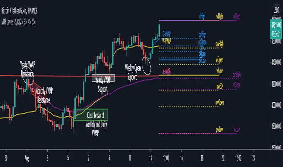
MTF Key Levels - Support and ResistanceThis indicator shows how to Multi Time Frame (MTF) interpret levels:
Watch how price acts around these levels and how they can act as support/resistance and can be used as great confluence levels for your technical analysis.
This indicator displays:
VWAP Levels
Daily / Weekly / Monthly / Yearly
Within the chart above I have marked out how displaying these VWAP levels can provide support and resistance levels to be aware of.
Daily – Weekly - Monthly – Yearly Levels
O = Open / H = High / L = Low
pO = Previous Open / pH = Previous High / pL = Previous Low / pEQ = Previous Equlibrium
Having previous Low/High levels makes you aware of Swing Failure Patterns (SFP). Also the daily/weekly/monthly opening and previous opening can assist with the trend.
Daily Open: Gives you an idea who is in control for the day. This level very often acts as strong support or resistance.
Weekly Open: Indicates where the price is within the higher timeframe.
Monthly Open & Yearly Levels: Overview of direction for the whole month without looking at a monthly chart and Yearly chart
Line Options
Within the line options you can choose to have a clean chart and display a “short line”. These line length can be adjusted by the user.
Line just to the right.
Line across the screen.
Disclaimer: The Monthly and Yealy VWAP will only show on higher timeframes this is due to restriction of how many candles can be shown on the chart. The candles displayed need to go back to either the start of the month of year to be able to calculate their VWAPs.
Heiken Ashi MTF Strategy- IndicatorHello, this is both a strategy and indicator that revolves around Heikin Ashi candles.
In this case we take 3 different time frames, in this example we use daily , weekly and monthly.
The conditions for entry are :
For long : we check that we have a green daily candle, at the same time we check that the weekly and monthly candles are also green.
For short : We check that all candles, daily, weekly and monthly and red.
For exit of long : as soon as 1 of the 3 candles, daily or weekly or monthly converts to red, we exit.
For exit of short : as soon as 1 of the 3 candles converts to green, we exit.
This strategy- indicator can be adapted to any type of market.

EMA with time-interval dependant visiblity settingThis scrip exposes 4 Exponential Moving Average (EMA) indicators which their visibility can be set to a daily or weekly time-frame (aka intervals). Based on your current chart time-frame, the matching EMA indicators come on and off.
This helps to have meaningful EMAs relevant to your time internal.
In a traditional 10 EMA indicates a plotted indicator would bear a meaning of a 10 day EMA when in daily and 10 week EMA when in weekly chart which may or may not be useful as some who for example only require a 10 week EMA for thier analysis and wouldn't want to cloud a daily chart with an EMA which won't resemble a valuable output for this particular user.
With EMA+, you can choose to see the 10 week EMA only when your chart is in the weekly time interval, so when switched to a daily interval a 10x EMA is not shown anymore.
If you prefer to see a 10 week EMA and a 21 day EMA on the other hand, you will only have 1 EMA shown when in weekly mode which is a 10 week EMA and one EMA when in daily mode with is 21 day EMA.
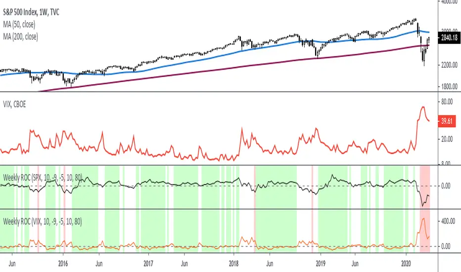
Rate Of Change - Weekly SignalsRate of Change - Weekly Signals
This indicator gives a potential "buy signal" using Rate of Change of SPX and VIX together,
using the following criteria:
SPX Weekly ROC(10) has been BELOW -9 and now rises ABOVE -5
*PLUS*
VIX Weekly ROC(10) has been ABOVE +80 and now falls BELOW +10
The background will turn RED when ROC(SPX) is below -9 and ROC(VIX) is above +80.
The background will turn GREEN when ROC(SPX) is above -5 and ROC(VIX) is below +10.
So the potential "buy signal" is when you start to get GREEN BARS AFTER RED - usually with
some white/empty bars in between...but wait for the green. This indicates that the volatility
has settled down, and the market is starting to turn up.
This indicator gives excellent entry points, but be careful of the occasional false signals.
See Nov. 2001 and Nov. 2008, in both cases the market dropped another 25-30% before the final
bottom was formed. Always have an exit strategy, especially when buying in after a downtrend.
How I use this indicator, pretty much as shown in the preview. Weekly SPX as the main chart with
some medium/long moving averages to identify the trend, VIX added as a "Compare Symbol" in red,
and then the Weekly ROC signals below.
For the ROC graphs, you can show SPX+VIX together, SPX alone, or VIX alone. I prefer to display
them separately because they don't scale well together (VIX crowds out the SPX when it spikes).
Background color is still based on both SPX/VIX together, regardless of which graph is shown.
Note that there is no VIX data available on Trading View prior to 1990, so for those dates the
formula is using only ROC(SPX) and the assigned thresholds (-9 and -5, or whatever you choose).
$0 Monthly Weekly & Daily OHLC Viewer
Visualizer of current or previous month(s), week(s) & days ranges
Purpose: View last Monthly, Weekly, Daily, and/or a custom time interval OHLC, i.e. previously closed/confirmed or the ongoing higher time interval ranges
Main configurations available:
- 2 main reporting modes: View the current/ongoing M/W/D candles' OHLC (live, repaints) or report OHLC of last closed ones, i.e. previous Montly, Weekly and/or Daily
- View only latest Monthly, Weekly and/or Daily OHLC (lines) or all past ones (~channel)
- Set your own time interval for its price range(s) to be reported, e.g. last quarter '3M', 12H '720', or hide it
- View one specific day of the week OHLC reported all over the week
Graphic/visual configuration:
- Show the High & Low levels or not
- Show the Open & close levels or not
- Display a background color between top & down or lines only
- Change the background color depending if is/was rising or falling price
- Highlight the top & down breaches of higher timeframe resolution candles: Daily breaching last Weekly range, and/or the Weekly the Monthly one
- Colors & styling can be edited from the indicator's styling configuration panel
Depending on its expected usage, those configurations enable to:
- Consider previously closed candles OLHC as reference top & down ranges (support & resistance, breaches)
- Review chart's current candles evolution within their higher time interval / candle (M/W/D)
- Consider specific week days' range as a reference for the week trend
- Have a general overview of the market evolution trends
Default config is to view current candles evolving within their higher time interval / candle, while reporting last previously closed M+W is a preferred usage. Play with the config settings to find your setup.
View ongoing M+W+D OHLC with dynamic background color:
View previously closed M+W+D OHLC:
View closed H&L for M+W+D, latest only:
View Mondays' OHLC:
Feedback & support welcome.
Current vs. Average price performance (daily and weekly)This indicator is to be used only by the values it gives back, don't use the lines .
In "current week days" choose number of days that already BEGAN this week (ex. on Wednesday type 3)
Green1 - Current Daily Range
Orange1 - Average Daily Range
Green2 - Current Weekly Range
Red1 - Average Weekly Range
Orange2 - Today's price movement compared to the average daily price movement (in percentage)
Red2 - This week price movement compared to the average weekly price movement (in percentage)
By these values you can check how price performed today and this week in comparison to the average daily and weekly values - you can check with some probability if the movement is already exhausted or price can do some more action.

10/5 Weekly/Daily EMAs with ConfirmationsPlots Daily and Weekly 10 & 5 EMAs (but fully customizable to your own).
In addition to plotting the EMAs it color coordinates trend bias and has cross confirmation signals.
Philosophy and how to read:
I use this indicator when trading strictly on the daily timeframe. I have not tested it on other timeframes.
In my trade system I start with both the monthly and weekly charts to define overall bias.
Here’s the general rule of thumb.
10 EMA is direction (bias) and 5 EMA is price.
If 5EMA is below 10EMA there is a bear bias. If 5EMA is above 10EMA there is a bull bias.
This indicator will plot both the daily and weekly 10 & 5 EMAs.
It will also color code the background based on how these EMAs relate to each other.
Light red typically is just the daily is confirmed bear (typically because it could be either or)
Dark red, both daily and weekly in confirmed bear.
Light green, typically just daily is confirmed bull (typically because it could be either or)
Dark green, both daily and weekly in confirmed bull.
In addition to background highlight there is confirmation crosses.
The daily confirmation cross is default yellow triangle.
Down triangle is 5 crossing the 10 downward.
Up triangle is the 5 crossing the 10 upward.
The weekly confirmation is the same only is aqua color.
Generally, on a color change you want to see one or both confirmation in the direction of the bias change.
If you only want to plot the daily bias in the options unclick the setting: Include Weekly Background Plotting. Unclicking this will remove the background coloring for the weekly bias. This might be helpful if you only want to see the strength of what the weekly timeframe is telling you.
Also, I’m primarily a trend trader but I also do have a reversal system I trade with lower R:R parameters.
A good reversal confirmation signal I’ve noticed is the instrument that you are trading should go through a cycle of light color to dark color.
You could also create alerts with this indicator based on just signals. When the signal fires the value will be 1.
Future Updates:
I want to find some way to correlate the distance between these EMAs to enhance the signal. Also to include a velocity component. Plus a few more things.
If you like this indicator please like and leave a comment down below.
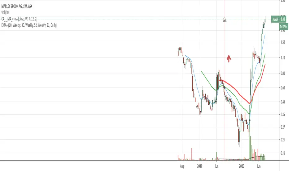
Rounded Weekly Pivot (by ChartArt)Trade with the trend. This is an overlay indicator which shows the weekly pivot (rounded) either as line or circle drawing, select-able by the user. The width of the pivot line (or circle) overlay is also adjustable.
In addition the bars can be colored by the trend, depending if the close price is above or below both the weekly and monthly pivots. If the close price is neither above or below both the weekly and monthly pivot prices the trend color is neutral blue.
The weekly pivot indicator with the optional setting that the pivot price is drawn as circles instead of a line:
And here with the pivot drawing disabled, showing only the pivot bar trend color

HTF Flip Close Levels, Daily Weekly Monthly TASHTF Flip Close Levels (D/W/M) — Support & Resistance Tool
This indicator automatically plots Daily, Weekly, and Monthly support & resistance levels based on higher-timeframe candle close behaviour.
🔹 What this tool does
The script detects HTF momentum flips using closed candles only:
Support is created when:
A red candle is followed by a green candle
The level is drawn at the close of the red candle
Resistance is created when:
A green candle is followed by a red candle
The level is drawn at the close of the green candle
This creates objective, rule-based horizontal levels derived purely from price behavior, not indicators.
🔹 Features
✅ Plots Daily, Weekly, and Monthly levels simultaneously
✅ Works on any timeframe (1m, 5m, 1H, Daily, Weekly, etc.)
✅ Keeps full historical levels, not just the most recent ones
✅ Optional auto-hide tapped levels (when price touches them)
✅ Tap detection:
Wick touch
or Close cross/touch
✅ Levels are always based on HTF candle closes, never wicks
✅ Designed to stay consistent across timeframe changes
🔹 How to use it (IMPORTANT)
This indicator:
❌ Does NOT predict market direction
❌ Does NOT generate buy/sell signals
❌ Does NOT tell you when to enter or exit
It is a context & confluence tool.
You should use these levels together with:
Market structure
Trend analysis
Volume / orderflow / CVD
Your own entry model
Your own risk management
Think of these levels as areas of interest, not automatic trade signals.
🔹 Best use cases
Confluence with:
Local support/resistance
VWAP / Anchored VWAP
Range highs/lows
Liquidity zones
Reversal or continuation patterns
Identifying:
HTF reaction zones
Decision points
Areas where other traders are likely watching
⚠️ Disclaimer
This indicator is a technical analysis tool only.
It is NOT financial advice.
It does NOT guarantee profits.
All trading decisions and risk are your responsibility.
Use it as part of a complete trading system, not as a standalone strategy.

Advisor CORE + MOMENTUM (Weekly) - ROC/EMA📊 Advisor CORE + Momentum (Weekly)
This indicator provides a rule-based portfolio management view, clearly separating long-term structure, risk monitoring, and entry timing, with a logic designed to support position review decisions, not mechanical trading.
It answers a single question:
Is this asset still justified at its current portfolio weight?
🔹 CORE — Structure & Risk Review
The CORE layer evaluates structural trend and long-term cycle, with an explicit review state to detect early deterioration:
Weekly price relative to a long-term EMA
Long-term Rate of Change (ROC) strength and direction
Long-term EMA slope
CORE states:
BUY / HOLD
Structure intact, long-term momentum strong.
HOLD
Structure still valid, but losing strength or under pressure.
REVIEW
Price below the long-term EMA and long-term momentum weakening.
Signals that the position should be actively reviewed.
REDUCE
Long-term momentum turned negative, indicating structural deterioration.
This allows risk to be addressed before a full trend break occurs.
🔹 MOMENTUM — CANSLIM Timing Discipline
The MOMENTUM layer applies strict CANSLIM entry rules, explicitly blocking any buy condition without valid timing:
BUY
Price above the short-term EMA,
short-term EMA above the long-term EMA,
long-term EMA rising.
HOLD / WAIT
Structure intact, but price below the short-term EMA.
NO OPERATE
Price below the long-term EMA or trend conditions failing.
This ensures that structure alone never justifies a buy, enforcing discipline between trend quality and entry timing.
🔗 Combined Use
This indicator is designed to be used together with:
ROC Triple (13 / 26 / 52)
The ROC Triple provides visual momentum context, while the Advisor translates structure and timing into clear, portfolio-oriented guidance.
⚠️ Important Notes
This is not a trading system.
It does not generate entry or exit signals.
It does not define position size or timing.
Its purpose is to standardize portfolio review decisions, reduce emotional bias, and maintain discipline across changing market regimes.

Advisor CORE + MOMENTUM (Weekly) - ROC/EMA📊 Advisor CORE + Momentum (Weekly)
This indicator provides a rule-based market diagnosis by clearly separating long-term structure from entry timing, following a CANSLIM-consistent logic.
It is designed to answer what is allowed right now, not to generate automatic trade signals.
🔹 CORE — Structural Context
The CORE layer evaluates trend and market cycle, independent of entry timing:
Weekly price relative to a long-term EMA
Long-term Rate of Change (ROC)
It identifies whether the asset’s primary structure is intact, weakening, or deteriorating.
Typical outputs:
CORE: BUY / HOLD → structure and cycle intact
CORE: HOLD → structure alive, under pressure
CORE: REDUCE → structural deterioration
🔹 MOMENTUM — CANSLIM Timing Logic
The MOMENTUM layer applies strict CANSLIM entry rules, clearly separating structure from timing:
BUY
Price above the short-term EMA
Short-term EMA above the long-term EMA
Long-term EMA rising
HOLD / WAIT
Structure intact, but price below the short-term EMA
NO OPERATE
Price below the long-term EMA or structural conditions failing
This ensures that no BUY condition is allowed without valid timing, even if the broader trend remains positive.
🔗 Combined Use
This indicator is designed to be used together with:
ROC Triple (13 / 26 / 52)
The ROC Triple provides visual momentum context, while the Advisor converts structure and timing into clear, rule-based guidance.
⚠️ Important Notes
This is not a signal generator.
It does not define entries, exits, or position size.
Recommendations are contextual, not predictive.
The objective is to standardize market reading, avoid mixed signals, and enforce discipline between structure and timing.

Advisor CORE + MOMENTUM (Weekly) - ROC/EMA📊 Advisor CORE + Momentum (Weekly)
This indicator provides a high-level diagnostic view of an asset by combining trend, momentum, and market cycle into concise, rule-based recommendations.
It is designed to answer “what is allowed right now”, not to automate trading decisions.
🔹 CORE (Long-Term Context)
The CORE assessment focuses on structural trend and cycle:
Weekly price relative to a long-term EMA
Long-term Rate of Change (ROC)
It helps identify whether the asset is in a healthy long-term phase, a temporary pullback, or a structural deterioration.
Typical outputs:
CORE: BUY / HOLD
CORE: HOLD
CORE: REDUCE
🔹 MOMENTUM (Tactical / Growth Context)
The Momentum assessment evaluates short- and medium-term price strength:
Short- and medium-term ROC alignment
Price behavior relative to the long-term trend
It is intended to determine whether momentum-based strategies are currently supported, in pause, or not advisable.
Typical outputs:
MOMENTUM: BUY
MOMENTUM: WAIT
MOMENTUM: NO OPERATE
🔗 Combined Use
This indicator is designed to be used in combination with:
ROC Triple (13 / 26 / 52)
The ROC Triple indicator provides the visual momentum context, while the Advisor translates that information into structured, high-level guidance.
Used together, they offer both:
Interpretation (ROC Triple)
Decision context (Advisor)
⚠️ Important Notes
This is not a signal generator.
It does not define position size or timing.
Recommendations are contextual, not predictive.
The objective is to standardize market reading, reduce emotional bias, and support consistent decision-making across different market regimes.

Monthly Weekly Daily ATR Calculation A weekly options trading script showing optimal levels using daily and weekly ATR ranges and stop loss. (Open ± ATR)

TQ Gold / DXY (Weekly Macro)What this indicator does
This indicator tracks the relative performance of gold versus the U.S. dollar using the Gold/DXY ratio. It helps determine whether gold’s strength is real (monetary) or merely nominal.
Why Gold/DXY matters
Gold rising with a rising dollar is not a strong signal.
Gold rising against a weakening dollar signals monetary outperformance.
This ratio filters out dollar noise and focuses on true purchasing-power strength.
How it works
The indicator calculates Gold ÷ DXY using weekly data.
A 30-week SMA is applied to the ratio.
Regimes are defined as:
Bull: Ratio above a rising 30-week SMA (gold beating the dollar)
Bear: Ratio below a falling 30-week SMA
Neutral: Transition or range-bound periods
A clear on-chart label shows the current regime.
How to use it
Use after confirming Gold Trend is Bull.
When Gold/DXY is Bull, gold has a true monetary tailwind.
When Gold/DXY is Bear, gold rallies are often fragile or dollar-driven.
Neutral readings signal consolidation or regime change.
Best timeframe
Designed for weekly charts and macro analysis.
Not intended for short-term trading signals.

Evil's Weekly Momentum ScoreA momentum scoring system that ranks any ticker on a 0-100 scale based on multi-timeframe relative strength. Built for weekly rotation decisions - example, I like to check this every Tuesday when it's nice and quiet, then rotate into the 3 strongest names.
Works on sector ETFs (XLK, XLF, XLE, etc.), mega caps (AAPL, NVDA, MSFT, GOOGL), or any liquid ticker watchlist you'd like to rank. Sector ETFs are probably more stable, mega caps have higher volatility; build your watchlist according to your comfort threshold.
How It Works
The indicator combines four components into a single score:
13-Week Momentum (40%) - Quarterly relative strength vs SPY. Where are institutions rotating?
4-Week Momentum (25%) - Monthly trend confirmation. Is the medium-term move intact?
2-Week Acceleration (20%) - Is momentum speeding up or fading? Catches turns early.
10-Week MA (15%) - Trend filter. Price above or below the 10-week moving average.
Each component is measured relative to SPY by default, so you're seeing true outperformance - not just whether something is going up, but whether it's beating the market.
Signal Levels
90+ : ON FIRE 🔥
80-89 : STRONG BUY
70-79 : BUY
50-69 : HOLD
Below 50 : AVOID
In my opinion, cash is a valid position so I don't rotate into scores below 80.
Features
Toggle each component on/off — weights auto-redistribute
Compare to SPY or use absolute momentum
Dashboard overlay sits on your price chart
Position dashboard anywhere: top/bottom, left/right
Alerts for signal level crossings
How To Use It
Add to your watchlist and flip through charts. Compare scores across sectors or mega caps. Rotate into the highest-scoring names, trim or avoid the lowest. Green values in the dashboard = outperforming. Red = underperforming. Simple.
Best Used For
Weekly sector rotation
Mega cap relative strength ranking
Momentum-based stock selection
Identifying leadership shifts before they're obvious

[CT] Daily & Weekly Percentage Price Oscillator Daily & Weekly Percentage Price Oscillator, or D&W PPO, is a dual-speed momentum oscillator that blends a slower “weekly-style” percentage oscillator with a faster “daily-style” percentage oscillator, then turns the relationship between them into a clean histogram that is easy to trade. The script builds four EMAs from the chart’s close. The first pair, L1 and L2, is used to create the W component, which behaves like a slow, higher-timeframe trend pressure line. W is calculated as the percentage distance between EMA(L1) and EMA(L2), normalized by EMA(L2). When W is rising and positive, it tells you the broader momentum is expanding upward, and when W is falling and negative, the broader momentum is expanding downward. The second pair, L3 and L4, creates the D component, which behaves like a faster, lower-timeframe momentum pulse, also expressed as a percentage but normalized by the same EMA(L2), so both components share a consistent “scale.” The script then combines them into R = W + D, which represents the total blended momentum, where W supplies the slow structure and D supplies the fast impulse.
The indicator is plotted as a histogram using “R − W,” and that choice is intentional. Because R = W + D, the histogram value “R − W” is mathematically identical to D. In other words, the columns you see are the fast momentum component, but anchored to a clear baseline that reflects whether the fast component is adding to, or subtracting from, the slower component’s trend context. The zero line is the equilibrium point where R equals W, meaning the fast component is neutral relative to the slow trend context. When the histogram is above zero, the fast component is contributing positive momentum and the script colors the columns with the Bull color, indicating that R is above W and the short-term push is aligned to the upside. When the histogram is below zero, the fast component is contributing negative momentum and the script colors the columns with the Bear color, indicating that R is below W and the short-term push is aligned to the downside. If you enable “Color price bars,” the chart candles are painted with the same logic so you can visually stay in sync with the fast momentum regime without staring at the panel.
How to trade it comes down to treating the histogram as your actionable trigger layer and using its behavior around the zero line as the decision boundary. A basic long framework is to prioritize long trades when the histogram is above zero and either expanding or printing consecutive positive columns, because that tells you the fast momentum pulse is supportive and not fighting the current regime. The cleanest long entries usually occur when the histogram flips from negative to positive and holds above zero for at least a bar or two, because that transition often marks the shift from pullback pressure into renewed upside impulse. You can add selectivity by watching for a “dip and re-strengthen” pattern above zero: after a positive run, the histogram contracts toward the baseline without breaking materially below it, then turns back up, which often corresponds to a controlled pullback followed by continuation. A basic short framework is the mirror image: prioritize shorts when the histogram is below zero and expanding downward, and treat flips from positive to negative that hold below zero as the higher-quality transition into downside impulse. In both directions, the histogram is especially useful for avoiding trades during momentum dead zones, because when columns chop tightly around the zero line with frequent flips, it is signaling indecision and a lack of clean directional impulse, which is where most “false starts” tend to happen.
Risk management with this tool is straightforward because the oscillator gives you a natural invalidation concept. For long trades, a common invalidation is the histogram losing the zero line and staying negative, since that indicates the fast component has turned from supportive to opposing. For short trades, invalidation is the histogram regaining the zero line and holding positive. Another practical way to manage trades is to use histogram contraction as an early warning that the impulse is weakening. If you are long and positive columns begin to shrink toward zero for several bars, you can tighten risk, take partials, or wait for a fresh expansion before adding. If you are short and negative columns begin to shrink toward zero, the same concept applies. The optional W line can be shown if you want a visual anchor of the slow component; while the histogram is already built to reflect the fast component relative to the slow context, viewing W can help you quickly recognize whether the larger momentum backdrop is generally rising or falling, which can be used as an additional bias filter for trade selection.
In practice, the D&W PPO is best used as a momentum alignment and timing tool: the slow component defines the “weather,” the fast component defines the “wind,” and the histogram tells you whether the wind is pushing with the weather or pushing against it. When the histogram is cleanly one-sided and expanding, it supports continuation-style trading and trend-following entries. When the histogram is choppy around zero, it warns you that conditions are rotational and patience usually pays.

KD Weekly Oversold Golden Cross (v6)KD Weekly Oversold Golden Cross (v6)
This is a screener for weekly KD indicator bullish crossovers at oversold levels, where the K value does not exceed 25.
