[GrandAlgo] Reaction ZonesThe Reaction Zones indicator leverages a proprietary algorithm to detect and highlight key areas on the price chart where significant market reactions are likely to occur. These zones, identified with precision, provide insights into areas where price might reverse, consolidate, or experience heightened volatility. Designed for versatility, this is one of our favorite tools for gaining clarity in complex market conditions.
Reaction zones represent critical levels of interest, such as support and resistance, liquidity pools, or institutional activity areas, giving traders a decisive edge in navigating price action.
How It Works:
Proprietary Algorithm: Detects reaction zones by analyzing historical price data, focusing on areas with potential for significant market activity.
Dynamic Adaptation: Continuously updates to reflect real-time market conditions, ensuring zones remain relevant.
Customizable Parameters: Allows traders to adjust zone sensitivity and visibility to match their trading strategies and preferred levels of precision.
Key Features:
Automatically identifies reaction zones tied to potential reversals, breakouts, or consolidations.
Dynamic visuals ensure zones are easy to interpret on the chart.
Customizable settings to align with various trading strategies.
Works seamlessly across all timeframes and markets, including Forex, crypto, stocks, and commodities.
Use Cases:
Identify potential reversal points by analyzing price interaction with reaction zones.
Enhance breakout trading by confirming price movements beyond critical zones.
Use reaction zones as high-probability areas for placing entries, stop-loss, or take-profit levels.
Spot areas of institutional activity or liquidity clusters where significant price movements often occur.
Adapt effectively to both trending and ranging markets by focusing on key reaction zones.
Leverage reaction zones to manage risk, protecting trades against adverse movements while targeting optimal rewards.
Refine intraday and swing trading strategies with precise zone detection.
The image demonstrates how the indicator dynamically highlights critical Reaction Zones, offering clear guidance for identifying reversals.
Disclaimer:
This indicator is a technical analysis tool designed to assist traders by providing insights into market conditions. It does not guarantee future price movements or trading outcomes and should not be relied upon as a sole decision-making tool. The effectiveness of this indicator depends on its application, which requires your trading knowledge, experience, and judgment.
Trading involves significant financial risk, including the potential loss of capital. Past performance of any tool or indicator does not guarantee future results. This script is intended for educational and informational purposes only and does not constitute financial or investment advice. Users are strongly encouraged to perform their own analysis and consult with a qualified financial professional before making trading decisions.
Supportandresitance

PivotBuilderOverview
PivotBuilder is a versatile trading tool that allows traders to create up to eight pivot lines, calculated using moving averages and standard deviation offsets, for enhanced market analysis and trade signal generation. These pivot lines work in conjunction with a trigger line to generate long and short signals based on user-defined parameters.
Key features:
Build strategies based on interaction between a moving average and any one or more of the 8 pivot lines - all fully configurable.
Customizable moving average types for pivot and trigger lines (SMA, EMA, VWMA).
Optional global pivot line configuration to simplify parameter adjustments.
Signal persistence options: signals can last for only one bar or until the opposite signal is issued.
Strategy visualization on chart.
Ideal for intraday and swing traders seeking dynamic support/resistance analysis and related strategies.
Key Concepts:
Customizable Pivot Lines
Create up to eight pivot lines with individually adjustable lengths, moving average types, and standard deviation offsets.
Optionally enable or disable signal generation for each pivot line.
Global Pivot Line Settings
Use a single global length for all pivot lines with one input for quicker configuration.
Signal Persistence
Choose between signals lasting only for the current bar or remaining active until the opposite signal is issued.
Chart Highlighting
Green background: Long signal is active.
Red background: Short signal is active.
Alerts
Configure alerts for signals via email, Discord, pop-ups, or sound using TradingView's native alert function.
Input Parameters
Global Settings:
Use Global Length for Pivot Lines: Enable this to apply a single length value to all pivot lines.
Global Pivot Line Length: The length to apply when the global setting is enabled.
Signal Mode:
Signal Mode: Select how long signals persist.
One Bar Only: Signals last only for the current bar.
Until Opposite Signal: Signals remain active until the opposite signal is triggered.
Trigger Line:
Trigger Line Moving Average Length: Set the length of the moving average for the trigger line.
Trigger Line MA Type: Choose the moving average type (Simple - SMA, Exponential - EMA, Volume-Weighted - VWMA).
Pivot Lines:
Each of the eight pivot lines has the following configurable settings:
Length: Define the moving average length. Overrides the global length if global settings are disabled.
MA Type: Choose between Simple - SMA, Exponential - EMA, Volume-Weighted - VWMA.
Standard Deviation: Set the standard deviation offset for the pivot line.
Enable Signal: Turn signal generation on/off for the specific pivot line.
Example Strategy on Nasdaq Futures (NQ, 1-minute Chart)
Long Signal:
A long signal is generated when:
The trigger line crosses above Pivot Line, Pivot Line 2, Pivot Line 3, and Pivot Line 4.
Short Signal:
A short signal is generated when:
The trigger line crosses below Pivot Line, Pivot Line 2, Pivot Line 3, and Pivot Line 4.
Configuration Example:
Global Settings:
Use Global Length for Pivot Lines: Disabled (to allow individual lengths for each pivot line).
Signal Mode: Until Opposite Signal (signals persist until the opposite signal is triggered).
Trigger Line:
Trigger Line Moving Average Length: 5.
Trigger Line MA Type: EMA (Exponential Moving Average).
Pivot Line 1:
Length: 20.
MA Type: EMA (Exponential Moving Average).
Standard Deviation: 0.25.
Enable Signal: True.
Pivot Line 2:
Length: 50.
MA Type: EMA (Exponential Moving Average).
Standard Deviation: -0.5.
Enable Signal: True.
Pivot Line 3:
Length: 50.
MA Type: EMA (Exponential Moving Average).
Standard Deviation: 1.
Enable Signal: True.
Pivot Line 4:
Length: 40.
MA Type: EMA (Exponential Moving Average).
Standard Deviation: 2.0.
Enable Signal: True.
Set Pivot Lines 5-8 disabled.
Signals:
Green Highlight: Indicates a long signal is active.
Red Highlight: Indicates a short signal is active.
Alerts
PivotBuilder allows you to set alerts for long or short signals. Here’s how to set them up in TradingView:
Add the Indicator: Attach PivotBuilder to your chart.
Open Alert Menu: Right-click on the chart and select Add Alert.
Condition: Choose your symbol (e.g., NQ) and select PivotBuilder.
Alert Options:
Crossing: Choose if you want to be alerted for "long" or "short" signals.
Notifications: Configure alerts via:
Email: Receive email alerts when signals are triggered.
Webhook: Set up Discord notifications via webhooks.
Pop-ups: Show an on-screen alert in TradingView.
Sound: Play a sound when a signal is issued.
Create: Save the alert.
Signal Persistence: How It Works
PivotBuilder gives you control over how long signals remain active:
One Bar Only:
Signals are active for the current bar only.
At the close of the bar, signals reset automatically.
Until Opposite Signal:
A long signal remains active until a short signal is triggered and vice versa.
Useful for trend-following strategies.
Development Roadmap
Future updates for PivotBuilder will include:
New Moving Average Types: Expand the available moving average options for both the pivot and trigger lines. Planned additions include, Weighted Moving Average (WMA), Hull Moving Average (HMA), Least Squares Moving Average (LSMA), and more.
Dynamic Volume Filtering: Add volume-based conditions to validate signals during periods of high market activity, filtering out low-liquidity signals.
Incorporation of Support/Resistance Calculations: Integrate traditional and alternative methods of support and resistance calculations into pivot lines such as Fibonacci retracements, Average True Range (ATR), volume-profile based support.
Automated trading via Strategy companion add-on.

[GrandAlgo] Impulse & Balance
The Impulse & Balance indicator identifies and labels three key levels—Impulse, Balance, and Apex—offering traders a structured and dynamic view of market behavior. Starting with the detection of Impulse levels, the indicator calculates corresponding Balance zones and Apex levels to provide actionable insights into price movement, potential reversals, and trend stability.
This indicator adapts seamlessly to all timeframes and market types, giving traders a powerful tool for understanding market dynamics and refining their strategies.
How It Works:
Impulse: Identifies critical price levels where significant market conditions occur. These Impulse levels serve as the foundation for calculating Balance and Apex levels.
Balance: Derived from Impulse levels, Balance zones mark areas of equilibrium where price tends to stabilize. These zones often act as key support or resistance areas.
Apex: The Apex is calculated as a pivotal level where price momentum within the Impulse reaches a peak, highlighting potential reversal or reaction points.
The indicator dynamically updates these levels in real-time as price evolves, ensuring that traders always have the most relevant data on their charts.
Key Features:
Automatically detects Impulse, Balance, and Apex levels for structured market analysis.
Continuously recalculates levels in real-time as price action evolves.
Offers customizable parameters for sensitivity and detection range.
Works seamlessly across all timeframes and market types.
Provides clear visual labels for effortless interpretation.
Use Cases:
Spot potential reversal zones or price reaction points using Apex levels.
Identify key price stabilizations with Balance zones for support and resistance analysis.
Monitor Impulse levels for insights into significant market conditions and momentum.
Suitable for various instruments, including Forex, crypto, stocks, and indices.

DAILY ATR LEVELS AND EXPECTED MOVE LEVELSThis Pine Script code is designed to visualize ATR (Average True Range) levels and expected move levels on a chart. It provides useful inputs for customizing how these levels are displayed, such as line width, style, and color. The script is divided into several sections, each focused on a different feature:
1. User Inputs for Customization:
- Line Width and Style: Users can customize the line width, style (solid, dotted, or dashed), and color for various levels.
- Offset for Line Placement: The rightOffset input controls how far in the future the lines extend (measured in minutes).
- Show Labels: Labels can be toggled on/off for ATR levels and expected move lines, with customizable text colors.
2. ATR Levels and ATR Settings:
- The ATR length (atrLength) and the multiplier (atrMultiplier) control the calculation of ATR levels.
- The script plots ATR levels based on the daily open price, including key levels like ATR +25%, ATR +50%, etc., for both positive and negative movements.
- Line Drawing: The script dynamically creates lines for each ATR level, and the lines are customized according to the user's inputs. For each level, the line.new function is used to plot a line from the start of the day (daily open) to a point offset in the future.
- Labels: Labels are added near each ATR level to make them more identifiable, such as "ATR +25%" or "Daily Open."
3. Expected Move Calculation and Logic:
- The script calculates the expected move for the next trading session based on the previous close price and the volatility derived from the VIX (Volatility Index).
- The expected move is calculated as a percentage of the previous close and is added and subtracted from the previous close price to generate upper and lower levels.
- Volatility Adjustment: The VIX value is adjusted by the square root of 252 (the number of average trading days in a year) to calculate the daily volatility.
- Upper and Lower Lines: Lines are drawn for the expected move's upper and lower bounds, showing the potential price movement based on volatility.
4. Customizable Expected Move Lines:
- Line Style and Color: The upper and lower expected move lines can be customized in terms of width, style, and color, as specified by the user.
- Labels for Expected Move Levels: Labels are added for the upper and lower expected move lines, such as "Expected Move Upper" and "Expected Move Lower."
5. Logic for Drawing Lines:
- The script continuously evaluates whether the levels should be displayed based on the user's preferences.
- If showATRLevels or showLineEM is enabled, the script will draw the respective lines and labels on the chart.
- It uses line.new to draw the lines and label.new to position the labels at the correct levels on the chart.
6. Handling Time and Line Deletion:
- The script handles the dynamic nature of the chart by deleting previous lines (using line.delete) to avoid cluttering the chart with outdated lines.
- The time for the lines is set dynamically using the startTime and endTime variables, ensuring that lines are drawn within the correct timeframe.
Summary of Key Features:
- ATR Levels: Plots key levels of ATR, such as daily open, ATR +25%, ATR -25%, etc., with customizable colors and line styles.
- Expected Move Levels: Calculates and plots the upper and lower bounds of the expected move based on the VIX and previous close price.
- Customization Options: Users can control the appearance (line width, style, color) and whether to show labels for the ATR and expected move levels.
- Dynamic Updates: The lines and labels update dynamically throughout the trading day, adjusting based on market conditions.
Overall, this script is designed to help traders visualize volatility and potential price movement on a daily chart by providing ATR-based levels and expected move projections. It offers a high degree of customization to suit different charting preferences.

Daily/Weekly/Monthly LevelsDaily/Weekly/Monthly Levels
TLDR
Shows Daily/Weekly/Monthly reversal levels. These can act as support/resistance levels.
Can only see what's in your candle history. I.e. It won't see old monthlies on your 1m chart! Use Daily to see everything with the most history.
Can only see levels higher than or equal to your current time frame. I.e. it will not see daily levels if you're looking at a weekly chart.
Doesn't keep levels that have been closed through. Does keep levels that have been only wicked.
This indicator shows you daily, weekly and monthly horizontal reversal levels to save you the hassle of doing it yourself. It's a little aid to speed up your TA routine.
Usage Details and Limitations
All daily, weekly, and monthly levels will be marked with lines on the chart automatically. Levels will only be visible from that level's TF or lower, i.e. you can't see the daily levels from the weekly chart, but you can see all levels from daily or lower charts. No levels will be displayed if you select a time frame higher than 1 month.
New levels will not be drawn if they are very close to existing levels. You can change the 'closeness' threshold in settings. It is specified as a percentage move from the existing level.
However, higher TF levels will REPLACE lower TF levels if they are too close. If you set the 'closeness' setting to 0, all levels will be drawn.
Levels will only be drawn if they are in your displayed candle range! I.e. the lower you go in timeframe, the less history you can see, and so levels originating from further back might be missed!
One technique you might have is to load up the daily timeframe and use that to mark any nearby levels of interest.
How does it work?
Basically, it looks for reversal candles on the D/W/M Timeframes, and draws a line for you from the open of the reversal candle (of that TF), so long as you are on a TF equal or lower than that level.
New bars on that TF that close through that TF's old levels will clear that level. Wicks do not clear.
Each newly found level will not be drawn if it's within the percentage distance of an existing level of equal or higher time frame.
Each new level also checks for existing levels on lower TFs that it can replace. E.g. if a monthly bar closes and produces a monthly level equal to an existing daily or weekly level, that daily or weekly level will be replaced. Use the settings to specify your 'closeness' allowance.
Please remember, it can only see as far back as your candle history, so you won't see old monthlies on a 1 minute chart! Use the daily TF to see all three levels at once with maximum history.

DAILY ATR LEVELSThis script is a custom technical indicator for use in TradingView, designed to display daily Average True Range (ATR) levels on the chart, along with the daily opening price. It provides a customizable way to track price levels relative to the daily ATR, which can be useful for traders looking for volatility-based price targets or ranges.
///////////////////////////////////////////////////////////////////////////////////////////////////////////////////////////////////////////////////////
Customization Options:
- Line Width: Determines the thickness of the plotted lines for the ATR levels and daily open line, ranging from 1 to 10.
- Right Offset (minutes): A time offset (in minutes) that shifts the end of the daily opening price line to the right for visual clarity.
- Line Style: The user can choose between solid, dashed, or dotted lines for all the plotted levels.
- Display Options: Users can toggle the visibility of the daily opening price line (showDayLevel), labels (showLabels), and ATR levels (showATRLevels).
- Colors: Customizable colors for the daily opening price line (dayLevelColor), labels (labelTextColor), and the ATR levels for both positive and negative values (atrLevelPlusColor and atrLevelMinusColor).
ATR Settings:
- ATR Length: Defines the number of periods (bars) to use when calculating the ATR. The default is 180, which corresponds to the ATR calculated on the daily chart using the last 180 bars.
- ATR Multiplier: Allows the user to scale the ATR levels by a multiplier (from 0.1 to 5.0), adjusting the sensitivity of the levels.
- ATR Levels: Users can toggle visibility for several predefined ATR levels, such as +25%, +50%, +75%, +100%, -25%, -50%, -75%, and -100%. These levels represent price points above or below the daily open based on the ATR.
///////////////////////////////////////////////////////////////////////////////////////////////////////////////////////////////////////////////////////
ATR Levels Calculation:
- The ATR is calculated based on the daily chart using the ta.atr() function with the specified ATR length, default is set at 180.
- The script computes multiple ATR levels above and below the daily open price, adjusting each level by 25%, 50%, 75%, and 100% of the ATR value (scaled by the ATR multiplier).
ATR Level Plotting:
- For each ATR level (positive and negative), a line is drawn across the chart at the corresponding price level.
- The color, line style, and width of these lines can be customized.
- Each ATR level also has an optional label showing the percentage level (e.g., "ATR +25%") at the specified price, which is positioned at the end of the line.
- The labels are removed from the previous bars to avoid clutter.
Workflow:
- The script first calculates the daily opening price using the request.security() function to pull the open price from the daily chart.
- It then calculates the ATR based on the selected length and multiplier.
- The start time for the daily open line is determined by the bar's timestamp at the start of the day, and the end time is adjusted using the user-defined right offset.
- After determining the relevant price levels (for the opening price and ATR levels), the script plots these levels on the chart as lines. It handles the drawing and deletion of lines to ensure that the chart remains updated in real time.
- If labels are enabled, text labels are displayed next to the ATR levels and the daily open line, providing clear markers for the user.
Practical Use:
- Volatility Analysis: This indicator is useful for identifying key price levels based on daily volatility (ATR). Traders can use it to set potential targets or support/resistance levels that are adjusted for volatility.
- Day Trading or Swing Trading: The daily opening price line helps traders quickly see where the price opened for the day, and the ATR levels give a dynamic range for the day's potential price movement.
Overall, this script is designed to provide a clear, customizable view of daily price levels in relation to the ATR, helping traders make informed decisions based on volatility and price action.

HTF CandlesHTF Candles, Plot of a Higher/Lower Timeframe Candles on any chart.
This HTF / LTF candle plot displays the previous 3 daily candles with the current update of the price with reference to a lower time frame.
Candles includes 3 Candles of HTF
last HTF candle includes 4 previous candles from LTF
Candle High Low Open Close are plotted.
these OHLC values act as Support and Resistance With reference to current Price.
very useful in making HTF and LTF analysis with reference to current timeframe.

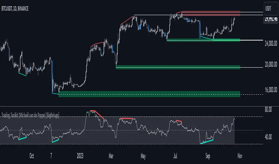
Comprehensive Trading Toolkit [BigBeluga]Trading Toolkit is a comprehensive indicator inspired by the trading strategies of the renowned crypto influencer Michaël van de Poppe . This tool combines RSI divergences, correction zones, and advanced support/resistance levels to provide traders with a robust framework for analyzing market movements.
🔵 Key Features:
RSI Divergences on Chart:
Automatically identifies and plots RSI divergences (bullish and bearish) directly on the main price chart.
Green lines indicate bullish divergences, suggesting potential upward reversals.
Red lines indicate bearish divergences, signaling possible downward movements.
Correction Boxes:
Traders typically define a correction as a drop in value of 10% or more. This drop can happen over a few hours or a few days. Also, it can last for less than 24 hours or many months.
This indicator visualizes corrections with blue shaded boxes, triggered by a percentage decline defined in the settings.
The boxes highlight sharp price drops, helping traders identify significant market movements quickly.
Advanced Support and Resistance Levels:
Dynamically detects key support and resistance levels based on price pivots.
When the price is above a level, it plots a green shaded area from the cross point, marking support.
When the price drops below a level, it plots a red shaded area, highlighting resistance.
Dashed lines indicate weaker levels, while solid lines represent stronger, more reliable levels.
🔵 Usage:
Identify Divergences: Use plotted RSI divergences to detect potential market reversals and align them with price action.
Analyze Correction Zones: Utilize correction boxes to evaluate significant price declines and find potential buying opportunities during these corrections.
Leverage Support and Resistance Levels: Confirm breakouts, reversals, or consolidation zones with the color-coded areas.
Enhance Risk Management: Combine divergences and correction zones to set informed stop-loss or take-profit levels.
Trading Toolkit empowers traders with actionable insights into market trends, corrections, and support/resistance dynamics, making it an invaluable tool for crypto and forex markets.
PowerStrike Pro V3Purpose of the Script
"PowerStrike Pro V3" is a custom indicator designed to generate high-accuracy buy/sell signals by combining multiple technical analysis tools. This script is optimized for trend-following, scalping, and support/resistance strategies. It integrates popular indicators such as RSI, Supertrend, Bollinger Bands, and dynamic support/resistance levels to provide traders with reliable signals.
Components of the Script and How It Works
The script combines the following key components, each contributing to the total signal strength based on user-defined weights. Below is a detailed explanation of how each component works and how it contributes to the overall score:
1. RSI (Relative Strength Index)
How It Works:
RSI identifies overbought (above 70) and oversold (below 30) conditions in the market.
The script uses RSI values to measure the strength of the trend and generate buy/sell signals.
When RSI is in the oversold zone, it strengthens buy signals. When in the overbought zone, it strengthens sell signals.
Contribution to Total Score:
RSI's contribution is calculated based on its strength in the oversold or overbought zones.
The final contribution is weighted by the user-defined "RSI Weight" and added to the total score.
2. Support and Resistance Levels
How It Works:
The script dynamically calculates recent peaks (resistance) and valleys (support) using a user-defined lookback period.
These levels are plotted on the chart as dynamic support and resistance lines.
The proximity of the price to these levels strengthens the signals.
Contribution to Total Score:
If the price is near a support level, it increases the strength of buy signals.
If the price is near a resistance level, it increases the strength of sell signals.
The contribution is weighted by the "Support/Resistance Weight" and added to the total score.
3. Supertrend Indicator
How It Works:
Supertrend uses ATR (Average True Range) and a multiplier to determine the trend direction.
The script uses Supertrend's direction changes as a filter for buy/sell signals.
When Supertrend is in an uptrend, it strengthens buy signals. When in a downtrend, it strengthens sell signals.
Contribution to Total Score:
Supertrend's contribution is weighted by the "Supertrend Weight" and added to the total score.
4. Bollinger Bands
How It Works:
Bollinger Bands measure price volatility and identify potential support/resistance levels.
The script generates buy signals when the price crosses above the lower band and sell signals when it crosses below the upper band.
Contribution to Total Score:
A crossover above the lower band increases the strength of buy signals.
A crossover below the upper band increases the strength of sell signals.
The contribution is weighted by the "Bollinger Bands Weight" and added to the total score.
5. Order Book Data
How It Works:
The script analyzes bid/ask volumes from the order book to assess market depth.
High bid volume near support levels strengthens buy signals.
High ask volume near resistance levels strengthens sell signals.
Contribution to Total Score:
Order book data is weighted by the "Order Book Weight" and added to the total score.
Signal Types and Their Meaning
The script generates two types of signals:
Weak Signals:
Weak signals indicate the early stages of a trend or minor corrections.
These are represented by small green (buy) or red (sell) triangles on the chart.
Weak signals are suitable for low-risk trades or scalping strategies.
Strong Signals:
Strong signals indicate the continuation of a trend or significant reversal points.
These are represented by larger green (buy) or red (sell) arrows on the chart.
Strong signals are suitable for higher-risk, higher-reward trades.
Total Score Calculation
The script calculates the total buy and sell scores by combining the weighted contributions of all components. The formula for the total score is as follows:
Copy
Total Buy Score = (RSI Buy Strength * RSI Weight) + (Support Strength * Support/Resistance Weight) + (Supertrend Buy Strength * Supertrend Weight) + (Bollinger Buy Strength * Bollinger Weight) + (Order Book Buy Strength * Order Book Weight)
Total Sell Score = (RSI Sell Strength * RSI Weight) + (Resistance Strength * Support/Resistance Weight) + (Supertrend Sell Strength * Supertrend Weight) + (Bollinger Sell Strength * Bollinger Weight) + (Order Book Sell Strength * Order Book Weight)
The total score is then compared to user-defined thresholds to generate weak or strong signals. For example:
A total buy score above 80% generates a weak buy signal.
A total buy score above 85% generates a strong buy signal.
Recommended Strategies
Trend Following: Use strong signals to trade in the direction of the main trend.
Scalping: Use weak signals to capture short-term price movements.
Support/Resistance Trading: Use the dynamically plotted support and resistance levels to identify reversal points.
How to Use the Script
Weight Settings:
Adjust the weights for each component (RSI, Supertrend, Bollinger Bands, etc.) in the script settings to customize the signal strength calculation.
Signal Thresholds:
Set the thresholds for weak and strong signals (e.g., 80% for weak signals, 85% for strong signals).
Chart Visualization:
The script automatically plots buy/sell signals on the chart. Use these signals in conjunction with your trading strategy.
Unique Features of the Script
Dynamic Weighting: Each component's contribution to the total score can be customized using user-defined weights.
Integrated Support/Resistance: The script dynamically calculates and plots support/resistance levels, enhancing signal accuracy.
Order Book Analysis: The inclusion of order book data provides additional confirmation for signals.
Final Notes
While "PowerStrike Pro V3" combines multiple indicators to generate reliable signals, no indicator guarantees 100% accuracy. Always use proper risk management and combine this script with other analysis tools for the best results

Supports and Resistances Multi Timeframe - VK TradingThe Supports and Resistances Multi Timeframe - VK Trading indicator is designed to help traders identify key support and resistance levels across multiple timeframes. It integrates real-time market data with smooth, customizable visual markers, allowing traders to quickly spot potential entry and exit points. This tool is particularly valuable for trend-following traders who want to see the most critical levels of price action on various timeframes.
Features:
Multi-Timeframe Support: Display support and resistance levels for the current, first, and second timeframes, helping traders identify price points across different market cycles.
Customizable Appearance: Choose from various colors for levels and bands, as well as transparency settings to match your chart's design.
ATR-based Bands: Uses the Average True Range (ATR) to dynamically adjust the width of support and resistance bands, offering more accurate price movement insights.
Pivot Points: Identifies pivot highs and lows, offering precise support and resistance levels based on the price action.
Smoothing Options: Customize the ATR smoothing method with options like RMA, SMA, EMA, and WMA for better alignment with your trading strategy.
Functionalities:
Quick Level Detection: The indicator highlights the most recent high and low levels on the current timeframe, ensuring you’re always aware of nearby price barriers.
Support and Resistance Visualization: Easily visualize the major support and resistance levels on multiple timeframes, improving decision-making and trade management.
Dynamic Band Widths: Customize the ATR multiplier for each timeframe, adapting the support and resistance bands based on the volatility of the market.
Multi-Timeframe Integration: View price action levels from a broader perspective with support and resistance data from the current, first, and second timeframes all in one chart.
Flexible Timeframe Selection: Choose your preferred timeframes for support and resistance levels, from daily, weekly, to monthly, for broader or narrower market views.
How it Helps Traders:
This indicator is ideal for traders who rely on multi-timeframe analysis to make well-informed trading decisions. By visualizing key support and resistance levels across several timeframes, traders can improve the precision of their entries and exits, better manage risk, and enhance their market timing. The tool provides a comprehensive view of price action, allowing traders to spot potential reversals and breakouts, making it easier to execute strategies effectively.
Disclaimer:
This script is an educational and analytical tool. It does not guarantee specific results or eliminate trading risk. Trading in the financial markets involves significant risks; use this script at your own risk.

Profitability Visualization with Bid-Ask Spread ApproximationOverview
The " Profitability Visualization with Bid-Ask Spread Approximation " indicator is designed to assist traders in assessing potential profit and loss targets in relation to the current market price or a simulated entry price. It provides flexibility by allowing users to choose between two methods for calculating the offset from the current price:
Bid-Ask Spread Approximation: The indicator attempts to estimate the bid-ask spread by using the highest (high) and lowest (low) prices within a given period (typically the current bar or a user-defined timeframe) as proxies for the ask and bid prices, respectively. This method provides a dynamic offset that adapts to market volatility.
Percentage Offset: Alternatively, users can specify a fixed percentage offset from the current price. This method offers a consistent offset regardless of market conditions.
Key Features
Dual Offset Calculation Methods: Choose between a dynamic bid-ask spread approximation or a fixed percentage offset to tailor the indicator to your trading style and market analysis.
Entry Price Consideration: The indicator can simulate an entry price at the beginning of each trading session (or the first bar on the chart if no sessions are defined). This feature enables a more realistic visualization of potential profit and loss levels based on a hypothetical entry point.
Profit and Loss Targets: When the entry price consideration is enabled, the indicator plots profit target (green) and loss target (red) lines. These lines represent the price levels at which a trade entered at the simulated entry price would achieve a profit or incur a loss equivalent to the calculated offset amount.
Offset Visualization: Regardless of whether the entry price is considered, the indicator always displays upper (aqua) and lower (fuchsia) offset lines. These lines represent the calculated offset levels based on the chosen method (bid-ask approximation or percentage offset).
Customization: Users can adjust the percentage offset, toggle the bid-ask approximation and entry price consideration, and customize the appearance of the lines through the indicator's settings.
Inputs
useBidAskApproximation A boolean (checkbox) input that determines whether to use the bid-ask spread approximation (true) or the percentage offset (false). Default is false.
percentageOffset A float input that allows users to specify the percentage offset to be used when useBidAskApproximation is false. The default value is 0.63.
considerEntryPrice A boolean input that enables the consideration of a simulated entry price for calculating and displaying profit and loss targets. Default is true.
Calculations
Bid-Ask Approximation (if enabled): bidApprox = request.security(syminfo.tickerid, timeframe.period, low) Approximates the bid price using the lowest price (low) of the current period. askApprox = request.security(syminfo.tickerid, timeframe.period, high) Approximates the ask price using the highest price (high) of the current period. spreadApprox = askApprox - bidApprox Calculates the approximate spread.
Offset Amount: offsetAmount = useBidAskApproximation ? spreadApprox / 2 : close * (percentageOffset / 100) Determines the offset amount based on the selected method. If useBidAskApproximation is true, the offset is half of the approximated spread; otherwise, it's the current closing price (close) multiplied by the percentageOffset.
Entry Price (if enabled): var entryPrice = 0.0 Initializes a variable to store the entry price. if considerEntryPrice Checks if entry price consideration is enabled. if barstate.isnew Checks if the current bar is the first bar of a new session. entryPrice := close Sets the entryPrice to the closing price of the first bar of the session.
Profit and Loss Targets (if entry price is considered): profitTarget = entryPrice + offsetAmount Calculates the profit target price level. lossTarget = entryPrice - offsetAmount Calculates the loss target price level.
Plotting
Profit Target Line: Plotted in green (color.green) with a dashed line style (plot.style_linebr) and increased linewidth (linewidth=2) when considerEntryPrice is true.
Loss Target Line: Plotted in red (color.red) with a dashed line style (plot.style_linebr) and increased linewidth (linewidth=2) when considerEntryPrice is true.
Upper Offset Line: Always plotted in aqua (color.aqua) to show the offset level above the current price.
Lower Offset Line: Always plotted in fuchsia (color.fuchsia) to show the offset level below the current price.
Limitations
Approximation: The bid-ask spread approximation is based on high and low prices and may not perfectly reflect the actual bid-ask spread of a specific broker, especially during periods of high volatility or low liquidity.
Simplified Entry: The entry price simulation is basic and assumes entry at the beginning of each session. It does not account for specific entry signals or order types.
No Order Execution: This indicator is purely for visualization and does not execute any trades.
Data Discrepancies: The high and low values used for approximation might not always align with real-time bid and ask prices due to differences in data aggregation and timing between TradingView and various brokers.
Disclaimer
This indicator is for educational and informational purposes only and should not be considered financial advice. Trading involves substantial risk, and past performance is not indicative of future results. Always conduct thorough research and consider your own risk tolerance before making any trading decisions. It is recommended to combine this indicator with other technical analysis tools and a well-defined trading strategy.

Big Money by ChartedhighsBig Money by Chartedhighs
Script Overview:
The "Big Money" indicator is designed to help traders easily identify significant price movements on their charts. This script visually highlights candles where the price change from open to close exceeds a user-defined threshold. It draws attention to these key moments, providing a clear indication of potential big-money moves in the market.
Key Features:
Customizable Threshold:
Allows users to set a specific price change threshold via the input menu (Highlight Threshold).
Only candles with a price change greater than or equal to this value are highlighted.
Candle Highlighting:
Uses color-coded bars to emphasize candles meeting the threshold condition.
Candles are highlighted in yellow for immediate visual clarity.
Dynamic Box Annotation:
Draws a semi-transparent yellow box around highlighted candles.
Extends the box dynamically to subsequent bars, providing an area of interest for continued analysis.
Labeling for Key Moments:
Automatically adds a label ("BigMoney") above highlighted bars to further indicate significant price action.
How It Works:
The script calculates the price change for each bar (close - open) and compares it to the user-defined threshold.
If the price change meets or exceeds the threshold:
The bar color changes to yellow.
A box is drawn around the candle to highlight the price movement visually.
A label is added above the candle to emphasize its significance.
The box extends dynamically until the next highlighted candle, allowing users to track zones of activity.
Customization Options:
Highlight Threshold: Modify the threshold value to suit your trading style or instrument volatility.
Use Case:
This indicator is ideal for traders looking to identify significant price movements quickly. It helps to locate areas where "big money" might be flowing into the market, offering potential entry or exit opportunities.
How to Use:
Add the "Big Money by Chartedhighs" script to your TradingView chart.
Set the Highlight Threshold to a value suitable for your market or timeframe.
Observe highlighted candles and boxes for potential trading signals or areas of interest.
This script is highly visual, intuitive, and customizable, making it a great addition to any trader's toolkit!

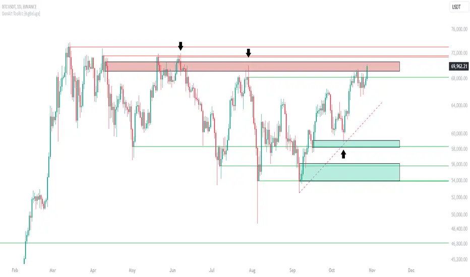
DonAlt - Smart Money Toolkit [BigBeluga]DonAlt - Smart Money Toolkit is inspired by the analytical insights of popular crypto influencer DonAlt.
This advanced toolkit integrates smart money concepts with key technical analysis elements to enhance your trading decisions.
🔵 KEY FEATURES:
SUPPORT AND RESISTANCE LEVELS Automatically identifies critical market turning points with significant volume. Levels turn green when the price is above them and red when below, providing a visual cue for key market thresholds.
ORDER BLOCKS: Highlights significant price zones preceding major price movements.
- If the move is down , it searches for the last bullish candle and plots a block from its body.
- If the move is up , it searches for the last bearish candle and creates a block from its body.
These blocks help identify areas of institutional interest and potential reversals.
TRENDLINES: Automatically plots trendlines to identify breakout zones or price accumulation areas.
• Bullish trendlines accumulation form when the current low is higher than the previous low.
• Bearish trendlines accumulation emerge when the current high is lower than the previous high.
• Bullish trendlines Breakout form when the price break above it.
• Bearish trendlines Breakout form when the price break below it.
Volatility Integration: The levels incorporate normalized volatility to ensure only significant zones are highlighted, filtering noise and emphasizing meaningful data.
🔵 WHEN TO USE:
This toolkit is ideal for traders seeking to align with "smart money" strategies by identifying key areas of institutional activity, strong support and resistance zones, and potential breakout setups.
🔵 CUSTOMIZATION:
Toggle the visibility of levels, order blocks, or trendlines to match your trading style and focus.
Colors of the Bull and Bear key features
Extend trendline
Support & Resistance SentinelSupport & Resistance Sentinel
The Support & Resistance Sentinel is a powerful and versatile indicator designed to identify and visualize key support and resistance levels on your charts. By leveraging multiple technical analysis tools, it ensures accuracy and adaptability across different market conditions and timeframes.
Key Features:
Dynamic Support and Resistance Levels: The indicator dynamically identifies local highs and lows, adapting to evolving market conditions.
Volume Spike Detection: Incorporates volume analysis to highlight significant market activity, ensuring the identified levels are robust.
Moving Average and RSI Filters: Utilizes moving averages and Relative Strength Index (RSI) to validate the significance of support and resistance levels.
Higher Timeframe Confirmation: Integrates higher timeframe data to provide an additional layer of confirmation for identified levels.
Customizable Visuals: Allows users to customize the length, color, and extension of support and resistance boxes for clear and personalized chart visualization.
Alerts: Includes alert conditions to notify users when the price hits significant support or resistance levels.
How It Works:
Identification: The indicator analyzes historical price data to identify local highs and lows within a specified lookback period.
Validation: It uses moving averages and RSI to filter out less significant levels, focusing on key support and resistance zones.
Volume Analysis: Detects volume spikes to ensure the levels correspond to substantial market activity.
Higher Timeframe Integration: Combines current timeframe data with higher timeframe levels for added confirmation.
Visualization: Draws customizable boxes around the identified support and resistance levels, extending them for better visual clarity.
Alerts: Sets up alerts to notify users when the price interacts with these crucial levels.
How to Use:
Customization: Adjust input settings such as lookback period, box length, and colors to fit your trading preferences.
Observation: Monitor the chart for highlighted support and resistance zones to understand key market levels.
Trading Decisions: Use these zones to make informed trading decisions, including setting entry and exit points or stop-loss orders.
Alerts: Enable alerts to get notified when price action hits significant support or resistance levels, allowing timely decision-making.
Enhance your trading strategy with the Support & Resistance Sentinel and gain deeper insights into market dynamics..
Custom Levels PTZ
This indicator lets you easily plot support, resistance, pivot, and key levels on your chart. Simply enter your levels in a structured format, and the indicator will draw them as lines or zones, complete with labels.
You can input as many levels as you want
The script will auto-plot the levels also if you switch the chart from a mini to micro for futures instruments , no need to change the ticker
How to Use:
Open the indicator settings.
In the "Input Levels" box, enter your levels using the following format:
For single levels: SYMBOL,COLOR,STYLE,WIDTH,DESCRIPTION,LEVEL1,LEVEL2,...;
For zones: SYMBOL,COLOR,ZONE,WIDTH,DESCRIPTION,LEVEL_LOW,LEVEL_HIGH;
Example Inputs:
CL,WHITE,SOLID,-2,Key Level,67.52;
CL,ORANGE,ZONE,-2,Strong Res,68.70,68.77;
CL,Aqua,solid,-,resistance levels as you like ,61.15,62.68,63,64.22,65,68,74;
Click "OK" to apply.
Format example:
ES,LIME,SOLID,-2,Support,5892,5864,5828,5819,5812,5806,5787,5782,5773,5749,5741,5730;
ES,LIME,ZONE,-2,Support,5886,5888;
ES,LIME,ZONE,-2,Support,5843,5846;
ES,RED,SOLID,-2,Resistance,5899,5917,5928,5988,5993,6009,6019,6027,6032,6058,6092,6103,6110,6121,6131,6141,6146,6152;
ES,RED,ZONE,-2,Resistance,5907,5910;
ES,RED,ZONE,-2,Resistance,5934,5935;

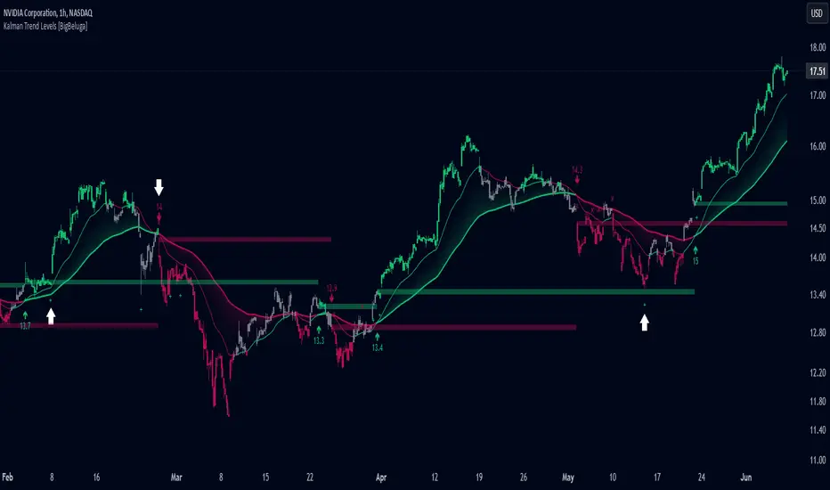
Kalman Trend Levels [BigBeluga]Kalman Trend Levels is an advanced trend-following indicator designed to highlight key support and resistance zones based on Kalman filter crossovers. With dynamic trend analysis and actionable signals, it helps traders interpret market direction and momentum shifts effectively.
🔵 Key Features:
Trend Levels with Crossover Boxes: Identifies trend shifts by tracking crossovers between fast and slow Kalman filters. When the fast line crosses above the slow line, a green box level appears, indicating a potential support zone. When it crosses below, a red box level forms, acting as a resistance zone.
Retest Signals for Support and Resistance Levels: Enable retest signals to capture price rejections at the established levels, providing possible re-entry points where the price confirms a support or resistance area.
Adaptive Candle Coloring by Trend Momentum: Candle colors adjust based on the trend's strength:
> During a downtrend, if the fast Kalman line shows upward movement, indicating reduced bearish momentum, candles turn gray to signal the weakening trend.
> In an uptrend, when the fast Kalman line declines, showing lower bullish momentum, candles become gray, signaling a potential slowdown in upward movement.
Crossover Signals with Price Labels: Displays arrows with price values at crossover points for quick reference, marking where the fast line overtakes or dips below the slow line. These labels provide a precise price snapshot of significant trend changes.
🔵 When to Use:
The Kalman Trend Levels indicator is ideal for traders looking to identify and act upon trend changes and significant price zones. By visualizing key levels and momentum shifts, this tool allows you to:
Define support and resistance zones that align with trend direction.
Identify and react to trend weakening or strengthening via candle color changes.
Use retest signals for potential re-entries at critical levels.
See crossover points and price values to gain a clearer view of trend changes in real time.
With its focus on trend direction, support/resistance, and momentum clarity, Kalman Trend Levels is an essential tool for navigating trending markets, providing actionable insights with every crossover and trend shift.
Dollar Cost Averaging (YavuzAkbay)The Dollar Cost Averaging (DCA) indicator is designed to support long-term investors following a Dollar Cost Averaging strategy. The core aim of this tool is to provide insights into overbought and oversold levels, assisting investors in managing buy and sell decisions with a clear visual cue system. Specifically developed for use in trending or fluctuating markets, this indicator leverages support and resistance levels to give structure to investors' buying strategies. Here’s a detailed breakdown of the indicator’s key features and intended usage:
Key Features and Color Coding
Overbought/Oversold Detection:
The indicator shades candles from light green to dark green when an asset becomes increasingly overbought. Dark green signals indicate a peak, where the asset is overbought, suggesting a potential opportunity to take partial profits.
Conversely, candles turn from light red to dark red when the market is oversold. Dark red signifies a heavily oversold condition, marking an ideal buying window for initiating or adding to a position. This color scheme provides a quick visual reference for investors to manage entries and exits effectively.
Support and Resistance Levels:
To address the risk of assets falling further after an overbought signal, the DCA indicator dynamically calculates support and resistance levels. These levels guide investors on key price areas to watch for potential price reversals, allowing them to make more informed buying or selling decisions.
Support levels help investors assess whether they should divide their capital across multiple buy orders, starting at the current oversold zone and extending to anticipated support zones for maximum flexibility.
Usage Methodology
This indicator is intended for Dollar Cost Averaging, a method where investors gradually add to their position rather than entering all at once. Here’s how it complements the DCA approach:
Buy at Oversold Levels: When the indicator shows a dark red candle, it signals that the asset is oversold, marking an optimal entry point. The presence of support levels can help investors determine if they should fully invest their intended amount or stagger buys at potential lower levels.
Sell at Overbought Levels: When the indicator transitions to dark green, it suggests that the asset is overbought. This is an ideal time to consider selling a portion of holdings to realize gains. The resistance levels, marked by the indicator, offer guidance on where the price may encounter selling pressure, aiding investors in planning partial exits.
Customizable Settings
The DCA indicator offers several user-adjustable parameters:
Pivot Frequency and Source: Define the pivot point frequency and the source (candle wick or body) for more tailored support/resistance detection.
Maximum Pivot Points: Set the maximum number of pivot points to be used in support/resistance calculations, providing flexibility in adapting to different market structures.
Channel Width and Line Width: Adjust the width of the channel for support/resistance levels and the thickness of the lines for easier visual tracking.
Color Intensities for Overbought/Oversold Levels: Customize the shading intensity for each overbought and oversold level to align with your trading preferences.
Support and Resistance MTF [Cometreon]The Support and Resistance MTF elevates your technical analysis by automatically identifying and plotting critical support and resistance levels across any symbol and timeframe—even higher ones. Powered by advanced algorithms, this tool continuously analyzes market structure and updates in real time, saving you hours of manual analysis.
If you're looking for a smart, dynamic, and highly customizable S&R solution, this is the tool for you.
🔷 Key Features & Improvements
🟩 Automatic Level Detection
The indicator automatically plots all support and resistance levels, providing a clear map of key points on the chart.
🟩 Historical Level Display
Shows historical support and resistance levels, providing a comprehensive view of the market over time.
🟩 Dynamic Trend Creation
Automatically identifies and updates trends based on levels, simplifying the understanding of market directions.
🟩 Automatic Fibonacci
Generates Fibonacci levels based on the last two support and resistance levels, offering additional reference points for potential price retracements or extensions.
🟩 Customizable Alerts
Offers a series of configurable alerts to keep you informed about breakouts, new confirmed levels, and price bounces on active levels.
🔷 Technical Details and Customizable Inputs
1️⃣ Line Types - Select the type of lines to display: active, broken, both, or none.
2️⃣ Left Length - Determines the number of candles to calculate the previous high or low point.
3️⃣ Right Length - Defines the number of candles needed to confirm a level as Support or Resistance.
4️⃣ Timeframe - You can modify the timeframe of supports and resistances to view levels of a higher timeframe. It's also possible to add additional support and resistance levels using a second timeframe.
5️⃣ Breakout Source - Change the source needed to break support and resistance levels between Close or High/Low.
6️⃣ Delete at Timeframe - Allows removing levels based on the current chart resource instead of using that of the higher timeframe.
7️⃣ Session Range - Choose a period of distance from the last candle to define how far back in the past the indicator should look for Supports or Resistances.
8️⃣ Style Valid Level - Customize the appearance of active levels, including the color of the level itself, Liquidity fill, text color, line style and thickness, extension, as well as the size, position, and values to display in the level text.
9️⃣ Liquidity - This option displays the liquidity associated with each support and resistance level, with three modes: "Wick" which goes from the high/low to the upper/lower body, "Body" instead goes from the level to the lower/upper body of the candle and "Full Range" which extends from the high to the low of the candle.
1️⃣0️⃣ Style Break Level - Allows modifying color, style, and thickness of lines, as well as text width, for two types of breakouts: "MSS" and "BOS".
" MSS " stands for " Market Structure Switch " and indicates a level breakout opposite to the previous breakout, signaling a trend reversal.
" BOS ", on the other hand, means " Break of Structure" and occurs when a level is broken in the same direction as the previous one, confirming trend continuation.
1️⃣1️⃣ Fibonacci Trend Line - Add up to 8 Fibonacci levels based on the last two identified support and resistance levels. Customize the different levels by modifying colors, thickness, style, and extension of lines. You also have the option to add a transparent background between each level.
1️⃣2️⃣ Use Only Confirmed Levels - Activate this option if you want the system to use only the last two confirmed levels, excluding potential levels not yet confirmed.
1️⃣3️⃣ Reverse - Used to reverse the direction of Fibonacci lines.
1️⃣4️⃣ Use Higher / Lower - This option allows using the currently active maximum and minimum levels of Support and Resistance. The indicator will update each Support level until it encounters another active Resistance, and vice versa.
1️⃣5️⃣ Trend Style - Activate/deactivate two types of indicator Trends: "Bar Color" based on level breakouts and "Background Color" based on the last active unconfirmed level.
1️⃣6️⃣ Signal Style - Activate or deactivate the various breakout and bounce signals. Bounces present three options:
Total Rejection(TR) : occurs when the price exceeds the high or low and closes below the liquidity level.
Internal Rejection(IR) : the price closes in the liquidity zone.
Liquidity Rejection(LR) : the price does not exceed the high or low, but only the liquidity level, closing below it.
1️⃣7️⃣ Customized Alerts - Set alerts to be notified in case of breakouts, bounces, or formation of new levels.
These options allow you to optimize the indicator for different trading styles and market conditions, ensuring accurate and tailored technical analysis.
🔍 How to Use Support and Resistance MTF Pro
📌 Using Critical Levels
Consider all levels on the chart as "magnetic points" for the price. These represent critical areas where the market tends to react.
📈 Signal Interpretation
Use the indicator's signals to interpret market movements. A level breakout can indicate a trend reversal or continuation. Bounces can suggest the holding of a level or signal a possible breakout.
🛠 Strategy Integration
Leverage the trend of support and resistance levels, breakouts, and bounces as key elements to develop and refine your trading strategies.
☄️ Support and Resistance simplifies your market analysis, saving you time and improving the accuracy of your decisions. Thanks to clearly visualized and customizable levels, you'll have a clearer and more immediate view of market dynamics.
Don't wait any longer: discover how Support and Resistance can enhance your market analysis, offering you clear indications for faster and more precise trading decisions.
Market structureHi all!
This script shows you the market structure. You can choose to show internal market structure (with pivots of a default length of 5) and swing market structure (with pivots of a default length of 50). For these two trends it will show you:
• Break of structure (BOS)
• Change of character (CHoCH) (mandatory)
• Equal high/low (EQH/EQL)
It's inspired by "Smart Money Concepts (SMC) " by LuxAlgo that will also show you the market structure.
It will create the two market structures depending on the pivots found. Both of these market structures can be enabled/disabled. The pivots length can be configured separately. The pivots found will be the 'base' of this indicator and will show you when price breaks it. When that happens a break of structure or a change of character will be created. The latest 5 pivots found within the current trends will be kept to take action on. The internal market structure is shown with dashed lines and swing market structure is shown with solid lines.
A break of structure is removed if an earlier pivots within the same trend is broken. Like in the images below, the first pivot (in the first image) is removed when an earlier pivot's higher price within the same trend is broken (the second image):
Equal high/lows have a pink zone (by default but can be changed by the user). These zones can be configured to be extended to the right (off by default). Equal high/lows are only possible if it's not been broken by price and if a later bar has a high/low within the limit it's added to the zone (without it being more 'extreme' (high or low) then the previous price). A factor (percentage of width) of the Average True Length (of length 14) that the pivot must be within to to be considered an Equal high/low. This is configurable and sets this 'limit' and is 10 by default.
You are able to show the pivots that are used. "HH" (higher high), "HL" (higher low), "LH" (lower high), "LL" (lower low) and "H"/"L" (for pivots (high/low) when the trend has changed) are the labels used.
This script has proven itself useful for me to quickly see how the current market is. You can see the pivots (price and bar) where break of structure or change of character happens to see the current trends. I hope that you will find this useful for you.
When programming I focused on simplicity and ease of read. I did not focus on performance, I will do so if it's a problem (haven't noticed it is one yet).
You can set alerts for when a change of character happens. You can configure it to fire on when it happens (all or once per bar) but it defaults to 'once_per_bar_close' to avoid repainting. This has the drawback to alert you when the bar closes.
TLDR: this is an indicator showing you the market structure (break of structures and change of characters) using swing points/pivots. Two trends can be shown, internal (with pivots of length of 5) and swing (with pivots of the length of 50).
Best of trading luck!
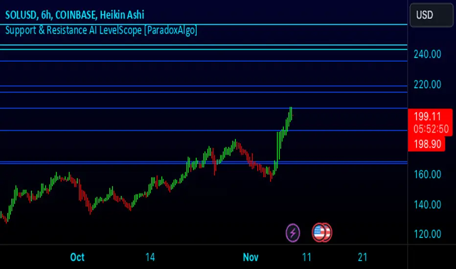
Support & Resistance AI LevelScopeSupport & Resistance AI LevelScope
Support & Resistance AI LevelScope is an advanced, AI-driven tool that automatically detects and highlights key support and resistance levels on your chart. This indicator leverages smart algorithms to pinpoint the most impactful levels, providing traders with a precise, real-time view of critical price boundaries. Save time and enhance your trading edge with effortless, intelligent support and resistance identification.
Key Features:
AI-Powered Level Detection: The LevelScope algorithm continuously analyzes price action, dynamically plotting support and resistance levels based on recent highs and lows across your chosen timeframe.
Sensitivity Control: Customize the sensitivity to display either major levels for a macro view or more frequent levels for detailed intraday analysis. Easily adjust to suit any trading style or market condition.
Level Strength Differentiation: Instantly recognize the strength of each level with visual cues based on how often price has touched each one. Stronger levels are emphasized, highlighting areas with higher significance, while weaker levels are marked subtly.
Customizable Visuals: Tailor the look of your chart with customizable color schemes and line thickness options for strong and weak levels, ensuring clear visibility without clutter.
Proximity Alerts: Receive alerts when price approaches key support or resistance, giving you a heads-up for potential market reactions and trading opportunities.
Who It’s For:
Whether you're a day trader, swing trader, or just want a quick, AI-driven way to identify high-probability levels on your chart, Support & Resistance AI LevelScope is designed to keep you focused and informed. This indicator is the perfect addition to any trader’s toolkit, empowering you to make more confident, data-backed trading decisions with ease.
Upgrade your analysis with AI-powered support and resistance—no more manual lines, only smart levels!
Higher Time Frame Support/Resistance [BigBeluga]The Higher Time Frame Support/Resistance indicator is a tool designed to display pivot points derived from higher timeframes on your current chart. These pivot points are calculated based on the highs and lows of price action in different timeframes, and the indicator draws horizontal lines to represent these levels. These lines act as potential support and resistance zones, giving traders key market levels that may influence future price movement.
Each pivot line is color-coded and labeled with its price value and the timeframe it originates from. This allows traders to clearly differentiate between the significance of the levels based on their timeframe. For example, weekly pivot levels may represent stronger, more long-term support and resistance, while hourly pivots offer more immediate, short-term levels to watch.
🔵 IDEA
The Higher Time Frame Support/Resistance indicator is designed to simplify the process of tracking key support and resistance levels across multiple timeframes. Pivot points, which represent turning points in the market, are essential for identifying areas where price might reverse or break out. By displaying these levels from higher timeframes directly on the current chart, traders can quickly identify and react to critical areas in the market without needing to switch between different timeframe charts.
The indicator labels each pivot point with the specific timeframe it comes from (e.g., 4H, 1D, 1W), making it easy for traders to assess the relative strength of each level. Stronger levels from higher timeframes are likely to act as more significant barriers or support zones, while lower timeframe levels can be used for more precise entries and exits.
🔵 KEY FEATURES
Pivot Levels from Multiple Timeframes:
The indicator calculates pivot highs and lows from various higher timeframes (e.g., 4H, 1D, 1W) and plots these levels on the current chart. These pivot points are represented by horizontal lines that extend across the chart, serving as potential support and resistance zones.
Color-Coded Support and Resistance Lines:
Each pivot level is color-coded based on its timeframe, helping traders quickly differentiate between short-term and long-term support and resistance. This visual aid simplifies the analysis and allows for a clearer understanding of key market levels.
Price Labels and Timeframe Information:
In addition to the pivot lines, the indicator displays labels at each level with the corresponding price and timeframe. For example, a label may show "D Pivot High" followed by the exact price. This helps traders understand the origin and significance of each line, allowing for more informed trading decisions.
Labels up and down mark highs and lows from higher timeframes:
Pivot Shadows for Enhanced Clarity:
The indicator can also draw shadow lines that represent the pivot points but with increased transparency. These shadows allow traders to keep track of previous pivots without cluttering the chart with too many solid lines. The width and transparency of these shadows can be customized in the settings.
🔵 HOW TO USE
🔵 CUSTOMIZATION
Timeframes and Pivot Length: Customize which higher timeframes (e.g., 4H, 1D, 1W) you want to display pivot levels from. Adjust the pivot length to control how sensitive the indicator is in detecting market highs and lows.
Line Style and Colors: Adjust the line style (solid, dashed, dotted) and colors for each timeframe to match your personal preference or chart theme. This customization helps in maintaining a clear and visually appealing chart.
Shadow Line Width and Transparency: Control the width and transparency of the shadow pivot lines to reduce chart clutter while still keeping track of key historical levels.

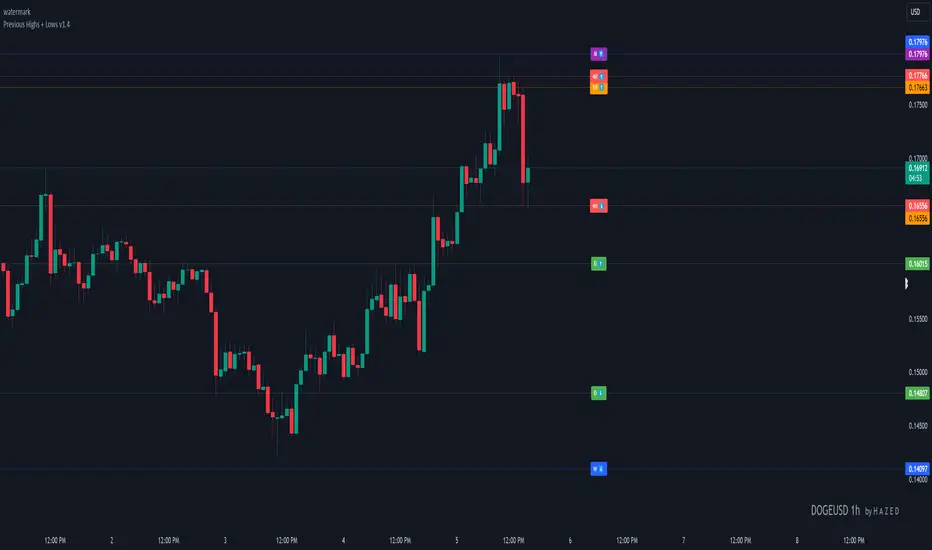
Previous Highs + Lows by HAZED📈 Introducing: Previous Highs + Lows by H A Z E D 📉
✨ Overview
Get a clear view of market levels with Previous Highs + Lows v1.0! This indicator lets you track critical previous highs and lows across multiple timeframes, marking them directly on your chart for an intuitive view of support and resistance zones. Whether you’re analyzing breakouts or looking for reversal levels, these indicators provide essential context to refine your trades.
🛠️ Key Features
Multiple Timeframes Supported
Toggle on previous highs and lows for daily, weekly, monthly, 4-hour, and 1-hour charts to match your analysis style.
Customizable Labels
Choose label sizes from “tiny” to “huge,” adjust the opacity to blend seamlessly with your chart, and customize text color for optimal readability.
Label Position Control
Avoid overlap with a flexible label offset feature, allowing for 10 adjustable increments to fit your preference and chart layout.
Clear Visual Cues
Labels use icons to differentiate high (⬆️) and low (⬇️) levels at a glance, providing a straightforward way to interpret key price areas.
Instant Alerts for Key Levels
Receive alerts when the price crosses over previous high levels, keeping you informed about potential breakout zones without constant chart-watching.
🚀 How to Use
Identify Key Levels: Quickly locate significant highs and lows from previous periods to define your support and resistance zones.
Set Alerts: Stay updated on market moves with built-in alerts when prices cross these critical levels.
Customize Your View: Use the various options to make this indicator uniquely yours – adjust label size, color, opacity, and position.
🔔 Why Use Previous Highs + Lows v1.0?
Enhanced visibility of critical levels saves you time by giving you a structured view of price action.
Customization features let you adapt the indicator to your personal style and chart setup.
Flexible alerts mean you can focus on other tasks without missing important price movements.
🔗 License: Mozilla Public License 2.0
© H A Z E D, 11/4/2024
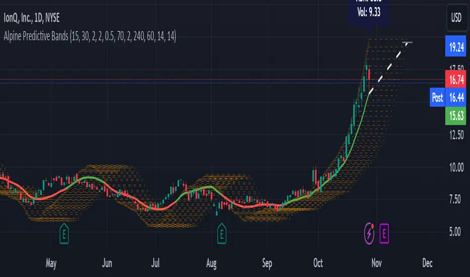
Alpine Predictive BandsAlpine Predictive Bands - ADX & Trend Projection is an advanced indicator crafted to estimate potential price zones and trend strength by integrating dynamic support/resistance bands, ADX-based confidence scoring, and linear regression-based price projections. Designed for adaptive trend analysis, this tool combines multi-timeframe ADX insights, volume metrics, and trend alignment for improved confidence in trend direction and reliability.
Key Calculations and Components:
Linear Regression for Price Projection:
Purpose: Provides a trend-based projection line to illustrate potential price direction.
Calculation: The Linear Regression Centerline (LRC) is calculated over a user-defined lookbackPeriod. The slope, representing the rate of price movement, is extended forward using predictionLength. This projected path only appears when the confidence score is 70% or higher, revealing a white dotted line to highlight high-confidence trends.
Adaptive Prediction Bands:
Purpose: ATR-based bands offer dynamic support/resistance zones by adjusting to volatility.
Calculation: Bands are calculated using the Average True Range (ATR) over the lookbackPeriod, multiplied by a volatilityMultiplier to adjust the width. These shaded bands expand during higher volatility, guiding traders in identifying flexible support/resistance zones.
Confidence Score (ADX, Volume, and Trend Alignment):
Purpose: Reflects the reliability of trend projections by combining ADX, volume status, and EMA alignment across multiple timeframes.
ADX Component: ADX values from the current timeframe and two higher timeframes assess trend strength on a broader scale. Strong ADX readings across timeframes boost the confidence score.
Volume Component: Volume strength is marked as “High” or “Low” based on a moving average, signaling trend participation.
Trend Alignment: EMA alignment across timeframes indicates “Bullish” or “Bearish” trends, confirming overall trend direction.
Calculation: ADX, volume, and trend alignment integrate to produce a confidence score from 0% to 100%. When the score exceeds 70%, the white projection line is activated, underscoring high-confidence trend continuations.
User Guide
Projection Line: The white dotted line, which appears only when the confidence score is 70% or higher, highlights a high-confidence trend.
Prediction Bands: Adaptive bands provide potential support/resistance zones, expanding with market volatility to help traders visualize price ranges.
Confidence Score: A high score indicates a stronger, more reliable trend and can support trend-following strategies.
Settings
Prediction Length: Determines the forward length of the projection.
Lookback Period: Sets the data range for calculating regression and ATR.
Volatility Multiplier: Adjusts the width of bands to match volatility levels.
Disclaimer: This indicator is for educational purposes and does not guarantee future price outcomes. Additional analysis is recommended, as trading carries inherent risks.