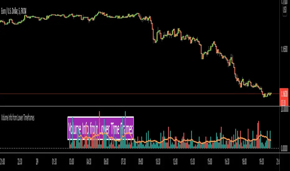
Volume Info from Lower Time FramesHello Traders,
We are now able to get info from lower time frames, Many Thanks to Pine Team .This script gets volume info from lower time frames and give alert if there is extreme volumes on last X lower time frame candles (if last X volumes are higher than volume moving average). so that if you set alerts on different securities then you will be able get alert if there is extreme volume moves and you can check the chart immediately.
The options:
Timeframe in Seconds : you can set lower time frames in seconds. by default it's 5 seconds. if you set it 60 then it will show 1min volumes, if you set it 1 then it will show 1 seconds volumes
MA Length : The script draws simple moving average using this length info. by default it's 20.
Number of Bars to Check for Alert : by default it's 5. meaning that if last 5 candles is greater than moving average and if you set alert then you get the alert "Extreme Volume"
Other options are for colors and line width.
As you can see in following example, chart time frame is 1 hour and the script shows volume info of 5 seconds candles:
Enjoy!
Timeframe
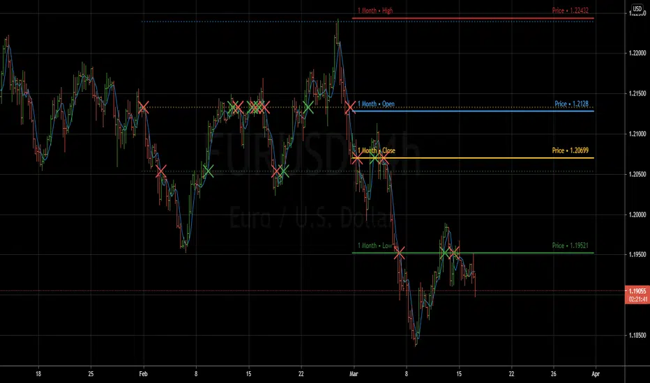
Yearly TimeframeENG
It shows annual highs and lows with lines, annual closings and openings with crosses.
ITA
Mostra massimi e minimi annuali con le linee e le aperture e chiusure annuali con le croci.

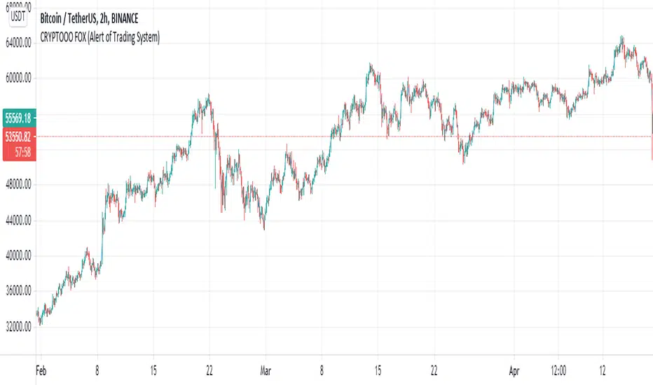
CRYPTOOO FOX (Alert of Trading System)CRYPTOOO FOX (Alert of Trading System) .
---DISCRIPTION---
How Indicator Work :
--Indicator is working on higher time frame so i use two high time frame
the higher is ( 2 H or 3 H or 4 H or 8 H or 12 H or Daily ) and the highest is ( Daily ) Time frame .
-- When the higher time frame cross over the Daily time frame( the Highest ) this mean the TREND and
the PRICE also going UP this strategy is going to long position ( Buy position ) .
-- When the higher time frame cross under Daily time frame( the Highest ) this mean the TREND and
the PRICE also going DOWN strategy going to ( close position ) .
-- Notes :
--Indicator use some averages to calculate the higher time frame .
--Indicator use parabolic indicator to filter entries which name is ( Filter )
--Indicator use one more candle close to confirm entry ( Filter 2 )
--This the best time frame ( HIGHER , HIGHEST ) in this strategy in profit and draw down .
--Indicator is working only in Long position i am not recommend to use it in short positions .
--THIS IS NO REPAINT Indicator .
--DON'T use it in DAILY time frame
--I recommend so mush to use take profit and stop loss although the low draw down but some time
the market have a huge movements .
Previous Period Levels - X Alerts====== ABOUT THIS INDICATOR
- A simple but highly customisable display of previous higher time-frame
OHLC values, drawn using line.new and label.new. Nothing fancy but...
- Customised resolution input which excludes time frames lower than 1 hour
while extending the common higher reference inputs to include:
• 6, and 12 Hour
• 5 Day
• 3, and 6 Month
• 1 Year
- Alert conditions using an adjustable SMA to help reduce false positive
spam.
- Full visual customisation options for (almost) every aspect, so it can be
tuned to suit most individual preferences.
- In line with the miriad visual customisation options is the ability to
change the display format of the Labels, to show more or less information,
or disable them altogether.
====== REASON FOR STUDY
- To practice advanced user input option handling to allow for a full visual
customisation experience without stepping outside of, or interfering with,
the intended function of the indicator.
- Provide reasonably clear code commenting and structure in order to be
useful as a potential learning aid for others, and future reference for
myself.
====== DISCLAIMER
Any trade decisions you make are entirely your own responsibility.
I've made an effort to squash all the bugs, but you never know!
[L] MTF SSL ChannelThis indicator plots SSL Channel, ideally from an higher time frame. I couldn't find any SSL Channel script with this feature so I made one, hope that helps others.
Features:
No Repainting
The script does not repaint and follows Pinescripters' guidelines.
Other Time Frame
It is possible to select another (higher) time frame. If a lower one is selected the script warns to change it, since calling a lower time frame leads to unreliable data.
Alerts
It is possible to create alerts for trend changes (cross Up or Down).
It also shows simple labels to see trend status at glance.

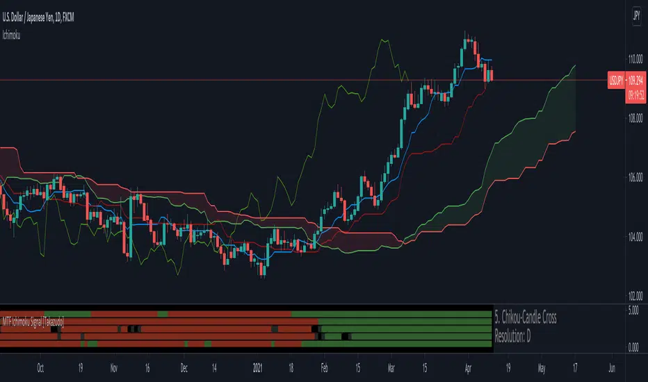
MTF Ichimoku Signal [Takazudo]A multi timeframe Ichimoku Signal indicator. This indicator shows the status of each Ichimoku Signals.
1. TK-Cross
Tenkan-Sen & Kijun-Sen cross status
2. Future Kumo
The newest Kumo color
3. Kumo & Current Relation
The relation between current price & Kumo.
4. Kumo & Chikou-Span Relation
The relation between Kumo & Chikou-Span.
5. Chikou-Span & Candle Cross
Chikou-Span & Candle cross status
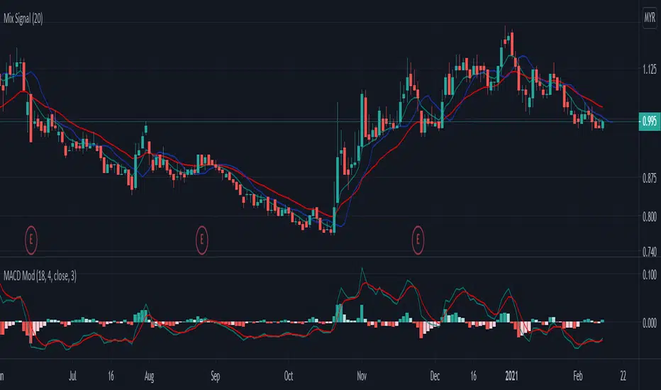
Mix signal-rileksdevMix Signal Indicator by rileksdev
Indikator ini mengandungi
-3 line bewarna hjau,merah,biru
-1 indikator MACD yang sudah diubahsuai supaya boleh mengesan pergerakan awal harga akan turun atau naik.
-Support & Resistance sudah tersedia pada chart,jadi tidak perlu susah payah cari sendiri
-Buy signal & Sell signal yang keluar apabila harga akan membuat kenaikan atau penurunan
Cara guna:
Line biru: digunakan untuk intraday timetrame 5minit.
Line hijau & merah digunakan untuk Intraday pada timeframe 15minit timeframe 30minit untuk swing short term atau midterm.
MACD MOD untuk mengesan pergerakan awal harga akan turun atau naik.
Garis bintik hijau(Support) & Garis bintik merah (Resistance) yang sudah tersedia pada Chart
Buy signal apabila harga akan membuat kenaikan
Sell signal apabila harga akan membuat penurunan
Multi-Indicator/Multi-Timeframe Panel | Agora AlgoWe strongly believe in order to be a profitable trader you need to understand what is happening on multiple timeframes, not just the timeframe you are trading on. We put together this script to help traders fix that problem and make multi-timeframe analysis as simple as a small "Panel" that you can glimpse at as well as customize. Too often we see traders focusing only on lower or singular timeframes resulting in opening positions at overbought/oversold areas or against the long-term trend. Hopefully with this approach we can help encourage all traders to take the initiative and responsibility to really do that multi-timeframe analysis.
The way it works is very simple but very useful. By default the script is looking for the direction of trend on all timeframes and sending that data to the "Panel". You as the user have the ability to change what the script/"Panel" will look for. Other available analysis methods are detecting RSI oversold and RSI overbought conditions on all of the timeframes as well as detecting Bollinger oversold and overbought conditions on all of the timeframes. You as the user also have the ability to customize all kinds of variables so that you are able to find what best suits your trading style.
Customizable options/variables:
MA Calculation Type
Fast/Short MA Length
Slow/Long MA Length
RSI Length
Bollinger Bands Length
Bollinger Bands Standard Deviation
Reference Manual/Documentation:
For Trend Detection the emoji ⏫ means UPTREND
For RSI Detection the emoji ⏫ means OVERBOUGHT
For Bollinger Detection the emoji ⏫ means OVERBOUGHT
For Trend Detection the emoji ⏬ means DOWNTREND
For RSI Detection the emoji ⏬ means OVERSOLD
For Bollinger Detection the emoji ⏬ means OVERSOLD
The 🔲 emoji means that neither of the above conditions are TRUE which usually when only happen when using RSI or Bollinger Mode.
The 🔲 emoji will also mask any timeframe lower than the timeframe you are currently viewing on the chart. Because security functions are used in this script/indicator we have taken the necessary precautions to follow
Tradingview/Pinescript best practices. With that being said best practices advise not to pull data from lower timeframes as security functions were initially intended for pulling higher timeframe data. Best practices tell us
there is a good chance of data loss when attempting to pull data from lower timeframes so we have removed the ability/chance of that happening.
Bonus Customizations:
You as the user also have the ability to enable a shortened version of the reference manual onto the "Panel" by enabling the option in the settings. If you need to get a quick idea of what the terminology stands for you could
check there and it will be defined for you.
We hope you enjoy what we have created and would appreciate any feedback! Remember guys, RISK MANAGEMENT and DO YOUR MULTI-TIMEFRAME ANALYSIS! Cheers!

Mint 3x Multi Timeframe EMA
Multi Time Frame 3x EMA - adjustable as per preference
Defaults set as 50, 100, 200
Change Time frame in settings as needed
Enjoy x
Profit Accumulator Heat MapHi Everyone
Happy to share this heat map packed full of indicators to make those trading decisions. There are a whole host of indicators including:
Inverse Fischer Transform
Moving Average Slope
EMA50 Crossover
Schaff Trend Cycle
MACD
RSI
Stochastic RSI
Moving Average Cross Over
Quantitative Qualitative Estimation
On Balance Volume
All of the indicators are customisable in the settings so you can adjust them to how you want.
I often find that the combination of MACD and QQE provide good early entry and exit signals.
Any comments or improvements then please feel free to get in touch.
Cheers
Mike
Big thanks go to @everget, @JustUncleL and @LazyBear for the use of their codes.

RSI MTF thresholds with auto adjustmentThe RSI MTF thresholds panel allows for identification of strong trends across multiple timeframes with automatic adjustment for different timeframes by utilising multiples of the chosen resolution. A specific timeframe can be used by entering its multiple in the corresponding Resmult() box.
The panel shows the current timeframe as well as 4 additional timeframes, displaying whether the RSI level is above a high threshold or below a low threshold.
A green or red indication on all timeframes is a strong indication of a trend that has some staying power on the timeframe under examination.
Markets that are ranging with no identifiable trend will show blank spaces.
Failure of the trend to "climb up" the panel shows a weak trend, while repeated signals in the same direction is a strong indication of a trend forming as the RSI level is prevented from cycling to the opposing extreme.
High probability continuations can be identified by a brief loss of signal at the lowest level of the panel only (corresponding to the current timeframe).
Setting the thresholds higher towards the overbought/oversold regions will identify levels that are oversold on multiple timeframes.
Happy to take suggestions or attempt to modify if there is interest.

Multi Timeframe Moving Average [xdecow]This indicator plots a moving average of 4 different timeframes.
The types of averages available are: SMA, EMA, DEMA, VWMA, RMA, WMA.

SRSI/CCI :: ALLinPower v10.0
Everything you see in this indicator has beed designed with purpose to ease your trading with visual technical analysis of the market. It pulls data from 7 different TimeFrames and it can not be more simpler visual representation of its calculations when applied on chart.
When applied on chart, you will see two sets of WAVES. First set is made out of SRSI calculation and the second is made out of CCI calculation. Both of them follows the same rules.
Background GREEN/RED wave is made out of Multiple Timeframes and it represents a TREND. GREEN for LONG, RED for SHORT trend.
Over the background wave there is a wave made of current TimeFrame data and its main purpose is to see when the POWER of certain direction will diminish. The less time little wave stays in current trend the more likely is that it will change the trend based on lack of power the market is getting in certain direction.
HOW TO USE IT?
Rule 1.
TIMEFRAMES
Choose the best TimeFrame for the job. I use: 1min, 2min, 3min, 5min, 8min, 13min, 21min, 34min or 56min (golden ratio). You can also pick a different TF but only to up to 1h TF chart as it does not work well with TF over 1h. Smaller TF is used for SCALPING of DAY TRADING higher TF is used for SWING TRADING. You get the picture?
Rule 2
TO ENTER BUY/LONG POSITION: When big trend wave is below the middle line and coloured in RED and little wave just entered the area and exits it very soon after. Basically when RED straight line gets smaller and smaller (the POWER of SHORT diminishes) it is a sign for LONG.
TO ENTER SELL/SHORT POSITION: When big trend wave is over the middle line and coloured in GREEN and little wave just entered the area and exits it very soon after. Basically when GREEN straight line gets smaller and smaller (the POWER of LONG diminishes) it is a sign for SHORT.
To ease yourself the spotting of this instances just follow the GREEN/RED dots and use ALERTS (choose BUY POWER for LONG signals or choose SELL POWER for SHORT signals) to make yourself free from staring at a computer/mobile all the time and just wait for a signal.
Rule 3
CAUTION
Do not rush to enter a position and try to predict what indicator will do next. It does not end well.
Be aware you are not exiting a position in panic that would be too soon or even worse, you get married to bad trade and you are not exiting even though you should exit by many signals you get.
Use risk management strategy to protect your capital.
Follow the rules and make your trading easier and better.

RSI :: ALLinDivergence v10.0
Everything you see in this indicator has been designed with a single purpose, to ease your trading with simplify visual technical analysis of the market. It pulls data from 7 different TimeFrames and it can not be more simpler visual representation of its calculations when applied on chart.
When applied on chart, you will see GREEN/RED alternating MTF RSI line and its 70 overbought area and its 30 oversold area. There is a gentle purple colour line in the background which represents RSI line of the current TF (it is not crucial but it helps to know why MTF line turns RED or turns GREEN (crossing of those two).
HOW TO USE IT?
Rule 1.
TIMEFRAMES
Choose the best TimeFrame for the job. I use: 1min, 2min, 3min, 5min, 8min, 13min, 21min, 34min or 56min (golden ratio). You can also pick a different TF but only to up to 1h TF chart as it does not work well with TF over 1h. Smaller TF is used for SCALPING of DAY TRADING higher TF is used for SWING TRADING. You get the picture?
Rule 2
TO ENTER BUY/LONG POSITION: search for HigherLows on RSI MTF GREEN/RED LINE when it is coloured RED. To enter a position it should be confirmed with AALERT :: ALLinDivergence v 10.0 that "GREEN" Divergence is emerging.
TO ENTER SELL/SHORT POSITION: search for LowerHighs on RSI MTF GREEN/RED LINE when it is coloured GREEN. To enter a position it should be confirmed with ALERT :: ALLinDivergence v 10.0 that "RED" Divergence is emerging.
Rule 3
EXIT FROM BUY/LONG POSITION: search for HigherLows on RSI MTF GREEN/RED LINE.
EXIT FROM SELL/SHORT POSITION: search for LowerHighs on RSI MTF GREEN/RED LINE.
Rule 4
CAUTION
Do not rush to enter a position and try to predict what indicator will do next. It does not end well.
Be aware you are not exiting a position in panic that would be too soon or even worse, you get married to bad trade and you are not exiting even though you should exit by many signals you get.
Use risk management strategy to protect your capital.
Follow the rules and make your trading easier and better.

ALERTS :: ALLinDivergence v10.0
Everything you see in this indicator has a designated purpose to ease your trading with predefined ALERTS of high quality. It pulls data from 7 different TimeFrames and it can not be more simpler visual representation of its calculations when applied on chart.
When applied on chart, it will colour your chart BARS/CANDLE to the colour PURPLE as that colour is well known colour of Relative Strength Indicator line that indicates overbought or oversold area. RSI is used as a main source of information/data for this indicator.
Second reason of colour PURPLE is that it cancels all the noise that default green/red bars have.
This indicator also has GREEN/RED colouring of BARS/CANDLES and they appear when something crucial is happening in the market. That something needs to be checked ASAP. This green/red coloured bars are just there to remind you that something can happen and it does not mean that market would actually change direction it is just a "friendly warning" you can use when creating alerts.
The best thing about this indicator is those full coloured GREEN/RED LITTLE DOTS.
They represent DIVERGENCES emerging and possible actual change of market direction. To be sure, you need to analyse your chart more in depth any way you prefer to get your needed confirmations. To do that, use your strategy that you have been using when trading up until now or even better, use indicator that I made and is called RSI :: ALLinDivergence v 10.0 -> It is a visual representation of ALERT :: ALLinDivergence v 10.0 indicator signals. Very easy to analyse in minutes.
HOW TO USE IT?
Rule 1.
TIMEFRAMES
Choose the best TimeFrame for the job. I use: 1min, 2min, 3min, 5min, 8min, 13min, 21min, 34min or 56min (golden ratio). You can also pick a different TF but only to up to 1h TF chart as it does not work well with TF over 1h. Smaller TF is used for SCALPING of DAY TRADING higher TF is used for SWING TRADING. You get the picture?
Rule 2
To ENTER A POSITION
Find the best TF that suits your needs. That depends on your trading style (day trading, scalping, swing trading, ect.). To know which TF is the best for you you also need to look for a good quality signals when looking the chart in the past (visual BACKTESTING). Signals from past should yield positive results.
When you wish to trade certain pair, find the best TF and from there you need to "Create Alert". Choose this indicator when creating alerts and from dropdown menu pick "GREEN" for Divergence BUY/LONG signals or "RED" Divergence SELL/SHORT signals. Then choose "Greater Than" and change the value to "1" (that will set off the alarm), choose how you want to be notified and then name the ALERT so you will know how it is made.
Do not forget to do your work and analyse your market situation best way you can and get needed confirmations before doing anything about it.
Rule 3
TO EXIT A POSITION
From the same TF as Divergence alerts are made from (Rule 2), you can make alerts that are just a "friendly warning" that something is happening on the market you are in an opened position. Instead of picking GREEN or RED from dropdown menu when creating alerts, you need to pick GREEN BARS or RED BARS and the rest is the same as with rule 2.
Rule 4
CONFIRMATIONS
Help yourself with any type of analysis you need to get the confirmations you need to enter or exit the position. Use the style you always have up until now. Or find a better one that is quicker and with good yield.
There is a great option that can change your way of thinking about trading and it is called RSI :: ALLinDivergence v 10.0 indicator that is used as a visual representation of ALERTS indicator. It takes literally minutes to do whole analysis - remember it uses data from 7 different TimeFrames and it is really good! Just find LowerHighs of RSI curve for SHORT or HigherLows for LONG.

Free Multiple Timeframe Chart Candle Resolution by Emiliano MesaFree Multiple Timeframe Chart Resolution by Emiliano Mesa
This indicator allows free users to have a multiple timeframe candlestick graph without the need of upgrading to PRO, PRO+, or Premium accounts. Furthermore you can even apply indicators to the chart, and has a much more historic data than similar indicators with the same purpose I have previously seen in the platform, which is a huge plus.
How to use?
1) Install the indicator
2) The background color, must be the same color as your actual TradingView chart background. For example, as mine is the white theme, then ill choose the white background.
3) Set a small timeframe for your real TradingView chart, this must always be less than the timeframe set in the indicator
4) Set a bigger timeframe in the indicator, this is done in the "Timeframe Wanted"
5) Expand the indicator window as much as you want
For the best results, try to make the wanted resolution 3 times bigger than the real chart resolution. For instance if using 3 minute real resolution I suggest a 9 minute multiple time frame wanted resolution for the indicator. If you are using 5 minutes, ill suggest a 15 minute, and so on
Add an indicator over the indicator?
1) When clicking in the indicator name, you will see 3 dots. Click them
2) Select "Add indicator on indicator/Strategy"
3) Select the indicator you whish to add
4) Select if the indicator will work with close,open,high, or low. More options will come in future updates.
Enjoy!
Indicator by Emiliano Mesa

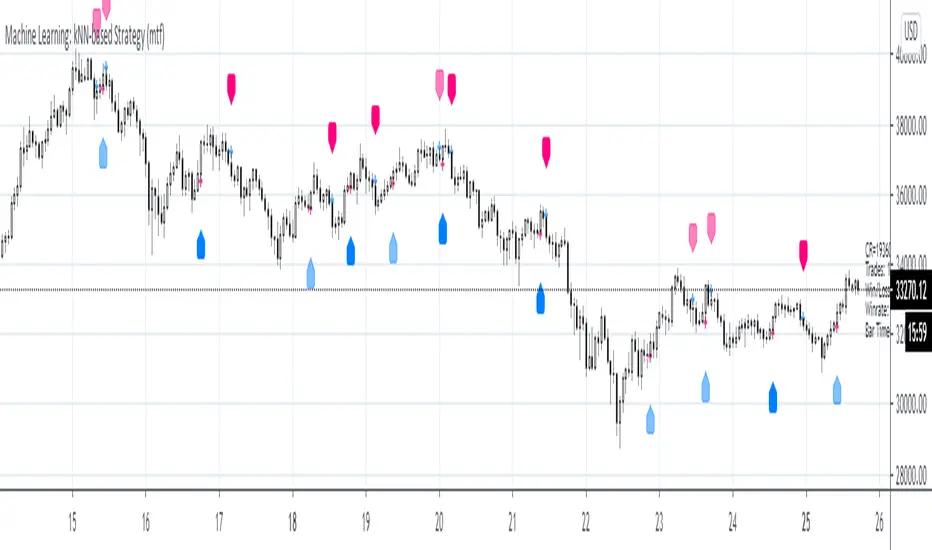
Machine Learning: kNN-based Strategy (mtf)This is a multi-timeframe version of the kNN-based strategy.

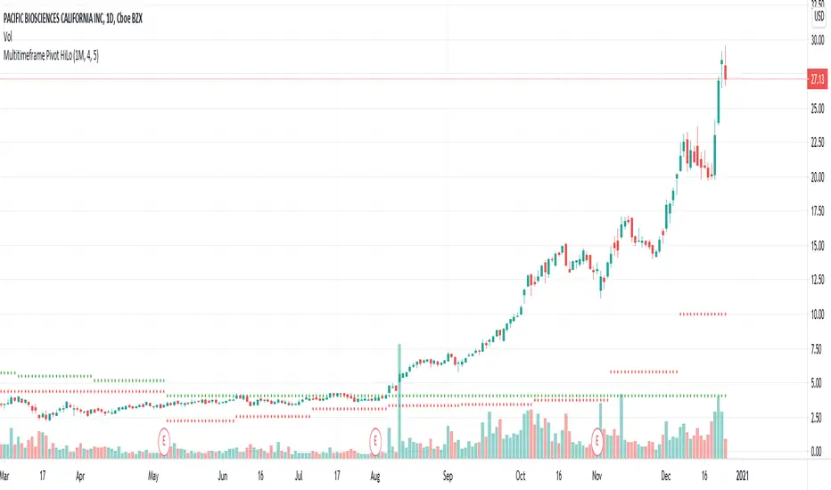
Multitimeframe Pivot HiLoPivot High/Low for multi timeframes.
Could be great entry filter to include multi time frame pivots in trend trading strategies.
PHInkTrade Price FinderHello there, fellow trader!
Welcome to Price Finder indicator for TradingView page.
Please join me as I present you an overview about it.
Before we begin, a few quick notes:
Availability information is presented at the last section of this content. Please check it out to know how to get access.
In addition to this description, there is also an overview video available. Please refer to the last section on this content as well.
With time, some of the functionality described below may change. Please refer to Release Notes for most up-to-date information.
Ok now, let's get started!
What is Price Finder?
Price Finder is a technical analysis indicator (aka "Indi" ), built on a mathematical foundation which recognizes price's fractal, multi-layered nature -- a key aspect, related to the multiple time-frames process different size traders use to make their decisions.
The objective of the indicator, naturally, is to help identify high probability opportunities for successful trades , especially those which can provide a good return : risk ratio (greater than 3:1). This is very important to foster sustainable equity growth over time .
In order to do that, it helps identify new positions of previously successful support and resistance levels , out of both its multi time-frame mathematical approach, and empirical evidence. By mapping these, indicator provides a good way to anticipate next levels with high success probability, as well as to validate or invalidate expectations in relation to what price is more likely to do next.
Last, but not least, it also helps identify price state , in terms of trend and consolidation . Meaning that, if price is trending, we can expect it to go farther -- either higher or lower --, in a more consistent way. Or, if it is consolidating, we can expect it to remain trading inside a range.
Combined, these aspects help you develop an enhanced view of the market , and a better edge for your trades.
Feedbacks from beta phase
Before diving into more details, i'd like to let you know that, besides internal tests, the indicator has gone through a public beta testing phase , having received quite nice feedback from participants . You can find more information about it in the overview video, as mentioned above.
How it works?
As seen on chart below, indicator is composed of:
a Trend Band
two Expansion Threshold Bands and
Bar colors .
Let's get through each of these.
Trend Band
The Trend Band is the one which runs around the middle of the indicator, and helps you assess if you should be leaning bullish or bearish, locally -- considering the time frame you are looking at. Its inflection points , also known as death crosses and golden crosses, are important events to anticipate -- and pay attention to when they happen. There's also a middle line , which helps you evaluate if price is leaning towards crossing the band to the other side.
The following chart shows some examples* of how lines can help identify potential places to have new trades.
* More information about specific trading approaches is available through complementary materials.
So, Trend Band helps us adjust our bias towards a direction. But how far can we expect price to go?
To help answer this question, the indicator also provides two other bands. Let's talk about them, next.
Expansion Threshold Bands
The Expansion Threshold Bands are the ones usually surrounding price (not always, as you'll notice). They are called the Upper Expansion Threshold Band and the Lower Expansion Threshold Band . Their purpose is to help identify potential limits , or places where price is more likely to face a contrarian force , and will probably have to decide whether to continue in the same direction, or to pull back -- end eventually revert.
On the following chart we have an example (Bitcoin, 15 minutes time-frame). It was retracing locally, but once it hit the corresponding Lower Expansion Threshold, it found strong support, making it pull back, and look to test upper structures, next . In fact, as can be seen, this support was tested and respected three times on this chart. Conversely, the Upper Expansion Threshold Band, resistance, was tested and broken twice -- an effect, and validation, of the overall uptrend Bitcoin was in.
Broken Expansion Threshold Bands
Indicator also helps adjust expectations when price breaks an Expansion Threshold . As an example, on the following chart, we see Bitcoin breaking the 15 mins lower band, after having respected it multiple times during the rise. The result was a significant correction.
So, when price breaks an Expansion Threshold Band of a particular time-frame, we can expect it to expand in that same direction for a while. In other words, we can expect it to trend in that direction, until it finds a larger time-frame Expansion Threshold which can hold it.
To help with this aspect, here enters indicator's distinctive multiple time-frame overlays functionality .
Multiple time-frame overlays
Multiple time-frames is a very important aspect to understand and consider when dealing with an asset's price, as different size traders make decisions based on each of them -- and, naturally, this requires us to deal with the combined results of all such decisions.
On the chart below, (again, Bitcoin 15 minutes time-frame), standard indicator deployment is showing where supports are for some of the lows. But there are moments when price stop "mid-air". Why is it so?
Well, this happens due to the influence of another time-frame structure (in this case, a smaller one). To identify which structures are working, it is possible to apply the indicator one or more times to the chart, and perform an empirical research . In this case, bounces were caused by the 10 minute lower threshold band, approximately.
This feature allows you to see, on a single chart, multiple time-frame structures working at once -- which, besides bringing greater clearness, can also help you save time, by skipping the handling of multiple charts.
Note : TradingView recommends using a lower time-frame chart and deploying a higher time-frame overlay. However, within a good margin, the reverse practice has proven itself to work for Price Finder, as indicator's approach is evidence-based. So, whichever smaller time-frame overlay which shows itself as working, even though on a higher time-frame chart, should continue to do so, as calculations remain proportional.
Another example below, now showing 5 minutes working as support multiple times too (besides 10 and 15).
So, by researching which supports and resistances are being repeatedly respected, out of price's multi time-frame / multi layered reality, and finding their current price levels -- both through the means of the indicator --, it is possible to anticipate high probability places for successful trades -- either in favor of the structure, if you believe in a stop-and-reverse move, or against it, if structure gets broken and allows price to start expanding / trending. Always based on both a mathematical foundation, and an empirical observation (evidence / confirmation).
Bar colors
As an additional information to help you understand if price is trending (or starting to develop trend intentions), or if it is consolidating , the indicator provides bar color schemes.
By default, it uses dark green and dark red colors for initial developments of bullish and bearish trends , bright green and bright red colors for developed, stronger trends , and orange for consolidations . Knowing such states help you build more confidence in the movement -- or not.
Color-blind friendly setting
Colors-wise, indicator also offers the possibility to use a second scheme, more friendly to color-blind users. You can change color scheme on settings panel.
Other settings
There are other ways to customize the presentation of the indicator , especially regarding multiple time-frame overlays , as we saw, but also to help you manage and reduce chart clutter , for example, in terms of number of lines being plotted.
It's possible to decide to just plot backgrounds, or some part of the structure, or avoid painting bars, etc.
Sample chart settings, explained
What you see on the chart above:
3 deployments of Price Finder, one for each of the following time frames: 1 hour ('Chart' time-frame), 15 and 4 minutes.
Custom settings:
1 hour: Upper and lower expansion threshold bands plotted in full. Trend band hidden;
15 minutes: Trend band hidden, expansion thresholds with just backgrounds (for better visibility);
4 minutes: likewise.
Price Finder working with other assets
Here are some other examples of the indicator, now working with other assets.
Time-frames used to 'calibrate' readings were observed from previous evidence on the same charts.
Ethereum / US Dollar, 4 hour chart, with 100, 50 and 25 minutes overlays.
S&P 500, 1 hour chart, with 30, 15 and 5 minutes overlays.
Dow Jones Industrial Average, also 1 hour chart, with 4 hours, 15 and 5 minutes overlays.
Gold / US Dollar, 1D chart, with 600 minutes, 4 hours, 140 and 80 minutes overlays.
Euro / US Dollar, 4 days chart, with 1 day, 700 minutes and 4 hours overlays.
Availability and more information
For indicator availability, access instructions, and/or additional information, please use the corresponding link in the external links section below.
Thank you very much for your attention!
Cheers!
PHInkTrade

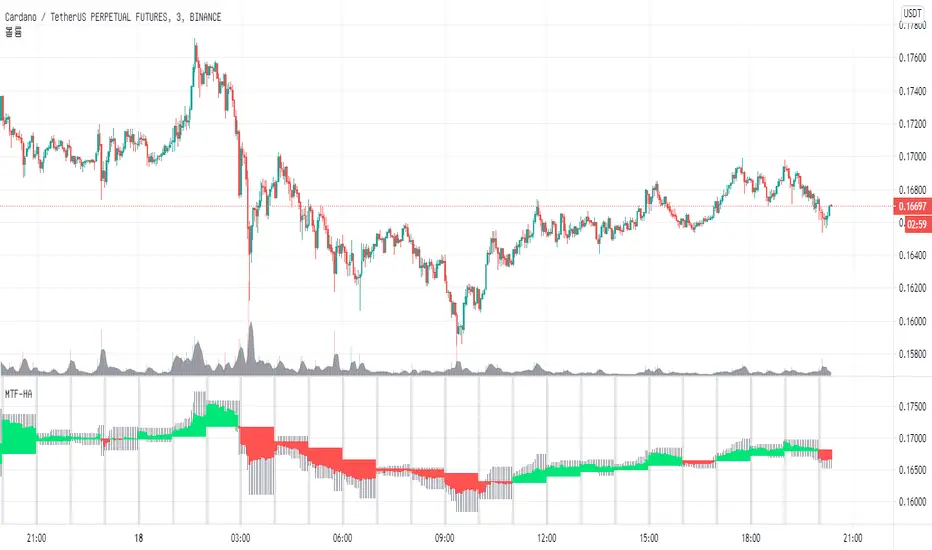
MTF_HA & CANDLE [by coral1213]Hi traders.
This is a multi-timeframe Heikin-Ashi candle chart script.
There is no repaint.
This is used when you want to see a high time frame Heikin-Ashi candle on the candlestick chart.
1. HTF RESOLUTION = Frame of output candle... 1H=60, 4H=240, 1D=1D, 1W=1W...
2. HTF SOURCE TYPE = Selects the target chart mode for the output candle... Candlestick of HighTimeFrame or Heikin-ashi of HighTimeFrame
3. HTF RESOLUTION HIGHLIGHT = Marks the beginning of the selected resolution.
For better visibility, it is recommended to turn off the optional border color.
Enjoy Trade
Cosmic Multi-timeframe ChannelsThis script creates 3 channels out of common moving average plots, 1 in the user-specified timeframe (densely-colored) and 2 in higher multiples of the user-specified timeframe (progressively weaker-colored).
In this instance, the user-specified timeframe is 1D and shows the 1D channel. As the higher timeframe multiples are by default set to 3 and 9, they show the channels for 3D and 9D timeframes.

Triple RSIThis idea behind this indicator was to show an un cluttered view of the RSI on 3 different timeframes. The RSI for the current chart highlights Lime/Red when it crosses the Overbought and Oversold levels, which are editable in the Inputs tab. RSI 2 defaults to the 1h timeframe and prints a lime dot at the top of the indicator when it's above the 50 level and a Red Dot at the bottom of the indicator when it's below the 50 level. It can also be viewed as a plot line that changes color when it's above or below the 50 level. RSI 3 defaults to the 4h timeframe and prints a blue square at the top of the indicator when it's above the 50 level and an orange square at the bottom of the indicator when it's below the 50 level. It also can be viewed as a plot line that changes color when it's above or below the 50 level.
I've added the indicator multiple times to show a few of the different viewing options, with the default settings at the very bottom.
