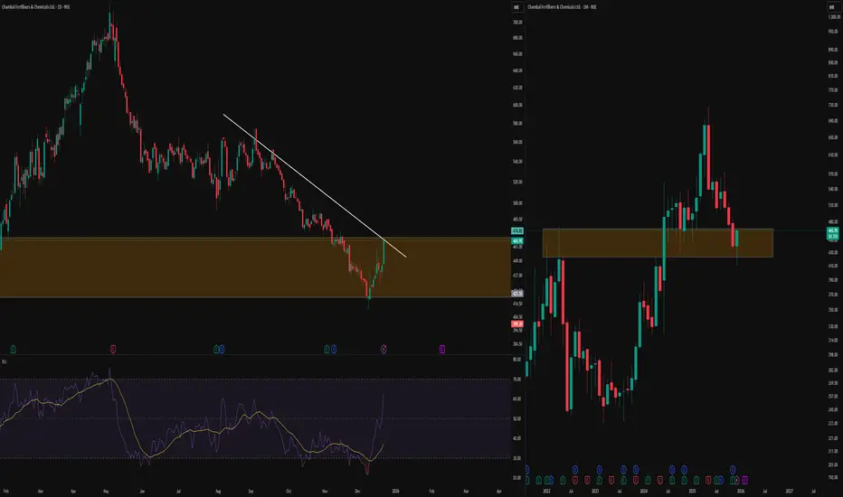
-This TradingView post contrasts multi-timeframe analysis, showing a clean counter trendline (CT) a white line connecting swing highs on the daily chart (left) with the monthly chart (right) revealing a classic cup pattern in the orange zone
-Key Concepts Explained
A counter trendline (CT) maps resistance from successive lower highs, highlighting areas where upward moves repeatedly stall and create liquidity zones below prior peaks. The cup breakout on monthly shows price emerging from a rounded base, followed by sustained action above the rim with multiple retests of those prior levels, demonstrating how higher timeframes contextualize lower timeframe lines.
-Educational Value
Observing CT interactions alongside cup structures illustrates price respect for dynamic resistance across timeframes, aiding in understanding market rhythm without directional assumptions. Traders use such alignments to study historical behavior at key zones.
Disclaimer: Educational content only. Not SEBI registered. No investment advice—do your own research
🎯 Master My Self-Made Trading Strategy
📈 Telegram (Learn Today): t.me/hashtaghammer
✅ WhatsApp (Learn Today): wa.me/919455664601
📈 Telegram (Learn Today): t.me/hashtaghammer
✅ WhatsApp (Learn Today): wa.me/919455664601
Related publications
Disclaimer
The information and publications are not meant to be, and do not constitute, financial, investment, trading, or other types of advice or recommendations supplied or endorsed by TradingView. Read more in the Terms of Use.