The Gold/Silver ratio (GSR) measures how many ounces of silver it takes to buy one ounce of gold. It’s one of the oldest indicators in commodity markets, with data going back centuries.
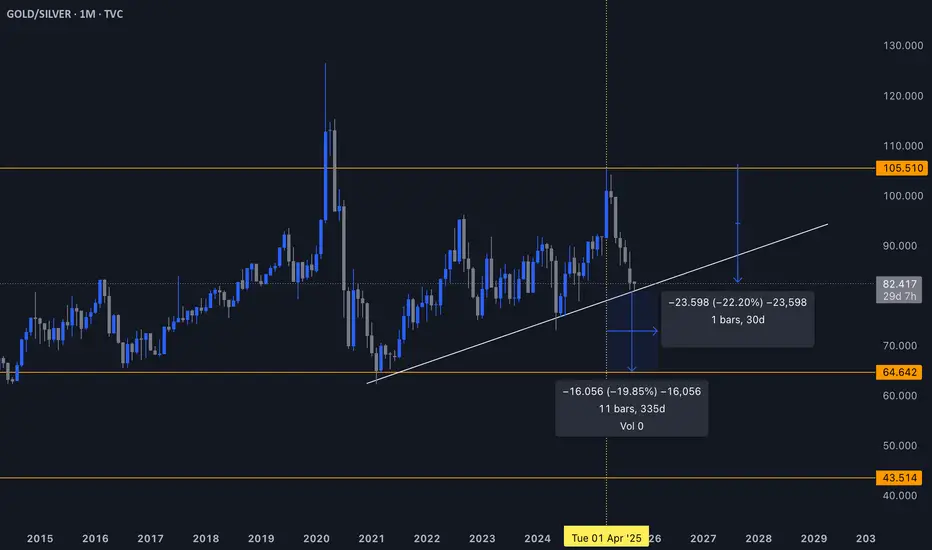
Long-term average: ~65
Extreme high: 105 in 2020 (COVID panic, gold as pure safe-haven while silver crashed)
Current level: ~80
1. Why the Ratio Is So Powerful
When the GSR is high (above 90–100), it means silver is undervalued relative to gold.
When the GSR falls, it signals that silver is outperforming gold – usually during the most explosive parts of precious metals cycles.
In simple terms:
👉 High ratio = silver cheap
👉 Falling ratio = silver catching up/outperforming
2. The Recent Move
At the 105 peak (2020), silver was ignored and gold was everyone’s safe-haven. That extreme stretched the ratio to historic highs.
Since then, the ratio has broken down to ~80. This collapse in the ratio coincided with silver’s recent 48–50% rally since April 2025.
So there’s already a tight correlation between GSR falling and silver surging.
3. Forward Projection
If we assume the ratio continues mean-reverting towards its historical average (~65):
From 80 → 65 = a ~20% decline in the ratio.
Given how silver has tracked ratio moves so far, that could translate to another ~50% upside.
🖊️ That math gives me:
Current silver ~$50 → my target range $70–73
Which also aligns with the inflation-adjusted 2011 top of Quarterly Silver chart
This alignment across technical (Cup & Handle), ratio math, and inflation-adjusted targets strengthens the conviction.
4. Where This Gets Interesting
The GSR chart you provided shows a trendline break risk:
If the ratio decisively breaks down from ~80, it confirms silver is in outperformance mode.
A breakdown projects to ~65 (mean), and potentially overshoot lower if momentum builds.
Historically, when the GSR enters a sustained downtrend, silver rallies parabolically.
🎈 Key Takeaway:
The Gold/Silver ratio is not just a technical indicator here – it’s the bridge linking your macro thesis (ETF demand, industrial pull, Fed distrust) with your chart targets.
The ratio tells us that:
Silver’s catch-up has already started.
There’s room for another 50% upside.
This lands silver in the $70–73 zone – exactly where the inflation-adjusted 2011 high sits.
Disclaimer
The information and publications are not meant to be, and do not constitute, financial, investment, trading, or other types of advice or recommendations supplied or endorsed by TradingView. Read more in the Terms of Use.
Disclaimer
The information and publications are not meant to be, and do not constitute, financial, investment, trading, or other types of advice or recommendations supplied or endorsed by TradingView. Read more in the Terms of Use.