EURUSD 2H CHART EUR/USD Long Setup
Entry Zone: After price touches the bullish order block (OB) and shows rejection/reversal signals.
Direction: Long
Invalidation Level: Below the order block low.
Target: Next higher structure high (or previous swing high / liquidity zone above).
Rationale: Price is expected to respect the order block as support and continue upward within the prevailing structure.
Beyond Technical Analysis

KOTAKBANK Level Analysis: Till Budget DayKOTAKBANK Level Analysis: Till Budget Day
Screen Shot: LEVELS for Positional Trading Published heading
"KOTAKBANSK: BUDGET Special Level Analysis for 30th JAN 2026+"
━━━━━━━━━₹₹₹₹₹₹₹₹₹₹₹₹━━━━━━━━
💥Level Interpretation / description:
L#1: If the candle crossed & stays above the “Buy Gen”, it is treated / considered as Bullish bias.
L#2: Possibility / Probability of REVERSAL near RLB#1 & UBTgt
L#3: If the candle stays above “Sell Gen” but below “Buy Gen”, it is treated / considered as Sidewise. Aggressive Traders can take Long position near “Sell Gen” either retesting or crossed from Below & vice-versa i.e. can take Short position near “Buy Gen” either retesting or crossed downward from Above.
L#4: If the candle crossed & stays below the “Sell Gen”, it is treated / considered a Bearish bias.
L#5: Possibility / Probability of REVERSAL near RLS#1 & USTgt
HZB (Buy side) & HZS (Sell side) => Hurdle Zone,
*** Specialty of “HZB#1, HZB#2 HZS#1 & HZS#2” is Sidewise (behaviour in Nature)
Rest Plotted and Mentioned on Chart
Color code Used:
Green =. Positive bias.
Red =. Negative bias.
RED in Between Green means Trend Finder / Momentum Change
/ CYCLE Change and Vice Versa.
Notice One thing: HOW LEVELS are Working.
Use any Momentum Indicator / Oscillator or as you "USED to" to Take entry.
━━━━━━━━━━━━━━━━━━━━━━━━━━━━━━━━━━━━━━━━━━━
⚠️ DISCLAIMER:
The information, views, and ideas shared here are purely for educational and informational purposes only. They are not intended as investment advice or a recommendation to buy, sell, or hold any financial instruments. I am not a SEBI-registered financial adviser.
Trading and investing in the stock market involves risk, and you should do your own research and analysis. You are solely responsible for any decisions made based on this research.
"As HARD EARNED MONEY IS YOUR's, So DECISION SHOULD HAVE TO BE YOUR's".
━━━━━━━━━━━━━━━━━━━━━━━━━━━━━━━━━
❇️ Follow notification about periodical View
💥 Do Comment for Stock WEEKLY Level Analysis.🚀
📊 Do you agree with this view?
✈️ HIT THE PLANE ICON if this technical observation resonates with you. It will Motivate me.
━━━━━━━━━━━━━━━━━━━━━━━━━━━━━━━━━
💡 If You LOOKING any CHART & want for Level and ANALYZE?
Share your desired stock names in the comments below! I will try to analyze the chart Levels, patterns and share my technical view (so far my Knowledge).
If Viewers think It can identify meaningful setups. Looking forward to hearing from all of you — let's keep this discussion going and help each other make better trading decisions.

KOTAKBASNK: BUDGET Special Level Analysis for 30th JAN 2026+KOTAKBANK: BUDGET Special Level Analysis for 30th JAN 2026+
Screenshot of "KOTAKBANK Level Analysis: Till Budget Day" Watch Live Post (published Later)
━━━━━━━━━₹₹₹₹₹₹₹₹₹₹₹₹━━━━━━━━
💥Level Interpretation / description:
L#1: If the candle crossed & stays above the “Buy Gen”, it is treated / considered as Bullish bias.
L#2: Possibility / Probability of REVERSAL near RLB#1 & UBTgt
L#3: If the candle stays above “Sell Gen” but below “Buy Gen”, it is treated / considered as Sidewise. Aggressive Traders can take Long position near “Sell Gen” either retesting or crossed from Below & vice-versa i.e. can take Short position near “Buy Gen” either retesting or crossed downward from Above.
L#4: If the candle crossed & stays below the “Sell Gen”, it is treated / considered a Bearish bias.
L#5: Possibility / Probability of REVERSAL near RLS#1 & USTgt
HZB (Buy side) & HZS (Sell side) => Hurdle Zone,
*** Specialty of “HZB#1, HZB#2 HZS#1 & HZS#2” is Sidewise (behaviour in Nature)
Rest Plotted and Mentioned on Chart
Color code Used:
Green =. Positive bias.
Red =. Negative bias.
RED in Between Green means Trend Finder / Momentum Change
/ CYCLE Change and Vice Versa.
Notice One thing: HOW LEVELS are Working.
Use any Momentum Indicator / Oscillator or as you "USED to" to Take entry.
━━━━━━━━━━━━━━━━━━━━━━━━━━━━━━━━━━━━━━━━━━━
⚠️ DISCLAIMER:
The information, views, and ideas shared here are purely for educational and informational purposes only. They are not intended as investment advice or a recommendation to buy, sell, or hold any financial instruments. I am not a SEBI-registered financial adviser.
Trading and investing in the stock market involves risk, and you should do your own research and analysis. You are solely responsible for any decisions made based on this research.
"As HARD EARNED MONEY IS YOUR's, So DECISION SHOULD HAVE TO BE YOUR's".
━━━━━━━━━━━━━━━━━━━━━━━━━━━━━━━━━
❇️ Follow notification about periodical View
💥 Do Comment for Stock WEEKLY Level Analysis.🚀
📊 Do you agree with this view?
✈️ HIT THE PLANE ICON if this technical observation resonates with you. It will Motivate me.
━━━━━━━━━━━━━━━━━━━━━━━━━━━━━━━━━
💡 If You LOOKING any CHART & want for Level and ANALYZE?
Share your desired stock names in the comments below! I will try to analyze the chart Levels, patterns and share my technical view (so far my Knowledge).
If Viewers think It can identify meaningful setups. Looking forward to hearing from all of you — let's keep this discussion going and help each other make better trading decisions.

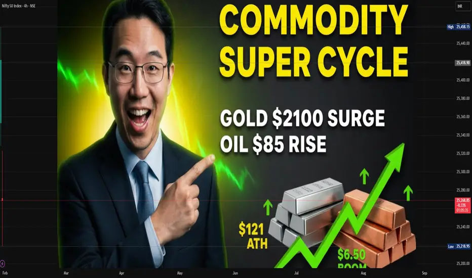
Commodity Supercycle and Geopolitics: An In-Depth AnalysisA commodity supercycle refers to an extended period—usually lasting 10 to 20 years or more—of elevated demand and prices for commodities, often driven by structural economic shifts rather than short-term market fluctuations. These cycles have historically been influenced by rapid industrialization, urbanization, technological innovation, and shifts in global trade patterns. However, geopolitics increasingly plays a central role in shaping commodity supercycles in today’s interconnected world, influencing both supply and demand dynamics.
Understanding Commodity Supercycles
Unlike normal commodity cycles, which are often tied to cyclical economic growth or short-term supply-demand imbalances, a supercycle is usually structural. Historical supercycles can be traced to events such as post-World War II reconstruction, the industrialization of Japan, and the economic rise of China in the early 21st century. During a supercycle, commodities such as metals, energy products, and agricultural goods experience prolonged price increases, often outpacing inflation and impacting global economic patterns.
The genesis of a supercycle is often linked to surges in global demand. For instance, the 2000s commodity supercycle was largely fueled by China’s rapid industrialization, urbanization, and infrastructure expansion. This created unprecedented demand for metals like copper, aluminum, iron ore, and energy resources such as oil and coal. Unlike short-term demand spikes, these structural drivers reshape production patterns and influence long-term investment decisions in mining, energy extraction, and logistics.
Supply-side constraints also reinforce supercycles. Commodities are often subject to long lead times for new production capacity. Mining projects, oil fields, and agricultural expansion cannot scale up instantly in response to rising demand. Environmental regulations, geopolitical instability, and technological limitations further restrict supply flexibility, allowing prices to remain elevated over extended periods.
Geopolitics and Its Role in Commodity Supercycles
Geopolitics—encompassing conflicts, trade policies, sanctions, territorial disputes, and strategic alliances—plays a decisive role in determining the timing, magnitude, and duration of commodity supercycles. Political events can affect both the physical availability of commodities and the perception of risk in global markets.
Energy and Oil Geopolitics:
Oil is perhaps the most geopolitically sensitive commodity. Historical supercycles, such as the 1970s oil crisis, demonstrate how conflicts, embargoes, or political instability in key oil-producing regions can trigger dramatic price spikes. Contemporary issues such as tensions in the Middle East, Russian-Ukrainian conflicts, and shifts in OPEC+ policies continue to influence crude oil supply and pricing. Energy security concerns drive countries to diversify energy sources, invest in strategic reserves, and accelerate transitions to renewable energy, indirectly affecting the demand patterns for fossil fuels.
Metals and Strategic Minerals:
Geopolitics also strongly influences metals and critical minerals essential for modern technologies. For example, rare earth elements, lithium, cobalt, and nickel are central to the production of batteries, semiconductors, and renewable energy infrastructure. China dominates the rare earth market, controlling the majority of global production. Any geopolitical tension, export restriction, or trade dispute involving China can trigger price volatility worldwide. Similarly, cobalt sourced from the Democratic Republic of Congo faces supply risks due to political instability and labor concerns, highlighting how geopolitics can constrain supply and accelerate supercycle trends.
Agriculture and Food Security:
Agricultural commodities are no longer insulated from geopolitics. Conflicts in Ukraine, one of the world’s largest grain exporters, have disrupted wheat and corn supply chains, sending shockwaves across global markets. Similarly, geopolitical tensions affecting fertilizer exports, such as Russia and Belarus, influence crop yields and prices worldwide. Nations increasingly consider strategic stockpiling, trade barriers, and domestic production incentives to safeguard food security, further affecting global commodity cycles.
Sanctions, Trade Wars, and Global Supply Chains:
Economic sanctions and trade wars can exacerbate commodity price volatility. U.S.-China trade tensions, for instance, affected the demand for soybeans, metals, and energy products. Sanctions on Russia following the Ukraine invasion impacted oil, gas, and wheat supplies. These disruptions not only affect immediate supply-demand balances but also alter long-term investment strategies and infrastructure development, reinforcing supercycle characteristics.
The Interplay of Technology, Transition, and Geopolitics
In the modern era, commodity supercycles are increasingly intertwined with technological transitions and environmental imperatives. The global push for green energy and decarbonization has heightened demand for lithium, nickel, cobalt, copper, and rare earth elements, all crucial for electric vehicles, energy storage, and renewable energy infrastructure. Geopolitical considerations, such as control over these critical minerals and the location of processing capabilities, shape the trajectory of this emerging supercycle.
For instance, the European Union, U.S., and other nations are investing heavily in domestic battery supply chains to reduce dependence on China, highlighting how geopolitics drives structural shifts in commodity markets. Similarly, energy transitions in India, Southeast Asia, and Africa are reshaping demand patterns for coal, natural gas, and renewables, with geopolitical alliances influencing both investment and trade flows.
Historical Patterns and Lessons
Past supercycles, such as those in the 1970s, 2000s, and early 2020s, reveal common patterns:
Demand-driven origin: Rapid industrialization and urbanization often create sustained increases in commodity consumption.
Supply-side rigidity: Long lead times for production expansions amplify price impacts.
Geopolitical triggers: Wars, sanctions, trade disputes, and policy interventions frequently catalyze or intensify supercycles.
Technological and policy transitions: Innovation and regulatory changes, such as renewable energy adoption or strategic stockpiling, significantly influence commodity prices.
These patterns suggest that future supercycles may increasingly revolve around critical minerals, energy transition metals, and food security, with geopolitics remaining a central driver.
Implications for Investors and Policymakers
For investors, understanding the nexus between commodity supercycles and geopolitics is crucial for risk management and portfolio strategy. Supercycles offer opportunities for long-term gains, but geopolitical risks can amplify volatility, making diversification, hedging, and strategic timing essential.
For policymakers, the interplay between commodities and geopolitics highlights the importance of securing supply chains, investing in strategic reserves, and fostering international cooperation. Policies addressing energy transition, climate goals, and technological sovereignty must account for potential supply disruptions caused by geopolitical conflicts.
Conclusion
Commodity supercycles are not merely economic phenomena; they are deeply entwined with geopolitics. Structural demand shifts, constrained supply, and long-term technological transitions interact with political instability, trade disputes, and strategic resource control to shape prolonged periods of elevated commodity prices. In an era of energy transition, technological innovation, and geopolitical realignment, understanding this interplay is critical for nations, corporations, and investors alike. The next supercycle will likely be defined not only by rapid growth in demand but also by the geopolitical landscape surrounding critical resources, energy security, and food production. Navigating this environment requires foresight, resilience, and an acute awareness of how politics and economics converge in shaping the global commodity market.
The Dollar Index (DXY) and Volatility: An In-Depth OverviewThe Dollar Index (DXY) is a benchmark that measures the value of the United States dollar (USD) relative to a basket of major foreign currencies. Developed in 1973 by the Intercontinental Exchange (ICE), it is designed to provide a broad perspective on the performance of the dollar in the global foreign exchange market. The DXY has become an essential reference point for traders, investors, economists, and policymakers to gauge the dollar’s strength or weakness over time.
Composition of the Dollar Index
The Dollar Index is calculated using a weighted geometric mean of six major world currencies:
Euro (EUR) – 57.6% weight
Japanese Yen (JPY) – 13.6% weight
British Pound (GBP) – 11.9% weight
Canadian Dollar (CAD) – 9.1% weight
Swedish Krona (SEK) – 4.2% weight
Swiss Franc (CHF) – 3.6% weight
The heavy weighting of the euro makes the DXY highly sensitive to changes in the EUR/USD exchange rate. Movements in these currencies directly affect the dollar’s index value, offering a snapshot of the USD’s overall global purchasing power.
Interpreting the Dollar Index
A rising DXY indicates that the USD is strengthening relative to the basket of currencies, whereas a declining DXY suggests the dollar is weakening. The index serves as a key barometer for traders, often used alongside other financial instruments such as commodities, equities, and bonds.
For example:
A strong dollar can reduce demand for commodities priced in USD, such as gold and oil, because these assets become more expensive in foreign currencies.
Conversely, a weak dollar can stimulate exports from the U.S., as American goods become more competitive abroad, potentially boosting corporate earnings in international markets.
Volatility and Its Connection to the Dollar Index
Volatility refers to the degree of variation in the price of a financial instrument over time. In the context of the Dollar Index, volatility reflects how sharply and unpredictably the value of the USD changes against the basket of currencies.
There are two types of volatility:
Historical Volatility – Measures past fluctuations in the DXY over a specific period.
Implied Volatility – Derived from options pricing, it reflects market expectations of future dollar movement.
High volatility in the DXY indicates uncertain or turbulent market conditions, while low volatility suggests relative stability in the dollar’s value. Traders and investors closely monitor DXY volatility because it has a ripple effect across multiple asset classes.
Factors Driving Dollar Index Volatility
U.S. Economic Data
Economic indicators such as GDP growth, unemployment rates, inflation, and consumer confidence directly impact the dollar. Positive data can strengthen the USD, while weaker data can trigger declines. Volatility often spikes during major economic announcements.
Monetary Policy
Decisions by the Federal Reserve regarding interest rates and quantitative easing heavily influence the dollar. Higher interest rates attract foreign capital, boosting the DXY, while rate cuts can weaken it. Market anticipation of policy changes also fuels volatility.
Global Political Events
Geopolitical crises, trade wars, or elections can drive sudden shifts in the dollar’s value. During uncertainty, investors often flock to the USD as a safe-haven asset, creating sharp price swings.
Risk Appetite and Market Sentiment
Investor behavior plays a crucial role. In risk-off environments (e.g., global recessions), the USD typically strengthens as a safe-haven, while risk-on sentiment can lead to a weaker dollar.
Commodity Prices
Many commodities, particularly oil, are priced in USD. Changes in commodity prices can create feedback loops with the dollar. For instance, a rising oil price can strengthen exporters’ currencies, affecting the DXY.
International Capital Flows
Large-scale investments into or out of U.S. assets, including stocks, bonds, and real estate, can influence the dollar index. Volatility often rises when capital flows are sudden or unpredictable.
Implications of Dollar Index Volatility
The volatility of the DXY has far-reaching consequences across global financial markets:
Impact on Forex Trading
The DXY serves as a reference for currency traders worldwide. A volatile dollar creates opportunities for profit but also increases risk. Traders often use the DXY to hedge against currency exposure.
Effect on Commodities
Commodities priced in USD, like gold, silver, and oil, tend to move inversely to the DXY. A volatile dollar can lead to unpredictable swings in commodity prices, affecting producers, consumers, and investors.
Global Economic Implications
Emerging markets often carry debt denominated in USD. Volatility in the dollar can increase debt servicing costs, trigger capital outflows, and destabilize these economies.
Stock Market Influence
A stronger dollar can reduce earnings of U.S. multinational companies when converted back from foreign currencies, affecting stock prices. Conversely, a weaker dollar can boost revenues abroad.
Investment Strategies
Portfolio managers use DXY volatility to adjust allocations in currencies, bonds, equities, and commodities. Options, futures, and ETFs linked to the DXY allow investors to hedge or speculate on dollar movements.
Tools and Metrics to Measure Volatility
Investors use several tools to measure dollar index volatility:
Standard Deviation – Calculates average price deviation over time.
Average True Range (ATR) – Measures daily price range to quantify volatility.
VIX or Dollar Volatility Index – Although VIX measures equity volatility, there are derivative instruments and implied volatility metrics for the DXY itself.
Option-Implied Volatility – Extracted from currency options, providing insight into expected future movements.
These metrics help traders and institutions anticipate market swings, manage risk, and design hedging strategies.
Dollar Index in Global Context
The DXY is not just a U.S.-centric indicator. Its movements influence global trade, investment flows, and macroeconomic policies:
Emerging Markets: High DXY volatility can create stress in emerging economies reliant on USD debt.
Global Trade: A stronger dollar can dampen demand for U.S. exports while boosting imports.
Central Banks: Other central banks monitor the DXY to adjust their monetary policies and manage currency stability.
Conclusion
The Dollar Index (DXY) and its volatility are central to understanding the dynamics of the global financial system. The DXY provides a comprehensive measure of the USD’s strength relative to a basket of key currencies, while volatility highlights the magnitude and unpredictability of dollar movements. Together, they affect forex markets, commodities, equity markets, and macroeconomic stability worldwide.
Volatility, driven by economic data, central bank policies, geopolitical events, and investor sentiment, serves as both a risk and an opportunity. Traders use it for speculation, hedging, and risk management, while policymakers and global investors monitor the DXY to gauge market sentiment and make strategic decisions. Understanding the relationship between the dollar and its volatility is therefore essential for anyone involved in global finance, from currency traders to multinational corporations and sovereign institutions.
In today’s interconnected economy, where financial shocks can quickly ripple across continents, the dollar index and its volatility remain critical indicators of global economic health, investor sentiment, and market risk.

GODREJPROP Level Analysis: Intraswing for 30th JAN 2026+GODREJPROP Level Analysis: Intraswing for 30th JAN 2026+
Pause after Perfect H&S Correction.
━━━━━━━━━₹₹₹₹₹₹₹₹₹₹₹₹━━━━━━━━
💥Level Interpretation / description:
L#1: If the candle crossed & stays above the “Buy Gen”, it is treated / considered as Bullish bias.
L#2: Possibility / Probability of REVERSAL near RLB#1 & UBTgt
L#3: If the candle stays above “Sell Gen” but below “Buy Gen”, it is treated / considered as Sidewise. Aggressive Traders can take Long position near “Sell Gen” either retesting or crossed from Below & vice-versa i.e. can take Short position near “Buy Gen” either retesting or crossed downward from Above.
L#4: If the candle crossed & stays below the “Sell Gen”, it is treated / considered a Bearish bias.
L#5: Possibility / Probability of REVERSAL near RLS#1 & USTgt
HZB (Buy side) & HZS (Sell side) => Hurdle Zone,
*** Specialty of “HZB#1, HZB#2 HZS#1 & HZS#2” is Sidewise (behaviour in Nature)
Rest Plotted and Mentioned on Chart
Color code Used:
Green =. Positive bias.
Red =. Negative bias.
RED in Between Green means Trend Finder / Momentum Change
/ CYCLE Change and Vice Versa.
Notice One thing: HOW LEVELS are Working.
Use any Momentum Indicator / Oscillator or as you "USED to" to Take entry.
━━━━━━━━━━━━━━━━━━━━━━━━━━━━━━━━━━━━━━━━━━━
⚠️ DISCLAIMER:
The information, views, and ideas shared here are purely for educational and informational purposes only. They are not intended as investment advice or a recommendation to buy, sell, or hold any financial instruments. I am not a SEBI-registered financial adviser.
Trading and investing in the stock market involves risk, and you should do your own research and analysis. You are solely responsible for any decisions made based on this research.
"As HARD EARNED MONEY IS YOUR's, So DECISION SHOULD HAVE TO BE YOUR's".
━━━━━━━━━━━━━━━━━━━━━━━━━━━━━━━━━
❇️ Follow notification about periodical View
💥 Do Comment for Stock WEEKLY Level Analysis.🚀
📊 Do you agree with this view?
✈️ HIT THE PLANE ICON if this technical observation resonates with you. It will Motivate me.
━━━━━━━━━━━━━━━━━━━━━━━━━━━━━━━━━
💡 If You LOOKING any CHART & want for Level and ANALYZE?
Share your desired stock names in the comments below! I will try to analyze the chart Levels, patterns and share my technical view (so far my Knowledge).
If Viewers think It can identify meaningful setups. Looking forward to hearing from all of you — let's keep this discussion going and help each other make better trading decisions.

MAZDOCK Correction Phase, Watching Channel BreakoutMAZDOCK is currently in a healthy correction phase, moving within a clear falling channel after a strong upside move. Price continues to respect both support and resistance levels, indicating controlled selling rather than panic.
The lower channel zone is acting as a reaction area, while the upper trendline remains the key hurdle. A breakout above the channel could signal trend continuation, whereas a breakdown may invite further weakness.
Structure will decide the next direction.

GIFTNIFTY IntraSwing Levels for 30th JAN 2026GIFTNIFTY IntraSwing Levels for 30th JAN 2026
🚀Follow & Compare NIFTY spot Post for Taking Trade
━━━━━━━━━₹₹₹₹₹₹₹₹₹₹₹₹━━━━━━━━
💥Level Interpretation / description:
L#1: If the candle crossed & stays above the “Buy Gen”, it is treated / considered as Bullish bias.
L#2: Possibility / Probability of REVERSAL near RLB#1 & UBTgt
L#3: If the candle stays above “Sell Gen” but below “Buy Gen”, it is treated / considered as Sidewise. Aggressive Traders can take Long position near “Sell Gen” either retesting or crossed from Below & vice-versa i.e. can take Short position near “Buy Gen” either retesting or crossed downward from Above.
L#4: If the candle crossed & stays below the “Sell Gen”, it is treated / considered a Bearish bias.
L#5: Possibility / Probability of REVERSAL near RLS#1 & USTgt
HZB (Buy side) & HZS (Sell side) => Hurdle Zone,
*** Specialty of “HZB#1, HZB#2 HZS#1 & HZS#2” is Sidewise (behaviour in Nature)
Rest Plotted and Mentioned on Chart
Color code Used:
Green =. Positive bias.
Red =. Negative bias.
RED in Between Green means Trend Finder / Momentum Change
/ CYCLE Change and Vice Versa.
Notice One thing: HOW LEVELS are Working.
Use any Momentum Indicator / Oscillator or as you "USED to" to Take entry.
━━━━━━━━━━━━━━━━━━━━━━━━━━━━━━━━━━━━━━━━━━━
⚠️ DISCLAIMER:
The information, views, and ideas shared here are purely for educational and informational purposes only. They are not intended as investment advice or a recommendation to buy, sell, or hold any financial instruments. I am not a SEBI-registered financial adviser.
Trading and investing in the stock market involves risk, and you should do your own research and analysis. You are solely responsible for any decisions made based on this research.
"As HARD EARNED MONEY IS YOUR's, So DECISION SHOULD HAVE TO BE YOUR's".
━━━━━━━━━━━━━━━━━━━━━━━━━━━━━━━━━
❇️ Follow notification about periodical View
💥 Do Comment for Stock WEEKLY Level Analysis.🚀
📊 Do you agree with this view?
✈️ HIT THE PLANE ICON if this technical observation resonates with you. It will Motivate me.
━━━━━━━━━━━━━━━━━━━━━━━━━━━━━━━━━
💡 If You LOOKING any CHART & want for Level and ANALYZE?
Share your desired stock names in the comments below! I will try to analyze the chart Levels, patterns and share my technical view (so far my Knowledge).
If Viewers think It can identify meaningful setups. Looking forward to hearing from all of you — let's keep this discussion going and help each other make better trading decisions.

Market Outlook & Trade Setup – Friday, 30th January 2025Major indices showed a sharp recovery yesterday and even crossed the opening day high. Silver and Gold has corrected by more than 6% overnight so some selling pressure could be seen.
We have the Budget on Sunday, 1st Feb, 2026, so heavy positions might not be build in the market today.
🔹 NIFTY
* Previous Close: 25,418
* Expected Range: 25,000 – 25,500
🔹 SENSEX
* Previous Close: 82,566
* Expected Range: 82,500 - 82,600
🌍 Global & Market Sentiment
* DJIA: +55 | S&P: -9
💰 Institutional Activity (Cash Market)
* FII: Net Sellers: - ₹ 394 Cr
* DII: Net Buyers: + ₹ 2639 Cr
🔥 Events this Week: US --- Trump Speech & FED Rate announcement
📌 Sectoral Focus
Metal, Energy
👉 Commodities in Focus: Gold, Silver, Copper, Crude, Natural Gas
💯 Important Quarterly Results: Cupid, GHCL, HUDCO, IEX, ITC,REC, Voltas
📈 Trade smart. Manage risk. Stay disciplined.


BTCUSDT LONG Trade Of The YEARLonging BTC here for a swing isn’t a bad idea.
TP: ~100k
SL: 78k
BTC is underperforming GOLD and Retail is FOMO’ing into gold & traditional assets.
Narrative shifting to crypto is dead this cycle
Fear & Greed shows crypto traders are scared.
that’s exactly the signal.
that’s when smart money steps in.
I’m taking the long.
— Ommeva

Massive crash in the market⚠️ Massive sell-off across global markets ⚠️
A sharp wave of panic hit both metals and equities within the last hour, wiping out trillions in market value:
• Gold plunged 8.2%, erasing nearly $3 trillion in market capitalization
• Silver crashed 12.2%, losing around $760 billion
• S&P 500 slipped 1.23%, wiping out $780 billion
• Nasdaq dropped over 2.5%, cutting roughly $760 billion
Heavy risk-off sentiment is clearly dominating as investors rush to reduce exposure across asset classes.

Nifty FIIs Open Interest - Jan 29, 2026Fiis have added fresh short positions around 25350-25400, Technically, Nifty may face resistance above 25550-25600 range.

NIFTY LTD before BUDGET level Analysis for 30th JAN 2026NIFTY Analysis for 30th JAN 2026: IntraSwing Spot levels
👇🏼 L ast T rading D ay before BUDGET, Market may little bit Choppy. Take Caesious Approach.
🚀Follow GIFTNIFTY Post for NF levels
━━━━━━━━━₹₹₹₹₹₹₹₹₹₹₹₹━━━━━━━━
💥Level Interpretation / description:
L#1: If the candle crossed & stays above the “Buy Gen”, it is treated / considered as Bullish bias.
L#2: Possibility / Probability of REVERSAL near RLB#1 & UBTgt
L#3: If the candle stays above “Sell Gen” but below “Buy Gen”, it is treated / considered as Sidewise. Aggressive Traders can take Long position near “Sell Gen” either retesting or crossed from Below & vice-versa i.e. can take Short position near “Buy Gen” either retesting or crossed downward from Above.
L#4: If the candle crossed & stays below the “Sell Gen”, it is treated / considered a Bearish bias.
L#5: Possibility / Probability of REVERSAL near RLS#1 & USTgt
HZB (Buy side) & HZS (Sell side) => Hurdle Zone,
*** Specialty of “HZB#1, HZB#2 HZS#1 & HZS#2” is Sidewise (behaviour in Nature)
Rest Plotted and Mentioned on Chart
Color code Used:
Green =. Positive bias.
Red =. Negative bias.
RED in Between Green means Trend Finder / Momentum Change
/ CYCLE Change and Vice Versa.
Notice One thing: HOW LEVELS are Working.
Use any Momentum Indicator / Oscillator or as you "USED to" to Take entry.
━━━━━━━━━₹₹₹₹₹₹₹₹₹₹₹₹━━━━━━━━
⚠️ DISCLAIMER:
The information, views, and ideas shared here are purely for educational and informational purposes only. They are not intended as investment advice or a recommendation to buy, sell, or hold any financial instruments. I am not a SEBI-registered financial adviser.
Trading and investing in the stock market involves risk, and you should do your own research and analysis. You are solely responsible for any decisions made based on this research.
"As HARD EARNED MONEY IS YOUR's, So DECISION SHOULD HAVE TO BE YOUR's".
━━━━━━━━━━━━━━━━━━━━━━━━━━━━━━━━━
❇️ Follow notification about periodical View
💥 Do Comment for Stock WEEKLY Level Analysis.🚀
📊 Do you agree with this view?
✈️ HIT THE PLANE ICON if this technical observation resonates with you. It will Motivate me.
━━━━━━━━━━━━━━━━━━━━━━━━━━━━━━━━━
💡 If You LOOKING any CHART & want for Level and ANALYZE?
Share your desired stock names in the comments below! I will try to analyze the chart Levels, patterns and share my technical view (so far my Knowledge).
If Viewers think It can identify meaningful setups. Looking forward to hearing from all of you — let's keep this discussion going and help each other make better trading decisions.

Why Maruti Share is FallingThe reason is Simple because Hournable Prime Minister of India Cut the Import Duty on BMW and Mercerdes for the benefit of #Poor People of India, hence Maruti Sales are Hevely impacted After all this reason Maruti Share is Fall.

NAVINFLUOR – Breakout After Bullish Flag | Trend ResumesNAVINFLUOR was already in a strong uptrend, showing higher highs and higher lows.
After a sharp bullish move, the stock didn’t collapse — instead, it moved into a controlled pullback inside a downward sloping channel (bullish flag).
This is a sign of profit booking, not weakness.
Price then broke out of the flag with strength and is now consolidating near highs, which shows buyers are still in control.
This type of price action usually indicates: 👉 Strong demand
👉 Trend continuation
👉 Institutions accumulating on dips
As long as the consolidation holds above the breakout zone, the overall structure remains bullish and favors further upside over time.
No panic selling.
No distribution.
Just a healthy pause in a strong trend.

KIRLOSENG Healthy Pullback After Strong RallyKIRLOSENG continues to trade inside a well-defined rising channel. After a strong impulsive move to the upside, the stock is now consolidating near channel support — a sign of healthy price action rather than weakness.
The structure remains bullish as long as price respects the lower trendline. A bounce from this zone could lead to another move toward the upper channel resistance around previous highs.
Trend remains intact unless the channel support breaks decisively.

MTARTECH Near Multi-Year Resistance After Strong RallyMTARTECH has made a sharp recovery from lower levels and is now moving back toward a major multi-year resistance zone that has capped price since 2021.
This resistance trendline has acted as a strong supply area in the past, leading to multiple rejections. The current move shows strength and momentum, but price is still below the long-term breakout level.
A decisive weekly close above this resistance with volume would confirm a structural breakout and open room for further upside.
Until then, this zone remains a critical area where profit booking or consolidation can occur.

GVT&D Strong Bounce From Trendline — Key Resistance AheadGVT&D has taken strong support from the falling trendline, which has acted as a key demand zone in the past.
From this support area, price has bounced sharply and is now approaching the major horizontal resistance zone where sellers have previously stepped in multiple times.
This resistance remains a crucial level to watch.
A strong breakout and close above this zone would open the door for further upside momentum.
However, if price faces rejection again from this area, consolidation or a pullback could follow.
For now, the trendline support has done its job — next move depends on how price reacts at resistance.

Copper and Critical Metals for Clean EnergyThe Role of Copper in Clean Energy
Copper is one of the most versatile and widely used metals in the global economy, particularly in the clean energy sector. Its unique properties—high electrical conductivity, corrosion resistance, ductility, and thermal conductivity—make it essential for a broad range of applications:
Electric Vehicles (EVs): EVs require significantly more copper than conventional internal combustion engine vehicles. A typical EV contains 3–4 times more copper, used in batteries, motors, wiring, and charging infrastructure. As EV adoption scales, copper demand is projected to increase exponentially.
Renewable Energy Infrastructure: Copper is critical for the generation, transmission, and storage of electricity. In solar photovoltaic (PV) systems, copper is used in inverters, cables, and solar panels. Wind turbines utilize copper in generators, transformers, and cabling. Grid expansion and smart grid technologies also rely on copper to ensure efficient electricity transmission from renewable sources.
Energy Storage: Batteries, particularly lithium-ion batteries, require copper for the anodes and electrical connections. As energy storage becomes central to integrating intermittent renewables into the grid, copper’s role in battery technology will expand significantly.
Electrification of Industry and Buildings: Electrification of heating, industrial processes, and transportation infrastructure increases the demand for copper in power cables, transformers, and distribution systems.
The International Energy Agency (IEA) estimates that achieving net-zero emissions by 2050 could triple copper demand in the energy sector. This makes copper a “green metal,” essential to decarbonization efforts.
Critical Metals Beyond Copper
While copper is foundational, several other metals are critical for enabling a low-carbon economy:
Lithium: Lithium is indispensable for rechargeable batteries in EVs and grid storage. The surge in EV production and renewable energy deployment has triggered a lithium demand boom, with the global lithium market projected to grow over 20% annually through 2030. Lithium extraction is concentrated in a few regions, notably Australia, Chile, and Argentina, creating potential supply vulnerabilities.
Cobalt: Cobalt is used in lithium-ion battery cathodes to enhance energy density and longevity. Although cobalt’s supply is critical, it is geographically concentrated, primarily in the Democratic Republic of Congo (DRC), which raises ethical and geopolitical concerns.
Nickel: Nickel is a key component in high-energy-density batteries for EVs. Demand for nickel, particularly Class 1 nickel suitable for battery applications, is expected to rise sharply as EV production grows. Nickel also plays a role in stainless steel and other industrial applications.
Rare Earth Elements (REEs): REEs like neodymium, dysprosium, and praseodymium are essential for permanent magnets used in wind turbines, EV motors, and various electronics. Despite being abundant in the Earth’s crust, REEs are challenging to extract and refine, leading to potential supply bottlenecks.
Graphite: Both natural and synthetic graphite are used in battery anodes. The expansion of lithium-ion battery manufacturing is driving strong demand for high-quality graphite.
Other Metals: Vanadium, manganese, and tin also play specialized roles in energy storage, batteries, and renewable energy technologies. Their availability and extraction will influence the pace and cost of the energy transition.
Demand Drivers for Copper and Critical Metals
Several interconnected factors drive the demand for these metals:
Electric Vehicle Revolution: Global EV sales are accelerating, supported by government incentives, emission regulations, and consumer demand for sustainable mobility. EVs require substantially more copper, lithium, and nickel than traditional vehicles.
Renewable Energy Deployment: Wind and solar capacity are expanding globally. The IEA estimates that global solar capacity needs to increase sixfold by 2050 to meet net-zero goals. Wind power, especially offshore wind, requires significant amounts of copper, rare earths, and steel.
Grid Modernization: Transitioning from fossil fuel-based grids to renewable-powered grids requires new transmission lines, substations, and smart grid technologies. Copper-intensive infrastructure is necessary to manage electricity efficiently.
Energy Storage Systems: To mitigate the intermittency of renewable energy, large-scale battery storage systems are required, driving demand for lithium, cobalt, nickel, and copper.
Decarbonization Policies: Government policies and international climate agreements incentivize renewable energy adoption, EV deployment, and energy efficiency—all of which increase demand for critical metals.
Supply Challenges and Geopolitical Considerations
Despite their importance, the supply of critical metals faces challenges:
Geographical Concentration: Many critical metals are mined and refined in a few countries, creating geopolitical risks. For example, China dominates REE processing, while the DRC produces most of the world’s cobalt.
Environmental and Social Concerns: Mining operations can have significant environmental and social impacts. Sustainable sourcing and adherence to responsible mining practices are critical for the clean energy transition to be genuinely sustainable.
Recycling and Circular Economy: Recycling metals from end-of-life batteries, electronics, and industrial waste is becoming increasingly important. Efficient recycling can reduce dependence on virgin resources and mitigate supply risks.
Technological Challenges: Some metals are difficult to extract, purify, or integrate into advanced technologies. For instance, REEs require complex separation processes, and battery-grade lithium requires high purity.
Strategic Importance and Market Outlook
The global clean energy transition has elevated copper and critical metals to a strategic category. Investors, governments, and industrial planners are increasingly focused on securing stable supply chains to avoid bottlenecks that could delay renewable energy projects and EV adoption. Key market trends include:
Rising Prices: The surging demand and constrained supply have driven prices for copper, lithium, and cobalt upward. Price volatility may affect the cost of clean energy technologies.
Exploration and Mining Expansion: Mining companies are exploring new deposits and investing in extraction technologies to increase production. However, permitting and environmental regulations can slow expansion.
Innovation in Materials Science: Battery chemistries are evolving to reduce reliance on scarce metals like cobalt. Solid-state batteries, sodium-ion batteries, and alternative cathode materials may shift future demand patterns.
Policy Support: Governments worldwide are developing strategies to secure access to critical metals through trade agreements, strategic reserves, and domestic mining initiatives.
Conclusion
Copper and critical metals are indispensable to the global clean energy transition. Copper, with its unmatched electrical and thermal conductivity, underpins EVs, renewable energy infrastructure, and electrification of industry. Critical metals such as lithium, cobalt, nickel, rare earth elements, and graphite enable battery technology, wind power, and other low-carbon innovations. While demand for these metals is poised to grow dramatically, supply challenges—geopolitical concentration, environmental impacts, and technological hurdles—must be addressed to ensure a sustainable and reliable clean energy future.
As the world pursues net-zero emissions and a decarbonized economy, copper and critical metals will not only be the building blocks of clean energy technologies but also strategic resources shaping geopolitics, industry, and investment for decades to come. Managing their supply responsibly, expanding recycling, and fostering innovation in materials will be essential to powering a greener future.

GIFTNIFTY IntraSwing Levels for 29th JAN 2026GIFTNIFTY IntraSwing Levels for 29th JAN 2026
🚀Follow & Compare NIFTY spot Post for Taking Trade
💥Level Interpretation / description:
L#1: If the candle crossed & stays above the “Buy Gen”, it is treated / considered as Bullish bias.
L#2: Possibility / Probability of REVERSAL near RLB#1 & UBTgt
L#3: If the candle stays above “Sell Gen” but below “Buy Gen”, it is treated / considered as Sidewise. Aggressive Traders can take Long position near “Sell Gen” either retesting or crossed from Below & vice-versa i.e. can take Short position near “Buy Gen” either retesting or crossed downward from Above.
L#4: If the candle crossed & stays below the “Sell Gen”, it is treated / considered a Bearish bias.
L#5: Possibility / Probability of REVERSAL near RLS#1 & USTgt
HZB (Buy side) & HZS (Sell side) => Hurdle Zone,
*** Specialty of “HZB#1, HZB#2 HZS#1 & HZS#2” is Sidewise (behaviour in Nature)
Rest Plotted and Mentioned on Chart
Color code Used:
Green =. Positive bias.
Red =. Negative bias.
RED in Between Green means Trend Finder / Momentum Change
/ CYCLE Change and Vice Versa.
Notice One thing: HOW LEVELS are Working.
Use any Momentum Indicator / Oscillator or as you "USED to" to Take entry.
━━━━━━━━━━━━━━━━━━━━━━━━━━━━━━━━━━━━━━━━━━━
⚠️ DISCLAIMER:
The information, views, and ideas shared here are purely for educational and informational purposes only. They are not intended as investment advice or a recommendation to buy, sell, or hold any financial instruments. I am not a SEBI-registered financial adviser.
Trading and investing in the stock market involves risk, and you should do your own research and analysis. You are solely responsible for any decisions made based on this research.
"As HARD EARNED MONEY IS YOUR's, So DECISION SHOULD HAVE TO BE YOUR's".
━━━━━━━━━━━━━━━━━━━━━━━━━━━━━━━━━
❇️ Follow notification about periodical View
💥 Do Comment for Stock WEEKLY Level Analysis.🚀
📊 Do you agree with this view?
✈️ HIT THE PLANE ICON if this technical observation resonates with you. It will Motivate me.
━━━━━━━━━━━━━━━━━━━━━━━━━━━━━━━━━
💡 If You LOOKING any CHART & want for Level and ANALYZE?
Share your desired stock names in the comments below! I will try to analyze the chart Levels, patterns and share my technical view (so far my Knowledge).
If Viewers think It can identify meaningful setups. Looking forward to hearing from all of you — let's keep this discussion going and help each other make better trading decisions.

BDL Trading Inside a Clear Downward ChannelBDL is moving within a well-defined downward channel, respecting both resistance at the top and support at the bottom.
The price has once again reacted strongly from the lower trendline, showing that buyers are actively defending this zone. This repeated bounce confirms that the structure is still intact and the stock remains in consolidation rather than a breakdown phase.
As long as the lower channel support holds, we can expect volatile moves within the range. A clear breakout above the upper trendline could signal a trend shift, while rejection near resistance may continue the sideways movement.

Market Outlook & Trade Setup – Wednesday, 29th January 2025🔹 NIFTY
* Previous Close: 25,342
* Expected Range: 25,000 – 25,200
🔹 SENSEX
* Previous Close: 82,344
* Expected Range: 82,000 - 83,000
🌍 Global & Market Sentiment
* DJIA: +12 | S&P: -0.57
💰 Institutional Activity (Cash Market)
* FII: Net Sellers: + ₹ 480 Cr
* DII: Net Buyers: + ₹ 3361 Cr
🔥 Events this Week: US --- Trump Speech & FED Rate announcement
📌 Sectoral Focus
Metal, PSU Bank, Pvt Bank
👉 Commodities in Focus: Gold, Silver, Copper
💯 Important Quarterly Results: Cupid, GHCL, HUDCO, IEX, ITC,REC, Voltas
📈 Trade smart. Manage risk. Stay disciplined.
