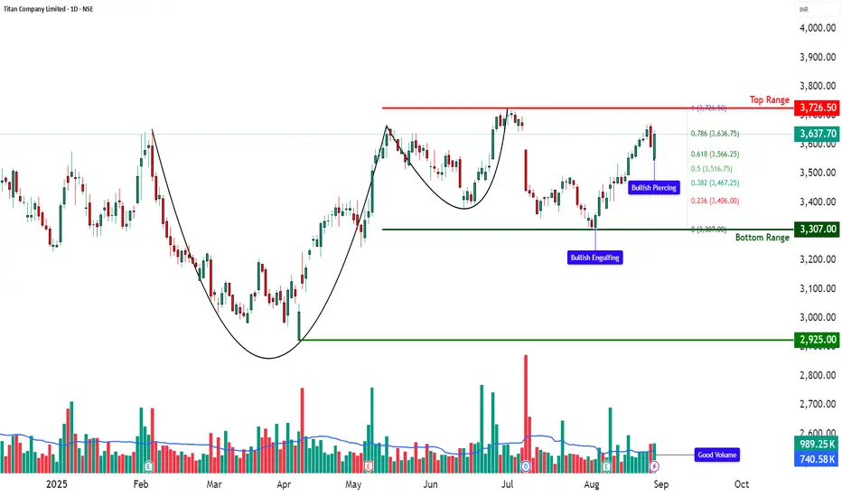
TITAN – Cup & Handle Breakout Retest📊 TITAN – Technical & Fundamental Educational Snapshot
Ticker: NSE: TITAN | Sector: Consumer – Lifestyle & Jewellery
CMP: ₹3,637.70
Rating: ⭐⭐⭐⭐ (Bullish Setup – For Educational Purposes Only)
Pattern Observed: ☕📈 Cup & Handle Breakout Retest
📊 Technical Observations
Titan Company Ltd. (CMP: ₹3,637.7) is presently exhibiting a Cup & Handle formation, with the price recently retesting the handle zone around ₹3,550–₹3,600 and showing signs of strength supported by healthy volumes. On the technical front, important resistance levels are noted around ₹3,675, ₹3,712, and ₹3,773, while support levels lie near ₹3,576, ₹3,515, and ₹3,477. Key indicators currently reflect positive momentum, with RSI around 65, MACD showing bullish signals on multiple timeframes, and CCI at 92, while the Stochastic indicator is in the higher zone (88–94), suggesting overbought but trending conditions. Volumes stood at ~989K, higher than the 20-day average of ~740K, indicating increased participation. Price action is also holding above VWAP, with Bollinger Band dynamics hinting at the possibility of trend continuation.
📰 Fundamental & News Flow
In its Q1 FY26 results, Titan Company Ltd. reported around 11% year-on-year revenue growth, primarily supported by sustained jewellery demand, although margins were modestly affected due to gold price volatility. The company continues to witness healthy traction in its Tanishq jewellery and Titan Eye+ businesses, alongside a recovery trend in watches and wearables. Titan has also been pursuing aggressive retail expansion, and the upcoming festive season is expected to support consumer demand further. From a structural perspective, the company is often highlighted for its premium brand positioning, robust balance sheet, and long-term jewellery demand drivers, which are considered key strengths in its sector.
📊 STWP Trade Analysis (Educational Purpose Only):
The recent price action indicates a Bullish Engulfing pattern followed by a Bullish Piercing formation, which are generally studied as signs of positive sentiment when supported by volumes. After the retest, a reference level around ₹3,726.50 may be noted, while the Bullish Piercing structure also highlights an observation zone near ₹3,650.90, with further upward reference levels around ₹3,752 and ₹3,854, and a protective support reference near ₹3,549. From a Fibonacci retracement perspective, a pullback level is visible near ₹3,566, with an invalidation reference around ₹3,516.
Candlestick Analysis
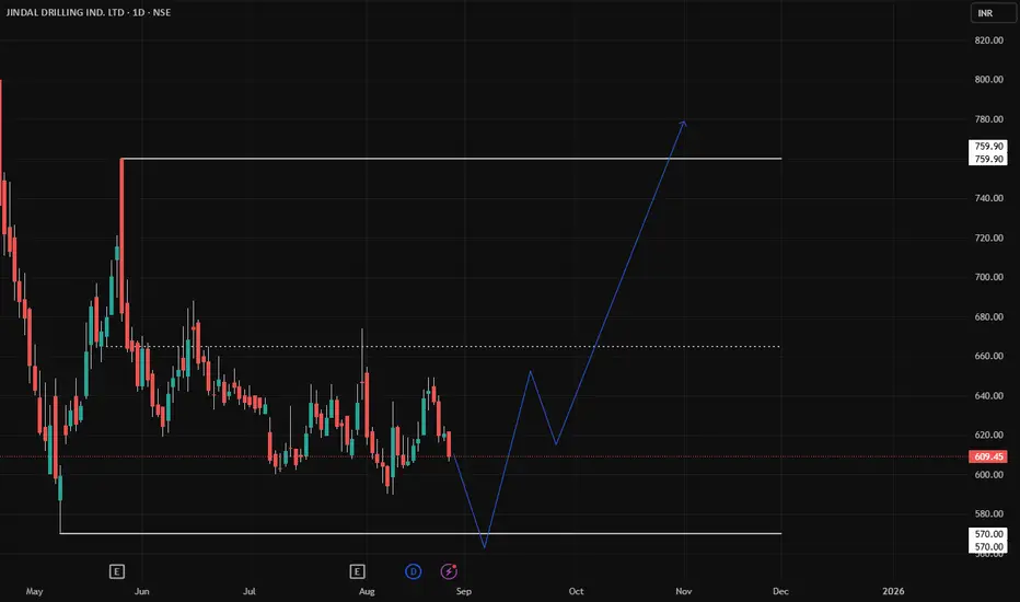
JINDRILL HTF Swing Trade SetupJINDRILL is currently trading within a range between ₹570 – ₹760.
Price is hovering near the lower band of this range. We can get a good long setup here if the level holds or shows a strong rejection.
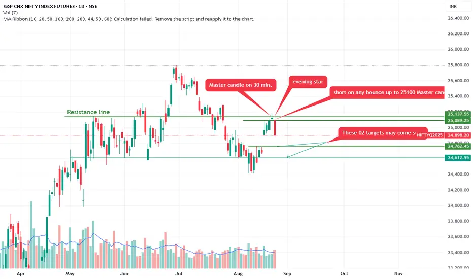
Nifty form Bearish Evening star. Correction expected.Annotations Patterns:
Master Candle on 30 min. Evening Star: Points to the recent high. A "master candle" refers to a large-range candle (here, likely on a 30-minute timeframe) that encompasses subsequent smaller candles, Combined with an "evening star" pattern—a three-candle bearish reversal (large green candle, small-bodied doji/star, followed by a large red candle closing below the first's midpoint)—this suggests a topping formation and potential for further downside.
Short on Any Bounce Up to 25,000-25,100 Master Candle Low.
Recommends selling (shorting) if price rebounds to 25,000-25,100 (labeled as the master candle's low, acting as resistance on pullback).
These 02 Targets May Come Soon: Arrows to lower levels (~24,793 and possibly 24,613), implying quick downside targets.
A downward-sloping green trendline projects further decline.
Overall Trend: The chart depicts a bull market correction or potential reversal. After months of gains, momentum has shifted bearish, with price breaking below key supports (e.g., the green line at 25,137). Higher volume on declines reinforces this.
The chart's creator appears to have a bearish bias, focusing on reversal patterns and downside projections.
ETHUSD | Technical Analysis 25/08/2025Hi,
ETH can form inverted head and should and go upside upto 5100+. Time period can be 4 to 5 days.
Disclaimer: This is only for educational purpose.
Thanks

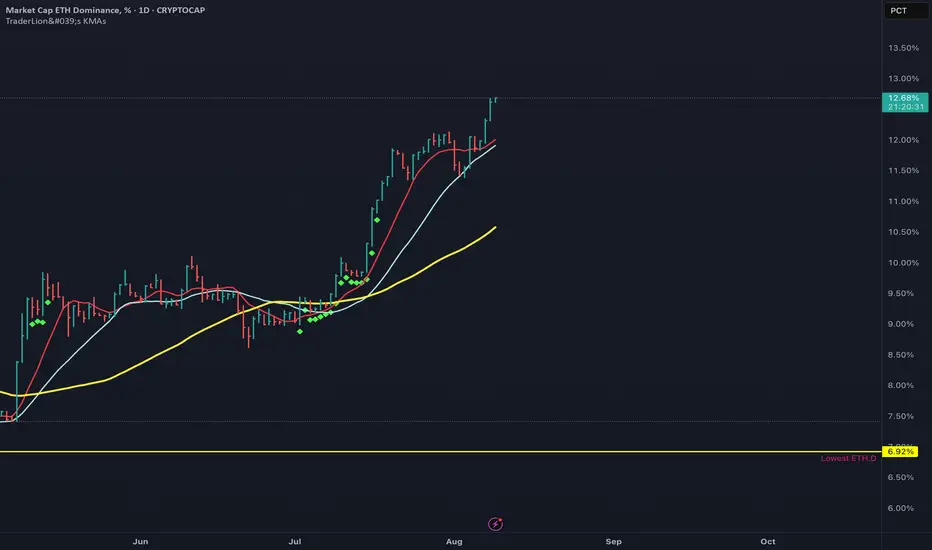
ETH DominanceETH market cap dominance has been stuck around the 9.3% level for a while, but now it’s breaking out and sitting around 12.6%. That’s a strong move, showing ETH is gaining ground compared to BTC.
What the chart is telling us:
Just broke through the 9.9% resistance and is holding above it
Moving averages are pointing up and momentum looks solid
If this keeps going, we could see 13–14% soon, maybe even 15% later on
If it drops back under 9.9%, that would weaken the setup
Why ETH might keep climbing
Institutions are loading up
Big companies are starting to put more of their treasury money into ETH. One example is Fundamental Global, which has a $5 billion Ethereum plan. They like ETH because it gives staking rewards, powers DeFi, and is at the center of tokenization.
401(k) crypto plans are now allowed
The US recently made it possible for retirement plans like 401(k)s to have crypto, including ETH. This could eventually bring in trillions of dollars into the market.
ETH turns 10
Ethereum just hit its 10-year mark. Long-term predictions are huge, with some saying it could hit $10k by 2030 and others going way higher. Over the years, ETH has gone from proof-of-work to proof-of-stake, rolled out upgrades like Dencun, and is planning more improvements like Pectra to make it faster and cheaper to use.
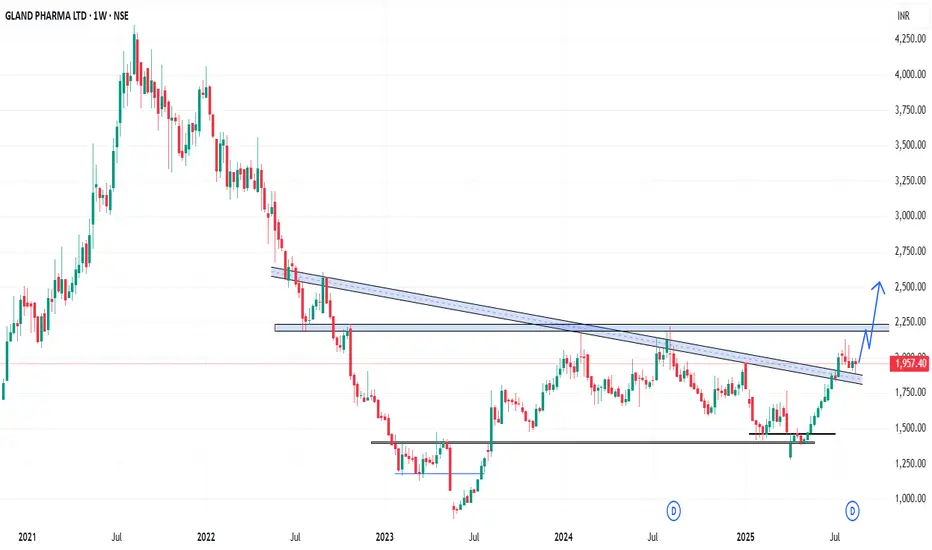
GLAND - Weekly AnalysisIn the Weekly Chart of GLAND ,
we can see that, it has created a Hammer candle on support..
Expected momentum is shown in chart.
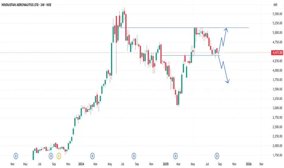
HAL - Weekly AnalysisIn the Weekly Chart of HAL ,
we can see that, it is at decision making point.
Possible momentums are shown in chart.
XPROINDIA - Weekly AnalysisIn the Weekly Chart of XPROINDIA ,
we can see that, it is at decision making point.
Possible momentums are shown in chart.

BALAMINES - Weekly AnalysisIn the Weekly Chart of BALAMINES ,
we can see that, it is at decision making point.
Possible momentums are shown in chart.

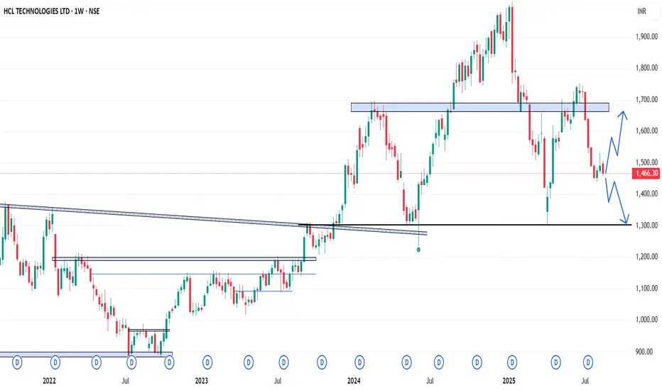
HCLTECH - Weekly AnalysisIn the Weekly Chart of HCLTECH ,
we can see that, it is at decision making point.
Possible momentums are shown in chart.
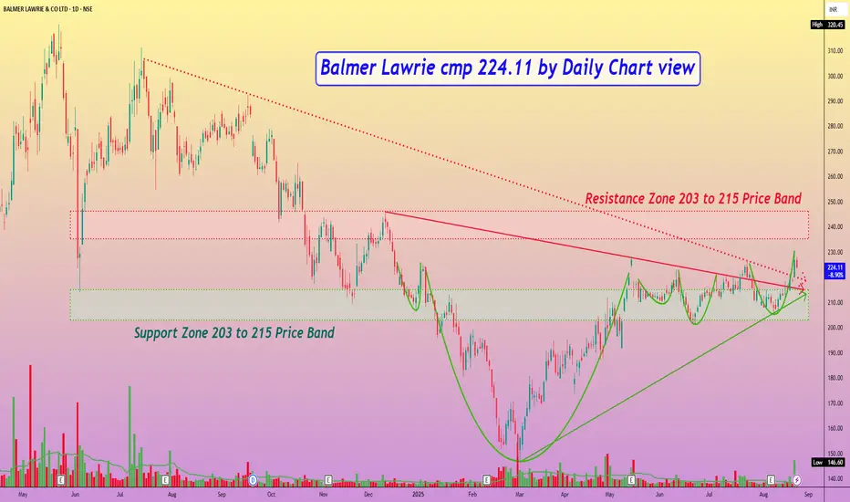
Balmer Lawrie cmp 224.11 by Daily Chart viewBalmer Lawrie cmp 224.11 by Daily Chart view
- Support Zone 203 to 215 Price Band
- Resistance Zone 203 to 215 Price Band
- Multiple Bullish Rounding Bottoms around Support Zone
- Both Falling Resistance Trendlines Breakout seems sustained
- Heavy Volumes surge on Friday post close sync with avg traded qty
- Upwards Price momentum has well respected the Rising Support Trendline
- [ b]*Inside Bar made on Friday closure, indicates observing caution either a Breakout or Breakdown*
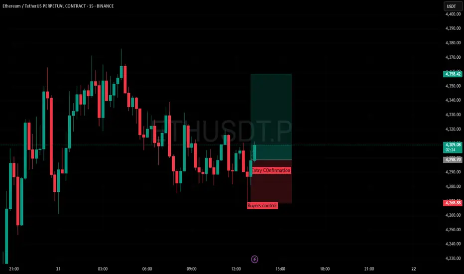
Simple Candlestick pattern Long tradeSimply wait for Buyers control and wait for confirmation candle that gives you volume and strength then entry and target for 1:2
Positional or Long Term Opportunity in Minda CorpGo Long @ 500.55 for Targets of 539.1, 577.65, and 616.2 with SL 462
Reasons to go Long :
1. On Weekly timeframe If we draw Fibonacci retracement from the recent swing low (A) to the swing high (B) then the stock took support from the 0.5 Fibonacci level.
2. In addition to this, the stock formed a Bullish Engulfing Pattern (marked with a orange color) around 0.382 Fibonacci level.
3. Also there is a strong demand zone from which the stock took support.

Indian Hotel Cmp 796 Dark Cloud Cover Candle @ top Indian Hotel Cmp 796 dated 21-8-2025
1. Dark Cloud Cover Candle @ top
2. RSI reversal
Sell below 790 SL 812 target 785-780-775-770-765
760-755-750
It is just a view, please trade at your own risk.

Jindal Stainless Cmp 774 Shooting Star Candle @ TopJindal Stainless Cmp 774 dated 21-8-2025
1. Shooting Star Candle at Top in uptrend
Sell below 768 SL 798 target 765-760-755-750-740-730-720
It is just a view, please trade at your own risk.

XAUUSD | 21/08/2025 Technical AnalysisHello,
Gold is create Same HH and moving HL pattern on daily timeframe. Soon we can see it moving towards ATH. One retracement is pending then we can see start of new uptrend move.
Disclaimer: This is only for educational purpose.
Thanks

L&T Finance Ltd.(LTF) This chart shows the daily price movement of L&T Finance Ltd. (NSE) from early 2024 to August 2025.
The stock is currently trading at ₹217.03, up +3.13% on the day with a volume of 9.45M.
The recent rally has pushed the price above a key resistance zone around ₹214–215, now acting as support (dotted green line).
A bullish breakout pattern is visible, with the drawn projection (blue arrow) suggesting possible continuation towards the ₹225–230 range in the near term.
The broader trend since March 2025 shows higher highs and higher lows, indicating strong upward momentum after a prolonged consolidation phase in 2024.
**** Not a BUY/ SELL Recommendation. Only for education purpose.

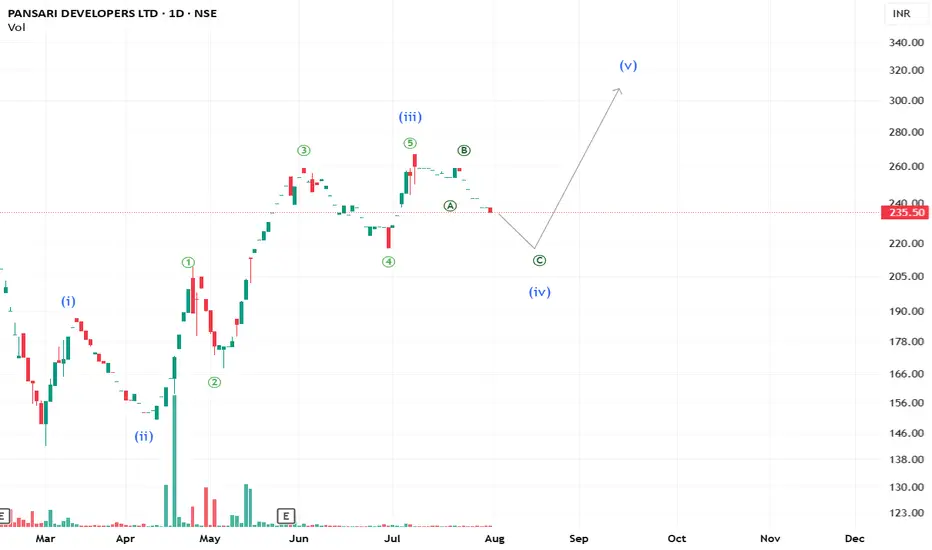
Has the time come for Pansari Developers?What we see is the beauty of the wave principle — a perfectly formed Impulse structure with #pansaridevelopers poised to move higher. However, a confirmation is still needed as the stock is relatively illiquid.
**This is an educational market outlook, not investment advice. Please consult a SEBI-registered advisor before taking any investment decisions.**
Gold trading range - 18 August 2025I have done a back testing of a Fibonacci - combined with swing calculation on a 15-30 min. Chart & on the basis of that I am making my first prediction on trading view as a publication. Tomorrow first we should see a downward move in the market. Till the levels marked in the chart. & then it should be a change in the swing. I will put an update once the swing shows a change.
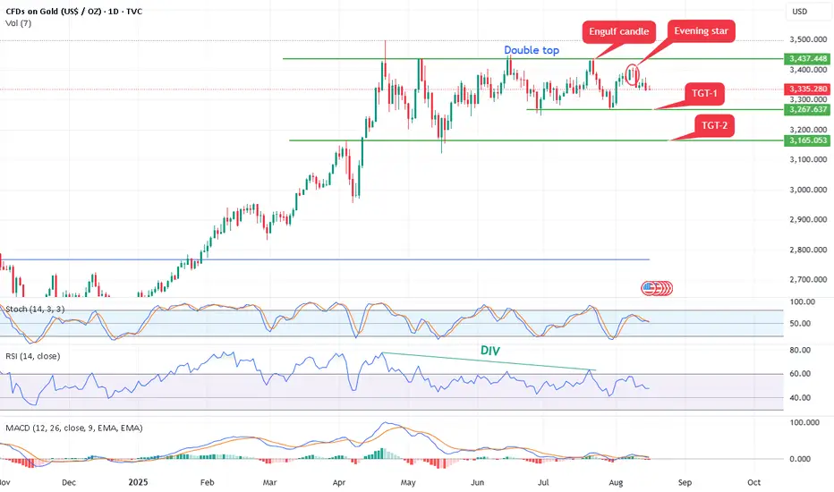
Gold form double top bearish pattern,Bearish Patterns Annotated:
Double Top: A classic bearish reversal pattern resembling an "M" shape. It occurs when price hits resistance twice at similar levels (here, approximately $3,437 and $3,448 in July and August) and fails to break higher. This signals potential exhaustion of buyers and a shift to sellers.
Evening Star: A three-candle bearish reversal pattern marked near the recent high. It typically consists of a large green candle (up day), followed by a small-bodied candle (indecision), and then a large red candle closing below the midpoint of the first candle. This suggests bulls are losing control.
Engulf Candle (Bearish Engulfing): A red candle that completely "engulfs" the body of the prior green candle, indicating strong selling pressure overriding previous buying. It's marked near the top, reinforcing the reversal theme.
Opportunity: - As per chart it can short 3380-3350 with stop loss 3400 above for the targets of double bottom pattern 3260 and 3160.
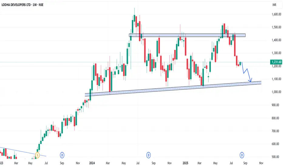
LODHA - Weekly AnalysisIn the Weekly Chart of LODHA ,
we can see that, it is looking week.
we can see more fall in it.
Expected momentum is shown in chart.
SFL - Weekly AnalysisIn the Weekly Chart of SFL ,
we can see that, it has created a inside Hammer candle.
We can see a bounce back from here.
Expected momentum is shown in chart.

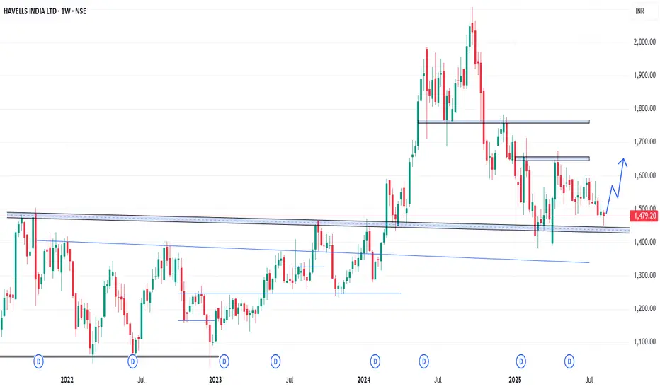
HAVELLS - Weekly AnalysisIn the Weekly Chart of HAVELLS ,
we can see that, it has created a Hammer candle on support.
We can see a bounce back from here.
Expected momentum is shown in chart.