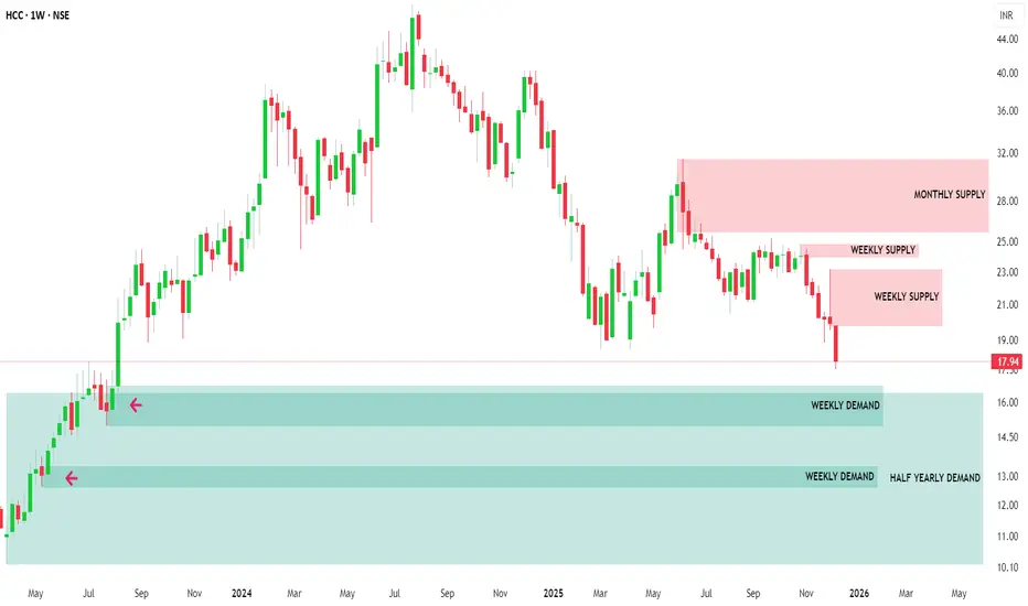
MTF Demand Confluence: High-RR Reversal SetupMulti Timeframe Supply & Demand Analysis
🕰️Yearly Timeframe
On the Yearly timeframe, price has already broken above a major supply zone, signaling strong higher‑timeframe bullish intent and possible long‑term accumulation by institutional players. Just above this breakout, price tapped into a previously tested yearly supply zone, from where it faced rejection and started to rotate lower, confirming active overhead supply.
This structure shows a classic “Break–into–higher supply” reaction, where long‑timeframe trend strength is present, but price is temporarily capped by remaining sell orders in the upper zone. A clean, sustained break above this upper yearly supply could unlock a fresh leg of long‑term upside.
📆 Half-Yearly Timeframe
On the Half-Yearly timeframe, price is currently approaching a strong demand zone — a critical level where significant buying pressure was previously observed. This prior bullish activity proved powerful enough to break through a previous Half-Yearly supply zone, clearly signaling the presence of institutional demand or major accumulation at this area. 💪
This HYTF demand confluence adds further conviction to the overall bullish structure, as it validates sustained buyer interest capable of overcoming historical supply barriers.
📉 Monthly Timeframe
On the Monthly Timeframe, price first reacted downward from a Monthly Demand Zone (MDZ) that coincided with a Half‑Yearly Supply Zone (HYSZ), creating a strong confluence area where sellers stepped in aggressively. As price moved away, the nearest Supply Zone (SZ) was respected again, extending the selling leg and confirming short‑term bearish order‑flow.
Currently, price is approaching Monthly Demand Zone that overlaps with a Half‑Yearly Demand Zone (HYDZ), forming a powerful HTF demand confluence with high probability of bullish reversal. If buyers manage to defend this HYDZ–MDZ cluster, it can act as a strong platform for a new upside swing.
If selling pressure remains elevated and this primary MDZ fails, there is one more MDZ sitting near the bottom of the structure, which can serve as a secondary demand pocket where price may still reverse to the upside. Both these stacked demand zones offer attractive areas to watch for confirmation‑based long setups.
Weekly Timeframe Focus (Reversal Zones)
On the Weekly timeframe, there are four clearly defined reversal zones where price has a high probability of reacting due to visible supply‑demand imbalances and prior impulsive moves. These levels align well with the higher‑timeframe zones, making them high‑quality decision points.
Monitoring these four zones for clean price action signals such as strong rejection wicks, engulfing candles, or structure breaks can help time entries with precision while keeping risk tightly controlled. This multi‑timeframe stacking significantly increases the reliability of any confirmed reversal from these areas.
Conclusion: Long‑Term Investment View
Given the strong confluence of demand zones across Yearly, Half-Yearly, and lower timeframes, plus multiple well‑defined reversal levels on the Weekly chart, this stock is positioned for a potentially strong bullish reversal from current or slightly lower zones. Notably, after the reaction from this higher timeframe demand zone, there are no significant supply hurdles visible on higher timeframes, clearing the path for sustained upside momentum and substantially increasing the chances of higher returns.
From a long‑term investment perspective, the structure suggests a favorable reward‑to‑risk profile and scope for strong performance if price holds above the mapped HTF demand. If demand is confirmed and price starts building a higher‑low structure from these zones, this can evolve into a high‑conviction long‑term swing or investment candidate, supported by institutional‑grade demand footprints and multi‑timeframe alignment.
Demand_zone
UltraTech Cement: Bullish Setup at Major Demand ConfluenceWe are analyzing UltraTech Cement across multiple timeframes as it approaches a high-probability reversal area. Here is the breakdown:
1️⃣ Quarterly Timeframe (Location)
Status: Price is currently approaching a Quarterly Demand Zone.
View: We are treating this as a key "Location" for our trade setup. Since the price is correcting from its Lifetime High , this zone is significant enough to absorb incoming selling pressure and hold the price.
2️⃣ Monthly Timeframe (Trend Origin)
Status: Price is testing the Monthly Demand Zone.
Confluence: This zone perfectly coincides (overlaps) with the Quarterly Demand Zone.
Significance: This acts as a strong support because the massive rally that led to the previous Lifetime High originated right from this level.
3️⃣ Weekly Timeframe (The Setup)
Status: Price is approaching a refined Weekly Demand Zone.
Strength: This is a high-probability zone because it has triple confluence: it coincides with both the Monthly and Quarterly zones.
Support: There is also a Monthly EMA resting in this area, adding extra strength to the zone.
Outlook: If price enters this zone, we expect a strong upmove. There are no major higher-timeframe supply zones overhead to block the momentum.
🛡️ Plan B: The Safety Net
Secondary Zone: In the unlikely event that our primary weekly zone breaks, we are not out of the fight.
Fresh & Untested: Just below the current level, there is another fresh demand zone that has never been tested before.
Opportunity: Because it is "fresh," there are likely unfilled pending buy orders sitting there, ready to trigger a strong reaction and push prices back up.
🎯 Verdict: A solid long setup forming at a high-value location with momentum expected to resume toward highs.

CERA – Demand Zone Confluence Supporting Bullish OutlookCERA has exhibited a notable price reaction from its Quarterly Demand Zone 📊, where price absorbed existing buy orders and initiated an upward movement 🚀. This reaction area coincides with the Yearly Demand Zone 🧭, thereby forming a strong confluence zone 🔗 that reinforces its structural significance.
On the Monthly timeframe 📅 , the active Demand Zone overlaps both the Monthly and Yearly Demand Zones . Such multi‑timeframe alignment ⚙️ typically represents a high‑probability support region 💪. Following the initial reaction from this area, price demonstrated a sustained upward move 📈 and established a new, untested Monthly Demand Zone 🟩.
Currently, the price is retracing toward this newly‑formed Monthly Demand Zone 🔄. The retracement is particularly significant because it occurs without any observable reaction from a higher‑timeframe supply zone 🚫🏗️. This suggests that the zone’s underlying demand remains intact 💼, and that the market is approaching an area of potential accumulation 🏦.
Additionally, the Weekly chart 📅 reveals that the current zone coincides with a Monthly Demand Zone 🧱, providing further confirmation of institutional-level support 🏛️. Overall, the technical setup indicates a favorable environment for a potential bullish reversal or continuation from this demand area 🔥📈.
📌 Conclusion
CERA is currently positioned within a multi‑layered structural support zone 🧱 that reflects strong institutional interest and demand alignment across timeframes. The fresh Monthly Demand Zone, combined with Yearly and Quarterly confluence, strengthens the bullish bias.
Unless price invalidates the zone through a sharp breakdown with high volume, the technical structure remains biased to the upside 🚀, favoring long accumulation setups and positioning this level as a potential launchpad for the next impulsive move 💫

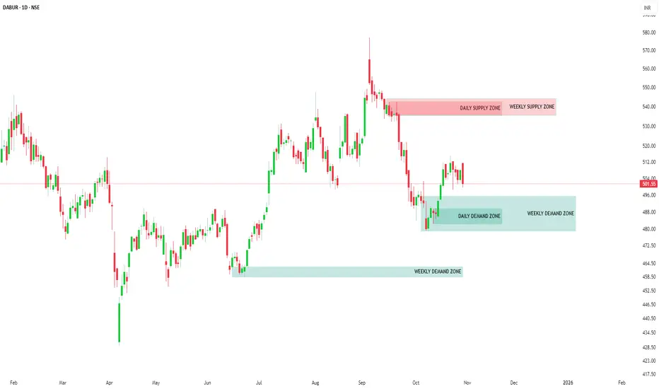
DABUR: Strong Demand Zones | Bullish Upside Setup📊 DABUR: Comprehensive Multi-Timeframe Demand-Supply Analysis
🎯 Executive Summary
This detailed analysis examines Dabur's price action across multiple timeframes using advanced demand-supply methodology. The stock demonstrates strong bullish momentum with multiple coinciding demand zones across higher timeframes, signaling potential for significant upward movement.
📅 Monthly Timeframe Analysis
Key Observations:
Strong Demand Zone Activation 💪
The monthly timeframe reveals that price has successfully picked up pending orders from a 1-month demand zone , triggering a powerful upward move. This demand zone represents institutional buying interest and forms the foundation of the current bullish structure.
Fresh Demand Zone Formation 📈
Following the initial order pickup, price has created a new 2 base candle monthly demand zone. The formation of fresh demand zones after respecting previous ones is a critical bullish signal that confirms:
Buyers maintain control of the stock
Momentum is building for continuation
The uptrend structure is solidifying
Current Month Response ✅
The current month's candle has reacted positively from this newly formed 2-base candle monthly demand zone, printing a green candle. This back-to-back demand zone respect pattern strongly suggests:
The stock has entered a confirmed uptrend
Price is preparing for a substantial upside move
Buyer dominance is firmly established
📊 Weekly Timeframe Analysis
Demand Zone Respect Pattern:
Consistent Zone Validation 🔄
The weekly timeframe mirrors the monthly bullish structure, with demand zones being consistently respected and price delivering upward moves from each zone. This repeated pattern across multiple weeks confirms the strength of the underlying demand.
Fresh Weekly Demand Zone 🆕
Currently, price is approaching a fresh weekly demand zone that has not been tested yet. Key characteristics:
Untested zones typically produce stronger reactions
Expected significant upward move from this level
High probability of continuation to higher levels
Back-to-Back Zone Formation 🏗️
The continuous formation of back-to-back demand zones, combined with price respecting and reacting from each zone with upward moves, clearly indicates:
Stock is preparing for a major upward leg
Accumulation phase is progressing systematically
Each pullback is being used for additional buying
📉 Daily Timeframe Analysis
Critical Confluence Zone:
Weekly-Daily Demand Zone Alignment 🎪
The daily timeframe shows price currently approaching a demand zone that coincides with the weekly demand zone . This creates a powerful confluence level with enhanced significance because:
Higher timeframe price structure taking precedence
Increased institutional interest at these levels
Multiple timeframe participants converging at the same price level
Maximum probability of reversal and upward continuation
Probability Assessment:
Bullish Factors ✨
✅ Back-to-back demand zone formation
✅ Consistent demand zone respect across timeframes
✅ Fresh weekly demand zone approaching
✅ Daily-Weekly demand zone coincidence
✅ Green candle formation on monthly chart
✅ Clear uptrend structure establishment
Expected Outcome 🚀
Based on the multi-timeframe demand-supply structure, Dabur is positioned for a substantial upward move. The alignment of demand zones across monthly, weekly, and daily timeframes, combined with consistent price respect and fresh zone formation, creates an exceptionally strong bullish setup with high probability of success.
📌 Conclusion
The demand-supply analysis across multiple timeframes reveals that Dabur has established a robust bullish structure with buyer dominance clearly visible. The coincidence of demand zones, back-to-back zone formation, and consistent price respect create a compelling case for s ignificant upside potential.
⚠️ IMPORTANT DISCLAIMER
Regulatory Compliance Notice
SEBI Compliance Statement:
In strict adherence to the latest Securities and Exchange Board of India (SEBI) guidelines, this content is NOT a trading recommendation, investment advice, or educational material. This publication serves informational purposes only.
Professional Disclaimer
Registration Status:
I am NOT a SEBI Registered Research Analyst (RA) nor a SEBI Registered Investment Adviser (RIA). This analysis does not constitute professional financial advice or recommendations as defined under SEBI regulations.
Risk Disclosure
Investment Advisory:
This analysis is provided solely for informational and reference purposes. Readers are strongly advised to:
Consult a SEBI-registered financial advisor or investment professional
Conduct comprehensive independent research
Perform thorough due diligence before making any investment decisions
Assess their own risk tolerance and financial situation
Liability Limitation:
The author assumes no responsibility for any financial losses, damages, or consequences arising from the use or interpretation of this information. All investment decisions remain the sole responsibility of the individual investor.
Market Risk:
Past performance and technical analysis do not guarantee future results. Markets are subject to inherent risks, volatility, and unpredictable factors.
KAYNES TECHNOLOGY IND LTD – Price Action + ZonesKAYNES TECHNOLOGY IND LTD – Price Action + Zones
Ticker: NSE:KAYNES | Sector: Electronics & Semiconductors
Timeframe: 15-Min | Current Price: ₹6,200.00 ▲ (+0.49%)
Technical View: ⭐⭐⭐⭐ | Chart Setup: Breakout with Zone-Based Trade Planning
Kaynes Technology (NSE:KAYNES) has exhibited strong directional momentum following a structured breakout above a prior consolidation range, as seen on the 15-minute chart. The price surged past intermediate resistance near ₹5,990 and is currently stabilizing around ₹6,200, suggesting trend continuation if supported by further volume. Marked zones like the Top Range (₹6,284) and Bottom Range (₹5,405) provide a visual framework to understand price behavior—where strength above upper resistance may invite bullish setups, while failure to hold could signal re-entry into the lower band. A clearly defined demand zone (₹5,850–₹5,764.50) with an example SL near ₹5,755 offers a contextual learning area to study zone-based entries with risk-reward alignment. Observing volume expansion on the breakout and contraction during consolidation is key for interpreting trend strength. The annotation “Trade as per Trend + Supporting Setup” reinforces the importance of directional bias and confluence. All observations are shared to help learners understand breakout structure, demand zones, and price-volume correlation in a real-world context.
⚠️ Disclaimer & Educational Note
This content is strictly intended for educational and research purposes related to the technical study of Kaynes Technology (NSE:KAYNES). I am not a SEBI-registered advisor, and no buy/sell recommendations are being made. All insights are based on personal chart analysis, price-action interpretation, and educational zone-mapping — not financial advice.
📘 The visual setup in this post demonstrates how traders and learners can study breakout structures, demand/supply zones, price-volume behavior, and risk levels in a controlled technical environment. Tools like support/resistance mapping, volume confirmation, and structure-based SL planning help illustrate disciplined trade preparation. However, trading — particularly in leveraged instruments like options or intraday setups — involves substantial risk, and losses can exceed the initial investment.
👉 Always do your own due diligence and consult a SEBI-registered investment advisor before taking any positions in the market.
👉 Practice strict risk management, and only trade with capital you can afford to lose.
The author assumes no responsibility for financial decisions based on this educational content. By engaging with this content, you acknowledge and accept these terms.
💬 Found this helpful?
Drop your thoughts, questions, or insights in the comments below ⬇️ — let’s learn together!
🔁 Share this post with your trading friends and community — help them discover clean charts, structured setups, and zone-based learning.
✅ Follow simpletradewithpatience for clear setups, educational content, and a no-nonsense approach to price action, supply-demand zones, and risk-managed trades.
🚀 Trade with patience. Trust your charts. Stay clear-headed.
Because the goal is not just to trade — it's to trade better.
Be Self-Reliant | Trade with Patience | Learn with Charts & Zones 📊

GODREJ CONSUMER PRODUCTS – Price Action + ZonesGODREJ CONSUMER PRODUCTS – Price Action + Zones
Ticker: NSE\:GODREJCP | Sector: FMCG
Timeframe: 15-Min | Current Price: ₹1,259.00 ▼ (−0.08%)
Technical View:⭐⭐⭐⭐ | Chart Setup: Range Bound Structure with Demand Zone Revisit in Focus
Godrej Consumer Products (NSE\:GODREJCP) is currently trading within a well-defined short-term range, with resistance capped near ₹1,265.50 and an anchored demand zone around ₹1,224.40–₹1,216.90. The stock has shown prior strength with a breakout above ₹1,244.35, but price is now consolidating between the orange mid-range and red supply zone, reflecting indecision. A clean zone-based structure is visible: the Top Range (₹1,265.50) may trigger bullish momentum if breached with volume, while failure to sustain may invite short setups within the range. The mid-structure zone (₹1,244.35) acts as a trend filter, while the green Demand Zone provides a case study for risk-managed entries — with example SL at ₹1,215.75 and mapped risk of ₹8.65. The Bottom Range (₹1,202.20) defines a lower band, and annotations like “Trade as per Trend + Supporting Setup” guide the learner to wait for trend + confluence. This setup is ideal for understanding how price reacts at key zones, how to frame directional bias within ranges, and how demand zones aid structured trade planning with logical stop-loss levels.
---
⚠️ **Disclaimer & Educational Note**
This content is strictly intended for educational and research purposes related to the technical study of Godrej Consumer Products (NSE\:GODREJCP). I am not a SEBI-registered advisor, and no buy/sell recommendations are being made. All insights are based on personal chart analysis, price-action interpretation, and educational zone-mapping — not financial advice.
📘 The visual setup in this post demonstrates how traders and learners can study breakout structures, demand/supply zones, price-volume behavior, and risk levels in a controlled technical environment. Tools like support/resistance mapping, volume confirmation, and structure-based SL planning help illustrate disciplined trade preparation. However, trading — particularly in leveraged instruments like options or intraday setups — involves substantial risk, and losses can exceed the initial investment.
👉 Always do your own due diligence and consult a SEBI-registered investment advisor before taking any positions in the market.
👉 Practice strict risk management, and only trade with capital you can afford to lose.
The author assumes no responsibility for financial decisions based on this educational content. By engaging with this content, you acknowledge and accept these terms.
---
💬 **Found this helpful?**
Drop your thoughts, questions, or insights in the comments below ⬇️ — let’s learn together!
🔁 Share this post with your trading friends and community — help them discover clean charts, structured setups, and zone-based learning.
✅ Follow **simpletradewithpatience** for clear setups, educational content, and a no-nonsense approach to price action, supply-demand zones, and risk-managed trades.
🚀 *Trade with patience. Trust your charts. Stay clear-headed.*
Because the goal is not just to trade — it's to trade better.
**Be Self-Reliant | Trade with Patience | Learn with Charts & Zones 📊**
---

Demand & Supply Price Action Play – CMSINFO Price Structure & Market Context
CMSINFO’s recent price action has followed a textbook path, respecting clean structural levels driven by institutional order flow. It's one of those charts where the zones aren’t just technical—they're telling a story. And right now, that story is setting up a potentially meaningful long opportunity.
💡 Daily Timeframe – Big Picture Bias
The daily chart remains resolutely bullish . We're still seeing that healthy rhythm of higher highs and higher lows , signaling that the uptrend is very much intact.
📍 Daily Supply Zone: ₹540 – ₹546
That said, price did face some resistance recently—right where we’d expect it to. A fresh supply zone Rally Base Drop around ₹540–₹546 served up a rejection and sparked the current pullback. Nothing unusual there. In fact, in strong trends, these kinds of pullbacks often offer the best risk-adjusted entries —as long as we’re positioned at the right zones.
⏱️ 125-Minute Timeframe – Precision Entry Layer
Zooming into the 125-minute chart gives us a much clearer map for potential execution.
🟢 Demand Zone: Rally Base Rally ₹500 – ₹498
Here’s where things get interesting. This demand zone hasn’t been touched since it formed—making it a fresh zone , and by definition, high-probability for a first bounce. Price has just tapped into it, which could attract short-term buyers looking to ride the next leg up.
🔴 Supply Zone: Rally Base Drop ₹532 – ₹537
This zone sits just overhead and marks the first potential resistance . If price moves up from the current demand area, this is where traders may begin trimming positions or tightening stops.
🎯 Trade Blueprint 🎯
Entry: Between ₹500 – ₹498 (inside 125-minute demand zone)
Stop Loss: Below ₹498 (conservative buffer: ₹495)
Target 1: ₹532 – ₹537 (nearest 125min supply)
🧩 Why This Setup Deserves Attention 🧩
Daily Trend Structure Remains Bullish – higher timeframe bias supports a continuation upward.
Fresh LTF Demand Zone – first touch makes this zone statistically favorable.
Defined Risk-Reward Parameters – tight stop with layered targets for flexible management.
Pure Price Action Logic – just clean, institutional footprints.
🚀 “Opportunities don’t come from chasing— they come from waiting in the right places.” 💡 Stay patient, respect your zones, and let the market come to you.
This analysis is purely for educational purposes and does not constitute a trading or investment recommendation. I am not a SEBI registered analyst.
Lastly, thank you for your support, your likes & comments. Feel free to ask if you have questions.

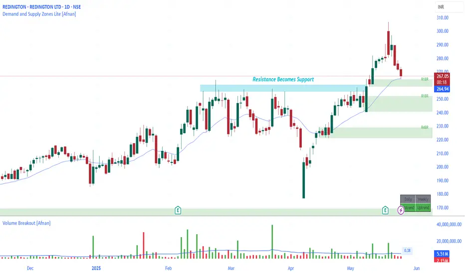
Strong Confluence Setup : REDINGTON at Crucial Demand Zone
REDINGTON is showing signs of a promising technical setup — something that can catch the attention of demand and supply zone traders. Let’s break down the analysis in simple words so that even a beginner can understand why this stock might be at an interesting level.
🔥 The Demand Zone Setup 🔥
The stock is currently hovering around a Rally-Base-Rally demand zone. This is a price area where big institutions may have left pending buy orders before pushing the price higher.
📉 Confluence of EMA and Support Flip
Here’s where the setup gets even more interesting. Apart from the demand zone:
REDINGTON is trading near its 20 EMA — a dynamic support level that often helps price bounce in uptrends.
There was a recent resistance breakout — price struggled to go above a certain level, broke through it with heavy volume, and is now returning to retest that same level.
Resistance turns into support : This classic law of polarity increases the odds of a bounce from here.
💡 Volume Analysis Matters
The breakout candle had heavy volume. Now, as the price pulls back to the demand zone, volume is dropping — this is a healthy sign. It suggests the sellers are weakening and the buyers might soon step in again.
👣 Smart Money Footprints & Pending Orders
Demand zones reflect unfilled institutional orders. If smart money had previously bought here, they may defend this zone to protect their positions. That could mean more buying at this level, pushing the price higher once again.
⚠️ But Wait — Risk Management is Key!
Even high-probability setups can fail — and that’s just the nature of trading. Always use a stop-loss. The goal isn’t to be right all the time — it’s to manage risk smartly and survive long enough to be consistently profitable.
📊 Setup Summary
Price near RBR demand zone Strong case for smart money entry
Confluence of 20 EMA support
Polarity principle : Resistance turned into support
Volume drop on pullback — bullish signal
Always place stop-loss — risk management matters
📌 "In trading, confidence comes from preparation — not prediction."
Lastly, Thank you for your support, your likes & comments. Feel free to ask if you have questions.
⚡ Stay focused, trade smart, and let the charts do the talking! ⚡
This analysis is for educational purposes only and is not intended as a trading or investment recommendation. I am not a SEBI registered analyst.
Nifty Reversal Watch: Key Demand Zones & Moving Average in FocusAs a pure technical analyst, I rely solely on what the charts reveal, ignoring the noise of news and fundamentals. Charts tell the story in advance.
As a demand and supply zone trader, my primary focus is on identifying key areas where institutional activity is likely to drive price action. Today, we’ll analyze the Nifty 50 through the lens of demand zones and then complement it with traditional technical analysis using moving averages. This analysis aims to provide clarity on potential reversal zones and market behavior.
📊 Demand Zones: The Foundation of Analysis
Monthly & Quarterly Demand Zones : On the monthly timeframe, I’ve identified a critical demand zone. When we zoom into the quarterly timeframe, this zone aligns perfectly, creating a high-confluence area. These zones represent institutional footprints (Banks, mutual funds, etc. ), indicating where smart money is likely to step in. These are not just traditional lines or boxes on the chart; they are the footprints of institutions that control the market.
Significance of Demand Zones : Demand zones are areas where buyers are expected to dominate, often leading to price reversals. The confluence of monthly and quarterly demand zones increases the probability of a strong support level.
Current Price Action : Nifty is currently hovering near these demand zones, suggesting a potential bottom formation.
📊 Traditional Technical Analysis: Moving Averages
Now, let’s analyze the market through the lens of traditional technical analysts who rely on moving averages.
EMA 20 on Monthly Timeframe : The 20-period EMA on the monthly chart acts as a reliable support level historically. Since 2004, price reversals have consistently occurred near this moving average, marked by green circles on the chart.
EMA 20 as a Magnet : The EMA 20 on the monthly timeframe is equivalent to the 400-period EMA on the daily timeframe, representing the average price of almost 400 days. In trending markets, price always reverts to its average, making this a critical level to watch.
Historical Exceptions : While there are rare instances (marked by red circles) where Nifty has broken below the monthly EMA 20, the presence of demand zones adds an extra layer of support, reducing the likelihood of a significant breakdown.
Current Price Action : Nifty is currently near the monthly EMA 20, which coincides with the monthly and quarterly demand zones.
📊 Combining Both Approaches
High-Confluence Area : The alignment of monthly and quarterly demand zones with the monthly EMA 20 creates a high-confluence area. This increases the likelihood of a strong support level and a potential Bottom.
Risk Management : While the setup appears promising, it’s crucial to manage risk effectively. Always use strict stop-loss orders and avoid over-leveraging. Even high-probability setups can fail, especially when market sentiment is overwhelmingly negative.
📊 Conclusion
The Nifty 50 is at a critical juncture, with multiple technical indicators pointing towards a potential reversal or consolidation. The confluence of demand zones and the monthly EMA 20 provides a high-probability setup. However, always remember that no setup is foolproof, and risk management is crucial, it’s essential to remain cautious as markets can sometimes defy all technical setups.
This analysis is purely for educational purposes and is not intended as trading or investment advice. I am not a SEBI-registered analyst.
Lastly, thank you for your support.
"The market is a master of patience; trade with discipline, not emotion." 🚀📊

OPTIEMUS: A Powerful Demand Zone with Breakout Retest ConfluenceNSE:OPTIEMUS is setting up for something very interesting — both from a traditional technical perspective and through the lens of the supply and demand concept. If you're a trader who loves high confluence zones and clean structures, this analysis is definitely worth your attention!
Let’s break it down in a step-by-step, top-down format.
🔥 Weekly Chart Analysis – The Bigger Picture 🔥
When we zoom out to the weekly chart, something really striking stands out. The stock was in a tight consolidation phase for nearly 3 years. During this period, volume was consistently high — an early sign that big players were possibly accumulating.
Then came the breakout — massive volumes , strong momentum, and a sharp move to the upside. This rally gave exceptional returns to early entrants. But as expected, after such a move, the price pulled back.
Here’s where it gets exciting: the stock has now returned to the very same zone it broke out from. This level acted as a strong resistance multiple times in the past. And according to the Law of Polarity , a broken resistance often flips to become a strong support.
Not only is the price back to that breakout level, but it's also doing so with very low volume — a classic indication of a healthy retest rather than panic selling.
🧠 Supply and Demand Concept – Strong Confluence Zone 🧠
Now let's apply the demand and supply perspective — and this is where the setup gets really juicy.
A fresh and powerful weekly demand zone has formed exactly where the breakout took place. This zone has a clear imbalance — a strong leg-out candle with strong follow through. It’s a textbook demand zone with high conviction .
Even better, this demand zone is sitting right on the old resistance (now support) level — giving us double confluence .
And guess what? There is no supply zone visible on the weekly timeframe above the current price. That means the sky is clear — the price has room to fly, if it starts moving up from here.
🔎 Daily Chart Analysis – Zooming Into the Details 🔎
Moving down to the daily timeframe, we find even more reason to stay excited.
There’s a daily demand zone nested inside the weekly demand zone — a perfect case of multi-timeframe confluence . While this daily zone has been tested once, the follow-through was strong, indicating buyers are still active.
There is a nearby supply zone on the daily chart, but it’s already been tested. The next significant supply zone is about 42% above the current market price, while the risk to the distal line of the demand zone is just 9% .
That gives us a very attractive Risk to Reward ratio of 1:4.5 — which is highly valuable in technical setups.
📊 Key Technical Highlights
Weekly breakout retest with low volume pullback
Strong weekly demand zone with strong follow through
Demand zone formed at previous resistance – high confluence
No supply zone on weekly – open upside
Daily demand zone inside weekly – excellent multi-timeframe setup
Nearby tested supply on daily, next fresh supply 42% away
Risk to Reward ratio: 1:4.5
⚠️ Risk Management Reminder ⚠️
Even though this is a high-conviction setup, remember: no setup is guaranteed . Always use proper risk management, stop-loss strategies, and position sizing. Protect your capital — it's your trading ammo.
✨ Final Thoughts ✨
This NSE:OPTIEMUS chart is a great learning opportunity for anyone studying supply and demand or traditional breakout structures. Whether you’re new or experienced, setups like these reinforce the value of patience and technical clarity.
Lastly, Thank you for your support, your likes & comments. Feel free to ask if you have questions.
💡 "The market rewards those who wait patiently with a plan, not those who rush in with hope." 💡
🚫 This analysis is for educational purposes only. I am not a SEBI registered analyst and this is not a trading or investment recommendation.

SIYSIL: A Strong Demand Zone Setup with High Reward Potential!When it comes to technical analysis, understanding demand zones can give traders an edge in identifying potential reversal points. Demand zones represent the footprints of institutional players who significantly influence the market. These zones indicate unfilled buy orders, and when the price revisits these areas, institutions tend to buy again, leading to a reversal.
Let's dive into SIYSIL's price action and explore its technical structure!
🌟 Weekly Chart Analysis
SIYSIL is currently displaying a highly structured setup. If we analyze the weekly chart , we can clearly see a well-defined Rally-Base-Rally (RBR) Demand Zone . The strength of this demand zone is reinforced by the fact that it broke a previous significant resistance level and formed an all-time high .
📊 Daily Chart Confirmation
Upon shifting to the daily chart , the same demand zone is clearly visible. A strong follow-through from this zone has resulted in a powerful imbalance, further validating the structure.
Moreover, there are currently no nearby supply zones that could act as resistance, making this demand zone even more significant.
💡 Observations
Act of Polarity: The concept of polarity further strengthens this structure— the previous resistance level has now turned into support , aligning perfectly with the demand zone.
Market Conditions: While this setup appears strong, it's essential to consider the current weakness in the overall market . Even well-defined structures can face challenges in uncertain conditions, so risk management is crucial.
📈 Final Thoughts
SIYSIL presents a structured demand zone setup with multiple confirmations on both the weekly and daily charts. The alignment of the demand zone with previous resistance-turned-support adds a strong layer of confluence.
Lastly, thank you for your support. Feel free to ask if you have questions.
🚀 "A successful trader is not the one who never loses but the one who learns to manage losses."
Disclaimer: This analysis is purely for educational purposes and is not intended as a trading or investment recommendation. I am not a SEBI-registered analyst.

How to define the Daily Bias for the Day? Determining the likely direction of the market for a particular day can be both challenging and cumbersome. Many traders find themselves overwhelmed by the multitude of data points and differing indicators. However, using a structured methodology, one can systematically analyze the chart and create a daily bias for the day.
If you are an intraday trader, you can use a combination of the Daily chart for the bias and the 15-minute chart for the entry, or alternatively, you can use a 75-minute chart for the bias and a 5-minute chart for the entry.
Steps to Identify the Daily Bias
1. Identify the Most Recent Swing High and Swing Low
The first step in defining the daily bias involves identifying the most recent swing high and swing low. This can be done manually, or you can use ready-made indicators available on trading platforms such as TradingView to plot these points on the chart. Understanding swing highs and lows are fundamental concepts in technical analysis, representing the highest and lowest points within a specific time period. These points can indicate potential reversal areas where the market may change direction.
2. Divide the Region into Two Equal Parts
Once the swing high and swing low are identified, the next step is to divide this region into two equal parts. This can be achieved using the rectangle tool in TradingView. Make sure to enable the middle line feature within the rectangle tool to visually divide the two sections. The middle line acts as a crucial reference point, providing a clear visual boundary between areas of perceived higher and lower value.
3. Define Retail and Wholesale Areas
After dividing the region into two parts, the upper section is termed the “Retail Area,” where prices are considered expensive. Conversely, the lower section is called the “Wholesale Area,” where prices are deemed cheap. This concept stems from the basic economic principle of supply and demand, where higher prices in the Retail Area suggest selling opportunities, and lower prices in the Wholesale Area indicate buying opportunities.
4. Focus on Buying and Selling Opportunities
With the areas defined, the next step is to focus on the appropriate trading opportunities. When prices are in the Retail Area, the focus should be on “Selling” opportunities. When prices are in the Wholesale Area, the focus should be on “Buying” opportunities. This methodology, known as “Curve Analysis” or determining your Bias for the day, simplifies the decision-making process by providing a clear framework for evaluating market conditions.
Example: BankNifty 75-Minute Chart
Let’s look at an example to understand this better. Here we have the BankNifty 75-minute chart. We have identified the most recent swing high and swing low on the chart and divided the section into two parts. The current market price is in the Wholesale Area, which means that on your execution time frame, which is 5 minutes, you will be focusing on buying or “Long” opportunities.
Now, proceed to the lower time frame and identify your key levels of interest using support, resistance, demand, supply, or any other technical analysis tools. Observe how the supply zone on the chart played out beautifully and how prices fell from the Retail Area. This example illustrates the practical application of the methodology, demonstrating how historical price movements can inform future trading decisions.
While the above steps provide a solid foundation for defining the daily bias, incorporating the following advanced tips can enhance your trading efficiency:
1. Use Multiple Time Frames
Integrate multiple time frames to gain a comprehensive view of the market. For example, use the Daily chart to determine the overall bias and the 15-minute or 5-minute chart for precise entries and exits. This multi-time frame analysis allows traders to align shorter-term trades with the broader market trend, increasing the likelihood of successful outcomes.
2. Incorporate Technical Indicators
Employ technical indicators such as Moving Averages, RSI, and MACD to corroborate your bias. Confirming signals from multiple sources can provide greater confidence in your trades. These indicators serve as additional tools to validate the defined bias, offering insights into market momentum, overbought or oversold conditions, and potential trend reversals.
3. Monitor Economic News
Stay updated with economic news and events that could influence market movements. Important news releases can cause significant price fluctuations, impacting your defined bias. Economic indicators, such as GDP reports, employment data, and central bank announcements, can have profound effects on market sentiment and price action.
4. Practice Risk Management
Always practice sound risk management strategies. Define your risk tolerance levels and use stop-loss orders to protect your capital. Never risk more than you can afford to lose on any single trade. Effective risk management involves setting appropriate position sizes, diversifying trades, and adhering to pre-defined risk parameters to safeguard against unforeseen market movements.
5. Keep a Trading Journal
Maintain a trading journal to record your trades, strategies, and outcomes. Analyzing past trades can help you refine your methodology and improve future performance. A detailed journal provides valuable insights into trading patterns, strengths, and areas for improvement, fostering continuous learning and development.
Conclusion
Defining the daily bias for the day is crucial for successful intraday trading. By following the structured steps of identifying swing highs and lows, dividing the price region into Retail and Wholesale areas, and focusing on appropriate buying and selling opportunities, traders can streamline their market analysis. Remember to use multiple time frames, incorporate technical indicators, stay informed about economic news, practice risk management, and maintain a trading journal. With these strategies in place, you can effectively navigate the markets and enhance your trading performance.
I hope you all find this article useful. Do give your valuable feedback in the comments section.

Zomato - Potential Long at Demand ZoneZomato has be ranging sideways and is now showing some signs of correction. If the overall market weakens the stock is expected to correct to the demand zone and from there we expect to see a potential bounce to the upside

AMD Effect on the BankniftyThe chart clearly reflects how the big players have done stop loss hunting where most retail traders and investors have their stop losses below a consolidation. It is clearly seen that the big players induced false buying and dragged the prices all the way down first triggering all stop losses and now gearing up the market to take it up in the intended direction.

HOW-TO: Use Demand and Supply Zones Pro [Afnan] As Screener In this video, I walks you through an exciting update to the Demand and Supply Zones Pro Indicator—integration with TradingView’s Pine Screener. This powerful tool allows traders to scan stocks based on demand and supply zones, helping to streamline your trading process and increase your efficiency.
Key Highlights:
Learn how to set up the Pine Screener for scanning stocks from your watchlist based on demand and supply zones.
A step-by-step guide to creating and using a Nifty 200 Watchlist.
Setting up Demand and Supply Zones Pro with custom timeframe and alert configurations.
How the screener analyzes stocks, focusing on demand and supply zone proximity and key price levels.
Understanding the columns in the Pine Screener and how to interpret them for your trades.
This screener is available exclusively to Premium and higher TradingView plans, so ensure your account is upgraded to take advantage of this feature.

SYNGENE: A Confluence of Demand Zones Worth Watching
Understanding the market moves through the lens of demand and supply zones can give traders a critical edge. I’ve been looking at SynGene International ( NSE:SYNGENE ), and I think it’s at a super interesting level right now. Let me break it down for you in a simple way!
📈 Why SynGene Looks Promising Right Now
Triple Timeframe Demand Zone Confluence : NSE:SYNGENE is trading in demand zones across the 75-minute, 125-minute, and daily timeframes. This rare alignment of zones suggests that "smart money" may be active here. Demand zones represent areas where unfilled buy orders are likely to exist, making this confluence a highly positive factor for demand-supply zone traders.
Absence of Supply Zones : No supply zones are visible on the current timeframes or even on the weekly chart. This indicates that price movement may face minimal resistance ahead. The absence of supply zones on the higher timeframe (weekly) places the stock in a "wholesale area" as per Curve (location) analysis.
Quality Demand Zone : The demand zones currently in play were instrumental in driving the price to an all-time high in the past. These zones follow-through candles broken multiple tested resistance levels, demonstrating their strength.
Act of Polarity : While the price is not precisely in the demand zone right now, it is trading at a level that previously acted as resistance. This "act of polarity" (where resistance becomes support) adds another layer of technical validity to this setup.
Uptrend on Higher Timeframe : The higher timeframe trend for SynGene remains upward, aligning well with the idea of buying on demand zones.
🎯 Key Trading Considerations
- Entry Strategy : Look for entry opportunities near the demand zone, ensuring your stop-loss (SL) is placed below the distal line of the demand zone with a buffer.
- Risk Management : Aim for a minimum 1:2 risk-reward ratio for your first target. If the price moves further upward, consider trailing your stop-loss to capture extended rallies.
- Safety is Key : While the setup is promising, remember that no setup is foolproof. Discipline with stop-losses.
Lastly, thank you for your support. Feel free to ask if you have any questions.
📢 Disclaimer : This analysis is purely for educational purposes and is not intended as a trading or investment recommendation. Please note, I am not a SEBI-registered analyst. Always consult with a financial professional before making trading or investment decisions.

Reliance Industries Approaching Key Demand ZoneReliance Industries ( NSE:RELIANCE ) is approaching a significant daily demand zone. This demand zone is noteworthy due to its historical impact: following its formation, Reliance has broken through previous resistance levels and reached an all-time high.
Key Observations:
Strong Demand Zone: The current demand zone has demonstrated substantial strength in the past. Its formation preceded a major breakout to new all-time highs, highlighting its robustness.
Breakout Confirmation: After this demand zone formed, Reliance surpassed its previous resistance levels, underscoring the demand zone’s significance in driving the upward momentum.
Opportunity: Given the strength of this demand zone, the current price level presents a potential high-reward trading opportunity. Entering trades at this demand zone could offer an advantageous risk-reward ratio.
Disclaimer: This analysis is for informational purposes only and does not constitute trading advice. Always conduct your own research and consult with a financial advisor before making investment decisions.

Bullish in HindZinc#HindZinc can continue its upside after some retracement.
I’m expecting it to touch the Green Zone (635-643) levels and then continue its upside.
It can give a short up move from the Yellow Zone (669-675)

A Great Demand Zone formed in Mazdock A Greatest Setup in Mazdock on Daily and 2H time frame that’s 99% sure to work and can easily give a return anywhere between 10-25% within a Month’s time

Long in Petronet LNGThe structure in Pretonet LNG is a superb one and looks very promising from every angle.
The Demand zone (marked in Green) is a very very fine zone and one can look for Entry at 290.3 levels with Stop Loss @ 287 (closing basis) and Target (as per current chart) of 308 which can be trailed further as per your satisfaction.

HDFCAMC NEAR DEMAND ZONEHDFCAMC is near it's demand zone and looking a good buy @ 1860 - 1830 for a bounce.
To motivate us, Please like the idea If you agree with the analysis.
Happy Trading!
InvestPro India Team

Laurus Labs Ready For Go Upside New Study For Paper Trade
Buy Lauruslab Near 355-360
StopLoss :330
Target : 400-450-500-600
Study Logic
👉 Weekly Demand Zone
👉 Monthly Demand Zone
👉50 EMA Support In Monthly TimeFrame
Only For Paper Trade And Education Purpose
Don't Real Trade
I am not sebi Registered Here Post is only for Education purpose i am not responsible for any profit and loss.

Bajaj Finance Ltd On Weekly Demand Zone New Study For Paper Trade
Buy Bajaj Finance Ltd Near 5880-5900 (Add More at 5800)
StopLoss :5750
Target : 6200-6500
Study Logic
👉 Weekly Demand Zone
Only For Paper Trade And Education Purpose
Don't Real Trade
I am not sebi Registered Here Post is only for Education purpose i am not responsible for any profit and loss.
