EMA vs SMA vs WMA: Which Moving Average Should You Use?🔎 Intro / Overview
Moving Averages remain one of the most trusted tools in technical analysis. They smooth price action, highlight the trend, and often act as dynamic support or resistance.
In this post, we compare the 20-period SMA, EMA, and WMA on BTCUSD 4H to show how each reacts differently to market moves.
___________________________________________________________
📔 Concept
SMA (Simple Moving Average): Every candle in the lookback is weighted equally → smooth but slower to react.
EMA (Exponential Moving Average): Recent candles carry more weight → reacts faster, hugs price closely.
WMA (Weighted Moving Average): Linear weighting → a balance between SMA’s stability and EMA’s sensitivity.
The difference lies in responsiveness. Faster averages react early but risk false signals, slower averages confirm trends but lag.
___________________________________________________________
📌 How to Use
1️⃣ Plot the 20-period SMA, EMA, and WMA together.
2️⃣ Watch how each responds during pullbacks, rallies, and consolidations.
3️⃣ Use EMA for quicker signals, SMA for smoother long-term view, and WMA if you prefer a middle ground.
4️⃣ Combine with price action or RSI to avoid relying on moving averages alone.
___________________________________________________________
🎯 Trading Plan
Intraday traders: EMA crossovers (e.g., 9 vs 21 EMA) for faster entries and exits.
Swing traders: SMA for identifying trend direction and major support/resistance.
Balanced traders: WMA for medium-term setups where stability and responsiveness matter equally.
Always align the moving average with your trading style and risk appetite.
___________________________________________________________
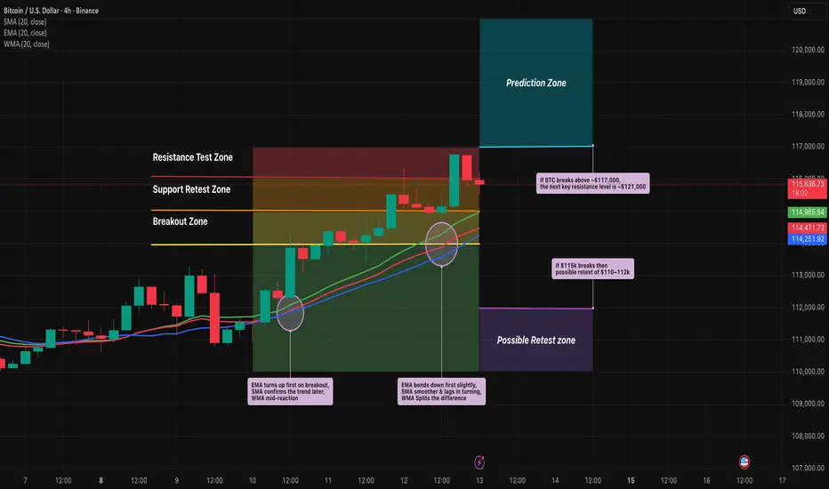
📊 Chart Explanation
On BTCUSD 4H:
EMA (red) bent upward first during the $114k breakout, SMA (blue) confirmed later, and WMA (green) sat between them.
At the $115k retest, EMA dipped first, while SMA lagged.
At $116.5–117k resistance, EMA whipsawed but SMA stayed smoother.
Notice how these differences become clear during sharp pullbacks, quick rallies, and sideways ranges.
___________________________________________________________
👀 Observation
EMA is quick but noisy ⚡, SMA is calm but late 🕰️, WMA strikes a middle ground ⚖️.
___________________________________________________________
❗ Why It Matters?
Choosing the right moving average impacts how quickly you spot entries, confirm trends, and manage stop-losses. Understanding the differences helps traders adapt strategies to both trending and sideways markets.
___________________________________________________________
🎯 Conclusion
No single moving average is “best.” Each serves a purpose depending on the timeframe and style of trading. The key is consistency — choose one that aligns with your plan, test it, and apply it with discipline.
👉 Which one do you prefer in your trading — EMA, SMA, or WMA?
___________________________________________________________
⚠️ Disclaimer
📘 For educational purposes only ·
🙅 Not SEBI registered ·
❌ Not a buy/sell recommendation ·
🧠 Purely a learning resource ·
📊 Not Financial Advice
Indicators
Impact of Rupee-Dollar Exchange Rate on Indian StocksIntroduction
The stock market is a complex system where numerous factors—both domestic and global—interact to determine price movements. One such crucial factor is the exchange rate between the Indian Rupee (INR) and the US Dollar (USD). The Rupee-Dollar exchange rate plays a vital role because the US Dollar is the world’s reserve currency, the primary medium of global trade, and a benchmark for financial transactions worldwide.
In India, the economy is deeply interconnected with global trade, capital flows, and financial markets. Any change in the value of the Rupee against the Dollar has wide-ranging implications on businesses, investors, and the stock market. Companies that import raw materials or export finished goods, sectors like Information Technology (IT), Pharmaceuticals, Oil & Gas, Banking, Aviation, and even Foreign Institutional Investors (FIIs), are directly influenced by these fluctuations.
This essay explores in detail how the Rupee-Dollar exchange rate impacts Indian stocks, covering the theoretical background, sectoral influences, investor behavior, macroeconomic effects, and real-world case studies.
Understanding the Rupee-Dollar Exchange Rate
The exchange rate refers to how much one unit of a currency is worth in terms of another. In India, the exchange rate most closely tracked by investors is INR/USD—the number of Rupees required to buy one US Dollar.
If 1 USD = ₹80, it means that importing something worth $1 will cost ₹80 in India.
If the Rupee depreciates (falls in value), say 1 USD = ₹85, imports become more expensive, but exporters receive more Rupees for the same Dollar earnings.
If the Rupee appreciates (gains in value), say 1 USD = ₹75, imports become cheaper, but exporters earn fewer Rupees per Dollar.
This constant push-and-pull directly influences corporate profitability and, in turn, the stock market.
Why Does the Rupee Move Against the Dollar?
The exchange rate fluctuates due to a combination of domestic and global factors:
Demand & Supply of Dollars – If India imports more than it exports, demand for Dollars rises, weakening the Rupee.
Foreign Institutional Investment (FII) Flows – When FIIs invest in Indian equities, they bring in Dollars, strengthening the Rupee. Conversely, when they pull out, the Rupee weakens.
Interest Rate Differentials – Higher interest rates in the US attract global investors, increasing demand for Dollars.
Crude Oil Prices – India is heavily dependent on crude imports. Rising oil prices increase Dollar demand, weakening the Rupee.
Geopolitical Events – Wars, sanctions, and global economic slowdowns push investors toward the Dollar as a "safe haven."
Inflation & Growth Rates – Higher inflation in India compared to the US reduces the Rupee’s purchasing power.
These factors cause daily volatility in the Rupee-Dollar exchange rate, impacting stock prices.
The Link Between Exchange Rate and Stock Market
The Rupee-Dollar relationship influences stocks in three broad ways:
Corporate Earnings Impact – Companies that earn or spend in Dollars see changes in profitability.
Foreign Investor Behavior – FIIs track currency stability before investing in emerging markets like India.
Macroeconomic Sentiment – A stable Rupee improves confidence, while sharp depreciation raises concerns about inflation, current account deficit, and fiscal health.
Sector-Wise Impact of Rupee-Dollar Exchange Rate
1. Information Technology (IT) Sector
Indian IT companies like TCS, Infosys, Wipro, and HCL earn the majority of their revenue in Dollars by exporting software services to the US and Europe.
A weak Rupee is positive for IT stocks since they earn more Rupees for the same Dollar revenue.
Example: If Infosys earns $1 billion, at ₹80/USD revenue = ₹80,000 crore. If Rupee falls to ₹85/USD, revenue = ₹85,000 crore (without increasing actual Dollar earnings).
Impact: Rupee depreciation → IT stocks rally. Rupee appreciation → IT stocks face margin pressure.
2. Pharmaceutical Sector
Similar to IT, Pharma companies like Sun Pharma, Dr. Reddy’s, and Cipla export a large share of medicines to the US.
A weak Rupee boosts export revenues, but import costs (like Active Pharmaceutical Ingredients from China) may rise.
Impact: Net positive for export-oriented pharma firms, but mixed for those heavily dependent on imports.
3. Oil & Gas Sector
India imports over 80% of its crude oil needs, priced in Dollars.
A weak Rupee makes oil imports costlier, increasing input costs for companies like IOC, BPCL, HPCL.
This also impacts sectors like aviation, paints, fertilizers, and chemicals, which rely on crude derivatives.
Impact: Rupee depreciation hurts oil & gas and related sectors.
4. Aviation Industry
Airlines like IndiGo, SpiceJet, and Air India earn revenue in Rupees but pay for aircraft leases, maintenance, and fuel in Dollars.
A weak Rupee increases costs significantly, leading to lower margins.
Impact: Rupee depreciation is negative for aviation stocks.
5. Banking & Financial Services
Banks with significant foreign borrowings may face higher repayment costs when the Rupee falls.
However, if they hold Dollar assets, they benefit.
Investor sentiment in the financial sector often mirrors overall macroeconomic stability tied to currency movements.
6. Import-Oriented Companies
Sectors like electronics, automobiles, FMCG (raw materials), and chemicals rely on imports.
A weaker Rupee raises raw material costs, compressing margins unless passed on to consumers.
7. Export-Oriented Manufacturing
Sectors like textiles, gems & jewelry, and leather benefit from a weaker Rupee as global buyers pay in Dollars.
However, if raw materials are imported, the benefits get diluted.
Impact on Foreign Investors
Foreign Institutional Investors (FIIs) are among the biggest drivers of the Indian stock market.
Stable Rupee: Encourages FIIs to invest since currency risk is lower.
Weakening Rupee: Even if stock returns are strong, FIIs may lose money when converting Rupees back to Dollars.
Example: If Nifty rises 10% but the Rupee falls 8% against the Dollar, FIIs net only ~2% returns.
Sudden depreciation often triggers FII outflows, leading to stock market corrections.
Thus, exchange rate stability is as important as stock fundamentals in attracting foreign capital.
Macroeconomic Effects on Stock Market
Inflation: A weak Rupee increases import costs (oil, electronics, machinery), leading to inflation. High inflation reduces corporate margins and consumer demand, pressuring stocks.
Current Account Deficit (CAD): Higher import bills widen CAD, weakening investor confidence.
Government Fiscal Position: Subsidy burdens (fertilizers, fuel) rise with Dollar appreciation, impacting fiscal deficit and bond yields, indirectly affecting equities.
Monetary Policy: RBI may raise interest rates to defend the Rupee, impacting borrowing costs and stock valuations.
The Way Forward
India’s growing integration into the global economy ensures that the Rupee-Dollar dynamic will continue to influence stocks. Key trends to watch:
US Federal Reserve policies – Dollar movements globally.
Energy Transition – Reducing oil imports will lower currency vulnerability.
Boosting Exports – Government initiatives like PLI schemes strengthen export-led sectors.
RBI Interventions – Maintaining stability via forex reserves.
Conclusion
The Rupee-Dollar exchange rate is more than just a number—it’s a reflection of India’s economic health, trade balance, and global investor confidence. Its impact on the stock market is far-reaching:
Exporters like IT and Pharma gain from Rupee weakness.
Import-heavy sectors like oil, aviation, and FMCG suffer.
Investors—both domestic and foreign—adjust portfolios based on currency trends.
Macroeconomic stability is closely linked to exchange rate dynamics.
For stock market participants, understanding this relationship provides an edge in making informed investment decisions. In the long run, India’s structural reforms, increasing exports, and growing financial depth may reduce vulnerability to Rupee-Dollar volatility. Until then, every swing in the currency will continue to ripple across Dalal Street.
Opportunities in PSU Stocks1. Historical Context of PSU Stocks in India
PSUs were originally created with the objective of building India’s industrial and economic base after independence. Since the private sector lacked resources and experience in heavy industries, the government stepped in to build enterprises in key sectors:
Oil & Gas: ONGC, IOC, HPCL, BPCL
Banking & Finance: SBI, PNB, BoB, LIC
Power & Energy: NTPC, NHPC, Power Grid, SJVN
Metals & Mining: Coal India, NMDC, Hindustan Copper
Engineering & Infrastructure: BHEL, NBCC, IRCON, RITES
Defense: HAL, BEL, BDL, Mazagon Dock
Initially, PSUs were seen as the backbone of the economy. Over time, inefficiencies, overstaffing, and political interference reduced their competitive edge. Private sector companies began to outperform them. This led to a long period where PSU stocks underperformed compared to private companies.
However, recent changes in government strategy, digital reforms, capital market participation, and global commodity cycles have shifted the outlook.
2. Why PSU Stocks are Back in Focus
Several factors have brought PSU stocks back into investor interest:
(a) Attractive Valuations
For many years, PSU stocks traded at low price-to-earnings (P/E) multiples compared to private peers. This made them undervalued despite strong fundamentals. Recent re-rating has unlocked opportunities.
(b) High Dividend Yields
PSUs are known for distributing high dividends, as the government is the largest shareholder and depends on dividend income. Some PSU stocks give 4%–10% annual dividend yield, making them attractive for long-term investors.
(c) Government Reforms & Disinvestment
The government has actively promoted disinvestment and privatization (e.g., Air India’s sale, BPCL privatization plans). This increases efficiency, improves market perception, and boosts stock prices.
(d) Revival in Core Sectors
Energy demand, infrastructure growth, and defense modernization are boosting PSU earnings. For example, Power Grid benefits from rising electricity demand, while HAL and BEL gain from India’s defense indigenization push.
(e) Improved Corporate Governance
Many PSUs have adopted better transparency, digital systems, and profit-focused strategies, reducing inefficiency and improving investor confidence.
3. Opportunities Across Different PSU Sectors
3.1. Banking & Financial PSUs
Key Players: SBI, PNB, BoB, Canara Bank, LIC, GIC, REC, PFC
Opportunity:
Public sector banks have cleaned up their balance sheets after years of bad loans (NPAs).
Credit growth is rising as the Indian economy expands.
SBI, the country’s largest bank, has become a strong wealth creator.
LIC, the insurance giant, is expanding beyond traditional markets and can benefit from India’s growing insurance penetration.
NBFCs like REC and PFC benefit from power sector financing demand.
Why Attractive: PSU banks trade at lower valuations than private banks but are witnessing strong earnings growth.
3.2. Oil & Gas PSUs
Key Players: ONGC, IOC, BPCL, HPCL, GAIL, Oil India
Opportunity:
India is heavily dependent on oil & gas imports, making PSUs critical players.
Rising energy demand ensures long-term growth.
GAIL’s gas distribution and pipeline network is expanding with the government’s push for a gas-based economy.
Strategic privatization of BPCL can unlock massive value.
Why Attractive: High dividend yields, global energy price cycles, and government support.
3.3. Power & Energy PSUs
Key Players: NTPC, NHPC, Power Grid, SJVN, Coal India
Opportunity:
India’s power demand is growing rapidly due to urbanization and industrialization.
NTPC is expanding into renewable energy.
Power Grid is a monopoly in transmission with stable cash flows.
Coal India benefits from being the largest coal producer in the world.
Why Attractive: Stable earnings, strong dividend payouts, and long-term demand visibility.
3.4. Defense PSUs
Key Players: HAL, BEL, BDL, Mazagon Dock, GRSE, Cochin Shipyard
Opportunity:
India is pushing for defense indigenization under the Atmanirbhar Bharat initiative.
Defense budget allocation is rising each year.
Export opportunities for Indian defense equipment are growing.
HAL and BEL are showing strong order books with multi-year growth visibility.
Why Attractive: Strategic importance, government support, and long-term contracts.
3.5. Infrastructure & Engineering PSUs
Key Players: BHEL, NBCC, IRCON, RITES, Engineers India
Opportunity:
India’s infrastructure push (roads, railways, housing, smart cities) benefits these companies.
IRCON and RITES are beneficiaries of railway modernization and export of rail technology.
NBCC plays a crucial role in government construction projects.
Why Attractive: Government-backed contracts, order book strength, and growth in infrastructure spending.
3.6. Metals & Mining PSUs
Key Players: NMDC, Hindustan Copper, MOIL, NALCO
Opportunity:
Commodity supercycles and rising demand for minerals (iron ore, copper, manganese, aluminum) benefit these PSUs.
NMDC is a low-cost iron ore producer, while NALCO is expanding aluminum production.
Electric vehicle (EV) growth increases demand for copper and aluminum.
Why Attractive: Global commodity upcycle, cost advantage, and strong government backing.
4. Key Strengths of PSU Stocks
Stable Business Models – Many PSUs enjoy monopolies or dominant positions in their industries.
Dividend Income – Attractive for long-term investors seeking passive income.
Government Support – Financial backing, bailout potential, and favorable policies.
Strategic Importance – PSUs play critical roles in defense, energy, and infrastructure.
Value Unlocking via Privatization – Upcoming privatizations can lead to stock re-rating.
5. Risks in PSU Stocks
While opportunities are strong, investors must be aware of risks:
Government Intervention – Policy decisions can affect profitability (e.g., fuel price controls for OMCs).
Competition from Private Sector – Private banks, energy companies, and defense startups pose challenges.
Global Commodity Price Volatility – Affects PSU metal, mining, and oil companies.
Disinvestment Delays – Political opposition or market conditions can slow privatization.
Efficiency Concerns – Despite improvements, some PSUs still face bureaucratic inefficiencies.
6. Investment Strategies in PSU Stocks
Dividend Investing – Focus on high-yield PSU stocks like Coal India, NTPC, Power Grid.
Value Investing – Buy undervalued PSUs trading at low P/E or P/B ratios.
Thematic Investing – Play sectors like defense indigenization (HAL, BEL) or renewable energy (NTPC, SJVN).
Disinvestment Opportunities – Monitor privatization candidates for potential re-rating.
Balanced Portfolio – Mix of stable dividend PSUs and growth-oriented defense/infra PSUs.
7. Outlook for PSU Stocks in India
The next decade could be transformational for PSU companies. Key trends driving growth:
India’s $5 trillion economy target will need massive energy, infrastructure, and defense spending.
Privatization push will unlock value and reduce inefficiencies.
Renewable energy expansion will benefit NTPC, NHPC, and SJVN.
Defense exports will grow as India becomes a global supplier.
Digitalization in PSU banks will improve competitiveness.
Foreign institutional investors (FIIs) and domestic investors are increasingly allocating capital to PSU stocks, indicating confidence in their long-term prospects.
Conclusion
PSU stocks in India are no longer “sleeping giants.” They have evolved into strong wealth-creating opportunities, backed by government reforms, improved efficiency, sectoral growth, and undervaluation compared to private peers.
Opportunities exist across multiple sectors: banking, energy, defense, infrastructure, and commodities. While risks remain in terms of government interference and competition, the overall outlook is positive.
For long-term investors, PSU stocks offer a unique combination of dividend income, stability, and growth potential. With India’s economic rise, PSU stocks can play a central role in wealth creation for investors who are willing to stay patient and selective.

HOW-TO use the Rainbow Indicator? (full guide)Below is a complete instruction on how to use the Rainbow Indicator along with examples. This indicator is an important facet of my decision-making system because it allows me to answer two important questions:
- At what price should I make a trade with the selected shares?
- In what volume?
Part 1: Darts Set
My concept of investing in stocks is buying great companies during a sell-off . Of course, this idea is not unique. One way or another, this was said by the luminaries of value investing – Benjamin Graham and Warren Buffett. However, the implementation of this concept may vary depending on the preferences of each investor.To find great companies, I use the Fundamental strength indicator , and to plan opening and closing positions I use the Rainbow indicator.
To begin your acquaintance with the Rainbow Indicator, I would like to invite you to take part in a mental experiment. Imagine two small rooms for a game of darts. Each room has a different target hanging in it. It can be anywhere: center, left, right, bottom, or top.
Target #1 from the first room looks like a small red circle.
Target #2 from the second room looks like a larger red circle.
You get a reward for hitting the target, calculated according to the following principle: the smaller the target in relation to the wall surface, the greater the reward you get.
You have 100 darts in your hand, that is 100 attempts to hit the target. For each attempt, you pay $10. So to play this unusual game of darts, you take with you $1,000. Now, the most important condition is that you play in absolute darkness . So you don't know exactly what part of the wall the target is hanging in, so all your years of darts practice don't matter here.
The question is: Which room will you choose?
This is where you begin to think. Since your skills and experience are almost completely untapped in this game, all of your attempts to hit a target will be random. This is a useful observation because it allows you to apply the theory of probability. The password is Jacob Bernoulli. This is the mathematician who derived the formula by which you can calculate the probability of a successful outcome for a limited number of attempts.
In our case, a successful outcome is a dart hitting the target as many times as necessary in order to, at least, not lose anything. In the case of Target #1, it is one hit or more. In the case of Target 2, it is 10 hits or more.
The probability of hitting Target #1 is 1/100 or 1% (since the target area occupies 1% of the wall area).
The probability of hitting Target #2 is 10/100 or 10% (since the target area occupies 10% of the wall area).
The number of attempts is equal to the number of darts - 100.
Now we have all the data to calculate.
So, Bernoulli's formula :
According to this formula:
- The probability of one or more hits on Target #1 is 63% (out of 100%).
- The probability of ten or more hits on Target #2 is 55% (out of 100%).
You may say, "I think we should go to the first room". However, take your time with this conclusion because it is interesting to calculate the probability of not hitting the target even once, i.e., losing $1,000.
We calculate using the same formula:
- The probability of not hitting Target #1 is 37% (out of 100%).
- The probability of not hitting Target #2 is 0.0027% (out of 100%).
If we calculate the ratio of the probability of a successful outcome to the probability of losing the whole amount, we get:
- For the first room = 1.7
- For the second room = 20370
You know, I like the second room better.
This mental experiment reflects my approach to investing in stocks. The first room is an example of a strategy where you try to find the perfect entry point - to buy at a price below which the stock will not fall. The second room reflects an approach where you're not chasing a specific price level, but thinking in price ranges. In both cases, you'll have plenty of attempts, but in the first room, the risk of losing everything is much greater than in the second room.
Now let me show you my target, which is a visual interpretation of the Rainbow Indicator.
It also hangs on the wall, in absolute darkness, and only becomes visible after I have used all the darts. Before the game starts, I announce the color where I want to go. The probability of hitting decreases from blue to green, and then to orange and red. That is, the smaller the color area, the less likely it is to successfully hit the selected color. However, the size of the reward also increases according to the same principle - the smaller the area of color, the greater the reward.
Throwing a dart is an attempt to close a position with a profit.
Hitting the selected color is a position closed with a profit.
Missing the selected color means the position is closed at a loss.
Now imagine that in the absolutely dark room where I am, I have a flashlight. Thanks to it, I have the opportunity to see in which part of the wall the target is located. This gives me a significant advantage because now I throw darts not blindly, but with a precise understanding of where I am aiming. Light shining on the wall increases the probability of a successful outcome, which can also be estimated using the Bernoulli formula.
Let's say I have 100 darts in my hands, that is, one hundred attempts to hit the chosen target. The probability of a dart hitting a red target (without the help of a flashlight) is 10%, and with the help of a flashlight, for example, 15%. That is, my ability to throw darts improves the probability of hitting the target by 5%. For hitting the red target, I get $100, and for each throw I pay $10. In this case, the probability of hitting the red target ten or more times is 94.49% (out of 100%) versus 55% (out of 100%) without a flashlight. In other words, under these game conditions and the assumptions made, if I try all 100 darts, the probability of recouping all my expenses will be 94.49% if I aim only at the red target.
In my decision-making system, such a "flashlight" is the Fundamental strength indicator, dynamics of cash flows, the P/E ratio and the absence of critical news. And the darts set (target and darts) is a metaphor for the Rainbow Indicator. However, please note that all probabilities of positive outcomes are assumptions and are provided only for the purpose of example and understanding of the approach I have chosen. Stocks of public companies are not a guaranteed income instrument, nor are any indicators associated with them.
Part 2: Margin of safety
The idea to create the Rainbow Indicator came to me thanks to the concept of "margin of safety" coined by the father of value investing, Benjamin Graham. According to his idea, it is reasonable to buy shares of a company only when the price offered by the market is lower than the "intrinsic value" calculated based on financial statements. The value of this difference is the "margin of safety". At the same time, the indicator does not copy Graham's idea but develops it relying on my own methodology.
So, according to Graham, the "margin of safety" is a good discount to the intrinsic value of the company. That is, if a company's stock is trading at prices that are well below the company's intrinsic value (on a per-share basis), it's a good opportunity to consider buying it. In this case, you will have a certain margin of safety in case the company is in financial distress and its stock price goes down. Accordingly, the greater the discount, the better.
When it comes to the intrinsic value of a company, there are many approaches to determining it - from calculating the Price-to-book value financial ratio to the discounted cash flow method. As for my approach, I don’t try to find the coveted intrinsic value/cost, but I try to understand how fundamentally strong the company in front of me is, and how many years it will take to pay off my investment in it.
To decide to buy shares, I use the following sequence of actions:
- Determining fundamental strength of a company and analysis of cash flows using the Fundamental Strength Indicator.
- Analysis of the recoupment period of investments using P/E ratio .
- Analysis of critical news .
- Analysis of the current price using Rainbow Indicator.
To decide to sell shares, I use:
- Analysis of the current price using Rainbow Indicator.
- Or The Rule of Replacement of Stocks in a Portfolio .
- Or Force majeure Position Closing Rule .
Thus, the Rainbow indicator is always used in tandem with other indicators and analysis methods when buying stocks. However, in the case of selling previously purchased shares, I can only use the Rainbow indicator or one of the rules that I will discuss below. Next, we will consider the methodology for calculating the Rainbow Indicator.
Indicator calculation methodology
The Rainbow indicator starts with a simple moving average of one year (this is the thick red line in the center). Hereinafter, a year will mean the last 252 trading days.
Applying a moving average of this length - is a good way to smooth out sharp price fluctuations which can happen during a year as much as possible, keeping the trend direction as much as possible. Thus, the moving average becomes for me the center of fluctuations of the imaginary pendulum of the market price.
Then the deviations are calculated from the center of fluctuations. To achieve this, a certain number of earnings per share is subtracted from and added to the moving average. This is the diluted EPS of the last year.
Deviations with a "-" sign from the Lower Rainbow of four colors:
- The Blue Spectrum of the Lower Rainbow begins with a deflection of -4 EPS and ends with a deflection of -8 EPS.
- The Green Spectrum of the Lower Rainbow begins with a deflection of -8 EPS and ends with a deflection of -16 EPS.
- The Orange Spectrum of the Lower Rainbow begins with a deflection of -16 EPS and ends with a deflection of -32 EPS.
- The Red Spectrum of the Lower Rainbow begins with a deflection of -32 EPS and goes to infinity.
The Lower Rainbow is used to determine the price ranges that can be considered for buying stocks. It is in the spectra of the Lower Rainbow that the very "margin of safety" according to my methodology is located. The Lower Rainbow has the boundaries between the spectra as a solid line . And only the Red Spectrum of the Lower Rainbow has only one boundary.
Deviations with a "+" sign from the Upper Rainbow of four similar colors:
- The Red Spectrum of the Upper Rainbow begins with a deflection of 0 EPS and ends with a deflection of +4 EPS.
- The Orange Spectrum of the Upper Rainbow begins with a deflection of +4 EPS and ends with a deflection of +8 EPS.
- The Green Spectrum top rainbow begins with a deflection of +8 EPS and ends with a deflection of +16 EPS.
- The Blue Spectrum of the Upper Rainbow begins with a deflection of +16 EPS and goes to infinity.
The Upper Rainbow is used to determine the price ranges that can be considered for selling stocks already purchased. The top rainbow has boundaries between the spectra in the form of crosses . And only the Blue Spectrum of the Upper Rainbow has only one boundary.
The presence of the Empty Area (the size of 4 EPS) above the Lower Rainbow creates some asymmetry between the two rainbows - the Lower Rainbow looks wider than the Upper Rainbow. This asymmetry is deliberate because the market tends to fall much faster and deeper than it grows . Therefore, a wider Lower Rainbow is conducive to buying stocks at a good discount during a period of massive "sell-offs".
The situation when the Lower Rainbow is below the center of fluctuations (the thick red line) and the Upper Rainbow is above the center of fluctuations is called an Obverse . It is only possible to buy a stock in an Obverse situation.
The situation when the Lower Rainbow is above the center of fluctuations and the Upper Rainbow is below the center of fluctuations is called Reverse . In this situation, the stock cannot be considered for purchase , according to my approach.
Selling a previously purchased stock is possible in both situations: Reverse and Obverse. After loading the indicator, you can see a hint next to the closing price - Reverse or Obverse now.
Because the size of the deviation from the center of fluctuation depends on the size of the diluted EPS, several important conclusions can be made:
- The increase in the width of both rainbows in the Obverse situation tells me about the growth of profits in the companies.
- The decrease in the width of both rainbows in the Obverse situation tells me about a decrease in profits in the companies.
- The increase in the width of both rainbows in the Reverse situation tells me about the growth of losses in the companies.
- The decrease in the width of both rainbows in the Reverse situation tells me about the decrease in losses in the companies.
- The higher the company's level of profit, the larger my "margin of safety" should be. This will provide the necessary margin of safety in the event of a transition to a cycle of declining financial results. The corresponding width of the Lower Rainbow will just create this "reserve".
- The growth in profit in the company (after buying its shares) will allow me to stay in the position longer due to the expansion of the Upper Rainbow.
- A decrease in profit in the company (after buying its shares) will allow me to close the position faster due to the narrowing of the Upper Rainbow.
So the Rainbow indicator shows me a price range that can be considered for purchase if all the necessary conditions are met. By being in this price range, my investment will have a certain margin of safety or "margin of safety." It will also tell me when to exit a stock position based on the company's earnings analysis.
Part 3: Crazy Mr. Market
The Fundamental strength of a company influences the long-term price performance of its shares. This is a thesis that I believe in and use in my work. A company that does not live in debt and quickly converts its goods or services into money will be appreciated by the market. This all sounds good, you say, but what should an investor do who needs to decide here and now? Moreover, one has to act in conditions of constant changes in market sentiment. Current talk about the company's excellent prospects can be replaced by a pessimistic view of it literally the next day. Therefore, the stock price chart of any companies, regardless of its fundamental strength, can resemble the chaotic drawings of preschool children.
Working with such uncertainty required me to develop my own attitude towards it. Benjamin Graham's idea of market madness was of invaluable help to me in this. Imagine that the market is your business partner, "Mr. Market". Every day, he comes to your office to check in and offer you a deal with shares of your mutual companies. Sometimes he wants to buy your share, sometimes he intends to sell his. And each time he offers a price at random, relying only on his intuition. When he is in a panic and afraid of everything, he wants to get rid of his shares. When he feels euphoria and blind faith in the future, he wants to buy your share. This is how crazy your partner is.
Why is he acting like this? According to Graham, this is how all investors behave who do not understand the real value/cost of what they own. They jump from side to side and do it with the regularity of a "maniac" every day. The smart investor's job is to understand the fundamental value of your business and just wait for the next visit from crazy Mr. Market. If he panics and offers to buy his stocks at a surprisingly low price, take them and wish him luck. If he begs you to sell him stocks and quotes an unusually high price, sell them and wish him luck. The Rainbow indicator is used to evaluate these two poles.
Now let's look at the conditions of opening and closing a position according to the indicator.
So, the Lower Rainbow has four differently colored spectra: blue, green, orange, and red. Each one highlights the desired range of prices acceptable for buying in an Obverse situation. The Blue Spectrum is upper regarding the Green Spectrum, and the Green Spectrum is lower regarding the Blue Spectrum, etc.
- If the current price is in the Blue Spectrum of the Lower Rainbow, that is a reason to consider that company for buying the first portion (*) of the stock.
- If the current price has fallen below (into the Green Spectrum of the Lower Rainbow), that is a reason to consider this company to buy a second portion of the stock.
- If the current price has fallen below (into the Orange Spectrum of the Lower Rainbow), it is a reason to consider this company to buy a third portion of the stock.
- If the current price has fallen below (into the Red Spectrum of the Lower Rainbow), that is a reason to consider that company to buy a fourth portion of the stock.
(*) The logic of the Rainbow Indicator implies that no more than 4 portions of one company's stock can be purchased. One portion refers to the number of shares you can consider buying at the current price (depending on your account size and personal diversification ratio - see information below).
The Upper Rainbow also has four differently colored spectra: blue, green, orange, and red. Each of them highlights the appropriate range of prices acceptable for closing an open position.
- If the current price is in the Red Spectrum of the Upper Rainbow, I close one portion of an open position bought in the Red Spectrum of the Lower Rainbow.
- If the current price is in the Orange Spectrum of the Upper Rainbow, I close one portion of an open position bought in the Orange Spectrum of the Lower Rainbow.
- If the current price is in the Green Spectrum of the Upper Rainbow, I close one portion of an open position bought in the Green Spectrum of the Lower Rainbow.
- If the current price is in the Blue Spectrum of the Upper Rainbow, I close one portion of an open position bought in the Blue Spectrum of the Lower Rainbow.
This position-closing logic applies to both the Obverse and Reverse situations. In both cases, the position is closed in portions in four steps. However, there are 3 exceptions to this rule when it is possible to close an entire position in whole rather than in parts:
1. If there is a Reverse situation and the current price is above the thick red line.
2.if I decide to invest in another company and I do not have enough free finances to purchase the required number of shares (Portfolio Replacement Rule).
3. If I learn of events that pose a real threat to the continued existence of the companies (for example, filing for bankruptcy), I can close the position earlier, without waiting for the price to fall into the corresponding Upper Rainbow spectrum (Force majeure Position Closing Rule).
So, the basic scenario of opening and closing a position assumes the gradual purchase of shares in 4 stages and their gradual sale in 4 stages. However, there is a situation where one of the stages is skipped in the case of buying shares and in the case of selling them. For example, because the Fundamental Strength Indicator and the P/E ratio became acceptable for me only at a certain stage (spectrum) or the moment was missed for a transaction due to technical reasons. In such cases, I buy or sell more than one portion of a stock in the spectrum I am in. The number of additional portions will depend on the number of missed spectra.
For example, if I have no position in the stock of the company in question, all conditions for buying the stock have been met, and the current price is in the Orange Spectrum of the Lower Rainbow, I can buy three portions of the stock at once (for the Blue, Green, and Orange Spectrum). I will sell these three portions in the corresponding Upper Rainbow spectra (orange, green, and blue). However, if, for some reason, the Orange Spectrum of the Upper Rainbow was missed, and the current price is in the Green Spectrum - I will sell two portions of the three (in the Green Spectrum). I will sell the last, third portion only when the price reaches the Blue Spectrum of the Upper Rainbow.
The table also contains additional information in the form of the current value of the company's market capitalization and P/E ratio. This allows me to use these two indicators within one indicator.
Returning to the madness of the market, I would like to mention that this is a reality that cannot be fought, but can be used to achieve results. To get a sense of this, I will give an example of one of the stereotypes of an investor who uses fundamental analysis in his work.His thinking might be: If I valued a company on its financial performance and bought it, then I should stay in the position long enough to justify my expenses of analysis. In this way, the investor deliberately deprives himself of flexibility in decision-making. He will be completely at a loss if the financial performance starts to deteriorate rapidly and the stock price starts to decline rapidly. It is surprising that the same condition will occur in the case of a rapid upward price movement. The investor will torment himself with the question "what to do?" because I just bought stocks of this company, expecting to hold them for the long term. It is at moments like these that I'm aware of the value of the Rainbow Indicator. If it is not a force majeure or a Reverse situation, I just wait until the price reaches the Upper Rainbow. Thus, I can close the position in a year, in a month or in a few weeks. I don't have a goal to hold an open position for a long time, but I do have a goal to constantly adhere to the chosen investment strategy.
Part 4: Diversification Ratio
If the price is in the Lower Rainbow range and all other criteria are met, it is a good time to ask yourself, "How many shares to buy?" To answer this question, I need to understand how many companies I plan to invest in. Here I adhere to the principle of diversification - that is, distributing investments between the shares of several companies. What is this for? To reduce the impact of any company on the portfolio as a whole. Remember the old saying: don't put all your eggs in one basket. Like baskets, stocks can fall and companies can file for bankruptcy and leave the exchange. In this regard, diversification is a way to avoid losing capital due to investing in only one company.
How do I determine the minimum number of companies for a portfolio? This amount depends on my attitude towards the capital that I will use to invest in stocks. If I accept the risk of losing 100% of my capital, then I can only invest in one company. It can be said that in this case there is no diversification. If I accept the risk of losing 50% of my capital, then I should invest in at least two companies, and so on. I just divide 100% by the percentage of capital that I can safely lose. The resulting number, rounded to the nearest whole number, is the minimum number of companies for my portfolio.
As for the maximum value, it is also easy to determine. To achieve this, you need to multiply the minimum number of companies by four (this is how many spectra the Lower or Upper Rainbow of the indicator contains). How many companies I end up with in my portfolio will depend on from this set of factors. However, this amount will always fluctuate between the minimum and maximum, calculated according to the principle described above.
I call the maximum possible number of companies in a portfolio the diversification coefficient. It is this coefficient that is involved in calculating the number of shares needed to be purchased in a particular spectrum of the Lower Rainbow. How does this work? Let's go to the indicator settings and fill in the necessary fields for the calculation.
+ Cash in - Cash out +/- Closed Profit/Loss + Dividends - Fees - Taxes
+Cash in - the number of finances deposited into my account
-Cash out - the number of finances withdrawn from my account
+/-Closed Profit/Loss - profit or loss on closed positions
+Dividends - dividends received on the account
-Fees - broker and exchange commission
-Taxes - taxes debited from the account
Diversification coefficient
The diversification coefficient determines how diversified I want my portfolio to be. For example, a diversification coefficient of 20 means that I plan to buy 20 share portions of different companies, but no more than 4 portions per company (based on the number of Lower Rainbow spectra).
The cost of purchased shares of this company (fees excluded)
Here, I specify the amount of already purchased shares of the company in question in the currency of my portfolio. For example, if at this point, I have purchased 1000 shares at $300 per share, and my portfolio is expressed in $, I enter - $300,000.
The cost of all purchased shares in the portfolio (fees excluded)
Here, I enter the amount of all purchased shares for all companies in the currency of my portfolio (without commissions spent on the purchase). This is necessary to determine the amount of available funds available to purchase shares.
After entering all the necessary data, I move on to the checkbox, by checking which I confirm that the company in question has successfully passed all preliminary stages of analysis (Fundamental strength indicator, P/E ratio, critical news). Without the check, the calculation is not performed. This is done intentionally because the use of the Rainbow Indicator for the purpose of purchasing shares is possible only after passing all the preliminary stages. Next, I click "Ok" and get the calculation in the form of a table on the left.
Market Capitalization
The value of a company's market capitalization, expressed in the currency of its stock price.
Price / EPS Diluted
Current value of the P/E ratio.
Free cash in portfolio
This is the amount of free cash available to purchase stocks. Please note that the price of the stock and the funds in your portfolio must be denominated in the same currency. On TradingView, you can choose which currency to display the stock price in.
Cash amount for one portion
The amount of cash needed to buy one portion of a stock. This depends on the diversification ratio entered. If you divide this value + Cash in - Cash out +/- Closed Profit/Loss + Dividends - Fees - Taxes by the diversification coefficient, you get Cash amount for one portion .
Potential portions amount
Number of portions, available for purchase at the current price. It can be a fractional number.
Cash amount to buy
The amount of cash needed to buy portions available for purchase at the current price.
Shares amount to buy
Number of shares in portions available for purchase at the current price.
Thus, the diversification ratio is a significant parameter of my stocks' investment strategy. It shows both the limit on the number of companies and the limit on the number of portions for the portfolio. It also participates in calculating the number of finances and shares to purchase at the current price level.
Changing the diversification coefficient is possible already during the process of investing in stocks. If my capital ( + Cash in - Cash out +/- Closed Profit/Loss + Dividends - Fees - Taxes ) has changed significantly (by more than Cash amount for one portion ), I always ask myself the same question: "What risk (as a percentage of capital) is acceptable for me now?" If the answer involves a change in the minimum number of companies in the portfolio, then the diversification ratio will also be recalculated. Therefore, the number of finances needed to purchase one portion will also change. We can say that the diversification ratio controls the distribution of finances among my investments.
Part 5: Prioritization and Exceptions to the Rainbow Indicator Rules
When analyzing a company and its stock price using the Fundamental Strength Indicator and the Rainbow Indicator, a situation may arise where all the conditions for buying are met in two or more companies. At the same time, Free cash in the portfolio does not allow me to purchase the required number of portions from different companies. In that case, I need to decide which companies I will give priority to.
To decide, I follow the following rules:
1. Priority is given to companies from the top-tier sector group (how these groups are defined is explained in this article ). That is, the first group prevails over the second, and the second over the third. These companies must also meet the purchase criteria described in Part 2.
2. If after applying the first rule, two or more companies have received priority, I look at the value of the Fundamental Strength Indicator. Priority is given to companies that have a fundamental strength of 8 points or higher. They must also be within two points of the leader in terms of fundamental strength. For example, if a leader has a fundamental strength of 12 points, then the range under consideration will be from 12 to 10 points.
3. If, after applying the second rule, two or more companies received priority, I look at which spectrum of the Lower Rainbow the current price of these companies is in. If a company's stock price is on the lower end of the spectrum, I give it priority.
4. If, after applying the third rule, two or more companies have received priority, I look at the P/E ratio. The Company with the lower P/E ratio gets priority.
After applying these four rules, I get the company with the highest priority. This is the company that wins the fight for my investment. To figure out the next priority to buy, I repeat this process over and over again to use up all the money I have allocated for investing in stocks.
The second part of the guide mentioned two rules that I use when deciding whether to close positions:
- The Rule for replacing shares in a portfolio.
- Force majeure position closure Rule.
They take priority over the Rainbow Indicator. This means that the position may be closed even if the Rainbow indicator does not signal this. Let's consider each rule separately.
Portfolio stock replacement Rule
Since company stocks are not an asset with a guaranteed return, I can get into a situation where the position is open for a long time without an acceptable financial result. That is, the price of the company's shares is not growing, and the Rainbow indicator does not signal the need to sell shares. In this case, I can replace the problematic companies with a new one. The criteria for a problem company are:
- 3 months have passed since the position was opened.
- Fundamental strength below 5 points.
- The width of both rainbows decreased during the period of holding the position.
To identify a new company that will take the place of the problematic one, I use the prioritization principle from this section. At the same time, I always consider this possibility as an option. The thing is that frequently replacing stocks in my portfolio is not a priority for me and is seen as a negative action. A new company would have to have really outstanding parameters for me to take advantage of this option.
Force majeure position closure Rule
If my portfolio contains stocks of a company that has critical news, then I can close the position without using the Rainbow Indicator. How to determine whether this news is critical or not is described in this article .
Part 6: Examples of using the indicator
Let’s consider the situation with NVIDIA Corporation stock (ticker - NVDA).
September 02, 2022:
Fundamental Strength Indicator - 11.46 (fundamentally strong company).
P/E - 39.58 (acceptable to me).
Current price - $136.47 (is in the Orange Spectrum of the Lower Rainbow).
Situation - Obverse.
There is no critical news for the company.
The basic conditions for buying this company's stock are met. The Rainbow Indicator settings are filled out as follows:
The table to the left of the Rainbow Indicator shows how many shares are possible to buy in the Orange Spectrum of Lower Rainbow at the current price = 10 shares. This corresponds to 2.73 portions.
To give you an example, I buy 10 shares of NVDA at $136.47 per share.
October 14, 2022:
NVDA's stock price has moved into the Red Spectrum of the Lower Rainbow.
The Fundamental Strength Indicator is 10.81 (fundamentally strong company).
P/E is 35.80 (an acceptable level for me).
Current price - $112.27 (is in the Red Spectrum of the Lower Rainbow).
Situation - Obverse.
There is no critical news for the company.
The basic conditions for buying this company's stock are still met. The Rainbow Indicator settings are populated as follows:
The table to the left of the Rainbow Indicator shows how many shares are possible to buy in the Lower Rainbow Red Spectrum at the current price (5 shares). This corresponds to 1.12 portions.
To give you an example, I buy 5 shares of NVDA at $112.27 per share. A total of 3.85 portions were purchased, which is the maximum possible number of portions at the current price level. The remainder in the form of 0.15 portions can be purchased only at a price level below $75 per share.
January 23, 2023:
The price of NVDA stock passes through the Red Spectrum of the Upper Rainbow and stops in the Orange Spectrum. As an example, I sell 5 shares bought in the Red Spectrum of the Lower Rainbow, for example at $180 per share (+60%). And also a third of the shares bought in the Orange Spectrum, 3 shares out of 10, for example at $190 a share (+39%). That leaves me with 7 shares.
January 27, 2023:
NVDA's stock price has continued to rise and has moved into the Green Spectrum of the Upper Rainbow. This is a reason to close some of the remaining 7 shares. I divide the 7 shares by 2 and round up to a whole number - that's 4 shares. For my example, I sell 4 shares at $199 a share (+46%). Now I am left with 3 shares of stock.
February 02, 2023:
The price of NVDA stock moves into the Blue Spectrum of the Upper Rainbow, and I close the remaining 3 shares, for example, at $216 per share (+58%). The entire position in NVDA stock is closed.
As you can see, the Fundamental Strength Indicator and the P/E ratio were not used in the process of closing the position. Decisions were made only based on the Rainbow Indicator.
As another example, let's look at the situation with the shares of Papa Johns International, Inc. (ticker PZZA).
November 01, 2017:
Fundamental Strength Indicator - 13.22 points (fundamentally strong company).
P/E - 21.64 (acceptable to me).
Current price - $62.26 (is in the Blue Spectrum of the Lower Rainbow).
Situation - Obverse.
There is no critical news for the company.
The basic conditions for buying shares of this company are met. The settings of the Rainbow Indicator are filled as follows:
The table to the left of the Rainbow Indicator shows how many shares are possible to buy in the Lower Rainbow Blue Spectrum at the current price - 8 shares. This corresponds to 1 portion.
To give you an example, I buy 8 shares of PZZA at a price of $62.26.
August 8, 2018:
PZZA's share price has moved into the Green Spectrum of the Lower Rainbow.
The Fundamental Strength Indicator is a 9.83 (fundamentally strong company).
P/E is 16.07 (an acceptable level for me).
Current price - $38.94 (is in the Green Spectrum of the Lower Rainbow).
Situation - Obverse.
There is no critical news for the company.
The basic conditions for buying shares of this company are still met. The Rainbow Indicator settings are populated as follows:
The table to the left of the Rainbow Indicator shows how many shares are possible to buy in the Lower Rainbow Green Spectrum at the current price - 12 shares. This corresponds to 0.93 portions.
To give you an example, I buy 12 shares of PZZA at a price of $38.94. A total of 1.93 portions were purchased.
October 31, 2018:
PZZA's stock price moves into the Upper Rainbow Red Spectrum and is $54.54 per share. Since I did not have any portions purchased in the Lower Rainbow Red Spectrum, there is no closing part of the position.
February 01, 2019:
After a significant decline, PZZA's stock price moves into the Orange Spectrum of the Lower Rainbow at $38.51 per share. However, I am not taking any action because the company's Fundamental Strength on this day is 5.02 (a fundamentally mediocre company).
March 27, 2019:
PZZA's stock price passes the green and Blue Spectrum of the Upper Rainbow. This allowed to close the previously purchased 12 shares, for example, at $50 a share (+28%) and 8 shares at $50.38 a share (-19%).
Closing the entire position at once was facilitated by a significant narrowing in both rainbows. As we now know, this indicates a decline in earnings at the company.
In conclusion of this instruction, I would like to remind you once again that any investment is associated with risk. Therefore, make sure that you understand all the nuances of the indicators before using them.
Mandatory requirements for using the indicator:
- Works only on a daily timeframe.
- The indicator is only applicable to shares of public companies.
- Quarterly income statements for the last year are required.
- An acceptable for your P/E ratio is required to consider the company's stock for purchase.
- The Rainbow Indicator only applies in tandem with the Fundamental Strength Indicator. To consider a company's stock for purchase, you need confirmation that the company is fundamentally strong.
What is the value of the Rainbow Indicator?
- Clearly demonstrates a company's profit and loss dynamics.
- Shows the price ranges that can be used to open and close a position.
- Considers the principle of gradual increase and decrease in a position.
- Allows calculating the number of shares to be purchased.
- Shows the current value of the P/E ratio.
- Shows the current capitalization of the company.
Risk disclaimer
When working with the Rainbow Indicator, keep in mind that the release of the Income statement (from which diluted EPS is derived) occurs some time after the end of the fiscal quarter. This means that the new relevant data for the calculation will only appear after the publication of the new statement. In this regard, there may be a significant change in the Rainbow Indicator after the publication of the new statement. The magnitude of this change will depend on both the content of the new statement and the number of days between the end of the financial quarter and the publication date of the statement. Before the publication date of the new statement, the latest actual data will be used for the calculations. Also, once again, please note that the Rainbow Indicator can only be used in tandem with the Fundamental Strength Indicator and the P/E ratio. Without these additional filters, the Rainbow Indicator loses its intended meaning.
The Rainbow Indicator allows you to determine the price ranges for opening and closing a position gradually, based on available data and the methodology I created. You can also use it to calculate the number of shares you can consider buying, considering the position you already have. However, this Indicator and/or its description and examples cannot be used as the sole reason for buying or selling stocks or for any other action or inaction related to stocks.

Trading indicators Trading indicators are mathematical formulas that give you a way to plot information on a price chart. This information can be used to identify possible signals, trends, and shifts in momentum. In simple terms, trading indicators can highlight when something might be happening.
Learn how to understand the concept of a stock trading indicator, how it affects your trading results and how to use to your benefit during day trading!
Volume Weighted Average Price (VWAP) ...
Bollinger Bands Trading Indicator. ...
Moving Average Convergence Divergence (MACD) ...
Fibonacci Trading Indicator. ...
Pivot Points.

What is Rsi Indicator What Is the Relative Strength Index (RSI)?
The relative strength index (RSI) is a momentum indicator used in technical analysis. RSI measures the speed and magnitude of a security's recent price changes to detect overvalued or undervalued conditions in the price of that security.
The RSI is displayed as an oscillator (a line graph) on a scale of zero to 100. The indicator was developed by J. Welles Wilder Jr. and introduced in his seminal 1978 book, New Concepts in Technical Trading Systems.
In addition to identifying overbought and oversold securities, the RSI can also indicate securities that may be primed for a trend reversal or a corrective pullback in price. It can signal when to buy and sell. Traditionally, an RSI reading of 70 or above indicates an overbought condition. A reading of 30 or below indicates an oversold condition.

Price Action vs Indicators : A Fresh PerspectivePrice Action vs Indicators: A Fresh Perspective
The comparison between price action and indicator trading has been a topic of debate for a long time. In this article, I aim to debunk some popular beliefs and provide traders with a new outlook on this ongoing argument.
1. Price Action is Better Than Indicators
Price action traders often claim that their method is superior. However, both price action and indicators rely on the same historical price data. The only difference lies in how this information is processed. Indicators apply a specific formula to the price data, but they do not alter what is seen on the charts. When interpreting price action, traders are essentially doing the same mental processing.
2. Indicators are Lagging – Price Action is Leading
Critics argue that indicators lag behind price action, but this misconception stems from a lack of understanding. Indicators utilize past price action based on their settings and display the results after applying a formula. Similarly, traders who analyze pure price patterns also examine past price action that has already moved away from potential entry points. Both methods rely on historical data and can be considered "lagging." To minimize lag, traders can adjust the indicator's time settings or analyze fewer past candlesticks. However, it's important to note that reducing data may result in less meaningful analysis.
3. Price Action is Simple and Better for Beginners
It is often believed that price action is simpler and more suitable for beginners. However, in trading, simplicity does not always equate to effectiveness. Both price action and indicator trading require a solid understanding and correct usage of the chosen tools. Personal preferences and how traders utilize their tools play a more significant role than the debate between price action and indicator trading.
In conclusion, the comparison between price action and indicators should not be seen as a competition between superiority and inferiority. Both methods have their merits and can be valuable tools for traders. It is crucial to grasp the underlying principles and use them appropriately to achieve success in the dynamic world of trading. So, choose wisely.
Thanks
Simranjit Singh Virdi

HOW-TO use the Fundamental Strength Indicator? (full guide)Below is the complete instruction on how to use the Fundamental Strength Indicator .
Part 1: The Fundamental Strength of the Company
To understand what it is for, let's imagine that you manage a long-distance running team, and you need to recruit a team of excellent athletes. However, you don’t even know the names of these athletes or their contract amounts. You only have information about their health and athletic performance: hemoglobin and iron content in the blood, maximal oxygen consumption, steps-per-minute rate, speed, age, etc. Each player has their own large table with different parameters. And you have, let’s say, a thousand tables like that.
If you spend 3 minutes studying one table, it will take you 50 hours to analyze all the tables, which is just over 2 days of continuous work. And how long would it take to compare each athlete with the rest? Approximately 2 years of continuous work.
This is obviously no good, that is why you take a computer, enter all the data from the tables and start thinking about how you can reduce the time to compare one athlete with another. As a result of your brainstorming, you come to the following conclusions:
— Each parameter has its range of values, which can give you an idea of whether an athlete is suitable or not suitable for a marathon.
— The parameter may have its dynamics: it may increase from month to month, stay the same, or decrease.
— Each parameter can be assigned a score.
For example, the step-per-minute rate can be:
— 175 and above (+1 point)
— 165–174 (0 points)
— 164 and below (-1 point)
And you do that with each parameter.
What are these points for? To convert indicators that use different units into one measurement system. Thanks to this method, you can now compare apples to oranges.
Then, you sum up all the points per month and get one single number — let's call it athletic strength. You like your thought process, and you apply this algorithm to every athlete’s table.
Now, instead of dozens of parameters per month, you have one number (athletic strength) for each athlete. It looks like your task has been dramatically simplified. Next, to study the dynamics of athletic strength from month to month, you “ask” your computer to create a plot for each of the athletes.
This chart shows that Athlete #1's athletic strength has fluctuated chaotically in the first three quarters of 2022, possibly due to the lack of regular training. But then you observe a positive trend, where athletic strength has grown from month to month. It seems like the athlete has taken up training.
Then, to compare one athlete with another, you “ask” your computer to add the average value of athletic strength over the past six months (average pre-competition training period) to the existing plot. Now, you can use the most average recent value as a weighted score of athletic strength and compare athletes with each other based on this value.
Thanks to this solution, you accelerate the analysis process by a magnitude: one athlete – one number. It appears that you can then simply sort the table by the highest athletic strength weighted score and consider the best athletes. However, not wanting to sort the table every time the data is updated or when you get new athletes, you make a better decision.
The logic behind the points system implies that there is a maximum and a minimum possible number of points that one athlete can get. This allows you to create ranges of scores for athletes with excellent, mediocre, and poor training.
For example, let’s say the maximum is 15 and the minimum is -15. Athletes with a score of 8 to 15 will be considered as strong, 1 to 7 – mediocre, and 0 to -15 – weak.
That’s it! Now, thanks to this gradation, you can simply check which range the weighted athletic strength falls within, and decide whether each athlete will be admitted to the team.
I believe that now your primary selection will take no more than one working day (including a lunch break).
Now let's mentally replace athletes with public companies. Instead of data on health and athletic performance, we will have data from the companies’ financial statements and financial ratios.
Applying a similar algorithm, we will get the fundamental strength of the company instead of athletic strength.
I think it's time to show the Fundamental Strength Indicator . Let's launch! What do we see?
— First, it is a Histogram with bars of three colors: green, orange, and red. The width of the histogram depends on the depth of data from the company statements. The more historical data, the wider the histogram over time.
The green color of the bars means that the company has been showing excellent financial results by the sum of the factors in that period. According to my terminology, the company has a “strong foundation” during this period. Green corresponds to values between 8 and 15 (where 15 is the maximum possible positive value on the sum of the factors).
The orange color of the bars means that according to the sum of factors during this period the company demonstrated mediocre financial results, i.e., it has a “mediocre foundation” . Orange color corresponds to values from 1 to 7.
The red color of the bars means that according to the sum of factors in this period of time, the company demonstrated weak financial results, i.e., it has a “weak foundation” . The red color corresponds to values from -15 to 0 (where -15 is the maximum possible negative value on the sum of factors).
— Second, this is the Blue Line , which is the moving average of the Histogram bars over the last year (*). Averaging over the year is necessary to obtain a weighted estimate that is not subject to medium-term fluctuations. It is by the last value of the blue line that the actual Fundamental Strength of the company is determined.
(*) The last year means the last 252 trading days, including the current trading day.
— Third, these are operating, investing, and financing Cash Flows expressed in Diluted net income. These flows look like thick green, orange, and red lines, respectively.
— Fourth, this is the Table on the left, which shows the latest actual value of the Fundamental Strength and Cash Flows.
Indicator settings:
In the indicator settings, I can disable the visibility of the Histogram, Blue Line, Cash Flows (each separately), and Table. It helps to study each of the parameters separately. It is also possible to change the color, transparency, and thickness of lines.
The movie Moneyball was released in 2011, where Brad Pitt plays the role of Billy Bean, the sports manager of the Oakland Athletics baseball team. With a small budget, he managed to assemble a high-scoring team based on the analysis of player performance. As a result, this approach was applied by other teams in the league, and Billy Bean received massive recognition from the professional community.
Part 2: Benchmark Business Model
One day, when I had already grasped the concept of the Fundamental Strength of a company, I was returning home from vacation. I was in a taxi and the driver was listening to an audiobook. As the drive took longer than an hour, I had nothing to do but listen to the story. I liked the content. It was a fictional novel with a plot centered around the main character named Alex Rogo. He is a manager of one of the three enterprises of the UniCo corporation.
Even though Alex spends all his time and energy on work, things are not going very well for the company: over the past six months, the company has only had losses. This leaves Alex's executives no choice but to give him an ultimatum: if he can’t radically improve the situation in three months, the enterprise will be shut down, and he will be left without a job. At the same time, Alex's wife is tired of her husband’s absence in her personal life, so she decides to leave him. Anyway, the story's beginning turned out to be very dramatic, and I wondered how Alex would cope with all this.
Luckily, in this stressful time, he meets his former physics teacher Jonah, who now consults companies regarding efficient production. Alex tells his old acquaintance about what’s going on and how he managed to increase labor productivity at the enterprise after purchasing new robots. However, the losses continue to hang over his head like the sword of Damocles.
After listening to Alex's story, Jonah wisely suggests that the problem with his enterprise lies in the management is concerned about anything but the main goal of their business, which is creating money or profit. Jonah explains to Alex that all management ideas related to expanding the sales market, using new technologies, or improving product quality can lead the company to a disaster if fundamental things are not considered. In his opinion, management should only focus on three indicators:
— Throughput , which is the rate at which a company makes money through sales.
— Inventory , which is all the money invested by the company in assets: premises, equipment, patents, raw materials, etc.: that is, in something that can then be sold.
— Operational expenses , which are all the money a company spends turning investments into cash, or something that can’t be sold, such as the salary of employees, the cost of rent, payment for delivery services, etc.
Thus, the management’s job is to make improvements that will ultimately lead to an increase in Throughput and a decrease in Inventory and Operational expenses.
For example, Alex’s purchase of robots to increase the number of products produced has led to an increase in production. However, suppose you look at it through the prism proposed by Jonah. In that case, we actually have the following picture: Inventory has increased, Operational expenses have not decreased (no one has been fired), and the robots can’t contribute to sales growth in any way (the Throughput is not increasing). As a result, this was not an improvement, but a deterioration.
The accumulation of such bad decisions eventually leads to the unprofitability of the company. Conversely, continuous improvements that will increase the Throughput and reduce Inventory and Operational expenses will inevitably lead to achieving the main goal – making money.
After I got home, I tried to find this book on the Internet. It turned out that it was written by physicist and philosopher Eliyahu M. Goldratt back in 1984. The novel is called The Goal .
That’s when I realized that if the company's management adheres to the approach described by Goldratt, then after a while, we will most likely see a fundamentally strong company. And the Fundamental Strength Indicator clearly shows how much the management has succeeded along this path.
For example, according to Goldratt, an increase in Throughput should lead to an increase in Earnings per share (EPS) and Total revenue . The reduction in Inventory may be linked with a decrease in Inventory to revenue ratio . Optimization of Operational expenses will definitely reduce the Operating expense ratio . All these parameters are considered when calculating the Fundamental Strength of the company.
So, let's move on to the methodology for calculating the Fundamental Strength Indicator.
The main idea that inspired me to create this indicator is: "Even if you buy just 1 share of a company, treat it like buying the whole business" . Guided by this approach, you can imagine what kind of business an investor is interested in owning and simultaneously determine the input parameters for calculating the indicator.
For me, a benchmark business is:
— A business that operates efficiently without diminishing the return on shareholders' investment. To assess the efficiency and profitability of a business, I use the following financial ratios(*): Diluted EPS and Return on Equity (ROE). The first two parameters for calculating the indicator are there.
— A business that scales sales and optimizes its costs. From this perspective, the following financial ratios are suitable: Gross margin, Operating expense ratio, and Total revenue. Plus three other metrics.
— A business that turns goods/services into cash quickly and does not fall behind on payments to suppliers. The following financial ratios will fit here: Days payable, Days sales outstanding, and Inventory to revenue ratio. These are three more metrics.
— A business that does not resort to significant accounts payable and shows financial strength. Here I use the following financial ratios: Current ratio, Interest coverage, and Debt to revenue ratio. These are the last three parameters.
(*) If you are keen to learn more about these financial ratios, I suggest reading my two articles on TradingView:
Financial ratios: digesting them together
What can financial ratios tell us?
Next, each of the parameters is assigned a certain number of points based on its last value or the position of that value relative to the annual maximum and minimum.
For example, if the Current ratio:
— greater than or equal to 2 (+1 point);
— less than or equal to 1 (-1 point);
— more than 1 but less than 2 (0 points).
Or for example, if Diluted EPS:
— near or above the annual high (+2 points);
— near the annual minimum and below (-2 points);
— between the annual maximum and minimum (0 points).
And so on with each of the parameters. As a result, the maximum number of points a company can score is 15 points. The minimum number of points a company can score is -15 points. These levels are marked with horizontal dotted lines: the green line is for the maximum value, and the red line is for the minimum.
I track the number of points for each day of a company's life on a three-color Histogram. The resulting average value for the last year is on the Blue Line. For me, it is the last value of the Blue Line that determines: this is the actual Fundamental Strength of the company.
As an additional filter, for example, when comparing two companies where all other conditions are equal: I use the dynamics of Cash Flows expressed in Diluted net income. These are the thick green, orange, and red lines over the Histogram.
Examples:
Below, I will evaluate various companies using the Fundamental Strength Indicator.
Tesla, Inc.
The indicator shows that since 2020, Tesla Inc. has been steadily increasing its Fundamental Strength (from 3.27 in Q1 2020 to 12.79 in Q1 2023). This is noticeable both by the color change of the Histogram from orange to green and by the rising Blue Line. If you look in detail at what has been happening with the financials during this time, it's clear what meaningful work the company has done. Revenues have almost quadrupled. Earnings per share have increased 134 times. At the same time, Total debt to revenue fell almost 10 times.
Keurig Dr Pepper Inc.
The company, formed in 2018 by the merger of Keurig Green Mountain and Dr Pepper Snapple Group, has failed to deliver outstanding financial results, causing its Fundamental Strength to fall from 4.63 in Q1 2018 to -0.53 in Q1 2023. During this period, the decline in diluted earnings per share was accompanied by higher debt and deteriorating liquidity.
Costco Wholesale Corporation
Wholesaler Costco has been surprisingly stable in its financial performance and with steady growth in both earnings and revenue. This is the reason the Histogram bars are exceptionally green throughout the calculation of the indicator. The Fundamental Strength has not changed in three years and is high at 11 points.
Part 3: Company Cash Flow Dynamics
The other day I came across an interesting article about the work of the Swiss company Glencore International AG in the 1990s. This company specializes in trading raw materials, and at that time it was actively trading with the countries that had left the USSR. None of those countries had foreign currency, and trust in local currencies had not yet appeared, so it was necessary to exchange commodities for commodities like in the Middle Ages. For example, to sell copper in Kazakhstan, a Swiss company bought raw sugar in Brazil, then took it to Ukraine for refining, then the refined sugar was exchanged for Siberian oil in Russia, then the oil was exchanged for copper ore in Mongolia, which was then sent to a plant in Kazakhstan to create copper suitable for sale on the world market. As we can see, money was used here only at the moment of purchase of raw sugar and sale of copper, the rest of the chain of transactions was an exchange of goods for goods. It turns out the following scheme:
Money - Raw sugar - Refined sugar - Oil - Copper ore - Copper - Money'
Of course, all of this made sense when Money' (with a stroke) equaled big money. Otherwise, the cost of preparing and executing such a complex transaction simply wouldn't have paid off.
This example once again convinced me how significant a role money plays in any company's operations. Can you imagine the chaos that a business can become without money and having to make up similar supply chains? Money simplifies and accelerates all processes in a company, so competent management of these flows is the basis of an effective business.
If you compare a company to a living organism, Cash Flow(*) is its circulatory system. It is thanks to this system that the company is supplied with everything it needs to produce goods or services.
(*) If you are keen to learn more about Cash Flows, I suggest reading my two articles on TradingView:
Cash flow statement or Three great rivers
Cash flow vibrations
Considering that cash flows play a fundamental role in the activity of any company, it is reasonable to assume that their analysis will give us the necessary information to decide.
For this reason, an additional parameter was added to the Fundamental Strength Indicator : the dynamics of Cash Flows expressed in Diluted net income(*).
(*) Since the value of income can be negative, the Diluted net income module is taken, that is, without the "minus" sign.
Why do I use income as a unit of measure of Cash Flows? Because it is a good way to make the scale of indicator values the same for companies from different countries, with different currencies. It also allows you to use a single value scale for both Cash Flows and Fundamental Strength.
So, let's take a look at how the dynamics of Cash Flows look like in the Fundamental Strength Indicator. These are three lines of different colors, which are located over the Histogram. Each of the flows corresponds to a specific color:
— Operating cash flow: green line;
— Investing cash flow: orange line;
— Financing cash flow: red line.
In this way, I can track the dynamics of the company's Cash Flow over time.
To interpret the dynamics of Cash Flows, I pay attention to the following patterns:
— How the cash flows are positioned in relation to each other;
— In which zone each of the cash flows is located: in the positive or negative;
— What is the trend of each of the cash flows;
— How volatile each of the cash flows is.
As an example, let's look at several companies to interpret the dynamics of their Cash Flows.
John B. Sanfilippo & Son, Inc.
This is the most ideal situation for me: operating cash flow (green line) is above the other cash flows, investment cash flow (orange line) is near zero and practically unchanged, and financial cash flow (red line) is consistently below zero. This picture shows that the company lives off its operating cash flow, does not increase its debt, does not spend a substantial amount of money on expensive purchases, and retains (does not sell off) assets.
Parker Hannifin Corporation
With stable operating cash flow (green line), the company implements investment programs by raising additional funding. This is noticeable due to an increase in financial cash flow (red line) and a simultaneous decrease in investment cash flow (orange line) with a significant deepening into negative areas. Apparently, there is not enough operating cash flow to realize the planned investments. One has to wonder how sustainable a company can be if it invests in its development using borrowed funds.
Schlumberger N. V.
The chaotic intertwining of cash flows outside the Fundamental Strength range (-15 to 15) is indicative of the company's rich life, but to me, it is an indicator of high riskiness of its actions. And as we can see, Fundamental Strength has only begun to strengthen in the last year, when the external appearance of cash flow has normalized.
Thus, when the Fundamental Strength of two companies is equally good, I use an additional filter in the form of Cash Flow dynamics. This helps me to clarify my interest in this or that company.
What is the value of the Fundamental Strength Indicator:
— allows for a quantitative assessment of a company's financial performance in points (from -15 to 15 points);
— allows you to visually track how the company's financial performance has changed (positively/negatively) over time;
— allows to visually trace the movement of main cash flows over time;
— accelerates the process of selecting companies for your shortlist (if you are focused on financial results when selecting companies);
— allows you to protect yourself from investing in companies with weak and mediocre fundamentals.
Mandatory requirements for using the indicator:
— works only on a daily timeframe;
— only applies to shares of public companies;
— company financial statements for the last 4 quarters and more are required;
— it is necessary to have the data from the Balance sheet, Income statement, and Cash flow statement, required for the calculation.
If at least one component required for calculating the Fundamental Strength is missing, the message "no data to calculate the Fundamental Strength correctly" is displayed. In the same case, but for the operating cash flow, the message "no data to calculate the Operating Cash Flow correctly" is shown, and similarly for other flows.
Risk disclaimer:
When working with the Fundamental Strength Indicator and the additional filter in the form of Cash Flows, you should understand that the publication of the Balance sheet, Income statement, and Cash flow statement takes place sometime after the end of the financial quarter. This means that new relevant data for the calculation will only appear after the publication of the new statements. In this regard, there may be a significant change in the values of the Indicator after the publication of new statements. The magnitude of this change will depend both on the content of the new statements and on the number of days between the end of the financial quarter and the publication date of the statements. Until the date of publication of the new statements, the latest relevant data will be used for calculations.
I would like to draw your attention to the fact that the calculation of Fundamental Strength and Cash Flows requires the availability of data for all parameters of the valuation model . It uses data that is exclusively available on TradingView (there is no reconciliation with other sources). If at least one parameter is missing, I switch to another company's analysis to continue using the indicator.
Thus, the Fundamental Strength Indicator and an additional filter in the form of Cash Flows make it possible to evaluate the financial results of the company based on the available data and the methodology I created. A simple visualization in the form of a three-color Histogram, a Blue line, and three thick Cash Flow lines significantly reduces the time for selecting fundamentally strong companies that fit the criteria of the selected model. However, this Indicator and/or its description and/or examples cannot be used as the sole reason for buying or selling stocks or for any other action or inaction related to stocks.

The most subjective facet of my decision-making systemIn the previous publication I started talking about my decision-making system. I use it when investing in stocks. This system allows me to answer three questions:
- which stocks to choose?
- at what price to make a trade?
- and in what quantity?
In this post, I will continue to answer the question Which stocks to pick? and tell you about another facet of my crystal.
As you can see, my decision-making system is quite formalized. What do I mean? It has clear criteria for which a company must be checked before investing in its stocks. If we go deeper into this idea, we can say that the state of affairs in any public company can be assessed using numbers from its statements and stock exchange prices for its stocks. All this can be visualized, put into a form that is readable for the investor, and accelerate the decision-making process many times over.
However, there is an area with information that hovers around the companies, directly or indirectly influences it, but is poorly formalized: this is News . News can be called a message related to a company and distributed through its website, media, and social networks. This message triggers an almost knee-jerk reaction among stock investors (and traders). They will try to interpret the information received, make a forecast, and in some cases even make a trade. It is for this reason that the moment the news is published is often accompanied by a sharp movement in the stock price and an increase in trading volume. The order book now has a lot more players than before. These are traders excited by the news, confident of what will happen next.
Here I can’t help but recall the allegory about Crazy Mister Market from Benjamin Graham. It presents the market as a partner who is constantly knocking on your door and offering you crazy ideas (stock prices). Where does this mister get his madness from? My answer is simple — from the news. Despite this, I cannot help but pay attention to the news, I cannot help but interpret it, to build predictions in my head. This happens reflexively, as a reaction to boiling water hitting my skin. However, will I make a trade under the influence of this information? We'll talk about this at the end of the post.
Let's find out what news is available and where to find it. In this publication, I will only consider matters relevant to the stock market. That is information that can directly or indirectly affect the state of affairs in the companies. As I work, I divide the news flow into two categories: macro-event and corp-event .
A macro-event is something that can indirectly impact the state of affairs in a company since it impacts the external environment in which it lives.
For example:
1. In the third quarter, US GDP grew by 4.9% year-on-year, which was better than expected (*).
GDP Dynamics are a general economic indicator of economic growth in a particular country. This event only indirectly affects the business of the US companies. In other words, a company can be unprofitable even if the GDP in the country of its business is growing.
(*) In the news, you will often see the following wording:
- better than expected
- worse than expected
- as expected
These are significant clarifications since it is believed that the exchange price already considers expectations for future events. Therefore, the coincidence with expectations will most likely be perceived calmly by market participants. Conversely, price fluctuations can be significant if the news can be qualified as a “surprise”.
2. The EPA is setting rules for a proposed “methane fee” on waste generated by oil and gas companies.
This news also refers to macro events, as it impacts an entire industry: the oil and gas business. Moreover, please note that methane fee is only suggested. That is, it is not at all a fact that it will ultimately be implemented.
Unlike macro events, a corp-event directly affects the state of affairs in the companies. Let's look at some of them.
For example:
3. Hilton's (HLT) 3rd quarter Profit was in line with revenue forecasts.
The news contains information about Hilton's financial results for the 3rd quarter. Of course, this directly impacts investors’ assessment of the company's prospects, and therefore the volume of investment in it.
4. Devastating wildfires have forced California's largest utility, Pacific Gas and Electric Company, to plan the sale of gas assets.
Based on the news headline, we can conclude that the company is considering selling a significant part of its business (since the word “gas” even appears in the company name) to compensate for the damage from the devastating fires. Of course, this directly points to the difficult situation in the companies.
Well, we figured out which news is considered a macro-event and which is a corporate event. Now let's find them where we need to. First, let's look at the event calendars that are available on TradingView. They are convenient because they inform us in advance what event to expect on the date in question.
Let's start with the Economic calendar . You can find it in the main TradingView Products menu (Products -> Economic calendar ). This calendar shows upcoming publications of key macroeconomic indicators such as GDP, interest rate, unemployment, and inflation. It will also reflect national events — for example, presidential elections. Thus, you will only see macro events in it.
Click on globe and select the country you are interested in, a group of countries, or the whole world: this way you will filter events by geography. If you are interested in tracking only important events, there is a special button for this High importance . There is also a three-column importance indicator next to each event. If all are shaded, the event is of maximum importance. You can expand any event, read information about it, view statistics, and even add it to your personal calendar.
In terms of importance, the higher the importance of the event, the stronger the market reaction may be after the information is released. Furthermore, the strength of the reaction will depend on how much reality diverges from expectations for this event (with the forecast). Please note that the current value published is published to the left of the forecast, and the value for the previous period is published to the right. This allows you to evaluate the released metric over time.
So, my standard set of filters for the economic calendar is:
- Geography: all over the world;
- High importance;
- This week;
- All categories.
The economic calendar has been set up. There is another calendar on TradingView: this is Earnings calendar . It is located in the interface for working with Supercharts and, of course, is intended for analyzing corporate events. Once you go to the chart, click on the calendar icon in the menu on the right, and the events panel will open in front of you.
The Earnings calendar will contain the names of the companies, their next reporting date, and analysts' estimates of earnings per share: EPS. In its meaning, this estimate is an average expectation or forecast. Therefore, any strong discrepancy between current data and the forecast value can greatly change the value of the company's stocks. By the way, you can check this simply by clicking on the company's name in the calendar: the window with the stock price chart will update instantly. The released earnings per share value can be viewed both on the chart itself and in the company's information (the top menu button on the right). The current value will be marked with either a red circle (below the forecast) or a green circle (above the forecast). The gray circle indicates the forecast itself.
Calendars are convenient because they present us with the main essence of the news in a compressed, digitized form. The description of such news is not as important as the value of the key indicator. However, if you want to read classic text news about a related company, simply click on the lightning bolt icon on your chart.
You can also find news grouped by asset class, region, news agency, etc. in the main menu of the TradingView site's root page. Of the groups presented, I most often use News Flow to get a general context of what is happening.
Returning to my decision-making system, there is news (let's call it critical ) that can trigger the closure of a position or non-opening of a position in the shares of a particular company, even though the main indicators do not suggest this.
To determine such news, I ask myself three questions:
1. Do I trust this news source?
We are surrounded by many sources of news: social networks, news sites, television, etc. It’s easy to check everyone’s reputation on the Internet. Therefore, to take the news into account, you must trust its source. If you see significant news about a company, but it is not in reputable media resources and/or on the company's website, this is a reason to think whether the source is trying to increase its popularity through a loud headline and unverified content.
2. Does this news describe an accomplished fact?
Even in reputable publications, you can find publications with versions of events, forecasts, and opinions. This is good food for thought. However, when deciding, I constantly try to separate the standpoint from the fact confirmed by a reliable source. Only facts can be considered when deciding.
3. Is an accomplished fact capable of leading the company to bankruptcy?
This is a difficult question that requires an assessment of the company's economic damage, and its comparison with the level of total debt to creditors and current assets. Even if a company is facing bankruptcy, it can be saved by providing assistance from the government or other businesses. Answering this question, I can listen to the opinions of analysts and my intuition. Therefore, this is the most subjective facet of my decision-making system. I just have to tell myself: “Yes, this fact can lead the company to bankruptcy” or vice versa: “No, this news is bad, but it does not pose a critical threat to the business.”
So, if I answer “yes” to all three questions, then I can close a position in the shares of a particular company or not open it, guided simply by my “yes, this should be done.” The fact is that critical news comes out now, and reporting on a specific date in the future: there is a time gap between these events. Therefore, I find myself in a situation where I just need to decide and evaluate it later, in the future, based on published reports. It is similar to flying an airplane that fails during transit. The pilot may not fully understand what happened, but the choice must be made right now. If I answer “no” to any of the three questions, then I continue to use other facets of my “crystal” in standard mode, and leave the news “just for my information.”
In future publications, I will continue to elaborate on my decision-making system and share my approach to choosing the price and quantity of a stock trade.

HOW-TO apply an indicator that is only available upon request?Recently, I've realized that my typical day involves constant encounters with indicators. For example, when the alarm clock rings, it's an indicator that it's morning and time to get up. I am checking the phone and once again paying attention to the indicators: battery charge and network signal level. I figure out in just one second that such a complex element of the phone as the battery is 100% charged and the signal from the cell towers is good enough.
Then I’m going out on a busy street, and it's only because of the traffic light indicator that I can safely cross the road to reach the parking lot. Looking at the on-board computer of my car, with its many indicators, I know that all the components of this complicated mechanism are working properly, and I can start driving.
Now, imagine what would happen if none of this existed. I would have to act blindly, relying on luck: hoping that I would wake up on time, that the phone would work today, that car drivers would let me cross the road, and that my own car would not suddenly stop because it ran out of gas.
We can say that indicators help to explain complex processes or phenomena in simple and understandable language. I think they will always be in demand in today's complex world, where we deal with a huge flow of information that cannot be perceived without simplifications.
If we talk about the financial market, it's all about constant data, data, data. Add in the element of randomness and everything becomes totally messed up.
To create indicators that simplify the analysis of financial information, the TradingView platform uses its own programming language — Pine Script . With this language, you can describe not only unique indicators, but also strategies — meaning algorithms for opening and closing positions.
All these tools are grouped together under the term "script" . Just like a trade or educational idea, a script can also be published. After this, it will be available to other users. The published script can be:
1. Visible in the list of community scripts with unrestricted access. Simply find the script by its name and add it to the chart.
2. Visible in the list of community scripts, but access is by invitation only. You'll need to find the script by its name and request access from its author.
3. Not visible in the list of community scripts, but accessible via a link. To add such a script to a chart, you need to have the link.
4. Not visible in the list of community scripts; access is by invitation only. You'll need both a link to the script and permission for access obtained from its author.
If you have added to your favorites a script that requires permission from the author, you'll only be able to start using the indicators after the author includes you in the script's user list. Without this, you will get an error message every time you add an indicator to the chart. In this case, contact the author to learn how to gain access. Instructions on how to contact the author are located after the script's description and highlighted within a frame. There you will also find the 'Add to favorite indicators' button.
The access can be valid until a certain date or indefinitely. If the author has granted access, you will be able to add the script to the chart.

Actual Trading in Intraday and Long👑💲👑👑Royal Trend👑
In this video we try to understand the Actual Trading in Intraday and Long Term Treading
How market really work with number's
Difference between technical analysis and option trading
Technical analysis and options trading can go hand in hand. Many of the best practices for options trading come directly from technical analysis concepts. Technical analysis focuses on price. Fundamental analysis does not solely focus on price.
why we learn option chain?
Option chain is a chart that will give in-depth information related to all stock contracts available for Nifty stocks. The best thing about the option chain is that it provides valuable information about the current security value and how it will affect it in the long term.
What is the purpose of option chain?
It can be used in creating an option strategy at several strike prices. It can be used to analyse and draw noteworthy insights about the stock and its probable movements. It helps the traders in evaluating the liquidity and the depth of the option contract.
How important is option chain analysis?
The option chain analysis data provides a very comprehensive view for all the available options for any particular underlying asset. This helps in understanding and selecting the correct option for trading or investment purpose.
NOTE
#We Are Not Promote Anything
#This channel Purpose to share market ideas.
Thanks for Watching🙏

MFI indicator and how to work with itHello everyone, letit is in touch and today we want to tell you about one very cool indicator.
MFI - (money flow index) is a technical indicator designed to demonstrate the intensity with which money is invested in a security and withdrawn from it by analyzing trading volumes and the ratio of typical prices of periods.
it shows how attractive the asset looks. That is, the degree of intensity of investing money in it. At the same time, only the dynamics of the indicator is important, its value at a particular moment in itself does not matter much.
That is, speaking in simple terms, there is a similarity with rsi, but here it is not so strict in terms of divergences and convergences.
The indicator simply shows the discrepancy between the cash flow and the price of an asset.
Now on bitcoin we can see this discrepancy.
We had growth when money left the asset - this is a signal for a fall.
Therefore, the team and I expect the asset to fall to the area of 21500-20200, and from there it will turn around.
Below are some more examples of discrepancies.
If you liked the article, then put a reaction and write a comment - it will help us a lot.

How to compare relative performance between stocks and indices ?You can compare the relative performance by using the compare option on charts. The compare function tool is used to compare the market movements of two or more different symbols simultaneously. Popular use for a comparison chart is comparing two companies within the same sector.
Click on the Compare or Add symbol button (displayed as plus sign) on the toolbar along the top of the chart, search and add the indices/stock which you would like to compare. You will see a representation of the percentage comparison from the beginning price point to the current price.
To delete the comparison line right-click on it and click on ‘Remove’.
This example is comparison chart of Nifty Bank and Nifty PSU Bank.
After 12 years i.e. 1st November, 2010 - 7th November, 2022:
Nifty Bank - 214% Positive
Nifty PSU Bank - 31% Negative
Nifty PSU Bank has given breakout.
I hope this little information on comparing indices/stocks is useful. Please feel free to write any additional information in the comments section below.
Thanks and happy learning/trading.
Disclaimer: This is for demonstration and educational purpose only. This is not buying or selling recommendations. I am not SEBI registered. Please consult your financial advisor before taking any trade.

Technical Market Indicatorslet us understand what the different types of
TECHNICAL MARKET INDICATORS in brief
😎Trend indicators are stronger than any other technical market indicator:-
A market trend is a tendency of a stock market to move in a particular direction over time
These trends are classified as secular trends for long time frames, primary trends for medium time frames, and secondary trends
lasting short times
Trend indicators are always lagging indicators as a trend has to establish first, before it can be measured
😎 Breadth indicators are designed to confirm a price action or an existing trend
Breadth indicators are measuring the overall strength of a price action or an existing trend by analyzing the proportion of the
overall stocks or volume that are participating in the market’s up or down move
Some measures of market breadth involve the volume of rising stocks compared to the volume of falling stocks
😎 Measure the investing behavior of certain trader groups
Contrarian market indicators attempt to measure the overall bullish or bearish attitude towards the market among traders and
investors (market sentiment) or tracking down the investing behavior of smart money and dumb money
Those indicators lead and/or confirm price actions
Somehow they are a mixture between trend- and breadth indicators and oscillators
😎 Oscillators are leading indicators as they lead a price move
Oscillators are leading indicators as they lead a price move
They move above and below a centerline (center oscillators) or are banded (banded oscillators) between two extreme values
The banded oscillators are designed for discovering shortterm overbought or oversold conditions. As the value of the
oscillator approaches the upper extreme band the stock market is deemed to be overbought, and as it approaches the lower
extreme it is deemed to be oversold
ALL THESE INDICATORS HAVE THEIR OWN ADVANTAGES AND COMPLICACY
I have tried to share details in bried
hope you enjoyed reading it
disclaimer - shared as read

The Powerful Indicator that can lead you to SuccessHello Everyone,
Today we are again with a New Topic CRS (Comparative Relative Strength)
So Lets Start
What is Comparative Relative Strength
This chapter will share insights on a valuable lesser-known form of market analysis referred to as comparative relative strength ( CRS ). This is the study of one stock or sector in relation to other sectors or the overall market. This technical study can give a better look at where the money may or may not be flowing. Comparative relative strength is not to be confused with Welles Wilder's relative strength index or Williams Percent “R” indicators. Both of these technical tools are considered oscillators and give an indication if the stock or security is overbought or oversold relative to its past price action over a specific period of time.
WHAT IS IT USED FOR?
In using CRS , we take one market and divide it into another, and the result is a continuous close line graph. Typically, the numerator is the product that we are comparing against the denominator or benchmark. This technique is used to uncover or detect any hidden weakness or strength when analyzing one company against another in the same sector or comparing an individual stock against its related industry sector. We can also use this technique to compare individual stocks or sectors to the benchmark stock index like the Standard & Poor's ( S&P ) 500, the Dow Jones Industrial Average , the Russell 200, the Nasdaq 100, or the Nasdaq Composite . Why do traders use this analysis method? To see where the money is flowing to help confirm a trading bias. To see if a stock or sector is outperforming compared to its benchmark. To see which are the weakest sectors compared to the benchmark. As an early warning signal.
Pair Trading
A pair trade simply consists of buying one company and simultaneously selling short another similar or “like” company with the expected results to see the company one bought outperforming the company that was sold. Keep in mind that the key word here is performance. As you will see, markets can move higher or lower, but one product may not move up or down as far or fast compared to the like market. This is why a spread or relative strength chart may show an increase or decrease in the trend.
Example of Pair Trading :-
We saw a couple of months ago that when Ronaldo moved two Bottles of Coke, The share price of coke started to a downfall in this situation Pepsi will get a much profit than coke so we will select Pepsi to buy
CREATING THE CHARTS
Setting up your charting platform is relatively easy. A basic relative chart is created as a spread chart. Here are a few reasons why you want to look at a comparative difference chart. Comparative analysis or pairs-trading charts are easy to create. Again, we're only looking at the price relationship of one product against another. Logically, since the price is dictated by the laws of supply and demand , you can anticipate that when one market outperforms another, it will do so over a period of time, which lends itself to a trending condition.
As you can see with the Help of the Moving Average and the Breakout of Trend Line in CRS ( Comparative Relative Strength )
This shows with the potential of moving up The dead Company Tata power shows a big bullish than Power grid
Trader's Tip
1. When placing a spread trade, one should remember to enter the size of each side of the trade basis, and the notional value of each side of the spread. Spread trades are not necessarily placed on a “one-to-one” basis, such as selling 100 shares and buying 100 shares. In commodity spreads, for example, one platinum contract is 50 ounces and one gold contract is 100 ounces. Therefore, as a correct spread trade, a ratio of two contracts of platinum versus one contract of gold would be the correct trade per spread order. As for the S&P 500 (ES) versus the Nasdaq 100 (NQ), if the E-mini S&P is valued at 1,340 and the index is priced at $50 times the index, then the notional contract value is $67,000. At the same time, if the E-Mini Nasdaq 100 contract is valued at 2605 and the index is priced at $20 times the index, then the notional contract value is $52,100. Therefore, a correct ratio for a spread trade between the ES and the NQ would be four contracts of the S&P versus five contracts of the Nasdaq
2. Thus, using comparative RS is by definition trading metric. Once again, the question begs: How we can make money using this form of analysis? Spread charts or RS comparisons graphs can give you an idea of the best place to put your money, but perhaps it may help you decide where not to put your money. Using trend-line breaks in the RS charts helps us to uncover what we call divergence between the spread chart and absolute prices. Therefore, make sure you set up your trading platform so that you look at the two different markets that you want to compare against, as well as the spread or the RS chart.
Two definitions of metrics found in Webster's dictionary are
1. The art of metrical composition, which is pertaining to measurement.
2. Combining form means the science of measuring that specified by the initial element.
Automating Signals
Most traders and technicians ask themselves what they can do to improve their indicators so they can respond more quickly to changes in market conditions. The obvious answer is the speed at which the data is received. But for end-of-day analysis, speed is not an issue. With thousands of markets to analyze, it would be nearly impossible to detect signals in all the market combinations, a requirement of using RS analysis. Therefore, it is best to take advantage of computer technology and create an automated scanning feature. How do we create this? By using moving averages on the RS charts themselves. As a rule of thumb, when using moving averages, the shorter the time frame, the more sensitive it is to price changes. I find that using a simple moving average for shorter time periods is effective for using longer time frames. Using a weighted moving average to the nearest close is more effective. For instance, if I'm using a 3- period moving average, I would use a simple moving average . If I'm using 12 or more time periods, I would use a weighted close moving average. In the following examples, I am using a 15-period weighted moving average .
Comparing two significant charts, So that we could find which gives more profit and which gives less
Conclusion
Comparative RS analysis demonstrates the concept of sticking with stocks in the strongest-performing groups—that's not to say that you can't make money in an overall rising stock market, but your best rate of return or performance will be with the stocks that are tied to strong industry groups. It also helps identify the weaker sectors, so you may figure out what to avoid. That way you are not putting good money to use on a less productive market. I don't want to make this out to be the end-all form of analysis. As I will discuss, there is no one single holy grail of market analysis tools or techniques; that's why we look for corroborating analysis, such as trying to fine-tune our indicators and finding the need for using a moving average of the spread or RS line in addition to trend line analysis. The coming chapters will show how we can apply other tools and techniques to help pinpoint our price entries as well as exit strategies.
Hope you all Like it
Bye-Bye for now

Technical Indicators: Are they certain or probabilistic?There are three types of technical indicators that I have listed in this post- Trend, Momentum and Volatility . This is not an exhaustive but selective list of indicators. The selection is based upon the most useful and the most popular ones.
🔊 General Definitions
✔ Trend Indicators : They represent the overall direction of the market. These indicators lose their significance in a sideways market.
✔ Momentum Indicators : They represent the rate of change in price over a period of time. These indicators oscillate between a defined upper and lower limit and hence are also known as oscillators.
✔ Volatility Indicators : They represent the intensity of price swings around the mean price. These indicators are useful in identifying vital values such as stop loss and targets.
👉 Select carefully : Any indicator can be selected from a specific group but it should be avoided to select two indicators from same group. Reason being two indicators would fire signals for the same characteristic and hence one of the signals will become redundant.
For using multiple indicators, it is advised to take only one signal from each group.
👉 Certainty behind indicators : Trading is probabilistic and indicators are a subset of trading, hence they cannot be certain. In simple words, indicators are derivatives of the price action so most of them are delayed. That is the reason, many a times, signals are fired too late. On the other hand indicators are good at devising strategies.
🚩It is advised to trade one strategy consistently. One advantage of indicator based strategies is that they make the trading process more mechanical and hence help in infusing discipline. In this way it may suppress the haunting psychological weaknesses in traders over a period of time.
🚩There are some traders who have used indicators and made money while most of the others have given up on indicators and made money by trading price action only. In my opinion one should always give it a try before giving up. It will surely add to one’s knowledge. I am not too much in favor of indicators but one should always try to discover new things for creativity.
I hope it helped. Thanks for reading 👋

Day Trading Strategy using Pivots & EMAOne can see price bounce from Pivots & EMAs, that signals our entry point
(Read image data & back test before applying in live market trade)

Public Library Indicators : Pivot Points & CPR Shows available Public Library Indicators for Pivot Points & CPR
