MACD Pullback Entry Framework📈 MACD Pullback Continuation & Momentum Reset Framework
This chart demonstrates how MACD can be used effectively within a strong trend by focusing on pullback entries, not late breakouts or tops.
Unlike using MACD as a standalone buy/sell signal, this framework combines:
Trend direction
Price structure
Momentum reset below the zero line
This approach is designed to trade with the trend, not predict reversals.
⸻⸻⸻⸻⸻⸻⸻⸻⸻⸻
📊 Key Observations
1️⃣ Higher-Timeframe Trend Filter (Directional Bias)
A valid bullish environment is defined by:
Price trading above the 200 EMA
Structure holding above key support zones
This confirms higher-timeframe bullish control.
Only long setups are considered in this phase.
2️⃣ Pullback Phase (Momentum Reset)
During an uptrend:
Price pulls back into a support zone
MACD moves below the zero line
⚠️ Important:
MACD moving below zero does NOT mean trend reversal in this context.
It represents a momentum reset within a bullish trend.
This phase often shakes out weak longs and prepares the market for continuation.
3️⃣ Entry Trigger (Bullish Momentum Shift)
The entry signal appears when:
Price reacts positively from support
MACD forms a bullish crossover
Crossover occurs below or near the zero line
This indicates:
Selling pressure has weakened
Bullish momentum is re-entering
Trend continuation probability increases
4️⃣ Why MACD Below Zero Works Better
In strong uptrends:
MACD crossovers above zero often occur late
MACD crossovers below zero align with pullback completion
This improves:
Risk-to-reward
Entry timing
Trade durability
MACD here acts as a timing tool, not a trend signal.
5️⃣ Trend Continuation Logic
The strongest continuation setups follow this sequence:
Price above 200 EMA
Pullback into support
MACD below zero (reset)
Bullish MACD crossover (trigger)
This allows traders to:
Avoid chasing highs
Enter during controlled pullbacks
Stay aligned with dominant trend pressure
6️⃣ What Invalidates the Setup?
The framework weakens when:
Price closes below the 200 EMA
Support structure breaks decisively
MACD remains weak despite price bounce
Only structure failure, not a single MACD signal, invalidates the bias.
⸻⸻⸻⸻⸻⸻⸻⸻⸻⸻
📊 Chart Explanation
Symbol → NSE:NESTLEIND
Timeframe → 2H
This chart highlights:
Bullish trend confirmed above 200 EMA
Controlled pullback into support
MACD dipping below zero (momentum reset)
Bullish MACD crossover triggering continuation
Expected Sequence:
Trend → Pullback → Momentum Reset → Trigger → Continuation
MACD excels at timing entries, not defining trend direction.
⸻⸻⸻⸻⸻⸻⸻⸻⸻⸻
📘 How to Use MACD Effectively
🔹 Trend-Following Use
Trade only in the direction of the higher-timeframe trend
Prefer MACD signals below zero in uptrends
Ignore MACD crossovers against the trend
🔹 Risk Management Tip
Use price structure or support zones for stop placement
MACD provides confirmation, not risk levels
🔹 Common Mistake
❌ Using MACD crossovers without trend context
✅ Using MACD as a pullback timing tool
⸻⸻⸻⸻⸻⸻⸻⸻⸻⸻
⚠️ Disclaimer
📘 For educational purposes only
🙅 Not SEBI registered
❌ Not financial or investment advice
Macdivergence

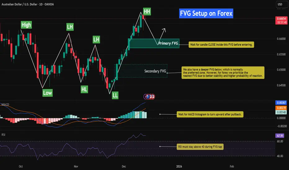
Bullish FVG Retracement With RSI & MACD📈 AUDUSD – Bullish FVG Retracement With RSI & MACD Momentum Confluence
This chart highlights a well-defined bullish structure on AUDUSD, characterized by a sequence of Higher Lows (HL) followed by a clean Higher High (HH). The latest impulsive leg upward created multiple Fair Value Gaps (FVGs), each formed by sharp displacement that left behind inefficiencies in price.
As price extends higher, the nearest unmitigated FVG becomes the primary area of interest. This imbalance represents the most logical level for a corrective retracement before bullish continuation resumes.
While a deeper FVG exists below, the nearest imbalance tends to offer stronger stability and higher probability in forex due to tighter liquidity behavior and more frequent shallow retracements.
In this setup, the combination of FVGs + RSI Behavior + MACD Histogram provides a high-confluence framework for identifying discount retracement zones and timing momentum re-acceleration.
⸻⸻⸻⸻⸻⸻⸻⸻⸻⸻
📊 Key Observations
1️⃣ Recent Bullish FVG Creation
The most recent impulsive leg upward generated a clear bullish FVG.
AUDUSD responded strongly to displacement, confirming active buy-side order flow.
Price has not yet returned to rebalance this inefficiency, making it the most probable retracement magnet.
2️⃣ Primary FVG (High-Probability Zone)
The upper FVG has the strongest confluence:
Formed by strong bullish displacement
Closest imbalance to current price (forex tends to fill nearest inefficiency first)
Aligns with bullish structure (HL → HH progression)
RSI remains elevated, signaling temporary overextension before a healthy pullback
MACD histogram shows slowing momentum, suggesting a cooling phase before continuation
This makes the upper FVG the most structurally significant level for a bullish reaction.
3️⃣ Secondary FVG Below
A deeper FVG also exists, but:
Formed during a smaller displacement
Much lower probability in forex due to shallower retracements
Carries less relevance unless the primary FVG fails
Momentum and structure currently favor reacting to the nearest imbalance
The zone may still attract price in extreme volatility, but it is not the main expectation.
4️⃣ RSI Behavior (Pullback Confirmation)
RSI is currently near the overbought region, indicating:
Market is stretched after a strong rally
A retracement is healthy and expected
During FVG entry, RSI must stay above 40 to maintain bullish structure and prevent a reversal signal
This acts as a structural momentum filter.
5️⃣ MACD Histogram Confirmation
MACD histogram is showing:
Momentum deceleration
A potential shift to light-green bars as price cools
A bullish continuation signal expected once the histogram begins turning upward from the pullback
Together, this confirms the classical model:
impulse → slowdown → retracement → continuation.
6️⃣ Structural Context
AUDUSD maintains a clean bullish sequence:
HL → HH progression
Deep liquidity sweep in the previous leg
Strong displacement aligned with bullish flow
As long as price holds above the FVG and prior HL, pullbacks are more likely to act as rebalancing events, not reversals.
⸻⸻⸻⸻⸻⸻⸻⸻⸻⸻
📊 Chart Explanation
Symbol → OANDA:AUDUSD
Timeframe → 1D
This chart illustrates how Smart Money Concepts blend with momentum indicators:
Clean HL → HH bullish structure
Fresh bullish FVG acting as primary discount zone
Secondary FVG present but lower probability in forex
RSI signaling temporary exhaustion before a pullback
MACD histogram confirming momentum slowdown into the FVG
Expected sequence:
displacement → inefficiency → retracement → mitigation → continuation
Price remains bullish unless structure breaks below the HL and the FVG fails to hold.
⸻⸻⸻⸻⸻⸻⸻⸻⸻⸻
📘How RSI & MACD Strengthen FVG Setups (Bullish & Bearish)
🔹 1. RSI + FVG
Bullish Setup:
RSI holding above 40 during the retracement confirms bullish structure.
Rising RSI from oversold strengthens the likelihood of continuation.
Bearish Setup:
RSI staying below 60 during the pullback confirms bearish structure.
Falling RSI from overbought increases the probability of downside continuation.
RSI shows whether the retracement is a healthy correction or a potential reversal.
🔹 2. MACD Histogram + FVG
Bullish Setup:
Decreasing histogram during the retracement = healthy cooldown.
Histogram turning upward inside or after the FVG = bullish continuation signal.
Bearish Setup:
Increasing histogram during the pullback = losing bearish momentum temporarily.
Histogram turning downward again at the FVG = bearish continuation confirmation.
MACD provides momentum timing for the reaction out of the FVG.
🔹 3. Combined Logic (Works Both Ways)
Displacement creates an FVG
Price retraces into the imbalance
RSI respects structural boundaries (bullish >40, bearish <60)
MACD momentum aligns with the trend direction
Price rejects the FVG and continues the trend
This combined approach filters low-quality FVG zones and identifies the highest-probability continuation setups in both bullish and bearish markets.
⸻⸻⸻⸻⸻⸻⸻⸻⸻⸻
⚠️ Disclaimer
📘 For educational purposes only
🙅 Not SEBI registered
❌ Not financial or investment advice
🧠 Smart-Money-Concepts explanation only
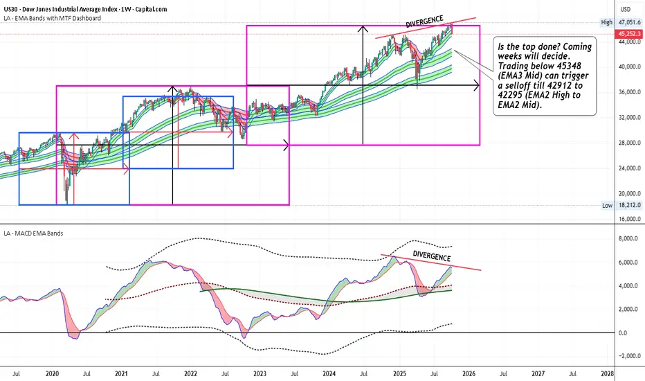
US30 - Trading below 45348 can trigger a selloff till 42912Is the top done? Coming weeks will decide. Trading below 45348 (EMA3 Mid) can trigger a selloff till 42912 to 42295 (EMA2 High to EMA2 Mid)
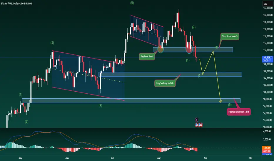
Bitcoin Trend Reversal – Elliott Wave in PlayBitcoin Trend Reversal – Elliott Wave in Play
Hello traders,
Today we look at a fresh scenario for BTC as price has broken decisively below a major support zone, showing clear short-side strength. This could mark the beginning of a medium-term downtrend, signalling a shift in market structure.
The 112k level has been fully taken out after two strong rejections earlier, and now the market looks ready to seek lower levels, potentially targeting 97k–98k based on Fibonacci Extension.
From an Elliott Wave perspective, BTC is currently in wave 3 of the down cycle, and has not yet reached the reaction point for wave 4. I expect the 105k zone to act as support for this leg down. From there, price could bounce into wave 4 before completing wave 5 lower towards 97k, or even 95k. This would provide a solid area to plan medium-term long entries afterwards.
The MACD also supports the bearish view, with both volume and moving averages trending below, signalling strong downside momentum.
I’ve marked the key price levels on the chart for clarity. Please use this scenario as reference and manage risk carefully with your trades.
What’s your outlook for BTC here? Share your thoughts in the comments so we can discuss together.
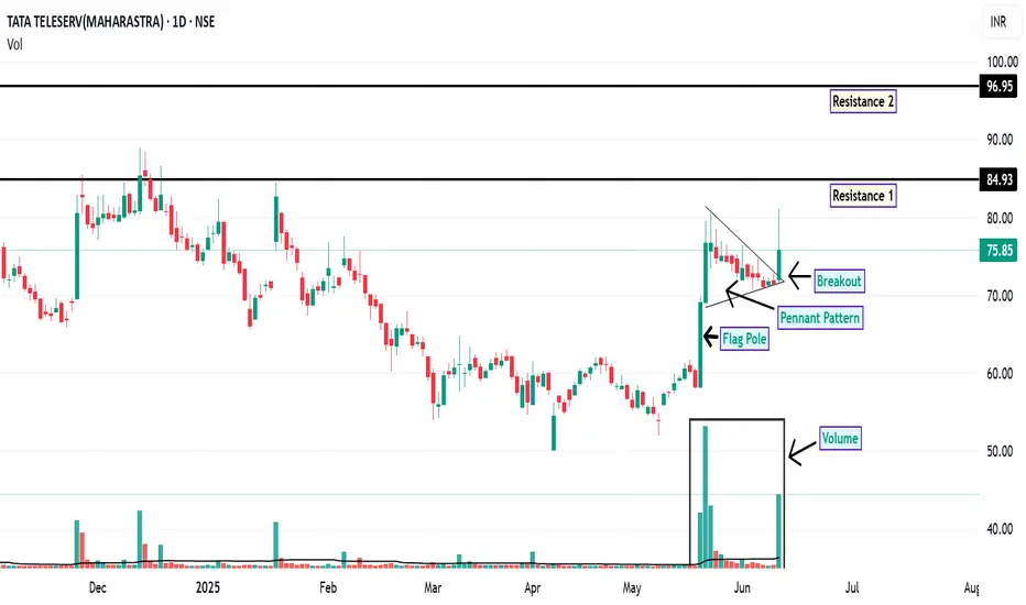
TTML: Pennant Breakout Signals Potential Upside
On the daily chart, TTML has recently exhibited a breakout from a pennant formation , a pattern often associated with potential continuation of the prevailing trend. This breakout is accompanied by a notable increase in trading volume, which may indicate growing market interest and participation.
Additionally, the price action has shown support at the 200-day EMA, a widely observed long-term trend indicator. This confluence of technical signals may suggest a strengthening bullish sentiment.
From a momentum perspective, both the RSI and MACD indicators are currently positioned in bullish territory on both the daily and weekly timeframes. This alignment across multiple timeframes can be interpreted as a sign of potential trend continuation.
Looking ahead, the price may revisit the ₹75 level, which could act as a demand zone. Should the stock manage to close and sustain above ₹76.40 , the next potential resistance levels to monitor are around ₹84.93 and ₹96.95 . For risk management, a suggested stop-loss level could be considered below ₹62 , based on recent support structures.
Disclaimer: This analysis is intended solely for informational and educational purposes. It does not constitute investment advice or a recommendation to buy or sell any financial instrument. Market participants are encouraged to conduct their own research or consult with a licensed financial advisor before making any investment decisions.
Tirumalai: The Anatomy of a BreakoutOn the daily chart, TIRUMALCHM appears to be approaching a potential breakout from an ascending triangle pattern, a formation often associated with bullish continuation. Notably, the price has managed to close above all key EMAs, including the 200-day EMA, which is widely regarded as a long-term trend indicator.
From a momentum perspective, both the RSI and MACD indicators are showing strength on the daily and weekly timeframes. These signals may suggest the early stages of a sustained upward trend, contingent on broader market conditions and follow-through price action.
Given the current technical setup, the stock may be considered for gradual accumulation near the CMP. Alternatively, more conservative participants might prefer to wait for a potential retest of the breakout zone in the coming sessions, which could offer a more favourable risk-reward entry with a next long term resistance of ₹340 .
A technical invalidation level could be considered below the ₹251 mark, depending on individual risk tolerance and trading strategy.
Disclaimer: This analysis is intended solely for educational and informational purposes. It does not constitute investment advice or a recommendation to buy or sell any financial instrument. Market participants are strongly encouraged to conduct their own research or consult with a qualified financial advisor before making any investment decisions.

Jayshree Tea: A Worthy Stock Pick!The chart of JAYSHREETEA provides delineates critical price thresholds that signify breakout points, along with specific support levels that serve as indicators of where buying interest may manifest.
Additionally, the chart highlights regions likely to act as ceiling points for future price ascensions, allowing for informed decisions on entry and exit strategies.
Disclaimer: The information contained in this technical analysis report is intended solely for informational and educational purposes. It should not be interpreted as financial advice or a recommendation to buy or sell any security. Investors are strongly encouraged to conduct their own research and consult with a qualified financial advisor before making any investment decisions.

SERVOTECH: Volume Surge Signals StrengthAn analysis of the weekly chart for SERVOTECH indicates a noteworthy technical development. The security has exhibited a breakout above a key pivot level previously identified around the 148 price zone.
This price action was accompanied by a substantial volume surge. The weekly volume registered approximately 34 million shares, a figure representing a more than five-fold increase compared to its 50W moving average of volume. Such a significant expansion in volume on a breakout can suggest strong institutional interest and conviction behind the move.
Further supporting a bullish outlook of RSI is situated above the 60 level on both the weekly and daily timeframes. A confluence of strong RSI readings across multiple timeframes is often interpreted by market participants as a sign of robust and broad-based upward momentum.
Based on this technical structure, the following price levels may be of interest for observation:
From a strategic standpoint, the stock may present a potential accumulation zone around the 150 level. The 195 level is identifiable as the next area of potential overhead supply, or resistance, where selling pressure might emerge. From a risk management perspective, a breach of the 136 level could challenge the validity of the recent bullish structure and might be monitored accordingly.
Disclaimer: The information provided in this stock analysis is for informational and educational purposes only and should not be construed as financial advice. Always seek the advice of a qualified financial advisor or conduct your own thorough research before making any investment decisions. Market conditions are dynamic, and past performance is not indicative of future results.

#AVANTIFEED - Multi Year Breakout Candidate📊 Script: AVANTIFEED
Key highlights: 💡⚡
📈Multi Year Breakout
📈 VCP in Weekly Time Frame
📈 BO with Volume in Daily Time Frame
📈 MACD gave a Bounce
📈 Price consolidated for 6 Years
📈 One can go for Swing Trade
⚠️ Over All Market condition is bad, Practice paper trading
🟢 If you have any questions regarding the setup, please feel free to leave your inquiries in the comments, and I will respond promptly.
BUY ONLY ABOVE 800 DCB
⏱️ C.M.P 📑💰- 786
🟢 Target 🎯🏆 – 30%
⚠️ Stoploss ☠️🚫 – 15%
⚠️ Important: Always Exit the trade before any Event.
⚠️ Important: Always maintain your Risk & Reward Ratio.
✅#Boost, #Like & #Follow to never miss a new idea! ✅
Disclaimer: I am not SEBI Registered Advisor. My posts are purely for training and educational purposes.
Eat🍜 Sleep😴 TradingView📈 Repeat 🔁
Happy learning with MMT. Cheers!🥂

#SARDAEN VCP Formation in DTF - Keep In WL 📊 Script: SARDAEN
Key highlights: 💡⚡
📈 VCP BreakOut in Daily chart.
📈 Price gave a good up move and consolidated before BO.
📈 Volume spike on Breakout
📈 MACD Cross Over
📈 One can go for Swing Trade.
BUY ONLY ABOVE 511 DCB
⏱️ C.M.P 📑💰- 506
🟢 Target 🎯🏆 – 20%
⚠️ Stoploss ☠️🚫 – 108
️⚠️ Important: Market conditions are not great, Paper Trade Only. Protect Capital Always
⚠️ Important: Always Exit the trade before any Event.
⚠️ Important: Always maintain your Risk & Reward Ratio.
✅Like and follow to never miss a new idea!✅
Disclaimer: I am not SEBI Registered Advisor. My posts are purely for training and educational purposes.
Eat🍜 Sleep😴 TradingView📈 Repeat 🔁
Happy learning with MMT. Cheers!🥂

MACD Trading #Technical AnalysisMACD measures the relationship between two EMAs to indicate momentum and potential trade reversals, while the RSI seeks out overbought and oversold conditions by evaluating recent price action. These indicators are often used together to give analysts a more complete technical picture.
The MACD is a technical indicator designed to help traders and investors identify and time potential buy and sell opportunities. The MACD displays moving averages and a histogram to identify trends and measure their momentum.

Technical analysisThe MACD indicator (or oscillator) is one of the best indicators for identifying trends and reversals in the financial markets. The MACD strategy in its most basic form involves using the crossing of the smoothed out signal line over the MACD line as your entry or exit point for a trade.
The best MACD setting for day trading often uses a faster configuration, such as 3-10-16, to capture quick price movements. While the default 12-26-9 is popular, shorter settings can improve sensitivity to intraday trends. Optimal settings vary by strategy and asset volatility.

MACD TradingMoving average convergence/divergence (MACD) is a technical indicator to help investors identify entry points for buying or selling. The MACD line is calculated by subtracting the 26-period exponential moving average (EMA) from the 12-period EMA. The signal line is a nine-period EMA of the MACD line.
A common strategy is to buy when the MACD line crosses above the signal line, as this indicates bullish momentum. Another strategy is to sell when it crosses below (which indicates bearish momentum).

Technical Analysis Part - 1An RSI divergence occurs when price moves in the opposite direction of the RSI. In other words, a chart might display a change in momentum before a corresponding change in price. A bullish divergence occurs when the RSI displays an oversold reading followed by a higher low that appears with lower lows in the price.
The RSI provides immediate signals for buying and selling, helping you understand whether an asset is overbought or oversold. RSI readings below 30 signal buy opportunities, indicating the asset is undervalued. Conversely, RSI readings above 70 signal sell opportunities, suggesting the asset is overvalued.

Technical Analysis Part - 4The MACD is a momentum indicator that can be used to anticipate changes in market sentiment. However, it is not foolproof: experienced traders look to other metrics, such as trading volume, for a more complete perspective on market sentiment.
Key Takeaways
The moving average convergence divergence (MACD) is a popular momentum indicator that is used in technical analysis.
The MACD is calculated by comparing exponential moving averages in a security's price.
The MACD line is charted alongside a nine-day moving average of the MACD line, called the signal line, and a histogram representing the difference between these two curves.
Traders use the MACD histogram to anticipate changes in market momentum.
MACD analysis can still generate false price predictions. Experienced traders use additional metrics and fundamental analysis to support their forecasts.

Technical Analysis MACD HIstogram Key Takeaways
The moving average convergence divergence (MACD) is a popular momentum indicator that is used in technical analysis.
The MACD is calculated by comparing exponential moving averages in a security's price.
The MACD line is charted alongside a nine-day moving average of the MACD line, called the signal line, and a histogram representing the difference between these two curves.
Traders use the MACD histogram to anticipate changes in market momentum.
MACD analysis can still generate false price predictions. Experienced traders use additional metrics and fundamental analysis to support their forecasts.
This example should demonstrate how observing the MACD histogram can help anticipate changes in trends in both short-term and long-term price momentum. It is important for traders to learn to recognize these trends and not bet against them. Fighting a trend is a sure way to get pummeled.

Advanced MACD with Professionals The moving average convergence/divergence (MACD) indicator is a technical tool that helps traders identify entry and exit points for buying or selling securities. It's made up of three time series calculated from historical price data, and the metrics are highly adaptable: MACD series:
The main series Signal or average series: The second series Divergence series: The difference between the first two series Momentum Trading Otimize your MACD strategies with ... The MACD indicator is often displayed with a histogram that shows the distance between the MACD and its signal line. The histogram is positive when the faster EMA line is on top, and negative when it's on the bottom.
Here are some tips for using the MACD indicator: Buy or sell: Traders may buy when the MACD line crosses above the signal line, and sell when it crosses below. Understand moving averages: Moving averages tend to trail behind price movements, but the MACD can transform this into a trading strategy. Look at the difference between two moving averages: This shows how fast a trend is moving.

EXIDEIND trendline breakoutExideind trendline breakout from falling wedge
positive crossover in MACD
Above 500 upside potential is 530+ in medium term
Disclaimer : I am not SEBI registered.

Histogram(MACD) Divergence Trading Let us discuss the MACD indicator strategy and histogram. I know being a chartist you are familiar with this tool.
Hence I hope this will be a revision for you. Assuming you already know this topic, you should know that MACD Histogram is derived from MACD.
To me, it is the effect of MACD (cause), without which MACD Histogram would not have been born. I hope you can relate it to the previous paragraph. If not, no problem. Carry on reading.
But before proceeding further I would request you to recapitulate MACD (moving average convergence divergence). Thanks for converging your thoughts with that of mine. I am glad. It will help me to explain this article without taking the additional burden.
MACD Histogram Peak-Trough Divergence
By now you must have understood how the histogram dances to the tunes of prices. If one looks at it closely then one can easily identify the divergences.
You will notice that a peak and trough divergence is formed with two peaks or two troughs in the MACD Histogram.
Usually, it can be segregated into two parts, i.e. bullish peak and trough divergence and bearish peak and trough divergence.
Alright, I will explain you in short.
Bullish Peak-Trough Divergence
It is formed when MACD makes a lower low and on the contrary, MACD-Histogram makes a higher low. One thing you should keep in mind, i.e., well-defined troughs define the health of a bullish peak-trough divergence.
bullish peak trough divergence
Bearish Peak-Trough Divergence
It is formed when MACD makes a higher high and on the contrary MACD Histogram makes a lower high.
One thing you should keep in mind, i.e., well-defined peaks define the health of a bearish peak-trough divergence.

Devyani International Potential Bullish MomentumFollowing a notable consolidation phase that commenced in January 2024, Devyani International has exhibited promising technical signals, suggesting a potential shift towards a bullish trend. Last week, the stock successfully breached the pivotal resistance level of 185 on the weekly timeframe, which is a critical psychological and technical milestone.
The 20 EMA has crossed above the 50 EMA on the weekly chart, a classic indicator of bullish momentum known as a "Golden Cross." This crossover typically signals a potential uptrend and aligns with the stock's recent move above the 185 pivot point.
Both the daily and weekly RSI readings have indicated bullish momentum, suggesting the stock has been gaining strength relative to its price action over the observed periods. The MACD indicator on both daily and weekly charts is also reflecting bullish dynamics, with the MACD line crossing above the signal line.
The stock has managed to close above the equilibrium level, a point where buying and selling pressures are balanced, on both the daily and weekly charts. A sustained close above this level could signify strong sentiment among investors, further corroborating the potential for upward momentum.
A Change of Character has been observed on the weekly chart, indicating a shift from prior selling exhaustion to potential buying interest. This technical pattern often precedes substantial price movements, and in this case, it may suggest that sellers are losing control, paving the way for bulls to take the lead.
Given the aforementioned technical indicators and patterns, the next resistance level is identified at approximately 236. Should the stock continue its bullish trajectory, this represents a potential upside of around 25% in the short term. Traders should closely monitor volume trends and broader market sentiment to fortify their positions.
Disclaimer: The information provided in this stock analysis is for informational and educational purposes only and should not be construed as financial advice. Always seek the advice of a qualified financial advisor or conduct your own research before making any investment decisions.

Navin Fluorine INT - Looks Good!NSE:NAVINFLUOR - Daily Chart analysis
Price Vs RSI divergence seen on daily chart
Price Vs MACD divergence seen on daily chart
Bullish Head and Shoulder Pattern seen on daily chart.
PLEASE NOTE THAT:
This chart analysis is only for reference purpose.
This is not buying or selling recommendations.
I am not SEBI registered.
Please consult your financial advisor before taking any trade

MSUMIThis Auto Ancillary stock has been under consolidation for a while. But technical indicators shows strength for a run. Further, it has been taking support at the 200 DEMA. One can buy at Rs. 61.45 with a target of Rs. 65.80 and closing above could run to Rs. 67.80. Keep Stop Loss of Rs. 58.69.

IRB Infra Going Strong IRB Infra- Weekly Time Frame -
=> MACD Crossing Signal Line
=> MACD Crossing Central Line
=> Symmetrical Traingle Breakout
=> Volume Present
