BTCUSDT – Charging Ahead in an Ascending Channel, Eyes on 120K!Bitcoin is gliding steadily within a rising channel, consistently printing higher highs and higher lows. After tagging the 120K psychological zone, price made a healthy pullback to key support and bounced back swiftly — reaffirming buyer dominance.
Price action reveals sustained bullish momentum, especially with key U.S. economic data on the horizon. If risk-on sentiment holds, BTC is well-positioned to break past psychological resistance and unlock the next leg higher.
This pullback? It’s not weakness — it’s a setup. And the market is gearing up for another breakout move.
Technical Analysis

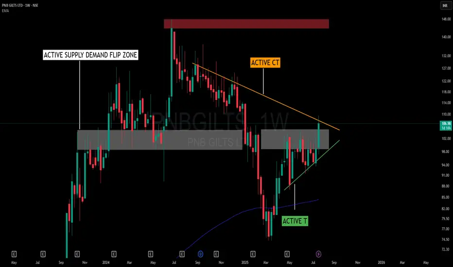
Squeezed by Structure – When Trendlines and Flip Zones CollideThis chart presents an interesting interaction between structure and zone dynamics without adhering to a textbook pattern name. The price is being squeezed within a random, yet well-defined structural form, shaped by the forces of support and resistance.
📌 Key Structural Notes:
🟠 Active Counter Trendline (CT) – Acting as overhead resistance, capping price for several weeks.
🟢 Rising Trendline (T) – Offering a base of support, encouraging higher lows and structural tightening.
🟫 Supply-Demand Flip Zone – A previously reactive supply zone now serving a dual role, showing consistent relevance to price behavior.
🟥 Major Supply Overhead – Remains untested, yet significant from a broader structure perspective.
Rather than labeling this as a triangle or cup-handle, it’s more about how CT and T are working together to compress price into a decision area. The presence of the flip zone adds to the friction, making this a valuable case to observe from a structural and behavioral standpoint.
🧠 Not a prediction or setup – just a visual study of how structure evolves when opposing pressures meet within a contextual zone.
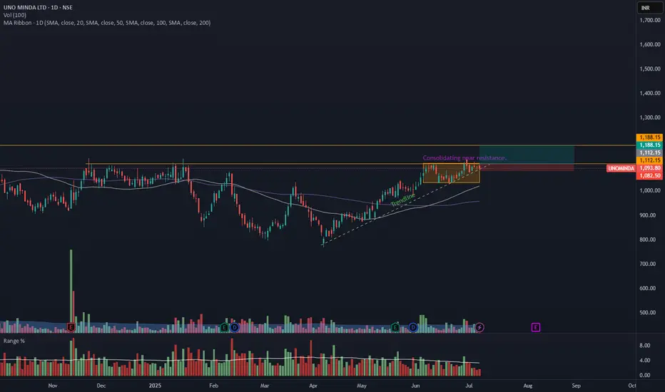
UNOMINDA – Daily Timeframe Breakout Idea (Resistance Zone Break)UNO MINDA LTD. has shown a breakout above a key horizontal resistance level on the daily chart, accompanied by a nearly 1.5 times volume surge near the breakout, as seen earlier, supported by strong momentum.
🔍 Breakout Context:
- Price might break above the ~₹1110 horizontal resistance, which had held for over 6 months.
- Breakout supported by more than average volume and just above average range near the resistance zone.
- The price is also trading above both the 50- and 100-day SMAs, indicating strong trend continuation.
- This aligns with a bullish continuation setup.
📉 Trade Plan:
- CMP: ₹1093
- Entry: Near ₹1112
- Target: ₹1188 (~7% upside from CMP)
- Stop-Loss: ₹1082
- Risk-Reward Ratio: ~1 : 2.0
📌 Note:
- Look for a confirmation candle to enter the trade.
- Avoid chasing the extended move unless confident in intraday momentum.
⚠️ Disclaimer: This post is for educational purposes only and not financial advice. Always do your research or consult a financial advisor before trading.
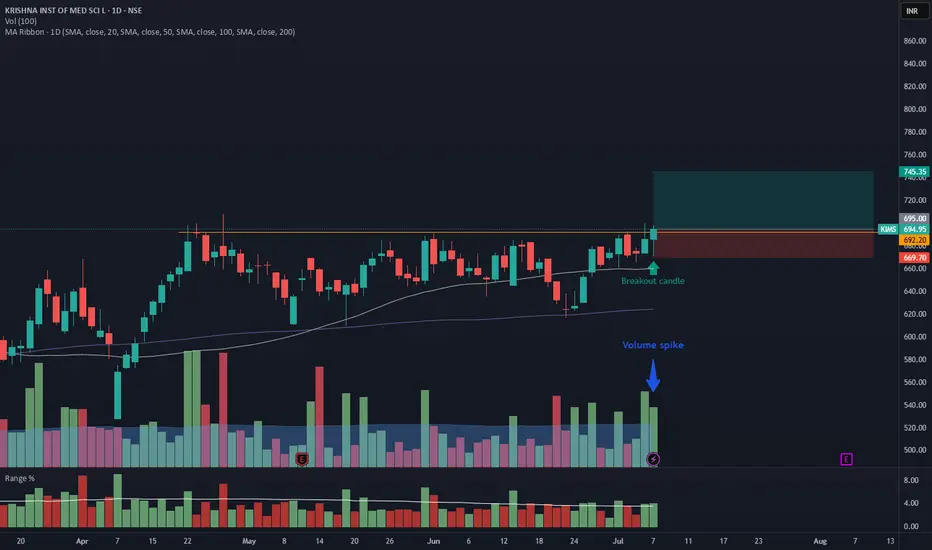
KIMS – Daily Timeframe Breakout Idea (Resistance Zone Break)
KRISHNA INSTITUTE OF MEDICAL SCIENCE has shown a breakout above a key horizontal resistance on the daily chart, accompanied by a ~2x volume surge, supported by strong momentum.
🔍 Breakout Context:
- Price broke above the ~692.20 horizontal resistance, which had held for over 2 months.
- Breakout supported by <2x average volume and just above average range on the breakout candle.
- The price is also trading above both the 50- and 100-day SMAs, indicating strong trend continuation.
- This aligns with a bullish continuation setup.
📉 Trade Plan:
- CMP: ₹694
- Entry: Near ₹695
- Target: ₹746 (~7.25% upside from CMP)
- Stop-Loss: ₹669
- Risk-Reward Ratio: ~1 : 2.0
📌 Note:
- Avoid chasing the extended move unless confident in intraday momentum.
⚠️ Disclaimer: This post is for educational purposes only and not financial advice. Always do your research or consult a financial advisor before trading.
GBPJPY Breakout Retest-Bullish Continuation in PlayGBPJPY showing potential breakout continuation after reclaiming a key intraday resistance zone.
Retest confirmation occurred near 198.72 support-turned-demand.
SignalPro structure highlights:
📍Clear high-probability buy signal
🟨 Caution label earlier flagged trend shift risk
📦 Liquidity Control Box now acting as base
Target set at 199.970 with defined risk below recent structure low.
Key Observations:
Breakout aligned with momentum recovery after multiple failed sell attempts.
Risk-to-reward is favorable for potential trend continuation toward upper liquidity levels.
🔍 Timeframe: 15-min
⚙️ Tool Used: Leola Lens SignalPro
📘 For learning use only – not financial advice.

XAUUSD – When Buying Pressure FadesGold attempted to break above a key resistance zone but quickly lost momentum, signaling that bullish strength is weakening. Meanwhile, strong U.S. economic data continues to support the dollar: the labor market remains robust and manufacturing activity is expanding — giving the Fed more reason to keep interest rates high for longer. This has put downward pressure on gold.
Currently, the market is approaching a critical support area. If this zone breaks, the bearish trend could accelerate further. Price structure no longer shows clear bullish momentum, and any pullbacks appear to be merely technical corrections.
Given this outlook, I favor a SELL setup if price breaks below support. The downside could expand significantly if buyers fail to return. Gold is now standing on the edge — either it holds the range, or a sharp drop may follow.

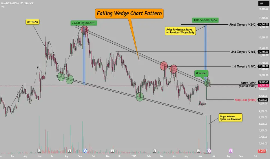
Bharat Rasayan–Falling Wedge Breakout with 39% Upside Potential!Hello Everyone, i hope you all will be doing good in your life and your trading as well! Today i have brought a post which is on Bharat Rasayan – a classic case of a falling wedge breakout.
After staying in a falling wedge pattern for nearly 10 months, the stock has finally broken out with a strong bullish candle and a clear volume spike. This breakout zone (9900–10200) also aligns with the downtrend line, making it even more valid.
The best part? This has participated in rally yet, means there is a lot remain in this stock, please check chart above for entry, stop loss and targets.
This setup is based on price action, chart structure, and previous pattern behavior. If you’re a swing or positional trader, this one’s worth watching!
If you liked this idea, don’t forget to LIKE & FOLLOW for more clean, technical setups.
Disclaimer: This idea is for educational purposes only. Do your own research before taking any trade.
XAUUSD – Gold Intraday Market Outlook (22/07)PLan XAUUSD TRADING BY MMFLOW SYSTEM - 22/07
Gold saw a sharp rally yesterday, completing its bullish wave structure for the day. However, as price approached the key psychological resistance around $3400, we started to see signs of exhaustion, with a clear bearish reversal candle forming at the top. This is the first indication of a possible correction in today’s session.
🔍 Technical Analysis
After forming a short-term top, gold is now entering a retracement phase and has tested a major support area – the FVG High Zone on H1 timeframe. If bearish pressure continues and this zone is broken, price may drop further to seek deeper liquidity zones.
🔽 Buy Zones to Watch Today
✅ Zone 1 – EL (End Liquidity within FVG): 3367 – 3350
→ Historically a strong reaction zone – good for short-term bounce entries.
✅ Zone 2 – Confluence of FIBO 0.5 – 0.618 + VPOC (3350 – 3335)
→ Ideal for long-term buy setups, as this zone overlaps key technical signals and previously saw strong buyer interest.
📌 Trade Setup Suggestions
🔸 BUY ZONE: 3351 – 3349
SL: 3344
TP targets: 3355 – 3360 – 3365 – 3370 – 3375 – 3380 – 3390 – 3400 – ???
🔸 BUY SCALP: 3366 – 3364
SL: 3360
TP: 3370 – 3375 – 3380 – 3385 – 3390
🔻 SELL ZONE: 3420 – 3422
SL: 3427
TP: 3415 – 3410 – 3405 – 3400 – 3390 – 3385
⚠️ Risk Reminder
Although there’s no major economic data today, traders should stay cautious. Unexpected volatility could arise from political developments or central bank commentary. In low-news environments, gold tends to consolidate tightly and then break out aggressively.
🔐 Always use Stop Loss and Take Profit to protect your capital – the market can surprise even the most experienced traders.
📈 Trading Strategy
Short-term bias: Favouring a pullback scenario.
Medium to long-term plan: If price drops deeper into key liquidity zones, that could offer excellent opportunities to load up on long positions, anticipating a strong upside move as the market prices in future Fed rate cuts and gold seeks new all-time highs.
💬 Stay focused, trade with confirmation, and always manage your risk. Patience and discipline will separate you from the crowd.

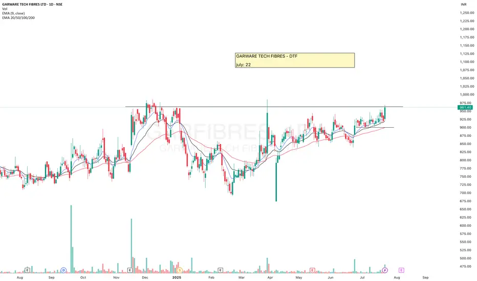
GARFIBRESGARWARE TECH FIBRES has formed a Bullish structure, made VCP pattern, volume is also visible.
Now it is at resistance, keep eyes on it as the breakout from here can give a good upside move.
Breaking ATH may boost it more. But definitely wait for the Re-test after the breakout.
📌 Re-test matters. Always!
Today I shared why waiting for a re-test is so important - with a real example.
Check out the chart and analysis on BLUEJET in my recent post.
It’ll make you rethink your entries.
✅ If you like my analysis, please follow me as a token of appreciation :)
in.tradingview.com/u/SatpalS/
📌 For learning and educational purposes only, not a recommendation. Please consult your financial advisor before investing.
XAUUSD – The bullish surge isn't over yetGold just delivered an impressive breakout of nearly 500 pips on July 21, fueled by a weakening USD as U.S. housing and manufacturing data showed signs of slowing down. With a bleaker economic outlook and growing expectations that the Fed may cut interest rates in Q4/2025, investors are flocking back to safe-haven assets – and gold is shining bright.
Technically, XAUUSD remains firmly within a clearly defined ascending channel, with price action bouncing sharply off dynamic support. The metal is currently consolidating around the 3,400 zone – if buyers can hold this ground, the door toward 3,440 and beyond could swing wide open.
As long as gold holds above 3,347, bulls remain in full control. This might just be a healthy pullback before the next leg up – don’t miss out as the market gains momentum!

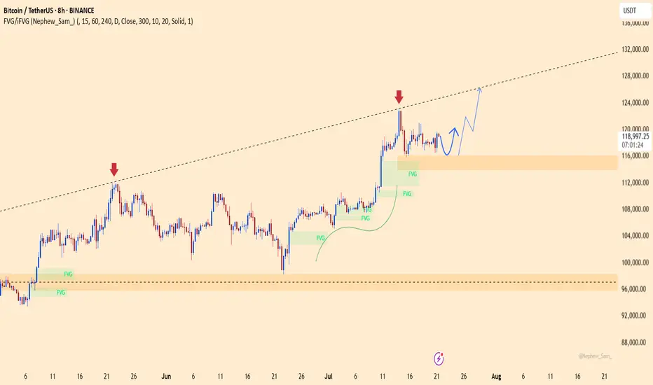
BTCUSDT – Rebounding from Fair Value Zone! Is the Bull Run Back?Bitcoin is building a strong base around the FVG support zone after rejecting the resistance trendline twice in a row. The current price structure is a textbook bullish setup: pullback – retest of liquidity zone – accumulation – and now prepping for a strong breakout.
Fair Value Gaps have been consistently filled and are acting as dynamic support, signaling that buyers are still in full control. RSI remains steady and not overheated – creating perfect conditions for a breakout.
Target: The 125,910 USDT area is the next clear price objective if BTC holds above the 116,082 USDT support zone.
Fundamental Catalyst: The crypto market is regaining strength after BlackRock officially confirmed its plan to expand its crypto ETF products – investor sentiment is back on the bullish side.
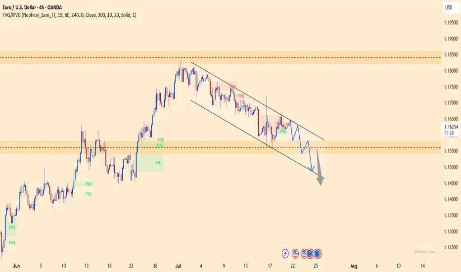
EURUSD – Trend broken, bearish momentum accelerating!EURUSD is maintaining a clear downtrend structure within a well-defined descending channel, with consistently lower highs forming. Fair Value Gaps (FVGs) keep getting rejected, signaling that sellers are firmly in control. The current scenario points to a technical bounce toward the 1.164 zone, followed by a likely rejection back down to the lower boundary near 1.148.
Technical signals confirm the bearish bias as price respects both the trendline and the supply zones, failing to break above recent resistance levels.
On the fundamental side, the ECB has recently struck a more dovish tone due to cooling inflation, while the USD is regaining strength amid expectations that the Fed will keep rates elevated longer — all of which continue to pressure the euro lower.
XAUUSD – Breakout or Continued Accumulation?Gold continues to respect a solid bullish structure within an ascending price channel. After a healthy pullback from recent highs, the price has retested a key technical support area and is showing signs of a strong rebound.
Current price action reveals that the market is respecting both the FVG zone and the rising support line—clear signals that smart money is still leaning toward the buy side. The next bullish targets lie around the upper resistance zone.
From a macro perspective, weaker-than-expected U.S. retail sales have placed downward pressure on the dollar, fueling speculation that the Fed may soon pivot toward easing. This adds momentum to gold’s upside potential.

Supply to Demand Flip Explained! | Spot High-Probability Zones Ever wondered how smart traders catch the perfect entries? 🤔
In this video, I break down the Supply-Demand Conversion Zones—where Supply turns into Demand and vice versa. With real chart examples .

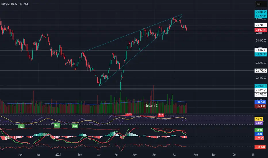
NIFTY Technical Breakdown – Rising Wedge Pattern🔻 NIFTY Technical Breakdown – Rising Wedge Pattern
The Nifty 50 has broken down from a rising wedge pattern on the daily timeframe, a bearish reversal formation that often signals distribution at the top.
📉 Key Observations:
Rising wedge breakdown after extended rally
RSI bearish divergence confirming weakness
MACD crossover turning negative
Volume gradually decreasing during the rise, indicating exhaustion
ADX flattening, showing weakening trend strength
📌 Support Levels to Watch:
23,783 – Key swing support
22,798 – Previous breakout zone
📌 Sectoral Rotation:
Defensive sectors like Pharma & FMCG are gaining strength
FII selling pressure, rising DXY, and global uncertainty continue to weigh on sentiment
⚠️ Outlook:
Caution warranted in the short term. Watch for sustained close below 24,900 for further downside confirmation. Macro and global cues to play a key role ahead.
💬 What’s your view on Nifty's near-term direction?
#Nifty50 #TechnicalAnalysis #RisingWedge #MarketOutlook #TradingView #ChartStudy #IndiaMarkets #BearishSetup #NiftyBreakdown #Puneet0130
GOLD WEEKLY OUTLOOK | JULY 21–25 GOLD WEEKLY OUTLOOK | JULY 21–25
Get Ready for a New Trading Week 🇮🇳
🔍 Market Recap:
Gold showed a strong bullish reversal late last week after sweeping liquidity around the FVG ZONE near 3310. Price quickly surged toward the OBS SELL ZONE around 335x–336x.
By Friday’s close, however, price reacted sharply to a confluence of technical zones (OBS + FIBO) and settled below the VPOC, hinting at a potential short-term top.
📉 Outlook for July 21–25:
📌 No major economic events are lined up next week.
⚠️ However, geopolitical tensions, global trade policies, and military news could bring sudden volatility.
Stay alert for unexpected liquidity spikes!
🧠 Technical Setup – H1 Mid-Term View:
Gold has been forming multiple Fair Value Gaps (FVGs) due to aggressive bullish moves.
While price has reached new highs, lower FVG zones remain unfilled – creating a strong possibility of a retracement.
🔁 Expected Scenario:
We may see price retrace to the 3310–3305 zone to fill these gaps, then potentially resume bullish movement.
📍 Trading Strategy for the Week:
🔸 Wait for price to enter lower FVG zones
🔸 Look for early BUY signals at key confluence areas such as:
CP zones
Fibonacci retracement levels
Volume/price reaction levels
🎯 Bullish Target Zones:
Primary target remains: 333x – 336x
If momentum continues after the pullback, we could see a move toward the Buy Side Liquidity near 3371.749
✅ Key Reminders for Indian Traders:
🚫 Avoid emotional buying at highs (no FOMO!)
📏 Stick to your TP/SL rules – risk management is critical, especially during uncertain global headlines
📊 Stay focused and trade with a plan
🌟 Wishing you a restful weekend. Come back refreshed and ready to dominate the charts next week!
🚀 Good luck & happy trading

MAHLIFEMAHLIFE looks good.
Small pullback for the Entry will be good. Keep eyes on it.
✅ If you like my analysis, please follow me as a token of appreciation :)
in.tradingview.com/u/SatpalS/
📌 For learning and educational purposes only, not a recommendation. Please consult your financial advisor before investing.

BLUEJETBLUEJET looks strong.
It gave breakout, a small pullback will be good for the Entry as it is bit far away from 20ema, once it touches the 20ema then we may expect a good upside move.
Keep eyes on it.
✅ If you like my analysis, please follow me as a token of appreciation :)
in.tradingview.com/u/SatpalS/
📌 For learning and educational purposes only, not a recommendation. Please consult your financial advisor before investing.

PVRINOXPVRINOX is looking good.
Making VCP pattern, equal highs and HL formation and good volume. Keep eyes on it.
✅ If you like my analysis, please follow me as a token of appreciation :)
in.tradingview.com/u/SatpalS/
📌 For learning and educational purposes only, not a recommendation. Please consult your financial advisor before investing.

EURUSD on the verge – a trap waiting for the carelessThis pair has just completed a classic rounding top, with a sharp rejection near 1.16500. Buying momentum is fading, RSI is dropping, and the recent retest of the broken trendline might have been the final warning – the “kiss of death” could already be in play.
On the fundamental side, the U.S. keeps fueling the dollar: consumer spending is rising, jobless claims are falling, and the Fed shows no sign of easing up. Meanwhile, the ECB is still searching for direction, leaving the euro exposed and vulnerable.
If the current support level breaks, EURUSD could slide quickly to lower zones. This is no longer a time for hope – it’s time to choose a side and act.

XAUUSD: breakout risk is approachingXAUUSD has been consolidating in a tight range since early July. Despite multiple bounces from support, price has failed to deliver a clear breakout, signaling weakening buying pressure. The current structure leans bearish, with momentum turning increasingly negative.
On the news front, the U.S. economy continues to show strong recovery: rising consumer demand, falling unemployment, and surging USD and bond yields. This puts significant pressure on gold – a non-yielding asset in a high-interest environment.
If price breaks below the bottom of the range, the downside could accelerate sharply in the near term. Buyers should remain extremely cautious in this setup.

EURUSD under pressureEURUSD is moving within a well-defined descending channel, forming consistent lower highs and lower lows. The price has recently rejected the resistance zone near 1.16100, showing signs of continued bearish momentum.
On the fundamental side, stronger-than-expected U.S. retail sales—especially in the core figure—have boosted the U.S. dollar, putting downward pressure on the euro. Coupled with ongoing concerns about Eurozone economic growth, the pair is likely to continue its decline toward the 1.15400 support area. RSI remains below the neutral zone, confirming short-term bearish bias.
Traders should watch closely for reactions at support to assess further short opportunities.

Gold wavers under pressure from strong U.S. retail dataXAUUSD is currently fluctuating within a price box, showing weaker bullish attempts and failing to break above the nearest resistance zone. Selling pressure is mounting as price continues to be rejected at the top and is approaching the medium-term ascending trendline — a key support level.
On the news front, U.S. core retail sales surged, boosting expectations for a stronger USD, which in turn weighs on gold prices. However, a slight uptick in unemployment claims may help slow the dollar’s momentum.
If buyers fail to defend this critical support, the bullish structure risks being broken, potentially signaling a shift toward a clearer downtrend. On the flip side, the price box could still act as a consolidation phase before another bullish leg.
