What is Multi confluence Strategy making ?In this video I am showcasing how to create multiple confluences and decrease the no of frequency of trades you get to filter out A+ setups .
I am using charts older than 3 months to showcase the same
Tradingstrategies

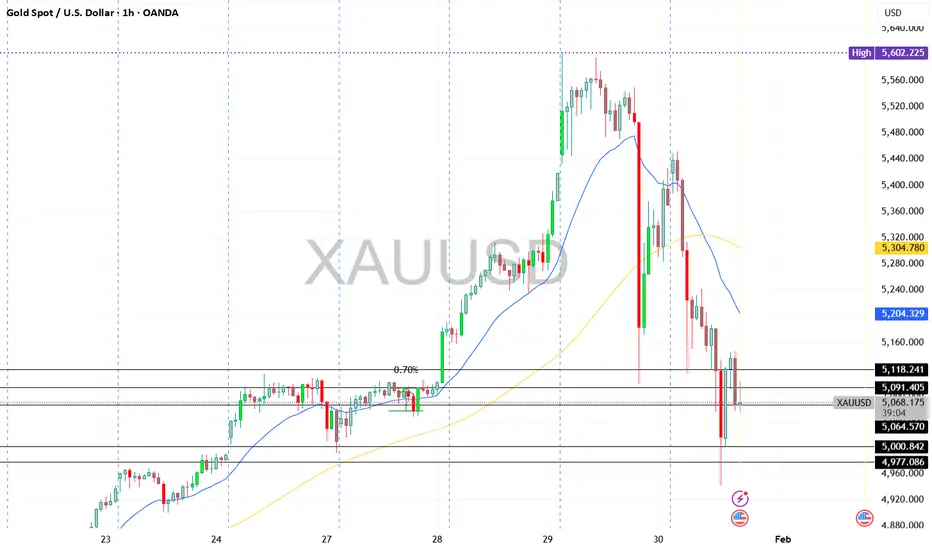
GOLD MARKET VOLATILITY - REALITY CHECK Noise is high around XAUUSD with headlines like “trillions wiped out” and “gold crashing”.
Let’s keep it factual.
Gold is volatile due to profit-booking after a historic rally, geo-political uncertainty, and US policy expectations.
This is correction + consolidation, not a confirmed crash.
💡 “Trillions wiped out” = notional intraday value swings, not permanent losses.
Key Levels to Watch (XAUUSD)
Resistance: 5250 – 5300
Support: 5080 – 5000 (major demand zone)
Below 5000: Only if volatility expands with strong volume
Key Takeaway for Traders 🎯
High volatility ≠ clear direction
Avoid revenge or blind trades
Let price settle → trade with risk control
🛑 Staying out is also a strategy
📊 Focus on Forex / Crypto / Indices if Gold is unstable
Risk management > FOMO
What is the Best Location / Area to Take a trade in the Markets I make educational content videos for trading
In this video I am sharing my experience on which areas are the best to trade with simple Price action using older than 3 months charts

Hidden Parallel Channel: Weighted Lines & Zones ExposedThis chart illustrates key technical elements where price interacts with multiple reference lines and zones, emphasizing their observed relevance based on proximity and historical behavior.
The red counter trend line, distant from price by 35-40%, carries less immediate weight, while the white counter trend line touched by price demonstrates stronger participation. Green highlights a long-term weekly demand zone from historical levels, and the white zone on daily timeframe marks a prior gap down with resistance reaction.
Parallel dotted white lines outline a hidden channel, repeatedly respected and rejected by price, underscoring its structural significance. These elements combine multi-timeframe context to showcase how markets organize around dynamic references rather than static predictions.
Motto is to showcase how one can create setup from any or all of the above ingredients, its all about perspective and how you approach and backtest in markets - experience is importnat - field experience in trading is scrolling Trading view and keep backtesting .
Disclaimer: This is purely educational content on price action, zones, and patterns. Not SEBI-registered advice. Charts use historical data >3 months old; NO forecasts, NO buy/sell recommendations, or guarantees of results. DYOR and consult professionals.

Part 9 Trading Master Class With Experts Risk Management in Options
Options carry inherent risks due to leverage and time decay:
Time Decay (Theta): Options lose value as expiry approaches, especially OTM options.
Volatility Risk (Vega): Changes in market volatility can dramatically affect option premiums.
Delta Risk: Directional exposure; delta measures how much the option price moves relative to the underlying.
Liquidity Risk: Illiquid options can have wide bid-ask spreads, increasing trading costs.
Effective risk management involves:
Position sizing – limiting exposure to a fraction of capital.
Diversifying strategies – combining hedges and directional trades.
Monitoring Greeks – delta, gamma, theta, vega, rho help quantify risk.

Learn a NEW Trading Strategy before 2026 StartsI make educational content videos for swing trading - in this video I am showcasing a new strategy with market structure - trigger points and activation .
Charts used are 3 months or older for Backtesting only
Happy New Year to everyone .

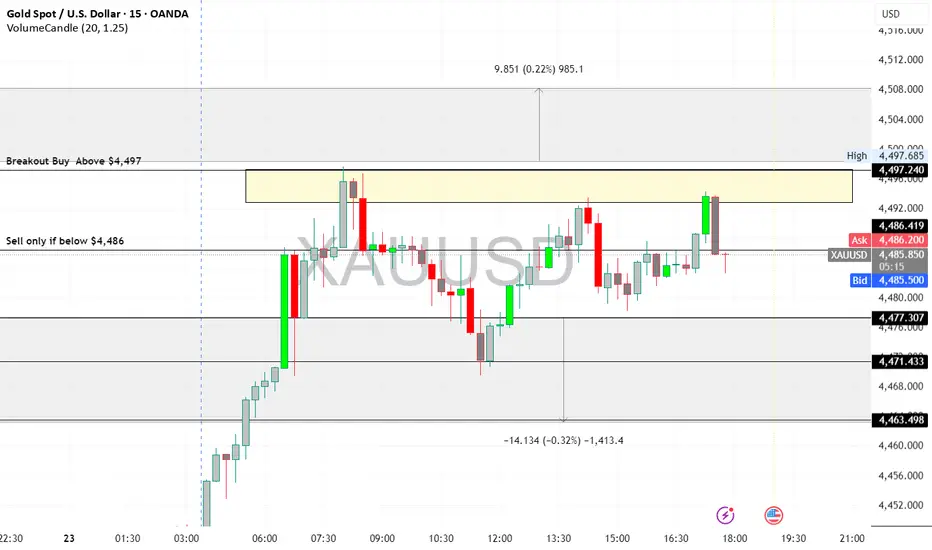
XAUUSD (Gold) Intraday Outlook - 23/12/2025XAU/USD Trend: Strong Bullish
Current Price: $4,491.99
Key Levels:
Support: $4,486 / $4,479
Resistance: $4,497 / $4,501 / $4,508
Pivot: $4,490
Strategy:
Buy on dips: $4,486–$4,479 → Target $4,497–$4,501
Breakout buy: Above $4,497 → Target $4,501–$4,508
Sell only if below $4,486
Gold remains bullish; prefer buying on dips or breakouts, keep stops tight near support.
Disclaimer: Trading involves risk. This analysis is for educational purposes only and is not financial advice. Trade responsibly.
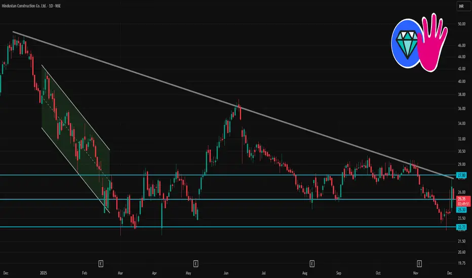
HCC 1 Day Time Frame📊 HCC — Key 1‑Day Levels
Based on the latest technical summary:
Level Value (₹) Significance
Opening Price (today) ~ ₹25.48 Start‑of‑day reference
Day’s Low ~ ₹25.30 Intra‑day support floor
Day’s High ~ ₹26.40‑₹26.47 Intraday resistance ceiling
Classic Pivot Point (1‑day) ~ ₹25.59 Mid‑point; price above = bullish bias,
below = bearish tilt
Support (S1) ~ ₹24.73 Key zone if price drops — potential
bounce area
Resistance (R1) ~ ₹27.17 If price rallies, watch this zone for
near‑term selling pressure
Tight Bullish Coil Above 50% EQ Means what ? Points to be Noted :
-Clear monthly swing low and swing high marked, defining the impulsive leg and its equilibrium zone. ( S1 and S2 )
-Price is consolidating in the upper half of this leg, holding above the 0.5 equilibrium level, showing sustained strength in the higher value area. ( also know as EQ )
-A clean ascending trendline (green) is guiding price from the swing low, with candles respecting it as dynamic support during the pause.
-Within this broader bullish structure, price has formed a tight parallel channel consolidation, indicating controlled pullback rather than distribution. ( white lines marked )
-Nearest major supply aligns with the all-time high, and the highlighted supply box marks the key decision zone where breakout or rejection is most likely.( orange box )
This post is for educational purposes only and is not investment, trading, or financial advice. Always do your own research, assess your risk tolerance, and consult a qualified financial advisor before making any trading decisions.

Always check the Higher Time frame but WHY ?I make educational content videos and Posts for Swing Trading based ideas - concepts and my full time trading experience .

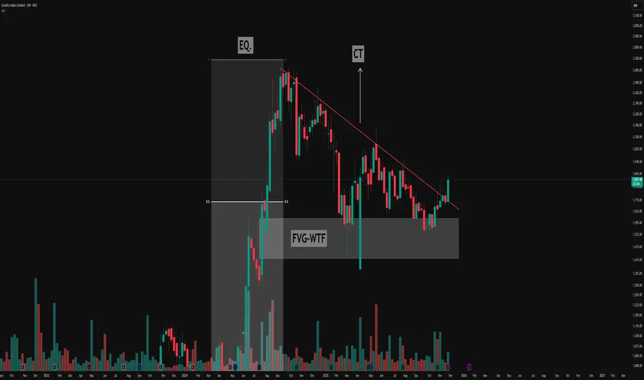
Decoding the Descending Triangle: Key Structure & FVG🔻Understanding the Pattern
- The chart above highlights a classic descending triangle pattern, easily visible by its series of lower highs (marked in red) and a relatively consistent demand zone acting as support.
- This resistance trendline (CT—Contraction Trendline) has been tested multiple times, confirming its significance as sellers consistently respond to price rallies by pushing back from lower levels.
🔻Equilibrium and Price Exploration
- Notice how price action moves from the equilibrium zone (EQ.)—the midpoint of the major move (from lows to all-time highs). This is a key area where supply and demand often rebalance
- The triangle structure forms as buyers continue to find value at support, while sellers become increasingly aggressive at lower highs, compressing price action over time.
🔻Weekly Fair Value Gap (FVG) in Focus
- A prominent Weekly Fair Value Gap (FVG-WTF) is identified, which price has tapped multiple times. This repeated interaction demonstrates its importance as a liquidity pocket where imbalances are re-tested and absorbed.
- Each revisit to this FVG offers a valuable lesson on how strong institutional levels serve as magnets, attracting price to resolve open liquidity.
This post is for educational purposes, highlighting how price structures can be interpreted without suggesting any forecast or trade.
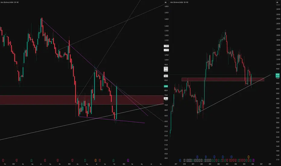
How to Observe Weekly and Monthly Chart StructureThe weekly (left) and monthly (right) timeframes, bringing attention to a confluence zone of technical interest.
On the weekly chart, price has developed a compressing pattern, defined by distinct purple lines, with dotted lines marking hidden channel boundaries and long-term levels for context. The highlighted supply-demand zone reflects previous market activity, where buyers and sellers actively shaped reversals and consolidations.
On the monthly timeframe, the same zone aligns with an established rising trendline support, indicating an area where price has historically responded with high volume and volatility. Multiple timeframe alignment and proximity to major horizontal structures
No forecasts or breakout signals are implied; the focus is on mapping price responses and monitoring structure, not predicting direction. Consistent observation of these overlapping technical factors may help traders build sound trading hypotheses in line with their individual strategies.
Emerging Symmetry: Spotting Recurrent Patterns on the WtfNoticing an interesting structural similarity on the weekly chart, where a previous impulsive move (highlighted) was followed by a prolonged corrective phase confined within dynamic support and resistance lines. The current price action is developing above a rising support and beneath a descending trendline, reflecting the classic ingredients of compression after expansion seen earlier.
This type of setup warrants attention for those studying recurring market behaviours and pattern symmetry.
No directional bias—just a pure market structure observation drawn from historical context.

Sharing my Secret Trading Mindset with Price actionIn this 18 minute video I will try to change the way you trade by sharing my trading experience using charts older than 3 months .

Multi‑Timeframe RSI Divergence Strategy with CandlesticksA confluence-based setup combining higher timeframe levels, RSI divergence, and candle signals for high‑probability swing entries . Sharing how to Create and backtest strategies on Trading view platform .
Charts used are 3 months or older .

PCR Trading Strategies Introduction to Option Trading
Option trading is a segment of the financial market where traders buy and sell contracts that give them the right—but not the obligation—to buy or sell an asset at a predetermined price within a specific time period. These contracts are known as options. Unlike stocks or commodities, where traders own the underlying asset directly, options allow traders to speculate on price movements, hedge risks, or leverage their investments.

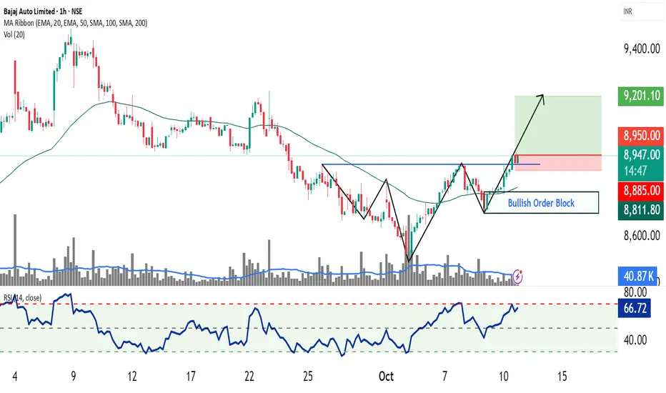
Bajaj Auto – Bullish head and shoulder breakout📈 Pattern Analysis: Bajaj Auto has successfully completed a Bullish Head and Shoulders pattern on the chart, followed by a clean breakout and subsequent retest, confirming the validity of the formation. The price action now awaits a pivot breakout, which would trigger the next leg of upside momentum.
📊 Trading Strategy:
Two distinct trading approaches can be considered based on trader type:
1. Retail Concept Strategy:
Enter long above the pivot high once price breaks decisively.
Place stop-loss below the breakout candle, ensuring a safer entry with confirmation.
Note: The risk–reward ratio is less favorable if the SL is kept below the right shoulder in classical style.
2. Smart Money Strategy:
Enter on retrace to the order block area positioned just above the right shoulder.
This offers a superior risk–reward entry aligned with institutional-style trading concepts.
🔎 Indicators & Trend:
50 EMA is sloping upward on the hourly timeframe, confirming short-term uptrend strength.
RSI > 65, indicating sustained bullish momentum with potential for continuation.
🎯 Target Projection:
Targets will be determined using the measurement rule, projecting the height of the head added to the neckline breakout zone.
⚠️ Disclaimer:
This analysis is prepared only for educational and training purposes. It does not constitute investment advice or a trading recommendation.
✍️ Prepared by: SEBI Certified Research Analyst (Not Registered)
Daily Update Nifty: 10/10/25There is a trap for both buyers and sellers today. Careful in the range of 25300-25330 spot.

Daily Analysis Nifty: 09/10/25Longs have been booked with profits and keeping the volatility in mins, no carry forwards in Nifty is suggested.
A pullback is quite possible in the 24980-24960 range, which is not a change of the trend, per se.
The resistance range or bearish/pullback invalidation is above the 25150-25180 range.

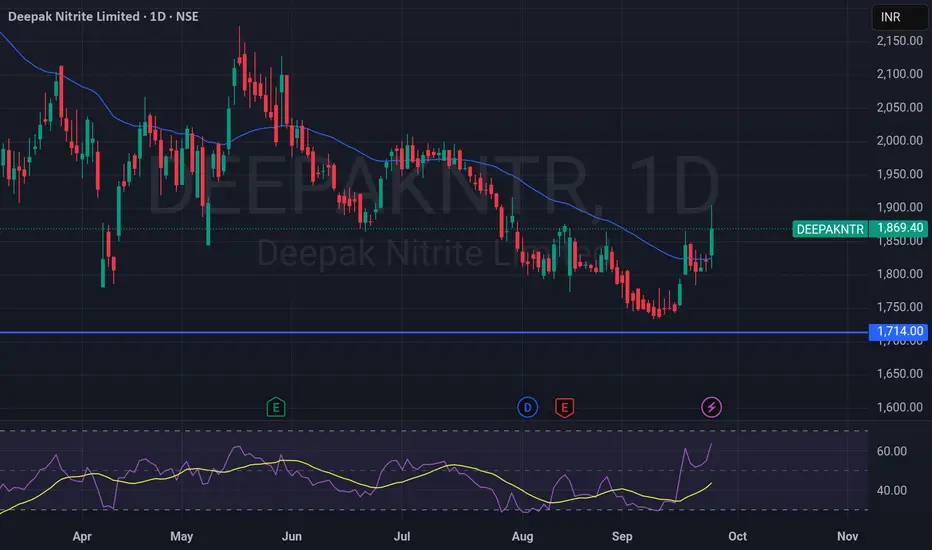
Trend Reversal or Short-Term Pullback Rally?Deepak Nitrite – Trend Reversal or Short-Term Pullback Rally?
📊 Chart Analysis (1D Timeframe)
The stock has recently taken support near the ₹1,714 zone (marked as a strong support level).
Price has bounced sharply from this support and is now trading around ₹1,869, posting a +2.65% gain today.
The stock has closed above the 20-day moving average (blue line) for the first time after a prolonged downtrend – indicating a possible shift in momentum.
📈 RSI Indicator:
RSI has surged above the 60 level, showing increasing bullish momentum.
This suggests strength in the ongoing up-move, though it is entering a higher zone where profit-booking can also occur.
🔎 Key Levels to Watch:
Support: ₹1,714 (major support).
Immediate Resistance:₹1,900 – ₹1,920 zone (supply area).
Next Resistance: ₹1,975 – ₹2,000.
📌 Trading View:
The strong bounce from support + RSI breakout + price closing above the 20-day MA all hint at a potential short-term bullish reversal.
If the stock sustains above ₹1,850, it can attempt a move towards ₹1,920 – 1,975.
However, a close below ₹1,800 will weaken this bullish setup and may drag the stock back towards ₹1,714.
Powergrid: Falling wedge pattern- Bullish breakout.Price has given the breakout already, but the entry is pending as I'm waiting for a retest of the entry level 290-291.30 range as support to validate the entry level.
The stop loss will be the upper trendline of the falling wedge for the upper side target. Targets are set as recent swing highs. Targets are 301, 310, 317 and 321-324.
On a higher timeframe, a triangle pattern is also evident, but I'm more bullish on this stock. If the price falls back within the wedge, a new updated video will be shared.

Buy, Sell, or Skip? Multi Timeframe Support ZonesUncover how support levels across multiple timeframes help clarify key buy/sell decisions—purely for technical education.
Chart used is 3 months old for educational purposes only.

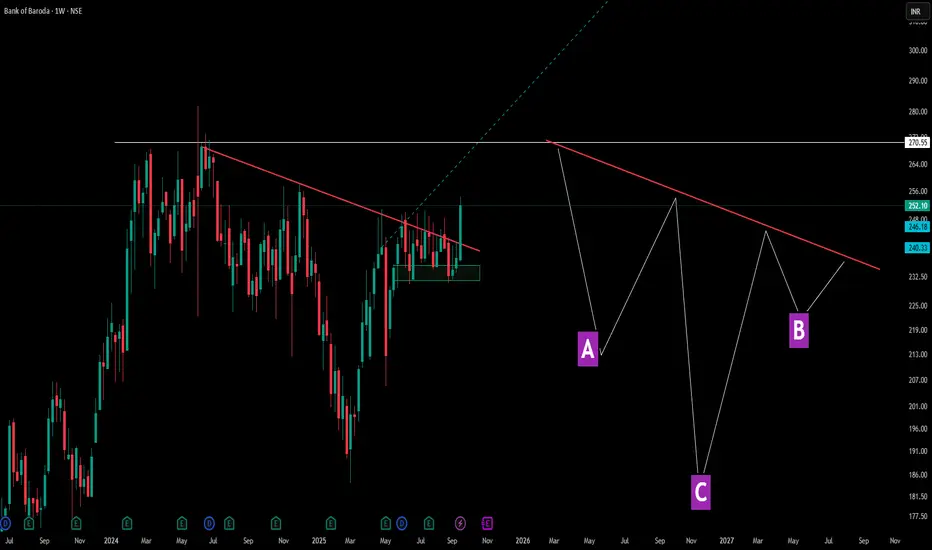
Decoding Angled Necklines in Inverted Head & ShouldersThis chart showcases a perfect example of how inverted head and shoulders patterns don't always follow textbook formations. Points A and B represent the shoulders, while C forms the deeper head—but notice the crucial difference: the neckline (red line) is tilted rather than horizontal.
Pattern Education Points:
- Traditional vs Reality: While many educational materials show horizontal necklines, real market patterns frequently display angled necklines, which are equally valid
-Shoulder Structure: The left shoulder (A) and right shoulder (B) don't need perfect symmetry—market patterns reflect actual supply and demand dynamics, not geometric precision
Market Structures:
- Before A, There was serious consolidation and then a Lower Low formation in the markets -> showcasing a dry volume dip and significant correction ( marking C ) as well as a result .
- Accompanied by a decent V shape recovery, tilted neckline is been touched again - showcasing market multi structure patterns are really important and there identification can lead to a decent trade idea
- later the next shoulder ( B ) gives solid consolidation but this time the dip is not solid unlike the normal Inverted HnS which makes the 2nd dip equal to the 1st shoulder dip here its a solid consolidation with small dip and a marubozu green candle after that .
Disclaimer: This content is for educational purposes and not financial advice. Always do your own research before making trading decisions.