Part 1 Intraday Institutional Trading How Option Premium Is Calculated
Premium = Intrinsic Value + Time Value + Volatility Value
1. Intrinsic Value (IV)
Actual value based on difference between spot and strike.
2. Time Value
More days to expiry → higher premium
Closer to expiry → premium decays (Theta)
3. Volatility (Implied Volatility – IV)
Higher volatility = higher premium
Low volatility = low premium
X-indicator

Part 5 Advance Trading Strategies The Option Contract Components (Very Important)
These are the most important terms every trader must understand:
1. Spot Price
Current market price of the underlying asset.
2. Strike Price
Pre-decided price at which the option buyer may buy/sell.
3. Premium
Price paid for the option.
4. Expiry
Last date on which option is valid.
In India:
Weekly expiry → Thursday
Monthly expiry → Last Thursday
5. Lot Size
Options are traded in fixed lots.
E.g., Nifty = 25 units per lot.
6. Option Chain
A data table that shows all strikes, premiums, volume, OI, IV.

Support Hold & Continuation Toward Premium Resistance
Chart Analysis
On the 1H timeframe, Gold is showing a bullish continuation setup after a corrective phase.
Market Structure
Price previously made a strong impulsive drop, then mitigated the FVG (fair value gap) around the 4,65x–4,75x area.
After mitigation, price formed higher lows, signaling a shift from bearish correction to bullish intent.
Current structure is range-to-expansion rather than trendless chop.
Key Levels
Support zone (≈ 5,000–5,030)
This area has been:
Previously resistance
Successfully flipped into support
Multiple candle rejections confirm buyers defending the level
Resistance / Target zone (≈ 5,220–5,260)
Clear supply zone
Likely resting liquidity from prior highs
Logical bullish target if support holds
Trade Idea Logic (as drawn)
Entry: Near support after consolidation
Bias: Bullish continuation
Target: Premium resistance zone
Rationale:
Support hold
Higher-low structure
Previous imbalance already mitigated
Price building acceptance before expansion
What Would Invalidate This Setup
A clean H1 close below the support zone
Loss of higher-low structure → opens risk of deeper retrace toward the FVG again
Overall Bias
📈 Bullish while above support
This is a classic buy-the-dip into support → target premium liquidity setup.

#SMSPHARMA - VCP BO in DTFScript: SMSPHARMA
Key highlights: 💡⚡
📈 VCP BO in DTF
📈 Volume spike seen during Breakout
📈 MACD Bounce
📈 RS Line making 52WH
If you have any doubts about the setup, drop a comment and I’ll reply.
✅ Boost and Follow to never miss a new idea!✅
✅Repost 🔁 Like <3 and Follow to never miss a new idea! ✅
⚠️ Important: Always Exit the trade before any Event.
⚠️ Important: Always maintain your Risk:Reward Ratio as 1:2, with this RR, you only need a 33% win rate to Breakeven.
⚠️Disclaimer: I’m not SEBI Registered RA. My posts are purely for training and educational purposes.
Eat🍜 Sleep😴 TradingView📈 Repeat 🔁

Gold Analysis & Trading Strategy | February 12✅ 4H Trend Analysis
● Yesterday, after breaking above 5070, price surged toward the 5119 high but failed to achieve a confirmed breakout.
● It is currently trading around MA10 / MA20 (approximately 5020–5090). The bullish moving average structure remains intact, but it is clearly flattening.
● The Bollinger Bands are narrowing, and price is oscillating around the middle band, indicating the trend has entered a consolidation phase.
● The bullish structure has not been broken, but momentum at higher levels is weakening, and the market is entering a direction-selection stage.
✅ 1H Trend Analysis
● The 1-hour chart shows a clear range-bound movement (approximately 5040–5080).
● MA5 / MA10 are crossing frequently, and the Bollinger Bands continue to contract.
● There is no short-term trend; this is a volatility compression phase ahead of key data.
🔴 Resistance
● 5100–5120 (previous high resistance)
● 5150–5180 (target after breakout)
🟢 Support
● 5020–5000 (short-term boundary)
● 4940–4900 (structural defense zone)
✅ Trading Strategy Reference
🔰 Long Strategy (Buy on pullback)
👉 Entry 1: 5020–5030
👉 Entry 2: 4980–5000
🎯 Targets: 5080 / 5100 / 5120 / 5150
🔰 Short Strategy (Light short at resistance)
👉 Entry: Light short between 5100–5120
🎯 Targets: 5050 / 5030 / 5000
⚠️ Today’s Risk Reminder (Important)
● Today, the U.S. Initial Jobless Claims data will be released.
● Avoid chasing trades within one hour before the data release.
● At the moment of release, rapid price fluctuations of $20–40 may occur.
● False breakouts are common, and slippage risk increases.
👉 If the data is bullish for gold (weaker employment): price may directly break above 5120 and accelerate upward.
👉 If the data is bearish for gold (strong employment): price may fall below 5000 and test 4940.

Part 4 Institutional Trading VS. Technical AnalysisOption Buyers vs. Option Sellers
The option market has two sides:
✔ 1) Option Buyer
Pays premium
Holds the right (to buy/sell)
Profit potential → unlimited
Loss → limited to premium paid
Needs movement in price and volatility
✔ 2) Option Seller (Writer)
Receives premium
Takes obligation
Limited profit → only premium
Loss → theoretically unlimited
Needs the market to stay stable or move opposite to buyer
Sellers usually have higher probability of winning but high risk exposure.

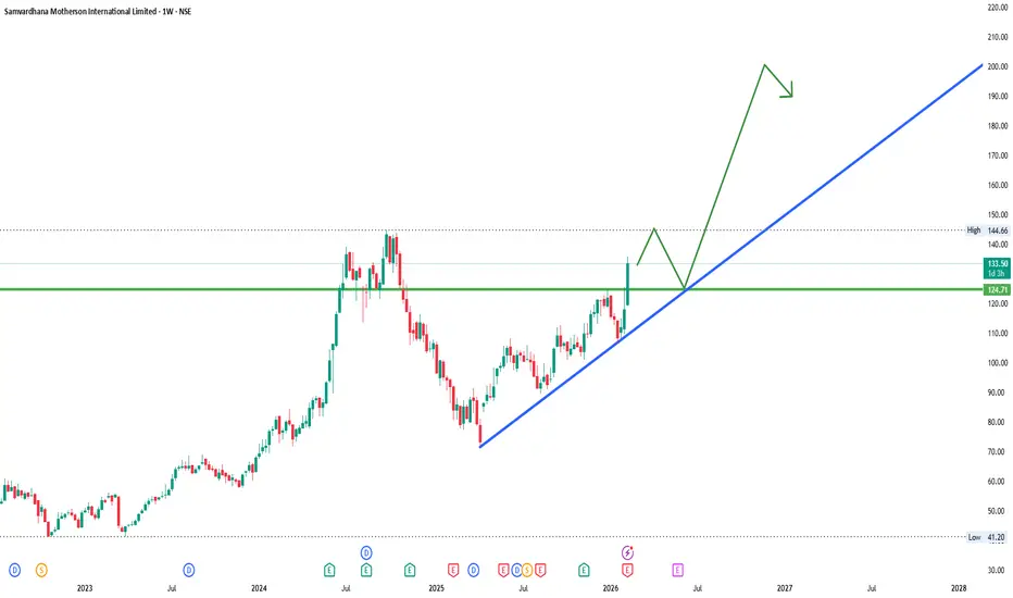
MOTHERSONMOTHERSON
bullish trend is Showing on the chart.
buy signals in
technical indicators and
ascending triangle chart pattern.
Part 3 Institutional Trading VS. Technical AnalysisWhat Are Options? — The Foundation
Options are derivative contracts whose price is derived from an underlying asset like:
Stocks
Indices (Nifty, Bank Nifty)
Commodities
Currencies
An option is a contract between a buyer and a seller that gives special rights to the buyer.
✔ In simple words:
An option gives you the right, but not the obligation, to buy or sell the underlying at a fixed price before a fixed date.
This fixed price = Strike Price
This fixed date = Expiry Date
Options are of two types: Call & Put.

MCX TRENDLINE, IF FOLLOWS, BOOK 5-6 % FOR SHORT TERM TRADERShis stock has been riding the same trendline since way before the split. 📈 fundamentals and technicals are looking strong, gap is filled, and volume is pumping. orders are flowing in for a great trade! 🚀 #stockmarket #trading

XAUUSD (H1) – Liam View | Gold ConsolidatingXAUUSD (H1) – Liam View | Gold Compressing Below Supply, Breakout Loading?
Gold is holding firm above the ascending trendline near 5,050, consolidating after the recent impulsive push. Price structure remains constructive, forming higher lows while compressing beneath a visible FVG supply zone around 5,250 – 5,300.
This is not random movement.
This is liquidity building.
Macro Backdrop
Fresh reports indicate Japan requested the US to check USD/JPY levels in January during yen weakness — a move often interpreted as a precursor to possible currency intervention.
Why this matters for gold:
Any USD instability from FX intervention risk can weaken the dollar.
Lower USD strength generally supports gold upside.
With markets already sensitive to Fed direction and global debt risks, volatility expansion is likely.
Gold is quietly positioning while FX tensions rise.
Technical Structure (H1)
From the chart:
Immediate support / trendline zone: 4,980 – 5,020
Fibonacci buy cluster: 4,900 – 4,950
Major upside imbalance (FVG): 5,250 – 5,300
Extended projection: 5,400+ (if supply is reclaimed)
Price is respecting the ascending structure. The current pullback is shallow — no structural breakdown.
Scenarios
Primary Bias – Upside Continuation
As long as price holds above the trendline and 4,980 support, upside expansion toward 5,250 liquidity remains the higher-probability path.
Liquidity Sweep Scenario
A temporary dip into 4,950 before expansion would still maintain bullish structure.
Only a clean H1 close below 4,900 shifts control back to sellers.
Liam’s Bottom Line
Trend is intact.
Structure is compressing.
Macro volatility is rising.
When price compresses beneath supply with higher lows forming — expansion usually follows.
Trade the level.
Respect the structure.
Let liquidity confirm the move.
— Liam

MOTHERSON 1 Month Time Frame 📌 Current Market Snapshot (as of Feb 12, 2026)
Latest observed share price: ~₹132–₹133 (approx daily close/current charging)
52-week trading range: ~₹71.50 (low) to ~₹135.83 (high)
📊 1-Month Technical Levels — Short-Term (Daily Pivot-Based)
Pivot Point Levels (Classic) — useful for short swing & intra-week trades:
Level Price (Approx)
R3 (High Resistance) ₹123.38
R2 ₹121.51
R1 ₹119.80
Pivot Point (PP) ₹117.93
S1 (Support) ₹116.22
S2 ₹114.35
S3 ₹112.64
👉 These levels are based on very recent daily ranges/pivots valid for the 1-month view cycle — traders often use these as entry/exit or trend confirmation zones.
Short-term interpretation:
Trading above pivot (~₹117.9–₹118) implies short-term bullish bias.
Immediate resistance cluster is ₹119–₹123+ (watch for a breakout).
Support cluster sits near ₹112–₹116 — break below may shift short-term bias bearish.
🧠 How Traders Use These Levels
Bullish Scenario
Sustained price above pivot (~₹118) → valid long signals
Key short-term targets: ₹119–₹123 + zone
Neutral / Range Bound
Price oscillating between ₹116–₹123
Expect sideways movement with occasional volatility
Bearish Scenario
Break & close below ₹112–₹114 region → continuation down
Next lower support would be recent swing lows around previous lows (not pivot-calculated)
📌 Summary (1-Month Technical View)
Bullish short-term bias zone: Above ~₹118
Immediate resistance: ~₹119–₹123
Strong support range: ~₹112–₹116
Neutral majority: Consolidation likely unless a decisive breakout/breakdown occurs.

Gold Analysis & Trading Strategy | February 11-12✅ 1H Trend Analysis
● After breaking above 5070, price surged to a high of 5119 but failed to continue accelerating, forming a short-term top.
● The bullish structure remains intact, but after the push higher, the market has entered a consolidation and correction phase.
● Price is currently ranging between 5030–5100, and the moving averages are beginning to converge.
● The Bollinger Bands are narrowing, indicating volatility compression and a wait for the next directional move.
● The 5000–4980 zone is the key short-term boundary.
👉 The core focus is the breakout direction of 5000 and 5100.
🔴 Resistance
● 5100–5120 (previous high resistance)
● 5160–5180 (extended target after breakout)
🟢 Support
● 5000–4980 (key boundary zone)
● 4940–4900 (structural defense zone)
✅ Trading Strategy Reference
🔰 Long Strategy (Buy on pullback)
👉 Entry 1: 5000–5020
👉 Entry 2: 4970–4980
🎯 Target 1: 5100
🎯 Target 2: 5160
🔰 Short Strategy (Light short near previous highs)
👉 Entry: Light short between 5100–5120
🎯 Target: 5050 / 5020 / 4980
✅ Risk Control
● If price holds firmly above 5120 → bullish acceleration, upside space opens
● If price breaks below 4980 → structure weakens, deeper pullback likely
● Current phase: The rally failed to hold, but the trend has not turned bearish; range-bound consolidation, waiting for direction.

Nifty 50: Mean Reversion Long (21-02-2026)Trade Setup: 200 EMA Support Bounce (15m Timeframe)
Based on the current alignment where the price is testing the 15m 200 EMA (25,735) while the StochRSI is Oversold, here is a high-probability tactical setup.
The Setup: "Mean Reversion Long"
This trade assumes the 4H Macro trend remains intact and the current dip is a healthy correction to a major technical floor.
Entry Zone: 25,735 – 25,750
Condition: Wait for a 5-minute or 15-minute green candle to close above the 200 EMA (Purple line) to confirm support is holding.
Stop-Loss (SL): 25,695
Logic: Placed below the recent structural pivot and the 200 EMA buffer zone. If this breaks, the Tier B setup invalidates into a Tier C (Bearish).
Take-Profit Targets (TP):
TP1: 25,837 (Recent consolidation midpoint / 100 EMA)
TP2: 25,870 (Red Resistance Line / 50 EMA confluence)
TP3: 25,950 (Upper resistance zone)
Execution Risk Parameters
Risk Metric Value Note
Risk/Reward Ratio ~1:2.5 Excellent ratio for a mean reversion play.
Trailing Strategy Move SL to Break-even Once price hits 25,810, lock in the trade.
Invalidation Signal 15m Close < 25,720 If the 200 EMA is lost on a closing basis, exit immediately.
The "Bull Trap" Watch
If the price reaches 25,870 (TP2) and the StochRSI is already Overbought (≥80) on the 15m, do not add to the position. This is a high-confluence zone for a "Lower High" formation. Expect a rejection there unless the 1H candle closes decisively above it.

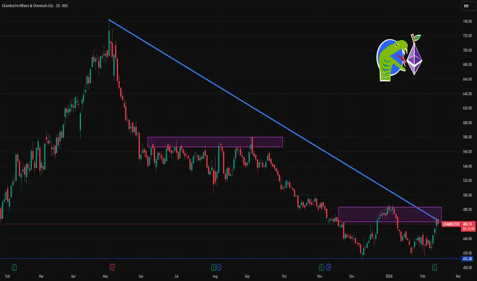
CHAMBLFERT 1 Day Time Frame 📌 Current Live Price (Approx)
₹456 – ₹466 per share on NSE/BSE this trading session (day range ~₹455 – ₹467).
📊 Daily Support & Resistance Levels (Key Levels Today)
🔹 Pivot & Mid-Range
Daily Pivot Point: ~₹460 – ₹464 (central anchor for today’s bias) — important intraday reference.
🟢 Resistance Levels (Bullish Targets)
1. R1: ~₹465 – ₹468 — first major resistance overhead.
2. R2: ~₹472 – ₹475 — stronger breakout zone above near-term range.
3. R3: ~₹475 + — secondary resistance above R2.
📈 If price sustains above daily pivot (~₹460) with volume, bulls may test ₹472-₹475+ later in the session.
🔻 Support Levels (Bearish Floors)
1. S1: ~₹453 – ₹454 — first support if price weakens intraday.
2. S2: ~₹444 – ₹445 — intermediate support zone.
3. S3: ~₹434 – ₹438 — strong support area from prior daily lows.
📉 A break below ₹444-₹438 could accelerate selling toward lower supports near the recent range lows.
🔍 How To Use These Levels Today
Bullish scenario
Keep an eye if price holds above ₹460 pivot.
Resistance area ₹465-₹472 is key intraday upside target zone.
Bearish scenario
If price drops below ₹453, look toward supports at ₹445 then ₹434.
A decisive break below ₹434 may open deeper correction intra-day.
BLUEJET 1 Week Time Frame 📌 Current Price
Last traded around ₹441–₹443 (NSE/BSE).
📍 Key Support & Resistance Levels
These pivot-style levels reflect typical short-term levels traders watch on a 1-week timeframe:
📉 Support Levels
S1: ~₹436
S2: ~₹430
S3: ~₹422
📈 Resistance Levels
R1: ~₹451
R2: ~₹459
R3: ~₹465
📍 Pivot Point: ~₹444 (weekly basis) — this is a central level biasing above = bullish pressure, below = bearish bias.
📊 1-Week Trend/Movement
Price has roughly gained on a weekly basis recently (one report ~+7.27% over 1 week).
Technical indicators on short timeframes show mixed to neutral signals — not strongly trending but with potential inflection ranges between support ~₹422–₹430 and resistance ~₹451–₹465.
🗓 Summary – 1-Week Timeframe View
Bullish if price sustains above:
✔ ₹444 (weekly pivot) → would indicate strength toward ₹451–₹465
Bearish if breaks below:
✘ ₹430 / ₹422 support zone → opens downside risk
Neutral range to watch: ₹430–₹451 — If price stays within this range, it’s likely consolidating before next breakout/breakdown.

XAUUSD – Rising channel intact.XAUUSD – Rising Channel Holding as Geopolitical Risk Builds | Lana ✨
Gold continues to trade within a well-defined ascending channel on H2, maintaining higher lows while compressing near the mid-range of the structure. This sideways movement is not weakness — it reflects accumulation and liquidity building before the next expansion phase.
The broader structure across timeframes still favors buyers as long as the rising channel remains intact.
📊 Technical Analysis
1️⃣ Market Structure
Price is consolidating above 5,000 within a rising channel. No bearish break of structure has formed.
2️⃣ Trend Context
The internal ascending trendline continues to guide momentum. Pullbacks remain corrective while above 4,900–4,950.
3️⃣ Key Liquidity Zones
5,260–5,270: Short-term sell FVG reaction zone
5,450+: Strong liquidity & higher-timeframe supply
5,600: Previous all-time high liquidity
4,900–4,950: Buy support zone
4,600 area: Deeper liquidity sweep zone
4️⃣ Compression Phase
Price is tightening within a smaller bullish channel inside the broader structure — typically a precursor to volatility expansion.
🌍 Fundamental Catalyst
Geopolitical tensions remain elevated as Iran signals openness to broader nuclear inspections amid growing pressure from the US and Israel. However, uncertainty remains after IAEA reported limited access to key facilities and ongoing concerns over enriched uranium levels.
This combination of diplomatic tension, inspection uncertainty, and military risk continues to support safe-haven flows into gold.
Meanwhile, softer USD dynamics and easing bond yields further reinforce structural support for bullion.
🎯 Outlook Scenario
As long as gold holds above 4,900–5,000, the medium-term structure remains constructive.
A confirmed breakout above 5,270 opens the path toward 5,450 liquidity and potentially a retest of the 5,600 all-time high zone.
Short-term pullbacks remain part of the bullish structure unless the channel support breaks decisively.
🧠 Lana’s Perspective
Gold is not overextended — it is consolidating within strength. Sideways movement inside a rising structure often precedes expansion. Patience during compression phases allows better positioning when momentum returns.
✨ Respect the channel. Respect liquidity. Let the market confirm before committing risk.

FIVESTAR 1 Week Time Frame 📊 Current Price Context (as of mid-Feb 2026)
The stock trades around ₹430–₹454 on the NSE/BSE.
52-week range: ~₹420.55 (low) to ₹850 (high).
📉 Short-Term (1-Week) Price Movement
Over the past week, the stock has mostly traded in a downtrend or slight negative return, with 1-week returns negative (approx. −1% to −7% based on different data sources).
📍 Key Short-Term Levels (Support & Resistance)
Approximate short-term levels traders often watch:
Immediate resistance: ~₹440–₹445+ — a level a break above could signal short-term uplift.
Near support: ~₹427–₹423 — this zone corresponds to recent low swings on the weekly chart.
Lower support risk: ~₹418–₹417 — below the recent 52-week low area; breaks here could signal deeper short-term weakness.
(These levels are typical short-term technical pivot levels used in trading and do not guarantee future movement.)
📈 Short-Term Technical Signals
Short-term technical indicators (e.g., moving averages and momentum tools) are neutral to slightly bearish, with some systems suggesting downward pressure in the near future.
A break above the near resistance at ~₹440–₹445 with strong volume could flip short-term sentiment toward bullish.
🧠 Summary (1-Week Outlook)
Trend: Slight downtrend/weakness over the last few sessions.
Key levels to watch this week:
• Resistance: ~₹440–₹445+
• Support: ~₹427–₹423
• Lower risk pivot: ~₹418
👉 Short-term trading tends to react to market sentiment and broader index moves, so weekly shifts could be influenced by Indian equity market trends as well.

BALAJITELEBALAJITELE
bullish trend is Showing on the chart.
buy signals in
technical indicators and
ascending triangle chart pattern.

Carbon Credits & Emissions Trading1. The Concept of Carbon Pricing
At the heart of carbon credits and emissions trading is the idea of carbon pricing. Carbon pricing assigns a monetary cost to emitting greenhouse gases. The rationale is simple: when polluters pay for emissions, they are motivated to reduce them. Economists argue that pricing carbon corrects a “market failure,” where environmental damage (a negative externality) is not reflected in the cost of goods and services.
There are two main carbon pricing approaches:
Carbon Tax – A direct price is set on each ton of CO₂ emitted.
Cap-and-Trade (Emissions Trading System) – A cap is set on total emissions, and companies trade emission allowances.
Carbon credits are most closely associated with the cap-and-trade model and voluntary offset markets.
2. What Are Carbon Credits?
A carbon credit represents the reduction or removal of one metric ton of carbon dioxide (or its equivalent in other greenhouse gases). These credits can be bought and sold in carbon markets.
There are two primary types of carbon credits:
a) Compliance Carbon Credits
These are used in regulated markets under government-imposed emissions caps. Companies that exceed their emission limits must purchase credits to comply with regulations.
b) Voluntary Carbon Credits
These are purchased by companies, organizations, or individuals who voluntarily offset their emissions. For example, a corporation may buy credits to claim carbon neutrality.
3. How Emissions Trading Systems (ETS) Work
An Emissions Trading System, often called cap-and-trade, operates in the following way:
Setting the Cap
The government sets a maximum limit (cap) on total emissions allowed within a specific sector or economy. This cap typically decreases over time to ensure gradual emission reductions.
Allocation of Allowances
Companies receive or purchase emission allowances. Each allowance permits the holder to emit a certain amount of CO₂ (usually one ton per allowance).
Trading
Companies that reduce emissions below their allocated limit can sell surplus allowances. Those that exceed their limit must buy additional allowances.
Compliance
At the end of a compliance period, companies must surrender enough allowances to cover their actual emissions. Failure results in penalties.
This system ensures that total emissions remain within the cap while encouraging cost-effective reductions.
4. Carbon Offset Projects
Carbon credits often originate from projects that reduce or remove emissions. These projects must demonstrate that emission reductions are real, measurable, and additional (meaning they would not have happened without the carbon finance incentive).
Examples include:
Reforestation and afforestation (planting trees)
Renewable energy projects (wind, solar, hydro)
Methane capture from landfills or livestock
Energy efficiency improvements
Carbon capture and storage (CCS) technologies
Project developers quantify the emissions reduced and receive certified carbon credits that can be sold in carbon markets.
5. Major Carbon Markets Around the World
Several significant carbon markets operate globally:
European Union Emissions Trading System (EU ETS)
Launched in 2005, the EU ETS is the world’s largest carbon market. It covers power plants, industrial facilities, and aviation within Europe. The cap decreases annually, driving steady emission reductions.
California Cap-and-Trade Program
California operates one of the most comprehensive sub-national carbon markets, covering electricity generation, transportation fuels, and industry.
China’s National ETS
China launched its national carbon market in 2021, initially covering the power sector. It is now the world’s largest ETS by emissions covered.
Voluntary Carbon Market
Companies like Microsoft, Google, and Amazon purchase voluntary carbon credits to meet sustainability commitments. These markets are less regulated but growing rapidly.
6. Advantages of Carbon Credits and Emissions Trading
a) Cost-Effectiveness
ETS allows companies to reduce emissions where it is cheapest. Firms with low reduction costs cut more emissions and sell allowances, creating overall efficiency.
b) Flexibility
Companies can choose how to meet targets—through technological upgrades, process improvements, or purchasing credits.
c) Innovation Incentive
A price on carbon encourages investment in low-carbon technologies such as renewable energy, electric vehicles, and energy-efficient systems.
d) Environmental Certainty (in Cap-and-Trade)
Since the cap sets a maximum emissions level, environmental outcomes are predictable if the cap is strict enough.
7. Challenges and Criticisms
Despite their benefits, carbon markets face several criticisms and challenges:
a) Price Volatility
Carbon prices can fluctuate significantly, creating uncertainty for investors and businesses.
b) Over-Allocation
If too many allowances are issued, carbon prices drop, reducing incentives to cut emissions (as seen in early phases of the EU ETS).
c) Quality Concerns in Voluntary Markets
Some voluntary carbon credits have been criticized for lacking “additionality” or overestimating emission reductions.
d) Carbon Leakage
Industries might relocate to countries with weaker climate policies, undermining global emission reduction efforts.
e) Equity Issues
Critics argue that carbon markets may allow wealthy polluters to continue emitting by simply purchasing credits rather than reducing emissions at source.
8. Carbon Credits vs Carbon Offsets
While often used interchangeably, the terms have subtle differences:
A carbon credit is a tradable certificate representing one ton of CO₂ reduced or removed.
A carbon offset refers to the act of compensating for emissions by funding projects that reduce emissions elsewhere.
In compliance markets, credits function as regulatory instruments. In voluntary markets, offsets are often used for corporate sustainability goals.
9. The Future of Carbon Markets
Carbon markets are expanding globally as countries strive to meet targets under the Paris Agreement, which aims to limit global warming to well below 2°C above pre-industrial levels.
Emerging trends include:
Linking carbon markets between countries
Stronger regulation of voluntary carbon markets
Integration of nature-based solutions
Increased transparency and digital tracking using blockchain technology
Development of carbon border adjustment mechanisms (CBAM) to prevent carbon leakage
Experts believe carbon pricing will play a central role in achieving net-zero emissions by mid-century.
10. Conclusion
Carbon credits and emissions trading systems represent innovative, market-based solutions to climate change. By putting a price on carbon, they align environmental goals with economic incentives. Emissions trading ensures that pollution is reduced at the lowest possible cost, while carbon credits encourage global investment in sustainable projects.
However, the effectiveness of these systems depends on strong regulatory oversight, strict caps, transparency, and high-quality credit verification. When properly designed and implemented, carbon markets can significantly contribute to global decarbonization efforts.

Volatility Trading (VIX, IV crush)1. What is Volatility in Financial Markets?
Volatility measures the magnitude of price fluctuations in a financial instrument over time.
High volatility = large, rapid price movements.
Low volatility = small, stable price movements.
Volatility does not indicate direction (up or down), only movement size.
Traders often say: “Volatility is the price of uncertainty.”
2. Types of Volatility
A. Historical (Realized) Volatility
Calculated from past price movements.
Based on standard deviation of returns.
Backward-looking.
Used to compare past market behavior.
Does not predict future volatility directly.
B. Implied Volatility (IV)
Derived from option prices.
Forward-looking estimate of expected volatility.
Reflects market expectations.
Higher IV = more expensive options.
IV changes constantly based on demand/supply of options.
3. Why Volatility Matters in Options Trading
Options pricing is heavily influenced by volatility.
Key option pricing model: Black-Scholes.
Major components affecting options:
Underlying price
Strike price
Time to expiration
Interest rates
Implied volatility
Vega measures sensitivity of option price to IV changes.
If IV rises → option premiums increase.
If IV falls → option premiums decrease.
4. The VIX (Volatility Index)
A. What is VIX?
VIX stands for Volatility Index.
Created by CBOE (Chicago Board Options Exchange).
Based on S&P 500 index options.
Measures expected 30-day forward volatility.
Often called the “Fear Index.”
B. How VIX Works
VIX uses out-of-the-money calls and puts.
It calculates implied volatility across strikes.
Expressed in percentage terms.
Example:
VIX = 20 → market expects ±20% annualized volatility.
Higher VIX = higher fear/uncertainty.
C. VIX Levels Interpretation
Below 15 → Calm market.
15–20 → Normal market conditions.
20–30 → Increased uncertainty.
30+ → High fear / crisis conditions.
50+ → Extreme panic (e.g., 2008 crisis, COVID crash).
5. Ways to Trade Volatility
A. Trading VIX Directly (Indirectly)
Cannot trade VIX spot directly.
Traders use:
VIX futures
VIX options
ETFs like VXX, UVXY
VIX usually moves opposite to S&P 500.
When market crashes → VIX spikes.
When market rallies steadily → VIX falls.
B. Trading Volatility Using Options
Buy options when expecting volatility increase.
Sell options when expecting volatility decrease.
Common volatility strategies:
Straddle
Strangle
Iron Condor
Calendar Spread
Butterfly Spread
6. Long Volatility Strategy
Trader expects large price movement.
Direction may be uncertain.
Buy call + buy put (Straddle).
Profit if:
Big move up
Big move down
IV increases
Used before major events:
Earnings
Fed meetings
Elections
Risk: If price stays flat and IV drops → losses.
7. Short Volatility Strategy
Trader expects calm market.
Sells options to collect premium.
Example strategies:
Short straddle
Short strangle
Iron condor
Profit when:
Price stays in range.
IV declines.
Risk:
Sudden large market move.
Volatility spike.
Often described as “picking up pennies in front of a steamroller.”
8. IV Crush (Implied Volatility Crush)
A. What is IV Crush?
Sudden drop in implied volatility.
Occurs after a major event.
Causes option prices to fall sharply.
Even if stock moves correctly, option may lose value.
Very common after earnings announcements.
B. Why IV Crush Happens
Before events → uncertainty high.
Traders bid up option premiums.
After event → uncertainty removed.
Implied volatility collapses.
Option extrinsic value shrinks rapidly.
C. Example of IV Crush
Stock trading at $100.
Earnings tomorrow.
Call option costs $5 due to high IV.
Earnings released.
Stock moves to $103.
IV drops sharply.
Call option falls to $3.
Despite correct direction, trader loses money.
9. How Traders Exploit IV Crush
A. Selling Premium Before Earnings
Sell straddle before earnings.
Collect inflated premium.
After earnings → IV drops.
Buy back options cheaper.
Profit from volatility collapse.
B. Iron Condor Strategy
Sell out-of-the-money call spread.
Sell out-of-the-money put spread.
Limited risk.
Benefit from IV crush + time decay.
Popular among income traders.
10. Volatility Term Structure
Shows IV across different expiration dates.
Can be:
Contango (long-term IV > short-term IV)
Backwardation (short-term IV > long-term IV)
VIX futures often in contango during calm markets.
Backwardation occurs during panic.
Important for VIX ETF traders.
11. Volatility Smile and Skew
IV varies across strike prices.
Out-of-the-money puts often more expensive.
Known as “volatility skew.”
Reflects downside crash fear.
Important in pricing strategies.
12. Greeks Related to Volatility Trading
Vega – sensitivity to IV change.
Theta – time decay.
Gamma – rate of delta change.
Delta – directional exposure.
Volatility traders focus heavily on Vega.
13. Risks in Volatility Trading
Volatility is mean-reverting.
Timing is critical.
Leverage can amplify losses.
Short volatility has tail risk.
VIX products suffer from decay.
Retail traders often misunderstand IV crush.
14. Professional Volatility Trading
Hedge funds trade volatility as an asset class.
Market makers hedge delta constantly.
Institutions use volatility for:
Hedging portfolios.
Arbitrage.
Dispersion trading.
Advanced strategies:
Gamma scalping.
Volatility arbitrage.
Variance swaps.
15. Key Psychological Aspect
Fear drives volatility spikes.
Complacency lowers volatility.
Retail traders often buy options at peak fear.
Professionals often sell volatility at peak fear.
Emotional discipline is critical.
16. When to Use Volatility Strategies
Before major macro events.
During earnings season.
In crisis periods.
When IV percentile is extremely high or low.
When expecting regime change.
17. IV Rank and IV Percentile
IV Rank compares current IV to past year range.
IV Percentile shows how often IV was lower.
High IV Rank → options expensive.
Low IV Rank → options cheap.
Helps in deciding buy vs sell volatility.
18. Summary
Volatility is central to options trading.
VIX measures expected S&P 500 volatility.
Implied volatility drives option pricing.
IV crush occurs after uncertainty events.
Long volatility profits from big moves.
Short volatility profits from stability.
Risk management is essential.
Volatility is cyclical and mean-reverting.
Professional traders trade volatility systematically.
Understanding IV behavior gives major edge in options markets.

Index Trading: (S&P 500, NASDAQ, DAX, Nikkei, Nifty)1. What Is a Stock Market Index?
A stock market index measures the performance of a selected group of stocks that represent a particular market or sector. Each index has its own methodology for selecting and weighting companies.
Indexes serve three main purposes:
Benchmarking portfolio performance
Measuring economic health
Providing trading and investment opportunities
You cannot directly buy an index itself, but you can trade financial products that track it.
2. Ways to Trade Indices
Index trading can be done through:
1. Futures Contracts
Standardized contracts to buy or sell an index at a future date at a predetermined price. Common among professional traders.
2. Options
Contracts giving the right (not obligation) to buy or sell an index at a specific price before expiration.
3. ETFs (Exchange-Traded Funds)
Funds that track an index and trade like stocks. Example:
SPY tracks S&P 500
QQQ tracks NASDAQ-100
4. CFDs (Contracts for Difference)
Popular with retail traders (outside the U.S.), allowing speculation on price movements with leverage.
3. Major Global Indices
S&P 500 (USA)
The S&P 500 (Standard & Poor’s 500) tracks 500 of the largest publicly traded U.S. companies. It is market-cap weighted, meaning larger companies (like Apple, Microsoft, Amazon) have more influence on price movement.
Key Features:
Considered the best representation of the U.S. economy
Highly liquid
Lower volatility compared to tech-heavy indices
Influenced by Federal Reserve policy, inflation data, and earnings
Who Trades It?
Institutional investors
Hedge funds
Long-term investors
Day traders
It is often seen as the “benchmark” of global equity markets.
NASDAQ-100 (USA)
4
The NASDAQ-100 contains 100 of the largest non-financial companies listed on the NASDAQ exchange. It is heavily weighted toward technology companies.
Key Features:
Tech-dominated (Apple, Microsoft, Nvidia, Meta, Tesla)
More volatile than S&P 500
Strong growth orientation
Reacts strongly to interest rate changes
Why Traders Like It:
Bigger price swings
Strong trends
Popular for short-term trading
Because of its volatility, it is favored by scalpers and day traders.
DAX (Germany)
4
The DAX 40 tracks 40 major German companies listed on the Frankfurt Stock Exchange.
Key Companies:
Siemens
SAP
BMW
Volkswagen
Adidas
Key Characteristics:
Export-driven economy sensitivity
Strong reaction to EU policy
Highly active during European session
Often volatile during overlap with U.S. session
The DAX is known for sharp intraday moves, making it popular among European day traders.
Nikkei 225 (Japan)
4
The Nikkei 225 tracks 225 large Japanese companies. Unlike many indices, it is price-weighted (similar to the Dow Jones).
Influencing Factors:
Yen exchange rate
Bank of Japan policy
Export data
Asian market sentiment
Trading Characteristics:
Active during Asian session
Sensitive to U.S. market performance
Can gap significantly overnight
It is widely traded by global investors seeking exposure to Asia.
Nifty 50 (India)
4
The Nifty 50 represents 50 major companies listed on the National Stock Exchange (NSE) of India.
Major Sectors:
Banking
IT services
Energy
Consumer goods
Key Characteristics:
Fast-growing emerging market
Influenced by global capital flows
Sensitive to oil prices
High retail participation
India’s economic growth story makes Nifty attractive to long-term investors and short-term traders alike.
4. Why Trade Indices Instead of Individual Stocks?
1. Diversification
You gain exposure to many companies at once, reducing single-company risk.
2. Lower Volatility (Generally)
Indices are less likely to collapse from one company’s bad earnings.
3. Cleaner Technical Trends
Indices often respect technical analysis better due to broader participation.
4. Macroeconomic Focus
Trading becomes more about economic data and global trends rather than company news.
5. Factors That Move Indices
1. Economic Data
GDP
Inflation (CPI, PPI)
Employment reports
PMI
2. Central Bank Decisions
Interest rates
Quantitative easing/tightening
3. Corporate Earnings
Large-cap companies can drive index direction.
4. Geopolitical Events
Wars, elections, trade agreements.
5. Currency Movements
Especially important for DAX, Nikkei, and Nifty.
6. Trading Strategies for Indices
Trend Following
Ride strong upward or downward momentum.
Breakout Trading
Enter when price breaks key support/resistance.
Mean Reversion
Trade pullbacks during ranging markets.
News Trading
Trade around high-impact economic releases.
Session-Based Trading
Nikkei → Asian session
DAX → European session
S&P/NASDAQ → U.S. session
7. Risk Management in Index Trading
Because indices can move quickly—especially NASDAQ and DAX—risk control is essential.
Key Principles:
Use stop-loss orders
Risk only 1–2% of capital per trade
Avoid overleveraging
Be aware of economic calendar
Leverage magnifies both profits and losses.
8. Comparison Overview
Index Region Volatility Best Trading Session Style
S&P 500 USA Moderate U.S. Balanced
NASDAQ USA High U.S. Growth/Tech
DAX Germany High Europe Aggressive
Nikkei Japan Moderate Asia Macro-driven
Nifty India Moderate–High Asia Emerging growth
9. Long-Term Investing vs Short-Term Trading
Long-Term
ETFs
Dollar-cost averaging
Economic growth exposure
Short-Term
Futures
CFDs
Intraday strategies
Both approaches use the same indices but different time horizons.
10. Final Thoughts
Index trading is one of the most efficient ways to participate in global financial markets. Whether trading the stability of the S&P 500, the volatility of the NASDAQ, the aggressive moves of the DAX, the macro-driven Nikkei, or the high-growth Nifty, each index offers unique opportunities.
Successful index trading requires:
Understanding macroeconomics
Monitoring global events
Practicing disciplined risk management
Developing a clear strategy
Because indices reflect entire economies rather than individual companies, they are often cleaner, more liquid, and more reliable for both beginners and professional traders.
If approached with proper education and discipline, index trading can be a powerful tool for wealth building and active income generation.

RBL BANK: 10DEMA GOLDEN CROSSOVER AND A RALLYRBL BANK:aFTER a consolidation phase has given 10DEMA Golden crossover against higher frame EMAs viz 20,50,100.
Golden crossover ,increase in volume ,price action suggests a move towards 320(For educational purpose only)

UNITDSPRUNITDSPR
bullish trend is Showing on the chart.
buy signals in
technical indicators and
descending triangle chart pattern.
