ATR ZLEMA [QuantAlgo]🟢 Overview
The ATR ZLEMA indicator identifies trend direction and reversal points using a Zero Lag Exponential Moving Average (ZLEMA) combined with volatility-adjusted dynamic trailing stops. It eliminates the inherent lag of traditional moving averages while incorporating Average True Range (ATR) volatility measurement to create adaptive support and resistance levels that automatically adjust to market conditions, with optional noise filtering to reduce whipsaws in choppy markets, helping traders and investors identify trend changes, maintain positions during trending markets, and exit when momentum shifts across multiple timeframes and asset classes.
🟢 How It Works
The indicator's core methodology lies in its zero-lag trend detection system combined with volatility-adaptive trailing stops, where the ZLEMA eliminates moving average lag while ATR-based bands provide dynamic support and resistance levels:
lag = math.floor((zlemaLength - 1) / 2)
rawZlema = ta.ema(source + (source - source ), zlemaLength)
The Zero Lag EMA calculation uses lag reduction through data compensation, adding the difference between current price and lagged price to eliminate the delay inherent in traditional exponential moving averages, providing faster response to trend changes while maintaining smoothness.
The script incorporates an optional ATR-based noise filter that prevents the ZLEMA from updating during insignificant price movements, helping to reduce false signals in choppy, range-bound markets:
if enableNoiseFilter
noiseThreshold = atr * noiseFilter
priceChange = math.abs(rawZlema - zlema)
if priceChange > noiseThreshold
zlema := rawZlema
First, the indicator calculates the Average True Range to measure current market volatility, then applies a user-defined multiplier to determine the distance of the trailing stop from the ZLEMA:
atr = ta.rma(ta.tr(true), atrLength)
atrBand = atr * atrMultiplier
Next, dynamic trend detection occurs through a state-based system where the indicator tracks whether the ZLEMA is above or below the ATR trailing line, automatically adjusting the trailing stop position:
if trend == 1
if zlema < zlemaATR
trend := -1
zlemaATR := zlema + atrBand
else
zlemaATR := math.max(zlemaATR, zlema - atrBand)
The ATR trailing line acts as a volatility-adjusted stop that follows the ZLEMA during trends but never moves against the trend direction. It ratchets upward with the ZLEMA in uptrends and ratchets downward in downtrends, creating a protective barrier that adapts to market volatility.
Finally, trend reversal signals are generated when the ZLEMA crosses the ATR trailing line, indicating a shift in market momentum:
bullSignal = trend == 1 and trend == -1
bearSignal = trend == -1 and trend == 1
This creates a volatility-adaptive trend-following system that combines ZLEMA with dynamic support/resistance levels and optional noise filtering, providing traders with responsive directional signals and automatic stop-loss levels that adjust to both price momentum and market volatility conditions.
🟢 Signal Interpretation
▶ Bullish Trend (Green): ZLEMA trading above ATR trailing line with indicator showing bullish color, indicating established upward momentum with zero-lag confirmation = Long/Buy opportunities
▶ Bearish Trend (Red): ZLEMA trading below ATR trailing line with indicator showing bearish color, indicating established downward momentum with zero-lag confirmation = Short/Sell opportunities
▶ ATR Trailing Line as Dynamic Support: In uptrends, the trailing line acts as volatility-adjusted support level that rises with ZLEMA, never declining = Use as potential stop-loss reference for long positions = ZLEMA holding above indicates trend strength and momentum continuation
▶ ATR Trailing Line as Dynamic Resistance: In downtrends, the trailing line acts as volatility-adjusted resistance level that falls with ZLEMA, never rising = Use as potential stop-loss reference for short positions = ZLEMA holding below indicates trend weakness and momentum continuation
🟢 Features
▶ Preconfigured Presets: Three optimized parameter sets for different trading styles and market conditions. "Default" provides balanced configuration suitable for swing trading on daily and 4-hour charts with standard ZLEMA and ATR periods, moderate multiplier, and moderate noise filtering that works across most market conditions. "Fast Response" delivers aggressive configuration designed for intraday trading and scalping on 5-minute to 1-hour charts with shorter ZLEMA period for quick trend detection, reduced ATR period for rapid volatility adaptation, tighter multiplier for early entries/exits, and minimal noise filtering for maximum responsiveness. This is ideal for active traders monitoring positions closely but expect more frequent signals and potential whipsaws in choppy conditions. "Smooth Trend" focuses on conservative configuration for position trading and long-term trend following on daily to weekly charts with extended ZLEMA period for smoother trend identification, longer ATR period for stable volatility measurement, wide multiplier to filter minor corrections, and aggressive noise filtering to ensure only strong sustained trends trigger signals. This is best for patient traders focused on major trend moves with fewer reversals.
▶ Built-in Alerts: Three alert conditions enable comprehensive automated monitoring of trend changes and zero-lag momentum shifts. "Bullish Trend" triggers when the ZLEMA crosses above the ATR trailing line and trend state changes from bearish to bullish, signaling potential long entry opportunities with lag-eliminated confirmation. "Bearish Trend" activates when the ZLEMA crosses below the ATR trailing line and trend state changes from bullish to bearish, signaling potential short entry or long exit points with immediate momentum detection. "Any Trend Change" provides a combined alert for any trend reversal regardless of direction, allowing traders to be notified of all zero-lag momentum shifts without setting up separate alerts. These notifications enable traders to capitalize on trend changes and protect positions without continuous chart monitoring, leveraging the indicator's zero-lag technology for faster trend change alerts.
▶ Color Customization: Six visual themes (Classic, Aqua, Cosmic, Ember, Neon, plus Custom) accommodate different chart backgrounds and visual preferences, ensuring optimal contrast for identifying bullish versus bearish trends across various trading environments. The adjustable cloud fill transparency control (0-100%) allows fine-tuning of the gradient area prominence between the ATR trailing line and ZLEMA, with higher transparency values (70-95) creating subtle background context without overwhelming the chart while lower values (20-40) produce bold, prominent trend zone emphasis for instant recognition. Optional bar coloring with adjustable transparency (0-100%) extends the trend color directly to the price bars themselves based on ZLEMA trend state, providing immediate visual reinforcement of current trend direction without requiring reference to the indicator lines.
BTCUSD

Institutional Structure [Clean Pro]Institutional Structure — Script Explanation
This script is designed to map institutional market behavior using high-timeframe structure, not retail noise.
It focuses on where smart money acts, not on frequent signals.
🔹 1. High-Timeframe Support & Resistance (HTF S/R)
The script identifies major structural highs and lows using a higher lookback period.
Purpose:
Defines where institutions previously distributed or accumulated
Acts as natural decision zones
Filters out low-quality intraday levels
Why it matters:
Institutions trade from key HTF levels, not random support/resistance.
🔹 2. Equilibrium (50% Mean Price)
The equilibrium line represents the fair price between HTF high and low.
How it’s used:
Below equilibrium → discount zone (buy interest)
Above equilibrium → premium zone (sell interest)
Professional insight:
Smart money prefers buying discounts and selling premiums, not chasing price.
🔹 3. Market Structure Shift (MSS)
Instead of frequent BOS labels, the script detects true directional shifts.
Bullish MSS:
Price closes above previous HTF high
Bearish MSS:
Price closes below previous HTF low
Why MSS over BOS:
MSS confirms control change
Reduces false signals
Aligns with institutional execution logic
🔹 4. Liquidity Sweep Detection (Wick-Based)
The script identifies stop-hunt behavior using wick rejection logic.
Buy-side liquidity:
Wick above HTF high, but close back below
Sell-side liquidity:
Wick below HTF low, but close back above
Meaning:
Stops were triggered, but price failed to accept → smart money absorption
🔹 5. Fair Value Gap (FVG) – Refined Imbalance
Fair Value Gaps highlight inefficient price movement.
Bullish FVG:
Price leaves an upside imbalance
Bearish FVG:
Price leaves a downside imbalance
How pros use it:
As reaction zones, not entry signals
Best combined with liquidity + MSS
🔍 How Everything Works Together
The script is context-based, not signal-based:
1️⃣ HTF structure defines the battlefield
2️⃣ Liquidity is taken (stop hunts)
3️⃣ MSS confirms direction
4️⃣ FVG offers precision
5️⃣ Equilibrium filters bias
This creates high-probability trade environments, not overtrading.
📌 Best Practices (Professional Use)
Timeframes: 1H / 4H / Daily
Avoid lower TF noise
Trade only after liquidity is taken
Use FVG as confirmation, not trigger
Respect equilibrium bias
🎯 Summary
✔ Clean institutional logic
✔ No clutter, no spam
✔ HTF-driven decisions
✔ Liquidity-first mindset
✔ Designed for BTC, Gold & FX
🧠 Trade where institutions trade — not where indicators flash.

BTC Fundamental Value Hypothesis [OmegaTools]BTC Fundamental Value Hypothesis is a macro-valuation and regime-detection model designed to contextualize Bitcoin’s price through relative market-cap comparisons against major capital reservoirs: Gold, Silver, the Altcoin market, and large-cap equities. Instead of relying on traditional on-chain metrics or purely technical signals, this tool frames BTC as an asset competing for global liquidity and “store-of-value mindshare”, then estimates an implied fair value based on how BTC historically coexists (or diverges) from these benchmark universes.
Core concept: relative market-cap anchoring
The indicator builds a reference-based fair price by translating external market capitalizations into implied BTC valuation using a dominance framework. In practice, you choose one or more reference universes (Gold, Silver, Altcoins, Stocks). For each selected universe, the script computes how large BTC “should be” relative to that universe (dominance ratio), and converts that into an implied BTC price. The final fair price is the average of the implied prices from the enabled universes.
Two dominance modes: automatic vs manual
1. Automatic Dominance % (default)
When enabled, the model estimates dominance ratios dynamically using a 252-period simple moving average of BTC market cap divided by each reference market cap. This produces an adaptive baseline that follows structural changes over time and reduces sensitivity to short-term spikes.
2. Manual Dominance %
If you prefer a discretionary macro thesis, you can directly input dominance parameters for each reference universe. This is useful when you want to stress-test scenarios (e.g., “BTC should converge toward X% of Gold’s market cap”) or align the model with a specific long-term adoption narrative.
Reference universes and data construction
- BTC market cap: pulled from CRYPTOCAP:BTC.
- Gold and Silver market caps: derived from the corresponding futures symbols (GC1!, SI1!) multiplied by an assumed total above-ground quantity (constant tonnage converted to troy ounces). This provides a practical and tradable proxy for spot valuation context.
- Altcoin market cap: pulled from CRYPTOCAP:TOTAL2 (total crypto market excluding BTC).
- Stocks market cap proxy (Σ3): a deliberately conservative equity benchmark built from three mega-cap stocks (AAPL, MSFT, AMZN) using total shares outstanding (request.financial) multiplied by price. This avoids index licensing complexity while still tracking a meaningful slice of global equity beta/liquidity.
Valuation output: overvalued vs undervalued (log-based)
The valuation readout is expressed as a percentage derived from the logarithmic distance between BTC price and the model’s fair price. This choice makes valuation comparable across long time horizons and reduces distortion during exponential growth phases. A positive valuation indicates BTC trading below the model’s implied value (undervalued), while a negative valuation indicates trading above it (overvalued).
Oscillator: relative momentum and regime confirmation
In addition to fair value, the indicator includes a momentum differential oscillator built from RSI(50):
- BTC RSI is compared to the average RSI of the selected reference universes.
- The oscillator highlights when BTC strength is leading or lagging the broader macro benchmarks.
- Color is rendered through a gradient to provide immediate regime readability (risk-on vs risk-off behavior, expansion vs contraction phases).
Visualization and UI components
- Fair Price overlay: the computed fair price is plotted directly on the BTC chart for immediate comparison with spot price action.
- Valuation shading: the area between price and fair price is filled to visually emphasize dislocation and potential mean-reversion zones.
- Oscillator panel: a zero-centered oscillator with filled bands helps you identify persistent trend regimes versus transitional conditions.
- Summary table: a right-side table displays the current valuation (over/under) and, when Automatic mode is enabled, the live dominance ratios used in the model (BTC/GOLD, BTC/SILVER, BTC/ALTC, BTC/STOCKS).
How to use it (practical workflows)
- Macro valuation context: use fair price as a structural anchor to assess whether BTC is trading at a premium or discount relative to external liquidity baselines.
- Regime filtering: combine valuation with the oscillator to distinguish “cheap but weak” from “cheap and strengthening” (and the inverse for tops).
- Mean-reversion mapping: large, persistent deviations from fair value often highlight speculative extremes or capitulation zones; this can support systematic entries/exits, position sizing, or hedging decisions.
- Scenario analysis: switch to Manual Dominance % to model adoption outcomes, policy-driven shifts, or multi-year re-rating assumptions.
Important notes and limitations (read before use)
- This is a hypothesis-driven macro model, not a literal intrinsic value calculation. Results depend on dominance assumptions, proxies, and data availability.
- Gold/Silver market caps are approximations based on futures pricing and fixed supply constants; real-world supply dynamics, above-ground estimates, and spot/futures basis can differ.
- The Stocks (Σ3) benchmark is a proxy and intentionally not “the whole market”. It is designed to represent a large-cap liquidity reference, not total equity capitalization.
- Always validate signals with additional context (market structure, volatility regime, risk management rules). This indicator is best used as a macro layer in a broader decision framework.
Designed for clarity, macro discipline, and repeatability
BTC Fundamental Value Hypothesis by OmegaTools is built for traders and investors who want a clean, data-driven way to interpret BTC through the lens of competing asset classes and capital flows. It is particularly effective on higher timeframes (Daily/Weekly) where macro relationships are more stable and valuation signals are less noisy.
© OmegaTools, Eros

ATR Supertrend [QuantAlgo]🟢 Overview
The ATR Supertrend indicator identifies trend direction and reversal points using volatility-adjusted dynamic support and resistance levels. It combines Average True Range (ATR) volatility measurement with adaptive price bands and EMA smoothing to create trailing stop levels that automatically adjust to market conditions, helping traders and investors identify trend changes, maintain positions during trending markets, and exit when momentum shifts across multiple timeframes and asset classes.
🟢 How It Works
The indicator's core methodology lies in its volatility-adaptive band system, where dynamic support and resistance levels are calculated based on market volatility and price movement:
smoothedSource = ta.ema(source, smoothingPeriod)
atr = ta.rma(ta.tr(true), atrLength) * atrMultiplier
The script uses ATR-based bands that expand and contract with market volatility, ensuring the indicator adapts to different market conditions rather than using fixed price distances:
if trend == 1
supertrend := math.max(supertrend, smoothedSource - atr)
else
supertrend := math.min(supertrend, smoothedSource + atr)
First, it applies optional EMA smoothing to the price source to reduce noise and filter out minor price fluctuations that could trigger premature trend changes, allowing traders to focus on genuine momentum shifts.
Then, the ATR calculation measures market volatility using the Average True Range over the specified lookback period, multiplied by the user-defined factor to set the band distance:
atr = ta.rma(ta.tr(true), atrLength) * atrMultiplier
Next, dynamic trend detection occurs through a state-based system where the indicator tracks whether price is in an uptrend or downtrend, automatically adjusting the Supertrend line position:
if trend == 1
if smoothedSource < supertrend
trend := -1
supertrend := smoothedSource + atr
The Supertrend line can act as a trailing stop that follows price during trends but never moves against the trend direction, i.e., it ratchets upward with price in uptrends and ratchets downward with price in downtrends.
Finally, trend reversal signals are generated when price crosses the Supertrend line, indicating a shift in market momentum:
bullSignal = trend == 1 and trend == -1
bearSignal = trend == -1 and trend == 1
This creates a volatility-adaptive trend-following system that combines dynamic support/resistance levels with momentum confirmation, providing traders with clear directional signals and automatic stop-loss levels that adjust to changing market conditions.
🟢 Signal Interpretation
▶ Bullish Trend (Green): Price trading above Supertrend line with indicator showing bullish color, indicating established upward momentum = Long/Buy opportunities
▶ Bearish Trend (Red): Price trading below Supertrend line with indicator showing bearish color, indicating established downward momentum = Short/Sell opportunities
▶ Supertrend Line as Dynamic Support: In uptrends, the Supertrend line can act as trailing support level that rises with price, never declining = Use as potential stop-loss reference for long positions = Price holding above indicates trend strength
▶ Supertrend Line as Dynamic Resistance: In downtrends, the Supertrend line can act as trailing resistance level that falls with price, never rising = Use as potential stop-loss reference for short positions = Price holding below indicates trend weakness
🟢 Features
▶ Preconfigured Presets: Three optimized parameter sets for different trading approaches. "Default" provides balanced trend detection for swing trading on daily/4-hour charts with moderate sensitivity. "Fast Response" delivers quick trend change detection for intraday trading on 5-minute to 1-hour charts, capturing moves early with increased whipsaw potential. "Smooth Trend" focuses on strong sustained trends for position trading on daily/weekly timeframes, filtering noise to identify only major trend shifts.
▶ Built-in Alerts: Three alert conditions enable comprehensive automated monitoring of trend changes and momentum shifts. "Bullish Trend" triggers when price crosses above the Supertrend line and the trend state changes from bearish to bullish, signaling potential long entry opportunities. "Bearish Trend" activates when price crosses below the Supertrend line and the trend state changes from bullish to bearish, signaling potential short entry or long exit points. "Any Trend Change" provides a combined alert for any trend reversal regardless of direction, allowing traders to be notified of all momentum shifts without setting up separate alerts. These notifications enable traders to capitalize on trend changes and protect positions without continuous chart monitoring.
▶ Color Customization: Five visual themes (Classic, Aqua, Cosmic, Ember, Neon, plus Custom) accommodate different chart backgrounds and visual preferences, ensuring optimal contrast for identifying bullish versus bearish trends across various trading environments. The adjustable cloud fill transparency control (0-100%) allows fine-tuning of the gradient area prominence between the Supertrend line and price, with higher opacity values creating subtle background context while lower values produce bold trend zone emphasis. Optional bar coloring with adjustable transparency (0-100%) extends the trend color directly to the price bars themselves, providing immediate visual reinforcement of current trend direction without requiring reference to the Supertrend line, with transparency controls allowing users to maintain visibility of candlestick patterns while still showing trend context.

Cumulative Volume Delta (CVD) Suite [QuantAlgo]🟢 Overview
The Cumulative Volume Delta (CVD) Suite is a comprehensive toolkit that tracks the net difference between buying and selling pressure over time, helping traders identify significant accumulation/distribution patterns, spot divergences with price action, and confirm trend strength. By visualizing the running balance of volume flow, this indicator reveals underlying market sentiment that often precedes significant price movements.
🟢 How It Works
The indicator begins by determining the optimal timeframe for delta calculation. When auto-select is enabled, it automatically chooses a lower timeframe based on your chart period, e.g., using 1-second bars for minute charts, 5-second bars for 5-minute charts, and progressively larger intervals for higher timeframes. This granular approach captures volume flow dynamics that might be missed at the chart level.
Once the timeframe is established, the indicator calculates volume delta for each bar using directional classification:
getDelta() =>
close > open ? volume : close < open ? -volume : 0
When a bar closes higher than it opens (bullish candle), the entire volume is counted as positive delta representing buying pressure. Conversely, when a bar closes lower than its open (bearish candle), volume becomes negative delta representing selling pressure. This classification is applied to every bar in the selected lower timeframe, then aggregated upward to construct the delta for each chart bar:
array deltaValues = request.security_lower_tf(syminfo.tickerid, lowerTimeframe, getDelta())
float barDelta = 0.0
if array.size(deltaValues) > 0
for i = 0 to array.size(deltaValues) - 1
barDelta := barDelta + array.get(deltaValues, i)
This aggregation process sums all the individual delta values from the lower timeframe bars that comprise each chart bar, capturing the complete volume flow activity within that period. The resulting bar delta then feeds into the various display calculations:
rawCVD = ta.cum(barDelta) // Cumulative sum from chart start
smoothCVD = ta.sma(rawCVD, smoothingLength) // Smoothed for noise reduction
rollingCVD = math.sum(barDelta, rollingLength) // Rolling window calculation
Note: This directional bar approach differs from exchange-level orderflow CVD, which uses tick data to separate aggressive buy orders (executed at the ask price) from aggressive sell orders (executed at the bid price). While this method provides a volume flow approximation rather than pure tape-reading precision, it offers a practical and accessible way to analyze buying and selling dynamics across all timeframes and instruments without requiring specialized data feeds on TradingView.
🟢 Key Features
The indicator offers five distinct visualization modes, each designed to reveal different aspects of volume flow dynamics and cater to various trading strategies and market conditions.
1. Oscillator (Raw): Displays the true cumulative volume delta from the beginning of chart history, accompanied by an EMA signal line that helps identify trend direction and momentum shifts. When CVD crosses above the signal line, it indicates strengthening buying pressure; crosses below suggest increasing selling pressure. This mode is particularly valuable for spotting long-term accumulation/distribution phases and identifying divergences where CVD makes new highs/lows while price fails to confirm, often signaling potential reversals.
2. Oscillator (Smooth): Applies a simple moving average to the raw CVD to filter out noise while preserving the underlying trend structure, creating smoother signal line crossovers. Use this when trading trending instruments where you need confirmation of genuine volume-backed moves versus temporary volatility spikes.
3. Oscillator (Rolling): Calculates cumulative delta over only the most recent N bars (configurable window length), effectively resetting the baseline and removing the influence of distant historical data. This approach focuses exclusively on current market dynamics, making it highly responsive to recent shifts in volume pressure and particularly useful in markets that have undergone regime changes or structural shifts. This mode can be beneficial for traders when they want to analyze "what's happening now" without legacy bias from months or years of prior data affecting the readings.
4. Histogram: Renders the per-bar volume delta as individual histogram bars rather than cumulative values, showing the immediate buying or selling pressure that occurred during each specific candle. Positive (green) bars indicate that bar closed higher than it opened with buying volume, while negative (red) bars show selling volume dominance. This mode excels at identifying sudden volume surges, exhaustion points where large delta bars fail to move price, and bar-by-bar absorption patterns where one side is aggressively consuming the other's volume.
5. Candles: Transforms CVD data into OHLC candlestick format, where each candle's open represents the CVD at the start of the bar and subsequent intra-bar delta changes create the high, low, and close values. This visualization reveals the internal volume flow dynamics within each time period, showing whether buying or selling pressure dominated throughout the bar's formation and exposing intra-bar reversals or sustained directional pressure. Use candle wicks and bodies to identify volume acceptance/rejection at specific CVD levels, similar to how price candles show acceptance/rejection at price levels.
▶ Built-in Alert System: Comprehensive alerts for all display modes including bullish/bearish momentum shifts (CVD crossing signal line), buying/selling pressure detection (histogram mode), and bullish/bearish CVD candle formations. Fully customizable with exchange and timeframe placeholders.
▶ Visual Customization: Choose from 5 color presets (Classic, Aqua, Cosmic, Ember, Neon) or create your own custom color schemes. Optional price bar coloring feature overlays CVD trend colors directly onto your main chart candles, providing instant visual confirmation of volume flow and making divergences immediately apparent. Optional info label with configurable position and size displays current CVD values, data source timeframe, and mode at a glance.

Triple KDJ - CKThe Triple KDJ is a market-reading architecture based on multiscale confirmation, not a new indicator. It consists of the simultaneous use of three KDJ settings with different parameters to represent three levels of price behavior: short-, medium-, and long-term. The systemic logic is simple and robust: a move is considered tradable only when there is directional coherence across all three layers, which reduces noise, prevents entries against the dominant regime, and stabilizes decision-making.
At the slowest level, the KDJ acts as a structural regime filter. It defines whether the market is, at that moment, permissive for buying, selling, or remaining neutral. When the slow KDJ shows the hierarchy J > K > D, the environment is bullish; when J < K < D occurs, the environment is bearish. If this condition is not clear, any signal on the faster levels should be ignored, as it represents only local fluctuation without directional support.
The intermediate KDJ fulfills the role of continuity confirmation. It checks whether the impulse observed on the short-term level is supported by the developing move. In practical terms, it prevents entries based solely on micro-impulses that fail to evolve into real price displacement. When the intermediate KDJ replicates the same directional hierarchy as the slow KDJ, structure and movement are aligned.
The fast KDJ is used exclusively as a timing tool, never as a standalone signal generator. This is where the J line reacts first, often emerging from extreme zones and offering the lowest-risk entry point. In the Triple KDJ, the fast layer does not “command” the trade; it simply executes what has already been authorized by the higher levels.
The J line plays a central role in this architecture. In the fast KDJ, it anticipates the change in impulse; in the intermediate KDJ, it confirms the transformation of that impulse into movement; and in the slow KDJ, it determines whether the market accepts or rejects that direction. For this reason, in the Triple KDJ the correct reading is not about line crossovers, but about a consistent hierarchy among J, K, and D across multiple scales.

Lakshmi - Low Volatility Range Breakout (LVRB)⚡️ Overview
The Low Volatility Range Breakout (LVRB) indicator is designed to identify consolidation phases characterized by suppressed volatility and generate actionable signals when price breaks out of these ranges. The underlying premise is rooted in the market principle that periods of low volatility often precede significant directional moves—volatility contraction leads to expansion.
Important Note on Optimization: The default parameter settings of this indicator have been specifically optimized for BTCUSDT on the 2-hour (2H) timeframe. While the indicator can be applied to other instruments and timeframes, users are encouraged to adjust the parameters accordingly to suit different trading conditions and asset characteristics.
This indicator automates the detection of "quiet" accumulation/distribution zones and provides clear visual cues and alerts when a breakout occurs.
⚡️ How to Use
1. Add the indicator to your chart. Default settings are optimized for BTCUSDT 2H.
2. Wait for a gray box to appear—this indicates a qualified low-volatility range is forming.
3. Monitor for breakout signals:
• LONG (green triangle below bar): Price broke above the range. Consider entering a long position.
• SHORT (red triangle above bar): Price broke below the range. Consider entering a short position.
4. Set alerts using "LVRB LONG" or "LVRB SHORT" to receive notifications on confirmed breakouts.
5. Adjust parameters as needed for different instruments or timeframes.
Tip: Combine with volume analysis or trend filters for higher-probability setups.
⚡️ How It Works
1. Low Volatility Bar Detection
A bar is classified as "low volatility" when it meets the following criteria:
• True Range (TR) is at or below the average TR (Simple Moving Average) multiplied by a user-defined threshold.
• (Optional) Candle Body is at or below the average body size multiplied by a separate threshold.
This dual-filter approach helps isolate bars that exhibit genuine compression in both range and directional commitment.
2. Range Box Formation
When consecutive low-volatility bars are detected, the indicator begins constructing a consolidation box:
• The box expands to encompass the high and low of qualifying bars.
• A minimum number of bars and a minimum fraction of low-volatility bars are required for the box to become "qualified" (active).
• A configurable tolerance allows for a limited number of consecutive non-low-vol bars within the sequence, accommodating minor noise without invalidating the range.
• If the box height exceeds a maximum threshold (defined as a multiple of the base ATR at sequence start), the range is invalidated.
3. Breakout Detection
Once a qualified range is established, the indicator monitors for breakouts:
• Wick Mode: Requires both a wick pierce beyond the range boundary AND a close outside the range.
• Close Mode: Requires only a close beyond the range boundary.
• (Optional) Breakout Body Filter: The breakout candle's body must exceed a multiple of the average body size at range formation.
• (Optional) Candle Direction Filter: Bullish breakouts require a green candle; bearish breakouts require a red candle.
Signals are displayed in real-time and confirmed upon bar close.
⚡️ Inputs & Parameters
• Volatility Window: Lookback period for calculating average TR and average body size.
• TR Multiplier: A bar's TR must be ≤ avgTR × this value to qualify as low-vol.
• Body Multiplier: A bar's body must be ≤ avgBody × this value (if body filter is enabled).
• Use Body Filter: Toggle the body size filter on/off.
• Min Bars in Box: Minimum number of bars required for a range to become qualified.
• Min Low-Vol Fraction: Minimum proportion of bars in the sequence that must be low-vol.
• Allowed Consecutive Non-Low-Vol Bars: Tolerance for consecutive bars that do not meet low-vol criteria.
• Max Box Height: Maximum allowed range height as a multiple of the base ATR.
• Breakout Mode: Choose between "Wick" (pierce + close) or "Close" (close only).
• Breakout Body Multiplier: Require breakout candle body ≥ avgBody × this value (1.0 = OFF).
• Require Candle Direction: Enforce green candle for LONG, red candle for SHORT.
⚡️ Visual Features
• Consolidation Boxes: Displayed in neutral (gray) color during formation. Upon a confirmed breakout, the box is colored green for bullish breakouts or red for bearish breakouts.
• Breakout Signals:
• LONG: Green upward triangle displayed below the price bar with "LONG" label.
• SHORT: Red downward triangle displayed above the price bar with "SHORT" label.
• Range Levels: Optional horizontal plots for the active range's high and low.
• Invalidated Boxes: Optionally retained in neutral (gray) color or deleted from the chart.
• Full Customization: Colors, transparency, and border width are all adjustable.
⚡️ Alerts
Two alert conditions are available:
• LVRB LONG: Triggered on a confirmed bullish breakout (bar close).
• LVRB SHORT: Triggered on a confirmed bearish breakout (bar close).
⚡️ Use Cases
• Breakout Trading: Enter positions when price escapes a well-defined low-volatility range.
• Volatility Expansion Plays: Anticipate increased volatility following periods of compression.
• Filtering Choppy Markets: Avoid trading during extended consolidation; wait for confirmed breakouts.
• Multi-Timeframe Analysis: Use on higher timeframes to identify major consolidation zones.
⚡️ Notes
• Best used in conjunction with volume analysis, trend context, or support/resistance levels for confirmation.
• Performance varies across instruments and timeframes; backtesting and parameter optimization are recommended.
⚡️ Credits
Developed by Lakshmi. Inspired by volatility contraction principles and range breakout methodologies.
⚡️ Disclaimer
This indicator is provided for educational and informational purposes only. It does not constitute financial advice, investment recommendations, or a guarantee of profits. Trading financial instruments involves substantial risk, and you may lose more than your initial investment. Past performance, whether indicated by backtesting or historical analysis, does not guarantee future results. The use of this indicator does not ensure or promise any profits or protection against losses. Users are solely responsible for their own trading decisions and should conduct their own research and/or consult with a qualified financial advisor before making any investment decisions. By using this indicator, you acknowledge and accept that you bear full responsibility for any trading outcomes.

Volume-Weighted Price Z-Score [QuantAlgo]🟢 Overview
The Volume-Weighted Price Z-Score indicator quantifies price deviations from volume-weighted equilibrium using statistical standardization. It combines volume-weighted moving average analysis with logarithmic deviation measurement and volatility normalization to identify when prices have moved to statistically extreme levels relative to their volume-weighted baseline, helping traders and investors spot potential mean reversion opportunities across multiple timeframes and asset classes.
🟢 How It Works
The indicator's core methodology lies in its volume-weighted statistical approach, where price displacement is measured through normalized deviations from volume-weighted price levels:
volumeWeightedAverage = ta.vwma(priceSource, lookbackPeriod)
logDeviation = math.log(priceSource / volumeWeightedAverage)
volatilityMeasure = ta.stdev(logDeviation, lookbackPeriod)
The script uses logarithmic transformation to capture proportional price changes rather than absolute differences, ensuring equal treatment of percentage moves regardless of price level:
rawZScore = logDeviation / volatilityMeasure
zScore = ta.ema(rawZScore, smoothingPeriod)
First, it establishes the volume-weighted baseline which gives greater weight to price levels where significant trading occurred, creating a more representative equilibrium point than simple moving averages.
Then, the logarithmic deviation measurement converts the price-to-average ratio into a normalized scale:
logDeviation = math.log(priceSource / volumeWeightedAverage)
Next, statistical normalization is achieved by dividing the deviation by its own historical volatility, creating a standardized z-score that measures how many standard deviations the current price sits from the volume-weighted mean.
Finally, EMA smoothing filters noise while preserving the signal's responsiveness to genuine market extremes:
rawZScore = logDeviation / volatilityMeasure
zScore = ta.ema(rawZScore, smoothingPeriod)
This creates a volume-anchored statistical oscillator that combines price-volume relationship analysis with volatility-adjusted normalization, providing traders with probabilistic insights into market extremes and mean reversion potential based on standard deviation thresholds.
🟢 Signal Interpretation
▶ Positive Values (Above Zero): Price trading above volume-weighted average indicating potential overvaluation relative to volume-weighted equilibrium = Caution on longs, potential mean reversion downward = Short/sell opportunities
▶ Negative Values (Below Zero): Price trading below volume-weighted average indicating potential undervaluation relative to volume-weighted equilibrium = Caution on shorts, potential mean reversion upward = Long/buy opportunities
▶ Zero Line Crosses: Mean reversion transitions where price crosses back through volume-weighted equilibrium, indicating shift from overvalued to undervalued (or vice versa) territory
▶ Extreme Positive Zone (Above +2.5σ default): Statistically rare overvaluation representing 98.8%+ confidence level deviation, indicating extremely stretched bullish conditions with high mean reversion probability = Strong correction warning/short signal
▶ Extreme Negative Zone (Below -2.5σ default): Statistically rare undervaluation representing 98.8%+ confidence level deviation, indicating extremely stretched bearish conditions with high mean reversion probability = Strong buying opportunity signal
▶ ±1σ Reference Levels: Moderate deviation zones (±1 standard deviation) marking common price fluctuation boundaries where approximately 68% of price action occurs under normal distribution
▶ ±2σ Reference Levels: Significant deviation zones (±2 standard deviations) marking unusual price extremes where approximately 95% of price action should be contained under normal conditions
🟢 Features
▶ Preconfigured Presets: Three optimized parameter sets accommodate different analytical approaches, instruments and timeframes. "Default" provides balanced statistical measurement suitable for swing trading and daily/4-hour analysis, offering deviation detection with moderate responsiveness to price dislocations. "Fast Response" delivers heightened sensitivity optimized for intraday trading and scalping on 15-minute to 1-hour charts, using shorter statistical windows and minimal smoothing to capture rapid mean reversion opportunities as they develop. "Smooth Trend" offers conservative extreme identification ideal for position trading on daily to weekly charts, employing extended statistical periods and heavy noise filtering to isolate only the most significant market extremes.
▶ Built-in Alerts: Seven alert conditions enable comprehensive automated monitoring of statistical extremes and mean reversion events. Extreme Overbought triggers when z-score crosses above the extreme threshold (default +2.5σ) signaling rare overvaluation, Extreme Oversold activates when z-score crosses below the negative extreme threshold (default -2.5σ) signaling rare undervaluation. Exit Extreme Overbought and Exit Extreme Oversold alert when prices begin reverting from these statistical extremes back toward the mean. Bullish Mean Reversion notifies when z-score crosses above zero indicating shift to overvalued territory, while Bearish Mean Reversion triggers on crosses below zero indicating shift to undervalued territory. Any Extreme Level provides a combined alert for any extreme threshold breach regardless of direction. These notifications allow you to capitalize on statistically significant price dislocations without continuous chart monitoring.
▶ Color Customization: Six visual themes (Classic, Aqua, Cosmic, Ember, Neon, plus Custom) accommodate different chart backgrounds and visual preferences, ensuring optimal contrast for identifying positive versus negative deviations across trading environments. The adjustable fill transparency control (0-100%) allows fine-tuning of the gradient area prominence between the z-score line and zero baseline, with higher opacity values creating subtle background context while lower values produce bold deviation emphasis. Optional bar coloring extends the z-score gradient directly to the indicator pane bars, providing immediate visual reinforcement of current deviation magnitude and direction without requiring reference to the plotted line itself.
*Note: This indicator requires volume data to function correctly, as it calculates deviations from a volume-weighted price average. Tickers with no volume data or extremely limited volume will not produce meaningful results, i.e., the indicator may display flat lines, erratic values, or fail to calculate properly. Using this indicator on assets without volume data (certain forex pairs, synthetic indices, or instruments with unreported/unavailable volume) will produce unreliable or no results at all. Additionally, ensure your chart has sufficient historical data to cover the selected lookback period, e.g., using a 100-bar lookback on a chart with only 50 bars of history will yield incomplete or inaccurate calculations. Always verify your chosen ticker has consistent, accurate volume information and adequate price history before applying this indicator.

Stress & Recovery Daily Stock/BTC This indicator is a stress → recovery regime tool designed for Daily charts (Bitcoin and equities). It combines Williams Vix Fix (WVF) to detect panic/capitulation conditions (potential bottoms) with RSI vs EMA(RSI) to confirm the start of a recovery phase — but only when that recovery occurs within a configurable number of bars after a WVF panic event.
It is not a generic trend indicator. It focuses on one specific sequence:
Panic spike (WVF) → Recovery confirmation (RSI crossing above EMA(RSI)).
What it Shows
1) Red Bottom Shadow (Panic Zone)
A red shaded area below the baseline appears when WVF triggers a panic condition. This highlights periods where downside pressure and “panic-like” behavior are elevated.
To avoid clutter, the red triangle marker (▼) is plotted only once per red cluster, specifically on the last bar of the panic cluster (end of the WVF signal streak).
2) Green State Ribbon (Recovery Regime)
A green ribbon above the baseline indicates a recovery regime. You can choose how the green signal behaves:
Crossover only: green is active only on the single bar where RSI crosses above EMA(RSI).
State (RSI > EMA): green stays active as long as RSI remains above EMA(RSI).
3) Amber Ribbon (Conflict State)
If panic (WVF) and recovery (green state) overlap, the ribbon turns amber.
This indicates a mixed condition: panic is still present, but momentum is attempting to reverse.
4) Green Triangle Marker (▲) — Validated Recovery Start
A green triangle (▲) appears only when RSI crosses above EMA(RSI) AND that crossover happens within N bars from the most recent WVF panic zone. This time-window filter helps avoid unrelated RSI crossovers that occur far from capitulation events.
How to Use
- Treat red shadow as a “panic/stress zone”.
- Look for the green triangle (▲) as the first validated recovery trigger after panic.
- Use green ribbon as a recovery regime filter (especially in “State” mode).
- Use amber ribbon as a caution zone (overlap = mixed signals).
This indicator is best used as a context and timing filter, not as a complete trading system by itself.
Notes:
- Designed and tuned for Daily timeframe usage.
- Signals may behave differently on intraday timeframes or illiquid assets.

Crypto Flow Index (CFI) - RS vs BTC/ETH ---
Crypto Flow Index, CFI
Crypto Flow Index, CFI, measures relative strength between an asset and Bitcoin or Ethereum.
You use CFI to judge whether capital favors your asset or the benchmark.
CFI does not give entry or exit signals.
You use CFI as a bias and context tool.
---
What CFI measures
Relative strength money flow on the BASE/BTC or BASE/ETH pair.
Volume weighted pressure, not price alone.
Momentum blended into flow to smooth rotations.
Optional USD trend filter using fast and slow EMAs.
---
How to read CFI
Above 50 means relative strength favors the asset.
Below 50 means relative strength favors BTC or ETH.
Rising CFI shows strengthening relative demand.
Falling CFI shows weakening relative demand.
---
Histogram
Green bars show positive relative flow.
Red bars show negative relative flow.
Larger bars signal stronger pressure.
---
Bias ribbon
Green ribbon shows bullish relative bias.
Red ribbon shows bearish relative bias.
Gray ribbon shows transition or balance.
---
How to use CFI
Favor long trades when CFI stays above 50.
Avoid longs when price rises but CFI falls.
Spot rotations before price reacts.
Combine with structure, entries, and risk rules.
---
Important limits
CFI compares assets only to BTC or ETH.
CFI does not represent the entire crypto market.
USD price and relative strength often diverge.
---
Core question CFI answers
Is your asset gaining or losing strength versus Bitcoin or Ethereum.
---

BTC Valuation ZonesBTC Valuation – Distance From 200 MA
This indicator provides a simple but powerful Bitcoin valuation framework based on how far price is from the 200-period Moving Average, a level that has historically acted as Bitcoin’s long-term equilibrium.
Instead of predicting tops or bottoms, this tool focuses on mean-reversion behavior:
When price deviates too far above the 200 MA → risk increases
When price deviates deeply below the 200 MA → long-term opportunity increases

Adaptive Z-Score Oscillator [QuantAlgo]🟢 Overview
The Adaptive Z-Score Oscillator transforms price action into statistical significance measurements by calculating how many standard deviations the current price deviates from its moving average baseline, then dynamically adjusting threshold levels based on historical distribution patterns. Unlike traditional oscillators that rely on fixed overbought/oversold levels, this indicator employs percentile-based adaptive thresholds that automatically calibrate to changing market volatility regimes and statistical characteristics. By offering both adaptive and fixed threshold modes alongside multiple moving average types and customizable smoothing, the indicator provides traders and investors with a robust framework for identifying extreme price deviations, mean reversion opportunities, and underlying trend conditions through the visualization of price behavior within a statistical distribution context.
🟢 How It Works
The indicator begins by establishing a dynamic baseline using a user-selected moving average type applied to closing prices over the specified length period, then calculates the standard deviation to measure price dispersion:
basis = ma(close, length, maType)
stdev = ta.stdev(close, length)
The core Z-Score calculation quantifies how many standard deviations the current price sits above or below the moving average basis, creating a normalized oscillator that facilitates cross-asset and cross-timeframe comparisons:
zScore = stdev != 0 ? (close - basis) / stdev : 0
smoothedZ = ma(zScore, smooth, maType)
The adaptive threshold mechanism employs percentile calculations over a historical lookback period to determine statistically significant extreme zones. Rather than using fixed levels like ±2.0, the indicator identifies where a specified percentage of historical Z-Score readings have fallen, automatically adjusting to market regime changes:
upperThreshold = adaptive ? ta.percentile_linear_interpolation(smoothedZ, percentilePeriod, upperPercentile) : fixedUpper
lowerThreshold = adaptive ? ta.percentile_linear_interpolation(smoothedZ, percentilePeriod, lowerPercentile) : fixedLower
The visualization architecture creates a four-tier coloring system that distinguishes between extreme conditions (beyond the adaptive thresholds) and moderate conditions (between the midpoint and threshold levels), providing visual gradation of statistical significance through opacity variations and immediate recognition of distribution extremes.
🟢 How to Use This Indicator
▶ Overbought and Oversold Identification:
The indicator identifies potential overbought conditions when the smoothed Z-Score crosses above the upper threshold, indicating that price has deviated to a statistically extreme level above its mean. Conversely, oversold conditions emerge when the Z-Score crosses below the lower threshold, signaling statistically significant downward deviation. In adaptive mode (default), these thresholds automatically adjust to the asset's historical behavior, i.e., during high volatility periods, the thresholds expand to accommodate wider price swings, while during low volatility regimes, they contract to capture smaller deviations as significant. This dynamic calibration reduce false signals that plague fixed-level oscillators when market character shifts between volatile and ranging conditions.
▶ Mean Reversion Trading Applications:
The Z-Score framework excels at identifying mean reversion opportunities by highlighting when price has stretched too far from its statistical equilibrium. When the oscillator reaches extreme bearish levels (below the lower threshold with deep red coloring), it suggests price has become statistically oversold and may snap back toward the mean, presenting potential long entry opportunities for mean reversion traders. Symmetrically, extreme bullish readings (above the upper threshold with bright green coloring) indicate potential short opportunities or long exit points as price becomes statistically overbought. The moderate zones (lighter colors between midpoint and threshold) serve as early warning areas where traders can prepare for potential reversals, while exits from extreme zones (crossing back inside the thresholds) often provide confirmation that mean reversion is underway.
▶ Trend and Distribution Analysis:
Beyond discrete overbought/oversold signals, the histogram's color pattern and shape reveal the underlying trend structure and distribution characteristics. Sustained periods where the Z-Score oscillates primarily in positive territory (green bars) indicate a bullish trend where price consistently trades above its moving average baseline, even if not reaching extreme levels. Conversely, predominant negative readings (red bars) suggest bearish trend conditions. The distribution shape itself provides insight into market behavior, e.g., a narrow, centered distribution clustering near zero indicates tight ranging conditions with price respecting the mean, while a wide distribution with frequent extreme readings reveals volatile trending or choppy conditions. Asymmetric distributions skewed heavily toward one side demonstrate persistent directional bias, whereas balanced distributions suggest equilibrium between bulls and bears.
▶ Built-in Alerts:
Seven alert conditions enable automated monitoring of statistical extremes and trend transitions. Enter Overbought and Enter Oversold alerts trigger when the Z-Score crosses into extreme zones, providing early warnings of potential reversal setups. Exit Overbought and Exit Oversold alerts signal when price begins reverting from extremes, offering confirmation that mean reversion has initiated. Zero Cross Up and Zero Cross Down alerts identify transitions through the neutral line, indicating shifts between above-mean and below-mean price action that can signal trend changes. The Extreme Zone Entry alert fires on any extreme threshold penetration regardless of direction, allowing unified monitoring of both overbought and oversold opportunities.
▶ Color Customization:
Six visual themes (Classic, Aqua, Cosmic, Ember, Neon, plus Custom) accommodate different chart backgrounds and aesthetic preferences, ensuring optimal contrast and readability across trading platforms. The bar transparency control (0-90%) allows fine-tuning of visual prominence, with minimal transparency creating bold, attention-grabbing bars for primary analysis, while higher transparency values produce subtle background context when using the oscillator alongside other indicators. The extreme and moderate zone coloring system uses automatic opacity variation to create instant visual hierarchy, with darkest colors highlight the most statistically significant deviations demanding immediate attention, while lighter shades mark developing conditions that warrant monitoring but may not yet justify action. Optional candle coloring extends the Z-Score color scheme directly to the price candles on the main chart, enabling traders to instantly recognize statistical extremes and trend conditions without needing to reference the oscillator panel, creating a unified visual experience where both price action and statistical analysis share the same color language.

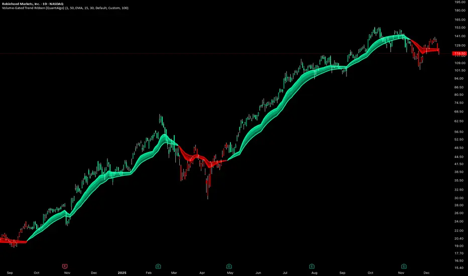
Volume-Gated Trend Ribbon [QuantAlgo]🟢 Overview
The Volume-Gated Trend Ribbon employs a selective price-updating mechanism that filters market noise through volume validation, creating a trend-following system that responds exclusively to significant price movements. The indicator gates price updates to moving average calculations based on volume threshold crossovers, ensuring that only bars with significant participation influence the trend direction. By interpolating between fast and slow moving averages to create a multi-layered visual ribbon, the indicator provides traders and investors with an adaptive trend identification framework that distinguishes between volume-backed directional shifts and low-conviction price fluctuations across multiple timeframes and asset classes.
🟢 How It Works
The indicator first establishes a dynamic baseline by calculating the simple moving average of volume over a configurable lookback period, then applies a user-defined multiplier to determine the significance threshold:
avgVol = ta.sma(volume, volPeriod)
highVol = volume >= avgVol * volMult
The gated price mechanism employs conditional updating where the close price is only captured and stored when volume exceeds the threshold. During low-volume periods, the indicator maintains the last qualified price level rather than tracking every minor fluctuation:
var float gatedClose = close
if highVol
gatedClose := close
Dual moving averages are calculated using the gated price input, with the indicator supporting various MA types. The fast and slow periods create the outer boundaries of the trend ribbon:
fastMA = volMA(gatedClose, close, fastPeriod)
slowMA = volMA(gatedClose, close, slowPeriod)
Ribbon interpolation creates intermediate layers by blending the fast and slow moving averages using weighted combinations, establishing a gradient effect that visually represents trend strength and momentum distribution:
midFastMA = fastMA * 0.67 + slowMA * 0.33
midSlowMA = fastMA * 0.33 + slowMA * 0.67
Trend state determination compares the fast MA against the slow MA, establishing bullish regimes when the faster average trades above the slower average and bearish regimes during the inverse relationship. Signal generation triggers on state transitions, producing alerts when the directional bias shifts:
bullish = fastMA > slowMA
longSignal = trendState == 1 and trendState != 1
shortSignal = trendState == -1 and trendState != -1
The visualization architecture constructs a three-tiered opacity gradient where the ribbon's core (between mid-slow and slow MAs) displays the highest opacity, the inner layer (between mid-fast and mid-slow) shows medium opacity, and the outer layer (between fast and mid-fast) presents the lightest fill, creating depth perception that emphasizes the trend center while acknowledging edge uncertainty.
🟢 How to Use This Indicator
▶ Long and Short Signals: The indicator generates long/buy signals when the trend state transitions to bullish (fast MA crosses above slow MA) and short/sell signals when transitioning to bearish (fast MA crosses below slow MA). Because these crossovers only reflect volume-validated price movements, they represent significant level of participation rather than random noise, providing higher-conviction entry signals that filter out false breakouts occurring on thin volume.
▶ Ribbon Width Dynamics: The spacing between the fast and slow moving averages creates the ribbon width, which serves as a visual proxy for trend strength and volatility. Expanding ribbons indicate accelerating directional movement with increasing separation between short-term and long-term momentum, suggesting robust trend development. Conversely, contracting ribbons signal momentum deceleration, potential trend exhaustion, or impending consolidation as the fast MA converges toward the slow MA.
▶ Preconfigured Presets: Three optimized parameter sets accommodate different trading styles and market conditions. Default provides balanced trend identification suitable for swing trading on daily timeframes with moderate volume filtering and responsiveness. Fast Response delivers aggressive signal generation optimized for intraday scalping on 1-15 minute charts, using lower volume thresholds and shorter moving average periods to capture rapid momentum shifts. Smooth Trend offers conservative trend confirmation ideal for position trading on 4-hour to weekly charts, employing stricter volume requirements and extended periods to filter noise and identify only the most robust directional moves.
▶ Built-in Alerts: Three alert conditions enable automated monitoring: Bullish Trend Signal triggers when the fast MA crosses above the slow MA confirming uptrend initiation, Bearish Trend Signal activates when the fast MA crosses below the slow MA confirming downtrend initiation, and Trend Change alerts on any directional transition regardless of direction. These notifications allow you to respond to volume-validated regime shifts without continuous chart monitoring.
▶ Color Customization: Six visual themes (Classic, Aqua, Cosmic, Ember, Neon, plus Custom) accommodate different chart backgrounds and display preferences, ensuring optimal contrast and visual clarity across trading environments. The adjustable fill opacity control (0-100%) allows fine-tuning of ribbon prominence, with lower opacity values create subtle background context while higher values produce bold trend emphasis. Optional bar coloring extends the trend indication directly to the price bars, providing immediate directional reference without requiring visual cross-reference to the ribbon itself.
The Abramelin Protocol [MPL]"Any sufficiently advanced technology is indistinguishable from magic." — Arthur C. Clarke
🌑 SYSTEM OVERVIEW
The Abramelin Protocol is not a standard technical indicator; it is a "Technomantic" trading algorithm engineered to bridge the gap between 15th-century esoteric mathematics and modern high-frequency markets.
This script is the flagship implementation of the MPL (Magic Programming Language) project—an open-source experimental framework designed to compile metaphysical intent into executable Python and Pine Script algorithms.
Unlike traditional indicators that rely on arbitrary constants (like the 14-period RSI or 200 SMA), this protocol calculates its parameters using "Dynamic Entity Gematria." We utilize a custom Python backend to analyze the ASCII vibrational frequencies of specific metaphysical archetypes, reducing them via Tesla's 3-6-9 harmonic principles to derive market-responsive periods.
🧬 WHAT IS ?
MPL (Magic Programming Language) is a domain-specific language and research initiative created to explore Technomancy—the art of treating code as a spellbook and the market as a chaotic entity to be tamed.
By integrating the logic of ancient Grimoires (such as The Book of Abramelin) with modern Data Science, MPL aims to discover hidden correlations in price action that standard tools overlook.
🔗 CONNECT WITH THE PROJECT:
If you are a developer, a trader, or a seeker of hidden knowledge, examine the source code and join the order:
• 📂 Official Project Site: hakanovski.github.io
• 🐍 MPL Source Code (GitHub): github.com
• 👨💻 Developer Profile (LinkedIn): www.linkedin.com
🔢 THE ALGORITHM: 452 - 204 - 50
The inputs for this script are mathematically derived signatures of the intelligence governing the system:
1. THE PAIMON TREND (Gravity)
• Origin: Derived from the ASCII summation of the archetype PAIMON (King of Secret Knowledge).
• Function: This 452-period Baseline acts as the market's "Event Horizon." It represents the deep, structural direction of the asset.
• Price > Line: Bullish Domain.
• Price < Line: Bearish Void.
2. THE ASTAROTH SIGNAL (Trigger)
• Origin: Derived from the ASCII summation of ASTAROTH (Knower of Past & Future), reduced by Tesla’s 3rd Harmonic.
• Function: This is the active trigger line. It replaces standard moving averages with a precise, gematria-aligned trajectory.
3. THE VOLATILITY MATRIX (Scalp)
• Origin: Based on the 9th Harmonic reduction.
• Function: Creates a "Cloud" around the signal line to visualize market noise.
🛡️ THE MILON GATE (Matrix Filter)
Unique to this script is the "MILON Gate" toggle found in the settings.
• ☑️ Active (Default): The algorithm applies the logic of the MILON Magic Square. Signals are ONLY generated if Volume and Volatility align with the geometric structure of the move. This filters out ~80% of false signals (noise).
• ⬜ Inactive: The algorithm operates in "Raw Mode," showing every mathematical crossover without the volume filter.
⚠️ OPERATIONAL USAGE
• Timeframe: Optimized for 4H (The Builder) and Daily (The Architect) charts.
• Strategy: Use the Black/Grey Line (452) as your directional bias. Take entries only when the "EXECUTE" (Long) or "PURGE" (Short) sigils appear.
Use this tool wisely. Risk responsibly. Let the harmonics guide your entries.
— Hakan Yorganci
Technomancer & Full Stack Developer

Mutanabby_AI | ONEUSDT_MR1
ONEUSDT Mean-Reversion Strategy | 74.68% Win Rate | 417% Net Profit
This is a long-only mean-reversion strategy designed specifically for ONEUSDT on the 1-hour timeframe. The core logic identifies oversold conditions following sharp declines and enters positions when selling pressure exhausts, capturing the subsequent recovery bounce.
Backtested Period: June 2019 – December 2025 (~6 years)
Performance Summary
| Metric | Value |
|--------|-------|
| Net Profit | +417.68% |
| Win Rate | 74.68% |
| Profit Factor | 4.019 |
| Total Trades | 237 |
| Sharpe Ratio | 0.364 |
| Sortino Ratio | 1.917 |
| Max Drawdown | 51.08% |
| Avg Win | +3.14% |
| Avg Loss | -2.30% |
| Buy & Hold Return | -80.44% |
Strategy Logic :
Entry Conditions (Long Only):
The strategy seeks confluence of three conditions that identify exhausted selling:
1. Prior Move Filter:*The price change from 5 bars ago to 3 bars ago must be ≥ -7% (ensures we're not entering during freefall)
2. Current Move Filter: The price change over the last 2 bars must be ≤ 0% (confirms momentum is stalling or reversing)
3. Three-Bar Decline: The price change from 5 bars ago to 3 bars ago must be ≤ -5% (confirms a significant recent drop occurred)
When all three conditions align, the strategy identifies a potential reversal point where sellers are exhausted.
Exit Conditions:
- Primary Exit: Close above the previous bar's high while the open of the previous bar is at or below the close from 9 bars ago (profit-taking on strength)
- Trailing Stop: 11x ATR trailing stop that locks in profits as price rises
Risk Management
- Position Sizing:Fixed position based on account equity divided by entry price
- Trailing Stop:11× ATR (14-period) provides wide enough room for crypto volatility while protecting gains
- Pyramiding:Up to 4 orders allowed (can scale into winning positions)
- **Commission:** 0.1% per trade (realistic exchange fees included)
Important Disclaimers
⚠️ This is NOT financial advice.
- Past performance does not guarantee future results
- Backtest results may contain look-ahead bias or curve-fitting
- Real trading involves slippage, liquidity issues, and execution delays
- This strategy is optimized for ONEUSDT specifically — results may differ on other pairs
- Always test before risking real capital
Recommended Usage
- Timeframe:*1H (as designed)
- Pair: ONEUSDT (Binance)
- Account Size: Ensure sufficient capital to survive max drawdown
Source Code
Feedback Welcome
I'm sharing this strategy freely for educational purposes. Please:
- Drop a comment with your backtesting results any you analysis
- Share any modifications that improve performance
- Let me know if you spot any issues in the logic
Happy trading
As a quant trader, do you think this strategy will survive in live trading?
Yes or No? And why?
I want to hear from you guys

BTC STH Proxy vs Realized Price (RP) Ratio | STH : LTH📊 REALIZED PRICE MARKET SIGNAL
Indicator that builds a Short-Term Holder (STH) price proxy using a configurable moving average of Bitcoin’s market price and compares it to Bitcoin’s Realized Price (RP) derived from on-chain data.
Realized Price (RP) is calculated from CoinMetrics Realized Market Cap divided by Glassnode circulating supply.
STH Proxy is a user-defined moving average (EMA/SMA/WMA) of BTC price, designed to mimic the behavior of the true STH Realized Price.
Users can adjust the MA type, length, and RP smoothing to closely replicate the STH curve seen on Glassnode, Bitbo, and Bitcoin Magazine Pro.
Optionally, the indicator can display the STH/RP ratio, which highlights transitions between market phases.
This tool provides a simple but effective way to visualize short-term vs long-term holder cost-basis dynamics using only publicly accessible on-chain aggregates and price data.
----------
💡TLDR: An alt take on the Short-Term Holder Realized Price / Long-Term Holder Realized Price cross model | (STH/LTH cross)
- A mix of MAs are used to mimic STH.
- RP here used as a proxy for the long-term holder (LTH) cost basis.
- Bull/Bear signals are generated when the STH proxy crosses above or below RP.
⭐ Free to use • Leave feedback • Happy trading!

Keltner Hull Suite [QuantAlgo]🟢 Overview
The Keltner Hull Suite combines Hull Moving Average positioning with double-smoothed True Range banding to identify trend regimes and filter market noise. The indicator establishes upper and lower volatility bounds around the Hull MA, with the trend line conditionally updating only when price violates these boundaries. This mechanism distinguishes between genuine directional shifts and temporary price fluctuations, providing traders and investors with a systematic framework for trend identification that adapts to changing volatility conditions across multiple timeframes and asset classes.
🟢 How It Works
The calculation foundation begins with the Hull Moving Average, a weighted moving average designed to minimize lag while maintaining smoothness:
hullMA = ta.hma(priceSource, hullPeriod)
The indicator then calculates true range and applies dual exponential smoothing to create a volatility measure that responds more quickly to volatility changes than traditional ATR implementations while maintaining stability through the double-smoothing process:
tr = ta.tr(true)
smoothTR = ta.ema(tr, keltnerPeriod)
doubleSmooth = ta.ema(smoothTR, keltnerPeriod)
deviation = doubleSmooth * keltnerMultiplier
Dynamic support and resistance boundaries are constructed by applying the multiplier-scaled volatility deviation to the Hull MA, creating upper and lower bounds that expand during volatile periods and contract during consolidation:
upperBound = hullMA + deviation
lowerBound = hullMA - deviation
The trend line employs a conditional update mechanism that prevents premature trend reversals. The system maintains the current trend line until price action violates the respective boundary, at which point the trend line snaps to the violated bound:
if upperBound < trendLine
trendLine := upperBound
if lowerBound > trendLine
trendLine := lowerBound
Directional bias determination compares the current trend line value against its previous value, establishing bullish conditions when rising and bearish conditions when falling. Signal generation occurs on state transitions, triggering alerts when the trend state shifts from neutral or opposite direction:
trendUp = trendLine > trendLine
trendDown = trendLine < trendLine
longSignal = trendState == 1 and trendState != 1
shortSignal = trendState == -1 and trendState != -1
The visualization layer creates a trend band by plotting both the current trend line and a two-bar shifted version, with the area between them filled to create a visual channel that reinforces directional conviction.
🟢 How to Use This Indicator
▶ Long and Short Signals: The indicator generates long/buy signals when the trend state transitions to bullish (trend line begins rising) and short/sell signals when transitioning to bearish (trend line begins falling). These state changes represent structural shifts in momentum where price has broken through the adaptive volatility bands, confirming directional commitment.
▶ Trend Band Dynamics: The spacing between the main trend line and its shifted counterpart creates a visual band whose width reflects trend strength and momentum consistency. Expanding bands indicate accelerating directional movement and strong trend persistence, while contracting or flattening bands suggest decelerating momentum, potential trend exhaustion, or impending consolidation. Monitoring band width provides early warning of regime transitions from trending to range-bound conditions.
▶ Preconfigured Presets: Three optimized parameter sets accommodate different trading styles and timeframes. Default (14, 20, 2.0) provides balanced trend identification suitable for daily charts and swing trading, Fast Response (10, 14, 1.5) delivers aggressive signal generation optimized for intraday scalping and momentum trading on 1-15 minute timeframes, while Smooth Trend (18, 30, 2.5) offers conservative trend confirmation ideal for position trading on 4-hour to daily charts with enhanced noise filtration.
▶ Built-in Alerts: Three alert conditions enable automated monitoring - Bullish Trend Signal triggers on long setup confirmation, Bearish Trend Signal activates on short setup confirmation, and Trend Change alerts on any directional transition. These notifications allow you to respond to regime shifts without continuous chart monitoring.
▶ Color Customization: Five visual themes (Classic, Aqua, Cosmic, Ember, Neon, plus Custom) accommodate different chart backgrounds and display preferences, ensuring optimal contrast and visual clarity across trading environments.

Filter Wave1. Indicator Name
Filter Wave
2. One-line Introduction
A visually enhanced trend strength indicator that uses linear regression scoring to render smoothed, color-shifting waves synced to price action.
3. General Overview
Filter Wave+ is a trend analysis tool designed to provide an intuitive and visually dynamic representation of market momentum.
It uses a pairwise comparison algorithm on linear regression values over a lookback period to determine whether price action is consistently moving upward or downward.
The result is a trend score, which is normalized and translated into a color-coded wave that floats above or below the current price. The wave's opacity increases with trend strength, giving a visual cue for confidence in the trend.
The wave itself is not a raw line—it goes through a three-stage smoothing process, producing a natural, flowing curve that is aesthetically aligned with price movement.
This makes it ideal for traders who need a quick visual context before acting on signals from other tools.
While Filter Wave+ does not generate buy/sell signals directly, its secure and efficient design allows it to serve as a high-confidence trend filter in any trading system.
4. Key Advantages
🌊 Smooth, Dynamic Wave Output
3-stage smoothed curves give clean, flowing visual feedback on market conditions.
🎨 Trend Strength Visualized by Color Intensity
Stronger trends appear with more solid coloring, while weak/neutral trends fade visually.
🔍 Quantitative Trend Detection
Linear regression ordering delivers precise, math-based trend scoring for confidence assessment.
📊 Price-Synced Floating Wave
Wave is dynamically positioned based on ATR and price to align naturally with market structure.
🧩 Compatible with Any Strategy
No conflicting signals—Filter Wave+ serves as a directional overlay that enhances clarity.
🔒 Secure Core Logic
Core algorithm is lightweight and secure, with minimal code exposure and strong encapsulation.
📘 Indicator User Guide
📌 Basic Concept
Filter Wave+ calculates trend direction and intensity using linear regression alignment over time.
The resulting wave is rendered as a smoothed curve, colored based on trend direction (green for up, red for down, gray for neutral), and adjusted in transparency to reflect trend strength.
This allows for fast trend interpretation without overwhelming the chart with signals.
⚙️ Settings Explained
Lookback Period: Number of bars used for pairwise regression comparisons (higher = smoother detection)
Range Tolerance (%): Threshold to qualify as an up/down trend (lower = more sensitive)
Regression Source: The price input used in regression calculation (default: close)
Linear Regression Length: The period used for the core regression line
Bull/Bear Color: Customize the color for bullish and bearish waves
📈 Timing Example
Wave color changes to green and becomes more visible (less transparent)
Wave floats above price and aligns with an uptrend
Use as trend confirmation when other signals are present
📉 Timing Example
Wave shifts to red and darkens, floating below the price
Regression direction down; price continues beneath the wave
Acts as bearish confirmation for short trades or risk-off positioning
🧪 Recommended Use Cases
Use as a trend confidence overlay on your existing strategies
Especially useful in swing trading for detecting and confirming dominant market direction
Combine with RSI, MACD, or price action for high-accuracy setups
🔒 Precautions
This is not a signal generator—intended as a trend filter or directional guide
May respond slightly slower in volatile reversals; pair with responsive indicators
Wave position is influenced by ATR and price but does not represent exact entry/exit levels
Parameter optimization is recommended based on asset class and timeframe
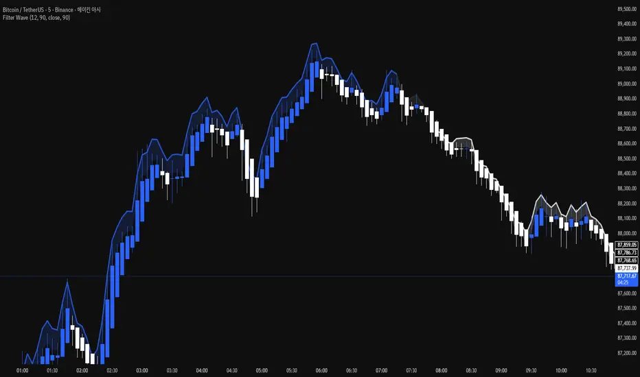
Multi Timeframe Bollinger Bands Spectrum [Ata]Multi-Timeframe Bollinger Bands Spectrum
Technical Overview
This script integrates multi-timeframe volatility analysis with volume-derived order flow estimation. By combining Bollinger Bands (statistical deviation) with internal candle volume logic, the indicator qualifies price movements to differentiate between sustained trends, reversals, and exhaustion events.
The system is designed to provide a structural context for price action, visualizing market regimes through a dual-zone spectrum and filtering signals based on the interaction between price location and specific volume thresholds.
Core Logic & Calculation
1. Volume Decomposition Algorithm
Instead of using total volume, the script estimates Buying Pressure vs. Selling Pressure based on the close position relative to the candle's High/Low range:
- Buying Volume (vb): Increases as the close approaches the High.
- Selling Volume (vs): Increases as the close approaches the Low.
This logic allows the detection of directional flow even within standard volume bars.
2. Statistical Spectrum
The indicator renders deviations from the Basis (SMA) as two distinct zones:
- Bullish Zone (Blue): Price positioning between the Basis and Upper Band.
- Bearish Zone (Red): Price positioning between the Basis and Lower Band.
This structure is applied across multiple timeframes (overlay) to visualize the macro trend context without noise.
3. Non-Repainting Execution
To ensure historical accuracy and reliability for backtesting, all higher-timeframe data is requested using "lookahead_off". Signals are confirmed only upon the closure of the respective timeframe's candle.
Signal Definitions
Signals are generated only when specific Volatility and Volume conditions intersect:
Reversal Setups (Reaction to Liquidity)
- WALL: Triggered when price rejects the Upper Band accompanied by Extreme Selling Volume (vs > Limit). This suggests active limit sell orders absorbing the rally.
- FLOOR: Triggered when price rejects the Lower Band accompanied by Extreme Buying Volume (vb > Limit). This suggests active limit buy orders absorbing the drop.
- ABSORP: Identifies absorption near the lower bands where selling pressure is met with passive buying (indicated by lower wicks and relative buy volume).
Momentum Setups (Trend Continuation)
- POWER: Validates a breakout above the Upper Band only if supported by Dominant Buying Volume and a strong candle body.
- PANIC: Validates a breakdown below the Lower Band only if supported by Dominant Selling Volume.
- TRAP: Marks failed breakouts where price exits the bands but volume analysis contradicts the move (e.g., low directional volume).
Exhaustion Setups (Statistical Extremes)
- CLIMAX/CRASH: Identifies anomalies where price deviates significantly from the mean (Extreme Deviation) or when volume reaches unsustainable levels relative to the average, often preceding a mean reversion.
Input Parameters
- Bollinger Logic: Configuration for Length and Standard Deviation Multiplier.
- Volume Thresholds: Adjustable factors for Minimum Volume (Trend) and Extreme Volume (Reversal/Climax).
- Timeframe Layers: Toggle visibility for up to 5 higher timeframes.
- Theme: Adjusts label contrast for Dark/Light backgrounds.
Disclaimer
This indicator is strictly for analytical purposes. It provides a visualization of past market data based on statistical and volumetric formulas. Users should apply their own risk management protocols.
9/15 EMA Scalper 9/15 EMA Scalper — by uzairbaloch
This script is a price-action based scalping system built around the 9 EMA and 15 EMA trend structure.
It identifies short-term reversal points where the market pulls back into the EMAs and confirms direction with a strong candle signal.
The strategy looks for:
• A clear EMA trend (9 above 15 for buys, 9 below 15 for sells)
• Pullback into EMA9/EMA15 with candle bodies touching the fast EMA
• Strong confirmation candle (engulfing / strong momentum / controlled wick)
• Optional slope filter to avoid flat, choppy sessions
• Automatic trade labels showing Entry, SL and TP (based on R:R)
The script is designed for scalping on gold, indices, and high-volatility FX pairs.
It resets trade logic immediately after SL or TP is hit, so it can catch the next valid signal without delay.
This tool is meant as an indicator — not a full strategy — and can be used to visually mark high-probability EMA pullback setups with precise levels.
Author: uzairbaloch

Trading Sessions [QuantAlgo]🟢 Overview
The Trading Sessions indicator tracks and displays the four major global trading sessions: Sydney, Tokyo, London, and New York. It provides session-based background highlighting, real-time price change tracking from session open, and a data table with session status. The script works across all markets (forex, equities, commodities, crypto) and helps traders identify when specific geographic markets are active, which directly correlates with changes in liquidity and volatility patterns. Default session times are set to major financial center hours in UTC but are fully adjustable to match your trading methodology.
🟢 Key Features
→ Session Background Color Coding
Each trading session gets a distinct background color on your chart:
1. Sydney Session - Default orange, 22:00-07:00 UTC
2. Tokyo Session - Default red, 00:00-09:00 UTC
3. London Session - Default green, 08:00-16:00 UTC
4. New York Session - Default blue, 13:00-22:00 UTC
When sessions overlap, the color priority is New York > London > Tokyo > Sydney. This means if London and New York are both active, the background shows New York's color. The priority matches typical liquidity and volatility patterns where later sessions generally show higher volume.
→ Color Customization
All session colors are configurable in the Color Settings panel:
1. Click any session color input to open the color picker
2. Select your preferred color for that session
3. Use the "Background Transparency" slider (0-100) to adjust opacity. Lower values = more visible, higher values = more subtle
4. Enable "Color Price Bars" to color candlesticks themselves according to the active session instead of just the background
The Color column in the info table shows a block (█) in each session's assigned color, matching what you see on the chart background.
→ Information Table Breakdown
→ Timeframe Warning
If you're viewing a timeframe of 12 hours or higher, a red warning label appears center-screen. Session boundaries don't render accurately on high timeframes because the time() function in Pine Script can't detect intra-bar session changes when each bar spans multiple sessions. The warning tells you to switch to sub-12H timeframes (e.g., 4H, 1H, 30m, 15m, etc.) for proper session detection. You can disable this warning in Color Settings if needed, but session highlighting can be unreliable on 12H+ charts regardless.
→ Time Range Configuration
Every session's time range is editable in Session Settings:
1. Click the time input field next to each session
2. Enter time as HHMM-HHMM in 24-hour format
3. All times are interpreted as UTC
4. Modify these to account for daylight saving shifts or to define custom session periods based on your backtested optimal trading windows
For example, if your strategy performs best during London/NY overlap specifically, you could set London to 08:00-17:00 and New York to 13:00-22:00 to ensure you see the full overlap highlighted.
→ Weekdays Filter
The "Weekdays Only (Mon-Fri)" toggle controls whether sessions display on weekends:
Enabled: Sessions only show Monday-Friday and hide on Saturday-Sunday. Use this for markets that close on weekends (most equities, forex).
Disabled: Sessions display 24/7 including weekends. Use this for markets that trade continuously (crypto).
→ Table Display Options
The info table has several configuration options in Table Settings:
Visibility: Toggle "Show Info Table" on/off to display or hide the entire table.
Position: Nine position options (Top/Middle/Bottom + Left/Center/Right) let you place the table wherever it doesn't block your price action or other indicators.
Text Size: Four size options (Tiny, Small, Normal, Large) to match your screen resolution and visual preferences.
→ Color Schemes:
Mono: Black background, gray header, white text
Light: White background, light gray header, black text
Blue: Dark blue background, medium blue header, white text
Custom: Manual selection of all five color components (table background, header background, header text, data text, borders)
→ Alert Functionality
The indicator includes ten alert conditions you can access via TradingView's alert system:
Session Opens:
1. Sydney Session Started
2. Tokyo Session Started
3. London Session Started
4. New York Session Started
5. Any Session Started
Session Closes:
6. Sydney Session Ended
7. Tokyo Session Ended
8. London Session Ended
9. New York Session Ended
10. Any Session Ended
These alerts fire when sessions transition based on your configured time ranges, letting you automate monitoring of session changes without watching the chart continuously. Useful for strategies that trade specific session opens/closes or need to adjust position sizing when volatility regime shifts between sessions.

Smart RSI Money Flow - Core Bands V1.01SMART RSI – Money Flow Bands (Technical Overview)
1. Background: RSI and Its Behavior on Lower Timeframes
The Relative Strength Index (RSI) originally is a momentum oscillator calculated from average gains and losses over a selected period. In its standard form, RSI is derived solely from price changes; it does not incorporate volume data or order-flow information in its formula.
Because RSI is price-based, its interpretation depends strongly on the timeframe:
• On higher timeframes, each bar aggregates more trading activity, and RSI tends to behave more smoothly.
• On lower timeframes (1-hour down to intraday scalping intervals), price fluctuations are quicker, and RSI becomes more sensitive to short-term noise.
This does not imply that RSI becomes invalid, but that its signals on fast charts can be more reactive and may benefit from additional context such as volume behavior or structural information.
2. Purpose of This Indicator
This indicator extends the classical RSI by adding information that RSI does not include:
• Mapping RSI values into price-based bands instead of the 0–100 oscillator space.
• Retrieving lower timeframe volume data and separating it into buy and sell components.
• Comparing the slope (angle) of price movement with the slope of buy and sell volume.
The goal is to provide a structural interpretation of where price sits relative to RSI conditions and how volume is behaving on a lower timeframe.
3. Technical Differences Compared to Classical RSI
A) Classical RSI
• Input: price only (usually close).
• Output: normalized oscillator between 0 and 100.
• Does not incorporate intra-bar volume distribution.
• Does not separate buy/sell volume.
B) SMART RSI – Money Flow Bands
1) RSI-to-Price Mapping
Converts RSI values into upper/lower price bands using recent price extremes.
2) Lower Timeframe Volume Decomposition
Retrieves LTF data and splits each bar’s volume into buy (close>open) and sell (close

Frequency Momentum Oscillator [QuantAlgo]🟢 Overview
The Frequency Momentum Oscillator applies Fourier-based spectral analysis principles to price action to identify regime shifts and directional momentum. It calculates Fourier coefficients for selected harmonic frequencies on detrended price data, then measures the distribution of power across low, mid, and high frequency bands to distinguish between persistent directional trends and transient market noise. This approach provides traders with a quantitative framework for assessing whether current price action represents meaningful momentum or merely random fluctuations, enabling more informed entry and exit decisions across various asset classes and timeframes.
🟢 How It Works
The calculation process removes the dominant trend from price data by subtracting a simple moving average, isolating cyclical components for frequency analysis:
detrendedPrice = close - ta.sma(close , frequencyPeriod)
The detrended price series undergoes frequency decomposition through Fourier coefficient calculation across the first 8 harmonics. For each harmonic frequency, the algorithm computes sine and cosine components across the lookback window, then derives power as the sum of squared coefficients:
for k = 1 to 8
cosSum = 0.0
sinSum = 0.0
for n = 0 to frequencyPeriod - 1
angle = 2 * math.pi * k * n / frequencyPeriod
cosSum := cosSum + detrendedPrice * math.cos(angle)
sinSum := sinSum + detrendedPrice * math.sin(angle)
power = (cosSum * cosSum + sinSum * sinSum) / frequencyPeriod
Power measurements are aggregated into three frequency bands: low frequencies (harmonics 1-2) capturing persistent cycles, mid frequencies (harmonics 3-4), and high frequencies (harmonics 5-8) representing noise. Each band's power normalizes against total spectral power to create percentage distributions:
lowFreqNorm = totalPower > 0 ? (lowFreqPower / totalPower) * 100 : 33.33
highFreqNorm = totalPower > 0 ? (highFreqPower / totalPower) * 100 : 33.33
The normalized frequency components undergo exponential smoothing before calculating spectral balance as the difference between low and high frequency power:
smoothLow = ta.ema(lowFreqNorm, smoothingPeriod)
smoothHigh = ta.ema(highFreqNorm, smoothingPeriod)
spectralBalance = smoothLow - smoothHigh
Spectral balance combines with price momentum through directional multiplication, producing a composite signal that integrates frequency characteristics with price direction:
momentum = ta.change(close , frequencyPeriod/2)
compositeSignal = spectralBalance * math.sign(momentum)
finalSignal = ta.ema(compositeSignal, smoothingPeriod)
The final signal oscillates around zero, with positive values indicating low-frequency dominance coupled with upward momentum (trending up), and negative values indicating either high-frequency dominance (choppy market) or downward momentum (trending down).
🟢 How to Use This Indicator
→ Long/Short Signals: the indicator generates long signals when the smoothed composite signal crosses above zero (indicating low-frequency directional strength dominates) and short signals when it crosses below zero (indicating bearish momentum persistence).
→ Upper and Lower Reference Lines: the +25 and -25 reference lines serve as threshold markers for momentum strength. Readings beyond these levels indicate strong directional conviction, while oscillations between them suggest consolidation or weakening momentum. These references help traders distinguish between strong trending regimes and choppy transitional periods.
→ Preconfigured Presets: three optimized configurations are available with Default (32, 3) offering balanced responsiveness, Fast Response (24, 2) designed for scalping and intraday trading, and Smooth Trend (40, 5) calibrated for swing trading and position trading with enhanced noise filtration.
→ Built-in Alerts: the indicator includes three alert conditions for automated monitoring - Long Signal (momentum shifts bullish), Short Signal (momentum shifts bearish), and Signal Change (any directional transition). These alerts enable traders to receive real-time notifications without continuous chart monitoring.
→ Color Customization: four visual themes (Classic green/red, Aqua blue/orange, Cosmic aqua/purple, Custom) allow chart customization for different display environments and personal preferences.
